How to Turn a Landscape Photograph Into an Isometric Icon in Adobe Photoshop

Post pobrano z: How to Turn a Landscape Photograph Into an Isometric Icon in Adobe Photoshop

Final product image
What You’ll Be Creating

Today you will learn how to create an isometric perspective grid in Adobe Photoshop. To make a nice isometric view illustration, we will add some photo textures.

If you’re in a hurry and looking for some ready-made isometric icons to use in your projects (along with many other awesome types of isometric vectors), read this article:

Tutorial Assets

To complete the tutorial, you will need the following assets:

1. How to Make an Isometric Grid

Step 1

First of all, we need to add an isometric grid to our canvas. You can find instructions for this in the isometric tutorial we published earlier.

Isometric grid

Step 2

Based on the grid, draw a rectangle vector shape on the isometric surface. You can use any color, because this is just a guide for our next photo manipulation process.

Draw basic map shape in isometric perspective

Step 3

Duplicate the vector shape by clicking Control-J, and move it upward.

Draw basic map shape in isometric perspective

Step 4

From now on, you can turn off the grid, because we won’t be needing it anymore.

Turning off the isometric grid

2. How to Build the Soil

Step 1

Draw the left side of the 3D map using the Pen Tool. Double-click its layer shape and then add a Gradient Overlay.

Drawing left side of the shape
Layer style for Gradient Overlay
Left side with gradient overlay

Step 2

Set its Fill to 0%.

Set Fill to 0

Step 3

Repeat the same step on the other side.

Right side

Step 4

Draw a new shape using the Pen Tool, covering the whole map. Add a Gradient Overlay to the shape and then set its Fill to 0%.

Another Gradient Overlay
Layer style for Gradient Overlay

Step 5

Grab the soil texture and place it on top of the map.

Adding soil texture

Step 6

Control-click the left side of the map to make a new selection based on its shape. Click the Add layer mask icon in the lower part of the Layers panel to cut off the rock texture outside the shape.

Adding layer mask

Step 7

Repeat the same process on the other side of the map.

Add soil to the edge

3. How to Build the Hill

Step 1

Grab the hill landscape and overlay it on the map with low Opacity. Position it until you get a nice perspective.

Adding hill landscape

Step 2

Add a layer mask to the landscape photo and then paint with black to hide unwanted areas. In this case, I want to retain the street, the hill next to it, and the tree in the corner. Try to get a natural shape using your brush stroke. We don’t want this to be a flat, box-like shape.

Masking the landscape

Step 3

Let’s go back to the soil. We need to make it darker and more believable. Start by painting shadow on its corner. Add a new layer and simply paint black using the Brush Tool with low Opacity.

Painting shadow on maps corner

Step 4

The result is already much better. Keep on adding black shadow to the soil to make it a lot darker.

Adding black shadow to the soil

Step 5

Next, grab another dirt or soil texture. Paste it on top of the previous soil and set its mode to Overlay. Take your time, add a layer mask, and carefully insert any dirt, rocks, and roots into the soil to make it as realistic as possible.

Add another soil texture

Step 6

Let’s add another landscape image into the map. Place the landscape behind the current hill landscape. Add a layer mask to the landscape image and then paint black to remove most of its content while leaving part of its valley.

Add another landscape
Unneeded areas are now hidden

Step 7

Add a new layer and then paint shadow on areas of the new landscape as indicated below.

Add shadow

4. How to Add the Sea to the Isometric View

Step 1

Now, add the sea image behind the map. Position it where you like it most.

Adding sea image

Step 2

Control-click the base of the map to create a new selection based on its shape. Click the Add layer mask icon to hide unselected pixels.

Adding layer mask to the sea

Step 3

Manually fix broken elements in the landscape, if there are any, by painting them with white using a soft brush. In this case, do this with the rock.

Fixing broken rock

Step 4

To add more waves to the sea, we can simply duplicate the sea image and move it to a different position. Apply the same layer mask as the first one and then hide some of the areas until it blends with the first image.

Adding another part of the sea
Adding another layer mask

Step 5

Select the ocean by Control-clicking on its layer shape. Add a Photo Filter Adjustment Layer with Cooling Filter to increase the contrast of its blue sea surface.

Increase sea contrast
Adding Photo Filter

5. How to Add Details

Step 1

Let’s add more contrast into the scene manually. Start by selecting the main hill. Make a new layer on top of it and then click Edit > Stroke to add a stroke line.

Add contrast to the landscape edges
Adding black stroke
Adding black stroke

Step 2

Apply a Gaussian Blur filter to soften the line, and then reduce its Opacity setting in the Layers panel. If necessary, you can also delete a segment of the blurred line using the Eraser Tool.

Soften the stroke line

Step 3

Repeat this process, and add another shadow by painting with black on a new layer.

Add another shadow

Step 4

Let’s make the road more realistic by adding an unfinished street at the end. Activate the hill landscape layer and then paint with white to reveal a chunk of street hanging outside the map. Right underneath the street, paint black to add thickness to the street and then paint a big soft shadow on the soil.

Add broken street

Step 5

To make it appear more realistic, add a new layer and scribble some short black lines using the Pencil Tool with 1 px brush size on the street. Duplicate the layer, and invert its color to white by pressing Control-I. Move the white scribbles down 1 pixel. Reduce their Opacity setting in the Layers panel.

Make the street more realistic
Adding scribbles to the street
The result after adding scribbles to the street

Step 6

Add another shadow and highlight onto the scene by painting with black and white using a soft big brush with low Opacity.

Adding shadow and highlight

Step 7

Here’s the fun part. The map will not be complete until we have a small car on the empty street. You might notice that in our main landscape there’s a parked car. Select and then copy it to a new layer (Control-J). Place it on the street, add a layer mask, and then hide unneeded pixels by painting them with black.

Adding car
Adding car
Car added

6. How to Add the Background

Step 1

We will use a simple background for this map. Activate the Gradient Tool with a standard white to black gradient. Drag from top to bottom until we have this background.

Add white to black gradient for background

Step 2

Let’s add a shadow underneath the map. Control-click the base to make a new selection. Fill it with black, deselect (Control-D), and then apply a Gaussian Blur filter (Filter > Blur > Gaussian Blur) to soften it. Repeat this process a few times with different Radius settings and layer Opacity until we have a realistic floor.

Adding map shadow
Adding map shadow

Step 3

We may need to draw shadow manually by painting black on the canvas using a big soft Brush Tool with low Opacity.

Adding map shadow

Step 4

This grey background is just too dull. Let’s make it more interesting by changing its color to blue. Add a Photo Filter Adjustment Layer above the background and select Cooling Filter.

Adding photo filter adjustment

Conclusion

Now, we have reached the final result. As you can see, there are no complicated tricks in this tutorial. We only used a simple layer mask and a bit of manual drawing. We made cool isometric perspective illustration in Adobe Photoshop.

I believe that it is important to select the best landscape photos—by doing this, we save ourselves from time-consuming photo editing and can focus on working with the map shape. I hope you understand this tutorial and can follow it easily. If you do follow along, let me know your result. I’d love to see it. Thanks.

Final result

Check out some other awesome tutorials with step-by-step cool isometric view illustrations and our articles about this type of design!

Weekly news: Truncating muti-line text, calc() in custom property values, Contextual Alternates

Post pobrano z: Weekly news: Truncating muti-line text, calc() in custom property values, Contextual Alternates

In this week’s roundup, WebKit’s method for truncating multi-line text gets some love, a note on calculations using custom properties, and a new OpenType feature that prevents typographic logjams.

Truncating mutli-line text

The CSS -webkit-line-clamp property for truncating multi-line text is now widely supported (see my usage guide). If you use Autoprefixer, update it to the latest version (9.6.1). Previous versions would remove -webkit-box-orient: vertical, which caused this CSS feature to stop working.

Note that Autoprefixer doesn’t generate any prefixes for you in this case. You need to use the following four declarations exactly (all are required):

.line-clamp {
  overflow: hidden;
  display: -webkit-box;
  -webkit-box-orient: vertical;
  -webkit-line-clamp: 3; /* or any other integer */
}

(via Autoprefixer)

Calculations in CSS custom property values

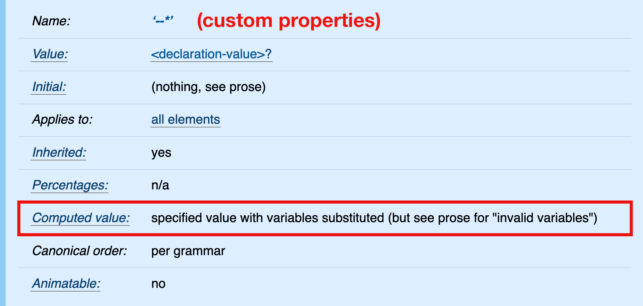
In CSS, it is currently not possible to pre-calculate custom property values (spec). The computed value of a custom property is its specified value (with variables substituted); therefore, relative values in calc() expressions are not „absolutized” (e.g., em values are not computed to pixel values).

:root {
  --large: calc(1em + 10px);
}

blockquote {
  font-size: var(--large);
}

It may appear that the calculation in the above example is performed on the root element, specifically that the relative value 1em is computed and added to the absolute value 10px. Under default conditions (where 1em equals 16px on the root element), the computed value of --large would be 26px.

But that’s not what’s happening here. The computed value of --large is its specified value, calc(1em + 10px). This value is inherited and substituted into the value of the font-size property on the <blockquote> element.

blockquote {
  /* the declaration after variable substitution */
  font-size: calc(1em + 10px);
}

Finally, the calculation is performed and the relative 1em value absolute-ized in the scope of the <blockquote> element — not the root element where the calc() expression is declared.

(via Tab Atkins Jr.)

Contextual Alternates

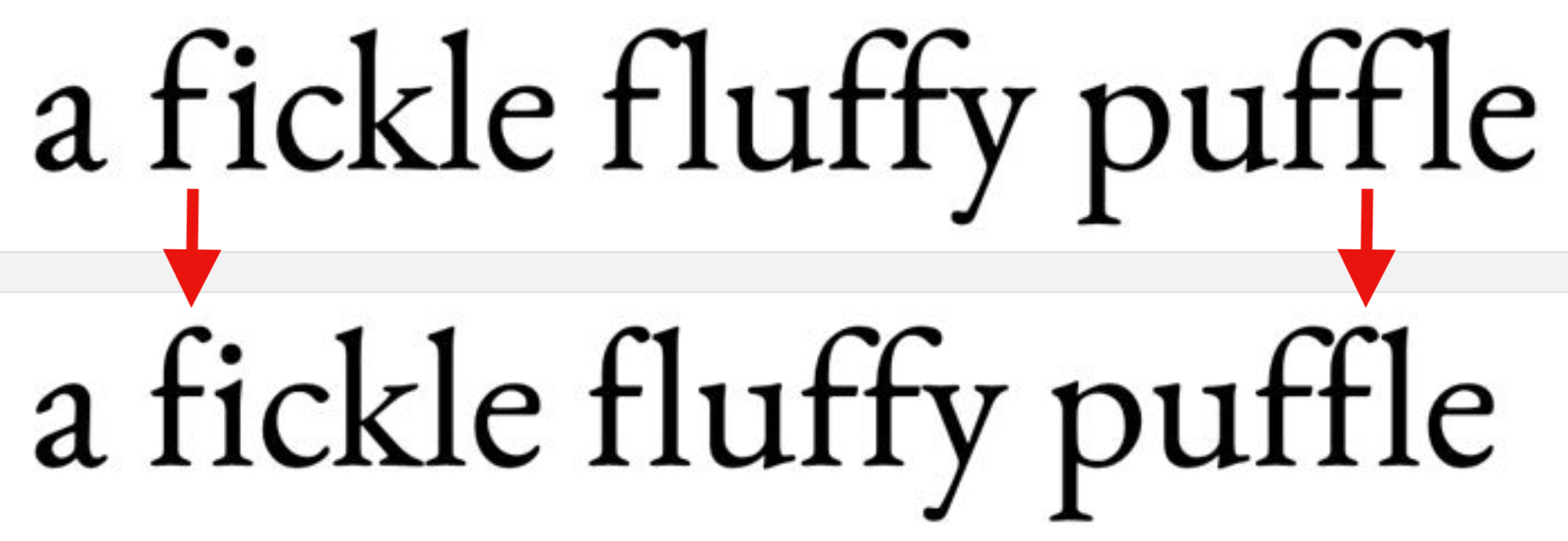
The „Contextual Alternates” OpenType feature ensures that characters don’t overlap or collide when ligatures are turned off. You can check if your font supports this feature on wakamaifondue.com and enable it (if necessary) via the CSS font-variant-ligatures: contextual declaration.

(via Jason Pamental)

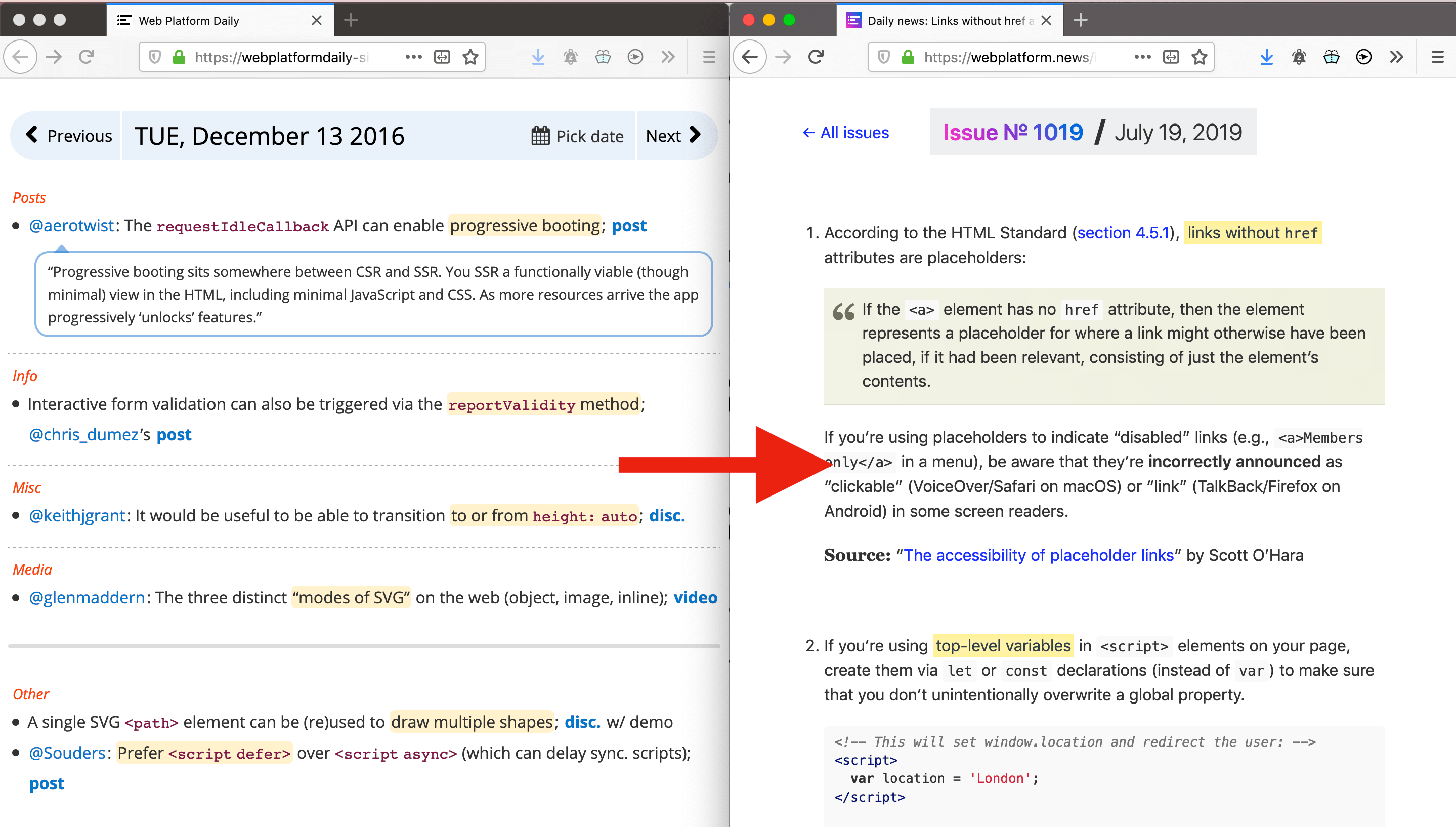
Announcing daily news on webplatform.news

I have started posting daily news for web developers on webplatform.news. Visit every day!

The post Weekly news: Truncating muti-line text, calc() in custom property values, Contextual Alternates appeared first on CSS-Tricks.

My Favorite Netlify Features

Post pobrano z: My Favorite Netlify Features

👋 Hey folks! Silvestar pitched this post to us because he is genuinely enthusiastic about JAMstack and all of the opportunities it opens up for front-end development. We wanted to call that out because, although some of the points in here might come across as sponsored content and Netlify is indeed a CSS-Tricks sponsor, it’s completely independent of Netlify.

Being a JAMstack developer in 2019 makes me feel like I am living in a wonderland. All these modern frameworks, tools, and services make our lives as JAMstack developers quite enjoyable. In fact, Chris would say they give us superpowers.

Yet, there is one particular platform that stands out with its formidable products and features — Netlify. You’re probably pretty well familiar with Netlify if you read CSS-Tricks regularly. There’s a slew of articles on it. There are even two CSS-Tricks microsites that use it.

This article is more of a love letter to Netlify and all of the great things it does. I decided to sit down and list my most favorite things about it. So that’s what I’d like to share with you here. Hopefully, this gives you a good idea not only what Netlify is capable of doing, but helps you get the most out of it as well.

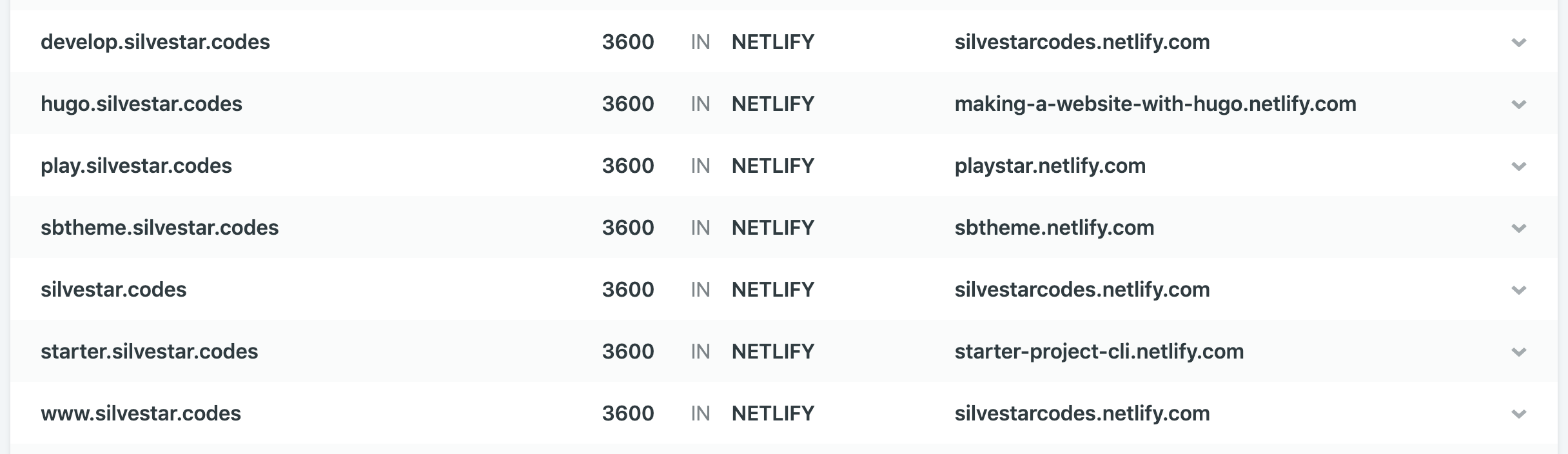
You can customize your site’s Netlify subdomain.

When creating a new project on Netlify, you start by either:

  • choosing a repository from a Git provider, or
  • uploading a folder.

The project should be ready in a matter of minutes, and you could start configuring it for your needs right away. Start by choosing the site name.

The site name determines the default URL for your site. Only alphanumeric characters and hyphens are allowed.

Netlify randomly creates a default name for a new project. If you don’t like the name, choose your own and make it one that would be much easier for you to remember.

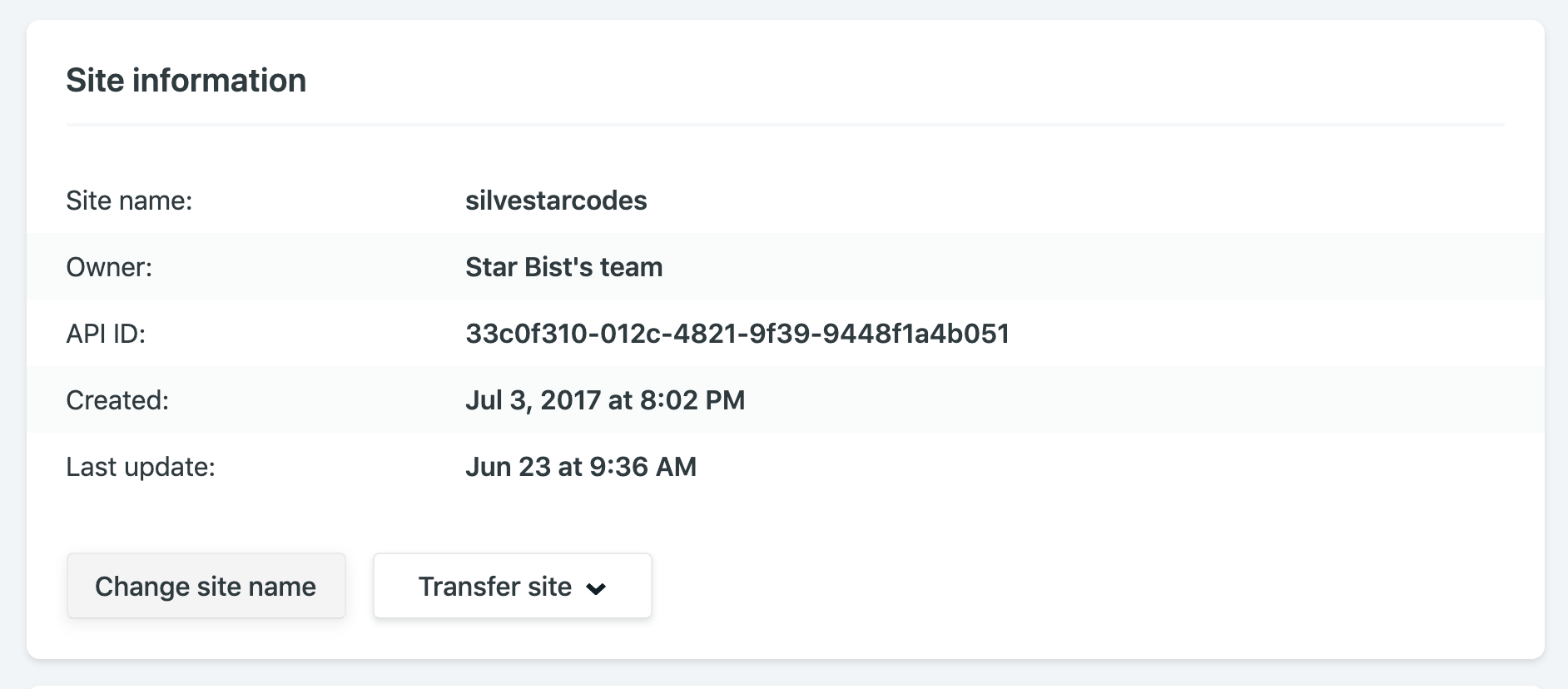
The „Site information” section of the Netlify dashboard.

For example, my site name is silvestarcodes, and I could access my site by visiting silvestarcodes.netlify.com.

You can manage all your DNS on Netlify.

If you are setting up an actual site, you would want to add a custom domain. From the domain management panel, go to the custom domains section, click on the „Add custom domain” button, enter your domain, and click the „Verify” button.

Now you have two options:

  1. Point your DNS records to Netlify load balancer IP address
  2. Let Netlify handle your DNS records

For the first option, you could read the full instructions in the official documentation for custom domains.

For the second option, you should add or update the nameservers on your domain registrar. If you didn’t buy the domain already, you could register it right from the dashboard.

Netlify has a service for provisioning DNS records called Netlify DNS.

Once you have configured the custom domain, you could handle your DNS records from the Netlify dashboard.

The „DNS” section of the Netlify dashboard.

If you want to set up a dev subdomain for your dev branch to preview development changes for your site, you could do it automatically. From the Domain Management section in the Settings section of your site, select the dev branch and Netlify would add a new subdomain dev for you automagically. Now you could see the previews by visiting dev subdomain.

The „Subdomains” section of the Netlify dashboard.

You could configure a subdomain for a different website. To achieve this, create a new Netlify site, enter a new subdomain as a custom domain, and Netlify would automatically add the records for you.

As an icing on the DNS management cake, Netlify lets you create Let’s Encrypt certificates for your domain automatically… for free.

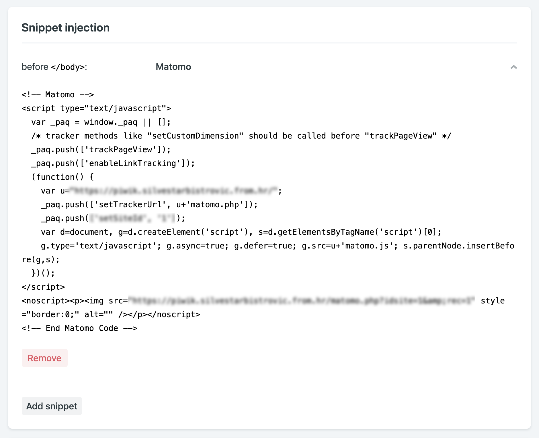
You can inject snippets into pages, which is sort of like a Tag Manager.

Snippet injection is another excellent feature. I am using it mostly for inserting analytics, but you could use it for adding meta tags for responsive behavior, favicon tags, or Webmention.io tags.

The „Snippet injection” section of the Netlify dashboard.

When inserting snippets, you could choose to append the code fragment at the end of the <head> block, or at the end of the <body> block.

Every deploy has its own URL forever.

Netlify creates a unique preview link for every successful build. That means you could easily compare revisions made to your site. For example, here is the link to my website from January this year, and here is the link from January last year. Notice the style and content changes.

In his talk, Phil Hawksworth calls this feature immutable, atomic deploys.

They are immutable deployments that live on forever.
— Phil Hawksworth

I found this feature useful when completing tasks and sending the preview links to the clients. If there is a person in charge of handling Git-related tasks, like publishing to production, these preview links could be convenient to understand what to expect during the merge. You could even set up the preview builds for every pull request.

Netlify allows for the cleanest and most responsible A/B testing you can do.

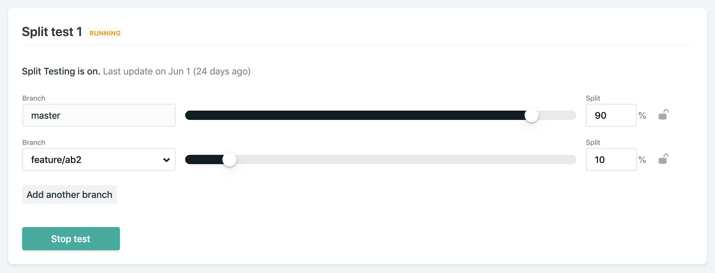
If you ever wanted to run A/B tests on your site, you would find that Netlify makes running A/B tests quite straightforward. Split testing on Netlify allows you to display different versions of your website from different Git branches without any hackery.

The „Split testing” section of the Netlify dashboard.

Start by adding and publishing a separate branch with desired changes. From “Split testing” panel, select which branches to test, set a split percentage, and start the test. You could even set a variable in analytics code to track which branch is currently displayed. You might need to active branch deploys if you didn’t do this already.

Netlify’s Split Testing lets you divide traffic to your site between different deploys, straight from our CDN network, without losing any download performance, and without installing any third party JavaScript library.
Netlify documentation

I have been using A/B testing on my site for a few different features so far:

  • Testing different versions of contact forms
  • Displaying different versions of banners
  • Tracking user behavior, like heatmaps

If you want to track split testing information, you could set up the process environment variable for this purpose. You could learn more about it in the official documentation. The best part? Most A/B testing services use client-side JavaScript to do it, which is unreliable and not great for performance. Doing it at the load balancer level like this is so much better.

There are lots of options for notifications, like email and Slack.

If you want to receive a notification when something happens with your Netlify project, you could choose from a wide variety of notification options. I prefer getting an email for every successful or failed build.

The „Notifications” section of the Netlify dashboard.

If you are using Gmail, you could notice „See the changes live” link for every successful build when hovering your message in Gmail inbox. That means you could open a preview link without opening the email. There are other links like „See full deploy logs” when your build have any issues or „Check usage details” when your plan is near its limits. How awesome is that?

Netlify email notifications include a preview link.

If you want to set up a hook for third-party services, all you need is a URL (JWS secret token is optional). Slack hooks are built-in with Netlify and could be set up within seconds if you know your Slack incoming webhook URL.

Conclusion

All of the features mentioned above are part of the free Netlify plan. I cannot even imagine the effort invested in providing a seamless experience as it is now. But Netlify doesn’t stop there. They are introducing more and more new and shiny features, like Netlify Dev CLI for local development and deploy cancelations. Netlify has established as an undoubtedly game-changing platform in modern web development of static websites, and it is a big part of the growth and popularity of static sites.

The post My Favorite Netlify Features appeared first on CSS-Tricks.

How to Make a Marketing Flyer Template in InDesign

Post pobrano z: How to Make a Marketing Flyer Template in InDesign

Final product image
What You’ll Be Creating

Promote your next business venture or current products with this super-easy tutorial that will help you attract more consumers. In this tutorial, I’ll show you how to make a flyer template.

Corporate business flyers are cost-effective advertising that you can use. Having an easy-to-use business flyer whose format you or your clients can quickly change is a huge advantage. 

In this tutorial, I’ll show you how to make a flyer with the most essential tools. You’ll learn how to successfully set up a template with layers, Color Swatches, and Paragraph styles. These three components will make trouble-free business flyers that can be formatted in just minutes. 

In a hurry? We’ve got amazing InDesign marketing flyer templates and business flyer templates over at Envato Elements and GraphicRiver. Go check them out! 

What You Will Need for Your InDesign Flyer Template

You’ll need access to Adobe InDesign and Adobe Illustrator. If you don’t have the software, you can download a trial from the Adobe website. You’ll also need:

Download the assets and make sure the font is installed on your system before starting. When you are ready, we can start designing the business flyer template! 

1. Setting Up a Marketing Flyer Template InDesign File

Step 1

In InDesign, go to File > New. In the New Document window, select the Print Tab. Select the A4 preset and name the document „Marketing Flyer Template”. Change the settings to the following:

  • Width to 21 cm
  • Height to 29.7 cm
  • Orientation to Portrait
  • Units to Centimeters
  • Pages to 1
  • Uncheck Facing Pages
  • Margins to 1.27 cm
  • Bleeds to 0.3 cm (it’s best to seek your professional printer’s preference)

Click Create.

Create a new marketing flyer template file

Step 2

For this open marketing flyer template, we will work with three Layers. Organizing layers is an important practice when designing a template as they will make it easier for the user to edit.

Bring up the Layers panel by going to Window > Layers. Double-click on Layer 1 and rename it Background. 

In the Layers panel main menu, select New Layer. Name it Images. Click OK.

Additionally, create a new layer named Copy. Click OK.

add layers on the layers panel

Step 3

Head over to Window > Color > Swatches to expand the Swatches panel. Choose New Color Swatch from the main menu. Set the Swatch Name and values to the following: 

  • Teal: C=60 M=0 Y=30 K=0 
  • Dark Blue: C=100 M=80 Y=0 K=70

Click Add and OK after you input each color value.

add colors on the swatches panel

Step 4

For this tutorial, we will create a list of Paragraph Styles that we will use to format the marketing flyer template. 

Head over to Window > Styles > Paragraph Styles to open the Paragraph Styles panel. On the main menu, select New Paragraph Style and set the Style Name to Copy. Select the Basic Character Formats option from the left side menu. Use the following settings:

  • Font Family: RNS Sanz
  • Font Style: Normal
  • Size: 9 pt

Select the Character Color option from the left side menu. Set the color to the Blue swatch. Click OK.

create paragraph styles for your marketing flyer template

Create a New Paragraph Style, setting the Style Name to Headline. Set the Basic Character Formats option to the following:

  • Font Family: RNS Sanz
  • Font Style: Extra Bold
  • Size: 14 pt

Select the Character Color option from the left side menu. Set the color to the Teal swatch. Click OK.

Create a New Paragraph Style, setting the Style Name to Subheadline. Set the Basic Character Formats option to the following:

  • Font Family: RNS Sanz
  • Font Style: Extra Bold
  • Size: 9 pt

Select the Character Color option from the left side menu. Set the color to the Teal swatch. Click OK.

Create a New Paragraph Style, setting the Style Name to Tagline. Set the Basic Character Formats option to the following:

  • Font Family: RNS Sanz
  • Font Style: Extra Bold
  • Size: 18 pt

Select the Character Color option from the left side menu. Set the color to the Blue swatch. Click OK.

paragraph styles

Step 5

Go to Layout > Create Guides. In the Create Guides option window, use the following settings:

  • Rows Number: 5
  • Rows Gutter: 0.5 cm
  • Columns Number: 2
  • Columns Gutter: 0.5 cm
  • Fit Guides to: Margins

Click OK.

create guides on your marketing flyer template

2. How to Design a Marketing Flyer Template in InDesign

Step 1

Select the Background layer from the Layers panel.

Using the Rectangle Tool (M), create a rectangle that measures 15 cm in Width and 5 cm in Height.

On the Swatches panel, select the Blue swatch. Set the Tint to 10%. 

create a rectangle on the top right corner of the marketing flyer template

Create a small text frame over the element and on the top right corner of the marketing flyer. Here, you can include contact information. Use the Paragraph Styles panel to format the frame into the Copy style. On the Control bar, select the Align Right button.

add contact information

Step 2

Select the Images layer from the Layers panel.   

Press Command-D to Place an image. Select the Social Media Logo EPS file and click Open. 

Use the Selection Tool (V) to crop the frame to the preferred logo. Place the logo on the top left corner of the flyer design. 

place a logon on the top left corner of the marketing flyer templates

Step 3

Press Command-D to Place an image. Select the Female Asian Architect JPG file and click Open. 

Place the image on the top guide of the first gutter. Use the Selection Tool (V) to crop the frame to the fourth row. 

Use the Direct Selection Tool (A) to resize the image to 50%. Check for the Scale percentage on the Control bar. 

place an image on the flyer design

Step 4

Select the Rectangle Tool (M) from the toolbar. Click on the document to open the Rectangle Option Window. 

Create a rectangle that measures 10.55 cm in Width and 3.45 cm in Height. Click OK.

Step 5

On the Swatches panel, select the [Paper] swatch for the rectangle. Set the Opacity to 90%. Align the rectangle to the top left corner of the image. 

add a rectangle on the indesign flyer template

Step 6

Select the Copy layer from the Layers panel.

Select the Text Tool (T) from the toolbar. Create a text frame over the rectangle that extends over the first column. 

add copy over the rectangle on the flyer design

Step 7

Add content to the frame and use the Paragraph Styles panel to style the text. Use the Tagline style for the first two lines—this is great for a catchphrase to attract customers. 

Use the Copy style for the description under the tagline.

use the paragraph styles panel to style the content

Step 8

While selecting the text frame, press Command-B to open the Text Frame Options window. Under Inset Spacing, set the Right option to 0.5 cm. Click OK.

add an inset spacing on the text frame

Step 9

Using the Text Tool (T), create a one-column text frame under the image. This frame can extend all the way to the bottom margin.

Add content and use the Paragraph Styles panel to style the frame. Use the Headline and Copy styles. Select the copy and change the color on the Swatches panel to [Paper]. 

Press Command-B to open the Text Frame Options window. Under Inset Spacing, set the Left side to 0.5 cm. 

Using the Rectangle Tool (M), create a rectangle that covers the text frame we created in this step. On the Swatches panel, set the color to Blue. Place this element on the Background layer.

add content and add a rectangle on the background of the flyer design

Step 10

Select the Text Tool (T) from the toolbar. Create a square text frame that measures 1 cm on all sides. 

Set the color of the frame to Blue on the Swatches panel. 

Add a number to the frame and use the Paragraph Styles panel to style it. Select the Headline style and change the color to [Paper] on the Swatches panel.

create a small text frame and add a number

Step 11

Head over to the Control bar and select the Align Center button. 

While selecting the text frame, press Command-B to open the Text Frame Options window. Under Inset Spacing, add 0.5 cm to all sides. Click OK.

use the text frame options to add an inset spacing

Step 12

Open the Text Wrap panel by going to Window > Text Wrap. On the panel, set the Offset to 0.3 cm on all sides

use the text wrap panel to add a wrap around on the text frame

Step 13

Duplicate the text frame by pressing Option and dragging. Change the numbers to „2” and „3”. Place the frames over the full-column frame created previously. 

duplicate the text frame and place over the content

Step 14

Using the Text Tool (T), create a second text frame on the opposite column. 

Use the Paragraph Styles panel to design the frame with the Headline and Copy styles. 

add a text frame to the opposite column of the flyer design

Step 15

Open the Digital Marketing Icons in Illustrator. Select three icons and copy/paste them onto the marketing flyer template in InDesign. 

Resize the icons on the Control bar. Set the Percentage Scale to 20%. 

copy and paste the icons

Step 16

You’ll notice the colors don’t match our design. On the Swatches panel, select the cream color and click on the Delete button. In the Delete Swatch options window, select the Replacement to Defined Swatch. In the dropdown menu, select the [Paper} swatch. Click OK.

Select the RGB teal color on the Swatches panel. Delete it and replace it with the Blue swatch. 

substitute the icons colors for the swatches we created

Step 17

Place each icon at the top of each gutter on the last three rows. 

Create a text frame with the Text Tool (T) for each icon/row. Add content and use the Paragraph Styles panel to style it. Use the Subheadline and Copy styles. 

add text next to the icons

Step 18

Using the Line Tool (/), create a stroke between each text frame. 

Open the Stroke panel by going to Window > Stroke. Set the Stroke Weight to 1 pt and the Type to Dotted.

On the Swatches panel, set the Stroke color to Blue. 

create stroke lines in between the text frames

3. How to Export an InDesign Flyer Template File for Printing

Before exporting a file for printing, it is useful to take a look around all the edges to make sure all the images and vectors bleeding out are touching the bleeds.

Step 1

To export the file, go to File > Export. Name the file „Marketing Flyer Template” and choose Adobe PDF (Print) from the Format dropdown menu. Click Save. 

export the marketing flyer template as a PDF

Step 2

In the Export Adobe PDF window, set the Adobe PDF Preset to Press Quality.

select Press Quality under the Adobe PDF Preset

On the left side of the panel, select Marks and Bleeds. Check All Printer’s Marks and Use Document Bleed Settings. Click Export. You will have a ready-to-print PDF file.

select all printers marks and document bleed settings

Great Job! You’ve Finished Your Business Flyer!

In this tutorial, we learned how to make a flyer template. We covered key tools that will help anyone edit this template fast and easy. Today, we learned to:

  • set up a ready-to-print InDesign file
  • create layers to keep an organized file
  • add color swatches and replace colors
  • create Paragraph styles to style text frames
  • use the Text Frame options and Text Wrap tool on text frames

If you are new to InDesign and need flyer templates or flyer design inspiration right away, head over to Envato Elements and GraphicRiver. We’ve got many options to explore! 

If you liked this tutorial, you might like these:

How to Make a Marketing Flyer Template in InDesign

Post pobrano z: How to Make a Marketing Flyer Template in InDesign

Final product image
What You’ll Be Creating

Promote your next business venture or current products with this super-easy tutorial that will help you attract more consumers. In this tutorial, I’ll show you how to make a flyer template.

Corporate business flyers are cost-effective advertising that you can use. Having an easy-to-use business flyer whose format you or your clients can quickly change is a huge advantage. 

In this tutorial, I’ll show you how to make a flyer with the most essential tools. You’ll learn how to successfully set up a template with layers, Color Swatches, and Paragraph styles. These three components will make trouble-free business flyers that can be formatted in just minutes. 

In a hurry? We’ve got amazing InDesign marketing flyer templates and business flyer templates over at Envato Elements and GraphicRiver. Go check them out! 

What You Will Need for Your InDesign Flyer Template

You’ll need access to Adobe InDesign and Adobe Illustrator. If you don’t have the software, you can download a trial from the Adobe website. You’ll also need:

Download the assets and make sure the font is installed on your system before starting. When you are ready, we can start designing the business flyer template! 

1. Setting Up a Marketing Flyer Template InDesign File

Step 1

In InDesign, go to File > New. In the New Document window, select the Print Tab. Select the A4 preset and name the document „Marketing Flyer Template”. Change the settings to the following:

  • Width to 21 cm
  • Height to 29.7 cm
  • Orientation to Portrait
  • Units to Centimeters
  • Pages to 1
  • Uncheck Facing Pages
  • Margins to 1.27 cm
  • Bleeds to 0.3 cm (it’s best to seek your professional printer’s preference)

Click Create.

Create a new marketing flyer template file

Step 2

For this open marketing flyer template, we will work with three Layers. Organizing layers is an important practice when designing a template as they will make it easier for the user to edit.

Bring up the Layers panel by going to Window > Layers. Double-click on Layer 1 and rename it Background. 

In the Layers panel main menu, select New Layer. Name it Images. Click OK.

Additionally, create a new layer named Copy. Click OK.

add layers on the layers panel

Step 3

Head over to Window > Color > Swatches to expand the Swatches panel. Choose New Color Swatch from the main menu. Set the Swatch Name and values to the following: 

  • Teal: C=60 M=0 Y=30 K=0 
  • Dark Blue: C=100 M=80 Y=0 K=70

Click Add and OK after you input each color value.

add colors on the swatches panel

Step 4

For this tutorial, we will create a list of Paragraph Styles that we will use to format the marketing flyer template. 

Head over to Window > Styles > Paragraph Styles to open the Paragraph Styles panel. On the main menu, select New Paragraph Style and set the Style Name to Copy. Select the Basic Character Formats option from the left side menu. Use the following settings:

  • Font Family: RNS Sanz
  • Font Style: Normal
  • Size: 9 pt

Select the Character Color option from the left side menu. Set the color to the Blue swatch. Click OK.

create paragraph styles for your marketing flyer template

Create a New Paragraph Style, setting the Style Name to Headline. Set the Basic Character Formats option to the following:

  • Font Family: RNS Sanz
  • Font Style: Extra Bold
  • Size: 14 pt

Select the Character Color option from the left side menu. Set the color to the Teal swatch. Click OK.

Create a New Paragraph Style, setting the Style Name to Subheadline. Set the Basic Character Formats option to the following:

  • Font Family: RNS Sanz
  • Font Style: Extra Bold
  • Size: 9 pt

Select the Character Color option from the left side menu. Set the color to the Teal swatch. Click OK.

Create a New Paragraph Style, setting the Style Name to Tagline. Set the Basic Character Formats option to the following:

  • Font Family: RNS Sanz
  • Font Style: Extra Bold
  • Size: 18 pt

Select the Character Color option from the left side menu. Set the color to the Blue swatch. Click OK.

paragraph styles

Step 5

Go to Layout > Create Guides. In the Create Guides option window, use the following settings:

  • Rows Number: 5
  • Rows Gutter: 0.5 cm
  • Columns Number: 2
  • Columns Gutter: 0.5 cm
  • Fit Guides to: Margins

Click OK.

create guides on your marketing flyer template

2. How to Design a Marketing Flyer Template in InDesign

Step 1

Select the Background layer from the Layers panel.

Using the Rectangle Tool (M), create a rectangle that measures 15 cm in Width and 5 cm in Height.

On the Swatches panel, select the Blue swatch. Set the Tint to 10%. 

create a rectangle on the top right corner of the marketing flyer template

Create a small text frame over the element and on the top right corner of the marketing flyer. Here, you can include contact information. Use the Paragraph Styles panel to format the frame into the Copy style. On the Control bar, select the Align Right button.

add contact information

Step 2

Select the Images layer from the Layers panel.   

Press Command-D to Place an image. Select the Social Media Logo EPS file and click Open. 

Use the Selection Tool (V) to crop the frame to the preferred logo. Place the logo on the top left corner of the flyer design. 

place a logon on the top left corner of the marketing flyer templates

Step 3

Press Command-D to Place an image. Select the Female Asian Architect JPG file and click Open. 

Place the image on the top guide of the first gutter. Use the Selection Tool (V) to crop the frame to the fourth row. 

Use the Direct Selection Tool (A) to resize the image to 50%. Check for the Scale percentage on the Control bar. 

place an image on the flyer design

Step 4

Select the Rectangle Tool (M) from the toolbar. Click on the document to open the Rectangle Option Window. 

Create a rectangle that measures 10.55 cm in Width and 3.45 cm in Height. Click OK.

Step 5

On the Swatches panel, select the [Paper] swatch for the rectangle. Set the Opacity to 90%. Align the rectangle to the top left corner of the image. 

add a rectangle on the indesign flyer template

Step 6

Select the Copy layer from the Layers panel.

Select the Text Tool (T) from the toolbar. Create a text frame over the rectangle that extends over the first column. 

add copy over the rectangle on the flyer design

Step 7

Add content to the frame and use the Paragraph Styles panel to style the text. Use the Tagline style for the first two lines—this is great for a catchphrase to attract customers. 

Use the Copy style for the description under the tagline.

use the paragraph styles panel to style the content

Step 8

While selecting the text frame, press Command-B to open the Text Frame Options window. Under Inset Spacing, set the Right option to 0.5 cm. Click OK.

add an inset spacing on the text frame

Step 9

Using the Text Tool (T), create a one-column text frame under the image. This frame can extend all the way to the bottom margin.

Add content and use the Paragraph Styles panel to style the frame. Use the Headline and Copy styles. Select the copy and change the color on the Swatches panel to [Paper]. 

Press Command-B to open the Text Frame Options window. Under Inset Spacing, set the Left side to 0.5 cm. 

Using the Rectangle Tool (M), create a rectangle that covers the text frame we created in this step. On the Swatches panel, set the color to Blue. Place this element on the Background layer.

add content and add a rectangle on the background of the flyer design

Step 10

Select the Text Tool (T) from the toolbar. Create a square text frame that measures 1 cm on all sides. 

Set the color of the frame to Blue on the Swatches panel. 

Add a number to the frame and use the Paragraph Styles panel to style it. Select the Headline style and change the color to [Paper] on the Swatches panel.

create a small text frame and add a number

Step 11

Head over to the Control bar and select the Align Center button. 

While selecting the text frame, press Command-B to open the Text Frame Options window. Under Inset Spacing, add 0.5 cm to all sides. Click OK.

use the text frame options to add an inset spacing

Step 12

Open the Text Wrap panel by going to Window > Text Wrap. On the panel, set the Offset to 0.3 cm on all sides

use the text wrap panel to add a wrap around on the text frame

Step 13

Duplicate the text frame by pressing Option and dragging. Change the numbers to „2” and „3”. Place the frames over the full-column frame created previously. 

duplicate the text frame and place over the content

Step 14

Using the Text Tool (T), create a second text frame on the opposite column. 

Use the Paragraph Styles panel to design the frame with the Headline and Copy styles. 

add a text frame to the opposite column of the flyer design

Step 15

Open the Digital Marketing Icons in Illustrator. Select three icons and copy/paste them onto the marketing flyer template in InDesign. 

Resize the icons on the Control bar. Set the Percentage Scale to 20%. 

copy and paste the icons

Step 16

You’ll notice the colors don’t match our design. On the Swatches panel, select the cream color and click on the Delete button. In the Delete Swatch options window, select the Replacement to Defined Swatch. In the dropdown menu, select the [Paper} swatch. Click OK.

Select the RGB teal color on the Swatches panel. Delete it and replace it with the Blue swatch. 

substitute the icons colors for the swatches we created

Step 17

Place each icon at the top of each gutter on the last three rows. 

Create a text frame with the Text Tool (T) for each icon/row. Add content and use the Paragraph Styles panel to style it. Use the Subheadline and Copy styles. 

add text next to the icons

Step 18

Using the Line Tool (/), create a stroke between each text frame. 

Open the Stroke panel by going to Window > Stroke. Set the Stroke Weight to 1 pt and the Type to Dotted.

On the Swatches panel, set the Stroke color to Blue. 

create stroke lines in between the text frames

3. How to Export an InDesign Flyer Template File for Printing

Before exporting a file for printing, it is useful to take a look around all the edges to make sure all the images and vectors bleeding out are touching the bleeds.

Step 1

To export the file, go to File > Export. Name the file „Marketing Flyer Template” and choose Adobe PDF (Print) from the Format dropdown menu. Click Save. 

export the marketing flyer template as a PDF

Step 2

In the Export Adobe PDF window, set the Adobe PDF Preset to Press Quality.

select Press Quality under the Adobe PDF Preset

On the left side of the panel, select Marks and Bleeds. Check All Printer’s Marks and Use Document Bleed Settings. Click Export. You will have a ready-to-print PDF file.

select all printers marks and document bleed settings

Great Job! You’ve Finished Your Business Flyer!

In this tutorial, we learned how to make a flyer template. We covered key tools that will help anyone edit this template fast and easy. Today, we learned to:

  • set up a ready-to-print InDesign file
  • create layers to keep an organized file
  • add color swatches and replace colors
  • create Paragraph styles to style text frames
  • use the Text Frame options and Text Wrap tool on text frames

If you are new to InDesign and need flyer templates or flyer design inspiration right away, head over to Envato Elements and GraphicRiver. We’ve got many options to explore! 

If you liked this tutorial, you might like these:

How to Make a Marketing Flyer Template in InDesign

Post pobrano z: How to Make a Marketing Flyer Template in InDesign

Final product image
What You’ll Be Creating

Promote your next business venture or current products with this super-easy tutorial that will help you attract more consumers. In this tutorial, I’ll show you how to make a flyer template.

Corporate business flyers are cost-effective advertising that you can use. Having an easy-to-use business flyer whose format you or your clients can quickly change is a huge advantage. 

In this tutorial, I’ll show you how to make a flyer with the most essential tools. You’ll learn how to successfully set up a template with layers, Color Swatches, and Paragraph styles. These three components will make trouble-free business flyers that can be formatted in just minutes. 

In a hurry? We’ve got amazing InDesign marketing flyer templates and business flyer templates over at Envato Elements and GraphicRiver. Go check them out! 

What You Will Need for Your InDesign Flyer Template

You’ll need access to Adobe InDesign and Adobe Illustrator. If you don’t have the software, you can download a trial from the Adobe website. You’ll also need:

Download the assets and make sure the font is installed on your system before starting. When you are ready, we can start designing the business flyer template! 

1. Setting Up a Marketing Flyer Template InDesign File

Step 1

In InDesign, go to File > New. In the New Document window, select the Print Tab. Select the A4 preset and name the document „Marketing Flyer Template”. Change the settings to the following:

  • Width to 21 cm
  • Height to 29.7 cm
  • Orientation to Portrait
  • Units to Centimeters
  • Pages to 1
  • Uncheck Facing Pages
  • Margins to 1.27 cm
  • Bleeds to 0.3 cm (it’s best to seek your professional printer’s preference)

Click Create.

Create a new marketing flyer template file

Step 2

For this open marketing flyer template, we will work with three Layers. Organizing layers is an important practice when designing a template as they will make it easier for the user to edit.

Bring up the Layers panel by going to Window > Layers. Double-click on Layer 1 and rename it Background. 

In the Layers panel main menu, select New Layer. Name it Images. Click OK.

Additionally, create a new layer named Copy. Click OK.

add layers on the layers panel

Step 3

Head over to Window > Color > Swatches to expand the Swatches panel. Choose New Color Swatch from the main menu. Set the Swatch Name and values to the following: 

  • Teal: C=60 M=0 Y=30 K=0 
  • Dark Blue: C=100 M=80 Y=0 K=70

Click Add and OK after you input each color value.

add colors on the swatches panel

Step 4

For this tutorial, we will create a list of Paragraph Styles that we will use to format the marketing flyer template. 

Head over to Window > Styles > Paragraph Styles to open the Paragraph Styles panel. On the main menu, select New Paragraph Style and set the Style Name to Copy. Select the Basic Character Formats option from the left side menu. Use the following settings:

  • Font Family: RNS Sanz
  • Font Style: Normal
  • Size: 9 pt

Select the Character Color option from the left side menu. Set the color to the Blue swatch. Click OK.

create paragraph styles for your marketing flyer template

Create a New Paragraph Style, setting the Style Name to Headline. Set the Basic Character Formats option to the following:

  • Font Family: RNS Sanz
  • Font Style: Extra Bold
  • Size: 14 pt

Select the Character Color option from the left side menu. Set the color to the Teal swatch. Click OK.

Create a New Paragraph Style, setting the Style Name to Subheadline. Set the Basic Character Formats option to the following:

  • Font Family: RNS Sanz
  • Font Style: Extra Bold
  • Size: 9 pt

Select the Character Color option from the left side menu. Set the color to the Teal swatch. Click OK.

Create a New Paragraph Style, setting the Style Name to Tagline. Set the Basic Character Formats option to the following:

  • Font Family: RNS Sanz
  • Font Style: Extra Bold
  • Size: 18 pt

Select the Character Color option from the left side menu. Set the color to the Blue swatch. Click OK.

paragraph styles

Step 5

Go to Layout > Create Guides. In the Create Guides option window, use the following settings:

  • Rows Number: 5
  • Rows Gutter: 0.5 cm
  • Columns Number: 2
  • Columns Gutter: 0.5 cm
  • Fit Guides to: Margins

Click OK.

create guides on your marketing flyer template

2. How to Design a Marketing Flyer Template in InDesign

Step 1

Select the Background layer from the Layers panel.

Using the Rectangle Tool (M), create a rectangle that measures 15 cm in Width and 5 cm in Height.

On the Swatches panel, select the Blue swatch. Set the Tint to 10%. 

create a rectangle on the top right corner of the marketing flyer template

Create a small text frame over the element and on the top right corner of the marketing flyer. Here, you can include contact information. Use the Paragraph Styles panel to format the frame into the Copy style. On the Control bar, select the Align Right button.

add contact information

Step 2

Select the Images layer from the Layers panel.   

Press Command-D to Place an image. Select the Social Media Logo EPS file and click Open. 

Use the Selection Tool (V) to crop the frame to the preferred logo. Place the logo on the top left corner of the flyer design. 

place a logon on the top left corner of the marketing flyer templates

Step 3

Press Command-D to Place an image. Select the Female Asian Architect JPG file and click Open. 

Place the image on the top guide of the first gutter. Use the Selection Tool (V) to crop the frame to the fourth row. 

Use the Direct Selection Tool (A) to resize the image to 50%. Check for the Scale percentage on the Control bar. 

place an image on the flyer design

Step 4

Select the Rectangle Tool (M) from the toolbar. Click on the document to open the Rectangle Option Window. 

Create a rectangle that measures 10.55 cm in Width and 3.45 cm in Height. Click OK.

Step 5

On the Swatches panel, select the [Paper] swatch for the rectangle. Set the Opacity to 90%. Align the rectangle to the top left corner of the image. 

add a rectangle on the indesign flyer template

Step 6

Select the Copy layer from the Layers panel.

Select the Text Tool (T) from the toolbar. Create a text frame over the rectangle that extends over the first column. 

add copy over the rectangle on the flyer design

Step 7

Add content to the frame and use the Paragraph Styles panel to style the text. Use the Tagline style for the first two lines—this is great for a catchphrase to attract customers. 

Use the Copy style for the description under the tagline.

use the paragraph styles panel to style the content

Step 8

While selecting the text frame, press Command-B to open the Text Frame Options window. Under Inset Spacing, set the Right option to 0.5 cm. Click OK.

add an inset spacing on the text frame

Step 9

Using the Text Tool (T), create a one-column text frame under the image. This frame can extend all the way to the bottom margin.

Add content and use the Paragraph Styles panel to style the frame. Use the Headline and Copy styles. Select the copy and change the color on the Swatches panel to [Paper]. 

Press Command-B to open the Text Frame Options window. Under Inset Spacing, set the Left side to 0.5 cm. 

Using the Rectangle Tool (M), create a rectangle that covers the text frame we created in this step. On the Swatches panel, set the color to Blue. Place this element on the Background layer.

add content and add a rectangle on the background of the flyer design

Step 10

Select the Text Tool (T) from the toolbar. Create a square text frame that measures 1 cm on all sides. 

Set the color of the frame to Blue on the Swatches panel. 

Add a number to the frame and use the Paragraph Styles panel to style it. Select the Headline style and change the color to [Paper] on the Swatches panel.

create a small text frame and add a number

Step 11

Head over to the Control bar and select the Align Center button. 

While selecting the text frame, press Command-B to open the Text Frame Options window. Under Inset Spacing, add 0.5 cm to all sides. Click OK.

use the text frame options to add an inset spacing

Step 12

Open the Text Wrap panel by going to Window > Text Wrap. On the panel, set the Offset to 0.3 cm on all sides

use the text wrap panel to add a wrap around on the text frame

Step 13

Duplicate the text frame by pressing Option and dragging. Change the numbers to „2” and „3”. Place the frames over the full-column frame created previously. 

duplicate the text frame and place over the content

Step 14

Using the Text Tool (T), create a second text frame on the opposite column. 

Use the Paragraph Styles panel to design the frame with the Headline and Copy styles. 

add a text frame to the opposite column of the flyer design

Step 15

Open the Digital Marketing Icons in Illustrator. Select three icons and copy/paste them onto the marketing flyer template in InDesign. 

Resize the icons on the Control bar. Set the Percentage Scale to 20%. 

copy and paste the icons

Step 16

You’ll notice the colors don’t match our design. On the Swatches panel, select the cream color and click on the Delete button. In the Delete Swatch options window, select the Replacement to Defined Swatch. In the dropdown menu, select the [Paper} swatch. Click OK.

Select the RGB teal color on the Swatches panel. Delete it and replace it with the Blue swatch. 

substitute the icons colors for the swatches we created

Step 17

Place each icon at the top of each gutter on the last three rows. 

Create a text frame with the Text Tool (T) for each icon/row. Add content and use the Paragraph Styles panel to style it. Use the Subheadline and Copy styles. 

add text next to the icons

Step 18

Using the Line Tool (/), create a stroke between each text frame. 

Open the Stroke panel by going to Window > Stroke. Set the Stroke Weight to 1 pt and the Type to Dotted.

On the Swatches panel, set the Stroke color to Blue. 

create stroke lines in between the text frames

3. How to Export an InDesign Flyer Template File for Printing

Before exporting a file for printing, it is useful to take a look around all the edges to make sure all the images and vectors bleeding out are touching the bleeds.

Step 1

To export the file, go to File > Export. Name the file „Marketing Flyer Template” and choose Adobe PDF (Print) from the Format dropdown menu. Click Save. 

export the marketing flyer template as a PDF

Step 2

In the Export Adobe PDF window, set the Adobe PDF Preset to Press Quality.

select Press Quality under the Adobe PDF Preset

On the left side of the panel, select Marks and Bleeds. Check All Printer’s Marks and Use Document Bleed Settings. Click Export. You will have a ready-to-print PDF file.

select all printers marks and document bleed settings

Great Job! You’ve Finished Your Business Flyer!

In this tutorial, we learned how to make a flyer template. We covered key tools that will help anyone edit this template fast and easy. Today, we learned to:

  • set up a ready-to-print InDesign file
  • create layers to keep an organized file
  • add color swatches and replace colors
  • create Paragraph styles to style text frames
  • use the Text Frame options and Text Wrap tool on text frames

If you are new to InDesign and need flyer templates or flyer design inspiration right away, head over to Envato Elements and GraphicRiver. We’ve got many options to explore! 

If you liked this tutorial, you might like these:

How to Make a Marketing Flyer Template in InDesign

Post pobrano z: How to Make a Marketing Flyer Template in InDesign

Final product image
What You’ll Be Creating

Promote your next business venture or current products with this super-easy tutorial that will help you attract more consumers. In this tutorial, I’ll show you how to make a flyer template.

Corporate business flyers are cost-effective advertising that you can use. Having an easy-to-use business flyer whose format you or your clients can quickly change is a huge advantage. 

In this tutorial, I’ll show you how to make a flyer with the most essential tools. You’ll learn how to successfully set up a template with layers, Color Swatches, and Paragraph styles. These three components will make trouble-free business flyers that can be formatted in just minutes. 

In a hurry? We’ve got amazing InDesign marketing flyer templates and business flyer templates over at Envato Elements and GraphicRiver. Go check them out! 

What You Will Need for Your InDesign Flyer Template

You’ll need access to Adobe InDesign and Adobe Illustrator. If you don’t have the software, you can download a trial from the Adobe website. You’ll also need:

Download the assets and make sure the font is installed on your system before starting. When you are ready, we can start designing the business flyer template! 

1. Setting Up a Marketing Flyer Template InDesign File

Step 1

In InDesign, go to File > New. In the New Document window, select the Print Tab. Select the A4 preset and name the document „Marketing Flyer Template”. Change the settings to the following:

  • Width to 21 cm
  • Height to 29.7 cm
  • Orientation to Portrait
  • Units to Centimeters
  • Pages to 1
  • Uncheck Facing Pages
  • Margins to 1.27 cm
  • Bleeds to 0.3 cm (it’s best to seek your professional printer’s preference)

Click Create.

Create a new marketing flyer template file

Step 2

For this open marketing flyer template, we will work with three Layers. Organizing layers is an important practice when designing a template as they will make it easier for the user to edit.

Bring up the Layers panel by going to Window > Layers. Double-click on Layer 1 and rename it Background. 

In the Layers panel main menu, select New Layer. Name it Images. Click OK.

Additionally, create a new layer named Copy. Click OK.

add layers on the layers panel

Step 3

Head over to Window > Color > Swatches to expand the Swatches panel. Choose New Color Swatch from the main menu. Set the Swatch Name and values to the following: 

  • Teal: C=60 M=0 Y=30 K=0 
  • Dark Blue: C=100 M=80 Y=0 K=70

Click Add and OK after you input each color value.

add colors on the swatches panel

Step 4

For this tutorial, we will create a list of Paragraph Styles that we will use to format the marketing flyer template. 

Head over to Window > Styles > Paragraph Styles to open the Paragraph Styles panel. On the main menu, select New Paragraph Style and set the Style Name to Copy. Select the Basic Character Formats option from the left side menu. Use the following settings:

  • Font Family: RNS Sanz
  • Font Style: Normal
  • Size: 9 pt

Select the Character Color option from the left side menu. Set the color to the Blue swatch. Click OK.

create paragraph styles for your marketing flyer template

Create a New Paragraph Style, setting the Style Name to Headline. Set the Basic Character Formats option to the following:

  • Font Family: RNS Sanz
  • Font Style: Extra Bold
  • Size: 14 pt

Select the Character Color option from the left side menu. Set the color to the Teal swatch. Click OK.

Create a New Paragraph Style, setting the Style Name to Subheadline. Set the Basic Character Formats option to the following:

  • Font Family: RNS Sanz
  • Font Style: Extra Bold
  • Size: 9 pt

Select the Character Color option from the left side menu. Set the color to the Teal swatch. Click OK.

Create a New Paragraph Style, setting the Style Name to Tagline. Set the Basic Character Formats option to the following:

  • Font Family: RNS Sanz
  • Font Style: Extra Bold
  • Size: 18 pt

Select the Character Color option from the left side menu. Set the color to the Blue swatch. Click OK.

paragraph styles

Step 5

Go to Layout > Create Guides. In the Create Guides option window, use the following settings:

  • Rows Number: 5
  • Rows Gutter: 0.5 cm
  • Columns Number: 2
  • Columns Gutter: 0.5 cm
  • Fit Guides to: Margins

Click OK.

create guides on your marketing flyer template

2. How to Design a Marketing Flyer Template in InDesign

Step 1

Select the Background layer from the Layers panel.

Using the Rectangle Tool (M), create a rectangle that measures 15 cm in Width and 5 cm in Height.

On the Swatches panel, select the Blue swatch. Set the Tint to 10%. 

create a rectangle on the top right corner of the marketing flyer template

Create a small text frame over the element and on the top right corner of the marketing flyer. Here, you can include contact information. Use the Paragraph Styles panel to format the frame into the Copy style. On the Control bar, select the Align Right button.

add contact information

Step 2

Select the Images layer from the Layers panel.   

Press Command-D to Place an image. Select the Social Media Logo EPS file and click Open. 

Use the Selection Tool (V) to crop the frame to the preferred logo. Place the logo on the top left corner of the flyer design. 

place a logon on the top left corner of the marketing flyer templates

Step 3

Press Command-D to Place an image. Select the Female Asian Architect JPG file and click Open. 

Place the image on the top guide of the first gutter. Use the Selection Tool (V) to crop the frame to the fourth row. 

Use the Direct Selection Tool (A) to resize the image to 50%. Check for the Scale percentage on the Control bar. 

place an image on the flyer design

Step 4

Select the Rectangle Tool (M) from the toolbar. Click on the document to open the Rectangle Option Window. 

Create a rectangle that measures 10.55 cm in Width and 3.45 cm in Height. Click OK.

Step 5

On the Swatches panel, select the [Paper] swatch for the rectangle. Set the Opacity to 90%. Align the rectangle to the top left corner of the image. 

add a rectangle on the indesign flyer template

Step 6

Select the Copy layer from the Layers panel.

Select the Text Tool (T) from the toolbar. Create a text frame over the rectangle that extends over the first column. 

add copy over the rectangle on the flyer design

Step 7

Add content to the frame and use the Paragraph Styles panel to style the text. Use the Tagline style for the first two lines—this is great for a catchphrase to attract customers. 

Use the Copy style for the description under the tagline.

use the paragraph styles panel to style the content

Step 8

While selecting the text frame, press Command-B to open the Text Frame Options window. Under Inset Spacing, set the Right option to 0.5 cm. Click OK.

add an inset spacing on the text frame

Step 9

Using the Text Tool (T), create a one-column text frame under the image. This frame can extend all the way to the bottom margin.

Add content and use the Paragraph Styles panel to style the frame. Use the Headline and Copy styles. Select the copy and change the color on the Swatches panel to [Paper]. 

Press Command-B to open the Text Frame Options window. Under Inset Spacing, set the Left side to 0.5 cm. 

Using the Rectangle Tool (M), create a rectangle that covers the text frame we created in this step. On the Swatches panel, set the color to Blue. Place this element on the Background layer.

add content and add a rectangle on the background of the flyer design

Step 10

Select the Text Tool (T) from the toolbar. Create a square text frame that measures 1 cm on all sides. 

Set the color of the frame to Blue on the Swatches panel. 

Add a number to the frame and use the Paragraph Styles panel to style it. Select the Headline style and change the color to [Paper] on the Swatches panel.

create a small text frame and add a number

Step 11

Head over to the Control bar and select the Align Center button. 

While selecting the text frame, press Command-B to open the Text Frame Options window. Under Inset Spacing, add 0.5 cm to all sides. Click OK.

use the text frame options to add an inset spacing

Step 12

Open the Text Wrap panel by going to Window > Text Wrap. On the panel, set the Offset to 0.3 cm on all sides

use the text wrap panel to add a wrap around on the text frame

Step 13

Duplicate the text frame by pressing Option and dragging. Change the numbers to „2” and „3”. Place the frames over the full-column frame created previously. 

duplicate the text frame and place over the content

Step 14

Using the Text Tool (T), create a second text frame on the opposite column. 

Use the Paragraph Styles panel to design the frame with the Headline and Copy styles. 

add a text frame to the opposite column of the flyer design

Step 15

Open the Digital Marketing Icons in Illustrator. Select three icons and copy/paste them onto the marketing flyer template in InDesign. 

Resize the icons on the Control bar. Set the Percentage Scale to 20%. 

copy and paste the icons

Step 16

You’ll notice the colors don’t match our design. On the Swatches panel, select the cream color and click on the Delete button. In the Delete Swatch options window, select the Replacement to Defined Swatch. In the dropdown menu, select the [Paper} swatch. Click OK.

Select the RGB teal color on the Swatches panel. Delete it and replace it with the Blue swatch. 

substitute the icons colors for the swatches we created

Step 17

Place each icon at the top of each gutter on the last three rows. 

Create a text frame with the Text Tool (T) for each icon/row. Add content and use the Paragraph Styles panel to style it. Use the Subheadline and Copy styles. 

add text next to the icons

Step 18

Using the Line Tool (/), create a stroke between each text frame. 

Open the Stroke panel by going to Window > Stroke. Set the Stroke Weight to 1 pt and the Type to Dotted.

On the Swatches panel, set the Stroke color to Blue. 

create stroke lines in between the text frames

3. How to Export an InDesign Flyer Template File for Printing

Before exporting a file for printing, it is useful to take a look around all the edges to make sure all the images and vectors bleeding out are touching the bleeds.

Step 1

To export the file, go to File > Export. Name the file „Marketing Flyer Template” and choose Adobe PDF (Print) from the Format dropdown menu. Click Save. 

export the marketing flyer template as a PDF

Step 2

In the Export Adobe PDF window, set the Adobe PDF Preset to Press Quality.

select Press Quality under the Adobe PDF Preset

On the left side of the panel, select Marks and Bleeds. Check All Printer’s Marks and Use Document Bleed Settings. Click Export. You will have a ready-to-print PDF file.

select all printers marks and document bleed settings

Great Job! You’ve Finished Your Business Flyer!

In this tutorial, we learned how to make a flyer template. We covered key tools that will help anyone edit this template fast and easy. Today, we learned to:

  • set up a ready-to-print InDesign file
  • create layers to keep an organized file
  • add color swatches and replace colors
  • create Paragraph styles to style text frames
  • use the Text Frame options and Text Wrap tool on text frames

If you are new to InDesign and need flyer templates or flyer design inspiration right away, head over to Envato Elements and GraphicRiver. We’ve got many options to explore! 

If you liked this tutorial, you might like these:

Web Design Trends To Watch Out For In 2019

Post pobrano z: Web Design Trends To Watch Out For In 2019

Web design changes rapidly year on year. After all, many design elements are only added after the route and wireframe of a site has been built, so adjusting things like typography and images is technically a relatively easy process. That doesn’t diminish its importance however, as the visual aesthetic of any website is what will always get noticed first. Having a strong, unified brand look has never been more important; with so many fish in the sea, standing out is necessary if you want to be noticed.

The serif is back in town

One major shift in the last year has been away from sans-serif fonts. The ubiquitous Helvetica-inspired typography which seemed in use on every major site has suffered from oversaturation, and now many more classic serif fonts are popping up. Indeed, many websites are making their choice of font front and center of their design philosophy, and quirky takes on traditional serif favorites are growing in popularity.

Colour blocks and monochrome

Another trend growing in popularity is the increase in monochrome images, offset by colored blocks. It gives the impression of a serious and nuanced approach to imagery and provides an easy way to maintain a consistent visual brand without too much effort. It allows any blocks of color to stand out more as well, giving the option to highlight particular sections which would otherwise be lost in a riot of color.

Flexible design

The ever-increasing use of mobile devices and tablets has been driving a radical change in web design philosophy for several years now, and that shows no signs of abating. While it first manifested as a necessity to have all elements of a site able to switch readily between portrait and landscape, touchscreen and monitor, more recent changes have incorporated elements that will work easily on any sort of device. This has meant a trend towards simple, bold elements in a design, which are both eye-catching when viewed on a large screen, and easy to navigate when held in the hand. Designers are now looking towards more asymmetric designs, breaking from the traditional grid-based approach to have more organically laid-out elements. It’s a careful balancing act, but when designers get it right it’s both spectacular and intuitive.

New media

An increase in the use of other forms of media, from micro-animations to video, has also become the norm. This is down in part to the increased bandwidth allowances that many mobile devices now have; and with the forthcoming introduction of 5G networking, and the vast upgrade in data that will allow, having media-rich design elements will become more and more common. Embedded video, interactive forms, chatbots, and even sound will all become commonplace as users are able to send and receive more data, more quickly. More powerful devices and browsers will also mean more interactivity with sites, from animated navigation to built-in applications.

Maximum minimalism. Finding a way to combine all these elements without overcrowding the screen is a challenge for any designer, and some designers are now reacting to that by hugely reducing the elements they wish to display. Minimalism will always have a certain chic, and that’s definitely a current trend, with many sites displaying copious white space and minimal content; a brave decision in many ways, necessitating trust that the content you display will keep your users interested. Certainly, the year ahead provides exciting and difficult challenges for designers and web development agencies alike to integrate new technologies and an ever more competitive fight for a share of the audience.

Thanks for being a subscriber, here is your FREE house vector icons set.

Web Design Trends To Watch Out For In 2019

Post pobrano z: Web Design Trends To Watch Out For In 2019

Web design changes rapidly year on year. After all, many design elements are only added after the route and wireframe of a site has been built, so adjusting things like typography and images is technically a relatively easy process. That doesn’t diminish its importance however, as the visual aesthetic of any website is what will always get noticed first. Having a strong, unified brand look has never been more important; with so many fish in the sea, standing out is necessary if you want to be noticed.

The serif is back in town

One major shift in the last year has been away from sans-serif fonts. The ubiquitous Helvetica-inspired typography which seemed in use on every major site has suffered from oversaturation, and now many more classic serif fonts are popping up. Indeed, many websites are making their choice of font front and center of their design philosophy, and quirky takes on traditional serif favorites are growing in popularity.

Colour blocks and monochrome

Another trend growing in popularity is the increase in monochrome images, offset by colored blocks. It gives the impression of a serious and nuanced approach to imagery and provides an easy way to maintain a consistent visual brand without too much effort. It allows any blocks of color to stand out more as well, giving the option to highlight particular sections which would otherwise be lost in a riot of color.

Flexible design

The ever-increasing use of mobile devices and tablets has been driving a radical change in web design philosophy for several years now, and that shows no signs of abating. While it first manifested as a necessity to have all elements of a site able to switch readily between portrait and landscape, touchscreen and monitor, more recent changes have incorporated elements that will work easily on any sort of device. This has meant a trend towards simple, bold elements in a design, which are both eye-catching when viewed on a large screen, and easy to navigate when held in the hand. Designers are now looking towards more asymmetric designs, breaking from the traditional grid-based approach to have more organically laid-out elements. It’s a careful balancing act, but when designers get it right it’s both spectacular and intuitive.

New media

An increase in the use of other forms of media, from micro-animations to video, has also become the norm. This is down in part to the increased bandwidth allowances that many mobile devices now have; and with the forthcoming introduction of 5G networking, and the vast upgrade in data that will allow, having media-rich design elements will become more and more common. Embedded video, interactive forms, chatbots, and even sound will all become commonplace as users are able to send and receive more data, more quickly. More powerful devices and browsers will also mean more interactivity with sites, from animated navigation to built-in applications.

Maximum minimalism. Finding a way to combine all these elements without overcrowding the screen is a challenge for any designer, and some designers are now reacting to that by hugely reducing the elements they wish to display. Minimalism will always have a certain chic, and that’s definitely a current trend, with many sites displaying copious white space and minimal content; a brave decision in many ways, necessitating trust that the content you display will keep your users interested. Certainly, the year ahead provides exciting and difficult challenges for designers and web development agencies alike to integrate new technologies and an ever more competitive fight for a share of the audience.

Thanks for being a subscriber, here is your FREE house vector icons set.

Using GraphQL Playground with Gatsby

Post pobrano z: Using GraphQL Playground with Gatsby

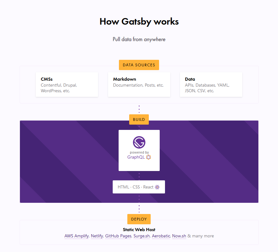
I’m assuming most of you have already heard about Gatsby, and at least loosely know that it’s basically a static site generator for React sites. It generally runs like this:

  1. Data Sources → Pull data from anywhere.
  2. Build → Generate your website with React and GraphQL.
  3. Deploy → Send the site to any static site host.

What this typically means is that you can get your data from any recognizable data source — CMS, markdown, file systems and databases, to name a few — manage the data through GraphQL to build your website, and finally deploy your website to any static web host (such as Netlify or Zeit).

Screenshot of the Gatsby homepage. It shows the three different steps of the Gatsby build process showing how data sources get built and then deployed.
The Gatsby homepage illustration of the Gatsby workflow.

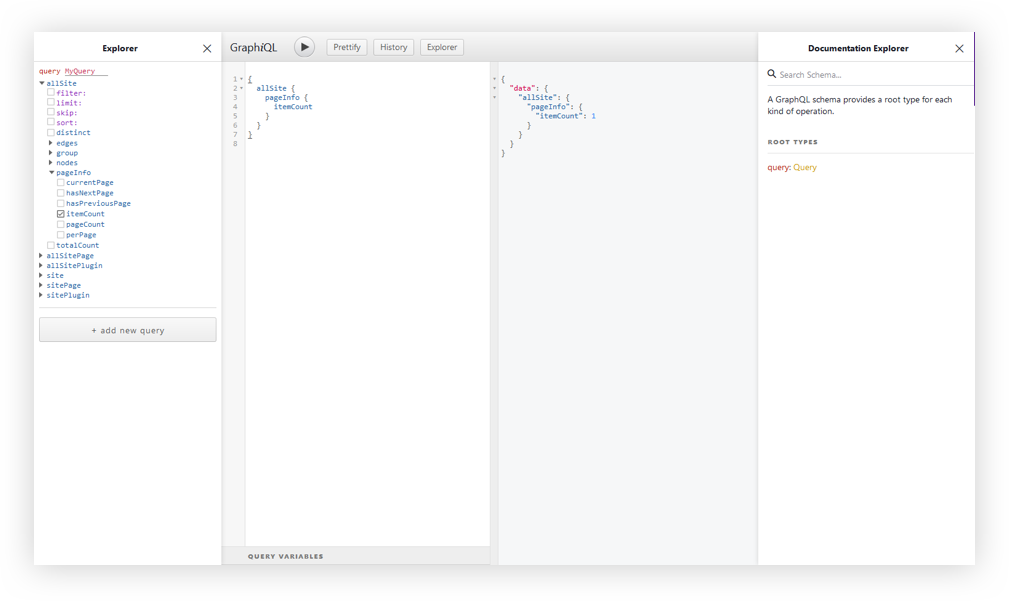
In this article, we are concerned with the build process, which is powered by GraphQL. This is the part where your data is managed. Unlike traditional REST APIs where you often need to send anonymous data to test your endpoints, GraphQL consolidates your APIs into a self-documenting IDE. Using this IDE, you can perform GraphQL operations such as queries, mutations, and subscriptions, as well as view your GraphQL schema, and documentation.

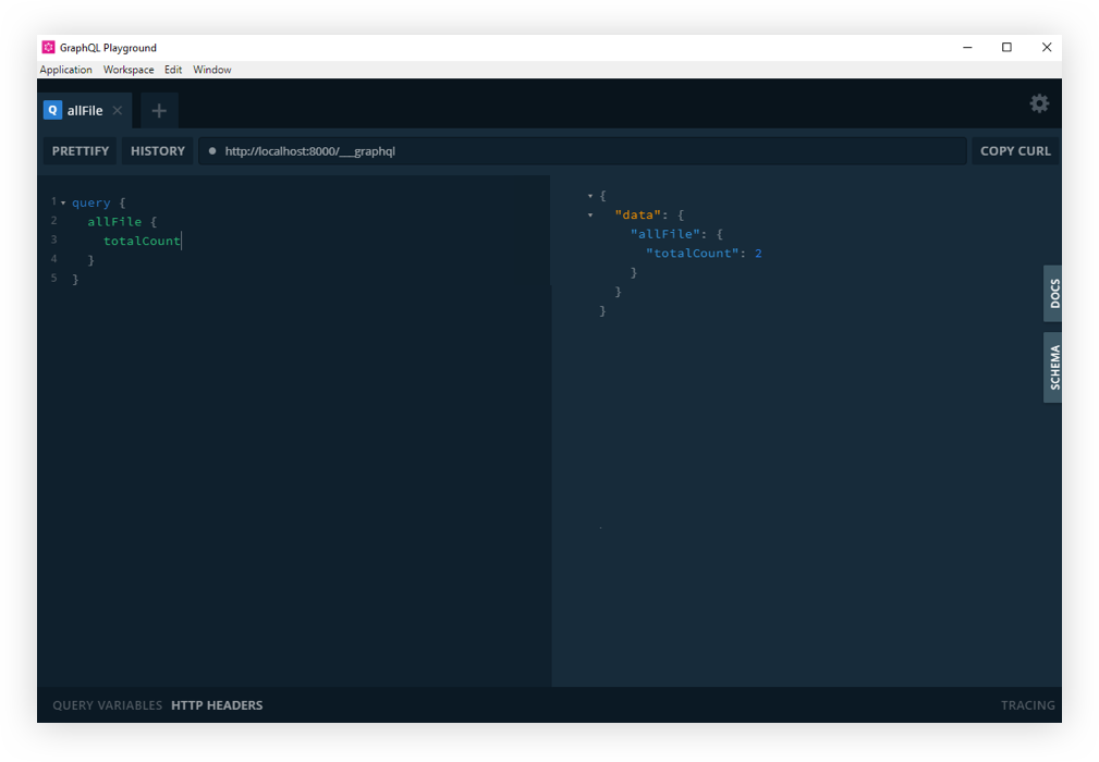
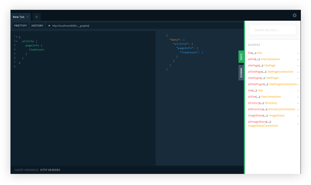
GraphQL has an IDE built right into it, but what if we want something a little more powerful? That’s where GraphQL Playground comes in and we’re going to walk through the steps to switch from the default over to GraphQL Playground so that it works with Gatsby.

GraphiQL and GraphQL Playground

GraphiQL is GraphQL’s default IDE for exploring GraphQL operations, but you could switch to something else, like GraphQL Playground. Both have their advantages. For example, GraphQL Playground is essentially a wrapper over GraphiQL but includes additional features such as:

  • Interactive, multi-column schema documentation
  • Automatic schema reloading
  • Support for GraphQL Subscriptions
  • Query history
  • Configuration of HTTP headers
  • Tabs
  • Extensibility (themes, etc.)

Choosing either GraphQL Playground or GraphiQL most likely depends on whether you need to use those additional features. There’s no strict rule that will make you write better GraphQL operations, or build a better website or app.

This post isn’t meant to sway you toward one versus the other. We’re looking at GraphQL Playground in this post specifically because it’s not the default IDE and there may be use cases where you need the additional features it provides and needs to set things up to work with Gatsby. So, let’s dig in and set up a new Gatsby project from scratch. We’ll integrate GraphQL Playground and configure it for the project.

Setting up a Gatsby Project

To set up a new Gatsby project, we first need to install the gatsby-cli. This will give us Gatsby-specific commands we can use in the Terminal.

npm install -g gatsby-cli

Now, let’s set up a new site. I’ve decided to call this example „gatsby-playground” but you can name it whatever you’d like.

gatsby new gatsby-playground

Let’s navigate to the directory where it was installed.

cd gatsby-playground

And, finally, flip on our development server.

gatsby develop

Head over to http://localhost:8000 in the browser for the opening page of the project. Your Gatsby GraphQL operations are going to be located at http://localhost:8000/___graphql.

Screenshot of the starter page for a new Gatsby project. It says Welcome to your new Gatsby website. Now go build something great.
The GraphiQL interface. There are four panels from left to right showing the explorer, query variables and documentation.
The GraphiQL interface.

At this point, I think it’s worth calling out that there is a desktop app for GraphQL Playground. You could just access your Gatsby GraphQL operations with the URL Endpoint localhost:8000/___graphql without going any further with this article. But, we want to get our hands dirty and have some fun under the hood!

Screenshot of the GraphQL Playground interface. It has two panels showing the Gatsby GraphQL operations.
GraphQL Playground running Gatsby GraphQL Operations.

Gatsby’s Environmental Variables

Still around? Cool. Moving on.

Since we’re not going to be relying on the desktop app, we’ll need to do a little bit of Environmental Variable setup.

Environmental Variables are variables used specifically to customize the behavior of a website in different environments. These environments could be when the website is in active development, or perhaps when it is live in production and available for the world to see. We can have as many environments as we want, and define different Environmental Variables for each of the environments.

Learn more about Environmental Variables in Gatsby.

Gatsby supports two environments: development and production. To set a development environmental variable, we need to have a .env.development file at the root of the project. Same sort of deal for production, but it’s .env.production.

To swap out both environments, we’ll need to set an environment variable in a cross-platform compatible way. Let’s create a .env.development file at the root of the project. Here, we set a key/value pair for our variables. The key will be GATSBY_GRAPHQL_IDE, and the value will be playground, like so:

GATSBY_GRAPHQL_IDE=playground

Accessing Environment Variables in JavaScript

In Gatsby, our Environmental Variables are only available at build time, or when Node.JS is running (what we’ll call run time). Since the variables are loaded client-side at build time, we need to use them dynamically at run time. It is important that we restart our server or rebuild our website every time we modify any of these variables.

To load our environmental variables into our project, we need to install a package:

yarn add env-cmd --dev // npm install --save-dev env-cmd

With that, we will change the develop script in package.json as the final step, to this instead:

"develop": "env-cmd --file .env.development --fallback gatsby develop"

The develop script instructs the env-cmd package to load environmental variables from a custom environmental variable file (.env.development in this case), and if it can’t find it, fallback to .env (if you have one, so if you see the need to, create a .env file at the root of your project with the same content as .env.development).

And that’s it! But, hey, remember to restart the server since we change the variable.

yarn start // npm run develop

If you refresh the http://localhost:8000/___graphql in the browser, you should now see GraphQL playground. Cool? Cool!

GraphQL Playground with Gatsby.

And that’s how we get GraphQL Playground to work with Gatsby!

So that’s how we get from GraphQL’s default GraphiQL IDE to GraphQL Playground. Like we covered earlier, the decision of whether or not to make the switch at all comes down to whether the additional features offered in GraphQL Playground are required for your project. Again, we’re basically working with a GraphiQL wrapper that piles on more features.

Resources

Here are some additional articles around the web to get you started with Gatsby and more familiar with GraphiQL, GraphQL Playground, and Environment Variables.

The post Using GraphQL Playground with Gatsby appeared first on CSS-Tricks.