Open up the pages of any high-end magazine and you can find some really outstanding design work. The interior layouts of fashion titles can be particularly awe-inspiring. Designers are becoming more experimental with typography, irregular grids and unusual image choices to create magazine layouts that look as gorgeous as the covers.
In this tutorial you’ll learn how to design your own three-spread layout for a magazine feature using Adobe InDesign. We’ll look at how to prepare a grid, work with Masters to create visual uniformity across the pages, and how to select colors, images and typefaces to create a professional-standard design.
We’ll take you through the process gradually, step by step, so this tutorial is suitable for beginners to InDesign.
Let’s get started!
1. Create Your Magazine Document and Grid
Step 1
Open InDesign and select New Document from the Welcome window or go to File > New > Document.
In the New Document window, keep Intent as Print. Set the No. of Pages to 6. Keep Facing Pages checked.
From the Page Size drop-down menu select Custom… to open the Custom Page Size window. We’re going to be using the same dimensions as we did for this Magazine Cover tutorial, which uses a standard US magazine page size. This is 8 3/8 inches by 10 7/8 inches, though we’ll be working in millimeters throughout.
Type ‘US Magazine’ into the text box at the top of the window and set the Width to 213 mm and the Height to 276.5 mm (this equates to 8 3/8 in by 10 7/8 in). Click Add and then OK.
Step 2
Back in the New Document window, set the Top, Bottom and Inside Margins to 10 mm. Click the chain icon to the right of the margin values to break the chain. Type 6 mm into the Outside Margin value box. This is so that we allow a bit more space on the inside edge of the page, to accommodate for binding.
You should also include a Bleed of 3 mm on all sides except the Inside, where it won’t be needed. Set the Inside Bleed to 0 mm.
Click OK.
Step 3
You will notice that the first page of your document begins on a right-hand single page. However, we want to create the layout for three two-page spreads. If you’re creating a whole magazine in one document, you can simply treat Page 1 as the first page of your whole magazine, e.g. a page for contents or perhaps for an advertisement.
For now, though, we want to be able to shuffle Page 2 of the document upwards, so that it sits next to Page 1, forming a full spread.
Open the Pages panel (Window > Pages) and then open the panel’s drop-down menu, accessible from the top-right corner of the panel. Click once on Allow Document Pages to Shuffle to uncheck the option.
Back in the Pages panel, you can now grab individual pages and move them around more freely, connecting them to other pages without the restraints of the normal shuffle mode.
Grab the Page 2 page icon and connect it to the right-hand side of Page 1. Repeat with the process with the other pages until you have a set of three two-page spreads, as shown.
Step 4
Even though experimenting with typography is encouraged for dynamic, exciting magazine layouts, you should always set up some sort of grid to allow text to appear consistent across the spreads of your magazine. This will give the layouts a professional, clean look.
Let’s create a simple grid on the Master spread, as this will then be applied automatically to all the pages in your document.
Return to the Pages panel and double-click on one of the A-Master page icons to bring up the Master on screen.
If the rulers are not shown by default go to View > Show Rulers. Drag a Guide down from the top ruler to 37 mm, allowing it to sit on the left-hand page. Drag a second guide down to 254 mm.
From the left-hand ruler, drag a vertical guide out to 13 mm and then drag a second out to 195 mm.
These guides will form the top, bottom and outer edges of your columns of text.
Let’s mark out the center point of the document. The center point will actually be slightly off center, as the outside margin is narrower than the inside margin. But this is absolutely fine; all your content will appear centered once printed and bound.
Go to Layout > Margins & Columns and set the Number of Columns to 2 and the Gutter to 0 mm. Click OK.
Drag out another vertical guide from the left-hand ruler to 94 mm and drag a second to 115 mm.
Finally, drag your mouse over the whole of the left page to select all the guides and go to Edit > Copy, Edit > Paste. Manoeuvre this pasted set of guides into a mirrored position on the right page of the Master spread.
2. Customize the Master(s)
You should place any content you will want to show up on every page of your document on a Master page. So things like running headers and page numbers should be placed here, to make creating the rest of your layouts fuss-free.
Step 1
Select the Zoom Tool (Z) from the Tools panel and click and drag over the bottom left-hand corner of the left page of the Master spread.
Using the Type Tool (T) create a small text frame, positioning it just below the bottom margin. Place your cursor in the text frame and go to Type > Insert Special Character > Markers > Current Page Number.
Highlight the ‘A’ character and adjust the Font, from the Character Formatting Controls panel running along the top of the screen, to Adobe Garamond Pro, Semibold Italic, and Size to 10 pt.
Select the text frame using the Selection Tool (V, Escape) and Edit > Copy, Edit > Paste. Manoeuvre the pasted frame to the bottom-right corner of the right page of the Master and adjust the alignment of the text to Align Right.
Step 2
You can also add running headers to the Master spread.
Use the Type Tool (T) to create two text frames, one at the top left-hand corner of the left page for the ‘Name of Magazine’. Set the Font as before to Adobe Garamond Pro, Size 10 pt. Set the weight to Semibold.
Position the other text frame centrally at the top of the left page, typing in the ‘Issue No.’, and setting the Font to Adobe Garamond Pro, Semibold Italic, and Size 10 pt. Set the text to Align Center.
Create a third text frame, positioning it at the top-right corner of the right-hand page of the Master. This is the perfect place to put in the name of your article. Here, it’s ‘days of denim dreaming’. Set the Font to Adobe Garamond Pro, Semibold Italic, and Size 10 pt. Set the text to Align Right.
We’re going to build up the magazine layout using just three colours: [Black], [Paper] and a new grey-blue swatch. Open the Swatches panel (Window > Color > Swatches) and click on the New Swatch icon. Add a new CMYK Swatch, C=56 M=41 Y=37 K=20.
Set the article title in this new swatch.
Step 3
Some of the pages in your magazine layout might include dark images or background colors, and dark text will disappear against these. Let’s solve that right now.
Return to the Pages panel and hold Shift and select both pages of the A-Master. Drag them down to the Create New Page icon at the bottom of the panel. A second Master spread, a B-Master, will be created.
Ensure the B-Master is brought up on screen, then drag your mouse across the whole of the spread, selecting all the text frames. Adjust the Font Color of all the text on the spread to [Paper]. Delete the ‘Issue No.’ text frame.
Step 4
To ensure that the text on your Master pages will be brought to the front of your design, you can sit the content of the Masters on the same layer as the main text of your layouts.
Open the Layers panel (Window > Layers) and double-click the default Layer 1name. Rename the layer as Typography and click OK.
3. Introduce Borders on Your Layouts
To give your magazine that extra professional look, you should introduce borders around the pages. This helps to frame your content, making it look really elegant.
Step 1
Remaining in the Layers panel, first Lock the Typography layer. Then click the New Layer icon at the bottom of the panel. Rename the layer as Border.
Grab the Border layer and move it to sit below the Typography layer.
Step 2
Remaining on the Border layer, bring up the first spread, Pages 1–2, of your document on screen.
Select the Rectangle Tool (M) and drag to create a frame that extends across the whole of Page 1, resting the edges on the trim edge of the document.
Set the Fill Color to [None] and Stroke to [Black], and increase the Weight of the Stroke to 4 mm.
Select the frame and Edit > Copy and Edit > Paste. Position the pasted frame in a mirrored position on Page 2.
Step 3
Drag your mouse across the whole of the spread to select both of the black frames and Edit > Copy.
Navigate down to Pages 3–4, and Edit > Paste in Place. Alter the Stroke Color to [Paper].
Repeat again for Pages 5–6, setting the Stroke Color to [Paper].
4. Get Playful with Color and Images
Now we can get started with the fun stuff!
Step 1
Return to the Layers panel and Lock the Border layer. Create a new layer, renaming it Image.
Grab the new layer and move it to sit below the Border layer.
Step 2
You want to select an image that will look strong and dramatic when placed across an entire page. For this fashion feature, I’ve chosen an image of a stylish woman wearing jeans.
The original image is in full color. But for added edge, I post-edited the photo in Adobe Photoshop. To imitate the look of the image here, where only the jeans are pulled out in color, use the Lasso Tool (L) to select the area of the jeans only. Copy and Paste the selection, so it stands apart on a separate layer.
Apply a Channel Mixer Adjustment Layer in Monochrome to the original photo only, keeping the jeans pulled out in color.
Step 3
Return to InDesign and bring up Page 2 of the document on screen.
Select the Rectangle Frame Tool (F) and drag to create a frame that extends across the whole of the page.
Go to File > Place and select your chosen image. Click Open. Arrange the image in the frame until you are happy with the scale.
Step 4
Select the Rectangle Tool (M) and drag to create a frame 216 mm in Width and 110 mm in Height. Place this at the bottom of Page 1 in the position shown.
Step 5
Navigate down to Page 3 of your document. As before, create an image frame the Width and Height of the page, extending to the Bleed, and File > Place. Select the same image as before.
Double-click inside the frame to select the image directly and Control-Click (Mac OS) or Right-Click (Windows) > Transform > Flip Horizontal. This time enlarge the scale of the image, and focus on the lower half of the photo, bringing the jeans and shoes into the frame. Leave a decent space to the right of the image to allow some space for text.
Step 6
Select the Rectangle Tool (M) and drag to create a frame that extends from the top to the bottom of Page 4. Rest the right edge on the far right bleed, and extend the Width until it meets at the center point of Page 4.
You’ll notice that the article title at the top right corner of Page 4 is now no longer visible and the page number doesn’t look very clear, now it’s set against a dark background. To solve this, simply go the Pages panel and drag the right-hand page icon of the B-Master, dropping it onto the Page 4 page icon in the panel.
While you’re there, you can also apply the B-Master to Page 5 of the document.
Step 7
Select the grey frame you’ve just created and Edit > Copy. Navigate further down to Page 5 of the document and Edit > Paste. Move the pasted frame to the left side of the page, as shown.
Step 8
Use the Rectangle Frame Tool (F) to create a new large image frame. Position it centrally on the Pages 5–6 spread.
As I did with the first image earlier, I then used Photoshop to pull out one of the pairs of jeans in color, with the rest of the stack set in monochrome.
Step 9
The white border’s cutting through the center of the image, which doesn’t look great. So, return to the Layers panel and Unlock the Border layer. Pull back the inside edges of each border to the center of the page, so you still have a white border around the colored background on the left-hand page.
Great work! This is how your magazine feature looks at the moment:
Now all we need to do is add some text!
5. Typography for Your Magazine Layouts
Step 1
Go to the Layers panel and Lock the Image layer. Unlock the Typography layer.
Step 2
We’ve already used Adobe Garamond Pro for the running headers and page numbers, so we can continue to use this for the main text of the article. However, you can introduce one, or even two, more typeface(s) to use for a more exciting title, and to use across the document for quotes and other decorative text elements.
Futura Std is a clean, minimal font which will give an extra stylish, modern edge to a fashion magazine layout. But any sans serif with an optional condensed weight would be a good pick too.
To add a fun touch, you can also install Sail, which has a more playful feel.
Navigate to Page 1 of your document and use the Type Tool (T) to create a text frame 214 mm in Width and 94 mm in Height. Type ‘Days of (paragraph break) Denim’ and set the Font to Futura Std Light Condensed, and the text to All Caps.
Highlight ‘Days of’ alone and set the Size to 122 pt. Increase the Tracking, from the Character Formatting Controls panel at the top of the screen, to 230.
Highlight ‘Denim’ alone and increase the Size to 135 pt, Leading to 160 pt and Tracking to 430. Set the text to Align Right and alter the Font Color to the grey‑blue swatch, C=56 M=41 Y=37 K=20.
Position the text frame just above the center of the page, as shown.
Step 3
Introduce a second smaller text frame (about 75 mm in Width) on Page 1, positioning it centrally towards the bottom of the page. Here you can type in a short summary of the article, setting the Font to Futura Std Light Condensed, Size 14 pt, All Caps, Font Color to [Paper] and text alignment to Justified (All Lines).
Set the ‘Name’ of the article’s author below the summary, in Adobe Garamond Pro.
Step 4
Create a third text frame on Page 1, about 170 mm in Width. Position it centrally on the page, at the top of the grey frame.
Type ‘Dreaming’ and set the Font to Sail, Size 112 pt, and Font Colour to [Paper]. With the Selection Tool (V, Escape) active, hover your cursor over the bottom right corner of the frame and rotate it upwards a little to give the text a slight slant.
Step 5
Navigate down to the second spread of the document, focussing on Page 3.
Use the Type Tool (T) to create a square text frame, and position it between the guides marking out the right-hand half of the page. Rest the top edge of the frame on the top horizontal guide, as shown below.
Type an introductory sub-title of four five-character words. Here, I’ve gone for ‘Basic Smart Rough Chic?’, positioning each word on a new line.
Set the Font to Futura Std Light Condensed, Size 50 pt, Leading 70 pt, All Caps and Justify All Lines. Increase the Tracking to 600 and highlight individual parts of the text, setting them in a different color, C=56 M=41 Y=37 K=20.
Step 6
Pull out a guide from the left-hand ruler to the center of the text frame, and the center of the column section.
Select the Type Tool (T) and create a new text frame, 37.5 mm in Width and 115.5 mm in Height. Align the left edge of this new text frame with the left edge of the sub-title text frame, and rest the bottom edge against the bottom horizontal guide.
You can start to feed in the text of your article into this text frame. If you don’t have any text yet, you can go to Type > Fill with Placeholder Text. Set the Font to Adobe Garamond Pro, Size 11 pt.
You can also pull out the first letter of the article in a Drop Cap, using the options available in the Character Formatting Controls panel. Set the Drop Cap Number of Lines to 3, and adjust the Font of the first character to Futura Std Medium Condensed and the Color to C=56 M=41 Y=37 K=20.
Step 7
Create another text frame at the same dimensions as the tall text frame you just created. Position to the right of the first frame, resting against the guide on the far right, as shown.
Click on the white box at the bottom right corner of the first frame, before clicking in the second frame, allowing the text to flow into it.
Continue to create new text frames at the same dimensions, positioning them in pairs on the opposite page of the spread, using the guides to help you. Repeat the process above, threading the text into the frames as you go. Adjust the color of some of the text to [Paper] if you need to contrast it against the dark background.
Continue onto the next spread, Pages 5–6, positioning the text frames around the image of the stacked jeans as shown.
Step 8
Return to Page 4 of the document, on the second spread. You can add in some pulled-out quotations to give a bit more depth to the design.
Use the Type Tool (T) to create a text frame the width of two columns, just like the sub-heading text frame. Type in a quote and set the Font to Futura Std light Condensed, Size 15 pt, Font Color to C=56 M=41 Y=37 K=20 and Justify All Lines. Set the Tracking to 300.
Open the Story panel (Window > Type & Tables > Story) and check the Optical Margin Alignment checkbox to shift the quotation marks to sit outside the text frame, giving a more even appearance to the text.
Position the first quotation text frame below the two left-hand columns on Page 4. Copy and Paste the text frame, adjusting the text content, three more times, placing them on Pages 4, 5 and 6 as shown.
Step 9
Your layouts are almost finished, and they’re looking awesome!
You can add a final decorative touch to give your layouts that extra pro touch. Create a square text frame and position it below the left-hand quotation on Page 4 of your document. Type ‘D’ (for ‘denim’) and set the Font to Sail, Size 200 pt, Color C=56 M=41 Y=37 K=20. Rotate the text frame slightly to give it a slightly jaunty angle.
With the text frame selected, go to Object > Effects > Transparency and reduce the Opacity to 30%.
Edit > Copy and Edit > Paste the text frame, adjusting the Font Color to [Paper]. Position this second frame at the top right corner of Page 4.
Copy and Paste both of the ‘D’ text frames onto the final spread of the magazine, positioning them as shown.
Step 10
Before you go to export your layouts for print, just take a quick detour back to the second spread of your document. You might notice that the right shoe in the photo is edging into the left-hand column of text, which isn’t ideal.
To quickly sort this out, select the Ellipse Tool (L) from the Tools panel and drag to create a small irregular ellipse that sits just over the bottom part of the shoe.
Adjust the Stroke Color to [None]. Go to Window > Text Wrap and set the wrap to Wrap Around Object Shape, at an Offset of 5 mm.
6. Export Your Magazine for Print
Your layouts are finished—super work! They look fantastic.
When you’re ready to send your designs off to print, simply follow the steps below.
Step 1
Go to File > Export… to open the Export window. Select Adobe PDF (Print) from the Format drop-down menu. Name the file and click Save.
In the Export Adobe PDF window select Press Quality from the Adobe PDF Preset drop-down menu.
Keep Pages checked, not Spreads, unless otherwise specified by your printer.
Step 2
Under the Marks and Bleeds section, click to select All Printer’s Marks under the Marks menu and click to select Use Document Bleed Settings under the Bleed and Slug menu. Click Export.
Well done!You now have your magazine layouts ready to be sent to the printers.
In this tutorial, we have learned how to design professional-standard layouts for a fashion magazine feature. The lessons we’ve covered here, such as setting up suitable Master pages, creating a simple grid, and experimenting with stylish typography, would also apply really well to any other kind of magazine you’re designing. Great work!
Want to jumpstart your next inDesign magazine design? Check out these high-quality templates—beautifully designed and ready to use in your next project.
Perfect for your fashion-centric projects, this template comes in two sizes: A4 & US letter. It includes both INDD and IDML files, as well as 30 custom pages!
Choose from 26 unique pages in this high-quality design. Master pages, character styles, and paragraphs are all included, in both A4 and US Letter paper size.
A stylish design with over 30 pages, this template includes images, paragraph styles, page numbers set up, alternative covers, and more—a great fit for a variety of InDesign projects.
Enjoyed this tutorial? Check out these other inDesign tutorials:
Open up the pages of any high-end magazine and you can find some really outstanding design work. The interior layouts of fashion titles can be particularly awe-inspiring. Designers are becoming more experimental with typography, irregular grids and unusual image choices to create magazine layouts that look as gorgeous as the covers.
In this tutorial you’ll learn how to design your own three-spread layout for a magazine feature using Adobe InDesign. We’ll look at how to prepare a grid, work with Masters to create visual uniformity across the pages, and how to select colors, images and typefaces to create a professional-standard design.
We’ll take you through the process gradually, step by step, so this tutorial is suitable for beginners to InDesign.
Let’s get started!
1. Create Your Magazine Document and Grid
Step 1
Open InDesign and select New Document from the Welcome window or go to File > New > Document.
In the New Document window, keep Intent as Print. Set the No. of Pages to 6. Keep Facing Pages checked.
From the Page Size drop-down menu select Custom… to open the Custom Page Size window. We’re going to be using the same dimensions as we did for this Magazine Cover tutorial, which uses a standard US magazine page size. This is 8 3/8 inches by 10 7/8 inches, though we’ll be working in millimeters throughout.
Type ‘US Magazine’ into the text box at the top of the window and set the Width to 213 mm and the Height to 276.5 mm (this equates to 8 3/8 in by 10 7/8 in). Click Add and then OK.
Step 2
Back in the New Document window, set the Top, Bottom and Inside Margins to 10 mm. Click the chain icon to the right of the margin values to break the chain. Type 6 mm into the Outside Margin value box. This is so that we allow a bit more space on the inside edge of the page, to accommodate for binding.
You should also include a Bleed of 3 mm on all sides except the Inside, where it won’t be needed. Set the Inside Bleed to 0 mm.
Click OK.
Step 3
You will notice that the first page of your document begins on a right-hand single page. However, we want to create the layout for three two-page spreads. If you’re creating a whole magazine in one document, you can simply treat Page 1 as the first page of your whole magazine, e.g. a page for contents or perhaps for an advertisement.
For now, though, we want to be able to shuffle Page 2 of the document upwards, so that it sits next to Page 1, forming a full spread.
Open the Pages panel (Window > Pages) and then open the panel’s drop-down menu, accessible from the top-right corner of the panel. Click once on Allow Document Pages to Shuffle to uncheck the option.
Back in the Pages panel, you can now grab individual pages and move them around more freely, connecting them to other pages without the restraints of the normal shuffle mode.
Grab the Page 2 page icon and connect it to the right-hand side of Page 1. Repeat with the process with the other pages until you have a set of three two-page spreads, as shown.
Step 4
Even though experimenting with typography is encouraged for dynamic, exciting magazine layouts, you should always set up some sort of grid to allow text to appear consistent across the spreads of your magazine. This will give the layouts a professional, clean look.
Let’s create a simple grid on the Master spread, as this will then be applied automatically to all the pages in your document.
Return to the Pages panel and double-click on one of the A-Master page icons to bring up the Master on screen.
If the rulers are not shown by default go to View > Show Rulers. Drag a Guide down from the top ruler to 37 mm, allowing it to sit on the left-hand page. Drag a second guide down to 254 mm.
From the left-hand ruler, drag a vertical guide out to 13 mm and then drag a second out to 195 mm.
These guides will form the top, bottom and outer edges of your columns of text.
Let’s mark out the center point of the document. The center point will actually be slightly off center, as the outside margin is narrower than the inside margin. But this is absolutely fine; all your content will appear centered once printed and bound.
Go to Layout > Margins & Columns and set the Number of Columns to 2 and the Gutter to 0 mm. Click OK.
Drag out another vertical guide from the left-hand ruler to 94 mm and drag a second to 115 mm.
Finally, drag your mouse over the whole of the left page to select all the guides and go to Edit > Copy, Edit > Paste. Manoeuvre this pasted set of guides into a mirrored position on the right page of the Master spread.
2. Customize the Master(s)
You should place any content you will want to show up on every page of your document on a Master page. So things like running headers and page numbers should be placed here, to make creating the rest of your layouts fuss-free.
Step 1
Select the Zoom Tool (Z) from the Tools panel and click and drag over the bottom left-hand corner of the left page of the Master spread.
Using the Type Tool (T) create a small text frame, positioning it just below the bottom margin. Place your cursor in the text frame and go to Type > Insert Special Character > Markers > Current Page Number.
Highlight the ‘A’ character and adjust the Font, from the Character Formatting Controls panel running along the top of the screen, to Adobe Garamond Pro, Semibold Italic, and Size to 10 pt.
Select the text frame using the Selection Tool (V, Escape) and Edit > Copy, Edit > Paste. Manoeuvre the pasted frame to the bottom-right corner of the right page of the Master and adjust the alignment of the text to Align Right.
Step 2
You can also add running headers to the Master spread.
Use the Type Tool (T) to create two text frames, one at the top left-hand corner of the left page for the ‘Name of Magazine’. Set the Font as before to Adobe Garamond Pro, Size 10 pt. Set the weight to Semibold.
Position the other text frame centrally at the top of the left page, typing in the ‘Issue No.’, and setting the Font to Adobe Garamond Pro, Semibold Italic, and Size 10 pt. Set the text to Align Center.
Create a third text frame, positioning it at the top-right corner of the right-hand page of the Master. This is the perfect place to put in the name of your article. Here, it’s ‘days of denim dreaming’. Set the Font to Adobe Garamond Pro, Semibold Italic, and Size 10 pt. Set the text to Align Right.
We’re going to build up the magazine layout using just three colours: [Black], [Paper] and a new grey-blue swatch. Open the Swatches panel (Window > Color > Swatches) and click on the New Swatch icon. Add a new CMYK Swatch, C=56 M=41 Y=37 K=20.
Set the article title in this new swatch.
Step 3
Some of the pages in your magazine layout might include dark images or background colors, and dark text will disappear against these. Let’s solve that right now.
Return to the Pages panel and hold Shift and select both pages of the A-Master. Drag them down to the Create New Page icon at the bottom of the panel. A second Master spread, a B-Master, will be created.
Ensure the B-Master is brought up on screen, then drag your mouse across the whole of the spread, selecting all the text frames. Adjust the Font Color of all the text on the spread to [Paper]. Delete the ‘Issue No.’ text frame.
Step 4
To ensure that the text on your Master pages will be brought to the front of your design, you can sit the content of the Masters on the same layer as the main text of your layouts.
Open the Layers panel (Window > Layers) and double-click the default Layer 1name. Rename the layer as Typography and click OK.
3. Introduce Borders on Your Layouts
To give your magazine that extra professional look, you should introduce borders around the pages. This helps to frame your content, making it look really elegant.
Step 1
Remaining in the Layers panel, first Lock the Typography layer. Then click the New Layer icon at the bottom of the panel. Rename the layer as Border.
Grab the Border layer and move it to sit below the Typography layer.
Step 2
Remaining on the Border layer, bring up the first spread, Pages 1–2, of your document on screen.
Select the Rectangle Tool (M) and drag to create a frame that extends across the whole of Page 1, resting the edges on the trim edge of the document.
Set the Fill Color to [None] and Stroke to [Black], and increase the Weight of the Stroke to 4 mm.
Select the frame and Edit > Copy and Edit > Paste. Position the pasted frame in a mirrored position on Page 2.
Step 3
Drag your mouse across the whole of the spread to select both of the black frames and Edit > Copy.
Navigate down to Pages 3–4, and Edit > Paste in Place. Alter the Stroke Color to [Paper].
Repeat again for Pages 5–6, setting the Stroke Color to [Paper].
4. Get Playful with Color and Images
Now we can get started with the fun stuff!
Step 1
Return to the Layers panel and Lock the Border layer. Create a new layer, renaming it Image.
Grab the new layer and move it to sit below the Border layer.
Step 2
You want to select an image that will look strong and dramatic when placed across an entire page. For this fashion feature, I’ve chosen an image of a stylish woman wearing jeans.
The original image is in full color. But for added edge, I post-edited the photo in Adobe Photoshop. To imitate the look of the image here, where only the jeans are pulled out in color, use the Lasso Tool (L) to select the area of the jeans only. Copy and Paste the selection, so it stands apart on a separate layer.
Apply a Channel Mixer Adjustment Layer in Monochrome to the original photo only, keeping the jeans pulled out in color.
Step 3
Return to InDesign and bring up Page 2 of the document on screen.
Select the Rectangle Frame Tool (F) and drag to create a frame that extends across the whole of the page.
Go to File > Place and select your chosen image. Click Open. Arrange the image in the frame until you are happy with the scale.
Step 4
Select the Rectangle Tool (M) and drag to create a frame 216 mm in Width and 110 mm in Height. Place this at the bottom of Page 1 in the position shown.
Step 5
Navigate down to Page 3 of your document. As before, create an image frame the Width and Height of the page, extending to the Bleed, and File > Place. Select the same image as before.
Double-click inside the frame to select the image directly and Control-Click (Mac OS) or Right-Click (Windows) > Transform > Flip Horizontal. This time enlarge the scale of the image, and focus on the lower half of the photo, bringing the jeans and shoes into the frame. Leave a decent space to the right of the image to allow some space for text.
Step 6
Select the Rectangle Tool (M) and drag to create a frame that extends from the top to the bottom of Page 4. Rest the right edge on the far right bleed, and extend the Width until it meets at the center point of Page 4.
You’ll notice that the article title at the top right corner of Page 4 is now no longer visible and the page number doesn’t look very clear, now it’s set against a dark background. To solve this, simply go the Pages panel and drag the right-hand page icon of the B-Master, dropping it onto the Page 4 page icon in the panel.
While you’re there, you can also apply the B-Master to Page 5 of the document.
Step 7
Select the grey frame you’ve just created and Edit > Copy. Navigate further down to Page 5 of the document and Edit > Paste. Move the pasted frame to the left side of the page, as shown.
Step 8
Use the Rectangle Frame Tool (F) to create a new large image frame. Position it centrally on the Pages 5–6 spread.
As I did with the first image earlier, I then used Photoshop to pull out one of the pairs of jeans in color, with the rest of the stack set in monochrome.
Step 9
The white border’s cutting through the center of the image, which doesn’t look great. So, return to the Layers panel and Unlock the Border layer. Pull back the inside edges of each border to the center of the page, so you still have a white border around the colored background on the left-hand page.
Great work! This is how your magazine feature looks at the moment:
Now all we need to do is add some text!
5. Typography for Your Magazine Layouts
Step 1
Go to the Layers panel and Lock the Image layer. Unlock the Typography layer.
Step 2
We’ve already used Adobe Garamond Pro for the running headers and page numbers, so we can continue to use this for the main text of the article. However, you can introduce one, or even two, more typeface(s) to use for a more exciting title, and to use across the document for quotes and other decorative text elements.
Futura Std is a clean, minimal font which will give an extra stylish, modern edge to a fashion magazine layout. But any sans serif with an optional condensed weight would be a good pick too.
To add a fun touch, you can also install Sail, which has a more playful feel.
Navigate to Page 1 of your document and use the Type Tool (T) to create a text frame 214 mm in Width and 94 mm in Height. Type ‘Days of (paragraph break) Denim’ and set the Font to Futura Std Light Condensed, and the text to All Caps.
Highlight ‘Days of’ alone and set the Size to 122 pt. Increase the Tracking, from the Character Formatting Controls panel at the top of the screen, to 230.
Highlight ‘Denim’ alone and increase the Size to 135 pt, Leading to 160 pt and Tracking to 430. Set the text to Align Right and alter the Font Color to the grey‑blue swatch, C=56 M=41 Y=37 K=20.
Position the text frame just above the center of the page, as shown.
Step 3
Introduce a second smaller text frame (about 75 mm in Width) on Page 1, positioning it centrally towards the bottom of the page. Here you can type in a short summary of the article, setting the Font to Futura Std Light Condensed, Size 14 pt, All Caps, Font Color to [Paper] and text alignment to Justified (All Lines).
Set the ‘Name’ of the article’s author below the summary, in Adobe Garamond Pro.
Step 4
Create a third text frame on Page 1, about 170 mm in Width. Position it centrally on the page, at the top of the grey frame.
Type ‘Dreaming’ and set the Font to Sail, Size 112 pt, and Font Colour to [Paper]. With the Selection Tool (V, Escape) active, hover your cursor over the bottom right corner of the frame and rotate it upwards a little to give the text a slight slant.
Step 5
Navigate down to the second spread of the document, focussing on Page 3.
Use the Type Tool (T) to create a square text frame, and position it between the guides marking out the right-hand half of the page. Rest the top edge of the frame on the top horizontal guide, as shown below.
Type an introductory sub-title of four five-character words. Here, I’ve gone for ‘Basic Smart Rough Chic?’, positioning each word on a new line.
Set the Font to Futura Std Light Condensed, Size 50 pt, Leading 70 pt, All Caps and Justify All Lines. Increase the Tracking to 600 and highlight individual parts of the text, setting them in a different color, C=56 M=41 Y=37 K=20.
Step 6
Pull out a guide from the left-hand ruler to the center of the text frame, and the center of the column section.
Select the Type Tool (T) and create a new text frame, 37.5 mm in Width and 115.5 mm in Height. Align the left edge of this new text frame with the left edge of the sub-title text frame, and rest the bottom edge against the bottom horizontal guide.
You can start to feed in the text of your article into this text frame. If you don’t have any text yet, you can go to Type > Fill with Placeholder Text. Set the Font to Adobe Garamond Pro, Size 11 pt.
You can also pull out the first letter of the article in a Drop Cap, using the options available in the Character Formatting Controls panel. Set the Drop Cap Number of Lines to 3, and adjust the Font of the first character to Futura Std Medium Condensed and the Color to C=56 M=41 Y=37 K=20.
Step 7
Create another text frame at the same dimensions as the tall text frame you just created. Position to the right of the first frame, resting against the guide on the far right, as shown.
Click on the white box at the bottom right corner of the first frame, before clicking in the second frame, allowing the text to flow into it.
Continue to create new text frames at the same dimensions, positioning them in pairs on the opposite page of the spread, using the guides to help you. Repeat the process above, threading the text into the frames as you go. Adjust the color of some of the text to [Paper] if you need to contrast it against the dark background.
Continue onto the next spread, Pages 5–6, positioning the text frames around the image of the stacked jeans as shown.
Step 8
Return to Page 4 of the document, on the second spread. You can add in some pulled-out quotations to give a bit more depth to the design.
Use the Type Tool (T) to create a text frame the width of two columns, just like the sub-heading text frame. Type in a quote and set the Font to Futura Std light Condensed, Size 15 pt, Font Color to C=56 M=41 Y=37 K=20 and Justify All Lines. Set the Tracking to 300.
Open the Story panel (Window > Type & Tables > Story) and check the Optical Margin Alignment checkbox to shift the quotation marks to sit outside the text frame, giving a more even appearance to the text.
Position the first quotation text frame below the two left-hand columns on Page 4. Copy and Paste the text frame, adjusting the text content, three more times, placing them on Pages 4, 5 and 6 as shown.
Step 9
Your layouts are almost finished, and they’re looking awesome!
You can add a final decorative touch to give your layouts that extra pro touch. Create a square text frame and position it below the left-hand quotation on Page 4 of your document. Type ‘D’ (for ‘denim’) and set the Font to Sail, Size 200 pt, Color C=56 M=41 Y=37 K=20. Rotate the text frame slightly to give it a slightly jaunty angle.
With the text frame selected, go to Object > Effects > Transparency and reduce the Opacity to 30%.
Edit > Copy and Edit > Paste the text frame, adjusting the Font Color to [Paper]. Position this second frame at the top right corner of Page 4.
Copy and Paste both of the ‘D’ text frames onto the final spread of the magazine, positioning them as shown.
Step 10
Before you go to export your layouts for print, just take a quick detour back to the second spread of your document. You might notice that the right shoe in the photo is edging into the left-hand column of text, which isn’t ideal.
To quickly sort this out, select the Ellipse Tool (L) from the Tools panel and drag to create a small irregular ellipse that sits just over the bottom part of the shoe.
Adjust the Stroke Color to [None]. Go to Window > Text Wrap and set the wrap to Wrap Around Object Shape, at an Offset of 5 mm.
6. Export Your Magazine for Print
Your layouts are finished—super work! They look fantastic.
When you’re ready to send your designs off to print, simply follow the steps below.
Step 1
Go to File > Export… to open the Export window. Select Adobe PDF (Print) from the Format drop-down menu. Name the file and click Save.
In the Export Adobe PDF window select Press Quality from the Adobe PDF Preset drop-down menu.
Keep Pages checked, not Spreads, unless otherwise specified by your printer.
Step 2
Under the Marks and Bleeds section, click to select All Printer’s Marks under the Marks menu and click to select Use Document Bleed Settings under the Bleed and Slug menu. Click Export.
Well done!You now have your magazine layouts ready to be sent to the printers.
In this tutorial, we have learned how to design professional-standard layouts for a fashion magazine feature. The lessons we’ve covered here, such as setting up suitable Master pages, creating a simple grid, and experimenting with stylish typography, would also apply really well to any other kind of magazine you’re designing. Great work!
Want to jumpstart your next inDesign magazine design? Check out these high-quality templates—beautifully designed and ready to use in your next project.
Perfect for your fashion-centric projects, this template comes in two sizes: A4 & US letter. It includes both INDD and IDML files, as well as 30 custom pages!
Choose from 26 unique pages in this high-quality design. Master pages, character styles, and paragraphs are all included, in both A4 and US Letter paper size.
A stylish design with over 30 pages, this template includes images, paragraph styles, page numbers set up, alternative covers, and more—a great fit for a variety of InDesign projects.
Enjoyed this tutorial? Check out these other inDesign tutorials:
Open up the pages of any high-end magazine and you can find some really outstanding design work. The interior layouts of fashion titles can be particularly awe-inspiring. Designers are becoming more experimental with typography, irregular grids and unusual image choices to create magazine layouts that look as gorgeous as the covers.
In this tutorial you’ll learn how to design your own three-spread layout for a magazine feature using Adobe InDesign. We’ll look at how to prepare a grid, work with Masters to create visual uniformity across the pages, and how to select colors, images and typefaces to create a professional-standard design.
We’ll take you through the process gradually, step by step, so this tutorial is suitable for beginners to InDesign.
Let’s get started!
1. Create Your Magazine Document and Grid
Step 1
Open InDesign and select New Document from the Welcome window or go to File > New > Document.
In the New Document window, keep Intent as Print. Set the No. of Pages to 6. Keep Facing Pages checked.
From the Page Size drop-down menu select Custom… to open the Custom Page Size window. We’re going to be using the same dimensions as we did for this Magazine Cover tutorial, which uses a standard US magazine page size. This is 8 3/8 inches by 10 7/8 inches, though we’ll be working in millimeters throughout.
Type ‘US Magazine’ into the text box at the top of the window and set the Width to 213 mm and the Height to 276.5 mm (this equates to 8 3/8 in by 10 7/8 in). Click Add and then OK.
Step 2
Back in the New Document window, set the Top, Bottom and Inside Margins to 10 mm. Click the chain icon to the right of the margin values to break the chain. Type 6 mm into the Outside Margin value box. This is so that we allow a bit more space on the inside edge of the page, to accommodate for binding.
You should also include a Bleed of 3 mm on all sides except the Inside, where it won’t be needed. Set the Inside Bleed to 0 mm.
Click OK.
Step 3
You will notice that the first page of your document begins on a right-hand single page. However, we want to create the layout for three two-page spreads. If you’re creating a whole magazine in one document, you can simply treat Page 1 as the first page of your whole magazine, e.g. a page for contents or perhaps for an advertisement.
For now, though, we want to be able to shuffle Page 2 of the document upwards, so that it sits next to Page 1, forming a full spread.
Open the Pages panel (Window > Pages) and then open the panel’s drop-down menu, accessible from the top-right corner of the panel. Click once on Allow Document Pages to Shuffle to uncheck the option.
Back in the Pages panel, you can now grab individual pages and move them around more freely, connecting them to other pages without the restraints of the normal shuffle mode.
Grab the Page 2 page icon and connect it to the right-hand side of Page 1. Repeat with the process with the other pages until you have a set of three two-page spreads, as shown.
Step 4
Even though experimenting with typography is encouraged for dynamic, exciting magazine layouts, you should always set up some sort of grid to allow text to appear consistent across the spreads of your magazine. This will give the layouts a professional, clean look.
Let’s create a simple grid on the Master spread, as this will then be applied automatically to all the pages in your document.
Return to the Pages panel and double-click on one of the A-Master page icons to bring up the Master on screen.
If the rulers are not shown by default go to View > Show Rulers. Drag a Guide down from the top ruler to 37 mm, allowing it to sit on the left-hand page. Drag a second guide down to 254 mm.
From the left-hand ruler, drag a vertical guide out to 13 mm and then drag a second out to 195 mm.
These guides will form the top, bottom and outer edges of your columns of text.
Let’s mark out the center point of the document. The center point will actually be slightly off center, as the outside margin is narrower than the inside margin. But this is absolutely fine; all your content will appear centered once printed and bound.
Go to Layout > Margins & Columns and set the Number of Columns to 2 and the Gutter to 0 mm. Click OK.
Drag out another vertical guide from the left-hand ruler to 94 mm and drag a second to 115 mm.
Finally, drag your mouse over the whole of the left page to select all the guides and go to Edit > Copy, Edit > Paste. Manoeuvre this pasted set of guides into a mirrored position on the right page of the Master spread.
2. Customize the Master(s)
You should place any content you will want to show up on every page of your document on a Master page. So things like running headers and page numbers should be placed here, to make creating the rest of your layouts fuss-free.
Step 1
Select the Zoom Tool (Z) from the Tools panel and click and drag over the bottom left-hand corner of the left page of the Master spread.
Using the Type Tool (T) create a small text frame, positioning it just below the bottom margin. Place your cursor in the text frame and go to Type > Insert Special Character > Markers > Current Page Number.
Highlight the ‘A’ character and adjust the Font, from the Character Formatting Controls panel running along the top of the screen, to Adobe Garamond Pro, Semibold Italic, and Size to 10 pt.
Select the text frame using the Selection Tool (V, Escape) and Edit > Copy, Edit > Paste. Manoeuvre the pasted frame to the bottom-right corner of the right page of the Master and adjust the alignment of the text to Align Right.
Step 2
You can also add running headers to the Master spread.
Use the Type Tool (T) to create two text frames, one at the top left-hand corner of the left page for the ‘Name of Magazine’. Set the Font as before to Adobe Garamond Pro, Size 10 pt. Set the weight to Semibold.
Position the other text frame centrally at the top of the left page, typing in the ‘Issue No.’, and setting the Font to Adobe Garamond Pro, Semibold Italic, and Size 10 pt. Set the text to Align Center.
Create a third text frame, positioning it at the top-right corner of the right-hand page of the Master. This is the perfect place to put in the name of your article. Here, it’s ‘days of denim dreaming’. Set the Font to Adobe Garamond Pro, Semibold Italic, and Size 10 pt. Set the text to Align Right.
We’re going to build up the magazine layout using just three colours: [Black], [Paper] and a new grey-blue swatch. Open the Swatches panel (Window > Color > Swatches) and click on the New Swatch icon. Add a new CMYK Swatch, C=56 M=41 Y=37 K=20.
Set the article title in this new swatch.
Step 3
Some of the pages in your magazine layout might include dark images or background colors, and dark text will disappear against these. Let’s solve that right now.
Return to the Pages panel and hold Shift and select both pages of the A-Master. Drag them down to the Create New Page icon at the bottom of the panel. A second Master spread, a B-Master, will be created.
Ensure the B-Master is brought up on screen, then drag your mouse across the whole of the spread, selecting all the text frames. Adjust the Font Color of all the text on the spread to [Paper]. Delete the ‘Issue No.’ text frame.
Step 4
To ensure that the text on your Master pages will be brought to the front of your design, you can sit the content of the Masters on the same layer as the main text of your layouts.
Open the Layers panel (Window > Layers) and double-click the default Layer 1name. Rename the layer as Typography and click OK.
3. Introduce Borders on Your Layouts
To give your magazine that extra professional look, you should introduce borders around the pages. This helps to frame your content, making it look really elegant.
Step 1
Remaining in the Layers panel, first Lock the Typography layer. Then click the New Layer icon at the bottom of the panel. Rename the layer as Border.
Grab the Border layer and move it to sit below the Typography layer.
Step 2
Remaining on the Border layer, bring up the first spread, Pages 1–2, of your document on screen.
Select the Rectangle Tool (M) and drag to create a frame that extends across the whole of Page 1, resting the edges on the trim edge of the document.
Set the Fill Color to [None] and Stroke to [Black], and increase the Weight of the Stroke to 4 mm.
Select the frame and Edit > Copy and Edit > Paste. Position the pasted frame in a mirrored position on Page 2.
Step 3
Drag your mouse across the whole of the spread to select both of the black frames and Edit > Copy.
Navigate down to Pages 3–4, and Edit > Paste in Place. Alter the Stroke Color to [Paper].
Repeat again for Pages 5–6, setting the Stroke Color to [Paper].
4. Get Playful with Color and Images
Now we can get started with the fun stuff!
Step 1
Return to the Layers panel and Lock the Border layer. Create a new layer, renaming it Image.
Grab the new layer and move it to sit below the Border layer.
Step 2
You want to select an image that will look strong and dramatic when placed across an entire page. For this fashion feature, I’ve chosen an image of a stylish woman wearing jeans.
The original image is in full color. But for added edge, I post-edited the photo in Adobe Photoshop. To imitate the look of the image here, where only the jeans are pulled out in color, use the Lasso Tool (L) to select the area of the jeans only. Copy and Paste the selection, so it stands apart on a separate layer.
Apply a Channel Mixer Adjustment Layer in Monochrome to the original photo only, keeping the jeans pulled out in color.
Step 3
Return to InDesign and bring up Page 2 of the document on screen.
Select the Rectangle Frame Tool (F) and drag to create a frame that extends across the whole of the page.
Go to File > Place and select your chosen image. Click Open. Arrange the image in the frame until you are happy with the scale.
Step 4
Select the Rectangle Tool (M) and drag to create a frame 216 mm in Width and 110 mm in Height. Place this at the bottom of Page 1 in the position shown.
Step 5
Navigate down to Page 3 of your document. As before, create an image frame the Width and Height of the page, extending to the Bleed, and File > Place. Select the same image as before.
Double-click inside the frame to select the image directly and Control-Click (Mac OS) or Right-Click (Windows) > Transform > Flip Horizontal. This time enlarge the scale of the image, and focus on the lower half of the photo, bringing the jeans and shoes into the frame. Leave a decent space to the right of the image to allow some space for text.
Step 6
Select the Rectangle Tool (M) and drag to create a frame that extends from the top to the bottom of Page 4. Rest the right edge on the far right bleed, and extend the Width until it meets at the center point of Page 4.
You’ll notice that the article title at the top right corner of Page 4 is now no longer visible and the page number doesn’t look very clear, now it’s set against a dark background. To solve this, simply go the Pages panel and drag the right-hand page icon of the B-Master, dropping it onto the Page 4 page icon in the panel.
While you’re there, you can also apply the B-Master to Page 5 of the document.
Step 7
Select the grey frame you’ve just created and Edit > Copy. Navigate further down to Page 5 of the document and Edit > Paste. Move the pasted frame to the left side of the page, as shown.
Step 8
Use the Rectangle Frame Tool (F) to create a new large image frame. Position it centrally on the Pages 5–6 spread.
As I did with the first image earlier, I then used Photoshop to pull out one of the pairs of jeans in color, with the rest of the stack set in monochrome.
Step 9
The white border’s cutting through the center of the image, which doesn’t look great. So, return to the Layers panel and Unlock the Border layer. Pull back the inside edges of each border to the center of the page, so you still have a white border around the colored background on the left-hand page.
Great work! This is how your magazine feature looks at the moment:
Now all we need to do is add some text!
5. Typography for Your Magazine Layouts
Step 1
Go to the Layers panel and Lock the Image layer. Unlock the Typography layer.
Step 2
We’ve already used Adobe Garamond Pro for the running headers and page numbers, so we can continue to use this for the main text of the article. However, you can introduce one, or even two, more typeface(s) to use for a more exciting title, and to use across the document for quotes and other decorative text elements.
Futura Std is a clean, minimal font which will give an extra stylish, modern edge to a fashion magazine layout. But any sans serif with an optional condensed weight would be a good pick too.
To add a fun touch, you can also install Sail, which has a more playful feel.
Navigate to Page 1 of your document and use the Type Tool (T) to create a text frame 214 mm in Width and 94 mm in Height. Type ‘Days of (paragraph break) Denim’ and set the Font to Futura Std Light Condensed, and the text to All Caps.
Highlight ‘Days of’ alone and set the Size to 122 pt. Increase the Tracking, from the Character Formatting Controls panel at the top of the screen, to 230.
Highlight ‘Denim’ alone and increase the Size to 135 pt, Leading to 160 pt and Tracking to 430. Set the text to Align Right and alter the Font Color to the grey‑blue swatch, C=56 M=41 Y=37 K=20.
Position the text frame just above the center of the page, as shown.
Step 3
Introduce a second smaller text frame (about 75 mm in Width) on Page 1, positioning it centrally towards the bottom of the page. Here you can type in a short summary of the article, setting the Font to Futura Std Light Condensed, Size 14 pt, All Caps, Font Color to [Paper] and text alignment to Justified (All Lines).
Set the ‘Name’ of the article’s author below the summary, in Adobe Garamond Pro.
Step 4
Create a third text frame on Page 1, about 170 mm in Width. Position it centrally on the page, at the top of the grey frame.
Type ‘Dreaming’ and set the Font to Sail, Size 112 pt, and Font Colour to [Paper]. With the Selection Tool (V, Escape) active, hover your cursor over the bottom right corner of the frame and rotate it upwards a little to give the text a slight slant.
Step 5
Navigate down to the second spread of the document, focussing on Page 3.
Use the Type Tool (T) to create a square text frame, and position it between the guides marking out the right-hand half of the page. Rest the top edge of the frame on the top horizontal guide, as shown below.
Type an introductory sub-title of four five-character words. Here, I’ve gone for ‘Basic Smart Rough Chic?’, positioning each word on a new line.
Set the Font to Futura Std Light Condensed, Size 50 pt, Leading 70 pt, All Caps and Justify All Lines. Increase the Tracking to 600 and highlight individual parts of the text, setting them in a different color, C=56 M=41 Y=37 K=20.
Step 6
Pull out a guide from the left-hand ruler to the center of the text frame, and the center of the column section.
Select the Type Tool (T) and create a new text frame, 37.5 mm in Width and 115.5 mm in Height. Align the left edge of this new text frame with the left edge of the sub-title text frame, and rest the bottom edge against the bottom horizontal guide.
You can start to feed in the text of your article into this text frame. If you don’t have any text yet, you can go to Type > Fill with Placeholder Text. Set the Font to Adobe Garamond Pro, Size 11 pt.
You can also pull out the first letter of the article in a Drop Cap, using the options available in the Character Formatting Controls panel. Set the Drop Cap Number of Lines to 3, and adjust the Font of the first character to Futura Std Medium Condensed and the Color to C=56 M=41 Y=37 K=20.
Step 7
Create another text frame at the same dimensions as the tall text frame you just created. Position to the right of the first frame, resting against the guide on the far right, as shown.
Click on the white box at the bottom right corner of the first frame, before clicking in the second frame, allowing the text to flow into it.
Continue to create new text frames at the same dimensions, positioning them in pairs on the opposite page of the spread, using the guides to help you. Repeat the process above, threading the text into the frames as you go. Adjust the color of some of the text to [Paper] if you need to contrast it against the dark background.
Continue onto the next spread, Pages 5–6, positioning the text frames around the image of the stacked jeans as shown.
Step 8
Return to Page 4 of the document, on the second spread. You can add in some pulled-out quotations to give a bit more depth to the design.
Use the Type Tool (T) to create a text frame the width of two columns, just like the sub-heading text frame. Type in a quote and set the Font to Futura Std light Condensed, Size 15 pt, Font Color to C=56 M=41 Y=37 K=20 and Justify All Lines. Set the Tracking to 300.
Open the Story panel (Window > Type & Tables > Story) and check the Optical Margin Alignment checkbox to shift the quotation marks to sit outside the text frame, giving a more even appearance to the text.
Position the first quotation text frame below the two left-hand columns on Page 4. Copy and Paste the text frame, adjusting the text content, three more times, placing them on Pages 4, 5 and 6 as shown.
Step 9
Your layouts are almost finished, and they’re looking awesome!
You can add a final decorative touch to give your layouts that extra pro touch. Create a square text frame and position it below the left-hand quotation on Page 4 of your document. Type ‘D’ (for ‘denim’) and set the Font to Sail, Size 200 pt, Color C=56 M=41 Y=37 K=20. Rotate the text frame slightly to give it a slightly jaunty angle.
With the text frame selected, go to Object > Effects > Transparency and reduce the Opacity to 30%.
Edit > Copy and Edit > Paste the text frame, adjusting the Font Color to [Paper]. Position this second frame at the top right corner of Page 4.
Copy and Paste both of the ‘D’ text frames onto the final spread of the magazine, positioning them as shown.
Step 10
Before you go to export your layouts for print, just take a quick detour back to the second spread of your document. You might notice that the right shoe in the photo is edging into the left-hand column of text, which isn’t ideal.
To quickly sort this out, select the Ellipse Tool (L) from the Tools panel and drag to create a small irregular ellipse that sits just over the bottom part of the shoe.
Adjust the Stroke Color to [None]. Go to Window > Text Wrap and set the wrap to Wrap Around Object Shape, at an Offset of 5 mm.
6. Export Your Magazine for Print
Your layouts are finished—super work! They look fantastic.
When you’re ready to send your designs off to print, simply follow the steps below.
Step 1
Go to File > Export… to open the Export window. Select Adobe PDF (Print) from the Format drop-down menu. Name the file and click Save.
In the Export Adobe PDF window select Press Quality from the Adobe PDF Preset drop-down menu.
Keep Pages checked, not Spreads, unless otherwise specified by your printer.
Step 2
Under the Marks and Bleeds section, click to select All Printer’s Marks under the Marks menu and click to select Use Document Bleed Settings under the Bleed and Slug menu. Click Export.
Well done!You now have your magazine layouts ready to be sent to the printers.
In this tutorial, we have learned how to design professional-standard layouts for a fashion magazine feature. The lessons we’ve covered here, such as setting up suitable Master pages, creating a simple grid, and experimenting with stylish typography, would also apply really well to any other kind of magazine you’re designing. Great work!
Want to jumpstart your next inDesign magazine design? Check out these high-quality templates—beautifully designed and ready to use in your next project.
Perfect for your fashion-centric projects, this template comes in two sizes: A4 & US letter. It includes both INDD and IDML files, as well as 30 custom pages!
Choose from 26 unique pages in this high-quality design. Master pages, character styles, and paragraphs are all included, in both A4 and US Letter paper size.
A stylish design with over 30 pages, this template includes images, paragraph styles, page numbers set up, alternative covers, and more—a great fit for a variety of InDesign projects.
Enjoyed this tutorial? Check out these other inDesign tutorials:
Open up the pages of any high-end magazine and you can find some really outstanding design work. The interior layouts of fashion titles can be particularly awe-inspiring. Designers are becoming more experimental with typography, irregular grids and unusual image choices to create magazine layouts that look as gorgeous as the covers.
In this tutorial you’ll learn how to design your own three-spread layout for a magazine feature using Adobe InDesign. We’ll look at how to prepare a grid, work with Masters to create visual uniformity across the pages, and how to select colors, images and typefaces to create a professional-standard design.
We’ll take you through the process gradually, step by step, so this tutorial is suitable for beginners to InDesign.
Let’s get started!
1. Create Your Magazine Document and Grid
Step 1
Open InDesign and select New Document from the Welcome window or go to File > New > Document.
In the New Document window, keep Intent as Print. Set the No. of Pages to 6. Keep Facing Pages checked.
From the Page Size drop-down menu select Custom… to open the Custom Page Size window. We’re going to be using the same dimensions as we did for this Magazine Cover tutorial, which uses a standard US magazine page size. This is 8 3/8 inches by 10 7/8 inches, though we’ll be working in millimeters throughout.
Type ‘US Magazine’ into the text box at the top of the window and set the Width to 213 mm and the Height to 276.5 mm (this equates to 8 3/8 in by 10 7/8 in). Click Add and then OK.
Step 2
Back in the New Document window, set the Top, Bottom and Inside Margins to 10 mm. Click the chain icon to the right of the margin values to break the chain. Type 6 mm into the Outside Margin value box. This is so that we allow a bit more space on the inside edge of the page, to accommodate for binding.
You should also include a Bleed of 3 mm on all sides except the Inside, where it won’t be needed. Set the Inside Bleed to 0 mm.
Click OK.
Step 3
You will notice that the first page of your document begins on a right-hand single page. However, we want to create the layout for three two-page spreads. If you’re creating a whole magazine in one document, you can simply treat Page 1 as the first page of your whole magazine, e.g. a page for contents or perhaps for an advertisement.
For now, though, we want to be able to shuffle Page 2 of the document upwards, so that it sits next to Page 1, forming a full spread.
Open the Pages panel (Window > Pages) and then open the panel’s drop-down menu, accessible from the top-right corner of the panel. Click once on Allow Document Pages to Shuffle to uncheck the option.
Back in the Pages panel, you can now grab individual pages and move them around more freely, connecting them to other pages without the restraints of the normal shuffle mode.
Grab the Page 2 page icon and connect it to the right-hand side of Page 1. Repeat with the process with the other pages until you have a set of three two-page spreads, as shown.
Step 4
Even though experimenting with typography is encouraged for dynamic, exciting magazine layouts, you should always set up some sort of grid to allow text to appear consistent across the spreads of your magazine. This will give the layouts a professional, clean look.
Let’s create a simple grid on the Master spread, as this will then be applied automatically to all the pages in your document.
Return to the Pages panel and double-click on one of the A-Master page icons to bring up the Master on screen.
If the rulers are not shown by default go to View > Show Rulers. Drag a Guide down from the top ruler to 37 mm, allowing it to sit on the left-hand page. Drag a second guide down to 254 mm.
From the left-hand ruler, drag a vertical guide out to 13 mm and then drag a second out to 195 mm.
These guides will form the top, bottom and outer edges of your columns of text.
Let’s mark out the center point of the document. The center point will actually be slightly off center, as the outside margin is narrower than the inside margin. But this is absolutely fine; all your content will appear centered once printed and bound.
Go to Layout > Margins & Columns and set the Number of Columns to 2 and the Gutter to 0 mm. Click OK.
Drag out another vertical guide from the left-hand ruler to 94 mm and drag a second to 115 mm.
Finally, drag your mouse over the whole of the left page to select all the guides and go to Edit > Copy, Edit > Paste. Manoeuvre this pasted set of guides into a mirrored position on the right page of the Master spread.
2. Customize the Master(s)
You should place any content you will want to show up on every page of your document on a Master page. So things like running headers and page numbers should be placed here, to make creating the rest of your layouts fuss-free.
Step 1
Select the Zoom Tool (Z) from the Tools panel and click and drag over the bottom left-hand corner of the left page of the Master spread.
Using the Type Tool (T) create a small text frame, positioning it just below the bottom margin. Place your cursor in the text frame and go to Type > Insert Special Character > Markers > Current Page Number.
Highlight the ‘A’ character and adjust the Font, from the Character Formatting Controls panel running along the top of the screen, to Adobe Garamond Pro, Semibold Italic, and Size to 10 pt.
Select the text frame using the Selection Tool (V, Escape) and Edit > Copy, Edit > Paste. Manoeuvre the pasted frame to the bottom-right corner of the right page of the Master and adjust the alignment of the text to Align Right.
Step 2
You can also add running headers to the Master spread.
Use the Type Tool (T) to create two text frames, one at the top left-hand corner of the left page for the ‘Name of Magazine’. Set the Font as before to Adobe Garamond Pro, Size 10 pt. Set the weight to Semibold.
Position the other text frame centrally at the top of the left page, typing in the ‘Issue No.’, and setting the Font to Adobe Garamond Pro, Semibold Italic, and Size 10 pt. Set the text to Align Center.
Create a third text frame, positioning it at the top-right corner of the right-hand page of the Master. This is the perfect place to put in the name of your article. Here, it’s ‘days of denim dreaming’. Set the Font to Adobe Garamond Pro, Semibold Italic, and Size 10 pt. Set the text to Align Right.
We’re going to build up the magazine layout using just three colours: [Black], [Paper] and a new grey-blue swatch. Open the Swatches panel (Window > Color > Swatches) and click on the New Swatch icon. Add a new CMYK Swatch, C=56 M=41 Y=37 K=20.
Set the article title in this new swatch.
Step 3
Some of the pages in your magazine layout might include dark images or background colors, and dark text will disappear against these. Let’s solve that right now.
Return to the Pages panel and hold Shift and select both pages of the A-Master. Drag them down to the Create New Page icon at the bottom of the panel. A second Master spread, a B-Master, will be created.
Ensure the B-Master is brought up on screen, then drag your mouse across the whole of the spread, selecting all the text frames. Adjust the Font Color of all the text on the spread to [Paper]. Delete the ‘Issue No.’ text frame.
Step 4
To ensure that the text on your Master pages will be brought to the front of your design, you can sit the content of the Masters on the same layer as the main text of your layouts.
Open the Layers panel (Window > Layers) and double-click the default Layer 1name. Rename the layer as Typography and click OK.
3. Introduce Borders on Your Layouts
To give your magazine that extra professional look, you should introduce borders around the pages. This helps to frame your content, making it look really elegant.
Step 1
Remaining in the Layers panel, first Lock the Typography layer. Then click the New Layer icon at the bottom of the panel. Rename the layer as Border.
Grab the Border layer and move it to sit below the Typography layer.
Step 2
Remaining on the Border layer, bring up the first spread, Pages 1–2, of your document on screen.
Select the Rectangle Tool (M) and drag to create a frame that extends across the whole of Page 1, resting the edges on the trim edge of the document.
Set the Fill Color to [None] and Stroke to [Black], and increase the Weight of the Stroke to 4 mm.
Select the frame and Edit > Copy and Edit > Paste. Position the pasted frame in a mirrored position on Page 2.
Step 3
Drag your mouse across the whole of the spread to select both of the black frames and Edit > Copy.
Navigate down to Pages 3–4, and Edit > Paste in Place. Alter the Stroke Color to [Paper].
Repeat again for Pages 5–6, setting the Stroke Color to [Paper].
4. Get Playful with Color and Images
Now we can get started with the fun stuff!
Step 1
Return to the Layers panel and Lock the Border layer. Create a new layer, renaming it Image.
Grab the new layer and move it to sit below the Border layer.
Step 2
You want to select an image that will look strong and dramatic when placed across an entire page. For this fashion feature, I’ve chosen an image of a stylish woman wearing jeans.
The original image is in full color. But for added edge, I post-edited the photo in Adobe Photoshop. To imitate the look of the image here, where only the jeans are pulled out in color, use the Lasso Tool (L) to select the area of the jeans only. Copy and Paste the selection, so it stands apart on a separate layer.
Apply a Channel Mixer Adjustment Layer in Monochrome to the original photo only, keeping the jeans pulled out in color.
Step 3
Return to InDesign and bring up Page 2 of the document on screen.
Select the Rectangle Frame Tool (F) and drag to create a frame that extends across the whole of the page.
Go to File > Place and select your chosen image. Click Open. Arrange the image in the frame until you are happy with the scale.
Step 4
Select the Rectangle Tool (M) and drag to create a frame 216 mm in Width and 110 mm in Height. Place this at the bottom of Page 1 in the position shown.
Step 5
Navigate down to Page 3 of your document. As before, create an image frame the Width and Height of the page, extending to the Bleed, and File > Place. Select the same image as before.
Double-click inside the frame to select the image directly and Control-Click (Mac OS) or Right-Click (Windows) > Transform > Flip Horizontal. This time enlarge the scale of the image, and focus on the lower half of the photo, bringing the jeans and shoes into the frame. Leave a decent space to the right of the image to allow some space for text.
Step 6
Select the Rectangle Tool (M) and drag to create a frame that extends from the top to the bottom of Page 4. Rest the right edge on the far right bleed, and extend the Width until it meets at the center point of Page 4.
You’ll notice that the article title at the top right corner of Page 4 is now no longer visible and the page number doesn’t look very clear, now it’s set against a dark background. To solve this, simply go the Pages panel and drag the right-hand page icon of the B-Master, dropping it onto the Page 4 page icon in the panel.
While you’re there, you can also apply the B-Master to Page 5 of the document.
Step 7
Select the grey frame you’ve just created and Edit > Copy. Navigate further down to Page 5 of the document and Edit > Paste. Move the pasted frame to the left side of the page, as shown.
Step 8
Use the Rectangle Frame Tool (F) to create a new large image frame. Position it centrally on the Pages 5–6 spread.
As I did with the first image earlier, I then used Photoshop to pull out one of the pairs of jeans in color, with the rest of the stack set in monochrome.
Step 9
The white border’s cutting through the center of the image, which doesn’t look great. So, return to the Layers panel and Unlock the Border layer. Pull back the inside edges of each border to the center of the page, so you still have a white border around the colored background on the left-hand page.
Great work! This is how your magazine feature looks at the moment:
Now all we need to do is add some text!
5. Typography for Your Magazine Layouts
Step 1
Go to the Layers panel and Lock the Image layer. Unlock the Typography layer.
Step 2
We’ve already used Adobe Garamond Pro for the running headers and page numbers, so we can continue to use this for the main text of the article. However, you can introduce one, or even two, more typeface(s) to use for a more exciting title, and to use across the document for quotes and other decorative text elements.
Futura Std is a clean, minimal font which will give an extra stylish, modern edge to a fashion magazine layout. But any sans serif with an optional condensed weight would be a good pick too.
To add a fun touch, you can also install Sail, which has a more playful feel.
Navigate to Page 1 of your document and use the Type Tool (T) to create a text frame 214 mm in Width and 94 mm in Height. Type ‘Days of (paragraph break) Denim’ and set the Font to Futura Std Light Condensed, and the text to All Caps.
Highlight ‘Days of’ alone and set the Size to 122 pt. Increase the Tracking, from the Character Formatting Controls panel at the top of the screen, to 230.
Highlight ‘Denim’ alone and increase the Size to 135 pt, Leading to 160 pt and Tracking to 430. Set the text to Align Right and alter the Font Color to the grey‑blue swatch, C=56 M=41 Y=37 K=20.
Position the text frame just above the center of the page, as shown.
Step 3
Introduce a second smaller text frame (about 75 mm in Width) on Page 1, positioning it centrally towards the bottom of the page. Here you can type in a short summary of the article, setting the Font to Futura Std Light Condensed, Size 14 pt, All Caps, Font Color to [Paper] and text alignment to Justified (All Lines).
Set the ‘Name’ of the article’s author below the summary, in Adobe Garamond Pro.
Step 4
Create a third text frame on Page 1, about 170 mm in Width. Position it centrally on the page, at the top of the grey frame.
Type ‘Dreaming’ and set the Font to Sail, Size 112 pt, and Font Colour to [Paper]. With the Selection Tool (V, Escape) active, hover your cursor over the bottom right corner of the frame and rotate it upwards a little to give the text a slight slant.
Step 5
Navigate down to the second spread of the document, focussing on Page 3.
Use the Type Tool (T) to create a square text frame, and position it between the guides marking out the right-hand half of the page. Rest the top edge of the frame on the top horizontal guide, as shown below.
Type an introductory sub-title of four five-character words. Here, I’ve gone for ‘Basic Smart Rough Chic?’, positioning each word on a new line.
Set the Font to Futura Std Light Condensed, Size 50 pt, Leading 70 pt, All Caps and Justify All Lines. Increase the Tracking to 600 and highlight individual parts of the text, setting them in a different color, C=56 M=41 Y=37 K=20.
Step 6
Pull out a guide from the left-hand ruler to the center of the text frame, and the center of the column section.
Select the Type Tool (T) and create a new text frame, 37.5 mm in Width and 115.5 mm in Height. Align the left edge of this new text frame with the left edge of the sub-title text frame, and rest the bottom edge against the bottom horizontal guide.
You can start to feed in the text of your article into this text frame. If you don’t have any text yet, you can go to Type > Fill with Placeholder Text. Set the Font to Adobe Garamond Pro, Size 11 pt.
You can also pull out the first letter of the article in a Drop Cap, using the options available in the Character Formatting Controls panel. Set the Drop Cap Number of Lines to 3, and adjust the Font of the first character to Futura Std Medium Condensed and the Color to C=56 M=41 Y=37 K=20.
Step 7
Create another text frame at the same dimensions as the tall text frame you just created. Position to the right of the first frame, resting against the guide on the far right, as shown.
Click on the white box at the bottom right corner of the first frame, before clicking in the second frame, allowing the text to flow into it.
Continue to create new text frames at the same dimensions, positioning them in pairs on the opposite page of the spread, using the guides to help you. Repeat the process above, threading the text into the frames as you go. Adjust the color of some of the text to [Paper] if you need to contrast it against the dark background.
Continue onto the next spread, Pages 5–6, positioning the text frames around the image of the stacked jeans as shown.
Step 8
Return to Page 4 of the document, on the second spread. You can add in some pulled-out quotations to give a bit more depth to the design.
Use the Type Tool (T) to create a text frame the width of two columns, just like the sub-heading text frame. Type in a quote and set the Font to Futura Std light Condensed, Size 15 pt, Font Color to C=56 M=41 Y=37 K=20 and Justify All Lines. Set the Tracking to 300.
Open the Story panel (Window > Type & Tables > Story) and check the Optical Margin Alignment checkbox to shift the quotation marks to sit outside the text frame, giving a more even appearance to the text.
Position the first quotation text frame below the two left-hand columns on Page 4. Copy and Paste the text frame, adjusting the text content, three more times, placing them on Pages 4, 5 and 6 as shown.
Step 9
Your layouts are almost finished, and they’re looking awesome!
You can add a final decorative touch to give your layouts that extra pro touch. Create a square text frame and position it below the left-hand quotation on Page 4 of your document. Type ‘D’ (for ‘denim’) and set the Font to Sail, Size 200 pt, Color C=56 M=41 Y=37 K=20. Rotate the text frame slightly to give it a slightly jaunty angle.
With the text frame selected, go to Object > Effects > Transparency and reduce the Opacity to 30%.
Edit > Copy and Edit > Paste the text frame, adjusting the Font Color to [Paper]. Position this second frame at the top right corner of Page 4.
Copy and Paste both of the ‘D’ text frames onto the final spread of the magazine, positioning them as shown.
Step 10
Before you go to export your layouts for print, just take a quick detour back to the second spread of your document. You might notice that the right shoe in the photo is edging into the left-hand column of text, which isn’t ideal.
To quickly sort this out, select the Ellipse Tool (L) from the Tools panel and drag to create a small irregular ellipse that sits just over the bottom part of the shoe.
Adjust the Stroke Color to [None]. Go to Window > Text Wrap and set the wrap to Wrap Around Object Shape, at an Offset of 5 mm.
6. Export Your Magazine for Print
Your layouts are finished—super work! They look fantastic.
When you’re ready to send your designs off to print, simply follow the steps below.
Step 1
Go to File > Export… to open the Export window. Select Adobe PDF (Print) from the Format drop-down menu. Name the file and click Save.
In the Export Adobe PDF window select Press Quality from the Adobe PDF Preset drop-down menu.
Keep Pages checked, not Spreads, unless otherwise specified by your printer.
Step 2
Under the Marks and Bleeds section, click to select All Printer’s Marks under the Marks menu and click to select Use Document Bleed Settings under the Bleed and Slug menu. Click Export.
Well done!You now have your magazine layouts ready to be sent to the printers.
In this tutorial, we have learned how to design professional-standard layouts for a fashion magazine feature. The lessons we’ve covered here, such as setting up suitable Master pages, creating a simple grid, and experimenting with stylish typography, would also apply really well to any other kind of magazine you’re designing. Great work!
Want to jumpstart your next inDesign magazine design? Check out these high-quality templates—beautifully designed and ready to use in your next project.
Perfect for your fashion-centric projects, this template comes in two sizes: A4 & US letter. It includes both INDD and IDML files, as well as 30 custom pages!
Choose from 26 unique pages in this high-quality design. Master pages, character styles, and paragraphs are all included, in both A4 and US Letter paper size.
A stylish design with over 30 pages, this template includes images, paragraph styles, page numbers set up, alternative covers, and more—a great fit for a variety of InDesign projects.
Enjoyed this tutorial? Check out these other inDesign tutorials:
Always wanted to learn what it takes to create your own icon, but never knew exactly where to start? Well, with this article, that’s going to change. You’ll learn what an icon is and get answers to the most common questions and problems that come up. Along the way, you’ll discover that the process isn’t as hard as you might once have thought.
Oh, and before I forget, if you want to expand your icon library, you can always head over to Envato Elements where you’ll find a great collection of vector icon packs just waiting to be picked up.
1. What
Are Icons?
If there’s one truly
important thing that school managed to teach me, it’s that whenever you find
yourself tackling a new concept, you should always put in the time and thoroughly
carry out the research, so that you can have a full understanding of what it
ultimately stands for.
So, being the
creature of habit that I am, I’m going to instill in you that same method of
problem solving, starting with the most basic of questions: “What is an icon?”
Well, according to
Google, the word originates from the Greek eikόn (image) and is commonly
defined today as a:
“devotional painting of Christ or another holy figure,
typically executed on wood and used ceremonially in the Byzantine and other
Eastern Churches”.
While this isn’t
exactly the type of icon that we creatives tend to think off, it
might be the first thing that some people visualize when you tell them
that you earn your living doing “icon design”.
Don’t get me
wrong, I have nothing against the art of painting icons, which is in itself a
beautiful yet hard craft, but we’re talking about a whole different use of the
hands and imagination here.
From a more
modern, digital perspective, an “icon” is defined as:
“a symbol or graphic representation
on a screen of a program, option, or window”.
Whether you’re using a Mac or a PC, an iPhone or an Android device,
every single one of them has a user interface based on icons of different
shapes, colors, and sizes.
2. Why
Do We Use Icons?
Historically, the
first ever set of computer icons was conceptualized almost 37 years ago (more
exactly in 1981), when a computer
scientist by the name of David Canfield Smith joined forces with designer Norman Lloyd Cox while working on the GUI
(Graphical User Interface) of the Xerox
Star 8010. Their task was to ease the user’s interaction with the machine,
which they creatively overcame by introducing familiar graphic symbols meant to
reflect real-life objects to which the user could relate.
Since back in the
day computers were mostly used within work environments, they quickly realized
that they could find inspiration by looking at the most common objects found
within an office, thus bringing the “office metaphor” to life.
This laid the foundation for building the first ever common visual
language for the digital age, which has shaped not only the way GUIs look but
also how they function.
Ease of
Interaction
Fast forward
to today, and while they’ve definitely seen some changes in terms of form, their core
function has remained pretty much identical, since they continue to serve the
same purpose that they were originally designed for, and that is easing our
interaction with the different pieces and types of software.
And honestly, should we even be surprised? Imagine having to use a piece of software that has
a GUI based entirely on the use of keywords. I just did, and believe me, it
quickly turned into a little nightmare.
Language Barrier Breakers
Icons behave as universal visual symbols that break free of the language barrier, due
to the fact that they manage to portray images that can be easily understood by
users who come from different sides of the planet.
Instead of having
to figure out ways of conveying the same meaning to speakers of two different languages, you can easily find a commonly accepted symbol that does the job for you.
Of course, there will occasionally be some depictions that might require users to go through a process of memorizing a symbol in order to add it to
their lingo. Usually, this will happen in the case of new concepts or
technologies with which they need to get familiar with.
Faster Thought
Triggers
Compared to words,
images have the ability to stimulate our eyes significantly faster and for a
longer time span. This in turn means that the user will not only decipher the
meaning behind an icon faster, but the overall expected engagement time will be far
smaller.
Imagine having some complex software with a lot of tools and functions. Now, what would it look like if all the tools were illustrated using labels, i.e. text instead of symbols? While you might manage to figure out the position of some of them, it would quickly become a visual overload which would eventually make you hate that piece of software.
Believe it or not, there’s a real reason why we moved away from command-line interfaces, and it mostly has to do with aesthetics and ease of interaction.
Eye
Candy
Going beyond the
idea of functionality, icons behave as visual triggers meant not only to
portray an idea faster but also to do so in a manner that is pleasing to the eye.
For example, I
like to think of a device’s screen as being one of those shelves that I usually
stroll past when I do my shopping at the local mini market. If the
products are wrapped in a colorful, eye-catching manner, then my attention is
immediately drawn to them, even though sometimes I don’t even need that product—I’m just interested in seeing what it contains.
The same can be said about icons, since the better they look, the more
compelled the user will be to stare at them and then engage in interaction, which sometimes is exactly what we want them to do.
3. How
to Make an Icon
Okay, so up to this point we’ve talked about what icons are and why we use them. Now it’s time
to get a sense of what it takes to make one.
3.1. The
Research Phase
Every
time you start working on a new icon-based project, there are a few key aspects
that you need to figure out before you go through the actual process of
building the icons.
I call this the “research phase” since that’s basically all that you’re going to be doing. You’re going to spend a few minutes or hours, depending on the time and patience that you have, looking for answers to a few basic questions.
How Many
Size Variations Do You Need?
The first question
that you should always ask yourself has to do with the number of size variations that you need
to create for a specific icon.
Do you need one
icon, two, or maybe more?
If, for some reason, you end up working on a single-size project, then this part should be pretty easy to go over. On the other hand, if you need to provide multiple sizes, then you might find yourself in a pickle, especially if you’re doing client work but don’t have a clear brief indicating the required values.
Luckily for us, most of these values have already become industry “standards”,
which means that you don’t have to waste time playing with numbers in order to
figure out what works and what doesn’t.
If you know where the icons will be
used, you can usually find the required sizing values by doing a simple Google
search.
Small Icons:
12 x 12 px
16 x 16 px
24 x 24 px
32 x 32 px
48 x 48 px
Medium Icons:
64 x 64 px
96 x 96 px
128 x 128 px
256 x 256 px
Large Icons:
512 x 512 px
1024 x 1024 px
Quick tip: if you take a closer look at the above size values, you’ll quickly notice that most of them are actually created by doubling the previous number: 12 > 24 > 48 > 96; 16 > 32 > 64 > 128 > 256 > 512 > 1024.
In some cases, such as for mobile apps, you can find detailed guidelines straight from the OS manufacturers that are meant to help you out:
When working on multiple-size projects, I strongly recommend you always start from the smallest addressable size possible.
This will become your base size, which you will later on use in order to make all the other required ones. The reason has to do with the pixel-perfect nature of your shapes, which will break down if you build big and then try to get the smaller variations by resizing them.
When it comes to choosing a value for the actual base size, it all depends on the project’s requirements, but the general rule is that you should always go as small as possible.
For example, if I need to create three variations (16 x 16 px, 32 x 32 px, and 64 x 64 px), I’ll always make sure to
start with the 16 x 16px as my base size, and then create the
other ones by doubling it up.
What Are
the Subject’s Main Defining Features?
Once we’ve figured
out the sizing problem, we need to take a couple of moments and break down the
concept that we’re going to be illustrating. For me personally, this step is a
must since it allows me to identify and isolate its main traits.
You can easily do
this by grabbing a piece of paper or by opening up a text document, and then
gradually writing down short observations (keywords) that have to do with its shape, size, colors, composing elements/features, etc.
While some tend to spend less time on this part of the research, adding
that extra minute can prove to be extremely helpful, especially if you’re just
starting out, since it will make things easier when it comes to getting a “feel”
of the subject.
What Style Do You Use?
At this point, we can
and should start thinking of the “style”, or in other words the look that our
icons will end up embracing.
Back in the day, things
were quite different, since the style of the first icons was dictated by the
limited display technology. That in turn ended up shaping the way these visual symbols looked, but also laid the
foundation for the first ever style, which used shapes defined by bold, hard lines
for the outer sections and thinner ones for the inner details.
Today, that pixel barrier
has long been crossed, allowing us to grow and create new styles, which
are constantly evolving and changing.
The most popular styles are:
pixel art
flat
material
line art
isometric
glyph
skeuomorphic
dimensional
hand-drawn
animated
Personally, when
it comes to choosing a look for my future icons, I usually end up going to Dribbble.com, where I tend to spend a few minutes analyzing the current trends.
As I scroll up and down, I quickly manage to get an idea of what I would like
to do, and then I try to stick to that.
That being said, I strongly recommend you get a good idea of what you’re aiming for from the start, since otherwise you might find yourself losing a
lot of time by going back and forth through different styles.
Oh, and another
thing, please don’t become that designer who sees something good and then fully copies another person’s work, putting it out there as
being their own. While some people recommend this approach in order to learn
and grow, that’s what it should ultimately be, an exercise where you try to
figure out how some things are done.
If copying is all
that you end up doing, then you might never reach that point where you
develop a personal style, which is what sets a good icon designer apart from the
rest.
If you want to find out more about this subject, I strongly recommend
you read my 10 Styles That Have Changed the Face of Icon Design article, which will break down the main existing styles and their traits.
Depending on the
nature of the project that you’re taking on, whether it’s a personal one or
client work, you’ll ultimately find yourself in need of some inspiration. This
phase is pretty entangled with the selecting a style one, since this is where
you start laying the foundation for your future icons.
So how do you go
about getting that feeling of being inspired?
Well, the best way
to get your creative juices flowing is to create what is commonly known as a “mood
board” (or inspiration board).
As the name
suggests, a mood board is a collection, or more exactly a collage of image-based ideas, ranging from color palettes to photos, illustrations, textures,
typography, etc. It helps you get a direction for what you would ultimately like
your product to feel like.
As a designer, you’re
constantly bookmarking stuff that grabs your attention, but
sometimes it’s kind of hard to keep track of all of them, especially when you
need to view them all at once.
This is where tools
like Pinterest and Instagram come in handy, since they allow you to create mood
boards at a click of a button.
Another
alternative, which I know a lot of people tend to use, is to download the
image selection that you’ve made, and then create the mood board directly
within your graphics suite.
If you’re using a
single-monitor setup then this might work better for you, but if you’re on team
double, you might consider using the first approach.
When it comes to
the actual images themselves, I usually rely on one of the following resources:
Sometimes, you’ll
find yourself in that situation where you have a more complicated subject that
you might need help with in order to figure out the symbol used for it. When
this happens, I usually go to The Noun Project or Iconfinder and do a simple
search, which always brings up a large selection of images that help me
understand the subject better.
At this point, you should have covered all of the above questions, which means
that we are now ready to move on to the next phase.
3.2. The
Building Phase
So, you’ve figured
out your base size, decided on the size variations, and even set up a little
mood board, which brings us to the second phase of the process.
Now, regardless of the software that you’re using—Adobe Illustrator, Adobe Photoshop, Affinity Designer, Sketch, etc.—this next part is pretty much the same, since you can apply the concepts to any of the existing graphics
suites.
The same can be
said about the different operating systems, since whether you’re a Mac or Windows user, you’ll be able to achieve the same result by following the same process.
That being said,
let’s see what it takes to start building your icon.
Make It Pixel Perfect
At this point, most of the programs already come preconfigured to help
you create your icons with pixel perfection in mind.
If this is your first time hearing about this idea, then I strongly
recommend you take a couple of moments and go through my How to Create Pixel-Perfect Artwork article, which should bring you up to speed.
Now, assuming you’ve
finished reading the above article, the question is whether or not we should put in the time and adapt to this more rigorous workflow.
Well, personally I’ve been using it for more than five years now, and no
matter how much more time it might end up eating, I still believe it’s all worth
it. If you take a look at how things were originally done back in the early
years of this craft, when resolution was a problem, you’ll notice that icons
were built using pixel grids, not random sized shapes.
Set Up a Proper Project File
The first step to
creating your own icon, or icon pack, is to set up a new project file. Simple,
right? Well, not really, since if you’re just starting out, there are a couple
of things that you should be aware of.
The
Profile
First, you should
always make sure that your document’s profile is set to Web, since icons are
usually used in the digital medium.
This is actually important, since different profiles will have different
color systems (Web uses RGB, while Print uses CMYK), which
might result in unwanted color representations when viewed by other people.
The Measuring
Units
Next, we have the
measuring units used to describe the width, height, corner radius, stroke weight, and spacing used for the different
composing shapes.
By default, the units should always be set to Pixel as long as you make
sure that the document is intended to be used for the web.
We use pixels instead of something else since it’s the universally agreed-upon unit used to measure any digital product.
The Number of Artboards
Once you’ve set your
document’s profile and units, you need to figure out if you’re going to be
using one larger Artboard or multiple smaller ones.
My advice is to
always try to take the second route, since it will make things a lot easier
when it comes to exporting the icons.
Going beyond that, having multiple Artboards means you can more easily focus
on one asset at a time, as you gradually build your pack.
Use
Layers
Whether you’re
creating a single icon, or an entire pack, you should always try and use a
couple of layers in order to separate your assets from your reference grids.
By doing so, you
can easily build your icons without having to worry that you’ll move or group the
underlying grids by mistake.
Going beyond that, it will help you out during the exporting process,
since you’ll want to be able to hide your grids.
Use
Reference Grids
By definition, a „reference grid” is a visual tool consisting of geometric guidelines meant
to help you achieve size consistency throughout your icons.
It can be as simple
as two squares stacked on top of one another, or you can use something a little
more complex. Personally, I prefer to go with the more basic one since it does
the job better than expected.
Normally, I start
out by creating the main reference surface using the exact same width and height values as my underlying Artboard. Then I add a slightly
smaller one called the active drawing area, which is where I’m going to be
positioning all of my asset’s composing shapes.
This will give me
an all-around protective padding, which I always include in order to make sure
that the icons don’t get clipped once they get delivered and used later on by
the client.
When working on multiple icons, my golden rule is to decide whether or
not I’m going to fill in both the width
and height of the active drawing area or just one of them, depending on the style that I’m
going for. Once I figure this out, I’ll take that rule and apply it to all my other assets,
thus achieving the consistency that I’m aiming for.
4. The Do’s
and Don’ts of Creating Icons
Once you’ve finished setting up your project file, layers, and reference
grids, all that remains is to start working on the actual icons. Now, depending
on the style that you’re going for, there are a couple of things that you
should be aware of.
Keep It
Simple
When we start
learning something new, we always have that desire to create at a higher
level, since we tend to look at what other people are doing and think, “Well, that can’t be that hard.”
While I don’t doubt your ability to put together something completely amazing, I
actually recommend you start by doing simple designs at first, so that you can gradually
build your skills in a more organic manner.
Beyond that, sometimes simple is just better since the idea is to
portray a subject—whether it’s an object, a function, or an idea—in a way that any user can instantly understand.
Start With Basic Shapes
If you’re having a hard time working on a project, the best idea is to take a step back and then focus on laying down the subject’s basic shapes. Whether you’re using rectangles, circles, or both, try to loosen up and see how you can build your icon by focusing on its main composing sections.
Once you’ve laid down your foundation, you can then start adjusting the main building blocks and gradually add details to them until you reach the desired form.
Focus on
Colors
A lot of the time, I see incredible work put out there by random creatives who put a lot of
attention into their compositions, but for some reason fail
when it comes to colors. Believe it or not, a color palette can make or break your
beautiful artwork, which is why I believe it’s important that you take the
time and learn all that you can about color theory.
If you’re feeling
lazy, or simply don’t have the time to start reading books about this subject, then
just look up some icons (some good ones), and try and analyze the way their
creator used colors in order to bring them to life.
Sometimes, learning by looking at another one’s example can fire up the
memory muscles a lot faster, teaching your mind which colors work and which don’t.
Avoid
Using Text Within Your Icons
This one is kind
of a no-brainer, since the whole idea behind an icon is to eliminate the need
for written letters, which should be replaced by symbols.
Of course, there will always be those few situations when you actually need to use letters in order to distinguish one icon from another. The best example is when you need to put together a document-themed icon pack, where you need to illustrate a PNG file, a JPEG, and an SVG. Since the shape of the document needs to remain identical, your best approach to do this would be to add a little label to the center of each document in order to let the user know which one is which.
Some styles, such as line icons, require a little more attention when it comes to the actual building process. From path overlapping to stroke positioning, I’ve covered all the different nooks and crannies that you need to be aware of when creating these sorts of icons.
Next, we’re going to quickly go through some of the most common problems that you’ll have to deal with when working on a new icon.
Shape
Rotation
This is probably
the most annoying one when it comes to working on a pixel-perfect icon, since anytime you rotate a shape, it will instantly snap off the
underlying Pixel Grid. When this happens, the shape’s width and height values
will turn into decimal values, which is usually indicated by the software’s transform
panel.
While you might
think that this isn’t such a big issue, you’ll shortly find out that it
actually is, since if you need to align the shape to the edge of another one, you simply won’t be able to.
Depending on the
complexity of the shape, most times you can fix the problem by individually
selecting its anchors/nodes, and then snapping them back into place to the
nearest gridline intersection.
Personally, I tend to stay away from rotated shapes and only use them when I really have to, making sure to do my best to snap them back to the Pixel Grid.
Creating Size Variations
So you’ve managed to create the base size for your icon, but how about adding multiple size variations based on it?
Well, the process itself is fairly simple, since most of the time all you have to do is double the size of your current icon using a 200% increment.
For example, if you have an icon that is 64 x 64 px, you can easily create the next size variation by doubling its width and height values, so 128 x 128 px.
We’ve gone through the main steps required in order to create an icon, so now let’s take a couple of moments and talk about what we need to be aware of when exporting it.
This last part of the process, while it might seem complicated, is actually really simple.
Choose the Right Format
The first thing that you need to do is figure out what file format you’re going to be using to save your final design.
Normally, when creating icons, you’ll want to export them using a transparent background, so that they can be used on a colored surface. This feature is supported by the following raster file formats:
Out of all of them, you will usually end up using PNG because it offers complete compatibility, using a very small footprint when it comes to size. This means that it can basically be used anywhere, whether it’s a website, a desktop application, a mobile app, a Word document, etc.
SVG is turning out to become another popular format for the web because it’s a scalable format that you can adjust on the fly and resize without any loss of quality.
Save Them Individually
When it comes to the process itself, it varies from tool to tool. Some come with dedicated exporting tools, while others still rely on more traditional methods.
No matter which software you use, the key objective is to always make sure to save each and every icon as its own individual file, naming them when possible.
Expand Your Icon-Building Skills!
Now that we’ve reached the end of the article, I want to leave you with a few hand-picked tutorials that should get you up and running in no time!
Always wanted to learn what it takes to create your own icon, but never knew exactly where to start? Well, with this article, that’s going to change. You’ll learn what an icon is and get answers to the most common questions and problems that come up. Along the way, you’ll discover that the process isn’t as hard as you might once have thought.
Oh, and before I forget, if you want to expand your icon library, you can always head over to Envato Elements where you’ll find a great collection of vector icon packs just waiting to be picked up.
1. What
Are Icons?
If there’s one truly
important thing that school managed to teach me, it’s that whenever you find
yourself tackling a new concept, you should always put in the time and thoroughly
carry out the research, so that you can have a full understanding of what it
ultimately stands for.
So, being the
creature of habit that I am, I’m going to instill in you that same method of
problem solving, starting with the most basic of questions: “What is an icon?”
Well, according to
Google, the word originates from the Greek eikόn (image) and is commonly
defined today as a:
“devotional painting of Christ or another holy figure,
typically executed on wood and used ceremonially in the Byzantine and other
Eastern Churches”.
While this isn’t
exactly the type of icon that we creatives tend to think off, it
might be the first thing that some people visualize when you tell them
that you earn your living doing “icon design”.
Don’t get me
wrong, I have nothing against the art of painting icons, which is in itself a
beautiful yet hard craft, but we’re talking about a whole different use of the
hands and imagination here.
From a more
modern, digital perspective, an “icon” is defined as:
“a symbol or graphic representation
on a screen of a program, option, or window”.
Whether you’re using a Mac or a PC, an iPhone or an Android device,
every single one of them has a user interface based on icons of different
shapes, colors, and sizes.
2. Why
Do We Use Icons?
Historically, the
first ever set of computer icons was conceptualized almost 37 years ago (more
exactly in 1981), when a computer
scientist by the name of David Canfield Smith joined forces with designer Norman Lloyd Cox while working on the GUI
(Graphical User Interface) of the Xerox
Star 8010. Their task was to ease the user’s interaction with the machine,
which they creatively overcame by introducing familiar graphic symbols meant to
reflect real-life objects to which the user could relate.
Since back in the
day computers were mostly used within work environments, they quickly realized
that they could find inspiration by looking at the most common objects found
within an office, thus bringing the “office metaphor” to life.
This laid the foundation for building the first ever common visual
language for the digital age, which has shaped not only the way GUIs look but
also how they function.
Ease of
Interaction
Fast forward
to today, and while they’ve definitely seen some changes in terms of form, their core
function has remained pretty much identical, since they continue to serve the
same purpose that they were originally designed for, and that is easing our
interaction with the different pieces and types of software.
And honestly, should we even be surprised? Imagine having to use a piece of software that has
a GUI based entirely on the use of keywords. I just did, and believe me, it
quickly turned into a little nightmare.
Language Barrier Breakers
Icons behave as universal visual symbols that break free of the language barrier, due
to the fact that they manage to portray images that can be easily understood by
users who come from different sides of the planet.
Instead of having
to figure out ways of conveying the same meaning to speakers of two different languages, you can easily find a commonly accepted symbol that does the job for you.
Of course, there will occasionally be some depictions that might require users to go through a process of memorizing a symbol in order to add it to
their lingo. Usually, this will happen in the case of new concepts or
technologies with which they need to get familiar with.
Faster Thought
Triggers
Compared to words,
images have the ability to stimulate our eyes significantly faster and for a
longer time span. This in turn means that the user will not only decipher the
meaning behind an icon faster, but the overall expected engagement time will be far
smaller.
Imagine having some complex software with a lot of tools and functions. Now, what would it look like if all the tools were illustrated using labels, i.e. text instead of symbols? While you might manage to figure out the position of some of them, it would quickly become a visual overload which would eventually make you hate that piece of software.
Believe it or not, there’s a real reason why we moved away from command-line interfaces, and it mostly has to do with aesthetics and ease of interaction.
Eye
Candy
Going beyond the
idea of functionality, icons behave as visual triggers meant not only to
portray an idea faster but also to do so in a manner that is pleasing to the eye.
For example, I
like to think of a device’s screen as being one of those shelves that I usually
stroll past when I do my shopping at the local mini market. If the
products are wrapped in a colorful, eye-catching manner, then my attention is
immediately drawn to them, even though sometimes I don’t even need that product—I’m just interested in seeing what it contains.
The same can be said about icons, since the better they look, the more
compelled the user will be to stare at them and then engage in interaction, which sometimes is exactly what we want them to do.
3. How
to Make an Icon
Okay, so up to this point we’ve talked about what icons are and why we use them. Now it’s time
to get a sense of what it takes to make one.
3.1. The
Research Phase
Every
time you start working on a new icon-based project, there are a few key aspects
that you need to figure out before you go through the actual process of
building the icons.
I call this the “research phase” since that’s basically all that you’re going to be doing. You’re going to spend a few minutes or hours, depending on the time and patience that you have, looking for answers to a few basic questions.
How Many
Size Variations Do You Need?
The first question
that you should always ask yourself has to do with the number of size variations that you need
to create for a specific icon.
Do you need one
icon, two, or maybe more?
If, for some reason, you end up working on a single-size project, then this part should be pretty easy to go over. On the other hand, if you need to provide multiple sizes, then you might find yourself in a pickle, especially if you’re doing client work but don’t have a clear brief indicating the required values.
Luckily for us, most of these values have already become industry “standards”,
which means that you don’t have to waste time playing with numbers in order to
figure out what works and what doesn’t.
If you know where the icons will be
used, you can usually find the required sizing values by doing a simple Google
search.
Small Icons:
12 x 12 px
16 x 16 px
24 x 24 px
32 x 32 px
48 x 48 px
Medium Icons:
64 x 64 px
96 x 96 px
128 x 128 px
256 x 256 px
Large Icons:
512 x 512 px
1024 x 1024 px
Quick tip: if you take a closer look at the above size values, you’ll quickly notice that most of them are actually created by doubling the previous number: 12 > 24 > 48 > 96; 16 > 32 > 64 > 128 > 256 > 512 > 1024.
In some cases, such as for mobile apps, you can find detailed guidelines straight from the OS manufacturers that are meant to help you out:
When working on multiple-size projects, I strongly recommend you always start from the smallest addressable size possible.
This will become your base size, which you will later on use in order to make all the other required ones. The reason has to do with the pixel-perfect nature of your shapes, which will break down if you build big and then try to get the smaller variations by resizing them.
When it comes to choosing a value for the actual base size, it all depends on the project’s requirements, but the general rule is that you should always go as small as possible.
For example, if I need to create three variations (16 x 16 px, 32 x 32 px, and 64 x 64 px), I’ll always make sure to
start with the 16 x 16px as my base size, and then create the
other ones by doubling it up.
What Are
the Subject’s Main Defining Features?
Once we’ve figured
out the sizing problem, we need to take a couple of moments and break down the
concept that we’re going to be illustrating. For me personally, this step is a
must since it allows me to identify and isolate its main traits.
You can easily do
this by grabbing a piece of paper or by opening up a text document, and then
gradually writing down short observations (keywords) that have to do with its shape, size, colors, composing elements/features, etc.
While some tend to spend less time on this part of the research, adding
that extra minute can prove to be extremely helpful, especially if you’re just
starting out, since it will make things easier when it comes to getting a “feel”
of the subject.
What Style Do You Use?
At this point, we can
and should start thinking of the “style”, or in other words the look that our
icons will end up embracing.
Back in the day, things
were quite different, since the style of the first icons was dictated by the
limited display technology. That in turn ended up shaping the way these visual symbols looked, but also laid the
foundation for the first ever style, which used shapes defined by bold, hard lines
for the outer sections and thinner ones for the inner details.
Today, that pixel barrier
has long been crossed, allowing us to grow and create new styles, which
are constantly evolving and changing.
The most popular styles are:
pixel art
flat
material
line art
isometric
glyph
skeuomorphic
dimensional
hand-drawn
animated
Personally, when
it comes to choosing a look for my future icons, I usually end up going to Dribbble.com, where I tend to spend a few minutes analyzing the current trends.
As I scroll up and down, I quickly manage to get an idea of what I would like
to do, and then I try to stick to that.
That being said, I strongly recommend you get a good idea of what you’re aiming for from the start, since otherwise you might find yourself losing a
lot of time by going back and forth through different styles.
Oh, and another
thing, please don’t become that designer who sees something good and then fully copies another person’s work, putting it out there as
being their own. While some people recommend this approach in order to learn
and grow, that’s what it should ultimately be, an exercise where you try to
figure out how some things are done.
If copying is all
that you end up doing, then you might never reach that point where you
develop a personal style, which is what sets a good icon designer apart from the
rest.
If you want to find out more about this subject, I strongly recommend
you read my 10 Styles That Have Changed the Face of Icon Design article, which will break down the main existing styles and their traits.
Depending on the
nature of the project that you’re taking on, whether it’s a personal one or
client work, you’ll ultimately find yourself in need of some inspiration. This
phase is pretty entangled with the selecting a style one, since this is where
you start laying the foundation for your future icons.
So how do you go
about getting that feeling of being inspired?
Well, the best way
to get your creative juices flowing is to create what is commonly known as a “mood
board” (or inspiration board).
As the name
suggests, a mood board is a collection, or more exactly a collage of image-based ideas, ranging from color palettes to photos, illustrations, textures,
typography, etc. It helps you get a direction for what you would ultimately like
your product to feel like.
As a designer, you’re
constantly bookmarking stuff that grabs your attention, but
sometimes it’s kind of hard to keep track of all of them, especially when you
need to view them all at once.
This is where tools
like Pinterest and Instagram come in handy, since they allow you to create mood
boards at a click of a button.
Another
alternative, which I know a lot of people tend to use, is to download the
image selection that you’ve made, and then create the mood board directly
within your graphics suite.
If you’re using a
single-monitor setup then this might work better for you, but if you’re on team
double, you might consider using the first approach.
When it comes to
the actual images themselves, I usually rely on one of the following resources:
Sometimes, you’ll
find yourself in that situation where you have a more complicated subject that
you might need help with in order to figure out the symbol used for it. When
this happens, I usually go to The Noun Project or Iconfinder and do a simple
search, which always brings up a large selection of images that help me
understand the subject better.
At this point, you should have covered all of the above questions, which means
that we are now ready to move on to the next phase.
3.2. The
Building Phase
So, you’ve figured
out your base size, decided on the size variations, and even set up a little
mood board, which brings us to the second phase of the process.
Now, regardless of the software that you’re using—Adobe Illustrator, Adobe Photoshop, Affinity Designer, Sketch, etc.—this next part is pretty much the same, since you can apply the concepts to any of the existing graphics
suites.
The same can be
said about the different operating systems, since whether you’re a Mac or Windows user, you’ll be able to achieve the same result by following the same process.
That being said,
let’s see what it takes to start building your icon.
Make It Pixel Perfect
At this point, most of the programs already come preconfigured to help
you create your icons with pixel perfection in mind.
If this is your first time hearing about this idea, then I strongly
recommend you take a couple of moments and go through my How to Create Pixel-Perfect Artwork article, which should bring you up to speed.
Now, assuming you’ve
finished reading the above article, the question is whether or not we should put in the time and adapt to this more rigorous workflow.
Well, personally I’ve been using it for more than five years now, and no
matter how much more time it might end up eating, I still believe it’s all worth
it. If you take a look at how things were originally done back in the early
years of this craft, when resolution was a problem, you’ll notice that icons
were built using pixel grids, not random sized shapes.
Set Up a Proper Project File
The first step to
creating your own icon, or icon pack, is to set up a new project file. Simple,
right? Well, not really, since if you’re just starting out, there are a couple
of things that you should be aware of.
The
Profile
First, you should
always make sure that your document’s profile is set to Web, since icons are
usually used in the digital medium.
This is actually important, since different profiles will have different
color systems (Web uses RGB, while Print uses CMYK), which
might result in unwanted color representations when viewed by other people.
The Measuring
Units
Next, we have the
measuring units used to describe the width, height, corner radius, stroke weight, and spacing used for the different
composing shapes.
By default, the units should always be set to Pixel as long as you make
sure that the document is intended to be used for the web.
We use pixels instead of something else since it’s the universally agreed-upon unit used to measure any digital product.
The Number of Artboards
Once you’ve set your
document’s profile and units, you need to figure out if you’re going to be
using one larger Artboard or multiple smaller ones.
My advice is to
always try to take the second route, since it will make things a lot easier
when it comes to exporting the icons.
Going beyond that, having multiple Artboards means you can more easily focus
on one asset at a time, as you gradually build your pack.
Use
Layers
Whether you’re
creating a single icon, or an entire pack, you should always try and use a
couple of layers in order to separate your assets from your reference grids.
By doing so, you
can easily build your icons without having to worry that you’ll move or group the
underlying grids by mistake.
Going beyond that, it will help you out during the exporting process,
since you’ll want to be able to hide your grids.
Use
Reference Grids
By definition, a „reference grid” is a visual tool consisting of geometric guidelines meant
to help you achieve size consistency throughout your icons.
It can be as simple
as two squares stacked on top of one another, or you can use something a little
more complex. Personally, I prefer to go with the more basic one since it does
the job better than expected.
Normally, I start
out by creating the main reference surface using the exact same width and height values as my underlying Artboard. Then I add a slightly
smaller one called the active drawing area, which is where I’m going to be
positioning all of my asset’s composing shapes.
This will give me
an all-around protective padding, which I always include in order to make sure
that the icons don’t get clipped once they get delivered and used later on by
the client.
When working on multiple icons, my golden rule is to decide whether or
not I’m going to fill in both the width
and height of the active drawing area or just one of them, depending on the style that I’m
going for. Once I figure this out, I’ll take that rule and apply it to all my other assets,
thus achieving the consistency that I’m aiming for.
4. The Do’s
and Don’ts of Creating Icons
Once you’ve finished setting up your project file, layers, and reference
grids, all that remains is to start working on the actual icons. Now, depending
on the style that you’re going for, there are a couple of things that you
should be aware of.
Keep It
Simple
When we start
learning something new, we always have that desire to create at a higher
level, since we tend to look at what other people are doing and think, “Well, that can’t be that hard.”
While I don’t doubt your ability to put together something completely amazing, I
actually recommend you start by doing simple designs at first, so that you can gradually
build your skills in a more organic manner.
Beyond that, sometimes simple is just better since the idea is to
portray a subject—whether it’s an object, a function, or an idea—in a way that any user can instantly understand.
Start With Basic Shapes
If you’re having a hard time working on a project, the best idea is to take a step back and then focus on laying down the subject’s basic shapes. Whether you’re using rectangles, circles, or both, try to loosen up and see how you can build your icon by focusing on its main composing sections.
Once you’ve laid down your foundation, you can then start adjusting the main building blocks and gradually add details to them until you reach the desired form.
Focus on
Colors
A lot of the time, I see incredible work put out there by random creatives who put a lot of
attention into their compositions, but for some reason fail
when it comes to colors. Believe it or not, a color palette can make or break your
beautiful artwork, which is why I believe it’s important that you take the
time and learn all that you can about color theory.
If you’re feeling
lazy, or simply don’t have the time to start reading books about this subject, then
just look up some icons (some good ones), and try and analyze the way their
creator used colors in order to bring them to life.
Sometimes, learning by looking at another one’s example can fire up the
memory muscles a lot faster, teaching your mind which colors work and which don’t.
Avoid
Using Text Within Your Icons
This one is kind
of a no-brainer, since the whole idea behind an icon is to eliminate the need
for written letters, which should be replaced by symbols.
Of course, there will always be those few situations when you actually need to use letters in order to distinguish one icon from another. The best example is when you need to put together a document-themed icon pack, where you need to illustrate a PNG file, a JPEG, and an SVG. Since the shape of the document needs to remain identical, your best approach to do this would be to add a little label to the center of each document in order to let the user know which one is which.
Some styles, such as line icons, require a little more attention when it comes to the actual building process. From path overlapping to stroke positioning, I’ve covered all the different nooks and crannies that you need to be aware of when creating these sorts of icons.
Next, we’re going to quickly go through some of the most common problems that you’ll have to deal with when working on a new icon.
Shape
Rotation
This is probably
the most annoying one when it comes to working on a pixel-perfect icon, since anytime you rotate a shape, it will instantly snap off the
underlying Pixel Grid. When this happens, the shape’s width and height values
will turn into decimal values, which is usually indicated by the software’s transform
panel.
While you might
think that this isn’t such a big issue, you’ll shortly find out that it
actually is, since if you need to align the shape to the edge of another one, you simply won’t be able to.
Depending on the
complexity of the shape, most times you can fix the problem by individually
selecting its anchors/nodes, and then snapping them back into place to the
nearest gridline intersection.
Personally, I tend to stay away from rotated shapes and only use them when I really have to, making sure to do my best to snap them back to the Pixel Grid.
Creating Size Variations
So you’ve managed to create the base size for your icon, but how about adding multiple size variations based on it?
Well, the process itself is fairly simple, since most of the time all you have to do is double the size of your current icon using a 200% increment.
For example, if you have an icon that is 64 x 64 px, you can easily create the next size variation by doubling its width and height values, so 128 x 128 px.
We’ve gone through the main steps required in order to create an icon, so now let’s take a couple of moments and talk about what we need to be aware of when exporting it.
This last part of the process, while it might seem complicated, is actually really simple.
Choose the Right Format
The first thing that you need to do is figure out what file format you’re going to be using to save your final design.
Normally, when creating icons, you’ll want to export them using a transparent background, so that they can be used on a colored surface. This feature is supported by the following raster file formats:
Out of all of them, you will usually end up using PNG because it offers complete compatibility, using a very small footprint when it comes to size. This means that it can basically be used anywhere, whether it’s a website, a desktop application, a mobile app, a Word document, etc.
SVG is turning out to become another popular format for the web because it’s a scalable format that you can adjust on the fly and resize without any loss of quality.
Save Them Individually
When it comes to the process itself, it varies from tool to tool. Some come with dedicated exporting tools, while others still rely on more traditional methods.
No matter which software you use, the key objective is to always make sure to save each and every icon as its own individual file, naming them when possible.
Expand Your Icon-Building Skills!
Now that we’ve reached the end of the article, I want to leave you with a few hand-picked tutorials that should get you up and running in no time!
Always wanted to learn what it takes to create your own icon, but never knew exactly where to start? Well, with this article, that’s going to change. You’ll learn what an icon is and get answers to the most common questions and problems that come up. Along the way, you’ll discover that the process isn’t as hard as you might once have thought.
Oh, and before I forget, if you want to expand your icon library, you can always head over to Envato Elements where you’ll find a great collection of vector icon packs just waiting to be picked up.
1. What
Are Icons?
If there’s one truly
important thing that school managed to teach me, it’s that whenever you find
yourself tackling a new concept, you should always put in the time and thoroughly
carry out the research, so that you can have a full understanding of what it
ultimately stands for.
So, being the
creature of habit that I am, I’m going to instill in you that same method of
problem solving, starting with the most basic of questions: “What is an icon?”
Well, according to
Google, the word originates from the Greek eikόn (image) and is commonly
defined today as a:
“devotional painting of Christ or another holy figure,
typically executed on wood and used ceremonially in the Byzantine and other
Eastern Churches”.
While this isn’t
exactly the type of icon that we creatives tend to think off, it
might be the first thing that some people visualize when you tell them
that you earn your living doing “icon design”.
Don’t get me
wrong, I have nothing against the art of painting icons, which is in itself a
beautiful yet hard craft, but we’re talking about a whole different use of the
hands and imagination here.
From a more
modern, digital perspective, an “icon” is defined as:
“a symbol or graphic representation
on a screen of a program, option, or window”.
Whether you’re using a Mac or a PC, an iPhone or an Android device,
every single one of them has a user interface based on icons of different
shapes, colors, and sizes.
2. Why
Do We Use Icons?
Historically, the
first ever set of computer icons was conceptualized almost 37 years ago (more
exactly in 1981), when a computer
scientist by the name of David Canfield Smith joined forces with designer Norman Lloyd Cox while working on the GUI
(Graphical User Interface) of the Xerox
Star 8010. Their task was to ease the user’s interaction with the machine,
which they creatively overcame by introducing familiar graphic symbols meant to
reflect real-life objects to which the user could relate.
Since back in the
day computers were mostly used within work environments, they quickly realized
that they could find inspiration by looking at the most common objects found
within an office, thus bringing the “office metaphor” to life.
This laid the foundation for building the first ever common visual
language for the digital age, which has shaped not only the way GUIs look but
also how they function.
Ease of
Interaction
Fast forward
to today, and while they’ve definitely seen some changes in terms of form, their core
function has remained pretty much identical, since they continue to serve the
same purpose that they were originally designed for, and that is easing our
interaction with the different pieces and types of software.
And honestly, should we even be surprised? Imagine having to use a piece of software that has
a GUI based entirely on the use of keywords. I just did, and believe me, it
quickly turned into a little nightmare.
Language Barrier Breakers
Icons behave as universal visual symbols that break free of the language barrier, due
to the fact that they manage to portray images that can be easily understood by
users who come from different sides of the planet.
Instead of having
to figure out ways of conveying the same meaning to speakers of two different languages, you can easily find a commonly accepted symbol that does the job for you.
Of course, there will occasionally be some depictions that might require users to go through a process of memorizing a symbol in order to add it to
their lingo. Usually, this will happen in the case of new concepts or
technologies with which they need to get familiar with.
Faster Thought
Triggers
Compared to words,
images have the ability to stimulate our eyes significantly faster and for a
longer time span. This in turn means that the user will not only decipher the
meaning behind an icon faster, but the overall expected engagement time will be far
smaller.
Imagine having some complex software with a lot of tools and functions. Now, what would it look like if all the tools were illustrated using labels, i.e. text instead of symbols? While you might manage to figure out the position of some of them, it would quickly become a visual overload which would eventually make you hate that piece of software.
Believe it or not, there’s a real reason why we moved away from command-line interfaces, and it mostly has to do with aesthetics and ease of interaction.
Eye
Candy
Going beyond the
idea of functionality, icons behave as visual triggers meant not only to
portray an idea faster but also to do so in a manner that is pleasing to the eye.
For example, I
like to think of a device’s screen as being one of those shelves that I usually
stroll past when I do my shopping at the local mini market. If the
products are wrapped in a colorful, eye-catching manner, then my attention is
immediately drawn to them, even though sometimes I don’t even need that product—I’m just interested in seeing what it contains.
The same can be said about icons, since the better they look, the more
compelled the user will be to stare at them and then engage in interaction, which sometimes is exactly what we want them to do.
3. How
to Make an Icon
Okay, so up to this point we’ve talked about what icons are and why we use them. Now it’s time
to get a sense of what it takes to make one.
3.1. The
Research Phase
Every
time you start working on a new icon-based project, there are a few key aspects
that you need to figure out before you go through the actual process of
building the icons.
I call this the “research phase” since that’s basically all that you’re going to be doing. You’re going to spend a few minutes or hours, depending on the time and patience that you have, looking for answers to a few basic questions.
How Many
Size Variations Do You Need?
The first question
that you should always ask yourself has to do with the number of size variations that you need
to create for a specific icon.
Do you need one
icon, two, or maybe more?
If, for some reason, you end up working on a single-size project, then this part should be pretty easy to go over. On the other hand, if you need to provide multiple sizes, then you might find yourself in a pickle, especially if you’re doing client work but don’t have a clear brief indicating the required values.
Luckily for us, most of these values have already become industry “standards”,
which means that you don’t have to waste time playing with numbers in order to
figure out what works and what doesn’t.
If you know where the icons will be
used, you can usually find the required sizing values by doing a simple Google
search.
Small Icons:
12 x 12 px
16 x 16 px
24 x 24 px
32 x 32 px
48 x 48 px
Medium Icons:
64 x 64 px
96 x 96 px
128 x 128 px
256 x 256 px
Large Icons:
512 x 512 px
1024 x 1024 px
Quick tip: if you take a closer look at the above size values, you’ll quickly notice that most of them are actually created by doubling the previous number: 12 > 24 > 48 > 96; 16 > 32 > 64 > 128 > 256 > 512 > 1024.
In some cases, such as for mobile apps, you can find detailed guidelines straight from the OS manufacturers that are meant to help you out:
When working on multiple-size projects, I strongly recommend you always start from the smallest addressable size possible.
This will become your base size, which you will later on use in order to make all the other required ones. The reason has to do with the pixel-perfect nature of your shapes, which will break down if you build big and then try to get the smaller variations by resizing them.
When it comes to choosing a value for the actual base size, it all depends on the project’s requirements, but the general rule is that you should always go as small as possible.
For example, if I need to create three variations (16 x 16 px, 32 x 32 px, and 64 x 64 px), I’ll always make sure to
start with the 16 x 16px as my base size, and then create the
other ones by doubling it up.
What Are
the Subject’s Main Defining Features?
Once we’ve figured
out the sizing problem, we need to take a couple of moments and break down the
concept that we’re going to be illustrating. For me personally, this step is a
must since it allows me to identify and isolate its main traits.
You can easily do
this by grabbing a piece of paper or by opening up a text document, and then
gradually writing down short observations (keywords) that have to do with its shape, size, colors, composing elements/features, etc.
While some tend to spend less time on this part of the research, adding
that extra minute can prove to be extremely helpful, especially if you’re just
starting out, since it will make things easier when it comes to getting a “feel”
of the subject.
What Style Do You Use?
At this point, we can
and should start thinking of the “style”, or in other words the look that our
icons will end up embracing.
Back in the day, things
were quite different, since the style of the first icons was dictated by the
limited display technology. That in turn ended up shaping the way these visual symbols looked, but also laid the
foundation for the first ever style, which used shapes defined by bold, hard lines
for the outer sections and thinner ones for the inner details.
Today, that pixel barrier
has long been crossed, allowing us to grow and create new styles, which
are constantly evolving and changing.
The most popular styles are:
pixel art
flat
material
line art
isometric
glyph
skeuomorphic
dimensional
hand-drawn
animated
Personally, when
it comes to choosing a look for my future icons, I usually end up going to Dribbble.com, where I tend to spend a few minutes analyzing the current trends.
As I scroll up and down, I quickly manage to get an idea of what I would like
to do, and then I try to stick to that.
That being said, I strongly recommend you get a good idea of what you’re aiming for from the start, since otherwise you might find yourself losing a
lot of time by going back and forth through different styles.
Oh, and another
thing, please don’t become that designer who sees something good and then fully copies another person’s work, putting it out there as
being their own. While some people recommend this approach in order to learn
and grow, that’s what it should ultimately be, an exercise where you try to
figure out how some things are done.
If copying is all
that you end up doing, then you might never reach that point where you
develop a personal style, which is what sets a good icon designer apart from the
rest.
If you want to find out more about this subject, I strongly recommend
you read my 10 Styles That Have Changed the Face of Icon Design article, which will break down the main existing styles and their traits.
Depending on the
nature of the project that you’re taking on, whether it’s a personal one or
client work, you’ll ultimately find yourself in need of some inspiration. This
phase is pretty entangled with the selecting a style one, since this is where
you start laying the foundation for your future icons.
So how do you go
about getting that feeling of being inspired?
Well, the best way
to get your creative juices flowing is to create what is commonly known as a “mood
board” (or inspiration board).
As the name
suggests, a mood board is a collection, or more exactly a collage of image-based ideas, ranging from color palettes to photos, illustrations, textures,
typography, etc. It helps you get a direction for what you would ultimately like
your product to feel like.
As a designer, you’re
constantly bookmarking stuff that grabs your attention, but
sometimes it’s kind of hard to keep track of all of them, especially when you
need to view them all at once.
This is where tools
like Pinterest and Instagram come in handy, since they allow you to create mood
boards at a click of a button.
Another
alternative, which I know a lot of people tend to use, is to download the
image selection that you’ve made, and then create the mood board directly
within your graphics suite.
If you’re using a
single-monitor setup then this might work better for you, but if you’re on team
double, you might consider using the first approach.
When it comes to
the actual images themselves, I usually rely on one of the following resources:
Sometimes, you’ll
find yourself in that situation where you have a more complicated subject that
you might need help with in order to figure out the symbol used for it. When
this happens, I usually go to The Noun Project or Iconfinder and do a simple
search, which always brings up a large selection of images that help me
understand the subject better.
At this point, you should have covered all of the above questions, which means
that we are now ready to move on to the next phase.
3.2. The
Building Phase
So, you’ve figured
out your base size, decided on the size variations, and even set up a little
mood board, which brings us to the second phase of the process.
Now, regardless of the software that you’re using—Adobe Illustrator, Adobe Photoshop, Affinity Designer, Sketch, etc.—this next part is pretty much the same, since you can apply the concepts to any of the existing graphics
suites.
The same can be
said about the different operating systems, since whether you’re a Mac or Windows user, you’ll be able to achieve the same result by following the same process.
That being said,
let’s see what it takes to start building your icon.
Make It Pixel Perfect
At this point, most of the programs already come preconfigured to help
you create your icons with pixel perfection in mind.
If this is your first time hearing about this idea, then I strongly
recommend you take a couple of moments and go through my How to Create Pixel-Perfect Artwork article, which should bring you up to speed.
Now, assuming you’ve
finished reading the above article, the question is whether or not we should put in the time and adapt to this more rigorous workflow.
Well, personally I’ve been using it for more than five years now, and no
matter how much more time it might end up eating, I still believe it’s all worth
it. If you take a look at how things were originally done back in the early
years of this craft, when resolution was a problem, you’ll notice that icons
were built using pixel grids, not random sized shapes.
Set Up a Proper Project File
The first step to
creating your own icon, or icon pack, is to set up a new project file. Simple,
right? Well, not really, since if you’re just starting out, there are a couple
of things that you should be aware of.
The
Profile
First, you should
always make sure that your document’s profile is set to Web, since icons are
usually used in the digital medium.
This is actually important, since different profiles will have different
color systems (Web uses RGB, while Print uses CMYK), which
might result in unwanted color representations when viewed by other people.
The Measuring
Units
Next, we have the
measuring units used to describe the width, height, corner radius, stroke weight, and spacing used for the different
composing shapes.
By default, the units should always be set to Pixel as long as you make
sure that the document is intended to be used for the web.
We use pixels instead of something else since it’s the universally agreed-upon unit used to measure any digital product.
The Number of Artboards
Once you’ve set your
document’s profile and units, you need to figure out if you’re going to be
using one larger Artboard or multiple smaller ones.
My advice is to
always try to take the second route, since it will make things a lot easier
when it comes to exporting the icons.
Going beyond that, having multiple Artboards means you can more easily focus
on one asset at a time, as you gradually build your pack.
Use
Layers
Whether you’re
creating a single icon, or an entire pack, you should always try and use a
couple of layers in order to separate your assets from your reference grids.
By doing so, you
can easily build your icons without having to worry that you’ll move or group the
underlying grids by mistake.
Going beyond that, it will help you out during the exporting process,
since you’ll want to be able to hide your grids.
Use
Reference Grids
By definition, a „reference grid” is a visual tool consisting of geometric guidelines meant
to help you achieve size consistency throughout your icons.
It can be as simple
as two squares stacked on top of one another, or you can use something a little
more complex. Personally, I prefer to go with the more basic one since it does
the job better than expected.
Normally, I start
out by creating the main reference surface using the exact same width and height values as my underlying Artboard. Then I add a slightly
smaller one called the active drawing area, which is where I’m going to be
positioning all of my asset’s composing shapes.
This will give me
an all-around protective padding, which I always include in order to make sure
that the icons don’t get clipped once they get delivered and used later on by
the client.
When working on multiple icons, my golden rule is to decide whether or
not I’m going to fill in both the width
and height of the active drawing area or just one of them, depending on the style that I’m
going for. Once I figure this out, I’ll take that rule and apply it to all my other assets,
thus achieving the consistency that I’m aiming for.
4. The Do’s
and Don’ts of Creating Icons
Once you’ve finished setting up your project file, layers, and reference
grids, all that remains is to start working on the actual icons. Now, depending
on the style that you’re going for, there are a couple of things that you
should be aware of.
Keep It
Simple
When we start
learning something new, we always have that desire to create at a higher
level, since we tend to look at what other people are doing and think, “Well, that can’t be that hard.”
While I don’t doubt your ability to put together something completely amazing, I
actually recommend you start by doing simple designs at first, so that you can gradually
build your skills in a more organic manner.
Beyond that, sometimes simple is just better since the idea is to
portray a subject—whether it’s an object, a function, or an idea—in a way that any user can instantly understand.
Start With Basic Shapes
If you’re having a hard time working on a project, the best idea is to take a step back and then focus on laying down the subject’s basic shapes. Whether you’re using rectangles, circles, or both, try to loosen up and see how you can build your icon by focusing on its main composing sections.
Once you’ve laid down your foundation, you can then start adjusting the main building blocks and gradually add details to them until you reach the desired form.
Focus on
Colors
A lot of the time, I see incredible work put out there by random creatives who put a lot of
attention into their compositions, but for some reason fail
when it comes to colors. Believe it or not, a color palette can make or break your
beautiful artwork, which is why I believe it’s important that you take the
time and learn all that you can about color theory.
If you’re feeling
lazy, or simply don’t have the time to start reading books about this subject, then
just look up some icons (some good ones), and try and analyze the way their
creator used colors in order to bring them to life.
Sometimes, learning by looking at another one’s example can fire up the
memory muscles a lot faster, teaching your mind which colors work and which don’t.
Avoid
Using Text Within Your Icons
This one is kind
of a no-brainer, since the whole idea behind an icon is to eliminate the need
for written letters, which should be replaced by symbols.
Of course, there will always be those few situations when you actually need to use letters in order to distinguish one icon from another. The best example is when you need to put together a document-themed icon pack, where you need to illustrate a PNG file, a JPEG, and an SVG. Since the shape of the document needs to remain identical, your best approach to do this would be to add a little label to the center of each document in order to let the user know which one is which.
Some styles, such as line icons, require a little more attention when it comes to the actual building process. From path overlapping to stroke positioning, I’ve covered all the different nooks and crannies that you need to be aware of when creating these sorts of icons.
Next, we’re going to quickly go through some of the most common problems that you’ll have to deal with when working on a new icon.
Shape
Rotation
This is probably
the most annoying one when it comes to working on a pixel-perfect icon, since anytime you rotate a shape, it will instantly snap off the
underlying Pixel Grid. When this happens, the shape’s width and height values
will turn into decimal values, which is usually indicated by the software’s transform
panel.
While you might
think that this isn’t such a big issue, you’ll shortly find out that it
actually is, since if you need to align the shape to the edge of another one, you simply won’t be able to.
Depending on the
complexity of the shape, most times you can fix the problem by individually
selecting its anchors/nodes, and then snapping them back into place to the
nearest gridline intersection.
Personally, I tend to stay away from rotated shapes and only use them when I really have to, making sure to do my best to snap them back to the Pixel Grid.
Creating Size Variations
So you’ve managed to create the base size for your icon, but how about adding multiple size variations based on it?
Well, the process itself is fairly simple, since most of the time all you have to do is double the size of your current icon using a 200% increment.
For example, if you have an icon that is 64 x 64 px, you can easily create the next size variation by doubling its width and height values, so 128 x 128 px.
We’ve gone through the main steps required in order to create an icon, so now let’s take a couple of moments and talk about what we need to be aware of when exporting it.
This last part of the process, while it might seem complicated, is actually really simple.
Choose the Right Format
The first thing that you need to do is figure out what file format you’re going to be using to save your final design.
Normally, when creating icons, you’ll want to export them using a transparent background, so that they can be used on a colored surface. This feature is supported by the following raster file formats:
Out of all of them, you will usually end up using PNG because it offers complete compatibility, using a very small footprint when it comes to size. This means that it can basically be used anywhere, whether it’s a website, a desktop application, a mobile app, a Word document, etc.
SVG is turning out to become another popular format for the web because it’s a scalable format that you can adjust on the fly and resize without any loss of quality.
Save Them Individually
When it comes to the process itself, it varies from tool to tool. Some come with dedicated exporting tools, while others still rely on more traditional methods.
No matter which software you use, the key objective is to always make sure to save each and every icon as its own individual file, naming them when possible.
Expand Your Icon-Building Skills!
Now that we’ve reached the end of the article, I want to leave you with a few hand-picked tutorials that should get you up and running in no time!
Always wanted to learn what it takes to create your own icon, but never knew exactly where to start? Well, with this article, that’s going to change. You’ll learn what an icon is and get answers to the most common questions and problems that come up. Along the way, you’ll discover that the process isn’t as hard as you might once have thought.
Oh, and before I forget, if you want to expand your icon library, you can always head over to Envato Elements where you’ll find a great collection of vector icon packs just waiting to be picked up.
1. What
Are Icons?
If there’s one truly
important thing that school managed to teach me, it’s that whenever you find
yourself tackling a new concept, you should always put in the time and thoroughly
carry out the research, so that you can have a full understanding of what it
ultimately stands for.
So, being the
creature of habit that I am, I’m going to instill in you that same method of
problem solving, starting with the most basic of questions: “What is an icon?”
Well, according to
Google, the word originates from the Greek eikόn (image) and is commonly
defined today as a:
“devotional painting of Christ or another holy figure,
typically executed on wood and used ceremonially in the Byzantine and other
Eastern Churches”.
While this isn’t
exactly the type of icon that we creatives tend to think off, it
might be the first thing that some people visualize when you tell them
that you earn your living doing “icon design”.
Don’t get me
wrong, I have nothing against the art of painting icons, which is in itself a
beautiful yet hard craft, but we’re talking about a whole different use of the
hands and imagination here.
From a more
modern, digital perspective, an “icon” is defined as:
“a symbol or graphic representation
on a screen of a program, option, or window”.
Whether you’re using a Mac or a PC, an iPhone or an Android device,
every single one of them has a user interface based on icons of different
shapes, colors, and sizes.
2. Why
Do We Use Icons?
Historically, the
first ever set of computer icons was conceptualized almost 37 years ago (more
exactly in 1981), when a computer
scientist by the name of David Canfield Smith joined forces with designer Norman Lloyd Cox while working on the GUI
(Graphical User Interface) of the Xerox
Star 8010. Their task was to ease the user’s interaction with the machine,
which they creatively overcame by introducing familiar graphic symbols meant to
reflect real-life objects to which the user could relate.
Since back in the
day computers were mostly used within work environments, they quickly realized
that they could find inspiration by looking at the most common objects found
within an office, thus bringing the “office metaphor” to life.
This laid the foundation for building the first ever common visual
language for the digital age, which has shaped not only the way GUIs look but
also how they function.
Ease of
Interaction
Fast forward
to today, and while they’ve definitely seen some changes in terms of form, their core
function has remained pretty much identical, since they continue to serve the
same purpose that they were originally designed for, and that is easing our
interaction with the different pieces and types of software.
And honestly, should we even be surprised? Imagine having to use a piece of software that has
a GUI based entirely on the use of keywords. I just did, and believe me, it
quickly turned into a little nightmare.
Language Barrier Breakers
Icons behave as universal visual symbols that break free of the language barrier, due
to the fact that they manage to portray images that can be easily understood by
users who come from different sides of the planet.
Instead of having
to figure out ways of conveying the same meaning to speakers of two different languages, you can easily find a commonly accepted symbol that does the job for you.
Of course, there will occasionally be some depictions that might require users to go through a process of memorizing a symbol in order to add it to
their lingo. Usually, this will happen in the case of new concepts or
technologies with which they need to get familiar with.
Faster Thought
Triggers
Compared to words,
images have the ability to stimulate our eyes significantly faster and for a
longer time span. This in turn means that the user will not only decipher the
meaning behind an icon faster, but the overall expected engagement time will be far
smaller.
Imagine having some complex software with a lot of tools and functions. Now, what would it look like if all the tools were illustrated using labels, i.e. text instead of symbols? While you might manage to figure out the position of some of them, it would quickly become a visual overload which would eventually make you hate that piece of software.
Believe it or not, there’s a real reason why we moved away from command-line interfaces, and it mostly has to do with aesthetics and ease of interaction.
Eye
Candy
Going beyond the
idea of functionality, icons behave as visual triggers meant not only to
portray an idea faster but also to do so in a manner that is pleasing to the eye.
For example, I
like to think of a device’s screen as being one of those shelves that I usually
stroll past when I do my shopping at the local mini market. If the
products are wrapped in a colorful, eye-catching manner, then my attention is
immediately drawn to them, even though sometimes I don’t even need that product—I’m just interested in seeing what it contains.
The same can be said about icons, since the better they look, the more
compelled the user will be to stare at them and then engage in interaction, which sometimes is exactly what we want them to do.
3. How
to Make an Icon
Okay, so up to this point we’ve talked about what icons are and why we use them. Now it’s time
to get a sense of what it takes to make one.
3.1. The
Research Phase
Every
time you start working on a new icon-based project, there are a few key aspects
that you need to figure out before you go through the actual process of
building the icons.
I call this the “research phase” since that’s basically all that you’re going to be doing. You’re going to spend a few minutes or hours, depending on the time and patience that you have, looking for answers to a few basic questions.
How Many
Size Variations Do You Need?
The first question
that you should always ask yourself has to do with the number of size variations that you need
to create for a specific icon.
Do you need one
icon, two, or maybe more?
If, for some reason, you end up working on a single-size project, then this part should be pretty easy to go over. On the other hand, if you need to provide multiple sizes, then you might find yourself in a pickle, especially if you’re doing client work but don’t have a clear brief indicating the required values.
Luckily for us, most of these values have already become industry “standards”,
which means that you don’t have to waste time playing with numbers in order to
figure out what works and what doesn’t.
If you know where the icons will be
used, you can usually find the required sizing values by doing a simple Google
search.
Small Icons:
12 x 12 px
16 x 16 px
24 x 24 px
32 x 32 px
48 x 48 px
Medium Icons:
64 x 64 px
96 x 96 px
128 x 128 px
256 x 256 px
Large Icons:
512 x 512 px
1024 x 1024 px
Quick tip: if you take a closer look at the above size values, you’ll quickly notice that most of them are actually created by doubling the previous number: 12 > 24 > 48 > 96; 16 > 32 > 64 > 128 > 256 > 512 > 1024.
In some cases, such as for mobile apps, you can find detailed guidelines straight from the OS manufacturers that are meant to help you out:
When working on multiple-size projects, I strongly recommend you always start from the smallest addressable size possible.
This will become your base size, which you will later on use in order to make all the other required ones. The reason has to do with the pixel-perfect nature of your shapes, which will break down if you build big and then try to get the smaller variations by resizing them.
When it comes to choosing a value for the actual base size, it all depends on the project’s requirements, but the general rule is that you should always go as small as possible.
For example, if I need to create three variations (16 x 16 px, 32 x 32 px, and 64 x 64 px), I’ll always make sure to
start with the 16 x 16px as my base size, and then create the
other ones by doubling it up.
What Are
the Subject’s Main Defining Features?
Once we’ve figured
out the sizing problem, we need to take a couple of moments and break down the
concept that we’re going to be illustrating. For me personally, this step is a
must since it allows me to identify and isolate its main traits.
You can easily do
this by grabbing a piece of paper or by opening up a text document, and then
gradually writing down short observations (keywords) that have to do with its shape, size, colors, composing elements/features, etc.
While some tend to spend less time on this part of the research, adding
that extra minute can prove to be extremely helpful, especially if you’re just
starting out, since it will make things easier when it comes to getting a “feel”
of the subject.
What Style Do You Use?
At this point, we can
and should start thinking of the “style”, or in other words the look that our
icons will end up embracing.
Back in the day, things
were quite different, since the style of the first icons was dictated by the
limited display technology. That in turn ended up shaping the way these visual symbols looked, but also laid the
foundation for the first ever style, which used shapes defined by bold, hard lines
for the outer sections and thinner ones for the inner details.
Today, that pixel barrier
has long been crossed, allowing us to grow and create new styles, which
are constantly evolving and changing.
The most popular styles are:
pixel art
flat
material
line art
isometric
glyph
skeuomorphic
dimensional
hand-drawn
animated
Personally, when
it comes to choosing a look for my future icons, I usually end up going to Dribbble.com, where I tend to spend a few minutes analyzing the current trends.
As I scroll up and down, I quickly manage to get an idea of what I would like
to do, and then I try to stick to that.
That being said, I strongly recommend you get a good idea of what you’re aiming for from the start, since otherwise you might find yourself losing a
lot of time by going back and forth through different styles.
Oh, and another
thing, please don’t become that designer who sees something good and then fully copies another person’s work, putting it out there as
being their own. While some people recommend this approach in order to learn
and grow, that’s what it should ultimately be, an exercise where you try to
figure out how some things are done.
If copying is all
that you end up doing, then you might never reach that point where you
develop a personal style, which is what sets a good icon designer apart from the
rest.
If you want to find out more about this subject, I strongly recommend
you read my 10 Styles That Have Changed the Face of Icon Design article, which will break down the main existing styles and their traits.
Depending on the
nature of the project that you’re taking on, whether it’s a personal one or
client work, you’ll ultimately find yourself in need of some inspiration. This
phase is pretty entangled with the selecting a style one, since this is where
you start laying the foundation for your future icons.
So how do you go
about getting that feeling of being inspired?
Well, the best way
to get your creative juices flowing is to create what is commonly known as a “mood
board” (or inspiration board).
As the name
suggests, a mood board is a collection, or more exactly a collage of image-based ideas, ranging from color palettes to photos, illustrations, textures,
typography, etc. It helps you get a direction for what you would ultimately like
your product to feel like.
As a designer, you’re
constantly bookmarking stuff that grabs your attention, but
sometimes it’s kind of hard to keep track of all of them, especially when you
need to view them all at once.
This is where tools
like Pinterest and Instagram come in handy, since they allow you to create mood
boards at a click of a button.
Another
alternative, which I know a lot of people tend to use, is to download the
image selection that you’ve made, and then create the mood board directly
within your graphics suite.
If you’re using a
single-monitor setup then this might work better for you, but if you’re on team
double, you might consider using the first approach.
When it comes to
the actual images themselves, I usually rely on one of the following resources:
Sometimes, you’ll
find yourself in that situation where you have a more complicated subject that
you might need help with in order to figure out the symbol used for it. When
this happens, I usually go to The Noun Project or Iconfinder and do a simple
search, which always brings up a large selection of images that help me
understand the subject better.
At this point, you should have covered all of the above questions, which means
that we are now ready to move on to the next phase.
3.2. The
Building Phase
So, you’ve figured
out your base size, decided on the size variations, and even set up a little
mood board, which brings us to the second phase of the process.
Now, regardless of the software that you’re using—Adobe Illustrator, Adobe Photoshop, Affinity Designer, Sketch, etc.—this next part is pretty much the same, since you can apply the concepts to any of the existing graphics
suites.
The same can be
said about the different operating systems, since whether you’re a Mac or Windows user, you’ll be able to achieve the same result by following the same process.
That being said,
let’s see what it takes to start building your icon.
Make It Pixel Perfect
At this point, most of the programs already come preconfigured to help
you create your icons with pixel perfection in mind.
If this is your first time hearing about this idea, then I strongly
recommend you take a couple of moments and go through my How to Create Pixel-Perfect Artwork article, which should bring you up to speed.
Now, assuming you’ve
finished reading the above article, the question is whether or not we should put in the time and adapt to this more rigorous workflow.
Well, personally I’ve been using it for more than five years now, and no
matter how much more time it might end up eating, I still believe it’s all worth
it. If you take a look at how things were originally done back in the early
years of this craft, when resolution was a problem, you’ll notice that icons
were built using pixel grids, not random sized shapes.
Set Up a Proper Project File
The first step to
creating your own icon, or icon pack, is to set up a new project file. Simple,
right? Well, not really, since if you’re just starting out, there are a couple
of things that you should be aware of.
The
Profile
First, you should
always make sure that your document’s profile is set to Web, since icons are
usually used in the digital medium.
This is actually important, since different profiles will have different
color systems (Web uses RGB, while Print uses CMYK), which
might result in unwanted color representations when viewed by other people.
The Measuring
Units
Next, we have the
measuring units used to describe the width, height, corner radius, stroke weight, and spacing used for the different
composing shapes.
By default, the units should always be set to Pixel as long as you make
sure that the document is intended to be used for the web.
We use pixels instead of something else since it’s the universally agreed-upon unit used to measure any digital product.
The Number of Artboards
Once you’ve set your
document’s profile and units, you need to figure out if you’re going to be
using one larger Artboard or multiple smaller ones.
My advice is to
always try to take the second route, since it will make things a lot easier
when it comes to exporting the icons.
Going beyond that, having multiple Artboards means you can more easily focus
on one asset at a time, as you gradually build your pack.
Use
Layers
Whether you’re
creating a single icon, or an entire pack, you should always try and use a
couple of layers in order to separate your assets from your reference grids.
By doing so, you
can easily build your icons without having to worry that you’ll move or group the
underlying grids by mistake.
Going beyond that, it will help you out during the exporting process,
since you’ll want to be able to hide your grids.
Use
Reference Grids
By definition, a „reference grid” is a visual tool consisting of geometric guidelines meant
to help you achieve size consistency throughout your icons.
It can be as simple
as two squares stacked on top of one another, or you can use something a little
more complex. Personally, I prefer to go with the more basic one since it does
the job better than expected.
Normally, I start
out by creating the main reference surface using the exact same width and height values as my underlying Artboard. Then I add a slightly
smaller one called the active drawing area, which is where I’m going to be
positioning all of my asset’s composing shapes.
This will give me
an all-around protective padding, which I always include in order to make sure
that the icons don’t get clipped once they get delivered and used later on by
the client.
When working on multiple icons, my golden rule is to decide whether or
not I’m going to fill in both the width
and height of the active drawing area or just one of them, depending on the style that I’m
going for. Once I figure this out, I’ll take that rule and apply it to all my other assets,
thus achieving the consistency that I’m aiming for.
4. The Do’s
and Don’ts of Creating Icons
Once you’ve finished setting up your project file, layers, and reference
grids, all that remains is to start working on the actual icons. Now, depending
on the style that you’re going for, there are a couple of things that you
should be aware of.
Keep It
Simple
When we start
learning something new, we always have that desire to create at a higher
level, since we tend to look at what other people are doing and think, “Well, that can’t be that hard.”
While I don’t doubt your ability to put together something completely amazing, I
actually recommend you start by doing simple designs at first, so that you can gradually
build your skills in a more organic manner.
Beyond that, sometimes simple is just better since the idea is to
portray a subject—whether it’s an object, a function, or an idea—in a way that any user can instantly understand.
Start With Basic Shapes
If you’re having a hard time working on a project, the best idea is to take a step back and then focus on laying down the subject’s basic shapes. Whether you’re using rectangles, circles, or both, try to loosen up and see how you can build your icon by focusing on its main composing sections.
Once you’ve laid down your foundation, you can then start adjusting the main building blocks and gradually add details to them until you reach the desired form.
Focus on
Colors
A lot of the time, I see incredible work put out there by random creatives who put a lot of
attention into their compositions, but for some reason fail
when it comes to colors. Believe it or not, a color palette can make or break your
beautiful artwork, which is why I believe it’s important that you take the
time and learn all that you can about color theory.
If you’re feeling
lazy, or simply don’t have the time to start reading books about this subject, then
just look up some icons (some good ones), and try and analyze the way their
creator used colors in order to bring them to life.
Sometimes, learning by looking at another one’s example can fire up the
memory muscles a lot faster, teaching your mind which colors work and which don’t.
Avoid
Using Text Within Your Icons
This one is kind
of a no-brainer, since the whole idea behind an icon is to eliminate the need
for written letters, which should be replaced by symbols.
Of course, there will always be those few situations when you actually need to use letters in order to distinguish one icon from another. The best example is when you need to put together a document-themed icon pack, where you need to illustrate a PNG file, a JPEG, and an SVG. Since the shape of the document needs to remain identical, your best approach to do this would be to add a little label to the center of each document in order to let the user know which one is which.
Some styles, such as line icons, require a little more attention when it comes to the actual building process. From path overlapping to stroke positioning, I’ve covered all the different nooks and crannies that you need to be aware of when creating these sorts of icons.
Next, we’re going to quickly go through some of the most common problems that you’ll have to deal with when working on a new icon.
Shape
Rotation
This is probably
the most annoying one when it comes to working on a pixel-perfect icon, since anytime you rotate a shape, it will instantly snap off the
underlying Pixel Grid. When this happens, the shape’s width and height values
will turn into decimal values, which is usually indicated by the software’s transform
panel.
While you might
think that this isn’t such a big issue, you’ll shortly find out that it
actually is, since if you need to align the shape to the edge of another one, you simply won’t be able to.
Depending on the
complexity of the shape, most times you can fix the problem by individually
selecting its anchors/nodes, and then snapping them back into place to the
nearest gridline intersection.
Personally, I tend to stay away from rotated shapes and only use them when I really have to, making sure to do my best to snap them back to the Pixel Grid.
Creating Size Variations
So you’ve managed to create the base size for your icon, but how about adding multiple size variations based on it?
Well, the process itself is fairly simple, since most of the time all you have to do is double the size of your current icon using a 200% increment.
For example, if you have an icon that is 64 x 64 px, you can easily create the next size variation by doubling its width and height values, so 128 x 128 px.
We’ve gone through the main steps required in order to create an icon, so now let’s take a couple of moments and talk about what we need to be aware of when exporting it.
This last part of the process, while it might seem complicated, is actually really simple.
Choose the Right Format
The first thing that you need to do is figure out what file format you’re going to be using to save your final design.
Normally, when creating icons, you’ll want to export them using a transparent background, so that they can be used on a colored surface. This feature is supported by the following raster file formats:
Out of all of them, you will usually end up using PNG because it offers complete compatibility, using a very small footprint when it comes to size. This means that it can basically be used anywhere, whether it’s a website, a desktop application, a mobile app, a Word document, etc.
SVG is turning out to become another popular format for the web because it’s a scalable format that you can adjust on the fly and resize without any loss of quality.
Save Them Individually
When it comes to the process itself, it varies from tool to tool. Some come with dedicated exporting tools, while others still rely on more traditional methods.
No matter which software you use, the key objective is to always make sure to save each and every icon as its own individual file, naming them when possible.
Expand Your Icon-Building Skills!
Now that we’ve reached the end of the article, I want to leave you with a few hand-picked tutorials that should get you up and running in no time!
Always wanted to learn what it takes to create your own icon, but never knew exactly where to start? Well, with this article, that’s going to change. You’ll learn what an icon is and get answers to the most common questions and problems that come up. Along the way, you’ll discover that the process isn’t as hard as you might once have thought.
Oh, and before I forget, if you want to expand your icon library, you can always head over to Envato Elements where you’ll find a great collection of vector icon packs just waiting to be picked up.
1. What
Are Icons?
If there’s one truly
important thing that school managed to teach me, it’s that whenever you find
yourself tackling a new concept, you should always put in the time and thoroughly
carry out the research, so that you can have a full understanding of what it
ultimately stands for.
So, being the
creature of habit that I am, I’m going to instill in you that same method of
problem solving, starting with the most basic of questions: “What is an icon?”
Well, according to
Google, the word originates from the Greek eikόn (image) and is commonly
defined today as a:
“devotional painting of Christ or another holy figure,
typically executed on wood and used ceremonially in the Byzantine and other
Eastern Churches”.
While this isn’t
exactly the type of icon that we creatives tend to think off, it
might be the first thing that some people visualize when you tell them
that you earn your living doing “icon design”.
Don’t get me
wrong, I have nothing against the art of painting icons, which is in itself a
beautiful yet hard craft, but we’re talking about a whole different use of the
hands and imagination here.
From a more
modern, digital perspective, an “icon” is defined as:
“a symbol or graphic representation
on a screen of a program, option, or window”.
Whether you’re using a Mac or a PC, an iPhone or an Android device,
every single one of them has a user interface based on icons of different
shapes, colors, and sizes.
2. Why
Do We Use Icons?
Historically, the
first ever set of computer icons was conceptualized almost 37 years ago (more
exactly in 1981), when a computer
scientist by the name of David Canfield Smith joined forces with designer Norman Lloyd Cox while working on the GUI
(Graphical User Interface) of the Xerox
Star 8010. Their task was to ease the user’s interaction with the machine,
which they creatively overcame by introducing familiar graphic symbols meant to
reflect real-life objects to which the user could relate.
Since back in the
day computers were mostly used within work environments, they quickly realized
that they could find inspiration by looking at the most common objects found
within an office, thus bringing the “office metaphor” to life.
This laid the foundation for building the first ever common visual
language for the digital age, which has shaped not only the way GUIs look but
also how they function.
Ease of
Interaction
Fast forward
to today, and while they’ve definitely seen some changes in terms of form, their core
function has remained pretty much identical, since they continue to serve the
same purpose that they were originally designed for, and that is easing our
interaction with the different pieces and types of software.
And honestly, should we even be surprised? Imagine having to use a piece of software that has
a GUI based entirely on the use of keywords. I just did, and believe me, it
quickly turned into a little nightmare.
Language Barrier Breakers
Icons behave as universal visual symbols that break free of the language barrier, due
to the fact that they manage to portray images that can be easily understood by
users who come from different sides of the planet.
Instead of having
to figure out ways of conveying the same meaning to speakers of two different languages, you can easily find a commonly accepted symbol that does the job for you.
Of course, there will occasionally be some depictions that might require users to go through a process of memorizing a symbol in order to add it to
their lingo. Usually, this will happen in the case of new concepts or
technologies with which they need to get familiar with.
Faster Thought
Triggers
Compared to words,
images have the ability to stimulate our eyes significantly faster and for a
longer time span. This in turn means that the user will not only decipher the
meaning behind an icon faster, but the overall expected engagement time will be far
smaller.
Imagine having some complex software with a lot of tools and functions. Now, what would it look like if all the tools were illustrated using labels, i.e. text instead of symbols? While you might manage to figure out the position of some of them, it would quickly become a visual overload which would eventually make you hate that piece of software.
Believe it or not, there’s a real reason why we moved away from command-line interfaces, and it mostly has to do with aesthetics and ease of interaction.
Eye
Candy
Going beyond the
idea of functionality, icons behave as visual triggers meant not only to
portray an idea faster but also to do so in a manner that is pleasing to the eye.
For example, I
like to think of a device’s screen as being one of those shelves that I usually
stroll past when I do my shopping at the local mini market. If the
products are wrapped in a colorful, eye-catching manner, then my attention is
immediately drawn to them, even though sometimes I don’t even need that product—I’m just interested in seeing what it contains.
The same can be said about icons, since the better they look, the more
compelled the user will be to stare at them and then engage in interaction, which sometimes is exactly what we want them to do.
3. How
to Make an Icon
Okay, so up to this point we’ve talked about what icons are and why we use them. Now it’s time
to get a sense of what it takes to make one.
3.1. The
Research Phase
Every
time you start working on a new icon-based project, there are a few key aspects
that you need to figure out before you go through the actual process of
building the icons.
I call this the “research phase” since that’s basically all that you’re going to be doing. You’re going to spend a few minutes or hours, depending on the time and patience that you have, looking for answers to a few basic questions.
How Many
Size Variations Do You Need?
The first question
that you should always ask yourself has to do with the number of size variations that you need
to create for a specific icon.
Do you need one
icon, two, or maybe more?
If, for some reason, you end up working on a single-size project, then this part should be pretty easy to go over. On the other hand, if you need to provide multiple sizes, then you might find yourself in a pickle, especially if you’re doing client work but don’t have a clear brief indicating the required values.
Luckily for us, most of these values have already become industry “standards”,
which means that you don’t have to waste time playing with numbers in order to
figure out what works and what doesn’t.
If you know where the icons will be
used, you can usually find the required sizing values by doing a simple Google
search.
Small Icons:
12 x 12 px
16 x 16 px
24 x 24 px
32 x 32 px
48 x 48 px
Medium Icons:
64 x 64 px
96 x 96 px
128 x 128 px
256 x 256 px
Large Icons:
512 x 512 px
1024 x 1024 px
Quick tip: if you take a closer look at the above size values, you’ll quickly notice that most of them are actually created by doubling the previous number: 12 > 24 > 48 > 96; 16 > 32 > 64 > 128 > 256 > 512 > 1024.
In some cases, such as for mobile apps, you can find detailed guidelines straight from the OS manufacturers that are meant to help you out:
When working on multiple-size projects, I strongly recommend you always start from the smallest addressable size possible.
This will become your base size, which you will later on use in order to make all the other required ones. The reason has to do with the pixel-perfect nature of your shapes, which will break down if you build big and then try to get the smaller variations by resizing them.
When it comes to choosing a value for the actual base size, it all depends on the project’s requirements, but the general rule is that you should always go as small as possible.
For example, if I need to create three variations (16 x 16 px, 32 x 32 px, and 64 x 64 px), I’ll always make sure to
start with the 16 x 16px as my base size, and then create the
other ones by doubling it up.
What Are
the Subject’s Main Defining Features?
Once we’ve figured
out the sizing problem, we need to take a couple of moments and break down the
concept that we’re going to be illustrating. For me personally, this step is a
must since it allows me to identify and isolate its main traits.
You can easily do
this by grabbing a piece of paper or by opening up a text document, and then
gradually writing down short observations (keywords) that have to do with its shape, size, colors, composing elements/features, etc.
While some tend to spend less time on this part of the research, adding
that extra minute can prove to be extremely helpful, especially if you’re just
starting out, since it will make things easier when it comes to getting a “feel”
of the subject.
What Style Do You Use?
At this point, we can
and should start thinking of the “style”, or in other words the look that our
icons will end up embracing.
Back in the day, things
were quite different, since the style of the first icons was dictated by the
limited display technology. That in turn ended up shaping the way these visual symbols looked, but also laid the
foundation for the first ever style, which used shapes defined by bold, hard lines
for the outer sections and thinner ones for the inner details.
Today, that pixel barrier
has long been crossed, allowing us to grow and create new styles, which
are constantly evolving and changing.
The most popular styles are:
pixel art
flat
material
line art
isometric
glyph
skeuomorphic
dimensional
hand-drawn
animated
Personally, when
it comes to choosing a look for my future icons, I usually end up going to Dribbble.com, where I tend to spend a few minutes analyzing the current trends.
As I scroll up and down, I quickly manage to get an idea of what I would like
to do, and then I try to stick to that.
That being said, I strongly recommend you get a good idea of what you’re aiming for from the start, since otherwise you might find yourself losing a
lot of time by going back and forth through different styles.
Oh, and another
thing, please don’t become that designer who sees something good and then fully copies another person’s work, putting it out there as
being their own. While some people recommend this approach in order to learn
and grow, that’s what it should ultimately be, an exercise where you try to
figure out how some things are done.
If copying is all
that you end up doing, then you might never reach that point where you
develop a personal style, which is what sets a good icon designer apart from the
rest.
If you want to find out more about this subject, I strongly recommend
you read my 10 Styles That Have Changed the Face of Icon Design article, which will break down the main existing styles and their traits.
Depending on the
nature of the project that you’re taking on, whether it’s a personal one or
client work, you’ll ultimately find yourself in need of some inspiration. This
phase is pretty entangled with the selecting a style one, since this is where
you start laying the foundation for your future icons.
So how do you go
about getting that feeling of being inspired?
Well, the best way
to get your creative juices flowing is to create what is commonly known as a “mood
board” (or inspiration board).
As the name
suggests, a mood board is a collection, or more exactly a collage of image-based ideas, ranging from color palettes to photos, illustrations, textures,
typography, etc. It helps you get a direction for what you would ultimately like
your product to feel like.
As a designer, you’re
constantly bookmarking stuff that grabs your attention, but
sometimes it’s kind of hard to keep track of all of them, especially when you
need to view them all at once.
This is where tools
like Pinterest and Instagram come in handy, since they allow you to create mood
boards at a click of a button.
Another
alternative, which I know a lot of people tend to use, is to download the
image selection that you’ve made, and then create the mood board directly
within your graphics suite.
If you’re using a
single-monitor setup then this might work better for you, but if you’re on team
double, you might consider using the first approach.
When it comes to
the actual images themselves, I usually rely on one of the following resources:
Sometimes, you’ll
find yourself in that situation where you have a more complicated subject that
you might need help with in order to figure out the symbol used for it. When
this happens, I usually go to The Noun Project or Iconfinder and do a simple
search, which always brings up a large selection of images that help me
understand the subject better.
At this point, you should have covered all of the above questions, which means
that we are now ready to move on to the next phase.
3.2. The
Building Phase
So, you’ve figured
out your base size, decided on the size variations, and even set up a little
mood board, which brings us to the second phase of the process.
Now, regardless of the software that you’re using—Adobe Illustrator, Adobe Photoshop, Affinity Designer, Sketch, etc.—this next part is pretty much the same, since you can apply the concepts to any of the existing graphics
suites.
The same can be
said about the different operating systems, since whether you’re a Mac or Windows user, you’ll be able to achieve the same result by following the same process.
That being said,
let’s see what it takes to start building your icon.
Make It Pixel Perfect
At this point, most of the programs already come preconfigured to help
you create your icons with pixel perfection in mind.
If this is your first time hearing about this idea, then I strongly
recommend you take a couple of moments and go through my How to Create Pixel-Perfect Artwork article, which should bring you up to speed.
Now, assuming you’ve
finished reading the above article, the question is whether or not we should put in the time and adapt to this more rigorous workflow.
Well, personally I’ve been using it for more than five years now, and no
matter how much more time it might end up eating, I still believe it’s all worth
it. If you take a look at how things were originally done back in the early
years of this craft, when resolution was a problem, you’ll notice that icons
were built using pixel grids, not random sized shapes.
Set Up a Proper Project File
The first step to
creating your own icon, or icon pack, is to set up a new project file. Simple,
right? Well, not really, since if you’re just starting out, there are a couple
of things that you should be aware of.
The
Profile
First, you should
always make sure that your document’s profile is set to Web, since icons are
usually used in the digital medium.
This is actually important, since different profiles will have different
color systems (Web uses RGB, while Print uses CMYK), which
might result in unwanted color representations when viewed by other people.
The Measuring
Units
Next, we have the
measuring units used to describe the width, height, corner radius, stroke weight, and spacing used for the different
composing shapes.
By default, the units should always be set to Pixel as long as you make
sure that the document is intended to be used for the web.
We use pixels instead of something else since it’s the universally agreed-upon unit used to measure any digital product.
The Number of Artboards
Once you’ve set your
document’s profile and units, you need to figure out if you’re going to be
using one larger Artboard or multiple smaller ones.
My advice is to
always try to take the second route, since it will make things a lot easier
when it comes to exporting the icons.
Going beyond that, having multiple Artboards means you can more easily focus
on one asset at a time, as you gradually build your pack.
Use
Layers
Whether you’re
creating a single icon, or an entire pack, you should always try and use a
couple of layers in order to separate your assets from your reference grids.
By doing so, you
can easily build your icons without having to worry that you’ll move or group the
underlying grids by mistake.
Going beyond that, it will help you out during the exporting process,
since you’ll want to be able to hide your grids.
Use
Reference Grids
By definition, a „reference grid” is a visual tool consisting of geometric guidelines meant
to help you achieve size consistency throughout your icons.
It can be as simple
as two squares stacked on top of one another, or you can use something a little
more complex. Personally, I prefer to go with the more basic one since it does
the job better than expected.
Normally, I start
out by creating the main reference surface using the exact same width and height values as my underlying Artboard. Then I add a slightly
smaller one called the active drawing area, which is where I’m going to be
positioning all of my asset’s composing shapes.
This will give me
an all-around protective padding, which I always include in order to make sure
that the icons don’t get clipped once they get delivered and used later on by
the client.
When working on multiple icons, my golden rule is to decide whether or
not I’m going to fill in both the width
and height of the active drawing area or just one of them, depending on the style that I’m
going for. Once I figure this out, I’ll take that rule and apply it to all my other assets,
thus achieving the consistency that I’m aiming for.
4. The Do’s
and Don’ts of Creating Icons
Once you’ve finished setting up your project file, layers, and reference
grids, all that remains is to start working on the actual icons. Now, depending
on the style that you’re going for, there are a couple of things that you
should be aware of.
Keep It
Simple
When we start
learning something new, we always have that desire to create at a higher
level, since we tend to look at what other people are doing and think, “Well, that can’t be that hard.”
While I don’t doubt your ability to put together something completely amazing, I
actually recommend you start by doing simple designs at first, so that you can gradually
build your skills in a more organic manner.
Beyond that, sometimes simple is just better since the idea is to
portray a subject—whether it’s an object, a function, or an idea—in a way that any user can instantly understand.
Start With Basic Shapes
If you’re having a hard time working on a project, the best idea is to take a step back and then focus on laying down the subject’s basic shapes. Whether you’re using rectangles, circles, or both, try to loosen up and see how you can build your icon by focusing on its main composing sections.
Once you’ve laid down your foundation, you can then start adjusting the main building blocks and gradually add details to them until you reach the desired form.
Focus on
Colors
A lot of the time, I see incredible work put out there by random creatives who put a lot of
attention into their compositions, but for some reason fail
when it comes to colors. Believe it or not, a color palette can make or break your
beautiful artwork, which is why I believe it’s important that you take the
time and learn all that you can about color theory.
If you’re feeling
lazy, or simply don’t have the time to start reading books about this subject, then
just look up some icons (some good ones), and try and analyze the way their
creator used colors in order to bring them to life.
Sometimes, learning by looking at another one’s example can fire up the
memory muscles a lot faster, teaching your mind which colors work and which don’t.
Avoid
Using Text Within Your Icons
This one is kind
of a no-brainer, since the whole idea behind an icon is to eliminate the need
for written letters, which should be replaced by symbols.
Of course, there will always be those few situations when you actually need to use letters in order to distinguish one icon from another. The best example is when you need to put together a document-themed icon pack, where you need to illustrate a PNG file, a JPEG, and an SVG. Since the shape of the document needs to remain identical, your best approach to do this would be to add a little label to the center of each document in order to let the user know which one is which.
Some styles, such as line icons, require a little more attention when it comes to the actual building process. From path overlapping to stroke positioning, I’ve covered all the different nooks and crannies that you need to be aware of when creating these sorts of icons.
Next, we’re going to quickly go through some of the most common problems that you’ll have to deal with when working on a new icon.
Shape
Rotation
This is probably
the most annoying one when it comes to working on a pixel-perfect icon, since anytime you rotate a shape, it will instantly snap off the
underlying Pixel Grid. When this happens, the shape’s width and height values
will turn into decimal values, which is usually indicated by the software’s transform
panel.
While you might
think that this isn’t such a big issue, you’ll shortly find out that it
actually is, since if you need to align the shape to the edge of another one, you simply won’t be able to.
Depending on the
complexity of the shape, most times you can fix the problem by individually
selecting its anchors/nodes, and then snapping them back into place to the
nearest gridline intersection.
Personally, I tend to stay away from rotated shapes and only use them when I really have to, making sure to do my best to snap them back to the Pixel Grid.
Creating Size Variations
So you’ve managed to create the base size for your icon, but how about adding multiple size variations based on it?
Well, the process itself is fairly simple, since most of the time all you have to do is double the size of your current icon using a 200% increment.
For example, if you have an icon that is 64 x 64 px, you can easily create the next size variation by doubling its width and height values, so 128 x 128 px.
We’ve gone through the main steps required in order to create an icon, so now let’s take a couple of moments and talk about what we need to be aware of when exporting it.
This last part of the process, while it might seem complicated, is actually really simple.
Choose the Right Format
The first thing that you need to do is figure out what file format you’re going to be using to save your final design.
Normally, when creating icons, you’ll want to export them using a transparent background, so that they can be used on a colored surface. This feature is supported by the following raster file formats:
Out of all of them, you will usually end up using PNG because it offers complete compatibility, using a very small footprint when it comes to size. This means that it can basically be used anywhere, whether it’s a website, a desktop application, a mobile app, a Word document, etc.
SVG is turning out to become another popular format for the web because it’s a scalable format that you can adjust on the fly and resize without any loss of quality.
Save Them Individually
When it comes to the process itself, it varies from tool to tool. Some come with dedicated exporting tools, while others still rely on more traditional methods.
No matter which software you use, the key objective is to always make sure to save each and every icon as its own individual file, naming them when possible.
Expand Your Icon-Building Skills!
Now that we’ve reached the end of the article, I want to leave you with a few hand-picked tutorials that should get you up and running in no time!
For quick logo and graphics creation, there is little chance that you will find a better logo design tool than Placeit. Obviously, if you are a branding expert who designed logos all his life, you may be reluctant to work fast and not control every aspect of the logo creation.
However, you should keep an open mind and accept that a long process is not needed for a logo that is just created for a web design mockup or for a small company that doesn’t have a large branding budget. I have redirected several prospects to Placeit already and they have been delighted with the corporate identities they could create for themselves.
Logo creation made simpler
Placeit’s logo maker has the shortest learning curve there could be. It is so simple that you don’t even need to learn anything before you use it.
On the web app’s landing page, you will be presented with a minimalist interface that just includes a text field for you to insert your brand’s name to get started.
Once you did this, you will get the chance to pick your brand’s industry in order to get logo templates proposals. You can do the first customization by changing the industry for more accurate templates, change colors, or choose a symbol already.
Once you select one of these logos to customize it further, you will have the chance to modify every part of the logo using the logo creator. Every color, font, or size can be changed.
Also, if you don’t have a brand name but already want to find a template for the look-and-feel of your future logo, you can check a selection of templates.
Finally an easy-to-use video intro making tool
Another useful tool for creative people, freelancers, and entrepreneurs is the ability offered by Placeit to create powerful video intros for your videos.
If you use the Internet more than once a month, you already noticed that the video format has exploded as a way to communicate for brands. While publishing online has become fairly easy, designing decent videos is much harder.
Placeit’s video maker is impressive for its user-friendliness. It’s also powerful, and features, among other things, the possibility to create Instagram Stories videos, slideshow videos, video intros, or product demos.
The slideshow maker is worth a mention, as it can be used to promote any product or service and make it more appealing. Let’s say that you are a freelance designer and that you want to interactively display your services or lastest work on your homepage. In this case, creating a slideshow with attractive effects will be the perfect solution.
However, my favorite feature is probably the intro maker, which allows you to create powerful intros for your videos in a matter of minutes. When you think of how hard it was to do this with traditional video editing software, it’s almost a life-saving feature.
Banners should not take long to create
With the banner creator, you can build an attractive image in a ridiculous time. By banners, it doesn’t mean just the old school online advertisements, but all kinds of banners that you will use on your website or on social media.
With Placeit, you can create banners for Twitter, Facebook, or Pinterest very quickly. The images created will look very professional, no matter if you are designing for Youtube thumbnails or flash sales promotional creatives.


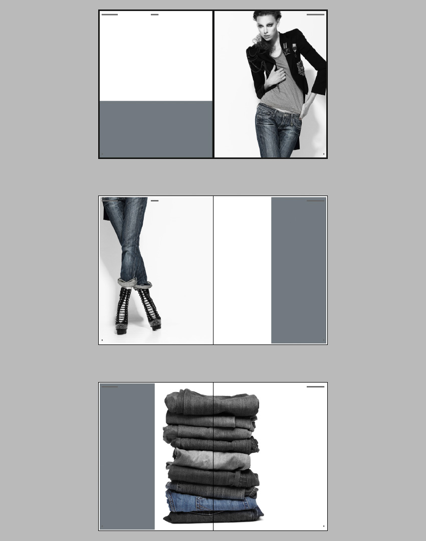


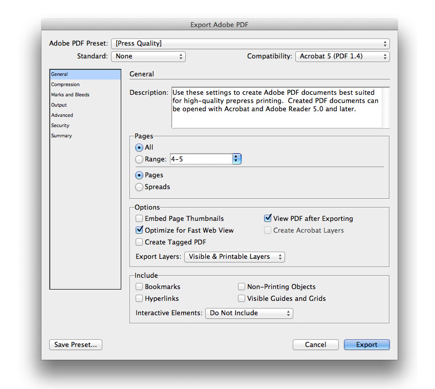


 InDesign TemplatesHow to Make Stylish Layouts for a Portfolio Template in InDesignLaura Keung
 InDesign TemplatesHow to Make a Book in InDesignGrace Fussell
 Adobe InDesignHow to Create a Simple Magazine Template in Adobe InDesignGrace Fussell
 BrochureHow to Make a Business Brochure in InDesignGrace Fussell
 FlyersHow to Create an Event Flyer Template in InDesignGrace Fussell