Finding Inspiration in Graphic Design History: 5 Aesthetics to Inspire Your Next Project

Post pobrano z: Finding Inspiration in Graphic Design History: 5 Aesthetics to Inspire Your Next Project

Final product image
What You’ll Be Creating

Looking for inspiration? Why not consider taking a look at the past—graphic design history, that is. In this article, we’ll take a look at five different points in design history and see how they could potentially inspire your next design project. 

Why Design History?

History Has Value

Personally, I don’t think it’s uncommon to see a lot of emphasis on design trends. Who doesn’t want to be relevant? We, as content creators, want to know what’s stylish, what’s popular, and ultimately, what people want to see (and that kind of awareness is generally smart!). We want our portfolio and our presence to look up to date and in touch with our target audience, whether it’s niche or broad.

However, there’s something to be said for history—design history, specifically. 

Using design history as inspiration is more than creating a „retro design”. We could potentially do that, in theory—but using history as a point of inspiration (or even continued education) is not necessarily exclusively about keying into a nostalgic „gimmick”. It can be a rich opportunity, not only to explore the history of your craft, but also to take what you’ve learned and push it in a fresh, modern direction. 

Retro Resume Template
Retro Resume Template, Envato Elements

History Repeats Itself

This concept, much like design itself, isn’t new. We can see evidence of design’s history all around us—some concepts just seem to be timeless, don’t they?

We could argue that strong usage of the principles of design makes for a good design—which, in some regards, is independent of aesthetic. However, it’s hard to say aesthetic isn’t important—form and function are a great team. 

In my opinion, a historical aesthetic or visual perspective often makes a resurgence (or sticks around for the long haul) for a few reasons:

Vintage Photoshop Actions
Animated Retro Vintage Film – Photoshop Actions, Envato Elements

Good Old-Fashioned Nostalgia

We’ve seen a lot of that in the late 2010s with the 1980s, and I get it. I’m part of that generation that grew up in the 80s and 90s. I love it. A big part of a successful design is connecting with your audience in a meaningful way, and this resonates with me, personally.

Retro Music Flyer
Retro Music Flyer, Envato Elements

It reminds me of how I remember the 1950s being pretty popular in the 1980s. As a kid, I didn’t really get it (or connect with it)—but my parents’ generation sure did. Playing into the preconceived ideas of our target audience can be a powerful perspective.

Retro Advertisement Kit
Retro Advertisement Kit, Envato Elements

Visual Communication That Really Connects

Sometimes, you get a concept that really connects with the audience for the long haul. A great example is the Coca Cola logo. It’s had its tweaks, but it’s generally withstood the test of time since one of its revisions in the early 1900s (with the exception being some rebranding in the mid-80s). 

Coca Cola Logo
Coca Cola Logo, The Coca Cola Company

An Old Concept Communicates in a New Way

Then, sometimes we get a concept that comes back in a different way—as a source of inspiration. Wood type posters, for example, heavily employed justified type that is „stacked” on top of itself. Variation in type is often line by line, with variations in style, weight, and width. 

How many times have you seen a fast food bag with stacked, justified type? A recent example I’ve spotted is on Qdoba’s food bags; notice the varied type, notice the justified alignment.

Qdoba Packaging and Advertisement
Qdoba Packaging and Advertising, Qdoba Restaurant Corporation

So let’s take a look at a handful of periods from different parts of graphic design history and see how you can recreate some of the key aspects of each aesthetic. Looking „under the hood” often makes me think about my own work and projects in a different way.  

Art Nouveau

An Introduction

Art Nouveau has been pretty popular in the last decade; I’ve seen a lot of fan art, for example, redone in an Art Nouveau-like style. It’s a popular aesthetic for a reason—it’s beautiful! The late 1800s and early 1900s were an interesting time in history; many places in the world were in the midst of large economic and industrial changes. Art Nouveau was an attempt to make the growing market for applied arts more „artful”. 

Aesthetically, Art Nouveau tends to feature flowers and foliage and/or organic, swooping line work. It is often quite ornate, and it’s not unusual to see bold, sweeping line work in strategic places to create a sense of flowing movement. 

Reverie Alphonse Mucha
„Rêverie”, Alphonse Mucha

Defining Attributes

When discussing the Art Nouveau period, one of the most well-known and well-loved artists is likely Alphonse Mucha; observe one of his works „6th Sokol Festival”, below. Note the emphasis on the use of organic shape, form, and line. There’s an ornate quality to the work; we see this reflected in the more supplementary parts of the composition too. For example, take note of the decorative borders and the line and shape used within the typography.

Alphonse Mucha Works
„6th Sokol Festival”, Alphonse Mucha

A Sample Design

So let’s create something ornate and organic. Since we won’t have time in this article to walk through an entire illustration, let’s create something with a typographic focus. 

I’m using the following assets in this example:

Let’s start out by creating a basic layout. I want emphasis on the type, so I’ve placed it in the center of my composition. I deliberately used typefaces that work with my target aesthetic—flowing and curved.

Art Nouveau Example Design

Bringing It Together

To push this further, I added ornate, decorative elements. Remember, Art Nouveau has an organic quality—so even though I wanted to work with a somewhat symmetrical „frame”, I still tried to incorporate some organic variation and asymmetry, particularly in the background. How does this visually communicate to you?

Art Nouveau Example Design

The International Typographic Style

An Introduction

The International Typographic Style, also referred to as Swiss Style, is a concept that emerged and developed in the early to mid-1900s. It typically relies on a grid to organize and present content; there’s also an emphasis on asymmetry and sans serif type. 

Most of us who have studied design, whether on our own or in an academic setting, have learned about using a grid—creating visual relationships and associations via a grid system has been a cornerstone of my studies, personally. The International Typographic Style is one of those history subjects that just looks timeless to me—check it out. 

International Typographic Style
„Auto Club of Switzerland Poster”, Joseph Müller-Brockmann; „Gisele”, Armin Hofmann; „Tempel Tee-Haus Japan”, Armin Hofmann

Defining Attributes

However, simply using a grid isn’t all there is to this historic point in design history. Shapes or photographic elements often took the wheel, while illustrative elements were not incorporated. As the name would imply, there was an emphasis on typography, often as a key element. Symmetry was avoided, with a particular emphasis on alignment to the left, rag right. 

Let’s take a look at „Zürich Town Hall Poster” by Josef Müller-Brockmann, below. Note the geometry and the visual relationships that the parts of the composition share. The shapes both create and reinforce the grid that the layout relies upon, while also creating both interest and movement. 

Joseph Mller-Brockmann
„Zürich Town Hall Poster”, Joseph Müller-Brockmann

A Sample Design

Let’s create an example that’s clean and heavily relies on a grid. We’ll create basic shapes ourselves—no assets needed for that—and we’ll put a lot of emphasis on our typography.

However, the following typeface is utilized in this example:

I started out by clearly defining a grid. This will directly influence where I’ll place my type and how I establish my hierarchy. In the below example, the grid is visible, for your reference—but we won’t see it literally drawn out in the final version.

International Typographic Style Sample

Bringing It Together

Notice how we can use design principles like scale and proximity to help promote the hierarchy here. Remember, asymmetry is a big part of this aesthetic. Do you „see” our grid? It’s not literally there anymore, but the elements of our design heavily imply and rely upon it. 

International Typographic Style Sample

De Stijl

An Introduction

De Stijl is an interesting movement, because we see some of the visual ideas from Swiss Design—there’s a lot of emphasis on a grid, but the guidelines are a bit more specific. We have emphasis on the horizontal and vertical in De Stijl—and color is limited to black, white, and primary colors. Abstraction and geometry are key here.

Piet Mondrian
„Composition No. 10”, Piet Mondrian.

Defining Attributes

This might sound unusual to you as a content creator today—I can remember first seeing De Stijl and thinking, „How could someone design like that? Isn’t that really limiting?”

Think, however, about trendy color schemes, branding guidelines, and even interior design. Do you welcome every color, every aesthetic into your work or even your spaces? Restriction isn’t necessarily „bad”. 

In this case, it was about the exploration of a visual ideal.

De Stijl was about abstraction and the appreciation of simplicity, as opposed to some of the „visual excess” seen in movements like Art Deco and Art Nouveau.

De Stijl
„Book Cover” by Théo van Doesburg and Laszlo Moholy-Nagy.

A Sample Design

De Stijl has a pretty distinct look, in my opinion—limited colors and an emphasis on clean, geometric space. So let’s stick with a clean, geometric sans serif, line, and limited color.

The following typeface is utilized in this example:

I started by creating a grid, although this time my grid is more visibly and literally present. 

De Stijl Sample

Bringing It Together

Color and value can be used to create interest—that concept is rather independent of aesthetic or historical movement—but in this case, I decided to strategically apply the limited color scheme in a way that helps balance the composition and create emphasis. 

De Stijl Sample

Dadaism

An Introduction

Dada is an interesting movement; I would describe it as visually rebellious. However, it wasn’t necessarily always „chaos for chaos’s sake”. Instead, in many cases, it was a response to current events, a response to distrust, and/or a way of challenging what is and is not „art”. 

This is an interesting movement to look at—especially after De Stijl and the International Typographic Style. Instead of order, we’re looking at the abstract and challenging what should and should not visually „be”. The subjective nature of art and design, as well as its role as a responsive and communicative tool, is an interesting concept to explore, regardless of the time period. 

Dadaism
„Cut with the Kitchen Knife Dada through the Beer-Belly of the Weimar Republic”, Hannah Höch

Defining Attributes

It’s difficult to define Dada as a singular aesthetic because the premise was breaking the rules and being non-conformist. There wasn’t supposed to be order or playing into expectations. Instead, the idea here was to subvert those expectations and challenge them. 

For example, let’s look at Theo van Doesburg’s „Kleine Dada Soirée”, below. It’s quite jumbled and abstracted, but that’s also the point. A poster „should” generally be legible, with a well-established hierarchy and a clear message. This challenges all of those ideas, but it’s also the premise that it seeks to communicate to the audience. 

Dadaism
„Kleine Dada Soirée”, Theo van Doesburg and Kurt Schwitters

A Sample Design

So, with this sample concept, let’s just have some fun—let’s throw everything out of the window. I must admit, as a content creator, sometimes I get really fixated on what’s „the right thing—or most universally enjoyed thing—to do”. 

While the intention of Dadaism was more complex than this, it’s still a perspective I find refreshing, when thinking about my own work. 

Here are the typefaces I experimented with in this example:

Let’s break the grid. I started by abstractly placing typography on my canvas. 

Dada Example

Bringing It Together

That’s not to say that we can’t communicate here. I decided to portray the phrase „Where am I?”—and I did so in a really disjointed and rather chaotic way. My objective was to visually communicate the feeling of being lost—there is no path and there is no order. I added some texture and imagery to help push my concept further.

Dada Example

The New York School

An Introduction

The New York School refers to a time in design history in the mid-1900s. We see similar ideas revolving around structure, visual associations, and even „the grid”—but with a degree of whimsy and informality. 

Here’s an example by graphic design great Saul Bass; notice how we see organized structure here, in this poster for „The Man With the Golden Arm”, but there’s some expressive variation thrown into the mix too. The jostled shapes and the strategic informality are very communicative, even though the shapes themselves are simple.

Saul Bass Man with the Golden Arm
„Man With the Golden Arm Poster”, Saul Bass

Defining Attributes

Any time I’ve studied or taught design history, one of the most popular names that pops up, time and time again, is Paul Rand—and for good reason. He created some really outstanding, timeless works. The ABC logo? Paul Rand. The classic UPS logo? Paul Rand. The IBM logo? Paul Rand. His work generally embodied the idea that strong design is a partnership of form and function used to visually communicate an idea. 

Personally, when I think of The New York School as a part of design history, I think of concept—an emphasis on communicating that concept in a visual way. The old-school UPS logo is a great example—we see a shield, which communicates trust and protection, and we see a package on top, which the shield „holds up”. 

Retro UPS Logo Paul Rand
UPS Logo, Paul Rand

A Sample Design

So, in this composition, let’s focus on communicating a concept in a visual way. I decided I wanted to communicate that giving flowers is a loving gesture—or that if you give a flower, it can be an expression of love or affection.

Here are the images I worked with in this example:

I started off by deciding where I wanted the parts of my composition to go—like a basic thumbnail.

Concept Thumbnail

Bringing It Together

Then, I arranged the lips to visually associate with the top of the flower, visually associating them as one and the same. The kiss is the flower—because the flower is the kiss.  

New York School Inspired Design

This Is Just the Beginning!

Thank you for joining me on this survey of different points in graphic design history! These are just some ideas to get you started and inspired. There’s so much more to explore here. If you’d like more design history in your life, I’d highly recommend picking up a copy of Megg’s History of Graphic Design; it’s a marvelous book! 

Good luck with your research, exploration, and creative projects—happy designing!

Example of Different Aesthetics

If you enjoyed this article, here are some others you might enjoy!

Finding Inspiration in Graphic Design History: 5 Aesthetics to Inspire Your Next Project

Post pobrano z: Finding Inspiration in Graphic Design History: 5 Aesthetics to Inspire Your Next Project

Final product image
What You’ll Be Creating

Looking for inspiration? Why not consider taking a look at the past—graphic design history, that is. In this article, we’ll take a look at five different points in design history and see how they could potentially inspire your next design project. 

Why Design History?

History Has Value

Personally, I don’t think it’s uncommon to see a lot of emphasis on design trends. Who doesn’t want to be relevant? We, as content creators, want to know what’s stylish, what’s popular, and ultimately, what people want to see (and that kind of awareness is generally smart!). We want our portfolio and our presence to look up to date and in touch with our target audience, whether it’s niche or broad.

However, there’s something to be said for history—design history, specifically. 

Using design history as inspiration is more than creating a „retro design”. We could potentially do that, in theory—but using history as a point of inspiration (or even continued education) is not necessarily exclusively about keying into a nostalgic „gimmick”. It can be a rich opportunity, not only to explore the history of your craft, but also to take what you’ve learned and push it in a fresh, modern direction. 

Retro Resume Template
Retro Resume Template, Envato Elements

History Repeats Itself

This concept, much like design itself, isn’t new. We can see evidence of design’s history all around us—some concepts just seem to be timeless, don’t they?

We could argue that strong usage of the principles of design makes for a good design—which, in some regards, is independent of aesthetic. However, it’s hard to say aesthetic isn’t important—form and function are a great team. 

In my opinion, a historical aesthetic or visual perspective often makes a resurgence (or sticks around for the long haul) for a few reasons:

Vintage Photoshop Actions
Animated Retro Vintage Film – Photoshop Actions, Envato Elements

Good Old-Fashioned Nostalgia

We’ve seen a lot of that in the late 2010s with the 1980s, and I get it. I’m part of that generation that grew up in the 80s and 90s. I love it. A big part of a successful design is connecting with your audience in a meaningful way, and this resonates with me, personally.

Retro Music Flyer
Retro Music Flyer, Envato Elements

It reminds me of how I remember the 1950s being pretty popular in the 1980s. As a kid, I didn’t really get it (or connect with it)—but my parents’ generation sure did. Playing into the preconceived ideas of our target audience can be a powerful perspective.

Retro Advertisement Kit
Retro Advertisement Kit, Envato Elements

Visual Communication That Really Connects

Sometimes, you get a concept that really connects with the audience for the long haul. A great example is the Coca Cola logo. It’s had its tweaks, but it’s generally withstood the test of time since one of its revisions in the early 1900s (with the exception being some rebranding in the mid-80s). 

Coca Cola Logo
Coca Cola Logo, The Coca Cola Company

An Old Concept Communicates in a New Way

Then, sometimes we get a concept that comes back in a different way—as a source of inspiration. Wood type posters, for example, heavily employed justified type that is „stacked” on top of itself. Variation in type is often line by line, with variations in style, weight, and width. 

How many times have you seen a fast food bag with stacked, justified type? A recent example I’ve spotted is on Qdoba’s food bags; notice the varied type, notice the justified alignment.

Qdoba Packaging and Advertisement
Qdoba Packaging and Advertising, Qdoba Restaurant Corporation

So let’s take a look at a handful of periods from different parts of graphic design history and see how you can recreate some of the key aspects of each aesthetic. Looking „under the hood” often makes me think about my own work and projects in a different way.  

Art Nouveau

An Introduction

Art Nouveau has been pretty popular in the last decade; I’ve seen a lot of fan art, for example, redone in an Art Nouveau-like style. It’s a popular aesthetic for a reason—it’s beautiful! The late 1800s and early 1900s were an interesting time in history; many places in the world were in the midst of large economic and industrial changes. Art Nouveau was an attempt to make the growing market for applied arts more „artful”. 

Aesthetically, Art Nouveau tends to feature flowers and foliage and/or organic, swooping line work. It is often quite ornate, and it’s not unusual to see bold, sweeping line work in strategic places to create a sense of flowing movement. 

Reverie Alphonse Mucha
„Rêverie”, Alphonse Mucha

Defining Attributes

When discussing the Art Nouveau period, one of the most well-known and well-loved artists is likely Alphonse Mucha; observe one of his works „6th Sokol Festival”, below. Note the emphasis on the use of organic shape, form, and line. There’s an ornate quality to the work; we see this reflected in the more supplementary parts of the composition too. For example, take note of the decorative borders and the line and shape used within the typography.

Alphonse Mucha Works
„6th Sokol Festival”, Alphonse Mucha

A Sample Design

So let’s create something ornate and organic. Since we won’t have time in this article to walk through an entire illustration, let’s create something with a typographic focus. 

I’m using the following assets in this example:

Let’s start out by creating a basic layout. I want emphasis on the type, so I’ve placed it in the center of my composition. I deliberately used typefaces that work with my target aesthetic—flowing and curved.

Art Nouveau Example Design

Bringing It Together

To push this further, I added ornate, decorative elements. Remember, Art Nouveau has an organic quality—so even though I wanted to work with a somewhat symmetrical „frame”, I still tried to incorporate some organic variation and asymmetry, particularly in the background. How does this visually communicate to you?

Art Nouveau Example Design

The International Typographic Style

An Introduction

The International Typographic Style, also referred to as Swiss Style, is a concept that emerged and developed in the early to mid-1900s. It typically relies on a grid to organize and present content; there’s also an emphasis on asymmetry and sans serif type. 

Most of us who have studied design, whether on our own or in an academic setting, have learned about using a grid—creating visual relationships and associations via a grid system has been a cornerstone of my studies, personally. The International Typographic Style is one of those history subjects that just looks timeless to me—check it out. 

International Typographic Style
„Auto Club of Switzerland Poster”, Joseph Müller-Brockmann; „Gisele”, Armin Hofmann; „Tempel Tee-Haus Japan”, Armin Hofmann

Defining Attributes

However, simply using a grid isn’t all there is to this historic point in design history. Shapes or photographic elements often took the wheel, while illustrative elements were not incorporated. As the name would imply, there was an emphasis on typography, often as a key element. Symmetry was avoided, with a particular emphasis on alignment to the left, rag right. 

Let’s take a look at „Zürich Town Hall Poster” by Josef Müller-Brockmann, below. Note the geometry and the visual relationships that the parts of the composition share. The shapes both create and reinforce the grid that the layout relies upon, while also creating both interest and movement. 

Joseph Mller-Brockmann
„Zürich Town Hall Poster”, Joseph Müller-Brockmann

A Sample Design

Let’s create an example that’s clean and heavily relies on a grid. We’ll create basic shapes ourselves—no assets needed for that—and we’ll put a lot of emphasis on our typography.

However, the following typeface is utilized in this example:

I started out by clearly defining a grid. This will directly influence where I’ll place my type and how I establish my hierarchy. In the below example, the grid is visible, for your reference—but we won’t see it literally drawn out in the final version.

International Typographic Style Sample

Bringing It Together

Notice how we can use design principles like scale and proximity to help promote the hierarchy here. Remember, asymmetry is a big part of this aesthetic. Do you „see” our grid? It’s not literally there anymore, but the elements of our design heavily imply and rely upon it. 

International Typographic Style Sample

De Stijl

An Introduction

De Stijl is an interesting movement, because we see some of the visual ideas from Swiss Design—there’s a lot of emphasis on a grid, but the guidelines are a bit more specific. We have emphasis on the horizontal and vertical in De Stijl—and color is limited to black, white, and primary colors. Abstraction and geometry are key here.

Piet Mondrian
„Composition No. 10”, Piet Mondrian.

Defining Attributes

This might sound unusual to you as a content creator today—I can remember first seeing De Stijl and thinking, „How could someone design like that? Isn’t that really limiting?”

Think, however, about trendy color schemes, branding guidelines, and even interior design. Do you welcome every color, every aesthetic into your work or even your spaces? Restriction isn’t necessarily „bad”. 

In this case, it was about the exploration of a visual ideal.

De Stijl was about abstraction and the appreciation of simplicity, as opposed to some of the „visual excess” seen in movements like Art Deco and Art Nouveau.

De Stijl
„Book Cover” by Théo van Doesburg and Laszlo Moholy-Nagy.

A Sample Design

De Stijl has a pretty distinct look, in my opinion—limited colors and an emphasis on clean, geometric space. So let’s stick with a clean, geometric sans serif, line, and limited color.

The following typeface is utilized in this example:

I started by creating a grid, although this time my grid is more visibly and literally present. 

De Stijl Sample

Bringing It Together

Color and value can be used to create interest—that concept is rather independent of aesthetic or historical movement—but in this case, I decided to strategically apply the limited color scheme in a way that helps balance the composition and create emphasis. 

De Stijl Sample

Dadaism

An Introduction

Dada is an interesting movement; I would describe it as visually rebellious. However, it wasn’t necessarily always „chaos for chaos’s sake”. Instead, in many cases, it was a response to current events, a response to distrust, and/or a way of challenging what is and is not „art”. 

This is an interesting movement to look at—especially after De Stijl and the International Typographic Style. Instead of order, we’re looking at the abstract and challenging what should and should not visually „be”. The subjective nature of art and design, as well as its role as a responsive and communicative tool, is an interesting concept to explore, regardless of the time period. 

Dadaism
„Cut with the Kitchen Knife Dada through the Beer-Belly of the Weimar Republic”, Hannah Höch

Defining Attributes

It’s difficult to define Dada as a singular aesthetic because the premise was breaking the rules and being non-conformist. There wasn’t supposed to be order or playing into expectations. Instead, the idea here was to subvert those expectations and challenge them. 

For example, let’s look at Theo van Doesburg’s „Kleine Dada Soirée”, below. It’s quite jumbled and abstracted, but that’s also the point. A poster „should” generally be legible, with a well-established hierarchy and a clear message. This challenges all of those ideas, but it’s also the premise that it seeks to communicate to the audience. 

Dadaism
„Kleine Dada Soirée”, Theo van Doesburg and Kurt Schwitters

A Sample Design

So, with this sample concept, let’s just have some fun—let’s throw everything out of the window. I must admit, as a content creator, sometimes I get really fixated on what’s „the right thing—or most universally enjoyed thing—to do”. 

While the intention of Dadaism was more complex than this, it’s still a perspective I find refreshing, when thinking about my own work. 

Here are the typefaces I experimented with in this example:

Let’s break the grid. I started by abstractly placing typography on my canvas. 

Dada Example

Bringing It Together

That’s not to say that we can’t communicate here. I decided to portray the phrase „Where am I?”—and I did so in a really disjointed and rather chaotic way. My objective was to visually communicate the feeling of being lost—there is no path and there is no order. I added some texture and imagery to help push my concept further.

Dada Example

The New York School

An Introduction

The New York School refers to a time in design history in the mid-1900s. We see similar ideas revolving around structure, visual associations, and even „the grid”—but with a degree of whimsy and informality. 

Here’s an example by graphic design great Saul Bass; notice how we see organized structure here, in this poster for „The Man With the Golden Arm”, but there’s some expressive variation thrown into the mix too. The jostled shapes and the strategic informality are very communicative, even though the shapes themselves are simple.

Saul Bass Man with the Golden Arm
„Man With the Golden Arm Poster”, Saul Bass

Defining Attributes

Any time I’ve studied or taught design history, one of the most popular names that pops up, time and time again, is Paul Rand—and for good reason. He created some really outstanding, timeless works. The ABC logo? Paul Rand. The classic UPS logo? Paul Rand. The IBM logo? Paul Rand. His work generally embodied the idea that strong design is a partnership of form and function used to visually communicate an idea. 

Personally, when I think of The New York School as a part of design history, I think of concept—an emphasis on communicating that concept in a visual way. The old-school UPS logo is a great example—we see a shield, which communicates trust and protection, and we see a package on top, which the shield „holds up”. 

Retro UPS Logo Paul Rand
UPS Logo, Paul Rand

A Sample Design

So, in this composition, let’s focus on communicating a concept in a visual way. I decided I wanted to communicate that giving flowers is a loving gesture—or that if you give a flower, it can be an expression of love or affection.

Here are the images I worked with in this example:

I started off by deciding where I wanted the parts of my composition to go—like a basic thumbnail.

Concept Thumbnail

Bringing It Together

Then, I arranged the lips to visually associate with the top of the flower, visually associating them as one and the same. The kiss is the flower—because the flower is the kiss.  

New York School Inspired Design

This Is Just the Beginning!

Thank you for joining me on this survey of different points in graphic design history! These are just some ideas to get you started and inspired. There’s so much more to explore here. If you’d like more design history in your life, I’d highly recommend picking up a copy of Megg’s History of Graphic Design; it’s a marvelous book! 

Good luck with your research, exploration, and creative projects—happy designing!

Example of Different Aesthetics

If you enjoyed this article, here are some others you might enjoy!

Finding Inspiration in Graphic Design History: 5 Aesthetics to Inspire Your Next Project

Post pobrano z: Finding Inspiration in Graphic Design History: 5 Aesthetics to Inspire Your Next Project

Final product image
What You’ll Be Creating

Looking for inspiration? Why not consider taking a look at the past—graphic design history, that is. In this article, we’ll take a look at five different points in design history and see how they could potentially inspire your next design project. 

Why Design History?

History Has Value

Personally, I don’t think it’s uncommon to see a lot of emphasis on design trends. Who doesn’t want to be relevant? We, as content creators, want to know what’s stylish, what’s popular, and ultimately, what people want to see (and that kind of awareness is generally smart!). We want our portfolio and our presence to look up to date and in touch with our target audience, whether it’s niche or broad.

However, there’s something to be said for history—design history, specifically. 

Using design history as inspiration is more than creating a „retro design”. We could potentially do that, in theory—but using history as a point of inspiration (or even continued education) is not necessarily exclusively about keying into a nostalgic „gimmick”. It can be a rich opportunity, not only to explore the history of your craft, but also to take what you’ve learned and push it in a fresh, modern direction. 

Retro Resume Template
Retro Resume Template, Envato Elements

History Repeats Itself

This concept, much like design itself, isn’t new. We can see evidence of design’s history all around us—some concepts just seem to be timeless, don’t they?

We could argue that strong usage of the principles of design makes for a good design—which, in some regards, is independent of aesthetic. However, it’s hard to say aesthetic isn’t important—form and function are a great team. 

In my opinion, a historical aesthetic or visual perspective often makes a resurgence (or sticks around for the long haul) for a few reasons:

Vintage Photoshop Actions
Animated Retro Vintage Film – Photoshop Actions, Envato Elements

Good Old-Fashioned Nostalgia

We’ve seen a lot of that in the late 2010s with the 1980s, and I get it. I’m part of that generation that grew up in the 80s and 90s. I love it. A big part of a successful design is connecting with your audience in a meaningful way, and this resonates with me, personally.

Retro Music Flyer
Retro Music Flyer, Envato Elements

It reminds me of how I remember the 1950s being pretty popular in the 1980s. As a kid, I didn’t really get it (or connect with it)—but my parents’ generation sure did. Playing into the preconceived ideas of our target audience can be a powerful perspective.

Retro Advertisement Kit
Retro Advertisement Kit, Envato Elements

Visual Communication That Really Connects

Sometimes, you get a concept that really connects with the audience for the long haul. A great example is the Coca Cola logo. It’s had its tweaks, but it’s generally withstood the test of time since one of its revisions in the early 1900s (with the exception being some rebranding in the mid-80s). 

Coca Cola Logo
Coca Cola Logo, The Coca Cola Company

An Old Concept Communicates in a New Way

Then, sometimes we get a concept that comes back in a different way—as a source of inspiration. Wood type posters, for example, heavily employed justified type that is „stacked” on top of itself. Variation in type is often line by line, with variations in style, weight, and width. 

How many times have you seen a fast food bag with stacked, justified type? A recent example I’ve spotted is on Qdoba’s food bags; notice the varied type, notice the justified alignment.

Qdoba Packaging and Advertisement
Qdoba Packaging and Advertising, Qdoba Restaurant Corporation

So let’s take a look at a handful of periods from different parts of graphic design history and see how you can recreate some of the key aspects of each aesthetic. Looking „under the hood” often makes me think about my own work and projects in a different way.  

Art Nouveau

An Introduction

Art Nouveau has been pretty popular in the last decade; I’ve seen a lot of fan art, for example, redone in an Art Nouveau-like style. It’s a popular aesthetic for a reason—it’s beautiful! The late 1800s and early 1900s were an interesting time in history; many places in the world were in the midst of large economic and industrial changes. Art Nouveau was an attempt to make the growing market for applied arts more „artful”. 

Aesthetically, Art Nouveau tends to feature flowers and foliage and/or organic, swooping line work. It is often quite ornate, and it’s not unusual to see bold, sweeping line work in strategic places to create a sense of flowing movement. 

Reverie Alphonse Mucha
„Rêverie”, Alphonse Mucha

Defining Attributes

When discussing the Art Nouveau period, one of the most well-known and well-loved artists is likely Alphonse Mucha; observe one of his works „6th Sokol Festival”, below. Note the emphasis on the use of organic shape, form, and line. There’s an ornate quality to the work; we see this reflected in the more supplementary parts of the composition too. For example, take note of the decorative borders and the line and shape used within the typography.

Alphonse Mucha Works
„6th Sokol Festival”, Alphonse Mucha

A Sample Design

So let’s create something ornate and organic. Since we won’t have time in this article to walk through an entire illustration, let’s create something with a typographic focus. 

I’m using the following assets in this example:

Let’s start out by creating a basic layout. I want emphasis on the type, so I’ve placed it in the center of my composition. I deliberately used typefaces that work with my target aesthetic—flowing and curved.

Art Nouveau Example Design

Bringing It Together

To push this further, I added ornate, decorative elements. Remember, Art Nouveau has an organic quality—so even though I wanted to work with a somewhat symmetrical „frame”, I still tried to incorporate some organic variation and asymmetry, particularly in the background. How does this visually communicate to you?

Art Nouveau Example Design

The International Typographic Style

An Introduction

The International Typographic Style, also referred to as Swiss Style, is a concept that emerged and developed in the early to mid-1900s. It typically relies on a grid to organize and present content; there’s also an emphasis on asymmetry and sans serif type. 

Most of us who have studied design, whether on our own or in an academic setting, have learned about using a grid—creating visual relationships and associations via a grid system has been a cornerstone of my studies, personally. The International Typographic Style is one of those history subjects that just looks timeless to me—check it out. 

International Typographic Style
„Auto Club of Switzerland Poster”, Joseph Müller-Brockmann; „Gisele”, Armin Hofmann; „Tempel Tee-Haus Japan”, Armin Hofmann

Defining Attributes

However, simply using a grid isn’t all there is to this historic point in design history. Shapes or photographic elements often took the wheel, while illustrative elements were not incorporated. As the name would imply, there was an emphasis on typography, often as a key element. Symmetry was avoided, with a particular emphasis on alignment to the left, rag right. 

Let’s take a look at „Zürich Town Hall Poster” by Josef Müller-Brockmann, below. Note the geometry and the visual relationships that the parts of the composition share. The shapes both create and reinforce the grid that the layout relies upon, while also creating both interest and movement. 

Joseph Mller-Brockmann
„Zürich Town Hall Poster”, Joseph Müller-Brockmann

A Sample Design

Let’s create an example that’s clean and heavily relies on a grid. We’ll create basic shapes ourselves—no assets needed for that—and we’ll put a lot of emphasis on our typography.

However, the following typeface is utilized in this example:

I started out by clearly defining a grid. This will directly influence where I’ll place my type and how I establish my hierarchy. In the below example, the grid is visible, for your reference—but we won’t see it literally drawn out in the final version.

International Typographic Style Sample

Bringing It Together

Notice how we can use design principles like scale and proximity to help promote the hierarchy here. Remember, asymmetry is a big part of this aesthetic. Do you „see” our grid? It’s not literally there anymore, but the elements of our design heavily imply and rely upon it. 

International Typographic Style Sample

De Stijl

An Introduction

De Stijl is an interesting movement, because we see some of the visual ideas from Swiss Design—there’s a lot of emphasis on a grid, but the guidelines are a bit more specific. We have emphasis on the horizontal and vertical in De Stijl—and color is limited to black, white, and primary colors. Abstraction and geometry are key here.

Piet Mondrian
„Composition No. 10”, Piet Mondrian.

Defining Attributes

This might sound unusual to you as a content creator today—I can remember first seeing De Stijl and thinking, „How could someone design like that? Isn’t that really limiting?”

Think, however, about trendy color schemes, branding guidelines, and even interior design. Do you welcome every color, every aesthetic into your work or even your spaces? Restriction isn’t necessarily „bad”. 

In this case, it was about the exploration of a visual ideal.

De Stijl was about abstraction and the appreciation of simplicity, as opposed to some of the „visual excess” seen in movements like Art Deco and Art Nouveau.

De Stijl
„Book Cover” by Théo van Doesburg and Laszlo Moholy-Nagy.

A Sample Design

De Stijl has a pretty distinct look, in my opinion—limited colors and an emphasis on clean, geometric space. So let’s stick with a clean, geometric sans serif, line, and limited color.

The following typeface is utilized in this example:

I started by creating a grid, although this time my grid is more visibly and literally present. 

De Stijl Sample

Bringing It Together

Color and value can be used to create interest—that concept is rather independent of aesthetic or historical movement—but in this case, I decided to strategically apply the limited color scheme in a way that helps balance the composition and create emphasis. 

De Stijl Sample

Dadaism

An Introduction

Dada is an interesting movement; I would describe it as visually rebellious. However, it wasn’t necessarily always „chaos for chaos’s sake”. Instead, in many cases, it was a response to current events, a response to distrust, and/or a way of challenging what is and is not „art”. 

This is an interesting movement to look at—especially after De Stijl and the International Typographic Style. Instead of order, we’re looking at the abstract and challenging what should and should not visually „be”. The subjective nature of art and design, as well as its role as a responsive and communicative tool, is an interesting concept to explore, regardless of the time period. 

Dadaism
„Cut with the Kitchen Knife Dada through the Beer-Belly of the Weimar Republic”, Hannah Höch

Defining Attributes

It’s difficult to define Dada as a singular aesthetic because the premise was breaking the rules and being non-conformist. There wasn’t supposed to be order or playing into expectations. Instead, the idea here was to subvert those expectations and challenge them. 

For example, let’s look at Theo van Doesburg’s „Kleine Dada Soirée”, below. It’s quite jumbled and abstracted, but that’s also the point. A poster „should” generally be legible, with a well-established hierarchy and a clear message. This challenges all of those ideas, but it’s also the premise that it seeks to communicate to the audience. 

Dadaism
„Kleine Dada Soirée”, Theo van Doesburg and Kurt Schwitters

A Sample Design

So, with this sample concept, let’s just have some fun—let’s throw everything out of the window. I must admit, as a content creator, sometimes I get really fixated on what’s „the right thing—or most universally enjoyed thing—to do”. 

While the intention of Dadaism was more complex than this, it’s still a perspective I find refreshing, when thinking about my own work. 

Here are the typefaces I experimented with in this example:

Let’s break the grid. I started by abstractly placing typography on my canvas. 

Dada Example

Bringing It Together

That’s not to say that we can’t communicate here. I decided to portray the phrase „Where am I?”—and I did so in a really disjointed and rather chaotic way. My objective was to visually communicate the feeling of being lost—there is no path and there is no order. I added some texture and imagery to help push my concept further.

Dada Example

The New York School

An Introduction

The New York School refers to a time in design history in the mid-1900s. We see similar ideas revolving around structure, visual associations, and even „the grid”—but with a degree of whimsy and informality. 

Here’s an example by graphic design great Saul Bass; notice how we see organized structure here, in this poster for „The Man With the Golden Arm”, but there’s some expressive variation thrown into the mix too. The jostled shapes and the strategic informality are very communicative, even though the shapes themselves are simple.

Saul Bass Man with the Golden Arm
„Man With the Golden Arm Poster”, Saul Bass

Defining Attributes

Any time I’ve studied or taught design history, one of the most popular names that pops up, time and time again, is Paul Rand—and for good reason. He created some really outstanding, timeless works. The ABC logo? Paul Rand. The classic UPS logo? Paul Rand. The IBM logo? Paul Rand. His work generally embodied the idea that strong design is a partnership of form and function used to visually communicate an idea. 

Personally, when I think of The New York School as a part of design history, I think of concept—an emphasis on communicating that concept in a visual way. The old-school UPS logo is a great example—we see a shield, which communicates trust and protection, and we see a package on top, which the shield „holds up”. 

Retro UPS Logo Paul Rand
UPS Logo, Paul Rand

A Sample Design

So, in this composition, let’s focus on communicating a concept in a visual way. I decided I wanted to communicate that giving flowers is a loving gesture—or that if you give a flower, it can be an expression of love or affection.

Here are the images I worked with in this example:

I started off by deciding where I wanted the parts of my composition to go—like a basic thumbnail.

Concept Thumbnail

Bringing It Together

Then, I arranged the lips to visually associate with the top of the flower, visually associating them as one and the same. The kiss is the flower—because the flower is the kiss.  

New York School Inspired Design

This Is Just the Beginning!

Thank you for joining me on this survey of different points in graphic design history! These are just some ideas to get you started and inspired. There’s so much more to explore here. If you’d like more design history in your life, I’d highly recommend picking up a copy of Megg’s History of Graphic Design; it’s a marvelous book! 

Good luck with your research, exploration, and creative projects—happy designing!

Example of Different Aesthetics

If you enjoyed this article, here are some others you might enjoy!

Finding Inspiration in Graphic Design History: 5 Aesthetics to Inspire Your Next Project

Post pobrano z: Finding Inspiration in Graphic Design History: 5 Aesthetics to Inspire Your Next Project

Final product image
What You’ll Be Creating

Looking for inspiration? Why not consider taking a look at the past—graphic design history, that is. In this article, we’ll take a look at five different points in design history and see how they could potentially inspire your next design project. 

Why Design History?

History Has Value

Personally, I don’t think it’s uncommon to see a lot of emphasis on design trends. Who doesn’t want to be relevant? We, as content creators, want to know what’s stylish, what’s popular, and ultimately, what people want to see (and that kind of awareness is generally smart!). We want our portfolio and our presence to look up to date and in touch with our target audience, whether it’s niche or broad.

However, there’s something to be said for history—design history, specifically. 

Using design history as inspiration is more than creating a „retro design”. We could potentially do that, in theory—but using history as a point of inspiration (or even continued education) is not necessarily exclusively about keying into a nostalgic „gimmick”. It can be a rich opportunity, not only to explore the history of your craft, but also to take what you’ve learned and push it in a fresh, modern direction. 

Retro Resume Template
Retro Resume Template, Envato Elements

History Repeats Itself

This concept, much like design itself, isn’t new. We can see evidence of design’s history all around us—some concepts just seem to be timeless, don’t they?

We could argue that strong usage of the principles of design makes for a good design—which, in some regards, is independent of aesthetic. However, it’s hard to say aesthetic isn’t important—form and function are a great team. 

In my opinion, a historical aesthetic or visual perspective often makes a resurgence (or sticks around for the long haul) for a few reasons:

Vintage Photoshop Actions
Animated Retro Vintage Film – Photoshop Actions, Envato Elements

Good Old-Fashioned Nostalgia

We’ve seen a lot of that in the late 2010s with the 1980s, and I get it. I’m part of that generation that grew up in the 80s and 90s. I love it. A big part of a successful design is connecting with your audience in a meaningful way, and this resonates with me, personally.

Retro Music Flyer
Retro Music Flyer, Envato Elements

It reminds me of how I remember the 1950s being pretty popular in the 1980s. As a kid, I didn’t really get it (or connect with it)—but my parents’ generation sure did. Playing into the preconceived ideas of our target audience can be a powerful perspective.

Retro Advertisement Kit
Retro Advertisement Kit, Envato Elements

Visual Communication That Really Connects

Sometimes, you get a concept that really connects with the audience for the long haul. A great example is the Coca Cola logo. It’s had its tweaks, but it’s generally withstood the test of time since one of its revisions in the early 1900s (with the exception being some rebranding in the mid-80s). 

Coca Cola Logo
Coca Cola Logo, The Coca Cola Company

An Old Concept Communicates in a New Way

Then, sometimes we get a concept that comes back in a different way—as a source of inspiration. Wood type posters, for example, heavily employed justified type that is „stacked” on top of itself. Variation in type is often line by line, with variations in style, weight, and width. 

How many times have you seen a fast food bag with stacked, justified type? A recent example I’ve spotted is on Qdoba’s food bags; notice the varied type, notice the justified alignment.

Qdoba Packaging and Advertisement
Qdoba Packaging and Advertising, Qdoba Restaurant Corporation

So let’s take a look at a handful of periods from different parts of graphic design history and see how you can recreate some of the key aspects of each aesthetic. Looking „under the hood” often makes me think about my own work and projects in a different way.  

Art Nouveau

An Introduction

Art Nouveau has been pretty popular in the last decade; I’ve seen a lot of fan art, for example, redone in an Art Nouveau-like style. It’s a popular aesthetic for a reason—it’s beautiful! The late 1800s and early 1900s were an interesting time in history; many places in the world were in the midst of large economic and industrial changes. Art Nouveau was an attempt to make the growing market for applied arts more „artful”. 

Aesthetically, Art Nouveau tends to feature flowers and foliage and/or organic, swooping line work. It is often quite ornate, and it’s not unusual to see bold, sweeping line work in strategic places to create a sense of flowing movement. 

Reverie Alphonse Mucha
„Rêverie”, Alphonse Mucha

Defining Attributes

When discussing the Art Nouveau period, one of the most well-known and well-loved artists is likely Alphonse Mucha; observe one of his works „6th Sokol Festival”, below. Note the emphasis on the use of organic shape, form, and line. There’s an ornate quality to the work; we see this reflected in the more supplementary parts of the composition too. For example, take note of the decorative borders and the line and shape used within the typography.

Alphonse Mucha Works
„6th Sokol Festival”, Alphonse Mucha

A Sample Design

So let’s create something ornate and organic. Since we won’t have time in this article to walk through an entire illustration, let’s create something with a typographic focus. 

I’m using the following assets in this example:

Let’s start out by creating a basic layout. I want emphasis on the type, so I’ve placed it in the center of my composition. I deliberately used typefaces that work with my target aesthetic—flowing and curved.

Art Nouveau Example Design

Bringing It Together

To push this further, I added ornate, decorative elements. Remember, Art Nouveau has an organic quality—so even though I wanted to work with a somewhat symmetrical „frame”, I still tried to incorporate some organic variation and asymmetry, particularly in the background. How does this visually communicate to you?

Art Nouveau Example Design

The International Typographic Style

An Introduction

The International Typographic Style, also referred to as Swiss Style, is a concept that emerged and developed in the early to mid-1900s. It typically relies on a grid to organize and present content; there’s also an emphasis on asymmetry and sans serif type. 

Most of us who have studied design, whether on our own or in an academic setting, have learned about using a grid—creating visual relationships and associations via a grid system has been a cornerstone of my studies, personally. The International Typographic Style is one of those history subjects that just looks timeless to me—check it out. 

International Typographic Style
„Auto Club of Switzerland Poster”, Joseph Müller-Brockmann; „Gisele”, Armin Hofmann; „Tempel Tee-Haus Japan”, Armin Hofmann

Defining Attributes

However, simply using a grid isn’t all there is to this historic point in design history. Shapes or photographic elements often took the wheel, while illustrative elements were not incorporated. As the name would imply, there was an emphasis on typography, often as a key element. Symmetry was avoided, with a particular emphasis on alignment to the left, rag right. 

Let’s take a look at „Zürich Town Hall Poster” by Josef Müller-Brockmann, below. Note the geometry and the visual relationships that the parts of the composition share. The shapes both create and reinforce the grid that the layout relies upon, while also creating both interest and movement. 

Joseph Mller-Brockmann
„Zürich Town Hall Poster”, Joseph Müller-Brockmann

A Sample Design

Let’s create an example that’s clean and heavily relies on a grid. We’ll create basic shapes ourselves—no assets needed for that—and we’ll put a lot of emphasis on our typography.

However, the following typeface is utilized in this example:

I started out by clearly defining a grid. This will directly influence where I’ll place my type and how I establish my hierarchy. In the below example, the grid is visible, for your reference—but we won’t see it literally drawn out in the final version.

International Typographic Style Sample

Bringing It Together

Notice how we can use design principles like scale and proximity to help promote the hierarchy here. Remember, asymmetry is a big part of this aesthetic. Do you „see” our grid? It’s not literally there anymore, but the elements of our design heavily imply and rely upon it. 

International Typographic Style Sample

De Stijl

An Introduction

De Stijl is an interesting movement, because we see some of the visual ideas from Swiss Design—there’s a lot of emphasis on a grid, but the guidelines are a bit more specific. We have emphasis on the horizontal and vertical in De Stijl—and color is limited to black, white, and primary colors. Abstraction and geometry are key here.

Piet Mondrian
„Composition No. 10”, Piet Mondrian.

Defining Attributes

This might sound unusual to you as a content creator today—I can remember first seeing De Stijl and thinking, „How could someone design like that? Isn’t that really limiting?”

Think, however, about trendy color schemes, branding guidelines, and even interior design. Do you welcome every color, every aesthetic into your work or even your spaces? Restriction isn’t necessarily „bad”. 

In this case, it was about the exploration of a visual ideal.

De Stijl was about abstraction and the appreciation of simplicity, as opposed to some of the „visual excess” seen in movements like Art Deco and Art Nouveau.

De Stijl
„Book Cover” by Théo van Doesburg and Laszlo Moholy-Nagy.

A Sample Design

De Stijl has a pretty distinct look, in my opinion—limited colors and an emphasis on clean, geometric space. So let’s stick with a clean, geometric sans serif, line, and limited color.

The following typeface is utilized in this example:

I started by creating a grid, although this time my grid is more visibly and literally present. 

De Stijl Sample

Bringing It Together

Color and value can be used to create interest—that concept is rather independent of aesthetic or historical movement—but in this case, I decided to strategically apply the limited color scheme in a way that helps balance the composition and create emphasis. 

De Stijl Sample

Dadaism

An Introduction

Dada is an interesting movement; I would describe it as visually rebellious. However, it wasn’t necessarily always „chaos for chaos’s sake”. Instead, in many cases, it was a response to current events, a response to distrust, and/or a way of challenging what is and is not „art”. 

This is an interesting movement to look at—especially after De Stijl and the International Typographic Style. Instead of order, we’re looking at the abstract and challenging what should and should not visually „be”. The subjective nature of art and design, as well as its role as a responsive and communicative tool, is an interesting concept to explore, regardless of the time period. 

Dadaism
„Cut with the Kitchen Knife Dada through the Beer-Belly of the Weimar Republic”, Hannah Höch

Defining Attributes

It’s difficult to define Dada as a singular aesthetic because the premise was breaking the rules and being non-conformist. There wasn’t supposed to be order or playing into expectations. Instead, the idea here was to subvert those expectations and challenge them. 

For example, let’s look at Theo van Doesburg’s „Kleine Dada Soirée”, below. It’s quite jumbled and abstracted, but that’s also the point. A poster „should” generally be legible, with a well-established hierarchy and a clear message. This challenges all of those ideas, but it’s also the premise that it seeks to communicate to the audience. 

Dadaism
„Kleine Dada Soirée”, Theo van Doesburg and Kurt Schwitters

A Sample Design

So, with this sample concept, let’s just have some fun—let’s throw everything out of the window. I must admit, as a content creator, sometimes I get really fixated on what’s „the right thing—or most universally enjoyed thing—to do”. 

While the intention of Dadaism was more complex than this, it’s still a perspective I find refreshing, when thinking about my own work. 

Here are the typefaces I experimented with in this example:

Let’s break the grid. I started by abstractly placing typography on my canvas. 

Dada Example

Bringing It Together

That’s not to say that we can’t communicate here. I decided to portray the phrase „Where am I?”—and I did so in a really disjointed and rather chaotic way. My objective was to visually communicate the feeling of being lost—there is no path and there is no order. I added some texture and imagery to help push my concept further.

Dada Example

The New York School

An Introduction

The New York School refers to a time in design history in the mid-1900s. We see similar ideas revolving around structure, visual associations, and even „the grid”—but with a degree of whimsy and informality. 

Here’s an example by graphic design great Saul Bass; notice how we see organized structure here, in this poster for „The Man With the Golden Arm”, but there’s some expressive variation thrown into the mix too. The jostled shapes and the strategic informality are very communicative, even though the shapes themselves are simple.

Saul Bass Man with the Golden Arm
„Man With the Golden Arm Poster”, Saul Bass

Defining Attributes

Any time I’ve studied or taught design history, one of the most popular names that pops up, time and time again, is Paul Rand—and for good reason. He created some really outstanding, timeless works. The ABC logo? Paul Rand. The classic UPS logo? Paul Rand. The IBM logo? Paul Rand. His work generally embodied the idea that strong design is a partnership of form and function used to visually communicate an idea. 

Personally, when I think of The New York School as a part of design history, I think of concept—an emphasis on communicating that concept in a visual way. The old-school UPS logo is a great example—we see a shield, which communicates trust and protection, and we see a package on top, which the shield „holds up”. 

Retro UPS Logo Paul Rand
UPS Logo, Paul Rand

A Sample Design

So, in this composition, let’s focus on communicating a concept in a visual way. I decided I wanted to communicate that giving flowers is a loving gesture—or that if you give a flower, it can be an expression of love or affection.

Here are the images I worked with in this example:

I started off by deciding where I wanted the parts of my composition to go—like a basic thumbnail.

Concept Thumbnail

Bringing It Together

Then, I arranged the lips to visually associate with the top of the flower, visually associating them as one and the same. The kiss is the flower—because the flower is the kiss.  

New York School Inspired Design

This Is Just the Beginning!

Thank you for joining me on this survey of different points in graphic design history! These are just some ideas to get you started and inspired. There’s so much more to explore here. If you’d like more design history in your life, I’d highly recommend picking up a copy of Megg’s History of Graphic Design; it’s a marvelous book! 

Good luck with your research, exploration, and creative projects—happy designing!

Example of Different Aesthetics

If you enjoyed this article, here are some others you might enjoy!

How to Make Watercolor Effects in Photoshop Quickly With Actions

Post pobrano z: How to Make Watercolor Effects in Photoshop Quickly With Actions

Final product image
What You’ll Be Creating

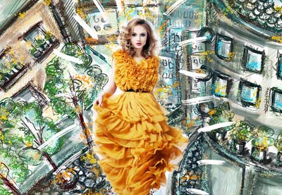
In this tutorial, you will learn how to create an amazing watercolor effect Photoshop action. I will explain everything in so much detail that everyone can create it, even those who have just opened Photoshop for the first time. 

The effect shown above is the one I will show you how to create in this tutorial. If you would like to create the even more advanced watercolor effects shown below, using just a single click and in only a few minutes, then check out my TechnicalArt 2 Photoshop Action.

Action final results watercolor effect Photoshop action

Looking for more watercolor resources? Check out our recommended actions, brushes and more:

What You’ll Need

To recreate the design above, you will need the following resources:

1. Let’s Get Started

First, open the photo that you want to work with. To open your photo, go to File > Open, choose your photo, and click Open. Now, before we get started, just check a couple of things:

  1. Your photo should be in RGB Color mode, 8 Bits/Channel. To check this, go to Image > Mode.
  2. For best results, your photo size should be 2000–4000 px wide/high. To check this, go to Image > Image Size.
  3. Your photo should be the Background layer. If it is not, go to Layer > New > Background from Layer.
Checking image size and mode

2. How to Create the Brushes

Step 1

In
this section, we are going to create the five watercolor brushes we’ll need.
You can either download the textures from the attachment and follow the process, or you can go to Ivan’s tutorial to learn how to create your own watercolor textures, or you can download my TechnicalArt 2 Photoshop Action and get over 60 high-quality and resolution watercolor brushes (in this case you can skip this whole section).

Step 2

If you’ve followed the first option and downloaded the textures, then open the first texture scan in Photoshop. Go to Edit > Define Brush to define this texture as a brush, and name it Temp_Brush_1.

Defining brush

Step 3

Open the second texture scan, go to Edit > Define Brush to define this texture as a brush, and name it Temp_Brush_2.

Defining brush

Step 4

Now open the third texture scan, go to Edit > Define Brush to define this texture as a brush, and name it Temp_Brush_3.

Defining brush

Step 5

Now open the fourth texture scan, go to Edit > Define Brush to define this texture as a brush, and name it Temp_Brush_4.

Defining brush

Step 6

Now open the last texture scan, go to Edit > Define Brush to define this texture as a brush, and name it Temp_Brush_5.

Defining brush

Step 7

Now that we have defined our brushes, we need to adjust their settings and then define them again as new brushes. Press B on your keyboard, Right-click anywhere inside the canvas, select the Temp_Brush_1 brush, and hit Enter. Then go to Window > Brush and, in the Brush window, use the settings below:

Adjusting brush settings

Step 8

To define this brush with new settings as a new brush, click on the top right icon in the bottom right corner of the Brush panel, and name it Watercolor_Brush_1.

Defining new brush

Step 9

Now press B on your keyboard, Right-click anywhere inside the canvas, select the Temp_Brush 2 brush, and hit Enter. Then go to Window > Brush and in the Brush window use the settings below:

Adjusting brush settings

Step 10

To define this brush with new settings as a new brush, click on the top right icon in the bottom right corner of the Brush panel, and name it Watercolor_Brush_2.

Defining new brush

Step 11

Now press B on your keyboard, Right-click anywhere inside the canvas, select the Temp_Brush_3 brush, and hit Enter. Then go to Window > Brush and in the Brush window use the settings below:

Adjusting brush settings

Step 12

To define this brush with new settings as a new brush, click on the top right icon in the bottom right corner of the Brush panel, and name it Watercolor_Brush_3.

Defining new brush

Step 13

Now press B on your keyboard, Right-click anywhere inside the canvas, select the Temp_Brush_4 brush, and hit Enter. Then go to Window > Brush and in the Brush window use the settings below:

Adjusting brush settings

Step 14

To define this brush with new settings as a new brush, click on the top right icon in the bottom right corner of the Brush panel, and name it Watercolor_Brush_4.

Defining new brush

Step 15

Now press B on your keyboard, Right-click anywhere inside the canvas, select the Temp_Brush_5 brush, and hit Enter. Then go to Window > Brush and in the Brush window use the settings below:

Adjusting brush settings

Step 16

To define this brush with new settings as a new brush, click on the top right icon in the bottom right corner of the Brush panel, and name it Watercolor_Brush_5.

Defining new brush

3. How to Create the Background

Step 1

In this section, we are going to create the background. Go to Layer > New Fill Layer > Solid Color to create a new solid color fill layer, name it Background color, and choose the color #e5e5e5.

Creating new solid color fill layer

Step 2

Now Right-click on this layer, choose Blending Options, check Gradient Overlay, and use the settings below:

Adding layer style

4. How to Create the Sketch

Step 1

In this step we are going to create the sketch. Select the Background layer and press Control-J on your keyboard to duplicate it. Then, drag this layer to the top of the layers in the Layers panel.

Duplicating layer

Step 2

Now press Control-Shift-U on your keyboard to desaturate this layer. Then, go to Filter > Filter Gallery > Stylize > Glowing Edges and set the Edge Width to 1, Edge Brightness to 20, and Smoothness to 15.

Adding glowing edges filter

Step 3

Press Control-I on your keyboard to invert this layer. Then, go to Filter > Sharpen > Unsharp Mask and set the Amount to 500%, Radius to 1 px, and Threshold to 0 levels.

Adding unsharp mask filter

Step 4

Change the Blending Mode of this layer to Multiply and set the Opacity to 47%. Then, name this layer Sketch.

Changing blending mode and opacity

5. How to Create the Watercolor Painting

Step 1

In this section we are going to create the watercolor painting. Go to Layer > New > Layer to create a new layer and name it Temp_1.

Creating new layer

Step 2

Now set the foreground color to #000000, choose the Brush Tool (B), and pick the Watercolor_Brush_1 brush. Then, adjust the Diameter of the brush as you like, and brush as shown below:

Brushing into layer

Step 3

Control-click on this layer thumbnail to make a selection of this layer. Then, hide this layer, select the Background layer, and press Control-J on your keyboard to create a new layer using the selection. After that, drag this new layer just below the Temp_1 layer in the Layers panel.

Creating new layer using selection

Step 4

Now change the Opacity of this layer to 56% and name it WP_1.

Changing opacity

Step 5

Go to Layer > New > Layer to create a new layer and name it Temp_2.

Creating new layer

Step 6

Now set the foreground color to #000000, choose the Brush Tool (B), and pick the Watercolor_Brush_2 brush. Then, adjust the Diameter of the brush as you like, and brush as shown below:

Brushing into layer

Step 7

Control-click on this layer thumbnail to make a selection of this layer. Then, hide this layer, select the Background layer, and press Control-J on your keyboard to create a new layer using the selection. After that, drag this new layer just below the WP_1 layer in the Layers panel.

Creating new layer using selection

Step 8

Now change the Opacity of this layer to 40% and name it WP_2.

Changing opacity

Step 9

Select the WP_1 layer, go to Layer > New > Layer to create a new layer, and name it Temp_3.

Creating new layer

Step 10

Now set the foreground color to #000000, choose the Brush Tool (B), and pick the Watercolor_Brush_3 brush. Then, adjust the Diameter of the brush as you like, and brush as shown below:

Brushing into layer

Step 11

Control-click on this layer thumbnail to make a selection of this layer. Then, hide this layer, select the Background layer, and press Control-J on your keyboard to create a new layer using the selection. After that, drag this new layer just below the WP_2 layer in the Layers panel.

Creating new layer using selection

Step 12

Now change the Opacity of this layer to 62% and name it WP_3.

Changing opacity

Step 13

Select the WP_1 layer, go to Layer > New > Layer to create a new layer, and name it Temp_4.

Creating new layer

Step 14

Now set the foreground color to #000000, choose the Brush Tool (B), and pick the Watercolor_Brush_4 brush. Then, adjust the Diameter of the brush as you like, and brush as shown below:

Brushing into layer

Step 15

Control-click on this layer thumbnail to make a selection of this layer. Then, hide this layer, select the Background layer, and press Control-J on your keyboard to create a new layer using the selection. After that, drag this new layer just below the WP_3 layer in the Layers panel.

Creating new layer using selection

Step 16

Now name this layer WP_4.

Changing layer name

Step 17

Select the WP_1 layer, go to Layer > New > Layer to create a new layer, and name it Temp_5.

Creating new layer

Step 18

Now set the foreground color to #000000, choose the Brush Tool (B), and pick the Watercolor_Brush_5 brush. Then, adjust the Diameter of the brush as you like, and brush as shown below:

Brushing into layer

Step 19

Control-click on this layer thumbnail to make a selection of this layer. Then, hide this layer, select the Background layer, and press Control-J on your keyboard to create a new layer using the selection. After that, drag this new layer just below the WP_4 layer in the Layers panel.

Creating new layer using selection

Step 20

Now name this layer WP_5.

Changing layer name

Step 21

Select the Temp_1 layer and Shift-click on the Temp_5 layer to select all layers between. Then, Right-click on any of the selected layers and choose Delete Layers.

Deleting layers

Step 22

Now select the WP_1 layer, go to Filter > Filter Gallery > Artistic > Watercolor, and set the Brush Detail to 14, Shadow Intensity to 0, and Texture to 1.

Adding watercolor filter

Step 23

Now repeat the previous step to apply the same filter to the remaining watercolor layers.

Adding watercolor filter

Step 24

Select the WP_1 layer and Shift-click on the WP_5 layer to select all layers between. Then, go to Layer > New > Group from Layers to create a new group from the selected layers and name it Watercolor Painting.

Creating new group from layers

6. How to Create the Texture

Step 1

In this step we are going to create the texture. Go to Layer > New > Layer to create a new layer and name it Texture.

Creating new layer

Step 2

Now go to Edit > Fill and set Contents to 50% Gray, Mode to Normal, and Opacity to 100%.

Filling layer

Step 3

Go to Filter > Filter Gallery > Texture > Texturizer and set the Texture to Canvas, Scaling to 200%, Relief to 4, and Light to Top as shown below:

Adding texturizer filter

Step 4

Now change the Blending Mode of this layer to Soft Light.

Changing blending mode

7. How to Make the Final Adjustments

Step 1

In this section, we are going to make final adjustments to the design. Go to Layer > New Adjustment Layer > Curves to create a new curves adjustment layer and name it Color_Look_1.

Creating new curves adjustment layer

Step 2

Now Double-click on this layer thumbnail and in the Properties panel enter the settings below:

Adjusting curves

Step 3

Change the Opacity of this layer to 46%.

Changing opacity

Step 4

Now select the Texture layer, go to Layer > New Adjustment Layer > Gradient Map to create a new gradient map adjustment layer, and name it Color_Look_2.

Creating new gradient map adjustment layer

Step 5

Double-click on this layer thumbnail, and then in the Properties panel, click on the gradient to open up the Gradient Editor panel and enter the settings below:

Adjusting gradient map
The left color stop has color 290a59, and the right color stop has color ff7c00.

Step 6

Now change the Blending Mode of this layer to Soft Light and set the Opacity to 33%.

Changing blending mode and opacity

Step 7

Select the Color_Look_1 layer and press D on your keyboard to reset the swatches. Then, go to Layer > New Adjustment Layer > Gradient Map to create a new gradient map adjustment layer and name it Overall Contrast.

Creating new gradient map adjustment layer

Step 8

Now change the Blending Mode of this layer to Soft Light and set the Opacity to 37%.

Changing blending mode and opacity

Step 9

Go to Layer > New Adjustment Layer > Vibrance to create a new vibrance adjustment layer and name it Overall Vibrance/Saturation.

Creating new vibrance adjustment layer

Step 10

Now Double-click on this layer thumbnail and in the Properties panel set the Vibrance to +33 and Saturation to +19.

Adjusting vibrance and saturation

Step 11

Now press Control-Alt-Shift-E on your keyboard to make a screenshot, and then press Control-Shift-U to desaturate this layer. Then, go to Filter > Other > High Pass and set the Radius to 2 px.

Adding high pass filter

Step 12

Change the Blending Mode of this layer to Hard Light and name it Overall Sharpening.

Changing blending mode

You Made It!

Congratulations, you have succeeded! Here is our final result:

Final result

If you would like to create the even more advanced watercolor effects
shown below, using just a single click and in only a few minutes, then
check out my TechnicalArt 2 Photoshop Action.

The
action works so you simply brush over your photo with a color and just
play the action. The action will do everything for you,
giving you fully
layered and customizable results. There are also over 60 high-quality watercolor brushes included with the
action that you can use to build the designs even further. The action
will also create four textures (watercolor, canvas, paper, and halftone)
and 25 preset color looks that you can choose from.

The action comes with a detailed video tutorial that demonstrates how to use the action and customize the results to get the most out of the effect.

Action final results

If you like watercolor photo effects, don’t forget to check out my Aquarelle Photoshop Action.

Using this action you can transform your photos into professional aquarelle artworks with no work at all! You just brush over your photo and play the action. The action will do all the work for you in just a couple of minutes, leaving you fully layered and customizable results.

The action is also made so that every time you run the action you will get a unique result,
even if you use the same brushed area. The action will always create
unique variations in the watercolor textures, so you can create an unlimited number of
results! The action also creates 50 preset color looks that you can choose from.

The action comes with a detailed video tutorial that demonstrates how to use the action and customize the results to get the most out of the effect.

Action final results watercolor effect Photoshop action

Loving the watercolor style? Find more similar content, here on Envato Tuts+:

How to Make Watercolor Effects in Photoshop Quickly With Actions

Post pobrano z: How to Make Watercolor Effects in Photoshop Quickly With Actions

Final product image
What You’ll Be Creating

In this tutorial, you will learn how to create an amazing watercolor effect Photoshop action. I will explain everything in so much detail that everyone can create it, even those who have just opened Photoshop for the first time. 

The effect shown above is the one I will show you how to create in this tutorial. If you would like to create the even more advanced watercolor effects shown below, using just a single click and in only a few minutes, then check out my TechnicalArt 2 Photoshop Action.

Action final results watercolor effect Photoshop action

Looking for more watercolor resources? Check out our recommended actions, brushes and more:

What You’ll Need

To recreate the design above, you will need the following resources:

1. Let’s Get Started

First, open the photo that you want to work with. To open your photo, go to File > Open, choose your photo, and click Open. Now, before we get started, just check a couple of things:

  1. Your photo should be in RGB Color mode, 8 Bits/Channel. To check this, go to Image > Mode.
  2. For best results, your photo size should be 2000–4000 px wide/high. To check this, go to Image > Image Size.
  3. Your photo should be the Background layer. If it is not, go to Layer > New > Background from Layer.
Checking image size and mode

2. How to Create the Brushes

Step 1

In
this section, we are going to create the five watercolor brushes we’ll need.
You can either download the textures from the attachment and follow the process, or you can go to Ivan’s tutorial to learn how to create your own watercolor textures, or you can download my TechnicalArt 2 Photoshop Action and get over 60 high-quality and resolution watercolor brushes (in this case you can skip this whole section).

Step 2

If you’ve followed the first option and downloaded the textures, then open the first texture scan in Photoshop. Go to Edit > Define Brush to define this texture as a brush, and name it Temp_Brush_1.

Defining brush

Step 3

Open the second texture scan, go to Edit > Define Brush to define this texture as a brush, and name it Temp_Brush_2.

Defining brush

Step 4

Now open the third texture scan, go to Edit > Define Brush to define this texture as a brush, and name it Temp_Brush_3.

Defining brush

Step 5

Now open the fourth texture scan, go to Edit > Define Brush to define this texture as a brush, and name it Temp_Brush_4.

Defining brush

Step 6

Now open the last texture scan, go to Edit > Define Brush to define this texture as a brush, and name it Temp_Brush_5.

Defining brush

Step 7

Now that we have defined our brushes, we need to adjust their settings and then define them again as new brushes. Press B on your keyboard, Right-click anywhere inside the canvas, select the Temp_Brush_1 brush, and hit Enter. Then go to Window > Brush and, in the Brush window, use the settings below:

Adjusting brush settings

Step 8

To define this brush with new settings as a new brush, click on the top right icon in the bottom right corner of the Brush panel, and name it Watercolor_Brush_1.

Defining new brush

Step 9

Now press B on your keyboard, Right-click anywhere inside the canvas, select the Temp_Brush 2 brush, and hit Enter. Then go to Window > Brush and in the Brush window use the settings below:

Adjusting brush settings

Step 10

To define this brush with new settings as a new brush, click on the top right icon in the bottom right corner of the Brush panel, and name it Watercolor_Brush_2.

Defining new brush

Step 11

Now press B on your keyboard, Right-click anywhere inside the canvas, select the Temp_Brush_3 brush, and hit Enter. Then go to Window > Brush and in the Brush window use the settings below:

Adjusting brush settings

Step 12

To define this brush with new settings as a new brush, click on the top right icon in the bottom right corner of the Brush panel, and name it Watercolor_Brush_3.

Defining new brush

Step 13

Now press B on your keyboard, Right-click anywhere inside the canvas, select the Temp_Brush_4 brush, and hit Enter. Then go to Window > Brush and in the Brush window use the settings below:

Adjusting brush settings

Step 14

To define this brush with new settings as a new brush, click on the top right icon in the bottom right corner of the Brush panel, and name it Watercolor_Brush_4.

Defining new brush

Step 15

Now press B on your keyboard, Right-click anywhere inside the canvas, select the Temp_Brush_5 brush, and hit Enter. Then go to Window > Brush and in the Brush window use the settings below:

Adjusting brush settings

Step 16

To define this brush with new settings as a new brush, click on the top right icon in the bottom right corner of the Brush panel, and name it Watercolor_Brush_5.

Defining new brush

3. How to Create the Background

Step 1

In this section, we are going to create the background. Go to Layer > New Fill Layer > Solid Color to create a new solid color fill layer, name it Background color, and choose the color #e5e5e5.

Creating new solid color fill layer

Step 2

Now Right-click on this layer, choose Blending Options, check Gradient Overlay, and use the settings below:

Adding layer style

4. How to Create the Sketch

Step 1

In this step we are going to create the sketch. Select the Background layer and press Control-J on your keyboard to duplicate it. Then, drag this layer to the top of the layers in the Layers panel.

Duplicating layer

Step 2

Now press Control-Shift-U on your keyboard to desaturate this layer. Then, go to Filter > Filter Gallery > Stylize > Glowing Edges and set the Edge Width to 1, Edge Brightness to 20, and Smoothness to 15.

Adding glowing edges filter

Step 3

Press Control-I on your keyboard to invert this layer. Then, go to Filter > Sharpen > Unsharp Mask and set the Amount to 500%, Radius to 1 px, and Threshold to 0 levels.

Adding unsharp mask filter

Step 4

Change the Blending Mode of this layer to Multiply and set the Opacity to 47%. Then, name this layer Sketch.

Changing blending mode and opacity

5. How to Create the Watercolor Painting

Step 1

In this section we are going to create the watercolor painting. Go to Layer > New > Layer to create a new layer and name it Temp_1.

Creating new layer

Step 2

Now set the foreground color to #000000, choose the Brush Tool (B), and pick the Watercolor_Brush_1 brush. Then, adjust the Diameter of the brush as you like, and brush as shown below:

Brushing into layer

Step 3

Control-click on this layer thumbnail to make a selection of this layer. Then, hide this layer, select the Background layer, and press Control-J on your keyboard to create a new layer using the selection. After that, drag this new layer just below the Temp_1 layer in the Layers panel.

Creating new layer using selection

Step 4

Now change the Opacity of this layer to 56% and name it WP_1.

Changing opacity

Step 5

Go to Layer > New > Layer to create a new layer and name it Temp_2.

Creating new layer

Step 6

Now set the foreground color to #000000, choose the Brush Tool (B), and pick the Watercolor_Brush_2 brush. Then, adjust the Diameter of the brush as you like, and brush as shown below:

Brushing into layer

Step 7

Control-click on this layer thumbnail to make a selection of this layer. Then, hide this layer, select the Background layer, and press Control-J on your keyboard to create a new layer using the selection. After that, drag this new layer just below the WP_1 layer in the Layers panel.

Creating new layer using selection

Step 8

Now change the Opacity of this layer to 40% and name it WP_2.

Changing opacity

Step 9

Select the WP_1 layer, go to Layer > New > Layer to create a new layer, and name it Temp_3.

Creating new layer

Step 10

Now set the foreground color to #000000, choose the Brush Tool (B), and pick the Watercolor_Brush_3 brush. Then, adjust the Diameter of the brush as you like, and brush as shown below:

Brushing into layer

Step 11

Control-click on this layer thumbnail to make a selection of this layer. Then, hide this layer, select the Background layer, and press Control-J on your keyboard to create a new layer using the selection. After that, drag this new layer just below the WP_2 layer in the Layers panel.

Creating new layer using selection

Step 12

Now change the Opacity of this layer to 62% and name it WP_3.

Changing opacity

Step 13

Select the WP_1 layer, go to Layer > New > Layer to create a new layer, and name it Temp_4.

Creating new layer

Step 14

Now set the foreground color to #000000, choose the Brush Tool (B), and pick the Watercolor_Brush_4 brush. Then, adjust the Diameter of the brush as you like, and brush as shown below:

Brushing into layer

Step 15

Control-click on this layer thumbnail to make a selection of this layer. Then, hide this layer, select the Background layer, and press Control-J on your keyboard to create a new layer using the selection. After that, drag this new layer just below the WP_3 layer in the Layers panel.

Creating new layer using selection

Step 16

Now name this layer WP_4.

Changing layer name

Step 17

Select the WP_1 layer, go to Layer > New > Layer to create a new layer, and name it Temp_5.

Creating new layer

Step 18

Now set the foreground color to #000000, choose the Brush Tool (B), and pick the Watercolor_Brush_5 brush. Then, adjust the Diameter of the brush as you like, and brush as shown below:

Brushing into layer

Step 19

Control-click on this layer thumbnail to make a selection of this layer. Then, hide this layer, select the Background layer, and press Control-J on your keyboard to create a new layer using the selection. After that, drag this new layer just below the WP_4 layer in the Layers panel.

Creating new layer using selection

Step 20

Now name this layer WP_5.

Changing layer name

Step 21

Select the Temp_1 layer and Shift-click on the Temp_5 layer to select all layers between. Then, Right-click on any of the selected layers and choose Delete Layers.

Deleting layers

Step 22

Now select the WP_1 layer, go to Filter > Filter Gallery > Artistic > Watercolor, and set the Brush Detail to 14, Shadow Intensity to 0, and Texture to 1.

Adding watercolor filter

Step 23

Now repeat the previous step to apply the same filter to the remaining watercolor layers.

Adding watercolor filter

Step 24

Select the WP_1 layer and Shift-click on the WP_5 layer to select all layers between. Then, go to Layer > New > Group from Layers to create a new group from the selected layers and name it Watercolor Painting.

Creating new group from layers

6. How to Create the Texture

Step 1

In this step we are going to create the texture. Go to Layer > New > Layer to create a new layer and name it Texture.

Creating new layer

Step 2

Now go to Edit > Fill and set Contents to 50% Gray, Mode to Normal, and Opacity to 100%.

Filling layer

Step 3

Go to Filter > Filter Gallery > Texture > Texturizer and set the Texture to Canvas, Scaling to 200%, Relief to 4, and Light to Top as shown below:

Adding texturizer filter

Step 4

Now change the Blending Mode of this layer to Soft Light.

Changing blending mode

7. How to Make the Final Adjustments

Step 1

In this section, we are going to make final adjustments to the design. Go to Layer > New Adjustment Layer > Curves to create a new curves adjustment layer and name it Color_Look_1.

Creating new curves adjustment layer

Step 2

Now Double-click on this layer thumbnail and in the Properties panel enter the settings below:

Adjusting curves

Step 3

Change the Opacity of this layer to 46%.

Changing opacity

Step 4

Now select the Texture layer, go to Layer > New Adjustment Layer > Gradient Map to create a new gradient map adjustment layer, and name it Color_Look_2.

Creating new gradient map adjustment layer

Step 5

Double-click on this layer thumbnail, and then in the Properties panel, click on the gradient to open up the Gradient Editor panel and enter the settings below:

Adjusting gradient map
The left color stop has color 290a59, and the right color stop has color ff7c00.

Step 6

Now change the Blending Mode of this layer to Soft Light and set the Opacity to 33%.

Changing blending mode and opacity

Step 7

Select the Color_Look_1 layer and press D on your keyboard to reset the swatches. Then, go to Layer > New Adjustment Layer > Gradient Map to create a new gradient map adjustment layer and name it Overall Contrast.

Creating new gradient map adjustment layer

Step 8

Now change the Blending Mode of this layer to Soft Light and set the Opacity to 37%.

Changing blending mode and opacity

Step 9

Go to Layer > New Adjustment Layer > Vibrance to create a new vibrance adjustment layer and name it Overall Vibrance/Saturation.

Creating new vibrance adjustment layer

Step 10

Now Double-click on this layer thumbnail and in the Properties panel set the Vibrance to +33 and Saturation to +19.

Adjusting vibrance and saturation

Step 11

Now press Control-Alt-Shift-E on your keyboard to make a screenshot, and then press Control-Shift-U to desaturate this layer. Then, go to Filter > Other > High Pass and set the Radius to 2 px.

Adding high pass filter

Step 12

Change the Blending Mode of this layer to Hard Light and name it Overall Sharpening.

Changing blending mode

You Made It!

Congratulations, you have succeeded! Here is our final result:

Final result

If you would like to create the even more advanced watercolor effects
shown below, using just a single click and in only a few minutes, then
check out my TechnicalArt 2 Photoshop Action.

The
action works so you simply brush over your photo with a color and just
play the action. The action will do everything for you,
giving you fully
layered and customizable results. There are also over 60 high-quality watercolor brushes included with the
action that you can use to build the designs even further. The action
will also create four textures (watercolor, canvas, paper, and halftone)
and 25 preset color looks that you can choose from.

The action comes with a detailed video tutorial that demonstrates how to use the action and customize the results to get the most out of the effect.

Action final results

If you like watercolor photo effects, don’t forget to check out my Aquarelle Photoshop Action.

Using this action you can transform your photos into professional aquarelle artworks with no work at all! You just brush over your photo and play the action. The action will do all the work for you in just a couple of minutes, leaving you fully layered and customizable results.

The action is also made so that every time you run the action you will get a unique result,
even if you use the same brushed area. The action will always create
unique variations in the watercolor textures, so you can create an unlimited number of
results! The action also creates 50 preset color looks that you can choose from.

The action comes with a detailed video tutorial that demonstrates how to use the action and customize the results to get the most out of the effect.

Action final results watercolor effect Photoshop action

Loving the watercolor style? Find more similar content, here on Envato Tuts+:

How to Make Watercolor Effects in Photoshop Quickly With Actions

Post pobrano z: How to Make Watercolor Effects in Photoshop Quickly With Actions

Final product image
What You’ll Be Creating

In this tutorial, you will learn how to create an amazing watercolor effect Photoshop action. I will explain everything in so much detail that everyone can create it, even those who have just opened Photoshop for the first time. 

The effect shown above is the one I will show you how to create in this tutorial. If you would like to create the even more advanced watercolor effects shown below, using just a single click and in only a few minutes, then check out my TechnicalArt 2 Photoshop Action.

Action final results watercolor effect Photoshop action

Looking for more watercolor resources? Check out our recommended actions, brushes and more:

What You’ll Need

To recreate the design above, you will need the following resources:

1. Let’s Get Started

First, open the photo that you want to work with. To open your photo, go to File > Open, choose your photo, and click Open. Now, before we get started, just check a couple of things:

  1. Your photo should be in RGB Color mode, 8 Bits/Channel. To check this, go to Image > Mode.
  2. For best results, your photo size should be 2000–4000 px wide/high. To check this, go to Image > Image Size.
  3. Your photo should be the Background layer. If it is not, go to Layer > New > Background from Layer.
Checking image size and mode

2. How to Create the Brushes

Step 1

In
this section, we are going to create the five watercolor brushes we’ll need.
You can either download the textures from the attachment and follow the process, or you can go to Ivan’s tutorial to learn how to create your own watercolor textures, or you can download my TechnicalArt 2 Photoshop Action and get over 60 high-quality and resolution watercolor brushes (in this case you can skip this whole section).

Step 2

If you’ve followed the first option and downloaded the textures, then open the first texture scan in Photoshop. Go to Edit > Define Brush to define this texture as a brush, and name it Temp_Brush_1.

Defining brush

Step 3

Open the second texture scan, go to Edit > Define Brush to define this texture as a brush, and name it Temp_Brush_2.

Defining brush

Step 4

Now open the third texture scan, go to Edit > Define Brush to define this texture as a brush, and name it Temp_Brush_3.

Defining brush

Step 5

Now open the fourth texture scan, go to Edit > Define Brush to define this texture as a brush, and name it Temp_Brush_4.

Defining brush

Step 6

Now open the last texture scan, go to Edit > Define Brush to define this texture as a brush, and name it Temp_Brush_5.

Defining brush

Step 7

Now that we have defined our brushes, we need to adjust their settings and then define them again as new brushes. Press B on your keyboard, Right-click anywhere inside the canvas, select the Temp_Brush_1 brush, and hit Enter. Then go to Window > Brush and, in the Brush window, use the settings below:

Adjusting brush settings

Step 8

To define this brush with new settings as a new brush, click on the top right icon in the bottom right corner of the Brush panel, and name it Watercolor_Brush_1.

Defining new brush

Step 9

Now press B on your keyboard, Right-click anywhere inside the canvas, select the Temp_Brush 2 brush, and hit Enter. Then go to Window > Brush and in the Brush window use the settings below:

Adjusting brush settings

Step 10

To define this brush with new settings as a new brush, click on the top right icon in the bottom right corner of the Brush panel, and name it Watercolor_Brush_2.

Defining new brush

Step 11

Now press B on your keyboard, Right-click anywhere inside the canvas, select the Temp_Brush_3 brush, and hit Enter. Then go to Window > Brush and in the Brush window use the settings below:

Adjusting brush settings

Step 12

To define this brush with new settings as a new brush, click on the top right icon in the bottom right corner of the Brush panel, and name it Watercolor_Brush_3.

Defining new brush

Step 13

Now press B on your keyboard, Right-click anywhere inside the canvas, select the Temp_Brush_4 brush, and hit Enter. Then go to Window > Brush and in the Brush window use the settings below:

Adjusting brush settings

Step 14

To define this brush with new settings as a new brush, click on the top right icon in the bottom right corner of the Brush panel, and name it Watercolor_Brush_4.

Defining new brush

Step 15

Now press B on your keyboard, Right-click anywhere inside the canvas, select the Temp_Brush_5 brush, and hit Enter. Then go to Window > Brush and in the Brush window use the settings below:

Adjusting brush settings

Step 16

To define this brush with new settings as a new brush, click on the top right icon in the bottom right corner of the Brush panel, and name it Watercolor_Brush_5.

Defining new brush

3. How to Create the Background

Step 1

In this section, we are going to create the background. Go to Layer > New Fill Layer > Solid Color to create a new solid color fill layer, name it Background color, and choose the color #e5e5e5.

Creating new solid color fill layer

Step 2

Now Right-click on this layer, choose Blending Options, check Gradient Overlay, and use the settings below:

Adding layer style

4. How to Create the Sketch

Step 1

In this step we are going to create the sketch. Select the Background layer and press Control-J on your keyboard to duplicate it. Then, drag this layer to the top of the layers in the Layers panel.

Duplicating layer

Step 2

Now press Control-Shift-U on your keyboard to desaturate this layer. Then, go to Filter > Filter Gallery > Stylize > Glowing Edges and set the Edge Width to 1, Edge Brightness to 20, and Smoothness to 15.

Adding glowing edges filter

Step 3

Press Control-I on your keyboard to invert this layer. Then, go to Filter > Sharpen > Unsharp Mask and set the Amount to 500%, Radius to 1 px, and Threshold to 0 levels.

Adding unsharp mask filter

Step 4

Change the Blending Mode of this layer to Multiply and set the Opacity to 47%. Then, name this layer Sketch.

Changing blending mode and opacity

5. How to Create the Watercolor Painting

Step 1

In this section we are going to create the watercolor painting. Go to Layer > New > Layer to create a new layer and name it Temp_1.

Creating new layer

Step 2

Now set the foreground color to #000000, choose the Brush Tool (B), and pick the Watercolor_Brush_1 brush. Then, adjust the Diameter of the brush as you like, and brush as shown below:

Brushing into layer

Step 3

Control-click on this layer thumbnail to make a selection of this layer. Then, hide this layer, select the Background layer, and press Control-J on your keyboard to create a new layer using the selection. After that, drag this new layer just below the Temp_1 layer in the Layers panel.

Creating new layer using selection

Step 4

Now change the Opacity of this layer to 56% and name it WP_1.

Changing opacity

Step 5

Go to Layer > New > Layer to create a new layer and name it Temp_2.

Creating new layer

Step 6

Now set the foreground color to #000000, choose the Brush Tool (B), and pick the Watercolor_Brush_2 brush. Then, adjust the Diameter of the brush as you like, and brush as shown below:

Brushing into layer

Step 7

Control-click on this layer thumbnail to make a selection of this layer. Then, hide this layer, select the Background layer, and press Control-J on your keyboard to create a new layer using the selection. After that, drag this new layer just below the WP_1 layer in the Layers panel.

Creating new layer using selection

Step 8

Now change the Opacity of this layer to 40% and name it WP_2.

Changing opacity

Step 9

Select the WP_1 layer, go to Layer > New > Layer to create a new layer, and name it Temp_3.

Creating new layer

Step 10

Now set the foreground color to #000000, choose the Brush Tool (B), and pick the Watercolor_Brush_3 brush. Then, adjust the Diameter of the brush as you like, and brush as shown below:

Brushing into layer

Step 11

Control-click on this layer thumbnail to make a selection of this layer. Then, hide this layer, select the Background layer, and press Control-J on your keyboard to create a new layer using the selection. After that, drag this new layer just below the WP_2 layer in the Layers panel.

Creating new layer using selection

Step 12

Now change the Opacity of this layer to 62% and name it WP_3.

Changing opacity

Step 13

Select the WP_1 layer, go to Layer > New > Layer to create a new layer, and name it Temp_4.

Creating new layer

Step 14

Now set the foreground color to #000000, choose the Brush Tool (B), and pick the Watercolor_Brush_4 brush. Then, adjust the Diameter of the brush as you like, and brush as shown below:

Brushing into layer

Step 15

Control-click on this layer thumbnail to make a selection of this layer. Then, hide this layer, select the Background layer, and press Control-J on your keyboard to create a new layer using the selection. After that, drag this new layer just below the WP_3 layer in the Layers panel.

Creating new layer using selection

Step 16

Now name this layer WP_4.

Changing layer name

Step 17

Select the WP_1 layer, go to Layer > New > Layer to create a new layer, and name it Temp_5.

Creating new layer

Step 18

Now set the foreground color to #000000, choose the Brush Tool (B), and pick the Watercolor_Brush_5 brush. Then, adjust the Diameter of the brush as you like, and brush as shown below:

Brushing into layer

Step 19

Control-click on this layer thumbnail to make a selection of this layer. Then, hide this layer, select the Background layer, and press Control-J on your keyboard to create a new layer using the selection. After that, drag this new layer just below the WP_4 layer in the Layers panel.

Creating new layer using selection

Step 20

Now name this layer WP_5.

Changing layer name

Step 21

Select the Temp_1 layer and Shift-click on the Temp_5 layer to select all layers between. Then, Right-click on any of the selected layers and choose Delete Layers.

Deleting layers

Step 22

Now select the WP_1 layer, go to Filter > Filter Gallery > Artistic > Watercolor, and set the Brush Detail to 14, Shadow Intensity to 0, and Texture to 1.

Adding watercolor filter

Step 23

Now repeat the previous step to apply the same filter to the remaining watercolor layers.

Adding watercolor filter

Step 24

Select the WP_1 layer and Shift-click on the WP_5 layer to select all layers between. Then, go to Layer > New > Group from Layers to create a new group from the selected layers and name it Watercolor Painting.

Creating new group from layers

6. How to Create the Texture

Step 1

In this step we are going to create the texture. Go to Layer > New > Layer to create a new layer and name it Texture.

Creating new layer

Step 2

Now go to Edit > Fill and set Contents to 50% Gray, Mode to Normal, and Opacity to 100%.

Filling layer

Step 3

Go to Filter > Filter Gallery > Texture > Texturizer and set the Texture to Canvas, Scaling to 200%, Relief to 4, and Light to Top as shown below:

Adding texturizer filter

Step 4

Now change the Blending Mode of this layer to Soft Light.

Changing blending mode

7. How to Make the Final Adjustments

Step 1

In this section, we are going to make final adjustments to the design. Go to Layer > New Adjustment Layer > Curves to create a new curves adjustment layer and name it Color_Look_1.

Creating new curves adjustment layer

Step 2

Now Double-click on this layer thumbnail and in the Properties panel enter the settings below:

Adjusting curves

Step 3

Change the Opacity of this layer to 46%.

Changing opacity

Step 4

Now select the Texture layer, go to Layer > New Adjustment Layer > Gradient Map to create a new gradient map adjustment layer, and name it Color_Look_2.

Creating new gradient map adjustment layer

Step 5

Double-click on this layer thumbnail, and then in the Properties panel, click on the gradient to open up the Gradient Editor panel and enter the settings below:

Adjusting gradient map
The left color stop has color 290a59, and the right color stop has color ff7c00.

Step 6

Now change the Blending Mode of this layer to Soft Light and set the Opacity to 33%.

Changing blending mode and opacity

Step 7

Select the Color_Look_1 layer and press D on your keyboard to reset the swatches. Then, go to Layer > New Adjustment Layer > Gradient Map to create a new gradient map adjustment layer and name it Overall Contrast.

Creating new gradient map adjustment layer

Step 8

Now change the Blending Mode of this layer to Soft Light and set the Opacity to 37%.

Changing blending mode and opacity

Step 9

Go to Layer > New Adjustment Layer > Vibrance to create a new vibrance adjustment layer and name it Overall Vibrance/Saturation.

Creating new vibrance adjustment layer

Step 10

Now Double-click on this layer thumbnail and in the Properties panel set the Vibrance to +33 and Saturation to +19.

Adjusting vibrance and saturation

Step 11

Now press Control-Alt-Shift-E on your keyboard to make a screenshot, and then press Control-Shift-U to desaturate this layer. Then, go to Filter > Other > High Pass and set the Radius to 2 px.

Adding high pass filter

Step 12

Change the Blending Mode of this layer to Hard Light and name it Overall Sharpening.

Changing blending mode

You Made It!

Congratulations, you have succeeded! Here is our final result:

Final result

If you would like to create the even more advanced watercolor effects
shown below, using just a single click and in only a few minutes, then
check out my TechnicalArt 2 Photoshop Action.

The
action works so you simply brush over your photo with a color and just
play the action. The action will do everything for you,
giving you fully
layered and customizable results. There are also over 60 high-quality watercolor brushes included with the
action that you can use to build the designs even further. The action
will also create four textures (watercolor, canvas, paper, and halftone)
and 25 preset color looks that you can choose from.

The action comes with a detailed video tutorial that demonstrates how to use the action and customize the results to get the most out of the effect.

Action final results

If you like watercolor photo effects, don’t forget to check out my Aquarelle Photoshop Action.

Using this action you can transform your photos into professional aquarelle artworks with no work at all! You just brush over your photo and play the action. The action will do all the work for you in just a couple of minutes, leaving you fully layered and customizable results.

The action is also made so that every time you run the action you will get a unique result,
even if you use the same brushed area. The action will always create
unique variations in the watercolor textures, so you can create an unlimited number of
results! The action also creates 50 preset color looks that you can choose from.

The action comes with a detailed video tutorial that demonstrates how to use the action and customize the results to get the most out of the effect.

Action final results watercolor effect Photoshop action

Loving the watercolor style? Find more similar content, here on Envato Tuts+:

How to Make Watercolor Effects in Photoshop Quickly With Actions

Post pobrano z: How to Make Watercolor Effects in Photoshop Quickly With Actions

Final product image
What You’ll Be Creating

In this tutorial, you will learn how to create an amazing watercolor effect Photoshop action. I will explain everything in so much detail that everyone can create it, even those who have just opened Photoshop for the first time. 

The effect shown above is the one I will show you how to create in this tutorial. If you would like to create the even more advanced watercolor effects shown below, using just a single click and in only a few minutes, then check out my TechnicalArt 2 Photoshop Action.

Action final results watercolor effect Photoshop action

Looking for more watercolor resources? Check out our recommended actions, brushes and more:

What You’ll Need

To recreate the design above, you will need the following resources:

1. Let’s Get Started

First, open the photo that you want to work with. To open your photo, go to File > Open, choose your photo, and click Open. Now, before we get started, just check a couple of things:

  1. Your photo should be in RGB Color mode, 8 Bits/Channel. To check this, go to Image > Mode.
  2. For best results, your photo size should be 2000–4000 px wide/high. To check this, go to Image > Image Size.
  3. Your photo should be the Background layer. If it is not, go to Layer > New > Background from Layer.
Checking image size and mode

2. How to Create the Brushes

Step 1

In
this section, we are going to create the five watercolor brushes we’ll need.
You can either download the textures from the attachment and follow the process, or you can go to Ivan’s tutorial to learn how to create your own watercolor textures, or you can download my TechnicalArt 2 Photoshop Action and get over 60 high-quality and resolution watercolor brushes (in this case you can skip this whole section).

Step 2

If you’ve followed the first option and downloaded the textures, then open the first texture scan in Photoshop. Go to Edit > Define Brush to define this texture as a brush, and name it Temp_Brush_1.

Defining brush

Step 3

Open the second texture scan, go to Edit > Define Brush to define this texture as a brush, and name it Temp_Brush_2.

Defining brush

Step 4

Now open the third texture scan, go to Edit > Define Brush to define this texture as a brush, and name it Temp_Brush_3.

Defining brush

Step 5

Now open the fourth texture scan, go to Edit > Define Brush to define this texture as a brush, and name it Temp_Brush_4.

Defining brush

Step 6

Now open the last texture scan, go to Edit > Define Brush to define this texture as a brush, and name it Temp_Brush_5.

Defining brush

Step 7

Now that we have defined our brushes, we need to adjust their settings and then define them again as new brushes. Press B on your keyboard, Right-click anywhere inside the canvas, select the Temp_Brush_1 brush, and hit Enter. Then go to Window > Brush and, in the Brush window, use the settings below:

Adjusting brush settings

Step 8

To define this brush with new settings as a new brush, click on the top right icon in the bottom right corner of the Brush panel, and name it Watercolor_Brush_1.

Defining new brush

Step 9

Now press B on your keyboard, Right-click anywhere inside the canvas, select the Temp_Brush 2 brush, and hit Enter. Then go to Window > Brush and in the Brush window use the settings below:

Adjusting brush settings

Step 10

To define this brush with new settings as a new brush, click on the top right icon in the bottom right corner of the Brush panel, and name it Watercolor_Brush_2.

Defining new brush

Step 11

Now press B on your keyboard, Right-click anywhere inside the canvas, select the Temp_Brush_3 brush, and hit Enter. Then go to Window > Brush and in the Brush window use the settings below:

Adjusting brush settings

Step 12

To define this brush with new settings as a new brush, click on the top right icon in the bottom right corner of the Brush panel, and name it Watercolor_Brush_3.

Defining new brush

Step 13

Now press B on your keyboard, Right-click anywhere inside the canvas, select the Temp_Brush_4 brush, and hit Enter. Then go to Window > Brush and in the Brush window use the settings below:

Adjusting brush settings

Step 14

To define this brush with new settings as a new brush, click on the top right icon in the bottom right corner of the Brush panel, and name it Watercolor_Brush_4.

Defining new brush

Step 15

Now press B on your keyboard, Right-click anywhere inside the canvas, select the Temp_Brush_5 brush, and hit Enter. Then go to Window > Brush and in the Brush window use the settings below:

Adjusting brush settings

Step 16

To define this brush with new settings as a new brush, click on the top right icon in the bottom right corner of the Brush panel, and name it Watercolor_Brush_5.

Defining new brush

3. How to Create the Background

Step 1

In this section, we are going to create the background. Go to Layer > New Fill Layer > Solid Color to create a new solid color fill layer, name it Background color, and choose the color #e5e5e5.

Creating new solid color fill layer

Step 2

Now Right-click on this layer, choose Blending Options, check Gradient Overlay, and use the settings below:

Adding layer style

4. How to Create the Sketch

Step 1

In this step we are going to create the sketch. Select the Background layer and press Control-J on your keyboard to duplicate it. Then, drag this layer to the top of the layers in the Layers panel.

Duplicating layer

Step 2

Now press Control-Shift-U on your keyboard to desaturate this layer. Then, go to Filter > Filter Gallery > Stylize > Glowing Edges and set the Edge Width to 1, Edge Brightness to 20, and Smoothness to 15.

Adding glowing edges filter

Step 3

Press Control-I on your keyboard to invert this layer. Then, go to Filter > Sharpen > Unsharp Mask and set the Amount to 500%, Radius to 1 px, and Threshold to 0 levels.

Adding unsharp mask filter

Step 4

Change the Blending Mode of this layer to Multiply and set the Opacity to 47%. Then, name this layer Sketch.

Changing blending mode and opacity

5. How to Create the Watercolor Painting

Step 1

In this section we are going to create the watercolor painting. Go to Layer > New > Layer to create a new layer and name it Temp_1.

Creating new layer

Step 2

Now set the foreground color to #000000, choose the Brush Tool (B), and pick the Watercolor_Brush_1 brush. Then, adjust the Diameter of the brush as you like, and brush as shown below:

Brushing into layer

Step 3

Control-click on this layer thumbnail to make a selection of this layer. Then, hide this layer, select the Background layer, and press Control-J on your keyboard to create a new layer using the selection. After that, drag this new layer just below the Temp_1 layer in the Layers panel.

Creating new layer using selection

Step 4

Now change the Opacity of this layer to 56% and name it WP_1.

Changing opacity

Step 5

Go to Layer > New > Layer to create a new layer and name it Temp_2.

Creating new layer

Step 6

Now set the foreground color to #000000, choose the Brush Tool (B), and pick the Watercolor_Brush_2 brush. Then, adjust the Diameter of the brush as you like, and brush as shown below:

Brushing into layer

Step 7

Control-click on this layer thumbnail to make a selection of this layer. Then, hide this layer, select the Background layer, and press Control-J on your keyboard to create a new layer using the selection. After that, drag this new layer just below the WP_1 layer in the Layers panel.

Creating new layer using selection

Step 8

Now change the Opacity of this layer to 40% and name it WP_2.

Changing opacity

Step 9

Select the WP_1 layer, go to Layer > New > Layer to create a new layer, and name it Temp_3.

Creating new layer

Step 10

Now set the foreground color to #000000, choose the Brush Tool (B), and pick the Watercolor_Brush_3 brush. Then, adjust the Diameter of the brush as you like, and brush as shown below:

Brushing into layer

Step 11

Control-click on this layer thumbnail to make a selection of this layer. Then, hide this layer, select the Background layer, and press Control-J on your keyboard to create a new layer using the selection. After that, drag this new layer just below the WP_2 layer in the Layers panel.

Creating new layer using selection

Step 12

Now change the Opacity of this layer to 62% and name it WP_3.

Changing opacity

Step 13

Select the WP_1 layer, go to Layer > New > Layer to create a new layer, and name it Temp_4.

Creating new layer

Step 14

Now set the foreground color to #000000, choose the Brush Tool (B), and pick the Watercolor_Brush_4 brush. Then, adjust the Diameter of the brush as you like, and brush as shown below:

Brushing into layer

Step 15

Control-click on this layer thumbnail to make a selection of this layer. Then, hide this layer, select the Background layer, and press Control-J on your keyboard to create a new layer using the selection. After that, drag this new layer just below the WP_3 layer in the Layers panel.

Creating new layer using selection

Step 16

Now name this layer WP_4.

Changing layer name

Step 17

Select the WP_1 layer, go to Layer > New > Layer to create a new layer, and name it Temp_5.

Creating new layer

Step 18

Now set the foreground color to #000000, choose the Brush Tool (B), and pick the Watercolor_Brush_5 brush. Then, adjust the Diameter of the brush as you like, and brush as shown below:

Brushing into layer

Step 19

Control-click on this layer thumbnail to make a selection of this layer. Then, hide this layer, select the Background layer, and press Control-J on your keyboard to create a new layer using the selection. After that, drag this new layer just below the WP_4 layer in the Layers panel.

Creating new layer using selection

Step 20

Now name this layer WP_5.

Changing layer name

Step 21

Select the Temp_1 layer and Shift-click on the Temp_5 layer to select all layers between. Then, Right-click on any of the selected layers and choose Delete Layers.

Deleting layers

Step 22

Now select the WP_1 layer, go to Filter > Filter Gallery > Artistic > Watercolor, and set the Brush Detail to 14, Shadow Intensity to 0, and Texture to 1.

Adding watercolor filter

Step 23

Now repeat the previous step to apply the same filter to the remaining watercolor layers.

Adding watercolor filter

Step 24

Select the WP_1 layer and Shift-click on the WP_5 layer to select all layers between. Then, go to Layer > New > Group from Layers to create a new group from the selected layers and name it Watercolor Painting.

Creating new group from layers

6. How to Create the Texture

Step 1

In this step we are going to create the texture. Go to Layer > New > Layer to create a new layer and name it Texture.

Creating new layer

Step 2

Now go to Edit > Fill and set Contents to 50% Gray, Mode to Normal, and Opacity to 100%.

Filling layer

Step 3

Go to Filter > Filter Gallery > Texture > Texturizer and set the Texture to Canvas, Scaling to 200%, Relief to 4, and Light to Top as shown below:

Adding texturizer filter

Step 4

Now change the Blending Mode of this layer to Soft Light.

Changing blending mode

7. How to Make the Final Adjustments

Step 1

In this section, we are going to make final adjustments to the design. Go to Layer > New Adjustment Layer > Curves to create a new curves adjustment layer and name it Color_Look_1.

Creating new curves adjustment layer

Step 2

Now Double-click on this layer thumbnail and in the Properties panel enter the settings below:

Adjusting curves

Step 3

Change the Opacity of this layer to 46%.

Changing opacity

Step 4

Now select the Texture layer, go to Layer > New Adjustment Layer > Gradient Map to create a new gradient map adjustment layer, and name it Color_Look_2.

Creating new gradient map adjustment layer

Step 5

Double-click on this layer thumbnail, and then in the Properties panel, click on the gradient to open up the Gradient Editor panel and enter the settings below:

Adjusting gradient map
The left color stop has color 290a59, and the right color stop has color ff7c00.

Step 6

Now change the Blending Mode of this layer to Soft Light and set the Opacity to 33%.

Changing blending mode and opacity

Step 7

Select the Color_Look_1 layer and press D on your keyboard to reset the swatches. Then, go to Layer > New Adjustment Layer > Gradient Map to create a new gradient map adjustment layer and name it Overall Contrast.

Creating new gradient map adjustment layer

Step 8

Now change the Blending Mode of this layer to Soft Light and set the Opacity to 37%.

Changing blending mode and opacity

Step 9

Go to Layer > New Adjustment Layer > Vibrance to create a new vibrance adjustment layer and name it Overall Vibrance/Saturation.

Creating new vibrance adjustment layer

Step 10

Now Double-click on this layer thumbnail and in the Properties panel set the Vibrance to +33 and Saturation to +19.

Adjusting vibrance and saturation

Step 11

Now press Control-Alt-Shift-E on your keyboard to make a screenshot, and then press Control-Shift-U to desaturate this layer. Then, go to Filter > Other > High Pass and set the Radius to 2 px.

Adding high pass filter

Step 12

Change the Blending Mode of this layer to Hard Light and name it Overall Sharpening.

Changing blending mode

You Made It!

Congratulations, you have succeeded! Here is our final result:

Final result

If you would like to create the even more advanced watercolor effects
shown below, using just a single click and in only a few minutes, then
check out my TechnicalArt 2 Photoshop Action.

The
action works so you simply brush over your photo with a color and just
play the action. The action will do everything for you,
giving you fully
layered and customizable results. There are also over 60 high-quality watercolor brushes included with the
action that you can use to build the designs even further. The action
will also create four textures (watercolor, canvas, paper, and halftone)
and 25 preset color looks that you can choose from.

The action comes with a detailed video tutorial that demonstrates how to use the action and customize the results to get the most out of the effect.

Action final results

If you like watercolor photo effects, don’t forget to check out my Aquarelle Photoshop Action.

Using this action you can transform your photos into professional aquarelle artworks with no work at all! You just brush over your photo and play the action. The action will do all the work for you in just a couple of minutes, leaving you fully layered and customizable results.

The action is also made so that every time you run the action you will get a unique result,
even if you use the same brushed area. The action will always create
unique variations in the watercolor textures, so you can create an unlimited number of
results! The action also creates 50 preset color looks that you can choose from.

The action comes with a detailed video tutorial that demonstrates how to use the action and customize the results to get the most out of the effect.

Action final results watercolor effect Photoshop action

Loving the watercolor style? Find more similar content, here on Envato Tuts+:

How to Make Watercolor Effects in Photoshop Quickly With Actions

Post pobrano z: How to Make Watercolor Effects in Photoshop Quickly With Actions

Final product image
What You’ll Be Creating

In this tutorial, you will learn how to create an amazing watercolor effect Photoshop action. I will explain everything in so much detail that everyone can create it, even those who have just opened Photoshop for the first time. 

The effect shown above is the one I will show you how to create in this tutorial. If you would like to create the even more advanced watercolor effects shown below, using just a single click and in only a few minutes, then check out my TechnicalArt 2 Photoshop Action.

Action final results watercolor effect Photoshop action

Looking for more watercolor resources? Check out our recommended actions, brushes and more:

What You’ll Need

To recreate the design above, you will need the following resources:

1. Let’s Get Started

First, open the photo that you want to work with. To open your photo, go to File > Open, choose your photo, and click Open. Now, before we get started, just check a couple of things:

  1. Your photo should be in RGB Color mode, 8 Bits/Channel. To check this, go to Image > Mode.
  2. For best results, your photo size should be 2000–4000 px wide/high. To check this, go to Image > Image Size.
  3. Your photo should be the Background layer. If it is not, go to Layer > New > Background from Layer.
Checking image size and mode

2. How to Create the Brushes

Step 1

In
this section, we are going to create the five watercolor brushes we’ll need.
You can either download the textures from the attachment and follow the process, or you can go to Ivan’s tutorial to learn how to create your own watercolor textures, or you can download my TechnicalArt 2 Photoshop Action and get over 60 high-quality and resolution watercolor brushes (in this case you can skip this whole section).

Step 2

If you’ve followed the first option and downloaded the textures, then open the first texture scan in Photoshop. Go to Edit > Define Brush to define this texture as a brush, and name it Temp_Brush_1.

Defining brush

Step 3

Open the second texture scan, go to Edit > Define Brush to define this texture as a brush, and name it Temp_Brush_2.

Defining brush

Step 4

Now open the third texture scan, go to Edit > Define Brush to define this texture as a brush, and name it Temp_Brush_3.

Defining brush

Step 5

Now open the fourth texture scan, go to Edit > Define Brush to define this texture as a brush, and name it Temp_Brush_4.

Defining brush

Step 6

Now open the last texture scan, go to Edit > Define Brush to define this texture as a brush, and name it Temp_Brush_5.

Defining brush

Step 7

Now that we have defined our brushes, we need to adjust their settings and then define them again as new brushes. Press B on your keyboard, Right-click anywhere inside the canvas, select the Temp_Brush_1 brush, and hit Enter. Then go to Window > Brush and, in the Brush window, use the settings below:

Adjusting brush settings

Step 8

To define this brush with new settings as a new brush, click on the top right icon in the bottom right corner of the Brush panel, and name it Watercolor_Brush_1.

Defining new brush

Step 9

Now press B on your keyboard, Right-click anywhere inside the canvas, select the Temp_Brush 2 brush, and hit Enter. Then go to Window > Brush and in the Brush window use the settings below:

Adjusting brush settings

Step 10

To define this brush with new settings as a new brush, click on the top right icon in the bottom right corner of the Brush panel, and name it Watercolor_Brush_2.

Defining new brush

Step 11

Now press B on your keyboard, Right-click anywhere inside the canvas, select the Temp_Brush_3 brush, and hit Enter. Then go to Window > Brush and in the Brush window use the settings below:

Adjusting brush settings

Step 12

To define this brush with new settings as a new brush, click on the top right icon in the bottom right corner of the Brush panel, and name it Watercolor_Brush_3.

Defining new brush

Step 13

Now press B on your keyboard, Right-click anywhere inside the canvas, select the Temp_Brush_4 brush, and hit Enter. Then go to Window > Brush and in the Brush window use the settings below:

Adjusting brush settings

Step 14

To define this brush with new settings as a new brush, click on the top right icon in the bottom right corner of the Brush panel, and name it Watercolor_Brush_4.

Defining new brush

Step 15

Now press B on your keyboard, Right-click anywhere inside the canvas, select the Temp_Brush_5 brush, and hit Enter. Then go to Window > Brush and in the Brush window use the settings below:

Adjusting brush settings

Step 16

To define this brush with new settings as a new brush, click on the top right icon in the bottom right corner of the Brush panel, and name it Watercolor_Brush_5.

Defining new brush

3. How to Create the Background

Step 1

In this section, we are going to create the background. Go to Layer > New Fill Layer > Solid Color to create a new solid color fill layer, name it Background color, and choose the color #e5e5e5.

Creating new solid color fill layer

Step 2

Now Right-click on this layer, choose Blending Options, check Gradient Overlay, and use the settings below:

Adding layer style

4. How to Create the Sketch

Step 1

In this step we are going to create the sketch. Select the Background layer and press Control-J on your keyboard to duplicate it. Then, drag this layer to the top of the layers in the Layers panel.

Duplicating layer

Step 2

Now press Control-Shift-U on your keyboard to desaturate this layer. Then, go to Filter > Filter Gallery > Stylize > Glowing Edges and set the Edge Width to 1, Edge Brightness to 20, and Smoothness to 15.

Adding glowing edges filter

Step 3

Press Control-I on your keyboard to invert this layer. Then, go to Filter > Sharpen > Unsharp Mask and set the Amount to 500%, Radius to 1 px, and Threshold to 0 levels.

Adding unsharp mask filter

Step 4

Change the Blending Mode of this layer to Multiply and set the Opacity to 47%. Then, name this layer Sketch.

Changing blending mode and opacity

5. How to Create the Watercolor Painting

Step 1

In this section we are going to create the watercolor painting. Go to Layer > New > Layer to create a new layer and name it Temp_1.

Creating new layer

Step 2

Now set the foreground color to #000000, choose the Brush Tool (B), and pick the Watercolor_Brush_1 brush. Then, adjust the Diameter of the brush as you like, and brush as shown below:

Brushing into layer

Step 3

Control-click on this layer thumbnail to make a selection of this layer. Then, hide this layer, select the Background layer, and press Control-J on your keyboard to create a new layer using the selection. After that, drag this new layer just below the Temp_1 layer in the Layers panel.

Creating new layer using selection

Step 4

Now change the Opacity of this layer to 56% and name it WP_1.

Changing opacity

Step 5

Go to Layer > New > Layer to create a new layer and name it Temp_2.

Creating new layer

Step 6

Now set the foreground color to #000000, choose the Brush Tool (B), and pick the Watercolor_Brush_2 brush. Then, adjust the Diameter of the brush as you like, and brush as shown below:

Brushing into layer

Step 7

Control-click on this layer thumbnail to make a selection of this layer. Then, hide this layer, select the Background layer, and press Control-J on your keyboard to create a new layer using the selection. After that, drag this new layer just below the WP_1 layer in the Layers panel.

Creating new layer using selection

Step 8

Now change the Opacity of this layer to 40% and name it WP_2.

Changing opacity

Step 9

Select the WP_1 layer, go to Layer > New > Layer to create a new layer, and name it Temp_3.

Creating new layer

Step 10

Now set the foreground color to #000000, choose the Brush Tool (B), and pick the Watercolor_Brush_3 brush. Then, adjust the Diameter of the brush as you like, and brush as shown below:

Brushing into layer

Step 11

Control-click on this layer thumbnail to make a selection of this layer. Then, hide this layer, select the Background layer, and press Control-J on your keyboard to create a new layer using the selection. After that, drag this new layer just below the WP_2 layer in the Layers panel.

Creating new layer using selection

Step 12

Now change the Opacity of this layer to 62% and name it WP_3.

Changing opacity

Step 13

Select the WP_1 layer, go to Layer > New > Layer to create a new layer, and name it Temp_4.

Creating new layer

Step 14

Now set the foreground color to #000000, choose the Brush Tool (B), and pick the Watercolor_Brush_4 brush. Then, adjust the Diameter of the brush as you like, and brush as shown below:

Brushing into layer

Step 15

Control-click on this layer thumbnail to make a selection of this layer. Then, hide this layer, select the Background layer, and press Control-J on your keyboard to create a new layer using the selection. After that, drag this new layer just below the WP_3 layer in the Layers panel.

Creating new layer using selection

Step 16

Now name this layer WP_4.

Changing layer name

Step 17

Select the WP_1 layer, go to Layer > New > Layer to create a new layer, and name it Temp_5.

Creating new layer

Step 18

Now set the foreground color to #000000, choose the Brush Tool (B), and pick the Watercolor_Brush_5 brush. Then, adjust the Diameter of the brush as you like, and brush as shown below:

Brushing into layer

Step 19

Control-click on this layer thumbnail to make a selection of this layer. Then, hide this layer, select the Background layer, and press Control-J on your keyboard to create a new layer using the selection. After that, drag this new layer just below the WP_4 layer in the Layers panel.

Creating new layer using selection

Step 20

Now name this layer WP_5.

Changing layer name

Step 21

Select the Temp_1 layer and Shift-click on the Temp_5 layer to select all layers between. Then, Right-click on any of the selected layers and choose Delete Layers.

Deleting layers

Step 22

Now select the WP_1 layer, go to Filter > Filter Gallery > Artistic > Watercolor, and set the Brush Detail to 14, Shadow Intensity to 0, and Texture to 1.

Adding watercolor filter

Step 23

Now repeat the previous step to apply the same filter to the remaining watercolor layers.

Adding watercolor filter

Step 24

Select the WP_1 layer and Shift-click on the WP_5 layer to select all layers between. Then, go to Layer > New > Group from Layers to create a new group from the selected layers and name it Watercolor Painting.

Creating new group from layers

6. How to Create the Texture

Step 1

In this step we are going to create the texture. Go to Layer > New > Layer to create a new layer and name it Texture.

Creating new layer

Step 2

Now go to Edit > Fill and set Contents to 50% Gray, Mode to Normal, and Opacity to 100%.

Filling layer

Step 3

Go to Filter > Filter Gallery > Texture > Texturizer and set the Texture to Canvas, Scaling to 200%, Relief to 4, and Light to Top as shown below:

Adding texturizer filter

Step 4

Now change the Blending Mode of this layer to Soft Light.

Changing blending mode

7. How to Make the Final Adjustments

Step 1

In this section, we are going to make final adjustments to the design. Go to Layer > New Adjustment Layer > Curves to create a new curves adjustment layer and name it Color_Look_1.

Creating new curves adjustment layer

Step 2

Now Double-click on this layer thumbnail and in the Properties panel enter the settings below:

Adjusting curves

Step 3

Change the Opacity of this layer to 46%.

Changing opacity

Step 4

Now select the Texture layer, go to Layer > New Adjustment Layer > Gradient Map to create a new gradient map adjustment layer, and name it Color_Look_2.

Creating new gradient map adjustment layer

Step 5

Double-click on this layer thumbnail, and then in the Properties panel, click on the gradient to open up the Gradient Editor panel and enter the settings below:

Adjusting gradient map
The left color stop has color 290a59, and the right color stop has color ff7c00.

Step 6

Now change the Blending Mode of this layer to Soft Light and set the Opacity to 33%.

Changing blending mode and opacity

Step 7

Select the Color_Look_1 layer and press D on your keyboard to reset the swatches. Then, go to Layer > New Adjustment Layer > Gradient Map to create a new gradient map adjustment layer and name it Overall Contrast.

Creating new gradient map adjustment layer

Step 8

Now change the Blending Mode of this layer to Soft Light and set the Opacity to 37%.

Changing blending mode and opacity

Step 9

Go to Layer > New Adjustment Layer > Vibrance to create a new vibrance adjustment layer and name it Overall Vibrance/Saturation.

Creating new vibrance adjustment layer

Step 10

Now Double-click on this layer thumbnail and in the Properties panel set the Vibrance to +33 and Saturation to +19.

Adjusting vibrance and saturation

Step 11

Now press Control-Alt-Shift-E on your keyboard to make a screenshot, and then press Control-Shift-U to desaturate this layer. Then, go to Filter > Other > High Pass and set the Radius to 2 px.

Adding high pass filter

Step 12

Change the Blending Mode of this layer to Hard Light and name it Overall Sharpening.

Changing blending mode

You Made It!

Congratulations, you have succeeded! Here is our final result:

Final result

If you would like to create the even more advanced watercolor effects
shown below, using just a single click and in only a few minutes, then
check out my TechnicalArt 2 Photoshop Action.

The
action works so you simply brush over your photo with a color and just
play the action. The action will do everything for you,
giving you fully
layered and customizable results. There are also over 60 high-quality watercolor brushes included with the
action that you can use to build the designs even further. The action
will also create four textures (watercolor, canvas, paper, and halftone)
and 25 preset color looks that you can choose from.

The action comes with a detailed video tutorial that demonstrates how to use the action and customize the results to get the most out of the effect.

Action final results

If you like watercolor photo effects, don’t forget to check out my Aquarelle Photoshop Action.

Using this action you can transform your photos into professional aquarelle artworks with no work at all! You just brush over your photo and play the action. The action will do all the work for you in just a couple of minutes, leaving you fully layered and customizable results.

The action is also made so that every time you run the action you will get a unique result,
even if you use the same brushed area. The action will always create
unique variations in the watercolor textures, so you can create an unlimited number of
results! The action also creates 50 preset color looks that you can choose from.

The action comes with a detailed video tutorial that demonstrates how to use the action and customize the results to get the most out of the effect.

Action final results watercolor effect Photoshop action

Loving the watercolor style? Find more similar content, here on Envato Tuts+:

How to Make Watercolor Effects in Photoshop Quickly With Actions

Post pobrano z: How to Make Watercolor Effects in Photoshop Quickly With Actions

Final product image
What You’ll Be Creating

In this tutorial, you will learn how to create an amazing watercolor effect Photoshop action. I will explain everything in so much detail that everyone can create it, even those who have just opened Photoshop for the first time. 

The effect shown above is the one I will show you how to create in this tutorial. If you would like to create the even more advanced watercolor effects shown below, using just a single click and in only a few minutes, then check out my TechnicalArt 2 Photoshop Action.

Action final results watercolor effect Photoshop action

Looking for more watercolor resources? Check out our recommended actions, brushes and more:

What You’ll Need

To recreate the design above, you will need the following resources:

1. Let’s Get Started

First, open the photo that you want to work with. To open your photo, go to File > Open, choose your photo, and click Open. Now, before we get started, just check a couple of things:

  1. Your photo should be in RGB Color mode, 8 Bits/Channel. To check this, go to Image > Mode.
  2. For best results, your photo size should be 2000–4000 px wide/high. To check this, go to Image > Image Size.
  3. Your photo should be the Background layer. If it is not, go to Layer > New > Background from Layer.
Checking image size and mode

2. How to Create the Brushes

Step 1

In
this section, we are going to create the five watercolor brushes we’ll need.
You can either download the textures from the attachment and follow the process, or you can go to Ivan’s tutorial to learn how to create your own watercolor textures, or you can download my TechnicalArt 2 Photoshop Action and get over 60 high-quality and resolution watercolor brushes (in this case you can skip this whole section).

Step 2

If you’ve followed the first option and downloaded the textures, then open the first texture scan in Photoshop. Go to Edit > Define Brush to define this texture as a brush, and name it Temp_Brush_1.

Defining brush

Step 3

Open the second texture scan, go to Edit > Define Brush to define this texture as a brush, and name it Temp_Brush_2.

Defining brush

Step 4

Now open the third texture scan, go to Edit > Define Brush to define this texture as a brush, and name it Temp_Brush_3.

Defining brush

Step 5

Now open the fourth texture scan, go to Edit > Define Brush to define this texture as a brush, and name it Temp_Brush_4.

Defining brush

Step 6

Now open the last texture scan, go to Edit > Define Brush to define this texture as a brush, and name it Temp_Brush_5.

Defining brush

Step 7

Now that we have defined our brushes, we need to adjust their settings and then define them again as new brushes. Press B on your keyboard, Right-click anywhere inside the canvas, select the Temp_Brush_1 brush, and hit Enter. Then go to Window > Brush and, in the Brush window, use the settings below:

Adjusting brush settings

Step 8

To define this brush with new settings as a new brush, click on the top right icon in the bottom right corner of the Brush panel, and name it Watercolor_Brush_1.

Defining new brush

Step 9

Now press B on your keyboard, Right-click anywhere inside the canvas, select the Temp_Brush 2 brush, and hit Enter. Then go to Window > Brush and in the Brush window use the settings below:

Adjusting brush settings

Step 10

To define this brush with new settings as a new brush, click on the top right icon in the bottom right corner of the Brush panel, and name it Watercolor_Brush_2.

Defining new brush

Step 11

Now press B on your keyboard, Right-click anywhere inside the canvas, select the Temp_Brush_3 brush, and hit Enter. Then go to Window > Brush and in the Brush window use the settings below:

Adjusting brush settings

Step 12

To define this brush with new settings as a new brush, click on the top right icon in the bottom right corner of the Brush panel, and name it Watercolor_Brush_3.

Defining new brush

Step 13

Now press B on your keyboard, Right-click anywhere inside the canvas, select the Temp_Brush_4 brush, and hit Enter. Then go to Window > Brush and in the Brush window use the settings below:

Adjusting brush settings

Step 14

To define this brush with new settings as a new brush, click on the top right icon in the bottom right corner of the Brush panel, and name it Watercolor_Brush_4.

Defining new brush

Step 15

Now press B on your keyboard, Right-click anywhere inside the canvas, select the Temp_Brush_5 brush, and hit Enter. Then go to Window > Brush and in the Brush window use the settings below:

Adjusting brush settings

Step 16

To define this brush with new settings as a new brush, click on the top right icon in the bottom right corner of the Brush panel, and name it Watercolor_Brush_5.

Defining new brush

3. How to Create the Background

Step 1

In this section, we are going to create the background. Go to Layer > New Fill Layer > Solid Color to create a new solid color fill layer, name it Background color, and choose the color #e5e5e5.

Creating new solid color fill layer

Step 2

Now Right-click on this layer, choose Blending Options, check Gradient Overlay, and use the settings below:

Adding layer style

4. How to Create the Sketch

Step 1

In this step we are going to create the sketch. Select the Background layer and press Control-J on your keyboard to duplicate it. Then, drag this layer to the top of the layers in the Layers panel.

Duplicating layer

Step 2

Now press Control-Shift-U on your keyboard to desaturate this layer. Then, go to Filter > Filter Gallery > Stylize > Glowing Edges and set the Edge Width to 1, Edge Brightness to 20, and Smoothness to 15.

Adding glowing edges filter

Step 3

Press Control-I on your keyboard to invert this layer. Then, go to Filter > Sharpen > Unsharp Mask and set the Amount to 500%, Radius to 1 px, and Threshold to 0 levels.

Adding unsharp mask filter

Step 4

Change the Blending Mode of this layer to Multiply and set the Opacity to 47%. Then, name this layer Sketch.

Changing blending mode and opacity

5. How to Create the Watercolor Painting

Step 1

In this section we are going to create the watercolor painting. Go to Layer > New > Layer to create a new layer and name it Temp_1.

Creating new layer

Step 2

Now set the foreground color to #000000, choose the Brush Tool (B), and pick the Watercolor_Brush_1 brush. Then, adjust the Diameter of the brush as you like, and brush as shown below:

Brushing into layer

Step 3

Control-click on this layer thumbnail to make a selection of this layer. Then, hide this layer, select the Background layer, and press Control-J on your keyboard to create a new layer using the selection. After that, drag this new layer just below the Temp_1 layer in the Layers panel.

Creating new layer using selection

Step 4

Now change the Opacity of this layer to 56% and name it WP_1.

Changing opacity

Step 5

Go to Layer > New > Layer to create a new layer and name it Temp_2.

Creating new layer

Step 6

Now set the foreground color to #000000, choose the Brush Tool (B), and pick the Watercolor_Brush_2 brush. Then, adjust the Diameter of the brush as you like, and brush as shown below:

Brushing into layer

Step 7

Control-click on this layer thumbnail to make a selection of this layer. Then, hide this layer, select the Background layer, and press Control-J on your keyboard to create a new layer using the selection. After that, drag this new layer just below the WP_1 layer in the Layers panel.

Creating new layer using selection

Step 8

Now change the Opacity of this layer to 40% and name it WP_2.

Changing opacity

Step 9

Select the WP_1 layer, go to Layer > New > Layer to create a new layer, and name it Temp_3.

Creating new layer

Step 10

Now set the foreground color to #000000, choose the Brush Tool (B), and pick the Watercolor_Brush_3 brush. Then, adjust the Diameter of the brush as you like, and brush as shown below:

Brushing into layer

Step 11

Control-click on this layer thumbnail to make a selection of this layer. Then, hide this layer, select the Background layer, and press Control-J on your keyboard to create a new layer using the selection. After that, drag this new layer just below the WP_2 layer in the Layers panel.

Creating new layer using selection

Step 12

Now change the Opacity of this layer to 62% and name it WP_3.

Changing opacity

Step 13

Select the WP_1 layer, go to Layer > New > Layer to create a new layer, and name it Temp_4.

Creating new layer

Step 14

Now set the foreground color to #000000, choose the Brush Tool (B), and pick the Watercolor_Brush_4 brush. Then, adjust the Diameter of the brush as you like, and brush as shown below:

Brushing into layer

Step 15

Control-click on this layer thumbnail to make a selection of this layer. Then, hide this layer, select the Background layer, and press Control-J on your keyboard to create a new layer using the selection. After that, drag this new layer just below the WP_3 layer in the Layers panel.

Creating new layer using selection

Step 16

Now name this layer WP_4.

Changing layer name

Step 17

Select the WP_1 layer, go to Layer > New > Layer to create a new layer, and name it Temp_5.

Creating new layer

Step 18

Now set the foreground color to #000000, choose the Brush Tool (B), and pick the Watercolor_Brush_5 brush. Then, adjust the Diameter of the brush as you like, and brush as shown below:

Brushing into layer

Step 19

Control-click on this layer thumbnail to make a selection of this layer. Then, hide this layer, select the Background layer, and press Control-J on your keyboard to create a new layer using the selection. After that, drag this new layer just below the WP_4 layer in the Layers panel.

Creating new layer using selection

Step 20

Now name this layer WP_5.

Changing layer name

Step 21

Select the Temp_1 layer and Shift-click on the Temp_5 layer to select all layers between. Then, Right-click on any of the selected layers and choose Delete Layers.

Deleting layers

Step 22

Now select the WP_1 layer, go to Filter > Filter Gallery > Artistic > Watercolor, and set the Brush Detail to 14, Shadow Intensity to 0, and Texture to 1.

Adding watercolor filter

Step 23

Now repeat the previous step to apply the same filter to the remaining watercolor layers.

Adding watercolor filter

Step 24

Select the WP_1 layer and Shift-click on the WP_5 layer to select all layers between. Then, go to Layer > New > Group from Layers to create a new group from the selected layers and name it Watercolor Painting.

Creating new group from layers

6. How to Create the Texture

Step 1

In this step we are going to create the texture. Go to Layer > New > Layer to create a new layer and name it Texture.

Creating new layer

Step 2

Now go to Edit > Fill and set Contents to 50% Gray, Mode to Normal, and Opacity to 100%.

Filling layer

Step 3

Go to Filter > Filter Gallery > Texture > Texturizer and set the Texture to Canvas, Scaling to 200%, Relief to 4, and Light to Top as shown below:

Adding texturizer filter

Step 4

Now change the Blending Mode of this layer to Soft Light.

Changing blending mode

7. How to Make the Final Adjustments

Step 1

In this section, we are going to make final adjustments to the design. Go to Layer > New Adjustment Layer > Curves to create a new curves adjustment layer and name it Color_Look_1.

Creating new curves adjustment layer

Step 2

Now Double-click on this layer thumbnail and in the Properties panel enter the settings below:

Adjusting curves

Step 3

Change the Opacity of this layer to 46%.

Changing opacity

Step 4

Now select the Texture layer, go to Layer > New Adjustment Layer > Gradient Map to create a new gradient map adjustment layer, and name it Color_Look_2.

Creating new gradient map adjustment layer

Step 5

Double-click on this layer thumbnail, and then in the Properties panel, click on the gradient to open up the Gradient Editor panel and enter the settings below:

Adjusting gradient map
The left color stop has color 290a59, and the right color stop has color ff7c00.

Step 6

Now change the Blending Mode of this layer to Soft Light and set the Opacity to 33%.

Changing blending mode and opacity

Step 7

Select the Color_Look_1 layer and press D on your keyboard to reset the swatches. Then, go to Layer > New Adjustment Layer > Gradient Map to create a new gradient map adjustment layer and name it Overall Contrast.

Creating new gradient map adjustment layer

Step 8

Now change the Blending Mode of this layer to Soft Light and set the Opacity to 37%.

Changing blending mode and opacity

Step 9

Go to Layer > New Adjustment Layer > Vibrance to create a new vibrance adjustment layer and name it Overall Vibrance/Saturation.

Creating new vibrance adjustment layer

Step 10

Now Double-click on this layer thumbnail and in the Properties panel set the Vibrance to +33 and Saturation to +19.

Adjusting vibrance and saturation

Step 11

Now press Control-Alt-Shift-E on your keyboard to make a screenshot, and then press Control-Shift-U to desaturate this layer. Then, go to Filter > Other > High Pass and set the Radius to 2 px.

Adding high pass filter

Step 12

Change the Blending Mode of this layer to Hard Light and name it Overall Sharpening.

Changing blending mode

You Made It!

Congratulations, you have succeeded! Here is our final result:

Final result

If you would like to create the even more advanced watercolor effects
shown below, using just a single click and in only a few minutes, then
check out my TechnicalArt 2 Photoshop Action.

The
action works so you simply brush over your photo with a color and just
play the action. The action will do everything for you,
giving you fully
layered and customizable results. There are also over 60 high-quality watercolor brushes included with the
action that you can use to build the designs even further. The action
will also create four textures (watercolor, canvas, paper, and halftone)
and 25 preset color looks that you can choose from.

The action comes with a detailed video tutorial that demonstrates how to use the action and customize the results to get the most out of the effect.

Action final results

If you like watercolor photo effects, don’t forget to check out my Aquarelle Photoshop Action.

Using this action you can transform your photos into professional aquarelle artworks with no work at all! You just brush over your photo and play the action. The action will do all the work for you in just a couple of minutes, leaving you fully layered and customizable results.

The action is also made so that every time you run the action you will get a unique result,
even if you use the same brushed area. The action will always create
unique variations in the watercolor textures, so you can create an unlimited number of
results! The action also creates 50 preset color looks that you can choose from.

The action comes with a detailed video tutorial that demonstrates how to use the action and customize the results to get the most out of the effect.

Action final results watercolor effect Photoshop action

Loving the watercolor style? Find more similar content, here on Envato Tuts+: