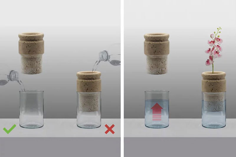
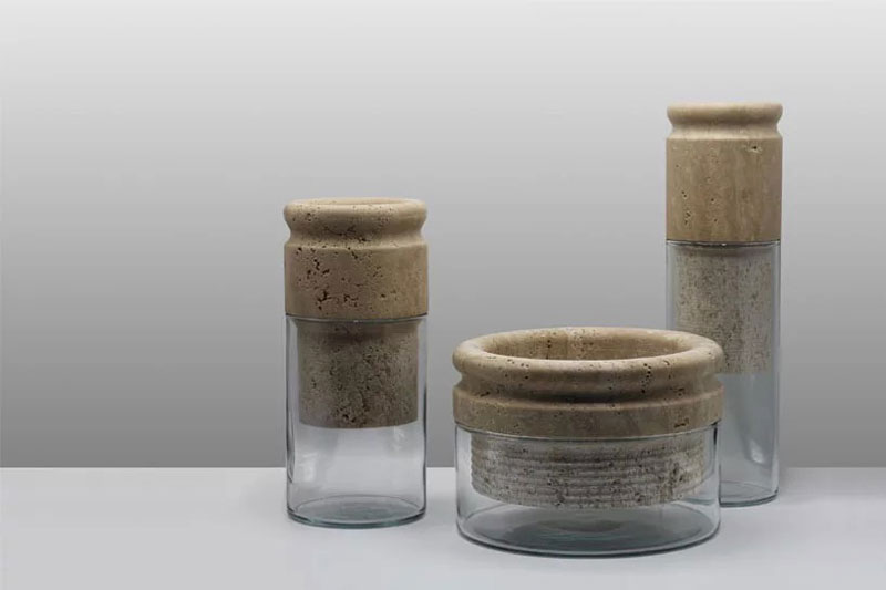
Based in Italia, Moreno Ratti is an architect and designer who attempts to incorporate ecological thinking in his work. He recently designed a series of flowerpots that include travertine marble that acts as a sponge in the pot.
It works as follows: the marble that contains the plants absorbs the water to distribute it to the soil. On the way to the soil, the water is transported through the marble holes and collects some mineral salts on the way, helping to nourish the plant’s roots better. The marble acts as both the central decorative element and the functional part.
Based in Italia, Moreno Ratti is an architect and designer who attempts to incorporate ecological thinking in his work. He recently designed a series of flowerpots that include travertine marble that acts as a sponge in the pot.
It works as follows: the marble that contains the plants absorbs the water to distribute it to the soil. On the way to the soil, the water is transported through the marble holes and collects some mineral salts on the way, helping to nourish the plant’s roots better. The marble acts as both the central decorative element and the functional part.
Web scraping has always been taken care of by actual developers, since a lot of coding, proxy management and CAPTCHA-solving is involved. However, the scraped data is very often needed by people that are non-coders: Marketers, Analysts, Business Developers etc.
Zenscrape is an easy-to-use web scraping tool that allows people to scrape websites without having to code.
Let’s run through a quick example together:
Select the data you need
The setup wizard guides you through the process of setting up your data extractor. It allows you to select the information you want to scrape visually. Click on the desired piece of content and specify what type of element you have. Depending on the package you have bought (they also offer a free plan), you can select up to 30 data elements per page.
The scraper is also capable of handling element lists.
Schedule your extractor
Perhaps, you want to scrape the selected data at a specific time interval. Depending on your plan, you can choose any time span between one minute to one hour. Also, decide what is supposed to happen with the scraped data after it has been gathered.
Use your data
In this example, we have chosen the .csv-export method and have selected a 10 minute scraping interval. Our first set of data should be ready by now. Let’s take a look:
Success! Our data is ready for us to be downloaded. We can now access all individual data sets or download all previously gathered data at once, in one file.
Need more flexibility?
Zenscrape also offers a web scraping API that returns the HTML markup of any website. This is especially useful for complicated scraping projects, that require the scraped content to be integrated into a software application for further processing.
Just like the web scraping suite, the API does not forward failed requests and takes care of proxy management, CAPTCHA-solving and all other maintenance tasks that are usually involved with DIY web scrapers.
Since the API returns the full HTML markup of the related website, you have full flexibility in terms of data selection and further processing.
You’re probably already at least a little familiar with CSS variables. If not, here’s a two-second overview: they are really called custom properties, you set them in declaration blocks like --size: 1em and use them as values like font-size: var(--size);, they differ from preprocessor variables (e.g. they cascade), and here’s a guide with way more information.
But are we using them to their full potential? Do we fall into old habits and overlook opportunities where variables could significantly reduce the amount of code we write?
This article was prompted by a recent tweet I made about using CSS variables to create dynamic animation behavior.
That’s an awful lot of code for something not particularly complex. We haven’t added many styles and we’ve added a lot of rules to cater to the button’s different states and colors. We could significantly reduce the code with a scoped variable.
In our example, the only differing value between the two button variants is the hue. Let’s refactor that code a little then. We won’t change the markup but cleaning up the styles a little, we get this:
This not only reduces the code but makes maintenance so much easier. Change the core button styles in one place and it will update all the variants! 🙌
I’d likely leave it there to make it easier for devs wanting to use those buttons. But, we could take it further. We could inline the variable on the actual element and remove the class declarations completely. 😲
Inlining those variables might not be best for your next design system or app but it does open up opportunities. Like, for example, if we had a button instance where we needed to override the color.
You may be writing straightforward HTML, but in many cases, you may be using a framework, like React or a preprocessor like Pug, to write your markup. These solutions allow you to leverage JavaScript to create random inline variables. For the following examples, I’ll be using Pug. Pug is an indentation-based HTML templating engine. If you aren’t familiar with Pug, do not fear! I’ll try to keep the markup simple.
Let’s start by randomizing the hue for our buttons:
button.button(style=`--hue: ${Math.random() * 360}`) First
With Pug, we can use ES6 template literals to inline randomized CSS variables. 💪
So, now that we have the opportunity to define random characteristics for an element, what else could we do? Well, one overlooked opportunity is animation. True, we can’t animate the variable itself, like this:
@keyframes grow {
  from { --scale: 1; }
  to   { --scale: 2; }
}
But we can create dynamic animations based on scoped variables. We can change the behavior of animation on the fly! 🤩
Example 1: The excited button
Let’s create a button that floats along minding its own business and then gets excited when we hover over it.
Start with the markup:
button.button(style=`--hue: ${Math.random() * 360}`) Show me attention
But, we need to introduce another keyframes definition. What if we could merge the two animations into one? They aren’t too far off from each other in terms of structure.
Although this works, we end up with an animation that isn’t quite as smooth because of the translation steps. So what else could we do? Let’s find a compromise by removing the steps at 25% and 75%.
Nice! Now our button has two different types of animations but defined via one set of keyframes. 🤯
Let’s have a little more fun with it. If we take it a little further, we can make the button a little more playful and maybe stop animating altogether when it’s active. 😅
Now that we’ve gone through some different techniques for things we can do with the power of scope, let’s put it all together. We are going to create a randomly generated bubble scene that heavily leverages scoped CSS variables.
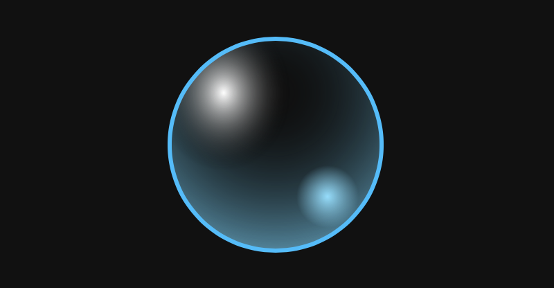
Let’s start by creating a bubble. A static bubble.
We are using background with multiple values and a border to make the bubble effect — but it’s not very dynamic. We know the border-radius will always be the same. And we know the structure of the border and background will not change. But the values used within those properties and the other property values could all be random.
Let’s add some more bubbles and leverage the inline scope to position them as well as size them. Since we are going to start randomizing more than one value, it’s handy to have a function to generate a random number in range for our markup.
- const randomInRange = (max, min) => Math.floor(Math.random() * (max - min + 1)) + min
With Pug, we can utilize iteration to create a large set of bubbles:
- const baseHue = randomInRange(0, 360)
- const bubbleCount = 50
- let b = 0
while b < bubbleCount
  - const size = randomInRange(10, 50)
  - const x = randomInRange(0, 100)
  .bubble(style=`--x: ${x}; --size: ${size}; --hue: ${baseHue}`)
  - b++
Updating our .bubble styling allows us to make use of the new inline variables.
That’s pretty boring. They all do the same thing at the same time. So let’s randomize the speed, delay, end scale and distance each bubble is going to travel.
Fluid typography is the idea that font-size (and perhaps other attributes of type, like line-height) change depending on the screen size (or perhaps container queries if we had them).
The core trickery comes from viewport units. You can literally set type in viewport units (e.g. font-size: 4vw), but the fluctuations in size are so extreme that it’s usually undesirable. That’s tampered by doing something like font-size: calc(16px + 1vw). But while we’re getting fancy with calculations anyway, the most common implementation ended up being an equation to calculate plain English:
I want the type to go between being 16px on a 320px screen to 22px on a 1000px screen.
html {
  font-size: 16px;
}
@media screen and (min-width: 320px) {
  html {
    font-size: calc(16px + 6 * ((100vw - 320px) / 680));
  }
}
@media screen and (min-width: 1000px) {
  html {
    font-size: 22px;
  }
}
That’s essentially setting a minimum and maximum font size so the type won’t shrink or grow to anything too extreme. „CSS locks” was a term coined by Tim Brown.
Minimum and maximum you say?! Well it so happens that functions for these have made their way into the CSS spec in the form of min() and max().
So we can simplify our fancy setup above with a one-liner and maintain the locks:
html {
  font-size: min(max(16px, 4vw), 22px);
}
We actually might want to stop there because even though both Safari (11.1+) and Chrome (79+) support this at the current moment, that’s as wide as support will get today. Speaking of which, you’d probably want to slip a font-size declaration before this to set an acceptable fallback value with no fancy functions.
But as long as we’re pushing the limits, there is another function to simplify things even more: clamp()! Clamp takes three values, a min, max, and a flexible unit (or calculation or whatever) in the middle that it will use in case the value is between the min and max. So, our one-liner gets even smaller:
body {
  font-size: clamp(16px, 4vw, 22px);
}
That’ll be Chrome 79+ (which doesn’t hasn’t even dropped to stable but will very soon).
Uncle Dave is very happy that FitText is now a few bytes instead of all-of-jQuery plus 40 more lines. Here is us chucking CSS custom properties at it:
As you begin to make use of React hooks in your applications, you’ll want to be certain the code you write is nothing short of solid. There’s nothing like shipping buggy code. One way to be certain your code is bug-free is to write tests. And testing React hooks is not much different from how React applications are tested in general.
In this tutorial, we will look at how to do that by making use of a to-do application built with hooks. We’ll cover writing of tests using Ezyme and React Testing Library, both of which are able to do just that. If you’re new to Enzyme, we actually posted about it a little while back showing how it can be used with Jest in React applications. It’s not a bad idea to check that as we dig into testing React hooks.
Here’s what we want to test
A pretty standard to-do component looks something like this:
We need to install the packages before we can start testing. Time to fire up the terminal!
npm install --save-dev enzyme enzyme-adapter-16
Inside the src directory, create a file called setupTests.js. This is what we’ll use to configure Enzyme’s adapter.
import Enzyme from "enzyme";
import Adapter from "enzyme-adapter-react-16";
Enzyme.configure({ adapter: new Adapter() });
Now we can start writing our tests! We want to test four things:
That the component renders
That the initial to-dos get displayed when it renders
That we can create a new to-do and get back three others
That we can delete one of the initial to-dos and have only one to-do left
In your src directory, create a folder called __tests__ and create the file where you’ll write your Todo component’s tests in it. Let’s call that file Todo.test.js.
With that done, we can import the packages we need and create a describe block where we’ll fill in our tests.
import React from "react";
import { shallow, mount } from "enzyme";
import Todo from "../Todo";

describe("Todo", () => {
  // Tests will go here using `it` blocks
});
Test 1: The component renders
For this, we’ll make use of shallow render. Shallow rendering allows us to check if the render method of the component gets called — that’s what we want to confirm here because that’s the proof we need that the component renders.
it("renders", () => {
  shallow(<Todo />);
});
Test 2: Initial to-dos get displayed
Here is where we’ll make use of the mount method, which allows us to go deeper than what shallow gives us. That way, we can check the length of the to-do items.
We mount the component then we make use of find() and instance() methods to set the value of the input field. We assert that the value of the input field is set to “Fix failing test” before going further to simulate a click event, which should add the new item to the to-do list.
We finally assert that we have three items on the list and that the third item is equal to the one we created.
Test 4: We can delete one of the initial to-dos and have only one to-do left
it("removes an item", () => {
  const wrapper = mount(<Todo />);
  wrapper
    .find("li button")
    .first()
    .simulate("click");
  expect(wrapper.find("li")).toHaveLength(1);
  expect(wrapper.find("li span").map(item => item.text())).toEqual([
    "Take out the trash"
  ]);
});
In this scenario, we return the to-do with a simulated click event on the first item. It’s expected that this will call the removeTodo() method, which should delete the item that was clicked. Then we’re checking the numbers of items we have, and the value of the one that gets returned.
The source code for these four tests are here on GitHub for you to check out.
import React from "react";
import { render, fireEvent } from "@testing-library/react";
import Todo from "../Todo";
import "@testing-library/jest-dom/extend-expect";

test("Todo", () => {
  // Tests go here
}
Test 1: The initial to-do renders
We’ll write our tests in a test block. The first test will look like this:
What’s happening here? We’re making use of getTestId to return the node of the element where data-testid matches the one that was passed to the method. That’s the <ul> element in this case. Then, we’re checking that it has a total of two children (each child being a <li> element inside the unordered list). This will pass as the initial to-do is equal to two.
Test 2: We can add a new to-do
We’re also making use of getTestById here to return the node that matches the argument we’re passing in.
We use getByTestId to return the input field and the ul element like we did before. To simulate a click event that adds a new to-do item, we’re using fireEvent.click() and passing in the getByText() method, which returns the node whose text matches the argument we passed. From there, we can then check to see the length of the to-dos by checking the length of the children array.
Test 3: We can delete a to-do
This will look a little like what we did a little earlier:
it("deletes a to-do", () => {
  const { getAllByTestId, getByTestId } = render(<Todo />);
  const todos = getByTestId("todos");
  const deleteButton = getAllByTestId("delete-button");
  const first = deleteButton[0];
  fireEvent.click(first);
  expect(todos.children.length).toBe(1);
});
We’re making use of getAllByTestId to return the nodes of the delete button. Since we only want to delete one item, we fire a click event on the first item in the collection, which should delete the first to-do. This should then make the length of todos children equal to one.
There are two lint rules to abide by when working with hooks:
Rule 1: Call hooks at the top level
…as opposed to inside conditionals, loops or nested functions.
// Don't do this!
if (Math.random() > 0.5) {
  const [invalid, updateInvalid] = useState(false);
}
This goes against the first rule. According to the official documentation, React depends on the order in which hooks are called to associate state and the corresponding useState call. This code breaks the order as the hook will only be called if the conditions are true.
Rule 2: Call hooks from React functional components
Hooks are meant to be used in React functional components — not in React’s class component or a JavaScript function.
We’ve basically covered what not to do when it comes to linting. We can avoid these missteps with an npm package that specifically enforces these rules.
npm install eslint-plugin-react-hooks --save-dev
Here’s what we add to the package’s configuration file to make it do its thing:
If you are making use of Create React App, then you should know that the package supports the lint plugin out of the box as of v3.0.0.
Go forth and write solid React code!
React hooks are equally prone to error as anything else in your application and you’re gonna want to ensure that you use them well. As we just saw, there’s a couple of ways we can go about it. Whether you use Enzyme or You can either make use of enzyme or React Testing Library to write tests is totally up to you. Either way, try making use of linting as you go, and no doubt, you’ll be glad you did.