How to Create a Vintage Brush to Add Texture in Illustrator

Post pobrano z: How to Create a Vintage Brush to Add Texture in Illustrator

Final product image
What You’ll Be Creating

Are
you always interested in creating new Adobe Illustrator brushes that
you can use in your designs to give them a special twist?

Well,
if you love the look of vintage designs and illustrations but never
knew exactly how to do it, then this tutorial is perfect for you. You
will learn how to make a brush in Illustrator (in this case an Art
Brush and a Pattern Brush), how to save it correctly, and how to apply
it to a set of fruit badges.

These
vintage brushes are easy to use to add texture, details, highlights
and shading in Illustrator, and you will be able to use them in many
future projects.

Expand
your brushes library by going to GraphicRiver, where you’ll find a
great selection of brushes and textures in various styles, shapes, and themes.
Also, check out the vector icons and illustrations, where you will
find plenty of resources ready to be used along with these
Illustrator brushes.

Let’s
start! 

Tutorial
Assets

To
complete the tutorial, you will need the following assets:

1. How
to Open a New Document 

Launch
Illustrator
and
go to
File
> New
to
open a blank document. Type a name for your file, set up the
dimensions, and then select
Pixels
as
Units
and
RGB
as
Color
Mode
.

Next,
go to
Edit
> Preferences > General
and
set the
Keyboard
Increment
to
1
px
and
while there, go to
Units
to
make sure they are set as in the following image. I usually work with
these settings, and they will help you throughout the drawing process.

how to open a new Illustrator document

2. How
to Create a Vintage Art Brush in Adobe Illustrator

Step
1

Learning
how to make a brush in Illustrator can be an easy process, especially
for an Art Brush, and this is one of those cases. Grab the Line
Segment Tool (\)
and draw a line on your artboard that’s 156 px in
length. Give it a 9 pt Stroke and press the Round Cap option in the
Stroke panel to get the rounded ends.

Next,
go to Object > Expand to turn the stroke into a filled shape.

how to create a simple rounded rectangle shape in Illustrator

Step
2

Now,
we need to distort this shape a little. Use the 
Add Anchor Point Tool (+) to add extra points along the path in the areas
indicated. After that, move these points with the Direct Selection
Tool (A)
to modify the shape. The aim is to get a thinner shape in
the middle area and a sharper tip.

how to distort a rounded rectangle shape in Illustrator

Step
3

Continue
to distort the right end of this shape and make it look less
perfectly rounded. Once you are done, color the shape with off black.

how to modify a brush shape in Illustrator

Step
4

Take
the Pen Tool (P) and draw a short path at one end of the black shape.
Give it a 6 pt Stroke using the Width Profile 4, and select the
Round Cap
option in the Stroke panel.

Continue
to draw similar paths along the shape and apply the same settings. I
would not recommend making copies of the first one because they need
to be slightly different. The end result of your vintage brush will
be more accurate.

how to create spikes for an art brush in Illustrator

Step
5

Select
all the spikes and go to Object > Expand Appearance to turn them
into shapes. Color them with the same off black, and now we are ready
to save the brush in Illustrator.

Select
all the shapes and drag them into the Brushes panel to be saved as a
New Art Brush. Type “Vintage Art Brush” as the name, select Tints
as the Colorization Method, and then hit OK. Easy, right?

how to save a vintage art brush in Adobe Illustrator

3. How
to Create a Vintage Pattern Brush 

Step
1

Grab
the Line Segment Tool (\) again, and draw a path
on your artboard at 45 degrees with a length of
64 px. Give it a 3 pt Stroke using any
color for the moment. While this path stays selected, go to Object >
Transform > Move
and type 260 px in the Horizontal field. Hit Copy
and you will get a second path to the right.

how to create two stripes in Illustrator

Step
2

Keep
both paths selected and go to Object > Blend > Blend Options.
Choose 15 Specified Steps and then go back to Object > Blend >
Make (Alt-Control-B)
.

Next,
go to Object > Expand twice in order to expand the blend and
to turn the stroked lines into shapes. Ungroup (Shift-Control-G) all
the resulting stripes.

how to blend two stripes in Illustrator

Step
3

While
all the stripes stay selected, go to Effect > Distort &
Transform > Roughen
and apply the settings shown, followed by
Object > Expand Appearance to expand this effect.

how to distort stripes with Roughen effect in Illustrator

Step
4

While
all the stripes stay selected, go to File > Scripts > Round Any
Corner
and apply a Radius of 1 in order to get more rounded edges all
around.

Round
Any Corner
is a great script and useful in many situations. Go to 20 Free and Useful Adobe Illustrator Scripts
, follow the instructions to install it in Illustrator, and after
that, you will always find it in File > Scripts ready to be used.

how to round corners in Adobe Illustrator with a script

Step
5

Now,
we are going to modify the stripes quite a bit to give them that
vintage look, and here is how to do it. Zoom in on one of the stripes
and grab the Eraser Tool (Shift-E). Start to delete a portion at the
top and make the stripe a little shorter.

how to delete and modify shapes with Eraser Tool in Illustrator

Step
6

Do
the same thing for some other stripes, making them shorter at the top.
Focus more on the center area of the brush and leave the stripes at
the ends as they are (1).

Now,
let’s repeat this process at the bottom and use the Eraser Tool
(Shift-E)
again to delete portions of the stripes, as shown in the
image below (2). Take your time and remember that you don’t have to
be too precise as we are trying to obtain a vintage look.

how to use the Eraser Tool to obtain a vintage brush in Illustrator

Step
7

How
to save a brush in Illustrator can be tricky sometimes,
especially when it comes to Pattern Brushes. Let me guide you through
the process and learn how to save a brush correctly.

Grab
the Rectangle Tool (M) and draw a rectangle starting from the bottom
end of the first stripe up to the top end. Make sure that the entire
first stripe is inside the rectangle, and it should go over the next
two stripes as well, but this is okay (1).

Copy
and
Paste
in Front (Control-F)

the rectangle and move the copy to the end of the brush whilst
holding the Shift key to make sure they stay horizontally aligned.
Make the width of this shape smaller in order to cover only the top
portion of the last two stripes (2).

Finally,
draw another rectangle between them to cover the rest of the stripes
(3).

how to define the sections of a pattern brush in Adobe Illustrator

Step
8

Select
all the stripes and Group (Control-G) them. Make two copies in front
of the group because you need one for each of the three rectangles.

Now,
select one group of stripes along with the first rectangle, and press
Crop in the Pathfinder panel. This will cut that section, and you will
get the Start Tile of the Pattern Brush (1). Drag it into the
Swatches panel to save it.

Select
a copy of the stripes group along with the middle rectangle and press
Crop in the Pathfinder panel again. This will cut that section, and
you will obtain the Side Tile of the Pattern Brush (2).

Select
the second copy of the stripes group along with the third rectangle
and press Crop again. You will obtain the End Tile of the Pattern
Brush (3). Drag it into the Swatches panel to save it.

how to cut sections of the pattern brush in Adobe Illustrator

Step
9

Select
the middle section and drag it into the Brushes panel to save it as a
New Pattern Brush. Type “Vintage Pattern Brush 1” and notice that
the middle section already appears under the Side Tile (1).

As
the Start Tile (2), select the New Pattern Swatch 1 from the
drop-down options, which is the first section saved in the Swatches
panel.

As
the End Tile (3), select New Pattern Swatch 2 from the drop-down
options, which is the last section saved in the Swatches panel.

Finally,
under Inner Corner Tile (4), select Auto-Sliced and set the
Colorization Method to Tints. Hit OK and your new Illustrator brush
is now saved and ready to use.

how to save a vintage pattern brush in Illustrator

Step
10

Following
the technique explained in this section of the tutorial, you can
create a bigger pattern brush with more details. It may look the same
as the one we just saved, but the fact that this one has more stripes
and more areas deleted with the Eraser Tool (Shift-E) will create a
different vintage brush stroke. It is definitely worth the effort to
make it, and you will use it in future projects as well.

Follow
the same steps and, once done, save it as “Vintage Pattern
Brush 2
”.

how to save a more detailed pattern brush in Adobe Illustrator

4. How
to Use a Vintage Brush to Add Texture in Illustrator

Step
1

Now
that we have saved both brushes, Illustrator will display them in the
Brushes panel, and they are ready to be used. To demonstrate, I am
going to use this set of Berry Badges 
from Envato Elements. Open the vector file, and let’s focus on the
cherries for the moment.

how to apply the vintage Illustrator brushes

Step
2

Use
the Pen Tool (P) to draw a straight path along the middle of the leaf
but a little inclined (1). Stroke this path with the Vintage Art
Brush
, which is the first brush we have created. Increase the Stroke
Weight
to 2 pt and set the Blending Mode to Multiply to give it a jet
black color (2). You can also use other stroke colors, and the brush
will automatically change color as well.

We
need the spikes of the brush to go outwards and upwards, so
open the Stroke Options window from the Appearance panel to see the
settings. Check Flip Along and Flip Across and then hit OK (3).

how to create texture on a leaf with Illustrator texture brushes

Step
3

The
leaf of the cherry is made of two separate shapes. Select the top
half and then Copy and Paste in Place (Shift-Control-V) to make
a copy of it in front of everything (1). Keep this copy selected
along with the stroked path and go to Object > Clipping Mask >
Make (Control-7)
. As a result, the vintage brush will only be visible
and add details on that part of the leaf (2).

how to mask a texture brush in Illutrator

Step
4

Next,
draw a similar path on the bottom half of the leaf (1). Stroke it
with the Vintage Art Brush again and increase the Stroke Weight to 2
pt
. This time, choose white as the stroke color and set the Blending
Mode
to Soft Light (2).

Next,
select the bottom half shape of the leaf and then Copy and Paste in
Place (Shift-Control-V)
to make a copy of it in front of everything.
Keep it selected along with the stroked path and go to Object >
Clipping Mask > Make (Control-7)
.

how to highlight a leaf with Illustrator texture brushes

Step
5

Use
the Pen Tool (P) to draw a straight path along the middle of the
leaf; then give it a 6 pt Stroke using Width Profile 5 in the
Stroke panel (1).

Select
the two half shapes of the leaf and then Copy and Paste in Place
(Shift-Control-V)
to make copies of them. Press Unite in the
Pathfinder panel to merge them into a single shape (2).

Keep
the newly obtained leaf shape selected along with the middle path and
go to Object > Clipping Mask > Make (Control-7). This will
define the midrib of the leaf and contribute to the vintage look
(3).

how to create the midrib of the vintage leaf in Illustrator

Step
6

Let’s
add a simple highlight on the leaf. Use the Pen Tool (P) to draw a
curved path along the edge of the leaf; then give it a 5 pt Stroke
using the Width Profile 1 in the Stroke panel. Set the stroke color
to light green.

At
this point, we are done with the details on this leaf. Use the
techniques explained to transform the right leaf in the same way. The
settings remain the same.

how to add a highlight on a leaf in Adobe Illustrator

5. How
to Use a Vintage Brush to Add Shading in Illustrator

Step
1

Focus
on the lower left side of the cherry and draw a curved path using the
Pen Tool (P) (1). Stroke it with the Vintage Pattern Brush 2 and
increase the Stroke Weight at 2 pt. You will get a nice vintage
shading texture (2).

Here
is how to create a criss-cross texture quickly. There is no need to use
other Illustrator texture brushes or make a separate new brush. All
you need is a simple trick.

Keep
the path selected and go to the Appearance panel. Press Add New
Stroke
and you will get a second Stroke attribute above the first.
Use the same Vintage Pattern Brush 2 but keep the Stroke Weight at 1
pt
. Double-click on this Stroke attribute to open the Stroke Options
window, and check Flip Along and Add space to fit. Hit OK, and the
cross-hatching is done (3).

how to create texture and shading on fruit in Illustrator

Step
2

Select
all the shapes that make up the cherry and then Copy and Paste in
Place (Shift-Control-V)
to make copies of them. Press Unite in the
Pathfinder panel to merge them into a single shape (1).

Keep
the newly obtained cherry shape selected, along with the stroked path,
and go to Object > Clipping Mask > Make (Control-7) (2). Once
done, apply the same technique to create the same vintage shading
look on the other cherry (3).

how to mask the crosshatching texture in Adobe Illustrator

Step
3

Zoom
in on the cherry and draw an oval shape with the Pen Tool (P) or the
Ellipse Tool (L), as shown in the image below (1). Stroke it with the
Vintage Art Brush and reduce the Stroke Weight to 0.5 pt. This will
create another style of vintage shading at the base of the stem (2).

Do
the same thing for the other cherry.

how to create shading with vintage Illustrator brushes

6. How
to Use a Vintage Brush to Add Highlights in Illustrator 

First,
select and delete the two existing ellipses that are adding highlights to the
cherry because we will create a new one in a vintage style (1).

Use
the Pen Tool (P) to draw a slightly curved path on the right side; then
stroke it with the Vintage Pattern Brush 1, set the Stroke Weight to
0.75 pt, and reduce the Opacity to 70% (2).

Do
the same thing for the other cherry, and you can see what the cherries
look like at this point in the image below. 

how to create highlight with vintage Illustrator brushes

7. How
to Enhance the Vintage Look With Strokes in Illustrator

Step
1

Select
the two shapes that make up each leaf and then Copy and Paste in
Place (Shift-Control-V)
to make copies of them. Press Unite in the
Pathfinder panel and you will get two new leaf shapes. Apply a 4 pt
black Stroke.

Repeat
the same thing for the cherries, and once you get the two new cherry
shapes, give them a 4 pt black Stroke as well.

how to use strokes to create a vintage look in Illustrator

Step
2

Now,
select the stem shape along with the small end piece at the top, and
apply a 4 pt black Stroke using Width Profile 2 in the Stroke
panel.

These
simple strokes really make a difference to our design and improve the
overall vintage look of the badge.

how to use profile strokes to create a vintage look in Illustrator

8. How
to Use a Vintage Brush to Create Shadow in Adobe Illustrator

Step
1

Use
the Pen Tool (P) to draw a curved path at the bottom of the badge,
behind the cherries. Stroke it with the Vintage Pattern Brush 2 and
set the Stroke Weight to 3 pt (1).

Add
a New Stroke in the Appearance panel above the first, and use the same
brush but set the Stroke Weight to 2 pt. Open the Stroke Options
window, check Flip Along and Add space to fit, and then hit OK. This
will create the cross-hatching look, as you did before (2).

Set
this path to Blending Mode Soft Light and reduce the Opacity to 50%.
Make a copy of the badge circle and use it to mask this path to get a
clean design (3).

how to create a shadow with Illustrator texture brushes

Step
2

As
a final step, select the badge circle and, along with the existing
light-blue fill color, also apply a 4 pt black Outside Stroke in order to
maintain the same style. At this point, the cherry badge is done.

how to finalize the vintage fruit badge in Illustrator

9. Strengthen
Your Knowledge

Step
1

Practice
is the key, so continue to use and apply these Adobe Illustrator
brushes for another badge in the set. Let’s focus on the blueberry
badge.

Here
is a sequence of images that can guide you through the same process
again. Use the same settings as before, and always mask the stroked
paths to get a clean design.

how to use vintage Illustrator brushes on fruit badges in Illustrator

Step
2

As
an extra detail on the blueberries, use the Pen Tool (P) to draw
three short paths right between the two shapes that make up each
blueberry. Give them a 4 pt Stroke using black and Width Profile
4
in the Stroke panel (1).

Continue
to add the vintage style highlights, as you did for the cherries (2).

how to add details on vintage fruit badges in Illustrator

Step
3

You’re almost done! It’s time to use the Vintage Pattern Brush to create
the shadow behind the berries (1) and complete the design with a 4 pt
black Stroke applied to the badge circle. Press Align Stroke to
Outside
in the Stroke panel to make it fully visible (2).

how to create a vintage crosshatching shadow in Adobe Illustrator

Step
4

Bring
back the purple background from the original file, and let’s add a
shadow to make the badges stand out. Select the two badge circles and,
along with the existing appearances, also apply a Drop Shadow
effect by going to Effect > Stylize > Drop Shadow. Use the
settings shown in the image below and hit OK.

how to create a shadow around fruit badges in Illustrator

10. How
to Desaturate a Vector Illustration in Adobe Illustrator

The
new vintage badges that we have created are beautiful as they are, but
if you want to go one step further and obtain that specific faded
vintage look, here is how to do it fast. You can also apply this
technique to any other illustrations that you have.

Select
the background rectangle or draw a new one the same size as your
artboard. This shape should be in front of the illustration, so
go to Object > Arrange > Bring to Front (Shift-Control-]) to
make sure it is. Color the rectangle with pale gray and, after
that, set the Blending Mode to Saturation. Done! 

Tip:
Choose a darker shade of gray to obtain a cool black and white look.

how to desaturate an illustration in Adobe Illustrator

Congratulations!
You’re Done

Illustrator
texture brushes and all kinds of other brushes are always fun to use
because you can obtain a unique look and put your personal touch into
a design or illustration. Now you have the knowledge to create a
vintage look using brushes in Illustrator, so continue to apply them
in future projects. 

vintage fruit badges made using Illustrator texture brushes final image

Expand
Your Adobe Illustrator Skills!

Don’t
stop here! Continue drawing to expand your skills and learn many more
useful techniques. Here is a list of recommended tutorials that can
help you achieve this goal:

How to Create a Vintage Brush to Add Texture in Illustrator

Post pobrano z: How to Create a Vintage Brush to Add Texture in Illustrator

Final product image
What You’ll Be Creating

Are
you always interested in creating new Adobe Illustrator brushes that
you can use in your designs to give them a special twist?

Well,
if you love the look of vintage designs and illustrations but never
knew exactly how to do it, then this tutorial is perfect for you. You
will learn how to make a brush in Illustrator (in this case an Art
Brush and a Pattern Brush), how to save it correctly, and how to apply
it to a set of fruit badges.

These
vintage brushes are easy to use to add texture, details, highlights
and shading in Illustrator, and you will be able to use them in many
future projects.

Expand
your brushes library by going to GraphicRiver, where you’ll find a
great selection of brushes and textures in various styles, shapes, and themes.
Also, check out the vector icons and illustrations, where you will
find plenty of resources ready to be used along with these
Illustrator brushes.

Let’s
start! 

Tutorial
Assets

To
complete the tutorial, you will need the following assets:

1. How
to Open a New Document 

Launch
Illustrator
and
go to
File
> New
to
open a blank document. Type a name for your file, set up the
dimensions, and then select
Pixels
as
Units
and
RGB
as
Color
Mode
.

Next,
go to
Edit
> Preferences > General
and
set the
Keyboard
Increment
to
1
px
and
while there, go to
Units
to
make sure they are set as in the following image. I usually work with
these settings, and they will help you throughout the drawing process.

how to open a new Illustrator document

2. How
to Create a Vintage Art Brush in Adobe Illustrator

Step
1

Learning
how to make a brush in Illustrator can be an easy process, especially
for an Art Brush, and this is one of those cases. Grab the Line
Segment Tool (\)
and draw a line on your artboard that’s 156 px in
length. Give it a 9 pt Stroke and press the Round Cap option in the
Stroke panel to get the rounded ends.

Next,
go to Object > Expand to turn the stroke into a filled shape.

how to create a simple rounded rectangle shape in Illustrator

Step
2

Now,
we need to distort this shape a little. Use the 
Add Anchor Point Tool (+) to add extra points along the path in the areas
indicated. After that, move these points with the Direct Selection
Tool (A)
to modify the shape. The aim is to get a thinner shape in
the middle area and a sharper tip.

how to distort a rounded rectangle shape in Illustrator

Step
3

Continue
to distort the right end of this shape and make it look less
perfectly rounded. Once you are done, color the shape with off black.

how to modify a brush shape in Illustrator

Step
4

Take
the Pen Tool (P) and draw a short path at one end of the black shape.
Give it a 6 pt Stroke using the Width Profile 4, and select the
Round Cap
option in the Stroke panel.

Continue
to draw similar paths along the shape and apply the same settings. I
would not recommend making copies of the first one because they need
to be slightly different. The end result of your vintage brush will
be more accurate.

how to create spikes for an art brush in Illustrator

Step
5

Select
all the spikes and go to Object > Expand Appearance to turn them
into shapes. Color them with the same off black, and now we are ready
to save the brush in Illustrator.

Select
all the shapes and drag them into the Brushes panel to be saved as a
New Art Brush. Type “Vintage Art Brush” as the name, select Tints
as the Colorization Method, and then hit OK. Easy, right?

how to save a vintage art brush in Adobe Illustrator

3. How
to Create a Vintage Pattern Brush 

Step
1

Grab
the Line Segment Tool (\) again, and draw a path
on your artboard at 45 degrees with a length of
64 px. Give it a 3 pt Stroke using any
color for the moment. While this path stays selected, go to Object >
Transform > Move
and type 260 px in the Horizontal field. Hit Copy
and you will get a second path to the right.

how to create two stripes in Illustrator

Step
2

Keep
both paths selected and go to Object > Blend > Blend Options.
Choose 15 Specified Steps and then go back to Object > Blend >
Make (Alt-Control-B)
.

Next,
go to Object > Expand twice in order to expand the blend and
to turn the stroked lines into shapes. Ungroup (Shift-Control-G) all
the resulting stripes.

how to blend two stripes in Illustrator

Step
3

While
all the stripes stay selected, go to Effect > Distort &
Transform > Roughen
and apply the settings shown, followed by
Object > Expand Appearance to expand this effect.

how to distort stripes with Roughen effect in Illustrator

Step
4

While
all the stripes stay selected, go to File > Scripts > Round Any
Corner
and apply a Radius of 1 in order to get more rounded edges all
around.

Round
Any Corner
is a great script and useful in many situations. Go to 20 Free and Useful Adobe Illustrator Scripts
, follow the instructions to install it in Illustrator, and after
that, you will always find it in File > Scripts ready to be used.

how to round corners in Adobe Illustrator with a script

Step
5

Now,
we are going to modify the stripes quite a bit to give them that
vintage look, and here is how to do it. Zoom in on one of the stripes
and grab the Eraser Tool (Shift-E). Start to delete a portion at the
top and make the stripe a little shorter.

how to delete and modify shapes with Eraser Tool in Illustrator

Step
6

Do
the same thing for some other stripes, making them shorter at the top.
Focus more on the center area of the brush and leave the stripes at
the ends as they are (1).

Now,
let’s repeat this process at the bottom and use the Eraser Tool
(Shift-E)
again to delete portions of the stripes, as shown in the
image below (2). Take your time and remember that you don’t have to
be too precise as we are trying to obtain a vintage look.

how to use the Eraser Tool to obtain a vintage brush in Illustrator

Step
7

How
to save a brush in Illustrator can be tricky sometimes,
especially when it comes to Pattern Brushes. Let me guide you through
the process and learn how to save a brush correctly.

Grab
the Rectangle Tool (M) and draw a rectangle starting from the bottom
end of the first stripe up to the top end. Make sure that the entire
first stripe is inside the rectangle, and it should go over the next
two stripes as well, but this is okay (1).

Copy
and
Paste
in Front (Control-F)

the rectangle and move the copy to the end of the brush whilst
holding the Shift key to make sure they stay horizontally aligned.
Make the width of this shape smaller in order to cover only the top
portion of the last two stripes (2).

Finally,
draw another rectangle between them to cover the rest of the stripes
(3).

how to define the sections of a pattern brush in Adobe Illustrator

Step
8

Select
all the stripes and Group (Control-G) them. Make two copies in front
of the group because you need one for each of the three rectangles.

Now,
select one group of stripes along with the first rectangle, and press
Crop in the Pathfinder panel. This will cut that section, and you will
get the Start Tile of the Pattern Brush (1). Drag it into the
Swatches panel to save it.

Select
a copy of the stripes group along with the middle rectangle and press
Crop in the Pathfinder panel again. This will cut that section, and
you will obtain the Side Tile of the Pattern Brush (2).

Select
the second copy of the stripes group along with the third rectangle
and press Crop again. You will obtain the End Tile of the Pattern
Brush (3). Drag it into the Swatches panel to save it.

how to cut sections of the pattern brush in Adobe Illustrator

Step
9

Select
the middle section and drag it into the Brushes panel to save it as a
New Pattern Brush. Type “Vintage Pattern Brush 1” and notice that
the middle section already appears under the Side Tile (1).

As
the Start Tile (2), select the New Pattern Swatch 1 from the
drop-down options, which is the first section saved in the Swatches
panel.

As
the End Tile (3), select New Pattern Swatch 2 from the drop-down
options, which is the last section saved in the Swatches panel.

Finally,
under Inner Corner Tile (4), select Auto-Sliced and set the
Colorization Method to Tints. Hit OK and your new Illustrator brush
is now saved and ready to use.

how to save a vintage pattern brush in Illustrator

Step
10

Following
the technique explained in this section of the tutorial, you can
create a bigger pattern brush with more details. It may look the same
as the one we just saved, but the fact that this one has more stripes
and more areas deleted with the Eraser Tool (Shift-E) will create a
different vintage brush stroke. It is definitely worth the effort to
make it, and you will use it in future projects as well.

Follow
the same steps and, once done, save it as “Vintage Pattern
Brush 2
”.

how to save a more detailed pattern brush in Adobe Illustrator

4. How
to Use a Vintage Brush to Add Texture in Illustrator

Step
1

Now
that we have saved both brushes, Illustrator will display them in the
Brushes panel, and they are ready to be used. To demonstrate, I am
going to use this set of Berry Badges 
from Envato Elements. Open the vector file, and let’s focus on the
cherries for the moment.

how to apply the vintage Illustrator brushes

Step
2

Use
the Pen Tool (P) to draw a straight path along the middle of the leaf
but a little inclined (1). Stroke this path with the Vintage Art
Brush
, which is the first brush we have created. Increase the Stroke
Weight
to 2 pt and set the Blending Mode to Multiply to give it a jet
black color (2). You can also use other stroke colors, and the brush
will automatically change color as well.

We
need the spikes of the brush to go outwards and upwards, so
open the Stroke Options window from the Appearance panel to see the
settings. Check Flip Along and Flip Across and then hit OK (3).

how to create texture on a leaf with Illustrator texture brushes

Step
3

The
leaf of the cherry is made of two separate shapes. Select the top
half and then Copy and Paste in Place (Shift-Control-V) to make
a copy of it in front of everything (1). Keep this copy selected
along with the stroked path and go to Object > Clipping Mask >
Make (Control-7)
. As a result, the vintage brush will only be visible
and add details on that part of the leaf (2).

how to mask a texture brush in Illutrator

Step
4

Next,
draw a similar path on the bottom half of the leaf (1). Stroke it
with the Vintage Art Brush again and increase the Stroke Weight to 2
pt
. This time, choose white as the stroke color and set the Blending
Mode
to Soft Light (2).

Next,
select the bottom half shape of the leaf and then Copy and Paste in
Place (Shift-Control-V)
to make a copy of it in front of everything.
Keep it selected along with the stroked path and go to Object >
Clipping Mask > Make (Control-7)
.

how to highlight a leaf with Illustrator texture brushes

Step
5

Use
the Pen Tool (P) to draw a straight path along the middle of the
leaf; then give it a 6 pt Stroke using Width Profile 5 in the
Stroke panel (1).

Select
the two half shapes of the leaf and then Copy and Paste in Place
(Shift-Control-V)
to make copies of them. Press Unite in the
Pathfinder panel to merge them into a single shape (2).

Keep
the newly obtained leaf shape selected along with the middle path and
go to Object > Clipping Mask > Make (Control-7). This will
define the midrib of the leaf and contribute to the vintage look
(3).

how to create the midrib of the vintage leaf in Illustrator

Step
6

Let’s
add a simple highlight on the leaf. Use the Pen Tool (P) to draw a
curved path along the edge of the leaf; then give it a 5 pt Stroke
using the Width Profile 1 in the Stroke panel. Set the stroke color
to light green.

At
this point, we are done with the details on this leaf. Use the
techniques explained to transform the right leaf in the same way. The
settings remain the same.

how to add a highlight on a leaf in Adobe Illustrator

5. How
to Use a Vintage Brush to Add Shading in Illustrator

Step
1

Focus
on the lower left side of the cherry and draw a curved path using the
Pen Tool (P) (1). Stroke it with the Vintage Pattern Brush 2 and
increase the Stroke Weight at 2 pt. You will get a nice vintage
shading texture (2).

Here
is how to create a criss-cross texture quickly. There is no need to use
other Illustrator texture brushes or make a separate new brush. All
you need is a simple trick.

Keep
the path selected and go to the Appearance panel. Press Add New
Stroke
and you will get a second Stroke attribute above the first.
Use the same Vintage Pattern Brush 2 but keep the Stroke Weight at 1
pt
. Double-click on this Stroke attribute to open the Stroke Options
window, and check Flip Along and Add space to fit. Hit OK, and the
cross-hatching is done (3).

how to create texture and shading on fruit in Illustrator

Step
2

Select
all the shapes that make up the cherry and then Copy and Paste in
Place (Shift-Control-V)
to make copies of them. Press Unite in the
Pathfinder panel to merge them into a single shape (1).

Keep
the newly obtained cherry shape selected, along with the stroked path,
and go to Object > Clipping Mask > Make (Control-7) (2). Once
done, apply the same technique to create the same vintage shading
look on the other cherry (3).

how to mask the crosshatching texture in Adobe Illustrator

Step
3

Zoom
in on the cherry and draw an oval shape with the Pen Tool (P) or the
Ellipse Tool (L), as shown in the image below (1). Stroke it with the
Vintage Art Brush and reduce the Stroke Weight to 0.5 pt. This will
create another style of vintage shading at the base of the stem (2).

Do
the same thing for the other cherry.

how to create shading with vintage Illustrator brushes

6. How
to Use a Vintage Brush to Add Highlights in Illustrator 

First,
select and delete the two existing ellipses that are adding highlights to the
cherry because we will create a new one in a vintage style (1).

Use
the Pen Tool (P) to draw a slightly curved path on the right side; then
stroke it with the Vintage Pattern Brush 1, set the Stroke Weight to
0.75 pt, and reduce the Opacity to 70% (2).

Do
the same thing for the other cherry, and you can see what the cherries
look like at this point in the image below. 

how to create highlight with vintage Illustrator brushes

7. How
to Enhance the Vintage Look With Strokes in Illustrator

Step
1

Select
the two shapes that make up each leaf and then Copy and Paste in
Place (Shift-Control-V)
to make copies of them. Press Unite in the
Pathfinder panel and you will get two new leaf shapes. Apply a 4 pt
black Stroke.

Repeat
the same thing for the cherries, and once you get the two new cherry
shapes, give them a 4 pt black Stroke as well.

how to use strokes to create a vintage look in Illustrator

Step
2

Now,
select the stem shape along with the small end piece at the top, and
apply a 4 pt black Stroke using Width Profile 2 in the Stroke
panel.

These
simple strokes really make a difference to our design and improve the
overall vintage look of the badge.

how to use profile strokes to create a vintage look in Illustrator

8. How
to Use a Vintage Brush to Create Shadow in Adobe Illustrator

Step
1

Use
the Pen Tool (P) to draw a curved path at the bottom of the badge,
behind the cherries. Stroke it with the Vintage Pattern Brush 2 and
set the Stroke Weight to 3 pt (1).

Add
a New Stroke in the Appearance panel above the first, and use the same
brush but set the Stroke Weight to 2 pt. Open the Stroke Options
window, check Flip Along and Add space to fit, and then hit OK. This
will create the cross-hatching look, as you did before (2).

Set
this path to Blending Mode Soft Light and reduce the Opacity to 50%.
Make a copy of the badge circle and use it to mask this path to get a
clean design (3).

how to create a shadow with Illustrator texture brushes

Step
2

As
a final step, select the badge circle and, along with the existing
light-blue fill color, also apply a 4 pt black Outside Stroke in order to
maintain the same style. At this point, the cherry badge is done.

how to finalize the vintage fruit badge in Illustrator

9. Strengthen
Your Knowledge

Step
1

Practice
is the key, so continue to use and apply these Adobe Illustrator
brushes for another badge in the set. Let’s focus on the blueberry
badge.

Here
is a sequence of images that can guide you through the same process
again. Use the same settings as before, and always mask the stroked
paths to get a clean design.

how to use vintage Illustrator brushes on fruit badges in Illustrator

Step
2

As
an extra detail on the blueberries, use the Pen Tool (P) to draw
three short paths right between the two shapes that make up each
blueberry. Give them a 4 pt Stroke using black and Width Profile
4
in the Stroke panel (1).

Continue
to add the vintage style highlights, as you did for the cherries (2).

how to add details on vintage fruit badges in Illustrator

Step
3

You’re almost done! It’s time to use the Vintage Pattern Brush to create
the shadow behind the berries (1) and complete the design with a 4 pt
black Stroke applied to the badge circle. Press Align Stroke to
Outside
in the Stroke panel to make it fully visible (2).

how to create a vintage crosshatching shadow in Adobe Illustrator

Step
4

Bring
back the purple background from the original file, and let’s add a
shadow to make the badges stand out. Select the two badge circles and,
along with the existing appearances, also apply a Drop Shadow
effect by going to Effect > Stylize > Drop Shadow. Use the
settings shown in the image below and hit OK.

how to create a shadow around fruit badges in Illustrator

10. How
to Desaturate a Vector Illustration in Adobe Illustrator

The
new vintage badges that we have created are beautiful as they are, but
if you want to go one step further and obtain that specific faded
vintage look, here is how to do it fast. You can also apply this
technique to any other illustrations that you have.

Select
the background rectangle or draw a new one the same size as your
artboard. This shape should be in front of the illustration, so
go to Object > Arrange > Bring to Front (Shift-Control-]) to
make sure it is. Color the rectangle with pale gray and, after
that, set the Blending Mode to Saturation. Done! 

Tip:
Choose a darker shade of gray to obtain a cool black and white look.

how to desaturate an illustration in Adobe Illustrator

Congratulations!
You’re Done

Illustrator
texture brushes and all kinds of other brushes are always fun to use
because you can obtain a unique look and put your personal touch into
a design or illustration. Now you have the knowledge to create a
vintage look using brushes in Illustrator, so continue to apply them
in future projects. 

vintage fruit badges made using Illustrator texture brushes final image

Expand
Your Adobe Illustrator Skills!

Don’t
stop here! Continue drawing to expand your skills and learn many more
useful techniques. Here is a list of recommended tutorials that can
help you achieve this goal:

How to Create a Vintage Brush to Add Texture in Illustrator

Post pobrano z: How to Create a Vintage Brush to Add Texture in Illustrator

Final product image
What You’ll Be Creating

Are
you always interested in creating new Adobe Illustrator brushes that
you can use in your designs to give them a special twist?

Well,
if you love the look of vintage designs and illustrations but never
knew exactly how to do it, then this tutorial is perfect for you. You
will learn how to make a brush in Illustrator (in this case an Art
Brush and a Pattern Brush), how to save it correctly, and how to apply
it to a set of fruit badges.

These
vintage brushes are easy to use to add texture, details, highlights
and shading in Illustrator, and you will be able to use them in many
future projects.

Expand
your brushes library by going to GraphicRiver, where you’ll find a
great selection of brushes and textures in various styles, shapes, and themes.
Also, check out the vector icons and illustrations, where you will
find plenty of resources ready to be used along with these
Illustrator brushes.

Let’s
start! 

Tutorial
Assets

To
complete the tutorial, you will need the following assets:

1. How
to Open a New Document 

Launch
Illustrator
and
go to
File
> New
to
open a blank document. Type a name for your file, set up the
dimensions, and then select
Pixels
as
Units
and
RGB
as
Color
Mode
.

Next,
go to
Edit
> Preferences > General
and
set the
Keyboard
Increment
to
1
px
and
while there, go to
Units
to
make sure they are set as in the following image. I usually work with
these settings, and they will help you throughout the drawing process.

how to open a new Illustrator document

2. How
to Create a Vintage Art Brush in Adobe Illustrator

Step
1

Learning
how to make a brush in Illustrator can be an easy process, especially
for an Art Brush, and this is one of those cases. Grab the Line
Segment Tool (\)
and draw a line on your artboard that’s 156 px in
length. Give it a 9 pt Stroke and press the Round Cap option in the
Stroke panel to get the rounded ends.

Next,
go to Object > Expand to turn the stroke into a filled shape.

how to create a simple rounded rectangle shape in Illustrator

Step
2

Now,
we need to distort this shape a little. Use the 
Add Anchor Point Tool (+) to add extra points along the path in the areas
indicated. After that, move these points with the Direct Selection
Tool (A)
to modify the shape. The aim is to get a thinner shape in
the middle area and a sharper tip.

how to distort a rounded rectangle shape in Illustrator

Step
3

Continue
to distort the right end of this shape and make it look less
perfectly rounded. Once you are done, color the shape with off black.

how to modify a brush shape in Illustrator

Step
4

Take
the Pen Tool (P) and draw a short path at one end of the black shape.
Give it a 6 pt Stroke using the Width Profile 4, and select the
Round Cap
option in the Stroke panel.

Continue
to draw similar paths along the shape and apply the same settings. I
would not recommend making copies of the first one because they need
to be slightly different. The end result of your vintage brush will
be more accurate.

how to create spikes for an art brush in Illustrator

Step
5

Select
all the spikes and go to Object > Expand Appearance to turn them
into shapes. Color them with the same off black, and now we are ready
to save the brush in Illustrator.

Select
all the shapes and drag them into the Brushes panel to be saved as a
New Art Brush. Type “Vintage Art Brush” as the name, select Tints
as the Colorization Method, and then hit OK. Easy, right?

how to save a vintage art brush in Adobe Illustrator

3. How
to Create a Vintage Pattern Brush 

Step
1

Grab
the Line Segment Tool (\) again, and draw a path
on your artboard at 45 degrees with a length of
64 px. Give it a 3 pt Stroke using any
color for the moment. While this path stays selected, go to Object >
Transform > Move
and type 260 px in the Horizontal field. Hit Copy
and you will get a second path to the right.

how to create two stripes in Illustrator

Step
2

Keep
both paths selected and go to Object > Blend > Blend Options.
Choose 15 Specified Steps and then go back to Object > Blend >
Make (Alt-Control-B)
.

Next,
go to Object > Expand twice in order to expand the blend and
to turn the stroked lines into shapes. Ungroup (Shift-Control-G) all
the resulting stripes.

how to blend two stripes in Illustrator

Step
3

While
all the stripes stay selected, go to Effect > Distort &
Transform > Roughen
and apply the settings shown, followed by
Object > Expand Appearance to expand this effect.

how to distort stripes with Roughen effect in Illustrator

Step
4

While
all the stripes stay selected, go to File > Scripts > Round Any
Corner
and apply a Radius of 1 in order to get more rounded edges all
around.

Round
Any Corner
is a great script and useful in many situations. Go to 20 Free and Useful Adobe Illustrator Scripts
, follow the instructions to install it in Illustrator, and after
that, you will always find it in File > Scripts ready to be used.

how to round corners in Adobe Illustrator with a script

Step
5

Now,
we are going to modify the stripes quite a bit to give them that
vintage look, and here is how to do it. Zoom in on one of the stripes
and grab the Eraser Tool (Shift-E). Start to delete a portion at the
top and make the stripe a little shorter.

how to delete and modify shapes with Eraser Tool in Illustrator

Step
6

Do
the same thing for some other stripes, making them shorter at the top.
Focus more on the center area of the brush and leave the stripes at
the ends as they are (1).

Now,
let’s repeat this process at the bottom and use the Eraser Tool
(Shift-E)
again to delete portions of the stripes, as shown in the
image below (2). Take your time and remember that you don’t have to
be too precise as we are trying to obtain a vintage look.

how to use the Eraser Tool to obtain a vintage brush in Illustrator

Step
7

How
to save a brush in Illustrator can be tricky sometimes,
especially when it comes to Pattern Brushes. Let me guide you through
the process and learn how to save a brush correctly.

Grab
the Rectangle Tool (M) and draw a rectangle starting from the bottom
end of the first stripe up to the top end. Make sure that the entire
first stripe is inside the rectangle, and it should go over the next
two stripes as well, but this is okay (1).

Copy
and
Paste
in Front (Control-F)

the rectangle and move the copy to the end of the brush whilst
holding the Shift key to make sure they stay horizontally aligned.
Make the width of this shape smaller in order to cover only the top
portion of the last two stripes (2).

Finally,
draw another rectangle between them to cover the rest of the stripes
(3).

how to define the sections of a pattern brush in Adobe Illustrator

Step
8

Select
all the stripes and Group (Control-G) them. Make two copies in front
of the group because you need one for each of the three rectangles.

Now,
select one group of stripes along with the first rectangle, and press
Crop in the Pathfinder panel. This will cut that section, and you will
get the Start Tile of the Pattern Brush (1). Drag it into the
Swatches panel to save it.

Select
a copy of the stripes group along with the middle rectangle and press
Crop in the Pathfinder panel again. This will cut that section, and
you will obtain the Side Tile of the Pattern Brush (2).

Select
the second copy of the stripes group along with the third rectangle
and press Crop again. You will obtain the End Tile of the Pattern
Brush (3). Drag it into the Swatches panel to save it.

how to cut sections of the pattern brush in Adobe Illustrator

Step
9

Select
the middle section and drag it into the Brushes panel to save it as a
New Pattern Brush. Type “Vintage Pattern Brush 1” and notice that
the middle section already appears under the Side Tile (1).

As
the Start Tile (2), select the New Pattern Swatch 1 from the
drop-down options, which is the first section saved in the Swatches
panel.

As
the End Tile (3), select New Pattern Swatch 2 from the drop-down
options, which is the last section saved in the Swatches panel.

Finally,
under Inner Corner Tile (4), select Auto-Sliced and set the
Colorization Method to Tints. Hit OK and your new Illustrator brush
is now saved and ready to use.

how to save a vintage pattern brush in Illustrator

Step
10

Following
the technique explained in this section of the tutorial, you can
create a bigger pattern brush with more details. It may look the same
as the one we just saved, but the fact that this one has more stripes
and more areas deleted with the Eraser Tool (Shift-E) will create a
different vintage brush stroke. It is definitely worth the effort to
make it, and you will use it in future projects as well.

Follow
the same steps and, once done, save it as “Vintage Pattern
Brush 2
”.

how to save a more detailed pattern brush in Adobe Illustrator

4. How
to Use a Vintage Brush to Add Texture in Illustrator

Step
1

Now
that we have saved both brushes, Illustrator will display them in the
Brushes panel, and they are ready to be used. To demonstrate, I am
going to use this set of Berry Badges 
from Envato Elements. Open the vector file, and let’s focus on the
cherries for the moment.

how to apply the vintage Illustrator brushes

Step
2

Use
the Pen Tool (P) to draw a straight path along the middle of the leaf
but a little inclined (1). Stroke this path with the Vintage Art
Brush
, which is the first brush we have created. Increase the Stroke
Weight
to 2 pt and set the Blending Mode to Multiply to give it a jet
black color (2). You can also use other stroke colors, and the brush
will automatically change color as well.

We
need the spikes of the brush to go outwards and upwards, so
open the Stroke Options window from the Appearance panel to see the
settings. Check Flip Along and Flip Across and then hit OK (3).

how to create texture on a leaf with Illustrator texture brushes

Step
3

The
leaf of the cherry is made of two separate shapes. Select the top
half and then Copy and Paste in Place (Shift-Control-V) to make
a copy of it in front of everything (1). Keep this copy selected
along with the stroked path and go to Object > Clipping Mask >
Make (Control-7)
. As a result, the vintage brush will only be visible
and add details on that part of the leaf (2).

how to mask a texture brush in Illutrator

Step
4

Next,
draw a similar path on the bottom half of the leaf (1). Stroke it
with the Vintage Art Brush again and increase the Stroke Weight to 2
pt
. This time, choose white as the stroke color and set the Blending
Mode
to Soft Light (2).

Next,
select the bottom half shape of the leaf and then Copy and Paste in
Place (Shift-Control-V)
to make a copy of it in front of everything.
Keep it selected along with the stroked path and go to Object >
Clipping Mask > Make (Control-7)
.

how to highlight a leaf with Illustrator texture brushes

Step
5

Use
the Pen Tool (P) to draw a straight path along the middle of the
leaf; then give it a 6 pt Stroke using Width Profile 5 in the
Stroke panel (1).

Select
the two half shapes of the leaf and then Copy and Paste in Place
(Shift-Control-V)
to make copies of them. Press Unite in the
Pathfinder panel to merge them into a single shape (2).

Keep
the newly obtained leaf shape selected along with the middle path and
go to Object > Clipping Mask > Make (Control-7). This will
define the midrib of the leaf and contribute to the vintage look
(3).

how to create the midrib of the vintage leaf in Illustrator

Step
6

Let’s
add a simple highlight on the leaf. Use the Pen Tool (P) to draw a
curved path along the edge of the leaf; then give it a 5 pt Stroke
using the Width Profile 1 in the Stroke panel. Set the stroke color
to light green.

At
this point, we are done with the details on this leaf. Use the
techniques explained to transform the right leaf in the same way. The
settings remain the same.

how to add a highlight on a leaf in Adobe Illustrator

5. How
to Use a Vintage Brush to Add Shading in Illustrator

Step
1

Focus
on the lower left side of the cherry and draw a curved path using the
Pen Tool (P) (1). Stroke it with the Vintage Pattern Brush 2 and
increase the Stroke Weight at 2 pt. You will get a nice vintage
shading texture (2).

Here
is how to create a criss-cross texture quickly. There is no need to use
other Illustrator texture brushes or make a separate new brush. All
you need is a simple trick.

Keep
the path selected and go to the Appearance panel. Press Add New
Stroke
and you will get a second Stroke attribute above the first.
Use the same Vintage Pattern Brush 2 but keep the Stroke Weight at 1
pt
. Double-click on this Stroke attribute to open the Stroke Options
window, and check Flip Along and Add space to fit. Hit OK, and the
cross-hatching is done (3).

how to create texture and shading on fruit in Illustrator

Step
2

Select
all the shapes that make up the cherry and then Copy and Paste in
Place (Shift-Control-V)
to make copies of them. Press Unite in the
Pathfinder panel to merge them into a single shape (1).

Keep
the newly obtained cherry shape selected, along with the stroked path,
and go to Object > Clipping Mask > Make (Control-7) (2). Once
done, apply the same technique to create the same vintage shading
look on the other cherry (3).

how to mask the crosshatching texture in Adobe Illustrator

Step
3

Zoom
in on the cherry and draw an oval shape with the Pen Tool (P) or the
Ellipse Tool (L), as shown in the image below (1). Stroke it with the
Vintage Art Brush and reduce the Stroke Weight to 0.5 pt. This will
create another style of vintage shading at the base of the stem (2).

Do
the same thing for the other cherry.

how to create shading with vintage Illustrator brushes

6. How
to Use a Vintage Brush to Add Highlights in Illustrator 

First,
select and delete the two existing ellipses that are adding highlights to the
cherry because we will create a new one in a vintage style (1).

Use
the Pen Tool (P) to draw a slightly curved path on the right side; then
stroke it with the Vintage Pattern Brush 1, set the Stroke Weight to
0.75 pt, and reduce the Opacity to 70% (2).

Do
the same thing for the other cherry, and you can see what the cherries
look like at this point in the image below. 

how to create highlight with vintage Illustrator brushes

7. How
to Enhance the Vintage Look With Strokes in Illustrator

Step
1

Select
the two shapes that make up each leaf and then Copy and Paste in
Place (Shift-Control-V)
to make copies of them. Press Unite in the
Pathfinder panel and you will get two new leaf shapes. Apply a 4 pt
black Stroke.

Repeat
the same thing for the cherries, and once you get the two new cherry
shapes, give them a 4 pt black Stroke as well.

how to use strokes to create a vintage look in Illustrator

Step
2

Now,
select the stem shape along with the small end piece at the top, and
apply a 4 pt black Stroke using Width Profile 2 in the Stroke
panel.

These
simple strokes really make a difference to our design and improve the
overall vintage look of the badge.

how to use profile strokes to create a vintage look in Illustrator

8. How
to Use a Vintage Brush to Create Shadow in Adobe Illustrator

Step
1

Use
the Pen Tool (P) to draw a curved path at the bottom of the badge,
behind the cherries. Stroke it with the Vintage Pattern Brush 2 and
set the Stroke Weight to 3 pt (1).

Add
a New Stroke in the Appearance panel above the first, and use the same
brush but set the Stroke Weight to 2 pt. Open the Stroke Options
window, check Flip Along and Add space to fit, and then hit OK. This
will create the cross-hatching look, as you did before (2).

Set
this path to Blending Mode Soft Light and reduce the Opacity to 50%.
Make a copy of the badge circle and use it to mask this path to get a
clean design (3).

how to create a shadow with Illustrator texture brushes

Step
2

As
a final step, select the badge circle and, along with the existing
light-blue fill color, also apply a 4 pt black Outside Stroke in order to
maintain the same style. At this point, the cherry badge is done.

how to finalize the vintage fruit badge in Illustrator

9. Strengthen
Your Knowledge

Step
1

Practice
is the key, so continue to use and apply these Adobe Illustrator
brushes for another badge in the set. Let’s focus on the blueberry
badge.

Here
is a sequence of images that can guide you through the same process
again. Use the same settings as before, and always mask the stroked
paths to get a clean design.

how to use vintage Illustrator brushes on fruit badges in Illustrator

Step
2

As
an extra detail on the blueberries, use the Pen Tool (P) to draw
three short paths right between the two shapes that make up each
blueberry. Give them a 4 pt Stroke using black and Width Profile
4
in the Stroke panel (1).

Continue
to add the vintage style highlights, as you did for the cherries (2).

how to add details on vintage fruit badges in Illustrator

Step
3

You’re almost done! It’s time to use the Vintage Pattern Brush to create
the shadow behind the berries (1) and complete the design with a 4 pt
black Stroke applied to the badge circle. Press Align Stroke to
Outside
in the Stroke panel to make it fully visible (2).

how to create a vintage crosshatching shadow in Adobe Illustrator

Step
4

Bring
back the purple background from the original file, and let’s add a
shadow to make the badges stand out. Select the two badge circles and,
along with the existing appearances, also apply a Drop Shadow
effect by going to Effect > Stylize > Drop Shadow. Use the
settings shown in the image below and hit OK.

how to create a shadow around fruit badges in Illustrator

10. How
to Desaturate a Vector Illustration in Adobe Illustrator

The
new vintage badges that we have created are beautiful as they are, but
if you want to go one step further and obtain that specific faded
vintage look, here is how to do it fast. You can also apply this
technique to any other illustrations that you have.

Select
the background rectangle or draw a new one the same size as your
artboard. This shape should be in front of the illustration, so
go to Object > Arrange > Bring to Front (Shift-Control-]) to
make sure it is. Color the rectangle with pale gray and, after
that, set the Blending Mode to Saturation. Done! 

Tip:
Choose a darker shade of gray to obtain a cool black and white look.

how to desaturate an illustration in Adobe Illustrator

Congratulations!
You’re Done

Illustrator
texture brushes and all kinds of other brushes are always fun to use
because you can obtain a unique look and put your personal touch into
a design or illustration. Now you have the knowledge to create a
vintage look using brushes in Illustrator, so continue to apply them
in future projects. 

vintage fruit badges made using Illustrator texture brushes final image

Expand
Your Adobe Illustrator Skills!

Don’t
stop here! Continue drawing to expand your skills and learn many more
useful techniques. Here is a list of recommended tutorials that can
help you achieve this goal:

How to use social proof for gaining credibility and boosting conversions

Post pobrano z: How to use social proof for gaining credibility and boosting conversions

The internet has given many web
companies the chance to rise and meet new audiences. The challenge for these
companies is the competition to grow the customer base and build the companies’
credibility. One of the ways to do that is to use social proof as a marketing
tool.

Many people make decisions regarding
a product or service based on what they see others do or say. People’s initial
judgment on a website can be influenced by what others perceive based on their
experiences. This can make or break a company especially if it is new in the
market.

What is Social Proof?

Image source

Social proof is the concept that
people have a tendency to conform to the action of others with the assumption
that other people are more knowledgeable in that particular situation and
therefore they reflect correct behavior.

For example, when people pass a
crowded restaurant that they have never set foot into, they will assume that
the food must be good and they will be more inclined to try it. On the other
hand, an empty restaurant will, unfortunately, send a warning signal that there
is something unfavorable about it and people will be more reluctant to make it
their choice of restaurant.

In this era of technology, social
proof has become a powerful marketing tool. When people encounter an unfamiliar
website, like a fintech app website (considering how new the term is for some), and they are
unsure whether the products or services offered are good, they will look for
third-party validation such as customers’ testimonials and product reviews to
decide on their course of action.

The right use of social proof can
positively impact your consumers’ behavior and boost your conversion rate.

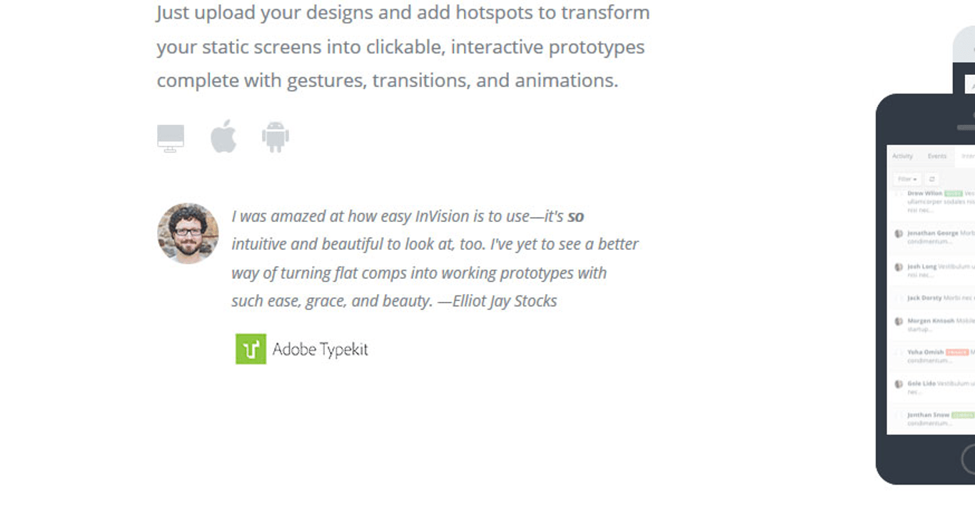
Testimonials

Testimonials
Image source

Many companies invite customers to
write their positive experiences with their products or services and post them
on their website. Companies may promise to deliver excellent service but until
someone actually shares their positive experience, people will look at that
promise as just another selling line used by countless websites.

Testimonials will give the
third-party validation that your site visitors need to look further into your
offer. People value the opinions of others, especially opinions from people
that they can relate to.

For example, a mom’s testimonial
about a cleaning product will be more influential than a testimonial from a
fashion celebrity. Also, make sure how you wrap those testimonials on the page.

A lot of designers are tempted to
stuff a lot of testimonials on the page. Don’t do that. Use transitions for the
testimonials or a parallax effect to not bore the visitor.

Getting Testimonials Right

Image source

Testimonials can be tricky to get
right. Ideally, testimonials should be specific, relatable and are aligned with
the overall feel of your website and brand. A generic comment such as ‘this is
a great product’ will not persuade your visitors to become buyers, as compared
to a specific comment like ‘I have been using this product for 5 years and have
not had any maintenance issue’.

Creating a separate page for
testimonials will most likely create a dead-end because people very rarely
visit a webpage to read the testimonial page. Place the testimonials in
multiple locations and alongside the relevant products or services to maximize
their effectiveness.

Used correctly, testimonials can be
a powerful form of social proof to build your website’s credibility and
increase your conversion rate.

An interesting way of using
testimonials to boost credibility is to show them through a popup to visitors
who are bouncing the site. If you’re on WordPress, use a WordPress popup plugin for that. If you are on a different CMS, use Leadpages or
something similar.

Use pictures

Use pictures on testimonials
Image source

The best way to maximize the
effectiveness of a testimonial is to put a face to the words.

People can relate better to the
testimonials when they can see the pictures of the persons writing it. They
will be more inclined to believe that the testimonials are not made up and come
from real customers.

Use high-quality photos and make
sure the participants look inviting and friendly. Placed strategically
alongside a call-to-action button such as ‘Call now’ or ‘Visit our store
today’, the testimonials can be a very persuasive tool.

Having Testimonials from Influential People

Approval from an expert or a
celebrity can have a positive influence on consumer behavior. The psychological
explanation is in the tendency for people to have a biased opinion on a certain
product or service based on their overall judgment of the people endorsing it,
also known as the halo effect.

It is no wonder that companies will
seek a well-known expert or celebrity with an established reputation to sponsor
their products. If you have a designer website, for instance, it will speak
volumes when a famous fashion blogger makes a reference to your website.

A word of caution on the use of
celebrity to endorse a website or a product. If the celebrity is a match to the
website, it will have a positive impact and people will look favorably on the
company. If the celebrity is a mismatch, it may make the company appear
desperate or confused about its own identity. This can make the company lose
its trustworthiness.

Using Logos of Customers or Sites That Reviewed Your Product

Image source

One of the ways to increase the conversion
rate is to display your customers’ logos, especially ones that are well-known.
This social proof will improve your credibility and impress your site visitors.

If your products are covered in the
news or other websites, this will be a chance to incorporate their logos into
your home page and boost your website’s credibility.

Other sources of logos that you
might want to include in your website are logos of your official partners, your
suppliers, awards and accreditation that you have and quality standards that
you have met.

If you’d have a big partner like
Coca-Cola, for example, it would immediately boost your trust. That Coca-Cola logo is one of the most recognized symbols on the planet and if
that huge company decided to work with you, there’s surely something good about
you.

The logos should be placed where
they are easily visible by visitors such as the side of the header/footer of
your website home page. Two big companies known in the B2B community, Calendly and Doodle are doing this differently. One is showing the logos in the
hero section, the other in the footer.

Newsletter Subscriber Count

Newsletter Subscriber Count
Image source

This form of social proof is an
example of the ‘wisdom of the crowds’ social proof. Basically, the more people
that have signed up to your newsletter, the higher the probability of new
visitors signing up too. If you have not built a large customer base yet, a
relevant testimonial highlighting the positive aspect of your newsletter might
persuade visitors to sign up.

People will be more inclined to sign
up for the newsletter if they believe the website is trustworthy and that their
information will be protected. Privacy policy regarding the use and collection
of their information should be included in the sign-up process.

Using Social Media Widgets

Using Social Media Widgets
Image source

Social media is a great source of
social proof. You can track the mention of your website or products on Twitter
and gain insight into your customers’ perception of them. You can track the
size of your website followers on Twitter and Facebook.

Many companies now include social
media icons on their website where customers can readily access their social
media and share the website’s link and post comments about the companies. Many
companies invite their customers to ‘like’ them on Facebook.

A positive comment on your website
or brand on social media can have a ripple effect that will bring new visitors
to your website. People feel more secure to engage in your website when their
friends have recommended it through social media.

Showcasing the Number of Users or Downloads

This display of user statistics
works in the same way as when McDonalds’ fast-food restaurants display signs
“Billions and Billions Served”.

This social proof will work if you
have an impressive statistic to make visitors believe that your website is
trustworthy. If your customer base is not up to par yet, this is a chance to
utilize other forms of social proof to increase the number of your site
visitors and increase your conversion rate.

Using Trust Badges

Image source

The display of trust badges is most
commonly found in the checkout section of a landing page. With online fraud
becoming common, customers are more cautious in filling out forms and sharing
sensitive information such as their credit card numbers to an online company.

Trust badges give customers the
assurance that the information they give to the company will be secure. People
have been reported to cancel their online purchase in the absence of a trust
seal and they are more likely to have a second thought about purchasing a
product. Trust badges may or may not bring in new visitors but they do prevent
potential customers to doubt the security of their purchase.

Ending Thoughts

There are many forms of social proof
available to promote your website. When used effectively, they can be a great
asset to continuously bring visitors to your website and increase your conversion rate.
On the other hand, misuse of social proof can also backfire and have the
reverse effect on your website.

The use of social
proof
requires
practice and experience. If you are looking to promote your great new products
or services on the web, social proof can be your best marketing tool and the
cheapest form of marketing available yet.

The
use of social proof

also promotes interactions with customers and this can have a long-lasting
effect. New customers will be enticed with existing testimonials about the
positive experiences other people have and existing customers will be reminded
of their own positive experience.

As with any marketing tool, it will
only be effective if you have a great product or service to start with and you
maintain your integrity in delivering what you promise. Continue to review your
products and gain feedback from close associates. As said earlier, social media
can be a great place to gain feedback about your products and keep track of
your number of followers.

The combination of the right
products and the right use of different forms of social proof will ensure your
company’s visibility in the market place and create a building platform for
your company’s sustainability.

How to use social proof for gaining credibility and boosting conversions

Post pobrano z: How to use social proof for gaining credibility and boosting conversions

The internet has given many web
companies the chance to rise and meet new audiences. The challenge for these
companies is the competition to grow the customer base and build the companies’
credibility. One of the ways to do that is to use social proof as a marketing
tool.

Many people make decisions regarding
a product or service based on what they see others do or say. People’s initial
judgment on a website can be influenced by what others perceive based on their
experiences. This can make or break a company especially if it is new in the
market.

What is Social Proof?

Image source

Social proof is the concept that
people have a tendency to conform to the action of others with the assumption
that other people are more knowledgeable in that particular situation and
therefore they reflect correct behavior.

For example, when people pass a
crowded restaurant that they have never set foot into, they will assume that
the food must be good and they will be more inclined to try it. On the other
hand, an empty restaurant will, unfortunately, send a warning signal that there
is something unfavorable about it and people will be more reluctant to make it
their choice of restaurant.

In this era of technology, social
proof has become a powerful marketing tool. When people encounter an unfamiliar
website, like a fintech app website (considering how new the term is for some), and they are
unsure whether the products or services offered are good, they will look for
third-party validation such as customers’ testimonials and product reviews to
decide on their course of action.

The right use of social proof can
positively impact your consumers’ behavior and boost your conversion rate.

Testimonials

Testimonials
Image source

Many companies invite customers to
write their positive experiences with their products or services and post them
on their website. Companies may promise to deliver excellent service but until
someone actually shares their positive experience, people will look at that
promise as just another selling line used by countless websites.

Testimonials will give the
third-party validation that your site visitors need to look further into your
offer. People value the opinions of others, especially opinions from people
that they can relate to.

For example, a mom’s testimonial
about a cleaning product will be more influential than a testimonial from a
fashion celebrity. Also, make sure how you wrap those testimonials on the page.

A lot of designers are tempted to
stuff a lot of testimonials on the page. Don’t do that. Use transitions for the
testimonials or a parallax effect to not bore the visitor.

Getting Testimonials Right

Image source

Testimonials can be tricky to get
right. Ideally, testimonials should be specific, relatable and are aligned with
the overall feel of your website and brand. A generic comment such as ‘this is
a great product’ will not persuade your visitors to become buyers, as compared
to a specific comment like ‘I have been using this product for 5 years and have
not had any maintenance issue’.

Creating a separate page for
testimonials will most likely create a dead-end because people very rarely
visit a webpage to read the testimonial page. Place the testimonials in
multiple locations and alongside the relevant products or services to maximize
their effectiveness.

Used correctly, testimonials can be
a powerful form of social proof to build your website’s credibility and
increase your conversion rate.

An interesting way of using
testimonials to boost credibility is to show them through a popup to visitors
who are bouncing the site. If you’re on WordPress, use a WordPress popup plugin for that. If you are on a different CMS, use Leadpages or
something similar.

Use pictures

Use pictures on testimonials
Image source

The best way to maximize the
effectiveness of a testimonial is to put a face to the words.

People can relate better to the
testimonials when they can see the pictures of the persons writing it. They
will be more inclined to believe that the testimonials are not made up and come
from real customers.

Use high-quality photos and make
sure the participants look inviting and friendly. Placed strategically
alongside a call-to-action button such as ‘Call now’ or ‘Visit our store
today’, the testimonials can be a very persuasive tool.

Having Testimonials from Influential People

Approval from an expert or a
celebrity can have a positive influence on consumer behavior. The psychological
explanation is in the tendency for people to have a biased opinion on a certain
product or service based on their overall judgment of the people endorsing it,
also known as the halo effect.

It is no wonder that companies will
seek a well-known expert or celebrity with an established reputation to sponsor
their products. If you have a designer website, for instance, it will speak
volumes when a famous fashion blogger makes a reference to your website.

A word of caution on the use of
celebrity to endorse a website or a product. If the celebrity is a match to the
website, it will have a positive impact and people will look favorably on the
company. If the celebrity is a mismatch, it may make the company appear
desperate or confused about its own identity. This can make the company lose
its trustworthiness.

Using Logos of Customers or Sites That Reviewed Your Product

Image source

One of the ways to increase the conversion
rate is to display your customers’ logos, especially ones that are well-known.
This social proof will improve your credibility and impress your site visitors.

If your products are covered in the
news or other websites, this will be a chance to incorporate their logos into
your home page and boost your website’s credibility.

Other sources of logos that you
might want to include in your website are logos of your official partners, your
suppliers, awards and accreditation that you have and quality standards that
you have met.

If you’d have a big partner like
Coca-Cola, for example, it would immediately boost your trust. That Coca-Cola logo is one of the most recognized symbols on the planet and if
that huge company decided to work with you, there’s surely something good about
you.

The logos should be placed where
they are easily visible by visitors such as the side of the header/footer of
your website home page. Two big companies known in the B2B community, Calendly and Doodle are doing this differently. One is showing the logos in the
hero section, the other in the footer.

Newsletter Subscriber Count

Newsletter Subscriber Count
Image source

This form of social proof is an
example of the ‘wisdom of the crowds’ social proof. Basically, the more people
that have signed up to your newsletter, the higher the probability of new
visitors signing up too. If you have not built a large customer base yet, a
relevant testimonial highlighting the positive aspect of your newsletter might
persuade visitors to sign up.

People will be more inclined to sign
up for the newsletter if they believe the website is trustworthy and that their
information will be protected. Privacy policy regarding the use and collection
of their information should be included in the sign-up process.

Using Social Media Widgets

Using Social Media Widgets
Image source

Social media is a great source of
social proof. You can track the mention of your website or products on Twitter
and gain insight into your customers’ perception of them. You can track the
size of your website followers on Twitter and Facebook.

Many companies now include social
media icons on their website where customers can readily access their social
media and share the website’s link and post comments about the companies. Many
companies invite their customers to ‘like’ them on Facebook.

A positive comment on your website
or brand on social media can have a ripple effect that will bring new visitors
to your website. People feel more secure to engage in your website when their
friends have recommended it through social media.

Showcasing the Number of Users or Downloads

This display of user statistics
works in the same way as when McDonalds’ fast-food restaurants display signs
“Billions and Billions Served”.

This social proof will work if you
have an impressive statistic to make visitors believe that your website is
trustworthy. If your customer base is not up to par yet, this is a chance to
utilize other forms of social proof to increase the number of your site
visitors and increase your conversion rate.

Using Trust Badges

Image source

The display of trust badges is most
commonly found in the checkout section of a landing page. With online fraud
becoming common, customers are more cautious in filling out forms and sharing
sensitive information such as their credit card numbers to an online company.

Trust badges give customers the
assurance that the information they give to the company will be secure. People
have been reported to cancel their online purchase in the absence of a trust
seal and they are more likely to have a second thought about purchasing a
product. Trust badges may or may not bring in new visitors but they do prevent
potential customers to doubt the security of their purchase.

Ending Thoughts

There are many forms of social proof
available to promote your website. When used effectively, they can be a great
asset to continuously bring visitors to your website and increase your conversion rate.
On the other hand, misuse of social proof can also backfire and have the
reverse effect on your website.

The use of social
proof
requires
practice and experience. If you are looking to promote your great new products
or services on the web, social proof can be your best marketing tool and the
cheapest form of marketing available yet.

The
use of social proof

also promotes interactions with customers and this can have a long-lasting
effect. New customers will be enticed with existing testimonials about the
positive experiences other people have and existing customers will be reminded
of their own positive experience.

As with any marketing tool, it will
only be effective if you have a great product or service to start with and you
maintain your integrity in delivering what you promise. Continue to review your
products and gain feedback from close associates. As said earlier, social media
can be a great place to gain feedback about your products and keep track of
your number of followers.

The combination of the right
products and the right use of different forms of social proof will ensure your
company’s visibility in the market place and create a building platform for
your company’s sustainability.

How to use social proof for gaining credibility and boosting conversions

Post pobrano z: How to use social proof for gaining credibility and boosting conversions

The internet has given many web
companies the chance to rise and meet new audiences. The challenge for these
companies is the competition to grow the customer base and build the companies’
credibility. One of the ways to do that is to use social proof as a marketing
tool.

Many people make decisions regarding
a product or service based on what they see others do or say. People’s initial
judgment on a website can be influenced by what others perceive based on their
experiences. This can make or break a company especially if it is new in the
market.

What is Social Proof?

Image source

Social proof is the concept that
people have a tendency to conform to the action of others with the assumption
that other people are more knowledgeable in that particular situation and
therefore they reflect correct behavior.

For example, when people pass a
crowded restaurant that they have never set foot into, they will assume that
the food must be good and they will be more inclined to try it. On the other
hand, an empty restaurant will, unfortunately, send a warning signal that there
is something unfavorable about it and people will be more reluctant to make it
their choice of restaurant.

In this era of technology, social
proof has become a powerful marketing tool. When people encounter an unfamiliar
website, like a fintech app website (considering how new the term is for some), and they are
unsure whether the products or services offered are good, they will look for
third-party validation such as customers’ testimonials and product reviews to
decide on their course of action.

The right use of social proof can
positively impact your consumers’ behavior and boost your conversion rate.

Testimonials

Testimonials
Image source

Many companies invite customers to
write their positive experiences with their products or services and post them
on their website. Companies may promise to deliver excellent service but until
someone actually shares their positive experience, people will look at that
promise as just another selling line used by countless websites.

Testimonials will give the
third-party validation that your site visitors need to look further into your
offer. People value the opinions of others, especially opinions from people
that they can relate to.

For example, a mom’s testimonial
about a cleaning product will be more influential than a testimonial from a
fashion celebrity. Also, make sure how you wrap those testimonials on the page.

A lot of designers are tempted to
stuff a lot of testimonials on the page. Don’t do that. Use transitions for the
testimonials or a parallax effect to not bore the visitor.

Getting Testimonials Right

Image source

Testimonials can be tricky to get
right. Ideally, testimonials should be specific, relatable and are aligned with
the overall feel of your website and brand. A generic comment such as ‘this is
a great product’ will not persuade your visitors to become buyers, as compared
to a specific comment like ‘I have been using this product for 5 years and have
not had any maintenance issue’.

Creating a separate page for
testimonials will most likely create a dead-end because people very rarely
visit a webpage to read the testimonial page. Place the testimonials in
multiple locations and alongside the relevant products or services to maximize
their effectiveness.

Used correctly, testimonials can be
a powerful form of social proof to build your website’s credibility and
increase your conversion rate.

An interesting way of using
testimonials to boost credibility is to show them through a popup to visitors
who are bouncing the site. If you’re on WordPress, use a WordPress popup plugin for that. If you are on a different CMS, use Leadpages or
something similar.

Use pictures

Use pictures on testimonials
Image source

The best way to maximize the
effectiveness of a testimonial is to put a face to the words.

People can relate better to the
testimonials when they can see the pictures of the persons writing it. They
will be more inclined to believe that the testimonials are not made up and come
from real customers.

Use high-quality photos and make
sure the participants look inviting and friendly. Placed strategically
alongside a call-to-action button such as ‘Call now’ or ‘Visit our store
today’, the testimonials can be a very persuasive tool.

Having Testimonials from Influential People

Approval from an expert or a
celebrity can have a positive influence on consumer behavior. The psychological
explanation is in the tendency for people to have a biased opinion on a certain
product or service based on their overall judgment of the people endorsing it,
also known as the halo effect.

It is no wonder that companies will
seek a well-known expert or celebrity with an established reputation to sponsor
their products. If you have a designer website, for instance, it will speak
volumes when a famous fashion blogger makes a reference to your website.

A word of caution on the use of
celebrity to endorse a website or a product. If the celebrity is a match to the
website, it will have a positive impact and people will look favorably on the
company. If the celebrity is a mismatch, it may make the company appear
desperate or confused about its own identity. This can make the company lose
its trustworthiness.

Using Logos of Customers or Sites That Reviewed Your Product

Image source

One of the ways to increase the conversion
rate is to display your customers’ logos, especially ones that are well-known.
This social proof will improve your credibility and impress your site visitors.

If your products are covered in the
news or other websites, this will be a chance to incorporate their logos into
your home page and boost your website’s credibility.

Other sources of logos that you
might want to include in your website are logos of your official partners, your
suppliers, awards and accreditation that you have and quality standards that
you have met.

If you’d have a big partner like
Coca-Cola, for example, it would immediately boost your trust. That Coca-Cola logo is one of the most recognized symbols on the planet and if
that huge company decided to work with you, there’s surely something good about
you.

The logos should be placed where
they are easily visible by visitors such as the side of the header/footer of
your website home page. Two big companies known in the B2B community, Calendly and Doodle are doing this differently. One is showing the logos in the
hero section, the other in the footer.

Newsletter Subscriber Count

Newsletter Subscriber Count
Image source

This form of social proof is an
example of the ‘wisdom of the crowds’ social proof. Basically, the more people
that have signed up to your newsletter, the higher the probability of new
visitors signing up too. If you have not built a large customer base yet, a
relevant testimonial highlighting the positive aspect of your newsletter might
persuade visitors to sign up.

People will be more inclined to sign
up for the newsletter if they believe the website is trustworthy and that their
information will be protected. Privacy policy regarding the use and collection
of their information should be included in the sign-up process.

Using Social Media Widgets

Using Social Media Widgets
Image source

Social media is a great source of
social proof. You can track the mention of your website or products on Twitter
and gain insight into your customers’ perception of them. You can track the
size of your website followers on Twitter and Facebook.

Many companies now include social
media icons on their website where customers can readily access their social
media and share the website’s link and post comments about the companies. Many
companies invite their customers to ‘like’ them on Facebook.

A positive comment on your website
or brand on social media can have a ripple effect that will bring new visitors
to your website. People feel more secure to engage in your website when their
friends have recommended it through social media.

Showcasing the Number of Users or Downloads

This display of user statistics
works in the same way as when McDonalds’ fast-food restaurants display signs
“Billions and Billions Served”.

This social proof will work if you
have an impressive statistic to make visitors believe that your website is
trustworthy. If your customer base is not up to par yet, this is a chance to
utilize other forms of social proof to increase the number of your site
visitors and increase your conversion rate.

Using Trust Badges

Image source

The display of trust badges is most
commonly found in the checkout section of a landing page. With online fraud
becoming common, customers are more cautious in filling out forms and sharing
sensitive information such as their credit card numbers to an online company.

Trust badges give customers the
assurance that the information they give to the company will be secure. People
have been reported to cancel their online purchase in the absence of a trust
seal and they are more likely to have a second thought about purchasing a
product. Trust badges may or may not bring in new visitors but they do prevent
potential customers to doubt the security of their purchase.

Ending Thoughts

There are many forms of social proof
available to promote your website. When used effectively, they can be a great
asset to continuously bring visitors to your website and increase your conversion rate.
On the other hand, misuse of social proof can also backfire and have the
reverse effect on your website.

The use of social
proof
requires
practice and experience. If you are looking to promote your great new products
or services on the web, social proof can be your best marketing tool and the
cheapest form of marketing available yet.

The
use of social proof

also promotes interactions with customers and this can have a long-lasting
effect. New customers will be enticed with existing testimonials about the
positive experiences other people have and existing customers will be reminded
of their own positive experience.

As with any marketing tool, it will
only be effective if you have a great product or service to start with and you
maintain your integrity in delivering what you promise. Continue to review your
products and gain feedback from close associates. As said earlier, social media
can be a great place to gain feedback about your products and keep track of
your number of followers.

The combination of the right
products and the right use of different forms of social proof will ensure your
company’s visibility in the market place and create a building platform for
your company’s sustainability.

McDonald’s: Download, Order, Enjoy

Post pobrano z: McDonald’s: Download, Order, Enjoy
Print
McDonald’s

When it comes to using mobile ordering to get fast food, Quebecers are behind the rest of Canada—it’s simply not one of their habits. So, McDonald’s wanted to promote its mobile ordering to show how easily a cell phone, via the My McD’s app, allows users to be two clicks away from picking up their favourite fast food. Using a trompe-l’oeil effect, we discover three first-person points of view where a Quarter Pounder, a McMuffin and a McCafé have never been both so real and so virtual at the same time.

Advertising Agency:Cossette, Montreal, Canada
Creative Directors:Anne-Claude Chénier, Barbara Jacques, Patrick Michaud, Alex Gadoua
Art Director:Alexandre Jutras
Copywriter:François-Julien Rainville
Photographer:René Lachapelle
Retoucher:René Lachapelle
Strategy:Simon Bédard

McDonald’s: Download, Order, Enjoy

Post pobrano z: McDonald’s: Download, Order, Enjoy
Print
McDonald’s

When it comes to using mobile ordering to get fast food, Quebecers are behind the rest of Canada—it’s simply not one of their habits. So, McDonald’s wanted to promote its mobile ordering to show how easily a cell phone, via the My McD’s app, allows users to be two clicks away from picking up their favourite fast food. Using a trompe-l’oeil effect, we discover three first-person points of view where a Quarter Pounder, a McMuffin and a McCafé have never been both so real and so virtual at the same time.

Advertising Agency:Cossette, Montreal, Canada
Creative Directors:Anne-Claude Chénier, Barbara Jacques, Patrick Michaud, Alex Gadoua
Art Director:Alexandre Jutras
Copywriter:François-Julien Rainville
Photographer:René Lachapelle
Retoucher:René Lachapelle
Strategy:Simon Bédard

29 Best Heavy Metal Fonts

Post pobrano z: 29 Best Heavy Metal Fonts

Bring the powerful, fast-paced spirit of heavy metal music to your next project when you use metal lettering fonts. 

Just one of the many heavy metal fonts you can find at Envato Elements and Graphic River
Just one of the many heavy metal fonts you can find at Envato Elements and GraphicRiver

Today we look at 29 premium fonts from Envato Elements and GraphicRiver that best capture the heavy metal aesthetic. Check them out and be inspired!

Best Source for Heavy Metal Fonts (Unlimited Downloads)

Best Source for Heavy Metal Fonts

If you’re looking for high-quality metal fonts, then Envato Elements should be your first stop. It offers a wide selection of terrific metal fonts to suit just about every project. 

What’s more, you can download as many fonts as you want for one low monthly price. And if you’re in the market for other resources like templates, icons, and other graphics, they’re also included under that monthly price. 

Let’s take a look at some of the awesome metal lettering fonts you can find at Envato Elements. 

24 Best Heavy Metal Fonts

1. Lordish

Gothic blackletter font

What better way to start off our list than with this gorgeous gothic font? Use it to create stunning album covers, posters, or T-shirts. The font includes uppercase, lowercase, punctuation, and international characters. 

2. Tribal Font

Tattoo lettering fonts

Looking for a metal lettering font for an album cover or a T-shirt with a bit of a twist? Then check out this tattoo lettering font. It includes uppercase and lowercase characters, numbers, punctuation, multilingual symbols, swashes, and alternate characters. A great choice for those who want to differentiate themselves from the pack. 

3. Blackink – Blackletter Font

Blackletter Font

Take your project to the next level with this gothic blackletter font. Ideal for signatures, logos, handwritten quotes, product packaging, headers, etc. The font includes uppercase, lowercase and alternative characters, numbers, punctuation, multilingual symbols, and swashes, giving you loads of options for customising your text to make it look just how you want it to. 

4. Smackdead

Black metal font

This black metal font is inspired by the black metal style crossed with the horror movie genre. It’s an excellent choice for posters, album covers, flyers, merchandise, etc.

5. Glaive Typeface

Metal Band FontGlaive Typeface

Looking for a super cool metal lettering font to grace your new poster? Take a look at this rock and metal inspired typeface with its clever combination of angular shapes and curved edges. It includes uppercase letters, numbers, and punctuation, and you can toggle the caps lock to use the alternate letters.

6. FireFlight | Blackletter Modern Font

Gothic blackletter font

This gothic blackletter font is a bit of a restrained version of the metal look, but still works well for those looking to capture the spirit of the genre in their work. The font, which also captures elements of old English fonts with its calligraphic style, can be used to create beautiful and eye-catching branding materials, business cards, posters, and more!

7. Bahjera YR

Metal band font

This brush and hand-drawn font manages to capture an air of menace with its knife-like pointed edges, making it great for those looking for metal band fonts for their album covers. This energetic font would also work well on T-shirt or poster projects, horror movie titles and credits, and for certain kinds of branding. 

8. Incognite Tattoo Font

tattoo lettering fonts

If you’re working on a metal-themed design and want to ramp up the gothic twist, try this tattoo lettering font. It would work well for motorbike-themed T-shirt designs, custom tattoo lettering, sports logos, etc.

9. Helmswald Post

Gothic blackletter font

This gothic blackletter font is a perfect choice for those looking for a metal band font. It combines elements from many different letters and time periods and features wispy terminals, flamboyant caps, and the use of negative space to create contrast and interest. Users of the Cyrillic alphabet will be happy to know that this font includes Cyrillic characters.

10. Eternal

Tattoo lettering fonts

This angular tattoo lettering font retains a bit of the gothic touch, making it a great choice for those wanting to bring a bit of the heavy metal font style to their projects. 

11. Brigade

Brigade

If you’re in the market for something extra special, then this font, which combines characteristics of gothic blackletter fonts and tattoo lettering fonts, may be the perfect fit. This beautiful, ornate font may not be the easiest to read, but it will get you attention and make you stand apart from the crowd.

12. Pattrious – Elegant Gothic Display Typeface

Pattrious - Elegant Gothic Display Typeface

Looking for a metal lettering font to use on your album cover or poster? Check out this gothic font with a bit of vintage blackletter vibe. It includes the basic set of uppercase Latin characters, numbers, and punctuation.

13. Santiago

Gothic blackletter font

Another gorgeous gothic blackletter font that combines elements of tattoo lettering fonts. Use this typeface sparingly for headings or titles or logos when you want to make a statement. The font includes uppercase Latin characters, numbers, punctuation, multilingual symbols, swashes, and alternate characters, so that you can create a distinctive look that’s all your own. 

14. Macbeth Typeface

Cursive tattoo font

This is a bit of a departure from the styles we have featured here so far, but we wanted to give you as many options as possible for creating a metal band font. This font is one that might combine well with one of the others here to be used on labels, clothing, movie titles, etc. 

15. Aceking – Vintage Blackletter Gothic

Gothic font

A vintage gothic font that’s an excellent choice for book titles, video games, albums, etc. This solid bold typeface includes basic Latin characters, numbers, and punctuation. 

16. Black Cameo

Gothic fonts

This gothic font combines elements of old English fonts and tattoo lettering fonts to create a wonderfully dynamic and eye-catching font. The set, which includes upper and lower case letters, also contains over 525 glyphs so that you can create truly unique and interesting text. 

17. Trigger

Old English font

This gorgeous typeface, which includes elements of old English fonts, is inspired by the old American advertisement letters. A great metal band font for album covers, tattoos, posters, etc. 

18. RockSands Type

Black metal font

The eye-catching typeface would work very well for those looking for death metal fonts or black metal fonts for a new album cover. The set includes uppercase and lowercase characters, numbers, punctuation, multilingual symbols, swashes and alternate characters, and tons of unique glyphs that allow you to create your own unique text for your next project.

19. Black Baron Typeface|Medieval Font

Old English font

So much more subdued than most of the other fonts featured here, this old English font is a great choice when you want a restrained approach to metal.

20. Satanic – Decorative Bold Display Typeface

Black metal font

The perfect font for those looking for death metal fonts or black metal fonts for their next project. This bold display font uses the language of the occult to introduce a sense of horror. The font just includes uppercase Latin characters, numbers, and punctuation. 

21. Vanderink

Heavy metal font

Whether you’re looking for a heavy metal font or a tattoo lettering font for a movie poster, T-shirt, or album cover, you just can’t go wrong with this terrific vintage-styled typeface. With its beautiful swashes that create a terrific stylised effect, all eyes will be on your text when you use this font. 

22. The Bjorke – Handmade Fonts

Tattoo lettering fonts

Add a touch of the old English font style to your heavy metal album when you use this typeface. This handmade font would also look great on posters and can be used for logos, headers, and titles. 

23. Seulanga Decorative Font

Decorative Font

Looking for something a bit different? Try this decorative font, which incorporates elements of gothic fonts to create a look that is interesting and unique. Not traditionally what you think of as a heavy metal font, but therein lies its strength. You will certainly set yourself apart from the crowd when you use this font in your projects.

24. Shodo Gothic

Asian calligraphy and Gothic fonts

Well, you’ve seen it here first, folks. This is what would happen if blackletter typography and Asian calligraphy had a baby. This intriguing font may raise some eyebrows when you apply it to your metal album cover, but who knows—you may start a trend. 

Best Source for Heavy Metal Fonts (Buy One at a Time)

Best Source for Heavy Metal Fonts Buy One at a Time

If you’re just interested in purchasing just one heavy metal font instead of experimenting with several, then GraphicRiver may be a better choice for you than Elements. You can download a single font for one-time use for a low fee. Let’s take a look at some of the top-quality offerings there. 

5 Best Heavy Metal Fonts

25. Sadis

Gothic font

One of the most gorgeous fonts featured here, this gothic font is for those who are looking for a typeface to make their text stand out. Mix uppercase and lowercase letters and add ligatures, swashes, and stylistic alternates to create text that is truly one of a kind. 

26. Dark Widow

Death metal font

The perfect font for those metal fans looking for death metal fonts and or black metal fonts, this typeface combines elements of gothic fonts and the horror genre to create a font with a high scare factor. The font comes with a full set of upper and lowercase characters, numbers, and punctuation. Use it to create album covers, posters, T-shirts, etc. 

27. Bhaltazar Typeface

Gothic Font

This gothic font style has some charming characteristics which you may not at first associate with metal but, styled in the right way, this interesting display font could give your projects that interesting edginess you’re after. 

28. The Mariam Story

Gothic blackletter font

This gothic blackletter font allows you to create unique titles by using a mixture of upper and lowercase characters and alternative glyphs. Keep experimenting with the font until you’ve created a look for your project that is uniquely yours. 

29. RCD Calamba

Tattoo lettering fonts

Use this tattoo lettering font to create your next poster, T-shirt, or metal band album cover. It’s a bit of an unconventional choice but, as you’ve seen in this list, we rather favour unconventional choices. They potentially add intrigue and surprise to your projects, which is a good thing indeed. 

Choose Your Favourite Heavy Metal Font Today 

This is just a small sample of the awesome metal font styles available at Envato Elements and GraphicRiver. So if you haven’t found just the right one for you here, head on over to both sites and have a browse to find one that suits your needs. 

By the way, if you’re looking for other cool fonts, check out these great articles on the other kinds of font selections available at both sites:

How to Create a Sparkle Effect Photoshop Action

Post pobrano z: How to Create a Sparkle Effect Photoshop Action

Final product image
What You’ll Be Creating

In this tutorial, you will learn how to create a sparkle overlay effect Photoshop action. I will explain everything in so much detail that everyone can create it, even those who have just opened Photoshop for the first time. 

The effect shown above is the one I will show you how to create in this tutorial. If you would like to create the even more advanced magic dust effects below, using just a single click and in only a few minutes, then check out my Magic Dust 2 Photoshop Action.

Follow along with us over on our Envato Tuts+ YouTube channel:

What You’ll Need

To recreate the design above, you will need the following resources:

1. Let’s Get Started

First, open the photo that you want to work with. To open your photo, go to File > Open, choose your photo, and click Open. Now, before we get started, just check a couple of things:

  1. Your photo should be in RGB Color mode, 8 Bits/Channel. To check this, go to Image > Mode.
  2. For best results, your photo size should be 2000–3000 px wide/high. To check this, go to Image > Image Size.
  3. Your photo should be the Background layer. If it is not, go to Layer > New > Background from Layer.
Checking image size and mode

2. How to Create the Sparkles Brush

Step 1

In this section, we are going to create the brush that we will need for this effect. Choose the Brush Tool (B) and pick a soft brush. Then, go to Window > Brush and in the Brush window use the settings below:

Adjusting brush settings

Step 2

Now to define this brush with new settings as a new brush, click on the top right icon in the bottom right corner of the Brush panel, and name it Sparkles.

Defining new brush

3. How to Create the Sparkles

Step 1

In this section we are going to create the sparkles. Go to Layer > New > Layer to create a new layer and name it Sparkles_Small_1.

Creating new layer

Step 2

Now choose the Brush Tool (B), select the Sparkles brush, and set the Diameter of the brush to around 10 px. Then, set the foreground color to #ffffff and brush as shown below (decrease the Diameter of the brush as you brush from the edges of the photo towards the center):

Brushing into layer

Step 3

Go to Layer > New > Layer to create a new layer and name it Sparkles_Small_2. Then, drag this layer just below the Sparkles_Small_1 layer in the Layers panel.

Creating new layer

Step 4

Now choose the Brush Tool (B), select the Sparkles brush, and set the Diameter of the brush to around 10 px. Then, set the foreground color to #ffffff and brush as shown below (decrease the Diameter of the brush as you brush from the edges of the photo towards the center):

Brushing into layer

Step 5

Go to Layer > New > Layer to create a new layer and name it Sparkles_Medium_1. Then, drag this layer just below the Sparkles_Small_2 layer in the Layers panel.

Creating new layer

Step 6

Now choose the Brush Tool (B), select the Sparkles brush, and set the Diameter of the brush to around 35 px. Then, set the foreground color to #ffffff and brush as shown below (decrease the Diameter of the brush as you brush from the edges of the photo towards the center):

Brushing into layer

Step 7

Go to Layer > New > Layer to create a new layer and name it Sparkles_Medium_2. Then, drag this layer just below the Sparkles_Medium_1 layer in the Layers panel.

Creating new layer

Step 8

Now choose the Brush Tool (B), select the Sparkles brush, and set the Diameter of the brush to around 35 px. Then, set the foreground color to #ffffff and brush as shown below (decrease the Diameter of the brush as you brush from the edges of the photo towards the center):

Brushing into layer

Step 9

Go to Layer > New > Layer to create a new layer and name it Sparkles_Large_1. Then, drag this layer just below the Sparkles_Medium_2 layer in the Layers panel.

Creating new layer

Step 10

Now choose the Brush Tool (B), select the Sparkles brush, and set the Diameter of the brush to around 50 px. Then, set the foreground color to #ffffff and brush as shown below (decrease the Diameter of the brush as you brush from the edges of the photo towards the center):

Brushing into layer

Step 11

Go to Layer > New > Layer to create a new layer and name it Sparkles_Large_1. Then, drag this layer just below the Sparkles_Large_1 layer in the Layers panel.

Creating new layer

Step 12

Now choose the Brush Tool (B), select the Sparkles brush, and set the Diameter of the brush to around 75 px. Then, set the foreground color to #ffffff and brush as shown below (decrease the Diameter of the brush as you brush from the edges of the photo towards the center):

Brushing into layer

Step 13

Select the Sparkles_Small_1 layer, go to Layer > New Fill Layer > Solid Color to create a new solid color fill layer, name it SS_1_Color, and choose the color #eea815 as shown below:

Creating new solid color fill layer

Step 14

Now press Control-Alt-G on your keyboard to create a clipping mask. Then, select the Sparkles_Small_1 layer and change the Blending Mode of this layer to Linear Dodge (Add).

Creating clipping mask

Step 15

Select the SS_1_Color layer and press Control-J on your keyboard to duplicate it. Then, drag this layer just above the Sparkles_Medium_1 layer in the Layers panel. After that, press Control-Alt-G on your keyboard to create a clipping mask.

Duplicating layer

Step 16

Now name this layer SM_1_Color. Then, select the Sparkles_Medium_1 layer and change the Blending Mode of this layer to Linear Dodge (Add).

Changing blending mode

Step 17

Select the SM_1_Color layer and press Control-J on your keyboard to duplicate it. Then, drag this layer just above the Sparkles_Large_1 layer in the Layers panel. After that, press Control-Alt-G on your keyboard to create a clipping mask.

Duplicating layer

Step 18

Now name this layer SL_1_Color. Then, select the Sparkles_Large_1 layer
and change the Blending Mode of this layer to Linear Dodge (Add).

Changing blending mode

Step 19

Select the SS_1_Color layer and Shift-click on the Sparkles_Large_2 layer to select all layers between. Then, go to Layer > New > Group from Layers to create a new group from the selected layers and name it Sparkles.

Creating new group from layers

4. How to Create the Focus

Step 1

In this section, we are going to create the focus. Select the Background layer, go to Layer > New Adjustment Layer > Levels to create a new levels adjustment layer, and name it Focus_1.

Creating new levels adjustment layer

Step 2

Now Double-click on this layer thumbnail and, in the Properties panel, use the settings below:

Adjusting levels

Step 3

Choose the Brush Tool (B), pick a soft brush, set the foreground color to #000000, and brush as shown below:

Brushing into layer mask

Step 4

Now select the Background layer and press Control-J on your keyboard to duplicate it. Then, go to Filter > Blur > Gaussian Blur and set the Radius to 10 px.

Adding gaussian blur filter

Step 5

Go to Layer > Layer Mask > Reveal All to add a layer mask that reveals the whole layer.

Adding layer mask

Step 6

Choose the Brush Tool (B), pick a soft brush, set the foreground color to #000000, and brush as shown below:

Brushing into layer mask

Step 7

Now name this layer Focus_2.

Renaming layer

5. How to Make the Final Adjustments

Step 1

In this section, we are going to make final adjustments to the design. Select the Sparkles folder, go to Layer > New Adjustment Layer > Curves to create a new curves adjustment layer, and name it Color Look.

Creating new curves adjustment layer

Step 2

Now Double-click on this layer thumbnail and in the Properties panel enter the settings below:

Adjusting curves

Step 3

Press D on your keyboard to reset the swatches. Then, go to Layer > New Adjustment Layer > Gradient Map to create a new gradient map adjustment layer and name it Overall Contrast.

Creating new gradient map adjustment layer

Step 4

Now change the Blending Mode of this layer to Overlay and set the Opacity to 10%.

Changing blending mode and opacity

Step 5

Go to Layer > New Adjustment Layer > Vibrance to create a new vibrance adjustment layer and name it Overall Vibrance/Saturation.

Creating new vibrance adjustment layer

Step 6

Now Double-click on this layer thumbnail and in the Properties panel, set the Vibrance to +10 and the Saturation to +5.

Adjusting vibrance and saturation

Step 7

Go to Layer > New Adjustment Layer > Levels to create a new levels adjustment layer and name it Overall Brightness.

Creating new levels adjustment layer

Step 8

Now Double-click on this layer thumbnail and in the Properties panel enter the settings below:

Adjusting levels

Step 9

Press Control-Alt-Shift-E on your keyboard to make a screenshot, and then press Control-Shift-U to desaturate this layer. Then, go to Filter > Other > High Pass and set the Radius to 2 px.

Adding high pass filter

Step 10

Change the Blending Mode of this layer to Vivid Light and set the Opacity to 50%. Then, name this layer Overall Sharpening.

Changing blending mode and opacity

You Made It!

Congratulations, you have succeeded! Here is our final result:

Final result sparkle effect photoshop

If you would like to create the even more advanced magic dust effects
below, using just a single click and in only a few minutes, then check
out my Magic Dust 2 Photoshop Action.

The
action works so you simply draw a path over your photo where you want the effect to appear and just
play the action. It’s really that simple! The sparkles remain fully layered, and you have full control over them to customize them—you can move, scale, or rotate them, remove them, or
duplicate them to create even more sparkles! The action
will also create 15 preset color looks that you can choose from.

The action comes with a detailed video tutorial that demonstrates how to use the action and customize the results to get the most out of the effect.

Action final result sparkle effect photoshop

You may also like: