Post pobrano z: Leith: Coronaverses
Print
Leith
Wash your hands for the time it takes to read this poem.
Advertising Agency:Leith London, United Kingdom
Post pobrano z: Leith: Coronaverses
Print
Leith
Wash your hands for the time it takes to read this poem.
Advertising Agency:Leith London, United Kingdom
Post pobrano z: Neumorphism and CSS
Neumorphism (aka neomorphism) is a relatively new design trend and a term that’s gotten a good amount of buzz lately. It’s aesthetic is marked by minimal and real-looking UI that’s sort of a new take on skeuomorphism — hence the name. It got its name in a UX Collective post from December 2019, and since then, various design and development communities have been actively discussing the trend, usually with differing opinions. Chris poked fun at it on Twitter. Adam Giebl created an online generator for it. Developers, designers, and UX specialists are weighing in on the topic of aesthetics, usability, accessibility, and practicality of this design trend.
Clearly, it’s stricken some sort of chord in the community.
Let’s dip our toes into the neumorphism pool, showcasing the various neumorphic effects that can be created using our language of choice, CSS. We’ll take a look at both the arguments for and against the style and weigh how it can be used in a web interface.
We’ve already established that the defining quality of neumorphism is a blend of minimalism and skeuomorphism. And that’s a good way to look at it. Think about the minimal aesthetic of Material Design and the hyper-realistic look of skeuomorphism. Or, think back to Apple’s design standards circa 2007-12 and compare it to the interfaces it produces today.

If we think about Apple’s skeuomorphic designs from earlier in the century as one extreme and today’s minimal UI as another, then we might consider neumorphism as something in the middle.

Neumorphic UI elements look like they’re connected to the background, as if the elements are extruded from the background or inset into the background. They’ve been described by some as “soft UI” because of the way soft shadows are used to create the effect.
Another way to understand neumorphic UI is to compare it to Material Design. Let’s use a regular card component to draw a distinction between the two.

Let’s break down the differences purely from a design standpoint.
| Quality | Material Design | Neomorphism |
|---|---|---|
| Shadows | Elements have a single or multiple dark shadows around them. | Elements have two shadows: one light and one dark. |
| Background colors | An element’s background color can be different than the background color of the parent element. | Background colors must be the same (or very similar) as the background color of the parent element. |
| Edges | Elements can be rounded or squared. | Rounded edges are a defining quality. |
| Borders | There are no hard rules on borders. Using them can help prevent elements that look like they are floating off the screen. | Elements can have an optional subtle border to improve contrast and make the edges a bit sharper |
That should draw a pretty picture of what we’re talking about when we refer to neumorphism. Let’s move on to how it’s implemented in CSS.
Creating a neumorphic interface with CSS is seemingly as easy as applying a regular box-shadow property on any element, but it’s more nuanced than that. The distinctiveness of a neumorphic UI comes from using multiple box-shadow and background-color values to achieve different types of effects and variations.
Let’s do a quick refresher on the box-shadow property first so we can get a better understanding. Here’s the syntax:
box-shadow: [horizontal offset] [vertical offset] [blur radius] [optional spread radius] [color];Following options can be adjusted:
We can apply multiple shadows using comma-separated box-shadow values. Up to four values can be concatenated, one for each side of the box.
box-shadow: 20px 20px 50px #00d2c6,
            -30px -30px 60px #00ffff;
The following shows the box-shadow property values for a neumorphic UI element. Individual offset, blur and opacity values can be adjusted to be higher or lower, depending on the size of an element and the intensity of the effect that you’re trying to achieve. For neumorphism, it’s required to keep the shadows soft and low contrast.
As we’ve mentioned before, a core part of neumorphic elements is the use of two shadows: a light shadow and a dark shadow. That’s how we get that sort of “raised” effect and we can create variations by changing the “light source” of the shadows.
Two positive and two negative offset values need to be set. Taking this into account, we get the following four combinations, simply by changing the placement of each shadow.
Let’s use CSS variables to keep the values abstract and better understand the variations.
box-shadow: var(--h1) var(--v1) var(--blur1) var(--color-dark),
var(--h2) var(--v2) var(--blur2) var(--color-light);| Light Source | Positive Values | Negative Values |
|---|---|---|
| Top Left | --h1, --v1 |
--h2, --v2 |
| Top Right | --h2, --v1 |
--h1, --v2 |
| Bottom Left | --h1, --v2 |
--h2, --v1 |
| Bottom Right | --h2, --v2 |
--h1, --v1 |
We can use inset shadows to create yet more variations. Unlike drop shadows that make an element appear to be raised from beneath the background, an inset shadow gives the appearance that the element is being pressed into it.
We can change if the element is extruded from the background or inset into the background by applying the initial (not apply the option at all) or inset, respectively.
Let’s keep our light source as the top left and only toggle the inset option to see the difference.
You might have noticed that the box-shadow values change the look of the edges of a neumorphic element. So far, we haven’t changed the background-color because it needs to be transparent or have the same (or similar) color as a background color of an underlying element, such as the element’s parent.
We can use both solid and gradient backgrounds. Using a solid color background on the element can create a flat surface sort of look, when that solid color is the same as the color of the underlying element.
On the other hand, using subtle gradients can change how the surface is perceived. As with the box-shadow property, there is alight and a dark value in a gradient. The gradient angle needs to be adjusted to match the light source. We have the following two variations when using gradients:
.element {
  background: linear-gradient(var(--bg-angle), var(--bg-start), var(--bg-end));
  box-shadow: var(--h1) var(--v1) var(--color-dark),
              var(--h2) var(--v2) var(--color-light);
}Let’s see how Neumorphism performs when applied to a simple button. The main characteristic of a neumorphic interface is that it blends with the background and does so by having a similar or same background color as the underlying element. The main purpose of many buttons, especially a primary call-to-action, is to stand out as much as possible, usually with a prominent background color in order to separate it from other elements and other buttons on the page.
The background color constraint in neumorphism takes away that convenience. If the background color of the button matches the background color of what it’s on top of, we lose the ability to make it stand out visually with a unique color.
We can try and adjust text color, add a border below the text, add an icon or some other elements to increase the visual weight to make it stand out, etc. Whatever the case, a solid background color on a neumorphic button seems to stand out more than a gradient. Plus, it can be paired with an inset shadow on the active state to create a nice “pressed” effect.

Taking some inspiration from the real-world devices, I’ve created the following examples as an attempt to improve on the neumorphic button and toggle concept. Although the results look somewhat better, the regular button still provides a better UX, has much fewer constraints, is more flexible, is simpler to implement, and does a better job overall.
The first example was inspired by a button on my router that extrudes from the device and has a sticker with an icon on it. I added a similar “sticker” element with a solid color background as well as a slight inset to add more visual weight and make it stand out as closely as possible to the ideal button. The second example was inspired by a car control panel where the button would light up when it’s in an active (pressed) state.
Let’s take a look at some more HTML elements. One of the downsides of neumorphism that has been pointed out is that it shouldn’t be applied to elements that can have various states, like inputs, select elements, progress bars, and others. These states include:
UX and accessibility rules require some elements to look different in each of their respective validation states and user interaction states. Neumorphism constraints and restrictions severely limit the customization options that are required to achieve the different styles for each possible state. Variations will be very subtle and aren’t possibly able to cover every single state.

It’s hard to see which elements are clickable! Even though this is the simplest possible example that showcases the issue, we could have added extra elements and styles to try and mitigate the issues. But as we’ve seen with the button example, some other types of elements would still perform better in terms of UX and accessibility.
It’s important to notice that Neumorphic elements also take more space (inside padding and outside margin) due to the shadow and rounded corners. A neumorphic effect wouldn’t look so good on a small-sized element simply because the visual effects consume the element.
The ideal element for neumorphism are cards, or any other static container element that doesn’t have states based on user interaction (e.g. hover, active and disabled) or validation (e.g. error, warning, and success).
In his highly critical article on neumorphism, Michal Malewicz (who helped coin “Neumorphism” as a term) suggests adding Neumorphic effects to the cards that already look good without it.
So the only way it works OK is when the card itself has the right structure, and the whole extrusion is unnecessary for hierarchy.
See?
It works well when it can be removed without any loss for the product.
We’ve seen which elements work well with neumorphism, but there are some important rules and restrictions to keep in mind when adding the effect to elements.
First is accessibility. This is a big deal and perhaps the biggest drawback to neumorphism: color contrast.
Neumorphic UI elements rely on multiple shadows that help blend the element into the background it is on. Using subtle contrasts isn’t actually the best fit for an accessible UI. If a contrast checker is scanning your UI, it may very well call you out for not having high enough contrast between the foreground and background because shadows don’t fit into the equation and, even if they did, they’d be too subtle to make much of a difference.
Here are some valid criticisms about the accessibility of a neumorphic design:
In order to achieve a good contrast with the shadow, the background color of what a neumorphic element sits on shouldn’t get too close to the edges of RGB extremes (white and black).
Now let’s talk UX for a moment. Even though Neumorphic UI looks aesthetically pleasing, it shouldn’t be a dominant style on a page. If used too often, the UI will have an overwhelmingly plastic effect and the visual hierarchy will be all out of whack. Ae page could easily lose its intended structure when directing users to the most important content or to the main flow.
My personal take is that neumorphism is best used as an enhancement to another style. For example, it could be paired with Material Design in a way that draws distinctions between various component styles. It’s probably best to use it sparsely so that it adds a fresh alternative look to something on the screen — there’s a diminishing return on its use and it’s a good idea to watch out for it.
Here’s an example where neumorphic qualities are used on card elements in combination with Materialize CSS:
See, it can be pretty nice when used as an accent instead of an entire framework.
So that was a deep look at neumorphism. We broke down what makes the style distinct from other popular styles, looked at a few ways to re-create the effect in CSS, and examined the implications it has on accessibility and user experience.
In practice, a full-scale neumorphic design system probably cannot be used on a website. It’s simply too restrictive in what colors can be used. Plus, the fact that it results in soft contrasts prevents it from being used on interactive elements, like buttons and toggle elements. Sure, it’s aesthetically-pleasing, modern and unique, but that shouldn’t come at the expense of usability and accessibility. It should be used sparsely, ideally in combination with another design system like Material Design.
Neumorphism is unlikely to replace the current design systems we use today (at least in my humble opinion), but it may find its place in those same design systems as a fresh new alternative to existing cards and static container styles.
The post Neumorphism and CSS appeared first on CSS-Tricks.
Post pobrano z: CSS2JS
To add inline styles on an element in JSX, you have to do it in this object syntax, like:
<div style={{
  fontSize: 16,
  marginBottom: "1rem"
}}>
  Content
</div>
That might look a little weird to us folks who are so used to the CSS syntax, where it is font-size (not fontSize), margin-bottom (not marginBottom), and semi-colons (not commas).
That’s not JSX (or React or whatever) being weird — that’s just how styles are in JavaScript. If you wanted to set the font-size from any other JavaScript, you’d have to do:
div.style.fontSize = "16px";I say that, but other APIs do want you to use the CSS syntax, like:
window.getComputedStyle(document.body)
  .getPropertyValue("font-size");
There are also lots of CSS-in-JS libraries that either require or optionally support setting styles in this object format. I’ve even heard that with libraries that support both the CSS format (via template literals) and the object format (e.g. Emotion), that some people prefer the object syntax over the CSS syntax because it feels more at home in the surrounding JavaScript and is a bit less verbose when doing stuff like logic or injecting variables.
Anyway, the actual reason for the post is this little website I came across that converts the CSS format to the object format. CSS2JS:

Definitely handy if you had a big block of styles to convert.
Direct Link to Article — Permalink
The post CSS2JS appeared first on CSS-Tricks.
Post pobrano z: Be stupid or be idiot? / Une copie complètement stupide?
 |
 |
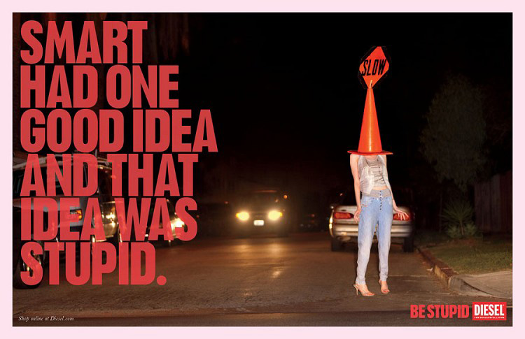
| THE ORIGINAL? RioSport – 2010 “Be stupid” Source : Cannes Lions Grand-Prix Agency : Anomaly, London (United-Kingdom) |
LESS ORIGINAL Fanta – 2020 “Unleash your inner idiot” Source : La Réclame Agency : 72andSunny (USA) |
Post pobrano z: The human pinball / Une ressemblance qui fait flipper?
 |
 |
| THE ORIGINAL? RioSport – 2015 “Sport is health, say no to steroids” “You don’t have an extra life” Source : Adsoftheworld Agency : FCB Sao Paulo (Brazil) |
LESS ORIGINAL Otrivin Nasal Spray – 2020 “Otrivin unblocks nose fast” Click on the image to enlarge Source : Adsoftheworld Agency : Wunderman Dubaï (UAE) |
Post pobrano z: McDonald’s Happy Meal: Kids energy
Print
McDonald’s
To celebrate the 40th anniversary of the McDonald’s Happy Meal, we captured emotional relationship between the iconic Happy Meal and kids. As we know, kids have so much energy that make them never get tired to move so much. But it’s the bright red box with its golden handles that always manages to draw their attention, making them stop moving. Focus only on the red box of Happy Meal, enjoy the delicious meals inside and forget anything else.
Advertising Agency:Flock, Jakarta, Indonesia
Post pobrano z: How to make sure your call to action buttons convert the way you want
You are probably already familiar
with the concept of call to action, but if somehow you are new to web
design, call to action refers to elements in a page that request an action from
its visitors.
If you are indeed new to web design,
there are high chances that you will neglect this important part of a website,
but the real problem is that experienced designers do it as well.
A lot of web designers struggle to
understand their true function, beyond looking attractive. Yet, call to action
buttons are too valuable to be placed carelessly on a website, without any real
regard for their purpose.
It is essential for designers and
developers to have a good understanding of the various ways in which color,
size, text, and other features can affect the value of a call to action button.

The techniques employed to create
better call to action buttons are not overly intricate, but they do need a
reasonable amount of planning and care if they are going to successfully
encourage visitors to exhibit desired behaviors.
For call to action buttons that
perform successfully, it is first necessary to work out how they should gel
with the rest of the website design. This is referred to as ‘establishing the
ground architecture’ and it will help you to further understand how call to
action buttons work within the web interface.
The primary goal of all business
websites is to turn a profit. As better call to action buttons actively
contribute to the achievement of this objective, it makes sense to spend a
reasonable amount of time thinking about their design, even if they do only
take up a tiny amount of space. In many ways, they are the true stars of a web
page.
It is a good idea to think carefully
about the size of your call to action buttons. A button that is too big is
likely to distract visitors in a negative way, but a button that is too small
will get lost in all of the other features which are competing for attention.
The best call to action buttons are big enough to draw in the eye
but dainty enough to gel with the overall design.
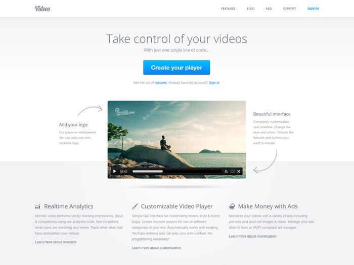
In fact, color is a great way to
further balance out the scale of the call to action buttons. For bigger
buttons, opt for a shade that is used infrequently within the overall website
design.
It should still be a color that is
bright enough to stand out. The opposite is true for shades that are used
frequently; in this case, a bold tone will really make the button stand out.
So, if you’re using a WordPress plugin to insert the buttons on the page, make sure not to use
the default ones. Customize them to your design and for your users. Use a
legible font, and make sure not to use one that you fancy from other sites.
This means that you should say no to using the font that Instagram uses just because you like it. Your
audience might not.
It is common for businesses to
surround call to action buttons with images associated with clicking or looking
at them. This is to further encourage visitors to want to go where they promise
to lead.
If you use the right images, this
kind of technique can be very effective – why not try a series of arrows or
even a picture of a person looking directly at the button?
For human beings, directional
prompts can be very powerful. You only have to think about what happens when we
spot an individual looking intensely in a specific direction – in most cases,
everybody else would look there too, in order to find out what was causing such
interest. This is why directional cuing can be a successful technique.
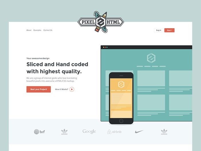
The
copy featured in your call to action buttons needs to be simple and easy to understand. A good call to
action button is one that tells a visitor what it offers in a fraction of a
second. This means that they do not have to pause to find out, and are much
more likely to follow it.
It is perfectly okay, necessary in
fact, to use direct language within call to action buttons. For example, words
like Click Here, Call, Visit, Buy, Register, and Subscribe are common and
effective. Look at German startups and how they are doing things. They’re known for being
direct. Their call to action buttons have a simple and efficient copy.
However, if you want to have a unique website not just in terms of design, but
also copy, you can use more creative copy variations.
It is just as important to think
about the size of your copy. It should be significantly bigger than the rest of
the text on your website so that it stands out. It should also be boldly
colored, and contrast enough so that it is easy to read quickly.

If necessary, you can use a call to
action button to tell visitors what to expect. However, this is most effective
when it comes to the use of ‘trial’ and ‘download’ functions. The information
provided usually pertains to the size of a download, or the length of a free
trial.
For call to action buttons that
feature extra data, it is still vital that their key goal is prioritized above
all else.
In other words, do not forget the
action which you are trying to promote. This can be achieved by making sure
that the ‘action’ words are more prominent than everything else.
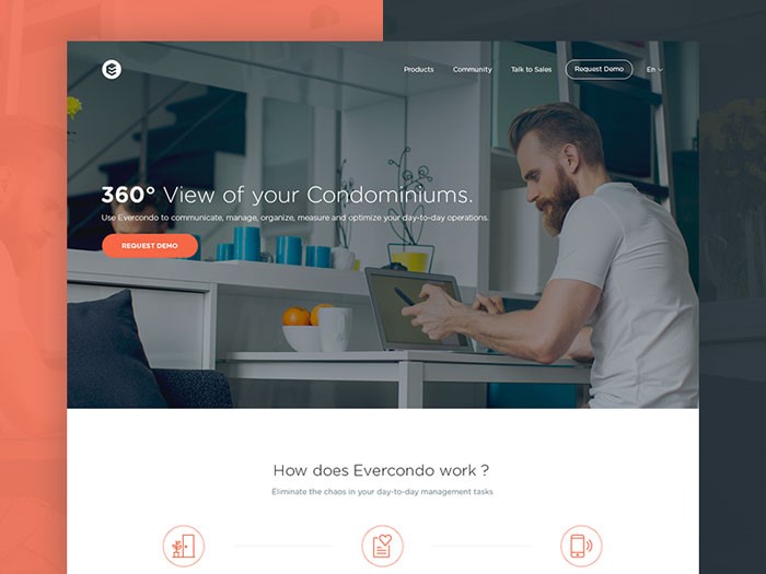
For most webpages, the best place to
position a call to action button is just above the fold. In fact, if a button
can only be reached with scrolling, many visitors will simply ignore it, or not
see it at all. This is what some people say, at least. The truth, however, is
that it depends.
You can get around this by placing
two of the same call to action buttons on a page, with one at the top and one
at the bottom. This way, if they can only be reached via scrolling, you have
doubled the chance that the prompt will be effective.
It is equally important to think
about proximity to other items. For instance, it can be valuable to position
call to action buttons close to reviews, testimonials, about us pages, and
anything else which clearly states what your company does, and what it promises
to offer visitors.
It is a mistake to assume that the
placement of a call to action button is all that matters. The area surrounding
it can be just as vital because the more empty space there is around a call to
action button, the more chance there is of the eye being drawn there. If there
is too much ‘noise,’ they may get lost.

The main aim is to prompt visitors
to exhibit the behaviors which you want to see with as little effort as
possible.
Whilst deception is not the aim, it
is important to make sure that they do not get too many opportunities to pause
and think about whether or not to click through. The internet is a place that
moves extremely fast, and you have to work fast if you want to secure
conversions.
This is why it is important for call
to action buttons to convey a sense of urgency. They should make it seem like
the only opportunity is right now as if the only chance to take advantage is to
follow the directions quickly.
In the case of high-cost purchases,
this might not be successful, but for low ticket items, it can lead to a hike
in sales. For example, if your
site sells tickets to events, you might want to create a sense of urgency to sell them
faster.
In many different ways, call to
action buttons are essential to the success of online businesses. For all
website developers, the primary aim is to secure either more attention or
increased sales, and this feature is a big part of achieving that.
It could be purchases,
registrations, membership enrollment, or anything else which needs
participation – whatever the aim, use call to action buttons to make it so.
They may take up a tiny amount of space, but these little buttons can have a
big impact on business.
Post pobrano z: How to make sure your call to action buttons convert the way you want
You are probably already familiar
with the concept of call to action, but if somehow you are new to web
design, call to action refers to elements in a page that request an action from
its visitors.
If you are indeed new to web design,
there are high chances that you will neglect this important part of a website,
but the real problem is that experienced designers do it as well.
A lot of web designers struggle to
understand their true function, beyond looking attractive. Yet, call to action
buttons are too valuable to be placed carelessly on a website, without any real
regard for their purpose.
It is essential for designers and
developers to have a good understanding of the various ways in which color,
size, text, and other features can affect the value of a call to action button.
The techniques employed to create
better call to action buttons are not overly intricate, but they do need a
reasonable amount of planning and care if they are going to successfully
encourage visitors to exhibit desired behaviors.
For call to action buttons that
perform successfully, it is first necessary to work out how they should gel
with the rest of the website design. This is referred to as ‘establishing the
ground architecture’ and it will help you to further understand how call to
action buttons work within the web interface.
The primary goal of all business
websites is to turn a profit. As better call to action buttons actively
contribute to the achievement of this objective, it makes sense to spend a
reasonable amount of time thinking about their design, even if they do only
take up a tiny amount of space. In many ways, they are the true stars of a web
page.
It is a good idea to think carefully
about the size of your call to action buttons. A button that is too big is
likely to distract visitors in a negative way, but a button that is too small
will get lost in all of the other features which are competing for attention.
The best call to action buttons are big enough to draw in the eye
but dainty enough to gel with the overall design.
In fact, color is a great way to
further balance out the scale of the call to action buttons. For bigger
buttons, opt for a shade that is used infrequently within the overall website
design.
It should still be a color that is
bright enough to stand out. The opposite is true for shades that are used
frequently; in this case, a bold tone will really make the button stand out.
So, if you’re using a WordPress plugin to insert the buttons on the page, make sure not to use
the default ones. Customize them to your design and for your users. Use a
legible font, and make sure not to use one that you fancy from other sites.
This means that you should say no to using the font that Instagram uses just because you like it. Your
audience might not.
It is common for businesses to
surround call to action buttons with images associated with clicking or looking
at them. This is to further encourage visitors to want to go where they promise
to lead.
If you use the right images, this
kind of technique can be very effective – why not try a series of arrows or
even a picture of a person looking directly at the button?
For human beings, directional
prompts can be very powerful. You only have to think about what happens when we
spot an individual looking intensely in a specific direction – in most cases,
everybody else would look there too, in order to find out what was causing such
interest. This is why directional cuing can be a successful technique.
The
copy featured in your call to action buttons needs to be simple and easy to understand. A good call to
action button is one that tells a visitor what it offers in a fraction of a
second. This means that they do not have to pause to find out, and are much
more likely to follow it.
It is perfectly okay, necessary in
fact, to use direct language within call to action buttons. For example, words
like Click Here, Call, Visit, Buy, Register, and Subscribe are common and
effective. Look at German startups and how they are doing things. They’re known for being
direct. Their call to action buttons have a simple and efficient copy.
However, if you want to have a unique website not just in terms of design, but
also copy, you can use more creative copy variations.
It is just as important to think
about the size of your copy. It should be significantly bigger than the rest of
the text on your website so that it stands out. It should also be boldly
colored, and contrast enough so that it is easy to read quickly.
If necessary, you can use a call to
action button to tell visitors what to expect. However, this is most effective
when it comes to the use of ‘trial’ and ‘download’ functions. The information
provided usually pertains to the size of a download, or the length of a free
trial.
For call to action buttons that
feature extra data, it is still vital that their key goal is prioritized above
all else.
In other words, do not forget the
action which you are trying to promote. This can be achieved by making sure
that the ‘action’ words are more prominent than everything else.
For most webpages, the best place to
position a call to action button is just above the fold. In fact, if a button
can only be reached with scrolling, many visitors will simply ignore it, or not
see it at all. This is what some people say, at least. The truth, however, is
that it depends.
You can get around this by placing
two of the same call to action buttons on a page, with one at the top and one
at the bottom. This way, if they can only be reached via scrolling, you have
doubled the chance that the prompt will be effective.
It is equally important to think
about proximity to other items. For instance, it can be valuable to position
call to action buttons close to reviews, testimonials, about us pages, and
anything else which clearly states what your company does, and what it promises
to offer visitors.
It is a mistake to assume that the
placement of a call to action button is all that matters. The area surrounding
it can be just as vital because the more empty space there is around a call to
action button, the more chance there is of the eye being drawn there. If there
is too much ‘noise,’ they may get lost.
The main aim is to prompt visitors
to exhibit the behaviors which you want to see with as little effort as
possible.
Whilst deception is not the aim, it
is important to make sure that they do not get too many opportunities to pause
and think about whether or not to click through. The internet is a place that
moves extremely fast, and you have to work fast if you want to secure
conversions.
This is why it is important for call
to action buttons to convey a sense of urgency. They should make it seem like
the only opportunity is right now as if the only chance to take advantage is to
follow the directions quickly.
In the case of high-cost purchases,
this might not be successful, but for low ticket items, it can lead to a hike
in sales. For example, if your
site sells tickets to events, you might want to create a sense of urgency to sell them
faster.
In many different ways, call to
action buttons are essential to the success of online businesses. For all
website developers, the primary aim is to secure either more attention or
increased sales, and this feature is a big part of achieving that.
It could be purchases,
registrations, membership enrollment, or anything else which needs
participation – whatever the aim, use call to action buttons to make it so.
They may take up a tiny amount of space, but these little buttons can have a
big impact on business.
Post pobrano z: “weeds of specificity”
[…] with WordPress child themes, you are all but guaranteed to get into the weeds of specificity, hunting around theme stylesheets that you didn’t author, trying to figure out what existing declaration is preventing you from applying a new style, and then figuring out the least specificity you need to override it, and then thinking “Maybe it would be faster if I just wrote all of this myself”.
Her point wasn’t child themes (although I think that’s a perfect thing to point to as the way you work with them is all with overriding what is already there), but the expectation of knowledge:
[…] unless you are “a CSS person” this understanding of specificity and its impact on the future of the code-base is somewhat specialized knowledge. Should everyone who writes CSS be expected to understand these details? Maybe, but the more experienced I become in all kinds of development, I’m starting to think that’s an unrealistic expectation given how much other stuff we have to know as developers.
Direct Link to Article — Permalink
The post “weeds of specificity” appeared first on CSS-Tricks.
Post pobrano z: Get Started Building GraphQL APIs With Node
We all have a number of interests and passions. For example, I’m interested in JavaScript, 90’s indie rock and hip hop, obscure jazz, the city of Pittsburgh, pizza, coffee, and movies starring John Lurie. We also have family members, friends, acquaintances, classmates, and colleagues who also have their own social relationships, interests, and passions. Some of these relationships and interests overlap, like my friend Riley who shares my interest in 90’s hip hop and pizza. Others do not, like my colleague Harrison, who prefers Python to JavaScript, only drinks tea, and prefers current pop music. All together, we each have a connected graph of the people in our lives, and the ways that our relationships and interests overlap.
These types of interconnected data are exactly the challenge that GraphQL initially set out to solve in API development. By writing a GraphQL API we are able to efficiently connect data, which reduces the complexity and number of requests, while allowing us to serve the client precisely the data that it needs. (If you’re into more GraphQL metaphors, check out Meeting GraphQL at a Cocktail Mixer.)
In this article, we’ll build a GraphQL API in Node.js, using the Apollo Server package. To do so, we’ll explore fundamental GraphQL topics, write a GraphQL schema, develop code to resolve our schema functions, and access our API using the GraphQL Playground user interface.
GraphQL is an open source query and data manipulation language for APIs. It was developed with the goal of providing single endpoints for data, allowing applications to request exactly the data that is needed. This has the benefit of not only simplifying our UI code, but also improving performance by limiting the amount of data that needs to be sent over the wire.
To follow along with this tutorial, you’ll need Node v8.x or later and some familiarity with working with the command line.
We’re going to build an API application for book highlights, allowing us to store memorable passages from the things that we read. Users of the API will be able to perform “CRUD” (create, read, update, delete) operations against their highlights:
To get started, first create a new directory for our project, initialize a new node project, and install the dependencies that we’ll need:
# make the new directory
mkdir highlights-api
# change into the directory
cd highlights-api
# initiate a new node project
npm init -y
# install the project dependencies
npm install apollo-server graphql
# install the development dependencies
npm install nodemon --save-dev
Before moving on, let’s break down our dependencies:
apollo-server is a library that enables us to work with GraphQL within our Node application. We’ll be using it as a standalone library, but the team at Apollo has also created middleware for working with existing Node web applications in Express, hapi, Fastify, and Koa.graphql includes the GraphQL language and is a required peer dependency of apollo-server.nodemon is a helpful library that will watch our project for changes and automatically restart our server.With our packages installed, let’s next create our application’s root file, named index.js. For now, we’ll console.log() a message in this file:
console.log("📚 Hello Highlights");To make our development process simpler, we’ll update the scripts object within our package.json file to make use of the nodemon package:
"scripts": {
  "start": "nodemon index.js"
},
Now, we can start our application by typing npm start in the terminal application. If everything is working properly, you will see 📚 Hello Highlights logged to your terminal.
A schema is a written representation of our data and interactions. By requiring a schema, GraphQL enforces a strict plan for our API. This is because the API can only return data and perform interactions that are defined within the schema. The fundamental component of GraphQL schemas are object types. GraphQL contains five built-in types:
We can construct a schema for an API with these basic components. In a file named schema.js, we can import the gql library and prepare the file for our schema syntax:
const { gql } = require('apollo-server');

const typeDefs = gql`
  # The schema will go here
`;

module.exports = typeDefs;
To write our schema, we first define the type. Let’s consider how we might define a schema for our highlights application. To begin, we would create a new type with a name of Highlight:
const typeDefs = gql`
  type Highlight {
  }
`;
Each highlight will have a unique ID, some content, a title, and an author. The Highlight schema will look something like this:
const typeDefs = gql`
  type Highlight {
    id: ID
    content: String
    title: String
    author: String
  }
`;
We can make some of these fields required by adding an exclamation point:
const typeDefs = gql`
  type Highlight {
    id: ID!
    content: String!
    title: String
    author: String
  }
`;
Though we’ve defined an object type for our highlights, we also need to provide a description of how a client will fetch that data. This is called a query. We’ll dive more into queries shortly, but for now let’s describe in our schema the ways in which someone will retrieve highlights. When requesting all of our highlights, the data will be returned as an array (represented as [Highlight]) and when we want to retrieve a single highlight we will need to pass an ID as a parameter.
const typeDefs = gql`
  type Highlight {
    id: ID!
    content: String!
    title: String
    author: String
  }
  type Query {
    highlights: [Highlight]!
    highlight(id: ID!): Highlight
  }
`;
Now, in the index.js file, we can import our type definitions and set up Apollo Server:
const {ApolloServer } = require('apollo-server');
const typeDefs = require('./schema');

const server = new ApolloServer({ typeDefs });

server.listen().then(({ url }) => {
  console.log(`📚 Highlights server ready at ${url}`);
});
If we’ve kept the node process running, the application will have automatically updated and relaunched, but if not, typing npm start from the project’s directory in the terminal window will start the server. If we look at the terminal, we should see that nodemon is watching our files and the server is running on a local port:
[nodemon] 2.0.2
[nodemon] to restart at any time, enter `rs`
[nodemon] watching dir(s): *.*
[nodemon] watching extensions: js,mjs,json
[nodemon] starting `node index.js`
📚 Highlights server ready at http://localhost:4000/
Visiting the URL in the browser will launch the GraphQL Playground application, which provides a user interface for interacting with our API.

Though we’ve developed our project with an initial schema and Apollo Server setup, we can’t yet interact with our API. To do so, we’ll introduce resolvers. Resolvers perform exactly the action their name implies; they resolve the data that the API user has requested. We will write these resolvers by first defining them in our schema and then implementing the logic within our JavaScript code. Our API will contain two types of resolvers: queries and mutations.
Let’s first add some data to interact with. In an application, this would typically be data that we’re retrieving and writing to from a database, but for our example let’s use an array of objects. In the index.js file add the following:
let highlights = [
  {
    id: '1',
    content: 'One day I will find the right words, and they will be simple.',
    title: 'Dharma Bums',
    author: 'Jack Kerouac'
  },
  {
    id: '2',
    content: 'In the limits of a situation there is humor, there is grace, and everything else.',
    title: 'Arbitrary Stupid Goal',
    author: 'Tamara Shopsin'
  }
]A query requests specific data from an API, in its desired format. The query will then return an object, containing the data that the API user has requested. A query never modifies the data; it only accesses it. We’ve already written a two queries in our schema. The first returns an array of highlights and the second returns a specific highlight. The next step is to write the resolvers that will return the data.
In the index.js file, we can add a resolvers object, which can contain our queries:
const resolvers = {
  Query: {
    highlights: () => highlights,
    highlight: (parent, args) => {
      return highlights.find(highlight => highlight.id === args.id);
    }
  }
};
The highlights query returns the full array of highlights data. The highlight query accepts two parameters: parent and args. The parent is the first parameter of any GraqhQL query in Apollo Server and provides a way of accessing the context of the query. The args parameter allows us to access the user provided arguments. In this case, users of the API will be supplying an id argument to access a specific highlight.
We can then update our Apollo Server configuration to include the resolvers:
const server = new ApolloServer({ typeDefs, resolvers });With our query resolvers written and Apollo Server updated, we can now query API using the GraphQL Playground. To access the GraphQL Playground, visit http://localhost:4000 in your web browser.
A query is formatted as so:
query {
  queryName {
      field
      field
    }
}
With this in mind, we can write a query that requests the ID, content, title, and author for each our highlights:
query {
  highlights {
    id
    content
    title
    author
  }
}
Let’s say that we had a page in our UI that lists only the titles and authors of our highlighted texts. We wouldn’t need to retrieve the content for each of those highlights. Instead, we could write a query that only requests the data that we need:
query {
  highlights {
    title
    author
  }
}
We’ve also written a resolver to query for an individual note by including an ID parameter with our query. We can do so as follows:
query {
  highlight(id: "1") {
    content
  }
}
We use a mutation when we want to modify the data in our API. In our highlight example, we will want to write a mutation to create a new highlight, one to update an existing highlight, and a third to delete a highlight. Similar to a query, a mutation is also expected to return a result in the form of an object, typically the end result of the performed action.
The first step to updating anything in GraphQL is to write the schema. We can include mutations in our schema, by adding a mutation type to our schema.js file:
type Mutation {
  newHighlight (content: String! title: String author: String): Highlight!
  updateHighlight(id: ID! content: String!): Highlight!
  deleteHighlight(id: ID!): Highlight!
}
Our newHighlight mutation will take the required value of content along with optional title and author values and return a Highlight. The updateHighlight mutation will require that a highlight id and content be passed as argument values and will return the updated Highlight. Finally, the deleteHighlight mutation will accept an ID argument, and will return the deleted Highlight.
With the schema updated to include mutations, we can now update the resolvers in our index.js file to perform these actions. Each mutation will update our highlights array of data.
const resolvers = {
  Query: {
    highlights: () => highlights,
    highlight: (parent, args) => {
      return highlights.find(highlight => highlight.id === args.id);
    }
  },
  Mutation: {
    newHighlight: (parent, args) => {
      const highlight = {
        id: String(highlights.length + 1),
        title: args.title || '',
        author: args.author || '',
        content: args.content
      };
      highlights.push(highlight);
      return highlight;
    },
    updateHighlight: (parent, args) => {
      const index = highlights.findIndex(highlight => highlight.id === args.id);
      const highlight = {
        id: args.id,
        content: args.content,
        author: highlights[index].author,
        title: highlights[index].title
      };
      highlights[index] = highlight;
      return highlight;
    },
    deleteHighlight: (parent, args) => {
      const deletedHighlight = highlights.find(
        highlight => highlight.id === args.id
      );
      highlights = highlights.filter(highlight => highlight.id !== args.id);
      return deletedHighlight;
    }
  }
};
With these mutations written, we can use the GraphQL Playground to practice mutating the data. The structure of a mutation is nearly identical to that of a query, specifying the name of the mutation, passing the argument values, and requesting specific data in return. Let’s start by adding a new highlight:
mutation {
  newHighlight(author: "Adam Scott" title: "JS Everywhere" content: "GraphQL is awesome") {
    id
    author
    title
    content
  }
}
We can then write mutations to update a highlight:
mutation {
  updateHighlight(id: "3" content: "GraphQL is rad") {
    id
    content
  }
}
And to delete a highlight:
mutation {
  deleteHighlight(id: "3") {
    id
  }
}Congratulations! You’ve now successfully built a GraphQL API, using Apollo Server, and can run GraphQL queries and mutations against an in-memory data object. We’ve established a solid foundation for exploring the world of GraphQL API development.
Here are some potential next steps to level up:
The post Get Started Building GraphQL APIs With Node appeared first on CSS-Tricks.