How to Make a CSS-Only Carousel

Post pobrano z: How to Make a CSS-Only Carousel

We mentioned a way to make a CSS-only carousel in a recent issue of the newsletter and I thought that a more detailed write up would be interesting and capture some of my thoughts on making one.

So, here’s what we’re making today:

There’s no JavaScript here, whatsoever! No jQuery plugins. No trickiness. Just a couple of new-ish CSS properties that I’ve been experimenting with as well as some basic HTML.

OK to start, we need to focus on the markup. The design includes a left navigation made up of images and a large image gallery on the right that lets us scroll through each image individually. We’ll also need a wrapper to help us organize the layout:

<div class="wrapper">
  <nav class="lil-nav"></nav>
  <div class="gallery"></div>
</div>

Next, we can add images! For this little example, I checked out our list of sites with high quality images that you can use for free and went with Unsplash.

After saving images with the CodePen asset manager, I started adding the URLs to the nav element:

<nav class="lil-nav">
  <a href="#image-1">
    <img class="lil-nav__img" src="..." alt="Yosemite" />
  </a>
  <a href="#image-2">
    <img class="lil-nav__img" src="..." alt="Basketball hoop" />
  </a>
  <!-- more images go here --> 
</nav>

See that the href to each of these links is pointing to an ID? That’s because if we look at the demo again, we want to be able to click an image and then we want to it to hop to the larger version of that image in the gallery to the right.

So, now we can start to add these images to the large gallery, too…

<div class="gallery">
  <img class="gallery__img" id="image-1" src="..." alt="Yosemite" />
  <img class="gallery__img" id="image-2" src="..." alt="Basketball hoop" />
  <!-- more images go here --> 
</div>

Nifty. Next is the fun part: styling this bad boy. We can use a grid layout the parent .wrapper and set some smart defaults for the img element:

img {
  display: block;
  max-width: 100%;
}

.wrapper {
  display: grid;
  grid-template-columns: 1fr 5fr;
  grid-gap: 20px;
}
CodePen Embed Fallback

So far, we have our layout sorted and our links set up. Next, let’s any any overflow that might spill outside our wrapper and make sure that the nav and the gallery are scrollable:

.wrapper {
  display: grid;
  grid-template-columns: 1fr 5fr;
  grid-gap: 10px;
  overflow: hidden;
  height: 100vh; 
}

.gallery {
  overflow: scroll;
}

.lil-nav {
  overflow-y: scroll;
  overflow-x: hidden;
}
CodePen Embed Fallback

We can scroll through each image in the gallery now, but if this was a production website we’d probably want to make sure that folks can scroll passed this carousel a bit more easily. Trent Walton wrote about this very problem several years ago and I think it’s always worth keeping in mind.

Next up, let’s focus on the carousel snap of each image in the gallery. To do that we’ll need to use the scroll-snap-type and scroll-snap-align property like this:

.gallery {
  overflow: scroll;
  scroll-snap-type: x mandatory;
}

.gallery__img {
  scroll-snap-align: start;
  margin-bottom: 10px;
}

Now try scrolling through the gallery on the right-hand side again:

CodePen Embed Fallback

If you want to learn more about these properties I’d highly recommend this piece about practical CSS scroll snapping which digs into the nitty-gritty of these properties.

We have a pretty dang usable carousel! From here, all we have to do is tidy up the design because the gallery image isn’t the full height of the screen. To do that we can use object-fit and give each image a min-height with the vh unit, just like this:

.gallery__img {
  scroll-snap-align: start;
  margin-bottom: 10px;
  min-height: 100vh;
  object-fit: cover;
}

Now the big gallery images will always be the full size of the screen and will scale to take up the width and height. Let’s move on and tackle the style of the little navigation images:

.lil-nav {
  overflow-y: scroll;
  overflow-x: hidden;
}

.lil-nav a {
  height: 200px;
  display: flex;
  margin-bottom: 10px;
}

.lil-nav__img {
  object-fit: cover;
}
CodePen Embed Fallback

At first, I made this little nav act like a carousel too, but it felt really weird. I’m just keeping the default scroll behavior for now. In that demo above, though, try clicking an image. Notice how it jumps to that image in the carousel immediately? It would be nice if we could animate that transition a bit — and we can!

.gallery {
  overflow: scroll;
  scroll-snap-type: x mandatory;
  scroll-behavior: smooth;
}

That scroll-behavior CSS property is super handy for this and so now the whole thing will animate if you click one of the nav items:

CodePen Embed Fallback

Nifty, eh? One more tiny thing we could do here is throw a filter on the nav items to make them black and white and then animate them on hover:

.lil-nav__img {
  object-fit: cover;
  filter: saturate(0);
  transition: 0.3s ease all;
}

.lil-nav__img:hover {
  transform: scale(1.05);
  filter: saturate(1);
}

I’m sure there’s a lot more we could do here but I think this works quite nicely!

CodePen Embed Fallback

We could even throw a tiny bit of JavaScript into the mix to show which image is active, but I reckon that folks know that just from looking at the gallery.

That’s it! We now have a carousel that’s pretty dang good for progressive enhancement and it means we don’t have to load a library of JavaScript or write a bunch more code than we really need to.

Making the carousel responsive…

Let’s go one step further though and make this chap responsive. What we want to do is reverse the order of our grid by moving all of our current styles into a media query that is only activated at larger screens.

You might want to open up this demo in a new tab and decrease/increase the size of the browser to see the changes take place:

CodePen Embed Fallback

If you load this demo on a mobile device you should see how the layout switches between the two modes. This is done by using a single media query on the .wrapper element. Note that we’re using Sass:

$large: 1200px;

.wrapper {
  overflow: hidden;
  height: 100vh;
  display: grid;
  grid-template-rows: 2fr 1fr;
  grid-gap: 10px;

  @media screen and (min-width: $large) {
    grid-template-columns: 1fr 5fr;
    grid-template-rows: auto;
  }
}

Let’s add one on the navigation, too. But this time, we need to tell the navigation to start on the second row so it moves to the bottom of the screen:

.lil-nav {
  overflow-x: scroll;
  overflow-y: hidden;
  display: flex;
  grid-row-start: 2;

  @media screen and (min-width: $large) {
    overflow-y: scroll;
    overflow-x: hidden;
    display: block;
    grid-row-start: auto;
  }
}

With the gallery we need to switch around the scroll-type for larger screens and reverse the overflow property as well:

.gallery {
  overflow-x: scroll;
  overflow-y: hidden;
  scroll-snap-type: x mandatory;
  scroll-behavior: smooth;
  display: flex;

  @media screen and (min-width: $large) {
    display: block;
    overflow-y: scroll;
    overflow-x: hidden;
    scroll-snap-type: y mandatory;
  }
}

That’s the bulk of the changes we’ve had to make and I quite like it! If we wanted to make this production-ready, we would think about accessibility (e.g. we probably don’t want screen readers to read out all the images in both the nav and gallery). Then there’s performance — we might consider lazy-loading so the images are only rendered when they’re needed.

Either way, this is a good start !

The post How to Make a CSS-Only Carousel appeared first on CSS-Tricks.

How to Make a CSS-Only Carousel

Post pobrano z: How to Make a CSS-Only Carousel

We mentioned a way to make a CSS-only carousel in a recent issue of the newsletter and I thought that a more detailed write up would be interesting and capture some of my thoughts on making one.

So, here’s what we’re making today:

There’s no JavaScript here, whatsoever! No jQuery plugins. No trickiness. Just a couple of new-ish CSS properties that I’ve been experimenting with as well as some basic HTML.

OK to start, we need to focus on the markup. The design includes a left navigation made up of images and a large image gallery on the right that lets us scroll through each image individually. We’ll also need a wrapper to help us organize the layout:

<div class="wrapper">
  <nav class="lil-nav"></nav>
  <div class="gallery"></div>
</div>

Next, we can add images! For this little example, I checked out our list of sites with high quality images that you can use for free and went with Unsplash.

After saving images with the CodePen asset manager, I started adding the URLs to the nav element:

<nav class="lil-nav">
  <a href="#image-1">
    <img class="lil-nav__img" src="..." alt="Yosemite" />
  </a>
  <a href="#image-2">
    <img class="lil-nav__img" src="..." alt="Basketball hoop" />
  </a>
  <!-- more images go here --> 
</nav>

See that the href to each of these links is pointing to an ID? That’s because if we look at the demo again, we want to be able to click an image and then we want to it to hop to the larger version of that image in the gallery to the right.

So, now we can start to add these images to the large gallery, too…

<div class="gallery">
  <img class="gallery__img" id="image-1" src="..." alt="Yosemite" />
  <img class="gallery__img" id="image-2" src="..." alt="Basketball hoop" />
  <!-- more images go here --> 
</div>

Nifty. Next is the fun part: styling this bad boy. We can use a grid layout the parent .wrapper and set some smart defaults for the img element:

img {
  display: block;
  max-width: 100%;
}

.wrapper {
  display: grid;
  grid-template-columns: 1fr 5fr;
  grid-gap: 20px;
}
CodePen Embed Fallback

So far, we have our layout sorted and our links set up. Next, let’s any any overflow that might spill outside our wrapper and make sure that the nav and the gallery are scrollable:

.wrapper {
  display: grid;
  grid-template-columns: 1fr 5fr;
  grid-gap: 10px;
  overflow: hidden;
  height: 100vh; 
}

.gallery {
  overflow: scroll;
}

.lil-nav {
  overflow-y: scroll;
  overflow-x: hidden;
}
CodePen Embed Fallback

We can scroll through each image in the gallery now, but if this was a production website we’d probably want to make sure that folks can scroll passed this carousel a bit more easily. Trent Walton wrote about this very problem several years ago and I think it’s always worth keeping in mind.

Next up, let’s focus on the carousel snap of each image in the gallery. To do that we’ll need to use the scroll-snap-type and scroll-snap-align property like this:

.gallery {
  overflow: scroll;
  scroll-snap-type: x mandatory;
}

.gallery__img {
  scroll-snap-align: start;
  margin-bottom: 10px;
}

Now try scrolling through the gallery on the right-hand side again:

CodePen Embed Fallback

If you want to learn more about these properties I’d highly recommend this piece about practical CSS scroll snapping which digs into the nitty-gritty of these properties.

We have a pretty dang usable carousel! From here, all we have to do is tidy up the design because the gallery image isn’t the full height of the screen. To do that we can use object-fit and give each image a min-height with the vh unit, just like this:

.gallery__img {
  scroll-snap-align: start;
  margin-bottom: 10px;
  min-height: 100vh;
  object-fit: cover;
}

Now the big gallery images will always be the full size of the screen and will scale to take up the width and height. Let’s move on and tackle the style of the little navigation images:

.lil-nav {
  overflow-y: scroll;
  overflow-x: hidden;
}

.lil-nav a {
  height: 200px;
  display: flex;
  margin-bottom: 10px;
}

.lil-nav__img {
  object-fit: cover;
}
CodePen Embed Fallback

At first, I made this little nav act like a carousel too, but it felt really weird. I’m just keeping the default scroll behavior for now. In that demo above, though, try clicking an image. Notice how it jumps to that image in the carousel immediately? It would be nice if we could animate that transition a bit — and we can!

.gallery {
  overflow: scroll;
  scroll-snap-type: x mandatory;
  scroll-behavior: smooth;
}

That scroll-behavior CSS property is super handy for this and so now the whole thing will animate if you click one of the nav items:

CodePen Embed Fallback

Nifty, eh? One more tiny thing we could do here is throw a filter on the nav items to make them black and white and then animate them on hover:

.lil-nav__img {
  object-fit: cover;
  filter: saturate(0);
  transition: 0.3s ease all;
}

.lil-nav__img:hover {
  transform: scale(1.05);
  filter: saturate(1);
}

I’m sure there’s a lot more we could do here but I think this works quite nicely!

CodePen Embed Fallback

We could even throw a tiny bit of JavaScript into the mix to show which image is active, but I reckon that folks know that just from looking at the gallery.

That’s it! We now have a carousel that’s pretty dang good for progressive enhancement and it means we don’t have to load a library of JavaScript or write a bunch more code than we really need to.

Making the carousel responsive…

Let’s go one step further though and make this chap responsive. What we want to do is reverse the order of our grid by moving all of our current styles into a media query that is only activated at larger screens.

You might want to open up this demo in a new tab and decrease/increase the size of the browser to see the changes take place:

CodePen Embed Fallback

If you load this demo on a mobile device you should see how the layout switches between the two modes. This is done by using a single media query on the .wrapper element. Note that we’re using Sass:

$large: 1200px;

.wrapper {
  overflow: hidden;
  height: 100vh;
  display: grid;
  grid-template-rows: 2fr 1fr;
  grid-gap: 10px;

  @media screen and (min-width: $large) {
    grid-template-columns: 1fr 5fr;
    grid-template-rows: auto;
  }
}

Let’s add one on the navigation, too. But this time, we need to tell the navigation to start on the second row so it moves to the bottom of the screen:

.lil-nav {
  overflow-x: scroll;
  overflow-y: hidden;
  display: flex;
  grid-row-start: 2;

  @media screen and (min-width: $large) {
    overflow-y: scroll;
    overflow-x: hidden;
    display: block;
    grid-row-start: auto;
  }
}

With the gallery we need to switch around the scroll-type for larger screens and reverse the overflow property as well:

.gallery {
  overflow-x: scroll;
  overflow-y: hidden;
  scroll-snap-type: x mandatory;
  scroll-behavior: smooth;
  display: flex;

  @media screen and (min-width: $large) {
    display: block;
    overflow-y: scroll;
    overflow-x: hidden;
    scroll-snap-type: y mandatory;
  }
}

That’s the bulk of the changes we’ve had to make and I quite like it! If we wanted to make this production-ready, we would think about accessibility (e.g. we probably don’t want screen readers to read out all the images in both the nav and gallery). Then there’s performance — we might consider lazy-loading so the images are only rendered when they’re needed.

Either way, this is a good start !

The post How to Make a CSS-Only Carousel appeared first on CSS-Tricks.

“The title ‘Front-End Developer’ is obsolete.”

Post pobrano z: “The title ‘Front-End Developer’ is obsolete.”

That title is from the opening tweet of a thread from Benjamin De Cock. I wouldn’t go that far, myself. What I like about the term is that ‘Front-End’ literally means the browser, and while the job has been changing quite a lot — and is perhaps fracturing before our eyes — the fact that the job is about doing browser work is still true. We’re browser people. This was a point I tried to make in my “Ooooops I guess we’re full-stack developers now” talk.

I really like Benjamin’s sentiment though. There is a scourge of implementations of things on the web that are both heavier and worse because they re-implement something that the browser offers better and “for free.” Think sliders: scrolling behavior, snap points, fixed/sticky positioning, form controls, animation, etc.

Our industry seems to have acknowledged that backend and frontend developers require very different skills (even though they often use the exact same language), and yet it’s struggling to see there’s too much bundled into the term “front-end developer”.

That’s the tricky part. That’s at the heart of The Great Divide. There’s an awful lot of front-end developers where their job solely focuses on JavaScript. You could call them “JavaScript Engineers” or “JavaScript Developers,” and that feels OK. However, I’m not sure what you call someone who’s a great front-end developer, not particularly focused on JavaScript, but is on other aspects of the front end.

The modern frontend developer is most often than not a “Jack of all trades” mastering JS (or even just a framework) and barely tolerating HTML/CSS as a necessary evil. That’s understandable. I strongly think it’s a different specialization, and it’s too much for a single person.

Yep, it’s OK! The divide isn’t a bad thing; it’s just a thing. Front-end teams need JavaScript specialists and CSS specialists and accessibility specialists and performance specialists and animation specialists and internationalization specialists and, and, and, and. They don’t have to all be separate people. People can be good at multiple things. It’s just exceptionally rare that people are good at everything, even when scoped only to front-end skills.

The post “The title ‘Front-End Developer’ is obsolete.” appeared first on CSS-Tricks.

“The title ‘Front-End Developer’ is obsolete.”

Post pobrano z: “The title ‘Front-End Developer’ is obsolete.”

That title is from the opening tweet of a thread from Benjamin De Cock. I wouldn’t go that far, myself. What I like about the term is that ‘Front-End’ literally means the browser, and while the job has been changing quite a lot — and is perhaps fracturing before our eyes — the fact that the job is about doing browser work is still true. We’re browser people. This was a point I tried to make in my “Ooooops I guess we’re full-stack developers now” talk.

I really like Benjamin’s sentiment though. There is a scourge of implementations of things on the web that are both heavier and worse because they re-implement something that the browser offers better and “for free.” Think sliders: scrolling behavior, snap points, fixed/sticky positioning, form controls, animation, etc.

Our industry seems to have acknowledged that backend and frontend developers require very different skills (even though they often use the exact same language), and yet it’s struggling to see there’s too much bundled into the term “front-end developer”.

That’s the tricky part. That’s at the heart of The Great Divide. There’s an awful lot of front-end developers where their job solely focuses on JavaScript. You could call them “JavaScript Engineers” or “JavaScript Developers,” and that feels OK. However, I’m not sure what you call someone who’s a great front-end developer, not particularly focused on JavaScript, but is on other aspects of the front end.

The modern frontend developer is most often than not a “Jack of all trades” mastering JS (or even just a framework) and barely tolerating HTML/CSS as a necessary evil. That’s understandable. I strongly think it’s a different specialization, and it’s too much for a single person.

Yep, it’s OK! The divide isn’t a bad thing; it’s just a thing. Front-end teams need JavaScript specialists and CSS specialists and accessibility specialists and performance specialists and animation specialists and internationalization specialists and, and, and, and. They don’t have to all be separate people. People can be good at multiple things. It’s just exceptionally rare that people are good at everything, even when scoped only to front-end skills.

The post “The title ‘Front-End Developer’ is obsolete.” appeared first on CSS-Tricks.
Chrome + System Fonts Snafu

Post pobrano z: Chrome + System Fonts Snafu

There was just a bug late last year where system fonts (at least on Mac, I don’t know what the story was on other platforms) in Chrome appeared too thin and tracked-in at small sizes and too thick and tracked-out at larger sizes. That one was fixed, thankfully. But while it was a problem, it was the reason I gave up on system fonts for now and switched something else. A performance loss but aesthetic gain.

Now there is a new much worse bug, where the system font can’t be bolded. It’s not great, as a ton of sites roll with the system font stack as it has two major benefits: 1) it can help your site look like the operating system 2) it has great performance as the site doesn’t need to download/display and custom fonts.

Jon Henshaw wrote it up:

… the bug caught the attention of Adam Argyle, maker of VisBug and Chrome CSS Developer Advocate at Google. Argyle created a Chromium bug report, but the Chromium development team ultimately decided it wasn’t a blocker for releasing version 81. That resulted in sites like Coywolf not being able to use bold text for fonts that are larger than 16px (e.g., every heading).

The bug won’t be fixed in version 82 because the Chromium team announced that they’re skipping it, and will be releasing version 83 in mid-May instead. Argyle assured everyone on the original GitHub bug report that it would be fixed in version 83.

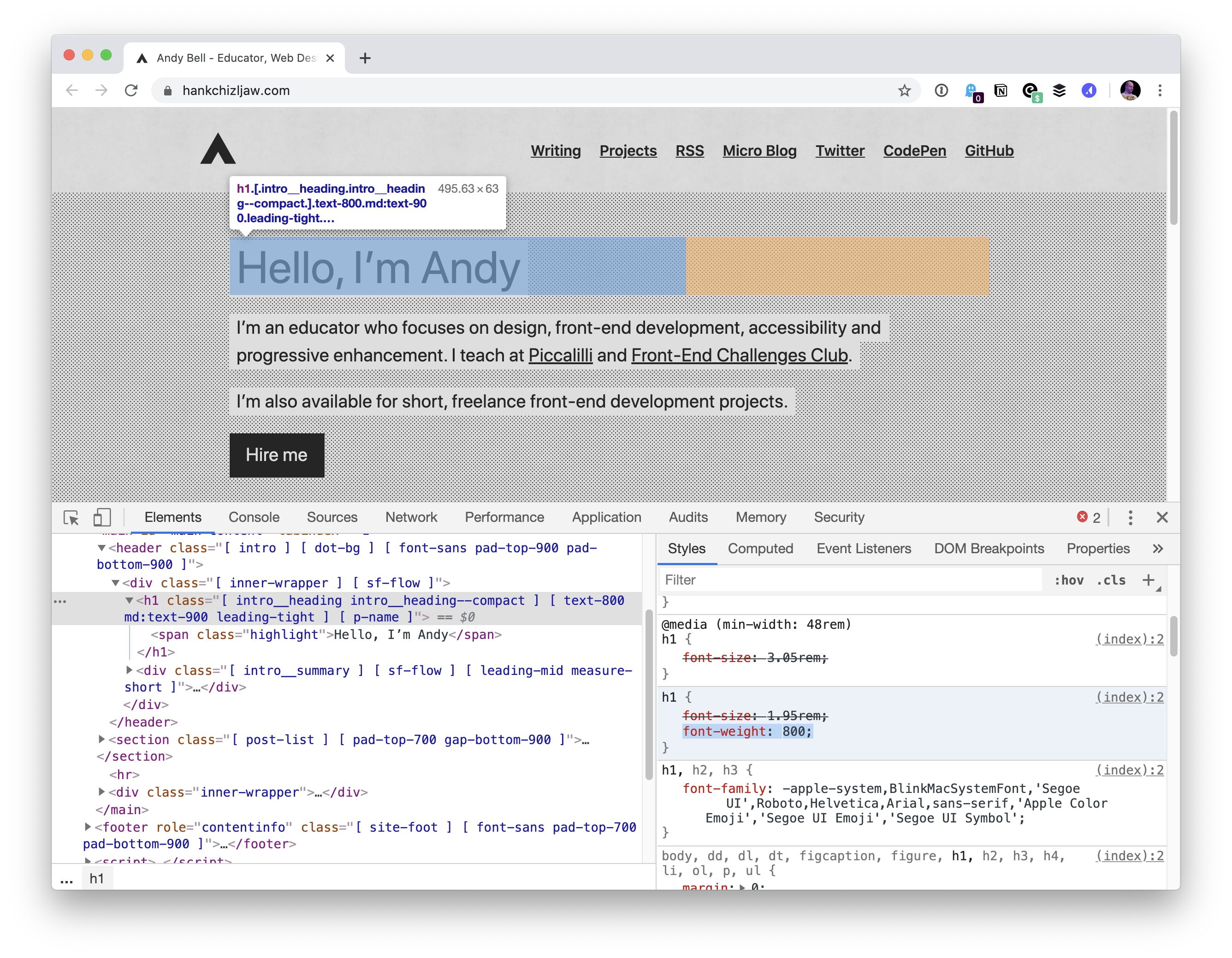
Above is Jon’s site. Andy Bell’s site got hit by it too.

So we’re looking at 4 weeks or so. Šime Vidas proposed a temporary fix of going Helvetica for now:

body {
  font-family: -apple-system, Helvetica;
}

I guess with -apple-system in there, older versions of Chrome/macOS still might be able to benefit from system fonts? Not sure.

That brings up a source of confusion for me. When I first heard of using system font stacks, there was -apple-system and BlinkMacSystemFont and you were supposed to use them in that order in the font stack. Then came along -system-ui, and that seemed to work well all by itself and that was nice as it was obviously less Mac-specific. But there is also system-ui (no starting dash), and that seems to do the same thing and I’m not sure which is correct. Now it looks like the plan is ui-sans-serif and friends (like ui-serif and ui-monospace). I like the idea, but I’d love to hear clarity from browser vendors on what the recommended use is. Are we in a spot like this?

/* Just a guess... */
body {
  font-family: 
    ui-sans-serif, 
    system-ui, 
    -system-ui, 
    -apple-system,
    BlinkMacSystemFont,
    Roboto, Helvetica, Arial, 
    sans-serif, 
    "Apple Color Emoji";
}

Another observation from me… as I was trying to replicate this on Chrome 81, at first I was like “weird, works for me”, because I was trying out the bolding on default 16px text. I noticed that it was when the font was 20px or bigger the problem kicked in:

Bramus has an alternative fix idea: use Inter.

The post Chrome + System Fonts Snafu appeared first on CSS-Tricks.

Chrome + System Fonts Snafu

Post pobrano z: Chrome + System Fonts Snafu

There was just a bug late last year where system fonts (at least on Mac, I don’t know what the story was on other platforms) in Chrome appeared too thin and tracked-in at small sizes and too thick and tracked-out at larger sizes. That one was fixed, thankfully. But while it was a problem, it was the reason I gave up on system fonts for now and switched something else. A performance loss but aesthetic gain.

Now there is a new much worse bug, where the system font can’t be bolded. It’s not great, as a ton of sites roll with the system font stack as it has two major benefits: 1) it can help your site look like the operating system 2) it has great performance as the site doesn’t need to download/display and custom fonts.

Jon Henshaw wrote it up:

… the bug caught the attention of Adam Argyle, maker of VisBug and Chrome CSS Developer Advocate at Google. Argyle created a Chromium bug report, but the Chromium development team ultimately decided it wasn’t a blocker for releasing version 81. That resulted in sites like Coywolf not being able to use bold text for fonts that are larger than 16px (e.g., every heading).

The bug won’t be fixed in version 82 because the Chromium team announced that they’re skipping it, and will be releasing version 83 in mid-May instead. Argyle assured everyone on the original GitHub bug report that it would be fixed in version 83.

Above is Jon’s site. Andy Bell’s site got hit by it too.

So we’re looking at 4 weeks or so. Šime Vidas proposed a temporary fix of going Helvetica for now:

body {
  font-family: -apple-system, Helvetica;
}

I guess with -apple-system in there, older versions of Chrome/macOS still might be able to benefit from system fonts? Not sure.

That brings up a source of confusion for me. When I first heard of using system font stacks, there was -apple-system and BlinkMacSystemFont and you were supposed to use them in that order in the font stack. Then came along -system-ui, and that seemed to work well all by itself and that was nice as it was obviously less Mac-specific. But there is also system-ui (no starting dash), and that seems to do the same thing and I’m not sure which is correct. Now it looks like the plan is ui-sans-serif and friends (like ui-serif and ui-monospace). I like the idea, but I’d love to hear clarity from browser vendors on what the recommended use is. Are we in a spot like this?

/* Just a guess... */
body {
  font-family: 
    ui-sans-serif, 
    system-ui, 
    -system-ui, 
    -apple-system,
    BlinkMacSystemFont,
    Roboto, Helvetica, Arial, 
    sans-serif, 
    "Apple Color Emoji";
}

Another observation from me… as I was trying to replicate this on Chrome 81, at first I was like “weird, works for me”, because I was trying out the bolding on default 16px text. I noticed that it was when the font was 20px or bigger the problem kicked in:

Bramus has an alternative fix idea: use Inter.

The post Chrome + System Fonts Snafu appeared first on CSS-Tricks.

SVG, Favicons, and All the Fun Things We Can Do With Them

Post pobrano z: SVG, Favicons, and All the Fun Things We Can Do With Them

Favicons are the little icons you see in your browser tab. They help you understand which site is which when you’re scanning through your browser’s bookmarks and open tabs. They’re a neat part of internet history that are capable of performing some cool tricks.

One very new trick is the ability to use SVG as a favicon. It’s something that most modern browsers support, with more support on the way.

Here’s the code for how to add favicons to your site:

<link rel="icon" type="image/svg+xml" href="/favicon.svg">
<link rel="alternate icon" href="/favicon.ico">
<link rel="mask-icon" href="/safari-pinned-tab.svg" color="#ff8a01">

If a browser doesn’t support a SVG favicon, it will ignore the first link element declaration and continue on to the second. This ensures that all browsers that support favicons can enjoy the experience. 

You may also notice the alternate attribute value for our rel declaration in the second line. This programmatically communicates to the browser that the favicon with a file format that uses .ico is specifically used as an alternate presentation.

Following the favicons is a line of code that loads another SVG image, one called safari-pinned-tab.svg. This is to support Safari’s pinned tab functionality, which existed before other browsers had SVG favicon support. There’s additional files you can add here to enhance your site for different apps and services, but more on that in a bit.

Here’s more detail on the current level of SVG favicon support:

This browser support data is from Caniuse, which has more detail. A number indicates that browser supports the feature at that version and up.

Desktop

Chrome Firefox IE Edge Safari
80 41 No 80 TP

Mobile / Tablet

Android Chrome Android Firefox Android iOS Safari
80 No No 13.4

Why SVG?

You may be questioning why this is needed. The .ico file format has been around forever and can support images up to 256×256 pixels in size. Here are three answers for you.

Ease of authoring

It’s a pain to make .ico files. The file is a proprietary format used by Microsoft, meaning you’ll need specialized tools to make them. SVG is an open standard, meaning you can use them without any further tooling or platform lock-in.

Future-proofing

Retina? 5k? 6k? When we use a resolution-agnostic SVG file for a favicon, we guarantee that our favicons look crisp on future devices, regardless of how large their displays get

Performance

SVGs are usually very small files, especially when compared to their raster image counterparts — even more-so if you optimize them beforehand. By only using a 16×16 pixel favicon as a fallback for browsers that don’t support SVG, we provide a combination that enjoys a high degree of support with a smaller file size to boot. 

This might seem a bit extreme, but when it comes to web performance, every byte counts!

Tricks

Another cool thing about SVG is we can embed CSS directly in it. This means we can do fun things like dynamically adjust them with JavaScript, provided the SVG is declared inline and not embedded using an img element.

<svg  version="1.1" xmlns="http://www.w3.org/2000/svg" viewBox="0 0 100 100">
  <style>
    path { fill: #272019; }
  </style>
  <!-- etc. -->
</svg>

Since SVG favicons are embedded using the link element, they can’t really be modified using JavaScript. We can, however, use things like emoji and media queries.

Emoji

Lea Verou had a genius idea about using emoji inside of SVG’s text element to make a quick favicon with a transparent background that holds up at small sizes.

In response, Chris Coyier whipped up a neat little demo that lets you play around with the concept.

Dark Mode support

Both Thomas Steiner and Mathias Bynens independently stumbled across the idea that you can use the prefers-color-scheme media query to provide support for dark mode. This work is built off of Jake Archibald’s exploration of SVG and media queries.

<svg width="128" height="128" xmlns="http://www.w3.org/2000/svg">
  <style>
    path { fill: #000000; }
    @media (prefers-color-scheme: dark) {
      path { fill: #ffffff; }
    }
  </style>
  <path d="M111.904 52.937a1.95 1.95 0 00-1.555-1.314l-30.835-4.502-13.786-28.136c-.653-1.313-2.803-1.313-3.456 0L48.486 47.121l-30.835 4.502a1.95 1.95 0 00-1.555 1.314 1.952 1.952 0 00.48 1.99l22.33 21.894-5.28 30.918c-.115.715.173 1.45.768 1.894a1.904 1.904 0 002.016.135L64 95.178l27.59 14.59c.269.155.576.232.883.232a1.98 1.98 0 001.133-.367 1.974 1.974 0 00.768-1.894l-5.28-30.918 22.33-21.893c.518-.522.71-1.276.48-1.99z" fill-rule="nonzero"/>
</svg>

For supporting browsers, this code means our star-shaped SVG favicon will change its fill color from black to white when dark mode is activated. Pretty neat!

Other media queries

Dark mode support got me thinking: if SVGs can support prefers-color-scheme, what other things can we do with them? While the support for Level 5 Media Queries may not be there yet, here’s some ideas to consider:

Mockup of four SVG favicon treatments. The first treatment is a pink star with a tab title of, “SVG Favicon.” The second treatment is a hot pink star with a tab title of, “Light Level SVG Favicon.” The third treatment is a light pink star with a tab title of, “Inverted Colors SVG Favicon.” The fourth treatment is a black pink star with a tab title of, “High Contrast Mode SVG Favicon.” The tabs are screen captures from Microsoft Edge, with the browser chrome updating to match each specialized mode.
A mockup of how these media query-based adjustments could work.

Keep it crisp

Another important aspect of good favicon design is making sure they look good in the small browser tab area. The secret to this is making the paths of the vector image line up to the pixel grid, the guide a computer uses to turn SVG math into the bitmap we see on a screen. 

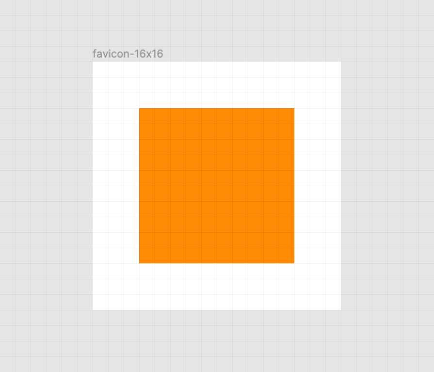
Here’s a simplified example using a square shape:

A crisp orange square on a white background. There is also a faint grid of gray horizontal and vertical lines that represent the pixel grid. Screenshot from Figma.

When the vector points of the square align to the pixel grid of the artboard, the antialiasing effect a computer uses to smooth out the shapes isn’t needed. When the vector points aren’t aligned, we get a “smearing” effect:

A blurred orange square on a white background. There is also a faint grid of gray horizontal and vertical lines that represent the pixel grid. Screenshot from Figma.

A vector point’s position can be adjusted on the pixel grid by using a vector editing program such as Figma, Sketch, Inkscape, or Illustrator. These programs export SVGs as well. To adjust a vector point’s location, select each node with a precision selection tool and drag it into position.

Some more complicated icons may need to be simplified, in order to look good at such a small size. If you’re looking for a good primer on this, Jeremy Frank wrote a really good two-part article over at Vidget.

Go the extra mile

In addition to favicons, there are a bunch of different (and unfortunately proprietary) ways to use icons to enhance its experience. These include things like the aforementioned pinned tab icon for Safari¹, chat app unfurls, a pinned Windows start menu tile, social media previews, and homescreen launchers.

If you’re looking for a great place to get started with these kinds of enhancements, I really like realfavicongenerator.net.

Icon output from realfavicongenerator.net arranged in a grid using CSS-Trick’s logo. There are two rows of five icons: android-chrome-192x192.png, android-chrome-384x384.png, apple-touch-icon.png, favicon-16x16.png, favicon-32x32.png, mstile-150x150.png, safari-pinned-tab.svg, favicon.ico, browserconfig.xml, and site.webmanifest.
It’s a lot, but it guarantees robust support.

A funny thing about the history of the favicon: Internet Explorer was the first browser to support them and they were snuck in at the 11th hour by a developer named Bharat Shyam:

As the story goes, late one night, Shyam was working on his new favicon feature. He called over junior project manager Ray Sun to take a look.

Shyam commented, “This is good, right? Check it in?”, requesting permission to check the code into the Internet Explorer codebase so it could be released in the next version. Sun didn’t think too much of it, the feature was cool and would clearly give IE an edge. So he told Shyam to go ahead and add it. And just like that, the favicon made its way into Internet Explorer 5, which would go on to become one of the largest browser releases the web has ever seen.

The next day, Sun was reprimanded by his manager for letting the feature get by so quickly. As it turns out, Shyam had specifically waited until later in the day, knowing that a less experienced Program Manager would give him a pass. But by then, the code had been merged in. Incidentally, you’d be surprised just how many relatively major browser features have snuck their way into releases like this.

From How We Got the Favicon by Jay Hoffmann

I’m happy to see the platform throw a little love at favicons. They’ve long been one of my favorite little design details, and I’m excited that they’re becoming more reactive to user’s needs. If you have a moment, why not sneak a SVG favicon into your project the same way Bharat Shyam did way back in 1999. 


¹ I haven’t been able to determine if Safari is going to implement SVG favicon support, but I hope they do. Has anyone heard anything?

The post SVG, Favicons, and All the Fun Things We Can Do With Them appeared first on CSS-Tricks.

How to Improve User Experience Design: Tips to Increase Conversion Rates

Post pobrano z: How to Improve User Experience Design: Tips to Increase Conversion Rates

Image by David Schwarzenberg from Pixabay

No one can deny that UX (user experience) is the foundation of any website. This is the main reason why many website owners always look for ways to improve it. Some even spend a lot of money on design because of it.

So, what is UX design exactly? And what is the difference between user interface vs user experience?

UX design is the process of improving user satisfaction through various aspects of a website. These enhancements usually deal with usability, efficiency, and accessibility of a website.

On the other hand, the user interface consists of the elements that a user interacts with when using a digital website or service. Of course, the user interface is a part of the user experience.

Conversion rates are directly proportional to the UX design of a website. After all, according to the latest sales stats, as much as 83% of customers would give a recommendation after a positive experience with a brand.

In other words, a good UX design means much more than an intuitive user flow and stunning layout. 

However, what’s even more important is that a great UX will instantly boost the experience visitors are having while on your website. And that can significantly help with conversions in your sales funnel.

If you are interested in learning how to improve user experience with some great design tips, keep reading.

Create a straightforward call-to-action button

Call-to-action (CTA) buttons are used to attract users towards conversion on a website.

The way people implement these buttons can vary. However, some of the most common ones include:

  • Starting a trial.
  • Signing up for updates.
  • Downloading the app.
  • Booking a consultation.

The CTA on your website needs to be placed on every page of the website. It has been recorded that websites that have a clear CTA have higher conversion rates.

Furthermore, if your website is designed in folds, it is essential to keep your CTA above the fold so that it is easy for users to see.

Bear in mind the following:

  • Be careful when picking the color for your CTA. Use colors that make the CTA stand out and make them big enough to be easily spotted.
  • When writing your CTA text, make sure that it is action-oriented. Do not use passive verbs in the text. The text needs to be subtle but still active enough to prompt the user to take action.
  • Be careful not to include more than five words when writing your CTA.

All in all, a clear and visible CTA is important if you want to improve UX.

All your website pages have to be consistent

When it comes to user experience, consistency means making everything on your website match. 

This includes:

  1. Heading sizes
  2. Font choices
  3. Coloring
  4. Button styles
  5. Spacing
  6. Design elements
  7. Illustration styles
  8. Photo choices

All of the elements need to be themed to make the overall design coherent between pages and on the same page.

For users to have a nice experience as they navigate your website, it is important that they are aware of the fact that they are still on your website. Hence, drastic design changes from one page to the other can make visitors feel lost and confused.

If you need to rearrange elements or add new ones to your website, consider utilizing the power of the drag and drop WordPress page builders.

WordPress is the most widely used website-building platform and the drag and drop feature makes it really easy for non-experts to make design changes.

Fix all 404s

Image by Mocho from Pixabay

Although search engines don’t punish you harshly for soft 404 errors (page not found), a user will.

When a website visitor clicks on an image or link, they expect it to take them to the next place they want to go. It will annoy them if they find a 404 error page. 

Also, it will definitely make them think about whether spending time on your website was a good decision. After all, they can always go to another website for a faster solution. 

Error pages are very frustrating and they completely disrupt the user’s journey throughout your website. Next to slow page load time, they are at the top of the list of unwanted aspects of a website.

If you want to check for 404s, you can set up Google Webmaster tools on your website and check crawl errors. 

Additionally, you can also ensure that when a visitor lands on a 404, the page provides them with the option to get back on track.

Speed up page loading time

It is easy to get frustrated when a web page is loading slowly. This can lead to visitors abandoning your website and moving on to another website where they can enjoy faster loading times.

In general, if a page takes more than 2 seconds to load, the users are most likely to leave the website. Depending on the loading time of your website, users decide if they would like to further visit your website or move to another site.

Remember, improving the website load speed for desktop is not enough. You need to optimize for mobile users too. Since the mobile-first approach is promoted by Google, it is crucial to optimize and design your webpage for mobile users and show you care about them.

Thanks to Google and its tool called PageSpeed Insights, if you enter the URL of the site you want to check, Google will highlight the areas where your page speed is weak.

On top of that, the tool provides suggestions on how you can improve the loading time.

Authentic images are better than stock photos

Images play a significant role in making a website look more professional and pleasing. However, you need to pay attention here too since your photos have to fit the overall design of your pages.

Avoid stock photos for a couple of very simple reasons. Yes, they are cheap (and often free), they are easy to use, but they may do more harm than good.

Stock images look professional. However, your website visitors will figure out these are stock images and thus lose interest before too long. Also, stock images are overused and don’t appeal to the users.

On the other hand, original photos draw more website visitors. The reason for this is that they have a personal approach and the user can easily connect. 

Another thing to bear in mind is that using stock photos shows that you have not invested too much effort in designing the website. Therefore, it won’t look unique, as the visitors might have already seen it on another website.

Therefore, try to use authentic images, no matter how basic and simple they might look.

Be consistent even with your outreach efforts

Image by Andrian Valeanu from Pixabay

Finally, just because outreach campaigns aren’t necessarily something directly related to the website design, it doesn’t mean that the messages you send out should look different and feel different from the content of your website.

In other words, after you learn how to create a newsletter, you should think about conversions and efficient converting email design.

Therefore, you also need to follow some email design practices that can help with UX.

White space

In order for your email design to be appealing, you need an adequate amount of white space around your CTA button.

This use of white space is meant to signal the importance of a given CTA button. Not only will your email look nice this way, but it will also guide a reader’s eyes towards the button.

Directional cues

If you want an effective and simple way to guide your readers to the crucial part of your email, you need to use directional cues. 

These cues will help a person to move in the direction of your CTA, which is, generally speaking, the whole point of the email. Consequently, this enables the user to easily follow the action process, which results in a higher click-through rate for your business.

Therefore, it shouldn’t be emphasized how important it is to use the directional cues in your emails and thus integrate them into your larger campaign and journey for the user.

How to Improve User Experience Design: Tips to Increase Conversion Rates

Post pobrano z: How to Improve User Experience Design: Tips to Increase Conversion Rates

Image by David Schwarzenberg from Pixabay

No one can deny that UX (user experience) is the foundation of any website. This is the main reason why many website owners always look for ways to improve it. Some even spend a lot of money on design because of it.

So, what is UX design exactly? And what is the difference between user interface vs user experience?

UX design is the process of improving user satisfaction through various aspects of a website. These enhancements usually deal with usability, efficiency, and accessibility of a website.

On the other hand, the user interface consists of the elements that a user interacts with when using a digital website or service. Of course, the user interface is a part of the user experience.

Conversion rates are directly proportional to the UX design of a website. After all, according to the latest sales stats, as much as 83% of customers would give a recommendation after a positive experience with a brand.

In other words, a good UX design means much more than an intuitive user flow and stunning layout. 

However, what’s even more important is that a great UX will instantly boost the experience visitors are having while on your website. And that can significantly help with conversions in your sales funnel.

If you are interested in learning how to improve user experience with some great design tips, keep reading.

Create a straightforward call-to-action button

Call-to-action (CTA) buttons are used to attract users towards conversion on a website.

The way people implement these buttons can vary. However, some of the most common ones include:

  • Starting a trial.
  • Signing up for updates.
  • Downloading the app.
  • Booking a consultation.

The CTA on your website needs to be placed on every page of the website. It has been recorded that websites that have a clear CTA have higher conversion rates.

Furthermore, if your website is designed in folds, it is essential to keep your CTA above the fold so that it is easy for users to see.

Bear in mind the following:

  • Be careful when picking the color for your CTA. Use colors that make the CTA stand out and make them big enough to be easily spotted.
  • When writing your CTA text, make sure that it is action-oriented. Do not use passive verbs in the text. The text needs to be subtle but still active enough to prompt the user to take action.
  • Be careful not to include more than five words when writing your CTA.

All in all, a clear and visible CTA is important if you want to improve UX.

All your website pages have to be consistent

When it comes to user experience, consistency means making everything on your website match. 

This includes:

  1. Heading sizes
  2. Font choices
  3. Coloring
  4. Button styles
  5. Spacing
  6. Design elements
  7. Illustration styles
  8. Photo choices

All of the elements need to be themed to make the overall design coherent between pages and on the same page.

For users to have a nice experience as they navigate your website, it is important that they are aware of the fact that they are still on your website. Hence, drastic design changes from one page to the other can make visitors feel lost and confused.

If you need to rearrange elements or add new ones to your website, consider utilizing the power of the drag and drop WordPress page builders.

WordPress is the most widely used website-building platform and the drag and drop feature makes it really easy for non-experts to make design changes.

Fix all 404s

Image by Mocho from Pixabay

Although search engines don’t punish you harshly for soft 404 errors (page not found), a user will.

When a website visitor clicks on an image or link, they expect it to take them to the next place they want to go. It will annoy them if they find a 404 error page. 

Also, it will definitely make them think about whether spending time on your website was a good decision. After all, they can always go to another website for a faster solution. 

Error pages are very frustrating and they completely disrupt the user’s journey throughout your website. Next to slow page load time, they are at the top of the list of unwanted aspects of a website.

If you want to check for 404s, you can set up Google Webmaster tools on your website and check crawl errors. 

Additionally, you can also ensure that when a visitor lands on a 404, the page provides them with the option to get back on track.

Speed up page loading time

It is easy to get frustrated when a web page is loading slowly. This can lead to visitors abandoning your website and moving on to another website where they can enjoy faster loading times.

In general, if a page takes more than 2 seconds to load, the users are most likely to leave the website. Depending on the loading time of your website, users decide if they would like to further visit your website or move to another site.

Remember, improving the website load speed for desktop is not enough. You need to optimize for mobile users too. Since the mobile-first approach is promoted by Google, it is crucial to optimize and design your webpage for mobile users and show you care about them.

Thanks to Google and its tool called PageSpeed Insights, if you enter the URL of the site you want to check, Google will highlight the areas where your page speed is weak.

On top of that, the tool provides suggestions on how you can improve the loading time.

Authentic images are better than stock photos

Images play a significant role in making a website look more professional and pleasing. However, you need to pay attention here too since your photos have to fit the overall design of your pages.

Avoid stock photos for a couple of very simple reasons. Yes, they are cheap (and often free), they are easy to use, but they may do more harm than good.

Stock images look professional. However, your website visitors will figure out these are stock images and thus lose interest before too long. Also, stock images are overused and don’t appeal to the users.

On the other hand, original photos draw more website visitors. The reason for this is that they have a personal approach and the user can easily connect. 

Another thing to bear in mind is that using stock photos shows that you have not invested too much effort in designing the website. Therefore, it won’t look unique, as the visitors might have already seen it on another website.

Therefore, try to use authentic images, no matter how basic and simple they might look.

Be consistent even with your outreach efforts

Image by Andrian Valeanu from Pixabay

Finally, just because outreach campaigns aren’t necessarily something directly related to the website design, it doesn’t mean that the messages you send out should look different and feel different from the content of your website.

In other words, after you learn how to create a newsletter, you should think about conversions and efficient converting email design.

Therefore, you also need to follow some email design practices that can help with UX.

White space

In order for your email design to be appealing, you need an adequate amount of white space around your CTA button.

This use of white space is meant to signal the importance of a given CTA button. Not only will your email look nice this way, but it will also guide a reader’s eyes towards the button.

Directional cues

If you want an effective and simple way to guide your readers to the crucial part of your email, you need to use directional cues. 

These cues will help a person to move in the direction of your CTA, which is, generally speaking, the whole point of the email. Consequently, this enables the user to easily follow the action process, which results in a higher click-through rate for your business.

Therefore, it shouldn’t be emphasized how important it is to use the directional cues in your emails and thus integrate them into your larger campaign and journey for the user.