I updated my personal website the other day. Always a fun project since it’s one of the few where it’s 100% just me. It’s my own personal playground with no other goal than making the site represent me to have a little fun. It’s not a complete re-write, just some new paint.
I thought I’d document little bits of it here just to hone in on some of the bits of trickery in the spirit of learning through sharing.
Hoefler Fonts
I think the Inkwell family is super cool. I like mix and matching not just the weights but the serif and sans-serif and caps vs not.
I used Inkwell in the last design as well, but I was worried that it was a little too jokey for blog post body copy. My writing is extremely casual, but not always, and Inkwell is way too jovial for serious topics. I went with Ideal Sans for body copy last time, but the pairing with Inkwell felt a little off.
This time I went with Whitney for general body copy, which is still pretty lighthearted, but works when the copy is more straight toned.
Blogroll
If you’re going to zebra-stripe a table, you’d do something like…
What if you wanted to rotate four colors though? It’s still :nth-child trickery, selecting every four, and then offsetting. Here, I’ll do it with list items in Sass (the nesting is nice, not having to repeat the selector):
li {
  &:nth-child(4n) a {
    color: $blue;
  }
  &:nth-child(4n + 1) a {
    color: $yellow;
  }
  &:nth-child(4n + 2) a {
    color: $red;
  }
  &:nth-child(4n + 3) a {
    color: $purple;
  }
}
That’s what I did to build the colorized blogroll:
Note the Sass used above… I used Sass because it was already in use on the project. All I had to do was open CodeKit and the processing was ready-to-go.
Oh, and blogrolls are cool again.
Chill YouTube
I used this click-to-load-YouTube-(at all) technique which is still extremely clever. Having an <iframe> that behaves just like a YouTube embed would but only loading a simple static image (rather than heaps and heaps of resources) is great for performance and behaves essentially the same as a normal YouTube embed does.
<iframe
  width="560"
  height="315"
  src="https://www.youtube.com/embed/Y8Wp3dafaMQ"
  srcdoc="<style>*{padding:0;margin:0;overflow:hidden}html,body{height:100%}img,span{position:absolute;width:100%;top:0;bottom:0;margin:auto}span{height:1.5em;text-align:center;font:48px/1.5 sans-serif;color:white;text-shadow:0 0 0.5em black}</style><a href=https://www.youtube.com/embed/Y8Wp3dafaMQ?autoplay=1><img src=https://img.youtube.com/vi/Y8Wp3dafaMQ/hqdefault.jpg alt='Video The Dark Knight Rises: What Went Wrong? – Wisecrack Edition'><span>▶</span></a>"
  frameborder="0"
  allow="accelerometer; autoplay; encrypted-media; gyroscope; picture-in-picture"
  allowfullscreen
  title="The Dark Knight Rises: What Went Wrong? – Wisecrack Edition"
></iframe>
Custom Post Types everywhere
I’m a big fan of giving myself structured data to work with. In WordPress-land, that often means Custom Post Types paired with something like the Advanced Custom Fields plugin for just the right data needed for the job.
Then I can loop over stuff and output it however I want. This isn’t that fancy, but it opens up whatever future doors I want to a lot easier.
Build your own bio
There is nothing fancy about how this works:
I literally made 18 <div> elements (3 lengths * 2 styles * 3 code types = 18) and swap between with a bit of JavaScript that calculates a class string based on the current choices, selects that class, and unhides it while hiding the rest.
$(".bio-choices input").on("change", function () {
  var lengthClass = ".bio-" + $("input[name=length]:checked").attr("id");
  var styleClass = ".bio-" + $("input[name=style]:checked").attr("id");
  var codeClass = ".bio-" + $("input[name=code]:checked").attr("id");
  var selector = lengthClass + styleClass + codeClass;

  $(".bio").hide();
  $(selector).show();
});
jQuery! That’s what was already on the site, and the site also uses the jQuery version of FitVids for responsive videos — so I figured I’d just leave it all be.
If I was going to re-write these bits of the site, I’d probably rip out jQuery and use this for FitVids. Then I’d find a way to only have three bios (maybe six if I can’t find a nice way to handle first vs. third person with word swaps) and then get the rest by automatically converting the formats somehow (maybe some cloud function if I had to).
ztext.js
I used ztext for the header! It’s this kinda stuff that makes the web feel extra webby to me. I’m not sure I’d do something with quite so much movement on a site like CSS-Tricks (because people visit it more often and the time-on-site is higher). But for a site that people might land on once in a blue moon, it has the right amount of cheerful levity, I think.
Background SVG
I was stoked to see the SVG Backgrounds site get an upgrade lately. I was playing around in there and was like YES, I’m doing this.
I went with a background-attachment: fixed look, which I think I like. I also added the slideout footer effect on desktop, but I’m less sold that it’s working here. It’s more fun when the background changes, and that doesn’t happen here. I’ll probably either change the background of the footer, or rip the effect out.
Filter trick for links
Some of the different sections on the site use a different primary highlight color, and I’m having the links in those sections follow that color. That might be questionable (perhaps all links should be blue) but, so far, I think it makes decent sense (they still have hover and focus styles). When you have a variety of colors and styles for interactive elements though, it often means that you have to create special alternate styles for hover and focus. That could mean crafting bespoke color alterations for each color. Not the end of the world, but I really like this little trick for interactive styles that ends up with a consistent look across all colors:
Anyway! This was just a couple hours of paint on this site. Mostly because blogrolls were the CodePen Challenge that week. But I can never touch a site I haven’t in a while and just do one thing. I get sucked in and gotta do more!
I updated my personal website the other day. Always a fun project since it’s one of the few where it’s 100% just me. It’s my own personal playground with no other goal than making the site represent me to have a little fun. It’s not a complete re-write, just some new paint.
I thought I’d document little bits of it here just to hone in on some of the bits of trickery in the spirit of learning through sharing.
Hoefler Fonts
I think the Inkwell family is super cool. I like mix and matching not just the weights but the serif and sans-serif and caps vs not.
I used Inkwell in the last design as well, but I was worried that it was a little too jokey for blog post body copy. My writing is extremely casual, but not always, and Inkwell is way too jovial for serious topics. I went with Ideal Sans for body copy last time, but the pairing with Inkwell felt a little off.
This time I went with Whitney for general body copy, which is still pretty lighthearted, but works when the copy is more straight toned.
Blogroll
If you’re going to zebra-stripe a table, you’d do something like…
What if you wanted to rotate four colors though? It’s still :nth-child trickery, selecting every four, and then offsetting. Here, I’ll do it with list items in Sass (the nesting is nice, not having to repeat the selector):
li {
  &:nth-child(4n) a {
    color: $blue;
  }
  &:nth-child(4n + 1) a {
    color: $yellow;
  }
  &:nth-child(4n + 2) a {
    color: $red;
  }
  &:nth-child(4n + 3) a {
    color: $purple;
  }
}
That’s what I did to build the colorized blogroll:
Note the Sass used above… I used Sass because it was already in use on the project. All I had to do was open CodeKit and the processing was ready-to-go.
Oh, and blogrolls are cool again.
Chill YouTube
I used this click-to-load-YouTube-(at all) technique which is still extremely clever. Having an <iframe> that behaves just like a YouTube embed would but only loading a simple static image (rather than heaps and heaps of resources) is great for performance and behaves essentially the same as a normal YouTube embed does.
<iframe
  width="560"
  height="315"
  src="https://www.youtube.com/embed/Y8Wp3dafaMQ"
  srcdoc="<style>*{padding:0;margin:0;overflow:hidden}html,body{height:100%}img,span{position:absolute;width:100%;top:0;bottom:0;margin:auto}span{height:1.5em;text-align:center;font:48px/1.5 sans-serif;color:white;text-shadow:0 0 0.5em black}</style><a href=https://www.youtube.com/embed/Y8Wp3dafaMQ?autoplay=1><img src=https://img.youtube.com/vi/Y8Wp3dafaMQ/hqdefault.jpg alt='Video The Dark Knight Rises: What Went Wrong? – Wisecrack Edition'><span>▶</span></a>"
  frameborder="0"
  allow="accelerometer; autoplay; encrypted-media; gyroscope; picture-in-picture"
  allowfullscreen
  title="The Dark Knight Rises: What Went Wrong? – Wisecrack Edition"
></iframe>
Custom Post Types everywhere
I’m a big fan of giving myself structured data to work with. In WordPress-land, that often means Custom Post Types paired with something like the Advanced Custom Fields plugin for just the right data needed for the job.
Then I can loop over stuff and output it however I want. This isn’t that fancy, but it opens up whatever future doors I want to a lot easier.
Build your own bio
There is nothing fancy about how this works:
I literally made 18 <div> elements (3 lengths * 2 styles * 3 code types = 18) and swap between with a bit of JavaScript that calculates a class string based on the current choices, selects that class, and unhides it while hiding the rest.
$(".bio-choices input").on("change", function () {
  var lengthClass = ".bio-" + $("input[name=length]:checked").attr("id");
  var styleClass = ".bio-" + $("input[name=style]:checked").attr("id");
  var codeClass = ".bio-" + $("input[name=code]:checked").attr("id");
  var selector = lengthClass + styleClass + codeClass;

  $(".bio").hide();
  $(selector).show();
});
jQuery! That’s what was already on the site, and the site also uses the jQuery version of FitVids for responsive videos — so I figured I’d just leave it all be.
If I was going to re-write these bits of the site, I’d probably rip out jQuery and use this for FitVids. Then I’d find a way to only have three bios (maybe six if I can’t find a nice way to handle first vs. third person with word swaps) and then get the rest by automatically converting the formats somehow (maybe some cloud function if I had to).
ztext.js
I used ztext for the header! It’s this kinda stuff that makes the web feel extra webby to me. I’m not sure I’d do something with quite so much movement on a site like CSS-Tricks (because people visit it more often and the time-on-site is higher). But for a site that people might land on once in a blue moon, it has the right amount of cheerful levity, I think.
Background SVG
I was stoked to see the SVG Backgrounds site get an upgrade lately. I was playing around in there and was like YES, I’m doing this.
I went with a background-attachment: fixed look, which I think I like. I also added the slideout footer effect on desktop, but I’m less sold that it’s working here. It’s more fun when the background changes, and that doesn’t happen here. I’ll probably either change the background of the footer, or rip the effect out.
Filter trick for links
Some of the different sections on the site use a different primary highlight color, and I’m having the links in those sections follow that color. That might be questionable (perhaps all links should be blue) but, so far, I think it makes decent sense (they still have hover and focus styles). When you have a variety of colors and styles for interactive elements though, it often means that you have to create special alternate styles for hover and focus. That could mean crafting bespoke color alterations for each color. Not the end of the world, but I really like this little trick for interactive styles that ends up with a consistent look across all colors:
Anyway! This was just a couple hours of paint on this site. Mostly because blogrolls were the CodePen Challenge that week. But I can never touch a site I haven’t in a while and just do one thing. I get sucked in and gotta do more!
The real estate industry is one of the most competitive industries, which is why it’s important to stand out. A great place to start is by having an effective real estate logo design.
Your real estate agent logo helps build brand recognition and it differentiates you from every other real estate agent.
If you want to create a great real estate logo design, there are a few things you need to keep in mind.
Simplicity. If you look at the real estate agent logos used by some of the famous brands, they’re all pretty simple. The reason behind this is because a simple logo is easier to use in a variety of media and sizes. It’s also easier to recognize than a logo that uses a myriad of shapes, colors, and fonts.
Memorability. A great realty logo is memorable so that your customers can easily recognize you and your brand when they come across it. They should be able to single your brand out of every other real estate agent and company in their area.
Timeless design.On a similar note, a great logo uses a timeless design that doesn’t require a logo redesign when a new realty company logo design trend comes along.
Conveys the right mood. Your logo should also convey the right mood. If you specialize in selling luxury homes, aim for a more elegant and luxe logo. If you prefer selling urban, modern homes then a logo with a modern feel will be better suited for your real estate business.
Balance. Finally, all elements in your logo design should be balanced. Aim to maintain the same amount of spacing between and around logo elements to create a visually appealing and well-balanced logo.
Now that we’ve covered the key real estate company logo design principles, it’s time to design it. You can quickly and easily make your own logo with Envato Elements or the Placeit tool.
Best Real Estate Logos on Envato Elements (With Unlimited Use)
You can find hundreds of the best real estate logos on Envato Elements, with a great offer: download as many as you want for one low price.
5 Best Real Estate Logos Inspirations From Envato Elements
Grab one of these cool, creative and professional best real estate logo design ideas, customize it to fit your chosen business colors and you’re ready to go out and market your new real estate business!
Here are five best real estate logos from Envato Elements to inspire your company logo design.
The first template, Smith & Robert Real Estate Logo Inspiration, features a clean and simple logo. It features a colorful house icon paired with elegant typography. It gives off a high-end vibe, which makes it a perfect choice for realtors selling luxury homes. The template can easily be customized in Adobe Illustrator and you’ll also get detailed documentation to help you customize the logo. Free real estate logos out there fall short in comparison to a premium design like this.
Another elegant logo with a unique hexagonal design, the Luxury Real Estate Logo Idea Template features a stunning gold color scheme. Don’t waste your time trying to look for a suitable free real estate logo for your new realtor business. This premium logo is fully editable with Adobe Illustrator and you can easily change colors and fonts to match your branding.
The Real Estate Agent Logo features an upbeat and modern realty logo design that’s bound to make your customers notice you and eager to learn more about the types of homes you’re selling. You can customize the colors and the fonts using either Adobe Photoshop or Adobe Illustrator.
The Royal Estate – Realtor Logo Idea Template would be a great choice for realtors selling commercial property. The template starts off with a golden color scheme and corporate-looking icon, but you can easily change the colors to better match your brand. The template also includes a help file, so you’ll have no problems customizing it. Free real estate logos out there won’t impress you the way this premium logo will.
The Real Estate Logo Inspiration Set is a set of realty logos with a modern and versatile design. You can choose from several logo icons and customize them to have colors that match your brand or opt for a monochrome look. Change the fonts to your brand fonts, add your agency name, and you’re done. A detailed help file is also included.
Envato Elements (Design Without Limits)
Envato Elements – Unlimited Modern Templates for Logos
Envato Elements has a single compelling (all inclusive) offer:
Sign up for Envato Elements and you get access to thousands of unlimited use graphics and templates (with unlimited use). Get great web themes, modern real estate logo ideas, and more—all for one low price.
Get unlimited downloads from a massive digital warehouse of creative assets.
That’s right! Download as many professional templates and graphics as you want, then customize them to fit any of your project needs.
While Envato Elements is a powerful option, if you prefer to design real estate business logos using an online logo creator (instead of using popular tools like Adobe Illustrator and InDesign), check out the selection from our Placeit’s photo logo maker for real estate businesses below.
How to Quickly Make a Logo With Placeit
Creating a logo can be quite costly if you hire a professional designer. However, if you’re just getting started with your real estate business and budget is tight, all is not lost. You can take advantage of an online logo generator such as Logo Maker from Placeit. This awesome logo generator allows you to create fabulous real estate team logos even if you’re not a natural-born designer.
To get started with Placeit and design your perfect real estate team logo, follow these simple steps:
2. Choose Logos from the menu, type in your business name, and choose Real Estate from the drop-down:
Start by typing your name and then selecting Real Estate from the drop-down.
3. Once logo templates load, browse the selection and choose the template that you like best.
4. Customize the template by changing the text and the fonts, colors, shapes, and more. Optionally, try out one of the presets offered below the template or switch to a different template.
Customize your real estate team logo design.
5. Once you’re completely happy with your real estate team logo design, hit the Download button at the top of the screen and download your design for a small fee.
Alternatively, if you need to create realty logos, posters or social media banners regularly, sign up for a subscription to Placeit for a low monthly fee. You’ll get access to the entire Placeit library of more than 20,000 mockups, designs, logos, and videos!
15 Awesome Real Estate Logo Templates From Placeit
Whether you want to create a logo design for your real estate agency that sells luxury real estate or a commercial real estate logo, the following 15 awesome Placeit real estate logo ideas are a great starting point for your logo designs.
This Minimalist Logo Design Real Estate is a perfect choice if you lean towards a minimalist style. The template features a simple icon and clean typography and you can easily customize fonts, colors, change out the icon, and switch the background image or remove it completely. There are loads of real estate logo ideas free to download online, but it’s nothing like creating one by yourself.
If you want to make your customers feel good and excited about their real estate purchase, try this Modern Real Estate Logo Design. With a calming and fresh green background and a cozy home icon, this template is bound to inspire confidence in your customers.
The Simple Real Estate Agency Logo Maker features an elegant negative space design and typography. It offers several real estate logo ideas free icons to choose from and you can easily change out the icon to an icon of your choice. It’s a perfect choice if you’re focusing on more upscale properties as it won’t require too much customizing to fit with your brand.
Is your agency focused on selling green, eco-friendly real estate? In that case, you definitely want to check out this Ecohouse Cool Agency Logo Design Real Estate. Featuring earth-friendly greens paired with an icon of a simple geometric house surrounded by nature, it’s the perfect logo to paint a vivid picture of an eco-friendly home for your customers. Set yourself apart from other realtors by not downloading real estate logo ideas free of charge online.
Try the Creative Real Estate Logo if you own a real estate agency that specializes in selling apartments. This template features a modern look and has dozens of icons to choose from so you can find the one that’s the best fit for your real estate business.
You can also opt for a transparent background or easily change the color of it.
Looking for a serious and professional vibe for your logo? Consider this Logo Maker for Real Estate Businesses template. With a dark blue background and bold typography, this logo is the perfect template for anyone looking for a professional look and feel for their logo. Feel free to customize the colors and fonts if you enjoy the overall look but want a less serious look. You can also change the position of the icons and rearrange them to your liking.
This Real Estate Business Logo template features a modern and vibrant design so it’s perfect if you’re targeting a younger audience. As with the rest of the templates, you can customize fonts and colors, add or remove the badge, and change the position to create an interesting layout for your logo. There are tons of real estate logo ideas free to download online, but nothing compares to this unique and modern design.
The Real Estate Agent Branding is perfect if you’re selling urban homes. On top of the ability to customize icons to better reflect the type of properties you’re selling; you can change the background to use a texture or to give your logo a subtle glow. This is really effective when used with a colored background.
The Logo Maker for Urban Real Estate Agency makes it very clear who this template is for. The template starts off with a dark red background contrasted with white icons. This makes this template a perfect choice if you want to encourage your customers to take action and schedule a home tour.
If you specialize more in finding properties, then this Modern Real Estate Logo Maker is just what you need. It features a simplistic realty logo design as a starting point, but don’t let that fool you. You can customize the fonts to your liking and opt for a different type of icon.
The Logo Template for Real Estate Developments features an elegant design that would be a good choice for a real estate company or agency selling upscale properties. This is another template that allows you to add a subtle texture or a glow to your logo. You can also easily change the icon and the placement of elements as well as the fonts used.
Another luxury logo template, the Luxury Real Estate Logo Maker is beautiful in its simplicity. With an elegant dark-gray background and Raleway fonts in light muted orange font, this template gives off a premium vibe suitable for any real estate company selling high-end properties.
This Logo Design Template for Modern House Real Estate features a modern, typography-based design. You can switch out the background to use a different color, you can add texture or a custom image, and customize the fonts that are used. Another option is to customize the layout by rearranging the elements yourself or by choosing a different layout preset.
A simple and minimal template, the Logo Creator for Real Estate Broker features an inviting icon of a house paired with bold typography. Make your logo stand out by changing the background color and adding texture and change the font colors to match your brand.
The last template on the list, Real Estate Logo Maker with Icons features awesome, minimal icons that make this template a perfect choice for urban realtors. However, if you like the layout, you can easily change the icon and the font to fit with your brand better. Don’t forget to customize the colors used in the logo so it represents your brand correctly.
Design Your Own Real Estate Logo Quickly
As you can see, there’s no shortage of best real estate logo templates online. In this article, we’ve shown you 20 great realtor logo ideas from Envato Elements and Placeit Logo Maker that you can use to quickly and effortlessly design your own logo. Go check out the logo templates and find the perfect one for your real estate agency.
The real estate industry is one of the most competitive industries, which is why it’s important to stand out. A great place to start is by having an effective real estate logo design.
Your real estate agent logo helps build brand recognition and it differentiates you from every other real estate agent.
If you want to create a great real estate logo design, there are a few things you need to keep in mind.
Simplicity. If you look at the real estate agent logos used by some of the famous brands, they’re all pretty simple. The reason behind this is because a simple logo is easier to use in a variety of media and sizes. It’s also easier to recognize than a logo that uses a myriad of shapes, colors, and fonts.
Memorability. A great realty logo is memorable so that your customers can easily recognize you and your brand when they come across it. They should be able to single your brand out of every other real estate agent and company in their area.
Timeless design.On a similar note, a great logo uses a timeless design that doesn’t require a logo redesign when a new realty company logo design trend comes along.
Conveys the right mood. Your logo should also convey the right mood. If you specialize in selling luxury homes, aim for a more elegant and luxe logo. If you prefer selling urban, modern homes then a logo with a modern feel will be better suited for your real estate business.
Balance. Finally, all elements in your logo design should be balanced. Aim to maintain the same amount of spacing between and around logo elements to create a visually appealing and well-balanced logo.
Now that we’ve covered the key real estate company logo design principles, it’s time to design it. You can quickly and easily make your own logo with Envato Elements or the Placeit tool.
Best Real Estate Logos on Envato Elements (With Unlimited Use)
You can find hundreds of the best real estate logos on Envato Elements, with a great offer: download as many as you want for one low price.
5 Best Real Estate Logos Inspirations From Envato Elements
Grab one of these cool, creative and professional best real estate logo design ideas, customize it to fit your chosen business colors and you’re ready to go out and market your new real estate business!
Here are five best real estate logos from Envato Elements to inspire your company logo design.
The first template, Smith & Robert Real Estate Logo Inspiration, features a clean and simple logo. It features a colorful house icon paired with elegant typography. It gives off a high-end vibe, which makes it a perfect choice for realtors selling luxury homes. The template can easily be customized in Adobe Illustrator and you’ll also get detailed documentation to help you customize the logo. Free real estate logos out there fall short in comparison to a premium design like this.
Another elegant logo with a unique hexagonal design, the Luxury Real Estate Logo Idea Template features a stunning gold color scheme. Don’t waste your time trying to look for a suitable free real estate logo for your new realtor business. This premium logo is fully editable with Adobe Illustrator and you can easily change colors and fonts to match your branding.
The Real Estate Agent Logo features an upbeat and modern realty logo design that’s bound to make your customers notice you and eager to learn more about the types of homes you’re selling. You can customize the colors and the fonts using either Adobe Photoshop or Adobe Illustrator.
The Royal Estate – Realtor Logo Idea Template would be a great choice for realtors selling commercial property. The template starts off with a golden color scheme and corporate-looking icon, but you can easily change the colors to better match your brand. The template also includes a help file, so you’ll have no problems customizing it. Free real estate logos out there won’t impress you the way this premium logo will.
The Real Estate Logo Inspiration Set is a set of realty logos with a modern and versatile design. You can choose from several logo icons and customize them to have colors that match your brand or opt for a monochrome look. Change the fonts to your brand fonts, add your agency name, and you’re done. A detailed help file is also included.
Envato Elements (Design Without Limits)
Envato Elements – Unlimited Modern Templates for Logos
Envato Elements has a single compelling (all inclusive) offer:
Sign up for Envato Elements and you get access to thousands of unlimited use graphics and templates (with unlimited use). Get great web themes, modern real estate logo ideas, and more—all for one low price.
Get unlimited downloads from a massive digital warehouse of creative assets.
That’s right! Download as many professional templates and graphics as you want, then customize them to fit any of your project needs.
While Envato Elements is a powerful option, if you prefer to design real estate business logos using an online logo creator (instead of using popular tools like Adobe Illustrator and InDesign), check out the selection from our Placeit’s photo logo maker for real estate businesses below.
How to Quickly Make a Logo With Placeit
Creating a logo can be quite costly if you hire a professional designer. However, if you’re just getting started with your real estate business and budget is tight, all is not lost. You can take advantage of an online logo generator such as Logo Maker from Placeit. This awesome logo generator allows you to create fabulous real estate team logos even if you’re not a natural-born designer.
To get started with Placeit and design your perfect real estate team logo, follow these simple steps:
2. Choose Logos from the menu, type in your business name, and choose Real Estate from the drop-down:
Start by typing your name and then selecting Real Estate from the drop-down.
3. Once logo templates load, browse the selection and choose the template that you like best.
4. Customize the template by changing the text and the fonts, colors, shapes, and more. Optionally, try out one of the presets offered below the template or switch to a different template.
Customize your real estate team logo design.
5. Once you’re completely happy with your real estate team logo design, hit the Download button at the top of the screen and download your design for a small fee.
Alternatively, if you need to create realty logos, posters or social media banners regularly, sign up for a subscription to Placeit for a low monthly fee. You’ll get access to the entire Placeit library of more than 20,000 mockups, designs, logos, and videos!
15 Awesome Real Estate Logo Templates From Placeit
Whether you want to create a logo design for your real estate agency that sells luxury real estate or a commercial real estate logo, the following 15 awesome Placeit real estate logo ideas are a great starting point for your logo designs.
This Minimalist Logo Design Real Estate is a perfect choice if you lean towards a minimalist style. The template features a simple icon and clean typography and you can easily customize fonts, colors, change out the icon, and switch the background image or remove it completely. There are loads of real estate logo ideas free to download online, but it’s nothing like creating one by yourself.
If you want to make your customers feel good and excited about their real estate purchase, try this Modern Real Estate Logo Design. With a calming and fresh green background and a cozy home icon, this template is bound to inspire confidence in your customers.
The Simple Real Estate Agency Logo Maker features an elegant negative space design and typography. It offers several real estate logo ideas free icons to choose from and you can easily change out the icon to an icon of your choice. It’s a perfect choice if you’re focusing on more upscale properties as it won’t require too much customizing to fit with your brand.
Is your agency focused on selling green, eco-friendly real estate? In that case, you definitely want to check out this Ecohouse Cool Agency Logo Design Real Estate. Featuring earth-friendly greens paired with an icon of a simple geometric house surrounded by nature, it’s the perfect logo to paint a vivid picture of an eco-friendly home for your customers. Set yourself apart from other realtors by not downloading real estate logo ideas free of charge online.
Try the Creative Real Estate Logo if you own a real estate agency that specializes in selling apartments. This template features a modern look and has dozens of icons to choose from so you can find the one that’s the best fit for your real estate business.
You can also opt for a transparent background or easily change the color of it.
Looking for a serious and professional vibe for your logo? Consider this Logo Maker for Real Estate Businesses template. With a dark blue background and bold typography, this logo is the perfect template for anyone looking for a professional look and feel for their logo. Feel free to customize the colors and fonts if you enjoy the overall look but want a less serious look. You can also change the position of the icons and rearrange them to your liking.
This Real Estate Business Logo template features a modern and vibrant design so it’s perfect if you’re targeting a younger audience. As with the rest of the templates, you can customize fonts and colors, add or remove the badge, and change the position to create an interesting layout for your logo. There are tons of real estate logo ideas free to download online, but nothing compares to this unique and modern design.
The Real Estate Agent Branding is perfect if you’re selling urban homes. On top of the ability to customize icons to better reflect the type of properties you’re selling; you can change the background to use a texture or to give your logo a subtle glow. This is really effective when used with a colored background.
The Logo Maker for Urban Real Estate Agency makes it very clear who this template is for. The template starts off with a dark red background contrasted with white icons. This makes this template a perfect choice if you want to encourage your customers to take action and schedule a home tour.
If you specialize more in finding properties, then this Modern Real Estate Logo Maker is just what you need. It features a simplistic realty logo design as a starting point, but don’t let that fool you. You can customize the fonts to your liking and opt for a different type of icon.
The Logo Template for Real Estate Developments features an elegant design that would be a good choice for a real estate company or agency selling upscale properties. This is another template that allows you to add a subtle texture or a glow to your logo. You can also easily change the icon and the placement of elements as well as the fonts used.
Another luxury logo template, the Luxury Real Estate Logo Maker is beautiful in its simplicity. With an elegant dark-gray background and Raleway fonts in light muted orange font, this template gives off a premium vibe suitable for any real estate company selling high-end properties.
This Logo Design Template for Modern House Real Estate features a modern, typography-based design. You can switch out the background to use a different color, you can add texture or a custom image, and customize the fonts that are used. Another option is to customize the layout by rearranging the elements yourself or by choosing a different layout preset.
A simple and minimal template, the Logo Creator for Real Estate Broker features an inviting icon of a house paired with bold typography. Make your logo stand out by changing the background color and adding texture and change the font colors to match your brand.
The last template on the list, Real Estate Logo Maker with Icons features awesome, minimal icons that make this template a perfect choice for urban realtors. However, if you like the layout, you can easily change the icon and the font to fit with your brand better. Don’t forget to customize the colors used in the logo so it represents your brand correctly.
Design Your Own Real Estate Logo Quickly
As you can see, there’s no shortage of best real estate logo templates online. In this article, we’ve shown you 20 great realtor logo ideas from Envato Elements and Placeit Logo Maker that you can use to quickly and effortlessly design your own logo. Go check out the logo templates and find the perfect one for your real estate agency.
I made this neat little gray burst thing. It’s nothing particularly special, especially compared to the amazing creativity on CodePen, but I figured I could document some of the things happening in it for learning reasons.
CodePen Embed Fallback
It’s SVG
SVG has <line x1 y1 x2 y2>, so I figured it would be easy to use for this burst look. The x1 y1 is always the middle, and the x2 y2 are randomly generated. The mental math for placing lines is pretty easy since it’s using viewBox="0 0 100 100". You might even prefer -50 -50 100 100 so that the coordinate 0 0 is in the middle.
Random numbers
const getRandomInt = (min, max) => {
  min = Math.ceil(min);
  max = Math.floor(max);
  return Math.floor(Math.random() * (max - min + 1)) + min;
};
It’s nice to have a function like that available for generate art. I use it not just for the line positioning but also the stroke width and opacity on the grays.
I’ve used that function so many times it makes me think native JavaScript should have a helper math function that is that clear.
Generating HTML with template literals is so easy
This is very readable to me:
let newLines;
for (let i = 0; i < NUM_LINES; i++) {
  newLines += `
  <line
    x1="50"
    y1="50"
    x2="${getRandomInt(10, 90)}"
    y2="${getRandomInt(10, 90)}"
    stroke="rgba(0, 0, 0, 0.${getRandomInt(0, 25)})"
    stroke-linecap="round"
    stroke-width="${getRandomInt(1, 2)}"
  />`;
}

svg.insertAdjacentHTML("afterbegin", newLines);
Interactivity in the form of click-to-regenerate
If there is a single function to kick off drawing the artwork, click-to-regenerate is as easy as:
doArt();

window.addEventListener("click", doArt);
Rounding
I find it far more pleasing with stroke-linecap="round". It’s nice we can do that with stroke endings in SVG.
The coordinates of the lines don’t move — it’s just a CSS transform
It might look like the lines are only getting longers/shorter, but really it’s the whole line that is shrinking with scale(). You just barely notice the thinning of the lines since they are so much longer than wide.
Notice the negative animation delays. That’s to stagger out the animations so they feel a bit random, but still have them all start at the same time.
What else could be done?
Colorization could be cool. Even pleasing, perhaps?
I like the idea of grouping aesthetics. As in, if you make all the strokes randomized between 1-10, it feels almost too random, but if it randomized between groups of 1-2, 2-4, or 8-10, the aesthetics feel more considered. Likewise with colorization — entirely random colors are too random. It would be more interesting to see randomization within stricter parameters.
More movement. Rotation? Movement around the page? More bursts?
Most of all, being able to play with more parameters right on the demo itself is always fun. dat.GUI is always cool for that.
I made this neat little gray burst thing. It’s nothing particularly special, especially compared to the amazing creativity on CodePen, but I figured I could document some of the things happening in it for learning reasons.
CodePen Embed Fallback
It’s SVG
SVG has <line x1 y1 x2 y2>, so I figured it would be easy to use for this burst look. The x1 y1 is always the middle, and the x2 y2 are randomly generated. The mental math for placing lines is pretty easy since it’s using viewBox="0 0 100 100". You might even prefer -50 -50 100 100 so that the coordinate 0 0 is in the middle.
Random numbers
const getRandomInt = (min, max) => {
  min = Math.ceil(min);
  max = Math.floor(max);
  return Math.floor(Math.random() * (max - min + 1)) + min;
};
It’s nice to have a function like that available for generate art. I use it not just for the line positioning but also the stroke width and opacity on the grays.
I’ve used that function so many times it makes me think native JavaScript should have a helper math function that is that clear.
Generating HTML with template literals is so easy
This is very readable to me:
let newLines;
for (let i = 0; i < NUM_LINES; i++) {
  newLines += `
  <line
    x1="50"
    y1="50"
    x2="${getRandomInt(10, 90)}"
    y2="${getRandomInt(10, 90)}"
    stroke="rgba(0, 0, 0, 0.${getRandomInt(0, 25)})"
    stroke-linecap="round"
    stroke-width="${getRandomInt(1, 2)}"
  />`;
}

svg.insertAdjacentHTML("afterbegin", newLines);
Interactivity in the form of click-to-regenerate
If there is a single function to kick off drawing the artwork, click-to-regenerate is as easy as:
doArt();

window.addEventListener("click", doArt);
Rounding
I find it far more pleasing with stroke-linecap="round". It’s nice we can do that with stroke endings in SVG.
The coordinates of the lines don’t move — it’s just a CSS transform
It might look like the lines are only getting longers/shorter, but really it’s the whole line that is shrinking with scale(). You just barely notice the thinning of the lines since they are so much longer than wide.
Notice the negative animation delays. That’s to stagger out the animations so they feel a bit random, but still have them all start at the same time.
What else could be done?
Colorization could be cool. Even pleasing, perhaps?
I like the idea of grouping aesthetics. As in, if you make all the strokes randomized between 1-10, it feels almost too random, but if it randomized between groups of 1-2, 2-4, or 8-10, the aesthetics feel more considered. Likewise with colorization — entirely random colors are too random. It would be more interesting to see randomization within stricter parameters.
More movement. Rotation? Movement around the page? More bursts?
Most of all, being able to play with more parameters right on the demo itself is always fun. dat.GUI is always cool for that.
Having a semantically versioned software will help you easily maintain and communicate changes in your software. Doing this is not easy. Even after manually merging the PR, tagging the commit, and pushing the release, you still have to write release notes. There are a lot of different steps, and many are repetitive and take time.
Let’s look at how we can make a more efficient flow and completely automating our release process by plugin semantic versioning into a continuous deployment process.
Semantic versioning
A semantic version is a number that consists of three numbers separated by a period. For example, 1.4.10 is a semantic version. Each of the numbers has a specific meaning.
CodePen Embed Fallback
Major change
The first number is a Major change, meaning it has a breaking change.
Minor change
The second number is a Minor change, meaning it adds functionality.
Patch change
The third number is a Patch change, meaning it includes a bug fix.
It is easier to look at semantic versioning as Breaking . Feature . Fix. It is a more precise way of describing a version number that doesn’t leave any room for interpretation.
Commit format
To make sure that we are releasing the correct version — by correctly incrementing the semantic version number — we need to standardize our commit messages. By having a standardized format for commit messages, we can know when to increment which number and easily generate a release note. We are going to be using the Angular commit message convention, although we can change this later if you prefer something else.
It goes like this:
<header>
<optional body>
<optional footer>
Each commit message consists of a header, a body, and a footer.
The commit header
The header is mandatory. It has a special format that includes a type, an optional scope, and a subject.
The header’s type is a mandatory field that tells what impact the commit contents have on the next version. It has to be one of the following types:
feat: New feature
fix: Bug fix
docs: Change to the documentation
style: Changes that do not affect the meaning of the code (e.g. white-space, formatting, missing semi-colons, etc.)
refactor: Changes that neither fix a bug nor add a feature
perf: Change that improves performance
test: Add missing tests or corrections to existing ones
chore: Changes to the build process or auxiliary tools and libraries, such as generating documentation
The scope is a grouping property that specifies what subsystem the commit is related to, like an API, or the dashboard of an app, or user accounts, etc. If the commit modifies more than one subsystem, then we can use an asterisk (*) instead.
The header subject should hold a short description of what has been done. There are a few rules when writing one:
Use the imperative, present tense (e.g. “change” instead of “changed” or “changes”).
Lowercase the first letter on the first word.
Leave out a period (.) at the end.
Avoid writing subjects longer than 80 charactersThe commit body.
Just like the header subject, use the imperative, present tense for the body. It should include the motivation for the change and contrast this with previous behavior.
The commit footer
The footer should contain any information about breaking changes and is also the place to reference issues that this commit closes.
Breaking change information should start with BREAKING CHANGE: followed by a space or two new lines. The rest of the commit message goes here.
Enforcing a commit format
Working on a team is always a challenge when you have to standardize anything that everyone has to conform to. To make sure that everybody uses the same commit standard, we are going to use Commitizen.
Commitizen is a command-line tool that makes it easier to use a consistent commit format. Making a repo Commitizen-friendly means that anyone on the team can run git cz and get a detailed prompt for filling out a commit message.
Generating a release
Now that we know our commits follow a consistent standard, we can work on generating a release and release notes. For this, we will use a package called semantic-release. It is a well-maintained package with great support for multiple continuous integration (CI) platforms.
semantic-release is the key to our journey, as it will perform all the necessary steps to a release, including:
Figuring out the last version you published
Determining the type of release based on commits added since the last release
Generating release notes for commits added since the last release
Updating a package.json file and creating a Git tag that corresponds to the new release version
Pushing the new release
Any CI will do. For this article we are using GitHub Action, because I love using a platform’s existing features before reaching for a third-party solution.
There are multiple ways to install semantic-release but we’ll use semantic-release-cli as it provides takes things step-by-step. Let’s run npx semantic-release-cli setup in the terminal, then fill out the interactive wizard.
Th script will do a couple of things:
It runs npm adduser with the NPM information provided to generate a .npmrc.
It creates a GitHub personal token.
It updates package.json.
After the CLI finishes, it wil add semantic-release to the package.json but it won’t actually install it. Run npm install to install it as well as other project dependencies.
The only thing left for us is to configure the CI via GitHub Actions. We need to manually add a workflow that will run semantic-release. Let’s create a release workflow in .github/workflows/release.yml.
name: Release
on:
  push:
    branches:
      - main
jobs:
  release:
    name: Release
    runs-on: ubuntu-18.04
    steps:
      - name: Checkout
        uses: actions/checkout@v2
      - name: Setup Node.js
        uses: actions/setup-node@v1
        with:
          node-version: 12
      - name: Install dependencies
        run: npm ci
      - name: Release
        env:
          GITHUB_TOKEN: ${{ secrets.GITHUB_TOKEN }}
        # If you need an NPM release, you can add the NPM_TOKEN
        #   NPM_TOKEN: ${{ secrets.NPM_TOKEN }}
        run: npm run release
Steffen Brewersdorff already does an excellent job covering CI with GitHub Actions, but let’s just briefly go over what’s happening here.
This will wait for the push on the main branch to happen, only then run the pipeline. Feel free to change this to work on one, two, or all branches.
on:
  push:
    branches:
      - main
Then, it pulls the repo with checkout and installs Node so that npm is available to install the project dependencies. A test step could go, if that’s something you prefer.
- name: Checkout
uses: actions/checkout@v2
- name: Setup Node.js
uses: actions/setup-node@v1
with:
    node-version: 12
- name: Install dependencies
run: npm ci
# You can add a test step here
# - name: Run Tests
# run: npm test
Finally, let semantic-release do all the magic:
- name: Release
run: npm run release
Push the changes and look at the actions:
Now each time a commit is made (or merged) to a specified branch, the action will run and make a release, complete with release notes.
Release party!
We have successfully created a CI/CD semantic release workflow! Not that painful, right? The setup is relatively simple and there are no downsides to having a semantic release workflow. It only makes tracking changes a lot easier.
semantic-release has a lot of plugins that can make an even more advanced automations. For example, there’s even a Slack release bot that can post to a project channel once the project has been successfully deployed. No need to head over to GitHub to find updates!
Having a semantically versioned software will help you easily maintain and communicate changes in your software. Doing this is not easy. Even after manually merging the PR, tagging the commit, and pushing the release, you still have to write release notes. There are a lot of different steps, and many are repetitive and take time.
Let’s look at how we can make a more efficient flow and completely automating our release process by plugin semantic versioning into a continuous deployment process.
Semantic versioning
A semantic version is a number that consists of three numbers separated by a period. For example, 1.4.10 is a semantic version. Each of the numbers has a specific meaning.
CodePen Embed Fallback
Major change
The first number is a Major change, meaning it has a breaking change.
Minor change
The second number is a Minor change, meaning it adds functionality.
Patch change
The third number is a Patch change, meaning it includes a bug fix.
It is easier to look at semantic versioning as Breaking . Feature . Fix. It is a more precise way of describing a version number that doesn’t leave any room for interpretation.
Commit format
To make sure that we are releasing the correct version — by correctly incrementing the semantic version number — we need to standardize our commit messages. By having a standardized format for commit messages, we can know when to increment which number and easily generate a release note. We are going to be using the Angular commit message convention, although we can change this later if you prefer something else.
It goes like this:
<header>
<optional body>
<optional footer>
Each commit message consists of a header, a body, and a footer.
The commit header
The header is mandatory. It has a special format that includes a type, an optional scope, and a subject.
The header’s type is a mandatory field that tells what impact the commit contents have on the next version. It has to be one of the following types:
feat: New feature
fix: Bug fix
docs: Change to the documentation
style: Changes that do not affect the meaning of the code (e.g. white-space, formatting, missing semi-colons, etc.)
refactor: Changes that neither fix a bug nor add a feature
perf: Change that improves performance
test: Add missing tests or corrections to existing ones
chore: Changes to the build process or auxiliary tools and libraries, such as generating documentation
The scope is a grouping property that specifies what subsystem the commit is related to, like an API, or the dashboard of an app, or user accounts, etc. If the commit modifies more than one subsystem, then we can use an asterisk (*) instead.
The header subject should hold a short description of what has been done. There are a few rules when writing one:
Use the imperative, present tense (e.g. “change” instead of “changed” or “changes”).
Lowercase the first letter on the first word.
Leave out a period (.) at the end.
Avoid writing subjects longer than 80 charactersThe commit body.
Just like the header subject, use the imperative, present tense for the body. It should include the motivation for the change and contrast this with previous behavior.
The commit footer
The footer should contain any information about breaking changes and is also the place to reference issues that this commit closes.
Breaking change information should start with BREAKING CHANGE: followed by a space or two new lines. The rest of the commit message goes here.
Enforcing a commit format
Working on a team is always a challenge when you have to standardize anything that everyone has to conform to. To make sure that everybody uses the same commit standard, we are going to use Commitizen.
Commitizen is a command-line tool that makes it easier to use a consistent commit format. Making a repo Commitizen-friendly means that anyone on the team can run git cz and get a detailed prompt for filling out a commit message.
Generating a release
Now that we know our commits follow a consistent standard, we can work on generating a release and release notes. For this, we will use a package called semantic-release. It is a well-maintained package with great support for multiple continuous integration (CI) platforms.
semantic-release is the key to our journey, as it will perform all the necessary steps to a release, including:
Figuring out the last version you published
Determining the type of release based on commits added since the last release
Generating release notes for commits added since the last release
Updating a package.json file and creating a Git tag that corresponds to the new release version
Pushing the new release
Any CI will do. For this article we are using GitHub Action, because I love using a platform’s existing features before reaching for a third-party solution.
There are multiple ways to install semantic-release but we’ll use semantic-release-cli as it provides takes things step-by-step. Let’s run npx semantic-release-cli setup in the terminal, then fill out the interactive wizard.
Th script will do a couple of things:
It runs npm adduser with the NPM information provided to generate a .npmrc.
It creates a GitHub personal token.
It updates package.json.
After the CLI finishes, it wil add semantic-release to the package.json but it won’t actually install it. Run npm install to install it as well as other project dependencies.
The only thing left for us is to configure the CI via GitHub Actions. We need to manually add a workflow that will run semantic-release. Let’s create a release workflow in .github/workflows/release.yml.
name: Release
on:
  push:
    branches:
      - main
jobs:
  release:
    name: Release
    runs-on: ubuntu-18.04
    steps:
      - name: Checkout
        uses: actions/checkout@v2
      - name: Setup Node.js
        uses: actions/setup-node@v1
        with:
          node-version: 12
      - name: Install dependencies
        run: npm ci
      - name: Release
        env:
          GITHUB_TOKEN: ${{ secrets.GITHUB_TOKEN }}
        # If you need an NPM release, you can add the NPM_TOKEN
        #   NPM_TOKEN: ${{ secrets.NPM_TOKEN }}
        run: npm run release
Steffen Brewersdorff already does an excellent job covering CI with GitHub Actions, but let’s just briefly go over what’s happening here.
This will wait for the push on the main branch to happen, only then run the pipeline. Feel free to change this to work on one, two, or all branches.
on:
  push:
    branches:
      - main
Then, it pulls the repo with checkout and installs Node so that npm is available to install the project dependencies. A test step could go, if that’s something you prefer.
- name: Checkout
uses: actions/checkout@v2
- name: Setup Node.js
uses: actions/setup-node@v1
with:
    node-version: 12
- name: Install dependencies
run: npm ci
# You can add a test step here
# - name: Run Tests
# run: npm test
Finally, let semantic-release do all the magic:
- name: Release
run: npm run release
Push the changes and look at the actions:
Now each time a commit is made (or merged) to a specified branch, the action will run and make a release, complete with release notes.
Release party!
We have successfully created a CI/CD semantic release workflow! Not that painful, right? The setup is relatively simple and there are no downsides to having a semantic release workflow. It only makes tracking changes a lot easier.
semantic-release has a lot of plugins that can make an even more advanced automations. For example, there’s even a Slack release bot that can post to a project channel once the project has been successfully deployed. No need to head over to GitHub to find updates!
Working on a bifold or tri-fold brochure project? Working with a professionally designed template could be the jump start you need to get your project started, going, or even completed!
I like to keep and collect a bank of tools, assets, and resources for professional and commercial use—like free templates and other valuable free finds on the Internet. In this article, we’ll look at some of the best free tri-fold and bifold brochure designs out there.
Before we dig into some awesome free finds, let’s take a quick look at some premium bifold and tri-fold brochure template options—they can be a great source of inspiration for your next tri-fold or bifold brochure! Then, we’ll dig right into a list of free templates to add to your design arsenal.
Why Use a Premium Brochure Template?
I get it—we’re all trying to get things done. We’re all working with a budget. Finding the right bifold or tri-fold brochure template, and finding it for free, is awesome. However, it can be a time-consuming process with limited results (that’s why lists are so handy, right?).
Don’t worry, we’re going to look at plenty of free content. But it’s good to think about the pros and cons when conducting your search.
A premium template comes with more options, more content. Often, there’s even documentation to help you get the job done. It can be way easier to find what you’re looking for, in way less time, with less hoops to jump through, too. There also tends to be more quality control when you’re working with a premium product.
The best part is, you’re looking at one fee for unlimited downloads. Download as many templates as you’d like to try out. Mix and match them, test them out—it’s all included.
The process is as simple as downloading the template and opening it up in the applicable software. Customize the content and the design to meet your project’s goals. This can also be a great fit if you’d like to try out more than one template! Download and experiment to your heart’s content.
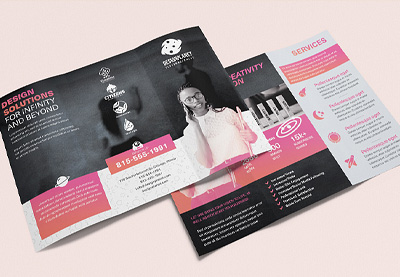
Not sure which template is right for you? Download a whole bunch, just like this premium brochure template! Mix and match layout designs, try them out, and customize them to meet your project’s goals!
5+ Best Premium Bifold & Tri-Fold Brochure Templates From Envato Elements
Before we continue, let’s look at some of the awesome offerings on Envato Elements. Pick one up, or sit back and enjoy some visual inspiration for your next design project!
Prefer a bifold brochure style layout? Check out this brochure template design. Many templates, like this one, are for Adobe InDesign. It’s got stylish considerations for both the front and back cover.
Cute design, right? This brochure design has fashion in mind but could work for a variety of situations. This one’s for Adobe Illustrator—what software will you opt to use?
Darker colors and higher contrast make this bifold brochure design stand out! It also comes in two different sizes: US Letter and A4. This perk makes it pretty versatile—you could use it for more than one project!
Check out this colorful brochure template. Not only is it stylish and whimsical, but it’s available in such a wide variety of formats! From Photoshop to Microsoft Word, this one’s easy to customize.
How about a clean, organic look? This template has such a relaxing vibe. What kind of aesthetic do you think would work best for your brochure project? This one would be great for showcasing photos!
If you need a brochure for your restaurant or food business, this trifold food brochure template is a great option for you. It’s really easy to use because is fully layered and well organized. Some of its cool features are:
A4 paper size (CMYK 300DPI)
Fully print ready
Well organized files and layers
Free fonts used
Bleed included
5 Best Bifold & Tri-Fold Brochure Templates From GraphicRiver
Not a fan of unlimited downloads? Prefer to only download and pay for the bifold or tri-fold brochures you need, rather than working from a large collection? Check out GraphicRiver—pay as you go, download only what you need, per brochure template.
The benefit here is that you’re looking at a one-time fee for exactly what you’re looking for, and that’s that—a simple, one-time transaction, no subscription fees and no fuss.
Let’s look at some of the awesome content available over on GraphicRiver before we dig into our collection of free finds.
How about a design that’s a little out of the ordinary? This trichure design folds outward and features square dimensions. This approach could be a perfect fit for art, design, and architecture projects—or any situation where you want to subvert expectations!
A pop of color can be eye-catching, right? In this tri-fold brochure template design, the red really stands out.
One of the great things about working with templates, like this one, is how easy it is to customize them. Red’s not your key color? Easily make it blue!
A three-fold brochure can be a great fit for menu designs. It can also work well for a whole host of different service-related data. Imagine having all your business offerings available in one easy-to-hand-out brochure!
A brochure template can save you a lot of time, but working with one can also be a lot of fun. It can help jump-start your process and give you a head start. Jump into a design, like this one, and start making your customizations.
A bifold brochure template like this one could be a great fit for a project with a lot of content to share with viewers. It’s important to present your content in a clear, organized way. This template does just that—with four different pages to mix and match, too!
20 Best Bifold & Tri-Fold Brochure Templates for Free
Now, let’s check out a selection of awesome bifold and tri-fold brochure templates for free from different sources on the Internet. Consider adding these links and websites to your list of resources, especially if you spot a design that catches your eye!
Let’s dig in and check out some great brochure designs for 2021 and beyond:
How fun is this colorful brochure template from InDesign Skills? It could be a perfect fit for your school-related function, or any project that could benefit from a little playfulness and whimsy.
Check out this 3-fold brochure template for free from TemplateLab—the darker part has such high contrast! This could be a great space for important information.
This free tri-fold brochure template was designed with luxury apartments in mind, but it’s got so much space to showcase your photos! It’s got the potential to work for a multitude of projects.
Looking for something simple and clean? This Microsoft Word tri-fold pamphlet is easy to edit and well organized. Jump in, add your content, and you’re ready to go.
Building or real estate your area of expertise? Check out this 3-fold brochure template. There’s plenty of space for your info and your pictures. Easily edit it in Microsoft Word—for free!
Simple and clean, with plenty of space to showcase your content—that’s this template! Want to push it further? It’s easy to dig in and make this your own in Adobe InDesign.
Here’s another lovely InDesign template. This one’s a tri-fold—how many folds do you think is most appropriate for your project? The white text against the muted blue looks awesome, but it’s also easy to customize this color scheme.
If you’re looking for something simple, this Microsoft Word template might fit the bill. It’s clean, to the point, ready for your edits, and free to use!
This bifold brochure template could be a great fit if you’ve got infographics to include. Or it would be great if you’ve got some photos that’ll work well in a collage setting!
Check out this stylish, color block look! Jump in and customize the imagery, the text, and the color scheme in this free tri-fold pamphlet template for Adobe InDesign.
Fun and colorful flowers are the theme of this free Microsoft Word tri-fold layout. Download it now and start customizing this design with your content!
Floral elements and organic colors can make for such a soothing, welcoming, visual experience, just like we see in this free template. You could swap this out, change the colors, and it could work for so many projects!
Working in academia? Trying to get the word out to your community? This template could be a great fit, especially if you’ve got a lot of content to share.
This Adobe InDesign template mixes up the composition with rounded shapes to command the viewer’s attention. Variation in shape, like this, can be a great way to mix things up.
Sometimes, less is more, like in this Microsoft Word Brochure template. Don’t underestimate clean, open space in a design—it can work really well! This tri-fold brochure template is ready for mailing address content, too!
This is another great example of a minimalist design! There are interesting pops of color here, too—notice how the red really stands out! What color would you use in this design?
We can also use color and value to divide our composition and organize our content, as we see in this free three-fold brochure template! Download this one and give it a try!
5 Quick Tips to Make Great Bifold & Tri-Fold Brochure Designs for 2021
So you found the perfect template. How do you make the right changes? Or you found a design you love, but you don’t understand why you love it. What makes a brochure design good versus great?
Here are some design tips that can help you with your brochure design choices:
1. Think About Both Form & Function
It’s important to consider more than just how your brochure looks.
We want our brochure design to look snazzy, but if it doesn’t function well—if the reader can’t navigate the content easily—then we potentially lose our audience.
Make sure to consider what content should go where—and why. For example, what sides of your brochure will the viewer likely see first? What might they see last? Using this information, what information should you prioritize and what might be more appropriate as supplemental content?
This premium tri-fold menu design template looks great, but also functions well too! Download it here!
2. Think About Color Too
Color can be very communicative. These communicative qualities really depend on our target audience. When working with color, as you design or customize your brochure design, here are some tips to keep in mind:
Think about your branding. Make sure your design decisions reflect your professional brand. So, for example, if your logo is purple, it might be a good idea to incorporate that same purple in your layout design.
Think about contrast and saturation. Choose colors that aren’t too hard on the eyes, especially when working with typography.
Color can „say” a lot! Think about what your color choices might say to your audience. Are you trying to communicate a calming vibe? Excitement?
3. Build a Cohesive Experience With Visual Consistency
Reading a brochure should potentially be a cohesive experience—a continuous document with a unifying theme. Think about it like this: if you were writing the content for your brochure, the content would all be related, with one specific goal or purpose.
The same perspective works well for visual elements in a design. Establishing visual relationships and using repeating elements can help create a sense of cohesion and continuation from panel to panel.
Let’s say you’ve got a longer brochure to create, with a lot of content to deliver to your audience. It might get a little tedious to look at if every page is exactly the same. It’s fun to mix things up, and it makes for a more visually engaging presentation.
But, as we discussed a little earlier, consistency is a great way to build a cohesive experience. Too much similarity, and we risk boredom. How do we find a happy medium?
Use things like colors, repeating footers, logos, and other repeating elements to help establish that consistency—but still mix it up with layout variations.
Design is a lot of fun, but we can end up with a lot of choices. Don’t forget that great design is often both form and function. It can’t just look good. It’s got to work too.
Of course, that’s easier said than done. But it’s often a good rule of thumb to make sure your content isn’t cluttered. Here are some tips that can help keep your content easy to read:
Remember to give body copy ample margin space. If the type is really cramped, it could hurt readability.
Line Spacing is important too! This is the space between each line in a paragraph. If the lines are too close together, it might look cramped. Likewise, if there’s too much space here, the lines might look disjointed, rather than like fluid sentences.
Don’t be afraid of „empty space.” Sometimes, less is more. We don’t have to „cram” as much content as we can into a layout design for it to look great.
Are you still looking for that perfect tri-fold or bifold brochure design? We’ve got plenty of brochure templates for you to choose from. Here are some more options:
When it comes to great design, there’s a lot to explore and cover. To learn more about brochure design and best practices, or to pump up your design skills, check out some of the tutorials on Envato Tuts+. From brochure design to typography to creating T-shirt designs, there’s so much to see and learn.
Check out these tutorials for more inspiration and brochure design walk-throughs, if you’d like to try making one from scratch.
BONUS: don’t forget to check our complete guide, where you’ll find a compilation of our best brochure design tutorials and inspiration: Brochure Design & Templates
Reach Your Audience With a Professional Brochure Design in 2021!
I hope this article brought some awesome new resources into your tool kit, from design inspiration to free templates that you can add to your arsenal.
Ready to jump in and start creating? Remember, you can find plenty of professional bifold and tri-fold designs on Envato Elements, if you’re looking for more inspiration or a premium option! Only need a single 3-fold or bifold brochure template? Check out GraphicRiver.
Here’s to your design project. Hopefully, your brochure meets all your goals and dazzles your audience! Why not get started today by downloading your next bifold or tri-fold brochure template?
Working on a bifold or tri-fold brochure project? Working with a professionally designed template could be the jump start you need to get your project started, going, or even completed!
I like to keep and collect a bank of tools, assets, and resources for professional and commercial use—like free templates and other valuable free finds on the Internet. In this article, we’ll look at some of the best free tri-fold and bifold brochure designs out there.
Before we dig into some awesome free finds, let’s take a quick look at some premium bifold and tri-fold brochure template options—they can be a great source of inspiration for your next tri-fold or bifold brochure! Then, we’ll dig right into a list of free templates to add to your design arsenal.
Why Use a Premium Brochure Template?
I get it—we’re all trying to get things done. We’re all working with a budget. Finding the right bifold or tri-fold brochure template, and finding it for free, is awesome. However, it can be a time-consuming process with limited results (that’s why lists are so handy, right?).
Don’t worry, we’re going to look at plenty of free content. But it’s good to think about the pros and cons when conducting your search.
A premium template comes with more options, more content. Often, there’s even documentation to help you get the job done. It can be way easier to find what you’re looking for, in way less time, with less hoops to jump through, too. There also tends to be more quality control when you’re working with a premium product.
The best part is, you’re looking at one fee for unlimited downloads. Download as many templates as you’d like to try out. Mix and match them, test them out—it’s all included.
The process is as simple as downloading the template and opening it up in the applicable software. Customize the content and the design to meet your project’s goals. This can also be a great fit if you’d like to try out more than one template! Download and experiment to your heart’s content.
Not sure which template is right for you? Download a whole bunch, just like this premium brochure template! Mix and match layout designs, try them out, and customize them to meet your project’s goals!
5+ Best Premium Bifold & Tri-Fold Brochure Templates From Envato Elements
Before we continue, let’s look at some of the awesome offerings on Envato Elements. Pick one up, or sit back and enjoy some visual inspiration for your next design project!
Prefer a bifold brochure style layout? Check out this brochure template design. Many templates, like this one, are for Adobe InDesign. It’s got stylish considerations for both the front and back cover.
Cute design, right? This brochure design has fashion in mind but could work for a variety of situations. This one’s for Adobe Illustrator—what software will you opt to use?
Darker colors and higher contrast make this bifold brochure design stand out! It also comes in two different sizes: US Letter and A4. This perk makes it pretty versatile—you could use it for more than one project!
Check out this colorful brochure template. Not only is it stylish and whimsical, but it’s available in such a wide variety of formats! From Photoshop to Microsoft Word, this one’s easy to customize.
How about a clean, organic look? This template has such a relaxing vibe. What kind of aesthetic do you think would work best for your brochure project? This one would be great for showcasing photos!
If you need a brochure for your restaurant or food business, this trifold food brochure template is a great option for you. It’s really easy to use because is fully layered and well organized. Some of its cool features are:
A4 paper size (CMYK 300DPI)
Fully print ready
Well organized files and layers
Free fonts used
Bleed included
5 Best Bifold & Tri-Fold Brochure Templates From GraphicRiver
Not a fan of unlimited downloads? Prefer to only download and pay for the bifold or tri-fold brochures you need, rather than working from a large collection? Check out GraphicRiver—pay as you go, download only what you need, per brochure template.
The benefit here is that you’re looking at a one-time fee for exactly what you’re looking for, and that’s that—a simple, one-time transaction, no subscription fees and no fuss.
Let’s look at some of the awesome content available over on GraphicRiver before we dig into our collection of free finds.
How about a design that’s a little out of the ordinary? This trichure design folds outward and features square dimensions. This approach could be a perfect fit for art, design, and architecture projects—or any situation where you want to subvert expectations!
A pop of color can be eye-catching, right? In this tri-fold brochure template design, the red really stands out.
One of the great things about working with templates, like this one, is how easy it is to customize them. Red’s not your key color? Easily make it blue!
A three-fold brochure can be a great fit for menu designs. It can also work well for a whole host of different service-related data. Imagine having all your business offerings available in one easy-to-hand-out brochure!
A brochure template can save you a lot of time, but working with one can also be a lot of fun. It can help jump-start your process and give you a head start. Jump into a design, like this one, and start making your customizations.
A bifold brochure template like this one could be a great fit for a project with a lot of content to share with viewers. It’s important to present your content in a clear, organized way. This template does just that—with four different pages to mix and match, too!
20 Best Bifold & Tri-Fold Brochure Templates for Free
Now, let’s check out a selection of awesome bifold and tri-fold brochure templates for free from different sources on the Internet. Consider adding these links and websites to your list of resources, especially if you spot a design that catches your eye!
Let’s dig in and check out some great brochure designs for 2021 and beyond:
How fun is this colorful brochure template from InDesign Skills? It could be a perfect fit for your school-related function, or any project that could benefit from a little playfulness and whimsy.
Check out this 3-fold brochure template for free from TemplateLab—the darker part has such high contrast! This could be a great space for important information.
This free tri-fold brochure template was designed with luxury apartments in mind, but it’s got so much space to showcase your photos! It’s got the potential to work for a multitude of projects.
Looking for something simple and clean? This Microsoft Word tri-fold pamphlet is easy to edit and well organized. Jump in, add your content, and you’re ready to go.
Building or real estate your area of expertise? Check out this 3-fold brochure template. There’s plenty of space for your info and your pictures. Easily edit it in Microsoft Word—for free!
Simple and clean, with plenty of space to showcase your content—that’s this template! Want to push it further? It’s easy to dig in and make this your own in Adobe InDesign.
Here’s another lovely InDesign template. This one’s a tri-fold—how many folds do you think is most appropriate for your project? The white text against the muted blue looks awesome, but it’s also easy to customize this color scheme.
If you’re looking for something simple, this Microsoft Word template might fit the bill. It’s clean, to the point, ready for your edits, and free to use!
This bifold brochure template could be a great fit if you’ve got infographics to include. Or it would be great if you’ve got some photos that’ll work well in a collage setting!
Check out this stylish, color block look! Jump in and customize the imagery, the text, and the color scheme in this free tri-fold pamphlet template for Adobe InDesign.
Fun and colorful flowers are the theme of this free Microsoft Word tri-fold layout. Download it now and start customizing this design with your content!
Floral elements and organic colors can make for such a soothing, welcoming, visual experience, just like we see in this free template. You could swap this out, change the colors, and it could work for so many projects!
Working in academia? Trying to get the word out to your community? This template could be a great fit, especially if you’ve got a lot of content to share.
This Adobe InDesign template mixes up the composition with rounded shapes to command the viewer’s attention. Variation in shape, like this, can be a great way to mix things up.
Sometimes, less is more, like in this Microsoft Word Brochure template. Don’t underestimate clean, open space in a design—it can work really well! This tri-fold brochure template is ready for mailing address content, too!
This is another great example of a minimalist design! There are interesting pops of color here, too—notice how the red really stands out! What color would you use in this design?
We can also use color and value to divide our composition and organize our content, as we see in this free three-fold brochure template! Download this one and give it a try!
5 Quick Tips to Make Great Bifold & Tri-Fold Brochure Designs for 2021
So you found the perfect template. How do you make the right changes? Or you found a design you love, but you don’t understand why you love it. What makes a brochure design good versus great?
Here are some design tips that can help you with your brochure design choices:
1. Think About Both Form & Function
It’s important to consider more than just how your brochure looks.
We want our brochure design to look snazzy, but if it doesn’t function well—if the reader can’t navigate the content easily—then we potentially lose our audience.
Make sure to consider what content should go where—and why. For example, what sides of your brochure will the viewer likely see first? What might they see last? Using this information, what information should you prioritize and what might be more appropriate as supplemental content?
This premium tri-fold menu design template looks great, but also functions well too! Download it here!
2. Think About Color Too
Color can be very communicative. These communicative qualities really depend on our target audience. When working with color, as you design or customize your brochure design, here are some tips to keep in mind:
Think about your branding. Make sure your design decisions reflect your professional brand. So, for example, if your logo is purple, it might be a good idea to incorporate that same purple in your layout design.
Think about contrast and saturation. Choose colors that aren’t too hard on the eyes, especially when working with typography.
Color can „say” a lot! Think about what your color choices might say to your audience. Are you trying to communicate a calming vibe? Excitement?
3. Build a Cohesive Experience With Visual Consistency
Reading a brochure should potentially be a cohesive experience—a continuous document with a unifying theme. Think about it like this: if you were writing the content for your brochure, the content would all be related, with one specific goal or purpose.
The same perspective works well for visual elements in a design. Establishing visual relationships and using repeating elements can help create a sense of cohesion and continuation from panel to panel.
Let’s say you’ve got a longer brochure to create, with a lot of content to deliver to your audience. It might get a little tedious to look at if every page is exactly the same. It’s fun to mix things up, and it makes for a more visually engaging presentation.
But, as we discussed a little earlier, consistency is a great way to build a cohesive experience. Too much similarity, and we risk boredom. How do we find a happy medium?
Use things like colors, repeating footers, logos, and other repeating elements to help establish that consistency—but still mix it up with layout variations.
Design is a lot of fun, but we can end up with a lot of choices. Don’t forget that great design is often both form and function. It can’t just look good. It’s got to work too.
Of course, that’s easier said than done. But it’s often a good rule of thumb to make sure your content isn’t cluttered. Here are some tips that can help keep your content easy to read:
Remember to give body copy ample margin space. If the type is really cramped, it could hurt readability.
Line Spacing is important too! This is the space between each line in a paragraph. If the lines are too close together, it might look cramped. Likewise, if there’s too much space here, the lines might look disjointed, rather than like fluid sentences.
Don’t be afraid of „empty space.” Sometimes, less is more. We don’t have to „cram” as much content as we can into a layout design for it to look great.
Are you still looking for that perfect tri-fold or bifold brochure design? We’ve got plenty of brochure templates for you to choose from. Here are some more options:
When it comes to great design, there’s a lot to explore and cover. To learn more about brochure design and best practices, or to pump up your design skills, check out some of the tutorials on Envato Tuts+. From brochure design to typography to creating T-shirt designs, there’s so much to see and learn.
Check out these tutorials for more inspiration and brochure design walk-throughs, if you’d like to try making one from scratch.
BONUS: don’t forget to check our complete guide, where you’ll find a compilation of our best brochure design tutorials and inspiration: Brochure Design & Templates
Reach Your Audience With a Professional Brochure Design in 2021!
I hope this article brought some awesome new resources into your tool kit, from design inspiration to free templates that you can add to your arsenal.
Ready to jump in and start creating? Remember, you can find plenty of professional bifold and tri-fold designs on Envato Elements, if you’re looking for more inspiration or a premium option! Only need a single 3-fold or bifold brochure template? Check out GraphicRiver.
Here’s to your design project. Hopefully, your brochure meets all your goals and dazzles your audience! Why not get started today by downloading your next bifold or tri-fold brochure template?
Agregator najlepszych postów o designie, webdesignie, cssie i Internecie