Important Features that Every Business Website Should Have

Post pobrano z: Important Features that Every Business Website Should Have

Having a well-designed website is essential for every business. It’s often the first place customers visit to learn more about your services, products, or brand. A good website isn’t just about looking professional. It should also be easy to use and create a great experience for visitors.

But what makes a business website truly effective? There are certain key features that every website needs to help it stand out, build trust, and support business growth. In this post, we’ll look at the most important features and explain why they matter.

Clear Navigation

Clear navigation is one of the most important parts of any business website. When visitors come to your site, they should be able to find what they’re looking for quickly and easily.

A simple menu at the top of the page is a great way to help people move around your website. It should include links to key pages, like your services, contact information, and about us section. Drop-down menus can also be useful if you have lots of pages, but keep them organised to avoid confusion.

Clear navigation not only improves the user experience but also helps search engines understand your website better. This can improve your rankings and make it easier for customers to find you online.

A well-organised website keeps visitors happy and increases the chance they’ll stay longer or get in touch with your business.

Mobile-Friendly Design

A mobile-friendly design is essential for any business website. More people are using their phones and tablets to browse the internet, so your site needs to look good and work well on smaller screens.

A mobile-friendly website adjusts automatically to fit any screen size. This means the text is easy to read, buttons are simple to click, and pages load quickly. If your site isn’t mobile-friendly, visitors might leave because it’s hard to use, and this can hurt your business.

Fast Loading Speed

A fast-loading website is crucial for keeping visitors happy. If your pages take too long to load, people might leave and look elsewhere. Most users expect a website to load in just a few seconds, so every second counts.

Slow websites can also affect your search engine ranking, as search engines like Google prioritise sites that load quickly. This means a fast website isn’t just good for your visitors. It’s also important for helping people find you online.

To improve loading speed, you can optimise your images, reduce large files, and use reliable hosting. A well-maintained website will not only load faster but also provide a better experience for your visitors.

Contact Information

Making it easy for visitors to contact you is essential for any business website. Your contact details, like a phone number, email address, and location, should be clearly displayed. Most websites include this information on a contact page and in the footer of every page.

Adding a contact form is also a great way to make it simple for visitors to reach you. It’s quick, easy to use, and removes the need for visitors to copy and paste your email address.

Clear and accessible contact details show your business is open and ready to help, which can encourage people to get in touch.

Trustworthy Signals

Building trust is a key part of creating a successful website. Visitors are more likely to stay and interact with your business if they feel confident in what you offer.

Adding customer reviews, testimonials, or case studies can show others have had good experiences with your business. Trust badges, like logos of certifications or memberships, can also help build credibility.

It’s important to have an SSL certificate for your website. This ensures your site is secure and shows visitors a padlock icon in their browser. A secure website reassures users, especially if they’re entering personal details or making a payment.

Search Engine Optimisation (SEO)

Search Engine Optimisation (SEO) helps your website appear higher in search engine results, making it easier for people to find you online. Good SEO ensures your site is visible when potential customers search for products or services you offer.

Basic SEO features include using the right keywords in your content, adding meta descriptions to your pages, and including alt text for images. These help search engines understand your website better and improve its ranking.

Conclusion

A successful business website isn’t just about looking good—it needs to include key features that make it easy to use, secure, and visible online. From clear navigation and mobile-friendly design to fast loading speed and SEO, these features work together to create a site that helps your business grow.

Investing in a website with these essentials, you can build trust with your visitors, attract more customers, and give your business the best chance of success.

The post Important Features that Every Business Website Should Have appeared first on Designer Daily: graphic and web design blog.

Important Features that Every Business Website Should Have

Post pobrano z: Important Features that Every Business Website Should Have

Having a well-designed website is essential for every business. It’s often the first place customers visit to learn more about your services, products, or brand. A good website isn’t just about looking professional. It should also be easy to use and create a great experience for visitors.

But what makes a business website truly effective? There are certain key features that every website needs to help it stand out, build trust, and support business growth. In this post, we’ll look at the most important features and explain why they matter.

Clear Navigation

Clear navigation is one of the most important parts of any business website. When visitors come to your site, they should be able to find what they’re looking for quickly and easily.

A simple menu at the top of the page is a great way to help people move around your website. It should include links to key pages, like your services, contact information, and about us section. Drop-down menus can also be useful if you have lots of pages, but keep them organised to avoid confusion.

Clear navigation not only improves the user experience but also helps search engines understand your website better. This can improve your rankings and make it easier for customers to find you online.

A well-organised website keeps visitors happy and increases the chance they’ll stay longer or get in touch with your business.

Mobile-Friendly Design

A mobile-friendly design is essential for any business website. More people are using their phones and tablets to browse the internet, so your site needs to look good and work well on smaller screens.

A mobile-friendly website adjusts automatically to fit any screen size. This means the text is easy to read, buttons are simple to click, and pages load quickly. If your site isn’t mobile-friendly, visitors might leave because it’s hard to use, and this can hurt your business.

Fast Loading Speed

A fast-loading website is crucial for keeping visitors happy. If your pages take too long to load, people might leave and look elsewhere. Most users expect a website to load in just a few seconds, so every second counts.

Slow websites can also affect your search engine ranking, as search engines like Google prioritise sites that load quickly. This means a fast website isn’t just good for your visitors. It’s also important for helping people find you online.

To improve loading speed, you can optimise your images, reduce large files, and use reliable hosting. A well-maintained website will not only load faster but also provide a better experience for your visitors.

Contact Information

Making it easy for visitors to contact you is essential for any business website. Your contact details, like a phone number, email address, and location, should be clearly displayed. Most websites include this information on a contact page and in the footer of every page.

Adding a contact form is also a great way to make it simple for visitors to reach you. It’s quick, easy to use, and removes the need for visitors to copy and paste your email address.

Clear and accessible contact details show your business is open and ready to help, which can encourage people to get in touch.

Trustworthy Signals

Building trust is a key part of creating a successful website. Visitors are more likely to stay and interact with your business if they feel confident in what you offer.

Adding customer reviews, testimonials, or case studies can show others have had good experiences with your business. Trust badges, like logos of certifications or memberships, can also help build credibility.

It’s important to have an SSL certificate for your website. This ensures your site is secure and shows visitors a padlock icon in their browser. A secure website reassures users, especially if they’re entering personal details or making a payment.

Search Engine Optimisation (SEO)

Search Engine Optimisation (SEO) helps your website appear higher in search engine results, making it easier for people to find you online. Good SEO ensures your site is visible when potential customers search for products or services you offer.

Basic SEO features include using the right keywords in your content, adding meta descriptions to your pages, and including alt text for images. These help search engines understand your website better and improve its ranking.

Conclusion

A successful business website isn’t just about looking good—it needs to include key features that make it easy to use, secure, and visible online. From clear navigation and mobile-friendly design to fast loading speed and SEO, these features work together to create a site that helps your business grow.

Investing in a website with these essentials, you can build trust with your visitors, attract more customers, and give your business the best chance of success.

The post Important Features that Every Business Website Should Have appeared first on Designer Daily: graphic and web design blog.
Fluid Superscripts and Subscripts

Post pobrano z: Fluid Superscripts and Subscripts

Superscripts and subscripts are essential elements in academic and scientific content — from citation references to chemical formulas and mathematical expressions. Yet browsers handle these elements with a static approach that can create significant problems: elements become either too small on mobile devices or disproportionately large on desktop displays.

After years of wrestling with superscript and subscript scaling in CSS, I’m proposing a modern solution using fluid calculations. In this article, I’ll show you why the static approach falls short and how we can provide better typography across all viewports while maintaining accessibility. Best of all, this solution requires nothing but clean, pure CSS.

The problem with static scaling

The scaling issue is particularly evident when comparing professional typography with browser defaults. Take this example (adapted from Wikipedia), where the first “2” is professionally designed and included in the glyph set, while the second uses <sub> (top) and <sup> (bottom) elements:

Diagramming the typographic parts and spacing of subscripts and superscripts.

Browsers have historically used font-size: smaller for <sup> and <sub> elements, which translates to roughly 0.83x scaling. While this made sense in the early days of CSS for simple documents, it can create problems in modern responsive designs where font sizes can vary dramatically. This is especially true when using fluid typography, where text sizes can scale smoothly between extremes.

Fluid scaling: A better solution

I’ve developed a solution that scales more naturally across different sizes by combining fixed and proportional units. This approach ensures legibility at small sizes while maintaining proper proportions at larger sizes, eliminating the need for context-specific adjustments.

CodePen Embed Fallback

Here’s how it works:

sup, sub {
  font-size: calc(0.5em + 4px);
  vertical-align: baseline;
  position: relative; 
  top: calc(-0.5 * 0.83 * 2 * (1em - 4px)); 
  /* Simplified top: calc(-0.83em + 3.32px) */
}

sub {
  top: calc(0.25 * 0.83 * 2 * (1em - 4px)); 
  /* Simplified top: calc(0.42em - 1.66px) */
}
  • Natural scaling: The degressive formula ensures that superscripts and subscripts remain proportional at all sizes
  • Baseline alignment: By using vertical-align: baseline and relative positioning, we prevent the elements from affecting line height and it gives us better control over the offset to match your specific needs. You’re probably also wondering where the heck these values come from — I’ll explain in the following.

Breaking down the math

Let’s look at how this works, piece by piece:

Calculating the font size (px)

At small sizes, the fixed 4px component has more impact. At large sizes, the 0.5em proportion becomes dominant. The result is more natural scaling across all sizes.

sup, sub {
  font-size: calc(0.5em + 4px);
  /* ... */
}

sub { 
  /* ... */
}

Calculating the parent font size (em)

Within the <sup> and <sub> elements, we can calculate the parent’s font-size:

sup, sub {
  font-size: calc(0.5em + 4px);
  top: calc(2 * (1em - 4px));
}

sub { 
  top: calc(2 * (1em + 4px));
}

The fluid font size is defined as calc(0.5em + 4px). To compensate for the 0.5em, we first need to solve 0.5em * x = 1em which gives us x = 2. The 1em here represents the font size of the <sup> and <sub> elements themselves. We subtract the 4px fixed component from our current em value before multiplying.

The vertical offset

For the vertical offset, we start with default CSS positioning values and adjust them to work with our fluid scaling:

sup, sub {
  font-size: calc(0.5em + 4px);
  top: calc(-0.5 * 0.83 * 2 * (1em - 4px));
}

sub { 
  top: calc(0.25 * 0.83 * 2 * (1em - 4px));
}

The formula is carefully calibrated to match standard browser positioning:

  • 0.5em (super) and 0.25em (sub) are the default vertical offset values (e.g. used in frameworks like Tailwind CSS and Bootstrap).
  • We multiply by 0.83 to account for the browser’s font-size: smaller scaling factor, which is used per default for superscript and subscript.

This approach ensures that our superscripts and subscripts maintain familiar vertical positions while benefiting from improved fluid scaling. The result matches what users expect from traditional browser rendering but scales more naturally across different font sizes.

Helpful tips

The exact scaling factor font-size: (0.5em + 4px) is based on my analysis of superscript Unicode characters in common fonts. Feel free to adjust these values to match your specific design needs. Here are a few ways how you might want to customize this approach:

For larger scaling:

sup, sub {
  font-size: calc(0.6em + 3px);
  /* adjust offset calculations accordingly */
}

For smaller scaling:

sup, sub {
  font-size: calc(0.4em + 5px);
  /* adjust offset calculations accordingly */
}

For backward compatibility, you might want to wrap all of it in a @supports block:

@supports (font-size: calc(1em + 1px)) {
  sup, sub {
    ...
  }
}

Final demo

I built this small interactive demo to show different fluid scaling options, compare them to the browser’s static scaling, and fine-tune the vertical positioning to see what works best for your use case:

CodePen Embed Fallback

Give it a try in your next project and happy to hear your thoughts!


Fluid Superscripts and Subscripts originally published on CSS-Tricks, which is part of the DigitalOcean family. You should get the newsletter.

7 Signs It’s Time To Hire a PPC Agency

Post pobrano z: 7 Signs It’s Time To Hire a PPC Agency

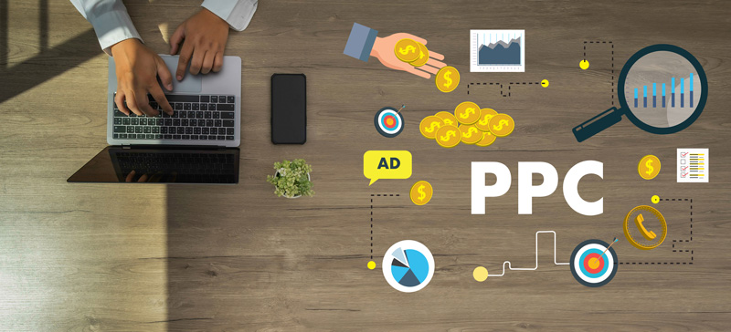
PPC advertising can help you attract visitors to your website, enhance conversions, and fuel your business growth. When handled well, PPC ads can show solid results, as they focus on the right audience and make the most of your ad budget. However, running successful PPC campaigns requires expertise, time, and an in-depth understanding of ever-changing trends, which can be challenging for businesses to handle alone.

If you’re wondering if it might be time to get expert help and hire a PPC agency, here are the key signs to help you decide.

1. Your Campaigns Aren’t Delivering Results

If your PPC campaigns are running, but you’re not seeing the results you expected, it’s a clear indication that something’s wrong. Factors like poor ad placement, low-quality scores, or ineffective keyword research could be holding your campaigns back. A PPC agency brings expertise in PPC advertising services, including conversion tracking, bid optimization, and landing page optimization, to help you achieve better performance.

Hiring the right PPC agency ensures you’ll have access to PPC specialists who understand how to refine your ad targeting, improve click-through rates, and optimize landing pages for maximum conversions. They also use advanced PPC tools and industry best practices to turn underperforming PPC ads into successful ones.

2. You’re Spending Too Much Without Seeing ROI

Managing your own PPC advertising can sometimes mean you’re pouring money into campaigns without seeing a return on investment. Poor bid optimization or targeting the wrong audience often results in wasted budgets. This is where a pay-per-click marketing expert can make all the difference.

A skilled PPC marketing agency focuses on key factors like cost per click, conversion rate optimization, and in-depth keyword research to reduce unnecessary ad spending while boosting ROI. Whether it’s Google Ads, Bing Ads, or paid social campaigns on platforms like Facebook, an experienced PPC team can help you achieve measurable results and control costs effectively.

3. You’re Struggling to Keep Up with PPC Trends

PPC advertising evolves rapidly, and staying updated on PPC trends, ad network changes, and new features like Google Shopping or the Google Display Network can be overwhelming. If you lack the time or expertise to keep up, a PPC management agency can help.

Top PPC agencies specialize in optimizing marketing campaigns on an ongoing basis. They understand the importance of compelling ad copy, quality ad groups, and remarketing strategies to boost conversion rates and reach the right audience. Their background in social media marketing, search engine marketing, and display advertising keeps your campaigns ahead of the competition.

4. Your Business Needs a Scalable Solution

As your small business grows, managing PPC campaigns becomes more complex. A growing business might require additional ad placements across various channels like social media platforms, display ads, and search engines. Whether you’re targeting home services in New York or scaling up nationwide in the United States, a great PPC agency can adapt to your needs.

With professional PPC consulting, a service marketing agency helps create scalable solutions tailored to your growth. They integrate PPC advertising with social media management and search engine optimization to enhance your overall digital marketing strategy.

5. Your Internal Team Lacks Expertise

If your in-house team doesn’t have a PPC expert, your campaigns might suffer from inefficiencies like low-quality scores or missed opportunities for remarketing. A dedicated PPC specialist from a digital marketing agency can fill this gap. They’ll manage all aspects of your campaigns, from keyword research to bid optimization, ensuring your PPC advertising delivers accurate results.

By partnering with a PPC agency, you gain access to professionals who excel in PPC management services, ad network expertise, and conversion tracking. Their knowledge ensures your marketing campaigns are expertly handled, leaving you free to focus on other aspects of your business.

6. You Need Consistent Performance Monitoring

PPC campaigns require constant analysis and refinement to stay effective. If you’re not tracking your conversion rates, ad targeting, and click-through rates regularly, you’re likely missing out on optimization opportunities. A reliable PPC marketing agency provides ongoing optimization to ensure your ads maintain peak performance.

They use PPC tools to monitor your campaigns, make adjustments, and deliver measurable results. From landing page optimization to Facebook Ads and Bing Ads, a skilled PPC team ensures every campaign provides maximum ROI.

7. You Want to Expand Your Marketing Efforts

Expanding into new ad networks or running campaigns on multiple social media platforms requires expertise. A professional PPC agency can help you diversify your marketing efforts with Google Ads, Bing Ads, display advertising, and paid search campaigns. They also integrate these efforts with social media platforms like Facebook to create a holistic strategy.

With their expert guidance, you can explore new opportunities for niche industries or geographic locations, such as Google Shopping, remarketing, and campaign management.

Conclusion

Managing PPC campaigns effectively takes time, skill, and resources. If any of these signs resonate with you, partnering with a PPC marketing agency could be the solution to unlocking your campaigns’ full potential. By leveraging their expertise in PPC management, you’ll see improvements in ad performance, conversion rates, and overall ROI.

Whether you’re a small business or a large organization, hiring the right PPC agency can transform your approach to digital marketing and deliver the actual results you’ve been looking for.

The post 7 Signs It’s Time To Hire a PPC Agency appeared first on Designer Daily: graphic and web design blog.

A+ Content: Why Design Matters in E-Commerce

Post pobrano z: A+ Content: Why Design Matters in E-Commerce

In the competitive world of e-commerce, standing out among the sea of online products is no easy feat. Every business, from small startups to large enterprises, is vying for the attention of consumers who are overwhelmed by choices. With so many options at their fingertips, customers are quick to judge, often within seconds, whether a product is worth their time and money. That’s where A+ content comes into play. But why exactly does design matter in e-commerce? Well, in today’s digital age, it’s not just about having great products; it’s about how you present them.

For sellers navigating marketplaces like Amazon, partnering with a full service Amazon agency can make all the difference. These agencies specialize in creating and optimizing A+ content that not only captures attention but also drives conversions, helping businesses maximize their e-commerce potential.

The Importance of A+ Content in E-Commerce

A+ content is essentially an enhanced content solution that allows sellers to improve their product pages. This enriched content goes beyond the basic description and images to include enhanced text, high-quality images, comparison charts, videos, and other visual elements that can dramatically impact a consumer’s purchasing decision. It’s your opportunity to showcase your product in its best light, and when done right, it can significantly boost conversions.

Why does this matter? Research has shown that customers are more likely to purchase products that have detailed, visually appealing content that answers their questions. In a world where 55% of shoppers decide on purchases based on visual content alone, not leveraging A+ content could mean the difference between a sale and a lost opportunity. A well-designed A+ content layout can build trust with potential buyers, giving them the confidence that your product is exactly what they need.

E-Commerce Product Page Optimization: The Role of A+ Content

Effective e-commerce product page optimization isn’t just about showing a product and telling customers about it. It’s about creating an experience for them. A+ content plays a crucial role here by combining design and strategy to guide customers through their decision-making process.

Product page optimization isn’t merely about stuffing keywords into the product description. It’s about providing clarity and highlighting the unique features of your product, all while maintaining a balance between text and visuals. In fact, it’s the strategic use of design elements like images, text boxes, videos, and infographics that can turn an ordinary product page into a compelling one.

When a customer visits a product page, the first thing they’re looking for is a clear, concise, and attractive presentation of the product. A well-designed product page with A+ content can showcase the product’s value more effectively by using elements like:

  1. High-quality images and videos: Visual content helps in showing the product in action, providing customers with a sense of its scale, usage, and functionality.
  2. Detailed specifications: These provide customers with all the relevant information they need to make an informed decision.
  3. Comparisons and charts: These highlight how your product stands out from competitors.
  4. Customer reviews and testimonials: Social proof reassures buyers of the product’s quality.

By integrating these elements into A+ content, you can enhance the user experience, making your product page more informative, engaging, and persuasive.

Designing Effective A+ Content: Key Factors to Consider

While the concept of A+ content may seem straightforward, designing effective A+ content involves a deeper understanding of both user experience and the psychology of online shoppers. Let’s take a look at the key factors to consider when creating compelling, high-converting A+ content:

1. Branding with Enhanced Product Content

Branding is one of the most powerful tools you can use in e-commerce, and it’s no different when designing A+ content. Effective branding doesn’t just mean using your logo in the product images, but rather creating a cohesive story that connects with your target audience on an emotional level. When consumers purchase a product, they’re buying into a brand experience—one that speaks to their values, needs, and desires.

Incorporating elements of your brand’s identity—such as color schemes, fonts, tone of voice, and imagery—into your A+ content can elevate the perception of your product. It reinforces the narrative that your product is not just a generic option in a crowded market, but a premium choice aligned with the brand’s quality and ethos.

When you design your A+ content with branding in mind, you increase the likelihood that consumers will not only recognize your brand but also connect with it on a personal level. This builds brand loyalty, turning first-time shoppers into repeat customers.

2. Focus on User-Centric Design

The best A+ content is intuitive and easy to navigate. Your goal is to create a seamless experience for the user, guiding them effortlessly toward a purchasing decision. The design should lead the viewer’s eye, ensuring they absorb the most important information first.

Consider these design principles:

  • Simplicity: Avoid clutter. Focus on what matters most to your audience. A minimalist design often works best, allowing the product’s features to shine without overwhelming the customer.
  • Consistent layout: Organize your A+ content so that it flows logically. Use headings, subheadings, and bullet points to break up text and make it more digestible.
  • Call to Action (CTA): A compelling CTA is essential in guiding the customer to the next step in their journey. Whether it’s “Buy Now” or “Learn More,” make sure your CTA is prominent and easy to act on.

By focusing on these aspects, you can ensure that your design not only communicates your brand effectively but also converts visitors into customers.

3. Optimizing for Mobile Devices

As more and more consumers shop from their mobile devices, optimizing A+ content for mobile viewing has become critical. Mobile optimization ensures that your product page looks just as great on a smartphone as it does on a desktop. This includes resizing images, adjusting text size, and ensuring that buttons are clickable.

It’s also essential to ensure that all elements of your A+ content load quickly. Slow load times can frustrate potential buyers and cause them to abandon their cart. A mobile-friendly design ensures that your product page reaches a wider audience and provides a seamless shopping experience.

4. Strategic Use of Keywords

Incorporating relevant keywords into your A+ content is vital for visibility on search engines, but the content should flow naturally and not appear stuffed with keywords. Focus on integrating keywords into headings, product descriptions, and image alt text, which can help improve your page’s SEO ranking.

It’s also helpful to tailor the content to answer common customer questions. By understanding your audience’s concerns and addressing them directly, you can increase your content’s relevance and searchability.

The Role of a Full-Service Amazon Agency in A+ Content Design

If you’re overwhelmed by the task of optimizing your product page or designing A+ content from scratch, a full-service Amazon agency can provide the expertise you need. These agencies specialize in everything from product listing optimization to driving traffic through Amazon ads. With experience in creating A+ content that not only enhances the visual appeal of your product page but also improves its search rankings, a full-service Amazon agency can be an invaluable asset to your e-commerce business.

By leveraging a full-service Amazon agency, you gain access to professionals who understand the nuances of Amazon’s platform, ensuring that your A+ content is optimized for both user experience and SEO. They can also help you track and analyze data, adjusting your strategy to ensure continuous improvement and maximized ROI.

Wrapping Up

In the fast-paced world of e-commerce, design matters more than ever before. A+ content is a powerful tool that allows businesses to enhance their product pages, build stronger brands, and improve conversion rates. Whether you’re designing the content yourself or working with a full-service Amazon agency, investing time and resources into effective A+ content design can yield significant returns. By focusing on user experience, branding, and optimization, you create a product page that not only looks great but also drives sales and customer loyalty. So, take the time to design A+ content that reflects the quality of your products, and watch your business thrive in the competitive e-commerce space.

The post A+ Content: Why Design Matters in E-Commerce appeared first on Designer Daily: graphic and web design blog.
The Future of Design Trends: What’s Coming in 2025

Post pobrano z: The Future of Design Trends: What’s Coming in 2025

Interior design is constantly evolving, with new trends popping up every season. But 2025 is shaping up to be a year of exciting innovation, some more predictable and others completely unexpected. We’re talking not only about the color palettes to embrace in design projects, but also the way to combine elements and shapes.

To give some concrete anticipations, a font that will be representative of 2025 in the graphic world is Friendly Serif, cherished for its somewhat outlandish and certainly multipurpose style. The same can be said for furniture trends, where we will see the prevalence of wavy, yet very versatile lines, as in any Baxter sofa. If you’re looking to stay ahead of the curve, this is the perfect time to explore the design trends that will define the year ahead.

1. Bold Colors and Layered Visuals

In 2025, expect to see a dramatic move toward bold, striking color choices and intricate layered designs. Both interior and graphic design will lean into more saturated, unexpected color schemes. In interiors, colors like mustard yellow, deep terracotta, and vibrant blues will set the tone for bold, energetic spaces. A Baxter Chester Moon Ochre Yellow Leather Sofa is an ideal example of this trend, with its striking ochre yellow tone making a statement in any room.

For graphic design, this trend translates to typography and digital layouts that aren’t afraid to play with color. Expect to see bold typefaces in strong colors paired with layered patterns and textures. Digital spaces, like websites and apps, will see a push toward more engaging, multi-dimensional designs that reflect this energy. Designers will move away from flat, minimalist layouts in favor of designs that feel vibrant and full of life.

2. Warm Minimalism

While minimalism has been popular for years, 2025 will introduce a softer version of this style. Instead of cold, sterile spaces, both interiors and digital designs will embrace warm tones over cool ones. In the world of interiors, expect to see more terracotta and beige shades that create a welcoming environment. A B&B Italia Dambo Rope Fabric Sofa, known for its sleek design, works perfectly in these environments, adding warmth and comfort to a minimalist living room. The thing is, places need to feel more human and less artificial.

In graphic design, this shift toward warm minimalism is evident in the use of soft, muted colors and clean, simple layouts. Websites will feel less cluttered, with ample white space and more focus on user experience. It’s about creating an atmosphere that’s easy on the eyes and doesn’t overwhelm the viewer. Typography will be understated yet elegant, and digital interactions will focus on simplicity and ease.

3. Sustainability and Nature-Inspired Design

2025 will continue to see the rise of biophilic and sustainable design practices, not just in interiors but across digital spaces as well. In the physical world, expect to see more natural materials like wood, stone, and metal making their way into furniture and decor. Designers will opt for sustainable, eco-friendly materials to create calming, nature-inspired environments. A Porada Aksel Desk, crafted with high-quality wood from sustainable practices, is a prime example of how eco-consciousness and luxury can coexist.

In graphic design, sustainability will also take center stage, with more brands adopting eco-friendly practices in their digital design choices. Expect to see an increase in green-themed websites and apps, using earthy colors, plant motifs, and nature-inspired graphics to communicate a commitment to sustainability. These designs will feel grounded and organic, offering a visual connection to the natural world.

4. Vintage Glam

One of the most exciting trends of 2025 is the return of vintage glam, a style that blends the opulence and elegance of past decades with the sleekness of modern design. Think of 1920s-inspired furniture, luxurious velvet finishes, and intricate gold detailing paired with clean, modern lines. Many pieces of furniture from old collections will be reissued, or many pieces of furniture straight from catalogs of the past will come back into vogue, like the Alias Seconda Chair.

In graphic design, vintage glam will show up through typography, color palettes, and branding. Expect to see fonts with an art-deco flair, along with rich color schemes like emerald greens, deep golds, and royal purples. Digital spaces will exude luxury, blending vintage styles with a modern sensibility. Websites and brands will use these elements to evoke nostalgia while keeping things fresh and current.

5. New Brutalism

In contrast to the warm minimalism of the new year, new brutalism is rising as well as a design trend for 2025. This style embraces raw materials, strong geometric shapes, and a sense of unapologetic boldness. In interiors, this means exposed concrete, large-scale furniture with sharp lines, and a focus on functionality over form. A Henge Zenith Table, with its sharp, structured form, could fit seamlessly into this type of space.

For graphic design, new brutalism is all about breaking the rules—using distorted fonts, asymmetrical layouts, and high-contrast color schemes to make a statement. Digital platforms will embrace this trend with bold, eye-catching designs that aren’t afraid to be unconventional. Websites may feature heavy, blocky typography, jagged visuals, and raw imagery that demand attention.

6. Tech-Inspired Aesthetics

As technology continues to influence every part of our lives, it’s only natural that it will leave its mark on design trends in 2025. From interiors to graphic design, there’s a growing focus on tech-inspired aesthetics that blend the physical and digital worlds. In interiors, this could mean futuristic-style furniture pieces, like the Cattelan Italia Paramount Storage Unit.

For graphic design, the tech aesthetic will be seen in the use of digital elements, like gradients, holographic effects, and 3D visuals. Websites will embrace more dynamic, futuristic layouts with interactive elements that respond to user behavior, creating an immersive experience. Think of these designs as spaces that feel both high-tech and user-friendly—bold and cutting-edge, yet intuitive.

Where to Find Design Inspiration in 2025

2025 promises to be a year full of creativity and experimentation in the world of design, where those who can embrace current fashions originally and uniquely will stand out. Whether it is designing the interface of a website or an Instagram account, or furnishing a flat with designer furniture, it will not be a matter of course to keep up to date with the latest trends, because it is expected to be a year full of sudden developments.

An excellent site for graphic inspiration is Dribbble: a community of designers where you can find everything from logo design to web layouts, illustrations, and typography. In the world of interior design, among the various online platforms, experts recommend Tomassini Arredamenti, where you’ll find a curated selection of the best design brands and many inspiring projects to start your next creative challenge.

The post The Future of Design Trends: What’s Coming in 2025 appeared first on Designer Daily: graphic and web design blog.
Heatmap 101: Understanding the Basics of This Essential Website Tool

Post pobrano z: Heatmap 101: Understanding the Basics of This Essential Website Tool

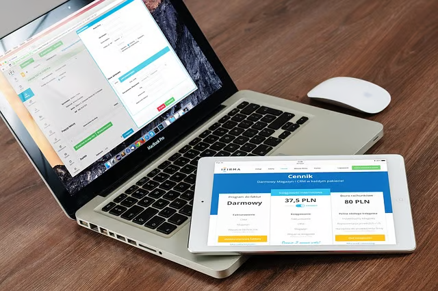
In the ever-evolving world of website optimization and user experience, heatmaps have emerged as an invaluable tool for businesses and marketers alike. They provide visual representations of user behavior on your website, offering insights into how visitors interact with your content. By leveraging these insights, you can make data-driven decisions to improve user experience, boost conversions, and enhance overall website performance. Here’s everything you need to know about heatmaps and how they can benefit your website. Keep on reading to learn more!

1. What Is a Heatmap?

A heatmap is a visual representation of data that uses color gradients to depict user behavior on a webpage. Warmer colors, such as red and orange, indicate areas of high engagement, while cooler colors, like blue and green, signify areas with less interaction. Heatmaps can reveal patterns in user behavior that might not be apparent through traditional analytics tools.

Unlike numerical data, which can be overwhelming, heatmaps simplify complex data into an intuitive and easy-to-understand format. They are particularly useful for identifying trends in scrolling, clicking, and mouse movement on a website.

2. Types of Heatmaps

There are several types of heatmaps, each serving a specific purpose. Understanding these variations will help you choose the right tool for analyzing your website’s performance.

  • Click Heatmaps: These heatmaps track where users click on a page. They are excellent for evaluating the effectiveness of buttons, links, and calls-to-action.
  • Scroll Heatmaps: These heatmaps display how far users scroll down a page. They help identify whether critical content is being seen by visitors or if it’s being overlooked.
  • Hover Heatmaps: Also known as mouse-movement heatmaps, these track cursor movements and can provide insights into areas that grab user attention.
  • Attention Heatmaps: These focus on areas where users spend the most time, combining elements of scrolling and hovering behaviors.
  • Form Heatmaps: These analyze user interactions with forms, revealing where visitors hesitate, drop off, or complete entries.

Each type of heatmap provides unique insights, making them complementary tools for a comprehensive understanding of user behavior.

3. How Heatmaps Work

Heatmaps function by collecting and aggregating user interaction data. Most heatmap software uses JavaScript tracking code embedded in your website to monitor user behavior. The tool then processes this data and generates a visual overlay on your web pages, showing engagement patterns.

For example, a click heatmap would aggregate all the clicks on a specific button or link and display them as a concentrated red spot, indicating high activity. These visual cues make it easier to pinpoint what’s working and what needs improvement.

4. Benefits of Using Heatmaps

Heatmaps offer a host of benefits for website owners, designers, and marketers. Here’s why they are an essential tool for any online presence:

  • Improved User Experience: Heatmaps reveal how users interact with your website, helping you identify pain points and areas for improvement. By addressing these issues, you can create a smoother and more intuitive user experience.
  • Enhanced Conversion Rates: Understanding where users click and what draws their attention allows you to optimize calls-to-action and content placement, increasing the likelihood of conversions.
  • Data-Driven Decision Making: Heatmaps provide actionable insights that guide your website design and content strategy, ensuring changes are backed by real user behavior.
  • Content Performance Analysis: Heatmaps show whether users are engaging with your most valuable content or ignoring it. This helps refine your messaging and layout to better meet user needs.
  • Reduced Bounce Rates: By identifying sections where users lose interest or exit the page, you can make adjustments to keep visitors engaged longer.

5. Heatmaps vs. Traditional Analytics

While traditional analytics tools like Google Analytics provide numerical data, heatmaps offer a visual dimension to user behavior analysis. Both tools are essential, but they serve different purposes:

  • Google Analytics: Provides metrics such as page views, bounce rates, and average time on site. It’s great for quantitative data but doesn’t reveal how users interact with individual elements.
  • Heatmaps: Focus on visualizing interaction patterns, offering qualitative insights that complement numerical data.

When used together, these tools provide a complete picture of your website’s performance, enabling you to make informed decisions that improve both engagement and usability.

6. How to Use Heatmaps Effectively

To get the most out of heatmaps, follow these best practices:

  • Set Clear Goals: Define what you want to learn from the heatmap. Are you testing a new page layout? Do you want to see if users are clicking on non-clickable elements? Knowing your objectives helps focus your analysis.
  • Test Key Pages: Focus on high-traffic or high-impact pages, such as your homepage, product pages, and checkout process. These pages play a critical role in user journeys and conversions.
  • Compare Variations: If you’re running A/B tests, use heatmaps to compare user behavior across different versions of a page. This can help identify which design or layout performs better.
  • Integrate with Other Tools: Combine heatmap insights with traditional analytics and user feedback to validate findings and gain a deeper understanding of user behavior.

7. Common Mistakes to Avoid

While heatmaps are powerful tools, there are pitfalls to watch out for:

  • Overgeneralizing Data: Heatmaps aggregate user behavior, which means they might not capture individual nuances. Combine heatmap data with user surveys or session recordings for a more detailed perspective.
  • Ignoring Mobile Behavior: User interactions on mobile devices differ significantly from desktops. Ensure you analyze heatmaps for both device types to get a complete picture.
  • Relying Solely on Heatmaps: Heatmaps are just one part of the puzzle. Always pair them with other analytics tools to ensure balanced and accurate conclusions.

To sum it up, heatmaps are a vital tool for understanding and optimizing user behavior on your website. By visualizing engagement patterns, they uncover valuable insights that traditional analytics can’t provide. Whether you’re aiming to improve user experience, boost conversions, or streamline your design, heatmaps offer the clarity needed to make impactful changes.

With the right software, a clear strategy, and a commitment to data-driven decision-making, you can transform your website into a more user-friendly and effective platform. Don’t just guess—use heatmaps to see what your visitors truly value and take your website’s performance to the next level. Thank you for reading!

The post Heatmap 101: Understanding the Basics of This Essential Website Tool appeared first on Designer Daily: graphic and web design blog.
A Chair Inspired By Typography

Post pobrano z: A Chair Inspired By Typography

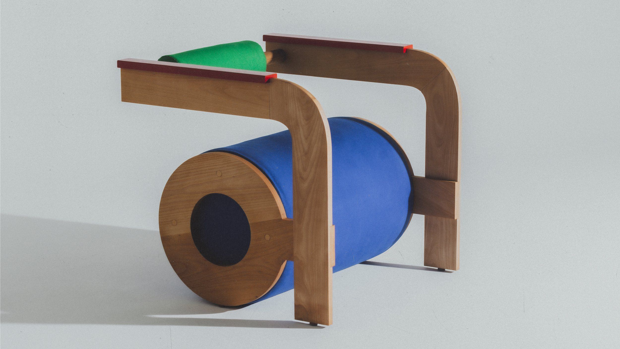
This sculptural chair is the result of a collaboration between Mexican industrial designer Rodrigo Méndez and Mexican art director Andrés Higueros.

The two designers teamed up to create a seat reminiscent of the first letter of our alphabet. And with good reason: the lower-case letter “a” was their inspiration for this creation.

Typography in 3 dimensions

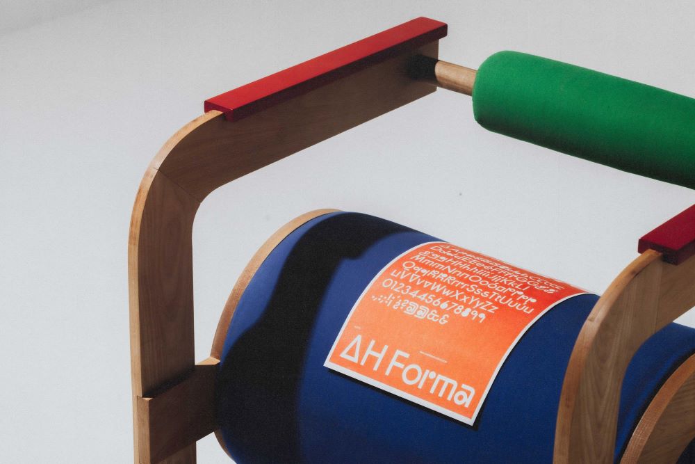
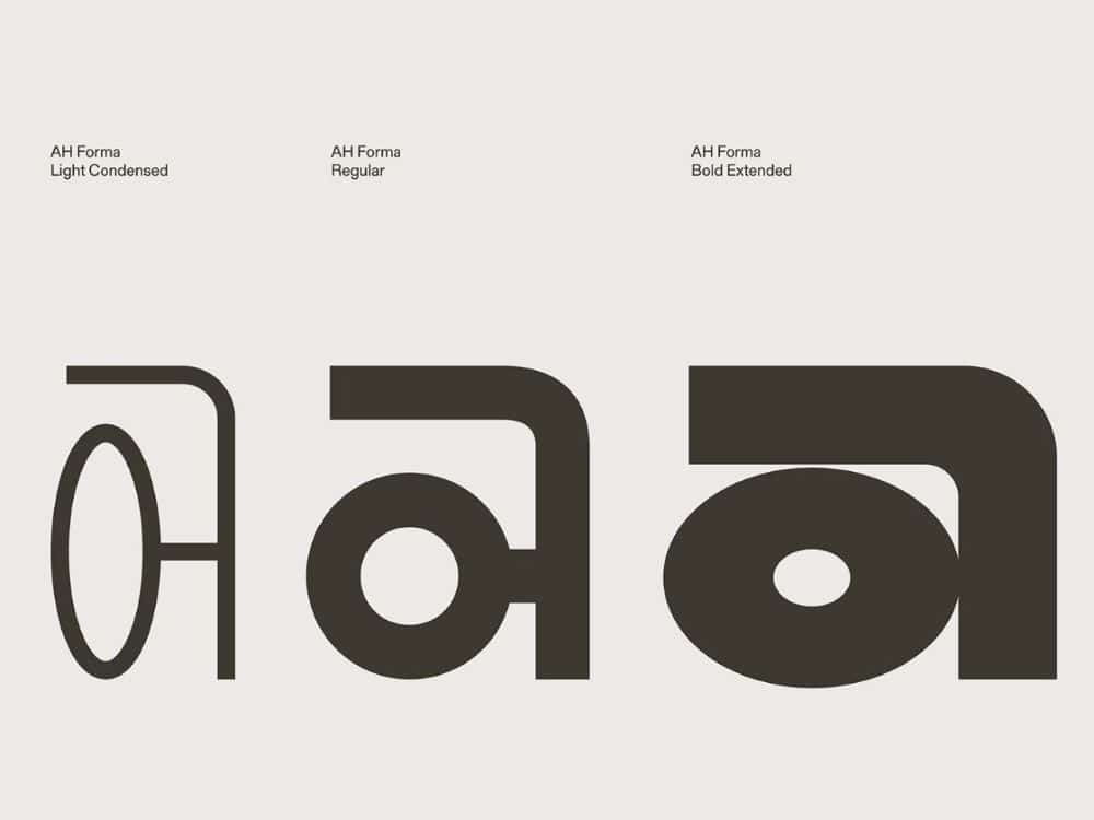
To design this chair, the two designers were inspired by the AH Forma font, and more specifically by the lowercase letter “a”. The idea was to move from two-dimensional typography to a three-dimensional, functional object: the chair.

The aim was also to show how variations in typeface according to context (bold, italic, etc.) can be transposed into everyday objects. The ORMA chair thus explores functionality through a single basic shape: the a.

The designers had fun proposing two models based on the same font. The “light” version of AH Forma becomes the ORMA chair light, a chair with slender, light lines. The “regular” style gives life to the ORMA chair regular, a comfortable piece with a balanced style. The designers did not propose a Bold version, but it would be easy to imagine a large chair in the “bold” style with thick lines.

A colorful and original seat

Created for Design Week Mexico 2024, the ORMA chair is intriguing. It resembles the letter from which it was inspired, offering the user the possibility of sitting on a letter of the alphabet. To add even more playfulness to the final piece, they played with colors. The ORMA regular version features primary colors in different places to emphasize the lines and shapes.

With its cylindrical shapes, this model also invites you to sit in different ways. It can be approached in two different directions, depending on the desired use. These chairs show how designers can play with furniture in the same way as they play with fonts in graphic design. It’s a new way of approaching typography, and a fusion of two design worlds: graphic design and furniture design.

The post A Chair Inspired By Typography appeared first on Designer Daily: graphic and web design blog.
Yet Another Anchor Positioning Quirk

Post pobrano z: Yet Another Anchor Positioning Quirk

I strongly believe Anchor Positioning will go down as one of the greatest additions to CSS. It may not be as game-changing as Flexbox or Grid, but it does fill a positioning gap that has been missing for decades. As awesome as I think it is, CSS Anchor Positioning has a lot of quirks, some of which are the product of its novelty and others due to its unique way of working. Today, I want to bring you yet another Anchor Positioning quirk that has bugged me since I first saw it.

The inception

It all started a month ago when I was reading about what other people have made using Anchor Positioning, specifically this post by Temani Afif about “Anchor Positioning & Scroll-Driven Animations.” I strongly encourage you to read it and find out what caught my eye there. Combining Anchor Positioning and Scroll-Driven Animation, he makes a range slider that changes colors while it progresses.

CodePen Embed Fallback

Amazing by itself, but it’s interesting that he is using two target elements with the same anchor name, each attached to its corresponding anchor, just like magic. If this doesn’t seem as interesting as it looks, we should then briefly recap how Anchor Positioning works.

CSS Anchor Positioning and the anchor-scope property

See our complete CSS Anchor Positioning Guide for a comprehensive deep dive.

Anchor Positioning brings two new concepts to CSS, an anchor element and a target element. The anchor is the element used as a reference for positioning other elements, hence the anchor name. While the target is an absolutely-positioned element placed relative to one or more anchors.

An anchor and a target can be almost every element, so you can think of them as just two div sitting next to each other:

<div class="anchor">anchor</div>
<div class="target">target</div>

To start, we first have to register the anchor element in CSS using the anchor-name property:

.anchor {
  anchor-name: --my-anchor;
}

And the position-anchor property on an absolutely-positioned element attaches it to an anchor of the same name. However, to move the target around the anchor we need the position-area property.

.target {
  position: absolute;
  position-anchor: --my-anchor;
  position-area: top right;
}
CodePen Embed Fallback

This works great, but things get complicated if we change our markup to include more anchors and targets:

<ul>
  <li>
    <div class="anchor">anchor 1</div>
    <div class="target">target 1</div>
  </li>
  <li>
    <div class="anchor">anchor 2</div>
    <div class="target">target 2</div>
  </li>
  <li>
    <div class="anchor">anchor 3</div>
    <div class="target">target 3</div>
  </li>
</ul>

Instead of each target attaching to its closest anchor, they all pile up at the last registered anchor in the DOM.

CodePen Embed Fallback

The anchor-scope property was introduced in Chrome 131 as an answer to this issue. It limits the scope of anchors to a subtree so that each target attaches correctly. However, I don’t want to focus on this property, because what initially caught my attention was that Temani didn’t use it. For some reason, they all attached correctly, again, like magic.

What’s happening?

Targets usually attach to the last anchor on the DOM instead of their closest anchor, but in our first example, we saw two anchors with the same anchor-name and their corresponding targets attached. All this without the anchor-scope property. What’s happening?

Two words: Containing Block.

Something to know about Anchor Positioning is that it relies a lot on how an element’s containing block is built. This isn’t something inherently from Anchor Positioning but from absolute positioning. Absolute elements are positioned relative to their containing block, and inset properties like top: 0px, left: 30px or inset: 1rem are just moving an element around its containing block boundaries, creating what’s called the inset-modified containing block.

An element being shrunk by its inset-modified containing block

A target attached to an anchor isn’t any different, and what the position-area property does under the table is change the target’s inset-modified containing block so it is right next to the anchor.

A target element inset-modified containing block shrunk to be in the top left corner of an anchor

Usually, the containing block of an absolutely-positioned element is the whole viewport, but it can be changed by any ancestor with a position other than static (usually relative). Temani takes advantage of this fact and creates a new containing block for each slider, so they can only be attached to their corresponding anchors. If you snoop around the code, you can find it at the beginning:

label {
  position: relative;
  /* No, It's not useless so don't remove it (or remove it and see what happens) */
}

If we use this tactic on our previous examples, suddenly they are all correctly attached!

CodePen Embed Fallback

Yet another quirk

We didn’t need to use the anchor-scope property to attach each anchor to its respective target, but instead took advantage of how the containing block of absolute elements is computed. However, there is yet another approach, one that doesn’t need any extra bits of code.

This occurred to me when I was also experimenting with Scroll-Driven Animations and Anchor Positioning and trying to attach text-bubble footnotes on the side of a post, like the following:

A blog post body with paragraphs, the paragraphs have footnotes attached on the sides

Logically, each footnote would be a target, but the choice of an anchor is a little more tricky. I initially thought that each paragraph would work as an anchor, but that would mean having more than one anchor with the same anchor-name. The result: all the targets would pile up at the last anchor:

CodePen Embed Fallback

This could be solved using our prior approach of creating a new containing block for each note. However, there is another route we can take, what I call the reductionist method. The problem comes when there is more than one anchor with the same anchor-name, so we will reduce the number of anchors to one, using an element that could work as the common anchor for all targets.

In this case, we just want to position each target on the sides of the post so we can use the entire body of the post as an anchor, and since each target is naturally aligned on the vertical axis, what’s left is to move them along the horizontal axis:

CodePen Embed Fallback

You can better check how it was done on the original post!

Conclusion

The anchor-scope may be the most recent CSS property to be shipped to a browser (so far, just in Chrome 131+), so we can’t expect its support to be something out of this world. And while I would love to use it every now and there, it will remain bound to short demos for a while. This isn’t a reason to limit the use of other Anchor Positioning properties, which are supported in Chrome 125 onwards (and let’s hope in other browsers in the near future), so I hope these little quirks can help you to keep using Anchor Positioning without any fear.


Yet Another Anchor Positioning Quirk originally published on CSS-Tricks, which is part of the DigitalOcean family. You should get the newsletter.

CSS Wrapped 2024

Post pobrano z: CSS Wrapped 2024

Join the Chrome DevRel team and a skateboarding Chrome Dino on a journey through the latest CSS launched for Chrome and the web platform in 2024, highlighting 17 new features

That breaks down (approximately) as:

Components

Interactions

Developer experience

Plus:


CSS Wrapped 2024 originally published on CSS-Tricks, which is part of the DigitalOcean family. You should get the newsletter.