Wszystkie wpisy, których autorem jest admin

Quoting in HTML: Quotations, Citations, and Blockquotes

Post pobrano z: Quoting in HTML: Quotations, Citations, and Blockquotes

It’s all too common to see the incorrect HTML used for quotes in markup. In this article, let’s dig into all this, looking at different situations and different HTML tags to handle those situations.

There are three major HTML elements involved in quotations:

  • <blockquote>
  • <q>
  • <cite>

Let’s take a look.

Blockquotes

Blockquote tags are used for distinguishing quoted text from the rest of the content. My tenth grade English teacher drilled it into my head that any quote of four lines or longer should be set apart this way. The HTML spec has no such requirement, but as long as the text is a quote and you want it to be set apart from the surrounding text and tags, a blockquote is the semantic choice.

By default, browsers indent blockquotes by adding margin on each side.

See the Pen
The Blockquote Tag
by Undead Institute (@undeadinstitute)
on CodePen.

As a flow element (i.e. “block level” element), blockquote can contain other elements inside it. For example, we can drop paragraphs in there with no problem:

<blockquote>
  <p></p>
  <p></p>
</blockquote>

But it could be other elements, too, like a heading or an unordered list:

<blockquote>
    <h2></h2>
    <ul>
      <li></li>
      <li></li>
    </ul>
</blockquote>

It’s important to note that blockquotes should only be used for quotations rather than as a decorative element in a design. This also aids accessibility as screen reader users can jump between blockquotes. Thus a blockquote element used solely for aesthetics could really confuse those users. If you need something more decorative that falls outside the bounds of extended quotations, then perhaps a div with a class is the way to go.

blockquote,
.callout-block {
  /* These could share styling */
}

Quoting with Q

Q tags (<q>) are for inline quotes, or what my tenth grade teacher would say are those under four lines. Many modern browsers will automatically add quotation marks to the quote as pseudo elements but you may need a backup solution for older browsers.

See the Pen
The Q Tag
by CSS-Tricks (@css-tricks)
on CodePen.

Typical quotation marks are just as valid for inline quotes as the <q> element. The benefits of using <q>, however, are that it includes a cite attribute, automatic handling of quotation marks, and automatic handling of quote levels. <q> elements should not used for sarcasm (e.g. “you would use a <q> tag for sarcasm, wouldn’t you?”), or signifying a word with air quotes (e.g. “awesome” is an “accurate” description of the author). But if you can figure out how to mark up air quotes, please let me know. Because that would be “awesome.”

The citation attribute

Both <q> and blockquotes can use a citation (cite) attribute. This attribute holds a URL that provides context and/or a reference for the quoted material. The spec makes a point of saying that the URL can be surrounded by spaces. (I’m not sure why that’s pointed out, but if you want to anger the semantic code deities, you’ll have to do more than throw spaces around.)

<p>The officer left a note saying <q cite="https://johnrhea.com/summons">You have been summoned to appear on the 4th day of January on charges of attempted reader bribery.</q></p>

That cite attribute isn’t visible to the user by default. You could add it in with a sprinkle of CSS magic like the following demo. You could even fiddle with it further to make the citation appear on hover.

See the Pen
Attributable citations
by CSS-Tricks (@css-tricks)
on CodePen.

Neither of those options are particularly great. If you need to cite a source such that users can see it and go to it, you should do it in HTML and probably with the <cite> element, which we’ll cover next.

The citation element

The <cite> tag should be used for referencing creative work rather than the person who said or wrote the quote. In other words, it’s not for quotes. Here are the examples from the spec:

<p>My favorite book is <cite>The Reality Dysfunction</cite> by
Peter F. Hamilton. My favorite comic is <cite>Pearls Before
Swine</cite> by Stephan Pastis. My favorite track is <cite>Jive
Samba</cite> by the Cannonball Adderley Sextet.</p>

Here’s another example:

See the Pen
Cite This!
by CSS-Tricks (@css-tricks)
on CodePen.

If the author of this article told you he’d give you a cupcake, and you <cite> him by name, that would be semantically incorrect. Thus no cupcakes would change hands. If you cited the article in which he offered you a cupcake, that would be semantically correct, but since the author wouldn’t do that, you still wouldn’t get a cupcake. Sorry.

By default, browsers italicize cite tags and there’s no requirement that a <q> or <blockquote> be present to use the cite element. If you want to cite a book or other creative work, then slap it in the cite element. The semantic deities will smile on you for not using either <i> or <em> elements.

But where to put the cite element? Inside? Outside? The upside down? If we put it inside the <blockquote> or the <q>, we’re making it part of the quote. That’s forbidden by the spec for just that reason.

<!-- This is apparently wrong -->
<blockquote>
  Quote about cupcake distribution from an article
  <cite>The Article</cite>
</blockquote>

Putting it outside just feels wrong and also requires you to have an enclosing element like a <div> if you wanted to style them together.

<div class="need-to-style-together">
  <blockquote>
    Quote about cupcake distribution from an article
  </blockquote>
  <cite>The Article</cite>
</div>

N.B. If you google this issue you may come across an HTML5 Doctor article from 2013 that contradicts much of what’s laid out here. That said, every time it links to the docs for support, the docs agree with the article you’re currently reading rather than the HTML5 Doctor article. Most likely the docs have changed since that article was written.

Hey, what about the figure element?

One way to mark up a quotation — and in a way that pleases the semantic code deities — is to put the blockquote within a figure element. Then, put the cite element and any other author or citation information in a figcaption.

<figure class="quote">
  <blockquote>
    But web browsers aren’t like web servers. If your back-end code is getting so big that it’s starting to run noticably slowly, you can throw more computing power at it by scaling up your server. That’s not an option on the front-end where you don’t really have one run-time environment—your end users have their own run-time environment with its own constraints around computing power and network connectivity.
  </blockquote>
  <figcaption>
    &mdash; Jeremy Keith, <cite>Mental models</cite>
  </figcaption>
</figure>

While this doubles the number of elements needed, there are several benefits:

  1. It’s semantically correct for all four elements.
  2. It allows you to both include and encapsulate author information beyond citing the name of the work.
  3. It gives you an easy way to style the quote without resorting to divs, spans or wretchedness.

See the Pen
It Figures You’d Say That
by CSS-Tricks (@css-tricks)
on CodePen.

None of this is for dialogue

Not <dialog>! Those are for attention-grabbing modals. Dialogue, as in, conversational exchanges between people speaking or typing to each other.

Neither <blockquote> nor <q> nor <cite> are to be used for dialogue and similar exchanges between speakers. If you’re marking up dialogue, you can use whatever makes the most sense to you. There’s no semantic way to do it. That said, the spec suggests <p> tags and punctuation with <span> or <b> tags to designate the speaker and <i> tags to mark stage directions.

Accessibility of quotes

From the research I’ve done, screen readers should not have any issue with understanding semantic-deity-approved <q>, <blockquote>, or <cite> tags.

More “ways” to “quote”

You can add quotation marks to a <blockquote> using CSS pseudo elements. The <q> element comes with quotation marks baked in so they need not be added, however adding them as pseudo-elements can be a workaround for older browsers that don’t automatically add them. Since this is how modern browsers add the quotation marks there’s no danger of adding duplicate quotes. New browsers will overwrite the default pseudo elements, and older browsers that support pseudo elements will add the quotes.
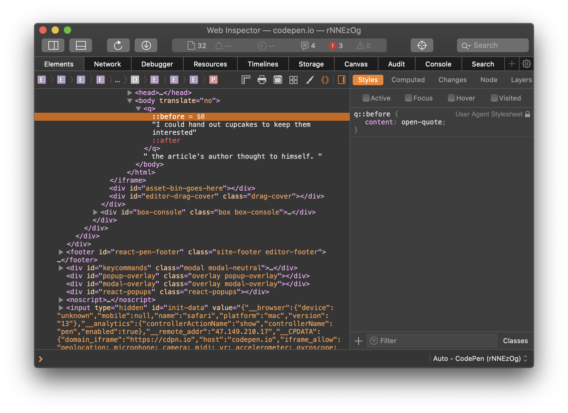
But you can’t, like I did, assume that the above will always give you smart opening and closing quotes. Even if the font supports smart quotes, sometimes straight quotes will be displayed. To be safe, it’s better to use the quotes CSS property to up the intelligence on those quotation marks.

blockquote {
  quotes: "“" "”" "‘" "’";
}

See the Pen
"Quot-a-tizing" the blockquote
by CSS-Tricks (@css-tricks)
on CodePen.

Multi-level quoting

Now let’s look at quote levels. The <q> tag will automatically adjust quote levels.

Let’s say you’re in an area that uses the British convention of using single quotes. You could use the CSS quotes rule to put the opening and closing single quotes first in the list. Here’s an example of both ways:

See the Pen
Quote Within a Quote
by CSS-Tricks (@css-tricks)
on CodePen.

There is no limit to nesting. Those nested <q> elements could even be within a blockquote that’s within a blockquote.

If you add quotation marks to a blockquote, know that the blockquote does not change the quote level the way a <q> tag does. If you expect to have quotes within a blockquote, you may want to add a descendant selector rule to start <q> elements within a blockquote at the single quote level (or double quotes if you follow British conventions).

 blockquote q {
  quotes: "‘" "’" "“" "”";
}

The last quote level you put in will continue through subsequent levels of quotation. To use the double, single, double, single… convention, add more levels to the CSS quotes property.

q {
  quotes: "“" "”" "‘" "’" "“" "”" "‘" "’" "“" "”";
}

Hanging punctuation

Many typography experts will tell you that hanging the quotation marks on blockquotes looks better (and they’re right). Hanging punctuation is, in this case, quotation marks that are pushed out from the text so that the characters of the text line up vertically.
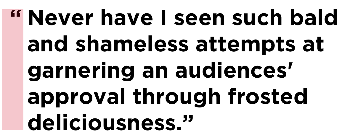
One possibility in CSS is using a slightly negative value on the text-indent property. The exact negative indentation will vary by font, so be sure to double check the spacing with the font you end up using.

blockquote {
  text-indent: -0.45em;
}

There is a nicer way to handle this by using the hanging-punctuation CSS property. It’s only supported in Safari at the time of this writing, so we’ll have to progressively enhance:

/* Fallback */
blockquote {
  text-indent: -0.45em;
}

/* If there's support, erase the indent and use the property instead */
@supports ( hanging-punctuation: first) {
  blockquote {
    text-indent: 0;
    hanging-punctuation: first;
  }
}

Using hanging-punctuation is better because it’s less fiddly. It’ll just work when it can.

See the Pen
Hanging Your Punctuation
by CSS-Tricks (@css-tricks)
on CodePen.

Can we animate quotation marks?

Of course we can.

See the Pen
Dancing Quotes
by CSS-Tricks (@css-tricks)
on CodePen.

Why you’d need to do this, I’m not totally sure, but the quotation marks in a <q> tag are added are pseudo elements in the UA stylesheet, so we’re able to select and style them — including animation — if we need to.

Wait, maybe we just solved the air quotes thing after all.

The post Quoting in HTML: Quotations, Citations, and Blockquotes appeared first on CSS-Tricks.

How to Create a Stained Glass Text Effect in Illustrator

Post pobrano z: How to Create a Stained Glass Text Effect in Illustrator

Final product image
What You’ll Be Creating

In the following steps, you will learn how to create a stained glass text effect in Adobe Illustrator.

For starters, you will learn how to set up a simple grid and how to create the letter outlines for your text design. Next, using the Appearance panel and some graphic styles, you will learn how to add the colored glass pieces.

Using basic vector shape building techniques and some basic effects, you will learn how to add shading and some subtle highlights. Finally, you will learn how to apply a simple opacity mask and how to use built-in Illustrator brushes.

For more inspiration on how to create text effects, you can find plenty of resources at GraphicRiver.

1. How to Set Up a Grid for the Text Design

Hit Control-N to create a new document. Select Pixels from the Units drop-down menu, enter 850 in the width box and 640 in the height box, and then click More Settings. Select RGB for the Color Mode, set the Raster Effects to Screen (72 ppi), and then click Create Document.

Enable the Grid (View > Show Grid) and Snap to Grid (View > Snap to Grid). For starters, you will need a grid every 10 px, so simply go to Edit > Preferences > Guides & Grid, and enter 10 in the Gridline every box and 1 in the Subdivisions box. Try not to get discouraged by all that grid—it will make your work easier, and keep in mind that you can easily enable or disable it using the Control-„ keyboard shortcut.

You can learn more about Illustrator’s grid system in this short tutorial from Andrei Stefan: Understanding Adobe Illustrator’s Grid System.

You should also open the Info panel (Window > Info) for a live preview with the size and position of your shapes. Don’t forget to set the unit of measurement to pixels from Edit > Preferences > Units. All these options will significantly increase your work speed. Now that everything is set up, let’s start to work on our text design.

set up grid

2. How to Create the Outline of the Text Design

Step 1

Pick the Rectangle Tool (M) and focus on your toolbar. Remove the color from the fill and then select the stroke and set its color to black (R=137 G=147 B=150). Move to your artboard and simply create a 90 x 30 px shape—the grid and the Snap to Grid should make it easier.

Make sure that your shape stays selected and open the Appearance panel (Window > Appearance). Click the „Stroke” piece of text to open the Stroke fly-out panel, set the Weight to 5 px, and check the Align Stroke to Inside button.

text design rectangle

Step 2

Using the same tool and the same Appearance attributes, add an 80 x 30 px shape and place it as shown in the first image.

Add a second 90 x 30 px shape and place it as shown in the second image. Create a second 80 x 30 px shape and a new 90 x 30 px shape. Place these rectangles as shown in the third image. In the end, these shapes will form the letter „S„. Your overall letter should be 90 px wide and 130 px long. Keep these overall dimensions in mind, and try to use them for the rest of the letters.

text design letter

Step 3

Using the same tools and Appearance attributes, create the remaining letters from the „STAINED” word, as shown in the following image.

Here’s how you make the oblique shape used for the letter „N„. Create a 130 x 30 px shape and pick the Direct Selection Tool (A). Select the bottom anchor points and drag them 60 px to the right.

text design letters

Step 4

Using the same tools and Appearance attributes, create the letters for the „GLASS” word. This will be the starting outline of your text design.

text design letters

Step 5

Select all the shapes made so far and add copies in front (Control-C > Control-F). Select only these copies, open the Pathfinder panel (Window > Pathfinder), and click the Unite button.

Select the resulting shapes and focus on the Appearance panel. Remove the stroke color, select the fill, and set the color to R=57 G=181 B=74. Make sure that your green shapes are selected and hit Control-8 (or go to Object > Compound Path > Make) to turn them into one compound path. With your compound path still selected, hit Shift-Control-[ to send it to back (behind all the other shapes).

compound path

Step 6

For the following two steps, you will need a grid every 1 px. Just go to Edit > Preferences > Guides & Grid and enter 1 in the Gridline every box.

Focus on the letter „S” from the first word. Pick the Pen Tool (P) and create a simple path roughly as shown in the first image. Add a 3 px stroke for this new path and set its color to black. Using the same tool and Appearance attributes, add a bunch of paths connecting the edges of the letter, as shown in the following images.

pen tool

Step 7

Focus on the rest of the letters and use the technique mentioned in the previous step to add the paths inside the letters, as shown in the first image.

Pick the Move Tool (M) and select everything. Hold Shift and click the green path to deselect it. Now that only the black paths are selected, go to Object > Path > Outline Stroke.

outline stroke

Step 8

Return to gridline every 10 px. Simply go to Edit > Preferences > Guides & Grid and enter 10 in the Gridline every box.

Select one of your black shapes and go to Select > Same > Fill Color to easily select all the shapes with a black fill color. Click the Unite button from the Pathfinder panel and hit Control-8 to turn the resulting shapes into one compound path. Select it and switch to the Direct Selection Tool (A). Enter 2 px in the Corners box from the control panel, and change the fill color to R=46 G=51 B=85. This final shape will be the main frame of your text effect.

radius

3. How to Create the Glass Pieces for the Text Design

Step 1

Make sure that the frame shape is selected and add a copy in front (Control-C > Control-F). Select your green compound path and go to Object > Path > Offset Path. Enter a -1 px Offset and click OK. Select this new shape along with the copy of that frame shape and click the Minus Front button from the Pathfinder panel. Ungroup (Shift-Control-G) the resulting group of shapes.

text effect frame

Step 2

Let’s focus on one of the green shapes. Select it and go to the Appearance panel.

First, select the existing fill and replace the green with R=244 G=50 B=1. Using the Add New Fill button from the bottom of the panel, add a second fill for your selected shape. Select it, change its Blending Mode to Soft Light, and replace the fill color with a linear gradient. Open the Gradient panel (Window > Gradient) to edit this gradient. Set the angle to 90 degrees and then move to the gradient sliders. Select the right one and set its color to black, and then select the left one, set its color to black, and lower the Opacity to 0%.

linear gradient

Step 3

Make sure that your red shape is still selected, open the Graphic Styles panel (Window > Graphic Styles), and click the New Graphic Style button.

text effect graphic style

Step 4

Select another green shape and simply apply the saved graphic style. Focus on the Appearance panel, select the bottom fill, and change the color to R=254 G=123 B=0.

Make sure that this new shape stays selected, return to the Graphic Styles panel, and click the New Graphic Style button.

graphic style

Step 5

Select another green shape and apply one of the saved graphic styles. Focus on the Appearance panel, select the bottom fill, and change the color to R=255 G=209 B=66.

Make sure that this new shape stays selected, return to the Graphic Styles panel, and click the New Graphic Style button.

graphic style

Step 6

Select another green shape and apply one of the saved graphic styles. Focus on the Appearance panel, select the bottom fill, and change the color to R=229 G=239 B=66.

Make sure that this new shape stays selected, return to the Graphic Styles panel, and click the New Graphic Style button.

graphic style

Step 7

Select another green shape and apply one of the saved graphic styles. Focus on the Appearance panel, select the bottom fill, and change the color to R=254 G=249 B=212.

Make sure that this new shape stays selected, return to the Graphic Styles panel, and click the New Graphic Style button.

graphic style

Step 8

Now that you’ve saved your five graphic styles, move to the remaining green shapes and simply apply your saved graphic styles.

glass text effects

4. How to Add Shading and Subtle Highlights to the Text Design

Step 1

Disable the Snap to Grid (Shift-Control-„) and then go to Edit > Preferences > General and make sure that the Keyboard Increment is set to 1 px.

Select the frame shape and add two copies in front (Control-C > Control-F > Control-F). Select the top copy and move it 1 px to the right using the Right Arrow key. Reselect both copies added in this step and click the Minus Front button from the Pathfinder panel. Turn the resulting group of shapes into one compound path and go to the Appearance panel. Change the fill color to white (R=255 G=255 B=255), lower the Opacity to 50%, and don’t forget to change the Blending Mode to Overlay.

text design highlight

Step 2

Select your green compound path, pick the Direct Selection Tool (A), and enter 2 px in the Corners box from the control panel.

Add a copy in front (Control-C > Control-F), bring it to the front (Shift-Control-]), and change the fill color to R=56 G=61 B=95.

corner radius

Step 3

Make sure that the compound path added in the previous step stays selected and focus on the Appearance panel.

Lower the Opacity to 10% and change the Blending Mode to Overlay, and then go to Effect > Artistic > Film Grain. Enter the attributes shown below, click OK, and return to the Appearance panel. Select the fill and go to Effect > Distort > Diffuse Glow. Enter the attributes shown in the following image and click OK.

text design texture

Step 4

Select the green compound path, hit Control-C to copy it, and then focus on the Appearance panel. Select the fill and change the green to black. Lower its Opacity to 15% and change the Blending Mode to Soft Light, and then go to Effect > Distort & Transform > Transform. Enter the attributes shown below, click OK, and go to Effect > Blur > Gaussian Blur. Enter a 6 px Radius and click OK.

text design shadow

Step 5

Make sure that your black compound path stays selected and keep focusing on the Appearance panel. Add a second fill and select it. Make sure that the color is set to black, lower its Opacity to 30%, and change the Blending Mode to Soft Light, and then go to Effect > Distort & Transform > Transform. Enter the attributes shown below, click OK, and go to Effect > Blur > Gaussian Blur. Enter a 6 px Radius and click OK.

text design shadow

Step 6

Select the frame shape and go to Effect > Stylize > Drop Shadow. Enter the attributes shown in the left window (in the following image), click OK, and go again to Effect > Stylize > Drop Shadow. Enter the attributes shown in the right window and click OK.

text design drop shadow

5. How to Add Extra Shading With Illustrator Brushes

Step 1

Open the Brushes panel (Window > Brushes), open the fly-out panel, and go to Ope Brush Library > Artistic > Artistic_ChalkCharcoalTapered. We’ll need one of the built-in Illustrator brushes from this list.

Hit Control-F to paste in front the green compound path copied several steps ago. Hit Control-F one more time to add a second copy. Select it and focus on the Appearance panel. Remove the fill color and then select the stroke. Set the color to black and apply the Charcoal – Tapered brush from that panel.

illustrator brushes

Step 2

Make sure that the compound path with the artistic brush is still selected, and focus on the Appearance panel. Lower the Opacity to 30% and change the Blending Mode to Soft Light.

illustrator brushes

Step 3

Select the green compound path, bring it to the front (Shift-Control-]), and change the fill color to white. Select this white compound path along with the one that has the artistic brush, open the Transparency panel (Window > Transparency), and click the Make Mask button. In the end, things should look like in the second image.

opacity mask

6. How to Add the Background for the Text Design

Step 1

Enable the Snap to Grid (Control-„). Using the Rectangle Tool (M), create an 870 x 660 px shape and send it to back (Shift-Control-[). Fill this rectangle with R=26 G=31 B=45 and make sure that it covers your entire artboard.

background

Step 2

Select the rectangle made in the previous step, add a copy in front (Control-C > Control-F), and bring it to the front (Shift-Control-]).

Select this new shape, change its Blending Mode to Overlay, and replace the existing color with the radial gradient shown below. Use the Gradient Tool (G) to stretch your gradient as shown in the following image. Don’t forget that the yellow zero from the Gradient panel image stands for Opacity.

radial gradient

Congratulations! You’re Done!

Here is how your stained glass text design should look. I hope you’ve enjoyed this tutorial and that it helped you learn more about text effects and Illustrator brushes. Don’t hesitate to share your final result in the comments section.

Feel free to adjust the final text design and make it your own. You can find some great sources of inspiration at GraphicRiver, with interesting solutions to improve your text effect skills.

stained glass text effect

Learn More About Text Effects

If you want to learn more about text design and Illustrator brushes, check one of the following tutorials:

Burger King: Comedian

Post pobrano z: Burger King: Comedian
PR, Print
Burger King

With their agency Buzzman, BURGER KING&reg; France bounced back with humor to the latest controversial work of Maurizio Cattelan: a banana simply stuck on a wall, which sold for $120,000.00 and was eaten by a visitor. On their social networks, the American brand trolled the work of art, replacing the fruit by a French-fry. All this for a much more reasonable price, obviously.

An ironic way of displaying the excesses of contemporary art, and to remember that BURGER KING&reg;, at least, is not bananas.

Advertising Agency:Buzzman, Paris, France
President and Executive Creative Director:Georges Mohammed-Cherif
Vicepresident:Thomas Granger
Managing Director:Julien Levilain
Copywriters:Philippe Boucheron & Patrice Lucet
Business Director:Loïc Coelho
Head of PR & Communication:Amélie Juillet
PR & Communication:Manager Paul Renaudineau