Web design changes rapidly year on year. After all, many design elements are only added after the route and wireframe of a site has been built, so adjusting things like typography and images is technically a relatively easy process. That doesn’t diminish its importance however, as the visual aesthetic of any website is what will always get noticed first. Having a strong, unified brand look has never been more important; with so many fish in the sea, standing out is necessary if you want to be noticed.
The serif is back in town
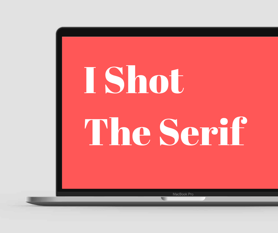
One major shift in the last year has been away from sans-serif fonts. The ubiquitous Helvetica-inspired typography which seemed in use on every major site has suffered from oversaturation, and now many more classic serif fonts are popping up. Indeed, many websites are making their choice of font front and center of their design philosophy, and quirky takes on traditional serif favorites are growing in popularity.
Colour blocks and monochrome
Another trend growing in popularity is the increase in monochrome images, offset by colored blocks. It gives the impression of a serious and nuanced approach to imagery and provides an easy way to maintain a consistent visual brand without too much effort. It allows any blocks of color to stand out more as well, giving the option to highlight particular sections which would otherwise be lost in a riot of color.
Flexible design
The ever-increasing use of mobile devices and tablets has been driving a radical change in web design philosophy for several years now, and that shows no signs of abating. While it first manifested as a necessity to have all elements of a site able to switch readily between portrait and landscape, touchscreen and monitor, more recent changes have incorporated elements that will work easily on any sort of device. This has meant a trend towards simple, bold elements in a design, which are both eye-catching when viewed on a large screen, and easy to navigate when held in the hand. Designers are now looking towards more asymmetric designs, breaking from the traditional grid-based approach to have more organically laid-out elements. It’s a careful balancing act, but when designers get it right it’s both spectacular and intuitive.
New media
An increase in the use of other forms of media, from micro-animations to video, has also become the norm. This is down in part to the increased bandwidth allowances that many mobile devices now have; and with the forthcoming introduction of 5G networking, and the vast upgrade in data that will allow, having media-rich design elements will become more and more common. Embedded video, interactive forms, chatbots, and even sound will all become commonplace as users are able to send and receive more data, more quickly. More powerful devices and browsers will also mean more interactivity with sites, from animated navigation to built-in applications.
Maximum minimalism. Finding a way to combine all these elements without overcrowding the screen is a challenge for any designer, and some designers are now reacting to that by hugely reducing the elements they wish to display. Minimalism will always have a certain chic, and that’s definitely a current trend, with many sites displaying copious white space and minimal content; a brave decision in many ways, necessitating trust that the content you display will keep your users interested. Certainly, the year ahead provides exciting and difficult challenges for designers and web development agencies alike to integrate new technologies and an ever more competitive fight for a share of the audience.
Web design changes rapidly year on year. After all, many design elements are only added after the route and wireframe of a site has been built, so adjusting things like typography and images is technically a relatively easy process. That doesn’t diminish its importance however, as the visual aesthetic of any website is what will always get noticed first. Having a strong, unified brand look has never been more important; with so many fish in the sea, standing out is necessary if you want to be noticed.
The serif is back in town
One major shift in the last year has been away from sans-serif fonts. The ubiquitous Helvetica-inspired typography which seemed in use on every major site has suffered from oversaturation, and now many more classic serif fonts are popping up. Indeed, many websites are making their choice of font front and center of their design philosophy, and quirky takes on traditional serif favorites are growing in popularity.
Colour blocks and monochrome
Another trend growing in popularity is the increase in monochrome images, offset by colored blocks. It gives the impression of a serious and nuanced approach to imagery and provides an easy way to maintain a consistent visual brand without too much effort. It allows any blocks of color to stand out more as well, giving the option to highlight particular sections which would otherwise be lost in a riot of color.
Flexible design
The ever-increasing use of mobile devices and tablets has been driving a radical change in web design philosophy for several years now, and that shows no signs of abating. While it first manifested as a necessity to have all elements of a site able to switch readily between portrait and landscape, touchscreen and monitor, more recent changes have incorporated elements that will work easily on any sort of device. This has meant a trend towards simple, bold elements in a design, which are both eye-catching when viewed on a large screen, and easy to navigate when held in the hand. Designers are now looking towards more asymmetric designs, breaking from the traditional grid-based approach to have more organically laid-out elements. It’s a careful balancing act, but when designers get it right it’s both spectacular and intuitive.
New media
An increase in the use of other forms of media, from micro-animations to video, has also become the norm. This is down in part to the increased bandwidth allowances that many mobile devices now have; and with the forthcoming introduction of 5G networking, and the vast upgrade in data that will allow, having media-rich design elements will become more and more common. Embedded video, interactive forms, chatbots, and even sound will all become commonplace as users are able to send and receive more data, more quickly. More powerful devices and browsers will also mean more interactivity with sites, from animated navigation to built-in applications.
Maximum minimalism. Finding a way to combine all these elements without overcrowding the screen is a challenge for any designer, and some designers are now reacting to that by hugely reducing the elements they wish to display. Minimalism will always have a certain chic, and that’s definitely a current trend, with many sites displaying copious white space and minimal content; a brave decision in many ways, necessitating trust that the content you display will keep your users interested. Certainly, the year ahead provides exciting and difficult challenges for designers and web development agencies alike to integrate new technologies and an ever more competitive fight for a share of the audience.
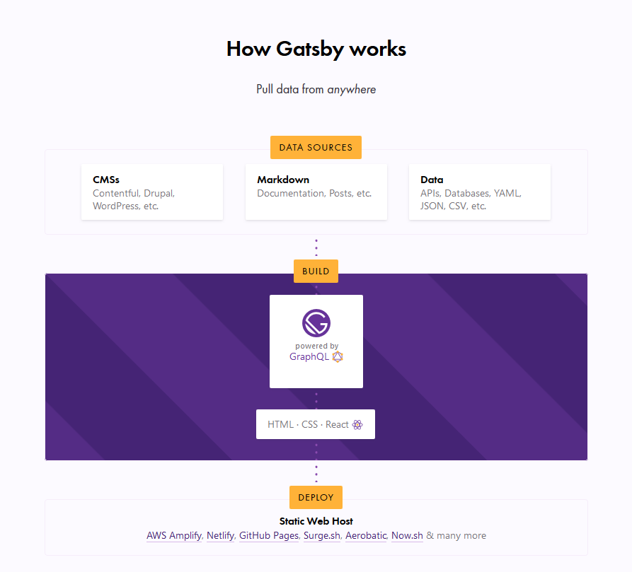
I’m assuming most of you have already heard about Gatsby, and at least loosely know that it’s basically a static site generator for React sites. It generally runs like this:
Data Sources → Pull data from anywhere.
Build → Generate your website with React and GraphQL.
Deploy → Send the site to any static site host.
What this typically means is that you can get your data from any recognizable data source — CMS, markdown, file systems and databases, to name a few — manage the data through GraphQL to build your website, and finally deploy your website to any static web host (such as Netlify or Zeit).
The Gatsby homepage illustration of the Gatsby workflow.
In this article, we are concerned with the build process, which is powered by GraphQL. This is the part where your data is managed. Unlike traditional REST APIs where you often need to send anonymous data to test your endpoints, GraphQL consolidates your APIs into a self-documenting IDE. Using this IDE, you can perform GraphQL operations such as queries, mutations, and subscriptions, as well as view your GraphQL schema, and documentation.
GraphQL has an IDE built right into it, but what if we want something a little more powerful? That’s where GraphQL Playground comes in and we’re going to walk through the steps to switch from the default over to GraphQL Playground so that it works with Gatsby.
GraphiQL and GraphQL Playground
GraphiQL is GraphQL’s default IDE for exploring GraphQL operations, but you could switch to something else, like GraphQL Playground. Both have their advantages. For example, GraphQL Playground is essentially a wrapper over GraphiQL but includes additional features such as:
Interactive, multi-column schema documentation
Automatic schema reloading
Support for GraphQL Subscriptions
Query history
Configuration of HTTP headers
Tabs
Extensibility (themes, etc.)
Choosing either GraphQL Playground or GraphiQL most likely depends on whether you need to use those additional features. There’s no strict rule that will make you write better GraphQL operations, or build a better website or app.
This post isn’t meant to sway you toward one versus the other. We’re looking at GraphQL Playground in this post specifically because it’s not the default IDE and there may be use cases where you need the additional features it provides and needs to set things up to work with Gatsby. So, let’s dig in and set up a new Gatsby project from scratch. We’ll integrate GraphQL Playground and configure it for the project.
Setting up a Gatsby Project
To set up a new Gatsby project, we first need to install the gatsby-cli. This will give us Gatsby-specific commands we can use in the Terminal.
npm install -g gatsby-cli
Now, let’s set up a new site. I’ve decided to call this example „gatsby-playground” but you can name it whatever you’d like.
gatsby new gatsby-playground
Let’s navigate to the directory where it was installed.
cd gatsby-playground
And, finally, flip on our development server.
gatsby develop
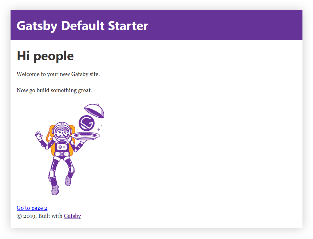
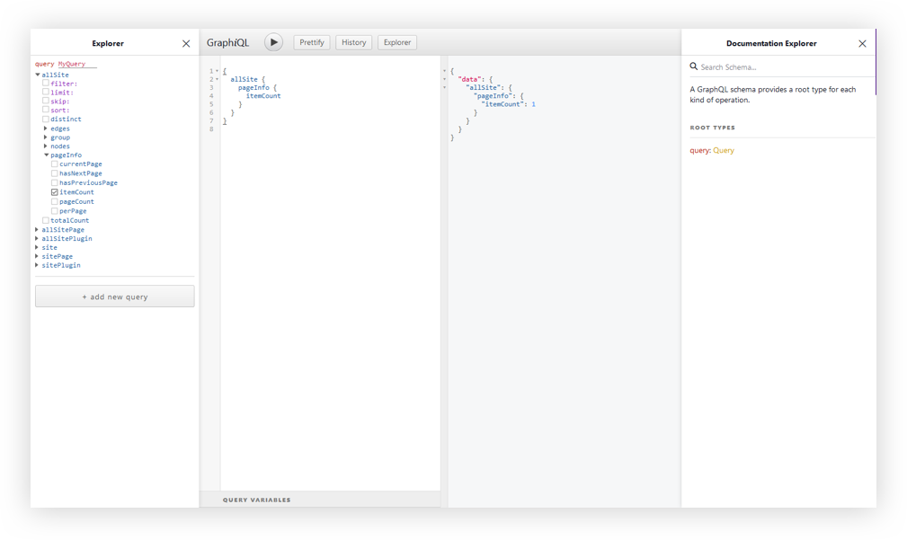
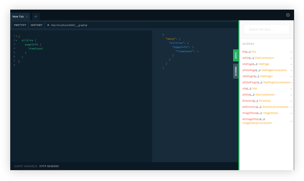
Head over to http://localhost:8000 in the browser for the opening page of the project. Your Gatsby GraphQL operations are going to be located at http://localhost:8000/___graphql.
The GraphiQL interface.
At this point, I think it’s worth calling out that there is a desktop app for GraphQL Playground. You could just access your Gatsby GraphQL operations with the URL Endpoint localhost:8000/___graphql without going any further with this article. But, we want to get our hands dirty and have some fun under the hood!
Since we’re not going to be relying on the desktop app, we’ll need to do a little bit of Environmental Variable setup.
Environmental Variables are variables used specifically to customize the behavior of a website in different environments. These environments could be when the website is in active development, or perhaps when it is live in production and available for the world to see. We can have as many environments as we want, and define different Environmental Variables for each of the environments.
Gatsby supports two environments: development and production. To set a development environmental variable, we need to have a .env.development file at the root of the project. Same sort of deal for production, but it’s .env.production.
To swap out both environments, we’ll need to set an environment variable in a cross-platform compatible way. Let’s create a .env.development file at the root of the project. Here, we set a key/value pair for our variables. The key will be GATSBY_GRAPHQL_IDE, and the value will be playground, like so:
GATSBY_GRAPHQL_IDE=playground
Accessing Environment Variables in JavaScript
In Gatsby, our Environmental Variables are only available at build time, or when Node.JS is running (what we’ll call run time). Since the variables are loaded client-side at build time, we need to use them dynamically at run time. It is important that we restart our server or rebuild our website every time we modify any of these variables.
To load our environmental variables into our project, we need to install a package:
And that’s it! But, hey, remember to restart the server since we change the variable.
yarn start // npm run develop
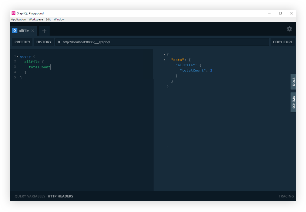
If you refresh the http://localhost:8000/___graphql in the browser, you should now see GraphQL playground. Cool? Cool!
GraphQL Playground with Gatsby.
And that’s how we get GraphQL Playground to work with Gatsby!
So that’s how we get from GraphQL’s default GraphiQL IDE to GraphQL Playground. Like we covered earlier, the decision of whether or not to make the switch at all comes down to whether the additional features offered in GraphQL Playground are required for your project. Again, we’re basically working with a GraphiQL wrapper that piles on more features.
Resources
Here are some additional articles around the web to get you started with Gatsby and more familiar with GraphiQL, GraphQL Playground, and Environment Variables.
I recently drew up a wireframe for a code beautifier. The next day, I decided to turn it into a real tool. The whole project took less than two days to complete.
I’d been thinking about building a new code beautifier for a while. The idea isn’t unique, but every time I use someone else’s tool, I find myself reapplying the same settings and dodging advertisements every single time. 🤦🏻
I wanted a simple tool that worked well without the hassle, so last week I grabbed some paper and started sketching one out. I’m a huge fan of wireframing by hand. There’s just something about pencil and paper that makes the design part of my brain work better than staring at a screen.
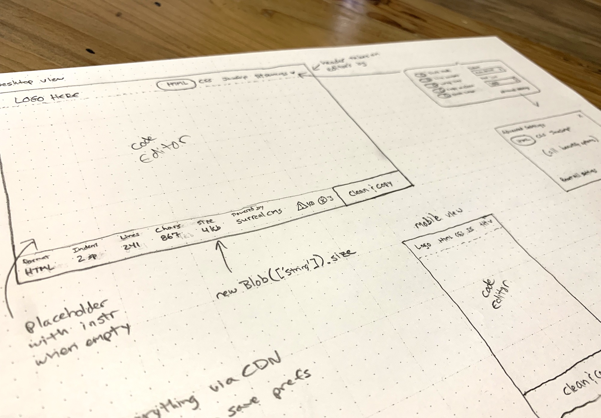
I kicked off the design process by hand-drawing wireframes for the app.
I was immediately inspired after drawing the wireframe. The next day, I took a break from my usual routine to turn it into a something real. 👨🏻💻
I knew I wanted the code editor to be the main focus of the tool, so I created a thin menu bar at the top that controls the mode (i.e. HTML, CSS, JavaScript) and settings. I eventually added an About button too.
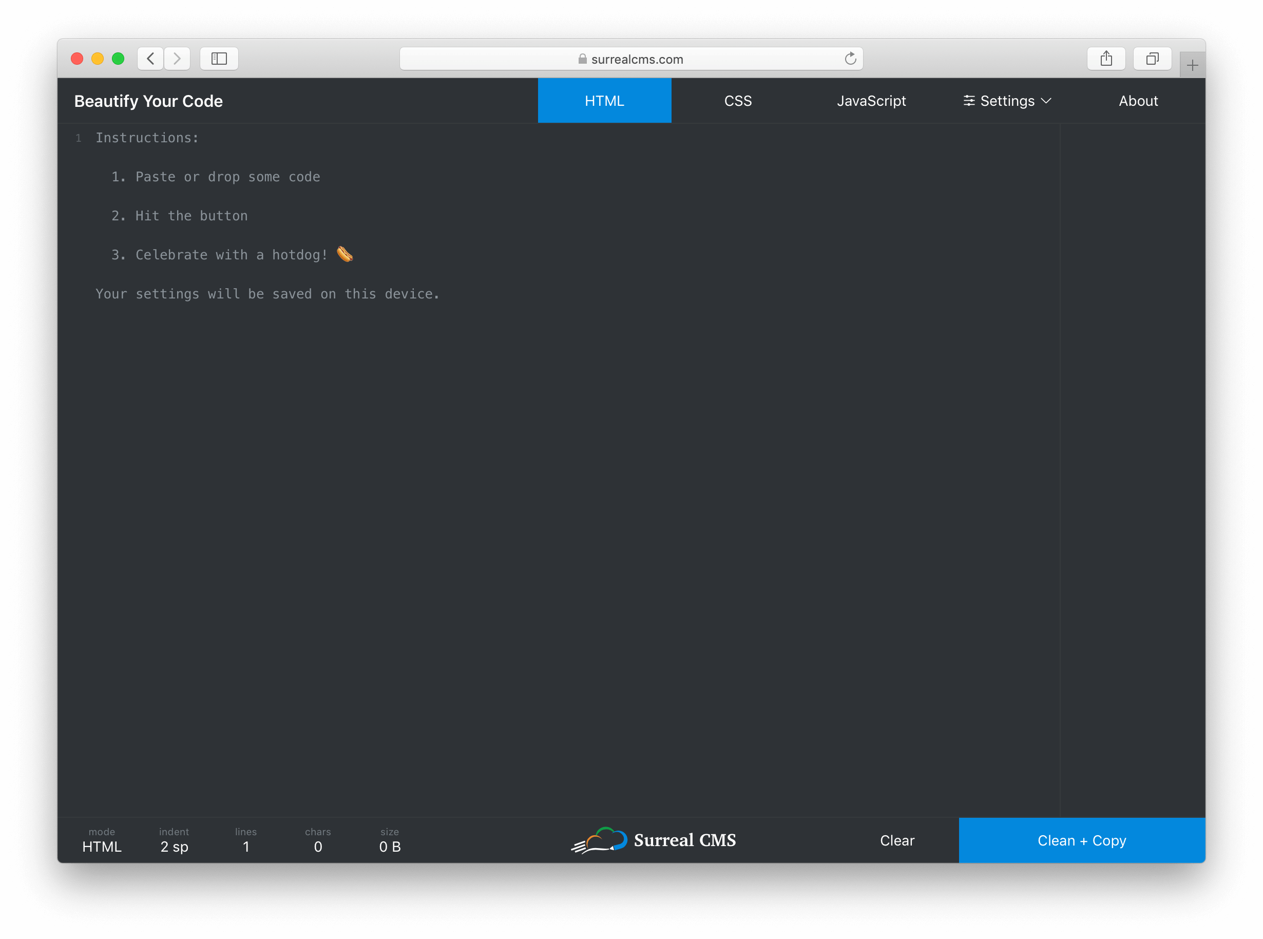
The editor itself takes up most of the screen, but it blends in so you don’t really notice it. Instead of wasting space with instructions, I used a placeholder that disappears when you start typing.
The Dark Mode UI is based on a toggle that updates the styles.
At the bottom, I created a status bar that shows live stats about the code including the current mode, indentation settings, number of lines, number of characters, and document size in bytes. The right side of the status bar has a „Clear” and „Clean + Copy” button. The center has a logo shamelessly plugging my own service.
I don’t think many developers really code on phones, but I wanted this to work on mobile devices anyway. Aside from the usual responsive techniques, I had to watch the window size and adjust the tab position when the screen becomes too narrow.
I’m using flexbox and viewport units for vertical sizing. This was actually pretty easy to do with the exception of a little iOS quirk. Here’s a pen showing the basic wireframe. Notice how the textarea stretches to fill the unused space between the header and footer.
If you look at the JavaScript tab, you’ll see the iOS quirk and the workaround. I’m not sure how to feature detect something like this, so for now it’s just a simple device check.
Handling settings
I wanted to keep the most commonly used settings easy to access, but also expose advanced settings for each mode. To do this, I made the settings button a popover with a link to more advanced settings inside. When a setting is changed, the UI updates immediately and the settings are persisted to localStorage.
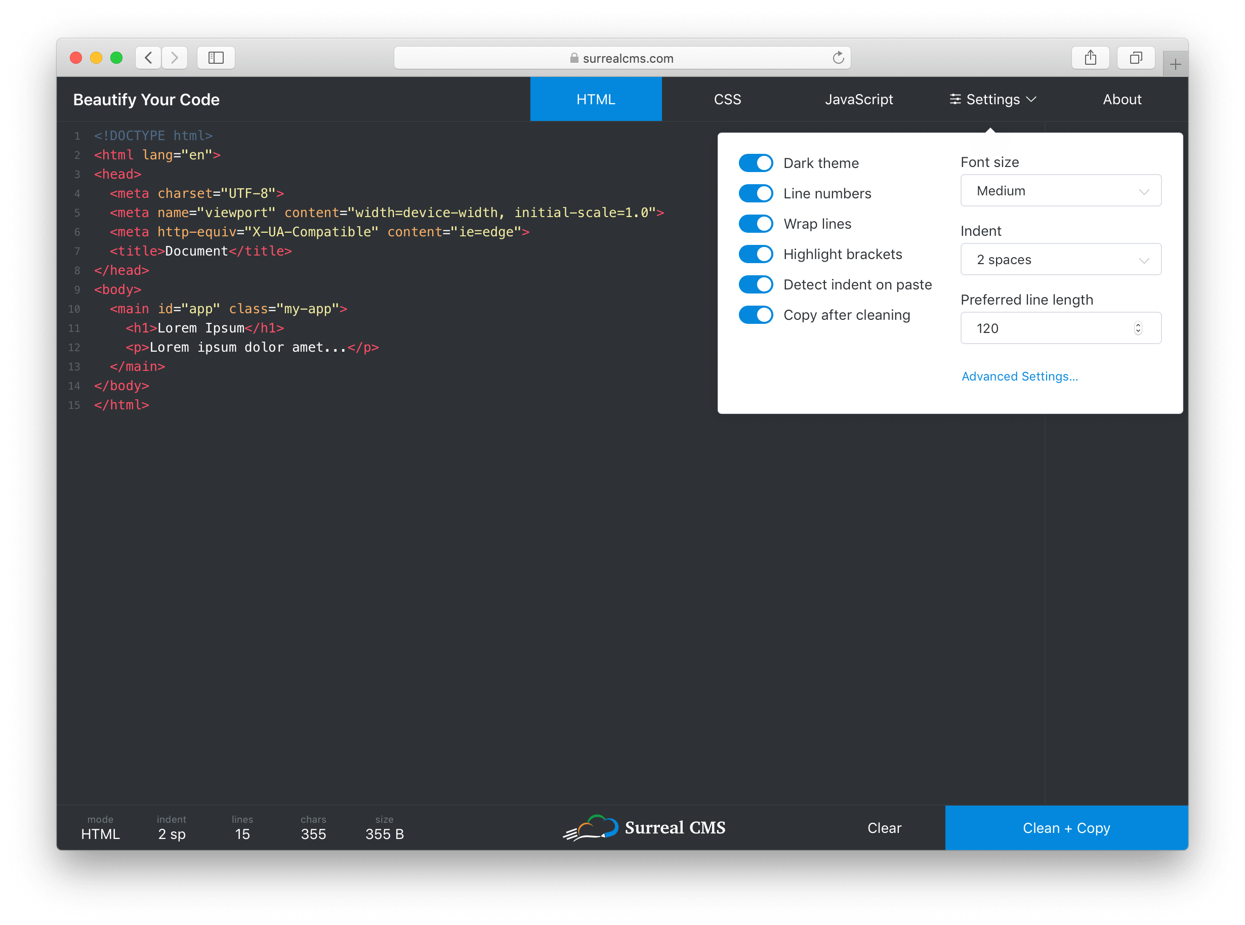
The most common settings are contained in a small panel that provides quick access to them, while advanced settings are still accessible via a link in the panel.
I took advantage of Vue.js here. Each setting gets mapped to a data property, and when one of them changes, the UI updates (if required) and I call saveSettings(). It works something like this.
function saveSettings() {
  const settings = {};

  // settingsToStore is an array of property names that will be persisted
  // and "this" is referencing the current Vue model
  settingsToStore.map(key => settings[key] = this[key]);
  localStorage.setItem('settings', JSON.stringify(settings);
}
Every setting is a data property that gets synced to localStorage. This is a rather primitive way to store state, so I might update the app to use a state management library such as Vuex later on.
To restore settings, I have a restoreSettings() function that runs when the app starts up.
function restoreSettings() {
  const json = localStorage.getItem('settings');

  if (json) {
    try {
      const settings = JSON.parse(json);

      Object.keys(settings).forEach(key => {
        if (settingsToStore.includes(key)) {
          this[key] = settings[key];
        }
      });
    } catch (err) {
      window.alert('There was an error loading your previous settings');
    }
  }
}
The function fetches settings from localStorage, then applies them one by one ensuring only valid settings in settingsToStore get imported.
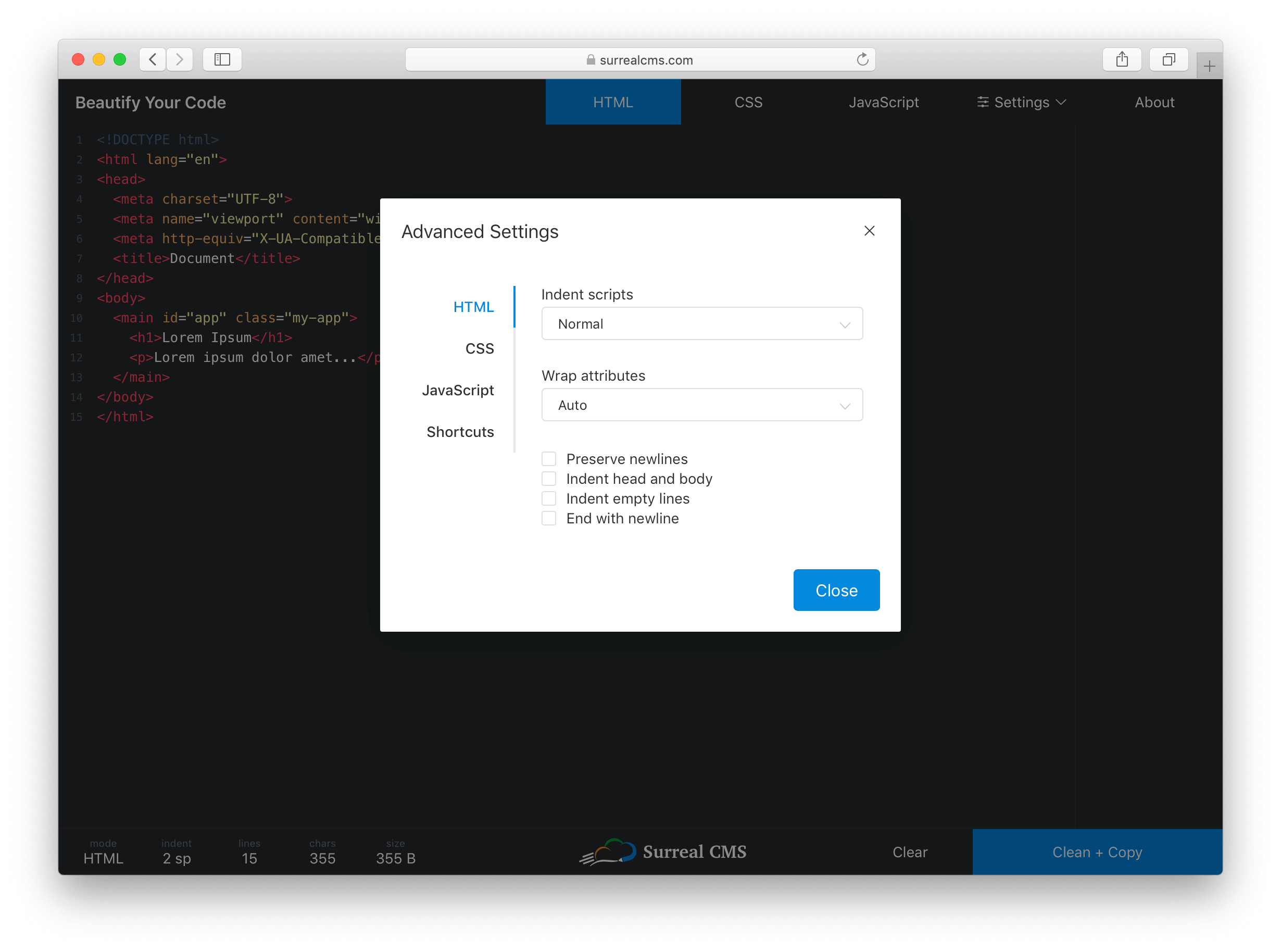
The Advanced Settings link opens a dialog with tabs for each mode. Despite having over 30 settings total, everything is organized and easy to access so users won’t feel overwhelmed.
Clicking the „Advanced Settings” link opens up language-specific preferences and shortcuts.
Applying themes
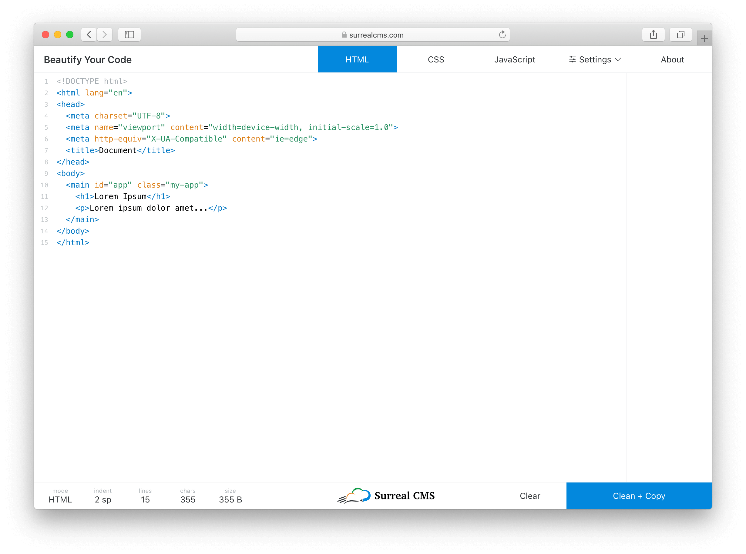
Dark mode is all the rage these days, so it’s enabled by default. There’s also a light theme for those who prefer it. The entire UI changes, except for popovers and dialogs.
I considered using prefers-color-scheme, which coincidentally landed in Firefox 67 recently, but I decided a toggle would probably be better. Browser support for the color theme preference query isn’t that great yet, plus developers are weird. (For example, I use macOS with the light theme, but my text editor is dark.)
The app with Light Mode UI enabled.
Defining features
Coming up with feature ideas is fairly easy. It’s limiting features for an initial release that’s hard. Here are the most relevant features I shipped right away:
Beautifies HTML, CSS, and JavaScript code
Syntax highlighting with tag/bracket matching
Paste or drop files to load code
Auto-detects indentation preference based on pasted code or dropped file
Light and dark themes
Clean and copy in one click
Keyboard shortcuts
Most JS Beautify options are configurable
Settings get stored indefinitely in localStorage
Minimal UI without ads (just an unobtrusive plug to my own service) 🙈
I also threw in a few easter eggs for fun. Try refreshing the page, exploring shortcuts, and sharing it on Facebook or Twitter to find them. 😉
The tools and libraries I used
I’m a big fan of Vue.js. It’s probably overkill for this project, but the Vue CLI let me start building with all the latest tooling via one simple command.
vue create beautify-code
I didn’t have to waste any time scaffolding, which helped me build this out quickly. Plus, Vue came in handy for things like live stats, changing themes, toggling settings, etc. I used various Element UI components for things like buttons, form elements, popovers, and dialogs.
The editor is powered by CodeMirror using custom styles. It’s a well-supported and fantastic project that I can’t recommend enough for in-browser code editing.
The library that does all the beautifying is called JS Beautify, which handles JavaScript, HTML, and CSS. JS Beautify runs on the client-side, so there’s really no backend to this app — your browser does all the work!
JS Beautify is incredibly easy to use. Install it with npm install js-beautify and run your code through the appropriate function.
import beautify from 'js-beautify';

const code = 'Your code here';
const settings = {
  // Your settings here
};

// HTML
const html = beautify.html(code, settings)

// CSS
const css = beautify.css(code, settings)

// JavaScript
const js = beautify.js(code, settings)
Each function returns a string containing the beautified code. You can change how each language is output by passing in your own settings.
I’ve been asked a few times about Prettier, which is a comparable tool, so it’s worth mentioning that I chose JS Beautify because it’s less opinionated and more configurable. If there’s enough demand, I’ll consider adding an option to toggle between JS Beautify and Prettier.
I’ve used all of these libraries before, so integration was actually pretty easy. 😅
This project was made possible by my app, Surreal CMS. If you’re looking for a great CMS for static websites, check it out — it’s free for personal, educational, and non-profit websites!
Oh, and if you’re wondering what editor I used… it’s Visual Studio Code. 👨🏻💻
The process of seeing a graphic design project through from conception to delivery can be a challenging one for even the most talented designers, but one thing experienced designers know is that excellent project management is critical to delivering successful projects within identified deadlines and budgets.
There are many approaches to effective project management, all of which have been left in the dust by today’s cloud-based project and team management tools like the ever-popular monday.com.
Used by more than 70,000 businesses around the world, monday.com is a simple yet sophisticated tool that allows team members to communicate with each other, plan each stage of a project, track tasks, costs and deadlines, brainstorm solutions and much more, no matter where they are or what digital device they happen to be using.
Let’s take a look at how you can manage your next graphic design project expertly using monday.com.
1. How to Set Up an Account
The first thing you’ll notice about monday.com is that it offers users a lot of flexibility in terms of pricing plans. There are, in fact, four different pricing plans to suit a variety of needs. What I suggest, though, is that you start with the free trial to get a feel for what this incredible tool can do. Set up your account by typing your email address into the appropriate slot at the top of the page and hitting the Get Started button.
Once you’ve submitted your email address, you will be walked through a few screens where you’ll be asked to provide key details about the kind of projects you’re likely to use the application for, your role in the team, and how many people you will be collaborating with.
At this point, you can also add the email addresses of your team members, and monday.com will automatically invite them to join you.
2. How to Create a Board
Now that you’re all set up, your next step is to create a design board for your project. Here you have a number of options. You can use one of the 70+ ready-made and highly functional templates on offer to start customising and building out your project details.
Or you can create your own blank board template from scratch. That’s the route we’re going to take for our example here, so that you can get a clear idea of the level of flexibility monday.com offers in creating highly individualised boards.
Click the + sign next to Boards on the left of the screen, and select the Blank Board template.
Enter your project name in the dialog that pops up and press the Create Board button.
This is what your board will look like.
3. How to Customise Your Board
Design boards are a key organisational component of your project. As you can see in the image above, each board is made up of groups, each group is made up of a number of items, and each item can have several columns.
It is inevitable that each team that uses these boards will use them differently based on their needs, but let me show you how you can use them to manage your graphic design project using the goal of creating a brochure for a cafe.
As you can see, the Brodbake Cafe Brochure board already has two generic self-generated groups. I will use these groups to break the project down into more manageable parts/steps and then break each step down into even more manageable parts/steps.
A. Create Groups
First, let’s change the titles of each group. To do so, just double-click on the title and type your title over the existing one. You can also change the colour assigned to each group by clicking on the coloured circle shown next to the title.
Once you’ve renamed the existing groups, you can add more groups to your board by clicking the three dots in the upper right corner of the app. This will expand an extensive customisation menu. Click the first menu item, Add Group.
B. Create Tasks
Now it’s time to add the tasks that need to be completed in each Phase. To do so, just start typing in the row where it says +Add, and hit Return to create a new task row.
Repeat these steps for each of your phases until all the tasks that need to be completed to move the project from start to finish have been added.
C. Add Columns
Now that you have added all the tasks that need to be accomplished to create your graphic design project, it’s time to add some columns.
Columns are all about accountability. They allow you to create checkpoints that identify and monitor critical details regarding each task, like deadlines and budget, who is responsible for which task, monitoring of progression on each task, and more.
To add a column, click the plus sign over the last column of any group.
This will open a list of the most popular columns. Select the More Columns button at the end of this list to open an extensive menu of columns options available for you to customise your tasks. When you see a column you want to add, simply press the Add to board button.
Any columns that you add to your board will be shared by all groups on your board, so if you delete or move a column in one group, it will affect the columns in another group.
D. Pick Your View
One of the coolest features of monday.com for teams managing a graphic design project is the ability to choose alternative ways of viewing project information to quickly gather specific information.
The standard project view is via the main table shown in the image above, but it is also possible to view project information in the form of a chart which could provide information like the distribution of tasks within a team. It is also possible to use a Kanban view in order to view tasks grouped by status or the Timeline view to identify information like pending tasks or the workload of different team members.
To access the different views offered by monday.com, go to the top left of the app window and use the dropdown menu to open the Views Center by clicking on the Add View button. Select the view you want from the list provided.
4. Communication and Collaboration
We all know that bad communication can sink even the most promising project. And that is why one of the most critical features of monday.com is the freedom and ease it brings to team communication and collaboration by having all your team’s communication in one place.
With the ability to access the app from your computer or mobile device of choice, team members can bounce ideas around easily during the critical brainstorming stage of a project and comment on any aspect of a shared project from directly in the app using the @mention.
monday.com also allows teammates to share files, links, images and ideas easily, and no one has to worry about being left out of the loop or being bogged down by duplicating information endlessly. With the possibility of including the entire team on a project, communication is easy, fast, and collaborative.
5. Track Progress, Promoting Accountability
Being able to track progress is critical to a project’s success, and monday.com provides several systems that will enable team leaders to keep things on track and intervene quickly before they get derailed. Not only does the app provide a „Project Tracker For Teams” template, but even if you’re not using that specific template, it makes it easy to integrate its features in your project.
For example, you could use the Status column feature with its colour coding of red, amber and green, so that you always know at a glance where problems are likely to arise and are better positioned to head them off.
The Person column indicates clear ownership of each aspect of a project and keeps everyone aware of where team members are with any given project at any given time.
What’s more, the Progress column is another great tool for understanding at a glance just how close you are to keeping your deadlines and delivering your project on time.
All these systems are indispensable in successfully managing a graphic design project from start to finish.
Manage Your Next Graphic Design Project With monday.com
All these great features make monday.com a terrific project management tool for the savvy graphic designer and team leader. To learn more about the other great features of this awesome app, check out the official guides and sign up for the generous free seven-day trial. You’ll be so impressed with this app, you’ll wonder how you ever got anything done without it.
The process of seeing a graphic design project through from conception to delivery can be a challenging one for even the most talented designers, but one thing experienced designers know is that excellent project management is critical to delivering successful projects within identified deadlines and budgets.
There are many approaches to effective project management, all of which have been left in the dust by today’s cloud-based project and team management tools like the ever-popular monday.com.
Used by more than 70,000 businesses around the world, monday.com is a simple yet sophisticated tool that allows team members to communicate with each other, plan each stage of a project, track tasks, costs and deadlines, brainstorm solutions and much more, no matter where they are or what digital device they happen to be using.
Let’s take a look at how you can manage your next graphic design project expertly using monday.com.
1. How to Set Up an Account
The first thing you’ll notice about monday.com is that it offers users a lot of flexibility in terms of pricing plans. There are, in fact, four different pricing plans to suit a variety of needs. What I suggest, though, is that you start with the free trial to get a feel for what this incredible tool can do. Set up your account by typing your email address into the appropriate slot at the top of the page and hitting the Get Started button.
Once you’ve submitted your email address, you will be walked through a few screens where you’ll be asked to provide key details about the kind of projects you’re likely to use the application for, your role in the team, and how many people you will be collaborating with.
At this point, you can also add the email addresses of your team members, and monday.com will automatically invite them to join you.
2. How to Create a Board
Now that you’re all set up, your next step is to create a design board for your project. Here you have a number of options. You can use one of the 70+ ready-made and highly functional templates on offer to start customising and building out your project details.
Or you can create your own blank board template from scratch. That’s the route we’re going to take for our example here, so that you can get a clear idea of the level of flexibility monday.com offers in creating highly individualised boards.
Click the + sign next to Boards on the left of the screen, and select the Blank Board template.
Enter your project name in the dialog that pops up and press the Create Board button.
This is what your board will look like.
3. How to Customise Your Board
Design boards are a key organisational component of your project. As you can see in the image above, each board is made up of groups, each group is made up of a number of items, and each item can have several columns.
It is inevitable that each team that uses these boards will use them differently based on their needs, but let me show you how you can use them to manage your graphic design project using the goal of creating a brochure for a cafe.
As you can see, the Brodbake Cafe Brochure board already has two generic self-generated groups. I will use these groups to break the project down into more manageable parts/steps and then break each step down into even more manageable parts/steps.
A. Create Groups
First, let’s change the titles of each group. To do so, just double-click on the title and type your title over the existing one. You can also change the colour assigned to each group by clicking on the coloured circle shown next to the title.
Once you’ve renamed the existing groups, you can add more groups to your board by clicking the three dots in the upper right corner of the app. This will expand an extensive customisation menu. Click the first menu item, Add Group.
B. Create Tasks
Now it’s time to add the tasks that need to be completed in each Phase. To do so, just start typing in the row where it says +Add, and hit Return to create a new task row.
Repeat these steps for each of your phases until all the tasks that need to be completed to move the project from start to finish have been added.
C. Add Columns
Now that you have added all the tasks that need to be accomplished to create your graphic design project, it’s time to add some columns.
Columns are all about accountability. They allow you to create checkpoints that identify and monitor critical details regarding each task, like deadlines and budget, who is responsible for which task, monitoring of progression on each task, and more.
To add a column, click the plus sign over the last column of any group.
This will open a list of the most popular columns. Select the More Columns button at the end of this list to open an extensive menu of columns options available for you to customise your tasks. When you see a column you want to add, simply press the Add to board button.
Any columns that you add to your board will be shared by all groups on your board, so if you delete or move a column in one group, it will affect the columns in another group.
D. Pick Your View
One of the coolest features of monday.com for teams managing a graphic design project is the ability to choose alternative ways of viewing project information to quickly gather specific information.
The standard project view is via the main table shown in the image above, but it is also possible to view project information in the form of a chart which could provide information like the distribution of tasks within a team. It is also possible to use a Kanban view in order to view tasks grouped by status or the Timeline view to identify information like pending tasks or the workload of different team members.
To access the different views offered by monday.com, go to the top left of the app window and use the dropdown menu to open the Views Center by clicking on the Add View button. Select the view you want from the list provided.
4. Communication and Collaboration
We all know that bad communication can sink even the most promising project. And that is why one of the most critical features of monday.com is the freedom and ease it brings to team communication and collaboration by having all your team’s communication in one place.
With the ability to access the app from your computer or mobile device of choice, team members can bounce ideas around easily during the critical brainstorming stage of a project and comment on any aspect of a shared project from directly in the app using the @mention.
monday.com also allows teammates to share files, links, images and ideas easily, and no one has to worry about being left out of the loop or being bogged down by duplicating information endlessly. With the possibility of including the entire team on a project, communication is easy, fast, and collaborative.
5. Track Progress, Promoting Accountability
Being able to track progress is critical to a project’s success, and monday.com provides several systems that will enable team leaders to keep things on track and intervene quickly before they get derailed. Not only does the app provide a „Project Tracker For Teams” template, but even if you’re not using that specific template, it makes it easy to integrate its features in your project.
For example, you could use the Status column feature with its colour coding of red, amber and green, so that you always know at a glance where problems are likely to arise and are better positioned to head them off.
The Person column indicates clear ownership of each aspect of a project and keeps everyone aware of where team members are with any given project at any given time.
What’s more, the Progress column is another great tool for understanding at a glance just how close you are to keeping your deadlines and delivering your project on time.
All these systems are indispensable in successfully managing a graphic design project from start to finish.
Manage Your Next Graphic Design Project With monday.com
All these great features make monday.com a terrific project management tool for the savvy graphic designer and team leader. To learn more about the other great features of this awesome app, check out the official guides and sign up for the generous free seven-day trial. You’ll be so impressed with this app, you’ll wonder how you ever got anything done without it.
The process of seeing a graphic design project through from conception to delivery can be a challenging one for even the most talented designers, but one thing experienced designers know is that excellent project management is critical to delivering successful projects within identified deadlines and budgets.
There are many approaches to effective project management, all of which have been left in the dust by today’s cloud-based project and team management tools like the ever-popular monday.com.
Used by more than 70,000 businesses around the world, monday.com is a simple yet sophisticated tool that allows team members to communicate with each other, plan each stage of a project, track tasks, costs and deadlines, brainstorm solutions and much more, no matter where they are or what digital device they happen to be using.
Let’s take a look at how you can manage your next graphic design project expertly using monday.com.
1. How to Set Up an Account
The first thing you’ll notice about monday.com is that it offers users a lot of flexibility in terms of pricing plans. There are, in fact, four different pricing plans to suit a variety of needs. What I suggest, though, is that you start with the free trial to get a feel for what this incredible tool can do. Set up your account by typing your email address into the appropriate slot at the top of the page and hitting the Get Started button.
Once you’ve submitted your email address, you will be walked through a few screens where you’ll be asked to provide key details about the kind of projects you’re likely to use the application for, your role in the team, and how many people you will be collaborating with.
At this point, you can also add the email addresses of your team members, and monday.com will automatically invite them to join you.
2. How to Create a Board
Now that you’re all set up, your next step is to create a design board for your project. Here you have a number of options. You can use one of the 70+ ready-made and highly functional templates on offer to start customising and building out your project details.
Or you can create your own blank board template from scratch. That’s the route we’re going to take for our example here, so that you can get a clear idea of the level of flexibility monday.com offers in creating highly individualised boards.
Click the + sign next to Boards on the left of the screen, and select the Blank Board template.
Enter your project name in the dialog that pops up and press the Create Board button.
This is what your board will look like.
3. How to Customise Your Board
Design boards are a key organisational component of your project. As you can see in the image above, each board is made up of groups, each group is made up of a number of items, and each item can have several columns.
It is inevitable that each team that uses these boards will use them differently based on their needs, but let me show you how you can use them to manage your graphic design project using the goal of creating a brochure for a cafe.
As you can see, the Brodbake Cafe Brochure board already has two generic self-generated groups. I will use these groups to break the project down into more manageable parts/steps and then break each step down into even more manageable parts/steps.
A. Create Groups
First, let’s change the titles of each group. To do so, just double-click on the title and type your title over the existing one. You can also change the colour assigned to each group by clicking on the coloured circle shown next to the title.
Once you’ve renamed the existing groups, you can add more groups to your board by clicking the three dots in the upper right corner of the app. This will expand an extensive customisation menu. Click the first menu item, Add Group.
B. Create Tasks
Now it’s time to add the tasks that need to be completed in each Phase. To do so, just start typing in the row where it says +Add, and hit Return to create a new task row.
Repeat these steps for each of your phases until all the tasks that need to be completed to move the project from start to finish have been added.
C. Add Columns
Now that you have added all the tasks that need to be accomplished to create your graphic design project, it’s time to add some columns.
Columns are all about accountability. They allow you to create checkpoints that identify and monitor critical details regarding each task, like deadlines and budget, who is responsible for which task, monitoring of progression on each task, and more.
To add a column, click the plus sign over the last column of any group.
This will open a list of the most popular columns. Select the More Columns button at the end of this list to open an extensive menu of columns options available for you to customise your tasks. When you see a column you want to add, simply press the Add to board button.
Any columns that you add to your board will be shared by all groups on your board, so if you delete or move a column in one group, it will affect the columns in another group.
D. Pick Your View
One of the coolest features of monday.com for teams managing a graphic design project is the ability to choose alternative ways of viewing project information to quickly gather specific information.
The standard project view is via the main table shown in the image above, but it is also possible to view project information in the form of a chart which could provide information like the distribution of tasks within a team. It is also possible to use a Kanban view in order to view tasks grouped by status or the Timeline view to identify information like pending tasks or the workload of different team members.
To access the different views offered by monday.com, go to the top left of the app window and use the dropdown menu to open the Views Center by clicking on the Add View button. Select the view you want from the list provided.
4. Communication and Collaboration
We all know that bad communication can sink even the most promising project. And that is why one of the most critical features of monday.com is the freedom and ease it brings to team communication and collaboration by having all your team’s communication in one place.
With the ability to access the app from your computer or mobile device of choice, team members can bounce ideas around easily during the critical brainstorming stage of a project and comment on any aspect of a shared project from directly in the app using the @mention.
monday.com also allows teammates to share files, links, images and ideas easily, and no one has to worry about being left out of the loop or being bogged down by duplicating information endlessly. With the possibility of including the entire team on a project, communication is easy, fast, and collaborative.
5. Track Progress, Promoting Accountability
Being able to track progress is critical to a project’s success, and monday.com provides several systems that will enable team leaders to keep things on track and intervene quickly before they get derailed. Not only does the app provide a „Project Tracker For Teams” template, but even if you’re not using that specific template, it makes it easy to integrate its features in your project.
For example, you could use the Status column feature with its colour coding of red, amber and green, so that you always know at a glance where problems are likely to arise and are better positioned to head them off.
The Person column indicates clear ownership of each aspect of a project and keeps everyone aware of where team members are with any given project at any given time.
What’s more, the Progress column is another great tool for understanding at a glance just how close you are to keeping your deadlines and delivering your project on time.
All these systems are indispensable in successfully managing a graphic design project from start to finish.
Manage Your Next Graphic Design Project With monday.com
All these great features make monday.com a terrific project management tool for the savvy graphic designer and team leader. To learn more about the other great features of this awesome app, check out the official guides and sign up for the generous free seven-day trial. You’ll be so impressed with this app, you’ll wonder how you ever got anything done without it.
The process of seeing a graphic design project through from conception to delivery can be a challenging one for even the most talented designers, but one thing experienced designers know is that excellent project management is critical to delivering successful projects within identified deadlines and budgets.
There are many approaches to effective project management, all of which have been left in the dust by today’s cloud-based project and team management tools like the ever-popular monday.com.
Used by more than 70,000 businesses around the world, monday.com is a simple yet sophisticated tool that allows team members to communicate with each other, plan each stage of a project, track tasks, costs and deadlines, brainstorm solutions and much more, no matter where they are or what digital device they happen to be using.
Let’s take a look at how you can manage your next graphic design project expertly using monday.com.
1. How to Set Up an Account
The first thing you’ll notice about monday.com is that it offers users a lot of flexibility in terms of pricing plans. There are, in fact, four different pricing plans to suit a variety of needs. What I suggest, though, is that you start with the free trial to get a feel for what this incredible tool can do. Set up your account by typing your email address into the appropriate slot at the top of the page and hitting the Get Started button.
Once you’ve submitted your email address, you will be walked through a few screens where you’ll be asked to provide key details about the kind of projects you’re likely to use the application for, your role in the team, and how many people you will be collaborating with.
At this point, you can also add the email addresses of your team members, and monday.com will automatically invite them to join you.
2. How to Create a Board
Now that you’re all set up, your next step is to create a design board for your project. Here you have a number of options. You can use one of the 70+ ready-made and highly functional templates on offer to start customising and building out your project details.
Or you can create your own blank board template from scratch. That’s the route we’re going to take for our example here, so that you can get a clear idea of the level of flexibility monday.com offers in creating highly individualised boards.
Click the + sign next to Boards on the left of the screen, and select the Blank Board template.
Enter your project name in the dialog that pops up and press the Create Board button.
This is what your board will look like.
3. How to Customise Your Board
Design boards are a key organisational component of your project. As you can see in the image above, each board is made up of groups, each group is made up of a number of items, and each item can have several columns.
It is inevitable that each team that uses these boards will use them differently based on their needs, but let me show you how you can use them to manage your graphic design project using the goal of creating a brochure for a cafe.
As you can see, the Brodbake Cafe Brochure board already has two generic self-generated groups. I will use these groups to break the project down into more manageable parts/steps and then break each step down into even more manageable parts/steps.
A. Create Groups
First, let’s change the titles of each group. To do so, just double-click on the title and type your title over the existing one. You can also change the colour assigned to each group by clicking on the coloured circle shown next to the title.
Once you’ve renamed the existing groups, you can add more groups to your board by clicking the three dots in the upper right corner of the app. This will expand an extensive customisation menu. Click the first menu item, Add Group.
B. Create Tasks
Now it’s time to add the tasks that need to be completed in each Phase. To do so, just start typing in the row where it says +Add, and hit Return to create a new task row.
Repeat these steps for each of your phases until all the tasks that need to be completed to move the project from start to finish have been added.
C. Add Columns
Now that you have added all the tasks that need to be accomplished to create your graphic design project, it’s time to add some columns.
Columns are all about accountability. They allow you to create checkpoints that identify and monitor critical details regarding each task, like deadlines and budget, who is responsible for which task, monitoring of progression on each task, and more.
To add a column, click the plus sign over the last column of any group.
This will open a list of the most popular columns. Select the More Columns button at the end of this list to open an extensive menu of columns options available for you to customise your tasks. When you see a column you want to add, simply press the Add to board button.
Any columns that you add to your board will be shared by all groups on your board, so if you delete or move a column in one group, it will affect the columns in another group.
D. Pick Your View
One of the coolest features of monday.com for teams managing a graphic design project is the ability to choose alternative ways of viewing project information to quickly gather specific information.
The standard project view is via the main table shown in the image above, but it is also possible to view project information in the form of a chart which could provide information like the distribution of tasks within a team. It is also possible to use a Kanban view in order to view tasks grouped by status or the Timeline view to identify information like pending tasks or the workload of different team members.
To access the different views offered by monday.com, go to the top left of the app window and use the dropdown menu to open the Views Center by clicking on the Add View button. Select the view you want from the list provided.
4. Communication and Collaboration
We all know that bad communication can sink even the most promising project. And that is why one of the most critical features of monday.com is the freedom and ease it brings to team communication and collaboration by having all your team’s communication in one place.
With the ability to access the app from your computer or mobile device of choice, team members can bounce ideas around easily during the critical brainstorming stage of a project and comment on any aspect of a shared project from directly in the app using the @mention.
monday.com also allows teammates to share files, links, images and ideas easily, and no one has to worry about being left out of the loop or being bogged down by duplicating information endlessly. With the possibility of including the entire team on a project, communication is easy, fast, and collaborative.
5. Track Progress, Promoting Accountability
Being able to track progress is critical to a project’s success, and monday.com provides several systems that will enable team leaders to keep things on track and intervene quickly before they get derailed. Not only does the app provide a „Project Tracker For Teams” template, but even if you’re not using that specific template, it makes it easy to integrate its features in your project.
For example, you could use the Status column feature with its colour coding of red, amber and green, so that you always know at a glance where problems are likely to arise and are better positioned to head them off.
The Person column indicates clear ownership of each aspect of a project and keeps everyone aware of where team members are with any given project at any given time.
What’s more, the Progress column is another great tool for understanding at a glance just how close you are to keeping your deadlines and delivering your project on time.
All these systems are indispensable in successfully managing a graphic design project from start to finish.
Manage Your Next Graphic Design Project With monday.com
All these great features make monday.com a terrific project management tool for the savvy graphic designer and team leader. To learn more about the other great features of this awesome app, check out the official guides and sign up for the generous free seven-day trial. You’ll be so impressed with this app, you’ll wonder how you ever got anything done without it.
The process of seeing a graphic design project through from conception to delivery can be a challenging one for even the most talented designers, but one thing experienced designers know is that excellent project management is critical to delivering successful projects within identified deadlines and budgets.
There are many approaches to effective project management, all of which have been left in the dust by today’s cloud-based project and team management tools like the ever-popular monday.com.
Used by more than 70,000 businesses around the world, monday.com is a simple yet sophisticated tool that allows team members to communicate with each other, plan each stage of a project, track tasks, costs and deadlines, brainstorm solutions and much more, no matter where they are or what digital device they happen to be using.
Let’s take a look at how you can manage your next graphic design project expertly using monday.com.
1. How to Set Up an Account
The first thing you’ll notice about monday.com is that it offers users a lot of flexibility in terms of pricing plans. There are, in fact, four different pricing plans to suit a variety of needs. What I suggest, though, is that you start with the free trial to get a feel for what this incredible tool can do. Set up your account by typing your email address into the appropriate slot at the top of the page and hitting the Get Started button.
Once you’ve submitted your email address, you will be walked through a few screens where you’ll be asked to provide key details about the kind of projects you’re likely to use the application for, your role in the team, and how many people you will be collaborating with.
At this point, you can also add the email addresses of your team members, and monday.com will automatically invite them to join you.
2. How to Create a Board
Now that you’re all set up, your next step is to create a design board for your project. Here you have a number of options. You can use one of the 70+ ready-made and highly functional templates on offer to start customising and building out your project details.
Or you can create your own blank board template from scratch. That’s the route we’re going to take for our example here, so that you can get a clear idea of the level of flexibility monday.com offers in creating highly individualised boards.
Click the + sign next to Boards on the left of the screen, and select the Blank Board template.
Enter your project name in the dialog that pops up and press the Create Board button.
This is what your board will look like.
3. How to Customise Your Board
Design boards are a key organisational component of your project. As you can see in the image above, each board is made up of groups, each group is made up of a number of items, and each item can have several columns.
It is inevitable that each team that uses these boards will use them differently based on their needs, but let me show you how you can use them to manage your graphic design project using the goal of creating a brochure for a cafe.
As you can see, the Brodbake Cafe Brochure board already has two generic self-generated groups. I will use these groups to break the project down into more manageable parts/steps and then break each step down into even more manageable parts/steps.
A. Create Groups
First, let’s change the titles of each group. To do so, just double-click on the title and type your title over the existing one. You can also change the colour assigned to each group by clicking on the coloured circle shown next to the title.
Once you’ve renamed the existing groups, you can add more groups to your board by clicking the three dots in the upper right corner of the app. This will expand an extensive customisation menu. Click the first menu item, Add Group.
B. Create Tasks
Now it’s time to add the tasks that need to be completed in each Phase. To do so, just start typing in the row where it says +Add, and hit Return to create a new task row.
Repeat these steps for each of your phases until all the tasks that need to be completed to move the project from start to finish have been added.
C. Add Columns
Now that you have added all the tasks that need to be accomplished to create your graphic design project, it’s time to add some columns.
Columns are all about accountability. They allow you to create checkpoints that identify and monitor critical details regarding each task, like deadlines and budget, who is responsible for which task, monitoring of progression on each task, and more.
To add a column, click the plus sign over the last column of any group.
This will open a list of the most popular columns. Select the More Columns button at the end of this list to open an extensive menu of columns options available for you to customise your tasks. When you see a column you want to add, simply press the Add to board button.
Any columns that you add to your board will be shared by all groups on your board, so if you delete or move a column in one group, it will affect the columns in another group.
D. Pick Your View
One of the coolest features of monday.com for teams managing a graphic design project is the ability to choose alternative ways of viewing project information to quickly gather specific information.
The standard project view is via the main table shown in the image above, but it is also possible to view project information in the form of a chart which could provide information like the distribution of tasks within a team. It is also possible to use a Kanban view in order to view tasks grouped by status or the Timeline view to identify information like pending tasks or the workload of different team members.
To access the different views offered by monday.com, go to the top left of the app window and use the dropdown menu to open the Views Center by clicking on the Add View button. Select the view you want from the list provided.
4. Communication and Collaboration
We all know that bad communication can sink even the most promising project. And that is why one of the most critical features of monday.com is the freedom and ease it brings to team communication and collaboration by having all your team’s communication in one place.
With the ability to access the app from your computer or mobile device of choice, team members can bounce ideas around easily during the critical brainstorming stage of a project and comment on any aspect of a shared project from directly in the app using the @mention.
monday.com also allows teammates to share files, links, images and ideas easily, and no one has to worry about being left out of the loop or being bogged down by duplicating information endlessly. With the possibility of including the entire team on a project, communication is easy, fast, and collaborative.
5. Track Progress, Promoting Accountability
Being able to track progress is critical to a project’s success, and monday.com provides several systems that will enable team leaders to keep things on track and intervene quickly before they get derailed. Not only does the app provide a „Project Tracker For Teams” template, but even if you’re not using that specific template, it makes it easy to integrate its features in your project.
For example, you could use the Status column feature with its colour coding of red, amber and green, so that you always know at a glance where problems are likely to arise and are better positioned to head them off.
The Person column indicates clear ownership of each aspect of a project and keeps everyone aware of where team members are with any given project at any given time.
What’s more, the Progress column is another great tool for understanding at a glance just how close you are to keeping your deadlines and delivering your project on time.
All these systems are indispensable in successfully managing a graphic design project from start to finish.
Manage Your Next Graphic Design Project With monday.com
All these great features make monday.com a terrific project management tool for the savvy graphic designer and team leader. To learn more about the other great features of this awesome app, check out the official guides and sign up for the generous free seven-day trial. You’ll be so impressed with this app, you’ll wonder how you ever got anything done without it.
The process of seeing a graphic design project through from conception to delivery can be a challenging one for even the most talented designers, but one thing experienced designers know is that excellent project management is critical to delivering successful projects within identified deadlines and budgets.
There are many approaches to effective project management, all of which have been left in the dust by today’s cloud-based project and team management tools like the ever-popular monday.com.
Used by more than 70,000 businesses around the world, monday.com is a simple yet sophisticated tool that allows team members to communicate with each other, plan each stage of a project, track tasks, costs and deadlines, brainstorm solutions and much more, no matter where they are or what digital device they happen to be using.
Let’s take a look at how you can manage your next graphic design project expertly using monday.com.
1. How to Set Up an Account
The first thing you’ll notice about monday.com is that it offers users a lot of flexibility in terms of pricing plans. There are, in fact, four different pricing plans to suit a variety of needs. What I suggest, though, is that you start with the free trial to get a feel for what this incredible tool can do. Set up your account by typing your email address into the appropriate slot at the top of the page and hitting the Get Started button.
Once you’ve submitted your email address, you will be walked through a few screens where you’ll be asked to provide key details about the kind of projects you’re likely to use the application for, your role in the team, and how many people you will be collaborating with.
At this point, you can also add the email addresses of your team members, and monday.com will automatically invite them to join you.
2. How to Create a Board
Now that you’re all set up, your next step is to create a design board for your project. Here you have a number of options. You can use one of the 70+ ready-made and highly functional templates on offer to start customising and building out your project details.
Or you can create your own blank board template from scratch. That’s the route we’re going to take for our example here, so that you can get a clear idea of the level of flexibility monday.com offers in creating highly individualised boards.
Click the + sign next to Boards on the left of the screen, and select the Blank Board template.
Enter your project name in the dialog that pops up and press the Create Board button.
This is what your board will look like.
3. How to Customise Your Board
Design boards are a key organisational component of your project. As you can see in the image above, each board is made up of groups, each group is made up of a number of items, and each item can have several columns.
It is inevitable that each team that uses these boards will use them differently based on their needs, but let me show you how you can use them to manage your graphic design project using the goal of creating a brochure for a cafe.
As you can see, the Brodbake Cafe Brochure board already has two generic self-generated groups. I will use these groups to break the project down into more manageable parts/steps and then break each step down into even more manageable parts/steps.
A. Create Groups
First, let’s change the titles of each group. To do so, just double-click on the title and type your title over the existing one. You can also change the colour assigned to each group by clicking on the coloured circle shown next to the title.
Once you’ve renamed the existing groups, you can add more groups to your board by clicking the three dots in the upper right corner of the app. This will expand an extensive customisation menu. Click the first menu item, Add Group.
B. Create Tasks
Now it’s time to add the tasks that need to be completed in each Phase. To do so, just start typing in the row where it says +Add, and hit Return to create a new task row.
Repeat these steps for each of your phases until all the tasks that need to be completed to move the project from start to finish have been added.
C. Add Columns
Now that you have added all the tasks that need to be accomplished to create your graphic design project, it’s time to add some columns.
Columns are all about accountability. They allow you to create checkpoints that identify and monitor critical details regarding each task, like deadlines and budget, who is responsible for which task, monitoring of progression on each task, and more.
To add a column, click the plus sign over the last column of any group.
This will open a list of the most popular columns. Select the More Columns button at the end of this list to open an extensive menu of columns options available for you to customise your tasks. When you see a column you want to add, simply press the Add to board button.
Any columns that you add to your board will be shared by all groups on your board, so if you delete or move a column in one group, it will affect the columns in another group.
D. Pick Your View
One of the coolest features of monday.com for teams managing a graphic design project is the ability to choose alternative ways of viewing project information to quickly gather specific information.
The standard project view is via the main table shown in the image above, but it is also possible to view project information in the form of a chart which could provide information like the distribution of tasks within a team. It is also possible to use a Kanban view in order to view tasks grouped by status or the Timeline view to identify information like pending tasks or the workload of different team members.
To access the different views offered by monday.com, go to the top left of the app window and use the dropdown menu to open the Views Center by clicking on the Add View button. Select the view you want from the list provided.
4. Communication and Collaboration
We all know that bad communication can sink even the most promising project. And that is why one of the most critical features of monday.com is the freedom and ease it brings to team communication and collaboration by having all your team’s communication in one place.
With the ability to access the app from your computer or mobile device of choice, team members can bounce ideas around easily during the critical brainstorming stage of a project and comment on any aspect of a shared project from directly in the app using the @mention.
monday.com also allows teammates to share files, links, images and ideas easily, and no one has to worry about being left out of the loop or being bogged down by duplicating information endlessly. With the possibility of including the entire team on a project, communication is easy, fast, and collaborative.
5. Track Progress, Promoting Accountability
Being able to track progress is critical to a project’s success, and monday.com provides several systems that will enable team leaders to keep things on track and intervene quickly before they get derailed. Not only does the app provide a „Project Tracker For Teams” template, but even if you’re not using that specific template, it makes it easy to integrate its features in your project.
For example, you could use the Status column feature with its colour coding of red, amber and green, so that you always know at a glance where problems are likely to arise and are better positioned to head them off.
The Person column indicates clear ownership of each aspect of a project and keeps everyone aware of where team members are with any given project at any given time.
What’s more, the Progress column is another great tool for understanding at a glance just how close you are to keeping your deadlines and delivering your project on time.
All these systems are indispensable in successfully managing a graphic design project from start to finish.
Manage Your Next Graphic Design Project With monday.com
All these great features make monday.com a terrific project management tool for the savvy graphic designer and team leader. To learn more about the other great features of this awesome app, check out the official guides and sign up for the generous free seven-day trial. You’ll be so impressed with this app, you’ll wonder how you ever got anything done without it.
Agregator najlepszych postów o designie, webdesignie, cssie i Internecie