Wszystkie wpisy, których autorem jest admin

How to Make Icons

Post pobrano z: How to Make Icons

Final product image
What You’ll Be Creating

Always wanted to learn what it takes to create your own icon, but never knew exactly where to start? Well, with this article, that’s going to change. You’ll learn what an icon is and get answers to the most common questions and problems that come up. Along the way, you’ll discover that the process isn’t as hard as you might once have thought.

Oh, and before I forget, if you want to expand your icon library, you can always head over to Envato Elements where you’ll find a great collection of vector icon packs just waiting to be picked up.

1. What
Are Icons?

If there’s one truly
important thing that school managed to teach me, it’s that whenever you find
yourself tackling a new concept, you should always put in the time and thoroughly
carry out the research, so that you can have a full understanding of what it
ultimately stands for.

So, being the
creature of habit that I am, I’m going to instill in you that same method of
problem solving, starting with the most basic of questions: “What is an icon?

what are icons

Well, according to
Google, the word originates from the Greek eikόn (image) and is commonly
defined today as a:

“devotional painting of Christ or another holy figure,
typically executed on wood and used ceremonially in the Byzantine and other
Eastern Churches”.

While this isn’t
exactly the type of icon that we creatives tend to think off, it
might be the first thing that some people visualize when you tell them
that you earn your living doing “icon design”.

Don’t get me
wrong, I have nothing against the art of painting icons, which is in itself a
beautiful yet hard craft, but we’re talking about a whole different use of the
hands and imagination here.

From a more
modern, digital perspective, an “icon” is defined as:

“a symbol or graphic representation
on a screen of a program, option, or window”.

Whether you’re using a Mac or a PC, an iPhone or an Android device,
every single one of them has a user interface based on icons of different
shapes, colors, and sizes.

2. Why
Do We Use Icons?

Historically, the
first ever set of computer icons was conceptualized almost 37 years ago (more
exactly in 1981), when a computer
scientist by the name of David Canfield Smith joined forces with designer
Norman Lloyd Cox while working on the GUI
(Graphical User Interface) of the Xerox
Star 8010
. Their task was to ease the user’s interaction with the machine,
which they creatively overcame by introducing familiar graphic symbols meant to
reflect real-life objects to which the user could relate.

Since back in the
day computers were mostly used within work environments, they quickly realized
that they could find inspiration by looking at the most common objects found
within an office, thus bringing the “office metaphor” to life.

This laid the foundation for building the first ever common visual
language for the digital age, which has shaped not only the way GUIs look but
also how they function.

Ease of
Interaction

Fast forward
to today, and while they’ve definitely seen some changes in terms of form, their core
function has remained pretty much identical, since they continue to serve the
same purpose that they were originally designed for, and that is easing our
interaction with the different pieces and types of software.

ease of interaction

And honestly, should we even be surprised? Imagine having to use a piece of software that has
a GUI based entirely on the use of keywords. I just did, and believe me, it
quickly turned into a little nightmare.

Language Barrier Breakers

Icons behave as universal visual symbols that break free of the language barrier, due
to the fact that they manage to portray images that can be easily understood by
users who come from different sides of the planet.

Instead of having
to figure out ways of conveying the same meaning to speakers of two different languages, you can easily find a commonly accepted symbol that does the job for you.

Of course, there will occasionally be some depictions that might require users to go through a process of memorizing a symbol in order to add it to
their lingo. Usually, this will happen in the case of new concepts or
technologies with which they need to get familiar with.

Faster Thought
Triggers

Compared to words,
images have the ability to stimulate our eyes significantly faster and for a
longer time span. This in turn means that the user will not only decipher the
meaning behind an icon faster, but the overall expected engagement time will be far
smaller.

Imagine having some complex software with a lot of tools and functions. Now, what would it look like if all the tools were illustrated using labels, i.e. text instead of symbols? While you might manage to figure out the position of some of them, it would quickly become a visual overload which would eventually make you hate that piece of software.

Believe it or not, there’s a real reason why we moved away from command-line interfaces, and it mostly has to do with aesthetics and ease of interaction. 

Eye
Candy

Going beyond the
idea of functionality, icons behave as visual triggers meant not only to
portray an idea faster but also to do so in a manner that is pleasing to the eye.

For example, I
like to think of a device’s screen as being one of those shelves that I usually
stroll past when I do my shopping at the local mini market. If the
products are wrapped in a colorful, eye-catching manner, then my attention is
immediately drawn to them, even though sometimes I don’t even need that product—I’m just interested in seeing what it contains.

The same can be said about icons, since the better they look, the more
compelled the user will be to stare at them and then engage in interaction, which sometimes is exactly what we want them to do.

3. How
to Make an Icon

Okay, so up to this point we’ve talked about what icons are and why we use them. Now it’s time
to get a sense of what it takes to make one.

3.1. The
Research Phase

Every
time you start working on a new icon-based project, there are a few key aspects
that you need to figure out before you go through the actual process of
building the icons.

I call this the “research phase” since that’s basically all that you’re going to be doing. You’re going to spend a few minutes or hours, depending on the time and patience that you have, looking for answers to a few basic questions.

research phase

How Many
Size Variations Do You Need?

The first question
that you should always ask yourself has to do with the number of size variations that you need
to create for a specific icon.

Do you need one
icon, two, or maybe more?

If, for some reason, you end up working on a single-size project, then this part should be pretty easy to go over. On the other hand, if you need to provide multiple sizes, then you might find yourself in a pickle, especially if you’re doing client work but don’t have a clear brief indicating the required values.

how many size variations do you need

Luckily for us, most of these values have already become industry “standards”,
which means that you don’t have to waste time playing with numbers in order to
figure out what works and what doesn’t.

If you know where the icons will be
used, you can usually find the required sizing values by doing a simple Google
search.

Small Icons:

  • 12 x 12 px
  • 16 x 16 px
  • 24 x 24 px
  • 32 x 32 px
  • 48 x 48 px

Medium Icons:

  • 64 x 64 px
  • 96 x 96 px
  • 128 x 128 px
  • 256 x 256 px

Large Icons:

  • 512 x 512 px
  • 1024 x 1024 px

Quick tip: if you take a closer look at the above size values, you’ll quickly notice that most of them are actually created by doubling the previous number: 12 > 24 > 48 > 9616 > 32 > 64 > 128 > 256 > 512 > 1024.

In some cases, such as for mobile apps, you can find detailed guidelines straight from the OS manufacturers that are meant to help you out:

What Will
Your Base Size Be?

When working on multiple-size projects, I strongly recommend you always start from the smallest addressable size possible.

This will become your base size, which you will later on use in order to make all the other required ones. The reason has to do with the pixel-perfect nature of your shapes, which will break down if you build big and then try to get the smaller variations by resizing them.

When it comes to choosing a value for the actual base size, it all depends on the project’s requirements, but the general rule is that you should always go as small as possible.

choosing a base size

For example, if I need to create three variations (16 x 16 px, 32 x 32 px, and
64 x 64 px), I’ll always make sure to
start with the 16 x 16 px as my base size, and then create the
other ones by doubling it up.

What Are
the Subject’s Main Defining Features?

Once we’ve figured
out the sizing problem, we need to take a couple of moments and break down the
concept that we’re going to be illustrating. For me personally, this step is a
must since it allows me to identify and isolate its main traits.

You can easily do
this by grabbing a piece of paper or by opening up a text document, and then
gradually writing down short observations (keywords) that have to do with its
shape, size, colors, composing elements/features, etc.

icon main features

While some tend to spend less time on this part of the research, adding
that extra minute can prove to be extremely helpful, especially if you’re just
starting out, since it will make things easier when it comes to getting a “feel”
of the subject.

What Style Do You Use?

At this point, we can
and should start thinking of the “style”, or in other words the look that our
icons will end up embracing.

Back in the day, things
were quite different, since the style of the first icons was dictated by the
limited display technology.  That in turn ended up shaping the way these visual symbols looked, but also laid the
foundation for the first ever style, which used shapes defined by bold, hard lines
for the outer sections and thinner ones for the inner details.

Today, that pixel barrier
has long been crossed, allowing us to grow and create new styles, which
are constantly evolving and changing. 

example of same icon in multiple styles

The most popular styles are:

  • pixel art
  • flat
  • material
  • line art
  • isometric
  • glyph
  • skeuomorphic
  • dimensional
  • hand-drawn
  • animated

Personally, when
it comes to choosing a look for my future icons, I usually end up going to
Dribbble.com, where I tend to spend a few minutes analyzing the current trends.
As I scroll up and down, I quickly manage to get an idea of what I would like
to do, and then I try to stick to that.

That being said, I strongly recommend you get a good idea of what you’re aiming for from the start, since otherwise you might find yourself losing a
lot of time by going back and forth through different styles.

Oh, and another
thing, please don’t become that designer who sees something good and then fully copies another person’s work, putting it out there as
being their own. While some people recommend this approach in order to learn
and grow, that’s what it should ultimately be, an exercise where you try to
figure out how some things are done.

If copying is all
that you end up doing, then you might never reach that point where you
develop a personal style, which is what sets a good icon designer apart from the
rest.

If you want to find out more about this subject, I strongly recommend
you read my 10 Styles That Have Changed the Face of Icon Design article, which will break down the main existing styles and their traits.

10 styles that have changed the face of icon design
10 Styles That Have Changed the Face of Icon Design

How to Find Inspiration

Depending on the
nature of the project that you’re taking on, whether it’s a personal one or
client work, you’ll ultimately find yourself in need of some inspiration. This
phase is pretty entangled with the selecting a style one, since this is where
you start laying the foundation for your future icons.

So how do you go
about getting that feeling of being inspired?

Well, the best way
to get your creative juices flowing is to create what is commonly known as a “mood
board” (or inspiration board).

As the name
suggests, a mood board is a collection, or more exactly a collage of image-based ideas, ranging from color palettes to photos, illustrations, textures,
typography, etc. It helps you get a direction for what you would ultimately like
your product to feel like.

As a designer, you’re
constantly bookmarking stuff that grabs your attention, but
sometimes it’s kind of hard to keep track of all of them, especially when you
need to view them all at once.

This is where tools
like Pinterest and Instagram come in handy, since they allow you to create mood
boards at a click of a button.

Another
alternative, which I know a lot of people tend to use, is to download the
image selection that you’ve made, and then create the mood board directly
within your graphics suite.

If you’re using a
single-monitor setup then this might work better for you, but if you’re on team
double, you might consider using the first approach.

When it comes to
the actual images themselves, I usually rely on one of the following resources:

Sometimes, you’ll
find yourself in that situation where you have a more complicated subject that
you might need help with in order to figure out the symbol used for it. When
this happens, I usually go to The Noun Project or Iconfinder and do a simple
search, which always brings up a large selection of images that help me
understand the subject better.

At this point, you should have covered all of the above questions, which means
that we are now ready to move on to the next phase.

3.2. The
Building Phase

So, you’ve figured
out your base size, decided on the size variations, and even set up a little
mood board, which brings us to the second phase of the process.

Now, regardless of the software that you’re using—Adobe Illustrator, Adobe Photoshop,
Affinity Designer, Sketch, etc.—this next part is pretty much the same, since you can apply the concepts to any of the existing graphics
suites.

The same can be
said about the different operating systems, since whether you’re a Mac or Windows user, you’ll be able to achieve the same result by following the same process.

That being said,
let’s see what it takes to start building your icon.

Make It Pixel Perfect

At this point, most of the programs already come preconfigured to help
you create your icons with pixel perfection in mind.

If this is your first time hearing about this idea, then I strongly
recommend you take a couple of moments and go through my How to Create Pixel-Perfect Artwork article, which should bring you up to speed.

how to create pixel perfect artwork
How to Create Pixel-Perfect Artwork in Adobe Illustrator

Now, assuming you’ve
finished reading the above article, the question is whether or not we should put in the time and adapt to this more rigorous workflow.

Well, personally I’ve been using it for more than five years now, and no
matter how much more time it might end up eating, I still believe it’s all worth
it. If you take a look at how things were originally done back in the early
years of this craft, when resolution was a problem, you’ll notice that icons
were built using pixel grids, not random sized shapes.

Set Up a Proper Project File

The first step to
creating your own icon, or icon pack, is to set up a new project file. Simple,
right? Well, not really, since if you’re just starting out, there are a couple
of things that you should be aware of.

The
Profile

First, you should
always make sure that your document’s profile is set to Web, since icons are
usually used in the digital medium.

This is actually important, since different profiles will have different
color systems (Web uses RGB, while Print uses CMYK), which
might result in unwanted color representations when viewed by other people.

The Measuring
Units

Next, we have the
measuring units used to describe the width,
height, corner radius, stroke weight, and spacing used for the different
composing shapes.

By default, the units should always be set to Pixel as long as you make
sure that the document is intended to be used for the web.

We use pixels instead of something else since it’s the universally agreed-upon unit used to measure any digital product.

The Number of Artboards

Once you’ve set your
document’s profile and units, you need to figure out if you’re going to be
using one larger Artboard or multiple smaller ones.

My advice is to
always try to take the second route, since it will make things a lot easier
when it comes to exporting the icons.

Going beyond that, having multiple Artboards means you can more easily focus
on one asset at a time, as you gradually build your pack.

Use
Layers

Whether you’re
creating a single icon, or an entire pack, you should always try and use a
couple of layers in order to separate your assets from your reference grids.

use layers

By doing so, you
can easily build your icons without having to worry that you’ll move or group the
underlying grids by mistake.

Going beyond that, it will help you out during the exporting process,
since you’ll want to be able to hide your grids.

Use
Reference Grids

By definition, a „reference grid” is a visual tool consisting of geometric guidelines meant
to help you achieve size consistency throughout your icons.

It can be as simple
as two squares stacked on top of one another, or you can use something a little
more complex. Personally, I prefer to go with the more basic one since it does
the job better than expected.

example of complex reference grid

Normally, I start
out by creating the main reference surface using the exact same width and height values as my underlying Artboard. Then I add a slightly
smaller one called the active drawing
area, which is where I’m going to be
positioning all of my asset’s composing shapes.

This will give me
an all-around protective padding, which I always include in order to make sure
that the icons don’t get clipped once they get delivered and used later on by
the client.

When working on multiple icons, my golden rule is to decide whether or
not I’m going to fill in both the width
and height of the active drawing area or just one of them, depending on the style that I’m
going for. Once I figure this out, I’ll take that rule and apply it to all my other assets,
thus achieving the consistency that I’m aiming for.

4. The Do’s
and Don’ts of Creating Icons

Once you’ve finished setting up your project file, layers, and reference
grids, all that remains is to start working on the actual icons. Now, depending
on the style that you’re going for, there are a couple of things that you
should be aware of.

Keep It
Simple

When we start
learning something new, we always have that desire to create at a higher
level, since we tend to look at what other people are doing and think, “Well, that can’t be that hard.”

While I don’t doubt your ability to put together something completely amazing, I
actually recommend you start by doing simple designs at first, so that you can gradually
build your skills in a more organic manner.

Beyond that, sometimes simple is just better since the idea is to
portray a subject—whether it’s an object, a function, or an idea—in a way that any user can instantly understand.

Start With Basic Shapes

If you’re having a hard time working on a project, the best idea is to take a step back and then focus on laying down the subject’s basic shapes. Whether you’re using rectangles, circles, or both, try to loosen up and see how you can build your icon by focusing on its main composing sections.

Once you’ve laid down your foundation, you can then start adjusting the main building blocks and gradually add details to them until you reach the desired form.

Focus on
Colors

A lot of the time, I see incredible work put out there by random creatives who put a lot of
attention into their compositions, but for some reason fail
when it comes to colors. Believe it or not, a color palette can make or break your
beautiful artwork, which is why I believe it’s important that you take the
time and learn all that you can about color theory.

If you’re feeling
lazy, or simply don’t have the time to start reading books about this subject, then
just look up some icons (some good ones), and try and analyze the way their
creator used colors in order to bring them to life.

Sometimes, learning by looking at another one’s example can fire up the
memory muscles a lot faster, teaching your mind which colors work and which don’t.

Avoid
Using Text Within Your Icons

This one is kind
of a no-brainer, since the whole idea behind an icon is to eliminate the need
for written letters, which should be replaced by symbols.

Of course, there will always be those few situations when you actually need to use letters in order to distinguish one icon from another. The best example is when you need to put together a document-themed icon pack, where you need to illustrate a PNG file, a JPEG, and an SVG. Since the shape of the document needs to remain identical, your best approach to do this would be to add a little label to the center of each document in order to let the user know which one is which.

You can find a more detailed list by reading my 10 Top Tips for
Creating Awesome Icons
, which should bring more light to this subject.

10 top tips for creating awesome icons
10 Top Tips for Creating Awesome Icons

Some styles, such as line icons, require a little more attention when it comes to the actual building process. From path overlapping to stroke positioning, I’ve covered all the different nooks and crannies that you need to be aware of when creating these sorts of icons.
the dos and donts of creating line icons
The Do’s and Don’ts of Creating Line Icons

5. Common Problems

Next, we’re going to quickly go through some of the most common problems that you’ll have to deal with when working on a new icon.

Shape
Rotation

This is probably
the most annoying one when it comes to working on a pixel-perfect icon, since anytime you rotate a shape, it will instantly snap off the
underlying Pixel Grid. When this happens, the shape’s width and height values
will turn into decimal values, which is usually indicated by the software’s transform
panel.

example of shape snapping off the pixel grid after being rotated

While you might
think that this isn’t such a big issue, you’ll shortly find out that it
actually is, since if you need to align the shape to the edge of another one, you simply won’t be able to.

Depending on the
complexity of the shape, most times you can fix the problem by individually
selecting its anchors/nodes, and then snapping them back into place to the
nearest gridline intersection.

Personally, I tend to stay away from rotated shapes and only use them when I really have to, making sure to do my best to snap them back to the Pixel Grid.

Creating Size Variations

So you’ve managed to create the base size for your icon, but how about adding multiple size variations based on it?

Well, the process itself is fairly simple, since most of the time all you have to do is double the size of your current icon using a 200% increment.

For example, if you have an icon that is 64 x 64 px, you can easily create the next size variation by doubling its width and height values, so 128 x 128 px.

You can find out more about this particular process by reading my article How to Scale Icons Correctly in Adobe Illustrator, which presents concepts that can be used in most graphics suites.

how to scale icons correctly in adobe illustrator
How to Scale Icons Correctly in Adobe Illustrator

6. How to Export Your Icon

We’ve gone through the main steps required in order to create an icon, so now let’s take a couple of moments and talk about what we need to be aware of when exporting it.

This last part of the process, while it might seem complicated, is actually really simple.

Choose the Right Format

The first thing that you need to do is figure out what file format you’re going to be using to save your final design.

Normally, when creating icons, you’ll want to export them using a transparent background, so that they can be used on a colored surface. This feature is supported by the following raster file formats:

Out of all of them, you will usually end up using PNG because it offers complete compatibility, using a very small footprint when it comes to size. This means that it can basically be used anywhere, whether it’s a website, a desktop application, a mobile app, a Word document, etc.

SVG is turning out to become another popular format for the web because it’s a scalable format that you can adjust on the fly and resize without any loss of quality.

Save Them Individually

When it comes to the process itself, it varies from tool to tool. Some come with dedicated exporting tools, while others still rely on more traditional methods.

No matter which software you use, the key objective is to always make sure to save each and every icon as its own individual file, naming them when possible.

Expand Your Icon-Building Skills!

Now that we’ve reached the end of the article, I want to leave you with a few hand-picked tutorials that should get you up and running in no time!

How to Make Icons

Post pobrano z: How to Make Icons

Final product image
What You’ll Be Creating

Always wanted to learn what it takes to create your own icon, but never knew exactly where to start? Well, with this article, that’s going to change. You’ll learn what an icon is and get answers to the most common questions and problems that come up. Along the way, you’ll discover that the process isn’t as hard as you might once have thought.

Oh, and before I forget, if you want to expand your icon library, you can always head over to Envato Elements where you’ll find a great collection of vector icon packs just waiting to be picked up.

1. What
Are Icons?

If there’s one truly
important thing that school managed to teach me, it’s that whenever you find
yourself tackling a new concept, you should always put in the time and thoroughly
carry out the research, so that you can have a full understanding of what it
ultimately stands for.

So, being the
creature of habit that I am, I’m going to instill in you that same method of
problem solving, starting with the most basic of questions: “What is an icon?

what are icons

Well, according to
Google, the word originates from the Greek eikόn (image) and is commonly
defined today as a:

“devotional painting of Christ or another holy figure,
typically executed on wood and used ceremonially in the Byzantine and other
Eastern Churches”.

While this isn’t
exactly the type of icon that we creatives tend to think off, it
might be the first thing that some people visualize when you tell them
that you earn your living doing “icon design”.

Don’t get me
wrong, I have nothing against the art of painting icons, which is in itself a
beautiful yet hard craft, but we’re talking about a whole different use of the
hands and imagination here.

From a more
modern, digital perspective, an “icon” is defined as:

“a symbol or graphic representation
on a screen of a program, option, or window”.

Whether you’re using a Mac or a PC, an iPhone or an Android device,
every single one of them has a user interface based on icons of different
shapes, colors, and sizes.

2. Why
Do We Use Icons?

Historically, the
first ever set of computer icons was conceptualized almost 37 years ago (more
exactly in 1981), when a computer
scientist by the name of David Canfield Smith joined forces with designer
Norman Lloyd Cox while working on the GUI
(Graphical User Interface) of the Xerox
Star 8010
. Their task was to ease the user’s interaction with the machine,
which they creatively overcame by introducing familiar graphic symbols meant to
reflect real-life objects to which the user could relate.

Since back in the
day computers were mostly used within work environments, they quickly realized
that they could find inspiration by looking at the most common objects found
within an office, thus bringing the “office metaphor” to life.

This laid the foundation for building the first ever common visual
language for the digital age, which has shaped not only the way GUIs look but
also how they function.

Ease of
Interaction

Fast forward
to today, and while they’ve definitely seen some changes in terms of form, their core
function has remained pretty much identical, since they continue to serve the
same purpose that they were originally designed for, and that is easing our
interaction with the different pieces and types of software.

ease of interaction

And honestly, should we even be surprised? Imagine having to use a piece of software that has
a GUI based entirely on the use of keywords. I just did, and believe me, it
quickly turned into a little nightmare.

Language Barrier Breakers

Icons behave as universal visual symbols that break free of the language barrier, due
to the fact that they manage to portray images that can be easily understood by
users who come from different sides of the planet.

Instead of having
to figure out ways of conveying the same meaning to speakers of two different languages, you can easily find a commonly accepted symbol that does the job for you.

Of course, there will occasionally be some depictions that might require users to go through a process of memorizing a symbol in order to add it to
their lingo. Usually, this will happen in the case of new concepts or
technologies with which they need to get familiar with.

Faster Thought
Triggers

Compared to words,
images have the ability to stimulate our eyes significantly faster and for a
longer time span. This in turn means that the user will not only decipher the
meaning behind an icon faster, but the overall expected engagement time will be far
smaller.

Imagine having some complex software with a lot of tools and functions. Now, what would it look like if all the tools were illustrated using labels, i.e. text instead of symbols? While you might manage to figure out the position of some of them, it would quickly become a visual overload which would eventually make you hate that piece of software.

Believe it or not, there’s a real reason why we moved away from command-line interfaces, and it mostly has to do with aesthetics and ease of interaction. 

Eye
Candy

Going beyond the
idea of functionality, icons behave as visual triggers meant not only to
portray an idea faster but also to do so in a manner that is pleasing to the eye.

For example, I
like to think of a device’s screen as being one of those shelves that I usually
stroll past when I do my shopping at the local mini market. If the
products are wrapped in a colorful, eye-catching manner, then my attention is
immediately drawn to them, even though sometimes I don’t even need that product—I’m just interested in seeing what it contains.

The same can be said about icons, since the better they look, the more
compelled the user will be to stare at them and then engage in interaction, which sometimes is exactly what we want them to do.

3. How
to Make an Icon

Okay, so up to this point we’ve talked about what icons are and why we use them. Now it’s time
to get a sense of what it takes to make one.

3.1. The
Research Phase

Every
time you start working on a new icon-based project, there are a few key aspects
that you need to figure out before you go through the actual process of
building the icons.

I call this the “research phase” since that’s basically all that you’re going to be doing. You’re going to spend a few minutes or hours, depending on the time and patience that you have, looking for answers to a few basic questions.

research phase

How Many
Size Variations Do You Need?

The first question
that you should always ask yourself has to do with the number of size variations that you need
to create for a specific icon.

Do you need one
icon, two, or maybe more?

If, for some reason, you end up working on a single-size project, then this part should be pretty easy to go over. On the other hand, if you need to provide multiple sizes, then you might find yourself in a pickle, especially if you’re doing client work but don’t have a clear brief indicating the required values.

how many size variations do you need

Luckily for us, most of these values have already become industry “standards”,
which means that you don’t have to waste time playing with numbers in order to
figure out what works and what doesn’t.

If you know where the icons will be
used, you can usually find the required sizing values by doing a simple Google
search.

Small Icons:

  • 12 x 12 px
  • 16 x 16 px
  • 24 x 24 px
  • 32 x 32 px
  • 48 x 48 px

Medium Icons:

  • 64 x 64 px
  • 96 x 96 px
  • 128 x 128 px
  • 256 x 256 px

Large Icons:

  • 512 x 512 px
  • 1024 x 1024 px

Quick tip: if you take a closer look at the above size values, you’ll quickly notice that most of them are actually created by doubling the previous number: 12 > 24 > 48 > 9616 > 32 > 64 > 128 > 256 > 512 > 1024.

In some cases, such as for mobile apps, you can find detailed guidelines straight from the OS manufacturers that are meant to help you out:

What Will
Your Base Size Be?

When working on multiple-size projects, I strongly recommend you always start from the smallest addressable size possible.

This will become your base size, which you will later on use in order to make all the other required ones. The reason has to do with the pixel-perfect nature of your shapes, which will break down if you build big and then try to get the smaller variations by resizing them.

When it comes to choosing a value for the actual base size, it all depends on the project’s requirements, but the general rule is that you should always go as small as possible.

choosing a base size

For example, if I need to create three variations (16 x 16 px, 32 x 32 px, and
64 x 64 px), I’ll always make sure to
start with the 16 x 16 px as my base size, and then create the
other ones by doubling it up.

What Are
the Subject’s Main Defining Features?

Once we’ve figured
out the sizing problem, we need to take a couple of moments and break down the
concept that we’re going to be illustrating. For me personally, this step is a
must since it allows me to identify and isolate its main traits.

You can easily do
this by grabbing a piece of paper or by opening up a text document, and then
gradually writing down short observations (keywords) that have to do with its
shape, size, colors, composing elements/features, etc.

icon main features

While some tend to spend less time on this part of the research, adding
that extra minute can prove to be extremely helpful, especially if you’re just
starting out, since it will make things easier when it comes to getting a “feel”
of the subject.

What Style Do You Use?

At this point, we can
and should start thinking of the “style”, or in other words the look that our
icons will end up embracing.

Back in the day, things
were quite different, since the style of the first icons was dictated by the
limited display technology.  That in turn ended up shaping the way these visual symbols looked, but also laid the
foundation for the first ever style, which used shapes defined by bold, hard lines
for the outer sections and thinner ones for the inner details.

Today, that pixel barrier
has long been crossed, allowing us to grow and create new styles, which
are constantly evolving and changing. 

example of same icon in multiple styles

The most popular styles are:

  • pixel art
  • flat
  • material
  • line art
  • isometric
  • glyph
  • skeuomorphic
  • dimensional
  • hand-drawn
  • animated

Personally, when
it comes to choosing a look for my future icons, I usually end up going to
Dribbble.com, where I tend to spend a few minutes analyzing the current trends.
As I scroll up and down, I quickly manage to get an idea of what I would like
to do, and then I try to stick to that.

That being said, I strongly recommend you get a good idea of what you’re aiming for from the start, since otherwise you might find yourself losing a
lot of time by going back and forth through different styles.

Oh, and another
thing, please don’t become that designer who sees something good and then fully copies another person’s work, putting it out there as
being their own. While some people recommend this approach in order to learn
and grow, that’s what it should ultimately be, an exercise where you try to
figure out how some things are done.

If copying is all
that you end up doing, then you might never reach that point where you
develop a personal style, which is what sets a good icon designer apart from the
rest.

If you want to find out more about this subject, I strongly recommend
you read my 10 Styles That Have Changed the Face of Icon Design article, which will break down the main existing styles and their traits.

10 styles that have changed the face of icon design
10 Styles That Have Changed the Face of Icon Design

How to Find Inspiration

Depending on the
nature of the project that you’re taking on, whether it’s a personal one or
client work, you’ll ultimately find yourself in need of some inspiration. This
phase is pretty entangled with the selecting a style one, since this is where
you start laying the foundation for your future icons.

So how do you go
about getting that feeling of being inspired?

Well, the best way
to get your creative juices flowing is to create what is commonly known as a “mood
board” (or inspiration board).

As the name
suggests, a mood board is a collection, or more exactly a collage of image-based ideas, ranging from color palettes to photos, illustrations, textures,
typography, etc. It helps you get a direction for what you would ultimately like
your product to feel like.

As a designer, you’re
constantly bookmarking stuff that grabs your attention, but
sometimes it’s kind of hard to keep track of all of them, especially when you
need to view them all at once.

This is where tools
like Pinterest and Instagram come in handy, since they allow you to create mood
boards at a click of a button.

Another
alternative, which I know a lot of people tend to use, is to download the
image selection that you’ve made, and then create the mood board directly
within your graphics suite.

If you’re using a
single-monitor setup then this might work better for you, but if you’re on team
double, you might consider using the first approach.

When it comes to
the actual images themselves, I usually rely on one of the following resources:

Sometimes, you’ll
find yourself in that situation where you have a more complicated subject that
you might need help with in order to figure out the symbol used for it. When
this happens, I usually go to The Noun Project or Iconfinder and do a simple
search, which always brings up a large selection of images that help me
understand the subject better.

At this point, you should have covered all of the above questions, which means
that we are now ready to move on to the next phase.

3.2. The
Building Phase

So, you’ve figured
out your base size, decided on the size variations, and even set up a little
mood board, which brings us to the second phase of the process.

Now, regardless of the software that you’re using—Adobe Illustrator, Adobe Photoshop,
Affinity Designer, Sketch, etc.—this next part is pretty much the same, since you can apply the concepts to any of the existing graphics
suites.

The same can be
said about the different operating systems, since whether you’re a Mac or Windows user, you’ll be able to achieve the same result by following the same process.

That being said,
let’s see what it takes to start building your icon.

Make It Pixel Perfect

At this point, most of the programs already come preconfigured to help
you create your icons with pixel perfection in mind.

If this is your first time hearing about this idea, then I strongly
recommend you take a couple of moments and go through my How to Create Pixel-Perfect Artwork article, which should bring you up to speed.

how to create pixel perfect artwork
How to Create Pixel-Perfect Artwork in Adobe Illustrator

Now, assuming you’ve
finished reading the above article, the question is whether or not we should put in the time and adapt to this more rigorous workflow.

Well, personally I’ve been using it for more than five years now, and no
matter how much more time it might end up eating, I still believe it’s all worth
it. If you take a look at how things were originally done back in the early
years of this craft, when resolution was a problem, you’ll notice that icons
were built using pixel grids, not random sized shapes.

Set Up a Proper Project File

The first step to
creating your own icon, or icon pack, is to set up a new project file. Simple,
right? Well, not really, since if you’re just starting out, there are a couple
of things that you should be aware of.

The
Profile

First, you should
always make sure that your document’s profile is set to Web, since icons are
usually used in the digital medium.

This is actually important, since different profiles will have different
color systems (Web uses RGB, while Print uses CMYK), which
might result in unwanted color representations when viewed by other people.

The Measuring
Units

Next, we have the
measuring units used to describe the width,
height, corner radius, stroke weight, and spacing used for the different
composing shapes.

By default, the units should always be set to Pixel as long as you make
sure that the document is intended to be used for the web.

We use pixels instead of something else since it’s the universally agreed-upon unit used to measure any digital product.

The Number of Artboards

Once you’ve set your
document’s profile and units, you need to figure out if you’re going to be
using one larger Artboard or multiple smaller ones.

My advice is to
always try to take the second route, since it will make things a lot easier
when it comes to exporting the icons.

Going beyond that, having multiple Artboards means you can more easily focus
on one asset at a time, as you gradually build your pack.

Use
Layers

Whether you’re
creating a single icon, or an entire pack, you should always try and use a
couple of layers in order to separate your assets from your reference grids.

use layers

By doing so, you
can easily build your icons without having to worry that you’ll move or group the
underlying grids by mistake.

Going beyond that, it will help you out during the exporting process,
since you’ll want to be able to hide your grids.

Use
Reference Grids

By definition, a „reference grid” is a visual tool consisting of geometric guidelines meant
to help you achieve size consistency throughout your icons.

It can be as simple
as two squares stacked on top of one another, or you can use something a little
more complex. Personally, I prefer to go with the more basic one since it does
the job better than expected.

example of complex reference grid

Normally, I start
out by creating the main reference surface using the exact same width and height values as my underlying Artboard. Then I add a slightly
smaller one called the active drawing
area, which is where I’m going to be
positioning all of my asset’s composing shapes.

This will give me
an all-around protective padding, which I always include in order to make sure
that the icons don’t get clipped once they get delivered and used later on by
the client.

When working on multiple icons, my golden rule is to decide whether or
not I’m going to fill in both the width
and height of the active drawing area or just one of them, depending on the style that I’m
going for. Once I figure this out, I’ll take that rule and apply it to all my other assets,
thus achieving the consistency that I’m aiming for.

4. The Do’s
and Don’ts of Creating Icons

Once you’ve finished setting up your project file, layers, and reference
grids, all that remains is to start working on the actual icons. Now, depending
on the style that you’re going for, there are a couple of things that you
should be aware of.

Keep It
Simple

When we start
learning something new, we always have that desire to create at a higher
level, since we tend to look at what other people are doing and think, “Well, that can’t be that hard.”

While I don’t doubt your ability to put together something completely amazing, I
actually recommend you start by doing simple designs at first, so that you can gradually
build your skills in a more organic manner.

Beyond that, sometimes simple is just better since the idea is to
portray a subject—whether it’s an object, a function, or an idea—in a way that any user can instantly understand.

Start With Basic Shapes

If you’re having a hard time working on a project, the best idea is to take a step back and then focus on laying down the subject’s basic shapes. Whether you’re using rectangles, circles, or both, try to loosen up and see how you can build your icon by focusing on its main composing sections.

Once you’ve laid down your foundation, you can then start adjusting the main building blocks and gradually add details to them until you reach the desired form.

Focus on
Colors

A lot of the time, I see incredible work put out there by random creatives who put a lot of
attention into their compositions, but for some reason fail
when it comes to colors. Believe it or not, a color palette can make or break your
beautiful artwork, which is why I believe it’s important that you take the
time and learn all that you can about color theory.

If you’re feeling
lazy, or simply don’t have the time to start reading books about this subject, then
just look up some icons (some good ones), and try and analyze the way their
creator used colors in order to bring them to life.

Sometimes, learning by looking at another one’s example can fire up the
memory muscles a lot faster, teaching your mind which colors work and which don’t.

Avoid
Using Text Within Your Icons

This one is kind
of a no-brainer, since the whole idea behind an icon is to eliminate the need
for written letters, which should be replaced by symbols.

Of course, there will always be those few situations when you actually need to use letters in order to distinguish one icon from another. The best example is when you need to put together a document-themed icon pack, where you need to illustrate a PNG file, a JPEG, and an SVG. Since the shape of the document needs to remain identical, your best approach to do this would be to add a little label to the center of each document in order to let the user know which one is which.

You can find a more detailed list by reading my 10 Top Tips for
Creating Awesome Icons
, which should bring more light to this subject.

10 top tips for creating awesome icons
10 Top Tips for Creating Awesome Icons

Some styles, such as line icons, require a little more attention when it comes to the actual building process. From path overlapping to stroke positioning, I’ve covered all the different nooks and crannies that you need to be aware of when creating these sorts of icons.

the dos and donts of creating line icons
The Do’s and Don’ts of Creating Line Icons

5. Common Problems

Next, we’re going to quickly go through some of the most common problems that you’ll have to deal with when working on a new icon.

Shape
Rotation

This is probably
the most annoying one when it comes to working on a pixel-perfect icon, since anytime you rotate a shape, it will instantly snap off the
underlying Pixel Grid. When this happens, the shape’s width and height values
will turn into decimal values, which is usually indicated by the software’s transform
panel.

example of shape snapping off the pixel grid after being rotated

While you might
think that this isn’t such a big issue, you’ll shortly find out that it
actually is, since if you need to align the shape to the edge of another one, you simply won’t be able to.

Depending on the
complexity of the shape, most times you can fix the problem by individually
selecting its anchors/nodes, and then snapping them back into place to the
nearest gridline intersection.

Personally, I tend to stay away from rotated shapes and only use them when I really have to, making sure to do my best to snap them back to the Pixel Grid.

Creating Size Variations

So you’ve managed to create the base size for your icon, but how about adding multiple size variations based on it?

Well, the process itself is fairly simple, since most of the time all you have to do is double the size of your current icon using a 200% increment.

For example, if you have an icon that is 64 x 64 px, you can easily create the next size variation by doubling its width and height values, so 128 x 128 px.

You can find out more about this particular process by reading my article How to Scale Icons Correctly in Adobe Illustrator, which presents concepts that can be used in most graphics suites.

how to scale icons correctly in adobe illustrator
How to Scale Icons Correctly in Adobe Illustrator

6. How to Export Your Icon

We’ve gone through the main steps required in order to create an icon, so now let’s take a couple of moments and talk about what we need to be aware of when exporting it.

This last part of the process, while it might seem complicated, is actually really simple.

Choose the Right Format

The first thing that you need to do is figure out what file format you’re going to be using to save your final design.

Normally, when creating icons, you’ll want to export them using a transparent background, so that they can be used on a colored surface. This feature is supported by the following raster file formats:

Out of all of them, you will usually end up using PNG because it offers complete compatibility, using a very small footprint when it comes to size. This means that it can basically be used anywhere, whether it’s a website, a desktop application, a mobile app, a Word document, etc.

SVG is turning out to become another popular format for the web because it’s a scalable format that you can adjust on the fly and resize without any loss of quality.

Save Them Individually

When it comes to the process itself, it varies from tool to tool. Some come with dedicated exporting tools, while others still rely on more traditional methods.

No matter which software you use, the key objective is to always make sure to save each and every icon as its own individual file, naming them when possible.

Expand Your Icon-Building Skills!

Now that we’ve reached the end of the article, I want to leave you with a few hand-picked tutorials that should get you up and running in no time!

Placeit: the Logo Maker Tool You’ve Been Looking For

Post pobrano z: Placeit: the Logo Maker Tool You’ve Been Looking For

For quick logo and graphics creation, there is little chance that you will find a better logo design tool than Placeit. Obviously, if you are a branding expert who designed logos all his life, you may be reluctant to work fast and not control every aspect of the logo creation.

However, you should keep an open mind and accept that a long process is not needed for a logo that is just created for a web design mockup or for a small company that doesn’t have a large branding budget. I have redirected several prospects to Placeit already and they have been delighted with the corporate identities they could create for themselves.

Logo creation made simpler

Placeit’s logo maker has the shortest learning curve there could be. It is so simple that you don’t even need to learn anything before you use it.

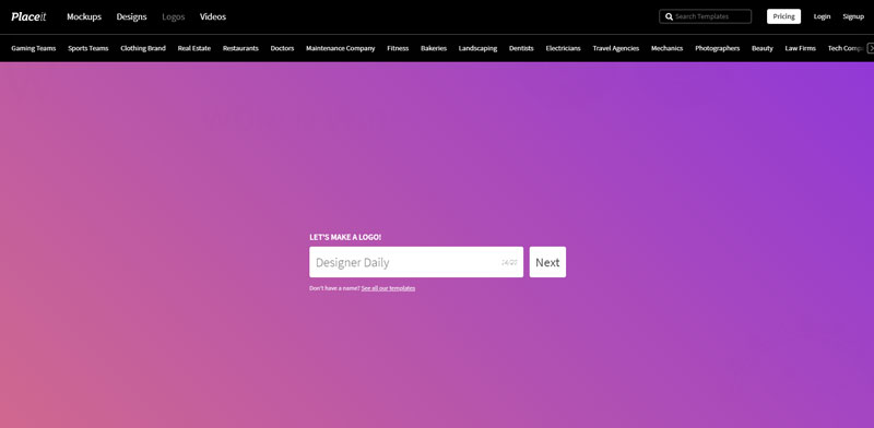
On the web app’s landing page, you will be presented with a minimalist interface that just includes a text field for you to insert your brand’s name to get started.

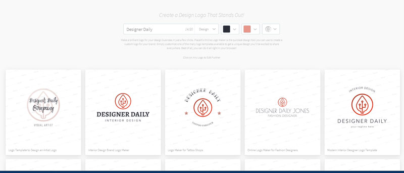
Once you did this, you will get the chance to pick your brand’s industry in order to get logo templates proposals. You can do the first customization by changing the industry for more accurate templates, change colors, or choose a symbol already.

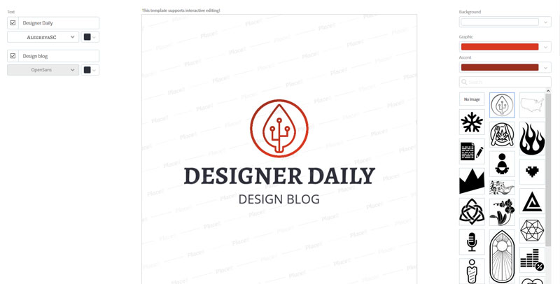
Once you select one of these logos to customize it further, you will have the chance to modify every part of the logo using the logo creator. Every color, font, or size can be changed.

Also, if you don’t have a brand name but already want to find a template for the look-and-feel of your future logo, you can check a selection of templates.

Finally an easy-to-use video intro making tool

Another useful tool for creative people, freelancers, and entrepreneurs is the ability offered by Placeit to create powerful video intros for your videos.

If you use the Internet more than once a month, you already noticed that the video format has exploded as a way to communicate for brands. While publishing online has become fairly easy, designing decent videos is much harder.

Placeit’s video maker is impressive for its user-friendliness. It’s also powerful, and features, among other things, the possibility to create Instagram Stories videos, slideshow videos, video intros, or product demos.

The slideshow maker is worth a mention, as it can be used to promote any product or service and make it more appealing. Let’s say that you are a freelance designer and that you want to interactively display your services or lastest work on your homepage. In this case, creating a slideshow with attractive effects will be the perfect solution.

However, my favorite feature is probably the intro maker, which allows you to create powerful intros for your videos in a matter of minutes. When you think of how hard it was to do this with traditional video editing software, it’s almost a life-saving feature.

Banners should not take long to create

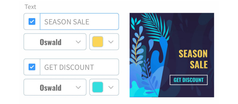
With the banner creator, you can build an attractive image in a ridiculous time. By banners, it doesn’t mean just the old school online advertisements, but all kinds of banners that you will use on your website or on social media.

With Placeit, you can create banners for Twitter, Facebook, or Pinterest very quickly. The images created will look very professional, no matter if you are designing for Youtube thumbnails or flash sales promotional creatives.

Thanks for being a subscriber, here is your FREE house vector icons set.

Placeit: the Logo Maker Tool You’ve Been Looking For

Post pobrano z: Placeit: the Logo Maker Tool You’ve Been Looking For

For quick logo and graphics creation, there is little chance that you will find a better logo design tool than Placeit. Obviously, if you are a branding expert who designed logos all his life, you may be reluctant to work fast and not control every aspect of the logo creation.

However, you should keep an open mind and accept that a long process is not needed for a logo that is just created for a web design mockup or for a small company that doesn’t have a large branding budget. I have redirected several prospects to Placeit already and they have been delighted with the corporate identities they could create for themselves.

Logo creation made simpler

Placeit’s logo maker has the shortest learning curve there could be. It is so simple that you don’t even need to learn anything before you use it.

On the web app’s landing page, you will be presented with a minimalist interface that just includes a text field for you to insert your brand’s name to get started.

Once you did this, you will get the chance to pick your brand’s industry in order to get logo templates proposals. You can do the first customization by changing the industry for more accurate templates, change colors, or choose a symbol already.

Once you select one of these logos to customize it further, you will have the chance to modify every part of the logo using the logo creator. Every color, font, or size can be changed.

Also, if you don’t have a brand name but already want to find a template for the look-and-feel of your future logo, you can check a selection of templates.

Finally an easy-to-use video intro making tool

Another useful tool for creative people, freelancers, and entrepreneurs is the ability offered by Placeit to create powerful video intros for your videos.

If you use the Internet more than once a month, you already noticed that the video format has exploded as a way to communicate for brands. While publishing online has become fairly easy, designing decent videos is much harder.

Placeit’s video maker is impressive for its user-friendliness. It’s also powerful, and features, among other things, the possibility to create Instagram Stories videos, slideshow videos, video intros, or product demos.

The slideshow maker is worth a mention, as it can be used to promote any product or service and make it more appealing. Let’s say that you are a freelance designer and that you want to interactively display your services or lastest work on your homepage. In this case, creating a slideshow with attractive effects will be the perfect solution.

However, my favorite feature is probably the intro maker, which allows you to create powerful intros for your videos in a matter of minutes. When you think of how hard it was to do this with traditional video editing software, it’s almost a life-saving feature.

Banners should not take long to create

With the banner creator, you can build an attractive image in a ridiculous time. By banners, it doesn’t mean just the old school online advertisements, but all kinds of banners that you will use on your website or on social media.

With Placeit, you can create banners for Twitter, Facebook, or Pinterest very quickly. The images created will look very professional, no matter if you are designing for Youtube thumbnails or flash sales promotional creatives.

Thanks for being a subscriber, here is your FREE house vector icons set.

Placeit: the Logo Maker Tool You’ve Been Looking For

Post pobrano z: Placeit: the Logo Maker Tool You’ve Been Looking For

For quick logo and graphics creation, there is little chance that you will find a better logo design tool than Placeit. Obviously, if you are a branding expert who designed logos all his life, you may be reluctant to work fast and not control every aspect of the logo creation.

However, you should keep an open mind and accept that a long process is not needed for a logo that is just created for a web design mockup or for a small company that doesn’t have a large branding budget. I have redirected several prospects to Placeit already and they have been delighted with the corporate identities they could create for themselves.

Logo creation made simpler

Placeit’s logo maker has the shortest learning curve there could be. It is so simple that you don’t even need to learn anything before you use it.

On the web app’s landing page, you will be presented with a minimalist interface that just includes a text field for you to insert your brand’s name to get started.

Once you did this, you will get the chance to pick your brand’s industry in order to get logo templates proposals. You can do the first customization by changing the industry for more accurate templates, change colors, or choose a symbol already.

Once you select one of these logos to customize it further, you will have the chance to modify every part of the logo using the logo creator. Every color, font, or size can be changed.

Also, if you don’t have a brand name but already want to find a template for the look-and-feel of your future logo, you can check a selection of templates.

Finally an easy-to-use video intro making tool

Another useful tool for creative people, freelancers, and entrepreneurs is the ability offered by Placeit to create powerful video intros for your videos.

If you use the Internet more than once a month, you already noticed that the video format has exploded as a way to communicate for brands. While publishing online has become fairly easy, designing decent videos is much harder.

Placeit’s video maker is impressive for its user-friendliness. It’s also powerful, and features, among other things, the possibility to create Instagram Stories videos, slideshow videos, video intros, or product demos.

The slideshow maker is worth a mention, as it can be used to promote any product or service and make it more appealing. Let’s say that you are a freelance designer and that you want to interactively display your services or lastest work on your homepage. In this case, creating a slideshow with attractive effects will be the perfect solution.

However, my favorite feature is probably the intro maker, which allows you to create powerful intros for your videos in a matter of minutes. When you think of how hard it was to do this with traditional video editing software, it’s almost a life-saving feature.

Banners should not take long to create

With the banner creator, you can build an attractive image in a ridiculous time. By banners, it doesn’t mean just the old school online advertisements, but all kinds of banners that you will use on your website or on social media.

With Placeit, you can create banners for Twitter, Facebook, or Pinterest very quickly. The images created will look very professional, no matter if you are designing for Youtube thumbnails or flash sales promotional creatives.

Thanks for being a subscriber, here is your FREE house vector icons set.

Magazines with the best design ideas

Post pobrano z: Magazines with the best design ideas

The design industry has a wealth of information and inspiration available. Fashion, art, photography, graphics, and interior design – all of these disciplines have a huge following and you can easily find online material to get those creative juices flowing. Businesses can look at online websites and magazines for new ideas. Moreover, creative types can also use these resources to help their work and inspire new designs.

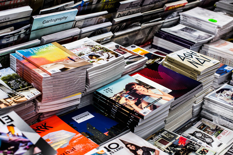
One fantastic type of publication that thrives within this industry is creative magazines. Before we look at the top publications, remember that for any design work containing written content, you can use a plagiarism checker such as this one – https://phdessay.com/online-plagiarism-checker/ to ensure your work is 100% plagiarism-free. Design is generally a hands-on experience. To that end, many creative companies and design agencies still produce physical magazines and publish them to the public. These magazines are packed full of amazing ideas and examples of stunning design work. In this article, we look at the best design magazines and how you can use them without essay plagiarism:

1. Printed Pages

You may have heard of the fantastic company called, “It’s Nice That” – this famous design company is well-known for bringing an awesome array of design-related information. Printed Pages is a magazine created by this company and released every season. Each issue contains a superb summary of current design trends and developments around the world. Moreover, it is, of course, packed full of awesome graphics and artwork. This is certainly one of the groundbreaking top design magazines.

2. Idea

Did you know that this document from Japan has been in publication since the 1950’s? Idea is printed each quarter and has a huge following within the design industry. The current edition is number 382 and features a striking front cover. Idea concentrates on two main subjects – typography and graphic design. Due to this fact, you can expect some epic graphics and host of design ideas for different font styles. The main version is printed in Japanese, but there is translated international versions available too.

3. IDN Magazine

IDN or International Design Community is a document created and printed in Hong Kong – this publication is available internationally, however. As with other popular papers, IDN has a particular theme for each bi-monthly print. The most recent print, for example, was Infographics & user interfaces. This awesome edition contained a myriad of interesting statistics and examples of how businesses are using infographics in creative ways. Generally, IDN concentrates on specialist subjects as opposed to mainstream design. Nonetheless, the contents of each publication are astounding.

4. Eye

Eye is self-titled as the international review of graphic design. This magazine concentrates largely on graphic design and visual culture. It is created in the United Kingdom and printed every quarter (4 times per year). The printing and release of an Eye quarterly magazine is something to behold, you can guarantee that the document has a myriad of beautiful visualizations and artwork. On every page, you can find something new and exciting to look at. There is certainly no need to check essay for plagiarism here.

5. Communication Arts

Communication Arts is another timeless classic that continues to produce bi-monthly publications jam-packed with awesome content. This magazine has been running since 1960. For each edition, a particular theme is chosen. Past themes include illustration, typography, interactive, and Advertising. The July/August edition, for example, was based on photography – the magazine contained some wonderful photographs and tips. Aside from the printed version, there is also a fantastic website complete with a PDF version of the publications.  

 6. Juxtapoz

Juxtapoz (A play on the word juxtaposition) is a long-standing magazine that has been in publication for many years. This paper is printed in San Francisco, California and contains a myriad of awesome articles about different creative arts. Juxtapoz is one of the most popular magazines in the United States and features some stunning articles and artwork. Subjects the paper covers include graphic design, painting, music, and even street art. The company behind Juxtapoz also print semi-regular themed creative books too.

7. Wallpaper

Wallpaper is another staple within the United States design circles. This publication has been released every month for many years – it continues to remain popular and contains a wealth of fantastic information. Wallpaper emphasizes interior design and architecture. The publication does contain elements of fashion, travel, jewelry, and graphic design too. Subscribers are privy to fantastic and stylish artwork for the publication front cover, whereas a generic cover is present for copies brought from newsstands.

8. Frame

Frame is a long-standing paper that has been printed since 1997. This document concentrates on interior design. Its ethos is that people should be privy to meaningful spaces that they can enjoy. Within the pages of this print, you can expect a wave of positive ideas for our interiors. Any creative type can benefit from Frame, but interior designers, in particular, will truly appreciate the content.

We hope you have found this creative magazine article useful. Inspiration is easy to come by if you know where to look! Searching through the top design magazines such as the ones listed can be a great source of ideas. You can look at the different styles, photos, and creations listed and use them for your work. Of course, you must check plagiarism and avoid this at all costs – your designs must always be original! 

Thanks for being a subscriber, here is your FREE house vector icons set.

Magazines with the best design ideas

Post pobrano z: Magazines with the best design ideas

The design industry has a wealth of information and inspiration available. Fashion, art, photography, graphics, and interior design – all of these disciplines have a huge following and you can easily find online material to get those creative juices flowing. Businesses can look at online websites and magazines for new ideas. Moreover, creative types can also use these resources to help their work and inspire new designs.

One fantastic type of publication that thrives within this industry is creative magazines. Before we look at the top publications, remember that for any design work containing written content, you can use a plagiarism checker such as this one – https://phdessay.com/online-plagiarism-checker/ to ensure your work is 100% plagiarism-free. Design is generally a hands-on experience. To that end, many creative companies and design agencies still produce physical magazines and publish them to the public. These magazines are packed full of amazing ideas and examples of stunning design work. In this article, we look at the best design magazines and how you can use them without essay plagiarism:

1. Printed Pages

You may have heard of the fantastic company called, “It’s Nice That” – this famous design company is well-known for bringing an awesome array of design-related information. Printed Pages is a magazine created by this company and released every season. Each issue contains a superb summary of current design trends and developments around the world. Moreover, it is, of course, packed full of awesome graphics and artwork. This is certainly one of the groundbreaking top design magazines.

2. Idea

Did you know that this document from Japan has been in publication since the 1950’s? Idea is printed each quarter and has a huge following within the design industry. The current edition is number 382 and features a striking front cover. Idea concentrates on two main subjects – typography and graphic design. Due to this fact, you can expect some epic graphics and host of design ideas for different font styles. The main version is printed in Japanese, but there is translated international versions available too.

3. IDN Magazine

IDN or International Design Community is a document created and printed in Hong Kong – this publication is available internationally, however. As with other popular papers, IDN has a particular theme for each bi-monthly print. The most recent print, for example, was Infographics & user interfaces. This awesome edition contained a myriad of interesting statistics and examples of how businesses are using infographics in creative ways. Generally, IDN concentrates on specialist subjects as opposed to mainstream design. Nonetheless, the contents of each publication are astounding.

4. Eye

Eye is self-titled as the international review of graphic design. This magazine concentrates largely on graphic design and visual culture. It is created in the United Kingdom and printed every quarter (4 times per year). The printing and release of an Eye quarterly magazine is something to behold, you can guarantee that the document has a myriad of beautiful visualizations and artwork. On every page, you can find something new and exciting to look at. There is certainly no need to check essay for plagiarism here.

5. Communication Arts

Communication Arts is another timeless classic that continues to produce bi-monthly publications jam-packed with awesome content. This magazine has been running since 1960. For each edition, a particular theme is chosen. Past themes include illustration, typography, interactive, and Advertising. The July/August edition, for example, was based on photography – the magazine contained some wonderful photographs and tips. Aside from the printed version, there is also a fantastic website complete with a PDF version of the publications.  

 6. Juxtapoz

Juxtapoz (A play on the word juxtaposition) is a long-standing magazine that has been in publication for many years. This paper is printed in San Francisco, California and contains a myriad of awesome articles about different creative arts. Juxtapoz is one of the most popular magazines in the United States and features some stunning articles and artwork. Subjects the paper covers include graphic design, painting, music, and even street art. The company behind Juxtapoz also print semi-regular themed creative books too.

7. Wallpaper

Wallpaper is another staple within the United States design circles. This publication has been released every month for many years – it continues to remain popular and contains a wealth of fantastic information. Wallpaper emphasizes interior design and architecture. The publication does contain elements of fashion, travel, jewelry, and graphic design too. Subscribers are privy to fantastic and stylish artwork for the publication front cover, whereas a generic cover is present for copies brought from newsstands.

8. Frame

Frame is a long-standing paper that has been printed since 1997. This document concentrates on interior design. Its ethos is that people should be privy to meaningful spaces that they can enjoy. Within the pages of this print, you can expect a wave of positive ideas for our interiors. Any creative type can benefit from Frame, but interior designers, in particular, will truly appreciate the content.

We hope you have found this creative magazine article useful. Inspiration is easy to come by if you know where to look! Searching through the top design magazines such as the ones listed can be a great source of ideas. You can look at the different styles, photos, and creations listed and use them for your work. Of course, you must check plagiarism and avoid this at all costs – your designs must always be original! 

Thanks for being a subscriber, here is your FREE house vector icons set.

Weekly Platform News: CSS ::marker pseudo-element, pre-rendering web components, adding Webmention to your site

Post pobrano z: Weekly Platform News: CSS ::marker pseudo-element, pre-rendering web components, adding Webmention to your site

Šime posts regular content for web developers on webplatform.news.

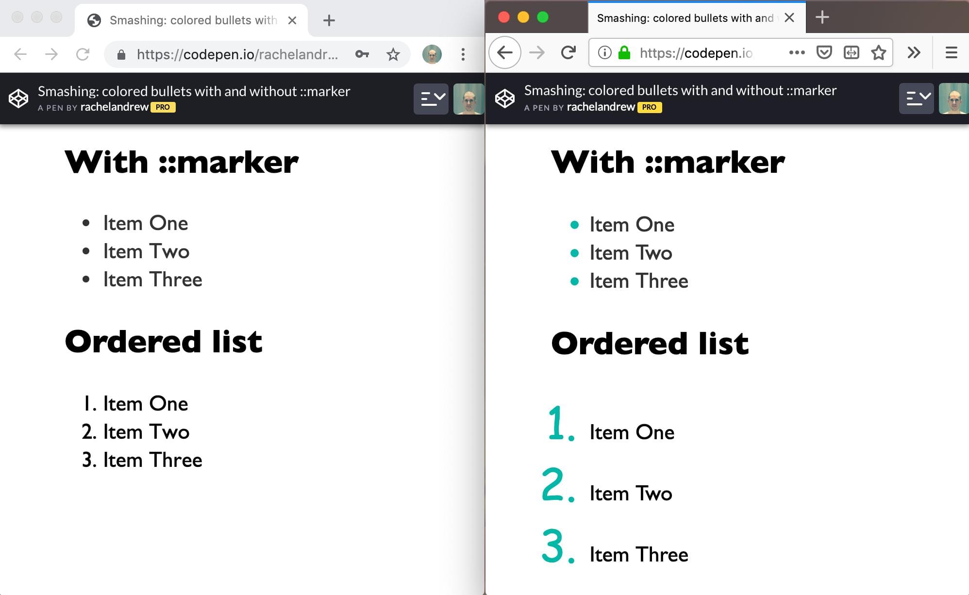
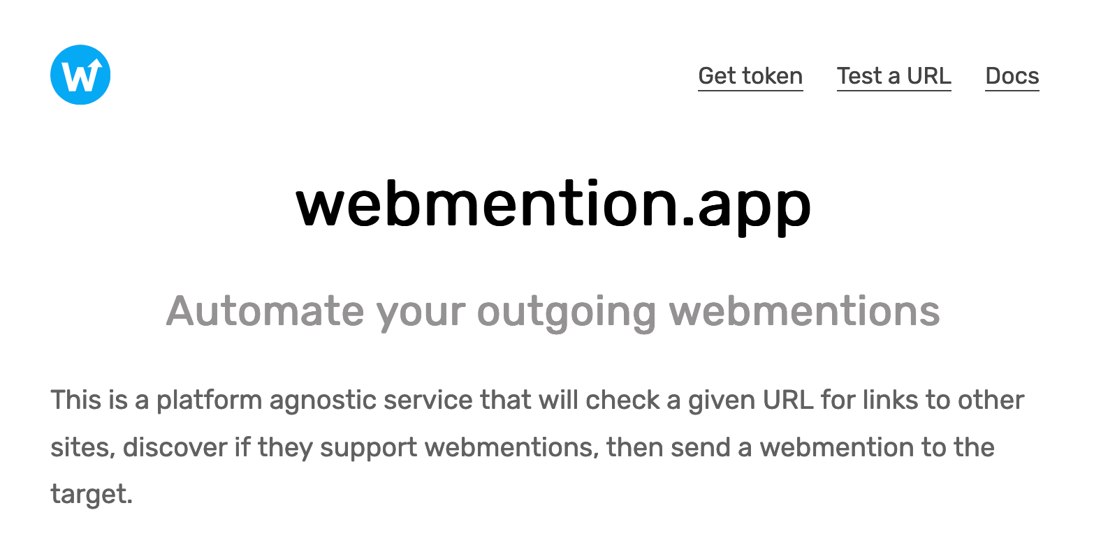
In this week’s roundup: datepickers are giving keyboard users headaches, a new web component compiler that helps fight FOUC, we finally get our hands on styling list item markers, and four steps to getting webmentions on your site.

Using plain text fields for date input

Keyboard users prefer regular text fields over complex date pickers, and voice users are frustrated by the native control (<input type="date">).

Previously, I have relied on plain text inputs as date fields with custom validation for the site, typically using the same logic on the client and the server. For known dates — birthdays, holidays, anniversaries, etc. — it has tested well.

(via Adrian Roselli)

Pre-rendering web components

Stencil is a “web component compiler” that can be used to pre-render web components (including Shadow DOM) or hide them until they are fully styled to avoid the flash of unstyled content (FOUC).

This tool also makes sure that polyfills are only loaded when needed, and its Component API includes useful decorators and hooks that make writing web components easier (e.g., the Prop decorator handles changes to attributes).

import { Component, Prop, h } from "@stencil/core";

@Component({
  tag: "my-component"
})
export class MyComponent {
  @Prop() age: number = 0;

  render() {
    return <div>I am {this.age} years old</div>;
  }
}

(via Max Lynch)

The CSS ::marker pseudo-element

When the CSS display: list-item declaration is applied to an element, the element generates a marker box containing a marker, e.g., a list bullet (the <li> and <summary> elements have markers by default).

Markers can be styled via the ::marker pseudo-element (useful for changing the color or font of the marker), but this CSS feature is currently only supported in Firefox.

(via Rachel Andrew)

Adding Webmention to your website

  1. Sign up on Webmention.io; this is a service that collects webmentions on your behalf.
  2. Add <link rel="webmention"> (with the appropriate href value) to your web pages.

    There are also Webmention plugins available for all major content management systems (CMS) if you prefer building on top of your CMS.

  3. Fetch webmentions from Webmention.io (via Ajax) to display them on your page.
  4. Use webmention.app to automate sending webmentions (when you publish content that includes links to other sites that support Webmention).

(via Daniel Aleksandersen)

The post Weekly Platform News: CSS ::marker pseudo-element, pre-rendering web components, adding Webmention to your site appeared first on CSS-Tricks.

How to Create a Burger Menu Template in Photoshop

Post pobrano z: How to Create a Burger Menu Template in Photoshop

Final product image
What You’ll Be Creating

This
tutorial shows you how to create a modern-looking burger menu template with Photoshop.
The main purpose of this tutorial is to teach you how to set up a document
ready for print, how to crop an image’s background, how to place graphics and
images into Photoshop, and how to create layers and layer groups.

The menu template we will be creating is a part of Burger Menu Template. If
you want to skip the tutorial and just use this template for your own projects, purchase the Burger Menu Template from GraphicRiver!

original burguer menu template

Let’s
begin!

Tutorial Assets

The
following assets were used during this Photoshop menu template tutorial:

1. How to Set Up a New Document

Step 1

Start
Photoshop and create a new document from the menu: File > New > Document. Set the file to the following
dimensions:

  • Width to 42 cm
  • Height to 29.7 cm
  • Resolution to 300 dpi
  • Color Mode to CMYK
  • Click Create
document set up

Step 2

For the guides, if
you can’t see the rulers, you need to make them visible by pressing Control-R. Now, with your
mouse, drag and drop the first guide down from the top.

using guides in photoshop

Step 3

Do the same for
the bottom. From the left, drag and drop the first guide and place it on the
left side of the menu template, and add another one on the right side. Your menu design should
look like this:

using guides in photoshop

Step 4

Let’s add our bleed marks, which allow us to set up our menu design ready for printing. Go
to Image > Canvas Size. In the
pop-up window, input the following dimensions:

  • Width to 42.6 cm
  • Height to 30.3 cm
  • Click OK
bleeds marks set up document ready for print

Step 5

Since
it’s a bi-fold brochure, we need to add also a guide in the center of the menu layout template.

menu layout template center guide

2. How to Place the Background

For the background,
start by placing our Blackboard Backgound.psd file. Go to File > Place Linked and choose the Blackboard file for the background. 

blackboard background image

While we’re
at it, we might as well just go to the Layers panel and click on the Create a new group button or simply
press Control-G. Double click the
Group 1 text and rename the folder „Background”, and this will be our first layer group created.

create new group layer for the background

3. How to Create the Front and Back Pages

Step 1

Go to Layers and Create a new group, and this time call it Side 1. Create another group, renaming it Right Side. Add two more groups, called Your Logo Here and Graphics.
Select both groups, press and hold the Shift
key, and drag them to the Right Side layer.

create new group layers right side

Step 2

Go to File > Place linked and place the Logo.png file in the center of the menu layout template. 

burguer menu template logo

Step 3

Click the Logo layer and move it to the layers folder called Your Logo Here.

Step 4

For the Graphics layer folder we’ve created, we’ll add some images. Head over
to File > Open. I have this image, but I need to remove the background.

Envato elements picture

For that, we will use the Quick Selection Tool (W) and select only the burger images. 

quick selection tool for background remove

After we finish the selection, just click Select > Modify > Contract and contract by 1 px.

select modify and contract images

Finally, Add Layer mask at the bottom of the Layers. The
background has been removed.

layer mask to remove background

Step 5

Now, Control-C on the image layer, go back to our menu template, and paste it with Control-V. Place it in the bottom right
corner. Finally, drag it to the Graphics
layer folder, rename the layer Burger, and create a group with the same name.

Step 6  

Resize the image by pressing Control-T. Then, go to Edit > Transform > Rotate.
With your mouse, grab the image by the top-right corner and give it a slight
rotation to the left.

resize and rotate image

Step 7

Add
some shadow to the image by Right Clicking and choosing Blending Options > Drop
Shadow
. Just insert the following values:

  • Blend ModeMultiply
  • Opacity75%
  • Angle: 90 degrees
  • Distance83 px
  • Size73 px
layer style add drop shadow

Go to Image > Adjustments
> Brightness/Contrast and change the Brightness to -15 and the Contrast to +15. Hit OK.

Step 8

Follow the same process with the other burger image, and this time we’ll place it in the
top-left corner of our menu design. Go to Image > Adjustments > Brightness/Contrast and change the Brightness to -15 and
the Contrast to +15. Hit OK.

image adjustments brightness contrast

Step 9

Finally, let’s add three more
images, a Tomato and two Leaves. Drag them to the layers panel,
from the Graphics.psd file.

organize layers panel

And the front page of our Photoshop menu template will look
like this:

front page layout

Step 10

Select the Text Tool (T) from the Toolbar and choose the Bebas Neue font. Select White as the foreground Color from the Toolbar Menu and use the
following style for the Title Burger Layer:

  • Font Family: Bebas Neue
  • Font Style: Bold
  • Size: 48 pt
  • Leading: Auto
  • Tracking: 60

Tip: Go to Window and
select Character from the drop-down
menu to help you out with these settings.

select the text tool and choose Bebas Neue font

Step 11

Again, with the Text Tool (T) selected and the font Wicked
Grit
, for the Subheader title
and the Price on the right, use
these settings:

  • Font Family: Wicked Grit
  • Font Style: Regular
  • Size: 20 pt
  • Leading: Auto
  • Tracking: 0
sub header title text Wicked Grit font

Step 12

For the Main Text, with the Text Tool (T) selected and Averia Sans font, use these settings:

  • Font Family: Averia Sans
  • Font Style: Light Italic
  • Size: 12 pt
  • Leading: 11 pt
  • Tracking: 60
main text averia sans font

Our menu template should look something like
the image below:

burguers layer

Step 13

Group the Title Burger Layer, Subheader title, Price and Main Text with 1. Then Copy the group (Control-C) > Paste (Control-V) seven times and rename each one of them (1, 2, 3, 4, 5, 6, 7, and 8). The  Layers panel will be
organized like the image below.

layers panel organized

And here’s the menu template final result:

menu layout template design

Step 14

With the Burgers layer group selected, Copy (Control-C) > Paste
(
Control-V), and rename it Hotdogs. Change
the name with the Text Tool (T)
selected. For the Hotdogs layer, we need only three copies,
so delete group 4 to group 8. Select the text layers, and make the changes with
the Text Tool (T) selected, like the
image below:

hot dogs layer group

Step 15

Again, with the Burgers layer group selected, Copy (Control-C) > Paste
(
Control-V), and rename it Salads. We
need four copies for the text layers, so delete group 5 to group 8. Select the
text layers and make the changes, like the image below:

salads layers group

Step 16

For the final group of our Photoshop template, you can
select the layer group Hotdogs and Copy (Control-C) > Paste (Control-V), renaming it Drinks. Select the text layers and
make the changes, like the image below:

drinks layers group

This is the final result of
our menu template:

final result menu template

4. How to Add Graphics and Images

Step 1

Start by opening the Brush.psd file.

Step 2

Make four copies (Control-C) > Paste (Control-V) and place them behind the Main titles, as shown below.

Note: Create a new layer group and call it Graphics. Drag the Brush layers to this layer group.

insert brush and create layer group

Step 3

Open the Graphics.psd file and place the following images:

  • 1 Ice Cubes
  • 1 Coke
  • 3 Arrows
  • 1 Line

You can download the Hotdog image from Unsplash. Arrange all the placed elements in our menu template as
follows:

arrange the placed elements

Step 4

To finish Side 1 of our template, select the Text Tool (T), pick the Caveat font, and type Coke, using the following style for the
text:

  • Font Family: Caveat
  • Font Style: Bold
  • Size: 130 pt
  • Leading: Auto
  • Tracking: 0
pick Caveat font and type Coke

Place it
like the image below:

place the text

Step 5

Use the same font for the $2 price text. For this one, pick the red color. Head over to the Character menu, click on Color, and open the Color Picker window. Use the color
code #b00f23 and click OK.

  • Font Family: Caveat
  • Font Style: Bold
  • Size: 72 pt
  • Leading: Auto
  • Tracking: 0
use color picker to color the text

Place it right below the Coke text, like this:

place the text below the Coke text

Step 6

Select the Text
Tool (T),
pick the Rhesmanisa font, and type, „Try it!” 

Use the following style for the
text:

  • Font Family: Rhesmanisa
  • Font Style: Regular
  • Size: 48 pt
  • Leading: Auto
  • Tracking: 0
select the text tool and pick rhesmanisa font

Step 7

Now, grab the line graphic
you’ve placed before into the menu template, drag it, and place it in the
middle of the left page.

place the line graphic in the middle of the left page

5. How to Make the Inside Left and Right Pages

Step 1

Let’s jump to Side 2 of our Photoshop menu template. Begin by creating a new group layer by pressing Control-G. Call it Side 2.

Step 2

Inside this new layer, hit Control-G and Create a
Layer Group
called Menu. Add
another one and rename it Graphics.

create a layer group

Step 3

Copy the text
elements from Side 1. Click Control-C on the Burgers layer group to
copy, and click the Eye icon on the
Layers panel to hide the Side 1 layer.

use eye icon to hide layer group

And then Control-V to paste it on the left inside
page at the top.

Step 4

Do the same for the
other text elements (Salads and Soups). Our menu layout template should look like
this:

add text elements to salads and soups

Step 5

For the inside right page, you must add the following text group elements:

  • Sandwiches
  • Coffee
  • Desserts
  • Drinks

 Our menu design should look like this:

place text elements inside the right page

Step 6

Organize these new
elements on the Layers panel like this:

organize elements in the layers panel

Step 7

We are almost done.
Finally, let’s add our graphic elements. Hide the Side 2 Layer by pressing the Eye
icon and copy (Control-C) the Graphics layer group.
Hide the Side 1 layer and make Side
2
 visible again with the Eye icon
button. Control-V the Graphics group layer.

add graphics group layer

Step 8

Click File > Place Linked and import the Salad
Image
.

Note: You must remove the image’s background first with
the same method we used for the previous ones.

Control-T to resize it and hit Enter.
Double-click
on the layer to open the Blending Options menu, and add a Drop Shadow with the following
settings:

  • Blend ModeMultiply
  • Opacity75%
  • Angle: 90 degrees
  • Distance83 px
  • Size73 px

Step 9

Click File > Place Linked and import the Hamburger
Image
. After removing the background, Control-T to resize it and hit Enter.
Double-click
on the layer to open the Blending
Options
menu, and add a Drop Shadow with the following
settings:

  • Blend ModeMultiply
  • Opacity75%
  • Angle: 90 degrees
  • Distance83 px
  • Size73 px

Step 10

Click File > Place Linked and import the Sandwich
Image
. Do the same here as before. Control-T to resize it and hit Enter.
Double-click
on the layer to open the Blending
Options
menu, and add a Drop Shadow with the following
settings:

  • Blend ModeMultiply
  • Opacity75%
  • Angle: 90 degrees
  • Distance83 px
  • Size73 px

The image below shows us the arrangement of the elements
on our Photoshop menu template.

place images

Step 11

Back to the Graphics.psd file, copy (Control-C) the layer called Leaf. Go back
to the menu template, Control-V, and
place it next to the Salad image. Grab another Leaf, and place it on the right side of
our menu design, next to the Sandwich image.

Step 12

From the Graphics.psd file, copy the following layers:

  • 1 Beer Glass
  • 1 Barbecue-Sauce
  • 3 arrows
  • 1 Line

Go back to the menu templateControl-V, and arrange them like this:

menu template elements disposition

Step 13

And to finish Side 2, go to Side 1 again and copy (Control-C) the Coke layer—for this one, we need to
change the text to Beer with the Text Tool (T). Add $2 and Try
it!
text layers, and arrange them like this:

add text layers

6. How to Export a Template for Printing

Step 1

You can print a
file from Photoshop by going to File > Print. Click Print

print a file from photoshop

Step 2

You can also export
a file as a PDF for online distributing or printing. Head over to File > Save As. In the Save
As
 option window, name the document Burger Menu Template or Photoshop Menu Template as you wish. Set the
format to Photoshop PDF and
click Save.

save as file

Great Job! You’ve Finished Your Photoshop Burger Menu Template!

In this tutorial,
you learned how to make a burger menu template in Photoshop. Here is what you
have learned how to do:

  • Set up a ready-to-print Photoshop file.
  • Add column guides and Bleeds to the menu design.
  • Use the Text Tool.
  • Organize your work into layer groups.
  • Crop and edit images.
  • Export a PDF file.
outside menu photoshop template
inside menu photoshop template

If you’re looking
for more Photoshop menu templates or menu design ideas, you can find easy-to-edit
professional styles on GraphicRiver and Envato Elements. If you want this Photoshop menu template that we’ve just created,
then grab it from GraphicRiver.

original burguer menu template

If you have any
comments or any doubts, feel free to use the comments section below! I’ll be
glad to help you all!

Looking for more? I recommend the following tutorials:

How to Create a Burger Menu Template in Photoshop

Post pobrano z: How to Create a Burger Menu Template in Photoshop

Final product image
What You’ll Be Creating

This
tutorial shows you how to create a modern-looking burger menu template with Photoshop.
The main purpose of this tutorial is to teach you how to set up a document
ready for print, how to crop an image’s background, how to place graphics and
images into Photoshop, and how to create layers and layer groups.

The menu template we will be creating is a part of Burger Menu Template. If
you want to skip the tutorial and just use this template for your own projects, purchase the Burger Menu Template from GraphicRiver!

original burguer menu template

Let’s
begin!

Tutorial Assets

The
following assets were used during this Photoshop menu template tutorial:

1. How to Set Up a New Document

Step 1

Start
Photoshop and create a new document from the menu: File > New > Document. Set the file to the following
dimensions:

  • Width to 42 cm
  • Height to 29.7 cm
  • Resolution to 300 dpi
  • Color Mode to CMYK
  • Click Create
document set up

Step 2

For the guides, if
you can’t see the rulers, you need to make them visible by pressing Control-R. Now, with your
mouse, drag and drop the first guide down from the top.

using guides in photoshop

Step 3

Do the same for
the bottom. From the left, drag and drop the first guide and place it on the
left side of the menu template, and add another one on the right side. Your menu design should
look like this:

using guides in photoshop

Step 4

Let’s add our bleed marks, which allow us to set up our menu design ready for printing. Go
to Image > Canvas Size. In the
pop-up window, input the following dimensions:

  • Width to 42.6 cm
  • Height to 30.3 cm
  • Click OK
bleeds marks set up document ready for print

Step 5

Since
it’s a bi-fold brochure, we need to add also a guide in the center of the menu layout template.

menu layout template center guide

2. How to Place the Background

For the background,
start by placing our Blackboard Backgound.psd file. Go to File > Place Linked and choose the Blackboard file for the background. 

blackboard background image

While we’re
at it, we might as well just go to the Layers panel and click on the Create a new group button or simply
press Control-G. Double click the
Group 1 text and rename the folder „Background”, and this will be our first layer group created.

create new group layer for the background

3. How to Create the Front and Back Pages

Step 1

Go to Layers and Create a new group, and this time call it Side 1. Create another group, renaming it Right Side. Add two more groups, called Your Logo Here and Graphics.
Select both groups, press and hold the Shift
key, and drag them to the Right Side layer.

create new group layers right side

Step 2

Go to File > Place linked and place the Logo.png file in the center of the menu layout template. 

burguer menu template logo

Step 3

Click the Logo layer and move it to the layers folder called Your Logo Here.

Step 4

For the Graphics layer folder we’ve created, we’ll add some images. Head over
to File > Open. I have this image, but I need to remove the background.

Envato elements picture

For that, we will use the Quick Selection Tool (W) and select only the burger images. 

quick selection tool for background remove

After we finish the selection, just click Select > Modify > Contract and contract by 1 px.

select modify and contract images

Finally, Add Layer mask at the bottom of the Layers. The
background has been removed.

layer mask to remove background

Step 5

Now, Control-C on the image layer, go back to our menu template, and paste it with Control-V. Place it in the bottom right
corner. Finally, drag it to the Graphics
layer folder, rename the layer Burger, and create a group with the same name.

Step 6  

Resize the image by pressing Control-T. Then, go to Edit > Transform > Rotate.
With your mouse, grab the image by the top-right corner and give it a slight
rotation to the left.

resize and rotate image

Step 7

Add
some shadow to the image by Right Clicking and choosing Blending Options > Drop
Shadow
. Just insert the following values:

  • Blend ModeMultiply
  • Opacity75%
  • Angle: 90 degrees
  • Distance83 px
  • Size73 px
layer style add drop shadow

Go to Image > Adjustments
> Brightness/Contrast and change the Brightness to -15 and the Contrast to +15. Hit OK.

Step 8

Follow the same process with the other burger image, and this time we’ll place it in the
top-left corner of our menu design. Go to Image > Adjustments > Brightness/Contrast and change the Brightness to -15 and
the Contrast to +15. Hit OK.

image adjustments brightness contrast

Step 9

Finally, let’s add three more
images, a Tomato and two Leaves. Drag them to the layers panel,
from the Graphics.psd file.

organize layers panel

And the front page of our Photoshop menu template will look
like this:

front page layout

Step 10

Select the Text Tool (T) from the Toolbar and choose the Bebas Neue font. Select White as the foreground Color from the Toolbar Menu and use the
following style for the Title Burger Layer:

  • Font Family: Bebas Neue
  • Font Style: Bold
  • Size: 48 pt
  • Leading: Auto
  • Tracking: 60

Tip: Go to Window and
select Character from the drop-down
menu to help you out with these settings.

select the text tool and choose Bebas Neue font

Step 11

Again, with the Text Tool (T) selected and the font Wicked
Grit
, for the Subheader title
and the Price on the right, use
these settings:

  • Font Family: Wicked Grit
  • Font Style: Regular
  • Size: 20 pt
  • Leading: Auto
  • Tracking: 0
sub header title text Wicked Grit font

Step 12

For the Main Text, with the Text Tool (T) selected and Averia Sans font, use these settings:

  • Font Family: Averia Sans
  • Font Style: Light Italic
  • Size: 12 pt
  • Leading: 11 pt
  • Tracking: 60
main text averia sans font

Our menu template should look something like
the image below:

burguers layer

Step 13

Group the Title Burger Layer, Subheader title, Price and Main Text with 1. Then Copy the group (Control-C) > Paste (Control-V) seven times and rename each one of them (1, 2, 3, 4, 5, 6, 7, and 8). The  Layers panel will be
organized like the image below.

layers panel organized

And here’s the menu template final result:

menu layout template design

Step 14

With the Burgers layer group selected, Copy (Control-C) > Paste
(
Control-V), and rename it Hotdogs. Change
the name with the Text Tool (T)
selected. For the Hotdogs layer, we need only three copies,
so delete group 4 to group 8. Select the text layers, and make the changes with
the Text Tool (T) selected, like the
image below:

hot dogs layer group

Step 15

Again, with the Burgers layer group selected, Copy (Control-C) > Paste
(
Control-V), and rename it Salads. We
need four copies for the text layers, so delete group 5 to group 8. Select the
text layers and make the changes, like the image below:

salads layers group

Step 16

For the final group of our Photoshop template, you can
select the layer group Hotdogs and Copy (Control-C) > Paste (Control-V), renaming it Drinks. Select the text layers and
make the changes, like the image below:

drinks layers group

This is the final result of
our menu template:

final result menu template

4. How to Add Graphics and Images

Step 1

Start by opening the Brush.psd file.

Step 2

Make four copies (Control-C) > Paste (Control-V) and place them behind the Main titles, as shown below.

Note: Create a new layer group and call it Graphics. Drag the Brush layers to this layer group.

insert brush and create layer group

Step 3

Open the Graphics.psd file and place the following images:

  • 1 Ice Cubes
  • 1 Coke
  • 3 Arrows
  • 1 Line

You can download the Hotdog image from Unsplash. Arrange all the placed elements in our menu template as
follows:

arrange the placed elements

Step 4

To finish Side 1 of our template, select the Text Tool (T), pick the Caveat font, and type Coke, using the following style for the
text:

  • Font Family: Caveat
  • Font Style: Bold
  • Size: 130 pt
  • Leading: Auto
  • Tracking: 0
pick Caveat font and type Coke

Place it
like the image below:

place the text

Step 5

Use the same font for the $2 price text. For this one, pick the red color. Head over to the Character menu, click on Color, and open the Color Picker window. Use the color
code #b00f23 and click OK.

  • Font Family: Caveat
  • Font Style: Bold
  • Size: 72 pt
  • Leading: Auto
  • Tracking: 0
use color picker to color the text

Place it right below the Coke text, like this:

place the text below the Coke text

Step 6

Select the Text
Tool (T),
pick the Rhesmanisa font, and type, „Try it!” 

Use the following style for the
text:

  • Font Family: Rhesmanisa
  • Font Style: Regular
  • Size: 48 pt
  • Leading: Auto
  • Tracking: 0
select the text tool and pick rhesmanisa font

Step 7

Now, grab the line graphic
you’ve placed before into the menu template, drag it, and place it in the
middle of the left page.

place the line graphic in the middle of the left page

5. How to Make the Inside Left and Right Pages

Step 1

Let’s jump to Side 2 of our Photoshop menu template. Begin by creating a new group layer by pressing Control-G. Call it Side 2.

Step 2

Inside this new layer, hit Control-G and Create a
Layer Group
called Menu. Add
another one and rename it Graphics.

create a layer group

Step 3

Copy the text
elements from Side 1. Click Control-C on the Burgers layer group to
copy, and click the Eye icon on the
Layers panel to hide the Side 1 layer.

use eye icon to hide layer group

And then Control-V to paste it on the left inside
page at the top.

Step 4

Do the same for the
other text elements (Salads and Soups). Our menu layout template should look like
this:

add text elements to salads and soups

Step 5

For the inside right page, you must add the following text group elements:

  • Sandwiches
  • Coffee
  • Desserts
  • Drinks

 Our menu design should look like this:

place text elements inside the right page

Step 6

Organize these new
elements on the Layers panel like this:

organize elements in the layers panel

Step 7

We are almost done.
Finally, let’s add our graphic elements. Hide the Side 2 Layer by pressing the Eye
icon and copy (Control-C) the Graphics layer group.
Hide the Side 1 layer and make Side
2
 visible again with the Eye icon
button. Control-V the Graphics group layer.

add graphics group layer

Step 8

Click File > Place Linked and import the Salad
Image
.

Note: You must remove the image’s background first with
the same method we used for the previous ones.

Control-T to resize it and hit Enter.
Double-click
on the layer to open the Blending Options menu, and add a Drop Shadow with the following
settings:

  • Blend ModeMultiply
  • Opacity75%
  • Angle: 90 degrees
  • Distance83 px
  • Size73 px

Step 9

Click File > Place Linked and import the Hamburger
Image
. After removing the background, Control-T to resize it and hit Enter.
Double-click
on the layer to open the Blending
Options
menu, and add a Drop Shadow with the following
settings:

  • Blend ModeMultiply
  • Opacity75%
  • Angle: 90 degrees
  • Distance83 px
  • Size73 px

Step 10

Click File > Place Linked and import the Sandwich
Image
. Do the same here as before. Control-T to resize it and hit Enter.
Double-click
on the layer to open the Blending
Options
menu, and add a Drop Shadow with the following
settings:

  • Blend ModeMultiply
  • Opacity75%
  • Angle: 90 degrees
  • Distance83 px
  • Size73 px

The image below shows us the arrangement of the elements
on our Photoshop menu template.

place images

Step 11

Back to the Graphics.psd file, copy (Control-C) the layer called Leaf. Go back
to the menu template, Control-V, and
place it next to the Salad image. Grab another Leaf, and place it on the right side of
our menu design, next to the Sandwich image.

Step 12

From the Graphics.psd file, copy the following layers:

  • 1 Beer Glass
  • 1 Barbecue-Sauce
  • 3 arrows
  • 1 Line

Go back to the menu templateControl-V, and arrange them like this:

menu template elements disposition

Step 13

And to finish Side 2, go to Side 1 again and copy (Control-C) the Coke layer—for this one, we need to
change the text to Beer with the Text Tool (T). Add $2 and Try
it!
text layers, and arrange them like this:

add text layers

6. How to Export a Template for Printing

Step 1

You can print a
file from Photoshop by going to File > Print. Click Print

print a file from photoshop

Step 2

You can also export
a file as a PDF for online distributing or printing. Head over to File > Save As. In the Save
As
 option window, name the document Burger Menu Template or Photoshop Menu Template as you wish. Set the
format to Photoshop PDF and
click Save.

save as file

Great Job! You’ve Finished Your Photoshop Burger Menu Template!

In this tutorial,
you learned how to make a burger menu template in Photoshop. Here is what you
have learned how to do:

  • Set up a ready-to-print Photoshop file.
  • Add column guides and Bleeds to the menu design.
  • Use the Text Tool.
  • Organize your work into layer groups.
  • Crop and edit images.
  • Export a PDF file.
outside menu photoshop template
inside menu photoshop template

If you’re looking
for more Photoshop menu templates or menu design ideas, you can find easy-to-edit
professional styles on GraphicRiver and Envato Elements. If you want this Photoshop menu template that we’ve just created,
then grab it from GraphicRiver.

original burguer menu template

If you have any
comments or any doubts, feel free to use the comments section below! I’ll be
glad to help you all!

Looking for more? I recommend the following tutorials: