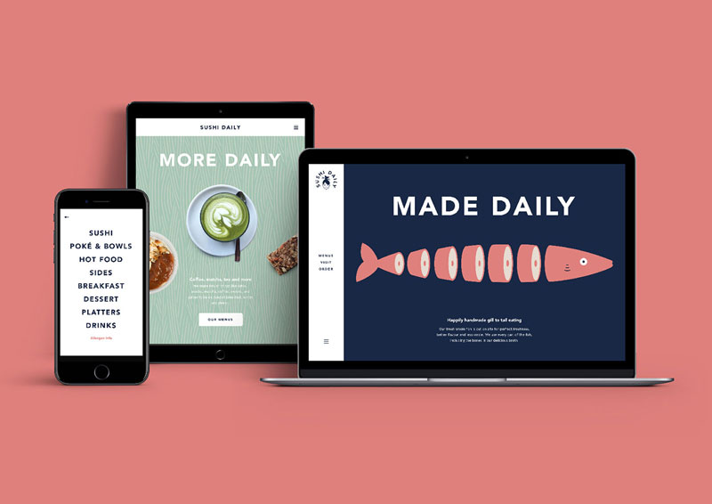
When choosing Without for its branding, Sushi Daily made an excellent decision. The London-based design studio did a great job with the branding, using simple illustrations and typography to create a friendly logo that can easily be declined in many variations.
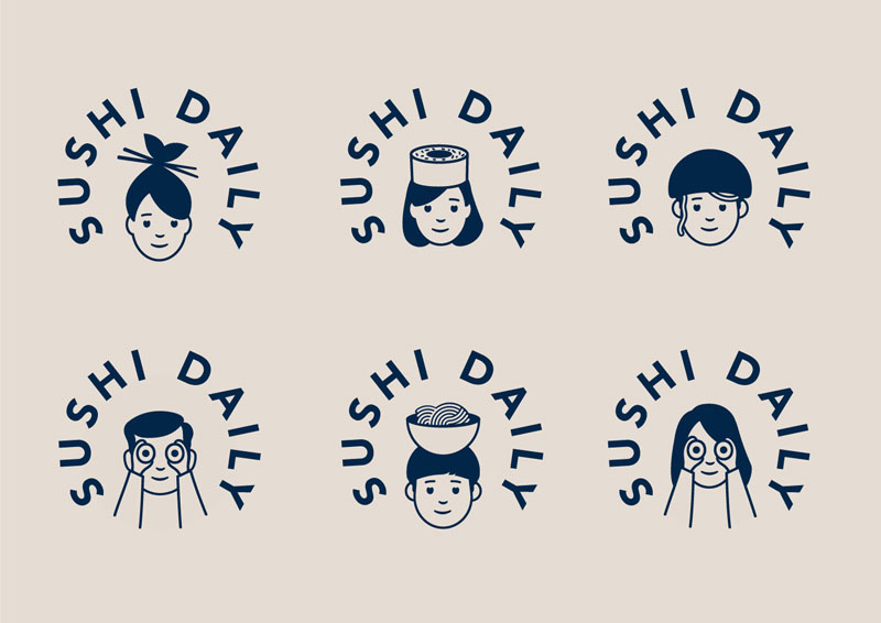
The basic logo is very subtle, the hair of the woman illustrated look like a fish with its mouth wide open, while the sticks in the hair look just like chopsticks. The brand being European, it was important to give it a Japanese touch while still making it attractive for European customers, which is the case in my opinion.
The “core” logo
Below: some illustrations that go along with the logo, the playful style of drawing and topics make it very attractive.
When choosing Without for its branding, Sushi Daily made an excellent decision. The London-based design studio did a great job with the branding, using simple illustrations and typography to create a friendly logo that can easily be declined in many variations.
The basic logo is very subtle, the hair of the woman illustrated look like a fish with its mouth wide open, while the sticks in the hair look just like chopsticks. The brand being European, it was important to give it a Japanese touch while still making it attractive for European customers, which is the case in my opinion.
The “core” logo
Below: some illustrations that go along with the logo, the playful style of drawing and topics make it very attractive.
I’d like to tell you how I see code and design intersect and support one another. Specifically, I want to cover how designers can use code in their everyday work. I suggest this not because it’s a required skill, but because even a baseline understanding of coding can make designs better and the hand-off from design to development smoother.
As a UX Designer, I am always looking for good ways to both explore my UX design problems and communicate the final designs to others. Over the past 30 years, my work has always involved working alongside developers, but generally there has been a great divide between what I do and what developers do.
I can code at a basic level. For example, I’ve helped teach C to undergraduates back when I was a post-graduate student. I’ve worked on the usability of JDeveloper Oracle’s Integrated Development Environment (IDE) for Java. I also worked for a very short while on simplifying the UX of a WordPress content management environment to make it accessible to less technical users. This required a good understanding of HTML and CSS. I also volunteered on the design of the PHP website and had to develop some understanding of the server side of web development.
But even given these experiences, I am not a developer in any true sense of the word. If I happen to be looking at code, it’s in a “just in time” learning model — I look up what I need and then hack it until it works. Learning this way has often been frowned upon, a bit like learning to drive without lessons. You pick up bad development habits but maybe that’s OK for the work I do.
So, no I don’t develop or write code. My day-to-day work is mostly been spent drawing, talking and gathering requirements. As far as design goes, I’ll start by sketching concepts in a notebook or using Balsamiq. Then I draw up UX wireframes and prototypes using tools like Axure, Adobe XD, InVision Studio, Figma and Sketch. By the time I’m ready to hand off my deliverables to development, all the visual assets and documentation have been defined and communicated. But I don’t step over the line into code development. That is just not my area of expertise.
So, why should designers know code?
We’ve already established that I’m no developer, but I have recently become an advocate for designers getting a good feel for how design and code interact.
In fact, I’d call it “playing with code.” I am definitely not suggesting that UX designers become developers, but at the very least, I think designers would benefit by becoming comfortable with a basic understanding of what is currently possible with CSS and best practices in HTML.
Being experimental is a huge part of doing design. Code is just another medium with which we can experiment and build beautiful solutions. So, we’re going to look at a couple of ways designers can experiment with code, even with a light understanding of it. What we’re covering here may be obvious to developers, but there are plenty of designers out there who have never experimented with code and will be seeing these for the first time.
So, it’s for them (and maybe a refresher for you) that we look at the following browser tools.
DevTools: The ultimate code playground
One of the concerns a UX designer might have is knowing how a design holds up once it’s in the browser. Are the colors accurate? Are fonts legible throughout? How do the elements respond on various devices? Will my grey hover state work with the white/grey zebra striping on my application grids in practice? These are some of the styling and interaction issues designers are thinking about when we hand our work off for development.
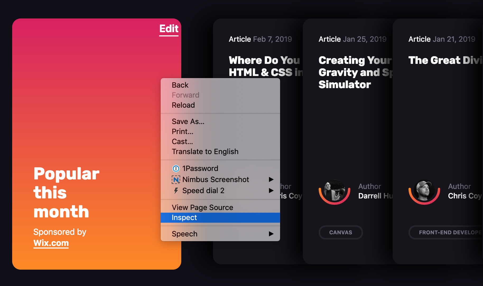
This is where DevTools can be a designer’s best friend. Every browser has its own version of it. You may have already played with such tools before. It’s that little “Inspect” option when right clicking on the screen.
Entering the wonderful world of DevTools can be done from any webpage.
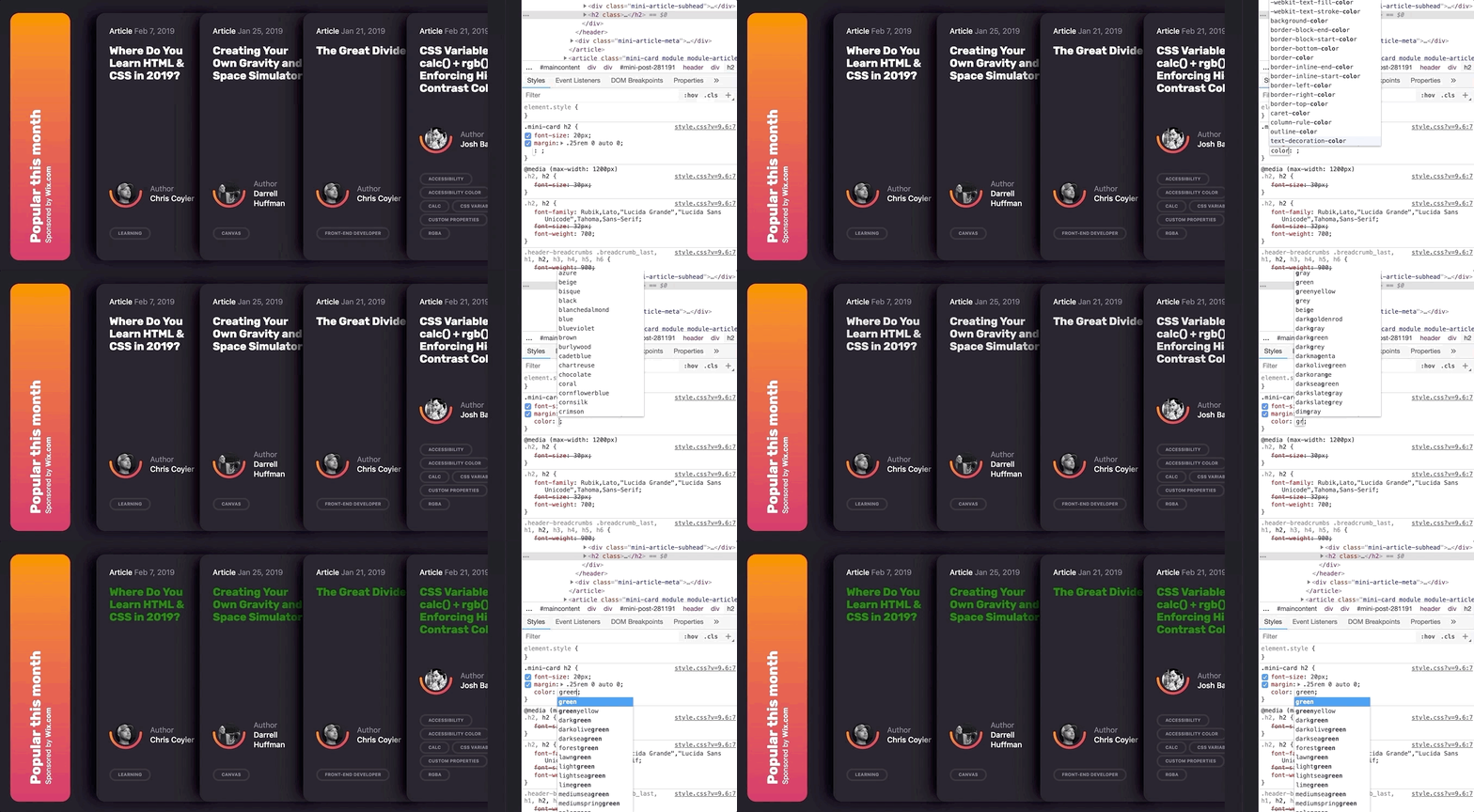
What makes DevTools such a wonderful resource is that it provides a way to manipulate the code of a live website or web application without having to set up a development environment. And it’s disposable. Any edits you make are for your eyes only and are washed away the very moment the browser refreshes.
Editing code in DevTools makes changes to the page on the fly.
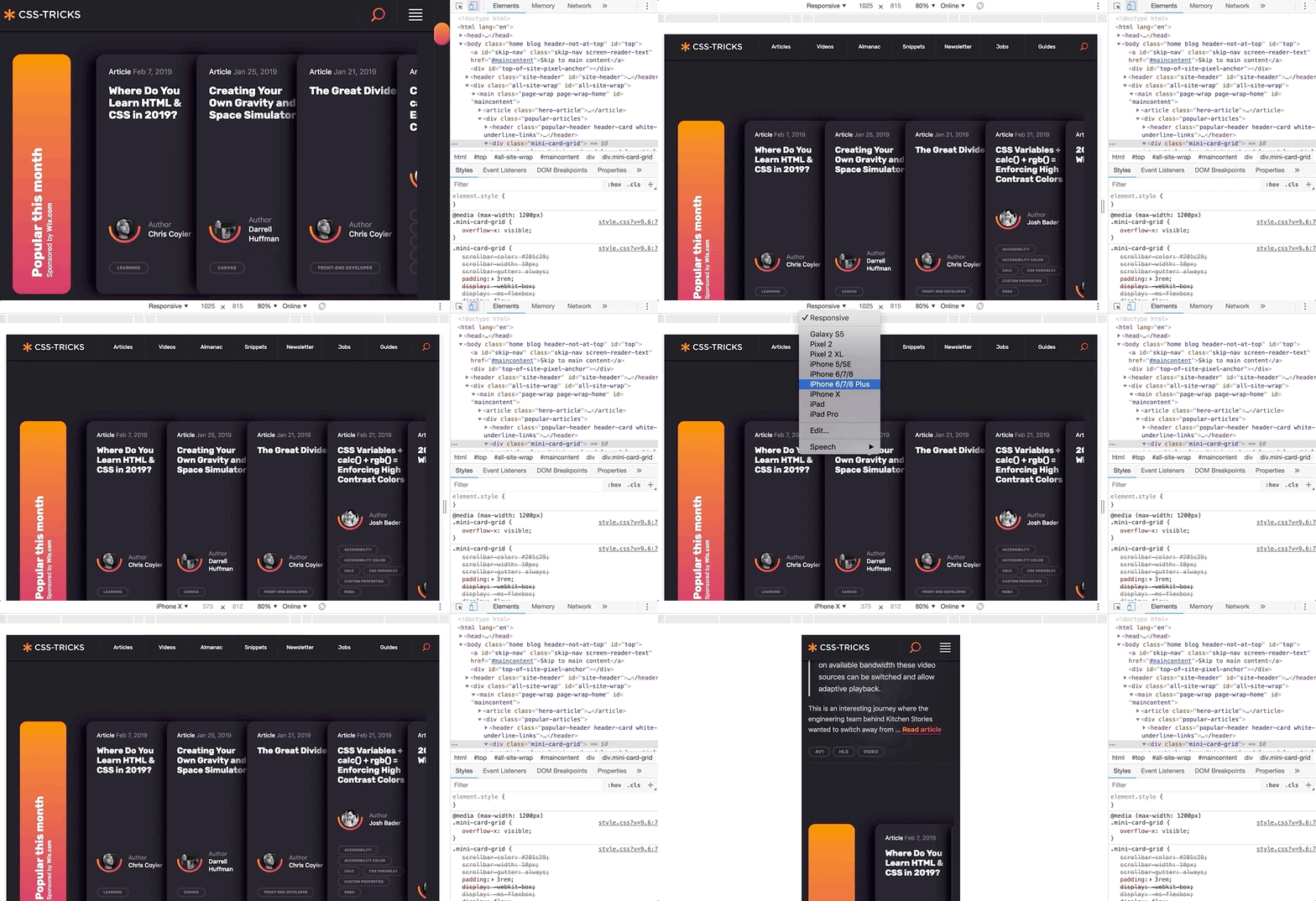
Further, DevTools can mimic other devices.
Need to see how a page or changes to it look on other devices? DevTools can give you an idea.
And, if you haven’t seen it yet, Firefox released a wonderful new shape path editor that’s very valuable for exploring interesting designs.
Over the past few months, I have been working on a complex web client for an enterprise-level application. Last sprint, my UX design story was to explore the look of the entry page of the web application and how to introduce a new color scheme. It was hard to envision how the changes I was making were going to impact the tool as a whole as some of the components I was changing are used throughout the product.
One day, when discussing a design decision, one of the developers tested out my suggested change to a component using the latest DevTools in his browser. I was amazed by how much DevTools has grown and expanded since I last remember it. I could immediately see the impact of that change across our whole web application and how different design decisions interacted with the existing design. I started to experiment with DevTools myself and was able to preview and experiment with how my own simple CSS changes to components would impact the whole web application. Super helpful!
However, it was also a little frustrating to not be able store my experiments and changes for future reference. So, I went exploring to see what else was out there to support my design process.
Chrome browser extensions
DevTools is are amazing right out of the box, but experimenting with code gets even more awesome when browser extensions are added to the mix. Chrome, in particular, has a couple that I really like.
Chrome Extension 1: User CSS
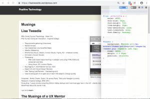
User CSS is a Chrome browser extension that allows you to save the changes you make in DevTools in an editable CSS code tab. These CSS changes are automatically executed on that page if User CSS is enabled. This means that you can set up CSS overrides for any page on the web, view them later, and share them with others. This can be an incredible tool when, say, doing a design review of a staging site prior to release, or really any design exploration for a web application or website that is viewable in a browser.
User CSS has a nice built-in code editor, so my code is always well formatted and includes syntax highlighting so I don’t have to worry about that sort of thing. I particularly like the fact that overrides are executed immediately so you can see changes on the fly. It also has a useful switch that allows you to turn your overrides on and off. This makes it very simple to demonstrate a set of changes to a team. This extension has allowed me to easily present a comparison between an existing page design and proposed changes. I’ve even used it to make a simple video demonstrating the proposed design changes.
In this video I make some simple edits to my web page and then show how I can turn on and off the edits by simply clicking the on/off button on User CSS:
This extension is a perfect if you all you need to do is edit CSS, particularly if you have some very simple design changes to make want to those changes to persist. However, the complexity of a design increases, I have found myself wanting to save more than one snippet of code at a time. Copying and pasting code in and out of the User CSS editor was becoming a pain. I wanted something with more flexibility and freedom to experiment. I also wanted to be able to look at simple changes to the HTML of my web application and even play with a bit of JavaScript.
That’s where the next extension comes into play.
Chrome Extension 2: Web Overrides
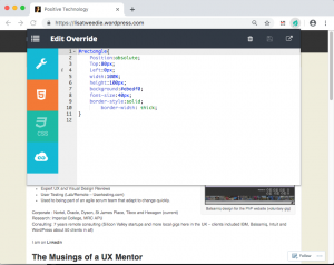
The second Chrome extension I found is called Web Override and it provides a way to override HTML, CSS and JavaScript. All of them! This is presented as three tabs, much the same way CodePen does, which makes it a very powerful tool for creating rough working design prototypes.
Web Overrides also allows you to save multiple files so that you can switch different parts of a design on or off in different combinations. It also quickly switches between the different options to show off different design concepts.
This video shows how I added an HTML element into a page and edited the new element with some basic CSS:
Using the HTML tab makes it possible to edit any element on the page, like swap out a logo, remove unnecessary elements, or add new ones. The JavaScript tab is similar in that I can do simple changes, like inject additional text into the website title so that I can test how dynamic changes might affect the layout — this can be useful for testing different scenarios, such as differences with internationalization.
These edits may be trivial from a coding perspective, but they allow me to explore hundreds of alternative designs in a much shorter time and with a lot less risk than scooting pixels around in a design application. I literally could not explore as many ideas as quickly using my traditional UX prototyping tools as I can with this one extension.
And, what is more, both me and my team have confidence in the design deliverables because we tested them early on in the browser. Even the most pixel-perfect Photoshop file can get lost in translation when the design is in the browser because it’s really just a snapshot of a design in a static state. Testing designs first in the browser using these extensions prove that what we have designed is possible.
On the flip side of this, you might want to check out how Jon Kantner used similar browser extensions to disable CSS as a means to audit the semantic markup various sites. It’s not exactly design-related, but interesting to see how these tools can have different use cases.
What I’ve learned so far
I am excited about what I have learned since leaning into DevTools and browser extensions. I believe my designs are so much better as a result. I also find myself able to have more productive conversations with developers because we now have a way to communicate well. The common ground between design and code in rapid prototypes really helps facilitate discussion. And, because I am playing around with actual code, I have a much better sense about how the underlying code will eventually be written and can empathize a lot more with the work developers do — and perhaps how I can make their jobs easier in the process.
It has also created a culture of collaborative rapid prototyping on my team which is a whole other story.
Playing with code has opened up new ideas and encouraged me to adapt my work to the context of the web. It’s been said that getting into the browser earlier in the design process is ideal and these are the types of tools that allow me (and you) to do just that!
Do you have other tools or processes that you use to facilitate the collaboration between design and code? Please share them in the comments!
I’d like to tell you how I see code and design intersect and support one another. Specifically, I want to cover how designers can use code in their everyday work. I suggest this not because it’s a required skill, but because even a baseline understanding of coding can make designs better and the hand-off from design to development smoother.
As a UX Designer, I am always looking for good ways to both explore my UX design problems and communicate the final designs to others. Over the past 30 years, my work has always involved working alongside developers, but generally there has been a great divide between what I do and what developers do.
I can code at a basic level. For example, I’ve helped teach C to undergraduates back when I was a post-graduate student. I’ve worked on the usability of JDeveloper Oracle’s Integrated Development Environment (IDE) for Java. I also worked for a very short while on simplifying the UX of a WordPress content management environment to make it accessible to less technical users. This required a good understanding of HTML and CSS. I also volunteered on the design of the PHP website and had to develop some understanding of the server side of web development.
But even given these experiences, I am not a developer in any true sense of the word. If I happen to be looking at code, it’s in a “just in time” learning model — I look up what I need and then hack it until it works. Learning this way has often been frowned upon, a bit like learning to drive without lessons. You pick up bad development habits but maybe that’s OK for the work I do.
So, no I don’t develop or write code. My day-to-day work is mostly been spent drawing, talking and gathering requirements. As far as design goes, I’ll start by sketching concepts in a notebook or using Balsamiq. Then I draw up UX wireframes and prototypes using tools like Axure, Adobe XD, InVision Studio, Figma and Sketch. By the time I’m ready to hand off my deliverables to development, all the visual assets and documentation have been defined and communicated. But I don’t step over the line into code development. That is just not my area of expertise.
So, why should designers know code?
We’ve already established that I’m no developer, but I have recently become an advocate for designers getting a good feel for how design and code interact.
In fact, I’d call it “playing with code.” I am definitely not suggesting that UX designers become developers, but at the very least, I think designers would benefit by becoming comfortable with a basic understanding of what is currently possible with CSS and best practices in HTML.
Being experimental is a huge part of doing design. Code is just another medium with which we can experiment and build beautiful solutions. So, we’re going to look at a couple of ways designers can experiment with code, even with a light understanding of it. What we’re covering here may be obvious to developers, but there are plenty of designers out there who have never experimented with code and will be seeing these for the first time.
So, it’s for them (and maybe a refresher for you) that we look at the following browser tools.
DevTools: The ultimate code playground
One of the concerns a UX designer might have is knowing how a design holds up once it’s in the browser. Are the colors accurate? Are fonts legible throughout? How do the elements respond on various devices? Will my grey hover state work with the white/grey zebra striping on my application grids in practice? These are some of the styling and interaction issues designers are thinking about when we hand our work off for development.
This is where DevTools can be a designer’s best friend. Every browser has its own version of it. You may have already played with such tools before. It’s that little “Inspect” option when right clicking on the screen.
Entering the wonderful world of DevTools can be done from any webpage.
What makes DevTools such a wonderful resource is that it provides a way to manipulate the code of a live website or web application without having to set up a development environment. And it’s disposable. Any edits you make are for your eyes only and are washed away the very moment the browser refreshes.
Editing code in DevTools makes changes to the page on the fly.
Further, DevTools can mimic other devices.
Need to see how a page or changes to it look on other devices? DevTools can give you an idea.
And, if you haven’t seen it yet, Firefox released a wonderful new shape path editor that’s very valuable for exploring interesting designs.
Over the past few months, I have been working on a complex web client for an enterprise-level application. Last sprint, my UX design story was to explore the look of the entry page of the web application and how to introduce a new color scheme. It was hard to envision how the changes I was making were going to impact the tool as a whole as some of the components I was changing are used throughout the product.
One day, when discussing a design decision, one of the developers tested out my suggested change to a component using the latest DevTools in his browser. I was amazed by how much DevTools has grown and expanded since I last remember it. I could immediately see the impact of that change across our whole web application and how different design decisions interacted with the existing design. I started to experiment with DevTools myself and was able to preview and experiment with how my own simple CSS changes to components would impact the whole web application. Super helpful!
However, it was also a little frustrating to not be able store my experiments and changes for future reference. So, I went exploring to see what else was out there to support my design process.
Chrome browser extensions
DevTools is are amazing right out of the box, but experimenting with code gets even more awesome when browser extensions are added to the mix. Chrome, in particular, has a couple that I really like.
Chrome Extension 1: User CSS
User CSS is a Chrome browser extension that allows you to save the changes you make in DevTools in an editable CSS code tab. These CSS changes are automatically executed on that page if User CSS is enabled. This means that you can set up CSS overrides for any page on the web, view them later, and share them with others. This can be an incredible tool when, say, doing a design review of a staging site prior to release, or really any design exploration for a web application or website that is viewable in a browser.
User CSS has a nice built-in code editor, so my code is always well formatted and includes syntax highlighting so I don’t have to worry about that sort of thing. I particularly like the fact that overrides are executed immediately so you can see changes on the fly. It also has a useful switch that allows you to turn your overrides on and off. This makes it very simple to demonstrate a set of changes to a team. This extension has allowed me to easily present a comparison between an existing page design and proposed changes. I’ve even used it to make a simple video demonstrating the proposed design changes.
In this video I make some simple edits to my web page and then show how I can turn on and off the edits by simply clicking the on/off button on User CSS:
This extension is a perfect if you all you need to do is edit CSS, particularly if you have some very simple design changes to make want to those changes to persist. However, the complexity of a design increases, I have found myself wanting to save more than one snippet of code at a time. Copying and pasting code in and out of the User CSS editor was becoming a pain. I wanted something with more flexibility and freedom to experiment. I also wanted to be able to look at simple changes to the HTML of my web application and even play with a bit of JavaScript.
That’s where the next extension comes into play.
Chrome Extension 2: Web Overrides
The second Chrome extension I found is called Web Override and it provides a way to override HTML, CSS and JavaScript. All of them! This is presented as three tabs, much the same way CodePen does, which makes it a very powerful tool for creating rough working design prototypes.
Web Overrides also allows you to save multiple files so that you can switch different parts of a design on or off in different combinations. It also quickly switches between the different options to show off different design concepts.
This video shows how I added an HTML element into a page and edited the new element with some basic CSS:
Using the HTML tab makes it possible to edit any element on the page, like swap out a logo, remove unnecessary elements, or add new ones. The JavaScript tab is similar in that I can do simple changes, like inject additional text into the website title so that I can test how dynamic changes might affect the layout — this can be useful for testing different scenarios, such as differences with internationalization.
These edits may be trivial from a coding perspective, but they allow me to explore hundreds of alternative designs in a much shorter time and with a lot less risk than scooting pixels around in a design application. I literally could not explore as many ideas as quickly using my traditional UX prototyping tools as I can with this one extension.
And, what is more, both me and my team have confidence in the design deliverables because we tested them early on in the browser. Even the most pixel-perfect Photoshop file can get lost in translation when the design is in the browser because it’s really just a snapshot of a design in a static state. Testing designs first in the browser using these extensions prove that what we have designed is possible.
On the flip side of this, you might want to check out how Jon Kantner used similar browser extensions to disable CSS as a means to audit the semantic markup various sites. It’s not exactly design-related, but interesting to see how these tools can have different use cases.
What I’ve learned so far
I am excited about what I have learned since leaning into DevTools and browser extensions. I believe my designs are so much better as a result. I also find myself able to have more productive conversations with developers because we now have a way to communicate well. The common ground between design and code in rapid prototypes really helps facilitate discussion. And, because I am playing around with actual code, I have a much better sense about how the underlying code will eventually be written and can empathize a lot more with the work developers do — and perhaps how I can make their jobs easier in the process.
It has also created a culture of collaborative rapid prototyping on my team which is a whole other story.
Playing with code has opened up new ideas and encouraged me to adapt my work to the context of the web. It’s been said that getting into the browser earlier in the design process is ideal and these are the types of tools that allow me (and you) to do just that!
Do you have other tools or processes that you use to facilitate the collaboration between design and code? Please share them in the comments!
Šime posts regular content for web developers on webplatform.news.
New Feature Policy API in Chrome
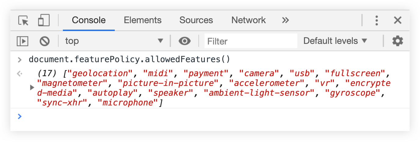
Pete LePage: You can use the document.featurePolicy.allowedFeatures method in Chrome to get a list of all Feature Policy-controlled features that are allowed on the current page.
This API can be useful when implementing a feature policy (and updating an existing feature policy) on your website.
Open your site in Chrome and run the API in the JavaScript console to check which Feature Policy-controlled features are allowed on your site.
Read about individual features on featurepolicy.info and decide which features should be disabled ('none' value), and which features should be disabled only in cross-origin <iframe> elements ('self' value).
Add the Feature-Policy header to your site’s HTTP responses (policies are separated by semicolons).
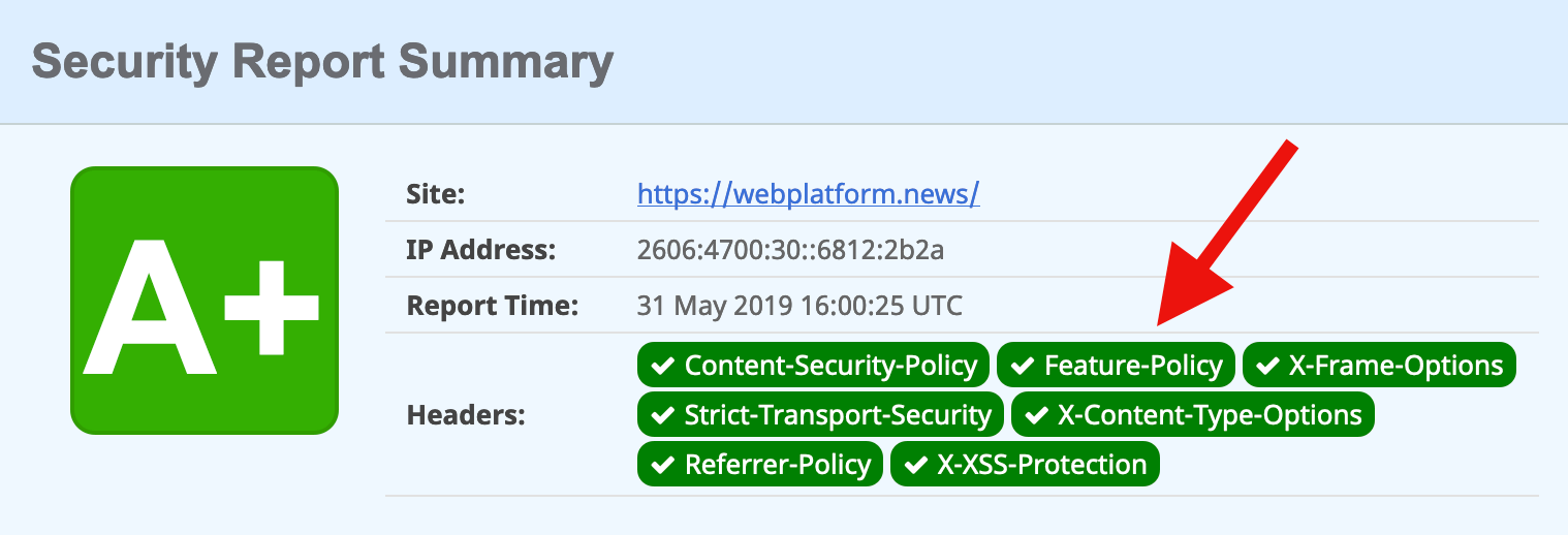
Repeat Step 1 to confirm that your new feature policy is in effect. You can also scan your site on securityheaders.com.
In other news…
Dave Camp: Firefox now blocks cookies from known trackers by default (when the cookie is used in a third-party context). This change is currently in effect only for new Firefox users; existing users will be automatically updated to the new policy „in the coming months.”
Pete LePage: Chrome for Android now allows websites to share images (and other file types) via the navigator.share method. See Web Platform News Issue 1014 for more information about the Web Share API. Ayooluwa Isaiah’s post from yesterday is also a good reference on how to use it.
Valerie Young: The ECMAScript Internationalization APIs for date and time formatting (Intl.DateTimeFormat constructor), and number formatting (Intl.NumberFormat constructor) are widely supported in browsers.
Alan Jeffrey: Patrick Walton from Mozilla is working on a vector graphics renderer that can render text smoothly at all angles when viewed with an Augmented Reality (AR) headset. We plan to use it in our browsers for AR headsets (Firefox Reality).
Pinterest Engineering: Our progressive web app is now available as a standalone desktop application on Windows 10. It can be installed via the Microsoft Store, which „treats the packaged PWA as a first class citizen with access to Windows 10 feature APIs.”
Jonathan Davis: The flow-root value for the CSS display property has landed in Safari Technology Preview. This value is already supported in Chrome and Firefox. See Web Platform News Issue 871 for a use case.
Ire Aderinokun writes about a new way to set a performance budget (and stick to it) with Lighthouse, Google’s suite of tools that help developers see how performant and accessible their websites are:
Until recently, I also hadn’t setup an official performance budget and enforced it. This isn’t to say that I never did performance audits. I frequently use tools like PageSpeed Insights and take the feedback to make improvements. But what I had never done was set a list of metrics that I needed the site to meet, and enforce them using some automated tool.
The reasons for this were a combination of not knowing what exact numbers I should use for budgets as well as there being a disconnect between setting a budget and testing/enforcing it. This is why I was really excited when, at Google I/O this year, the Lighthouse team announced support for performance budgets that can be integrated with Lighthouse. We can now define a simple performance budget in a JSON file, which will be tested as part of the lighthouse audit!
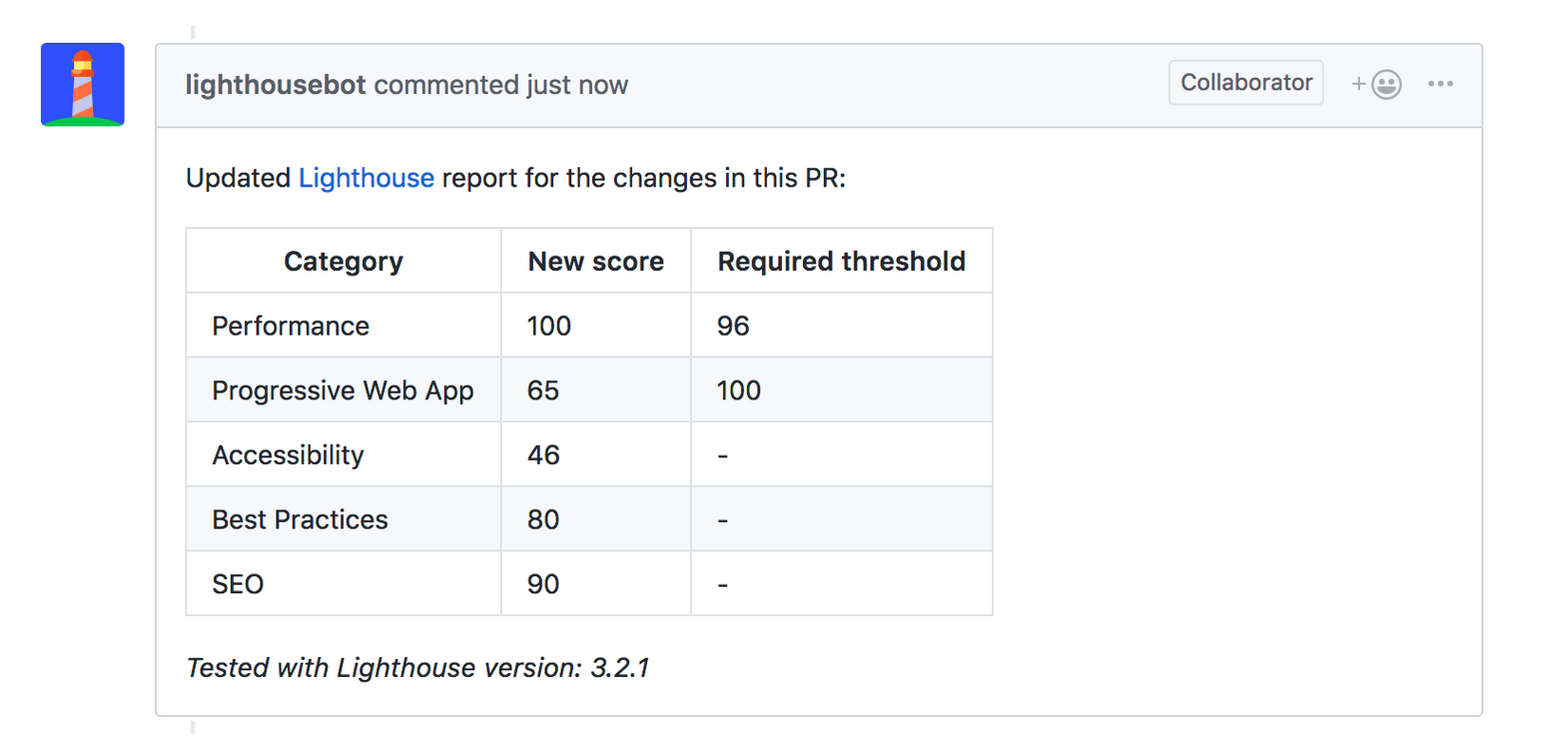
I completely agree with Ire, and much in the same way I’ve tended to neglect sticking to a performance budget simply because the process of testing was so manual and tedious. But no more! As Ire shows in this post, you can even set Lighthouse up to test your budget with every PR in GitHub. That tool is called lighthousebot and it’s just what I’ve been looking for – an automated and predictable way to integrate a performance budget into every change that I make to a codebase.
Today lighthousebot will comment on your PR after a test is complete and it will show you the before and after score:
How neat is that? This reminds me of Gareth Clubb’s recent post about improving web performance and building a culture around budgets in an organization. What better way to remind everyone about performance than right in GitHub after each and every change that they make?
Want to convey statistics, facts or survey information in a more exciting way than using text alone? Infographic templates are a beautiful and compelling way to present data, and they are fantastic for making complicated or even dull concepts clearer and more exciting.
In this article, you’ll discover ten top tips for creating infographic design templates that are easy to read and look amazing too. From choosing the right software to create your infographic layout to sourcing stylish icons and charts, this is your one-stop shop for getting started with creating your own infographic template.
1. Get Started With Publishing and Vector Software
An infographic template can be created using a wide range of programs, but generally software that supports vector graphics will be the wisest choice.
Vector programs like Adobe Illustrator or Inkscape will give you maximum control over importing, editing and creating vector graphics and type, allowing you to scale designs easily without compromising on quality.
Publishing software like Adobe InDesign and QuarkXPress also allow you to treat an infographic design as a complete layout, which can be helpful if you’re creating designs for print or multi-page documents like reports. These tutorials show you how you can create beautifully designed infographics using InDesign:
Learn how to put together this stylish infographic in Adobe InDesign. In this tutorial for relative beginners to InDesign, we’ll look at how to set up a…
You can also find a wide range of infographic templates for Keynote and PowerPoint, which can be adapted into dynamic presentations with animations and transitions.
At the core of every great infographic design is a narrative.
You might be handling a large range of data, but it’s likely that the information will have a common unifying theme. Ask yourself—what message do you want to convey to your viewers? How can I condense this range of data into a single idea or concept?
If you have a single strong message to convey, such as an environmental message, or have a single topic in mind, such as education, choosing a graphic to represent the theme can be a helpful starting point.
These infographic templates use this idea effectively, using a single Earth or pencil illustration at the core of the design, before structuring the data around it.
Perhaps a single image doesn’t feel like quite the right choice for your infographic design. If you’re dealing instead with a wide range of data that can’t be condensed into one visual element, you can look into alternative ways of presenting the information.
Timeline infographics are a tried-and-tested, effective style that works particularly well for communicating progression, such as history or travel.
A timeline is also simple to set up and is a helpful method for structuring your infographic design. Begin by drafting a line or arrow down the center of your layout, and build up your data around the perimeter.
Alternatively, you may want to use a grid-based layout for your design, which can include a variety of charts, icons, and callouts. This is particularly effective when you are dealing with a large quantity of varied data, or data that is more statistical, such as quantities or percentages.
Simply break your layout up into square sections, rows or columns and place a single item of data, whether a graph, icon or statistic, inside each section.
4. Size Your Infographic Template for Online Sharing
Before you begin putting your infographic design together, take a moment to consider the end purpose of your design. Who is the infographic intended for? Will it need to be adapted for multiple purposes?
For example, you might want to incorporate your infographic into a PowerPoint presentation as well as a print poster. With this in mind, you will need to make sure your design can be adapted to a slide size as well as to a portrait sheet of paper.
Infographics are also fantastic for communicating concepts to an online audience. With the ability to quickly catch a browser’s eye and hold their attention for longer than a text-based article, infographics can be a clever way to raise awareness about a topic or issue.
Your infographic design could be competing with lots of other designs on social media sites like Pinterest, so it’s important to carefully consider the size of your design, as well as the size of text and graphics.
If you would like to share your finished infographic online, you will need to size your page appropriately before you start designing. Visual social media like Pinterest will automatically readjust the size of your images to fit them into their feed, so it’s key to ensure your images aren’t going to be warped or too difficult to read.
Expanded pins on Pinterest are sized to 735 pixels in width, but pins in the feed are reduced even further to a minuscule width of 238 px.
Images that are too tall will also lose their visual impact on a Pinterest feed, so it’s important to ensure your infographic looks just as good with a 238 px width as it does at full size.
5. You Don’t Have to Create Everything From Scratch!
Infographics can be very complex, with one design often made up of numerous icons, charts, and other images. If you’re happy to create all your graphics from scratch, then good for you, but you’ll need to put aside a decent chunk of time to do so.
Most infographic designers opt instead to incorporate and adapt ready-made graphics into their designs to save time. Downloading a set of simple vector icons or charts can save you a ton of time and effort, and help to create an overall more polished and professional effect.
As you start working on your infographic design, you might start to feel a little overwhelmed with the sheer amount of stuff on the layout.
Don’t panic! A simple, sensible tactic for tackling any infographic template is to layer your design, splitting the design into easily separated and lockable layers, allowing you to edit individual elements without mistakenly moving or deleting other items on your design.
In Illustrator or InDesign, you can create layers in the Layers panel. Begin with a background layer, before building up separate layers for images, icons, and text. It’s a simple tip, but it will really help you to organise your work process and avoid any hair-pulling moments.
In this example, the infographic template is split into a large number of layers, which separates everything from the cars to the trees to the color of the buildings.
While infographics might be in large part visual and image-based, text is actually a really intrinsic part of any successful infographic design.
The visual elements might entice the viewer to take a closer look, but it’s the facts and figures that will really hammer your point home. With this in mind, it’s important to give just as much attention to the presentation of your text as you do to the visuals.
For starters, a clear and well-sized header is arguably one of the most important elements on your infographic design. After all, if a viewer can’t read your title, the theme and meaning of the infographic will be lost on them. Place your header at the top of your infographic (centered or to the left side for English-language designs), and make the sizing nice and generous.
This space travel infographic uses a bold and creative header title, which has been converted to outlines and filled with a starry sky image.
Choosing the right font to use on your infographic can be tricky. The choice of fonts can be overwhelming, and some fonts which look beautiful on other types of layouts can suddenly look illegible or clunky on an infographic design.
A good tip is to always stick to ultra-clear and minimal sans serif typefaces. This is an almost universal feature of good infographic designs, because sans serifs are super easy to read and look clean and modern. They allow the visuals to take center stage too, while serif fonts can feel a little distracting and fussy.
8. Use Eye-Catching Color on Your Infographic Template
Color plays such a key part in attracting a viewer’s eye, but it’s often one of the last things designers consider when creating infographics. Stand out in a sea of washed-out browns and greys with an attention-grabbing color palette.
This infographic template uses a simple and striking combination of primary colors to create a stylish and on-trend effect.
Gradient swatches are another fantastic technique for both catching the eye and building a sense of depth on your infographic layout.
In this tutorial, I show you how you can create a multi-colored gradient swatch in InDesign to create a rainbow road effect for a Pride infographic.
Color can also be a helpful tool for making your design more readable and compelling. Color coding elements on your design is a great idea for giving order and legibility to complex designs.
In this example, a detailed religious calendar infographic is given more structure and order with a color-coded key at the bottom of the design.
9. Experiment With 3D and Photographic Elements
Infographic trends have recently been dominated by illustration, with flat design being the most popular with designers of late.
However, new approaches to infographic design are now presenting fresh and novel ways to craft an infographic style. If you want a break from the dominance of flat design, look to emerging trends in infographic illustration, such as isometric design and 3D styles, to give your design an aesthetic overhaul.
These 3D infographic elements use shadows and highlights to merge the legible appeal of flat design with a more immersive style.
You certainly don’t need to take a purely illustrated approach to your infographic designs either. Photography might be less commonly used, but it can be incredibly effective, especially when blended with illustrated elements and softened with overlay effects.
This climate change infographic uses a striking photo at the top of the design to create a visual anchor to the whole design. When teamed with condensed typography and flat illustration, it looks particularly contemporary.
When you’ve finished working on your infographic layout template, it’s time to export it and share it with others.
The final stage in creating an effective infographic design is to make it visible to the right audience. Marketers often use infographics as an effective tool in building brand awareness or to raise awareness of key topics and issues.
The final tip to take away from this article is to know your audience and target them effectively using a marketing strategy. For example, an infographic celebrating International Women’s Day might have more impact and views on a social media channel that is female-dominated, and it would also be wiser to share and promote the infographic in the days leading up to the event.
Themed infographics will also benefit from a captive audience. For example, try sharing a beer-themed infographic with breweries on Twitter, or share with craft ale groups on Facebook.
Conclusion: Ready to Share Your Infographic With the World?
In this article, we’ve looked at ten tips and tricks for designing amazing infographic templates. Infographics can be as conceptual and creative as you like, as long as the information content is clear, so design with confidence and you’ll be sure to catch someone’s eye.
Looking for a fantastic infographic template to help you get started? You can find a wide range of infographic templates on Envato Elements and GraphicRiver to help you make a quick start on creating your own infographic designs.
Don’t miss these infographic tutorials for InDesign and Illustrator:
Do you need to tell a compelling story with your data? A well-designed infographic is a great way to visualize a concept in your marketing, present numerical…
This infographic looks at how organisations worldwide are battling to improve education for girls. Here we’ll learn how to put together the infographic in…
Want to convey statistics, facts or survey information in a more exciting way than using text alone? Infographic templates are a beautiful and compelling way to present data, and they are fantastic for making complicated or even dull concepts clearer and more exciting.
In this article, you’ll discover ten top tips for creating infographic design templates that are easy to read and look amazing too. From choosing the right software to create your infographic layout to sourcing stylish icons and charts, this is your one-stop shop for getting started with creating your own infographic template.
1. Get Started With Publishing and Vector Software
An infographic template can be created using a wide range of programs, but generally software that supports vector graphics will be the wisest choice.
Vector programs like Adobe Illustrator or Inkscape will give you maximum control over importing, editing and creating vector graphics and type, allowing you to scale designs easily without compromising on quality.
Publishing software like Adobe InDesign and QuarkXPress also allow you to treat an infographic design as a complete layout, which can be helpful if you’re creating designs for print or multi-page documents like reports. These tutorials show you how you can create beautifully designed infographics using InDesign:
Learn how to put together this stylish infographic in Adobe InDesign. In this tutorial for relative beginners to InDesign, we’ll look at how to set up a…
You can also find a wide range of infographic templates for Keynote and PowerPoint, which can be adapted into dynamic presentations with animations and transitions.
At the core of every great infographic design is a narrative.
You might be handling a large range of data, but it’s likely that the information will have a common unifying theme. Ask yourself—what message do you want to convey to your viewers? How can I condense this range of data into a single idea or concept?
If you have a single strong message to convey, such as an environmental message, or have a single topic in mind, such as education, choosing a graphic to represent the theme can be a helpful starting point.
These infographic templates use this idea effectively, using a single Earth or pencil illustration at the core of the design, before structuring the data around it.
Perhaps a single image doesn’t feel like quite the right choice for your infographic design. If you’re dealing instead with a wide range of data that can’t be condensed into one visual element, you can look into alternative ways of presenting the information.
Timeline infographics are a tried-and-tested, effective style that works particularly well for communicating progression, such as history or travel.
A timeline is also simple to set up and is a helpful method for structuring your infographic design. Begin by drafting a line or arrow down the center of your layout, and build up your data around the perimeter.
Alternatively, you may want to use a grid-based layout for your design, which can include a variety of charts, icons, and callouts. This is particularly effective when you are dealing with a large quantity of varied data, or data that is more statistical, such as quantities or percentages.
Simply break your layout up into square sections, rows or columns and place a single item of data, whether a graph, icon or statistic, inside each section.
4. Size Your Infographic Template for Online Sharing
Before you begin putting your infographic design together, take a moment to consider the end purpose of your design. Who is the infographic intended for? Will it need to be adapted for multiple purposes?
For example, you might want to incorporate your infographic into a PowerPoint presentation as well as a print poster. With this in mind, you will need to make sure your design can be adapted to a slide size as well as to a portrait sheet of paper.
Infographics are also fantastic for communicating concepts to an online audience. With the ability to quickly catch a browser’s eye and hold their attention for longer than a text-based article, infographics can be a clever way to raise awareness about a topic or issue.
Your infographic design could be competing with lots of other designs on social media sites like Pinterest, so it’s important to carefully consider the size of your design, as well as the size of text and graphics.
If you would like to share your finished infographic online, you will need to size your page appropriately before you start designing. Visual social media like Pinterest will automatically readjust the size of your images to fit them into their feed, so it’s key to ensure your images aren’t going to be warped or too difficult to read.
Expanded pins on Pinterest are sized to 735 pixels in width, but pins in the feed are reduced even further to a minuscule width of 238 px.
Images that are too tall will also lose their visual impact on a Pinterest feed, so it’s important to ensure your infographic looks just as good with a 238 px width as it does at full size.
5. You Don’t Have to Create Everything From Scratch!
Infographics can be very complex, with one design often made up of numerous icons, charts, and other images. If you’re happy to create all your graphics from scratch, then good for you, but you’ll need to put aside a decent chunk of time to do so.
Most infographic designers opt instead to incorporate and adapt ready-made graphics into their designs to save time. Downloading a set of simple vector icons or charts can save you a ton of time and effort, and help to create an overall more polished and professional effect.
As you start working on your infographic design, you might start to feel a little overwhelmed with the sheer amount of stuff on the layout.
Don’t panic! A simple, sensible tactic for tackling any infographic template is to layer your design, splitting the design into easily separated and lockable layers, allowing you to edit individual elements without mistakenly moving or deleting other items on your design.
In Illustrator or InDesign, you can create layers in the Layers panel. Begin with a background layer, before building up separate layers for images, icons, and text. It’s a simple tip, but it will really help you to organise your work process and avoid any hair-pulling moments.
In this example, the infographic template is split into a large number of layers, which separates everything from the cars to the trees to the color of the buildings.
While infographics might be in large part visual and image-based, text is actually a really intrinsic part of any successful infographic design.
The visual elements might entice the viewer to take a closer look, but it’s the facts and figures that will really hammer your point home. With this in mind, it’s important to give just as much attention to the presentation of your text as you do to the visuals.
For starters, a clear and well-sized header is arguably one of the most important elements on your infographic design. After all, if a viewer can’t read your title, the theme and meaning of the infographic will be lost on them. Place your header at the top of your infographic (centered or to the left side for English-language designs), and make the sizing nice and generous.
This space travel infographic uses a bold and creative header title, which has been converted to outlines and filled with a starry sky image.
Choosing the right font to use on your infographic can be tricky. The choice of fonts can be overwhelming, and some fonts which look beautiful on other types of layouts can suddenly look illegible or clunky on an infographic design.
A good tip is to always stick to ultra-clear and minimal sans serif typefaces. This is an almost universal feature of good infographic designs, because sans serifs are super easy to read and look clean and modern. They allow the visuals to take center stage too, while serif fonts can feel a little distracting and fussy.
8. Use Eye-Catching Color on Your Infographic Template
Color plays such a key part in attracting a viewer’s eye, but it’s often one of the last things designers consider when creating infographics. Stand out in a sea of washed-out browns and greys with an attention-grabbing color palette.
This infographic template uses a simple and striking combination of primary colors to create a stylish and on-trend effect.
Gradient swatches are another fantastic technique for both catching the eye and building a sense of depth on your infographic layout.
In this tutorial, I show you how you can create a multi-colored gradient swatch in InDesign to create a rainbow road effect for a Pride infographic.
Color can also be a helpful tool for making your design more readable and compelling. Color coding elements on your design is a great idea for giving order and legibility to complex designs.
In this example, a detailed religious calendar infographic is given more structure and order with a color-coded key at the bottom of the design.
9. Experiment With 3D and Photographic Elements
Infographic trends have recently been dominated by illustration, with flat design being the most popular with designers of late.
However, new approaches to infographic design are now presenting fresh and novel ways to craft an infographic style. If you want a break from the dominance of flat design, look to emerging trends in infographic illustration, such as isometric design and 3D styles, to give your design an aesthetic overhaul.
These 3D infographic elements use shadows and highlights to merge the legible appeal of flat design with a more immersive style.
You certainly don’t need to take a purely illustrated approach to your infographic designs either. Photography might be less commonly used, but it can be incredibly effective, especially when blended with illustrated elements and softened with overlay effects.
This climate change infographic uses a striking photo at the top of the design to create a visual anchor to the whole design. When teamed with condensed typography and flat illustration, it looks particularly contemporary.
When you’ve finished working on your infographic layout template, it’s time to export it and share it with others.
The final stage in creating an effective infographic design is to make it visible to the right audience. Marketers often use infographics as an effective tool in building brand awareness or to raise awareness of key topics and issues.
The final tip to take away from this article is to know your audience and target them effectively using a marketing strategy. For example, an infographic celebrating International Women’s Day might have more impact and views on a social media channel that is female-dominated, and it would also be wiser to share and promote the infographic in the days leading up to the event.
Themed infographics will also benefit from a captive audience. For example, try sharing a beer-themed infographic with breweries on Twitter, or share with craft ale groups on Facebook.
Conclusion: Ready to Share Your Infographic With the World?
In this article, we’ve looked at ten tips and tricks for designing amazing infographic templates. Infographics can be as conceptual and creative as you like, as long as the information content is clear, so design with confidence and you’ll be sure to catch someone’s eye.
Looking for a fantastic infographic template to help you get started? You can find a wide range of infographic templates on Envato Elements and GraphicRiver to help you make a quick start on creating your own infographic designs.
Don’t miss these infographic tutorials for InDesign and Illustrator:
Do you need to tell a compelling story with your data? A well-designed infographic is a great way to visualize a concept in your marketing, present numerical…
This infographic looks at how organisations worldwide are battling to improve education for girls. Here we’ll learn how to put together the infographic in…
Want to convey statistics, facts or survey information in a more exciting way than using text alone? Infographic templates are a beautiful and compelling way to present data, and they are fantastic for making complicated or even dull concepts clearer and more exciting.
In this article, you’ll discover ten top tips for creating infographic design templates that are easy to read and look amazing too. From choosing the right software to create your infographic layout to sourcing stylish icons and charts, this is your one-stop shop for getting started with creating your own infographic template.
1. Get Started With Publishing and Vector Software
An infographic template can be created using a wide range of programs, but generally software that supports vector graphics will be the wisest choice.
Vector programs like Adobe Illustrator or Inkscape will give you maximum control over importing, editing and creating vector graphics and type, allowing you to scale designs easily without compromising on quality.
Publishing software like Adobe InDesign and QuarkXPress also allow you to treat an infographic design as a complete layout, which can be helpful if you’re creating designs for print or multi-page documents like reports. These tutorials show you how you can create beautifully designed infographics using InDesign:
Learn how to put together this stylish infographic in Adobe InDesign. In this tutorial for relative beginners to InDesign, we’ll look at how to set up a…
You can also find a wide range of infographic templates for Keynote and PowerPoint, which can be adapted into dynamic presentations with animations and transitions.
At the core of every great infographic design is a narrative.
You might be handling a large range of data, but it’s likely that the information will have a common unifying theme. Ask yourself—what message do you want to convey to your viewers? How can I condense this range of data into a single idea or concept?
If you have a single strong message to convey, such as an environmental message, or have a single topic in mind, such as education, choosing a graphic to represent the theme can be a helpful starting point.
These infographic templates use this idea effectively, using a single Earth or pencil illustration at the core of the design, before structuring the data around it.
Perhaps a single image doesn’t feel like quite the right choice for your infographic design. If you’re dealing instead with a wide range of data that can’t be condensed into one visual element, you can look into alternative ways of presenting the information.
Timeline infographics are a tried-and-tested, effective style that works particularly well for communicating progression, such as history or travel.
A timeline is also simple to set up and is a helpful method for structuring your infographic design. Begin by drafting a line or arrow down the center of your layout, and build up your data around the perimeter.
Alternatively, you may want to use a grid-based layout for your design, which can include a variety of charts, icons, and callouts. This is particularly effective when you are dealing with a large quantity of varied data, or data that is more statistical, such as quantities or percentages.
Simply break your layout up into square sections, rows or columns and place a single item of data, whether a graph, icon or statistic, inside each section.
4. Size Your Infographic Template for Online Sharing
Before you begin putting your infographic design together, take a moment to consider the end purpose of your design. Who is the infographic intended for? Will it need to be adapted for multiple purposes?
For example, you might want to incorporate your infographic into a PowerPoint presentation as well as a print poster. With this in mind, you will need to make sure your design can be adapted to a slide size as well as to a portrait sheet of paper.
Infographics are also fantastic for communicating concepts to an online audience. With the ability to quickly catch a browser’s eye and hold their attention for longer than a text-based article, infographics can be a clever way to raise awareness about a topic or issue.
Your infographic design could be competing with lots of other designs on social media sites like Pinterest, so it’s important to carefully consider the size of your design, as well as the size of text and graphics.
If you would like to share your finished infographic online, you will need to size your page appropriately before you start designing. Visual social media like Pinterest will automatically readjust the size of your images to fit them into their feed, so it’s key to ensure your images aren’t going to be warped or too difficult to read.
Expanded pins on Pinterest are sized to 735 pixels in width, but pins in the feed are reduced even further to a minuscule width of 238 px.
Images that are too tall will also lose their visual impact on a Pinterest feed, so it’s important to ensure your infographic looks just as good with a 238 px width as it does at full size.
5. You Don’t Have to Create Everything From Scratch!
Infographics can be very complex, with one design often made up of numerous icons, charts, and other images. If you’re happy to create all your graphics from scratch, then good for you, but you’ll need to put aside a decent chunk of time to do so.
Most infographic designers opt instead to incorporate and adapt ready-made graphics into their designs to save time. Downloading a set of simple vector icons or charts can save you a ton of time and effort, and help to create an overall more polished and professional effect.
As you start working on your infographic design, you might start to feel a little overwhelmed with the sheer amount of stuff on the layout.
Don’t panic! A simple, sensible tactic for tackling any infographic template is to layer your design, splitting the design into easily separated and lockable layers, allowing you to edit individual elements without mistakenly moving or deleting other items on your design.
In Illustrator or InDesign, you can create layers in the Layers panel. Begin with a background layer, before building up separate layers for images, icons, and text. It’s a simple tip, but it will really help you to organise your work process and avoid any hair-pulling moments.
In this example, the infographic template is split into a large number of layers, which separates everything from the cars to the trees to the color of the buildings.
While infographics might be in large part visual and image-based, text is actually a really intrinsic part of any successful infographic design.
The visual elements might entice the viewer to take a closer look, but it’s the facts and figures that will really hammer your point home. With this in mind, it’s important to give just as much attention to the presentation of your text as you do to the visuals.
For starters, a clear and well-sized header is arguably one of the most important elements on your infographic design. After all, if a viewer can’t read your title, the theme and meaning of the infographic will be lost on them. Place your header at the top of your infographic (centered or to the left side for English-language designs), and make the sizing nice and generous.
This space travel infographic uses a bold and creative header title, which has been converted to outlines and filled with a starry sky image.
Choosing the right font to use on your infographic can be tricky. The choice of fonts can be overwhelming, and some fonts which look beautiful on other types of layouts can suddenly look illegible or clunky on an infographic design.
A good tip is to always stick to ultra-clear and minimal sans serif typefaces. This is an almost universal feature of good infographic designs, because sans serifs are super easy to read and look clean and modern. They allow the visuals to take center stage too, while serif fonts can feel a little distracting and fussy.
8. Use Eye-Catching Color on Your Infographic Template
Color plays such a key part in attracting a viewer’s eye, but it’s often one of the last things designers consider when creating infographics. Stand out in a sea of washed-out browns and greys with an attention-grabbing color palette.
This infographic template uses a simple and striking combination of primary colors to create a stylish and on-trend effect.
Gradient swatches are another fantastic technique for both catching the eye and building a sense of depth on your infographic layout.
In this tutorial, I show you how you can create a multi-colored gradient swatch in InDesign to create a rainbow road effect for a Pride infographic.
Color can also be a helpful tool for making your design more readable and compelling. Color coding elements on your design is a great idea for giving order and legibility to complex designs.
In this example, a detailed religious calendar infographic is given more structure and order with a color-coded key at the bottom of the design.
9. Experiment With 3D and Photographic Elements
Infographic trends have recently been dominated by illustration, with flat design being the most popular with designers of late.
However, new approaches to infographic design are now presenting fresh and novel ways to craft an infographic style. If you want a break from the dominance of flat design, look to emerging trends in infographic illustration, such as isometric design and 3D styles, to give your design an aesthetic overhaul.
These 3D infographic elements use shadows and highlights to merge the legible appeal of flat design with a more immersive style.
You certainly don’t need to take a purely illustrated approach to your infographic designs either. Photography might be less commonly used, but it can be incredibly effective, especially when blended with illustrated elements and softened with overlay effects.
This climate change infographic uses a striking photo at the top of the design to create a visual anchor to the whole design. When teamed with condensed typography and flat illustration, it looks particularly contemporary.
When you’ve finished working on your infographic layout template, it’s time to export it and share it with others.
The final stage in creating an effective infographic design is to make it visible to the right audience. Marketers often use infographics as an effective tool in building brand awareness or to raise awareness of key topics and issues.
The final tip to take away from this article is to know your audience and target them effectively using a marketing strategy. For example, an infographic celebrating International Women’s Day might have more impact and views on a social media channel that is female-dominated, and it would also be wiser to share and promote the infographic in the days leading up to the event.
Themed infographics will also benefit from a captive audience. For example, try sharing a beer-themed infographic with breweries on Twitter, or share with craft ale groups on Facebook.
Conclusion: Ready to Share Your Infographic With the World?
In this article, we’ve looked at ten tips and tricks for designing amazing infographic templates. Infographics can be as conceptual and creative as you like, as long as the information content is clear, so design with confidence and you’ll be sure to catch someone’s eye.
Looking for a fantastic infographic template to help you get started? You can find a wide range of infographic templates on Envato Elements and GraphicRiver to help you make a quick start on creating your own infographic designs.
Don’t miss these infographic tutorials for InDesign and Illustrator:
Do you need to tell a compelling story with your data? A well-designed infographic is a great way to visualize a concept in your marketing, present numerical…
This infographic looks at how organisations worldwide are battling to improve education for girls. Here we’ll learn how to put together the infographic in…
Want to convey statistics, facts or survey information in a more exciting way than using text alone? Infographic templates are a beautiful and compelling way to present data, and they are fantastic for making complicated or even dull concepts clearer and more exciting.
In this article, you’ll discover ten top tips for creating infographic design templates that are easy to read and look amazing too. From choosing the right software to create your infographic layout to sourcing stylish icons and charts, this is your one-stop shop for getting started with creating your own infographic template.
1. Get Started With Publishing and Vector Software
An infographic template can be created using a wide range of programs, but generally software that supports vector graphics will be the wisest choice.
Vector programs like Adobe Illustrator or Inkscape will give you maximum control over importing, editing and creating vector graphics and type, allowing you to scale designs easily without compromising on quality.
Publishing software like Adobe InDesign and QuarkXPress also allow you to treat an infographic design as a complete layout, which can be helpful if you’re creating designs for print or multi-page documents like reports. These tutorials show you how you can create beautifully designed infographics using InDesign:
Learn how to put together this stylish infographic in Adobe InDesign. In this tutorial for relative beginners to InDesign, we’ll look at how to set up a…
You can also find a wide range of infographic templates for Keynote and PowerPoint, which can be adapted into dynamic presentations with animations and transitions.
At the core of every great infographic design is a narrative.
You might be handling a large range of data, but it’s likely that the information will have a common unifying theme. Ask yourself—what message do you want to convey to your viewers? How can I condense this range of data into a single idea or concept?
If you have a single strong message to convey, such as an environmental message, or have a single topic in mind, such as education, choosing a graphic to represent the theme can be a helpful starting point.
These infographic templates use this idea effectively, using a single Earth or pencil illustration at the core of the design, before structuring the data around it.
Perhaps a single image doesn’t feel like quite the right choice for your infographic design. If you’re dealing instead with a wide range of data that can’t be condensed into one visual element, you can look into alternative ways of presenting the information.
Timeline infographics are a tried-and-tested, effective style that works particularly well for communicating progression, such as history or travel.
A timeline is also simple to set up and is a helpful method for structuring your infographic design. Begin by drafting a line or arrow down the center of your layout, and build up your data around the perimeter.
Alternatively, you may want to use a grid-based layout for your design, which can include a variety of charts, icons, and callouts. This is particularly effective when you are dealing with a large quantity of varied data, or data that is more statistical, such as quantities or percentages.
Simply break your layout up into square sections, rows or columns and place a single item of data, whether a graph, icon or statistic, inside each section.
4. Size Your Infographic Template for Online Sharing
Before you begin putting your infographic design together, take a moment to consider the end purpose of your design. Who is the infographic intended for? Will it need to be adapted for multiple purposes?
For example, you might want to incorporate your infographic into a PowerPoint presentation as well as a print poster. With this in mind, you will need to make sure your design can be adapted to a slide size as well as to a portrait sheet of paper.
Infographics are also fantastic for communicating concepts to an online audience. With the ability to quickly catch a browser’s eye and hold their attention for longer than a text-based article, infographics can be a clever way to raise awareness about a topic or issue.
Your infographic design could be competing with lots of other designs on social media sites like Pinterest, so it’s important to carefully consider the size of your design, as well as the size of text and graphics.
If you would like to share your finished infographic online, you will need to size your page appropriately before you start designing. Visual social media like Pinterest will automatically readjust the size of your images to fit them into their feed, so it’s key to ensure your images aren’t going to be warped or too difficult to read.
Expanded pins on Pinterest are sized to 735 pixels in width, but pins in the feed are reduced even further to a minuscule width of 238 px.
Images that are too tall will also lose their visual impact on a Pinterest feed, so it’s important to ensure your infographic looks just as good with a 238 px width as it does at full size.
5. You Don’t Have to Create Everything From Scratch!
Infographics can be very complex, with one design often made up of numerous icons, charts, and other images. If you’re happy to create all your graphics from scratch, then good for you, but you’ll need to put aside a decent chunk of time to do so.
Most infographic designers opt instead to incorporate and adapt ready-made graphics into their designs to save time. Downloading a set of simple vector icons or charts can save you a ton of time and effort, and help to create an overall more polished and professional effect.
As you start working on your infographic design, you might start to feel a little overwhelmed with the sheer amount of stuff on the layout.
Don’t panic! A simple, sensible tactic for tackling any infographic template is to layer your design, splitting the design into easily separated and lockable layers, allowing you to edit individual elements without mistakenly moving or deleting other items on your design.
In Illustrator or InDesign, you can create layers in the Layers panel. Begin with a background layer, before building up separate layers for images, icons, and text. It’s a simple tip, but it will really help you to organise your work process and avoid any hair-pulling moments.
In this example, the infographic template is split into a large number of layers, which separates everything from the cars to the trees to the color of the buildings.
While infographics might be in large part visual and image-based, text is actually a really intrinsic part of any successful infographic design.
The visual elements might entice the viewer to take a closer look, but it’s the facts and figures that will really hammer your point home. With this in mind, it’s important to give just as much attention to the presentation of your text as you do to the visuals.
For starters, a clear and well-sized header is arguably one of the most important elements on your infographic design. After all, if a viewer can’t read your title, the theme and meaning of the infographic will be lost on them. Place your header at the top of your infographic (centered or to the left side for English-language designs), and make the sizing nice and generous.
This space travel infographic uses a bold and creative header title, which has been converted to outlines and filled with a starry sky image.
Choosing the right font to use on your infographic can be tricky. The choice of fonts can be overwhelming, and some fonts which look beautiful on other types of layouts can suddenly look illegible or clunky on an infographic design.
A good tip is to always stick to ultra-clear and minimal sans serif typefaces. This is an almost universal feature of good infographic designs, because sans serifs are super easy to read and look clean and modern. They allow the visuals to take center stage too, while serif fonts can feel a little distracting and fussy.
8. Use Eye-Catching Color on Your Infographic Template
Color plays such a key part in attracting a viewer’s eye, but it’s often one of the last things designers consider when creating infographics. Stand out in a sea of washed-out browns and greys with an attention-grabbing color palette.
This infographic template uses a simple and striking combination of primary colors to create a stylish and on-trend effect.
Gradient swatches are another fantastic technique for both catching the eye and building a sense of depth on your infographic layout.
In this tutorial, I show you how you can create a multi-colored gradient swatch in InDesign to create a rainbow road effect for a Pride infographic.
Color can also be a helpful tool for making your design more readable and compelling. Color coding elements on your design is a great idea for giving order and legibility to complex designs.
In this example, a detailed religious calendar infographic is given more structure and order with a color-coded key at the bottom of the design.
9. Experiment With 3D and Photographic Elements
Infographic trends have recently been dominated by illustration, with flat design being the most popular with designers of late.
However, new approaches to infographic design are now presenting fresh and novel ways to craft an infographic style. If you want a break from the dominance of flat design, look to emerging trends in infographic illustration, such as isometric design and 3D styles, to give your design an aesthetic overhaul.
These 3D infographic elements use shadows and highlights to merge the legible appeal of flat design with a more immersive style.
You certainly don’t need to take a purely illustrated approach to your infographic designs either. Photography might be less commonly used, but it can be incredibly effective, especially when blended with illustrated elements and softened with overlay effects.
This climate change infographic uses a striking photo at the top of the design to create a visual anchor to the whole design. When teamed with condensed typography and flat illustration, it looks particularly contemporary.
When you’ve finished working on your infographic layout template, it’s time to export it and share it with others.
The final stage in creating an effective infographic design is to make it visible to the right audience. Marketers often use infographics as an effective tool in building brand awareness or to raise awareness of key topics and issues.
The final tip to take away from this article is to know your audience and target them effectively using a marketing strategy. For example, an infographic celebrating International Women’s Day might have more impact and views on a social media channel that is female-dominated, and it would also be wiser to share and promote the infographic in the days leading up to the event.
Themed infographics will also benefit from a captive audience. For example, try sharing a beer-themed infographic with breweries on Twitter, or share with craft ale groups on Facebook.
Conclusion: Ready to Share Your Infographic With the World?
In this article, we’ve looked at ten tips and tricks for designing amazing infographic templates. Infographics can be as conceptual and creative as you like, as long as the information content is clear, so design with confidence and you’ll be sure to catch someone’s eye.
Looking for a fantastic infographic template to help you get started? You can find a wide range of infographic templates on Envato Elements and GraphicRiver to help you make a quick start on creating your own infographic designs.
Don’t miss these infographic tutorials for InDesign and Illustrator:
Do you need to tell a compelling story with your data? A well-designed infographic is a great way to visualize a concept in your marketing, present numerical…
This infographic looks at how organisations worldwide are battling to improve education for girls. Here we’ll learn how to put together the infographic in…