Wszystkie wpisy, których autorem jest admin

How to Make a Movie Poster in Photoshop

Post pobrano z: How to Make a Movie Poster in Photoshop
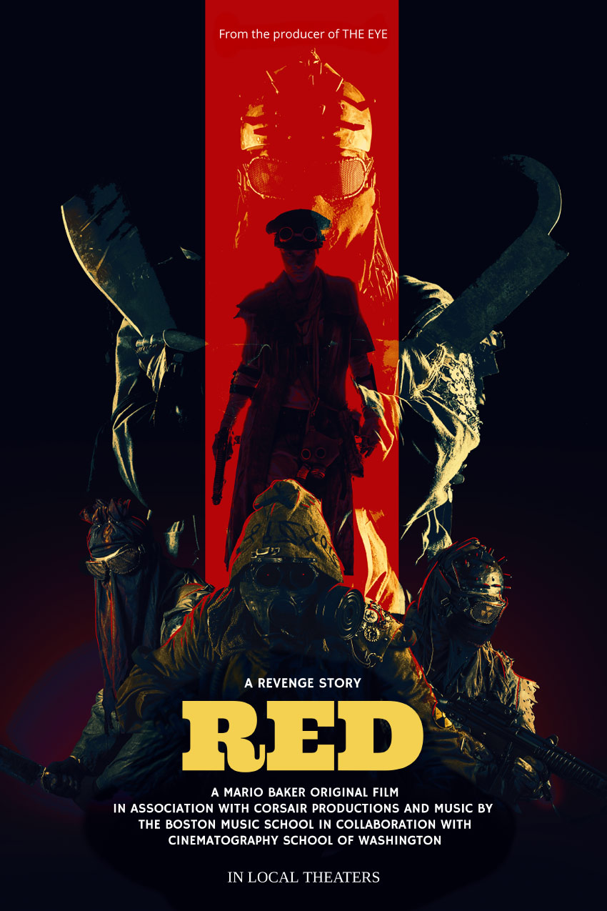
Final product image
What You’ll Be Creating

Today we will be learning how to make a movie poster in Adobe Photoshop, paired with Placeit’s poster maker!

We will be focusing on creating a gritty post-apocalyptic color grade using adjustment layers, and you’ll also learn how to apply quick and easy typography with Placeit. Let’s get started! 

What You’ll Need

You’ll need the following resources to complete this project:

Find more resources on Envato Elements! Or check out this roundup of the best ready-made movie poster templates:

1. How to Create a Red and Black Silhouetted Character

To start everything off, we will be creating our base and the main focus of our poster. In a real movie poster, this is where the hero would be located!

Step 1

Create a 4349 x 5907 px canvas with a Resolution of 300

Step 2

Create a Color Fill Layer and fill it with black. 

Using the Gradient or Brush Tool, create a red #ef0000 to transparent gradient coming from the bottom of the canvas. 

gradient

Step 3

Using a massive, soft, round Brush Tool, paint a black shadow gradient coming in from the left and right sides of the canvas. 

gradient

Step 4

Use the Rectangle Tool to create a long red #ff0000 vertical rectangle going from the top of the canvas to the bottom. 

stripe

Step 5

Drop in the Post-apocalypse female character and clip her into the red rectangle.  

Set the female image to Multiply.

Group all of your background layers into a group named „Base.”

subject

2. How to Plan Out and Place an Effective Composition

Next, we want to place our secondary characters—in this case, our hero’s enemies.

 Step 1

Take Nuclear survivor 1 and Nuclear survivor 2  and place them side by side, but facing away from each other. This will help frame the main female character.

place other subjects

Step 2

Next, place Nuclear survivor 3 between the previous survivors. 

To help place him and get his positioning just right, loosely extract him from his background using the Lasso Tool—just enough so that you can see behind the character. 

place other subject

Step 3

Finally, drag and drop Nuclear survivor 4 onto your canvas, setting the layer to Lighten.

He will represent our main bad guy, so let’s not only make him bigger but also place him looming over all the other characters.

Placing all your characters before extracting them is helpful when you have multiple poses or people to choose from. It will keep you from wasting time removing the background of people or objects you end up not using. 

place final subject

3.  How to Create a Gritty Post-Apocalyptic Photo Effect

Before we go any further, we are going to add a gritty color grade. Most of the time I save this step for last, but given the intensity of this effect in particular, it’s best to do it earlier on so you have a better vision of the outcome.

These are layered from bottom to top and should be placed above all future layers from here on out. 

Step 1

Create a Color Lookup adjustment layer. 

Color Lookup Settings

  • 3DLUT: Bleach Bypass 
  • Opacity: 50%
color lookup result

Step 2

Create a Color Lookup adjustment layer. 

Color Lookup Settings

  • 3DLUT: Foggy Night
  • Opacity: 20%
color lookup result

Step 3

Create a Color Lookup adjustment layer. 

Color Lookup Settings

  • 3DLUT: Crisp Warm
  • Opacity: 40%
color lookup result

Step 4

Create a Color Lookup adjustment layer. 

Color Lookup Settings

  • 3DLUT: Edgey Amber
  • Opacity: 50%
color lookup result

Step 5

Create a Color Lookup adjustment layer. 

Color Lookup Settings

  • 3DLUT: Horror Blue
  • Opacity: 100%
  • Layer Mode: Darker Color
color lookup result

Step 6

Create a Selective Color adjustment layer. 

Selective Color Settings

Reds

  • Yellow: +100%

Blues

  • Cyan: +100%
  • Magenta: +3%
  • Yellow: -96%
selective color result

Step 7

Create a Color Lookup adjustment layer. 

Color Lookup Settings

  • 3DLUT: Teal Orange Plus Contrast 
  • Opacity: 62%
  • Layer Mode: Color

Group all of your adjustment layers together, naming the group „Color Grade.”

color lookup result

4. How to Composite Multiple Subjects Together  

Now that we have our colors fleshed out and our characters placed, we can finally composite them all together.

Step 1

Extract the left and right characters using your preferred method; mine is the Pen Tool. Check out my How to Create a Honey Bee Themed Photo Manipulation to see how I extract subjects!

Now is the time to get their exact positioning just right. 

exstract subjects

Step 2

Extract and place your third subject located in the front. I also went ahead and enlarged him slightly to give the characters more of a hierarchy. 

adjust subjects

Step 3

Extract the fourth, largest character using the Magic Wand Tool. We want this character to have mostly highlights and be roughly extracted with a lot of jagged and torn edges. 

Make sure the layer is still set to Lighten and place it behind all other characters. 

Group all of your characters into a group named „Subjects.”

final layers

5. How to Draw Highlights and Blend Characters Quickly

Given the darkness of the overall image, it’s important to make sure your characters pop against their background; adding some strong highlights is a great way to do that!

Step 1

Create a New Layer above the „Subjects” group. 

Paint a red, somewhat sloppy outline around your three lower subjects using a small, hard round Brush. 

If you don’t have a graphics tablet, bring up the Smoothing of the brush to 30-50% and use the Smudge Tool to taper out the ends of the lines.

add red highlight

Step 2

Create a New Layer above your red outline. 

Using a large, soft, round Brush, paint a black shadow below your three lower subjects. 

Make sure not to hide any crucial details such as the subject’s weapons, while also making sure the bottom edges of the subjects aren’t showing and it’s a smooth black transition. 
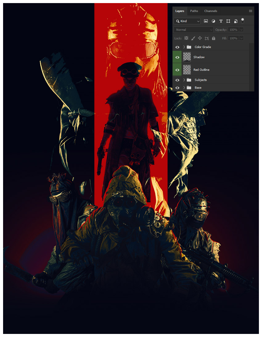
add shadow

6. How to Add Typography Using Placeit’s Poster Maker

Finally, we will be bringing our poster into Placeit’s poster maker to add our movie’s title and other relevant text!

Step 1

Save your poster design as either a JPG or PNG at a max of 12 MB in size. 

I’d suggest making your width at least 3600 px.

Step 2

See all of the poster templates available by going to www.placeit.net  > Designs and searching „Poster”.

I will be using the first option, Horror Film Poster Template.

templates

Step 3

Scroll down to see some of the horror genres presets available.

I will be using „Ritual”. Although this is a horror preset and our film is more in the post-apocalyptic action genre, Placeit gives you tons of customization options! 

horror presets

Step 4

While Placeit has a library of images available to use, we, of course, will be using our own. 

Do this by selecting Custom Image on the right-hand side where the background images are located.

Select your saved poster PNG or JPG image.

Crop your image using Placeit’s simple slider crop feature if needed. 

crop image

Step 5

Add your own text by replacing the text found on the left-hand side of the screen. 

The changes happen live and in real time!

add text

Step 6

Once all your text is decided, you can start to change the color, font face, and font placement! 

I will be using a pale-yellow color #f4d150 for the title font to make it stand out. 

Use the Color Picker Tool in Photoshop to pick colors right off your poster.

color text

Step 7

Next, I will be changing the font to Ultra.

change placement of text

Step 8

Finally, to finish everything up, I am going to arrange our poster text.

To do this in Placeit, drag and place the text wherever you want it. Once again, it’s all live editing! 

It also has guides to help you align everything perfectly! 

We’ve Done It!

The only thing more important than the composition or color story of a movie poster is the text itself! It must be bold, readable, and something that draws the eye to it!  

So, as always, keep experimenting with different techniques, and don’t forget to post your version below, along with any questions, comments, or critiques!

final

Looking to learn more? Why not check out the following excellent photo manipulation tutorials:

How to Make a Movie Poster in Photoshop

Post pobrano z: How to Make a Movie Poster in Photoshop

Final product image
What You’ll Be Creating

Today we will be learning how to make a movie poster in Adobe Photoshop, paired with Placeit’s poster maker!

We will be focusing on creating a gritty post-apocalyptic color grade using adjustment layers, and you’ll also learn how to apply quick and easy typography with Placeit. Let’s get started! 

What You’ll Need

You’ll need the following resources to complete this project:

Find more resources on Envato Elements! Or check out this roundup of the best ready-made movie poster templates:

1. How to Create a Red and Black Silhouetted Character

To start everything off, we will be creating our base and the main focus of our poster. In a real movie poster, this is where the hero would be located!

Step 1

Create a 4349 x 5907 px canvas with a Resolution of 300

Step 2

Create a Color Fill Layer and fill it with black. 

Using the Gradient or Brush Tool, create a red #ef0000 to transparent gradient coming from the bottom of the canvas. 

gradient

Step 3

Using a massive, soft, round Brush Tool, paint a black shadow gradient coming in from the left and right sides of the canvas. 

gradient

Step 4

Use the Rectangle Tool to create a long red #ff0000 vertical rectangle going from the top of the canvas to the bottom. 

stripe

Step 5

Drop in the Post-apocalypse female character and clip her into the red rectangle.  

Set the female image to Multiply.

Group all of your background layers into a group named „Base.”

subject

2. How to Plan Out and Place an Effective Composition

Next, we want to place our secondary characters—in this case, our hero’s enemies.

 Step 1

Take Nuclear survivor 1 and Nuclear survivor 2  and place them side by side, but facing away from each other. This will help frame the main female character.

place other subjects

Step 2

Next, place Nuclear survivor 3 between the previous survivors. 

To help place him and get his positioning just right, loosely extract him from his background using the Lasso Tool—just enough so that you can see behind the character. 

place other subject

Step 3

Finally, drag and drop Nuclear survivor 4 onto your canvas, setting the layer to Lighten.

He will represent our main bad guy, so let’s not only make him bigger but also place him looming over all the other characters.

Placing all your characters before extracting them is helpful when you have multiple poses or people to choose from. It will keep you from wasting time removing the background of people or objects you end up not using. 

place final subject

3.  How to Create a Gritty Post-Apocalyptic Photo Effect

Before we go any further, we are going to add a gritty color grade. Most of the time I save this step for last, but given the intensity of this effect in particular, it’s best to do it earlier on so you have a better vision of the outcome.

These are layered from bottom to top and should be placed above all future layers from here on out. 

Step 1

Create a Color Lookup adjustment layer. 

Color Lookup Settings

  • 3DLUT: Bleach Bypass 
  • Opacity: 50%
color lookup result

Step 2

Create a Color Lookup adjustment layer. 

Color Lookup Settings

  • 3DLUT: Foggy Night
  • Opacity: 20%
color lookup result

Step 3

Create a Color Lookup adjustment layer. 

Color Lookup Settings

  • 3DLUT: Crisp Warm
  • Opacity: 40%
color lookup result

Step 4

Create a Color Lookup adjustment layer. 

Color Lookup Settings

  • 3DLUT: Edgey Amber
  • Opacity: 50%
color lookup result

Step 5

Create a Color Lookup adjustment layer. 

Color Lookup Settings

  • 3DLUT: Horror Blue
  • Opacity: 100%
  • Layer Mode: Darker Color
color lookup result

Step 6

Create a Selective Color adjustment layer. 

Selective Color Settings

Reds

  • Yellow: +100%

Blues

  • Cyan: +100%
  • Magenta: +3%
  • Yellow: -96%
selective color result

Step 7

Create a Color Lookup adjustment layer. 

Color Lookup Settings

  • 3DLUT: Teal Orange Plus Contrast 
  • Opacity: 62%
  • Layer Mode: Color

Group all of your adjustment layers together, naming the group „Color Grade.”

color lookup result

4. How to Composite Multiple Subjects Together  

Now that we have our colors fleshed out and our characters placed, we can finally composite them all together.

Step 1

Extract the left and right characters using your preferred method; mine is the Pen Tool. Check out my How to Create a Honey Bee Themed Photo Manipulation to see how I extract subjects!

Now is the time to get their exact positioning just right. 

exstract subjects

Step 2

Extract and place your third subject located in the front. I also went ahead and enlarged him slightly to give the characters more of a hierarchy. 

adjust subjects

Step 3

Extract the fourth, largest character using the Magic Wand Tool. We want this character to have mostly highlights and be roughly extracted with a lot of jagged and torn edges. 

Make sure the layer is still set to Lighten and place it behind all other characters. 

Group all of your characters into a group named „Subjects.”

final layers

5. How to Draw Highlights and Blend Characters Quickly

Given the darkness of the overall image, it’s important to make sure your characters pop against their background; adding some strong highlights is a great way to do that!

Step 1

Create a New Layer above the „Subjects” group. 

Paint a red, somewhat sloppy outline around your three lower subjects using a small, hard round Brush. 

If you don’t have a graphics tablet, bring up the Smoothing of the brush to 30-50% and use the Smudge Tool to taper out the ends of the lines.

add red highlight

Step 2

Create a New Layer above your red outline. 

Using a large, soft, round Brush, paint a black shadow below your three lower subjects. 

Make sure not to hide any crucial details such as the subject’s weapons, while also making sure the bottom edges of the subjects aren’t showing and it’s a smooth black transition. 

add shadow

6. How to Add Typography Using Placeit’s Poster Maker

Finally, we will be bringing our poster into Placeit’s poster maker to add our movie’s title and other relevant text!

Step 1

Save your poster design as either a JPG or PNG at a max of 12 MB in size. 

I’d suggest making your width at least 3600 px.

Step 2

See all of the poster templates available by going to www.placeit.net  > Designs and searching „Poster”.

I will be using the first option, Horror Film Poster Template.

templates

Step 3

Scroll down to see some of the horror genres presets available.

I will be using „Ritual”. Although this is a horror preset and our film is more in the post-apocalyptic action genre, Placeit gives you tons of customization options! 

horror presets

Step 4

While Placeit has a library of images available to use, we, of course, will be using our own. 

Do this by selecting Custom Image on the right-hand side where the background images are located.

Select your saved poster PNG or JPG image.

Crop your image using Placeit’s simple slider crop feature if needed. 

crop image

Step 5

Add your own text by replacing the text found on the left-hand side of the screen. 

The changes happen live and in real time!

add text

Step 6

Once all your text is decided, you can start to change the color, font face, and font placement! 

I will be using a pale-yellow color #f4d150 for the title font to make it stand out. 

Use the Color Picker Tool in Photoshop to pick colors right off your poster.

color text

Step 7

Next, I will be changing the font to Ultra.

change placement of text

Step 8

Finally, to finish everything up, I am going to arrange our poster text.

To do this in Placeit, drag and place the text wherever you want it. Once again, it’s all live editing! 

It also has guides to help you align everything perfectly! 

We’ve Done It!

The only thing more important than the composition or color story of a movie poster is the text itself! It must be bold, readable, and something that draws the eye to it!  

So, as always, keep experimenting with different techniques, and don’t forget to post your version below, along with any questions, comments, or critiques!

final

Looking to learn more? Why not check out the following excellent photo manipulation tutorials:

How to Make a Movie Poster in Photoshop

Post pobrano z: How to Make a Movie Poster in Photoshop

Final product image
What You’ll Be Creating

Today we will be learning how to make a movie poster in Adobe Photoshop, paired with Placeit’s poster maker!

We will be focusing on creating a gritty post-apocalyptic color grade using adjustment layers, and you’ll also learn how to apply quick and easy typography with Placeit. Let’s get started! 

What You’ll Need

You’ll need the following resources to complete this project:

Find more resources on Envato Elements! Or check out this roundup of the best ready-made movie poster templates:

1. How to Create a Red and Black Silhouetted Character

To start everything off, we will be creating our base and the main focus of our poster. In a real movie poster, this is where the hero would be located!

Step 1

Create a 4349 x 5907 px canvas with a Resolution of 300

Step 2

Create a Color Fill Layer and fill it with black. 

Using the Gradient or Brush Tool, create a red #ef0000 to transparent gradient coming from the bottom of the canvas. 

gradient

Step 3

Using a massive, soft, round Brush Tool, paint a black shadow gradient coming in from the left and right sides of the canvas. 

gradient

Step 4

Use the Rectangle Tool to create a long red #ff0000 vertical rectangle going from the top of the canvas to the bottom. 

stripe

Step 5

Drop in the Post-apocalypse female character and clip her into the red rectangle.  

Set the female image to Multiply.

Group all of your background layers into a group named „Base.”

subject

2. How to Plan Out and Place an Effective Composition

Next, we want to place our secondary characters—in this case, our hero’s enemies.

 Step 1

Take Nuclear survivor 1 and Nuclear survivor 2  and place them side by side, but facing away from each other. This will help frame the main female character.

place other subjects

Step 2

Next, place Nuclear survivor 3 between the previous survivors. 

To help place him and get his positioning just right, loosely extract him from his background using the Lasso Tool—just enough so that you can see behind the character. 

place other subject

Step 3

Finally, drag and drop Nuclear survivor 4 onto your canvas, setting the layer to Lighten.

He will represent our main bad guy, so let’s not only make him bigger but also place him looming over all the other characters.

Placing all your characters before extracting them is helpful when you have multiple poses or people to choose from. It will keep you from wasting time removing the background of people or objects you end up not using. 

place final subject

3.  How to Create a Gritty Post-Apocalyptic Photo Effect

Before we go any further, we are going to add a gritty color grade. Most of the time I save this step for last, but given the intensity of this effect in particular, it’s best to do it earlier on so you have a better vision of the outcome.

These are layered from bottom to top and should be placed above all future layers from here on out. 

Step 1

Create a Color Lookup adjustment layer. 

Color Lookup Settings

  • 3DLUT: Bleach Bypass 
  • Opacity: 50%
color lookup result

Step 2

Create a Color Lookup adjustment layer. 

Color Lookup Settings

  • 3DLUT: Foggy Night
  • Opacity: 20%
color lookup result

Step 3

Create a Color Lookup adjustment layer. 

Color Lookup Settings

  • 3DLUT: Crisp Warm
  • Opacity: 40%
color lookup result

Step 4

Create a Color Lookup adjustment layer. 

Color Lookup Settings

  • 3DLUT: Edgey Amber
  • Opacity: 50%
color lookup result

Step 5

Create a Color Lookup adjustment layer. 

Color Lookup Settings

  • 3DLUT: Horror Blue
  • Opacity: 100%
  • Layer Mode: Darker Color
color lookup result

Step 6

Create a Selective Color adjustment layer. 

Selective Color Settings

Reds

  • Yellow: +100%

Blues

  • Cyan: +100%
  • Magenta: +3%
  • Yellow: -96%
selective color result

Step 7

Create a Color Lookup adjustment layer. 

Color Lookup Settings

  • 3DLUT: Teal Orange Plus Contrast 
  • Opacity: 62%
  • Layer Mode: Color

Group all of your adjustment layers together, naming the group „Color Grade.”

color lookup result

4. How to Composite Multiple Subjects Together  

Now that we have our colors fleshed out and our characters placed, we can finally composite them all together.

Step 1

Extract the left and right characters using your preferred method; mine is the Pen Tool. Check out my How to Create a Honey Bee Themed Photo Manipulation to see how I extract subjects!

Now is the time to get their exact positioning just right. 

exstract subjects

Step 2

Extract and place your third subject located in the front. I also went ahead and enlarged him slightly to give the characters more of a hierarchy. 

adjust subjects

Step 3

Extract the fourth, largest character using the Magic Wand Tool. We want this character to have mostly highlights and be roughly extracted with a lot of jagged and torn edges. 

Make sure the layer is still set to Lighten and place it behind all other characters. 

Group all of your characters into a group named „Subjects.”

final layers

5. How to Draw Highlights and Blend Characters Quickly

Given the darkness of the overall image, it’s important to make sure your characters pop against their background; adding some strong highlights is a great way to do that!

Step 1

Create a New Layer above the „Subjects” group. 

Paint a red, somewhat sloppy outline around your three lower subjects using a small, hard round Brush. 

If you don’t have a graphics tablet, bring up the Smoothing of the brush to 30-50% and use the Smudge Tool to taper out the ends of the lines.

add red highlight

Step 2

Create a New Layer above your red outline. 

Using a large, soft, round Brush, paint a black shadow below your three lower subjects. 

Make sure not to hide any crucial details such as the subject’s weapons, while also making sure the bottom edges of the subjects aren’t showing and it’s a smooth black transition. 

add shadow

6. How to Add Typography Using Placeit’s Poster Maker

Finally, we will be bringing our poster into Placeit’s poster maker to add our movie’s title and other relevant text!

Step 1

Save your poster design as either a JPG or PNG at a max of 12 MB in size. 

I’d suggest making your width at least 3600 px.

Step 2

See all of the poster templates available by going to www.placeit.net  > Designs and searching „Poster”.

I will be using the first option, Horror Film Poster Template.

templates

Step 3

Scroll down to see some of the horror genres presets available.

I will be using „Ritual”. Although this is a horror preset and our film is more in the post-apocalyptic action genre, Placeit gives you tons of customization options! 

horror presets

Step 4

While Placeit has a library of images available to use, we, of course, will be using our own. 

Do this by selecting Custom Image on the right-hand side where the background images are located.

Select your saved poster PNG or JPG image.

Crop your image using Placeit’s simple slider crop feature if needed. 

crop image

Step 5

Add your own text by replacing the text found on the left-hand side of the screen. 

The changes happen live and in real time!

add text

Step 6

Once all your text is decided, you can start to change the color, font face, and font placement! 

I will be using a pale-yellow color #f4d150 for the title font to make it stand out. 

Use the Color Picker Tool in Photoshop to pick colors right off your poster.

color text

Step 7

Next, I will be changing the font to Ultra.

change placement of text

Step 8

Finally, to finish everything up, I am going to arrange our poster text.

To do this in Placeit, drag and place the text wherever you want it. Once again, it’s all live editing! 

It also has guides to help you align everything perfectly! 

We’ve Done It!

The only thing more important than the composition or color story of a movie poster is the text itself! It must be bold, readable, and something that draws the eye to it!  

So, as always, keep experimenting with different techniques, and don’t forget to post your version below, along with any questions, comments, or critiques!

final

Looking to learn more? Why not check out the following excellent photo manipulation tutorials:

What if we got aspect-ratio sized images by doing almost nothing?

Post pobrano z: What if we got aspect-ratio sized images by doing almost nothing?

Say you have an image you’re using in an <img> that is 800×600 pixels. Will it actually display as 800px wide on your site? It’s very likely that it will not. We tend to put images into flexible container elements, and the image inside is set to width: 100%;. So perhaps that image ends up as 721px wide, or 381px wide, or whatever. What doesn’t change is that image’s aspect ratio, lest you squish it awkwardly (ignoring the special use-case object-fit scenario).

The main point is that we don’t know how much vertical space an image is going to occupy until that image loads. This is the cause of jank! Terrible jank! It’s everywhere and it’s awful.

There are ways to create aspect-ratio sized boxes in HTML/CSS today. None of the options are particularly elegant because they rely on the „hack” of setting a zero height and pushing the boxes height with padding. Wouldn’t it be nicer to have a platform feature to help us here? The first crack at fixing this problem that I know about is an intrinsicsize attribute. Eric Portis wrote about how this works wonderfully in Jank-Free Image Loads.

We’d get this:

<img src="image.jpg" intrinsicsize="800x600" />

This is currently behind a flag in Chrome 71+, and it really does help solve this problem.

But…

The intrinsicsize property is brand new. It will only help on sites where the developers know about it and take the care to implement it. And it’s tricky! Images tend to be sized arbitrarily, and the intrinsicsize attribute will need to be custom on every image to be accurate and do its job. That is, if it makes it out of standards at all.

There is another possibility! Eric also talked about the aspect-ratio property in CSS as a potential solution. It’s also still just a draft spec. You might say, but how is this helpful? It needs to be just as bespoke as intrinsicsize does, meaning you’d have to do it as inline styles to be helpful. Maybe that’s not so bad if it solves a big problem, but inline styles are such a pain to override and it seems like the HTML attribute approach is more inline with the spirit of images. Think of how srcset is a hint to browsers for what images are available to download, allowing the browser to pick the best one for the scenario. Telling the browser about the aspect-ratio upfront is similarly useful.

I heard from Jen Simmons about an absolutely fantastic way to handle this: put a default aspect ratio into the UA stylesheet based on the elements existing width and height attributes. Like this:

img, video {
  aspect-ratio: attr(width) / attr(height);
}

Let that soak in.

Now if you already have:

<img src="image.jpg" width="800" height="600" />

It automatically has the correct aspect ratio as the page loads. That’s awesome.

  1. It’s easy to understand.
  2. A ton of the internet already has these attributes sitting on their images.
  3. New developers will have no trouble understanding this, and old developers will be grateful there is little (if any) work to do here.

I like the idea of the CSS feature. But I like 100 times more the idea of putting it into the UA</abbr? stylesheet so that the entire web benefits. I'm sure that changing a UA stylesheet is no small thing to consider — and I’m not qualified to understand all the implications of that — but it feels like a very awesome thing at first consideration.

Jen has a ticket open for people to voice their thoughts and links to the bug ticket where Firefox is going to test this out to see how it goes.

The post What if we got aspect-ratio sized images by doing almost nothing? appeared first on CSS-Tricks.

Gaming Screenshots as an Art Form

Post pobrano z: Gaming Screenshots as an Art Form

Flexibility is one of the most fundamental cornerstones of
artistic expression. This doesn’t just apply with already established art forms
either, as it also reflects the new and constantly evolving avenues which our
artistic appreciation can take.

One of the most recent forms that has been becoming
increasingly visible is that of static gaming images as art. Of course, games
themselves consist of enormous quantities of art assets but, as we commonly see
in photography, images when properly framed can account for more than just the
sum of their parts.

Borrowing from the Old, Relying on the New

Perhaps the most obvious component of this burgeoning art
form comes from the classic discipline of photography. Light, framing, focal length,
and so many other forms of image manipulation raise their heads here, and these
have benefitted heavily from improving graphical horsepower.

Rising graphical standards through better in-game textures,
model quality, lighting techniques, anti-aliasing, and antistrophic filtering
have all been growing increasingly convincing in recent years, and these are
only a few of the technologies involved.

First Dragon Ball FighterZ screenshot of future trunks revealed https://t.co/OkLbXSwnJZ pic.twitter.com/8FCuq41lju

— GameSpot (@GameSpot) June 27, 2017

While depictions of realism have obviously seen some of the
biggest leaps in believability, it should also be noted that stylised graphics
like those from cell-shaded games have also made significant strides in recent
years.

Aiding in this more traditional appeal to photography is
the inclusion of what is known as a photo mode in many newer games. This is
usually triggered through the pause menu or by performing a special button
combination, which then pauses the action and opens up the photo tool.

This tool then allows players to fully rotate and tilt the
camera, change its distance, add filters to the screen, remove certain
characters, add borders, manipulate saturation and brightness, and otherwise
play with a whole host of other options.

Somebody call the Daily Bugle! ?

?(Screenshot from Spider-Man PS4) #SpiderManPS4 #peterparker pic.twitter.com/hpW7J9sfyS

— MASH Virtual (@MashVirtual) October 8, 2018

In effect, this gives more freedom than a real-life
photographer could ever find, which can give rise to some astounding artistic
pieces. Take a look at a few from Redbull, for the recent PS4 Spider-Man game, to see just a hint of the
possibilities here.

Building the Business

The other side of this equation is afforded through the
inclusion of humanity as a means of guiding expression and understanding.
Before taking a look at how we accomplish this today, however, we need to
examine the place screenshots have had in gaming’s past.

Primarily, screenshots were a form of advertising above all
else. By placing images of the most exciting parts of a game on the back of the
box, a studio could show their games in the most measured way possible. This
could allow them to draw from parts of high action or the areas where games
possessed the most graphical fidelity.

This was so important, in fact, that it sometimes involved
less than honest practices and, more recently, helped shaped the current form
of console gaming. On rare occasions, the screenshots on the back of the gaming
box would only include images from the best-looking version of a multiplatform
release, for example, while the game included within might never match these
standards.

When it comes to the most recent generation of consoles,
gaming enthusiasts have lamented the emphasis of resolution over frame-rate.
This very deliberate choice has allowed games to look amazingly good in still
images like screenshots, though it inevitably makes the gameplay itself suffer
as a result of less fluidity.

Better in screenshots, and better for their art, but less
helpful to those invested in more mobile depictions of gaming art.

Taking from the Human Aspect

In terms of bringing the visibility of gaming and the art
within to mass attention, few developments have been as influential as game
streaming. Giving space to both the game and the human participants, this goes
for a different tact than just in-game illustration, relating human response
and feeling back to the game with a direct line.

It's been 2 years since I first pressed start stream. From trying to find a path in life working as a QA tester, to crying before starting stream cause I was scared I would fail. Now being partnered with a beautiful community, it's been an amazing journey.

Thank you @Twitch ? pic.twitter.com/QtRqI1Q9zO

— ??????? (@KatLink) November 6, 2018

There is a modern classic style in taking screenshots from
live gaming services like Twitch, UStream, and YouTube, for example, in times
of success, failure, frustration, or comedy. Selecting the right moment, and
using this to capture emotion is an incredibly effective system and one that
has inspired memes the world over.

This doesn’t just apply to these services either, as casino online services utilise game streaming to offer
interactive classics such as blackjack and roulette though the likes of live casino
games. These are more interactive, and all the more effective at conveying and
setting a mood because of it.

Static, Moving, and Virtual

As graphics and animation only improve, and the gaming
market continues to grow, it is inevitable that we will see a greater emphasis
on gaming-related art in the future. With the introduction of new tech like virtual reality, this could even take the form
of fully immersive images, which could shape the medium in ways not yet
conceived.

Offering itself as one of the more communal and
participatory illustrations of art, from the assets to the placement and
capture, this opens doors to an interesting future of collaboration. Regardless
of how you see gaming itself, these possibilities are certainly expansive and
exciting.

Gaming Screenshots as an Art Form

Post pobrano z: Gaming Screenshots as an Art Form

Flexibility is one of the most fundamental cornerstones of
artistic expression. This doesn’t just apply with already established art forms
either, as it also reflects the new and constantly evolving avenues which our
artistic appreciation can take.

One of the most recent forms that has been becoming
increasingly visible is that of static gaming images as art. Of course, games
themselves consist of enormous quantities of art assets but, as we commonly see
in photography, images when properly framed can account for more than just the
sum of their parts.

Borrowing from the Old, Relying on the New

Perhaps the most obvious component of this burgeoning art
form comes from the classic discipline of photography. Light, framing, focal length,
and so many other forms of image manipulation raise their heads here, and these
have benefitted heavily from improving graphical horsepower.

Rising graphical standards through better in-game textures,
model quality, lighting techniques, anti-aliasing, and antistrophic filtering
have all been growing increasingly convincing in recent years, and these are
only a few of the technologies involved.

First Dragon Ball FighterZ screenshot of future trunks revealed https://t.co/OkLbXSwnJZ pic.twitter.com/8FCuq41lju

— GameSpot (@GameSpot) June 27, 2017

While depictions of realism have obviously seen some of the
biggest leaps in believability, it should also be noted that stylised graphics
like those from cell-shaded games have also made significant strides in recent
years.

Aiding in this more traditional appeal to photography is
the inclusion of what is known as a photo mode in many newer games. This is
usually triggered through the pause menu or by performing a special button
combination, which then pauses the action and opens up the photo tool.

This tool then allows players to fully rotate and tilt the
camera, change its distance, add filters to the screen, remove certain
characters, add borders, manipulate saturation and brightness, and otherwise
play with a whole host of other options.

Somebody call the Daily Bugle! ?

?(Screenshot from Spider-Man PS4) #SpiderManPS4 #peterparker pic.twitter.com/hpW7J9sfyS

— MASH Virtual (@MashVirtual) October 8, 2018

In effect, this gives more freedom than a real-life
photographer could ever find, which can give rise to some astounding artistic
pieces. Take a look at a few from Redbull, for the recent PS4 Spider-Man game, to see just a hint of the
possibilities here.

Building the Business

The other side of this equation is afforded through the
inclusion of humanity as a means of guiding expression and understanding.
Before taking a look at how we accomplish this today, however, we need to
examine the place screenshots have had in gaming’s past.

Primarily, screenshots were a form of advertising above all
else. By placing images of the most exciting parts of a game on the back of the
box, a studio could show their games in the most measured way possible. This
could allow them to draw from parts of high action or the areas where games
possessed the most graphical fidelity.

This was so important, in fact, that it sometimes involved
less than honest practices and, more recently, helped shaped the current form
of console gaming. On rare occasions, the screenshots on the back of the gaming
box would only include images from the best-looking version of a multiplatform
release, for example, while the game included within might never match these
standards.

When it comes to the most recent generation of consoles,
gaming enthusiasts have lamented the emphasis of resolution over frame-rate.
This very deliberate choice has allowed games to look amazingly good in still
images like screenshots, though it inevitably makes the gameplay itself suffer
as a result of less fluidity.

Better in screenshots, and better for their art, but less
helpful to those invested in more mobile depictions of gaming art.

Taking from the Human Aspect

In terms of bringing the visibility of gaming and the art
within to mass attention, few developments have been as influential as game
streaming. Giving space to both the game and the human participants, this goes
for a different tact than just in-game illustration, relating human response
and feeling back to the game with a direct line.

It's been 2 years since I first pressed start stream. From trying to find a path in life working as a QA tester, to crying before starting stream cause I was scared I would fail. Now being partnered with a beautiful community, it's been an amazing journey.

Thank you @Twitch ? pic.twitter.com/QtRqI1Q9zO

— ??????? (@KatLink) November 6, 2018

There is a modern classic style in taking screenshots from
live gaming services like Twitch, UStream, and YouTube, for example, in times
of success, failure, frustration, or comedy. Selecting the right moment, and
using this to capture emotion is an incredibly effective system and one that
has inspired memes the world over.

This doesn’t just apply to these services either, as casino online services utilise game streaming to offer
interactive classics such as blackjack and roulette though the likes of live casino
games. These are more interactive, and all the more effective at conveying and
setting a mood because of it.

Static, Moving, and Virtual

As graphics and animation only improve, and the gaming
market continues to grow, it is inevitable that we will see a greater emphasis
on gaming-related art in the future. With the introduction of new tech like virtual reality, this could even take the form
of fully immersive images, which could shape the medium in ways not yet
conceived.

Offering itself as one of the more communal and
participatory illustrations of art, from the assets to the placement and
capture, this opens doors to an interesting future of collaboration. Regardless
of how you see gaming itself, these possibilities are certainly expansive and
exciting.

Gaming Screenshots as an Art Form

Post pobrano z: Gaming Screenshots as an Art Form

Flexibility is one of the most fundamental cornerstones of
artistic expression. This doesn’t just apply with already established art forms
either, as it also reflects the new and constantly evolving avenues which our
artistic appreciation can take.

One of the most recent forms that has been becoming
increasingly visible is that of static gaming images as art. Of course, games
themselves consist of enormous quantities of art assets but, as we commonly see
in photography, images when properly framed can account for more than just the
sum of their parts.

Borrowing from the Old, Relying on the New

Perhaps the most obvious component of this burgeoning art
form comes from the classic discipline of photography. Light, framing, focal length,
and so many other forms of image manipulation raise their heads here, and these
have benefitted heavily from improving graphical horsepower.

Rising graphical standards through better in-game textures,
model quality, lighting techniques, anti-aliasing, and antistrophic filtering
have all been growing increasingly convincing in recent years, and these are
only a few of the technologies involved.

First Dragon Ball FighterZ screenshot of future trunks revealed https://t.co/OkLbXSwnJZ pic.twitter.com/8FCuq41lju

— GameSpot (@GameSpot) June 27, 2017

While depictions of realism have obviously seen some of the
biggest leaps in believability, it should also be noted that stylised graphics
like those from cell-shaded games have also made significant strides in recent
years.

Aiding in this more traditional appeal to photography is
the inclusion of what is known as a photo mode in many newer games. This is
usually triggered through the pause menu or by performing a special button
combination, which then pauses the action and opens up the photo tool.

This tool then allows players to fully rotate and tilt the
camera, change its distance, add filters to the screen, remove certain
characters, add borders, manipulate saturation and brightness, and otherwise
play with a whole host of other options.

Somebody call the Daily Bugle! ?

?(Screenshot from Spider-Man PS4) #SpiderManPS4 #peterparker pic.twitter.com/hpW7J9sfyS

— MASH Virtual (@MashVirtual) October 8, 2018

In effect, this gives more freedom than a real-life
photographer could ever find, which can give rise to some astounding artistic
pieces. Take a look at a few from Redbull, for the recent PS4 Spider-Man game, to see just a hint of the
possibilities here.

Building the Business

The other side of this equation is afforded through the
inclusion of humanity as a means of guiding expression and understanding.
Before taking a look at how we accomplish this today, however, we need to
examine the place screenshots have had in gaming’s past.

Primarily, screenshots were a form of advertising above all
else. By placing images of the most exciting parts of a game on the back of the
box, a studio could show their games in the most measured way possible. This
could allow them to draw from parts of high action or the areas where games
possessed the most graphical fidelity.

This was so important, in fact, that it sometimes involved
less than honest practices and, more recently, helped shaped the current form
of console gaming. On rare occasions, the screenshots on the back of the gaming
box would only include images from the best-looking version of a multiplatform
release, for example, while the game included within might never match these
standards.

When it comes to the most recent generation of consoles,
gaming enthusiasts have lamented the emphasis of resolution over frame-rate.
This very deliberate choice has allowed games to look amazingly good in still
images like screenshots, though it inevitably makes the gameplay itself suffer
as a result of less fluidity.

Better in screenshots, and better for their art, but less
helpful to those invested in more mobile depictions of gaming art.

Taking from the Human Aspect

In terms of bringing the visibility of gaming and the art
within to mass attention, few developments have been as influential as game
streaming. Giving space to both the game and the human participants, this goes
for a different tact than just in-game illustration, relating human response
and feeling back to the game with a direct line.

It's been 2 years since I first pressed start stream. From trying to find a path in life working as a QA tester, to crying before starting stream cause I was scared I would fail. Now being partnered with a beautiful community, it's been an amazing journey.

Thank you @Twitch ? pic.twitter.com/QtRqI1Q9zO

— ??????? (@KatLink) November 6, 2018

There is a modern classic style in taking screenshots from
live gaming services like Twitch, UStream, and YouTube, for example, in times
of success, failure, frustration, or comedy. Selecting the right moment, and
using this to capture emotion is an incredibly effective system and one that
has inspired memes the world over.

This doesn’t just apply to these services either, as casino online services utilise game streaming to offer
interactive classics such as blackjack and roulette though the likes of live casino
games. These are more interactive, and all the more effective at conveying and
setting a mood because of it.

Static, Moving, and Virtual

As graphics and animation only improve, and the gaming
market continues to grow, it is inevitable that we will see a greater emphasis
on gaming-related art in the future. With the introduction of new tech like virtual reality, this could even take the form
of fully immersive images, which could shape the medium in ways not yet
conceived.

Offering itself as one of the more communal and
participatory illustrations of art, from the assets to the placement and
capture, this opens doors to an interesting future of collaboration. Regardless
of how you see gaming itself, these possibilities are certainly expansive and
exciting.

Gaming Screenshots as an Art Form

Post pobrano z: Gaming Screenshots as an Art Form

Flexibility is one of the most fundamental cornerstones of
artistic expression. This doesn’t just apply with already established art forms
either, as it also reflects the new and constantly evolving avenues which our
artistic appreciation can take.

One of the most recent forms that has been becoming
increasingly visible is that of static gaming images as art. Of course, games
themselves consist of enormous quantities of art assets but, as we commonly see
in photography, images when properly framed can account for more than just the
sum of their parts.

Borrowing from the Old, Relying on the New

Perhaps the most obvious component of this burgeoning art
form comes from the classic discipline of photography. Light, framing, focal length,
and so many other forms of image manipulation raise their heads here, and these
have benefitted heavily from improving graphical horsepower.

Rising graphical standards through better in-game textures,
model quality, lighting techniques, anti-aliasing, and antistrophic filtering
have all been growing increasingly convincing in recent years, and these are
only a few of the technologies involved.

First Dragon Ball FighterZ screenshot of future trunks revealed https://t.co/OkLbXSwnJZ pic.twitter.com/8FCuq41lju

— GameSpot (@GameSpot) June 27, 2017

While depictions of realism have obviously seen some of the
biggest leaps in believability, it should also be noted that stylised graphics
like those from cell-shaded games have also made significant strides in recent
years.

Aiding in this more traditional appeal to photography is
the inclusion of what is known as a photo mode in many newer games. This is
usually triggered through the pause menu or by performing a special button
combination, which then pauses the action and opens up the photo tool.

This tool then allows players to fully rotate and tilt the
camera, change its distance, add filters to the screen, remove certain
characters, add borders, manipulate saturation and brightness, and otherwise
play with a whole host of other options.

Somebody call the Daily Bugle! ?

?(Screenshot from Spider-Man PS4) #SpiderManPS4 #peterparker pic.twitter.com/hpW7J9sfyS

— MASH Virtual (@MashVirtual) October 8, 2018

In effect, this gives more freedom than a real-life
photographer could ever find, which can give rise to some astounding artistic
pieces. Take a look at a few from Redbull, for the recent PS4 Spider-Man game, to see just a hint of the
possibilities here.

Building the Business

The other side of this equation is afforded through the
inclusion of humanity as a means of guiding expression and understanding.
Before taking a look at how we accomplish this today, however, we need to
examine the place screenshots have had in gaming’s past.

Primarily, screenshots were a form of advertising above all
else. By placing images of the most exciting parts of a game on the back of the
box, a studio could show their games in the most measured way possible. This
could allow them to draw from parts of high action or the areas where games
possessed the most graphical fidelity.

This was so important, in fact, that it sometimes involved
less than honest practices and, more recently, helped shaped the current form
of console gaming. On rare occasions, the screenshots on the back of the gaming
box would only include images from the best-looking version of a multiplatform
release, for example, while the game included within might never match these
standards.

When it comes to the most recent generation of consoles,
gaming enthusiasts have lamented the emphasis of resolution over frame-rate.
This very deliberate choice has allowed games to look amazingly good in still
images like screenshots, though it inevitably makes the gameplay itself suffer
as a result of less fluidity.

Better in screenshots, and better for their art, but less
helpful to those invested in more mobile depictions of gaming art.

Taking from the Human Aspect

In terms of bringing the visibility of gaming and the art
within to mass attention, few developments have been as influential as game
streaming. Giving space to both the game and the human participants, this goes
for a different tact than just in-game illustration, relating human response
and feeling back to the game with a direct line.

It's been 2 years since I first pressed start stream. From trying to find a path in life working as a QA tester, to crying before starting stream cause I was scared I would fail. Now being partnered with a beautiful community, it's been an amazing journey.

Thank you @Twitch ? pic.twitter.com/QtRqI1Q9zO

— ??????? (@KatLink) November 6, 2018

There is a modern classic style in taking screenshots from
live gaming services like Twitch, UStream, and YouTube, for example, in times
of success, failure, frustration, or comedy. Selecting the right moment, and
using this to capture emotion is an incredibly effective system and one that
has inspired memes the world over.

This doesn’t just apply to these services either, as casino online services utilise game streaming to offer
interactive classics such as blackjack and roulette though the likes of live casino
games. These are more interactive, and all the more effective at conveying and
setting a mood because of it.

Static, Moving, and Virtual

As graphics and animation only improve, and the gaming
market continues to grow, it is inevitable that we will see a greater emphasis
on gaming-related art in the future. With the introduction of new tech like virtual reality, this could even take the form
of fully immersive images, which could shape the medium in ways not yet
conceived.

Offering itself as one of the more communal and
participatory illustrations of art, from the assets to the placement and
capture, this opens doors to an interesting future of collaboration. Regardless
of how you see gaming itself, these possibilities are certainly expansive and
exciting.

7 Color Palette Generators that Will Make Your Brand Pop

Post pobrano z: 7 Color Palette Generators that Will Make Your Brand Pop

As of January 2019, there were over 1 billion websites in the world (and counting!). In this veritable landslide of code, what can you do to make your website stand out at the end of the day?

The answer is so basic that it’s often overlooked. A website’s color palette often makes all the difference in the amount of attention it gets.

Why Color?

There are many reasons – both aesthetic and scientific – that play into why you should carefully select your website’s color palette.

For one, your color palette is an expression of your brand or business’s personality. The aim is to find something that jives with your brand and showcases how unique your brand really is.

When it comes to science, know that one study found that 92.6% percent of shoppers claim that color is the primary factor influencing their purchasing decisions. In another study performed by the University of Loyola, Maryland, it was discovered that brand recognition is boosted by 80 percent when the right colors are used.

How to Find the Right Color Combination

Creating a color scheme that fits your brand is no easy feat. In fact, color theorists use multiple rules and guidelines to help them assemble sets of colors.

Luckily, you don’t have to. There are two types of tools you can find online that allow you to create color palettes:

  1. Color Palette Galleries: In these, either humans or algorithms compile beautifully matched color schemes. This is the best choice for you if don’t understand color theory.
  2. Color Palette Generators: You can use these to design your color palette manually. To use color palette generators, start by choosing a color palettes you like. From there, adjust the combinations, hues, contrast and lightness. Some tools, like COLOURlovers, allow you to look at galleries and use a generator.

Read on for reviews of our top color palette generators to help you create a site that with a color palette that shines.

1. COLOURlovers

colourlovers

COLOURlovers proclaims itself an international creative community. In fact, it is 8 million users strong.

You could spend hours on this website, it’s that comprehensive. And at first, you might even find COLOURlover’s interface a bit overwhelming. Though it’s definitely not the simplest of the color palette generators on this list, with so much going for it, it’s worth taking the time to peruse all COLOURlovers has to offer.

coulourlovers palettes

On COLOURlovers, you can browse color palettes contributed by millions of users (along with commercially-generated color palettes), shapes, patterns, or the latest trends. If you’d like to brush up on your color theory, you can read articles on the psychology of color in relation to products or troubleshoot your color quandaries on the forums.

As we alluded to in our introduction, COLOURlovers is a tool where you not only can you view palettes, but you can also create palettes of your own.

Pros:

  • Millions of custom color palettes to choose from
  • Convenient sorting function
  • Easy to find hex and RGB codes for all colors

Cons:

  • Interface can be overwhelming for those just looking for simple color schemes

2. Coolors

coolors

Coolors is one of the easiest color palette generators to use. All you have to do is hit your spacebar to generate a new 5-color palette (and click on colors to lock them in). This tool also allows you to view alternative shades of all of the colors of your palette at the same time and adjust hue saturation and brightness.

coolors color palette generator

This color palette generator also lets you create a profile and keep your palettes filed under names and tags for easy retrieval.

On the technical side of things, Coolors allows you to export or save color palettes as SVG, PNG, SVG, SCSS or COPIC. You can download Coolors as an iOS app, Adobe Photoshop or Illustrator plugin, and a Chrome extension.

Pros:

  • Very simple interface
  • Ability to find different shades, hues, and saturation
  • Saving color palettes makes working on multiple projects a cinch

Cons:

  • To find a color scheme you like, you might have to click through a ton of palettes

3. BrandColors

brandcolors

BrandColors is as straightforward as it sounds. The site is a resource for color palettes of well-known brand names. The originator says the site was born because he needed a handy reference for himself (which started out with 30 colors).

Now, the site includes brand name colors for Delta Airlines, DHL, eBay, and Ferrari, to name a few.

brandcolors color palettes

The list of brand name colors on this site is quite comprehensive (and organized alphabetically), but if you feel there’s something missing, you can still make a suggestion for the site’s creator to add a brand.

BrandColors also enables you to Share the URL to your color palette or download it in ASE (Adobe), CSS, Sass, LESS, or Stylus.

Pros:

  • Alphabetical organization makes it easy to find specific brand color palettes
  • Links to brand URL for design inspiration

Cons:

  • Difficult to find hex codes for specific colors if you don’t know where to look

4. Colr

colr.org

As you can see from the screenshot below, Colr breaks your image down into tiny, colorful boxes. Click on a box to view the color, or choose to view the scheme as a whole.

colr pixel color palette generators - example

The most unique aspect of this tool is that it allows for some extra flexibility, as you can ask the tool to fetch a random Flickr image or upload your own.

Colr also gives you access to a few other tools, like a search engine that generates the color schemes used on websites, and the opportunity to view the latest schemes created by other users.

Pros:

  • Perfect for finding specific colors in images for editing purposes
  • Extensive search function for finding color palettes
  • Neat way to find website color schemes for your own web design inspiration

Cons:

  • Interface is a bit outdated
  • Not all websites you search will have available color palettes, which can be frustrating


5. Palettable

palettable

Palettable reminds us of a dating app – only the choice is much simpler. Instead of looking for the love of your life, you’re just flipping through colors.

To start off, the site presents you with your first color. It will choose your next color based on whether you Like or Dislike the color before it.

palettable color palette generators

You can have a maximum of five colors in your palette at once. Otherwise, you can opt to trash a color, or adjust the hue.

This color palette generator is for those who are looking for simple fun. The fact that the color combos are based on the input of thousands of designers doesn’t hurt either.

Pros:

  • Fun way to find new color schemes
  • Algorithm matching colors based on likes and dislikes works well

Cons:

  • Hard to take seriously if you’re a designer in need of true color palettes

6. Palette Cam

palette cam

This app has a 4.7/5 start rating in the App Store, and it’s free!

If you like the colors you see in the world around you, this could be the color palette generator for you. All you do is snap a photo and use the app to display the color palette of your photo.

palette cam color palette generators - examples

Plus you can easily access the RGB and hex codes to use in any upcoming projects.

Pros:

  • Great way to find color inspiration on the go
  • Versatile tool – create color palettes, determine hex codes, use your camera or library images
  • Inspiration page helps you find color palettes to suit your needs

Cons:

  • Only available in the App Store for iOS devices

7. Material Design Palette

material design palette

The Material Design Palette tool is also super simple to use. All you need to do is select two colors from the tiles and your work is done!

material design color palette generators

The color palette generator automatically comes up with a four-color palette that you can download or Tweet. Plus, you can easily view the hex codes, making it easy to use colors you like on your next project, regardless of whether you use this tool to copy anything to your clipboard or not.

Pros:

  • Easy to customize beautiful color palettes based on your own color choice
  • Social sharing is neat if you network with other designers
  • Easy access to hex codes

Cons:

  • Can only choose two colors at a time, which can be limiting for those that need complex color palettes

Conclusion

And there you have it! Some of the coolest color palette generators around that are designed to help you put together the perfect color scheme for your website.

If you’ve been inspired by these color palette generators, but are still on the fence about which color scheme to use, try looking at other factors to help aid your decision.

For example, different colors attract different types of people and inspire specific moods. For instance, the color red provokes energy and may spur customers to give in to impulse shopping. On the other hand, blue instills a sense of trust and security. Take a look around to see that this is true. Banks often use blue color schemes, and retail stores often use red color schemes. You can have the same effect over your site visitors depending on what actions you want them to take.

And if you’re thinking about launching a new website and need a little inspiration, be sure to check out our roundups of stunning Squarespace sites and real-life Wix examples to get you started in the right direction.

Lastly, don’t forget to enjoy selecting your splashes of color. After all, playing with color is supposed to be fun.

The post 7 Color Palette Generators that Will Make Your Brand Pop appeared first on WebresourcesDepot.

7 Color Palette Generators that Will Make Your Brand Pop

Post pobrano z: 7 Color Palette Generators that Will Make Your Brand Pop

As of January 2019, there were over 1 billion websites in the world (and counting!). In this veritable landslide of code, what can you do to make your website stand out at the end of the day?

The answer is so basic that it’s often overlooked. A website’s color palette often makes all the difference in the amount of attention it gets.

Why Color?

There are many reasons – both aesthetic and scientific – that play into why you should carefully select your website’s color palette.

For one, your color palette is an expression of your brand or business’s personality. The aim is to find something that jives with your brand and showcases how unique your brand really is.

When it comes to science, know that one study found that 92.6% percent of shoppers claim that color is the primary factor influencing their purchasing decisions. In another study performed by the University of Loyola, Maryland, it was discovered that brand recognition is boosted by 80 percent when the right colors are used.

How to Find the Right Color Combination

Creating a color scheme that fits your brand is no easy feat. In fact, color theorists use multiple rules and guidelines to help them assemble sets of colors.

Luckily, you don’t have to. There are two types of tools you can find online that allow you to create color palettes:

  1. Color Palette Galleries: In these, either humans or algorithms compile beautifully matched color schemes. This is the best choice for you if don’t understand color theory.
  2. Color Palette Generators: You can use these to design your color palette manually. To use color palette generators, start by choosing a color palettes you like. From there, adjust the combinations, hues, contrast and lightness. Some tools, like COLOURlovers, allow you to look at galleries and use a generator.

Read on for reviews of our top color palette generators to help you create a site that with a color palette that shines.

1. COLOURlovers

colourlovers

COLOURlovers proclaims itself an international creative community. In fact, it is 8 million users strong.

You could spend hours on this website, it’s that comprehensive. And at first, you might even find COLOURlover’s interface a bit overwhelming. Though it’s definitely not the simplest of the color palette generators on this list, with so much going for it, it’s worth taking the time to peruse all COLOURlovers has to offer.

coulourlovers palettes

On COLOURlovers, you can browse color palettes contributed by millions of users (along with commercially-generated color palettes), shapes, patterns, or the latest trends. If you’d like to brush up on your color theory, you can read articles on the psychology of color in relation to products or troubleshoot your color quandaries on the forums.

As we alluded to in our introduction, COLOURlovers is a tool where you not only can you view palettes, but you can also create palettes of your own.

Pros:

  • Millions of custom color palettes to choose from
  • Convenient sorting function
  • Easy to find hex and RGB codes for all colors

Cons:

  • Interface can be overwhelming for those just looking for simple color schemes

2. Coolors

coolors

Coolors is one of the easiest color palette generators to use. All you have to do is hit your spacebar to generate a new 5-color palette (and click on colors to lock them in). This tool also allows you to view alternative shades of all of the colors of your palette at the same time and adjust hue saturation and brightness.

coolors color palette generator

This color palette generator also lets you create a profile and keep your palettes filed under names and tags for easy retrieval.

On the technical side of things, Coolors allows you to export or save color palettes as SVG, PNG, SVG, SCSS or COPIC. You can download Coolors as an iOS app, Adobe Photoshop or Illustrator plugin, and a Chrome extension.

Pros:

  • Very simple interface
  • Ability to find different shades, hues, and saturation
  • Saving color palettes makes working on multiple projects a cinch

Cons:

  • To find a color scheme you like, you might have to click through a ton of palettes

3. BrandColors

brandcolors

BrandColors is as straightforward as it sounds. The site is a resource for color palettes of well-known brand names. The originator says the site was born because he needed a handy reference for himself (which started out with 30 colors).

Now, the site includes brand name colors for Delta Airlines, DHL, eBay, and Ferrari, to name a few.

brandcolors color palettes

The list of brand name colors on this site is quite comprehensive (and organized alphabetically), but if you feel there’s something missing, you can still make a suggestion for the site’s creator to add a brand.

BrandColors also enables you to Share the URL to your color palette or download it in ASE (Adobe), CSS, Sass, LESS, or Stylus.

Pros:

  • Alphabetical organization makes it easy to find specific brand color palettes
  • Links to brand URL for design inspiration

Cons:

  • Difficult to find hex codes for specific colors if you don’t know where to look

4. Colr

colr.org

As you can see from the screenshot below, Colr breaks your image down into tiny, colorful boxes. Click on a box to view the color, or choose to view the scheme as a whole.

colr pixel color palette generators - example

The most unique aspect of this tool is that it allows for some extra flexibility, as you can ask the tool to fetch a random Flickr image or upload your own.

Colr also gives you access to a few other tools, like a search engine that generates the color schemes used on websites, and the opportunity to view the latest schemes created by other users.

Pros:

  • Perfect for finding specific colors in images for editing purposes
  • Extensive search function for finding color palettes
  • Neat way to find website color schemes for your own web design inspiration

Cons:

  • Interface is a bit outdated
  • Not all websites you search will have available color palettes, which can be frustrating


5. Palettable

palettable

Palettable reminds us of a dating app – only the choice is much simpler. Instead of looking for the love of your life, you’re just flipping through colors.

To start off, the site presents you with your first color. It will choose your next color based on whether you Like or Dislike the color before it.

palettable color palette generators

You can have a maximum of five colors in your palette at once. Otherwise, you can opt to trash a color, or adjust the hue.

This color palette generator is for those who are looking for simple fun. The fact that the color combos are based on the input of thousands of designers doesn’t hurt either.

Pros:

  • Fun way to find new color schemes
  • Algorithm matching colors based on likes and dislikes works well

Cons:

  • Hard to take seriously if you’re a designer in need of true color palettes

6. Palette Cam

palette cam

This app has a 4.7/5 start rating in the App Store, and it’s free!

If you like the colors you see in the world around you, this could be the color palette generator for you. All you do is snap a photo and use the app to display the color palette of your photo.

palette cam color palette generators - examples

Plus you can easily access the RGB and hex codes to use in any upcoming projects.

Pros:

  • Great way to find color inspiration on the go
  • Versatile tool – create color palettes, determine hex codes, use your camera or library images
  • Inspiration page helps you find color palettes to suit your needs

Cons:

  • Only available in the App Store for iOS devices

7. Material Design Palette

material design palette

The Material Design Palette tool is also super simple to use. All you need to do is select two colors from the tiles and your work is done!

material design color palette generators

The color palette generator automatically comes up with a four-color palette that you can download or Tweet. Plus, you can easily view the hex codes, making it easy to use colors you like on your next project, regardless of whether you use this tool to copy anything to your clipboard or not.

Pros:

  • Easy to customize beautiful color palettes based on your own color choice
  • Social sharing is neat if you network with other designers
  • Easy access to hex codes

Cons:

  • Can only choose two colors at a time, which can be limiting for those that need complex color palettes

Conclusion

And there you have it! Some of the coolest color palette generators around that are designed to help you put together the perfect color scheme for your website.

If you’ve been inspired by these color palette generators, but are still on the fence about which color scheme to use, try looking at other factors to help aid your decision.

For example, different colors attract different types of people and inspire specific moods. For instance, the color red provokes energy and may spur customers to give in to impulse shopping. On the other hand, blue instills a sense of trust and security. Take a look around to see that this is true. Banks often use blue color schemes, and retail stores often use red color schemes. You can have the same effect over your site visitors depending on what actions you want them to take.

And if you’re thinking about launching a new website and need a little inspiration, be sure to check out our roundups of stunning Squarespace sites and real-life Wix examples to get you started in the right direction.

Lastly, don’t forget to enjoy selecting your splashes of color. After all, playing with color is supposed to be fun.

The post 7 Color Palette Generators that Will Make Your Brand Pop appeared first on WebresourcesDepot.