Wszystkie wpisy, których autorem jest admin

A Practical Use Case for Vue Render Functions: Building a Design System Typography Grid

Post pobrano z: A Practical Use Case for Vue Render Functions: Building a Design System Typography Grid

This post covers how I built a typography grid for a design system using Vue render functions. Here’s the demo and the code. I used render functions because they allow you to create HTML with a greater level of control than regular Vue templates, yet surprisingly I couldn’t find very much when I web searched around for real-life, non-tutorial applications of them. I’m hoping this post will fill that void and provide a helpful and practical use case on using Vue render functions.

I’ve always found render functions to be a little out-of-character for Vue. While the rest of the framework emphasizes simplicity and separation of concerns, render functions are a strange and often difficult-to-read mix of HTML and JavaScript.

For example, to display:

<div class="container">
  <p class="my-awesome-class">Some cool text</p>
</div>

…you need:

render(createElement) {
  return createElement("div", { class: "container" }, [
    createElement("p", { class: "my-awesome-class" }, "Some cool text")
  ])
}

I suspect that this syntax turns some people off, since ease-of-use is a key reason to reach for Vue in the first place. This is a shame because render functions and functional components are capable of some pretty cool, powerful stuff. In the spirit of demonstrating their value, here’s how they solved an actual business problem for me.

Quick disclaimer: It will be super helpful to have the demo open in another tab to reference throughout this post.

Defining criteria for a design system

My team wanted to include a page in our VuePress-powered design system showcasing different typography options. This is part of a mockup that I got from our designer.
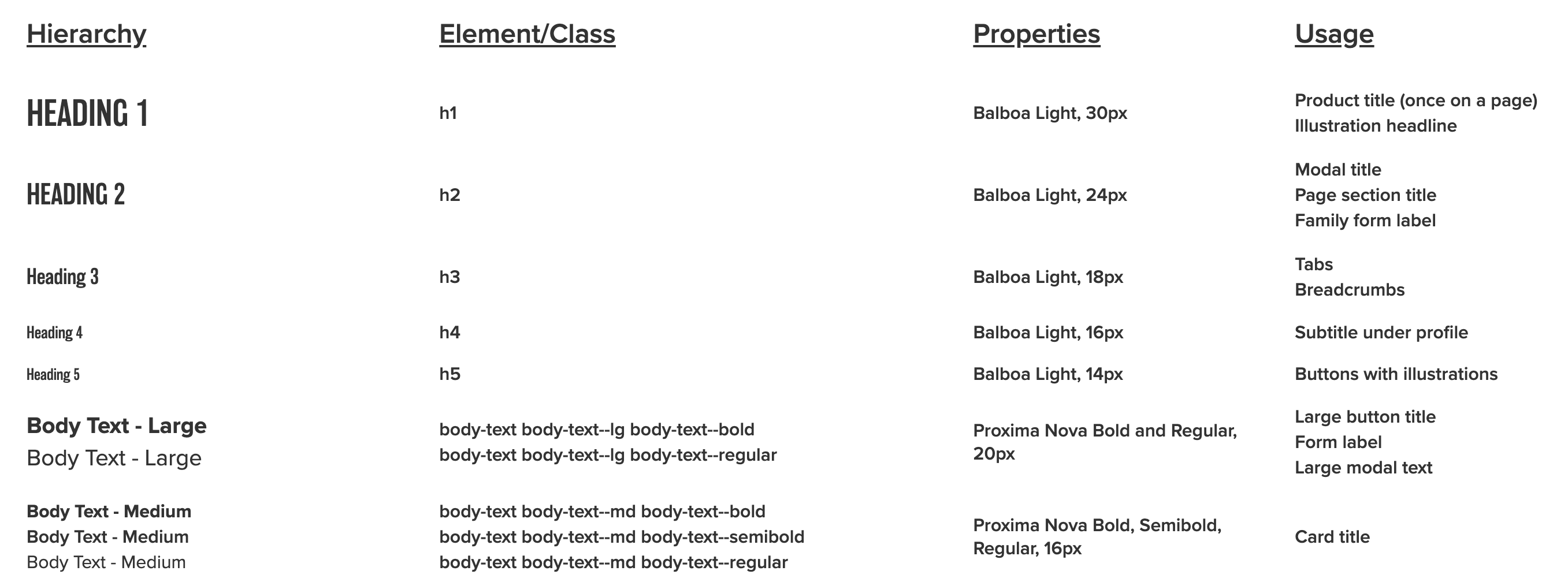
A screenshot of the typographic design system. There are four columns where the first shows the style name with the rendered style, second is the element or class, third shows the properties that make the styles, and fourth is the defined usage.

And here’s a sample of some of the corresponding CSS:

h1, h2, h3, h4, h5, h6 {
  font-family: "balboa", sans-serif;
  font-weight: 300;
  margin: 0;
}

h4 {
  font-size: calc(1rem - 2px);
}

.body-text {
  font-family: "proxima-nova", sans-serif;
}

.body-text--lg {
  font-size: calc(1rem + 4px);
}

.body-text--md {
  font-size: 1rem;
}

.body-text--bold {
  font-weight: 700;
}

.body-text--semibold {
  font-weight: 600;
}

Headings are targeted with tag names. Other items use class names, and there are separate classes for weight and size.

Before writing any code, I created some ground rules:

  • Since this is really a data visualization, the data should be stored in a separate file.
  • Headings should use semantic heading tags (e.g. <h1>, <h2>, etc.) instead of having to rely on a class.
  • Body content should use paragraph (<p>) tags with the class name (e.g. <p class="body-text--lg">).
  • Content types that have variations should be grouped together by wrapping them in the root paragraph tag, or corresponding root element, without a styling class. Children should be wrapped with <span> and the class name.
<p>
  <span class="body-text--lg">Thing 1</span>
  <span class="body-text--lg">Thing 2</span>
</p>
  • Any content that’s not demonstrating special styling should use a paragraph tag with the correct class name and <span> for any child nodes.
<p class="body-text--semibold">
  <span>Thing 1</span>
  <span>Thing 2</span>
</p>
  • Class names should only need to be written once for each cell that’s demonstrating styling.

Why render functions make sense

I considered a few options before starting:

Hardcoding

I like hardcoding when appropriate, but writing my HTML by hand would have meant typing out different combinations of the markup, which seemed unpleasant and repetitive. It also meant that data couldn’t be kept in a separate file, so I ruled out this approach.

Here’s what I mean:

<div class="row">
  <h1>Heading 1</h1>
  <p class="body-text body-text--md body-text--semibold">h1</p>
  <p class="body-text body-text--md body-text--semibold">Balboa Light, 30px</p>
  <p class="group body-text body-text--md body-text--semibold">
    <span>Product title (once on a page)</span>
    <span>Illustration headline</span>
  </p>
</div>

Using a traditional Vue template

This would normally be the go-to option. However, consider the following:

See the Pen
Different Styles Example
by Salomone Baquis (@soluhmin)
on CodePen.

In the first column, we have:

– An <h1>> tag rendered as-is.
– A <p> tag that groups some <span> children with text, each with a class (but no special class on the <p> tag).
– A <p> tag with a class and no children.

The result would have meant many instances of v-if and v-if-else, which I knew would get confusing fast. I also disliked all of that conditional logic inside the markup.

Because of these reasons, I chose render functions. Render functions use JavaScript to conditionally create child nodes based on all of the criteria that’s been defined, which seemed perfect for this situation.

Data model

As I mentioned earlier, I’d like to keep typography data in a separate JSON file so I can easily make changes later without touching markup. Here’s the raw data.

Each object in the file represents a different row.

{
  "text": "Heading 1",
  "element": "h1", // Root wrapping element.
  "properties": "Balboa Light, 30px", // Third column text.
  "usage": ["Product title (once on a page)", "Illustration headline"] // Fourth column text. Each item is a child node. 
}

The object above renders the following HTML:

<div class="row">
  <h1>Heading 1</h1>
  <p class="body-text body-text--md body-text--semibold">h1</p>
  <p class="body-text body-text--md body-text--semibold">Balboa Light, 30px</p>
  <p class="group body-text body-text--md body-text--semibold">
    <span>Product title (once on a page)</span>
    <span>Illustration headline</span>
  </p>
</div>

Let’s look at a more involved example. Arrays represent groups of children. A classes object can store classes. The base property contains classes that are common to every node in the cell grouping. Each class in variants is applied to a different item in the grouping.

{
  "text": "Body Text - Large",
  "element": "p",
  "classes": {
    "base": "body-text body-text--lg", // Applied to every child node
    "variants": ["body-text--bold", "body-text--regular"] // Looped through, one class applied to each example. Each item in the array is its own node. 
  },
  "properties": "Proxima Nova Bold and Regular, 20px",
  "usage": ["Large button title", "Form label", "Large modal text"]
}

Here’s how that renders:

<div class="row">
  <!-- Column 1 -->
  <p class="group">
    <span class="body-text body-text--lg body-text--bold">Body Text - Large</span>
    <span class="body-text body-text--lg body-text--regular">Body Text - Large</span>
  </p>
  <!-- Column 2 -->
  <p class="group body-text body-text--md body-text--semibold">
    <span>body-text body-text--lg body-text--bold</span>
    <span>body-text body-text--lg body-text--regular</span>
  </p>
  <!-- Column 3 -->
  <p class="body-text body-text--md body-text--semibold">Proxima Nova Bold and Regular, 20px</p>
  <!-- Column 4 -->
  <p class="group body-text body-text--md body-text--semibold">
    <span>Large button title</span>
    <span>Form label</span>
    <span>Large modal text</span>
  </p>
</div>

The basic setup

We have a parent component, TypographyTable.vue, which contains the markup for the wrapper table element, and a child component, TypographyRow.vue, which creates a row and contains our render function.

I loop through the row component, passing the row data as props.

<template>
  <section>
    <!-- Headers hardcoded for simplicity -->
    <div class="row">
      <p class="body-text body-text--lg-bold heading">Hierarchy</p>
      <p class="body-text body-text--lg-bold heading">Element/Class</p>
      <p class="body-text body-text--lg-bold heading">Properties</p>
      <p class="body-text body-text--lg-bold heading">Usage</p>
    </div>  
    <!-- Loop and pass our data as props to each row -->
    <typography-row
      v-for="(rowData, index) in $options.typographyData"
      :key="index"
      :row-data="rowData"
    />
  </section>
</template>
<script>
import TypographyData from "@/data/typography.json";
import TypographyRow from "./TypographyRow";
export default {
  // Our data is static so we don't need to make it reactive
  typographyData: TypographyData,
  name: "TypographyTable",
  components: {
    TypographyRow
  }
};
</script>

One neat thing to point out: the typography data can be a property on the Vue instance and be accessed using $options.typographyData since it doesn’t change and doesn’t need to be reactive. (Hat tip to Anton Kosykh.)

Making a functional component

The TypographyRow component that passes data is a functional component. Functional components are stateless and instanceless, which means that they have no this and don’t have access to any Vue lifecycle methods.

The empty starting component looks like this:

// No <template>
<script>
export default {
  name: "TypographyRow",
  functional: true, // This property makes the component functional
  props: {
    rowData: { // A prop with row data
      type: Object
    }
  },
  render(createElement, { props }) {
    // Markup gets rendered here
  }
}
</script>

The render method takes a context argument, which has a props property that’s de-structured and used as the second argument.

The first argument is createElement, which is a function that tells Vue what nodes to create. For brevity and convention, I’ll be abbreviating createElement as h. You can read about why I do that in Sarah’s post.

h takes three arguments:

  1. An HTML tag (e.g. div)
  2. A data object with template attributes (e.g. { class: 'something'})
  3. Text strings (if we’re just adding text) or child nodes built using h
render(h, { props }) {
  return h("div", { class: "example-class" }, "Here's my example text")
}

OK, so to recap where we are at this point, we’ve covered creating:

  • a file with the data that’s going to be used in my visualization;
  • a regular Vue component where I’m importing the full data file; and
  • the beginning of a functional component that will display each row.

To create each row, the data from the JSON file needs to be passed into arguments for h. This could be done all at once, but that involves a lot of conditional logic and is confusing.

Instead, I decided to do it in two parts:

  1. Transform the data into a predictable format.
  2. Render the transformed data.

Transforming the common data

I wanted my data in a format that would match the arguments for h, but before doing this, I wrote out how I wanted things structured:

// One cell
{
  tag: "", // HTML tag of current level
  cellClass: "", // Class of current level, null if no class exists for that level
  text: "", // Text to be displayed 
  children: [] // Children each follow this data model, empty array if no child nodes
}

Each object represents one cell, with four cells making up each row (an array).

// One row
[ { cell1 }, { cell2 }, { cell3 }, { cell4 } ]

The entry point would be a function like:

function createRow(data) { // Pass in the full row data and construct each cell
  let { text, element, classes = null, properties, usage } = data;
  let row = [];
  row[0] = createCellData(data) // Transform our data using some shared function
  row[1] = createCellData(data)
  row[2] = createCellData(data)
  row[3] = createCellData(data)

  return row;
}

Let’s take another look at our mockup.

The first column has styling variations, but the rest seem to follow the same pattern, so let’s start with those.

Again, the desired model for each cell is:

{
  tag: "",
  cellClass: "", 
  text: "", 
  children: []
}

This gives us a tree-like structure for each cell since some cells have groups of children. Let’s use two functions to create the cells.

  • createNode takes each of our desired properties as arguments.
  • createCell wraps around createNode so that we can check if the text that we’re passing in is an array. If it is, we build up an array of child nodes.
// Model for each cell
function createCellData(tag, text) {
  let children;
  // Base classes that get applied to every root cell tag
  const nodeClass = "body-text body-text--md body-text--semibold";
  // If the text that we're passing in as an array, create child elements that are wrapped in spans. 
  if (Array.isArray(text)) {
    children = text.map(child => createNode("span", null, child, children));
  }
  return createNode(tag, nodeClass, text, children);
}
// Model for each node
function createNode(tag, nodeClass, text, children = []) {
  return {
    tag: tag,
    cellClass: nodeClass,
    text: children.length ? null : text,
    children: children
  };
}

Now, we can do something like:

function createRow(data) {
  let { text, element, classes = null, properties, usage } = data;
  let row = [];
  row[0] = ""
  row[1] = createCellData("p", ?????) // Need to pass in class names as text 
  row[2] = createCellData("p", properties) // Third column
  row[3] = createCellData("p", usage) // Fourth column

  return row;
}

We pass properties and usage to the third and fourth columns as text arguments. However, the second column is a little different; there, we’re displaying the class names, which are stored in the data file like:

"classes": {
  "base": "body-text body-text--lg",
  "variants": ["body-text--bold", "body-text--regular"]
},

Additionally, remember that headings don’t have classes, so we want to show the heading tag names for those rows (e.g. h1, h2, etc.).

Let’s create some helper functions to parse this data into a format that we can use for our text argument.

// Pass in the base tag and class names as arguments
function displayClasses(element, classes) {
  // If there are no classes, return the base tag (appropriate for headings)
  return getClasses(classes) ? getClasses(classes) : element;
}

// Return the node class as a string (if there's one class), an array (if there are multiple classes), or null (if there are none.) 
// Ex. "body-text body-text--sm" or ["body-text body-text--sm body-text--bold", "body-text body-text--sm body-text--italic"]
function getClasses(classes) {
  if (classes) {
    const { base, variants = null } = classes;
    if (variants) {
      // Concatenate each variant with the base classes
      return variants.map(variant => base.concat(`${variant}`));
    }
    return base;
  }
  return classes;
}

Now we can do this:

function createRow(data) {
  let { text, element, classes = null, properties, usage } = data;
  let row = [];
  row[0] = ""
  row[1] = createCellData("p", displayClasses(element, classes)) // Second column
  row[2] = createCellData("p", properties) // Third column
  row[3] = createCellData("p", usage) // Fourth column

  return row;
}

Transforming the demo data

This leaves the first column that demonstrates the styles. This column is different because we’re applying new tags and classes to each cell instead of using the class combination used by the rest of the columns:

<p class="body-text body-text--md body-text--semibold">

Rather than try to do this in createCellData or createNodeData, let’s make another function to sit on top of these base transformation functions and handle some of the new logic.

function createDemoCellData(data) {
  let children;
  const classes = getClasses(data.classes);
  // In cases where we're showing off multiple classes, we need to create children and apply each class to each child.
  if (Array.isArray(classes)) {
    children = classes.map(child =>
      // We can use "data.text" since each node in a cell grouping has the same text
      createNode("span", child, data.text, children)
    );
  }
  // Handle cases where we only have one class
  if (typeof classes === "string") {
    return createNode("p", classes, data.text, children);
  }
  // Handle cases where we have no classes (ie. headings)
  return createNode(data.element, null, data.text, children);
}

Now we have the row data in a normalized format that we can pass to our render function:

function createRow(data) {
  let { text, element, classes = null, properties, usage } = data
  let row = []
  row[0] = createDemoCellData(data)
  row[1] = createCellData("p", displayClasses(element, classes))
  row[2] = createCellData("p", properties)
  row[3] = createCellData("p", usage)

  return row
}

Rendering the data

Here’s how we actually render the data to display:

// Access our data in the "props" object
const rowData = props.rowData;

// Pass it into our entry transformation function
const row = createRow(rowData);

// Create a root "div" node and handle each cell
return h("div", { class: "row" }, row.map(cell => renderCells(cell)));

// Traverse cell values
function renderCells(data) {

  // Handle cells with multiple child nodes
  if (data.children.length) {
    return renderCell(
      data.tag, // Use the base cell tag
      { // Attributes in here
        class: {
          group: true, // Add a class of "group" since there are multiple nodes
          [data.cellClass]: data.cellClass // If the cell class isn't null, apply it to the node
        }
      },
      // The node content
      data.children.map(child => {
        return renderCell(
          child.tag,
          { class: child.cellClass },
          child.text
        );
      })
    );
  }

  // If there are no children, render the base cell
  return renderCell(data.tag, { class: data.cellClass }, data.text);
}

// A wrapper function around "h" to improve readability
function renderCell(tag, classArgs, text) {
  return h(tag, classArgs, text);
}

And we get our final product! Here’s the source code again.

Wrapping up

It’s worth pointing out that this approach represents an experimental way of addressing a relatively trivial problem. I’m sure many people will argue that this solution is needlessly complicated and over-engineered. I’d probably agree.

Despite the up-front cost, however, the data is now fully separated from the presentation. Now, if my design team adds or removes rows, I don’t have to dig into messy HTML — I just update a couple of properties in the JSON file.

Is it worth it? Like everything else in programming, I guess it depends. I will say that this comic strip was in the back of my mind as I worked on this:

A three-panel comic strip. First panel is a stick figure at a dinner table asking to pass the salt. Second panel is the same figure with no dialogue. Third panel is another figure saying he's building a system to pass the condiments and that it will save time in the long run. First figure says it's already been 20 minutes.
Source: https://xkcd.com/974

Maybe that’s an answer. I’d love to hear all of your (constructive) thoughts and suggestions, or if you’ve tried other ways of going about a similar task.

The post A Practical Use Case for Vue Render Functions: Building a Design System Typography Grid appeared first on CSS-Tricks.
Customer Satisfaction Surveys with Wufoo

Post pobrano z: Customer Satisfaction Surveys with Wufoo

I was once tasked to create a makeshift customer service survey that would allow an employee to receive a customer call and send a survey to the custom once the call ended. The goal was to track customer satisfaction, which is a totally legit thing to want.

There are some solutions out there that do this out of the box. The problem was that my client neither had the desire or budget to use them. They did, however already use Campaign Monitor for sending emails and Wufoo for embedded forms. I figured, hey, if MacGyver can create complex gadgets out of bubble gum and paper clips, then I can cobble something together with these two robust tools. Right?

Right!

Knowing the data

The biggest challenge for a phone call is that it’s sometimes difficult to track down an email address during the call. Without that, there’s nowhere to send the survey, so that’s a big bummer. That means the employee needs to capture the address, whether it’s getting a custom ID at the start of the call or straight up asking for it.

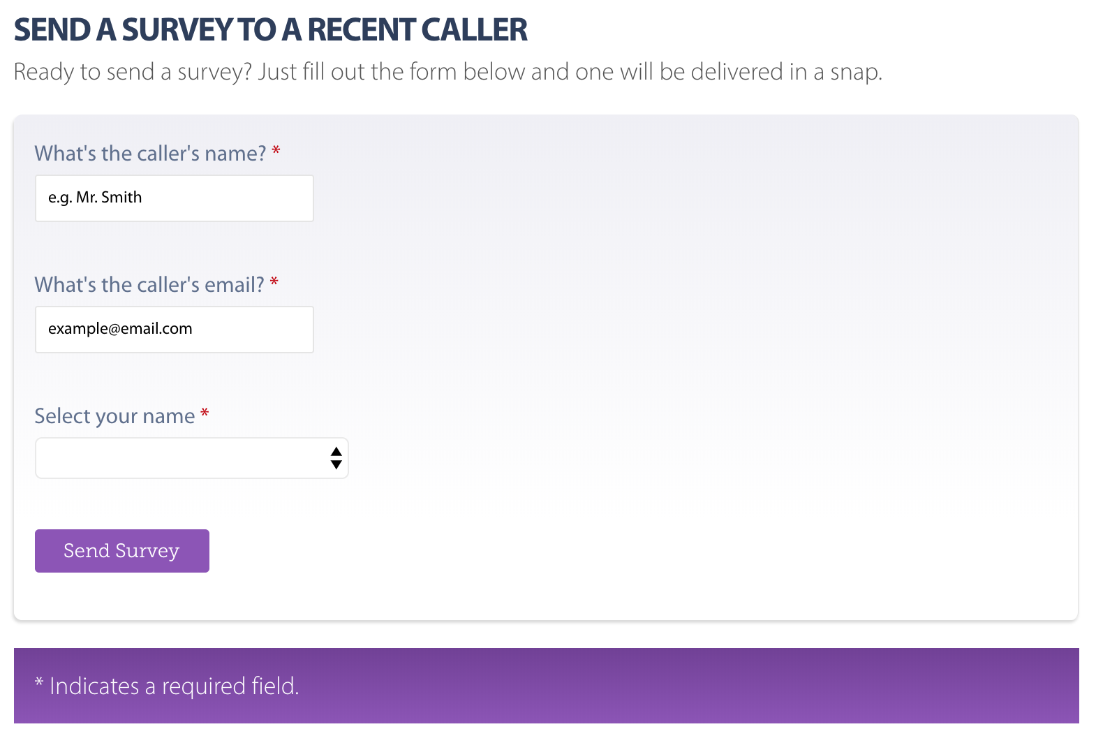
I decided I would spin up Wufoo to create an internal form that employees can use to capture the data. Nothing fancy, only the following fields:

  • Employee Name: Used to associate the employee with the call
  • Customer Name: Used to personalize the email sent containing the survey link
  • Customer Email: Used to send the survey link

Wufoo makes this trivial, of course. Create a new form, add a few text fields, copy and paste the snippet onto a page. Voilà! We have a form! We could make it a little simpler (and dummy-proof) by creating a select field containing all employee names so the data remains consistent. We can also make the fields required and use Wufoo’s built-in validation to ensure the email address is properly formatted.

There’s also a lot of flexibility with the styling to boot, meaning the form can look like a native part of the site.

The employee can now fill that out during the call and submit it once the call is done. Plus, the form is embedded on a private page that can’t accidentally get out to others.

Sending the survey

Did you know Wufoo can auto-send emails anywhere once a form is completed? Well, now you do!

This is super handy for most cases and I really wanted to use it for this task, but decided to go with Campaign Monitor because there’s one little snag which is…

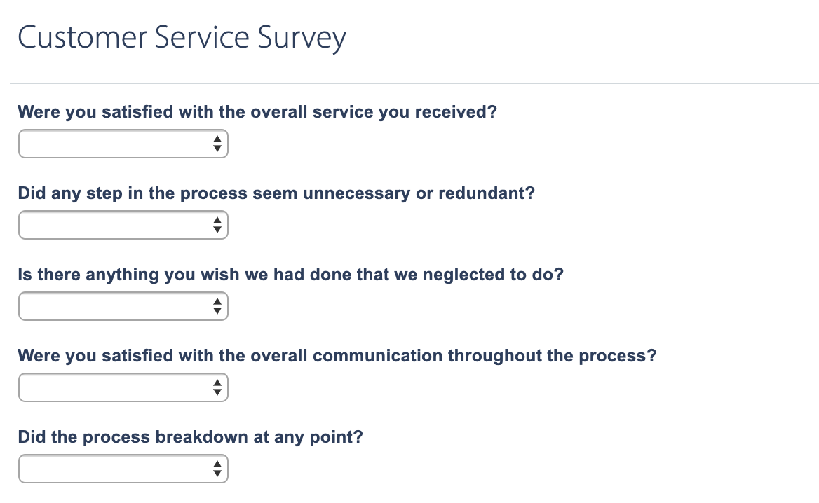
Each employee needs a unique survey form

Yep, that’s a thing. Otherwise, we’d have to ask the customer to identify the employee’s name in the survey, which we can’t expect them to know. Sure, we could use another select field, but that requires the customer to recall the name as well, and not having the employee name makes it difficult to associate customer satisfaction results with specific employees for tracking.

So, the email needs to contain a unique link that goes to a form that’s associated with a specific employee. Again, there are solutions for this stuff, but we’re MacGyver’ing this thing.

I’m so glad Wufoo makes building forms so simple. All I needed to do was create one form, duplicate it for each employee, and change the employee value in each one.

On that note, we don’t necessarily need to display the employee’s name in the survey form. Wufoo accepts custom CSS which means we can hide any field! Plus, it allows us to pre-populate a field, so that gives us hidden fields that already contains the values we need to associate the survey data with a specific employee and create a webpage containing the form for that employee. 💥

Hidden fields are, well…hidden!

Now that there’s a survey for each employee, all I needed to do was create webpages where I could embed each employee form and use those as the survey links.

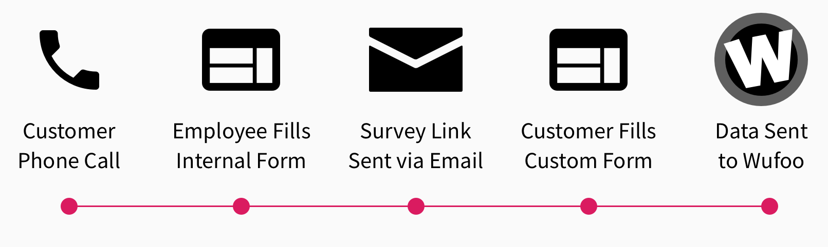
Here’s the flow:

Auto-sending the survey link

Let’s go back to the first form for a moment. Remember, that’s the one an employee fills out and submits once the call has ended. This should send an email to the customer containing a link to the webpage that has the survey form for that employee.

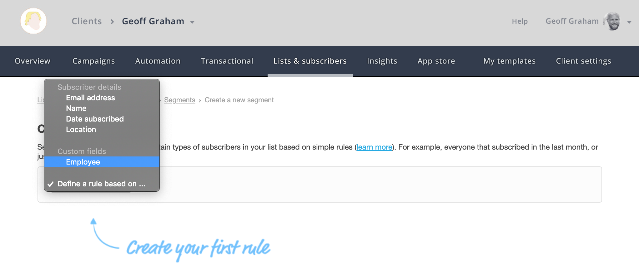
Campaign Monitor can segment lists by custom variables. In other words, we can create one list that contains all of the customers who have called in and create sub-lists that are divided by employee since we have that as a value in the internal employee form. And, since Campaign Monitor and Wufoo play nice together, all of the data we capture is contained in both places.

The other thing Campaign Monitor can do is trigger emails to send based on conditions. So, if the employee submits the internal form, Campaign Monitor can be configured to send a specific email template/campaign to a new subscriber that is added to the list. If we set up a trigger to send an email to any new customer who is added to the list, we can personalize the email to contain the link for the employee who took the call.

Watch the data roll in!

Great! We have a form employees can use to send a survey, surveys set up on webpages for each employee, and an auto-triggered email that’s sent to a customer containing the survey link for the employee who submitted the internal survey.

All that’s left is to monitor the data and — wouldn’t you know it — Wufoo has reporting built right into it where all of that can be accessed and monitored 24/7. Heck, it even permits us to create custom reporting dashboards on a per-survey basis.

Wrapping up

Was this the best way to hack things together? Probably not. Is it bulletproof from incorrect data or misuse? Not entirely. But the fact that Wufoo could intervene at all and is flexible enough to power this sort of thing is awesome. It’s more than awesome; it’s amazing. It sure wasn’t intended to be used that way, but it did the trick anyway.

Thanks, Wufoo!

The post Customer Satisfaction Surveys with Wufoo appeared first on CSS-Tricks.

Weekly Platform News: Favicon Guidelines, Accessibility Testing, Web Almanac

Post pobrano z: Weekly Platform News: Favicon Guidelines, Accessibility Testing, Web Almanac

Šime posts regular content for web developers on webplatform.news.

Google posts guidelines for defining favicons

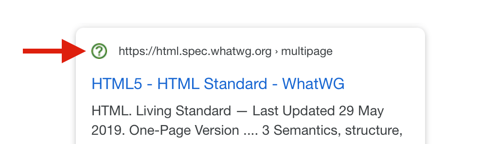
Jamie Leach: Google Search now displays favicons in search results on mobile. Your favicon should be a multiple of 48×48 (Google will re-scale it to 16×16 for use in search results). If a website doesn’t have a favicon or Google deems the favicon inappropriate, a generic globe icon will be displayed instead.

Your favicon should be a visual representation of your website’s brand, in order to help users quickly identify your site when they scan through search results.

Top websites are surprisingly inconsistent in the way they declare icons (via <link> elements in the page’s head). Twitter and Pinterest, two relatively modern progressive web apps, provide icons in two sizes.

<!-- example -->
<link rel="icon" href="/icon-32x32.png">
<link rel="apple-touch-icon" href="/icon-192x192.png">

The Paciello Group releases ARC Toolkit

In honor of Global Accessibility Awareness Day, TPG is releasing our professional-level accessibility testing tool to the public. Learn all about it at https://t.co/ol33pizq2v and download it from the Google Chrome store today. #GAAD

— The Paciello Group (@paciellogroup) May 16, 2019

The Paciello Group: ARC Toolkit, our professional-level accessibility testing tool, is now available as a Chrome DevTools extension. This tool detects issues related to the WCAG 2.1 guidelines. You can run the test on the entire page or just the node selected in the DevTools Elements panel.

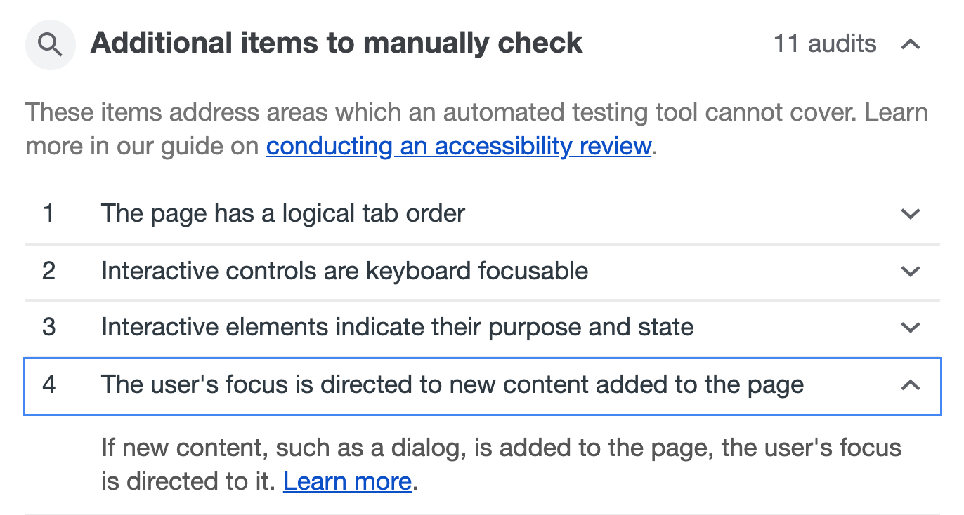
Remember, automated accessibility tools are only able to find some accessibility issues, and manual testing is necessary to ensure full accessibility. Lighthouse (via the Audits panel) suggests manual checks after performing an accessibility audit.

Other news

  • Jeff Jaffe: W3C and WHATWG have reached an agreement to collaborate on the development of HTML. „W3C shall encourage the community … to contribute directly to the WHATWG HTML and DOM repositories; raising issues, proposing solutions, commenting on proposed solutions, and indicating support or otherwise for proposals.”
  • Paul Calvano: „There is a significant gap in the first- vs. third-party resource age of CSS and web fonts. 95% of first-party fonts are older than one week compared to 50% of third-party fonts … This makes a strong case for self-hosting web fonts!”
  • Rachel Andrew: The CSS subgrid value is a relatively straightforward addition to grid layout. For example, if you have nested grids, and you apply grid-template-rows: subgrid to the child grid, then this grid will use the row tracks of the parent grid instead of creating its own row tracks. That’s all there is to it. (This feature is currently only supported in Firefox Nightly.)
  • GitHub Blog: GitHub can now generate automated security fixes for your dependencies with known security vulnerabilities. On GitHub’s website, check your repository’s Security tab for security alerts. If you open an alert and press the „Create automated security fix” button, GitHub will create an automated pull request that fixes the security vulnerability.
  • Rick Viscomi: HTTP Archive plans to release the first annual Web Almanac in November, a report of the state of the web with interesting insights written by different experts. About 50 volunteers from the web community are currently working on it, and they are looking for more contributors.

The post Weekly Platform News: Favicon Guidelines, Accessibility Testing, Web Almanac appeared first on CSS-Tricks.

Reducing motion with the picture element

Post pobrano z: Reducing motion with the picture element

Here’s a bonafide CSS/HTML trick from Brad Frost and Dave Rupert where they use the <picture> element to switch out a GIF file with an image if the user has reduced motion enabled. This is how Brad goes about implementing that:

<picture>
  <!-- This image will be loaded if the media query is true  -->
  <source srcset="no-motion.jpg" media="(prefers-reduced-motion: reduce)"></source>

  <!--  Otherwise, load this gif -->
  <img srcset="animated.gif" alt="brick wall"/>
</picture>

How nifty is this? It makes me wonder if there are other ways this image-switching technique can be used besides accessibility and responsive images…

Also, it’s worth noting that Eric Bailey wrote about the reduced motion media query a while back where he digs into its history and various approaches to use it.

Direct Link to ArticlePermalink

The post Reducing motion with the picture element appeared first on CSS-Tricks.

Xbox: VisitXbox

Post pobrano z: Xbox: VisitXbox

Integrated
Xbox

Advertising Agency:McCann, London, United Kingdom
Chief Creative Officer McCann UK and CoPresident:Rob Doubal, Laurence Thomson
Executive Creative Director:Jamie Mietz, Sanjiv Mistry
Senior Creative:Jim Nilsson, Jacob Björdal
Director:Jim Nilsson, Jacob Björdal
Head Of Strategy:Karen Crum
Senior Planner:James Appleby, Fannie David
Head Of Art:Dan Howarth
Designer:Matthew Thomas, Nazima Motegheria
Project Director:Clare Prager
Project Manager:Anna Curtis

Xbox: VisitXbox

Post pobrano z: Xbox: VisitXbox

Integrated
Xbox

Advertising Agency:McCann, London, United Kingdom
Chief Creative Officer McCann UK and CoPresident:Rob Doubal, Laurence Thomson
Executive Creative Director:Jamie Mietz, Sanjiv Mistry
Senior Creative:Jim Nilsson, Jacob Björdal
Director:Jim Nilsson, Jacob Björdal
Head Of Strategy:Karen Crum
Senior Planner:James Appleby, Fannie David
Head Of Art:Dan Howarth
Designer:Matthew Thomas, Nazima Motegheria
Project Director:Clare Prager
Project Manager:Anna Curtis

Xbox: VisitXbox

Post pobrano z: Xbox: VisitXbox

Integrated
Xbox

Advertising Agency:McCann, London, United Kingdom
Chief Creative Officer McCann UK and CoPresident:Rob Doubal, Laurence Thomson
Executive Creative Director:Jamie Mietz, Sanjiv Mistry
Senior Creative:Jim Nilsson, Jacob Björdal
Director:Jim Nilsson, Jacob Björdal
Head Of Strategy:Karen Crum
Senior Planner:James Appleby, Fannie David
Head Of Art:Dan Howarth
Designer:Matthew Thomas, Nazima Motegheria
Project Director:Clare Prager
Project Manager:Anna Curtis

How to Make an Infographic Template

Post pobrano z: How to Make an Infographic Template

Final product image
What You’ll Be Creating

In this tutorial, you will have the opportunity to learn how to draw a set of elements for a medical infographic template in Illustrator!

If you’d like to skip this tutorial and just use this infographic design template (with even more elements!) in your work, you can go ahead and simply purchase Big Set of Flat Medical Infographic Elements from GraphicRiver!

Big Set of Flat Medical Infographic Elements

1. How to Draw the Bodies and Organs

Step 1

Let’s begin by drawing our first set of elements for the research infographic template!

To draw the outline of the male body, copy the half illustrated on the left, and then Reflect it and merge both copies with the Outline function in the Pathfinder panel.

infographic design templates

Step 2

Do the same for the female body!

research infographic template

Step 3

Fill both body outlines with #98AEC5.

infographic template illustrator

Step 4

Draw lungs, using the same Pathfinder function. Fill the organ in with #C7D7E2.

Next, make a copy of the lungs and place them inside a #BF3B35 hexagon icon with an outline of the same color. Color the lungs with #EDEDDD.

Add a line with a small circle on the end of it to serve as a pointer.

infographic design templates

Step 5

Repeat a similar process for the liver, only changing the hexagon’s color to #889CB1.

infographic template illustrator

Step 6

Use #ED7777 for the brain icon.

research infographic template

Step 7

Draw the next set of organs, using the same colors and functions as before.

infographic design templates

Step 8

Draw the next organ, coloring it with #EDEDDD.

infographic template

Step 9

Add the heart. Use #A1A4C2 for the icon.

infographic template illustrator

Step 10

Draw the rest of the organs, using the same colors as we did earlier in the tutorial.

research infographic template

Step 11

Place the organs and the icons as shown below.

infographic design templates

2. How to Create the Graphs

Step 1

Draw the axis for the graph, and then add columns using these colors:

  • #BF3835
  • #98AEC5
  • #6F89A4

You can use a Rectangular Grid with 13 Horizontal Dividers for reference.

infographic template

Step 2

Create one more graph with different-colored columns.

infographic design templates

Step 3

Create a stick man out of different shapes, using the Pathfinder functions Minus Front and Unite to make the figure.

Use #98AEC5 for the blue stick man and #BF3B35 for the red one.

infographic design templates

Step 4

Create three more copies of the figure, coloring them with #ED7777, #7B83A1, and #6F89A4.

Make some graphs as seen below, indicating the percentages with the number of the stick men used.

infographic template illustrator

Step 5

Proceed similarly to build a stick woman, coloring it with the same colors.

infographic design templates

Step 6

Use it to complete a few simple graphs.

research infographic template

Step 7

I’ve used an open source vector map for our research infographic template.

You can use the same one or add your own.

Color your world map with #BFCEDB and add a #6F89A4 stick man.

infographic template illustrator

Step 8

Place the figures with the percentages onto the map.

infographic design templates

Step 9

Create four colored percentage bars as pictured below.

Use these colors:

  • #A1A4C2
  • #98AEC5
  • #C23F40
  • #ED7777
infographic template

Step 10

Make all of the columns 3D by going to Effect > 3D > Extrude and Bevel.

Use the settings below for all of the columns.

research infographic template

Step 11

Expand Appearance of the columns and add the percentages, using the same color.

infographic template illustrator

Step 12

Add one more 3D bar graph, this time using Effect > 3D > Revolve and these colors:

  • #DD1E20
  • #FF7D7D
  • #C5E6FF
  • #CCD3FF
infographic design templates

Step 13

Expand Appearance of the graphs and arrange them in a slanted line.

infographic template illustrator

Step 14

Draw colored markers, using the Pathfinder functions Unite and Minus Front.

Color them with #ED7777, #A1A4C2, #C23F40, and #6F89A4.

infographic template

3. How to Draw the Circular Graph

Step 1

Cut out the middle of a circle with the Minus Front function in Pathfinder.

infographic design templates

Step 2

Add a Polar Grid with 20 Radial Dividers and overlay it on top of the graph.

infographic template illustrator

Step 3

Use the dividers as references to measure out the percentages seen below, and then use the Divide function to „cut up” the circular graph.

Use these colors:

  • #98AEC5
  • #7B83A1
  • #ED7777
  • #C03F40
infographic design templates

Step 4

Draw the background with Gradient Mesh.

Begin with a #F5F2E6 rectangle, and then, with the Mesh Tool (U), create a mesh grid as pictured below.

Color the middle node with #FFFFFF, and then add two nodes colored with #F6F4EB above and below it.

Change the edges to #EEEAD9.

infographic template

Step 5

Place the infographic elements we made onto the background.

research infographic template

Awesome Work, Your Infographic Design Template Is Now Done!

You’ve completed the research infographic template in Illustrator! What now? You can try any of my other tutorials from my profile, or check out my portfolio on GraphicRiver, as well as my collection of medical infographic elements, some of which we’ve used in this tutorial.

 Big Set of Flat Medical Infographic Elements
Big Set of Flat Medical Infographic Elements

I hope you enjoyed the tutorial, and I would be super happy to see any results in the comments below!

Check out more of my tutorials:

How to Make an Infographic Template

Post pobrano z: How to Make an Infographic Template

Final product image
What You’ll Be Creating

In this tutorial, you will have the opportunity to learn how to draw a set of elements for a medical infographic template in Illustrator!

If you’d like to skip this tutorial and just use this infographic design template (with even more elements!) in your work, you can go ahead and simply purchase Big Set of Flat Medical Infographic Elements from GraphicRiver!

Big Set of Flat Medical Infographic Elements

1. How to Draw the Bodies and Organs

Step 1

Let’s begin by drawing our first set of elements for the research infographic template!

To draw the outline of the male body, copy the half illustrated on the left, and then Reflect it and merge both copies with the Outline function in the Pathfinder panel.

infographic design templates

Step 2

Do the same for the female body!

research infographic template

Step 3

Fill both body outlines with #98AEC5.

infographic template illustrator

Step 4

Draw lungs, using the same Pathfinder function. Fill the organ in with #C7D7E2.

Next, make a copy of the lungs and place them inside a #BF3B35 hexagon icon with an outline of the same color. Color the lungs with #EDEDDD.

Add a line with a small circle on the end of it to serve as a pointer.

infographic design templates

Step 5

Repeat a similar process for the liver, only changing the hexagon’s color to #889CB1.

infographic template illustrator

Step 6

Use #ED7777 for the brain icon.

research infographic template

Step 7

Draw the next set of organs, using the same colors and functions as before.

infographic design templates

Step 8

Draw the next organ, coloring it with #EDEDDD.

infographic template

Step 9

Add the heart. Use #A1A4C2 for the icon.

infographic template illustrator

Step 10

Draw the rest of the organs, using the same colors as we did earlier in the tutorial.

research infographic template

Step 11

Place the organs and the icons as shown below.

infographic design templates

2. How to Create the Graphs

Step 1

Draw the axis for the graph, and then add columns using these colors:

  • #BF3835
  • #98AEC5
  • #6F89A4

You can use a Rectangular Grid with 13 Horizontal Dividers for reference.

infographic template

Step 2

Create one more graph with different-colored columns.

infographic design templates

Step 3

Create a stick man out of different shapes, using the Pathfinder functions Minus Front and Unite to make the figure.

Use #98AEC5 for the blue stick man and #BF3B35 for the red one.

infographic design templates

Step 4

Create three more copies of the figure, coloring them with #ED7777, #7B83A1, and #6F89A4.

Make some graphs as seen below, indicating the percentages with the number of the stick men used.

infographic template illustrator

Step 5

Proceed similarly to build a stick woman, coloring it with the same colors.

infographic design templates

Step 6

Use it to complete a few simple graphs.

research infographic template

Step 7

I’ve used an open source vector map for our research infographic template.

You can use the same one or add your own.

Color your world map with #BFCEDB and add a #6F89A4 stick man.

infographic template illustrator

Step 8

Place the figures with the percentages onto the map.

infographic design templates

Step 9

Create four colored percentage bars as pictured below.

Use these colors:

  • #A1A4C2
  • #98AEC5
  • #C23F40
  • #ED7777
infographic template

Step 10

Make all of the columns 3D by going to Effect > 3D > Extrude and Bevel.

Use the settings below for all of the columns.

research infographic template

Step 11

Expand Appearance of the columns and add the percentages, using the same color.

infographic template illustrator

Step 12

Add one more 3D bar graph, this time using Effect > 3D > Revolve and these colors:

  • #DD1E20
  • #FF7D7D
  • #C5E6FF
  • #CCD3FF
infographic design templates

Step 13

Expand Appearance of the graphs and arrange them in a slanted line.

infographic template illustrator

Step 14

Draw colored markers, using the Pathfinder functions Unite and Minus Front.

Color them with #ED7777, #A1A4C2, #C23F40, and #6F89A4.

infographic template

3. How to Draw the Circular Graph

Step 1

Cut out the middle of a circle with the Minus Front function in Pathfinder.

infographic design templates

Step 2

Add a Polar Grid with 20 Radial Dividers and overlay it on top of the graph.

infographic template illustrator

Step 3

Use the dividers as references to measure out the percentages seen below, and then use the Divide function to „cut up” the circular graph.

Use these colors:

  • #98AEC5
  • #7B83A1
  • #ED7777
  • #C03F40
infographic design templates

Step 4

Draw the background with Gradient Mesh.

Begin with a #F5F2E6 rectangle, and then, with the Mesh Tool (U), create a mesh grid as pictured below.

Color the middle node with #FFFFFF, and then add two nodes colored with #F6F4EB above and below it.

Change the edges to #EEEAD9.

infographic template

Step 5

Place the infographic elements we made onto the background.

research infographic template

Awesome Work, Your Infographic Design Template Is Now Done!

You’ve completed the research infographic template in Illustrator! What now? You can try any of my other tutorials from my profile, or check out my portfolio on GraphicRiver, as well as my collection of medical infographic elements, some of which we’ve used in this tutorial.

 Big Set of Flat Medical Infographic Elements
Big Set of Flat Medical Infographic Elements

I hope you enjoyed the tutorial, and I would be super happy to see any results in the comments below!

Check out more of my tutorials:

How to Make an Infographic Template

Post pobrano z: How to Make an Infographic Template

Final product image
What You’ll Be Creating

In this tutorial, you will have the opportunity to learn how to draw a set of elements for a medical infographic template in Illustrator!

If you’d like to skip this tutorial and just use this infographic design template (with even more elements!) in your work, you can go ahead and simply purchase Big Set of Flat Medical Infographic Elements from GraphicRiver!

Big Set of Flat Medical Infographic Elements

1. How to Draw the Bodies and Organs

Step 1

Let’s begin by drawing our first set of elements for the research infographic template!

To draw the outline of the male body, copy the half illustrated on the left, and then Reflect it and merge both copies with the Outline function in the Pathfinder panel.

infographic design templates

Step 2

Do the same for the female body!

research infographic template

Step 3

Fill both body outlines with #98AEC5.

infographic template illustrator

Step 4

Draw lungs, using the same Pathfinder function. Fill the organ in with #C7D7E2.

Next, make a copy of the lungs and place them inside a #BF3B35 hexagon icon with an outline of the same color. Color the lungs with #EDEDDD.

Add a line with a small circle on the end of it to serve as a pointer.

infographic design templates

Step 5

Repeat a similar process for the liver, only changing the hexagon’s color to #889CB1.

infographic template illustrator

Step 6

Use #ED7777 for the brain icon.

research infographic template

Step 7

Draw the next set of organs, using the same colors and functions as before.

infographic design templates

Step 8

Draw the next organ, coloring it with #EDEDDD.

infographic template

Step 9

Add the heart. Use #A1A4C2 for the icon.

infographic template illustrator

Step 10

Draw the rest of the organs, using the same colors as we did earlier in the tutorial.

research infographic template

Step 11

Place the organs and the icons as shown below.

infographic design templates

2. How to Create the Graphs

Step 1

Draw the axis for the graph, and then add columns using these colors:

  • #BF3835
  • #98AEC5
  • #6F89A4

You can use a Rectangular Grid with 13 Horizontal Dividers for reference.

infographic template

Step 2

Create one more graph with different-colored columns.

infographic design templates

Step 3

Create a stick man out of different shapes, using the Pathfinder functions Minus Front and Unite to make the figure.

Use #98AEC5 for the blue stick man and #BF3B35 for the red one.

infographic design templates

Step 4

Create three more copies of the figure, coloring them with #ED7777, #7B83A1, and #6F89A4.

Make some graphs as seen below, indicating the percentages with the number of the stick men used.

infographic template illustrator

Step 5

Proceed similarly to build a stick woman, coloring it with the same colors.

infographic design templates

Step 6

Use it to complete a few simple graphs.

research infographic template

Step 7

I’ve used an open source vector map for our research infographic template.

You can use the same one or add your own.

Color your world map with #BFCEDB and add a #6F89A4 stick man.

infographic template illustrator

Step 8

Place the figures with the percentages onto the map.

infographic design templates

Step 9

Create four colored percentage bars as pictured below.

Use these colors:

  • #A1A4C2
  • #98AEC5
  • #C23F40
  • #ED7777
infographic template

Step 10

Make all of the columns 3D by going to Effect > 3D > Extrude and Bevel.

Use the settings below for all of the columns.

research infographic template

Step 11

Expand Appearance of the columns and add the percentages, using the same color.

infographic template illustrator

Step 12

Add one more 3D bar graph, this time using Effect > 3D > Revolve and these colors:

  • #DD1E20
  • #FF7D7D
  • #C5E6FF
  • #CCD3FF
infographic design templates

Step 13

Expand Appearance of the graphs and arrange them in a slanted line.

infographic template illustrator

Step 14

Draw colored markers, using the Pathfinder functions Unite and Minus Front.

Color them with #ED7777, #A1A4C2, #C23F40, and #6F89A4.

infographic template

3. How to Draw the Circular Graph

Step 1

Cut out the middle of a circle with the Minus Front function in Pathfinder.

infographic design templates

Step 2

Add a Polar Grid with 20 Radial Dividers and overlay it on top of the graph.

infographic template illustrator

Step 3

Use the dividers as references to measure out the percentages seen below, and then use the Divide function to „cut up” the circular graph.

Use these colors:

  • #98AEC5
  • #7B83A1
  • #ED7777
  • #C03F40
infographic design templates

Step 4

Draw the background with Gradient Mesh.

Begin with a #F5F2E6 rectangle, and then, with the Mesh Tool (U), create a mesh grid as pictured below.

Color the middle node with #FFFFFF, and then add two nodes colored with #F6F4EB above and below it.

Change the edges to #EEEAD9.

infographic template

Step 5

Place the infographic elements we made onto the background.

research infographic template

Awesome Work, Your Infographic Design Template Is Now Done!

You’ve completed the research infographic template in Illustrator! What now? You can try any of my other tutorials from my profile, or check out my portfolio on GraphicRiver, as well as my collection of medical infographic elements, some of which we’ve used in this tutorial.

 Big Set of Flat Medical Infographic Elements
Big Set of Flat Medical Infographic Elements

I hope you enjoyed the tutorial, and I would be super happy to see any results in the comments below!

Check out more of my tutorials: