If you’re a watch brand in 2019, you’d best be doing something different, otherwise you’re just going to get lost in the sea of companies out there all vying for our attention. At Designer Daily, not much slips past our nets when it comes to noticing the design trends currently happening in the world of watches! That’s why we’re going to list a few of the noticeable crazes we’ve been seeing lately. Strap in and watch out for these.
Big watch faces
Go big or go home, it seems. Diminutive square faces and circular watch faces the size of a quarter coin are no good here, as wrist-swallowing designs are the order of the day in 2019. We can see why such designs are prevalent, after all, why buy a watch if it doesn’t get noticed? Jaeger-LeCoultre is doing some pretty cool world-changing things with its Geophysic Universal Time steel watch, in particular, as it’s literally a large map of the world. This is done quite tastefully and is elegant enough to stand side-by-side with Jaeger-LeCoultre’s other models, but its $14,300 might be a little off-putting for some. Despite that, it could be worth checking on Chrono24 to see if there’s a cheaper one online.
Notable collabs
Hublot has collaborated with Ferrari, Nixon with Metallica, and even Swatch with a famous painting pig called Pigasso. These days, joining forces with big names for a cooperated design is a wise marketing move, as you get two camps interested in your watch that may not have been otherwise. Which metalhead fan could honestly say they would have bought a Nixon watch if some designs didn’t feature album art from ‘Ride the Lightning’ or ‘Master of Puppets?’ Sponsoring celebrities to be brand ambassadors for your watch brand will always be a thing, but working together on new projects is a trend that will only get bigger.
Weird and wonderful
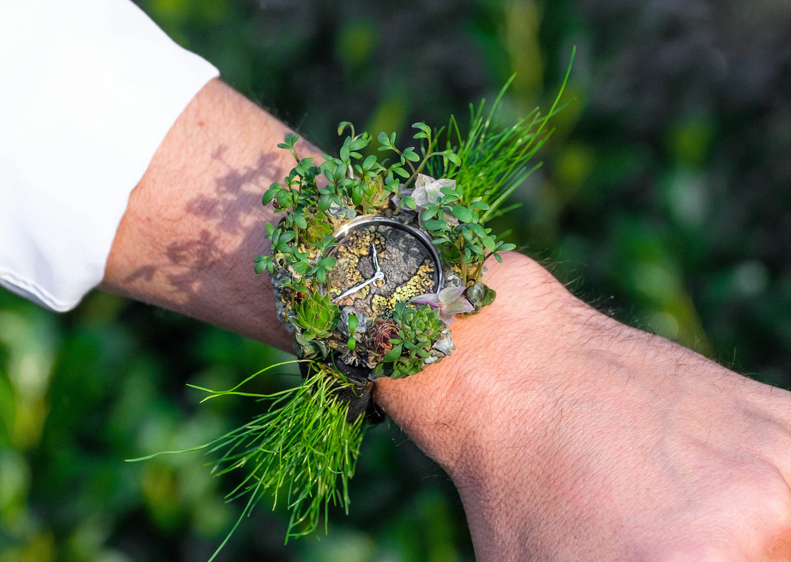
It’s not completely uncommon for unusual watch designs to pop up here and there, but 2019 will see them more than ever. Swatch has always been known to push the boundaries for what’s considered a “normal” design, but respected watchmaker Richard Mille has even gone a bit wacky with a series of sweets-inspired watches. Of course, let’s not forget H. Moser & Cie., which recently made a watch from living plants and even a model that simply chimes you the time instead of having hands.
Simplistic
Why so fancy? Swiss watch brands are known to release highly complex watches, with what you could call a “busy” watch face and too many dials than you even know what to do with. In going the opposite direction, companies like MVMT, Daniel Wellington, and Skagen are keeping things simple and producing designs which are literally a blank watch face with hour indicators, as well as an hour and minute hand – literally all you need to know the time during the day. These designs are a lot cheaper, too, which generally keeps customers interested.
Fitness features
Finally, if your watch isn’t checking your heart rate or counting your steps, is it even a watch? Smartwatches like the Apple Watch and Samsung Gear have become increasingly popular, as consumers love to have the apps that keep track of everything from the amount of calories burned to how much water was drunk that day. TAG Heuer even released its Connected Modular 45 smartwatch, a true sign that even longstanding Swiss companies are feeling the pressure of staying relevant in the modern age.
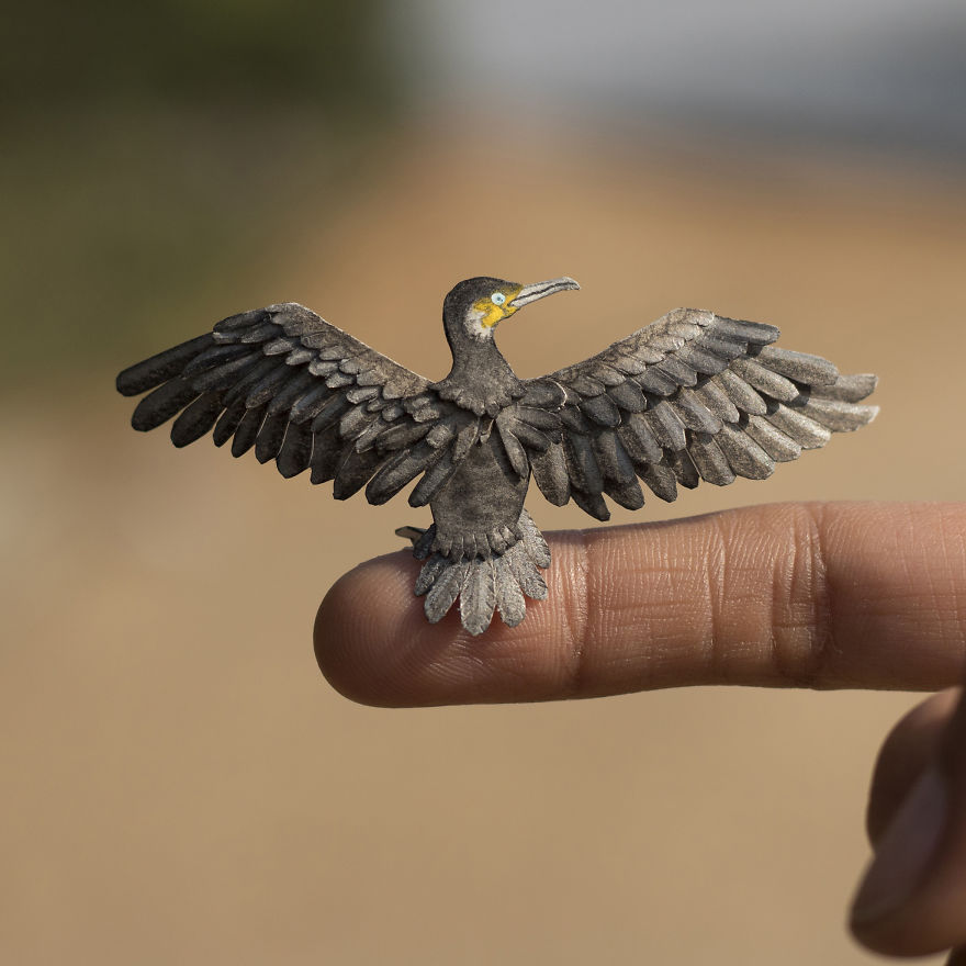
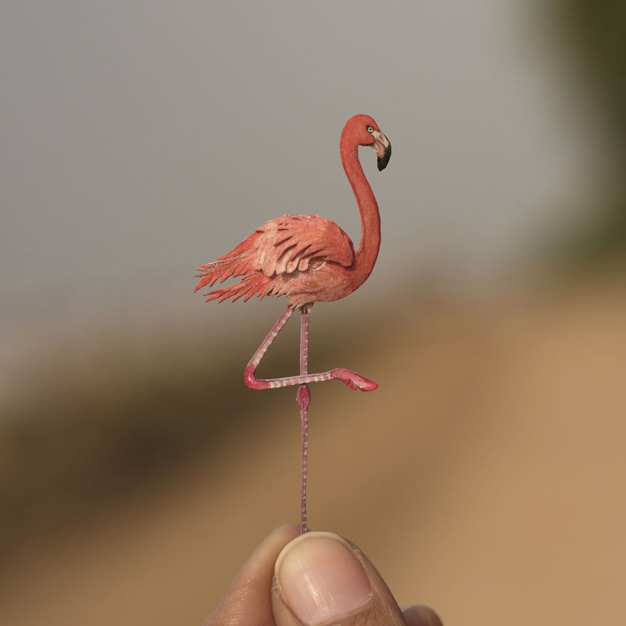
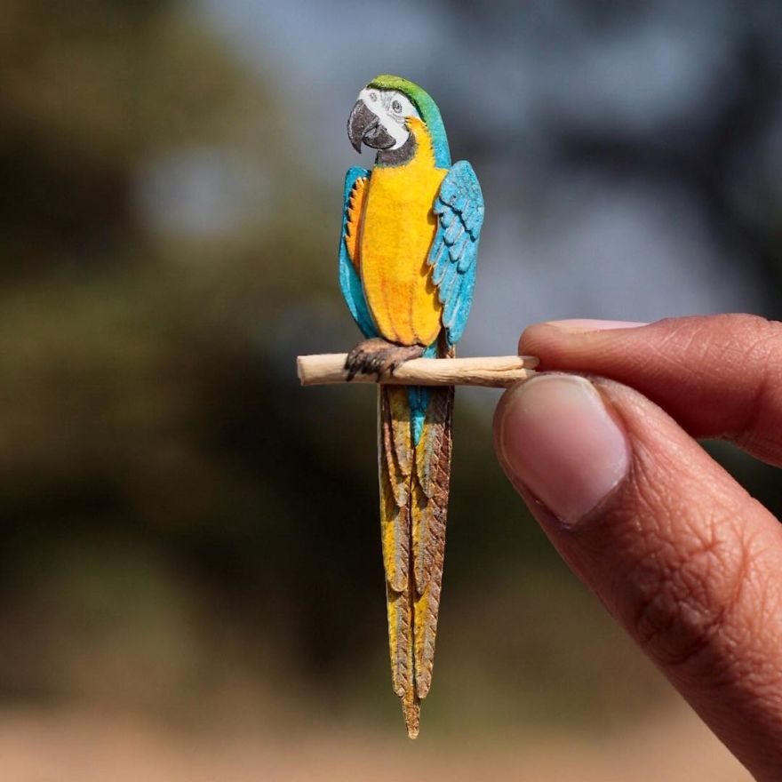
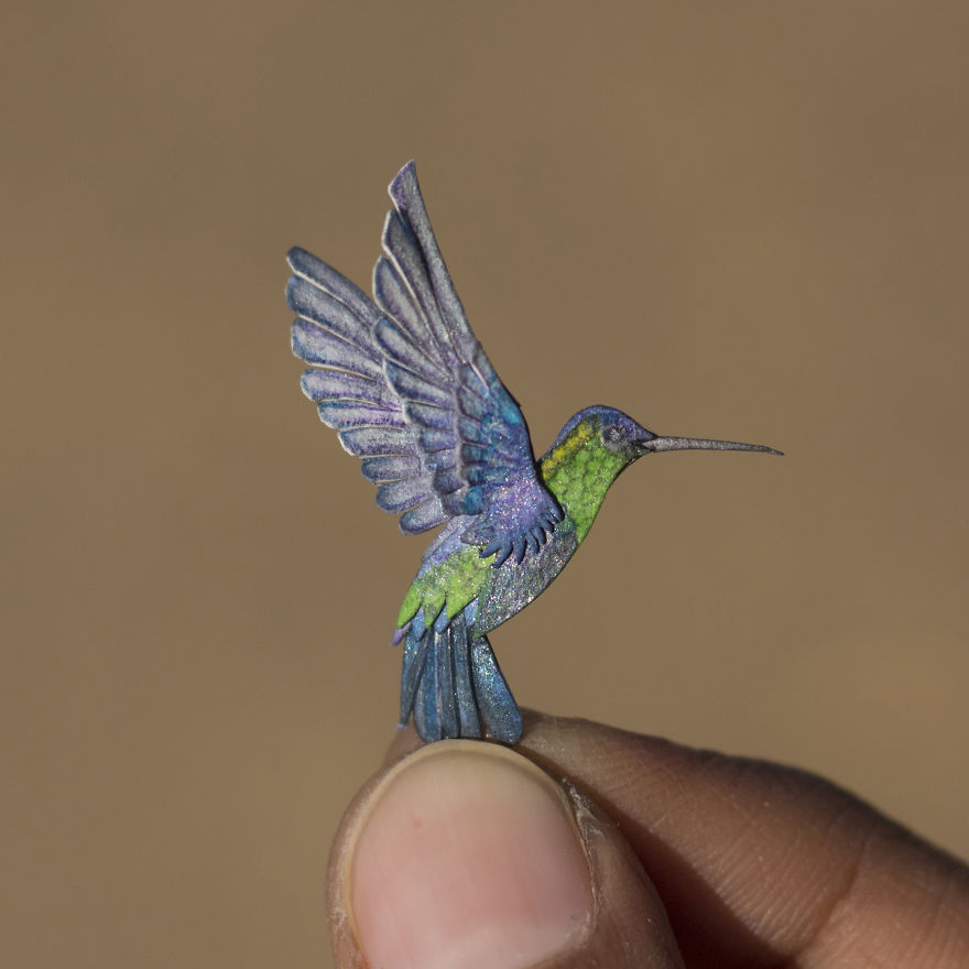
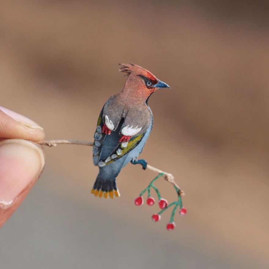
Vaishali Chudasama and Nayan are two designers based in Ahmedabad, India. Vaishali works as an illustrator, while Nayan is an interior designer. Together, they run an Etsy shop that sells some impressive paper cutted birds.
Each papercut takes from four to eight hours to create, which is quite fast when you take the level of details into consideration. As you can see on the photos, the birds are very small, the smallest being as tiny as 1.8cm!
Vaishali Chudasama and Nayan are two designers based in Ahmedabad, India. Vaishali works as an illustrator, while Nayan is an interior designer. Together, they run an Etsy shop that sells some impressive paper cutted birds.
Each papercut takes from four to eight hours to create, which is quite fast when you take the level of details into consideration. As you can see on the photos, the birds are very small, the smallest being as tiny as 1.8cm!
Vaishali Chudasama and Nayan are two designers based in Ahmedabad, India. Vaishali works as an illustrator, while Nayan is an interior designer. Together, they run an Etsy shop that sells some impressive paper cutted birds.
Each papercut takes from four to eight hours to create, which is quite fast when you take the level of details into consideration. As you can see on the photos, the birds are very small, the smallest being as tiny as 1.8cm!
There are two types of trends in web design.
The first type is trends that stem from research. UX trends do not disappear,
they evolve. Ultimately, there are some things that work best, and they are
there to stay.
Then there are UI trends. Most of the times,
they’re a great way to show your website is changing. Some trends, however, tend
to be so prevalent they become trite.
It’s these trends that you’d be better off not
using in 2019.
1. Bright Colors
How do you attract attention to something on
your website? You make it bright red! This was the motto of some web designers
for quite some time.
Even though the trend to use bright colors is
not as egregious as this simple strategy, it’s not without its faults either.
It’s been overused, and frankly, bright colors do not work for most websites.
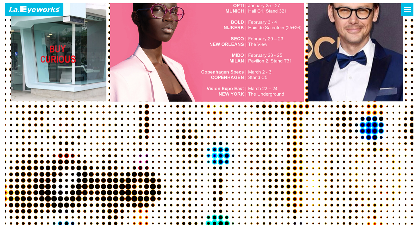
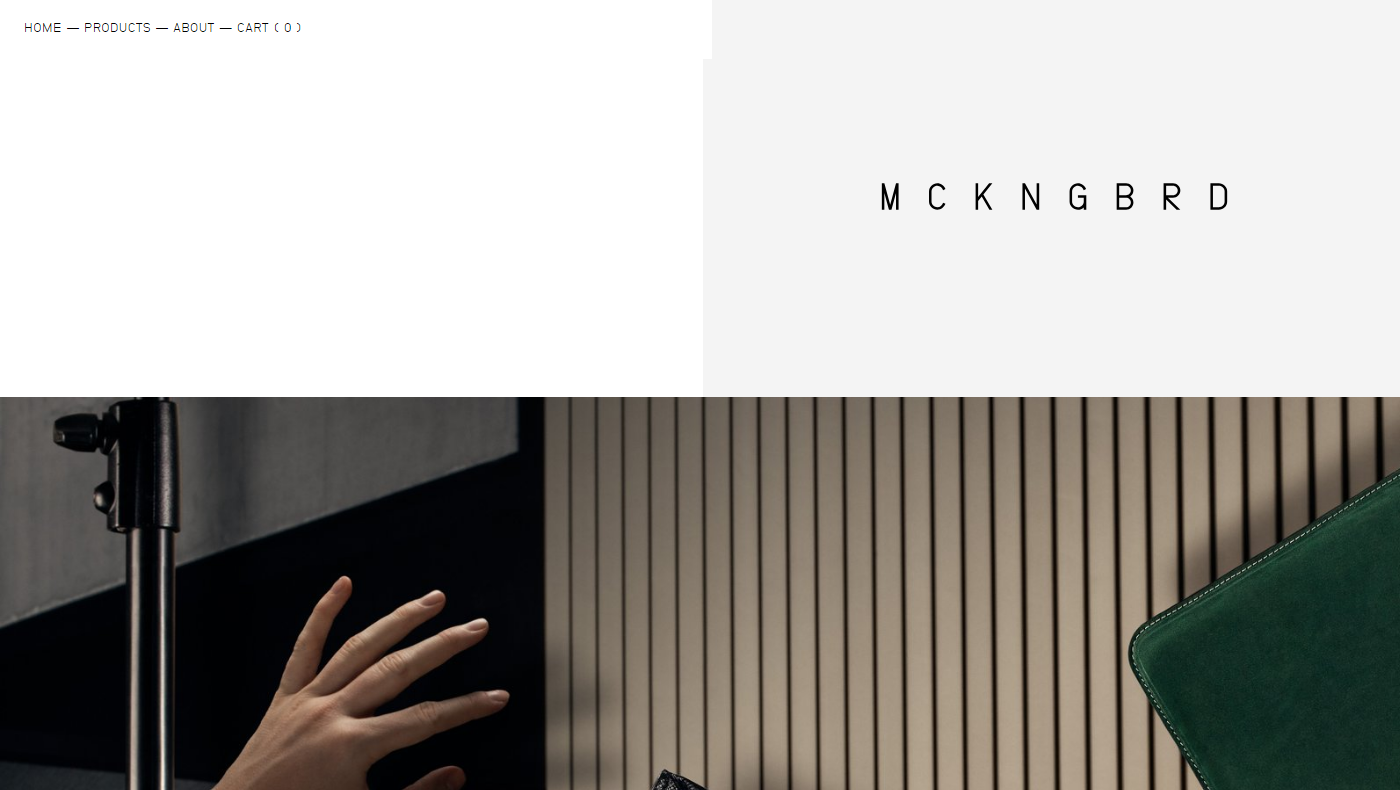
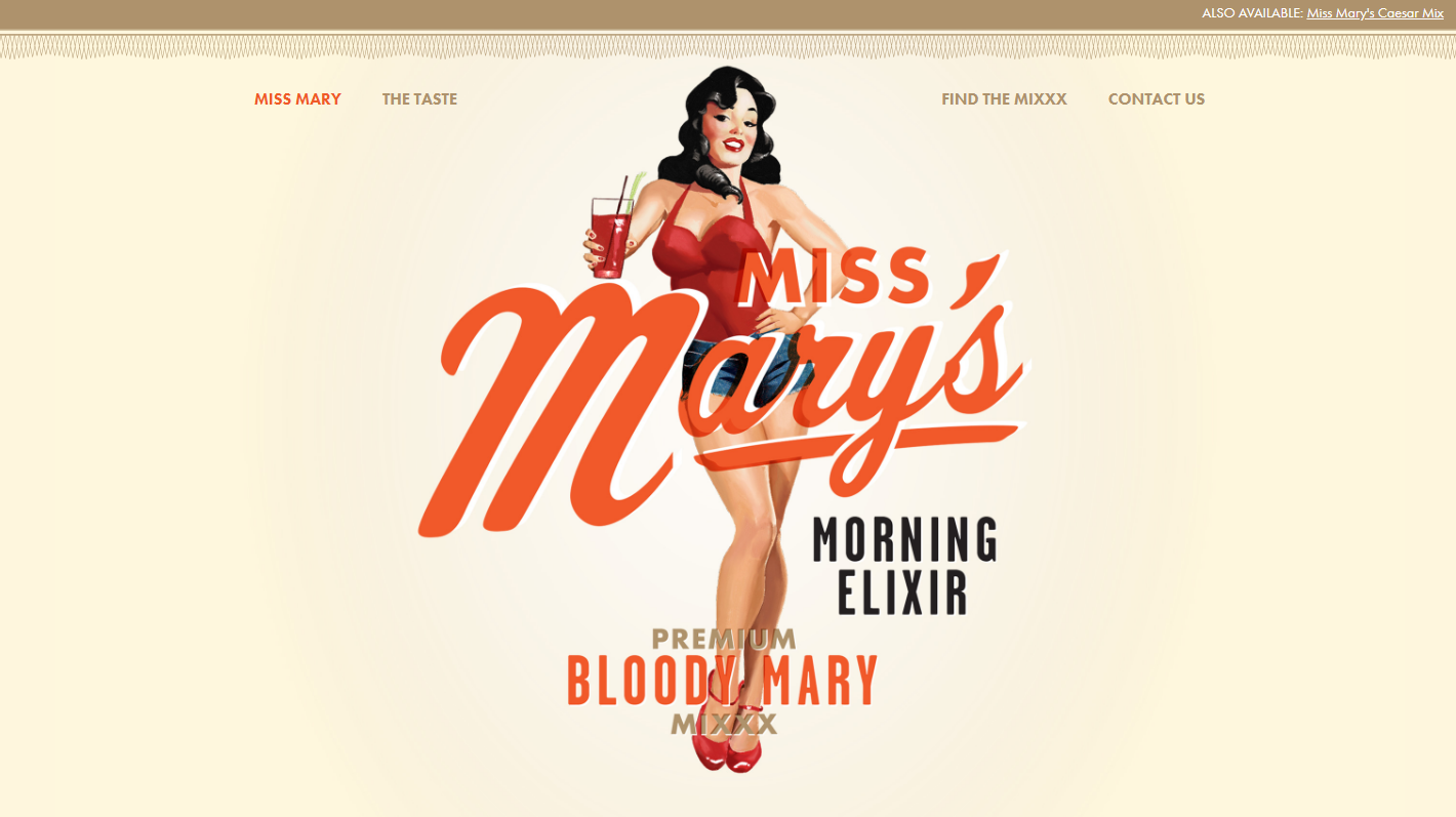
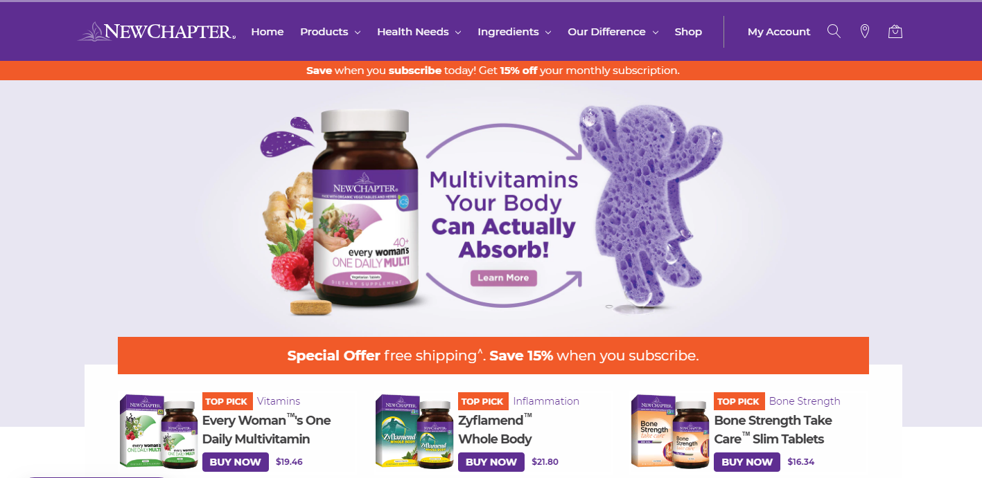
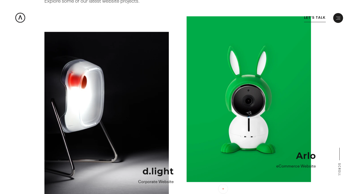
Take a look at this website. It does a great
job with imagery on the top of the page – great photography and smooth pastel
tones. Then it descends into this nightmare of a background.
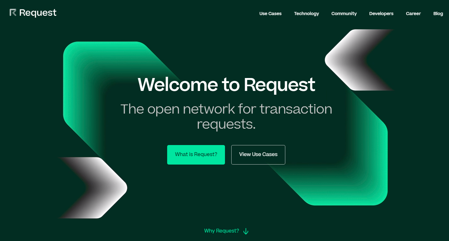
If you have to use color, make it smoother.
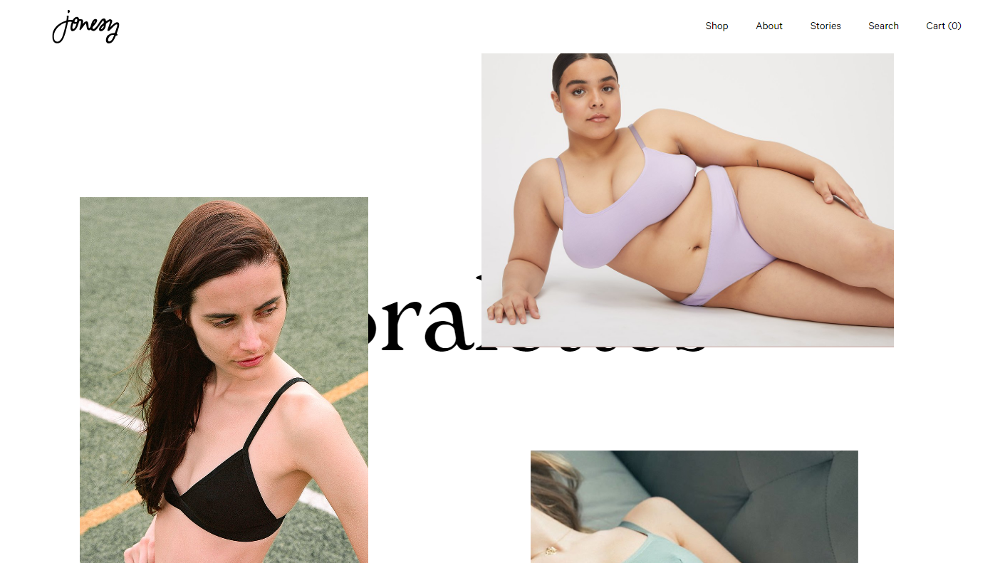
Take a look at this screenshot. The biggest part of a page is taken up by a
picture, but it isn’t bright and doesn’t make your eyes bleed.
If you’ve read something on typography trends,
you know that people love to mix fonts. Sometimes it looks good, sometimes it’s
over the top.
When you take on too many fonts, the odds of
you making something that looks good are rather low. Add to it too many
different and mismatching fonts and you’re headed for a disaster.
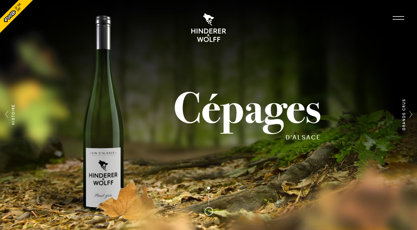
Sometimes, creative use of fonts works. Take a
look at this website, for instance.
In most cases, it just doesn’t cut it. If you
stick to a more traditional approach, you have higher chances of success. At
least, you don’t have as many opportunities to fail. Make your typography look
something along these lines, and you’re on the safe side.
If you’ve tried to design your own logo, you
know what badge logos are. They’re supposed to look hip and vintage. They’re
the Gucci of logo design – everyone wants one but few can afford them.
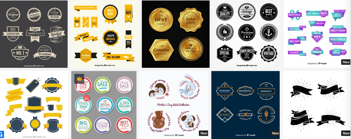
The thing is, most stock websites offer some
kind of badge logo. Most of these logos look pretty cool, and they may be a
great fit for a website that sells beard lotions with wood flavor.
But what is a logo for, anyway? It should make
your company stand out from the crowd. A badge logo will only make you look
like every other company that visited this page to get a cheap logo.
Approach creating your logo like getting your APA style paper written for you. If the thing
you’re paying for predicts your success, make sure to find a professional and
pay them well.
4. The Burst
The burst is another ugly trend that comes
from the stock websites and must go. It’s a classic way to attract attention to
something important, and it shows you’re a lazy designer.
The problem with this design trend is that
it’s overused. It’s overused to the point where it’s become trite. The bursting
badge that says “New” or “Sale” is boring now.
Try to present your sale in a new and fun way.
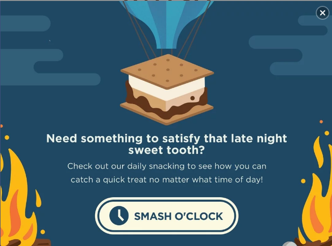
Make the news about a sale an experience of its own. This is what your popup
that informs people about discounts can look like.
It catches attention due to being well-designed
and well-written, and not due to being bright and having the word “Sale” in all
caps.
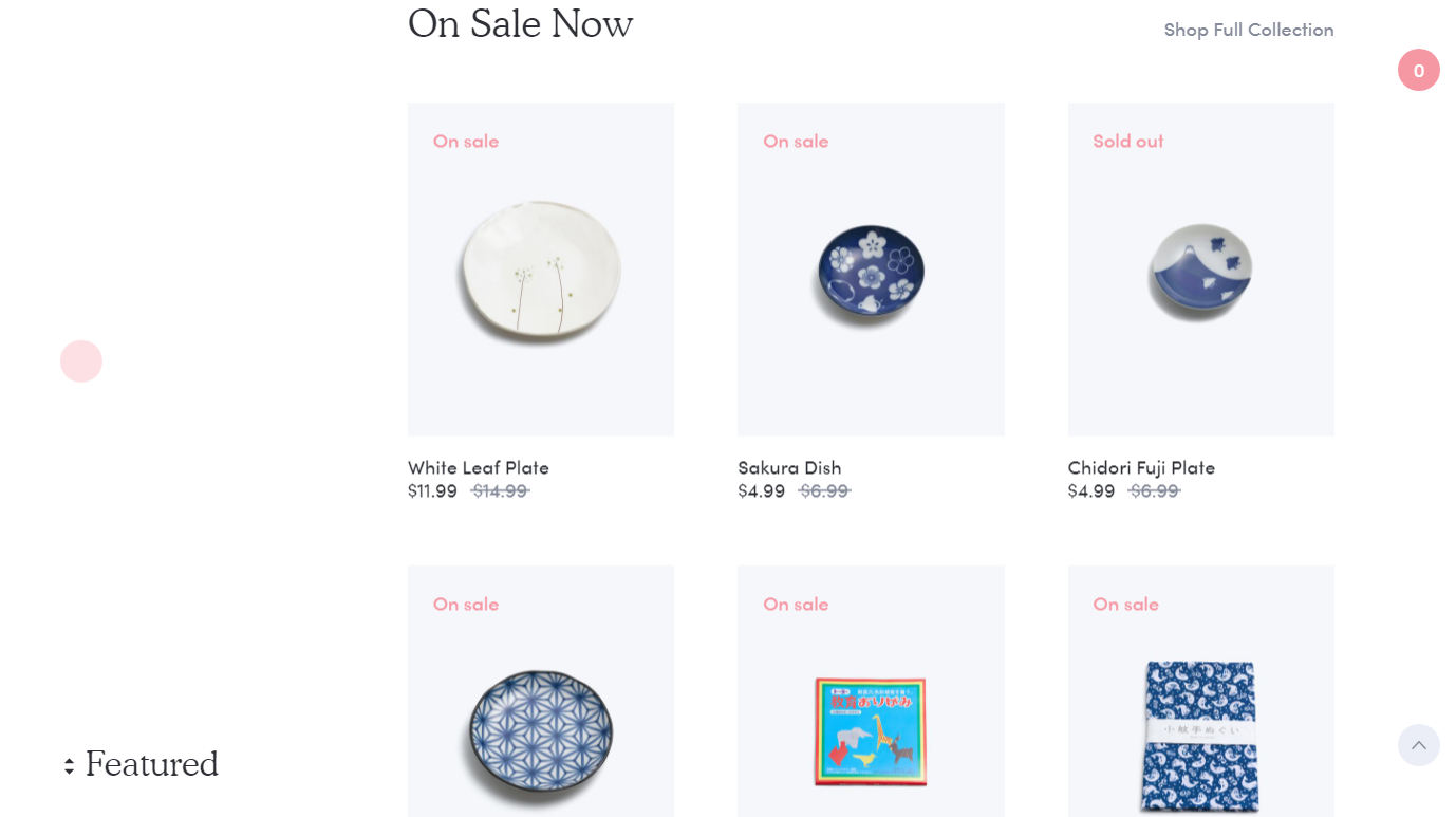
If you need to use badges for products, make
them minimalistic. These badges attract attention by means of contrast, even
though they don’t look like a small explosion that the burst is .
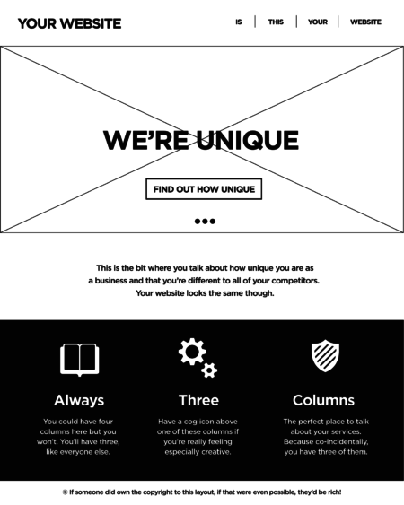
No. The thing is, there’s a fear that if you
conform to the standards of UX design this will make your website look dull.
That’s not what makes it this way. It’s a
combination of things, really. If your website does follow the standards of
layout that many conform to and then doesn’t communicate to the users, you end
up looking like this.
It sure looks ugly, but breaking the tree
columns rule won’t make your website interesting. It’s inconsistent and
confusing for the customers. It will only work if you have a couple of products
on display as well since scrolling through four screens of these is hard.
Minimalism is trendy. It’s great, too. Flat
design is not the minimalism you need, however.
It’s been around for a while. It had its peak
of popularity, and now it’s time for it to go. The problem with flat is that
it’s overused (just like the burst and badge logos). Every stock photo website
offers it. This picture must have been posted on too many websites.
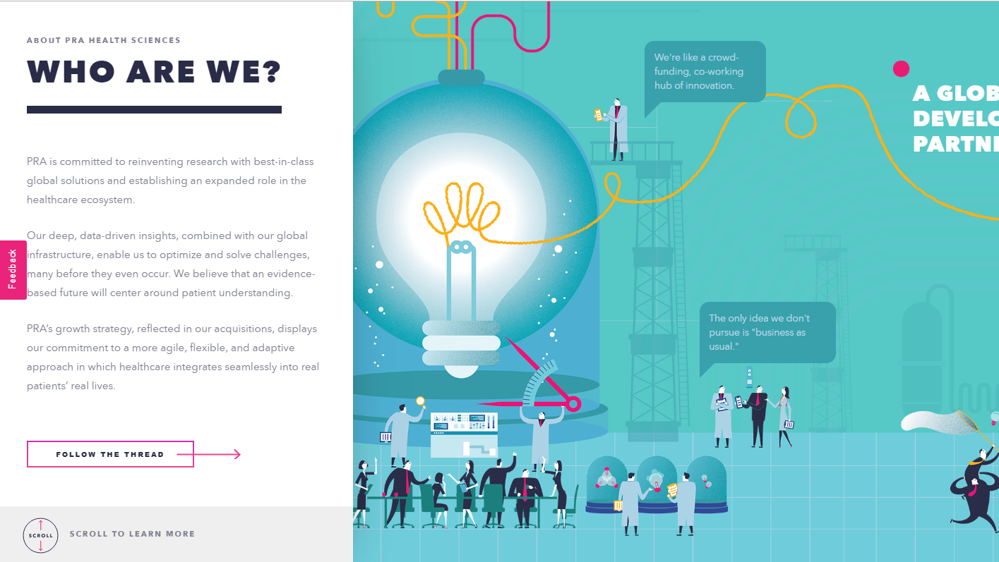
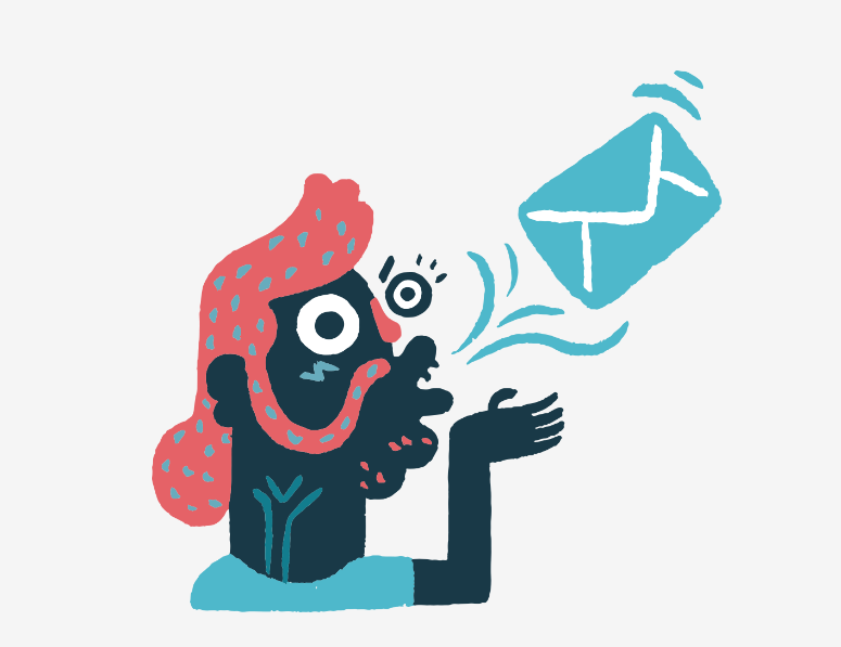
Your illustrations don’t have to be this
boring. Take a look at how MailChimp treats illustrations in their blog
articles. It’s just a random picture, but it’s fun and attention-grabbing.
The ultimate lesson you should draw from this
list is that following UI trends is not a great idea in general. You can use
most of them and make your website look great but only if you adopt a trend,
not follow it.
Take a trend and give it your own spin. This
will make you both up to date and unique.
There are two types of trends in web design.
The first type is trends that stem from research. UX trends do not disappear,
they evolve. Ultimately, there are some things that work best, and they are
there to stay.
Then there are UI trends. Most of the times,
they’re a great way to show your website is changing. Some trends, however, tend
to be so prevalent they become trite.
It’s these trends that you’d be better off not
using in 2019.
1. Bright Colors
How do you attract attention to something on
your website? You make it bright red! This was the motto of some web designers
for quite some time.
Even though the trend to use bright colors is
not as egregious as this simple strategy, it’s not without its faults either.
It’s been overused, and frankly, bright colors do not work for most websites.
Take a look at this website. It does a great
job with imagery on the top of the page – great photography and smooth pastel
tones. Then it descends into this nightmare of a background.
If you have to use color, make it smoother.
Take a look at this screenshot. The biggest part of a page is taken up by a
picture, but it isn’t bright and doesn’t make your eyes bleed.
If you’ve read something on typography trends,
you know that people love to mix fonts. Sometimes it looks good, sometimes it’s
over the top.
When you take on too many fonts, the odds of
you making something that looks good are rather low. Add to it too many
different and mismatching fonts and you’re headed for a disaster.
Sometimes, creative use of fonts works. Take a
look at this website, for instance.
In most cases, it just doesn’t cut it. If you
stick to a more traditional approach, you have higher chances of success. At
least, you don’t have as many opportunities to fail. Make your typography look
something along these lines, and you’re on the safe side.
If you’ve tried to design your own logo, you
know what badge logos are. They’re supposed to look hip and vintage. They’re
the Gucci of logo design – everyone wants one but few can afford them.
The thing is, most stock websites offer some
kind of badge logo. Most of these logos look pretty cool, and they may be a
great fit for a website that sells beard lotions with wood flavor.
But what is a logo for, anyway? It should make
your company stand out from the crowd. A badge logo will only make you look
like every other company that visited this page to get a cheap logo.
Approach creating your logo like getting your APA style paper written for you. If the thing
you’re paying for predicts your success, make sure to find a professional and
pay them well.
4. The Burst
The burst is another ugly trend that comes
from the stock websites and must go. It’s a classic way to attract attention to
something important, and it shows you’re a lazy designer.
The problem with this design trend is that
it’s overused. It’s overused to the point where it’s become trite. The bursting
badge that says “New” or “Sale” is boring now.
Try to present your sale in a new and fun way.
Make the news about a sale an experience of its own. This is what your popup
that informs people about discounts can look like.
It catches attention due to being well-designed
and well-written, and not due to being bright and having the word “Sale” in all
caps.
If you need to use badges for products, make
them minimalistic. These badges attract attention by means of contrast, even
though they don’t look like a small explosion that the burst is .
No. The thing is, there’s a fear that if you
conform to the standards of UX design this will make your website look dull.
That’s not what makes it this way. It’s a
combination of things, really. If your website does follow the standards of
layout that many conform to and then doesn’t communicate to the users, you end
up looking like this.
It sure looks ugly, but breaking the tree
columns rule won’t make your website interesting. It’s inconsistent and
confusing for the customers. It will only work if you have a couple of products
on display as well since scrolling through four screens of these is hard.
Minimalism is trendy. It’s great, too. Flat
design is not the minimalism you need, however.
It’s been around for a while. It had its peak
of popularity, and now it’s time for it to go. The problem with flat is that
it’s overused (just like the burst and badge logos). Every stock photo website
offers it. This picture must have been posted on too many websites.
Your illustrations don’t have to be this
boring. Take a look at how MailChimp treats illustrations in their blog
articles. It’s just a random picture, but it’s fun and attention-grabbing.
The ultimate lesson you should draw from this
list is that following UI trends is not a great idea in general. You can use
most of them and make your website look great but only if you adopt a trend,
not follow it.
Take a trend and give it your own spin. This
will make you both up to date and unique.
You scroll down to a certain point, now you want to style things in a certain way. A header becomes fixed. An animation triggers. A table of contents appears. To do anything based on scroll position, JavaScript is required right now. You watch the scroll position via a DOM event and alter an element’s styling based on that position. Or, probably better if you can, use IntersectionObserver. We just blogged about all this.
Now there is a new (unofficial) spec trying to bring these possibilities to CSS. I love it when web standards get involved because it sees authors like us trying to pull off certain design effects and wants to (presumably) help make it easier and more performant. I also like how this spec lists editors from Mozilla and Google and Apple.
I wonder how they’ll handle the infinite-loop stuff here. Like you scroll to a point, it triggers some animation, which moves some element such that it changes the scroll position, which stops the animation, which moves the scroll position again… etc. I also wonder why it’s all specific to animation. „Scroll-position styling” seems like it would have the widest appeal and use level of usefulness.
The idea behind most of web applications is to fetch data from the database and present it to the user in the best possible way. When we deal with data there are cases when the best possible way of presentation means creating a list.
Depending on the amount of data and its content, we may decide to show all content at once (very rarely), or show only a specific part of a bigger data set (more likely). The main reason behind showing only part of the existing data is that we want to keep our applications as performant as possible and avoid loading or showing unnecessary data.
If we decide to show our data in „chunks” then we need a way to navigate through that collection. The two most common ways of navigating through set of data are:
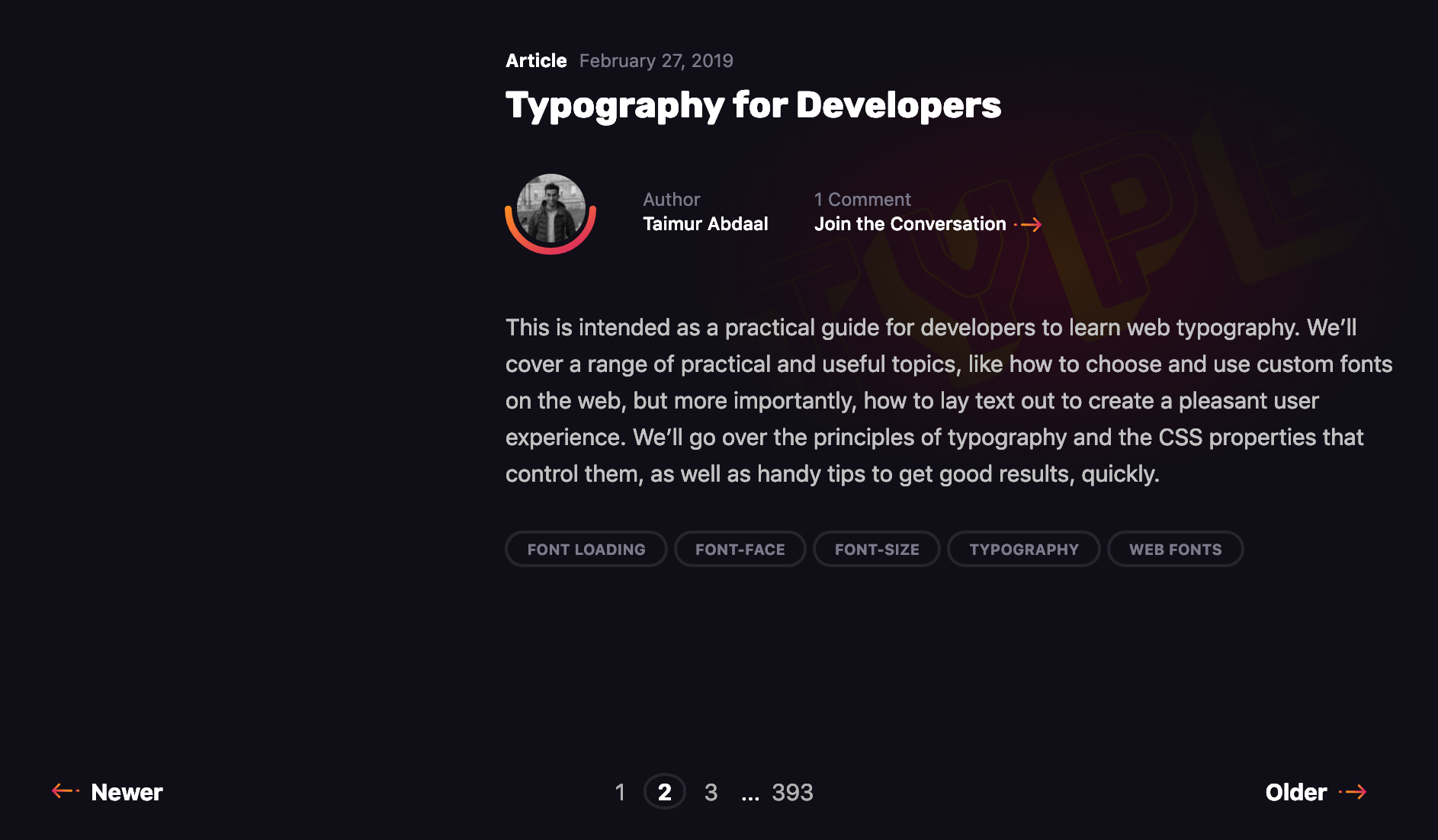
The first is pagination, a technique that splits the set of data into a specific number of pages, saving users from being overwhelmed by the amount of data on one page and allowing them to view one set of results at a time. Take this very blog you’re reading, for example. The homepage lists the latest 10 posts. Viewing the next set of latest posts requires clicking a button.
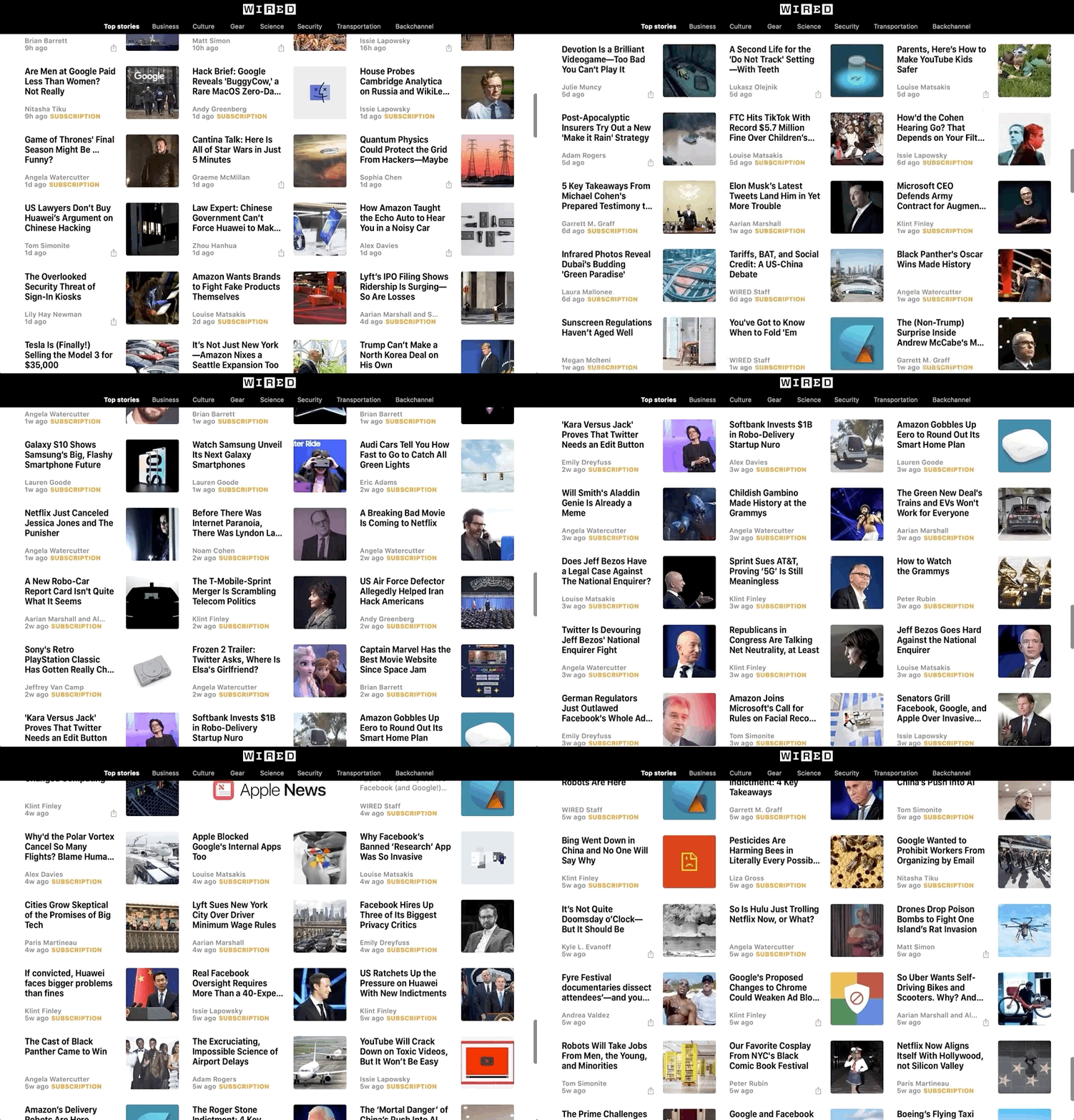
The second common technique is infinite scrolling, something you’re likely familiar with if you’ve ever scrolled through a timeline on either Facebook or Twitter.
The Apple News app also uses infinite scroll to browse a list of articles.
We’re going to take a deeper look at the first type in this post. Pagination is something we encounter on a near-daily basis, yet making it is not exactly trivial. It’s a great use case for a component, so that’s exactly what we’re going to do. We will go through the process of creating a component that is in charge of displaying that list, and triggering the action that fetches additional articles when we click on a specific page to be displayed. In other words, we’re making a pagination component in Vue.js like this:
Let’s go through the steps together.
Step 1: Create the ArticlesList component in Vue
Let’s start by creating a component that will show a list of articles (but without pagination just yet). We’ll call it ArticlesList. In the component template, we’ll iterate through the set of articles and pass a single article item to each ArticleItem component.
Now we need to create a method that will load the next page, the previous page or a selected page.
In the pageChangeHandle method, before loading new articles, we change the currentPage value depending on a property passed to the method and fetch the data respective to a specific page from the API. Upon receiving new data, we replace the existing articles array with the fresh data containing a new page of articles.
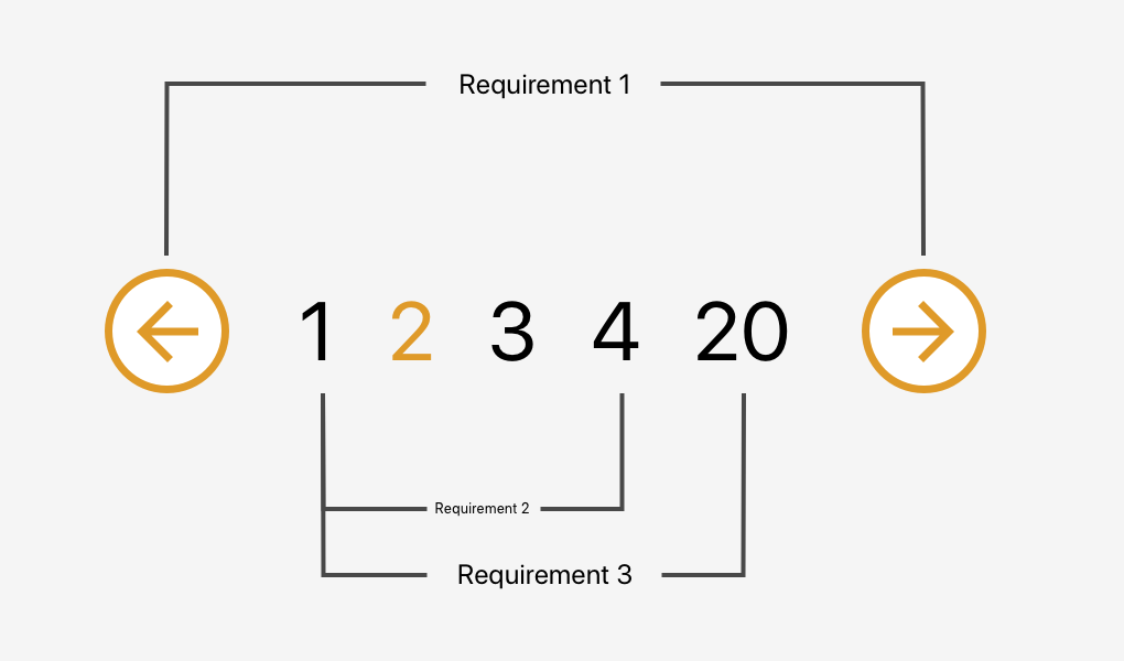
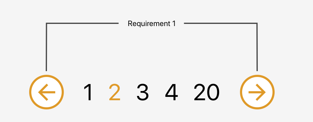
The component will accept currentPage and pageCount properties from the parent component and emit proper actions back to the parent when the next or previous button is clicked. It will also be responsible for disabling buttons when we are on the first or last page to prevent moving out of the existing collection.
That was the easy part. Now we need to create a list of page numbers, each allowing us to select a specific page. The number of pages should be customizable and we also need to make sure not to show any pages that may lead us beyond the collection range.
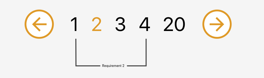
Requirement 2: Allow the user to go to a specific page within a range
Let’s start by creating a component that will be used as a single page number. I called it BasePaginationTrigger. It will do two things: show the page number passed from the BasePagination component and emit an event when the user clicks on a specific number.
In the script section, we need to add one more method (onLoadPage) that will be fired when the loadPage event is emitted from the trigger component. This method will receive a page number that was clicked and emit the event up to the ArticlesList component.
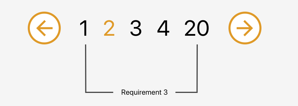
Requirement 3: Change the range of page numbers based on the current page
OK, now we have a single trigger that shows us the current page and allows us to fetch the same page again. Pretty useless, don’t you think? Let’s make some use of that newly created trigger component. We need a list of pages that will allow us to jump from one page to another without needing to go through the pages in between.
We also need to make sure to display the pages in a nice manner. We always want to display the first page (on the far left) and the last page (on the far right) on the pagination list and then the remaining pages between them.
We have three possible scenarios:
The selected page number is smaller than half of the list width (e.g. 1 – 2 – 3 – 4 – 18)
The selected page number is bigger than half of the list width counting from the end of the list (e.g. 1 – 15 – 16 – 17 – 18)
All other cases (e.g. 1 – 4 – 5 – 6 – 18)
To handle these cases, we will create a computed property that will return an array of numbers that should be shown between the next and previous buttons. To make the component more reusable we will accept a property visiblePagesCount that will specify how many pages should be visible in the pagination component.
Before going to the cases one by one we create few variables:
visiblePagesThreshold:- Tells us how many pages from the centre (selected page should be shown)
paginationTriggersArray: Array that will be filled with page numbers
visiblePagesCount: Creates an array with the required length
Scenario 1: The selected page number is smaller than half of the list width
We set the first element to always be equal to 1. Then we iterate through the list, adding an index to each element. At the end, we add the last value and set it to be equal to the last page number — we want to be able to go straight to the last page if we need to.
Scenario 2: The selected page number is bigger than half of the list width counting from the end of the list
Similar to the previous scenario, we start with the last page and iterate through the list, this time subtracting the index from each element. Then we reverse the array to get the proper order and push 1 into the first place in our array.
We know what number should be in the center of our list: the current page. We also know how long the list should be. This allows us to get the first number in our array. Then we populate the list by adding an index to each element. At the end, we push 1 into the first place in our array and replace the last number with our last page number.
And we are done! We just built a nice and reusable pagination component in Vue.
When to avoid this pattern
Although this component is pretty sweet, it’s not a silver bullet for all use cases involving pagination.
For example, it’s probably a good idea to avoid this pattern for content that streams constantly and has a relatively flat structure, like each item is at the same level of hierarchy and has a similar chance of being interesting to the user. In other words, something less like an article with multiple pages and something more like main navigation.
Another example would be browsing news rather than looking for a specific news article. We do not need to know where exactly the news is and how much we scrolled to get to a specific article.
That’s a wrap!
Hopefully this is a pattern you will be able to find useful in a project, whether it’s for a simple blog, a complex e-commerce site, or something in between. Pagination can be a pain, but having a modular pattern that not only can be re-used, but considers a slew of scenarios, can make it much easier to handle.