Layer masks are your go-to tool when doing photo composites or manipulations! You can add a mask to a layer and then use that mask to hide, or „mask,” portions of the layer.
Masking is different from erasing as you aren’t deleting anything, but hiding it. Anything you mask can be brought back at any time! Let’s get to learning how to make a layer mask in Photoshop.
2. How to Use Layer Masks
Below, I will walk you through a simple example of how to add a layer mask in Photoshop.
Step 1
Create a New Layer over a background. I’ll be using this Night Sky image.
Create a shape using the Shape Tool.
Step 2
With the shape selected, click on the Add Layer Mask button found at the bottom of the Layers panel, right in the middle. The icon is of a square with a circle in the middle.
A white box will appear next to your layer icon.
Step 3
Click the layer mask, the white box that appeared, to make sure it’s active. This is your Photoshop mask!
Now, with a Brush set to black, you can mask out any part of that shape.
Step 4
You can then mask things back in using the color white! Remember, nothing is ever really gone.
You use black to erase and white to recover. You can even use shades of gray; the darker the gray, the more it will erase.
Below, I created some star-shaped selections and then masked them out with a black brush.
Step 5
If you move your layer around, your mask will follow and stay attached, indicated by the Chain Link icon located between the layer and layer mask icons.
However, you can also Unlink the layer and the layer mask, allowing you to move the layer and layer mask around independently, depending on which one you have active.
Step 6
Finally, if for any reason you want to permanently apply your layer mask, you can Right-Click > Apply Layer Mask on your layer mask.
Once a layer mask is applied, whatever is masked out will become permanently deleted, the layer will turn back into a standard rasterized layer, and you are free to add a new layer mask.
And There You Have It!
We’ve learned how to create a layer mask in Photoshop! Layer masks are what make photo composites and manipulation possible, allowing us to blend dozens of images to create one cohesive new piece of art! The possibilities are endless.
So, as always, keep experimenting with different techniques, continue learning how to mask in Photoshop, and don’t forget to post your version below, along with any questions, comments, or critiques!
Looking to learn more? Why not check out the following excellent photo manipulation tutorials:
Layer masks are your go-to tool when doing photo composites or manipulations! You can add a mask to a layer and then use that mask to hide, or „mask,” portions of the layer.
Masking is different from erasing as you aren’t deleting anything, but hiding it. Anything you mask can be brought back at any time! Let’s get to learning how to make a layer mask in Photoshop.
2. How to Use Layer Masks
Below, I will walk you through a simple example of how to add a layer mask in Photoshop.
Step 1
Create a New Layer over a background. I’ll be using this Night Sky image.
Create a shape using the Shape Tool.
Step 2
With the shape selected, click on the Add Layer Mask button found at the bottom of the Layers panel, right in the middle. The icon is of a square with a circle in the middle.
A white box will appear next to your layer icon.
Step 3
Click the layer mask, the white box that appeared, to make sure it’s active. This is your Photoshop mask!
Now, with a Brush set to black, you can mask out any part of that shape.
Step 4
You can then mask things back in using the color white! Remember, nothing is ever really gone.
You use black to erase and white to recover. You can even use shades of gray; the darker the gray, the more it will erase.
Below, I created some star-shaped selections and then masked them out with a black brush.
Step 5
If you move your layer around, your mask will follow and stay attached, indicated by the Chain Link icon located between the layer and layer mask icons.
However, you can also Unlink the layer and the layer mask, allowing you to move the layer and layer mask around independently, depending on which one you have active.
Step 6
Finally, if for any reason you want to permanently apply your layer mask, you can Right-Click > Apply Layer Mask on your layer mask.
Once a layer mask is applied, whatever is masked out will become permanently deleted, the layer will turn back into a standard rasterized layer, and you are free to add a new layer mask.
And There You Have It!
We’ve learned how to create a layer mask in Photoshop! Layer masks are what make photo composites and manipulation possible, allowing us to blend dozens of images to create one cohesive new piece of art! The possibilities are endless.
So, as always, keep experimenting with different techniques, continue learning how to mask in Photoshop, and don’t forget to post your version below, along with any questions, comments, or critiques!
Looking to learn more? Why not check out the following excellent photo manipulation tutorials:
In today’s tutorial, we’re going to take a quick look at the process of creating a set of vector line patterns in Adobe Illustrator, using nothing more than some basic shapes that we’re going to adjust here and there.
Also, don’t forget you can always expand your library by heading over to Envato Elements, where you’ll find a great selection of vector patterns.
So, assuming you already have the software up and running, let’s jump straight into it!
Looking to download vector line patterns? Check out the following article for our recommendations:
As with every new
project, we’re going to kick things off by setting up a New Document. So head over to File > New (or use the Control-N
keyboard shortcut), and use the following settings:
Profile: Web
Number of Artboards:
3
Spacing:
200 px
Columns:
3
Width: 400
px
Height: 400 px
2. How to Create
the First Pattern Variation
Now that we’ve
finished setting up our project file, we can start working on our first repeating pattern
segment, which we will later use to create the actual pattern.
Step 1
Create the main shape for the background using a 400 x 400 px square, which we will color using #78B9FF and then
center align to the first Artboard
using the Align panel’s Horizontal and Vertical Align Center options.
Step 2
Grab the Pen
Tool (P), and draw a diagonal line using a 4 px thick Stroke
(#FFFFFF) starting from the background’s upper-left corner
and going all the way down to its bottom-right one.
Step 3
Adjust the shape
that we’ve just created by heading over to Effect
> Distort & Transform and applying a Zig Zag effect with the following settings:
Size:
4 px
Absolute:
checked
Ridges per segment:
15
Points: Smooth
Quick tip:
when adjusting the effect, make sure you use an odd number for the Ridges per segment input box since
otherwise when you create the larger pattern, your lines won’t align properly.
Step 4
With the resulting shape selected, add the bottom-left lines by right clicking and then going to Transform > Move where we will
enter -8 px in the Horizontal value field and 8 px in the Vertical one, making sure to press the Copy button in order to create the first line.
Step 5
Once you have the first copy, simply use the Control-D keyboard shortcut (24 times) to duplicate the
action until you’ve filled in the lower empty space.
Step 6
Add the top-right lines by selecting the initial stroke again, and then
going through the same process, making sure to reverse the direction of
the Position, by using a value of 8 px for the Horizontal field and -8 px
for the Vertical one.
Once you have
the first copy, add the remaining ones using the Control-D keyboard shortcut (23 times), making sure to
select (Select > Same > Stroke
Color) and group all of them together afterwards using the Control-G keyboard shortcut.
Step 7
Finish off the current pattern by creating a copy (Control-C) of the background, which we will paste in front, and
then with both it and the diagonal lines selected, simply right click > Make Clipping Mask.
Once you’re done, make sure
you select the resulting shapes and the background, and then group (Control-G) them together before moving
on to the next pattern.
3. How to Create
the Second Pattern Variation
Assuming you’ve
finished working on the first pattern’s repeating segment, move on to the neighbouring Artboard, where we will gradually
build the next one.
Step 1
Start working on the pattern’s first column of repeating shapes by
creating a 20 x 20 px square, which
we will color using #FFE180 and then position in the bottom-left corner of the Artboard, as seen in the reference image.
Step 2
Adjust the shape that we’ve just created by selecting its right anchor
points using the Direct Selection Tool
(A), and then pushing them to the bottom by 16 px using the Move tool (right click >
Transform > Move > Vertical > 16 px).
Step 3
Give the resulting shape an outline using the Stroke method, by creating a copy (Control-C) of it, which we will then paste in front (Control-F) and adjust by first changing
its color to #191515, and then setting its StrokeWeight to 4 px and its Corner to Round Join. Once you’re done, make sure
you select and group the two shapes together using the Control-G keyboard shortcut.
Step 4
Create the right side of the column using a copy (Control-C > Control-F) of the shapes that we’ve just grouped,
which we will vertically reflect (right
click > Transform > Reflect > Vertical) and then position as seen
in the reference image so that their paths overlap.
Step 5
Add the column’s second row by selecting the shapes that we have so far
and then dragging them up while holding down the Shift key (in order to drag in a straight line) and the Alt one (in order to create the
duplicates), making sure to flip the colors as seen in the reference image.
Step 6
Create the remaining upper rows by using the select and drag method to
create the first instance, and then adding the remaining duplicates using the Control-D keyboard shortcut (nine
times), making sure to remove the last row. Take your time, and once you’re
done, select and group all of them together using the Control-G keyboard shortcut.
Step 7
Finish off the pattern by adding the remaining nine columns using the
select and drag method, making sure to group (Control-G) and then mask them using a 400 x 400 px square (desired shapes selected > right click > Make Clipping Mask).
4. How to Create
the Third Pattern Variation
We are now down to
our third and last repeating pattern segment, so assuming you’ve already
positioned yourself on the remaining Artboard, let’s jump straight into it.
Step 1
Start by creating the main shape for the first row using a 40 x 40 px square, which we will color
using #FFB685 and then position in the bottom-left corner of the Artboard, as seen
in the reference image.
Step 2
Adjust the shape that we’ve just created by adding a new anchor point
to the center of its bottom edge using the Add
Anchor Point Tool (+) and then removing its bottom corner ones using the Delete Anchor Point Tool (-). Give the
resulting shape a 4 px thick outline
(#191515) with a Round Join, making
sure to select and group the two together using the Control-G keyboard shortcut.
Step 3
Create a copy (Control-C >
Control-F) of the shapes that we’ve just grouped, which we will
horizontally reflect (right click >
Transform > Reflect > Horizontal) and then position on top of the
original shapes as shown, so that their paths overlap.
Step 4
Add the smaller details using four 16 x 16 px circles (#A0EFD5) with a 4 px thick outline (#191515), which we
will individually group (Control-G)
and then position onto the larger shapes as shown in the reference image. Once
you’re done, make sure you select and group all of
them together using the Control-G
keyboard shortcut.
Step 5
Fill in the row by creating ten overlapping copies using the select and
drag method, making sure to change the color of the inner shape on every second one to #FFE180.
Step 6
Create the second row using ten copies of the orange based triangles,
making sure to position them in-between as seen in the reference image.
Step 7
Add the remaining rows using nine instances of the ones that we already
have, making sure to adjust the position of the yellow triangles as seen in the
reference image. Once you’re done, select and group all of them together using
the Control-G keyboard shortcut,
making sure to mask them using a 400 x
400 px square (desired shapes selected >
right click > Make Clipping Mask).
5. How to Turn the
Repeating Pattern Segments Into Actual Patterns
So up to this
point we’ve gone through the process of creating three different repeating line
pattern variations, which means that now we can finally see how we can turn
them into an actual usable pattern.
Step 1
Start by selecting any of the three pattern segments (since the process
is identical), and then going to Object
> Pattern > Make, which will bring up the following window, where we can
fine tune some of its settings. First, let’s give it a custom name.
Step 2
Moving on down, we have Tile Type, which we’ll always want to leave set to Grid,
followed by the Width and Height settings, which will
automatically be set to that of the Artboard (400 x 400 px) as long as you check the Size Tile to Art option. Leave all the other settings as they are,
and then create the pattern by simply clicking on the Done button found underneath the current project tab.
6. How to Use the Patterns You’ve Created
Okay, so we’ve
created the actual patterns, but how do we actually go about using them?
Well, if you open up the Swatches
panel, you’ll quickly notice that your new patterns have now been added to your
library.
To use any one of them, simply set it as your Fill color and then select the Rectangle Tool (M), and click and drag
in order to draw the desired shape.
Great Job!
There you have it,
a nice and easy exercise on how to create three different line patterns using
some basic shapes.
As always, I hope you had fun working on the project and managed to
learn something new and useful during the process. That being said, if you have
any questions, feel free to post them in the comments section and I’ll get
back to you as soon as I can!
Want to Expand Your Adobe Illustrator Skillbag?!
Just started out using Adobe Illustrator, but haven’t quite gotten the hang of it? Well, today’s your lucky day since we’ve hand-picked a few tutorials that should get you up and running in no time!
As a beginner, creating digital artwork intended for web use can sometimes get a bit frustrating, especially when you put a lot of time into a piece (be it…
In this article, we’re going to talk about the top ten most useful tools in Adobe Illustrator. Whether you’re into icon design, illustrations or any other…
In today’s tutorial, we’re going to take a quick look at the process of creating a set of vector line patterns in Adobe Illustrator, using nothing more than some basic shapes that we’re going to adjust here and there.
Also, don’t forget you can always expand your library by heading over to Envato Elements, where you’ll find a great selection of vector patterns.
So, assuming you already have the software up and running, let’s jump straight into it!
Looking to download vector line patterns? Check out the following article for our recommendations:
As with every new
project, we’re going to kick things off by setting up a New Document. So head over to File > New (or use the Control-N
keyboard shortcut), and use the following settings:
Profile: Web
Number of Artboards:
3
Spacing:
200 px
Columns:
3
Width: 400
px
Height: 400 px
2. How to Create
the First Pattern Variation
Now that we’ve
finished setting up our project file, we can start working on our first repeating pattern
segment, which we will later use to create the actual pattern.
Step 1
Create the main shape for the background using a 400 x 400 px square, which we will color using #78B9FF and then
center align to the first Artboard
using the Align panel’s Horizontal and Vertical Align Center options.
Step 2
Grab the Pen
Tool (P), and draw a diagonal line using a 4 px thick Stroke
(#FFFFFF) starting from the background’s upper-left corner
and going all the way down to its bottom-right one.
Step 3
Adjust the shape
that we’ve just created by heading over to Effect
> Distort & Transform and applying a Zig Zag effect with the following settings:
Size:
4 px
Absolute:
checked
Ridges per segment:
15
Points: Smooth
Quick tip:
when adjusting the effect, make sure you use an odd number for the Ridges per segment input box since
otherwise when you create the larger pattern, your lines won’t align properly.
Step 4
With the resulting shape selected, add the bottom-left lines by right clicking and then going to Transform > Move where we will
enter -8 px in the Horizontal value field and 8 px in the Vertical one, making sure to press the Copy button in order to create the first line.
Step 5
Once you have the first copy, simply use the Control-D keyboard shortcut (24 times) to duplicate the
action until you’ve filled in the lower empty space.
Step 6
Add the top-right lines by selecting the initial stroke again, and then
going through the same process, making sure to reverse the direction of
the Position, by using a value of 8 px for the Horizontal field and -8 px
for the Vertical one.
Once you have
the first copy, add the remaining ones using the Control-D keyboard shortcut (23 times), making sure to
select (Select > Same > Stroke
Color) and group all of them together afterwards using the Control-G keyboard shortcut.
Step 7
Finish off the current pattern by creating a copy (Control-C) of the background, which we will paste in front, and
then with both it and the diagonal lines selected, simply right click > Make Clipping Mask.
Once you’re done, make sure
you select the resulting shapes and the background, and then group (Control-G) them together before moving
on to the next pattern.
3. How to Create
the Second Pattern Variation
Assuming you’ve
finished working on the first pattern’s repeating segment, move on to the neighbouring Artboard, where we will gradually
build the next one.
Step 1
Start working on the pattern’s first column of repeating shapes by
creating a 20 x 20 px square, which
we will color using #FFE180 and then position in the bottom-left corner of the Artboard, as seen in the reference image.
Step 2
Adjust the shape that we’ve just created by selecting its right anchor
points using the Direct Selection Tool
(A), and then pushing them to the bottom by 16 px using the Move tool (right click >
Transform > Move > Vertical > 16 px).
Step 3
Give the resulting shape an outline using the Stroke method, by creating a copy (Control-C) of it, which we will then paste in front (Control-F) and adjust by first changing
its color to #191515, and then setting its StrokeWeight to 4 px and its Corner to Round Join. Once you’re done, make sure
you select and group the two shapes together using the Control-G keyboard shortcut.
Step 4
Create the right side of the column using a copy (Control-C > Control-F) of the shapes that we’ve just grouped,
which we will vertically reflect (right
click > Transform > Reflect > Vertical) and then position as seen
in the reference image so that their paths overlap.
Step 5
Add the column’s second row by selecting the shapes that we have so far
and then dragging them up while holding down the Shift key (in order to drag in a straight line) and the Alt one (in order to create the
duplicates), making sure to flip the colors as seen in the reference image.
Step 6
Create the remaining upper rows by using the select and drag method to
create the first instance, and then adding the remaining duplicates using the Control-D keyboard shortcut (nine
times), making sure to remove the last row. Take your time, and once you’re
done, select and group all of them together using the Control-G keyboard shortcut.
Step 7
Finish off the pattern by adding the remaining nine columns using the
select and drag method, making sure to group (Control-G) and then mask them using a 400 x 400 px square (desired shapes selected > right click > Make Clipping Mask).
4. How to Create
the Third Pattern Variation
We are now down to
our third and last repeating pattern segment, so assuming you’ve already
positioned yourself on the remaining Artboard, let’s jump straight into it.
Step 1
Start by creating the main shape for the first row using a 40 x 40 px square, which we will color
using #FFB685 and then position in the bottom-left corner of the Artboard, as seen
in the reference image.
Step 2
Adjust the shape that we’ve just created by adding a new anchor point
to the center of its bottom edge using the Add
Anchor Point Tool (+) and then removing its bottom corner ones using the Delete Anchor Point Tool (-). Give the
resulting shape a 4 px thick outline
(#191515) with a Round Join, making
sure to select and group the two together using the Control-G keyboard shortcut.
Step 3
Create a copy (Control-C >
Control-F) of the shapes that we’ve just grouped, which we will
horizontally reflect (right click >
Transform > Reflect > Horizontal) and then position on top of the
original shapes as shown, so that their paths overlap.
Step 4
Add the smaller details using four 16 x 16 px circles (#A0EFD5) with a 4 px thick outline (#191515), which we
will individually group (Control-G)
and then position onto the larger shapes as shown in the reference image. Once
you’re done, make sure you select and group all of
them together using the Control-G
keyboard shortcut.
Step 5
Fill in the row by creating ten overlapping copies using the select and
drag method, making sure to change the color of the inner shape on every second one to #FFE180.
Step 6
Create the second row using ten copies of the orange based triangles,
making sure to position them in-between as seen in the reference image.
Step 7
Add the remaining rows using nine instances of the ones that we already
have, making sure to adjust the position of the yellow triangles as seen in the
reference image. Once you’re done, select and group all of them together using
the Control-G keyboard shortcut,
making sure to mask them using a 400 x
400 px square (desired shapes selected >
right click > Make Clipping Mask).
5. How to Turn the
Repeating Pattern Segments Into Actual Patterns
So up to this
point we’ve gone through the process of creating three different repeating line
pattern variations, which means that now we can finally see how we can turn
them into an actual usable pattern.
Step 1
Start by selecting any of the three pattern segments (since the process
is identical), and then going to Object
> Pattern > Make, which will bring up the following window, where we can
fine tune some of its settings. First, let’s give it a custom name.
Step 2
Moving on down, we have Tile Type, which we’ll always want to leave set to Grid,
followed by the Width and Height settings, which will
automatically be set to that of the Artboard (400 x 400 px) as long as you check the Size Tile to Art option. Leave all the other settings as they are,
and then create the pattern by simply clicking on the Done button found underneath the current project tab.
6. How to Use the Patterns You’ve Created
Okay, so we’ve
created the actual patterns, but how do we actually go about using them?
Well, if you open up the Swatches
panel, you’ll quickly notice that your new patterns have now been added to your
library.
To use any one of them, simply set it as your Fill color and then select the Rectangle Tool (M), and click and drag
in order to draw the desired shape.
Great Job!
There you have it,
a nice and easy exercise on how to create three different line patterns using
some basic shapes.
As always, I hope you had fun working on the project and managed to
learn something new and useful during the process. That being said, if you have
any questions, feel free to post them in the comments section and I’ll get
back to you as soon as I can!
Want to Expand Your Adobe Illustrator Skillbag?!
Just started out using Adobe Illustrator, but haven’t quite gotten the hang of it? Well, today’s your lucky day since we’ve hand-picked a few tutorials that should get you up and running in no time!
As a beginner, creating digital artwork intended for web use can sometimes get a bit frustrating, especially when you put a lot of time into a piece (be it…
In this article, we’re going to talk about the top ten most useful tools in Adobe Illustrator. Whether you’re into icon design, illustrations or any other…
In today’s tutorial, we’re going to take a quick look at the process of creating a set of vector line patterns in Adobe Illustrator, using nothing more than some basic shapes that we’re going to adjust here and there.
Also, don’t forget you can always expand your library by heading over to Envato Elements, where you’ll find a great selection of vector patterns.
So, assuming you already have the software up and running, let’s jump straight into it!
Looking to download vector line patterns? Check out the following article for our recommendations:
As with every new
project, we’re going to kick things off by setting up a New Document. So head over to File > New (or use the Control-N
keyboard shortcut), and use the following settings:
Profile: Web
Number of Artboards:
3
Spacing:
200 px
Columns:
3
Width: 400
px
Height: 400 px
2. How to Create
the First Pattern Variation
Now that we’ve
finished setting up our project file, we can start working on our first repeating pattern
segment, which we will later use to create the actual pattern.
Step 1
Create the main shape for the background using a 400 x 400 px square, which we will color using #78B9FF and then
center align to the first Artboard
using the Align panel’s Horizontal and Vertical Align Center options.
Step 2
Grab the Pen
Tool (P), and draw a diagonal line using a 4 px thick Stroke
(#FFFFFF) starting from the background’s upper-left corner
and going all the way down to its bottom-right one.
Step 3
Adjust the shape
that we’ve just created by heading over to Effect
> Distort & Transform and applying a Zig Zag effect with the following settings:
Size:
4 px
Absolute:
checked
Ridges per segment:
15
Points: Smooth
Quick tip:
when adjusting the effect, make sure you use an odd number for the Ridges per segment input box since
otherwise when you create the larger pattern, your lines won’t align properly.
Step 4
With the resulting shape selected, add the bottom-left lines by right clicking and then going to Transform > Move where we will
enter -8 px in the Horizontal value field and 8 px in the Vertical one, making sure to press the Copy button in order to create the first line.
Step 5
Once you have the first copy, simply use the Control-D keyboard shortcut (24 times) to duplicate the
action until you’ve filled in the lower empty space.
Step 6
Add the top-right lines by selecting the initial stroke again, and then
going through the same process, making sure to reverse the direction of
the Position, by using a value of 8 px for the Horizontal field and -8 px
for the Vertical one.
Once you have
the first copy, add the remaining ones using the Control-D keyboard shortcut (23 times), making sure to
select (Select > Same > Stroke
Color) and group all of them together afterwards using the Control-G keyboard shortcut.
Step 7
Finish off the current pattern by creating a copy (Control-C) of the background, which we will paste in front, and
then with both it and the diagonal lines selected, simply right click > Make Clipping Mask.
Once you’re done, make sure
you select the resulting shapes and the background, and then group (Control-G) them together before moving
on to the next pattern.
3. How to Create
the Second Pattern Variation
Assuming you’ve
finished working on the first pattern’s repeating segment, move on to the neighbouring Artboard, where we will gradually
build the next one.
Step 1
Start working on the pattern’s first column of repeating shapes by
creating a 20 x 20 px square, which
we will color using #FFE180 and then position in the bottom-left corner of the Artboard, as seen in the reference image.
Step 2
Adjust the shape that we’ve just created by selecting its right anchor
points using the Direct Selection Tool
(A), and then pushing them to the bottom by 16 px using the Move tool (right click >
Transform > Move > Vertical > 16 px).
Step 3
Give the resulting shape an outline using the Stroke method, by creating a copy (Control-C) of it, which we will then paste in front (Control-F) and adjust by first changing
its color to #191515, and then setting its StrokeWeight to 4 px and its Corner to Round Join. Once you’re done, make sure
you select and group the two shapes together using the Control-G keyboard shortcut.
Step 4
Create the right side of the column using a copy (Control-C > Control-F) of the shapes that we’ve just grouped,
which we will vertically reflect (right
click > Transform > Reflect > Vertical) and then position as seen
in the reference image so that their paths overlap.
Step 5
Add the column’s second row by selecting the shapes that we have so far
and then dragging them up while holding down the Shift key (in order to drag in a straight line) and the Alt one (in order to create the
duplicates), making sure to flip the colors as seen in the reference image.
Step 6
Create the remaining upper rows by using the select and drag method to
create the first instance, and then adding the remaining duplicates using the Control-D keyboard shortcut (nine
times), making sure to remove the last row. Take your time, and once you’re
done, select and group all of them together using the Control-G keyboard shortcut.
Step 7
Finish off the pattern by adding the remaining nine columns using the
select and drag method, making sure to group (Control-G) and then mask them using a 400 x 400 px square (desired shapes selected > right click > Make Clipping Mask).
4. How to Create
the Third Pattern Variation
We are now down to
our third and last repeating pattern segment, so assuming you’ve already
positioned yourself on the remaining Artboard, let’s jump straight into it.
Step 1
Start by creating the main shape for the first row using a 40 x 40 px square, which we will color
using #FFB685 and then position in the bottom-left corner of the Artboard, as seen
in the reference image.
Step 2
Adjust the shape that we’ve just created by adding a new anchor point
to the center of its bottom edge using the Add
Anchor Point Tool (+) and then removing its bottom corner ones using the Delete Anchor Point Tool (-). Give the
resulting shape a 4 px thick outline
(#191515) with a Round Join, making
sure to select and group the two together using the Control-G keyboard shortcut.
Step 3
Create a copy (Control-C >
Control-F) of the shapes that we’ve just grouped, which we will
horizontally reflect (right click >
Transform > Reflect > Horizontal) and then position on top of the
original shapes as shown, so that their paths overlap.
Step 4
Add the smaller details using four 16 x 16 px circles (#A0EFD5) with a 4 px thick outline (#191515), which we
will individually group (Control-G)
and then position onto the larger shapes as shown in the reference image. Once
you’re done, make sure you select and group all of
them together using the Control-G
keyboard shortcut.
Step 5
Fill in the row by creating ten overlapping copies using the select and
drag method, making sure to change the color of the inner shape on every second one to #FFE180.
Step 6
Create the second row using ten copies of the orange based triangles,
making sure to position them in-between as seen in the reference image.
Step 7
Add the remaining rows using nine instances of the ones that we already
have, making sure to adjust the position of the yellow triangles as seen in the
reference image. Once you’re done, select and group all of them together using
the Control-G keyboard shortcut,
making sure to mask them using a 400 x
400 px square (desired shapes selected >
right click > Make Clipping Mask).
5. How to Turn the
Repeating Pattern Segments Into Actual Patterns
So up to this
point we’ve gone through the process of creating three different repeating line
pattern variations, which means that now we can finally see how we can turn
them into an actual usable pattern.
Step 1
Start by selecting any of the three pattern segments (since the process
is identical), and then going to Object
> Pattern > Make, which will bring up the following window, where we can
fine tune some of its settings. First, let’s give it a custom name.
Step 2
Moving on down, we have Tile Type, which we’ll always want to leave set to Grid,
followed by the Width and Height settings, which will
automatically be set to that of the Artboard (400 x 400 px) as long as you check the Size Tile to Art option. Leave all the other settings as they are,
and then create the pattern by simply clicking on the Done button found underneath the current project tab.
6. How to Use the Patterns You’ve Created
Okay, so we’ve
created the actual patterns, but how do we actually go about using them?
Well, if you open up the Swatches
panel, you’ll quickly notice that your new patterns have now been added to your
library.
To use any one of them, simply set it as your Fill color and then select the Rectangle Tool (M), and click and drag
in order to draw the desired shape.
Great Job!
There you have it,
a nice and easy exercise on how to create three different line patterns using
some basic shapes.
As always, I hope you had fun working on the project and managed to
learn something new and useful during the process. That being said, if you have
any questions, feel free to post them in the comments section and I’ll get
back to you as soon as I can!
Want to Expand Your Adobe Illustrator Skillbag?!
Just started out using Adobe Illustrator, but haven’t quite gotten the hang of it? Well, today’s your lucky day since we’ve hand-picked a few tutorials that should get you up and running in no time!
As a beginner, creating digital artwork intended for web use can sometimes get a bit frustrating, especially when you put a lot of time into a piece (be it…
In this article, we’re going to talk about the top ten most useful tools in Adobe Illustrator. Whether you’re into icon design, illustrations or any other…
In today’s tutorial, we’re going to take a quick look at the process of creating a set of vector line patterns in Adobe Illustrator, using nothing more than some basic shapes that we’re going to adjust here and there.
Also, don’t forget you can always expand your library by heading over to Envato Elements, where you’ll find a great selection of vector patterns.
So, assuming you already have the software up and running, let’s jump straight into it!
Looking to download vector line patterns? Check out the following article for our recommendations:
As with every new
project, we’re going to kick things off by setting up a New Document. So head over to File > New (or use the Control-N
keyboard shortcut), and use the following settings:
Profile: Web
Number of Artboards:
3
Spacing:
200 px
Columns:
3
Width: 400
px
Height: 400 px
2. How to Create
the First Pattern Variation
Now that we’ve
finished setting up our project file, we can start working on our first repeating pattern
segment, which we will later use to create the actual pattern.
Step 1
Create the main shape for the background using a 400 x 400 px square, which we will color using #78B9FF and then
center align to the first Artboard
using the Align panel’s Horizontal and Vertical Align Center options.
Step 2
Grab the Pen
Tool (P), and draw a diagonal line using a 4 px thick Stroke
(#FFFFFF) starting from the background’s upper-left corner
and going all the way down to its bottom-right one.
Step 3
Adjust the shape
that we’ve just created by heading over to Effect
> Distort & Transform and applying a Zig Zag effect with the following settings:
Size:
4 px
Absolute:
checked
Ridges per segment:
15
Points: Smooth
Quick tip:
when adjusting the effect, make sure you use an odd number for the Ridges per segment input box since
otherwise when you create the larger pattern, your lines won’t align properly.
Step 4
With the resulting shape selected, add the bottom-left lines by right clicking and then going to Transform > Move where we will
enter -8 px in the Horizontal value field and 8 px in the Vertical one, making sure to press the Copy button in order to create the first line.
Step 5
Once you have the first copy, simply use the Control-D keyboard shortcut (24 times) to duplicate the
action until you’ve filled in the lower empty space.
Step 6
Add the top-right lines by selecting the initial stroke again, and then
going through the same process, making sure to reverse the direction of
the Position, by using a value of 8 px for the Horizontal field and -8 px
for the Vertical one.
Once you have
the first copy, add the remaining ones using the Control-D keyboard shortcut (23 times), making sure to
select (Select > Same > Stroke
Color) and group all of them together afterwards using the Control-G keyboard shortcut.
Step 7
Finish off the current pattern by creating a copy (Control-C) of the background, which we will paste in front, and
then with both it and the diagonal lines selected, simply right click > Make Clipping Mask.
Once you’re done, make sure
you select the resulting shapes and the background, and then group (Control-G) them together before moving
on to the next pattern.
3. How to Create
the Second Pattern Variation
Assuming you’ve
finished working on the first pattern’s repeating segment, move on to the neighbouring Artboard, where we will gradually
build the next one.
Step 1
Start working on the pattern’s first column of repeating shapes by
creating a 20 x 20 px square, which
we will color using #FFE180 and then position in the bottom-left corner of the Artboard, as seen in the reference image.
Step 2
Adjust the shape that we’ve just created by selecting its right anchor
points using the Direct Selection Tool
(A), and then pushing them to the bottom by 16 px using the Move tool (right click >
Transform > Move > Vertical > 16 px).
Step 3
Give the resulting shape an outline using the Stroke method, by creating a copy (Control-C) of it, which we will then paste in front (Control-F) and adjust by first changing
its color to #191515, and then setting its StrokeWeight to 4 px and its Corner to Round Join. Once you’re done, make sure
you select and group the two shapes together using the Control-G keyboard shortcut.
Step 4
Create the right side of the column using a copy (Control-C > Control-F) of the shapes that we’ve just grouped,
which we will vertically reflect (right
click > Transform > Reflect > Vertical) and then position as seen
in the reference image so that their paths overlap.
Step 5
Add the column’s second row by selecting the shapes that we have so far
and then dragging them up while holding down the Shift key (in order to drag in a straight line) and the Alt one (in order to create the
duplicates), making sure to flip the colors as seen in the reference image.
Step 6
Create the remaining upper rows by using the select and drag method to
create the first instance, and then adding the remaining duplicates using the Control-D keyboard shortcut (nine
times), making sure to remove the last row. Take your time, and once you’re
done, select and group all of them together using the Control-G keyboard shortcut.
Step 7
Finish off the pattern by adding the remaining nine columns using the
select and drag method, making sure to group (Control-G) and then mask them using a 400 x 400 px square (desired shapes selected > right click > Make Clipping Mask).
4. How to Create
the Third Pattern Variation
We are now down to
our third and last repeating pattern segment, so assuming you’ve already
positioned yourself on the remaining Artboard, let’s jump straight into it.
Step 1
Start by creating the main shape for the first row using a 40 x 40 px square, which we will color
using #FFB685 and then position in the bottom-left corner of the Artboard, as seen
in the reference image.
Step 2
Adjust the shape that we’ve just created by adding a new anchor point
to the center of its bottom edge using the Add
Anchor Point Tool (+) and then removing its bottom corner ones using the Delete Anchor Point Tool (-). Give the
resulting shape a 4 px thick outline
(#191515) with a Round Join, making
sure to select and group the two together using the Control-G keyboard shortcut.
Step 3
Create a copy (Control-C >
Control-F) of the shapes that we’ve just grouped, which we will
horizontally reflect (right click >
Transform > Reflect > Horizontal) and then position on top of the
original shapes as shown, so that their paths overlap.
Step 4
Add the smaller details using four 16 x 16 px circles (#A0EFD5) with a 4 px thick outline (#191515), which we
will individually group (Control-G)
and then position onto the larger shapes as shown in the reference image. Once
you’re done, make sure you select and group all of
them together using the Control-G
keyboard shortcut.
Step 5
Fill in the row by creating ten overlapping copies using the select and
drag method, making sure to change the color of the inner shape on every second one to #FFE180.
Step 6
Create the second row using ten copies of the orange based triangles,
making sure to position them in-between as seen in the reference image.
Step 7
Add the remaining rows using nine instances of the ones that we already
have, making sure to adjust the position of the yellow triangles as seen in the
reference image. Once you’re done, select and group all of them together using
the Control-G keyboard shortcut,
making sure to mask them using a 400 x
400 px square (desired shapes selected >
right click > Make Clipping Mask).
5. How to Turn the
Repeating Pattern Segments Into Actual Patterns
So up to this
point we’ve gone through the process of creating three different repeating line
pattern variations, which means that now we can finally see how we can turn
them into an actual usable pattern.
Step 1
Start by selecting any of the three pattern segments (since the process
is identical), and then going to Object
> Pattern > Make, which will bring up the following window, where we can
fine tune some of its settings. First, let’s give it a custom name.
Step 2
Moving on down, we have Tile Type, which we’ll always want to leave set to Grid,
followed by the Width and Height settings, which will
automatically be set to that of the Artboard (400 x 400 px) as long as you check the Size Tile to Art option. Leave all the other settings as they are,
and then create the pattern by simply clicking on the Done button found underneath the current project tab.
6. How to Use the Patterns You’ve Created
Okay, so we’ve
created the actual patterns, but how do we actually go about using them?
Well, if you open up the Swatches
panel, you’ll quickly notice that your new patterns have now been added to your
library.
To use any one of them, simply set it as your Fill color and then select the Rectangle Tool (M), and click and drag
in order to draw the desired shape.
Great Job!
There you have it,
a nice and easy exercise on how to create three different line patterns using
some basic shapes.
As always, I hope you had fun working on the project and managed to
learn something new and useful during the process. That being said, if you have
any questions, feel free to post them in the comments section and I’ll get
back to you as soon as I can!
Want to Expand Your Adobe Illustrator Skillbag?!
Just started out using Adobe Illustrator, but haven’t quite gotten the hang of it? Well, today’s your lucky day since we’ve hand-picked a few tutorials that should get you up and running in no time!
As a beginner, creating digital artwork intended for web use can sometimes get a bit frustrating, especially when you put a lot of time into a piece (be it…
In this article, we’re going to talk about the top ten most useful tools in Adobe Illustrator. Whether you’re into icon design, illustrations or any other…
In today’s tutorial, we’re going to take a quick look at the process of creating a set of vector line patterns in Adobe Illustrator, using nothing more than some basic shapes that we’re going to adjust here and there.
Also, don’t forget you can always expand your library by heading over to Envato Elements, where you’ll find a great selection of vector patterns.
So, assuming you already have the software up and running, let’s jump straight into it!
Looking to download vector line patterns? Check out the following article for our recommendations:
As with every new
project, we’re going to kick things off by setting up a New Document. So head over to File > New (or use the Control-N
keyboard shortcut), and use the following settings:
Profile: Web
Number of Artboards:
3
Spacing:
200 px
Columns:
3
Width: 400
px
Height: 400 px
2. How to Create
the First Pattern Variation
Now that we’ve
finished setting up our project file, we can start working on our first repeating pattern
segment, which we will later use to create the actual pattern.
Step 1
Create the main shape for the background using a 400 x 400 px square, which we will color using #78B9FF and then
center align to the first Artboard
using the Align panel’s Horizontal and Vertical Align Center options.
Step 2
Grab the Pen
Tool (P), and draw a diagonal line using a 4 px thick Stroke
(#FFFFFF) starting from the background’s upper-left corner
and going all the way down to its bottom-right one.
Step 3
Adjust the shape
that we’ve just created by heading over to Effect
> Distort & Transform and applying a Zig Zag effect with the following settings:
Size:
4 px
Absolute:
checked
Ridges per segment:
15
Points: Smooth
Quick tip:
when adjusting the effect, make sure you use an odd number for the Ridges per segment input box since
otherwise when you create the larger pattern, your lines won’t align properly.
Step 4
With the resulting shape selected, add the bottom-left lines by right clicking and then going to Transform > Move where we will
enter -8 px in the Horizontal value field and 8 px in the Vertical one, making sure to press the Copy button in order to create the first line.
Step 5
Once you have the first copy, simply use the Control-D keyboard shortcut (24 times) to duplicate the
action until you’ve filled in the lower empty space.
Step 6
Add the top-right lines by selecting the initial stroke again, and then
going through the same process, making sure to reverse the direction of
the Position, by using a value of 8 px for the Horizontal field and -8 px
for the Vertical one.
Once you have
the first copy, add the remaining ones using the Control-D keyboard shortcut (23 times), making sure to
select (Select > Same > Stroke
Color) and group all of them together afterwards using the Control-G keyboard shortcut.
Step 7
Finish off the current pattern by creating a copy (Control-C) of the background, which we will paste in front, and
then with both it and the diagonal lines selected, simply right click > Make Clipping Mask.
Once you’re done, make sure
you select the resulting shapes and the background, and then group (Control-G) them together before moving
on to the next pattern.
3. How to Create
the Second Pattern Variation
Assuming you’ve
finished working on the first pattern’s repeating segment, move on to the neighbouring Artboard, where we will gradually
build the next one.
Step 1
Start working on the pattern’s first column of repeating shapes by
creating a 20 x 20 px square, which
we will color using #FFE180 and then position in the bottom-left corner of the Artboard, as seen in the reference image.
Step 2
Adjust the shape that we’ve just created by selecting its right anchor
points using the Direct Selection Tool
(A), and then pushing them to the bottom by 16 px using the Move tool (right click >
Transform > Move > Vertical > 16 px).
Step 3
Give the resulting shape an outline using the Stroke method, by creating a copy (Control-C) of it, which we will then paste in front (Control-F) and adjust by first changing
its color to #191515, and then setting its StrokeWeight to 4 px and its Corner to Round Join. Once you’re done, make sure
you select and group the two shapes together using the Control-G keyboard shortcut.
Step 4
Create the right side of the column using a copy (Control-C > Control-F) of the shapes that we’ve just grouped,
which we will vertically reflect (right
click > Transform > Reflect > Vertical) and then position as seen
in the reference image so that their paths overlap.
Step 5
Add the column’s second row by selecting the shapes that we have so far
and then dragging them up while holding down the Shift key (in order to drag in a straight line) and the Alt one (in order to create the
duplicates), making sure to flip the colors as seen in the reference image.
Step 6
Create the remaining upper rows by using the select and drag method to
create the first instance, and then adding the remaining duplicates using the Control-D keyboard shortcut (nine
times), making sure to remove the last row. Take your time, and once you’re
done, select and group all of them together using the Control-G keyboard shortcut.
Step 7
Finish off the pattern by adding the remaining nine columns using the
select and drag method, making sure to group (Control-G) and then mask them using a 400 x 400 px square (desired shapes selected > right click > Make Clipping Mask).
4. How to Create
the Third Pattern Variation
We are now down to
our third and last repeating pattern segment, so assuming you’ve already
positioned yourself on the remaining Artboard, let’s jump straight into it.
Step 1
Start by creating the main shape for the first row using a 40 x 40 px square, which we will color
using #FFB685 and then position in the bottom-left corner of the Artboard, as seen
in the reference image.
Step 2
Adjust the shape that we’ve just created by adding a new anchor point
to the center of its bottom edge using the Add
Anchor Point Tool (+) and then removing its bottom corner ones using the Delete Anchor Point Tool (-). Give the
resulting shape a 4 px thick outline
(#191515) with a Round Join, making
sure to select and group the two together using the Control-G keyboard shortcut.
Step 3
Create a copy (Control-C >
Control-F) of the shapes that we’ve just grouped, which we will
horizontally reflect (right click >
Transform > Reflect > Horizontal) and then position on top of the
original shapes as shown, so that their paths overlap.
Step 4
Add the smaller details using four 16 x 16 px circles (#A0EFD5) with a 4 px thick outline (#191515), which we
will individually group (Control-G)
and then position onto the larger shapes as shown in the reference image. Once
you’re done, make sure you select and group all of
them together using the Control-G
keyboard shortcut.
Step 5
Fill in the row by creating ten overlapping copies using the select and
drag method, making sure to change the color of the inner shape on every second one to #FFE180.
Step 6
Create the second row using ten copies of the orange based triangles,
making sure to position them in-between as seen in the reference image.
Step 7
Add the remaining rows using nine instances of the ones that we already
have, making sure to adjust the position of the yellow triangles as seen in the
reference image. Once you’re done, select and group all of them together using
the Control-G keyboard shortcut,
making sure to mask them using a 400 x
400 px square (desired shapes selected >
right click > Make Clipping Mask).
5. How to Turn the
Repeating Pattern Segments Into Actual Patterns
So up to this
point we’ve gone through the process of creating three different repeating line
pattern variations, which means that now we can finally see how we can turn
them into an actual usable pattern.
Step 1
Start by selecting any of the three pattern segments (since the process
is identical), and then going to Object
> Pattern > Make, which will bring up the following window, where we can
fine tune some of its settings. First, let’s give it a custom name.
Step 2
Moving on down, we have Tile Type, which we’ll always want to leave set to Grid,
followed by the Width and Height settings, which will
automatically be set to that of the Artboard (400 x 400 px) as long as you check the Size Tile to Art option. Leave all the other settings as they are,
and then create the pattern by simply clicking on the Done button found underneath the current project tab.
6. How to Use the Patterns You’ve Created
Okay, so we’ve
created the actual patterns, but how do we actually go about using them?
Well, if you open up the Swatches
panel, you’ll quickly notice that your new patterns have now been added to your
library.
To use any one of them, simply set it as your Fill color and then select the Rectangle Tool (M), and click and drag
in order to draw the desired shape.
Great Job!
There you have it,
a nice and easy exercise on how to create three different line patterns using
some basic shapes.
As always, I hope you had fun working on the project and managed to
learn something new and useful during the process. That being said, if you have
any questions, feel free to post them in the comments section and I’ll get
back to you as soon as I can!
Want to Expand Your Adobe Illustrator Skillbag?!
Just started out using Adobe Illustrator, but haven’t quite gotten the hang of it? Well, today’s your lucky day since we’ve hand-picked a few tutorials that should get you up and running in no time!
As a beginner, creating digital artwork intended for web use can sometimes get a bit frustrating, especially when you put a lot of time into a piece (be it…
In this article, we’re going to talk about the top ten most useful tools in Adobe Illustrator. Whether you’re into icon design, illustrations or any other…
Have you ever visited a website that pushed you away? No, it’s not about content, you didn’t even read it. The design of the site was so unattractive and disturbing that you closed it and looked for a better place to order or buy something. We all bump into deadly navigation websites sometimes, they are visually disturbing and make us leave them as soon as possible, even though there can be very useful information to read and learn. The design is a huge part of a website and if it’s done nicely, users want to spend hours on such a site. The main purpose of a design is to turn visitors into customers, therefore, we decided to dedicate this article to the most common mistakes that web designers make.
If
you want to become a web designer and help people to sell stuff via their
websites, you need to know what attracts visitors and what pushes them away.
When you have to prepare a piece of dissertation proposal writing on web design topic,
you have to explain how to meet the client’s expectations and how to solve your
client’s problem with the help of the latest tools. In your dissertation, you
can describe the problems such as impractical gallery, the absence of CMS, low
bounce rate of a landing page and list the solutions that you can offer your
client. What you don’t want to do is to provide the wrong solutions and get a
low grade from your professor. To avoid this and help you with writing a decent
proposal, keep reading our article.
10 Deadly Sins That You Can Commit as a Web Designer
1. Complicated Navigation
The first rule is to keep navigation simple. Remember that the users can be the people who use the Internet sometimes and don’t visit dozens of websites every day as you do. Such an audience can get easily confused and frustrated. It’s recommended to create a menu with short descriptive tags. There also should be a clearly visible search box, so the users can type the name of the product and quickly find what they came for.
2. Fonts are Too Small
Do
you enjoy reading small fonts online? No, this is
very disturbing and makes you ask “Who was this written for?” Forget about an
old-school website with font 12 that is really hard to read. It’s not so bad
when someone is using a tablet but what if someone is using a computer with 24
inches screen, are they supposed to zoom? Important information should be
written clearly. The statistic shows that you have only 8 seconds to make an
impression, therefore, use headline fonts to grab users’ attention.
3. A Lack of Call to Action
There are plenty of websites that provide interesting information but make someone doubt what to do next. Call to action wording such as “Sign up today”, “Contact us” or “Add to cart” will make users’ experience so much easier and much more effective for the business. A custom writing service Paperial and the professional authors with good knowledge in web design topic will help you to write more ideas in your dissertation on useful tools and mistakes in designing websites.
4. Moving Sliders
Moving
banners often distract users from searching for the necessary items on the
website. In some cases, such moving sliders are absolutely useless. The recent
statistic showed that only 1% of website visitors click the sliders. When poorly
designed websites need help, web designers recommend creating a page with
important information and pictures that will be clearly found and understood by
the visitors.
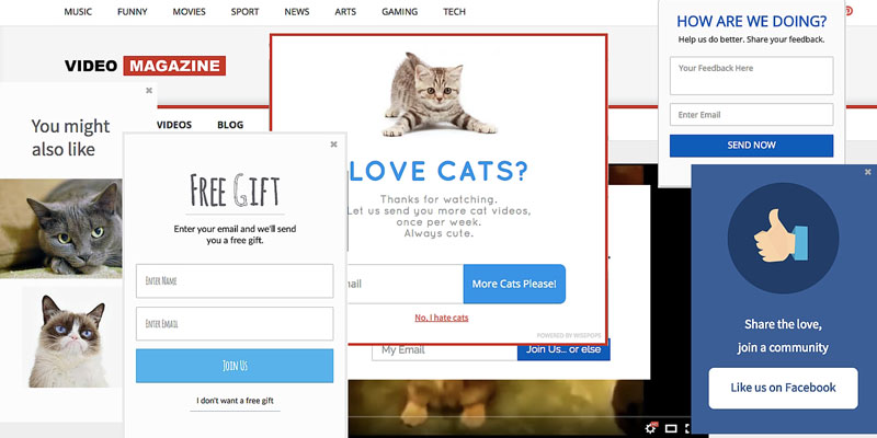
5. Popups
Google has recently warned the websites to use pop up adverts because they hurt SEO and make users’ experience negative especially for those who use mobile devices. Reconsider pop up adverts on the website. Mobile users will tell you that some pop-ups really annoy especially when you can’t close them.
6. The Absence of Bullets
The practice
shows that using bullets help users to find necessary information quicker. For
example, sections pros and cons should be organized in bullets. By listing
advantages of the service that the company offers instead of putting this
information in the text, you will highlight what is important and direct the
users. Bullet lists will improve the document’s readability and help users not
to get confused by looking for important information through texts.
7. Too Large Images
Using
picture and photos on a website is great but when their size is too large, it
will take a long time for a site to load. Reconsider the size of graphics that you are using on
the website and whether they are needed after all. Average users don’t wait for
a site to load if it takes longer than 5 seconds. You wouldn’t like to lose a
customer because of those beautiful pictures on the site, would you?
8. Hidden Contact Information
Contact
information is the link between you and your customers. Often contact
information is hidden or it’s really difficult to find it on the site. Such
details as phone number, email address, and mailing addresses with the map
should be visible on the front page. Add “Contact us” section where users can
be guided to see all contact information or fill the online form with questions
and send their inquiry.
9. The Absence of Social Media Links
Believe us
or not but modern users want to find your business on social media to read more
information, see photos and read what others say about the company. Popular
social media accounts dedicated to the business will create a better
relationship with the customers. It will help to drive big traffic to the site
within a short time.
10. Free Software
If
you are just learning how to design websites, using free software is acceptable
but if you are working as a web designer already, forget about free programs.
The downsides of using free apps for building site are lots of errors,
long loading time and poor performance in general. If you want to create
unique, excellently-performing and attractive websites that will make users’
experience positive, pay for the app to build a fantastic website and recommend
yourself as a professional web designer.
So, now you
know what mistakes to avoid in order to create and keep the website in the
perfect condition. Make it attractive yet convenient for users and the website
will bring the desired result.
Have you ever visited a website that pushed you away? No, it’s not about content, you didn’t even read it. The design of the site was so unattractive and disturbing that you closed it and looked for a better place to order or buy something. We all bump into deadly navigation websites sometimes, they are visually disturbing and make us leave them as soon as possible, even though there can be very useful information to read and learn. The design is a huge part of a website and if it’s done nicely, users want to spend hours on such a site. The main purpose of a design is to turn visitors into customers, therefore, we decided to dedicate this article to the most common mistakes that web designers make.
If
you want to become a web designer and help people to sell stuff via their
websites, you need to know what attracts visitors and what pushes them away.
When you have to prepare a piece of dissertation proposal writing on web design topic,
you have to explain how to meet the client’s expectations and how to solve your
client’s problem with the help of the latest tools. In your dissertation, you
can describe the problems such as impractical gallery, the absence of CMS, low
bounce rate of a landing page and list the solutions that you can offer your
client. What you don’t want to do is to provide the wrong solutions and get a
low grade from your professor. To avoid this and help you with writing a decent
proposal, keep reading our article.
10 Deadly Sins That You Can Commit as a Web Designer
1. Complicated Navigation
The first rule is to keep navigation simple. Remember that the users can be the people who use the Internet sometimes and don’t visit dozens of websites every day as you do. Such an audience can get easily confused and frustrated. It’s recommended to create a menu with short descriptive tags. There also should be a clearly visible search box, so the users can type the name of the product and quickly find what they came for.
2. Fonts are Too Small
Do
you enjoy reading small fonts online? No, this is
very disturbing and makes you ask “Who was this written for?” Forget about an
old-school website with font 12 that is really hard to read. It’s not so bad
when someone is using a tablet but what if someone is using a computer with 24
inches screen, are they supposed to zoom? Important information should be
written clearly. The statistic shows that you have only 8 seconds to make an
impression, therefore, use headline fonts to grab users’ attention.
3. A Lack of Call to Action
There are plenty of websites that provide interesting information but make someone doubt what to do next. Call to action wording such as “Sign up today”, “Contact us” or “Add to cart” will make users’ experience so much easier and much more effective for the business. A custom writing service Paperial and the professional authors with good knowledge in web design topic will help you to write more ideas in your dissertation on useful tools and mistakes in designing websites.
4. Moving Sliders
Moving
banners often distract users from searching for the necessary items on the
website. In some cases, such moving sliders are absolutely useless. The recent
statistic showed that only 1% of website visitors click the sliders. When poorly
designed websites need help, web designers recommend creating a page with
important information and pictures that will be clearly found and understood by
the visitors.
5. Popups
Google has recently warned the websites to use pop up adverts because they hurt SEO and make users’ experience negative especially for those who use mobile devices. Reconsider pop up adverts on the website. Mobile users will tell you that some pop-ups really annoy especially when you can’t close them.
6. The Absence of Bullets
The practice
shows that using bullets help users to find necessary information quicker. For
example, sections pros and cons should be organized in bullets. By listing
advantages of the service that the company offers instead of putting this
information in the text, you will highlight what is important and direct the
users. Bullet lists will improve the document’s readability and help users not
to get confused by looking for important information through texts.
7. Too Large Images
Using
picture and photos on a website is great but when their size is too large, it
will take a long time for a site to load. Reconsider the size of graphics that you are using on
the website and whether they are needed after all. Average users don’t wait for
a site to load if it takes longer than 5 seconds. You wouldn’t like to lose a
customer because of those beautiful pictures on the site, would you?
8. Hidden Contact Information
Contact
information is the link between you and your customers. Often contact
information is hidden or it’s really difficult to find it on the site. Such
details as phone number, email address, and mailing addresses with the map
should be visible on the front page. Add “Contact us” section where users can
be guided to see all contact information or fill the online form with questions
and send their inquiry.
9. The Absence of Social Media Links
Believe us
or not but modern users want to find your business on social media to read more
information, see photos and read what others say about the company. Popular
social media accounts dedicated to the business will create a better
relationship with the customers. It will help to drive big traffic to the site
within a short time.
10. Free Software
If
you are just learning how to design websites, using free software is acceptable
but if you are working as a web designer already, forget about free programs.
The downsides of using free apps for building site are lots of errors,
long loading time and poor performance in general. If you want to create
unique, excellently-performing and attractive websites that will make users’
experience positive, pay for the app to build a fantastic website and recommend
yourself as a professional web designer.
So, now you
know what mistakes to avoid in order to create and keep the website in the
perfect condition. Make it attractive yet convenient for users and the website
will bring the desired result.
Have you ever visited a website that pushed you away? No, it’s not about content, you didn’t even read it. The design of the site was so unattractive and disturbing that you closed it and looked for a better place to order or buy something. We all bump into deadly navigation websites sometimes, they are visually disturbing and make us leave them as soon as possible, even though there can be very useful information to read and learn. The design is a huge part of a website and if it’s done nicely, users want to spend hours on such a site. The main purpose of a design is to turn visitors into customers, therefore, we decided to dedicate this article to the most common mistakes that web designers make.
If
you want to become a web designer and help people to sell stuff via their
websites, you need to know what attracts visitors and what pushes them away.
When you have to prepare a piece of dissertation proposal writing on web design topic,
you have to explain how to meet the client’s expectations and how to solve your
client’s problem with the help of the latest tools. In your dissertation, you
can describe the problems such as impractical gallery, the absence of CMS, low
bounce rate of a landing page and list the solutions that you can offer your
client. What you don’t want to do is to provide the wrong solutions and get a
low grade from your professor. To avoid this and help you with writing a decent
proposal, keep reading our article.
10 Deadly Sins That You Can Commit as a Web Designer
1. Complicated Navigation
The first rule is to keep navigation simple. Remember that the users can be the people who use the Internet sometimes and don’t visit dozens of websites every day as you do. Such an audience can get easily confused and frustrated. It’s recommended to create a menu with short descriptive tags. There also should be a clearly visible search box, so the users can type the name of the product and quickly find what they came for.
2. Fonts are Too Small
Do
you enjoy reading small fonts online? No, this is
very disturbing and makes you ask “Who was this written for?” Forget about an
old-school website with font 12 that is really hard to read. It’s not so bad
when someone is using a tablet but what if someone is using a computer with 24
inches screen, are they supposed to zoom? Important information should be
written clearly. The statistic shows that you have only 8 seconds to make an
impression, therefore, use headline fonts to grab users’ attention.
3. A Lack of Call to Action
There are plenty of websites that provide interesting information but make someone doubt what to do next. Call to action wording such as “Sign up today”, “Contact us” or “Add to cart” will make users’ experience so much easier and much more effective for the business. A custom writing service Paperial and the professional authors with good knowledge in web design topic will help you to write more ideas in your dissertation on useful tools and mistakes in designing websites.
4. Moving Sliders
Moving
banners often distract users from searching for the necessary items on the
website. In some cases, such moving sliders are absolutely useless. The recent
statistic showed that only 1% of website visitors click the sliders. When poorly
designed websites need help, web designers recommend creating a page with
important information and pictures that will be clearly found and understood by
the visitors.
5. Popups
Google has recently warned the websites to use pop up adverts because they hurt SEO and make users’ experience negative especially for those who use mobile devices. Reconsider pop up adverts on the website. Mobile users will tell you that some pop-ups really annoy especially when you can’t close them.
6. The Absence of Bullets
The practice
shows that using bullets help users to find necessary information quicker. For
example, sections pros and cons should be organized in bullets. By listing
advantages of the service that the company offers instead of putting this
information in the text, you will highlight what is important and direct the
users. Bullet lists will improve the document’s readability and help users not
to get confused by looking for important information through texts.
7. Too Large Images
Using
picture and photos on a website is great but when their size is too large, it
will take a long time for a site to load. Reconsider the size of graphics that you are using on
the website and whether they are needed after all. Average users don’t wait for
a site to load if it takes longer than 5 seconds. You wouldn’t like to lose a
customer because of those beautiful pictures on the site, would you?
8. Hidden Contact Information
Contact
information is the link between you and your customers. Often contact
information is hidden or it’s really difficult to find it on the site. Such
details as phone number, email address, and mailing addresses with the map
should be visible on the front page. Add “Contact us” section where users can
be guided to see all contact information or fill the online form with questions
and send their inquiry.
9. The Absence of Social Media Links
Believe us
or not but modern users want to find your business on social media to read more
information, see photos and read what others say about the company. Popular
social media accounts dedicated to the business will create a better
relationship with the customers. It will help to drive big traffic to the site
within a short time.
10. Free Software
If
you are just learning how to design websites, using free software is acceptable
but if you are working as a web designer already, forget about free programs.
The downsides of using free apps for building site are lots of errors,
long loading time and poor performance in general. If you want to create
unique, excellently-performing and attractive websites that will make users’
experience positive, pay for the app to build a fantastic website and recommend
yourself as a professional web designer.
So, now you
know what mistakes to avoid in order to create and keep the website in the
perfect condition. Make it attractive yet convenient for users and the website
will bring the desired result.
Agregator najlepszych postów o designie, webdesignie, cssie i Internecie


 Adobe PhotoshopHow to Create an Abstract Diamond Lens Effect in PhotoshopAbbey Esparza
 Photo ManipulationHow to Create a Honey Bee Themed Photo Manipulation in PhotoshopAbbey Esparza
 Photo ManipulationHow to Create a Futuristic Fashion Portrait in Adobe PhotoshopAbbey Esparza
 Photo ManipulationHow to Create a Ghostly Horror-Themed Photo Manipulation in Adobe PhotoshopAbbey Esparza