Welcome to how to create an abstract icon set in Adobe Illustrator! The theme we’re working on will be chess. In this tutorial we will learn the step by step process of how to create an abstract set of icons using basic shapes and tools.
For more examples of abstract icon sets, check out GraphicRiver where you can find a wide variety of different abstract icons.
1. How to Set Up a New Project File
Step 1
Let’s get started by setting up a New Document in Adobe Illustrator (File > New or Control-N). For this tutorial, we will use the settings below:
Number of Artboards: 1
Width: 850 px
Height: 850 px
Units: Pixels
In the Advanced tab, use the following settings:
Colour Mode: RGB
Raster Effects: Screen (72ppi)
Preview Mode: Default
Step 2
Go to Edit > Preferences > General and set the Keyboard Increment to 1 px.
Step 3
Go to Units and use the settings shown below.
General: Pixel
Stroke: Points
Type: Points
2. How to Set Up the Layers
Step 1
Next, you will need to structure the project by creating layers. Select the Layers panel and create two layers. Name them as follows:
Layer 1: Background
Layer 2: Icons
Step 2
Make sure that you select the background layer to begin creating the background.
3. How to Create the Background Color
Step 1
With the background layer selected, click on the Rectangle Tool (M) and create a 850 x 850 rectangular area to place your icons in. This should fit the entire area of the Artboard.
Step 2
Make sure that the rectangle is still selected, and click on the Gradient Tool. In the angle section, select 45 Degrees from the drop-down menu.
Step 3
Select two colors for the gradient. For this tutorial, we will use the following:
R: 70
G: 82
B: 162
Step 4
For the second color, we will use the following:
R: 138
G: 105
B: 173
Step 5
The final background should look like the image below. Lock the background layer by clicking on the lock icon, and click on the icon layer to start creating the icons.
4. How to Create a Pawn Icon
Step 1
Choose the Pen Tool (P) and adjust the settings of stroke to the following:
Stroke Weight: 6
Cap: Round Cap
Corner: Miter Join
Align Stroke: Align Stroke to Center
Step 2
Start by selecting the Ellipse Tool (L) and creating a small circle. To create a perfect circle, press and hold the Shift keyon the keyboard whilst clicking and dragging with the mouse.
Step 3
Select the Pen Tool (P) and create two lines underneath the circle.
Step 4
Select the Rounded Rectangle Tool (M) and create a shape underneath the two lines. You can adjust the curvature of the corners by pressing the Up Arrow or the Down Arrow on your keyboard whilst creating the shape (clicking and dragging with the mouse).
With the shape still selected, change it to a fill shape.
Step 5
Duplicate the shape by copying it (Control-C) and then paste it into place (Control-Shift-V).
Add a stroke to the second shape with a width of 20 pt. For the best results, align the stroke to the outside.
Step 6
With the second shape still selected, go to the top menu and select Object > Expand to open the Expand window. Make sure both Fill and Stroke are selected, and then click OK.
Step 7
This will create a shape from the stroke. Make sure that the shape is still selected and, using the Pathfinder, click on Unite. This will merge the shape.
Step 8
Change the shape to a stroke by using the Eyedropper Tool (I) and align the stroke to the outside.
Step 9
Use the Ellipse Tool (L) to create a small circle at the bottom to complete the pawn icon.
5. How to Create a Rook Icon
Step 1
To start creating the rook icon, use the Rectangle Tool (M) to create a small rectangle shape.
Step 2
Create a slightly larger rectangle shape and set it to Stroke by using the Eyedropper Tool and selecting one of the strokes we used previously on the pawn icon.
Step 3
Use the Rectangle Tool (M) to create a small rectangle shape at the top.Then use the Ellipse Tool (L) to create a small circle at the bottom (holding the Shift keyon the keyboard to create a perfect circle).
Step 4
Use the Rectangle Tool (M) and follow the steps below to create the top of the rook icon.
Step 5
Select all the shapes in Step 4 and click on Pathfinder > Unite.
Step 6
This will merge all the shapes together.
Step 7
With the new shape selected, change it into a stroke by using the Eyedropper Tool (I) to ensure that the weight of the stroke is the same.
Step 8
To create the semicircles, you need to start by creating a circle using the Ellipse Tool (L). Place a rectangle over the circle using the Rectangle Tool (M).
Step 9
Select both the shapes (making sure that the rectangle is arranged on top of the circle) and then select Pathfinder > Minus Front.
Step 10
This will remove the rectangle shape and the part of the circle which is overlapping.
Step 11
Duplicate the semicircle by copying it (Control-C) and then pasting it (Control-V).
Step 12
Select the duplicate semicircle and then Right-Click on it. From the menu, select Transform > Select. Choose Vertical axis at 90 Degrees and then click OK.
Step 13
Make sure that both semicircles are aligned horizontally opposite each other.
Step 14
Place the semicircles on either side of the shapes to complete the rook icon.
6. How to Create a Knight Icon
Step 1
To start creating the knight icon, create a duplicate of the rook icon. With the duplicate icon, use the Selection Tool (V) or the Direct Selection Tool (A) to remove the middle shapes of the icon.
Step 2
Use the Polygon Tool to create a triangle. Whilst using the Polygon Tool, press the Up Arrow keyor Down Arrow keyon the keyboard to increase or decrease the number of sides.
To create an equilateral triangle,press and hold the Shift keyon the keyboard whilst creating the shape.
Create a smaller equilateral triangleand place it in the middle.
Step 3
Rotate the semicircles on either side of the triangle so that the strokes align diagonally (Right Click > Transform > Rotate).
Step 4
To create the head of knight icon, use the Rounded Rectangle Tool and the Ellipse Tool (L) to create the shapes below.
Step 5
Use the Rectangle Tool (M) and place two rectangles above the shapes as shown below.
Step 6
Use the Minus Front Tool on the overlapping shapes.
Step 7
This will create a straight edge where the shapes used to overlap. Move the two shapes together so that they resemble the image below.
Step 8
Use the Minus Front Tool again to remove the left side of the shape and change them both into a stroke.
Step 9
Select both shapes and use Pathfinder > Unite to combine them into a single shape.
Step 10
Select the Add Anchor Point Tool (+) and add a point near the left corner of the shape. Then use the Direct Selection Tool (A) to drag the top left corner to the left to create the ear.
Step 11
Use the Direct Selection Tool (A) and remove the point shown in the image below.
Step 12
Use the Pen Tool (P) and draw out three extra points on the right side of the shape.
Step 13
Select the curve points and drag them to the middle using the mouse to create the neck of the horse. Hold the Shift key on the keyboard to select multiple points.
Step 14
Once you are happy with the way the horse head looks, use the Ellipse Tool (L) to create the eye (remember to press and hold the Shift keyon the keyboard to create a perfect circle).
Step 15
Add a line underneath the head and position it underneath the previous shapes to create the final knight icon.
7. How to Create a Bishop Icon
Step 1
To start creating the bishop icon, create a duplicate of the knight icon. With the duplicate icon, use the Selection Tool (V) or the Direct Selection Tool (A) to remove the top shapes (the horse head) of the icon.
Step 2
Use the Ellipse Tool (L) and hold the Shift keyon the keyboard to create a perfect circle on top of the icon.
Step 3
Use the Direct Selection Tool (A) to move the top point of the circle slightly upwards. This will create an egg-like shape.
Step 4
Select the handlebars with the Direct Selection Tool (A) and move them to the middle point to create a teardrop shape.
Step 5
Use the Ellipse Tool (L) to create a circle and place it on top of the teardrop shape. Then use the Pen Tool (P) to create a cross, and place it inside the teardrop shape to create the final bishop icon.
8. How to Create a Queen Icon
Step 1
To start creating the queen icon, create a duplicate of the bishop icon. With the duplicate icon use the Selection Tool (V) or the Direct Selection Tool (A) to remove the top and middle shapes of the icon.
This will leave just the two circles at the bottom and the semicircles on the sides.
Step 2
Rotate the semicircles slightly. To do this, Right-Click on the shapes, and then go to Transform > Rotate,following the image below.
Step 3
Use the Ellipse Tool (L) to create two circles, with the outer circle using a stroke and the inner circle using a fill. Remember to hold the Shift keyon the keyboard to create a perfect circle.
Step 4
Use the Ellipse Tool (L) to create two overlapping circles side by side on top of the other shapes.
Step 5
Use the Ellipse Tool (L) to create a small circle on top.
Step 6
To create the base of the crown, use the Pen Tool (P) or the Rectangle Tool (M) to draw the shape as seen in the image below. When using the Pen Tool, you can hold the Shift key on the keyboard in order the draw a straight line vertically or horizontally. This will make it easier to align.
From there, use the Direct Selection Tool (A) to select the curve points (hold Shift to select multiple points) and move the points towards the centre with the mouse to transform the corners into curves.
Step 7
Complete the queen icon by placing the crown on top of the shapes, as shown in the image below.
9. How to Create a King Icon
Step 1
To create the king icon, duplicate the queen icon. With the duplicate icon, use the Direct Selection Tool (A) to delete the middle circle shapes.
Step 2
Use the Direct Selection Tool (A) to delete the small circle shape at the top of the crown.
Step 3
Use the Rectangular Shape Tool (M) to create two squares (one larger outline and one smaller fill shape). Place the smaller square inside and in the middle of the larger square.
From there, select both squares and rotate them both by 45 degrees (Right Click > Transform > Rotate) and place both squares in the centre space of the icon.
Step 4
Use the Pen Tool (P) to create a small cross on top of the crown.
Awesome! You’re Finished!
Congratulations! You have successfully completed this tutorial. Feel free to share your own creations below! I hope you found this tutorial helpful and that you’ve learned many new tips and tricks that you can use for your future illustrations. See you next time!
Learn More Icon Skills!
If you liked this and are looking to learn some new icon skills, check out these tutorials below! Expand your expertise by going through these in-depth guides. Happy designing!
Today, I’m going to share with you ten tips on icon design that I’ve managed to isolate and put down in digital ink after doing some research from both my…
This little quick tip is dedicated to a subject that is close to my heart but at the same time gave me some strong headaches in the early days of my design…
In our new course, Designing Game UI Assets in Adobe Illustrator, you’ll learn how to design beautiful user interface (UI) elements for your video-game…
Lately I’ve been getting a lot more technical and started exploring solutions to the different challenges that you might encounter along your creative…
Welcome to how to create an abstract icon set in Adobe Illustrator! The theme we’re working on will be chess. In this tutorial we will learn the step by step process of how to create an abstract set of icons using basic shapes and tools.
For more examples of abstract icon sets, check out GraphicRiver where you can find a wide variety of different abstract icons.
1. How to Set Up a New Project File
Step 1
Let’s get started by setting up a New Document in Adobe Illustrator (File > New or Control-N). For this tutorial, we will use the settings below:
Number of Artboards: 1
Width: 850 px
Height: 850 px
Units: Pixels
In the Advanced tab, use the following settings:
Colour Mode: RGB
Raster Effects: Screen (72ppi)
Preview Mode: Default
Step 2
Go to Edit > Preferences > General and set the Keyboard Increment to 1 px.
Step 3
Go to Units and use the settings shown below.
General: Pixel
Stroke: Points
Type: Points
2. How to Set Up the Layers
Step 1
Next, you will need to structure the project by creating layers. Select the Layers panel and create two layers. Name them as follows:
Layer 1: Background
Layer 2: Icons
Step 2
Make sure that you select the background layer to begin creating the background.
3. How to Create the Background Color
Step 1
With the background layer selected, click on the Rectangle Tool (M) and create a 850 x 850 rectangular area to place your icons in. This should fit the entire area of the Artboard.
Step 2
Make sure that the rectangle is still selected, and click on the Gradient Tool. In the angle section, select 45 Degrees from the drop-down menu.
Step 3
Select two colors for the gradient. For this tutorial, we will use the following:
R: 70
G: 82
B: 162
Step 4
For the second color, we will use the following:
R: 138
G: 105
B: 173
Step 5
The final background should look like the image below. Lock the background layer by clicking on the lock icon, and click on the icon layer to start creating the icons.
4. How to Create a Pawn Icon
Step 1
Choose the Pen Tool (P) and adjust the settings of stroke to the following:
Stroke Weight: 6
Cap: Round Cap
Corner: Miter Join
Align Stroke: Align Stroke to Center
Step 2
Start by selecting the Ellipse Tool (L) and creating a small circle. To create a perfect circle, press and hold the Shift keyon the keyboard whilst clicking and dragging with the mouse.
Step 3
Select the Pen Tool (P) and create two lines underneath the circle.
Step 4
Select the Rounded Rectangle Tool (M) and create a shape underneath the two lines. You can adjust the curvature of the corners by pressing the Up Arrow or the Down Arrow on your keyboard whilst creating the shape (clicking and dragging with the mouse).
With the shape still selected, change it to a fill shape.
Step 5
Duplicate the shape by copying it (Control-C) and then paste it into place (Control-Shift-V).
Add a stroke to the second shape with a width of 20 pt. For the best results, align the stroke to the outside.
Step 6
With the second shape still selected, go to the top menu and select Object > Expand to open the Expand window. Make sure both Fill and Stroke are selected, and then click OK.
Step 7
This will create a shape from the stroke. Make sure that the shape is still selected and, using the Pathfinder, click on Unite. This will merge the shape.
Step 8
Change the shape to a stroke by using the Eyedropper Tool (I) and align the stroke to the outside.
Step 9
Use the Ellipse Tool (L) to create a small circle at the bottom to complete the pawn icon.
5. How to Create a Rook Icon
Step 1
To start creating the rook icon, use the Rectangle Tool (M) to create a small rectangle shape.
Step 2
Create a slightly larger rectangle shape and set it to Stroke by using the Eyedropper Tool and selecting one of the strokes we used previously on the pawn icon.
Step 3
Use the Rectangle Tool (M) to create a small rectangle shape at the top.Then use the Ellipse Tool (L) to create a small circle at the bottom (holding the Shift keyon the keyboard to create a perfect circle).
Step 4
Use the Rectangle Tool (M) and follow the steps below to create the top of the rook icon.
Step 5
Select all the shapes in Step 4 and click on Pathfinder > Unite.
Step 6
This will merge all the shapes together.
Step 7
With the new shape selected, change it into a stroke by using the Eyedropper Tool (I) to ensure that the weight of the stroke is the same.
Step 8
To create the semicircles, you need to start by creating a circle using the Ellipse Tool (L). Place a rectangle over the circle using the Rectangle Tool (M).
Step 9
Select both the shapes (making sure that the rectangle is arranged on top of the circle) and then select Pathfinder > Minus Front.
Step 10
This will remove the rectangle shape and the part of the circle which is overlapping.
Step 11
Duplicate the semicircle by copying it (Control-C) and then pasting it (Control-V).
Step 12
Select the duplicate semicircle and then Right-Click on it. From the menu, select Transform > Select. Choose Vertical axis at 90 Degrees and then click OK.
Step 13
Make sure that both semicircles are aligned horizontally opposite each other.
Step 14
Place the semicircles on either side of the shapes to complete the rook icon.
6. How to Create a Knight Icon
Step 1
To start creating the knight icon, create a duplicate of the rook icon. With the duplicate icon, use the Selection Tool (V) or the Direct Selection Tool (A) to remove the middle shapes of the icon.
Step 2
Use the Polygon Tool to create a triangle. Whilst using the Polygon Tool, press the Up Arrow keyor Down Arrow keyon the keyboard to increase or decrease the number of sides.
To create an equilateral triangle,press and hold the Shift keyon the keyboard whilst creating the shape.
Create a smaller equilateral triangleand place it in the middle.
Step 3
Rotate the semicircles on either side of the triangle so that the strokes align diagonally (Right Click > Transform > Rotate).
Step 4
To create the head of knight icon, use the Rounded Rectangle Tool and the Ellipse Tool (L) to create the shapes below.
Step 5
Use the Rectangle Tool (M) and place two rectangles above the shapes as shown below.
Step 6
Use the Minus Front Tool on the overlapping shapes.
Step 7
This will create a straight edge where the shapes used to overlap. Move the two shapes together so that they resemble the image below.
Step 8
Use the Minus Front Tool again to remove the left side of the shape and change them both into a stroke.
Step 9
Select both shapes and use Pathfinder > Unite to combine them into a single shape.
Step 10
Select the Add Anchor Point Tool (+) and add a point near the left corner of the shape. Then use the Direct Selection Tool (A) to drag the top left corner to the left to create the ear.
Step 11
Use the Direct Selection Tool (A) and remove the point shown in the image below.
Step 12
Use the Pen Tool (P) and draw out three extra points on the right side of the shape.
Step 13
Select the curve points and drag them to the middle using the mouse to create the neck of the horse. Hold the Shift key on the keyboard to select multiple points.
Step 14
Once you are happy with the way the horse head looks, use the Ellipse Tool (L) to create the eye (remember to press and hold the Shift keyon the keyboard to create a perfect circle).
Step 15
Add a line underneath the head and position it underneath the previous shapes to create the final knight icon.
7. How to Create a Bishop Icon
Step 1
To start creating the bishop icon, create a duplicate of the knight icon. With the duplicate icon, use the Selection Tool (V) or the Direct Selection Tool (A) to remove the top shapes (the horse head) of the icon.
Step 2
Use the Ellipse Tool (L) and hold the Shift keyon the keyboard to create a perfect circle on top of the icon.
Step 3
Use the Direct Selection Tool (A) to move the top point of the circle slightly upwards. This will create an egg-like shape.
Step 4
Select the handlebars with the Direct Selection Tool (A) and move them to the middle point to create a teardrop shape.
Step 5
Use the Ellipse Tool (L) to create a circle and place it on top of the teardrop shape. Then use the Pen Tool (P) to create a cross, and place it inside the teardrop shape to create the final bishop icon.
8. How to Create a Queen Icon
Step 1
To start creating the queen icon, create a duplicate of the bishop icon. With the duplicate icon use the Selection Tool (V) or the Direct Selection Tool (A) to remove the top and middle shapes of the icon.
This will leave just the two circles at the bottom and the semicircles on the sides.
Step 2
Rotate the semicircles slightly. To do this, Right-Click on the shapes, and then go to Transform > Rotate,following the image below.
Step 3
Use the Ellipse Tool (L) to create two circles, with the outer circle using a stroke and the inner circle using a fill. Remember to hold the Shift keyon the keyboard to create a perfect circle.
Step 4
Use the Ellipse Tool (L) to create two overlapping circles side by side on top of the other shapes.
Step 5
Use the Ellipse Tool (L) to create a small circle on top.
Step 6
To create the base of the crown, use the Pen Tool (P) or the Rectangle Tool (M) to draw the shape as seen in the image below. When using the Pen Tool, you can hold the Shift key on the keyboard in order the draw a straight line vertically or horizontally. This will make it easier to align.
From there, use the Direct Selection Tool (A) to select the curve points (hold Shift to select multiple points) and move the points towards the centre with the mouse to transform the corners into curves.
Step 7
Complete the queen icon by placing the crown on top of the shapes, as shown in the image below.
9. How to Create a King Icon
Step 1
To create the king icon, duplicate the queen icon. With the duplicate icon, use the Direct Selection Tool (A) to delete the middle circle shapes.
Step 2
Use the Direct Selection Tool (A) to delete the small circle shape at the top of the crown.
Step 3
Use the Rectangular Shape Tool (M) to create two squares (one larger outline and one smaller fill shape). Place the smaller square inside and in the middle of the larger square.
From there, select both squares and rotate them both by 45 degrees (Right Click > Transform > Rotate) and place both squares in the centre space of the icon.
Step 4
Use the Pen Tool (P) to create a small cross on top of the crown.
Awesome! You’re Finished!
Congratulations! You have successfully completed this tutorial. Feel free to share your own creations below! I hope you found this tutorial helpful and that you’ve learned many new tips and tricks that you can use for your future illustrations. See you next time!
Learn More Icon Skills!
If you liked this and are looking to learn some new icon skills, check out these tutorials below! Expand your expertise by going through these in-depth guides. Happy designing!
Today, I’m going to share with you ten tips on icon design that I’ve managed to isolate and put down in digital ink after doing some research from both my…
This little quick tip is dedicated to a subject that is close to my heart but at the same time gave me some strong headaches in the early days of my design…
In our new course, Designing Game UI Assets in Adobe Illustrator, you’ll learn how to design beautiful user interface (UI) elements for your video-game…
Lately I’ve been getting a lot more technical and started exploring solutions to the different challenges that you might encounter along your creative…
Welcome to how to create an abstract icon set in Adobe Illustrator! The theme we’re working on will be chess. In this tutorial we will learn the step by step process of how to create an abstract set of icons using basic shapes and tools.
For more examples of abstract icon sets, check out GraphicRiver where you can find a wide variety of different abstract icons.
1. How to Set Up a New Project File
Step 1
Let’s get started by setting up a New Document in Adobe Illustrator (File > New or Control-N). For this tutorial, we will use the settings below:
Number of Artboards: 1
Width: 850 px
Height: 850 px
Units: Pixels
In the Advanced tab, use the following settings:
Colour Mode: RGB
Raster Effects: Screen (72ppi)
Preview Mode: Default
Step 2
Go to Edit > Preferences > General and set the Keyboard Increment to 1 px.
Step 3
Go to Units and use the settings shown below.
General: Pixel
Stroke: Points
Type: Points
2. How to Set Up the Layers
Step 1
Next, you will need to structure the project by creating layers. Select the Layers panel and create two layers. Name them as follows:
Layer 1: Background
Layer 2: Icons
Step 2
Make sure that you select the background layer to begin creating the background.
3. How to Create the Background Color
Step 1
With the background layer selected, click on the Rectangle Tool (M) and create a 850 x 850 rectangular area to place your icons in. This should fit the entire area of the Artboard.
Step 2
Make sure that the rectangle is still selected, and click on the Gradient Tool. In the angle section, select 45 Degrees from the drop-down menu.
Step 3
Select two colors for the gradient. For this tutorial, we will use the following:
R: 70
G: 82
B: 162
Step 4
For the second color, we will use the following:
R: 138
G: 105
B: 173
Step 5
The final background should look like the image below. Lock the background layer by clicking on the lock icon, and click on the icon layer to start creating the icons.
4. How to Create a Pawn Icon
Step 1
Choose the Pen Tool (P) and adjust the settings of stroke to the following:
Stroke Weight: 6
Cap: Round Cap
Corner: Miter Join
Align Stroke: Align Stroke to Center
Step 2
Start by selecting the Ellipse Tool (L) and creating a small circle. To create a perfect circle, press and hold the Shift keyon the keyboard whilst clicking and dragging with the mouse.
Step 3
Select the Pen Tool (P) and create two lines underneath the circle.
Step 4
Select the Rounded Rectangle Tool (M) and create a shape underneath the two lines. You can adjust the curvature of the corners by pressing the Up Arrow or the Down Arrow on your keyboard whilst creating the shape (clicking and dragging with the mouse).
With the shape still selected, change it to a fill shape.
Step 5
Duplicate the shape by copying it (Control-C) and then paste it into place (Control-Shift-V).
Add a stroke to the second shape with a width of 20 pt. For the best results, align the stroke to the outside.
Step 6
With the second shape still selected, go to the top menu and select Object > Expand to open the Expand window. Make sure both Fill and Stroke are selected, and then click OK.
Step 7
This will create a shape from the stroke. Make sure that the shape is still selected and, using the Pathfinder, click on Unite. This will merge the shape.
Step 8
Change the shape to a stroke by using the Eyedropper Tool (I) and align the stroke to the outside.
Step 9
Use the Ellipse Tool (L) to create a small circle at the bottom to complete the pawn icon.
5. How to Create a Rook Icon
Step 1
To start creating the rook icon, use the Rectangle Tool (M) to create a small rectangle shape.
Step 2
Create a slightly larger rectangle shape and set it to Stroke by using the Eyedropper Tool and selecting one of the strokes we used previously on the pawn icon.
Step 3
Use the Rectangle Tool (M) to create a small rectangle shape at the top.Then use the Ellipse Tool (L) to create a small circle at the bottom (holding the Shift keyon the keyboard to create a perfect circle).
Step 4
Use the Rectangle Tool (M) and follow the steps below to create the top of the rook icon.
Step 5
Select all the shapes in Step 4 and click on Pathfinder > Unite.
Step 6
This will merge all the shapes together.
Step 7
With the new shape selected, change it into a stroke by using the Eyedropper Tool (I) to ensure that the weight of the stroke is the same.
Step 8
To create the semicircles, you need to start by creating a circle using the Ellipse Tool (L). Place a rectangle over the circle using the Rectangle Tool (M).
Step 9
Select both the shapes (making sure that the rectangle is arranged on top of the circle) and then select Pathfinder > Minus Front.
Step 10
This will remove the rectangle shape and the part of the circle which is overlapping.
Step 11
Duplicate the semicircle by copying it (Control-C) and then pasting it (Control-V).
Step 12
Select the duplicate semicircle and then Right-Click on it. From the menu, select Transform > Select. Choose Vertical axis at 90 Degrees and then click OK.
Step 13
Make sure that both semicircles are aligned horizontally opposite each other.
Step 14
Place the semicircles on either side of the shapes to complete the rook icon.
6. How to Create a Knight Icon
Step 1
To start creating the knight icon, create a duplicate of the rook icon. With the duplicate icon, use the Selection Tool (V) or the Direct Selection Tool (A) to remove the middle shapes of the icon.
Step 2
Use the Polygon Tool to create a triangle. Whilst using the Polygon Tool, press the Up Arrow keyor Down Arrow keyon the keyboard to increase or decrease the number of sides.
To create an equilateral triangle,press and hold the Shift keyon the keyboard whilst creating the shape.
Create a smaller equilateral triangleand place it in the middle.
Step 3
Rotate the semicircles on either side of the triangle so that the strokes align diagonally (Right Click > Transform > Rotate).
Step 4
To create the head of knight icon, use the Rounded Rectangle Tool and the Ellipse Tool (L) to create the shapes below.
Step 5
Use the Rectangle Tool (M) and place two rectangles above the shapes as shown below.
Step 6
Use the Minus Front Tool on the overlapping shapes.
Step 7
This will create a straight edge where the shapes used to overlap. Move the two shapes together so that they resemble the image below.
Step 8
Use the Minus Front Tool again to remove the left side of the shape and change them both into a stroke.
Step 9
Select both shapes and use Pathfinder > Unite to combine them into a single shape.
Step 10
Select the Add Anchor Point Tool (+) and add a point near the left corner of the shape. Then use the Direct Selection Tool (A) to drag the top left corner to the left to create the ear.
Step 11
Use the Direct Selection Tool (A) and remove the point shown in the image below.
Step 12
Use the Pen Tool (P) and draw out three extra points on the right side of the shape.
Step 13
Select the curve points and drag them to the middle using the mouse to create the neck of the horse. Hold the Shift key on the keyboard to select multiple points.
Step 14
Once you are happy with the way the horse head looks, use the Ellipse Tool (L) to create the eye (remember to press and hold the Shift keyon the keyboard to create a perfect circle).
Step 15
Add a line underneath the head and position it underneath the previous shapes to create the final knight icon.
7. How to Create a Bishop Icon
Step 1
To start creating the bishop icon, create a duplicate of the knight icon. With the duplicate icon, use the Selection Tool (V) or the Direct Selection Tool (A) to remove the top shapes (the horse head) of the icon.
Step 2
Use the Ellipse Tool (L) and hold the Shift keyon the keyboard to create a perfect circle on top of the icon.
Step 3
Use the Direct Selection Tool (A) to move the top point of the circle slightly upwards. This will create an egg-like shape.
Step 4
Select the handlebars with the Direct Selection Tool (A) and move them to the middle point to create a teardrop shape.
Step 5
Use the Ellipse Tool (L) to create a circle and place it on top of the teardrop shape. Then use the Pen Tool (P) to create a cross, and place it inside the teardrop shape to create the final bishop icon.
8. How to Create a Queen Icon
Step 1
To start creating the queen icon, create a duplicate of the bishop icon. With the duplicate icon use the Selection Tool (V) or the Direct Selection Tool (A) to remove the top and middle shapes of the icon.
This will leave just the two circles at the bottom and the semicircles on the sides.
Step 2
Rotate the semicircles slightly. To do this, Right-Click on the shapes, and then go to Transform > Rotate,following the image below.
Step 3
Use the Ellipse Tool (L) to create two circles, with the outer circle using a stroke and the inner circle using a fill. Remember to hold the Shift keyon the keyboard to create a perfect circle.
Step 4
Use the Ellipse Tool (L) to create two overlapping circles side by side on top of the other shapes.
Step 5
Use the Ellipse Tool (L) to create a small circle on top.
Step 6
To create the base of the crown, use the Pen Tool (P) or the Rectangle Tool (M) to draw the shape as seen in the image below. When using the Pen Tool, you can hold the Shift key on the keyboard in order the draw a straight line vertically or horizontally. This will make it easier to align.
From there, use the Direct Selection Tool (A) to select the curve points (hold Shift to select multiple points) and move the points towards the centre with the mouse to transform the corners into curves.
Step 7
Complete the queen icon by placing the crown on top of the shapes, as shown in the image below.
9. How to Create a King Icon
Step 1
To create the king icon, duplicate the queen icon. With the duplicate icon, use the Direct Selection Tool (A) to delete the middle circle shapes.
Step 2
Use the Direct Selection Tool (A) to delete the small circle shape at the top of the crown.
Step 3
Use the Rectangular Shape Tool (M) to create two squares (one larger outline and one smaller fill shape). Place the smaller square inside and in the middle of the larger square.
From there, select both squares and rotate them both by 45 degrees (Right Click > Transform > Rotate) and place both squares in the centre space of the icon.
Step 4
Use the Pen Tool (P) to create a small cross on top of the crown.
Awesome! You’re Finished!
Congratulations! You have successfully completed this tutorial. Feel free to share your own creations below! I hope you found this tutorial helpful and that you’ve learned many new tips and tricks that you can use for your future illustrations. See you next time!
Learn More Icon Skills!
If you liked this and are looking to learn some new icon skills, check out these tutorials below! Expand your expertise by going through these in-depth guides. Happy designing!
Today, I’m going to share with you ten tips on icon design that I’ve managed to isolate and put down in digital ink after doing some research from both my…
This little quick tip is dedicated to a subject that is close to my heart but at the same time gave me some strong headaches in the early days of my design…
In our new course, Designing Game UI Assets in Adobe Illustrator, you’ll learn how to design beautiful user interface (UI) elements for your video-game…
Lately I’ve been getting a lot more technical and started exploring solutions to the different challenges that you might encounter along your creative…
Welcome to how to create an abstract icon set in Adobe Illustrator! The theme we’re working on will be chess. In this tutorial we will learn the step by step process of how to create an abstract set of icons using basic shapes and tools.
For more examples of abstract icon sets, check out GraphicRiver where you can find a wide variety of different abstract icons.
1. How to Set Up a New Project File
Step 1
Let’s get started by setting up a New Document in Adobe Illustrator (File > New or Control-N). For this tutorial, we will use the settings below:
Number of Artboards: 1
Width: 850 px
Height: 850 px
Units: Pixels
In the Advanced tab, use the following settings:
Colour Mode: RGB
Raster Effects: Screen (72ppi)
Preview Mode: Default
Step 2
Go to Edit > Preferences > General and set the Keyboard Increment to 1 px.
Step 3
Go to Units and use the settings shown below.
General: Pixel
Stroke: Points
Type: Points
2. How to Set Up the Layers
Step 1
Next, you will need to structure the project by creating layers. Select the Layers panel and create two layers. Name them as follows:
Layer 1: Background
Layer 2: Icons
Step 2
Make sure that you select the background layer to begin creating the background.
3. How to Create the Background Color
Step 1
With the background layer selected, click on the Rectangle Tool (M) and create a 850 x 850 rectangular area to place your icons in. This should fit the entire area of the Artboard.
Step 2
Make sure that the rectangle is still selected, and click on the Gradient Tool. In the angle section, select 45 Degrees from the drop-down menu.
Step 3
Select two colors for the gradient. For this tutorial, we will use the following:
R: 70
G: 82
B: 162
Step 4
For the second color, we will use the following:
R: 138
G: 105
B: 173
Step 5
The final background should look like the image below. Lock the background layer by clicking on the lock icon, and click on the icon layer to start creating the icons.
4. How to Create a Pawn Icon
Step 1
Choose the Pen Tool (P) and adjust the settings of stroke to the following:
Stroke Weight: 6
Cap: Round Cap
Corner: Miter Join
Align Stroke: Align Stroke to Center
Step 2
Start by selecting the Ellipse Tool (L) and creating a small circle. To create a perfect circle, press and hold the Shift keyon the keyboard whilst clicking and dragging with the mouse.
Step 3
Select the Pen Tool (P) and create two lines underneath the circle.
Step 4
Select the Rounded Rectangle Tool (M) and create a shape underneath the two lines. You can adjust the curvature of the corners by pressing the Up Arrow or the Down Arrow on your keyboard whilst creating the shape (clicking and dragging with the mouse).
With the shape still selected, change it to a fill shape.
Step 5
Duplicate the shape by copying it (Control-C) and then paste it into place (Control-Shift-V).
Add a stroke to the second shape with a width of 20 pt. For the best results, align the stroke to the outside.
Step 6
With the second shape still selected, go to the top menu and select Object > Expand to open the Expand window. Make sure both Fill and Stroke are selected, and then click OK.
Step 7
This will create a shape from the stroke. Make sure that the shape is still selected and, using the Pathfinder, click on Unite. This will merge the shape.
Step 8
Change the shape to a stroke by using the Eyedropper Tool (I) and align the stroke to the outside.
Step 9
Use the Ellipse Tool (L) to create a small circle at the bottom to complete the pawn icon.
5. How to Create a Rook Icon
Step 1
To start creating the rook icon, use the Rectangle Tool (M) to create a small rectangle shape.
Step 2
Create a slightly larger rectangle shape and set it to Stroke by using the Eyedropper Tool and selecting one of the strokes we used previously on the pawn icon.
Step 3
Use the Rectangle Tool (M) to create a small rectangle shape at the top.Then use the Ellipse Tool (L) to create a small circle at the bottom (holding the Shift keyon the keyboard to create a perfect circle).
Step 4
Use the Rectangle Tool (M) and follow the steps below to create the top of the rook icon.
Step 5
Select all the shapes in Step 4 and click on Pathfinder > Unite.
Step 6
This will merge all the shapes together.
Step 7
With the new shape selected, change it into a stroke by using the Eyedropper Tool (I) to ensure that the weight of the stroke is the same.
Step 8
To create the semicircles, you need to start by creating a circle using the Ellipse Tool (L). Place a rectangle over the circle using the Rectangle Tool (M).
Step 9
Select both the shapes (making sure that the rectangle is arranged on top of the circle) and then select Pathfinder > Minus Front.
Step 10
This will remove the rectangle shape and the part of the circle which is overlapping.
Step 11
Duplicate the semicircle by copying it (Control-C) and then pasting it (Control-V).
Step 12
Select the duplicate semicircle and then Right-Click on it. From the menu, select Transform > Select. Choose Vertical axis at 90 Degrees and then click OK.
Step 13
Make sure that both semicircles are aligned horizontally opposite each other.
Step 14
Place the semicircles on either side of the shapes to complete the rook icon.
6. How to Create a Knight Icon
Step 1
To start creating the knight icon, create a duplicate of the rook icon. With the duplicate icon, use the Selection Tool (V) or the Direct Selection Tool (A) to remove the middle shapes of the icon.
Step 2
Use the Polygon Tool to create a triangle. Whilst using the Polygon Tool, press the Up Arrow keyor Down Arrow keyon the keyboard to increase or decrease the number of sides.
To create an equilateral triangle,press and hold the Shift keyon the keyboard whilst creating the shape.
Create a smaller equilateral triangleand place it in the middle.
Step 3
Rotate the semicircles on either side of the triangle so that the strokes align diagonally (Right Click > Transform > Rotate).
Step 4
To create the head of knight icon, use the Rounded Rectangle Tool and the Ellipse Tool (L) to create the shapes below.
Step 5
Use the Rectangle Tool (M) and place two rectangles above the shapes as shown below.
Step 6
Use the Minus Front Tool on the overlapping shapes.
Step 7
This will create a straight edge where the shapes used to overlap. Move the two shapes together so that they resemble the image below.
Step 8
Use the Minus Front Tool again to remove the left side of the shape and change them both into a stroke.
Step 9
Select both shapes and use Pathfinder > Unite to combine them into a single shape.
Step 10
Select the Add Anchor Point Tool (+) and add a point near the left corner of the shape. Then use the Direct Selection Tool (A) to drag the top left corner to the left to create the ear.
Step 11
Use the Direct Selection Tool (A) and remove the point shown in the image below.
Step 12
Use the Pen Tool (P) and draw out three extra points on the right side of the shape.
Step 13
Select the curve points and drag them to the middle using the mouse to create the neck of the horse. Hold the Shift key on the keyboard to select multiple points.
Step 14
Once you are happy with the way the horse head looks, use the Ellipse Tool (L) to create the eye (remember to press and hold the Shift keyon the keyboard to create a perfect circle).
Step 15
Add a line underneath the head and position it underneath the previous shapes to create the final knight icon.
7. How to Create a Bishop Icon
Step 1
To start creating the bishop icon, create a duplicate of the knight icon. With the duplicate icon, use the Selection Tool (V) or the Direct Selection Tool (A) to remove the top shapes (the horse head) of the icon.
Step 2
Use the Ellipse Tool (L) and hold the Shift keyon the keyboard to create a perfect circle on top of the icon.
Step 3
Use the Direct Selection Tool (A) to move the top point of the circle slightly upwards. This will create an egg-like shape.
Step 4
Select the handlebars with the Direct Selection Tool (A) and move them to the middle point to create a teardrop shape.
Step 5
Use the Ellipse Tool (L) to create a circle and place it on top of the teardrop shape. Then use the Pen Tool (P) to create a cross, and place it inside the teardrop shape to create the final bishop icon.
8. How to Create a Queen Icon
Step 1
To start creating the queen icon, create a duplicate of the bishop icon. With the duplicate icon use the Selection Tool (V) or the Direct Selection Tool (A) to remove the top and middle shapes of the icon.
This will leave just the two circles at the bottom and the semicircles on the sides.
Step 2
Rotate the semicircles slightly. To do this, Right-Click on the shapes, and then go to Transform > Rotate,following the image below.
Step 3
Use the Ellipse Tool (L) to create two circles, with the outer circle using a stroke and the inner circle using a fill. Remember to hold the Shift keyon the keyboard to create a perfect circle.
Step 4
Use the Ellipse Tool (L) to create two overlapping circles side by side on top of the other shapes.
Step 5
Use the Ellipse Tool (L) to create a small circle on top.
Step 6
To create the base of the crown, use the Pen Tool (P) or the Rectangle Tool (M) to draw the shape as seen in the image below. When using the Pen Tool, you can hold the Shift key on the keyboard in order the draw a straight line vertically or horizontally. This will make it easier to align.
From there, use the Direct Selection Tool (A) to select the curve points (hold Shift to select multiple points) and move the points towards the centre with the mouse to transform the corners into curves.
Step 7
Complete the queen icon by placing the crown on top of the shapes, as shown in the image below.
9. How to Create a King Icon
Step 1
To create the king icon, duplicate the queen icon. With the duplicate icon, use the Direct Selection Tool (A) to delete the middle circle shapes.
Step 2
Use the Direct Selection Tool (A) to delete the small circle shape at the top of the crown.
Step 3
Use the Rectangular Shape Tool (M) to create two squares (one larger outline and one smaller fill shape). Place the smaller square inside and in the middle of the larger square.
From there, select both squares and rotate them both by 45 degrees (Right Click > Transform > Rotate) and place both squares in the centre space of the icon.
Step 4
Use the Pen Tool (P) to create a small cross on top of the crown.
Awesome! You’re Finished!
Congratulations! You have successfully completed this tutorial. Feel free to share your own creations below! I hope you found this tutorial helpful and that you’ve learned many new tips and tricks that you can use for your future illustrations. See you next time!
Learn More Icon Skills!
If you liked this and are looking to learn some new icon skills, check out these tutorials below! Expand your expertise by going through these in-depth guides. Happy designing!
Today, I’m going to share with you ten tips on icon design that I’ve managed to isolate and put down in digital ink after doing some research from both my…
This little quick tip is dedicated to a subject that is close to my heart but at the same time gave me some strong headaches in the early days of my design…
In our new course, Designing Game UI Assets in Adobe Illustrator, you’ll learn how to design beautiful user interface (UI) elements for your video-game…
Lately I’ve been getting a lot more technical and started exploring solutions to the different challenges that you might encounter along your creative…
Welcome to how to create an abstract icon set in Adobe Illustrator! The theme we’re working on will be chess. In this tutorial we will learn the step by step process of how to create an abstract set of icons using basic shapes and tools.
For more examples of abstract icon sets, check out GraphicRiver where you can find a wide variety of different abstract icons.
1. How to Set Up a New Project File
Step 1
Let’s get started by setting up a New Document in Adobe Illustrator (File > New or Control-N). For this tutorial, we will use the settings below:
Number of Artboards: 1
Width: 850 px
Height: 850 px
Units: Pixels
In the Advanced tab, use the following settings:
Colour Mode: RGB
Raster Effects: Screen (72ppi)
Preview Mode: Default
Step 2
Go to Edit > Preferences > General and set the Keyboard Increment to 1 px.
Step 3
Go to Units and use the settings shown below.
General: Pixel
Stroke: Points
Type: Points
2. How to Set Up the Layers
Step 1
Next, you will need to structure the project by creating layers. Select the Layers panel and create two layers. Name them as follows:
Layer 1: Background
Layer 2: Icons
Step 2
Make sure that you select the background layer to begin creating the background.
3. How to Create the Background Color
Step 1
With the background layer selected, click on the Rectangle Tool (M) and create a 850 x 850 rectangular area to place your icons in. This should fit the entire area of the Artboard.
Step 2
Make sure that the rectangle is still selected, and click on the Gradient Tool. In the angle section, select 45 Degrees from the drop-down menu.
Step 3
Select two colors for the gradient. For this tutorial, we will use the following:
R: 70
G: 82
B: 162
Step 4
For the second color, we will use the following:
R: 138
G: 105
B: 173
Step 5
The final background should look like the image below. Lock the background layer by clicking on the lock icon, and click on the icon layer to start creating the icons.
4. How to Create a Pawn Icon
Step 1
Choose the Pen Tool (P) and adjust the settings of stroke to the following:
Stroke Weight: 6
Cap: Round Cap
Corner: Miter Join
Align Stroke: Align Stroke to Center
Step 2
Start by selecting the Ellipse Tool (L) and creating a small circle. To create a perfect circle, press and hold the Shift keyon the keyboard whilst clicking and dragging with the mouse.
Step 3
Select the Pen Tool (P) and create two lines underneath the circle.
Step 4
Select the Rounded Rectangle Tool (M) and create a shape underneath the two lines. You can adjust the curvature of the corners by pressing the Up Arrow or the Down Arrow on your keyboard whilst creating the shape (clicking and dragging with the mouse).
With the shape still selected, change it to a fill shape.
Step 5
Duplicate the shape by copying it (Control-C) and then paste it into place (Control-Shift-V).
Add a stroke to the second shape with a width of 20 pt. For the best results, align the stroke to the outside.
Step 6
With the second shape still selected, go to the top menu and select Object > Expand to open the Expand window. Make sure both Fill and Stroke are selected, and then click OK.
Step 7
This will create a shape from the stroke. Make sure that the shape is still selected and, using the Pathfinder, click on Unite. This will merge the shape.
Step 8
Change the shape to a stroke by using the Eyedropper Tool (I) and align the stroke to the outside.
Step 9
Use the Ellipse Tool (L) to create a small circle at the bottom to complete the pawn icon.
5. How to Create a Rook Icon
Step 1
To start creating the rook icon, use the Rectangle Tool (M) to create a small rectangle shape.
Step 2
Create a slightly larger rectangle shape and set it to Stroke by using the Eyedropper Tool and selecting one of the strokes we used previously on the pawn icon.
Step 3
Use the Rectangle Tool (M) to create a small rectangle shape at the top.Then use the Ellipse Tool (L) to create a small circle at the bottom (holding the Shift keyon the keyboard to create a perfect circle).
Step 4
Use the Rectangle Tool (M) and follow the steps below to create the top of the rook icon.
Step 5
Select all the shapes in Step 4 and click on Pathfinder > Unite.
Step 6
This will merge all the shapes together.
Step 7
With the new shape selected, change it into a stroke by using the Eyedropper Tool (I) to ensure that the weight of the stroke is the same.
Step 8
To create the semicircles, you need to start by creating a circle using the Ellipse Tool (L). Place a rectangle over the circle using the Rectangle Tool (M).
Step 9
Select both the shapes (making sure that the rectangle is arranged on top of the circle) and then select Pathfinder > Minus Front.
Step 10
This will remove the rectangle shape and the part of the circle which is overlapping.
Step 11
Duplicate the semicircle by copying it (Control-C) and then pasting it (Control-V).
Step 12
Select the duplicate semicircle and then Right-Click on it. From the menu, select Transform > Select. Choose Vertical axis at 90 Degrees and then click OK.
Step 13
Make sure that both semicircles are aligned horizontally opposite each other.
Step 14
Place the semicircles on either side of the shapes to complete the rook icon.
6. How to Create a Knight Icon
Step 1
To start creating the knight icon, create a duplicate of the rook icon. With the duplicate icon, use the Selection Tool (V) or the Direct Selection Tool (A) to remove the middle shapes of the icon.
Step 2
Use the Polygon Tool to create a triangle. Whilst using the Polygon Tool, press the Up Arrow keyor Down Arrow keyon the keyboard to increase or decrease the number of sides.
To create an equilateral triangle,press and hold the Shift keyon the keyboard whilst creating the shape.
Create a smaller equilateral triangleand place it in the middle.
Step 3
Rotate the semicircles on either side of the triangle so that the strokes align diagonally (Right Click > Transform > Rotate).
Step 4
To create the head of knight icon, use the Rounded Rectangle Tool and the Ellipse Tool (L) to create the shapes below.
Step 5
Use the Rectangle Tool (M) and place two rectangles above the shapes as shown below.
Step 6
Use the Minus Front Tool on the overlapping shapes.
Step 7
This will create a straight edge where the shapes used to overlap. Move the two shapes together so that they resemble the image below.
Step 8
Use the Minus Front Tool again to remove the left side of the shape and change them both into a stroke.
Step 9
Select both shapes and use Pathfinder > Unite to combine them into a single shape.
Step 10
Select the Add Anchor Point Tool (+) and add a point near the left corner of the shape. Then use the Direct Selection Tool (A) to drag the top left corner to the left to create the ear.
Step 11
Use the Direct Selection Tool (A) and remove the point shown in the image below.
Step 12
Use the Pen Tool (P) and draw out three extra points on the right side of the shape.
Step 13
Select the curve points and drag them to the middle using the mouse to create the neck of the horse. Hold the Shift key on the keyboard to select multiple points.
Step 14
Once you are happy with the way the horse head looks, use the Ellipse Tool (L) to create the eye (remember to press and hold the Shift keyon the keyboard to create a perfect circle).
Step 15
Add a line underneath the head and position it underneath the previous shapes to create the final knight icon.
7. How to Create a Bishop Icon
Step 1
To start creating the bishop icon, create a duplicate of the knight icon. With the duplicate icon, use the Selection Tool (V) or the Direct Selection Tool (A) to remove the top shapes (the horse head) of the icon.
Step 2
Use the Ellipse Tool (L) and hold the Shift keyon the keyboard to create a perfect circle on top of the icon.
Step 3
Use the Direct Selection Tool (A) to move the top point of the circle slightly upwards. This will create an egg-like shape.
Step 4
Select the handlebars with the Direct Selection Tool (A) and move them to the middle point to create a teardrop shape.
Step 5
Use the Ellipse Tool (L) to create a circle and place it on top of the teardrop shape. Then use the Pen Tool (P) to create a cross, and place it inside the teardrop shape to create the final bishop icon.
8. How to Create a Queen Icon
Step 1
To start creating the queen icon, create a duplicate of the bishop icon. With the duplicate icon use the Selection Tool (V) or the Direct Selection Tool (A) to remove the top and middle shapes of the icon.
This will leave just the two circles at the bottom and the semicircles on the sides.
Step 2
Rotate the semicircles slightly. To do this, Right-Click on the shapes, and then go to Transform > Rotate,following the image below.
Step 3
Use the Ellipse Tool (L) to create two circles, with the outer circle using a stroke and the inner circle using a fill. Remember to hold the Shift keyon the keyboard to create a perfect circle.
Step 4
Use the Ellipse Tool (L) to create two overlapping circles side by side on top of the other shapes.
Step 5
Use the Ellipse Tool (L) to create a small circle on top.
Step 6
To create the base of the crown, use the Pen Tool (P) or the Rectangle Tool (M) to draw the shape as seen in the image below. When using the Pen Tool, you can hold the Shift key on the keyboard in order the draw a straight line vertically or horizontally. This will make it easier to align.
From there, use the Direct Selection Tool (A) to select the curve points (hold Shift to select multiple points) and move the points towards the centre with the mouse to transform the corners into curves.
Step 7
Complete the queen icon by placing the crown on top of the shapes, as shown in the image below.
9. How to Create a King Icon
Step 1
To create the king icon, duplicate the queen icon. With the duplicate icon, use the Direct Selection Tool (A) to delete the middle circle shapes.
Step 2
Use the Direct Selection Tool (A) to delete the small circle shape at the top of the crown.
Step 3
Use the Rectangular Shape Tool (M) to create two squares (one larger outline and one smaller fill shape). Place the smaller square inside and in the middle of the larger square.
From there, select both squares and rotate them both by 45 degrees (Right Click > Transform > Rotate) and place both squares in the centre space of the icon.
Step 4
Use the Pen Tool (P) to create a small cross on top of the crown.
Awesome! You’re Finished!
Congratulations! You have successfully completed this tutorial. Feel free to share your own creations below! I hope you found this tutorial helpful and that you’ve learned many new tips and tricks that you can use for your future illustrations. See you next time!
Learn More Icon Skills!
If you liked this and are looking to learn some new icon skills, check out these tutorials below! Expand your expertise by going through these in-depth guides. Happy designing!
Today, I’m going to share with you ten tips on icon design that I’ve managed to isolate and put down in digital ink after doing some research from both my…
This little quick tip is dedicated to a subject that is close to my heart but at the same time gave me some strong headaches in the early days of my design…
In our new course, Designing Game UI Assets in Adobe Illustrator, you’ll learn how to design beautiful user interface (UI) elements for your video-game…
Lately I’ve been getting a lot more technical and started exploring solutions to the different challenges that you might encounter along your creative…
CSS is designed in a way that allows for relatively seamless addition of new features. Since the dawn of the language, specifications have required browsers to gracefully ignore any properties, values, selectors, or at-rules they do not support. Consequently, in most cases, it is possible to successfully use a newer technology without causing any issues in older browsers.
Consider the relatively new caret-color property (it changes the color of the cursor in inputs). Its support is still low but that does not mean that we should not use it today.
.myInput {
  color: blue;
  caret-color: red;
}
Notice how we put it right next to color, a property with practically universal browser support; one that will be applied everywhere. In this case, we have not explicitly discriminated between modern and older browsers. Instead, we just rely on the older ones ignoring features they do not support.
It turns out that this pattern is powerful enough in the vast majority of situations.
When feature detection is necessary
In some cases, however, we would really like to use a modern property or property value whose use differs significantly from its fallback. In those cases, @supports comes to the rescue.
@supports is a special at-rule that allows us to conditionally apply any styles in browsers that support a particular property and its value.
@supports (display: grid) {
  /* Styles for browsers that support grid layout... */
}
It works analogously to @media queries, which also only apply styles conditionally when a certain predicate is met.
To illustrate the use of @supports, consider the following example: we would like to display a user-uploaded avatar in a nice circle but we cannot guarantee that the actual file will be of square dimensions. For that, the object-fit property would be immensely helpful; however, it is not supported by Internet Explorer (IE). What do we do then?
As a not-so-pretty fallback, we will squeeze the image width within the avatar at the cost that wider files will not completely cover the avatar area. Instead, our single-color background will appear underneath.
Even though the Selectors Level 4 specification is still a Working Draft, some of the selectors it defines — such as :placeholder-shown — are already supported by many browsers. Should this trend continue (and should the draft retain most of its current proposals), this level of the specification will introduce more new selectors than any of its predecessors. In the meantime, and also while IE is still alive, CSS developers will have to target a yet more diverse and volatile spectrum of browsers with nascent support for these selectors.
It will be very useful to perform feature detection on selectors. Unfortunately, @supports is only designed for testing support of properties and their values, and even the newest draft of its specification does not appear to change that. Ever since its inception, it has, however, defined a special production rule in its grammar whose sole purpose is to provide room for potential backwards-compatible extensions, and thus it is perfectly feasible for a future version to add the ability to condition on support for particular selectors. Nevertheless, that eventuality remains entirely hypothetical.
Selector counterpart to @supports
First of all, it is important to emphasize that, analogous to the aforementioned caret-color example where @supports is probably not necessary, many selectors do not need to be explicitly tested for either. For instance, we might simply try to match ::selection and not worry about browsers that do not support it since it will not be the end of the world if the selection appearance remains the browser default.
Nevertheless, there are cases where explicit feature detection for selectors would be highly desirable. In the rest of this article, we will introduce a pattern for addressing such needs and subsequently use it with :placeholder-shown to build a CSS-only alternative to the Material Design text field with a floating label.
Fundamental property groups of selectors
In order to avoid duplication, it is possible to condense several identical declarations into one comma-separated list of selectors, which is referred to as group of selectors.
Thus we can turn:
.foo { color: red }
.bar { color: red }
…into:
.foo, .bar { color: red }
However, as the Selectors Level 3 specification warns, these are only equivalent because all of the selectors involved are valid. As per the specification, if any of the selectors in the group is invalid, the entire group is ignored. Consequently, the selectors:
..foo { color: red } /* Note the extra dot */
.bar { color: red }
…could not be safely grouped, as the former selector is invalid. If we grouped them, we would cause the browser to ignore the declaration for the latter as well.
It is worth pointing out that, as far as a browser is concerned, there is no difference between an invalid selector and a selector that is only valid as per a newer version of the specification, or one that the browser does not know. To the browser, both are simply invalid.
We can take advantage of this property to test for support of a particular selector. All we need is a selector that we can guarantee matches nothing. In our examples, we will use :not(*).
.foo { color: red }

:not(*):placeholder-shown,
.foo {
  color: green
}
Let us break down what is happening here. An older browser will successfully apply the first rule, but when processing the the rest, it will find the first selector in the group invalid since it does not know :placeholder-shown, and thus it will ignore the entire selector group. Consequently, all elements matching .foo will remain red. In contrast, while a newer browser will likely roll its robot eyes upon encountering :not(*) (which never matches anything) it will not discard the entire selector group. Instead, it will override the previous rule, and thus all elements matching .foo will be green.
Notice the similarity to @supports (or any @media query, for that matter) in terms of how it is used. We first specify the fallback and then override it for browsers that satisfy a predicate, which in this case is the support for a particular selector — albeit written in a somewhat convoluted fashion.
We can use this technique for our input with a floating label to separate browsers that do from those that do not support :placeholder-shown, a pseudo-class that is absolutely vital to this example. For the sake of relative simplicity, in spite of best UI practices, we will choose our fallback to be only the actual placeholder.
As before, the key is to first add styles for older browsers. We hide the label and set the color of the placeholder.
.input {
  height: 3.2em;
  position: relative;
  display: flex;
  align-items: center;
  font-size: 1em;
}

.input-control {
  flex: 1;
  z-index: 2; /* So that it is always "above" the label */
  border: none;
  padding: 0 0 0 1em;
  background: transparent;
  position: relative;
}

.input-label {
  position: absolute;
  top: 50%;
  right: 0;
  bottom: 0;
  left: 1em; /* Align this with the control's padding */
  z-index: 1;
  display: none; /* Hide this for old browsers */
  transform-origin: top left;
  text-align: left;
}
For modern browsers, we can effectively disable the placeholder by setting its color to transparent. We can also align the input and the label relative to one other for when the placeholder is shown. To that end, we can also utilize the sibling selector in order to style the label with respect to the state of the input.
Finally, the trick! Exactly like above, we override the styles for the label and the input for modern browsers and the state where the placeholder is not shown. That involves moving the label out of the way and shrinking it a little.
Fundamentally, this technique requires a selector that matches nothing. To that end, we have been using :not(*); however, its support is also limited. The universal selector * is supported even by IE 7, whereas the :not pseudo-class has only been implemented since IE 9, which is thus the oldest browser in which this approach works. Older browsers would reject our selector groups for the wrong reason — they do not support :not! Alternatively, we could use a class selector such as .foo or a type selector such as foo, thereby supporting even the most ancient browsers. Nevertheless, these make the code less readable as they do not convey that they should never match anything, and thus for most modern sites, :not(*) seems like the best option.
As for whether the property of groups of selectors that we have been taking advantage of also holds in older browsers, the behavior is illustrated in an example as a part of the CSS 1 section on forward-compatible parsing. Furthermore, the CSS 2.1 specification then explicitly mandates this behavior. To put the age of this specification in perspective, this is the one that introduced :hover. In short, while this technique has not been extensively tested in the oldest or most obscure browsers, its support should be extremely wide.
Lastly, there is one small caveat for Sass users (Sass, not SCSS): upon encountering the :not(*):placeholder-shown selector, the compiler gets fooled by the leading colon, attempts to parse it as a property, and when encountering the error, it advises the developer to escape the selector as so: \:not(*):placeholder-shown, which does not look very pleasant. A better workaround is perhaps to replace the backslash with yet another universal selector to obtain *:not(*):placeholder-shown since, as per the specification, it is implied anyway in this case.
Dependencies in JavaScript are pretty straightforward. I can’t write library.doThing() unless library exists. If library changes in some fundamental way, things break and hopefully our tests catch it.
Dependencies in CSS can be a bit more abstract. Robin just wrote in our newsletter how the styling from certain classes (e.g. position: absolute) can depend on the styling from other classes (e.g. position: relative) and how that can be — at best — obtuse sometimes.
Design has dependencies too, especially in design systems. Nathan Curtis:
You release icon first, and then other components that depend on it later. Then, icon adds minor features or suffers a breaking change. If you update icon, you can’t stop there. You must ripple that change through all of icon’s dependent in the library too.
“If we upgrade and break a component, we have to go through and fix all the dependent components.” — Jony Cheung, Software Engineering Manager, Atlassian’s Atlaskit
The biggest changes happen with the smallest components.
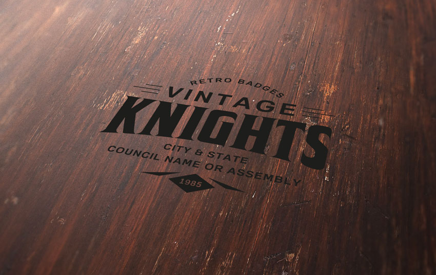
Learn how to take advantage of Photoshop’s Smart Objects to mock up your logo with photorealistic results. Thanks to the use of multiple layer styles, we’ll carve your logo into wood!
But first, do you need to design a logo? Check out this simple, easy to use online logo maker. Over 745 SMART logo templates to design your custom logo all in one place, Placeit. No Photoshop skills required.
In the top menu, choose Select > All and then Edit > Copy to copy the selection to the clipboard.
Go back to the background document and choose, in the top menu, Edit > Paste to paste the perspective image over the background.
Rename the layer by double-clicking directly on the layer’s name in the Layers panel and changing it to „Perspective„.
Step 4
Set the foreground color to yellow (any color different from black is good).
Then choose the Rectangle Tool, move the cursor over the canvas, and click. You’ll open a small dialog box that allows you to enter precise dimensions for your new shape. Type 1267 x 814 px and then click the OK button.
Rename the layer by double-clicking directly on the layer’s name in the Layers panel and changing it to „Smart Object„.
With the „Smart Object” layer selected, choose, in the top menu, Layer > Smart Object > Convert to Smart Object.
Step 5
Choose Edit > Transform > Distort and move the top right corner point to align it with the top right corner of the black rectangle
Step 6
Keep dragging the corner points until you align all the corners of the yellow rectangle with the black perspective image and cover the whole area:
Step 7
Now you can remove the „Perspective” layer by selecting it in the Layers panel and choosing Layer > Delete > Layer.
2. How to Prepare the Badge With Illustrator
Step 1
We need a logo or badge to complete the scene. This badge will be a prominent element that later will be engraved in the wood texture.
Fortunately, Envato Elements offers a wide range of high-quality badges and vector elements ready for use. Subscribe to unlock unlimited badges, templates, photos and more for one monthly fee!
In this tutorial we’ll use a badge that comes from Badges and Logos Vol.01. Download it and open with Illustrator.
Step 2
Open the vector .ai file with Adobe Illustrator. While you open the file, a window may pop up alerting you that the document uses fonts that are currently not available on your computer. No worries about that—all the fonts are free for use, and you can find a text file inside the folder with all the references and links to download each font.
For the purpose of this tutorial, I used the following free fonts for the badge:
Once you’re done with fonts, choose the Selection Tool (V). Now select the „Vintage Knights” badge (or whatever badge you like).
Copy the badge by going to Edit > Copy or pressing Command-C.
Create a new 350 x 350 px document in Adobe Illustrator.
Finally, paste the badge just copied by choosing Edit > Paste or pressing Command-V.
Step 4
With the Selection Tool (V), move the badge over the grey area, out of the white canvas.
Step 5
Before importing the badge into our scene in Photoshop, we need to expand the appearance, convert all the text to vector shapes, and remove the white area revealed now that we’ve moved the badge to the grey area.
If the badge is not selected, select it by clicking on it with the Selection Tool (V).
In the top menu, choose Object > Expand Appearance.
Again, choose Object > Expand. A dialog window will appear; select Object and Fill and press OK:
Step 6
Locate the Pathfinder panel. If you can’t see the panel, open it by choosing Window > Pathfinder.
Choose Trim.
Step 7
Now that the badge is 100% vector shapes, we can remove the white area. Choose the Magic Wand Tool, and move the cursor over a white area and click to select all the white areas of the badge. If you need, magnify the canvas by using the Zoom Tool (Z). When all the white areas of the badge are selected, remove them by choosing, in the top menu, Edit > Cut.
3. How to Include the Badge in the Scene
Step 1
We’re still in the Adobe Illustrator workspace. If the badge is not selected, select it by clicking on it with the Selection Tool (V). Copy the badge by going to Edit > Copy or pressing Command-C.
Step 2
Go back to Photoshop, and double-click on the Smart Objects thumbnail. This will open the content of the smart object in a new window of Photoshop. Here you can make any changes you like and, once you’re satisfied, all you need to do is save the file and the Photoshop Smart Object will be updated when you return to it.
In the Layers panel, deactivate the visibility for the yellow rectangle layer, and paste the badge just copied by choosing Edit > Paste or pressing Command-V.
From the dialog box, choose Smart Object and press OK:
Step 3
Locate the top options bar and set the badge’s position to 633.50 x 406.50 px and its dimension to 666% for both Width and Height fields. When you’re done, press ENTER on your keyboard:
Step 4
Save the document by choosing File > Save or using the keyboard shortcut Command-S.
Go back to the main document and you’ll notice that the smart object is now updated with the last changes. The badge, in fact, has taken the perspective of the smart object.
4. How to Engrave the Badge Into the Wood
Step 1
Set the Fill for the „Smart Object” layer to 0%:
Step 2
Duplicate the „Smart Object” layer five times by going to Layer > New > Layer Via Copy.
Now rename and group the layers as shown in the image below.
From now on, when you need to replace the badge in your smart object, you can use the „Smart Object” layer, by clicking on it and editing the content.
Step 3
Let’s start adding some layer styles to the „Effect 5” layer. Open the Layer Style panel and add a new Bevel & Embossed effect. Set the color for the Highlight Mode to #ffffff, the color for the Shadow Mode to #000000, and set the rest as follows:
Step 4
Add a new Inner Shadow effect, set the color for the Blend Mode to #000000, and set the rest as follows:
Step 5
Add a new Satin effect, set the color for the Blend Mode to #3b2b25, and set the rest as follows:
Step 6
Add a new Drop Shadow effect, set the color for the Blend Mode to #ffffff, and set the rest as follows:
Step 7
Now let’s add some layer styles to the „Effect 4” layer.
Open the Layer Style panel and add a new Inner Shadow effect, set the Blend Mode color to #000000, and set the rest as follows:
Step 8
Add a new Pattern Overlay effect and set the options as shown in the image below:
Click on the pattern thumbnail, and then click on the small gear to open the cascade menu. Choose Grayscale Paper and then click on the first pattern named Black Weaved.
Step 9
Add a new Drop Shadow effect, set the Blend Mode color to #b07555, and set the rest as follows:
Step 10
Let’s add a layer style to the „Effect 3” layer.
Open the Layer Style panel and add a new Inner Shadow effect, set the Blend Mode color to #000000, and set the rest as follows:
Step 11
Let’s add a layer style to the „Effect 2” layer.
Open the Layer Style panel and add a new Inner Shadow effect, set the Blend Mode color to #000000, and set the rest as follows:
Step 12
Let’s add a layer style to the „Effect 1” layer.
Open the Layer Style panel and add a new Inner Shadow effect, set the Blend Mode color to #000000, and set the rest as follows:
Step 13
Add a new Gradient Overlay effect and set the options as follows:
Click on the small gradient window to edit the gradient color.
Set the first color stop to Color #696969 and Location 0%.
Set the second color stop to Color#d9d9d9 and Location 100%.
Congratulations, You’re Done!
In this tutorial we learned how to create an engraved wood logo mockup with Adobe Photoshop!
I hope that you’ve enjoyed my tutorial and learned something new. Please feel free to leave your comments, suggestions, and outcomes below.
Enjoy Photoshopping!
Agregator najlepszych postów o designie, webdesignie, cssie i Internecie