A great business card should convey the overall motto and images of your business. It is a not an easy task considering the fact that an average business card only measures 2 inches in width and 3.5 inches in length. It is inconsiderate to have the thought that your business card will portray the entirety of your business. However, what it can do is portray a professional image of your business which the other person will remember.
You need to consider a lot of factors before deciding on the design of your business card. These factors include colour, text and typography to name a few. And all of these factors should perfectly align in order to reflect a professional image of your business.
While designing your business card, it is important to use common sense. For example, if you are a business selling children products, the best bet will be to use bright colours and quirky designs. You can consider the typography to be written in child script for the design to stand out even more.
Another example to consider- suppose you are the proprietor of a financial advisory firm. When designing your business card, you should keep in mind that it should reflect the two most important aspects of your business, which are professionalism and integrity. Go for a simple black-gold or a white-beige business card design to successfully reflect the same.
While professional designers always suggest that an entrepreneur shouldn’t design their own business card, most small and cash-strapped business owners are left with few other choices. But don’t lose hope, keep the below-mentioned tips in mind, and you will be all set.
Keep your logo as the basis
Make your business logo the biggest element in your business card. By making it big, you will not attract the attention of your readers on to it, but also utilise the space which would otherwise remain empty.
KISS- Keep it Simple, Stupid!
Professionalism is best reflected when the design is simple yet unique and convenient. Keeping the entire layout of your business card simple, will ease the eyes of your readers and only attract their attention to the important details of your company. Don’t cramp too much information into your business card.
Include the essentials
The most important aspect of having a business card is to portray essential information about your company or organisation. Include your name, designation, company name, email address and phone number. Keep the font size bigger than the rest of the card and also make them bold to stand out even more. Although there is no standard arrangement on how to portray this information, it is best practice to put your name, designation, email address and then the phone number.
Make it readable
Being excessively creative with your design can take you to a whole different tangent. While in the flow, make sure to keep the entire font very readable. People don’t have the time to stretch their eyes and invest a lot of time into figuring out what you have written.
Stick to one or two colours
While some creative prefer keeping the colour scheme as a rainbow, it is usually not a good choice. First, it makes the card look unprofessional and moreover the cost of printing them will be very high. The more the number of colours the more will be the price of the overall card.
Try different papers and printing techniques
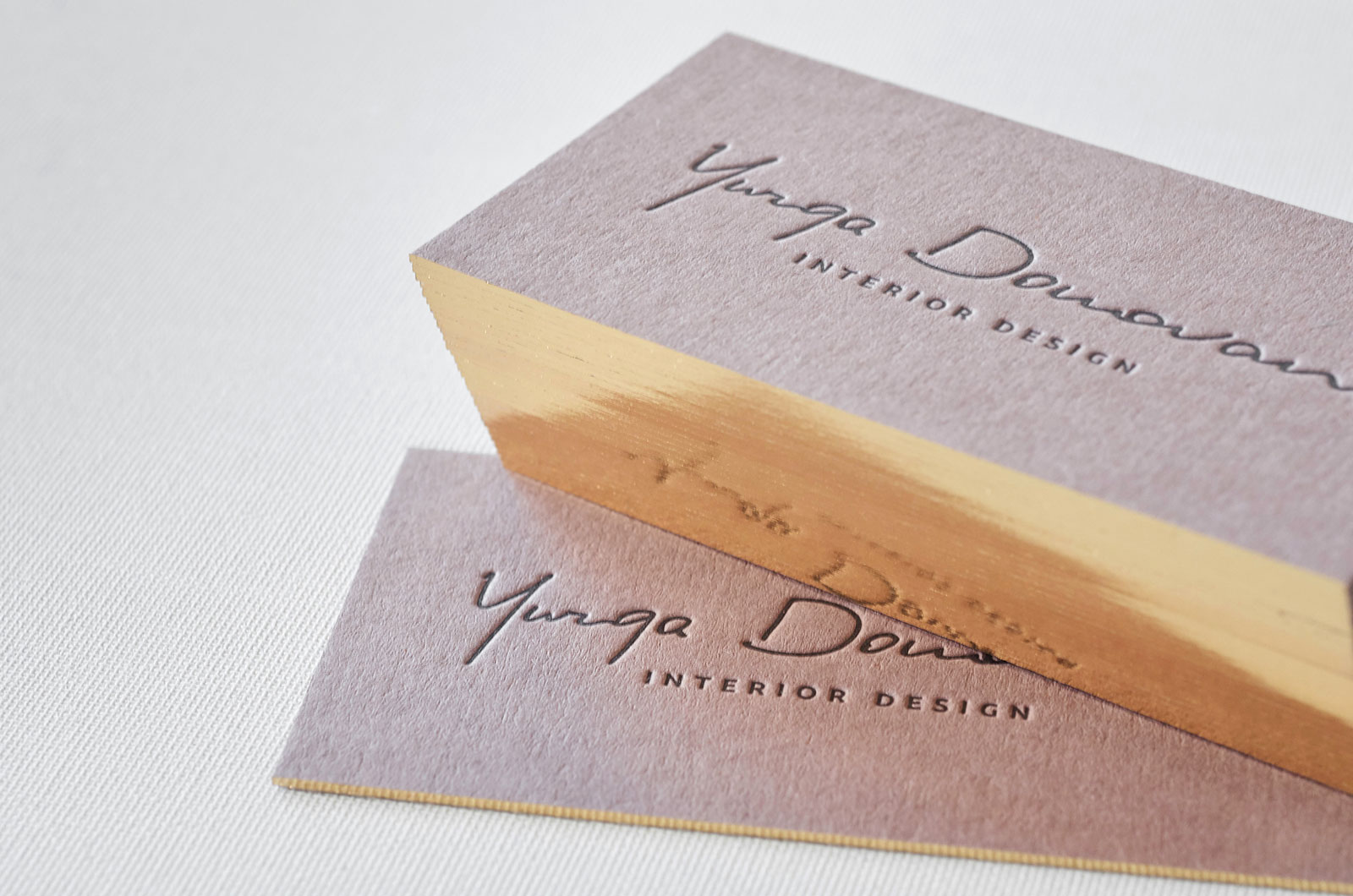
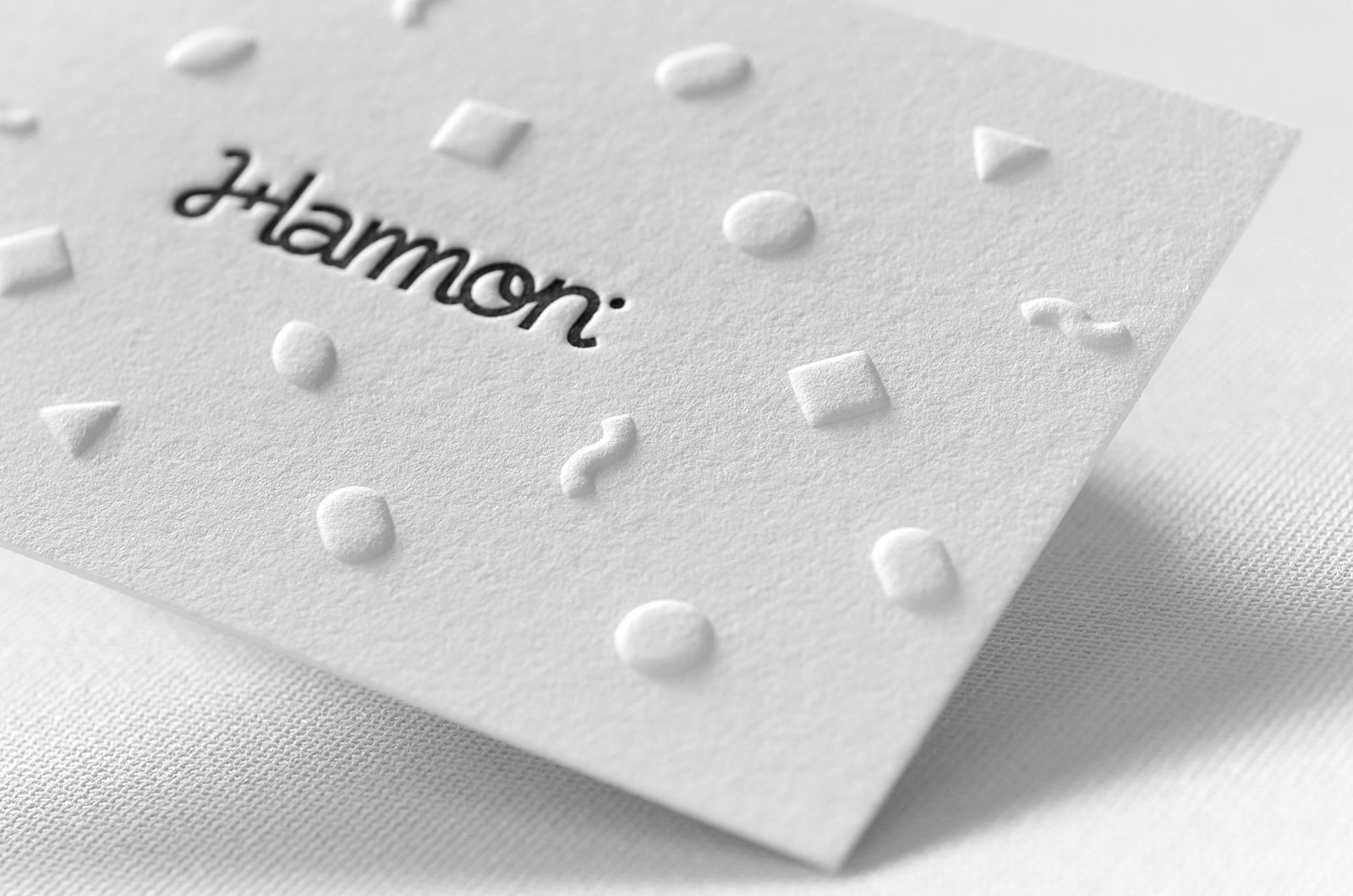
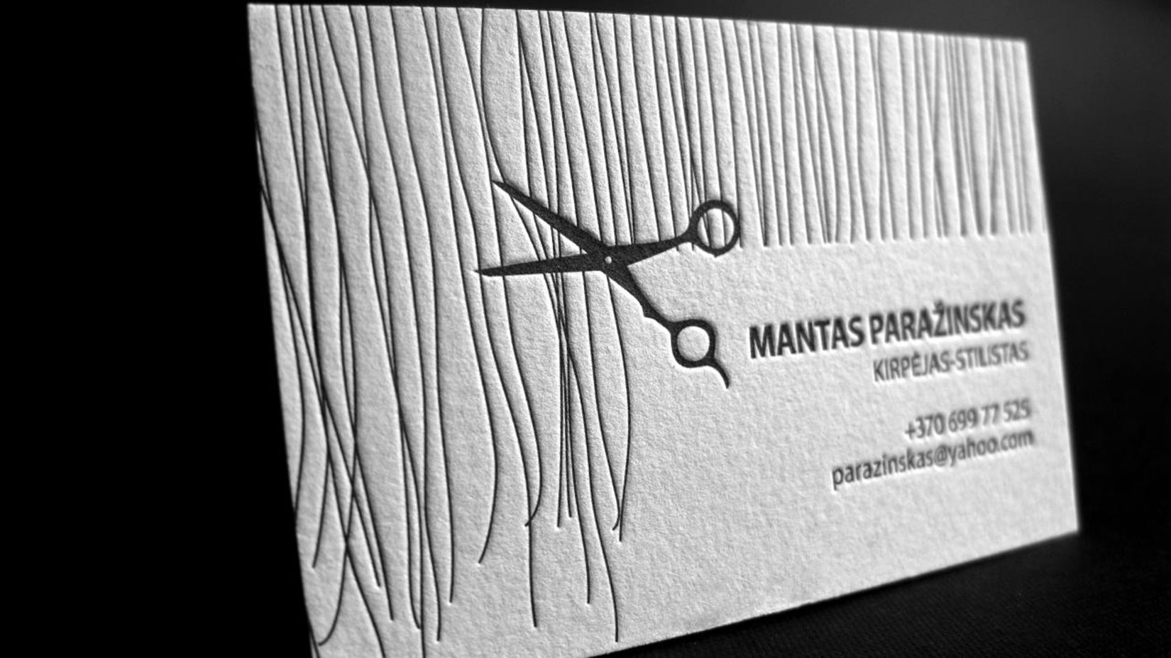
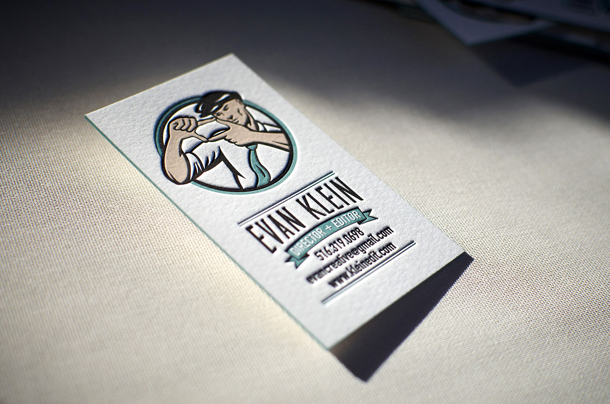
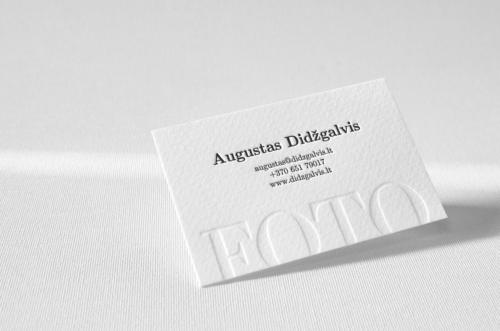
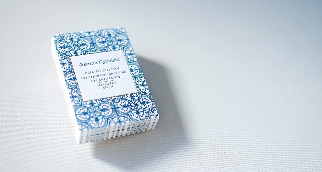
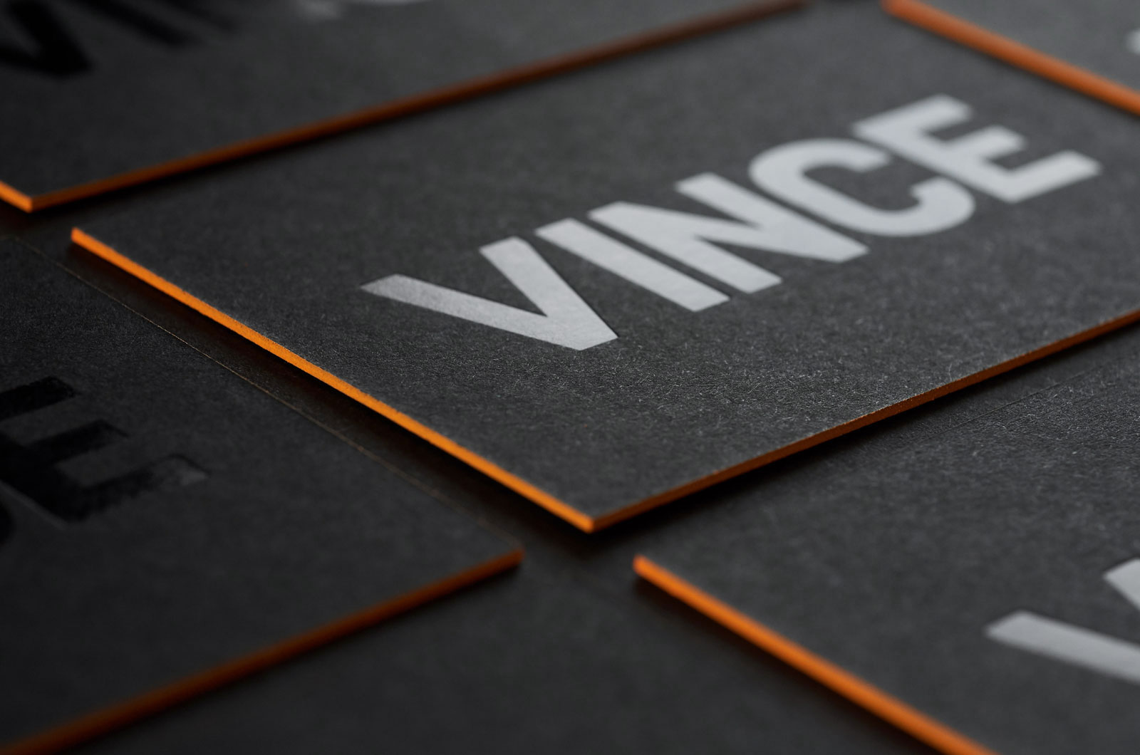
If you are in the creative industry, or a person who is very creative, you can surely out the various papers available in the market. Starting from pure cotton paper to recycled kraft or even corrugated cardboard, there are a lot of choices to choose from. Combining few different printing techniques like letterpress and hot foiling or engraving and silkscreen you can get really impressive results.
Break the norm
While traditional cards are surely more common, business cards in non-traditional shapes like oval, cuboidal or even round are super attention grabbers. Not only does the shape stand out and with the above-mentioned designs, they will look good to both you and the receiver. Designing a business card is fairly easy, and owning one will surely make you look more professional in the eyes of your business associates. Check out for more beautiful business cards samples on Elegante Press portfolio.
Many people actively use PowerPoint to create presentations. But very few of them know what requirements must be met in this case and what kinds of mistakes must be avoided. So, consider the main mistakes that the authors make when creating a presentation:
Mistake One: Too Much Information
Almost 90% of presentations suffer from this common mistake, so it’s almost impossible to understand anything in them. An overloaded presentation is easy to be recognized by long and unstructured texts. As well as by the abundance of graphic objects on one single slide. Most often, both of this issues can be found together. Sometimes, the overload of information occurs because of the limitations put on the maximum number of slides.
For example, an investor who asks for no more than a dozen slides. But much worse is the situation when the author limits the number of slides by his own initiative. Most people seem to understand that the content of the presentation must be laconic. But instead of limiting the content, many tend to reduce the number of slides. And also, very often confusing and overloaded presentation comes from the desire of the speaker to look like an expert. For example, in an academic environment, presentations with huge text arrays on slides are very common when presenting information.
How To Avoid
It’s necessary to carry out preparatory work first. To clearly formulate the purpose of the presentation, to write its script, and to compose the main themes for each slide. You can’t come up with a plan on the go and write everything that comes to mind. The brain can’t handle too much information changing in the fast sequence. And it’s almost impossible to correctly spread all the necessary information on the slides at the last moment. If the purpose of the presentation is to get someone to make a decision, then it should be made in a simple and understandable manner. And always remember the following formula: one slide equals one idea. In addition to the main thesis, use a maximum of five sub-paragraphs. Anything that doesn’t fit must be transferred to the next slide.
Mistake Two: Too Many Styles
A mess and disorder of styles is a sign of an inexperienced beginner. Who believes that the audience can be surprised by the cool design. And therefore thinks of how to apply his design skills in the best possible way in the first place. The task at hand is pushed into the background. And most people don’t even keep in mind following the same design principles. All the time is spent on choosing the elements of the layout, backgrounds, fonts, and types of animation. As a result, the design starts to change from slide to slide. The more experienced guys know that the main elements should look the same everywhere. But in their case, the details usually do not. And even such a small detail as a customized design of headings on each slide can sometimes cause confusion to the audience.
When creating a single style, one must build a visual hierarchy of each slide (the order of readable objects) and create a rhythm and repetition. In this case, the same design from slide to slide helps the audience to quickly get the meaning. Another type of such mistakes is found in presentations which are created on the basis of different materials. A piece of the report from the Internet, a piece of colleague’s presentation, a screenshot from somewhere. Such data pieces are really difficult to be brought to a single work.
How To Avoid
The absence of a single style leads to chaos in the visual hierarchy of objects. When the design jumps from slide to slide, the viewer’s mind can’t connect all the seen elements into a single system. The brain doesn’t adhere to already familiar things, as each time it has to interpret new ones. This definitely doesn’t help the information to be better absorbed. You need to learn to perceive one single style as a system. In this system, any design element contains a certain meaning and obeys the general logic. Start with the basic things: headings, texts, backgrounds, and colors. Identical elements will immediately increase the chance for a normal assimilation of information.
Mistake Three: Lack Of Focus
Lack of focus is noticeable when behind the presentation there’s a weak story. The one that was not built around one particular idea. The other common mistake happens when a good and logical story is already there but the author begins to think in a dangerous direction “what else to improve”. It happens that the author first goes on the right path but at the very end suddenly realizes that it has turned out to be poor and boring. Then he starts to play with the design. The white backgrounds turn blue. Headings and explanatory text change fonts and inscriptions. The slide layout is re-arranged. A series of such ambiguous decorating decisions can lead to a shift in emphasis. The result is the slides on which it’s impossible to get the key idea in a few seconds. Too many accents on the slide graphics lead to the fact that its logic is violated. And so you obtain the scattered blocks of information that the viewer reads in an arbitrary form.
How To Avoid
The main difficulty is that presentations that suffer from this mistake often look good. But the pleasant design doesn’t work. The viewer wants to quickly scroll further. There’s a feeling that he’s looking at a fuzzy picture in which colors and contrasts came out successfully, but it’s impossible to recognize the main subject. Clear signs of poor focus are differently designed large objects on the slide, the backgrounds that are distracting an attention from the main topic, and some unnecessary explanatory texts. To get the focus back the first step is to get rid of all this.
The attention of the viewer should be pinned to the content of the slides, not to their appearance. Be guided by the principle that the casual spectator must be able to fully understand what you wished to convey in a few seconds. If it takes more time, then the probability of losing the viewer’s attention is high. It’s especially sad when the focus is lost in the presentation and it becomes necessary to struggle for the attention of listeners. And with their constant desire to talk with a neighbor. The poor level of focus is easy to determine by the high number of headings that are present on the slides.
Mistake Four: Disorder
The slide looks as if its contents were gathered by pieces from different presentations. The arrangement of the elements is not logic, as if each of them is here by chance. The disorder of elements of the slides is often based on the author’s desire to approach the matter “creatively”. But the layout of the slides is a technical, not a creative process. While working on the slides you should forbid yourself to look for ideas. In addition, the author must perceive the presentation as a system. Each element must not exist in isolation.
How To Avoid
To achieve harmony you need to sort objects by importance to create a visual hierarchy on the slides. After that, you need to distribute elements along it, arrange them, and then align the objects шт a smart way. So the slides will be clean and neat and an understandable and readable composition will be formed.
Mistake Five: Wrong Decoration Of The Slides
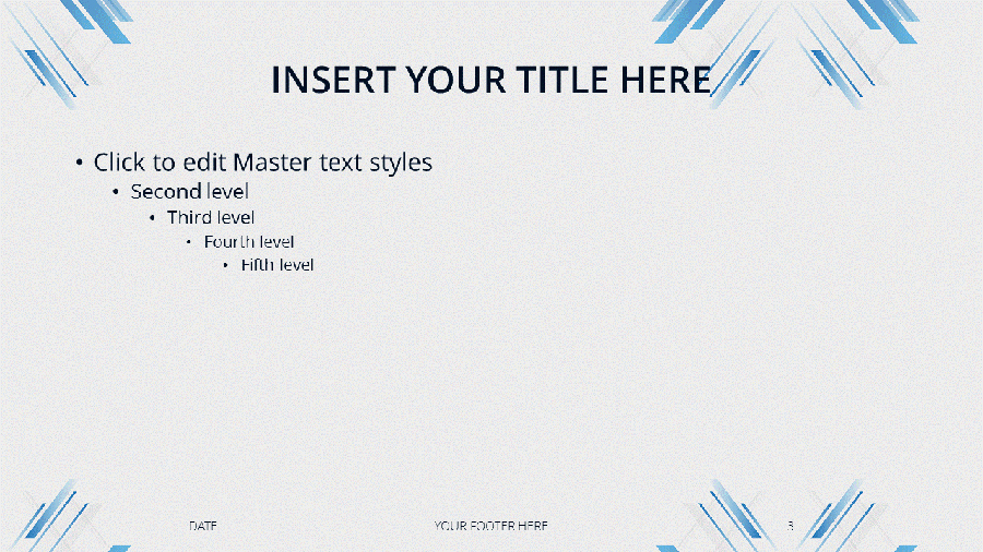
Decorating the slides with any abstract elements is another sign of the beginner. It’s caused by the fear of white space. Many beginners are sure that to look like an expert and feel confident, the one needs to fill the slides to the edges. Therefore, they see nothing wrong with using the basic PowerPoint templates. Only to avoid the white color anywhere. Wrong decoration can be both semantic (explaining the unnecessary details), and visual (too many graphic elements that are “improving” visual perception). The last one is particularly common among beginning graphic designers.
How To Avoid
Any visual details require additional time to get their meaning. Therefore, excessive decorating always works against understanding the presentation by the audience. They usually don’t make any sense but they absorb a lot of attention. In the presentation, one should respect and appreciate free space. Thanks to it, the slide stays alive. All visual elements should be informative. Everything that doesn’t make sense is a white noise which is better to get rid of.
Conclusion
Each of us makes mistakes. This is normal. It’s important to learn from them, to gain the experience, and never repeat them again. So, I tried to describe the most common mistakes people make while creating presentations and I hope that this will help all of you avoid them in the future.
A great business card should convey the overall motto and images of your business. It is a not an easy task considering the fact that an average business card only measures 2 inches in width and 3.5 inches in length. It is inconsiderate to have the thought that your business card will portray the entirety of your business. However, what it can do is portray a professional image of your business which the other person will remember.
You need to consider a lot of factors before deciding on the design of your business card. These factors include colour, text and typography to name a few. And all of these factors should perfectly align in order to reflect a professional image of your business.
While designing your business card, it is important to use common sense. For example, if you are a business selling children products, the best bet will be to use bright colours and quirky designs. You can consider the typography to be written in child script for the design to stand out even more.
Another example to consider- suppose you are the proprietor of a financial advisory firm. When designing your business card, you should keep in mind that it should reflect the two most important aspects of your business, which are professionalism and integrity. Go for a simple black-gold or a white-beige business card design to successfully reflect the same.
While professional designers always suggest that an entrepreneur shouldn’t design their own business card, most small and cash-strapped business owners are left with few other choices. But don’t lose hope, keep the below-mentioned tips in mind, and you will be all set.
Keep your logo as the basis
Make your business logo the biggest element in your business card. By making it big, you will not attract the attention of your readers on to it, but also utilise the space which would otherwise remain empty.
KISS- Keep it Simple, Stupid!
Professionalism is best reflected when the design is simple yet unique and convenient. Keeping the entire layout of your business card simple, will ease the eyes of your readers and only attract their attention to the important details of your company. Don’t cramp too much information into your business card.
Include the essentials
The most important aspect of having a business card is to portray essential information about your company or organisation. Include your name, designation, company name, email address and phone number. Keep the font size bigger than the rest of the card and also make them bold to stand out even more. Although there is no standard arrangement on how to portray this information, it is best practice to put your name, designation, email address and then the phone number.
Make it readable
Being excessively creative with your design can take you to a whole different tangent. While in the flow, make sure to keep the entire font very readable. People don’t have the time to stretch their eyes and invest a lot of time into figuring out what you have written.
Stick to one or two colours
While some creative prefer keeping the colour scheme as a rainbow, it is usually not a good choice. First, it makes the card look unprofessional and moreover the cost of printing them will be very high. The more the number of colours the more will be the price of the overall card.
Try different papers and printing techniques
If you are in the creative industry, or a person who is very creative, you can surely out the various papers available in the market. Starting from pure cotton paper to recycled kraft or even corrugated cardboard, there are a lot of choices to choose from. Combining few different printing techniques like letterpress and hot foiling or engraving and silkscreen you can get really impressive results.
Break the norm
While traditional cards are surely more common, business cards in non-traditional shapes like oval, cuboidal or even round are super attention grabbers. Not only does the shape stand out and with the above-mentioned designs, they will look good to both you and the receiver. Designing a business card is fairly easy, and owning one will surely make you look more professional in the eyes of your business associates. Check out for more beautiful business cards samples on Elegante Press portfolio.
A great business card should convey the overall motto and images of your business. It is a not an easy task considering the fact that an average business card only measures 2 inches in width and 3.5 inches in length. It is inconsiderate to have the thought that your business card will portray the entirety of your business. However, what it can do is portray a professional image of your business which the other person will remember.
You need to consider a lot of factors before deciding on the design of your business card. These factors include colour, text and typography to name a few. And all of these factors should perfectly align in order to reflect a professional image of your business.
While designing your business card, it is important to use common sense. For example, if you are a business selling children products, the best bet will be to use bright colours and quirky designs. You can consider the typography to be written in child script for the design to stand out even more.
Another example to consider- suppose you are the proprietor of a financial advisory firm. When designing your business card, you should keep in mind that it should reflect the two most important aspects of your business, which are professionalism and integrity. Go for a simple black-gold or a white-beige business card design to successfully reflect the same.
While professional designers always suggest that an entrepreneur shouldn’t design their own business card, most small and cash-strapped business owners are left with few other choices. But don’t lose hope, keep the below-mentioned tips in mind, and you will be all set.
Keep your logo as the basis
Make your business logo the biggest element in your business card. By making it big, you will not attract the attention of your readers on to it, but also utilise the space which would otherwise remain empty.
KISS- Keep it Simple, Stupid!
Professionalism is best reflected when the design is simple yet unique and convenient. Keeping the entire layout of your business card simple, will ease the eyes of your readers and only attract their attention to the important details of your company. Don’t cramp too much information into your business card.
Include the essentials
The most important aspect of having a business card is to portray essential information about your company or organisation. Include your name, designation, company name, email address and phone number. Keep the font size bigger than the rest of the card and also make them bold to stand out even more. Although there is no standard arrangement on how to portray this information, it is best practice to put your name, designation, email address and then the phone number.
Make it readable
Being excessively creative with your design can take you to a whole different tangent. While in the flow, make sure to keep the entire font very readable. People don’t have the time to stretch their eyes and invest a lot of time into figuring out what you have written.
Stick to one or two colours
While some creative prefer keeping the colour scheme as a rainbow, it is usually not a good choice. First, it makes the card look unprofessional and moreover the cost of printing them will be very high. The more the number of colours the more will be the price of the overall card.
Try different papers and printing techniques
If you are in the creative industry, or a person who is very creative, you can surely out the various papers available in the market. Starting from pure cotton paper to recycled kraft or even corrugated cardboard, there are a lot of choices to choose from. Combining few different printing techniques like letterpress and hot foiling or engraving and silkscreen you can get really impressive results.
Break the norm
While traditional cards are surely more common, business cards in non-traditional shapes like oval, cuboidal or even round are super attention grabbers. Not only does the shape stand out and with the above-mentioned designs, they will look good to both you and the receiver. Designing a business card is fairly easy, and owning one will surely make you look more professional in the eyes of your business associates. Check out for more beautiful business cards samples on Elegante Press portfolio.
A great business card should convey the overall motto and images of your business. It is a not an easy task considering the fact that an average business card only measures 2 inches in width and 3.5 inches in length. It is inconsiderate to have the thought that your business card will portray the entirety of your business. However, what it can do is portray a professional image of your business which the other person will remember.
You need to consider a lot of factors before deciding on the design of your business card. These factors include colour, text and typography to name a few. And all of these factors should perfectly align in order to reflect a professional image of your business.
While designing your business card, it is important to use common sense. For example, if you are a business selling children products, the best bet will be to use bright colours and quirky designs. You can consider the typography to be written in child script for the design to stand out even more.
Another example to consider- suppose you are the proprietor of a financial advisory firm. When designing your business card, you should keep in mind that it should reflect the two most important aspects of your business, which are professionalism and integrity. Go for a simple black-gold or a white-beige business card design to successfully reflect the same.
While professional designers always suggest that an entrepreneur shouldn’t design their own business card, most small and cash-strapped business owners are left with few other choices. But don’t lose hope, keep the below-mentioned tips in mind, and you will be all set.
Keep your logo as the basis
Make your business logo the biggest element in your business card. By making it big, you will not attract the attention of your readers on to it, but also utilise the space which would otherwise remain empty.
KISS- Keep it Simple, Stupid!
Professionalism is best reflected when the design is simple yet unique and convenient. Keeping the entire layout of your business card simple, will ease the eyes of your readers and only attract their attention to the important details of your company. Don’t cramp too much information into your business card.
Include the essentials
The most important aspect of having a business card is to portray essential information about your company or organisation. Include your name, designation, company name, email address and phone number. Keep the font size bigger than the rest of the card and also make them bold to stand out even more. Although there is no standard arrangement on how to portray this information, it is best practice to put your name, designation, email address and then the phone number.
Make it readable
Being excessively creative with your design can take you to a whole different tangent. While in the flow, make sure to keep the entire font very readable. People don’t have the time to stretch their eyes and invest a lot of time into figuring out what you have written.
Stick to one or two colours
While some creative prefer keeping the colour scheme as a rainbow, it is usually not a good choice. First, it makes the card look unprofessional and moreover the cost of printing them will be very high. The more the number of colours the more will be the price of the overall card.
Try different papers and printing techniques
If you are in the creative industry, or a person who is very creative, you can surely out the various papers available in the market. Starting from pure cotton paper to recycled kraft or even corrugated cardboard, there are a lot of choices to choose from. Combining few different printing techniques like letterpress and hot foiling or engraving and silkscreen you can get really impressive results.
Break the norm
While traditional cards are surely more common, business cards in non-traditional shapes like oval, cuboidal or even round are super attention grabbers. Not only does the shape stand out and with the above-mentioned designs, they will look good to both you and the receiver. Designing a business card is fairly easy, and owning one will surely make you look more professional in the eyes of your business associates. Check out for more beautiful business cards samples on Elegante Press portfolio.
A great business card should convey the overall motto and images of your business. It is a not an easy task considering the fact that an average business card only measures 2 inches in width and 3.5 inches in length. It is inconsiderate to have the thought that your business card will portray the entirety of your business. However, what it can do is portray a professional image of your business which the other person will remember.
You need to consider a lot of factors before deciding on the design of your business card. These factors include colour, text and typography to name a few. And all of these factors should perfectly align in order to reflect a professional image of your business.
While designing your business card, it is important to use common sense. For example, if you are a business selling children products, the best bet will be to use bright colours and quirky designs. You can consider the typography to be written in child script for the design to stand out even more.
Another example to consider- suppose you are the proprietor of a financial advisory firm. When designing your business card, you should keep in mind that it should reflect the two most important aspects of your business, which are professionalism and integrity. Go for a simple black-gold or a white-beige business card design to successfully reflect the same.
While professional designers always suggest that an entrepreneur shouldn’t design their own business card, most small and cash-strapped business owners are left with few other choices. But don’t lose hope, keep the below-mentioned tips in mind, and you will be all set.
Keep your logo as the basis
Make your business logo the biggest element in your business card. By making it big, you will not attract the attention of your readers on to it, but also utilise the space which would otherwise remain empty.
KISS- Keep it Simple, Stupid!
Professionalism is best reflected when the design is simple yet unique and convenient. Keeping the entire layout of your business card simple, will ease the eyes of your readers and only attract their attention to the important details of your company. Don’t cramp too much information into your business card.
Include the essentials
The most important aspect of having a business card is to portray essential information about your company or organisation. Include your name, designation, company name, email address and phone number. Keep the font size bigger than the rest of the card and also make them bold to stand out even more. Although there is no standard arrangement on how to portray this information, it is best practice to put your name, designation, email address and then the phone number.
Make it readable
Being excessively creative with your design can take you to a whole different tangent. While in the flow, make sure to keep the entire font very readable. People don’t have the time to stretch their eyes and invest a lot of time into figuring out what you have written.
Stick to one or two colours
While some creative prefer keeping the colour scheme as a rainbow, it is usually not a good choice. First, it makes the card look unprofessional and moreover the cost of printing them will be very high. The more the number of colours the more will be the price of the overall card.
Try different papers and printing techniques
If you are in the creative industry, or a person who is very creative, you can surely out the various papers available in the market. Starting from pure cotton paper to recycled kraft or even corrugated cardboard, there are a lot of choices to choose from. Combining few different printing techniques like letterpress and hot foiling or engraving and silkscreen you can get really impressive results.
Break the norm
While traditional cards are surely more common, business cards in non-traditional shapes like oval, cuboidal or even round are super attention grabbers. Not only does the shape stand out and with the above-mentioned designs, they will look good to both you and the receiver. Designing a business card is fairly easy, and owning one will surely make you look more professional in the eyes of your business associates. Check out for more beautiful business cards samples on Elegante Press portfolio.
Many people actively use PowerPoint to create presentations. But very few of them know what requirements must be met in this case and what kinds of mistakes must be avoided. So, consider the main mistakes that the authors make when creating a presentation:
Mistake One: Too Much Information
Almost 90% of presentations suffer from this common mistake, so it’s almost impossible to understand anything in them. An overloaded presentation is easy to be recognized by long and unstructured texts. As well as by the abundance of graphic objects on one single slide. Most often, both of this issues can be found together. Sometimes, the overload of information occurs because of the limitations put on the maximum number of slides.
For example, an investor who asks for no more than a dozen slides. But much worse is the situation when the author limits the number of slides by his own initiative. Most people seem to understand that the content of the presentation must be laconic. But instead of limiting the content, many tend to reduce the number of slides. And also, very often confusing and overloaded presentation comes from the desire of the speaker to look like an expert. For example, in an academic environment, presentations with huge text arrays on slides are very common when presenting information.
How To Avoid
It’s necessary to carry out preparatory work first. To clearly formulate the purpose of the presentation, to write its script, and to compose the main themes for each slide. You can’t come up with a plan on the go and write everything that comes to mind. The brain can’t handle too much information changing in the fast sequence. And it’s almost impossible to correctly spread all the necessary information on the slides at the last moment. If the purpose of the presentation is to get someone to make a decision, then it should be made in a simple and understandable manner. And always remember the following formula: one slide equals one idea. In addition to the main thesis, use a maximum of five sub-paragraphs. Anything that doesn’t fit must be transferred to the next slide.
Mistake Two: Too Many Styles
A mess and disorder of styles is a sign of an inexperienced beginner. Who believes that the audience can be surprised by the cool design. And therefore thinks of how to apply his design skills in the best possible way in the first place. The task at hand is pushed into the background. And most people don’t even keep in mind following the same design principles. All the time is spent on choosing the elements of the layout, backgrounds, fonts, and types of animation. As a result, the design starts to change from slide to slide. The more experienced guys know that the main elements should look the same everywhere. But in their case, the details usually do not. And even such a small detail as a customized design of headings on each slide can sometimes cause confusion to the audience.
When creating a single style, one must build a visual hierarchy of each slide (the order of readable objects) and create a rhythm and repetition. In this case, the same design from slide to slide helps the audience to quickly get the meaning. Another type of such mistakes is found in presentations which are created on the basis of different materials. A piece of the report from the Internet, a piece of colleague’s presentation, a screenshot from somewhere. Such data pieces are really difficult to be brought to a single work.
How To Avoid
The absence of a single style leads to chaos in the visual hierarchy of objects. When the design jumps from slide to slide, the viewer’s mind can’t connect all the seen elements into a single system. The brain doesn’t adhere to already familiar things, as each time it has to interpret new ones. This definitely doesn’t help the information to be better absorbed. You need to learn to perceive one single style as a system. In this system, any design element contains a certain meaning and obeys the general logic. Start with the basic things: headings, texts, backgrounds, and colors. Identical elements will immediately increase the chance for a normal assimilation of information.
Mistake Three: Lack Of Focus
Lack of focus is noticeable when behind the presentation there’s a weak story. The one that was not built around one particular idea. The other common mistake happens when a good and logical story is already there but the author begins to think in a dangerous direction “what else to improve”. It happens that the author first goes on the right path but at the very end suddenly realizes that it has turned out to be poor and boring. Then he starts to play with the design. The white backgrounds turn blue. Headings and explanatory text change fonts and inscriptions. The slide layout is re-arranged. A series of such ambiguous decorating decisions can lead to a shift in emphasis. The result is the slides on which it’s impossible to get the key idea in a few seconds. Too many accents on the slide graphics lead to the fact that its logic is violated. And so you obtain the scattered blocks of information that the viewer reads in an arbitrary form.
How To Avoid
The main difficulty is that presentations that suffer from this mistake often look good. But the pleasant design doesn’t work. The viewer wants to quickly scroll further. There’s a feeling that he’s looking at a fuzzy picture in which colors and contrasts came out successfully, but it’s impossible to recognize the main subject. Clear signs of poor focus are differently designed large objects on the slide, the backgrounds that are distracting an attention from the main topic, and some unnecessary explanatory texts. To get the focus back the first step is to get rid of all this.
The attention of the viewer should be pinned to the content of the slides, not to their appearance. Be guided by the principle that the casual spectator must be able to fully understand what you wished to convey in a few seconds. If it takes more time, then the probability of losing the viewer’s attention is high. It’s especially sad when the focus is lost in the presentation and it becomes necessary to struggle for the attention of listeners. And with their constant desire to talk with a neighbor. The poor level of focus is easy to determine by the high number of headings that are present on the slides.
Mistake Four: Disorder
The slide looks as if its contents were gathered by pieces from different presentations. The arrangement of the elements is not logic, as if each of them is here by chance. The disorder of elements of the slides is often based on the author’s desire to approach the matter “creatively”. But the layout of the slides is a technical, not a creative process. While working on the slides you should forbid yourself to look for ideas. In addition, the author must perceive the presentation as a system. Each element must not exist in isolation.
How To Avoid
To achieve harmony you need to sort objects by importance to create a visual hierarchy on the slides. After that, you need to distribute elements along it, arrange them, and then align the objects шт a smart way. So the slides will be clean and neat and an understandable and readable composition will be formed.
Mistake Five: Wrong Decoration Of The Slides
Decorating the slides with any abstract elements is another sign of the beginner. It’s caused by the fear of white space. Many beginners are sure that to look like an expert and feel confident, the one needs to fill the slides to the edges. Therefore, they see nothing wrong with using the basic PowerPoint templates. Only to avoid the white color anywhere. Wrong decoration can be both semantic (explaining the unnecessary details), and visual (too many graphic elements that are “improving” visual perception). The last one is particularly common among beginning graphic designers.
How To Avoid
Any visual details require additional time to get their meaning. Therefore, excessive decorating always works against understanding the presentation by the audience. They usually don’t make any sense but they absorb a lot of attention. In the presentation, one should respect and appreciate free space. Thanks to it, the slide stays alive. All visual elements should be informative. Everything that doesn’t make sense is a white noise which is better to get rid of.
Conclusion
Each of us makes mistakes. This is normal. It’s important to learn from them, to gain the experience, and never repeat them again. So, I tried to describe the most common mistakes people make while creating presentations and I hope that this will help all of you avoid them in the future.
Many people actively use PowerPoint to create presentations. But very few of them know what requirements must be met in this case and what kinds of mistakes must be avoided. So, consider the main mistakes that the authors make when creating a presentation:
Mistake One: Too Much Information
Almost 90% of presentations suffer from this common mistake, so it’s almost impossible to understand anything in them. An overloaded presentation is easy to be recognized by long and unstructured texts. As well as by the abundance of graphic objects on one single slide. Most often, both of this issues can be found together. Sometimes, the overload of information occurs because of the limitations put on the maximum number of slides.
For example, an investor who asks for no more than a dozen slides. But much worse is the situation when the author limits the number of slides by his own initiative. Most people seem to understand that the content of the presentation must be laconic. But instead of limiting the content, many tend to reduce the number of slides. And also, very often confusing and overloaded presentation comes from the desire of the speaker to look like an expert. For example, in an academic environment, presentations with huge text arrays on slides are very common when presenting information.
How To Avoid
It’s necessary to carry out preparatory work first. To clearly formulate the purpose of the presentation, to write its script, and to compose the main themes for each slide. You can’t come up with a plan on the go and write everything that comes to mind. The brain can’t handle too much information changing in the fast sequence. And it’s almost impossible to correctly spread all the necessary information on the slides at the last moment. If the purpose of the presentation is to get someone to make a decision, then it should be made in a simple and understandable manner. And always remember the following formula: one slide equals one idea. In addition to the main thesis, use a maximum of five sub-paragraphs. Anything that doesn’t fit must be transferred to the next slide.
Mistake Two: Too Many Styles
A mess and disorder of styles is a sign of an inexperienced beginner. Who believes that the audience can be surprised by the cool design. And therefore thinks of how to apply his design skills in the best possible way in the first place. The task at hand is pushed into the background. And most people don’t even keep in mind following the same design principles. All the time is spent on choosing the elements of the layout, backgrounds, fonts, and types of animation. As a result, the design starts to change from slide to slide. The more experienced guys know that the main elements should look the same everywhere. But in their case, the details usually do not. And even such a small detail as a customized design of headings on each slide can sometimes cause confusion to the audience.
When creating a single style, one must build a visual hierarchy of each slide (the order of readable objects) and create a rhythm and repetition. In this case, the same design from slide to slide helps the audience to quickly get the meaning. Another type of such mistakes is found in presentations which are created on the basis of different materials. A piece of the report from the Internet, a piece of colleague’s presentation, a screenshot from somewhere. Such data pieces are really difficult to be brought to a single work.
How To Avoid
The absence of a single style leads to chaos in the visual hierarchy of objects. When the design jumps from slide to slide, the viewer’s mind can’t connect all the seen elements into a single system. The brain doesn’t adhere to already familiar things, as each time it has to interpret new ones. This definitely doesn’t help the information to be better absorbed. You need to learn to perceive one single style as a system. In this system, any design element contains a certain meaning and obeys the general logic. Start with the basic things: headings, texts, backgrounds, and colors. Identical elements will immediately increase the chance for a normal assimilation of information.
Mistake Three: Lack Of Focus
Lack of focus is noticeable when behind the presentation there’s a weak story. The one that was not built around one particular idea. The other common mistake happens when a good and logical story is already there but the author begins to think in a dangerous direction “what else to improve”. It happens that the author first goes on the right path but at the very end suddenly realizes that it has turned out to be poor and boring. Then he starts to play with the design. The white backgrounds turn blue. Headings and explanatory text change fonts and inscriptions. The slide layout is re-arranged. A series of such ambiguous decorating decisions can lead to a shift in emphasis. The result is the slides on which it’s impossible to get the key idea in a few seconds. Too many accents on the slide graphics lead to the fact that its logic is violated. And so you obtain the scattered blocks of information that the viewer reads in an arbitrary form.
How To Avoid
The main difficulty is that presentations that suffer from this mistake often look good. But the pleasant design doesn’t work. The viewer wants to quickly scroll further. There’s a feeling that he’s looking at a fuzzy picture in which colors and contrasts came out successfully, but it’s impossible to recognize the main subject. Clear signs of poor focus are differently designed large objects on the slide, the backgrounds that are distracting an attention from the main topic, and some unnecessary explanatory texts. To get the focus back the first step is to get rid of all this.
The attention of the viewer should be pinned to the content of the slides, not to their appearance. Be guided by the principle that the casual spectator must be able to fully understand what you wished to convey in a few seconds. If it takes more time, then the probability of losing the viewer’s attention is high. It’s especially sad when the focus is lost in the presentation and it becomes necessary to struggle for the attention of listeners. And with their constant desire to talk with a neighbor. The poor level of focus is easy to determine by the high number of headings that are present on the slides.
Mistake Four: Disorder
The slide looks as if its contents were gathered by pieces from different presentations. The arrangement of the elements is not logic, as if each of them is here by chance. The disorder of elements of the slides is often based on the author’s desire to approach the matter “creatively”. But the layout of the slides is a technical, not a creative process. While working on the slides you should forbid yourself to look for ideas. In addition, the author must perceive the presentation as a system. Each element must not exist in isolation.
How To Avoid
To achieve harmony you need to sort objects by importance to create a visual hierarchy on the slides. After that, you need to distribute elements along it, arrange them, and then align the objects шт a smart way. So the slides will be clean and neat and an understandable and readable composition will be formed.
Mistake Five: Wrong Decoration Of The Slides
Decorating the slides with any abstract elements is another sign of the beginner. It’s caused by the fear of white space. Many beginners are sure that to look like an expert and feel confident, the one needs to fill the slides to the edges. Therefore, they see nothing wrong with using the basic PowerPoint templates. Only to avoid the white color anywhere. Wrong decoration can be both semantic (explaining the unnecessary details), and visual (too many graphic elements that are “improving” visual perception). The last one is particularly common among beginning graphic designers.
How To Avoid
Any visual details require additional time to get their meaning. Therefore, excessive decorating always works against understanding the presentation by the audience. They usually don’t make any sense but they absorb a lot of attention. In the presentation, one should respect and appreciate free space. Thanks to it, the slide stays alive. All visual elements should be informative. Everything that doesn’t make sense is a white noise which is better to get rid of.
Conclusion
Each of us makes mistakes. This is normal. It’s important to learn from them, to gain the experience, and never repeat them again. So, I tried to describe the most common mistakes people make while creating presentations and I hope that this will help all of you avoid them in the future.
Agregator najlepszych postów o designie, webdesignie, cssie i Internecie