Wszystkie wpisy, których autorem jest admin

Paul Schlacter’s Journey to Success and Inspiration

Post pobrano z: Paul Schlacter’s Journey to Success and Inspiration

For people like Paul Schlacter, being inspired is a perpetual state, and they’ve learned to live and breathe in an environment of constant motivation. For some, this might seem like a pipe dream, but according to Paul himself in an interview for DesignRush, it’s mostly about finding the right source of motivation in your work, and following that path until you land a prospective opportunity.

Starting Modestly

Perhaps surprisingly to some, considering Paul’s current position, he didn’t actually know much about graphic design as a field when he decided to follow it as his main study, although he does admit to having an inclination to drawing from a young age. To him, choosing to study graphic design was mostly about making a safe bet that could allow him to develop in a familiar direction.

He’s evolved a lot since then though, devoting his time to studying more advanced concepts like motion graphics, user interfaces and how people interact with them, and other fields that, according to him, need more attention in today’s designer world.

Paul’s Process

Many people reading this would probably immediately wonder about the kind of daily routine that drives the work of someone like Paul, and according to him, it mostly starts out with a lot of experimentation and creative brainstorming. He mentions a large number of sketches at this stage, and he also stresses the importance of getting early feedback and reiterating on the original idea until it gets the kind of response he was looking for.
As for finding sources of inspiration, Paul explains that he likes to maintain a photo blog, in which he tries to capture an interesting moment from his life every day. These small bits serve as a major drive for him, and one can perhaps see some relevance to his work in those pictures after exploring them enough.

Getting Through the Tough Times

Everyone working in a creative field inevitably runs into the “block” problem at some point, and Paul is no exception – although his advice for overcoming the situation might not be what most people would like to hear. According to him, perseverance is key in these cases, and working on the problem until it’s gone is pretty much the only viable approach he has managed to find.

However, as simple as that piece of advice may seem, it also holds a lot of truth, as anyone experienced enough in a particular creative field would readily tell you. It’s important to have the capacity to just push through the more challenging times, and sometimes the right answer is not the most elegant one.

Paul also shares a quote that has allowed him to get through some of the more challenging moments of his life, a short but powerful sentence by Ray Hunt – “Make the right thing easy, and the wrong thing difficult”. Combined with a little discipline, maybe we can all get a little closer to Paul and explore our true potential as creative minds. You never know when you might find that you have a knack for something.

Featured image by Brooke Lark

WWF: Burning Tiger, Burning Elephant

Post pobrano z: WWF: Burning Tiger, Burning Elephant
Print
WWF

Forest fires occur regularly in Indonesia without much regard. As of August 2017, 170 active hot spots are burning across the country. In this campaign, we try to increase the concern by refocusing on irreplaceable wildlife lost instead of just plant life.

Advertising Agency:LOTUS:H, Jakarta, Indonesia
Chief Creative Officer:Hoh Woon Siew
Executive Creative Director:Dino Mojica
Creative Director:Ramdhan Hidayat, Nicholas Kosasih
Copywriter:Shinta Afiati, Dino Mojica
Senior Graphic Designer:Agung Suksma
Account Director:Ebie Prasetio
Account Executive:Juliantra Rianda
Strategic Planning Manager:Wimala Djafar
Creative Support:Suryo Guritno, Rini Susanti, Iman Budiman
Print Production Company:Illusion, Bangkok)
Illustrator:Illusion, Bangkok)
Photographer:Illusion, Bangkok)
Retouch:Illusion, Bangkok)

Banglalink: Banglalink 4G #FeelsLikeNew

Post pobrano z: Banglalink: Banglalink 4G #FeelsLikeNew

Film
Banglalink

After promoting a quantum leap in speed with 3G, promoting 4G was not an easy challenge. We needed to add value to the generic proposition of speed. We found that proposition in content viewing – better video quality, smoother video calls, better game graphics and so on. The same movie that you were watching on 3G would become a much better experience on 4G. While our competition built on the speed proposition and the generic internet benefits like play a game, upload to Facebook kind of things, stuff that were already proposed with 3G, we decided to propose a world where every view is fresh view. The strapline – “Everything I see feels new” – along with stunning visuals and never-seen-before scenes carried the campaign. You may be watching the same thing as before, but with speed and robust connections, it will feel like a completely new experience. It was unexpected, clutter breaking, more relevant than the competition.

Advertising Agency:Asiatic JWT, Dhaka, Bangladesh
Managing Director:Neville Ferdous Hasan
Client Services Director:Abhishek Rahman
Account Director:S.Ehsanul Khaleque Bappee
Group Account Manager:Pavel Rahman
Campaign Supervisor:Zannat Bushra Antora
Account Supervisor:Lamia Alamgir
Account Senior Executive:Saurov Adhiraz
Vice President:Aditya Kabir
Strategic Planning:Aditya Kabir, Naimul Hoque
Supervisor:Naimul Hoque
Group Creative Director:Anam Biswas
Creative Directors:Quratul Ayin Shohel, Fahim Reza Pial
Creative Manager:Zubair Hossain Oni
Creative Art Team:Biplob Kor Birat, Azizul Haque Biplob, Humyun Kabir, Dipok Das, Zonayed Azim Chowdhury, Minhaz Chowdhury
Copywriters:Rahul Rahman, Anup Aich
Director:Adnan Al Rajeev
Photographer:Riyad Ashraf

Miyabi: The Beauty Of Sharpness 2018

Post pobrano z: Miyabi: The Beauty Of Sharpness 2018
Print
Miyabi

The „Beauty of Sharpness” saga of the Miyabi knives is back with a new campaign signed Herezie Group.

SUJIHIKI, SANTOKU and SHOTOH are the names of the 3 high performance knives that Miyabi has chosen for its new campaign „Jewels”.

This time, to celebrate „the beauty of sharpness”, the legendary precision of the Miyabi blades has been applied on salmon, cheese and cucumber to create unique and incredible shapes of real jewels of food.

The Beauty Of Sharpness

Advertising Agency:Herezie Group, Paris, France
Creative Director:Baptiste Clinet
Art Directors:Sonia Presne, Thomas Vogt
Photographer:Antoine Magnien
Art Buyer:Johanna Warlus
Print Producer:Emmanuelle Sannier
Agent:Anne Lecerf
Marketing Director:Nathalie Chanbert
PDG:Andrea Stillacci

Buying Domains in 2018: How to Figure Out a Good Name for your Site

Post pobrano z: Buying Domains in 2018: How to Figure Out a Good Name for your Site

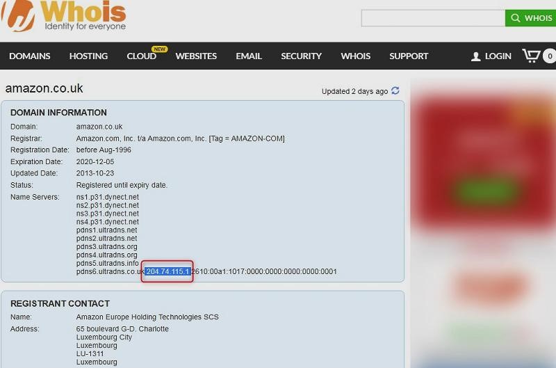
Your website’s name and URL address are how customers remember you. Your website also has an IP address that anyone can find for free using WhoIs.com

In the screenshot above, you can see the result of a WhoIs search for Amazon.co.uk. The IP address is highlighted. But who is going to remember the IP address of every site they visit? Site names make the Internet possible for ordinary people to use.

What Makes a Poor Site Name?

Users must be able to remember your site’s name.

  • Avoid numbers (either written or numerical eg three or 3) – people have to say “number” or ‘word’ every time
  • Avoid dashes (-) – Sites with hyphens are often perceived as low quality
  • Avoid underscores (_) – Who is going to say “underscore” when they are talking about your site?
  • Avoid trademarks (eg Hoover, BBC) – That way you avoid expensive legal battles you will lose
  • Avoid mis-spellings (eg hoovver) – Their legal team has more clout than yours
  • Avoid triple letters (eg MissScunthorpe) – They are hard to remember

A good site name must be memorable, easy to say and have an unambiguous pronunciation.

Ideally, it will include what you do, be one word that you can trademark, eg, WordPress or two words run together, eg, InMotion or LinkedIn.

Where Should You Buy Your Domain Name?

Most web hosting companies give you a free domain name, but experts agree this is an unwise option to take up for your company name: Rather, you should buy your site address from a different company.

Trust is essential when searching for a domain name, and your searches must be private. Some name resellers sell your search data to unscrupulous domain “investors” who buy the domain you searched for and try to blackmail you into paying ten times what they paid.

LCN is one domain name seller you should look at.

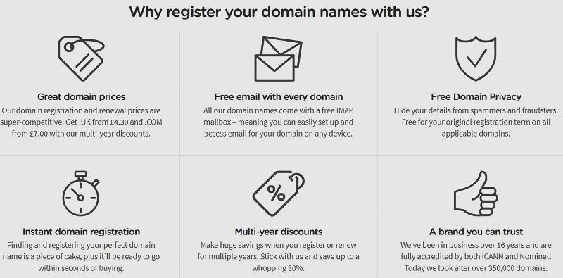
LCN offers free domain privacy so a simple WhoIs search won’t reveal your name and address. They keep your searches private so that you can come back the next day and no domain sitting parasite will have ‘stolen’ your preferred URL.

Do .shop and Similar Domain Names Work?

You have a whole galaxy of domain name suffixes to choose from. Forget them all: Nothing works like .com or .co.uk.

Country-level domains work well within that country, but .com domains are essential for international businesses: Nothing else conveys the same authority.

Can You Use Your Business Name as Your Site Name?

Yes if someone hasn’t already registered that URL.

Should you do so is another question.

If your website visitors come from Google and Bing, your URL should tell users about the services you offer. This is less important if yours is a high street business with mostly word-of-mouth custom.

BobJones.com will work for a company with mostly local trade where everyone knows who you are and what you do. If you are targeting a broader geographic area through search engines, BobJonesHardware.com will work better

Think about your business exit strategy before settling on a site name. The name would need to be attractive to anyone buying your business. If your preferred URL were HarrogateHardware.co.uk, that would only appeal to potential buyers of your business from North Yorkshire. Similarly, avoid local colloquialisms, eg, JonesButties.com, because ‘butties’ is meaningless to many outside the North. (If you are not a Northerner, it means sandwiches.)

Other Ideas for Your Site Name

If you are setting up your business and website simultaneously, then you must check any business name you think of to check if the .com domain name is available.

Think of adding an extra letter to a URL that is unavailable, eg, Cowws.com or Letterss.com. Another trick is to use homophones, eg, Lyft.com or Silli.com.

Long Story Short

Never search for a web address on an untrustworthy site, and that includes many web hosting company sites. Only search on a website that is entirely trustworthy and guarantees your search data will remain private.

Look for a .com site name that reflects what your business does and that will have a broad appeal to buyers. If possible, your URL should be similar to your ‘trading as’ business name, but it must not include numbers or dashes.

Once you have set up your site there is more to be done – Check out this TechDonut guide to improving it.

What inspires you as a designer?

Post pobrano z: What inspires you as a designer?

As a designer, you never know when inspiration will strike.  Although we might feel inspired while working, it is normal while taking a break that we find ourselves inspired.

This because during off times, our minds are free to process our experiences and to come up with new ideas.  As a result, we often feel inspired by walking, spending time with friends, going out to dinner or watching a movie.

Without our design inspirations, we often don’t add fuel to our creative fires.  This often results in a ‘creative block’.  It is therefore very important to surround yourself with artistic inspiration in order to feed your imagination.

Inspiration gives us the energy to create new designs and to work hard to ensure they fit with our image or vision.  It is when we are inspired that we produce our best work.  Inspiration assists us with brainstorming, mapping out new ideas and with bringing these new ideas to life.

As designers, inspiration assists us with keeping our creativity alive.  When we are innovative, we are able to produce ideas that have never been seen before.  It is our creativity which produces ideas which are ‘fresh’, ‘new’, out of the box or even genius.

As a designer we can use simple things around us to get inspiration, as example having a motivational wallpaper on your desktop is a very good option for this job.

So how do we ensure we remain inspired?

Set the parameters

When we are working towards creative design, it is important to consider the purpose of your graphic.  Explore:

What do you hope to achieve with your work?

What message would you like to create and how would you like to deliver it?

Are you working towards an online design or will your design be printed?

Who are your clients, and what guidelines have they given you?

Who would your audience be?

By taking your design brief into consideration, you will be able to create parameters for your design.  This helps you to eliminate possibilities and focus clearly on your options.

Source your inspiration

When we work creatively, there is a wide range of possibilities which are available.  We can find inspiration for dinner, other people, photographs, ideas and even experiences.  In order to find inspiration, we simply need to open our eyes to the world around us.

Often, we may have a specific aspect or area where we go to find inspiration.  We may explore the designs or color palette within nature.  Alternatively, the designs of others may fill us with wonder.

This often means taking ourselves to a specific place, such as the beach at dusk or an art museum.  At other times we may find inspiration during times of rest or relaxation.  We may find it when we run to catch the bus, walk in the park or are on the verge of sleep.

However, we do know that people or situations inspire us, fill us with awe and motivate us to add to the aesthetics we see around us.  We are often inspired by something extraordinary, just as we find delight in an exquisite restaurant meal when compared to a takeaway.

However, sometimes an everyday object or event can also offer up a sense of wonder when we open our eyes and truly see it for the first time.  Many historical artists were able to depict the beauty in everyday objects such as apples on a kitchen table.

Inspiration often has an emotional impact on us and leaves us touched by wonder.  Our minds feel inspired to create.

Inspiration touches each of us in different ways.  One person may be inspired by a bowl of fruit while another is inspired by a girl, a bridge over a canal, or the sky at nighttime.  Drawing upon our creative inspirations assists us to put together a campaign.

Working with inspiration

As designers, we depend on our inspiration in order to work creatively.  Giving our best at work depends on our creativity.  Many creative people work flexible hours, taking on tasks while their creativity moves them and allowing themselves periods of contemplation or exploration when it does not.

However, many designers have deadlines to meet and short-term projects which do not allow us to contemplate.  There is a need to draw on creativity the majority of the time.  It is therefore important to know ourselves, find out what inspires us, and understand where to look for inspiration.

Some people might have an intricate knowledge of how to find inspiration, but others are still finding what moves them.  Below are some spaces where inspiration can leap out at you.

Explore social media

Access the internet to a great peek into the collective unconscious.  Pinterest and Tumblr are image-based social media platforms which offer up great inspiration.

Both are packed with photography and design ideas and are easy to navigate and search.  Whether you’re searching for inspiration for a website design, logo or simply a color scheme, Pinterest, and Tumblr offer a great range of visual treats to explore.

Search the pages of a magazine

Design magazines are often inspiring because they offer up quick snapshots of some of the best work in the industry.  As a designer, these magazines are bound to leave you feeling awed.

Have a look at the creative use of color, composition or font and pick a look that inspires you.  You can pull out the pages you feel awed by and file them or keep them in a folder you’ll be able to refer to later on.

Gather up your inspiration

When you find websites which inspire you, bookmark them.  Pin images to your Pinterest board.  Use Twitter to follow designers who you love.  When you create a collection of images which move you, you’ll gain great inspiration for future projects.  You could even store your inspirations using Google Drive.

Make connections

Start conversations with designers or creators.  Share your projects, what inspires you, what you find challenging, and those places you find inspiration.  Other designers may give you great advice.

They may also be able to offer you solutions to some of your challenges.  However, even just sharing will enable you to think through some of the struggles you are having.  This often creates the space for solutions.

Draw on your inspiration

As a designer, it is often possible to live with continual inspiration.  You can draw on the colors of nature, the swirls within leaves or the metallics on an insect’s back.

There’s the genius present in the clothes we wear, the movies we make, the designs offered up on the internet and the work that is constantly reproduced by artists all over the world.  Once you open your eyes and begin to notice it, you will feel alive to the creativity around us.  In return, it will enliven you.

So if you need inspiration for your designs, or you would simply like to live a life of wonder, understanding what inspires you is key.  Tuning in to the world you see around you and allowing it to carry you away to another universe will awaken your imagination.  You will feel more alive.

Summary

Inspiration can come from anywhere, a verse of poetry, the sight of a bird in flight or the colors in a sidewalk might all draw your attention.  When you draw on these images, incorporating them into your own work, you will give of your best.

A design is always a collaboration.  We build on new ideas every day.  None of the work we produce on a day to day basis would ever exist without the thoughts, ideas, and visions which inspired us in the past.  We are connected to a larger world and this feeds our artistic imaginations.

Best AWWWARDS winners of the last 12 months

Post pobrano z: Best AWWWARDS winners of the last 12 months

When did web design become an art form? We know it sure as heck wasn’t anywhere close to when sites really started hitting the World Wide Web in waves back in the 90s. With no CSS, ugly fonts (the polar opposite of these), brutal colors and a painfully slow loading time, calling websites art back then is like calling a jackhammer music. Thankfully, we now have a world where progression is expected, and much like every technological discipline out there, web design has moved forward so fast that we’re essentially playing catch-up.

It’s quite remarkable to think that we’re in an age where pre-designed website templates exist for those either unwilling or incapable of creating their own. But while what you can find here is useful for non-web designers in terms of templates, there are still those who desire to push the envelope in terms of web design and consequently change our perceptions of what makes a great website. Does it present information in a succinct and appealing manner? Yes, but how exactly does it do that? That’s what Designer Daily is all about, as we want to delve deeper and showcase the sites which take that information and make it art.

However, it’s not just us, as AWWWARDS.com does a great job of featuring brilliantly functional and gorgeously designed sites which can’t help but put a smile on your face. AWWWARDS gives out honors for site of the day, site of the month, and site of the year (alluding to design, creativity and innovation), and as that’s far too many to discuss in one article, we’re going to focus on our favorites from the site of the month category over the last 12 months.

Tao Tajima

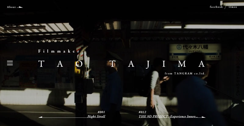
Filmmaker Tao Tajima’s site makes such a great use of space because as soon as it loads, the screen is filled with a full-size video of Tajima’s work while the necessary text is overlaid splendidly in white. What’s more, the transitions from one page to the next seem to shimmer and dissolve, making the whole site appear as one living, breathing entity. His videos can be accessed easily enough and come with a short and interesting backstory, while a ‘Play’ button simply begs you to click. A beautiful portfolio on a cutting-edge site.

We The Fans

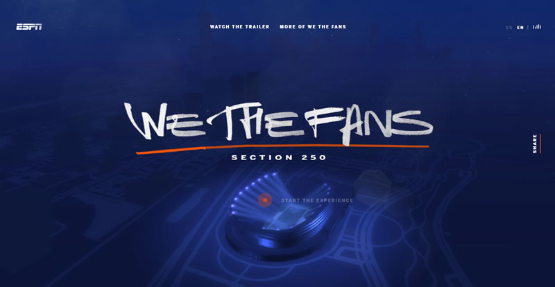
For ESPN’s upcoming documentary series following hardcore Chicago Bears season ticket holders, an accompanying website has been set up to add further detail and simply to hype the project. The user is greeted with a calming blue screen featuring a lit-up stadium, in addition to the typical sounds one hears in the midst of the action. After clicking ‘Start the experience,’ you can explore particular areas of the stadium and find out more details of the fans featured in the documentary. The overall experience is soothing, delightful and enjoyable, as we’re the ones who get to move around the (admittedly small) section of the digital stadium and read about the fans as and when we feel.

Ghost Recon Wildlands

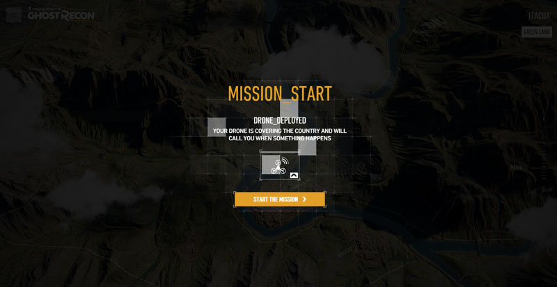
This site is made for the new Ghost Recon video game, and after the intense and quite shocking video, we’re treated with a map view of Bolivia, where we can play side missions relating to the story. While the missions are mostly observation and don’t involve the user doing too much, it’s still an immersive experience and overall, makes you feel invested in the world. The map design is fantastic, and the moving elements such as cars and helicopters turn it into something so much more.

If you’re a web designer who wants to be a trailblazer and smash preconceptions of what a website is capable of, then the AWWWARDS are merely a way of simultaneously motivating you to try harder and be inspired by the work of others.

Improve Your Brand With Typography

Post pobrano z: Improve Your Brand With Typography

Branding goes beyond the logo.  It also transcends the product or service and creates an emotional resonance with the public.  Typography assists with creating a brand.

As we move into a digital world, new products or brands are being given the opportunity to shine.

If you’re looking at building a brand which stands out amongst the competition, focus on the role typography plays in creating a deep emotional resonance with your audience.

Designers today work with digital and web technology.  This includes video, illustration and social media.  However, text-based website content plays an important role in building a relationship with an audience.

Once a video has been played, the audience will interact with the text of a website.  In fact, there is probably more text on a website than anything else.  As a designer, you can ensure this makes an impact.

Typeface helps to identify a brand
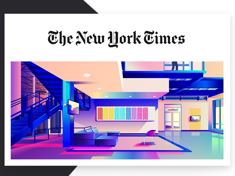
There are many free fonts available online, but if you’re looking at identifying your brand, paid fonts or unique font designs have their place.  Companies such as The New York Times and Coca-Cola are immediately recognizable by the fonts they use.

Using a single identifiable font gives your page a clean feel.  As a page is not simply made up of headers or titles, you can use other fonts as well.  Limiting your number while creating a neat feel to your page helps to create an identifiable brand which is familiar to readers.

Classic brands have used digital imagery to create an online presence.  This means that their brands remain easy to identify both online and off.  The quality of the design creates a positive experience for online viewers.

What do fonts add to a brand?

Fonts are expressive and give words a visual representation or language.  They are also durable because they help to create an identity for a brand that will remain in the minds of the public.

Brands such as Coca-Cola, American Eagle, Apple, Vogue, Disney and Calvin Klein all use distinctive fonts that help to identify their products and communicate their message.  It is no wonder companies pay such large quantities of money to have a logo designed.

Through using typography, brands communicate a message.  Think of Disney’s typeface logo, which communicates fun, imagination, vibrancy and nostalgia.  However, branding goes beyond the typeface used for a logo.
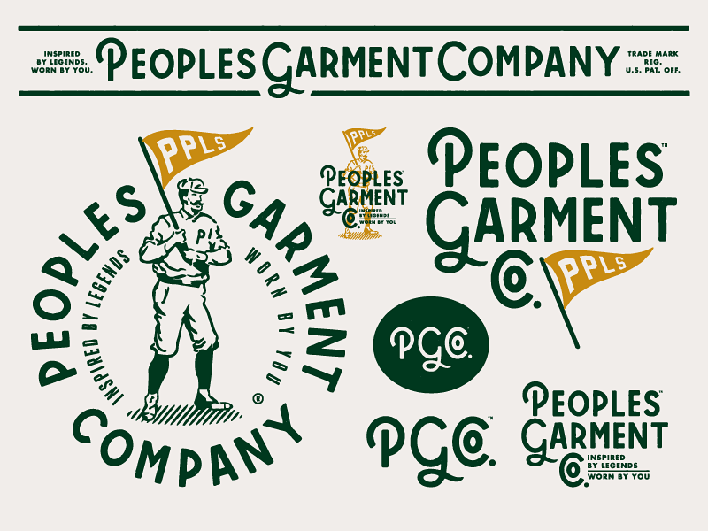
Aligning you’re the typeface on a website with a company’s message helps to add another layer to the brand.

Which typeface should you use?

There are a great number of different typeface fonts in the world.  Some are wonderful, some terrible, and opinion is sometimes personal.  However, there are some basic design principles to take into account when choosing a font.
Body fonts

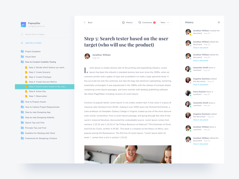
When selecting your body font choose lettering which is simple and easy to read.  Some fonts come with serifs or finishing strokes (serifs) between letters, such as Times New Roman.  Others are without these strokes and are sans serifs.

In the printing industry, serifs are often used for text.  Online, however, the copy is often sans serif, and fonts like Helvetica are popular choices.
Fonts for headings

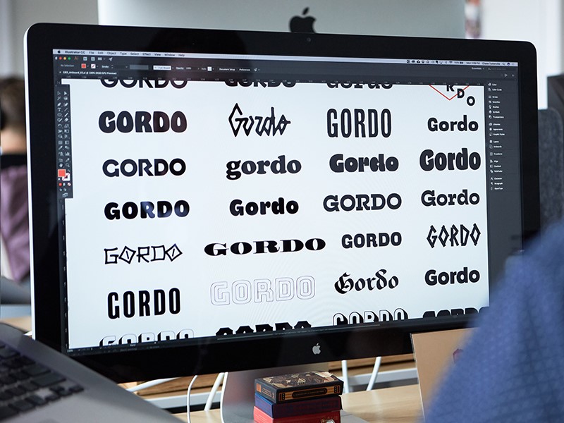
When selecting headings, fonts can be dramatic or full of flourish.  It should also be bold enough to command attention.  Display fonts break up your page, add contrast and direct the user’s attention.  You can use fonts which are eccentric, elegant, beautiful or full of flourish.

The font does have to be easy to read, however.  This is because headings often give a site user quick insight into the contents of a page.  If the font is difficult to read, it will lose its design purpose.
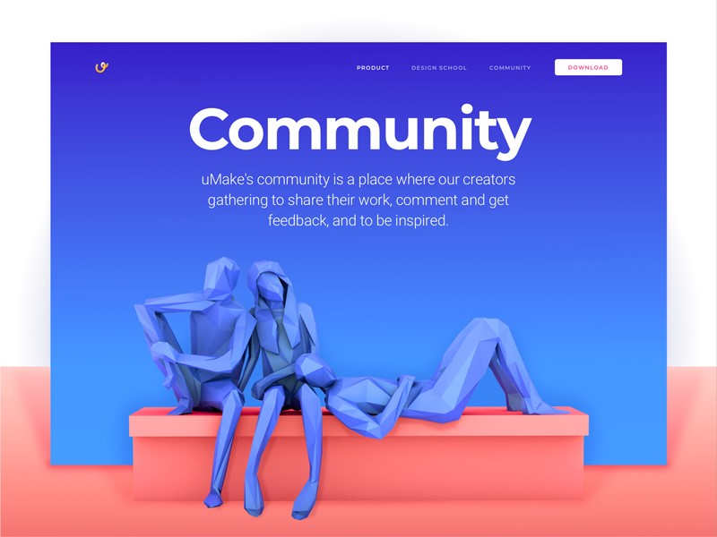
When working with a font, it is often helpful to limit your choice to two options, but vary the weight and height in order to create emphasis or hierarchy within the text.  This will help to create a sense of consistency as well as keep your page uncluttered.

When selecting a typeface, take the following into consideration:

Legibility:  Does your typeface feel familiar to your readers?  Are the letters easily distinguished?  Look at the spacing between the typeface.  Does it flow, so that readers can follow easily?

Readability:  Is it easy to make sense of the text?  Each letter should disappear into the background as the reader recognizes the overall shape of the words.  This makes the text enjoyable for the reader.

Suitability:  Look for a font which is suitable for the product or brand.  Apple, for example, uses a slick, clean-lined and modern typeface as a part of its brand.  Remember to pick a typeface which fits the purpose of your design as well.

Free versus paid for typeface

Many people use the term typeface and font interchangeably.  However, from a technical perspective, typeface refers to the name of the lettering (such as Helvetica or Arial) whereas font refers to the variation within the lettering, such as Bold or Light.

A typeface which is freely available online often comes in only one font.  This means it doesn’t come with a variety of weights and styles.  This might limit your options as a designer.

Many free fonts are also untested, which means that they do not always look the same across web browsers.  This can limit your ability to design your page according to the message you would like to portray.

Quality fonts which have been tested and which are helpful to the design industry are not normally free.  There is a range of typefaces which are fairly inexpensive (between $35 and $75) which will give you a range of options and weights in order to create a cohesive and well-designed site.
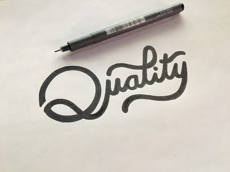
There are, however, some designers who charge a great deal for their lettering.  Determine your client’s budget in order to establish how much you have to spend on a typeface.

Services such as Adobe Typekit are helpful to access fonts across the web.  Typekit obtains fonts from different artists, testing them across different browsers to ensure uniformity and quality.  Users can obtain typeface from Typekit.

Creative Cloud is a desktop application which enables you to sync fonts available from Typekit onto your computer.

If you’d like to build up a library of font purchases on your own computer, you can use sites such as fonts.com or myfonts.com.

These fonts can be purchased by you for a set fee.  If you do choose to purchase your fonts, ensure that everybody who will need access to them will have a license to do so if you’re working in a team.  Otherwise, this might exclude certain members of your team from working on a project.

Digitalization adds new options to design

In the past, printing relied on letter setting. When a book or pamphlet was about to go to press, blocks of letters were arranged in a printing press.  Lettering options were limited.  It was also harder to make changes because this would mean rearranging all of the letters in the typeset.
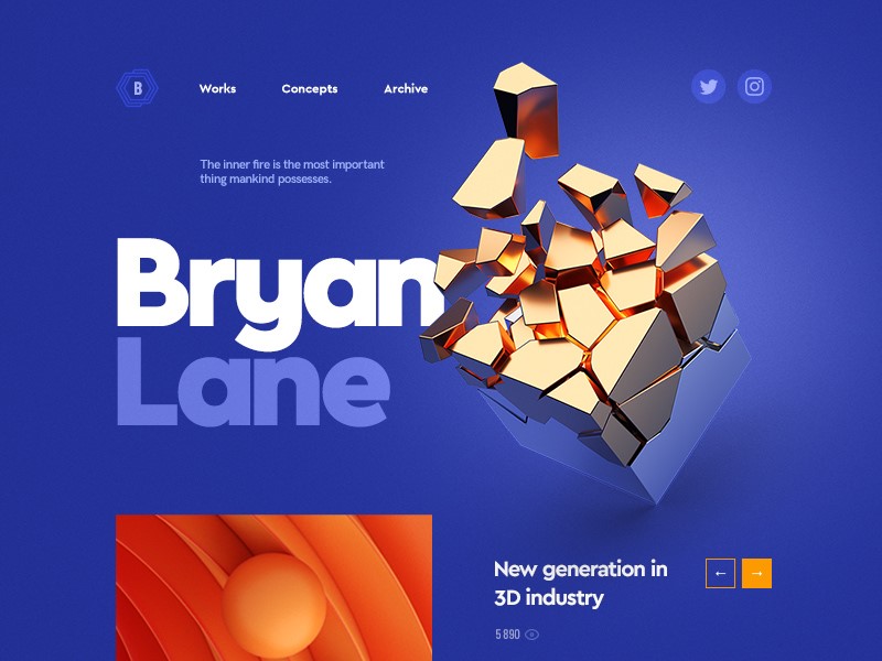
These days, it is much easier to make changes to a page as you go along.  This means making copy easier to read.  You can add or subtract headlines and break up the text.  You can also try out a number of different lettering styles until you are happy with your design.

How does your font speak to your audience?

Each typeface has its own personality.  Some fonts are clean-lined, sleek and modern.  Others speak of elegance and heritage. They bring a sense of trustworthiness and reliability.

The personality of your typeface should combine with the message behind a brand in order to send out the correct message.  This is particularly true with a logo.

Your design should send out a message or first impression to a potential client or customer.  This message will be clear before the client purchases a product.
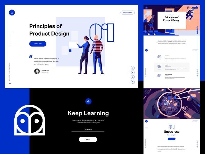
What meaning will the audience take from it?

A typeface will have to mean to your reader.  If a font is familiar, it will often feel as trustworthy as an old friend.  This doesn’t mean you have to limit your choices.  Instead, consider carefully what your brand is portraying.

Fonts are often related to products we’ve seen in the past and will remind viewers of a range of products, from pickles to candy.  Some fonts are associated with ceremony while others with technology or creativity.

When it comes to font, consider the size, weight and height of your typeface as well.  This will enable your font to whisper, shout or make a simple, bold statement.

As a designer, you have the ability to use type to create a statement.  And to ensure you are putting across the right message.

Understand how your message is received

The choice you make in selecting your font will determine how your readers determine a brand or product.  Are you contemporary, innovative, trustworthy or old fashioned?
How you present a brand will determine audience response.

Although some responses are subjective, it is often helpful to determine how an audience sees a design or product before making a final commitment.

Selecting the best choice for a brand often means determining how the audience interprets your design.

Researching or understanding public perceptions of a typeface will help you to establish the meanings you create for a product and the way that your brand speaks to the audience.

Your design should be invisible

If your design is doing its job, your audience shouldn’t notice your typeface.  This is because the whole is more than the sum of its parts.

You want your audience to gain an overall impression of a brand which transcends both your design and the product.
This might be one of creativity, honesty, reliability, innovation or even intelligence.  This is because it’s the emotional resonance with a brand which motivates a client to make a purchase.

An effective design assists clients to understand a product, organize information, easily digest what is being said and it attracts attention.

This enables the audience to build a story.  In effect, a good design is like the backstage work in a theatre which ensures the audience is able to resonate with the production.

Summary

The story we absorb, or the end product we perceive (form) follows a process of careful and practical planning or creation.  As designers, we want our work to be attractive.

However, it is the thought and creativity we put into it which will result in the emotional resonance with a brand or product.  It is therefore crucial that this is well thought through.  Without it, we simply create an attractive image.

Typography, when used with care, can turn a product into a brand which has a deep emotional resonance with its audience.

Why would you do that in CSS?

Post pobrano z: Why would you do that in CSS?

And by that, it’s usually some kind of CSS experiment, often an elaborate drawing or interaction.

For example, have you seen Lynn Fisher’s extraordinary A Single Div project? Not only are all these graphics drawn in just HTML and CSS, they are all created with (you guessed it) a single <div></div>.

Why would she do that? Here’s one pertinent possibility: it’s none of our business. We’re free to wonder, or even ask if it’s done respectfully enough. But does it really matter? Let’s stop short of assuming she doesn’t know what’s she’s doing, assuming it’s a twisted form of pain, or that she’s unaware of other technologies. Check out the example where she drew the official SVG logo with CSS and a single div. Woke.

A screenshot of the official SVG logo recreated using a single element in CSS on a yellow background.

I even kinda get it. I wrote a whole book about SVG because I think it’s underused. Are there „CSS drawings” that I think would be better as SVG for a production site meant to last? Sure.

How about this one?

See the Pen Pure CSS Biker by Julia Muzafarova (@miocene) on CodePen.

Jeepers creepers that’s something else. I would have guessed GreenSock was behind this at a quick glance. Speaking of, GreenSock has advocated right here on CSS-Tricks some techniques for smart animations. Part of that is breaking animations into parts and stitching them together into larger timelines for maintenance ease and „without getting bogged down by the process.”

So, did Julia Muzafarova do it wrong? Of course not. If there is a wrong way to animate a cartoon hipster on a bike in this world, I don’t wanna live here anymore. It’s 2,100 lines of meticulous positioning, coloring, and animating. Heck, it’ll work in some email clients if you really need to latch onto something „practical.”

Sasha Tran, a UI developer at Apple, shared her story of creating drawings in CSS last year. She drew something new everyday for 20 days during Codevember.

Even if I am not talented in hand illustrations, there is a way to express myself through other mediums. I found that medium to be in HTML and CSS. To level up and get to a point where I could create cute artwork, I focused on two things: the basics, and consistency. Working with basic CSS shapes like rectangles and basic properties like border-radius overtime gave me the muscle memory to progress into more intricate illustrations.

Significantly leveled up in a month and developed better CSS muscle memory. Huh. Speaking of shapes, there are plenty of ways to get tricky with those in CSS!

You could argue that pushing boundaries toward the impractical is what hones our skills for all that other work we have to do.

See the Pen CSS3 Thermostat by Daniel Stancu (@birkof) on CodePen.

You could argue that forcing yourself into restrictions is fuel for creativity.

See the Pen Pixel Hellboy by Servin (@servinnissen) on CodePen.

You could argue that stretching your brain creatively in these forced conditions helps build your confidence and widens your toolbox.

See the Pen Simple CSS Anchor by Joni Trythall (@jonitrythall) on CodePen.

You could argue that it’s just kinda fun.

See the Pen CSS Cheese (or sponge) by Hugo Giraudel (@HugoGiraudel) on CodePen.

The post Why would you do that in CSS? appeared first on CSS-Tricks.