I’ve been thinking about this post by Isabel Lee for the last couple of weeks — it’s all about how we should be more considerate when making designs in Sketch. They argue that we’re more likely to see real efficiency and organizational improvements in our work if we name our layers, artboards, and pages properly. Isabel writes:
Keeping a super organized Sketch file has helped me smooth out my design process and saved me time when I was trying to find a specific component or understand an archived design. For instance, I was looking for an icon that I used six months ago and it was (relatively) easy to find because all my artboards and layers were well-named and grouped reverse-chronologically. I was also able to cross-reference it with my meeting notes from around that time. If I hadn’t done any of that work (thanks Past Isabel!), I probably would’ve had to dig through all my old designs and look at each layer. Or worse — I would’ve had to recreate that icon.
Since I read this I’ve been doing the same thing and effectively making “daily commits” with the naming of my pages and it’s been genuinely helpful when looking back through work that I’ve forgotten about. But what I really like about this tidy-up process is how Isabel describes the way in which they could easily look back on their work, identify weaknesses in their design process, and how to become a better designer:
Aside from making it easier to find things, it’s also helped me cultivate good documentation habits when I want to analyze my old work and see where I could’ve made improvements. I revisited one of my old Sketch files and realized that I didn’t do enough research before diving into a million iterations for an initial idea I had.
Do you design digital products (or websites) and hand design files off to developers for implementation? If you answered yes, settle in! While the should-designers-codedebate rages on, we’re going to look at how adding a methodology to your design workflow can make you faster, more consistent, and loved by all developers… even if you don’t code.
Let’s dig in!
Why a methodology?
In the development world, it seems like at least half of your career is about staying up to date with new tech and leveling up your skills. While the pace may not be quite as frantic in the design landscape as it is in development, there definitely has been a huge shift in tools over the past three years or so.
Tools like Sketch have made a lot of the old pain of working in design files a thing of the past. Smart combinations of text styles, object styles, symbols, and libraries now mean sweeping changes are just one click away. No more picking through 40 Photoshop layers to make a single color change.
Yet, sweeping color changes in a marketing landing page is no longer the biggest design challenge. Design and development teams are now expected to deliver complex interfaces loaded with interaction and conditional states… for every device available now and the next day. Working as both a designer and developer, I have seen the workflow friction from both sides.
Beyond tools, designers need an approach.
Thinking in terms of „components”
If you work in the tech space in any capacity, you have likely heard of development frameworks such as React, Angular, or Vue.
Um yeah, I’m a designer so that doesn’t really concern me, bye.
Kinda. But if you’re hoping to do design work for modern digital products, there is a pretty big chance that said products will be built using one of these frameworks. No one expects an architect to build the structures themselves, but they better have a high-level understanding of the what the tools are and how they will be used.
So here’s what you need to know about modern front-end frameworks:
They have brought on a paradigm shift for developers in which products are built by combining a series of smaller components into complex systems which can adapt to different contexts and devices. This makes the code easier to maintain, and the entire system more flexible.
For a variety of legitimate reasons, many designers have not caught on to this paradigm shift as quickly as developers. We are missing a mental model for creating the pieces that make up these interfaces independently from their environment/pages/screens/viewports etc.
One such approach is Atomic Design.
What is Atomic Design?
First coined by Brad Frost, Atomic Design is a methodology which tries to answer a simple question: if hundreds of device sizes mean we can no longer effectively design „pages,” then how do we even design?
The answer lies in breaking down everything that could make up a „page” or „view” into smaller and smaller pieces, creating a „system” of blocks which can then be recombined into an infinite number of variations for our project.
You can think of it like the ingredients in a recipe. Sure, you could make muffins, but you could just as easily make a cake with the same list of ingredients.
Brad decided to use the chemistry analogy, and so he proposes that our systems are made up of:
Atoms
Molecules
Organisms
For the sake of simplicity, let’s take a look at how we might apply this to a website.
Atoms
Atoms represent the smallest building blocks which make up our user interfaces. Imagine a form label, a form input, and a button. Each one of those represents an atom:
A header, text block, and link each serve as atoms.
Molecules
Molecules are simply groups of atoms combined to create something new. For our purposes, we can think of molecules as groups of disjointed UI pieces which are combined to create a meaningful component.
The atoms come together to form a „card” component.
Organisms
Organisms are made up of groups of molecules (or atoms or other organisms). These are the pieces of an interface which we might think of as a „section.” In an invoicing application, an organism could be a dashboard combining a „new invoice” button (atom), a search form (molecule), a „total open” card (molecule), and table listing overdue invoices. You get the idea.
Let’s look at what a „featured block” organism might look like in our simple website:
A header (atom), three cards (molecules), an image (atom), and a teaser (molecule) are combined to form one featured block organism.
Using stacks for consistency
So, now that we have a mental model for the „stuff,” how do we go about creating these building blocks? Sketch is great out of the box, but the plugins available for it provide huge performance tools… just like text editors for developers. We will be using Sketch’s built-in symbols tools, as well as the amazing Stacks” feature from Anima App’s Auto-Layout plugin.
Using these tools will bring some priceless benefits which I will point out as we go, but at the very least you can count on:
better design consistency and faster iteration
a sanity check from using consistent spacing multipliers
faster reordering of content
help identifying design problems quickly and early on
What exactly are stacks?
If you’ve ever heard developers excitedly talk about flexbox for building layouts in CSS, then you can think of stacks as the Sketch equivalent. Stacks (like flexbox) allow you to group a series of layers together and then define their spacing and alignment on a vertical or horizontal axis.
Here we group three items, align them through their center, and set 48px vertical space between each one:
A simple stacked folder aligning and distributing three items.
The layers will automatically be group into a blue folder with an icon of vertical or horizontal dots to show what kind of stack you have.
Look at that! You just learned flexbox without touching a line of code. 😂
Nested stacks
The real power of stacks comes from nesting stacks inside other stacks:
Stacks can be nested inside of each other to create complex spacing systems.]
Here, we can see a card component made up of multiple stacks:
card__cta link from the previous example.
card__copy stack which handles the alignment & space for the header and text.
card__content which controls the spacing and alignment between the card__cta and card__copy stacks.
A quick note about layer naming
I almost always use the BEM naming convention for my components. Developers appreciate the logic when I have to to hand off design files because it often aligns with the naming conventions they are using in code. In the case where I’m developing the project myself, it gives me a bit of a head start as I’ve started thinking about the markup at the design stage.
If that’s super confusing, don’t worry about it. Please just make your colleagues’ job a little easier by organizing your layers and giving them descriptive names.
Stacks shmacks, I have great attention to detail and can do all this manually!
You’re absolutely right! But what about when you have carefully laid out 10 items, all of varying sizes, and now they need extra space between them? Or, you need to add a line of text to one of those items? Or, you need to split content into three columns rather than four?
That never happens, right? 😱
One of two things usually happens at this stage:
You start manually reorganizing all the things and someone’s paying for wasted time (whether it’s you or the client).
You kinda fudge it… after all, the developer surely knows what your original intentions were before you left every margin off by a couple pixels in your layout. ¯\_(ツ)_/¯
Here’s what stacks get you:
You can change the alignment or spacing options as much as you like with a simple value adjustment and things will just magically update.
You can resize elements without having to pick at your artboard to rejig all the things.
You can reorder, add, or remove items from the stack folder and watch the items redistribute themselves according to your settings—just like code. 🎉
Notice how fast it is to edit content and experiment with different layouts all while maintaining consistency:
Stacks and symbols make experimentation cheap and consistent.
OK, so now we know why stacks are amazing, how do we actually use them?
Creating stacks
Creating a stack is a matter of selecting two (or more) layers and hitting the stacks folder icon in the inspector. From there, you can decide if you are stacking your layers horizontally or vertically, and set the distance between the items.
Here’s an example of how we’d create an atom component using stacks:
Creating a horizontal stack with 20px spacing between the text and icon.
And, now let’s apply the stacks concept to a more complex molecule component:
Creating a card molecule using nested stacks.
Creating symbols from stacks
We’ve talked about the many benefits of stacks, but we can make them even more efficient by applying Sketch’s symbol tool to them. The result we get is a stack that can be managed from one source instance and reused anywhere.
Creating an atom symbol
We can grab that call-to-action stack we just created and make it a symbol. Then, we can use overrides for the text and know that stacks will honor the spacing:
Creating a symbol from a stack is great for ensuring space consistency with overrides.
If I decide later that I want to change the space by a few pixels, I can just tweak the stack spacing on the symbol and have it update on every instance 🎉
Creating a molecule symbol
Similarly, I can group multiple stacked atoms into a component and make that into a symbol:
Creating a card symbol from our stacks and call-to-action symbol.
Symbols + stacks = 💪
Wouldn’t it be nice if we could maintain the spacial requirements we set regardless of the tweaks we might bring to them down the line? Yes!
Replacing one item with another inside a component
Let’s assume our card component now requires a button rather than a link as a call-to-action. As long as we place that button in the correct stack folder, all the pixel-nudging happens automagically:
Because our symbol uses stacks, the distance between the copy and the call-to-action will automatically be respected.
Editing molecules and organisms on the fly 🔥
You might be thinking that this isn’t a huge deal and that adjusting the tiny spacial issue from the previous example would have taken just a moment without stacks. And you wouldn’t be wrong. But let’s refer back to our notions about atomic design for a moment, and ask what happens when we have far more complex „organisms” (groups of atoms and molecules) to deal with?
Similar to our mobile example from the beginning, this is where the built-in power of stacks really shines:
Stacks and symbols makes experimentation cheap and consistent.
With a library of basic symbols (atoms) at our fingertips, and powerful spacing/alignment tools, we can experiment and create endless variations of components. The key is that we can do it quickly and without sacrificing design consistency.
Complex layouts and mega stacks
Keeping with the elements we have already designed, let’s see what a layer stack might look like for a simple marketing page:
An example of an expanded layer stack.
Don’t let the initial impression of complexity of those stacks scare you. A non-stacked version of this artboard would not look so different aside from the color of the folder icons.
However it’s those very folders that give us all the power:
Layout experimentation can be fast and cheap!
We may not need to code, but we have a responsibility to master our tools for efficiency and figure out new workflows with our developer colleagues.
This means moving away from thinking of design in the context of pages, and creating collections of components… modules… ingredients… legos… figure out a metaphor that works for you and then make sure the whole team shares the vocabulary.
Once we do this, issues around workflow and collaboration melt away:
Speed and Flexibility
Carefully building components with symbols and using automated and consistent spacing/alignment with stacks does require a bit of time investment upfront. However, the return of easy experimentation and ability to change course quickly and at low cost is well worth it.
Consistency and UX
Having to think about how elements work as combinations and in different contexts will catch UX-smells early and expose issues around consistency before you’re 13 screens in. Changing direction by adjusting a few variables/components/spacing units beats nudging elements around an artboard all day.
Responsibility and Governance
A single 1440px page view of the thing you are building simply does not provided a developer with enough context for multiple screens and interaction. At the same time, crafting multiple high fidelity comps one tiny element at a time is a budget buster (and this is particularly true of app designs). So, what tends to happen on small teams? The developer gets the one gorgeous 1440px view… aaaaand all the cognitive overhead of filling in the gaps for everything else.
Providing the details is our job.
Atomic design gave us speed, creative freedom, and flexibility. It changed everything.”
If we work with developers on digital products, we should be excited about learning how the sausage is made and adapt our approach to design accordingly. Our tools may not evolve quite as quickly as JavaScript frameworks, but if you haven’t taken a peek under to hood of some of these apps in the last couple of years, this is a great time to dig in!
In today’s
tutorial, we’re going to embark on a creative journey into the land of
Minecraft and learn how to create a cute little character using Affinity
Designer’s handy Isometric Grid.
So assuming you’re a fan of the game, quickly get a coffee refill and
let’s jump straight into it!
Also, don’t forget you can always expand the
project by heading over to GraphicRiver where you’ll find a great selection of vector pixel art.
1. How to Set Up a
New Project File
Assuming you
already have Affinity up and running, let’s set up a New Document by going to File
> New (or by using the Control-N
keyboard shortcut) which we will adjust as follows:
Type:
Web
Document Units: Pixels
Create artboard:
checked
Page Width:
800 px
Page Height:
600 px
DPI: 72
2. How to Set Up
an Isometric Grid
As soon as we’ve
created our document, we’ll want to set up a custom isometric grid, which will
provide visual guidance when it comes to drawing the shapes of our character.
Step 1
To do this, simply
go to View > Grids and Axis Manager,
where we will first enable the Show grid option, and then uncheck the Use
automatic grid one so that we can set up a custom one as follows:
Grid type: Isometric
Spacing:
16 px
Divisions: 4 px
Step 2
Once the grid is all set up, we need to make sure that our shapes are
actually snapping to it, so go to View
> Snapping Manager (or use the little Magnet icon) where we will make sure it’s enabled, and then uncheck
all the options except the Snap to grid
one.
Normally, we would have the Force pixel alignment option enabled, but due to the angles of the
grid’s lines, our shapes will end up having comma-delimited values, which as
you know can’t snap to the Pixel Grid.
Step 3
As you can see, the resulting grid is made out of multiple 16 px tall rhombi, which have 4 subdivisions along each of their
sides (16 in total), which become
clearly visible once you zoom in on them. We are going to rely on them in the
process of defining the size of each and every shape, using the outer edges of
the rhombus as a Width measuring
unit, and its inner vertical height as a Height
measuring one.
To keep things simple, I’m going to use some
simple annotation where R= one edge/height of the larger rhombus,
and a small r= one edge/height of the
smaller division.
3. How to Create the Character’s Lower Body
As soon as we’ve created our custom isometric grid, we can start working on
the actual character, and we will do so by creating a blank version of its
entire body one section at a time.
Step 1
Using the Pen
Tool (P), draw the front section of the legs using a 6 x 4 R shape, which we will color using #596C7B and then position
as seen in the reference image.
Step 2
Add the side section of the legs using a 2 x6 R shape, which we will color using #384C57 and then position
onto the right side of the previous one.
4. How to Create the Character’s Upper Body
Now that we have the main shapes of the legs, we can move up and start
working on the upper body, which we will create one shape at a time.
Step 1
Start by creating the torso using a copy (Control-C > Control-V) of the legs’ front section, which we will position above, making sure
to change its color to #E47145.
Step 2
With the torso in place, we can now start working on the character’s arms
and shoulders.
Create the main shape for the left arm using a 2 x6 R rectangle, which we will color using #96693B and then position
next to the torso as seen in the reference image.
Step 3
Add the front section of the right hand using a
copy (Control-C > Control-V) of
the one that we’ve just finished working on, which we will position on the
opposite side of the torso.
Step 4
Create the side section using a copy (Control-C > Control-V) of the shape
that we’ve just created, which we will horizontally reflect (right click > Transform > Flip Horizontal),
and then position on its right side.
Step 5
Add the shoulders and upper section of the torso
using a single shape, which we will color using #E58047 and then position as
seen in the reference image. Once you’re done, make sure you select and group (Control-G) all of the upper body’s
composing shapes together before moving on to the next section.
5. How to Create
the Character’s Head
Since at this
point we pretty much have all the sections of the character’s body, we can move
up and focus on creating the main shapes for its head.
Step 1
Start by drawing the front section using a 4 x 4 R shape, which we will color using #96693B and then position
on the body as seen in the reference image.
Step 2
Add the side section using a copy (Control-C
> Control-V) of the shape that we’ve just created, which we will color
using #3E2815 and then position on the right side, making sure to
horizontally reflect it (right click
> Transform > Flip Horizontal).
Step 3
Finish off the head by drawing a 4
x 4 R shape which we will color using #6D4A2D and then position on top of
the two rectangles, as seen in the reference image. Once you’re done, select and
group all three shapes together using the Control-G
keyboard shortcut.
Quick tip: at this point, it would be a good idea to start
organizing our project by opening up the Layers
panel and naming the different sections that we’ve grouped, so that we can
more easily target and navigate the body parts of our character.
6. Adding Details
to the Character’s Head
Now that we have
the blank version of our character, we can begin adding details to it, and we
will do so from the head down.
Step 1
Draw the mouth using a 4 x 2 r shape,
which we will color using #BD9169 and then position towards the lower edge of
the head’s front section, as seen in the reference image.
Step 2
Create the left eye using two 2 x
4 r shapes (one colored using #FFFFFF and one using #3E2815), which we will
group (Control-G) and then position
on the upper-left section of the mouth, at a distance of just 1 r from its top edge.
Step 3
Add the right eye using a copy of the one that we’ve just grouped, which
we will position on the
opposite side of the mouth, making sure to flip their colors.
Step 4
With both eyes in place, we can quickly draw the hair segment (#4C341E)
using the reference image as our main guide. Take your time, and once you’re
done, move on to the next step.
Step 5
Finish detailing the current section by adding the little golden
earring using a 1 x 2 r shape, which
we will color using #E19B4F and then position on the side section of the
head, aligning it to the lower eye line. Once you’re done, select and group all
of the head’s details together (Control-G)
before moving on to the next section.
7. Adding Details
to the Character’s Upper Body
Now that we’ve
finished working on the head, we can shift our focus over to the character’s
body, where we will gradually start adding details to it.
Step 1
Create the front section of the left sleeve using a copy (Control-C > Control-V) of the arm’s
main shape, which we will then adjust by first changing its color to #E47145 and then cutting its height in half.
Step 2
Add the front section of the right sleeve using a copy (Control-C > Control-V) of the one
that we’ve just finished working on, which we will position on the opposite
side of the torso.
Step 3
Draw the lower section of the sleeve using the reference image as your
main guide, making sure to select and group (Control-G) the two shapes together once you’re done.
Step 4
Create the lower section of the right sleeve using the same
process used for the left one, making sure to select and group the resulting
shape and the front section together using the Control-G keyboard shortcut.
Step 5
Create the right sleeve’s side section using a copy (Control-C > Control-V) of the arm,
which we will adjust by first setting its color to #C0512A and then shortening
its height from 6 R to 4 R.
Step 6
Add the neck cutout using the reference image as your main guide, making
sure to color the resulting shape using #96693B.
Step 7
Separate the front section of the head from the neck using an 8 x 2 r block, which we will color using #784A27
and position onto the cutout.
Step 8
With the Fill color set to #4C341E,
draw the front hair segments using the reference image as your main guide. Take
your time, and once you’re done, move on to the next step.
Step 9
Add the shoulder hair segments using #4C341E for the front section and #3E2815 for the top one, making sure to select and group the two together
afterwards using the Control-G
keyboard shortcut.
Step 10
Draw the belt using a 16 x 2 r shape,
which we color using #343E4C and then position at a distance of 2 r from the bottom edge of the shirt’s
front section.
Step 11
Add the shirt’s bottom front details using a copy (Control-C > Control-V) of the ones that we’ve just created for
the sleeves, which we will position as seen in the reference image.
Step 12
Finish the detailing process of the current part of the
illustration by adding the side section of the shirt’s bottom, which we will
color using #C0512A. Once you’re done, create individual groups (Control-G) of the different sections,
positioning them within the main shapes with the help of the Layers panel.
8. Adding Details to the Character’s Lower Body
Now that we’ve finished adding the different details to the upper body,
we can shift our focus towards the legs and gradually add details to those as
well.
Step 1
Start by creating the side section of the boot,
using a copy (Control-C > Control-V)
of the underlying leg, which we will adjust by first setting its color to #152028 and then shortening its Height to
just 14 r.
Step 2
With the color set to #343E4C, draw the main
shape for the front section of the right foot’s boot using the reference image
as your main guide.
Step 3
Finish detailing the legs, and with them the illustration itself, by
adding the left boot using a copy (Control-C
> Control-V) of the one that we’ve just finished working on, which we
will position on the left side of the legs. Once you’re done, select and
group all of the details together using the Control-G keyboard shortcut, before hitting that save button.
9. A Little
Touching Up
At this point, you may have noticed that some of our
character’s neighboring shapes ended up having little white gaps between
them, which has to do with the way the software handles aliasing, which is a
problem that the people at Serif are aware of.
The official method of fixing this annoying
issue is to add duplicates of the shapes where this happens, which I’ve tested
out and seems to work. It’s not a perfect method, but it’s all we have
until we get a software update.
Great Job!
There you have it, fellow Minecraft lovers, a cute little character created using Affinity’s
powerful isometric grid.
As always, I hope
you’ve managed to follow each and every step and most importantly learned
something new and useful along the way.
That being said, if you have any questions, feel free to post them
in the comments section and I’ll get back to you as soon as I can!
In this tutorial, you will learn how to create an amazing energy
effect. I will explain everything in so much detail that everyone can
create it, even those who have just opened Photoshop for the first time.
The effect shown above is the one I will show you how to create
in this tutorial. If you would like to create the even more advanced
energy effects shown below, using just a single click and in only a few
minutes, then check out my Energy Photoshop Action.
What You’ll Need
To recreate the design above, you will need the following resources:
First, open the photo that you want to work with. To open your photo, go to File > Open, choose your photo, and click Open. Now, before we get started, just check a couple of things:
Your photo should be in RGB Color mode, 8 Bits/Channel. To check this, go to Image > Mode.
For best results, your photo size should be 2000–4000 px wide/high. To check this, go to Image > Image Size.
Your photo should be the Background layer. If it is not, go to Layer > New > Background from Layer.
2. How to Select the Subject
Step 1
In this section, we are going to make a selection of our subject and then copy the subject to a separate layer. Choose the Quick Selection Tool(W) and select the background of the photo. Use the Shift-Alt buttons on your keyboard to add or subtract areas from the selection. After you’ve made a perfect selection, press Control-Shift-I on your keyboard to invert the selection.
Step 2
Now go to Select > Modify > Smooth and set the Sample Radius to 5 px. Then, go to Select > Modify > Contract andset Contract By to 2 px. After that, go to Select > Modify > Feather and set the Feather Radius to 2 px as shown below:
Step 3
Press Control-J on your keyboard to create a new layer using the selection, and name this layer Subject.
3. How to Create the Background
Step 1
In this section we are going to create the background. Select the Background layer, go to Layer > New Fill Layer > Solid Color to create a new solid color fill layer, name it Background Color, and choose the color #000000 as shown below:
Step 2
Now go to Layer > New > Layer to create a new layer and name it Temp.
Step 3
Press D on your keyboard to reset the swatches and go to Filter > Render > Clouds.
Step 4
Now press Control-J on your keyboard to duplicate this layer. Then, go to Filter > Distort > Twirl and set the Angle to 50° as shown below:
Step 5
Change the Blending Mode of this layer to Darken and press Control-J on your keyboard to duplicate this layer. Then, go to Edit > Transform > Flip Horizontal and then to Edit > Transform Flip Vertical to flip this layer both horizontally and vertically.
Step 6
Now Shift-click on the Temp layer to select all layers between and press Control-E on your keyboard to merge them into one layer. Then, press Control-J to duplicate this layer.
Step 7
Press Control-I on your keyboard to invert this layer. Then, press D to reset the swatches and go to Filter > Render > Difference Clouds.
Step 8
Now press Control-I on your keyboard to invert this layer. Then, go to Filter > Distort > Twirl and set the Angle to 50° as shown below:
Step 9
Change the Blending Mode of this layer to Multiply. Then, Control-click on the Temp copy 2 layer to select both layers at the same time and press Control-E on your keyboard to merge them into one layer.
Step 10
Now press Control-T on your keyboard to transform this layer and set the Width and Height to 200% as shown below:
Step 11
Now go to Layer > Layer Mask > Hide All to add a layer mask that hides the whole layer. Then, set the foreground color to #ffffff, choose the Brush Tool (B), pick a soft brush, and brush where you want texture to appear. Feel free to change the Hardness of the brush.
Step 12
Name this layer Background_Texture_1. Then, select the Background Color layer, go to Layer > New > Layer to create a new layer, and name it Background_Texture_2.
Step 13
Press D on your keyboard to reset the swatches, and go to Filter > Render > Clouds.
Step 14
Now press Control-T on your keyboard to transform this layer and set the Width and Height to 200% as shown below:
Step 15
Now go to Filter > Distort > Twirl and set the Angle to 50° as shown below:
Step 16
Go to Image > Adjustments > Levels and enter the settings below:
Step 17
Now change the Opacity of this layer to 10%.
Step 18
Select the Background_Texture_1 layer, go to Layer > New > Layer to create a new layer, and name it Temp.
Step 19
Press D on your keyboard to reset the swatches and go to Filter > Render > Clouds.
Step 20
Now press Control-T on your keyboard to transform this layer and set the Width and Height to 150% as shown below:
Step 21
Press Control-J on your keyboard to duplicate this layer. Then, go to Filter > Distort > Twirl and set the Angle to 50°.
Step 22
Now change the Blending Mode of this layer to Screen. Then, Control-click on the Temp copy 2 layer to select both layers at the same time and press Control-E on your keyboard to merge them into one layer.
Step 23
Now go to Layer > Layer Mask > Hide All to add a layer mask that hides the whole layer. Then, set the foreground color to #ffffff, choose the Brush Tool (B), pick a soft brush, and brush where you want texture to appear. Feel free to change the Hardness of the brush.
Step 24
Change the Blending Mode of this layer to Screen and set the Opacity to 50%. Then, name this layer Background Glow.
4. How to Blend the Subject
Step 1
In this section we are going to blend the subject more with the background. Select the Subject layer and Control-click on this layer thumbnail to make a selection of this layer. Then, go to Select > Modify > Contract and set the Contact By to 25 px. After that, go to Select > Modify > Feather and set the Feather Radius to 50 px as shown below:
Step 2
Now go to Layer > Layer Mask > Reveal Selection to add a layer mask that reveals the selected area of the layer. Then, in the Properties panel, set the Density of the layer mask to 55% as shown below:
Step 3
Press Control-J on your keyboard to duplicate this layer. Then, press Control-Shift-U to desaturate this layer, go to Filter > Other > High Pass, and set the Radius to 30 px.
Step 4
Now go to Image > Auto tone and then to Image > Auto Contrast to make auto-corrections of this layer tone and contrast. Then, go to Edit > Adjustments > Levels and enter the settings below:
Step 5
Change the Blending Mode of this layer to Overlay and set the Opacity to 50%. Then, name this layer Subject Details.
Step 6
Control-click on the Subject layer to select both layers at the same time. Then, go to Layer > New > Group from Layers to create a new group from the selected layers and name it Main Subject.
Step 7
Now go to Layer > Layer Mask > Reveal All to add a layer mask that reveals the whole layer group. Then, set the foreground color to #000000, choose the Brush Tool (B), pick a soft brush, and brush over the areas that are left from the background.
5. How to Create the Subject Glow
Step 1
In this section we are going to create the subject glow. Control-click on the Subject layer thumbnail to make a selection of this layer. Then, Control-Alt-Shift-click on the layer mask of the Main Subject layer group to intersect the selection. After that, go to Select > Modify > Contract and set Contract By to 10 px.
Step 2
Now press Control-Shift-I on your keyboard to invert the selection. Then, Control-Alt-Shift-click on the Subject layer thumbnail to intersect the selection. After that, Control-Alt-Shift-click on the layer mask of the Main Subject layer group to intersect the selection again.
Step 3
Select the Background layer and press Control-J on your keyboard to create a new layer using the selection. Then, drag this layer to the top of the layers in the Layers panel.
Step 4
Now go to Filter > Blur > Gaussian Blur and set the Radius to 10 px as shown below:
Step 5
Change the Blending Mode of this layer to Linear Dodge (Add) and set the Opacity to 70%. Then, name this layer Subject_Glow_1.
Step 6
Now Control-click on the Subject layer thumbnail to make a selection of this layer. Then, Control-Alt-Shift-click on the layer mask of the Main Subject layer to intersect the selection. After that, go to Layer > New > Layer to create a new layer and name it Temp.
Step 7
Set foreground color to #ffffff. Then, go to Edit > Fill and set Contents to Foreground Color, Mode to Normal, and Opacity to 100%.
Step 8
Now press Control-D on your keyboard to deselect. Then, press Control-J to duplicate this layer. After that, go to Filter > Blur > Gaussian Blur and set the Radius to 100 px.
Step 9
Name this layer Subject_Glow_2 and drag it just below the Main Subject layers group in the Layers panel.
Step 10
Now select the Temp layer, go to Filter > Blur > Gaussian Blur, and set the Radius to 100 px.
Step 11
Name this layer Subject_Glow_3 and drag it just below the Subject_Glow_2 layer in the Layers panel.
6. How to Make the Final Adjustments
Step 1
In this section we are going to make final adjustments to the design. Select the Subject_Glow_1 layer, go to Layer > New Adjustment Layer > Color Balance to create a new color balance adjustment layer and name it Color_1.
Step 2
Now Double-click on this layer thumbnail and in the Properties panel enter the settings below:
Step 3
Go to Layer > New Adjustment Layer > Curves to create a new curves adjustment layer and name it Color_2. Then, drag this layer just below the Color_1 layer in the Layers panel.
Step 4
Now Double-click on this layer thumbnail and in the Properties panel enter the settings below:
Step 5
Press D on your keyboard to reset the swatches. Then, go to Layer > New Adjustment Layer > Gradient Map to create a new gradient map adjustment layer and name it Overall Contrast. After that, drag this layer to the top of the Layers panel.
Step 6
Now change the Blending Mode of this layer to Soft Light and set the Opacity to 10%.
Step 7
Go to Layer > New Adjustment Layer > Hue/Saturation to create a new hue/saturation adjustment layer and name it Overall Saturation.
Step 8
Now Double-click on this layer thumbnail and in the Properties panel set the Saturation to +7 as shown below:
Step 9
Go to Layer > New Adjustment Layer > Levels to create a new levels adjustment layer and name it Overall Brightness.
Step 10
Now Double-click on this layer thumbnail and in the Properties panel enter the settings below:
Step 11
Select the Subject layer, go to Layer > New Adjustment Layer > Hue/Saturation to create a new hue/saturation adjustment layer and name it Subject_Color_Correction.
Step 12
Now press Control-Alt-G on your keyboard to create a clipping mask. Then, Double-click on this layer thumbnail and in the Properties panel, choose the Cyans preset color range, and set Hue to +55 and Saturation to -80 as shown below:
Step 13
Select the Overall Brightness layer, press Control-Alt-Shift-E on your keyboard to make a screenshot, and then press Control-Shift-U to desaturate this layer. Then, go to Filter > Other > High Pass and set the Radius to 2 px.
Step 14
Name this layer Overall Sharpening and change the Blending Mode of this layer to Vivid Light.
You Made It!
Congratulations, you have succeeded! Here is our final result:
If you would like to create the even more advanced
energy effects shown below, using just a single click and in only a few
minutes, then check out my Energy Photoshop Action.
The action works so you simply fill in your subject with a color and
just play the action. The action will do everything for you,
giving you fully
layered and customizable results. The action will also create 30 preset color looks that you can choose
from, and there are 65 high-quality fractal brushes included with the
action that you can use to build the designs even further.
The action comes with a detailed video tutorial that demonstrates how to use the action and customize the results to get the most out of the effect.
There’s been two really interesting videos released recently that use the „Local Overrides” feature of Chrome DevTools in order to play with web performance without even touching the original source code.
The big idea is that you can literally edit CSS and reload the page and your changes stick. Meaning you can use the other performance testing tools inside DevTools to see if your changes had the effect you wanted them to have. Great for showing a client a change without them having to set up a whole dev environment for you.
Say you’re trying to pull off a design effect where the corner of an element are cut off. Maybe you’re a Battlestar Galactica fan? Or maybe you just like the unusual effect of it, since it avoids looking like a typical rectangle.
I suspect there are many ways to do it. Certainly, you could use multiple backgrounds to place images in the corners. You could just as well use a flexible SVG shape placed in the background. I bet there is also an exotic way to use gradients to pull it off.
But, I like the idea of simply taking some scissors and clipping off the dang corners. We essentially can do just that thanks to clip-path. We can use the polygon() function, provide it a list of X and Y coordinates and clip away what is outside of them.
Check out what happens if we list three points: middle top, bottom right, bottom left.
Instead of just three points, let’s list all eight points needed for our notched corners. We could use pixels, but that would be dangerous. We probably don’t really know the pixel width or height of the element. Even if we did, it could change. So, here it is using percentages:
.module {
  clip-path:
    polygon(
      0% 5%,     /* top left */
      5% 0%,     /* top left */
      95% 0%,    /* top right */
      100% 5%,   /* top right */
      100% 95%,  /* bottom right */
      95% 100%,  /* bottom right */
      5% 100%,   /* bottom left */
      0 95%      /* bottom left */
    );
}
That’s OK, but notice how the notches aren’t at perfect 45 degree angles. That’s because the element itself isn’t a square. That gets worse the less square the element is.
We can use the calc() function to fix that. We’ll use percentages when we have to, but just subtract from a percentage to get the position and angle we need.
.module {
  clip-path:
    polygon(
      0% 20px,                 /* top left */
      20px 0%,                 /* top left */
      calc(100% - 20px) 0%,    /* top right */
      100% 20px,               /* top right */
      100% calc(100% - 20px),  /* bottom right */
      calc(100% - 20px) 100%,  /* bottom right */
      20px 100%,               /* bottom left */
      0 calc(100% - 20px)      /* bottom left */
    );
}
And you know what? That number is repeated so many times that we may as well make it a variable. If we ever need to update the number later, then all it takes is changing it once instead of all those individual times.
This may go without saying, but make sure you have enough padding to handle the clipping. If you wanna get really fancy, you might use CSS variables in your padding value as well, so the more you notch, the more padding there is.
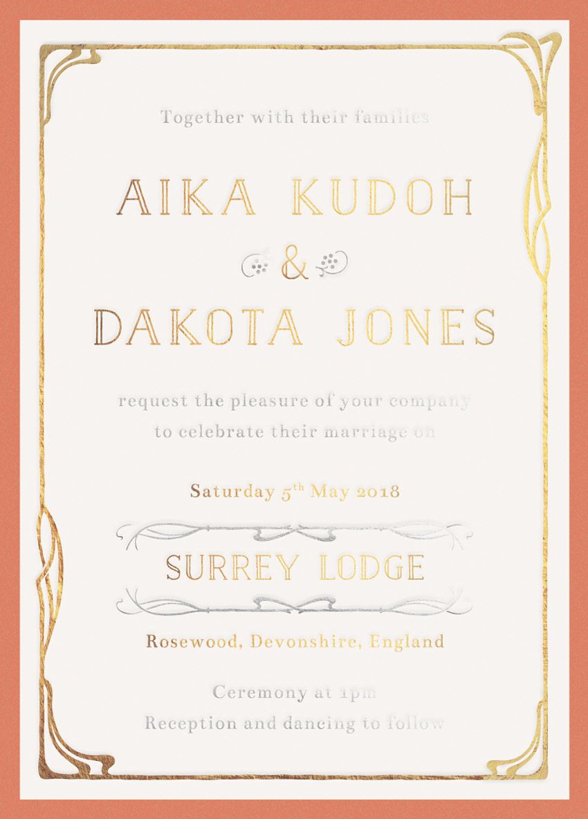
Art Nouveau is a romantic, decorative design style that works beautifully for wedding stationery. Here, we’ll give a modern update to this ornate style with this easy-to-create wedding invitation.
In this tutorial suitable for relative beginners, we’ll create the layout in Adobe InDesign and use Adobe Illustrator to edit some Belle Époque-style graphics.
The design we’re going to create here is made up of three separations: a full-color background, a gold metallic foil layer, and a silver metallic foil layer. We’ll look at how to set up the layout and export the separations ready for printing.
Let’s get started!
What You’ll Need to Create Your Invite
As well as access to InDesign and Illustrator, you’ll also need to download the following vector illustrations and font files:
Once you’ve installed the fonts onto your computer, you’re ready to start creating your invitation.
1. How to Create an Elegant Backdrop for Your Invite
Step 1
Open up Adobe InDesign, and go to File > New > Document.
With the Intent set to Print and Number of Pages to 1, uncheck the Facing Pages box. Set the Width of the invite to 4.5 in and Height to 6.25 in, to create a standard-size card. Add Margins of 0.1575 in, and a Bleed of 0.25 in, before clicking OK.
Step 2
Expand the Layers panel (Window > Layers) and double-click on Layer 1 to rename it Background.
Click on the Create New Layer button at the bottom of the panel and rename this layer Gold Foil. Then create a third layer, and rename this Silver Foil.
Lock all layers except the bottom Background layer.
Step 3
Expand the Swatches panel (Window > Color > Swatches) and create a New Color Swatch.
Set the Type to Process, Mode to CMYK and levels to C=13 M=52 Y=56 K=2. Click Add and OK.
Create a second new CMYK swatch, setting the levels to C=9 M=71 Y=66 K=1. Click Add and OK, as before.
Create a final new swatch, C=5 M=4 Y=6 K=0.
Step 4
Take the Rectangle Tool (M) and drag across the whole page, extending the shape up to the edge of the bleed.
From the Swatches panel, set the Fill of the rectangle to C=13 M=52 Y=56 K=2.
With the rectangle selected, head up to Object on the main menu, and Effects > Inner Glow.
Set the Mode to Overlay, and set the Effect Color to your new red swatch, C=9 M=71 Y=66 K=1. Bring the Opacity down to around 35%.
Set the Source to Center and increase the Noise to around 100%. This will add a bit of grainy, vintage-style texture to the color. Then click OK.
Step 5
Create a new rectangle in the center of the invite using the Rectangle Tool (M) and rest the edges of this against the margin line.
Set the Fill of this shape to your new pale swatch, C=5 M=4 Y=6 K=0.
2. How to Add Gold Foil Elements to Your Invite
The invite as it is presented here is made up of three colorways: a full-color background, a gold metallic foil layer, and a silver metallic foil layer.
Here we’ll start to build up the gold separation layer.
Step 1
Minimize the InDesign window for a moment, and open up the ‘Vitis Combined Elements.eps’ file from your Art Nouveau ornaments pack in Illustrator. Right-Click > Ungroup the elements.
Select the border design at the top-left corner of the artboard and Edit > Copy.
Step 2
Head back to your InDesign document.
Return to the Layers panel and lock the Background layer. Unlock the layer above, Gold Foil.
Edit > Paste the vector border directly into your InDesign document. Position it centrally, nestled inside the border of the pale central rectangle, as shown below.
I’ve switched the Fill of the border to a gold swatch, purely to demonstrate the color difference. But in your own work you should keep this set to [Black](C=0 M=0 Y=0 K=100).
Step 3
Back in Illustrator momentarily again, open up the other vector file in your ornaments pack, ‘Vitis Combination Ornaments Main Set.eps’. Right-Click > Ungroup the elements.
Select one of the corner decorations, as highlighted in the image below, and Edit > Copy.
Step 4
Back in InDesign, Edit > Paste the vector onto the page, and move up to the top-left corner of the border, resizing it to fit snugly onto the design.
Select the corner element, and Edit > Copy, Edit > Paste. Right-Click on the pasted vector and Transform > Rotate 180 Degrees.
Position it over on the bottom-right corner of the border.
Step 5
Take the Type Tool (T) and drag to create a long text frame over the top third of the invite.
Type in the first name of the couple, and from either the top Controls panel or the Character panel (Window > Type & Tables > Character) set the Font to Naive Inline, Size 26 pt, and Tracking to 100.
From the Paragraph panel or the Controls panel, set the text to Align Center.
Edit > Copy, Edit > Paste the text frame twice, moving these below the first. Edit the central frame to have an ampersand (&), and the lower frame to read the second name.
Step 6
Create three more text frames across the lower half of the page, with the date first, set in Bentham, Size 11 pt.
Then set the venue in Naive Inline, Size 18 pt. Finally, set the location of the wedding in Bentham, Size 11 pt.
3. How to Add a Touch of Silver to Your Invite
With the gold elements finished, we can now start to build up the silver foil elements on our design.
Step 1
Lock the Gold Foil layer and unlock the layer above, Silver Foil.
Create a text frame at the top of the invite, reading ‘Together with their families’, set in Bentham, Size 11 pt.
Copy and Paste the text frame, moving it between the second name and the date text frame, editing the text to read ‘request the pleasure of your company to celebrate their marriage on’.
Paste a final text frame at the bottom of the invite, reading ‘Ceremony at (time) / Reception and dancing to follow’.
Step 2
Head back to the ‘Vitis Combination Ornaments Main Set.eps’ file in Illustrator. Select the small berries icon (highlighted below), and Edit > Copy.
Edit > Paste the illustration straight into your InDesign document, positioning it on the left side of the ampersand.
Copy and Paste the icon, and then Right-Click > Transform > Rotate 180 Degrees.
Position it on the right side of the ampersand.
Step 3
Head back to the ‘Vitis Combination Ornaments Main Set.eps’ Illustrator document, and select one of the long horizontal sections of a border, like the one highlighted below. Then Edit > Copy it.
Back in InDesign, Edit > Paste the element in, positioning it below the venue name.
Copy and Paste the border and Right-Click > Transform > Flip Vertical.
Position this above the venue name, to frame it.
4. How to Prepare Your Invite as Separations
If you’re going to ask your printer to apply metallic foiling to your invite, you’ll need to create ‘separations’ of your file, splitting the document into separate PDFs. Here we’ll look at how to create three separations: a full-color CMYK layer, a gold foil layer, and a silver foil layer.
Step 1
Make sure you’re happy with the final design of your invite, and check that the details of the event and spelling are correct.
Then switch off the visibility of the top two Foil layers, and make sure Background is visible.
Go to File > Export. Name this file ‘Invite_Background Full-Color’, and choose Adobe PDF (Print) from the Format menu below. Then click Save.
Step 2
In the Export Adobe PDF window that opens, set the Adobe PDF Preset to Press Quality (at the top).
Click on Marks and Bleeds in the window’s left-hand menu, and check both All Printer’s Marks and Use Document Bleed Settings.
Then click Export to create your first separation PDF.
Step 3
Back in your InDesign document, switch off the visibility of the Background layer and switch on Gold Foil.
Make sure all the elements on this layer are set in [Black].
Then head up to File > Export. Choose Adobe PDF (Print) for the Format as before, and name the file ‘Invite_GOLD FOIL SEPARATION’, before clicking Save.
In the window that opens, set the Preset to Press Quality, as before, but this time only check Crop Marks and Use Document Bleed Settings under the Marks and Bleeds options.
Then click Export.
Step 4
To create your final separation, make sure only the top layer, Silver Foil, is visible. Ensure that all the elements sitting on this layer are set to [Black].
Go to File > Export, this time naming the Adobe PDF (Print) file ‘Invite_SILVER FOIL SEPARATION’.
In the Export window, check Crop Marks and Use Document Bleed Settings as before, and then hit Export.
You’ll need to send all three separation PDFs to the printer, with clear instructions for which layers should be rendered in foil (although your naming convention should make this obvious, it’s always wise to get a proof).
Conclusion
Your invitation artwork is finished and ready to send straight off to the printers—great job!
This invite would make a great pairing with other vintage-inspired, Art Nouveau stationery. Why not send your invites in marbled envelopes, or have baroque-style place settings at the event?