Wszystkie wpisy, których autorem jest admin

Counting With CSS Counters and CSS Grid

Post pobrano z: Counting With CSS Counters and CSS Grid

You’ve heard of CSS Grid, I’m sure of that. It would be hard to miss it considering that the whole front-end developer universe has been raving about it for the past year.

Whether you’re new to Grid or have already spent some time with it, we should start this post with a short definition directly from the words of W3C:

Grid Layout is a new layout model for CSS that has powerful abilities to control the sizing and positioning of boxes and their contents. Unlike Flexible Box Layout, which is single-axis–oriented, Grid Layout is optimized for 2-dimensional layouts: those in which alignment of content is desired in both dimensions.

In my own words, CSS Grid is a mesh of invisible horizontal and vertical lines. We arrange elements in the spaces between those lines to create a desired layout. An easier, stable, and standardized way to structure contents in a web page.

Besides the graph paper foundation, CSS Grid also provides the advantage of a layout model that’s source order independent: irrespective of where a grid item is placed in the source code, it can be positioned anywhere in the grid across both the axes on screen. This is very important, not only for when you’d find it troublesome to update HTML while rearranging elements on page but also at times when you’d find certain source placements being restrictive to layouts.

Although we can always move an element to a desired coordinate on screen using other techniques like translate, position, or margin, they’re both harder to code and to update for situations like building a responsive design, compared to true layout mechanisms like CSS Grid.

In this post, we’re going to demonstrate how we can use the source order independence of CSS Grid to solve a layout issue that’s the result of a source order constraint. Specifically, we’re going to look at checkboxes and CSS Counters.

Counting With Checkboxes

If you’ve never used CSS Counters, don’t worry, the concept is pretty simple! We set a counter to count a set of elements at the same DOM level. That counter is incremented in the CSS rules of those individual elements, essentially counting them.

Here’s the code to count checked and unchecked checkboxes:

<input type="checkbox">Checkbox #1<br>
<input type="checkbox">Checkbox #2
<!-- more checkboxes, if we want them -->

<div class="total">
  <span class="totalChecked"> Total Checked: </span><br>
  <span class="totalUnChecked"> Total Unchecked: </span>
</div>
::root {
  counter-reset: checked-sum, unchecked-sum;
}

input[type="checkbox"] {
  counter-increment: unchecked-sum;
}

input[type="checkbox"]:checked {
  counter-increment: checked-sum;
}

.totalUnChecked::after {
  content: counter(unchecked-sum);
}

.totalChecked::after {
  content: counter(checked-sum);
}

In the above code, two counters are set at the root element using the counter-reset property and are incremented at their respective rules, one for checked and the other for unchecked checkboxes, using counter-increment. The values of the counters are then shown as contents of two empty <span>s’ pseudo elements using counter().

Here’s a stripped-down version of what we get with this code:

See the Pen Checkbox + Label Grid by Preethi (@rpsthecoder) on CodePen.

This is pretty cool. We can use it in to-do lists, email inbox interfaces, survey forms, or anywhere where users toggle boxes and will appreciate being shown how many items are checked and how many are unselected. All this with just CSS! Useful, isn’t it?

But the effectiveness of counter() wanes when we realize that an element displaying the total count can only appear after all the elements to be counted in the source code. This is because the browser first needs the chance to count all the elements, before showing the total. Hence, we can’t simply change the markup to place the counters above the checkboxes like this:

<!-- This will not work! -->
<div class="total">
  <span class="totalChecked"> Total Checked: </span><br>
  <span class="totalUnChecked"> Total Unchecked: </span>
</div>
<input type="checkbox">Checkbox #1<br>
<input type="checkbox">Checkbox #2

Then, how else can we get the counters above the checkboxes in our layout? This is where CSS Grid and its layout-rendering powers come into play.

Adding Grid

We’re basically wrapping the previous HTML in a new <div> element that’ll serve as the grid container:

<div class="grid">

  <input type="checkbox">Checkbox #1 
  <input type="checkbox">Checkbox #2 
  <input type="checkbox">Checkbox #3 
  <input type="checkbox">Checkbox #4 
  <input type="checkbox">Checkbox #5 
  <input type="checkbox">Checkbox #6

  <div class=total>
    <span class="totalChecked"> Total Checked: </span>
    <span class="totalUnChecked"> Total Unchecked: </span>
  </div>

</div>

And, here is the CSS for our grid:

.grid { 
  display: grid; /* creates the grid */
  grid-template-columns: repeat(2, max-content); /* creates two columns on the grid that are sized based on the content they contain */
}

.total { 
  grid-row: 1; /* places the counters on the first row */
  grid-column: 1 / 3;  /* ensures the counters span the full grid width, forcing other content below */
}

This is what we get as a result (with some additional styling):

See the Pen CSS Counter Grid by Preethi (@rpsthecoder) on CodePen.

See that? The counters are now located above the checkboxes!

We defined two columns on the grid element in the CSS, each accommodating its own content to their maximum size.

When we grid-ify an element, its contents (text including) block-ify, meaning they acquire a grid-level box (similar to block-level box) and are automatically placed in the available grid cells.

In the demo above, the counters take up both the grid cells in the first row as specified, and following that, every checkbox resides in the first column and the text after each checkbox stays in the last column.

The checkboxes are forced below the counters without changing the actual source order!

Since we didn’t change the source order, the counter works and we can see the running total count of checked and unchecked checkboxes at the top the same way we did when they were at the bottom. The functionality is left unaffected!

To be honest, there’s a staggering number of ways to code and implement a CSS Grid. You can use grid line numbers, named grid areas, among many other methods. The more you know about them, the easier it gets and the more useful they become. What we covered here is just the tip of the iceberg and you may find other approaches to create a grid that work equally well (or better).


Counting With CSS Counters and CSS Grid is a post from CSS-Tricks

How to Create a Colorful, Wavy, Tribal Photo Manipulation in Adobe Photoshop & Lightroom

Post pobrano z: How to Create a Colorful, Wavy, Tribal Photo Manipulation in Adobe Photoshop & Lightroom

Final product image
What You’ll Be Creating

I have always been a fan of Japanese art, so I decided to merge two styles together: Afrofuturistic and Japanese. I hope you will enjoy this. 

In this tutorial, I’ll show you how to use Adobe Photoshop to create a colorful, wavy, tribal collage featuring a beautiful woman. I will also teach you how to retouch the artwork in Adobe Lightroom.

First, we’ll isolate the model from the background. After that, we’ll add our background, patterns, and waves. Later, we will cut out the model’s eyes, create some faux sunglasses, and add some stars to create that dreamy, futuristic mood. Then, we will additional elements such as the crow, the UFO, the face accessories, and some tribal marks. Finally, we will retouch the artwork in Adobe Lightroom. Let’s get started!

Tutorial Assets

The following assets were used during the production of this tutorial:

1. How to Isolate the Model and Prepare the Base Background

Step 1

Create a new 20″ by 30” document in Photoshop with the given settings:

Setting up the canvas

Step 2

Open the model image. Cut out the image using the Pen Tool (P). Find a spot on the main image to start drawing the outline. As we’re drawing, we want to zoom in closer to the subject. Press Control-(+) or Control-(–) to zoom in and out.

Showing the image we are going to work on
Outlining the model to be able to remove background

Step 3

We need to isolate the model to be able to work easily in the future. Click on the Marquee Tool (M), choose Make Selection, and then press Delete.

Deleting the background after outlining

2. How to Bring the Image Into Your Main Canvas

Drag the image onto the main canvas using the Move Tool (V). Then, press Control-T to resize the image. Hold Shift while resizing. Next, use the Move Tool (V) to center the image.

Dragging the image into the main canvas

3. How to Create an Accordion Effect on the Model

Step 1

Use the Rectangle Marquee Tool (M) and draw a vertical rectangle on the left side of the model.

Cutting out the edge of the image

Step 2

Then, Right-Click and select Layer via cut to separate the selected slice. Then, duplicate the layer nine times and align them as shown below. Use the Move Tool (V) to move each slice.

Creating the accordion effect

Step 3

Next, select all layers, Right-Click and merge layers, and rename the layer „Main image”. Then, activate the Move Tool (V) and move the image to the left of the canvas.

End result of the accordion effect

4. How Create the Colorful Background

Step 1

Hit Control-Shift-N to make a new layer. Name the layer “Background”. Set this layer under the model’s one.

Step 2

Activate the Brush Tool (B) and select #009e7d and paint over the background.

Adding the colorful background

5. How to Turn the Model Black and White

Select the Model layer in the Layers panel and turn it black and white. Click on Image > Adjustments > Black and white, and then click OK or Alt-Shift-Control-B.

Turning the model into black and white

6. How to Add the UFO and the Crow

Step 1

Drag the UFO picture into Photoshop. We need to remove the background. Cut out the image using the Pen Tool (P). Find a spot on the main image, and click on a point to start drawing the outline. To finish, we have to click from the last point to the first one we did. Press Control-(+) to zoom in and Control-(-) to zoom out during the process.

Outlining the UFO to delete the background
Deleting the background

Step 2

Now we want to import the UFO into the main file. Select the UFO layer, use the Move Tool (V), and drag the image into the main canvas. Then resize it to make it fit on the model’s head. To resize, press Control-T, holding the Shift key while resizing the UFO image. 

Bringing the UFO on the models head

Step 3

Now we need to add the crow. Drag the image into Photoshop, and use the Pen Tool (P) to draw the crow’s outline. Then, click on the Marquee Tool (M), Right-click, and Select inverse if the background is not selected. Otherwise, Right-click, Make Selection, and then press Delete.

outlining the crow

Step 4

Drag the crow image into the main file. Resize the image. Press Control-T, holding the Shift key while resizing. Use the Move Tool (V) and bring the crow onto the model’s left shoulder. Then we want to adjust the contrast and brightness.

Step 5

Next, we want to adjust the brightness of the UFO. Select Brightness / Contrast in the adjustment palette, and then bring down the Brightness to -110. Next, to apply the adjustment on the UFO only, press Alt on the adjustment layer and click on the layer thumbnail (the white square on the layer) to apply the settings.

Adding the crow and adjusting the exposure of the UFO

Step 6

Now, we want to adjust the contrast and brightness on the model as well as on the other elements. First, group all layers except the background together. Then, select Brightness/Contrast and boost the Contrast to +81. Place the adjustment layer above the group layer, and then press Alt on the adjustment layer and click to apply the settings to the model only, not the background.

Adjusting the exposure of the Model and each element

7. How to Add the Waves

Drag the wave picture into the main canvas. Place the layer under the model’s layer. Then, duplicate the waves layer by pressing Control-J and place that layer above the model’s layer. Use the Move Tool (V) to place the images as shown below.

Adding the waves

8. How to Add the Yellow Circle and the Patterns

Step 1

Select the Ellipse Tool (U), change the fill color to #ffff01, and draw a medium circle. Then place the layer under the model’s layer. Use the Move Tool (V) to center the image.

Adding the yellow circle

Step 2

Drag the pattern image into the main canvas and bring the layer under the model’s and the wave layer.

Adding tribal patterns in the background

Step 3

Then, lower the Opacity to 16%. Resize the patterns by pressing Control-T. Hold Shift while resizing.

9. How to Add Tribal Marks, Faux Sunglasses, and Stars

Step 1

We want to add some tribal marks. Activate your Ellipse Tool (U). Make sure the fill color is white, draw a small circle, and duplicate the layer four times by pressing Control-J. Redistribute the circles on the cheeks, forehead, and chin. 

Then activate your Ellipse Tool (U) again, and duplicate the layer four times by pressing Control-J. Use the Move Tool (V) to align the circles vertically and group the layers. Now duplicate the group layer twice and redistribute them on the two corners and on the model’s chest as shown. 

Adding tribal marks

Step 2

Now we want to create our faux sunglasses. Use the Pen Tool (P) and draw the sunglasses outline as shown below.

Drawing the sunglasses outline

Step 3

Next, we want to remove the part we outlined. Right-Click, select Make Selection, and then hit Delete.

Removing the outlined part

Step 4

Bring the stars picture into the main canvas. Place the layer under the Main Image layer. Activate the Pen Tool (P) and draw around the sunglasses shape, and then Right-Click, select Make SelectionSelect Inverse, and hit Delete.

Adding the stars on the faux sunglasses
Removing the extra parts

10. How to Retouch in Adobe Lightroom

Step 1

We want to add more contrast to our artwork. Bring the Exposure to +0.24, the Clarity to +21, and the Vibrance to +62. Then go to the Hue palette and boost the Orange Hue to +100. 

Adjusting the exposure and hue in Lightroom

Step 2

Next, boost the Grain level to +54 and the Dehaze amount to +10.

Adding a vignette grain and dehaze

11. How to Export the Final Artwork From Adobe Lightroom

Now that we are finished, we want to export our artwork as a JPEG. Click File, then Export. Select in which folder we want to save the image. Then click Export.

Before and after

Awesome Work, You’re Done!

I hope that you’ve enjoyed the tutorial and learned something new for your own projects. Feel free to share your results or leave comments in the box below. Keep creating!

Final result

Design deals for the week

Post pobrano z: Design deals for the week

Every week, we’ll give you an overview of the best deals for designers, make sure you don’t miss any by subscribing to our deals feed. You can also follow the recently launched website Type Deals if you are looking for free fonts or font deals.

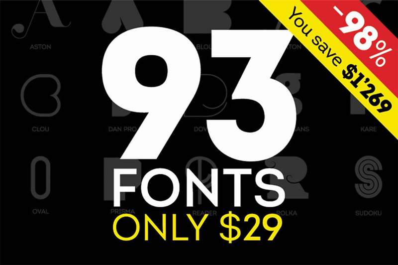
Fontfabric Font Bundle of 90+ Fonts

If you’re looking for a great set of fonts, this Fontfabric Font Bundle is sure to put a big fat smile on your face! That’s because with just 1 deal, you’ll get yourself more than 90 different fonts! You’ll get yourself some of the greatest Sans and Art fonts around. These 18 unique font families are delivered to you all in an .OTF file format. What’s even more amazing is that thanks to this Mighty Deal, you can save more than 95% off the regular price!

$29 instead of $1208 – Get it now!

Take Full Control of Email, Social and SEO with All-In-One Marketing Automation Platform

No need to spend a fortune hiring a full marketing team to promote your website. Instead, just grab hold of this All-In-One Marketing Automation Platform from Maax Market! Through an easy-to-use interface, you’ll have full control of all your marketing needs from email to social media to SEO! You can even analyze your data in real time.

$87 instead of $687 – Get it now!

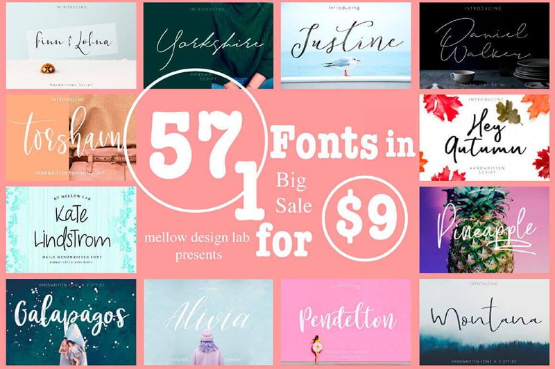
57 Premium Fonts from Mellow Design Lab

It’s time to expand your already fabulous font collection! With this Mighty Deal from Mellow Design Lab, you’ll get 57 high-quality, professional fonts for 1 ridiculously low price. With styles ranging from Script to Display, you’ll also get plenty of OpenType features and an extended license to ensure you’re set to design away til your heart’s content!

$9 instead of $956 – Get it now!

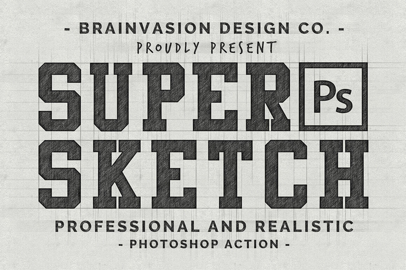
Quickly Transform Vectors or Text into Realistic Sketches with Super Sketch

Have trouble sketching out a stick figure? Not to worry. Even for the least artistic designers out there, you can achieve results with Super Sketch! This amazing Photoshop Action instantly transforms your logos, vectors and even text into a realistic sketch appearance. Simple to use, with just a few clicks you can play around with the organized layers to customize and combine the perfect sketch appearance for your designs.

$9 instead of $15 – Get it now!

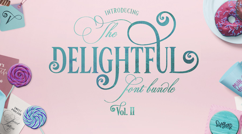
The Delightful Bundle Vol II

Jam packed with 25 fonts from 20 different font families, this amazing font bundle comes in at JUST $0.80 per font.

$19 instead of $299 – Get it now!

Design deals for the week

Post pobrano z: Design deals for the week

Every week, we’ll give you an overview of the best deals for designers, make sure you don’t miss any by subscribing to our deals feed. You can also follow the recently launched website Type Deals if you are looking for free fonts or font deals.

The Delightful Bundle Vol II

Jam packed with 25 fonts from 20 different font families, this amazing font bundle comes in at JUST $0.80 per font.

$19 instead of $299 – Get it now!

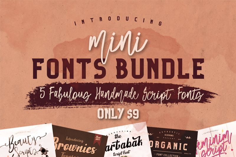
5 Fabulous Handmade Script Fonts

Fonts make all the difference in your designs. Sure, what you say is important, but how you say it is just as powerful! Be sure to hurry and grab this Mini-Font collection sporting 5 fantastic handmade script fonts! Whether you’re working on invitations or mugs, these professional typefaces can be molded to suit your style thanks to the many OpenType Features they include.
$9 instead of $75 – Get it now!

UX Web Tiles for Flow Diagrams and Sitemaps

This Mighty Deal features a total of 150 unique Web Tiles from Firetuts, that can easily be used to create Flow Diagrams and Sitemaps for your clients. Simple to edit and highly customizable, these Tiles are compatible with popular editing software such as Adobe Photoshop, Illustrator, Fireworks and Omnigraffle. This deal has been brought back for another run, by popular demand. Jump on it now and you could save 91% off the regular price! And for just $9 more, you can also get the iOS Mobile UX Tiles collection.

$15 instead of $74 – Get it now!

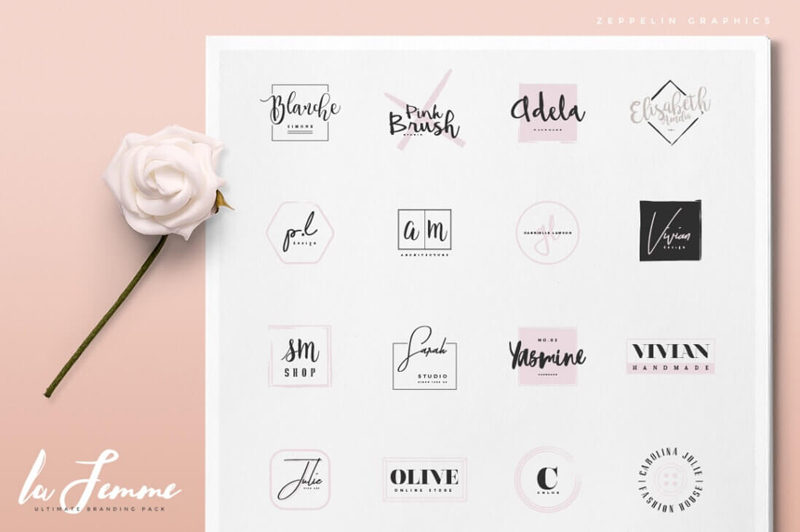
250 Feminine-Style Branding Logos & 20 Bonus Textures

If you’re looking to add a feminine touch to your latest project, this Mighty Deal is for you! A huge collection of 250 feminine-style logos, this ultimate branding pack features colorful and fully editable logo templates. Plus as a bonus, you’ll get 20 hi-res textures! There are even video tutorials included that explain how to add the textures in both Photoshop and Illustrator.

$9 instead of $19 – Get it now!

Feel the Love: Valentine’s Day Bundle of 100+ Vectors

Ahhh… Love… what a wonderful, magical feeling. The butterflies in your stomach, the ongoing daydreaming about your significant other, the fulfilling feeling of passion and excitement of just thinking of your beloved one. This bundle is just about that. Love…pure simple passionate love. Please take a peak of this beautiful new Valentine’s Day Bundle. We’re sure that you will find something suitable for your own love life and to show the love on your websites. Happy Valentines Day!

$9 instead of $200 – Get it now!

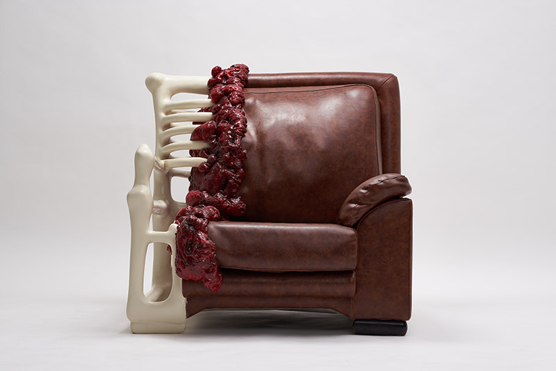
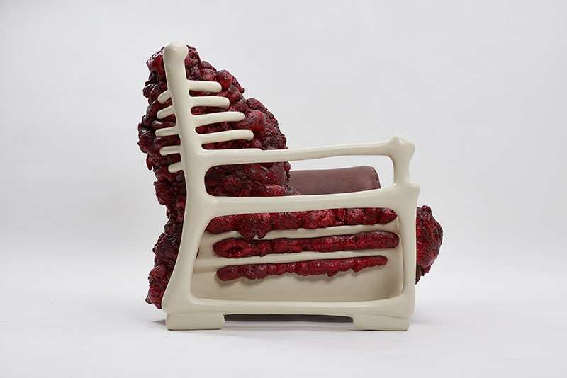
An anatomic armchair by Jade T. Cho

Post pobrano z: An anatomic armchair by Jade T. Cho

On Designer Daily, we have already featured the anatomy of gadgets or the evolution of type, two projects that revealed a supposed anatomy or evolution of objects and type. Obviously, we were delighted upon discovering the anatomic armchair by Jade T. Cho. The young designer from Korea took a vintage armchair and exposed some bones and gory details using various material for building it.