Post pobrano z: Creating Graphic Design and Illustration for Color Blind People
Color blindness is a vision deficiency that affects a large number of people around the world. Whether we know it or not, we as designers have a great impact on their daily lives through the work that we create and put out all around us. That being the case, I believe that we should take a few moments and explore some simple yet effective solutions that could help improve their situation and thus the quality of their lives.
1. What Is Color? A Brief Definition
Before we can
completely understand what color blindness is, we should first take a couple of
moments and talk about color, what it is, and how it behaves.
According to
Google, the noun color is defined as:
“the property possessed by an object
of producing different sensations on the eye as a result of the way it reflects
or emits light”.
Now, light itself
is made out of multiple colors that have different wavelengths, where red is
the longest one that humans can see, while violet is the shortest.
We know this since in 1666 Sir Isaac Newton put together a little experiment in which he
took a beam of white sunlight and passed it through a glass prism. What he
observed must have been incredible at that moment since the prism split the
beam into a band of seven composing colors which he called the “spectrum”. The
order of these colors from the lower end of the spectrum is violet (V), indigo (I), blue (B), green (G), yellow (Y), orange (O),
and red (R)—which we now call ROYGBIV.

Quick tip: you can see Newton’s prism experiment in action by
heading over to MITK12Videos’
YouTube channel where they give you an in-depth explanation of the cause of the light dispersion phenomenon.
2. How Do Our Eyes „See” Color?
Depending on its physical
properties (light absorption, emission spectra, etc.), an object can
individually reflect or absorb these seven colors more or less, giving it the
property that we call color.
So when we say we
see a specific color, we actually see the amount of color reflected by the
surface of an object when it’s being hit by a light source. When an object
reflects all the wavelengths, we see it as being white; when it absorbs them
all, it is black.
We’re able to visualize these properties due to the millions of
light-sensitive cells found within our retinas, which process the light into
nerve impulses and then pass them to the cortex of the brain via the optic
nerve.
These cells come
in two different shapes: rods and cones. The rods are highly concentrated around the edge of the retina
(somewhere around 90 million cells for humans), and transmit mostly black and
white information due to the fact that they contain a single photopigment,
being the ones that help us adjust to a darker environment.
The cones, on the other hand, are
concentrated in the middle of the retina (4.5–6 million cells), and are able
to capture three different wavelengths: S
(short), M (medium), and L (long).
Short cones are
usually referred to as “blue” due to the fact that they provide color
information for that specific wavelength of light. Medium cones are referred to
as “green”, while long ones are known as “red”.
Normal color
vision uses all three types of light cones (red, green, and blue), and is known as trichromacy.
In fact, the RGB color
space that we work and interact with on a daily basis is created around our trichromatic vision determined by
these three types of cones, where each and every image is built using a combination of just three colors.
3. What Is Color Blindness?
We now have a
basic idea of what color is, but what is color blindness?
Well, many people think that being color blind means you see the world in black and white, but that’s not actually true.
As the online version of the Medical Dictionary points out, color blindness is:
“an abnormal
condition characterized by the inability to clearly distinguish different
colors of the spectrum”.
A person that is color blind is usually born with this condition, which is
determined by a faulty gene found within the X chromosome. According to the American Academy of Ophthalmology, „color blindness can occur when one or more of the color cone cells are absent, non functioning, or detect a different color than normal”.
Colour Blind Awareness states that the condition affects approximately 1 in every 12 men (8%) and 1 in every 200 women around the world.
4. What Are the
Different Types of Color Blindness?
As we learned a few moments ago, our eyes have three types of cone cells. Depending on which
of them is affected, a person can suffer from one of three conditions:
4.1. Red-Green Color Blindness
According to the National Eye Institute (NEI), the most common type of color blindness is due to „the loss or limited function of the red cone (known as protan) or green cone (deutran) photopigments” that depending on their severity can lead to:
- Protanomaly: when the person’s red cone photopigment is abnormal, causing red, orange, and yellow colors to appear greener.

- Protanopia: when there are no working red cone cells, causing red to appear as black, and certain shades of orange, yellow, and green to appear as yellow.

-
Deuteranomaly: when the person’s green
cone photopigment is abnormal, causing yellow and green to appear redder, making
it difficult to tell violet apart from blue.

-
Deuteranopia: when there are no working green cone cells, causing reds to appear as brownish-yellow
and greens as beige.

4.2. Blue-Yellow Color Blindness
Compared to red-green color blindness, blue-yellow color blindness is rarer, and it appears when the blue cone photopigments are either missing or have limited function.
Depending on the case, we can have:
-
Tritanomaly:
when the person’s blue cone cells have limited function, causing blue to appear
greener and making it difficult to tell yellow and red apart from pink.

-
Tritanopia: when the person’s blue cone cells are missing, causing blue to appear
green and yellow violet or light grey.

4.3. Complete Color Blindness
For those who don’t experience any color at all, they suffer from what is called monochromacy, which is when they see the world in shades of grey ranging from black to white.

5. How Do You Know If You’re Color Blind?
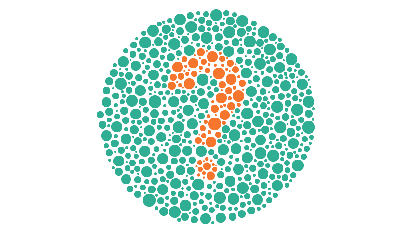
If you want to make sure that your eyes are functioning correctly, you should always go visit an optometrist, who will apply a simple color perception test called the „Ishihara Color Test”. The name comes from its creator Dr. Shinobu Ishihara, who in 1917 published a simple yet ingenious method of determining if a person is color blind or not using colored plates (ishihara plates). Each plate contains multiple dots that vary in color and size and are displayed within a circular pattern, forming a number at the center.

If you can distinguish the number correctly then it means you have normal color vision. If you’re having problems seeing the shape of the numbers, then you might be suffering from one of the color blindness types that we talked about a few moments ago.
If you don’t really want to go to an eye doctor just yet, you can take the test online using any of the following sites:
6. How Can You See What a Color Blind Person Sees?
As a designer and visual creative, you must understand that your work will need to be visible not only to people with normal vision but also to those that suffer from one type of color blindness.
The first step to finding a solution to the problem is understanding how it manifests itself, by trying to see what a color blind person would see.
Luckily, there are a couple of solutions out there that allow you to take a normal image and apply filters to it in order to get an idea of what a certain vision deficiency would look like.
6.1 Online Color Blindness Simulators
If you’re dealing with regular images, these color blindness simulators can quickly generate a picture of what a person suffering from a specific condition would see:
- Coblis by Colorblindness.com is probably the most exhaustive solution out there since it generates images for all types of color blindness.

- Vischeck is a simpler generator that gives you the ability to preview a side-by-side picture of both the original and the simulated color vision deficiency.

If you’re a web designer and want to see what your project would look like for a person suffering from color blindness, Toptal has put together a smart little Color Blind Filter that takes any website and converts it using one of the four available filters.

6.2. Local Color Blindness Simulators
Since uploading your project to the web and then comparing the images back and forward can be a little time-consuming, there are a couple of software solutions out there that can help you achieve the same result faster.
- Adobe Illustrator: if you didn’t know, Illustrator actually comes with two color proofs (Protanopia and Deuteranopia) within its View menu (View > Proof Setup), that help you quickly see what your project would look like when viewed by a color blind person.

- Adobe Photoshop: the same color proofs are included within Photoshop (View > Proof Setup), helping you identify and correct the final result.

- Stark is a free plugin created for Sketch that helps you select from eight color profiles and preview your design as a color blind person.
- Color Oracle is another free color blindness simulator developed by Bernie Jenny that can be installed and used on Windows, Mac, and Linux and was created to work independent of the creative software that you’re using.
7. How Does Color Blindness Affect the Quality of One’s Life?
Even though for color blind people the world around them seems „normal”, since most of the time that’s the only way they’ve experienced it, the reality is that they usually face difficulties in what we think of as being simple, everyday tasks. From cooking food to driving a car or choosing what clothes to wear, what they see does affect their reactions and behavior, directly influencing their life.
Imagine that you would like to drive a car, but can never tell if the traffic lights are green or red without knowing the position of each of the three states. Or maybe you would like to cook a nice piece of meat that you bought from the local market, but you can’t tell if it’s rare or well done.
Also, think of all the creative jobs out there that you would love to do but could never apply for since you can’t really see what everybody else is seeing.
These are just a couple of the situations that a color blind person has to deal with on a daily basis, so why not try and learn how we can help them even just a little bit by following some of the simple solutions presented below.
8. How Can You Adjust Your Designs and Illustrations for the Color Blind?
So at this point, we know what color blindness is and have a basic idea what it can look like, which means that we can now talk about finding and implementing solutions meant to adjust our projects for people affected by these vision deficiencies.
8.1. What Colors Work Best?
The first thing that we need to ask ourselves when working on a project (whether it’s an existing or new one) is what color combinations work best. And the answer is that we really don’t have a generalized list, since it all depends on the Saturation and Brightness levels used for each and every color.
What we do know is that there is a set of color combinations that should be avoided, since it might be hard for a color blind person to tell them apart:
- red and green
- red and brown
- red and orange
- red and violet
- red and black
- green and brown
- green and orange
- light green and yellow
- blue and green
- blue and purple
- blue and yellow
The problem usually arises when a design is based on colors that have close hue, saturation, or brightness levels, making them seem like shades of the same color.

So our goal is not to create a color scheme that is clearly identifiable by a person suffering from color blindness, but to make it possible for them to distinguish one color from another, even though they might not be sure what that color is.
8.2. How Can You Fix Bad Color Combinations?
The first step to fixing a bad color combination is noticing it. This is where the color simulation tools come in handy, since you can quickly observe if you have indistinguishable overlapping sections or elements that are either identical or simply not visible, by going through the different available filters.
Depending on the type of creative project that you’re working on, whether it’s an illustration, a mobile app, or a type of graphical data representation (bar chart, line chart, or pie chart), you can use the following suggestions to adjust the final result for those suffering from this condition.
Use a Different Hue
If you take a look at this illustration of a classic Game Boy, you might notice that when using a Deuteranopia filter, the upper section of the device looks as if it has a cutout since the hue of the background and that of the screen are really close in terms of saturation (57.83% for the red hue and 42.96% for the green one).

We could adjust the saturation of the screen section in order to increase the hue’s intensity, but as you can see, in this particular situation that won’t help as much as we’d like.

What we want to do is adjust the hue of the background from red to purple, which as you can see will create a clear separation between the two sections.

Aim for High Contrast
We’ve fixed the background problem, but as you can see, some sections of the console (such as the front and the side) are really hard to distinguish, since they use the same hue value (0%), and similar brightness levels (92.94% for the front and 86.67% for the side). The same thing can be said about the d-pad button, where the cross-section uses a 45.88% brightness level while the center dot uses a similar 40.78% value.
When this happens, you can quickly address the situation by selecting the respective shapes and adjusting their saturation and/or brightness levels until they start standing out.

The general rule would be to use as few tints and shades as possible, and have the artwork stand out, using high contrast whenever you can.
Since in real life the console’s shell is made out of white plastic, it seems fair to use a few tints and shades if we want to represent it more accurately, but if the project allows, you can always achieve higher contrast by using different hues.
Separate Your Shapes Using Outlines
If you tried some of the previous solutions but couldn’t get the desired result, you can sometimes isolate the different sections of a badly colored composition using thick, dark outlines. In the case of our Game Boy, we could turn some of its shapes into outlines and add new ones to those that support them, thus giving us a more defined result.

Add or Remove Colors
Adding or removing colors can make or break a design, especially one viewed by a person that can’t distinguish all of them. If we take a look at the outlined version of our console, you might have noticed that the circular buttons are now blending in with their outlines.
We can easily fix this by introducing two new hues (a light yellow and blue) as long as we know what colors can be seen by a person suffering from a specific vision deficiency (in our case, Deuteranopia).

In other situations, you might find that removing colors will improve the overall design since sometimes simpler is better.
Adhere to a Monochromatic Color Scheme
Sometimes colors might prove to be your biggest enemy, especially when dealing with a vision deficiency such as Deuteranopia, so it might be a good idea to reduce your palette to a monochromatic color scheme.
Often, people confuse a monochromatic color scheme with a grayscale one consisting of only blacks, grays, and whites, but they’re actually two completely different things.
According to Wikipedia, a monochromatic color scheme is derived from „a single base hue and extended using its shades, tones, and tints”.
As you can see below, by adhering to a monochromatic scheme, you can eliminate the whole rigorous color matching process, and focus on just one hue from which you can create shades and tints using different saturation and brightness levels.

Go Grayscale
Another solution to avoiding color completely is to go fully grayscale. By doing so, you eliminate almost all of the above steps, which means you can focus on the artwork itself.

Add Texture
One last method of making sure your design is clearly understandable by those suffering from vision deficiency is that of adding texture. Whether it’s grain, horizontal lines, or any other type, texture can easily separate and highlight a specific section of an image, helping you break any color boundary.

Conclusion
Whether we realize it or not, color blindness is a condition that affects a large number of people out there, making their daily lives harder by limiting the things they can see and understand through the filter of color.
Luckily, as we’ve seen, there are several things that we as designers can do in order to improve the quality of their life, thus making things a little easier one step at a time.
I really hope that this article has opened your eyes to an area of design that is often overlooked, and managed to teach you a few key notions that you can implement in future projects.
That being said, you can further expand your knowledge on color by checking out these awesome articles:
-

Designing For, and As, a Color-Blind Person
Color blindness is a mild disability through which the affected experience a decreased ability to distinguish colors from others. This can be a real drawback… -

Advanced Color Theory: What Is Color Management?
This article defines terms such as Color Models, Color Spaces and Color Management and explains what, as a designer, you should know about it. -

Design in 60 Seconds: RGB and CMYK Color Modes Explained
Ever wonder about the difference between RGB and CMYK color modes? Well if you have a minute, I can help you sort it out. -

Color in 60 Seconds: Tints, Tones and Shades
Tints, tones and shades are terms you’ll hear used when discussing color. A “tint” is the result of mixing a color with white. A “shade” is the resultant… -

How to Use Color Look-Up Tables
In this short video tutorial, you’ll learn how to use one image to define a set of colors, and then how to make other images fit into that color set. -

Using Color Palettes to Create Identity in Artwork
Artists seek to stand out in a variety of ways. One way that you can accomplish this is by using a recognizable color palette throughout your work. In this…