Every week, we’ll give you an overview of the best deals for designers, make sure you don’t miss any by subscribing to our deals feed. You can also follow the recently launched website Type Deals if you are looking for free fonts or font deals.
3D Lettering Mega Bundle of Grunge, Ice, Cubes & more
Want to have some real fun with your fonts? Try adding some real 3D texture to your words! Thanks to this 3D Lettering Mega Bundle from MIIM Design, you can do just that. You’ll get 6 super creative 3D lettering sets that range from grunge painted wood to realistic ice. It’s high time you really let your letters speak for you.
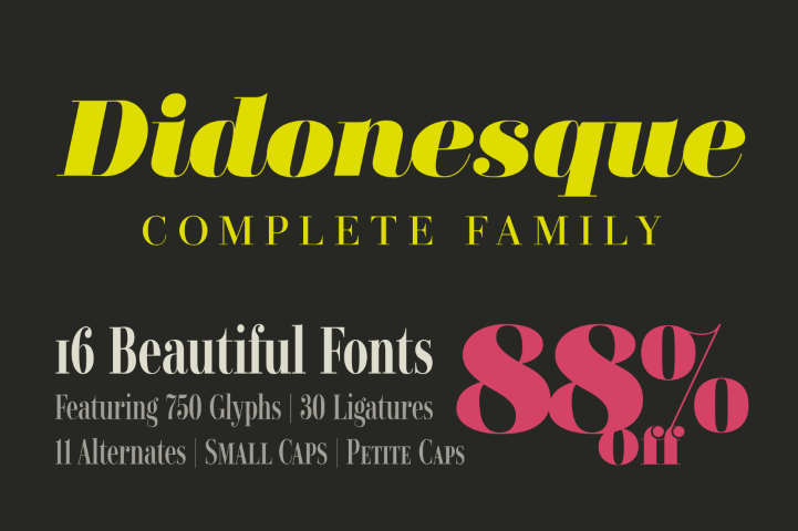
Didonesque Font Family with 16 Beautiful & Elegant Fonts
Give your typeface toolbox a luxurious makeover with the Didonesque Font Family! You’ll get 16 beautiful, elegant typefaces that were all inspired by the classic Didone fonts. With a variety of OpenType features and multilingual support, Didonesque is a great choice for your next branded project.
The Crafters Delight Bundle Volume II is here! The 2nd Instalment of our Crafters Delight Series includes over 900 design elements perfect for crafters.
Packed with SVG’s, Fonts, Monograms, Wreaths, Arrows Silhouettes, Flourishes, Decorative Items, Cut Files and more!
Lifetime Access to 145+ Tech Courses at Stone River eLearning
When it comes to getting an education in technology, there’s an awful lot to learn. Good thing you’ve got a lifetime ahead of you! With this Mighty Deal from Stone River eLearning, you can get a lifetime access to more than 145 amazing courses built to help you master everything from graphic design to iPhone app development! That’s more than 500 hours of online learning!
Negative space is an often misunderstood and underused idea. It breaks down very simply. Positive space represents the elements of your site—navigation, content, ads, images, and so forth. Negative space is where those things are not.
It’s the empty space between those elements, the space around and between them. Negative space helps structure and define your website design.
It’s a necessity that you rarely think about. Understanding how it plays a part in web design more thoroughly will help your designs achieve results better.
There are two kinds of negative space: micro negative space and macro negative space.
Micro negative space is the small spaces between the small elements of your web design, like the space between lines of type, the space between paragraphs, even the spaces between words and letters.
Macro negative space, on the other hand, is the space between larger elements like your header and footer. Both micro and macro negative space are vitally important to the overall effectiveness of your design.
Negative space makes a huge impact on the usability of a site. It makes sure that the users find it easy to read the text and easy to navigate between different pages or elements.
A cluttered, visually busy site makes it incredibly hard to find what you want to be found.
Negative space is especially useful in the header design, where the first impression of your site is created.
It’s all too easy to think that you need to fill up every last bit of screen space with info to catch a potential customer’s attention, but the truth is that this overabundance of information makes it harder for that potential customer to focus on what they need and want to know.
It’s very important for a web designer to understand the vital importance of negative space. You’ll probably find clients that want an incredibly cluttered site design. You need to calmly convince them of how that is more of a hindrance than a help to their business or organization.
A site with negative space is not a waste of money or screen space. It’s an important element of creating a useful, clean, navigable, and professional looking website that will help them stand out.
How do you explain this to a client?
Getting Clients to Understand Negative Space
The first thing you need to do is demonstrate to your client that you can, in fact, fit everything necessary (and a lot of desired elements) onto a cleaner looking website that makes use of negative space.
It’s okay if potential customers need to scroll through the site, and is in fact expected. Content should still be chosen widely, especially the content that will be featured on the front page and “above the fold”. Offering too many options on the front page can make the site unnavigable to a user, who will quickly move on.
A well-designed site’s negative space will not even be obvious to a user. They will instead focus on what matters. They’ll pay attention to the details of a product or service, or find it easier to find the articles that interest them. For most website design, the best approach is “less is more”.
Think of Negative Space as an Active Element of Web Design
A lot of fancier elements of web design do not actually make a very big impact on a user’s experience, like flat design or parallax scrolling, but they are still treated as active elements of design.
You really think about them. Start to think of negative space in the same way, because it definitely makes an impact on the user experience of the website.
Now that you’re going to start thinking about negative space as a design element unto itself, what are ways that you use negative space? There are a lot of them we see and use in web designs that we don’t even think about.
Negative space is used to offer visual relief and separation between messages and items on the webpage. This allows the viewer to between understand what’s going on.
If they better understand what’s going on, they can better get to the goal that you and/or your client want them to achieve.
Highlighting a central message
Negative space will draw a user’s eyes to the main items on the page.
It helps make sure the page is focused on the message and emotions it wants to communicate. It makes the page more readable without having to anything elaborate.
Negative space dictates the way a user moves through the page and the entire site.
Placing it in certain ways can direct people to scroll down for more info, view page elements in a particular pattern, or prompt them to go to a different landing page. Negative space creates visual relationships between elements and provides direction.
How to Successfully Apply Negative Space
Practice different arrangements of negative space. Every website will need to use negative space in a different way. Some might need to use it less, while others may need more.
Make sure the pages are easy to read and comprehend
Before you even begin to work on the design proper, create a list of required interface elements. Doing this will help you to estimate how much content the page will need.
From there, you can create a rough wireframe to see how much space you require to include all this content in a way that can be easily read and understood.
Keep the design fresh and modern
Proportionate font sizes and asymmetrical uses of negative space create an overall very stylish look that is both uncluttered and interesting.
This will assist in the overall readability. Separate blocks of content out to make it easier for visitors to access. Include margins between different elements. Use padding to create space inside an element and prevent overcrowding.
Experiment with the proximity and containment of the elements
Proximity is how close or far objects are from each other, while containment is used to group objects together.
Understanding how negative space focuses and organizes a page will help you get the elements right.
Conclusion
Negative space can make all the difference in the functionality of a web page. You should create your web designs while thinking of negative space as a major element.
Welcome, React aficionados and amateurs like myself! I have a puzzle for you today.
Let’s say that you wanted to render out a list of items in a 2 column structure. Each of these items is a separate component. For example, say we had a list of albums and we wanted to render them a full page 2 column list. Each „Album” is a React component.
Scroll rendering problem
Now assume the CSS framework that you are using requires you to render out a two column layout like this…
This means that in order to render out the albums correctly, you have to open a columns div tag, render two albums, then close the tag. You do this over and over until all the albums have been rendered out.
I solved it by breaking the set into chunks and rendering on every other album conditionally in a separate render function. That render function is only called for every other item.
class App extends Component {
  state = {albums: [] }

  async componentDidMount() {
    let data = Array.from(await GetAlbums());
    this.setState({ albums: data } );
  }

  render() {
    return (
      <section className="section">
        {this.state.albums.map((album, index) => {
          // use the modulus operator to determine even items return index % 2 ?
          this.renderAlbums(index) : '';
        })}
      </section>
    )
  }

  renderAlbums(index) {
    // two albums at a time - the current and previous item
    let albums = [this.state.albums[index - 1], this.state.albums[index]];

    return (
      <div className="columns" key={index}>
        {albums.map(album => {
          return (
            <Album album={album} />
          );
        })}
      </div>
    );
  }
}
Another way to do this would be to break the albums array up into a two-dimensional array and iterate over that. The first highlighted block below splits up the array. The second is the vastly simplified rendering logic.
class App extends Component {
  state = {albums: []}

  async componentDidMount() {
    let data = Array.from(await GetAlbums());

    // split the original array into a collection of two item sets
    data.forEach((item, index) => {
      if (index % 2) {
        albums.push([data[index - 1], data[index]]);
      }
    });

    this.setState({
      albums: albums
    });
  }

  render() {
    return (
      <section className="section">
        {this.state.albums.map((album, index) => {
          return (
            <div className="columns">
              <Album album={album[0]}></Album>
              <Album album={album[1]}></Album>
            </div>
          )
        })}
      </section>
    )
  }
}
This cleans up the JSX quite a bit, but now I’m redundantly entering the Album component, which just feels wrong.
Sarah Drasner pointed out to me that I hadn’t even considered one of the more important scenarios here, and that is the unknown bottom scenario.
Unknown Bottom
Both of my solutions above assume that the results set received from the fetch is final. But what if it isn’t?
What if we are streaming data from a server (ala RxJs style) and we don’t know how many times we will receive a results set, and we don’t know how many items will be in a given set. That seriously complicates things and utterly destroys the proposed solutions. In fact, we could go ahead and say that neither of these solutions are ideal because they don’t scale to this use case.
I feel like the absolute simplest solution here would be to fix this in the CSS. Let the CSS worry about the layout the way God intended. I still think it’s important to look at how to do this with JSX because there are people building apps in the real world who have to deal with shenanigans like this every day. The requirements are not always what we want them to be.
How Would You Do It?
My question is just that — how would you do this? Is there a cleaner more efficient way? How can this be done so that it scales with an unknown bottom? Inquiring minds (mine specifically) would love to know.
Colin Bendell writes about a new and particularly weird addition to Safari Technology Preview in this excellent post about the evolution of animated images on the web. He explains how we can now add an MP4 file directly to the source of an img tag. That would look something like this:
<img src="video.mp4"/>
The idea is that that code would render an image with a looping video inside. As Colin describes, this provides a host of performance benefits:
Animated GIFs are a hack. […] But they have become an awesome tool for cinemagraphs, memes, and creative expression. All of this awesomeness, however, comes at a cost. Animated GIFs are terrible for web performance. They are HUGE in size, impact cellular data bills, require more CPU and memory, cause repaints, and are battery killers. Typically GIFs are 12x larger files than H.264 videos, and take 2x the energy to load and display in a browser. And we’re spending all of those resources on something that doesn’t even look very good – the GIF 256 color limitation often makes GIF files look terrible…
By enabling video content in img tags, Safari Technology Preview is paving the way for awesome Gif-like experiences, without the terrible performance and quality costs associated with GIF files. This functionality will be fantastic for users, developers, designers, and the web. Besides the enormous performance wins that this change enables, it opens up many new use cases that media and ecommerce businesses have been yearning to implement for years. Here’s hoping the other browsers will soon follow.
This seems like a weird hack but, after mulling it over for a second, I get how simple and elegant a solution this is. It also sort of means that other browsers won’t have to support WebP in the future, too.
Here’s a nifty post by Jonathan Snook where he walks us through how to make a calendar interface with CSS Grid and there’s a lot of tricks in here that are worth digging into a little bit more, particularly where Jonathan uses grid-auto-flow: dense which will let Grid take the wheels of a design and try to fill up as much of the allotted space as possible.
As I was digging around, I found a post on Grid’s auto-placement algorithm by Ian Yates which kinda fleshes things out more succinctly. Might come in handy.
Oh, and we have an example of a Grid-based calendar in our ongoing collection of CSS Grid starter templates.
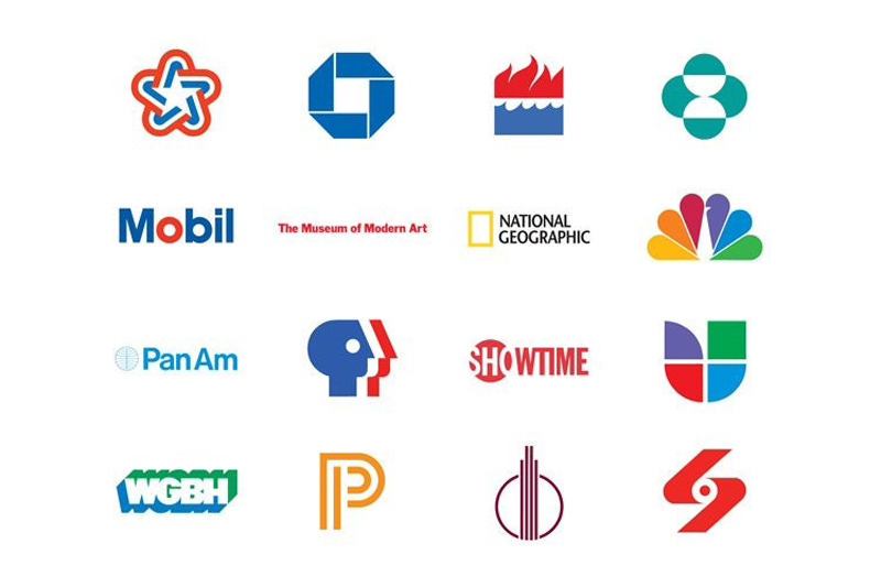
You may never have heard his name, but Ivan Chermayeff was one of the most influential designers of the 20th century. Unfortunately, I must write “was”, because the logo design expert died last week at the age of eighty-five. In his over 60 years career, Chermayeff designed some of the most memorable logos, many of which became iconic, such as the NBC, PanAm, Chase Bank, or National Geographic logos. In this post you can find a tiny sample of his work, you’ll see more on his professional website.
This tutorial will show you how to use brush settings, layer styles, healing tools, adjustment layers, and some tips and tricks to create a shiny, bright, fun tinsel text effect. Let’s get started!
Create a new 1613 x 1075 px document, and go to File > Place Linked to open the Background Image.
Resize the Background Image to fit within the document and hit the Return key to commit the changes.
Step 2
Create the text in All Caps using the font Quicksand Bold. Change the Size to 300 pt, the Kerning to Optical, and the Leading value to 325 pt if you have multiple lines of text.
Place the text however you like, and don’t worry about the background as we’ll fix it at the end of the tutorial.
2. How to Create Inner Work Paths
Next, we are going to create work paths inside the letters we have.
You can do that using the Pen Tool, but in this tutorial, we are going to use Photoshop’s new Curvature Pen Tool.
Step 1
Pick the Curvature Pen Tool, make sure to choose the Path option in the Options bar, and click once in the center of the first letter where you want to start creating the work path.
The Curvature Pen Tool is different from the Pen Tool. So to create corner points, you need to double-click when you add the point, and to create a curve, you can either click once or create a straight line instead, and then click on that line to add a point and drag it to create the curve.
When you finish creating the path, Command-click anywhere outside it.
Step 2
You can also use any other shape tools to help you easily create the work path for some of the letters. For example, you can use the Ellipse Tool, with the Path option active, to create the work path for the letter O.
Step 3
Make sure to create all the work paths needed to fill all the letters you have.
Step 4
It is very important to save the paths created. To do so, open the Paths panel, double-click the Work Path tab, and type Center in the Name field.
This will save the work paths so that you can go back to them and use them any time.
Step 5
Right-click the text layer and choose Create Work Path to create the outer stroke path.
The dots on top of the letter E are a bit too big and will overlap with the letter when stroked with the tinsel brushes, so we’ll create smaller ones.
To do so, pick the Direct Selection Tool, select the dots, and hit the Delete key to delete them.
Step 6
Then, use the Ellipse Tool to create smaller circular paths.
Once you’re done, double-click the new Work Path tab and name it Stroke.
3. How to Create a Tinsel Brush Tip
Step 1
Pick the Rectangle Tool, choose the Shape option in the Options bar, and create a small 3 x 30 pxBlack rectangle.
Step 2
Pick the Add Anchor Point Tool, and click once in the middle of each of the rectangle’s vertical sides to add two anchor points.
Step 3
Use the Direct Selection Tool to select both added points, and click the Left Arrow key three times to nudge the points 3 px to the left.
Step 4
Command-click the Rectangle shape layer’s thumbnail to load the selection.
Step 5
Go to Edit > Define Brush Preset, and type Tinsel Brush in the Name field.
4. How to Modify and Save Brush Tip Settings
Step 1
Pick the Brush Tool, choose the Tinsel Brush tip, and open the Brush panel to modify the settings:
Brush Tip Shape
Shape Dynamics
Scattering
Color Dynamics
Step 2
Click the Create new brush icon in the bottom right corner of the Brush panel, and change the Name to Brush 01.
Step 3
Modify the same tip’s settings to create another variation:
Brush Tip Shape
Shape Dynamics
Scattering
Color Dynamics
Step 4
Click the Create new brush icon, and change the Name to Brush 02.
Step 5
This is optional, but it’s a cool new feature in Photoshop that will help keep things a bit more organized.
Click the Brush Preset Picker icon in the Options bar, Command-click the icons of the three brush tips you’ve created for this tutorial (Tinsel Brush, Brush 01, and Brush 02), click the flyout menu icon, and choose New Brush Group.
Name the group Tinsel Brushes, and click OK.
5. How to Stroke Work Paths
Step 1
We will create six new layers that will be used to create the main tinsel effect, and we will name them according to what they will contain. So it is important to name the layers as mentioned below to follow the tutorial easily.
The names from bottom to top are:
Stroke – Brush 01
Center – Brush 01
Center – Brush 02
Stroke – Brush 01 – White FG
Center – Brush 02 – White FG
Center – Brush 01 – Desaturated
Step 2
Put all the new layers in a group and call it Tinsel, and set the Foreground Color to #d9001f and the Background Color to #300600.
Step 3
Open the Paths panel, and for each layer, select the path in the layer’s name, and stroke it with the brush tip mentioned along with it.
So if you select the Stroke – Brush 01 layer, you’ll need to click the Stroke work path in the Paths panel, pick the Brush Tool and choose the Brush 01 tip, and hit the Return key to stroke the path.
Step 4
To quickly switch between the brush tips, you can right-click anywhere to get the preset and choose the tip you need.
Step 5
Make sure to set the Foreground Color to White before you stroke the two layers that have White FG in their name.
Step 6
Change the Foreground Color back to #d9001f before creating the Center – Brush 01 – Desaturated layer’s stroke.
6. How to Add Glow and Shadow Effects
Double-click the Stroke – Brush 01 layer to apply the following layer style:
Step 1
Add an Inner Glow with these settings:
Blend Mode: Linear Light
Opacity: 50%
Color: #a7a7a7
Size: 10
Step 2
Add a Drop Shadow with these settings:
Opacity: 36%
Distance: 10
Size: 5
This will style the first layer.
Step 3
Double-click the Center – Brush 01 layer to apply an Inner Glow effect with these settings:
Blend Mode: Linear Light
Opacity: 74%
Color: #a7a7a7
Size: 10
This will help build the glow effect to add more dimension to the tinsel.
You can hide the top layers to see the effects you apply, and then show them again.
Double-click the Center – Brush 02 layer to apply the following layer style:
Step 4
Add an Inner Glow with these settings:
Blend Mode: Linear Light
Opacity: 74%
Color: #a7a7a7
Size: 10
Step 5
Add a Drop Shadow with these settings:
Opacity: 50%
Distance: 0
Size: 5
Step 6
Change the Center – Brush 02 layer’s Blend Mode to Overlay.
7. How to Style Layers
Step 1
Change the Stroke – Brush 01 – White FG layer’s Blend Mode to Linear Light and its Opacity to 60%.
Double-click the Center – Brush 02 – White FG layer to apply the following layer style:
Step 2
Add a Pattern Overlay with these settings:
Blend Mode: Vivid Light
Opacity: 70%
Pattern: FDR Glitter Pattern 02
Step 3
Add a Drop Shadow with these settings:
Blend Mode: Linear Burn
Color: #8e8e8e
Opacity: 35%
Distance: 0
Size: 5
Step 4
Change the Center – Brush 02 – White FG layer’s Blend Mode to Linear Light.
Step 5
Select the Center – Brush 01 – Desaturated layer, and go to Image > Adjustments > Desaturate.
Step 6
Double-click the Center – Brush 01 – Desaturated layer to apply an Inner Glow effect with these settings:
Blend Mode: Linear Light
Opacity: 60%
Color: #a7a7a7
Source: Center
Size: 7
Step 7
Change the Center – Brush 01 – Desaturated layer’s Blend Mode to Soft Light.
8. How to Colorize a Layer Group
Double-click the Tinsel group to apply the following layer style:
Step 1
Add a Color Overlay with these settings:
Color: #c29816
Blend Mode: Hue
Step 2
Add another Color Overlay effect instance with these settings:
Color: #cecece
Blend Mode: Divide
Step 3
Add a Drop Shadow with these settings:
Blend Mode: Linear Burn
Color: #1e0700
Opacity: 10%
Distance: 30
Size: 5
This will create the final tinsel effect.
9. How to Create a Texture Overlay Using Filters
Step 1
Create a new layer on top of all layers, name it Texture Overlay, fill it with White, and right-click it to choose Convert to Smart Object.
Set the Foreground and Background Colors to Black and White.
Step 2
Go to Filter > Render > Fibers, and change the Variance to 30 and the Strength to 3.
Step 3
Go to Filter > Filter Gallery > Sketch > Bas Relief, and use these settings:
Detail: 13
Smoothness: 3
Light: Bottom
Step 4
Click the New effect layer icon in the bottom right corner, go to Texture > Grain, and use these settings:
Intensity: 40
Contrast: 50
Grain Type: Regular
Step 5
Clip the Texture Overlay layer to the Tinsel group, and change its Blend Mode to Soft Light and its Opacity to 50%.
10. How to Add Global Adjustments
Step 1
Add a Selective Color adjustment layer with these settings:
Yellows
Cyan: -10
Magenta: -2
Black: -5
Step 2
Add a Color Lookup adjustment layer, choose the Fuji ETERNA 250D Kodak 2395 (by Adobe).cube table from the 3DLUT File menu, and change its Opacity to 15%.
Step 3
Add a Solid Color fill layer with the Color#150806 and change its Blend Mode to Soft Light and its Opacity to 20%.
Step 4
Use the Elliptical Marquee Tool to create an elliptical selection around the text, select the Solid Color layer mask’s thumbnail, and fill the selection with Black.
Step 5
With the mask’s thumbnail still selected, open the Properties panel, and change the Feather value to 52% to create a quick simple vignette effect.
11. How to Add Glitter Using Brush Settings
Step 1
Create a new layer on top of the Background Image layer, and name it Background Glitter.
Double-click the Background Glitter layer to apply the following layer styles:
Step 2
Add a Pattern Overlay with these settings:
Pattern: FDR Glitter Pattern 16
Step 3
Add a Drop Shadow with these settings:
Blend Mode: Linear Burn
Color: #0a1119
Opacity: 15%
Distance: 1
Size: 2
Step 4
Pick the Brush Tool, choose the Airbrush Hard Low Density Grainy tip, and open the Brush panel to change the Scattering settings as needed.
The important thing for this to work is to use a big, 300px brush tip Size.
Step 5
Click-drag slightly to add the glitter behind the text. You can change the brush settings to get a result you like.
12. How to Modify a Background Image
Step 1
Double-click the Background Image Smart Object’s thumbnail to open its file.
Pick the Content-Aware Move Tool, and set the Mode to Move in the Options bar.
Select the object you want to move and place somewhere else, and make sure to include some empty space around it within the selection.
You can check the Transform on Drop box if you want to transform the object after moving it.
Step 2
Move the selected object to its new position, transform it if needed, and then hit Return.
Step 3
After that, you can use any of the other Healing Tools to better blend the object’s edges with the new background.
You can also use the Dodge, Burn, and Sponge Tools wherever needed.
Step 4
If there are any parts you want to remove completely, select them using any selection tool, and go to Edit > Fill and choose Content-Aware from the Content menu.
Step 5
Again, use the Healing Tools to make any further adjustment to the area after removing the object.
Step 6
Make any other adjustment needed to the background using the same tools.
Step 7
You can save the file and go back to the original document to see the changes there and make any necessary adjustments.
13. How to Add Finishing Touches
Step 1
Add a Hue/Saturation adjustment layer and clip it to the Background Image layer.
Choose the Yellows channel, and change the Saturation value to -25.
Step 2
We need the Hue/Saturation layer to affect only the bells in the image.
So fill the Hue/Saturation layer mask with Black, set the Foreground Color to White, and use a soft round brush tip to brush over the bells.
Step 3
Select the Background Glitter layer and click the Add layer mask icon at the bottom of the Layers panel.
Set the Foreground Color to Black, and paint over the areas you want to remove the glitter from, like the bells and the trees, since the glitter is supposed to be under them.
Congratulations! You’re Done
In this tutorial, we created a simple brush tip and adjusted its settings to create the main tinsel effect.
Then, we styled the many layers used in creating the effect to achieve the final result. After that, we added glitter, modified the background image, and added global adjustments to the effect.
Finally, we used some more adjustment layers and layer masks to add final touches.
Please feel free to leave your comments, suggestions, and outcomes below.
If you’re a true Star Trek fan, then you’re going to love this tutorial
since we’re going to be recreating the iconic NCC-1701 starship, using a step-by-step
process based on some basic geometric shapes and tools.
That being said, grab a hot cup of the energizing space juice, and let’s get started!
1. How to Set Up a New Project File
Since I’m hoping you already have
Illustrator up and running in the background, bring it up and let’s set up a New Document (File > New or Control-N)
for our project using the following settings:
Number
of Artboards: 1
Width: 800
px
Height: 600
px
Units: Pixels
And from the Advanced tab:
Color
Mode: RGB
Raster
Effects: Screen (72ppi)
Preview Mode: Default
2. How to Set Up a Custom Grid
Even though today we’re not working on
icons, we’ll still want to create the illustration using a pixel-perfect
workflow, so let’s set up a nice little Grid so that we can have full control
over our shapes.
Step 1
Go to the Edit > Preferences > Guides & Grid submenu, and adjust
the following settings:
Once we’ve set up our custom grid, all we
need to do in order to make sure our shapes look crisp is enable the Snap to Grid option found under the View menu (that’s if you’re using an
older version of Illustrator).
Now, if you’re new to
the whole “pixel-perfect workflow”, I strongly recommend you go through my How
to Create Pixel-Perfect Artwork tutorial, which will help you widen your
technical skills in no time.
3. How to Set Up the Layers
Once we’ve finished setting up our project
file, it would be a good idea to structure our document using a few layers, since this way we can maintain a steady workflow by focusing on one
section of the illustration at a time.
That being said, bring up the Layers panel and create a total of four
layers, which we will rename as follows:
layer
1: background
layer
2: starship
layer
3: warp lines
layer 4: texture
Quick tip: I’ve colored all of my layers using the same
green value, since it’s the easiest one to view when used to highlight your
selected shapes (whether they’re closed or open paths).
4. How to Create
the Background
We’re going to kick off the
project by quickly creating the interstellar background, so make sure you’re on
the right layer (that would be the first one), and then lock all the other ones
so that we can get started.
Step 1
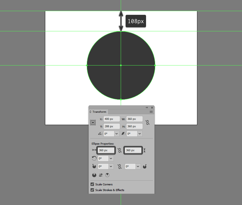
Create a 360 x 360 px circle,
which we will color using #343434 and then center align to the underlying
Artboard, positioning it 108
px from its top edge.
Step 2
Take a couple of moments and add the static stars using a couple of 4 x 4 px circles, which we will color
using a lighter orange (#EFC36C) and a slightly darker one (#EF986C) and
position on the background as seen in the reference image. Once you’re done,
select and group all of them together using the Control-G keyboard shortcut.
Step 3
Start working on the first of the moving objects by creating its tail
using a 4 x 16 px rectangle, to
which we will apply a 90ºLinear Gradient using #6FCDE2 for both
color stops. Set the right color’s Opacity
to 0%, positioning the resulting
shape next to one of the static stars.
Step 4
Add the head section using a 4 x 4 px circle, which we will color
using #6FCDE2 and then position onto the tail as seen in the reference image.
Once you have the shape in place, select and group (Control-G) the two together before moving on to the next step.
Step 5
Add a few more moving objects using copies (Control-C > Control-F) of the one that we’ve just finished
working on, which we will position on the sides of the background as seen in
the reference image. Once you’re done, don’t forget to select and group (Control-G) all of them together.
Step 6
As soon as you’ve finished working on the background, you can select and
group (Control-G) all its composing
shapes together, locking its layer before moving on to the next one.
5. How to Create
the Starship
Assuming you’ve
finished working on the background, make your way to the next layer (that would
be the second one) and let’s start building the iconic USS Enterprise NCC-1701
starship!
Step 1
Create the main shape for the ship’s secondary hull using a 28 x 64 px rectangle, which we will
color using #AAAAAA and then center align to the underlying background,
positioning it 140 px from its top edge.
Step 2
Add the hull’s center section
using a 28 x 80 px rectangle (#AAAAAA),
which we will adjust by individually selecting its bottom anchor points using
the Direct Selection Tool (A), and
then pushing them to the inside by 4 px using the Move tool
(right click > Transform > Move
> Horizontal > +/- 4 px depending on which side you start with).
Once you’re done, position the resulting shape as seen in the reference image.
Step 3
Position another smaller 20 x 4
px rectangle (#AAAAAA) beneath the one that we’ve just adjusted, and then
select and unite all three shapes into a single larger one using Pathfinder’s Unite Shape Mode.
Step 4
Create the hangar’s entry section using a 12 x 4 px rectangle (#7F7F7F), which we
will adjust by setting the Radius of
its bottom corners to 4 px from
within the Transform panel’s Rectangle Properties. Position the
resulting shape beneath the larger hull, making sure to leave a 4 px gap between them, which will act
as a hard shadow.
Step 5
Start adding details to the current section of the ship by creating an 8 x 8 px circle (#7F7F7F), on top of
which we’ll add a smaller 4 x 4 px one
(#F2A16B), which we will group (Control-G)
and then position at a distance of 2 px from
its bottom edge.
Step 6
Add the vertical detail line using a 2 x 56 px rounded rectangle (#7F7F7F)
with a 1 px Corner Radius, which we
will center align to the hull, positioning it at a distance of 2 px from its circular detail.
Step 7
Create a slightly bigger 8 x 24
px rounded rectangle (#7F7F7F) with a 4
px Corner Radius, which we will position on the vertical detail line so
that it overlaps its bottom section by 4 px.
Step 8
Next, take a couple of moments and add the
little rectangular details using fourteen 2
x 4 px rectangles (#7F7F7F), which we will position onto the sides of the
hull as seen in the reference image. Once you’re done, make sure
you select and group all of them together using the Control-G keyboard shortcut.
Step 9
Add the shadow cast by the ship’s main hull
using a 152 x 152 px circle, which
we will color using #343434 and then center align to the current section’s top
edge.
Step 10
Mask the shadow that we’ve just created using a
copy (Control-C) of the ship’s
secondary hull (highlighted with red), which we will paste in front (Control-F), and then with both shapes
selected, right click > Make Clipping
Mask. Once you’re done, select and group (Control-G) all of the current section’s composing shapes together,
before moving on to the next step.
Step 11
Star working on the ship’s main hull by creating
a 136 x 136 px circle, which we will
color using #D8D8D8 and then center align to the previous section’s top edge.
Step 12
Add a subtle highlight by creating two copies
(Control-C > Control-F twice) of
the circle that we’ve just positioned, and then pushing the top
one to the bottom by 4 px,
cutting it out from the one from underneath afterwards using Pathfinder’s Minus Front Shape Mode. Color the resulting shape using white
(#FFFFFF), before moving on to the next step.
Step 13
Add the ring
sections using five 2 px thick
circles (#AAAAAA), with the following Width
and Height values:
first circle: 126 x 126 px
second circle: 106 x 106 px
third circle: 86 x 86 px
fourth circle: 66 x 66 px
fifth circle: 46 x 46 px
Position the shapes as seen in the reference image, making sure to select
and group all of them together afterwards using the Control-G keyboard shortcut.
Step 14
Start working on the detail lines by creating the vertical one using a 140 px tall 2 px thick Stroke (#AAAAAA),
which we will center align to the ship’s main hull.
Step 15
Create the second line using the Rotate tool, by selecting the one that we’ve already have and then right click > Transform > Rotate >
Angle >360 / 16 (which gives
you a 22.5º angle), making sure to
use the Copy function. The first
value is the actual circumference of the circle, while the second one is the
number of segments that we want to delimit after adding all the line details.
Step 16
Gradually add the remaining strokes using
Illustrator’s repeatfunction, by pressing Control-D six times, until you have the same result as in the reference image.
Step 17
Make sure that all of the lines’ anchor points
are snapped to the underlying pixel grid, by turning on Pixel Preview mode (Alt-Control-Y) and then manually
selecting and repositioning them with the help of the Direct Selection Tool (A). Take your time, and once you’re done, select and group all of the adjusted strokes together using the Control-G keyboard shortcut.
Step 18
Create an 8
x 6 px rectangle, which we will color using #7F7F7F and then center align
to the circle’s bottom edge.
Step 19
Add a 4 x
24 px rectangle (#7F7F7F) above the shape that we’ve just created,
adjusting it afterwards by setting the Radius
of its top corners to 2 px from
within the Transform panel’s Rectangle Properties.
Step 20
Select and group all of the main hull’s details, masking them afterwards using a copy (Control-C > Control-F) of the larger underlying circle (right click > Make Clipping Mask).
Step 21
Start working on the bridge section by creating
a 28 x 28 px circle, which we will
color using #EDEDED and then center align to the larger underlying circle.
Step 22
Adjust the shape that we’ve just created by selecting its bottom anchor point using the Direct Selection Tool (A), and then
pushing it to the bottom by 12 px using the Move tool (right click > Transform > Move > Vertical > 12 px).
Step 23
As we did with the ship’s main hull, give the bridge section a 2 px tall highlight which we
will color using #FFFFFF.
Step 24
Add the hard shadow using a copy (Control-C
> Control-B) of the shape that we adjusted a few steps ago, which we
will color using #343434 and then push to the bottom by 4 px using either the keyboard’s
directional arrows or the Move tool (right click > Transform > Move >
Vertical > 4 px).
Step 25
Create the center section of the bridge using a 12 x 12 px circle (#7F7F7F), on top of which we will add a smaller 4 x 4 px one (#EDEDED), which we will
group (Control-G) and then center
align to the larger underlying shape.
Step 26
Add some of the bridge’s details using a few rectangles (#7F7F7F)
and a circle (#7F7F7F), which we will position as seen in the reference image.
Take your time, and once you’re done, select and group (Control-G) all of the current
section’s composing shapes before moving on to the next step.
Step 27
Create the rectangular details sitting on top of the hull’s second ring
section, using four 8 x 4 px rectangles
(#AAAAAA), which we will rotate using a 45º
angle (right click > Transform >
Rotate > 45º), making sure to snap their anchors back to the Pixel Grid.
Step 28
Finish off the hull by adding the two circular details using an 8 x 8 px circle (#7F7F7F), on top of
which we will add a smaller 4 x 4 px one
(#F2A16B), which we will group (Control-G), duplicate (Control-C > Control-F), and then position onto the sides of the ship as seen in the reference image.
Once you’re done, select and group (Control-G)
all of the current section’s composing shapes, before moving on to the next
step.
Step 29
Start working on the left propulsion unit’s wing by creating a 24 x 12 px rectangle (#D8D8D8), which we
will position at a distance of 22 px from
the secondary hull’s bottom edge and 6
px from its vertical detail line.
Step 30
Give the shape that we’ve just created a subtle highlight using a 24 x 2 px rectangle, which we will
color using #FFFFFF and then center align to its top edge.
Step 31
Add three 4 x 4 px detail
squares (#7F7F7F) positioned 2 px from
one another, which we will group (Control-G)
and then position 2 px from
the wing’s left edge and its top highlight. Once you have them in place, select
and group (Control-G) all of the
current section’s composing shapes before moving on to the next step.
Step 32
Create the main shape for the ship’s left warp engine using a 16 x
128 px rectangle, which we will color using #EDEDED, and then position at a
distance of 4 px from the smaller
wing and 28 px from the ship’s main
hull.
Step 33
Add the tip using a 12 x 12 px circle
(#F2A16B), which we will center align to the taller rectangle, positioning it
at a distance of 8 px from its top
edge.
Step 34
Create a 16 x 8 px rectangle
(#EDEDED), which we will adjust as seen in the reference image, positioning the
resulting shape on the lower half of the tip.
Step 35
Fill in the gap between the warp engine’s main body and its tip by
positioning a 16 x 2 px rectangle, which we will color using #EDEDED.
Step 36
Add some of the current section’s highlights (#FFFFFF) using the reference image as your main guide.
Take your time, and once you’re done, move on to the next step.
Step 37
Create the left wing segment using a 4 x 32 px rectangle (#AAAAAA), which we will adjust by setting the Radius of its left corners to 2 px from within the Transform panel’s Rectangle Properties. Center align a 2 x 12 px rectangle (#7F7F7F) to the resulting shape’s right edge,
grouping (Control-G) and then
positioning the two at a distance of 2
px from the current section’s bottom edge.
Step 38
Add the right wing using a copy (Control-C
> Control-F) of the one that we’ve just created, which we will
vertically reflect (right click >
Transform > Reflect > Vertical) and then position on the opposite
side of the warp engine.
Step 39
Create a 16 x 4 px rectangle,
which we will color using #636363 and then position below the warp engine’s
main body.
Step 40
Add the rear end of the engine using a 16 x 16 px square (#7F7F7F), which we will adjust by setting the Radius of its bottom corners to 6 px.
Step 41
Give the shape that we’ve just created a set of four 2 x 16 px rectangles (#636363)
positioned 2 px from one another,
which we will group (Control-G) and
then mask. Once you’re done, select and group (Control-G) all of the left warp engine’s composing shapes together,
before moving on to the next step.
Step 42
Finish up the ship by creating the right warp engine using a copy of
the one that we’ve just finished working on, which we will vertically reflect (right click > Transform > Reflect
> Vertical), and then position on the opposite side. Once you’re done,
select and group all of its composing sections using the Control-G keyboard shortcut.
6. How to Create
the Warp Lines
Assuming you’ve locked
the previous layer and already moved on to the next one (that would be the
third one), let’s take a couple of moments and add the little warp lines that help
create the illusion of movement.
Step 1
Create the left-sided warp lines using five 2 px wide rounded rectangles (#FFFFFF)
with a 1 px Corner Radius and
varying heights, which we will position as seen in the reference image, making
sure to select and group (Control-G)
them together afterwards.
Step 2
Add the right-sided warp line using a copy (Control-C > Control-F) of the ones
that we’ve just finished working on, which we will vertically reflect (right click > Transform > Reflect
> Vertical) and then position on the opposite side of the ship.
Step 3
Finish off the current section by adding the
bottom warp lines (#FFFFFF), making sure to select and group all of them
together afterwards using the Control-G keyboard
shortcut.
7. How to Create the Texture
Since we’re pretty much done working on our starship, we can now move on to
the fourth and last layer, where we will create the subtle texture covering the
entire illustration.
Step 1
Unlock the first two layers and then quickly grab
a copy (Control-C) of the background
and the ship’s sections that go outside of its surface, which we will paste (Control-F) back onto the texture layer,
making sure to color them using black (#000000) afterwards.
Step 2
Select all of the shapes that we’ve just pasted, and make them behave
like a single larger one by using Pathfinder’s Make Compound Shape advanced option.
Step 3
Select the resulting compound shape and turn it into a texture by going
to Effect > Photoshop Effects >
Texture > Grain and setting the Intensity to 58, making sure to set the Grain Type to Sprinkles.
Step 4
Finally, set the resulting texture’s Blending Mode to Soft Light,
lowering its Opacity all the way
down to 20%.
Live Long and
Prosper!
It might have taken us a while to get here, but I truly believe the end
result makes it all worth it. That being said, I hope you’ve managed to follow
each and every step, and if you have any questions, feel free to post them
within the comments area and I’ll get back to you as soon as I can!
Jingle Genie is a free IOS app that allows you to create a customized jingle for any business you choose, using a variety of templates that have been composed in-house by our audio production company. Answer the fill-in-the-blank questions by recording your voice into your microphone, choose a template, and rub the lamp to create your very own jingle. The results can then be shared on social media and can be used as a fun promo for your company.This app is purely for entertainment purposes, and is not for creating serious jingles.