The New Zealand Police has launched a fast paced recruitment video as part of the New Cops campaign to attract hundreds of new recruits. They’re looking for a diverse range who can form a team that represents and understands all communities of New Zealand. The NZ Police recruitment film features over 70 actual cops. The Police band, Police dogs & cats, Eagle helicopter, the Armed Offenders Squad, William Waiirua, Black Ferns and the Police Commissioner Mike Bush, all put their hands (or paws) up to be involved in the video to encourage New Zealanders to join NZ Police. The three minute video was released on the New Zealand Police Facebook page, YouTube site and Recruitment site, newcops.co.nz, with different durations rolling out in coming weeks over other media.
“New Zealand Police are striving to increase our overall staff numbers over next three years to meet our objective of being the safest country, and to deliver on the Government’s signalled staffing increase,” Police Commissioner, Mike Bush says.
Deputy Chief Executive Public Affairs, Karen Jones backs up Bush’s statement, saying, “We want to attract people who bring their own skill set, like problem solving and working in a team, and who are fit, or prepared to get fit. Most importantly we want people who care about making our communities safe. There are more than 30 different career paths within New Zealand Police and we will invest time in training these people to ensure they have the skills to handle any situation”.
Ogilvy’s Group Creative Director, Lisa Fedyszyn says, “It was an extremely fun, yet at the same time, challenging project to bring to life. There were many important puzzle pieces we kept moving around to guarantee we delivered the right message with the right tone.”
Ogilvy’s Executive Creative Director, Regan Grafton continues, “We believe this video celebrates the kind of recruits New Zealand Police want on their team – ones who bring their own unique and diverse qualities, skills and quirks to the job.”
NZ Police Recruitment Credits
The NZ Police Recruitment campaign was developed at Ogilvy & Mather New Zealand by executive creative director Regan Grafton, group creative directors Lisa Fedyszyn and Jonathan McMahon, art director Sam Henderson and copywriter Kent Briggs, designer director Danny Carlsen, design producer Dave Preece, head of operations Siobhan Burke, agency producer Steen Beech, executive director Wendy Schrijvers, digital media manager Nick Pickering, planning director Ben Fielding, group media director Denelle Joyce, media manager Stephen May, account director Christina Opferkuch, working with NZ Police deputy chief executive Karen Jones, strategic communications manager Jane Archibald, senior marketing advisor Helen Flannery, media support Garry Boles
Filming was shot by director Damien Shatford via The Sweet Shop with executive producer Ben Dailey, managing director Fiona King, director of photography Andrew Stroud, director’s assistant Alistair MacDonald, senior editor Ben Marshall, head of post production Martin Spencer and colourist Dave Gibson.
Sound and music were produced at Liquid Studios by executive producer Tamara O’Neill, head composer Peter van der Fluit and senior sound engineer Craig Matuschka.
Der Tagesspiegel, a German newspaper, and Scholz & Friends have won two Grand Prix awards for their print ad: “Newspaper Stack – Trump”, at the London International Awards (Poster) and the Epica Awards (Press). Launched in the lead up to the US Presidential elections in November 2016, the print ad shows a stack of newspapers featuring the face of Republican nominee Donald Trump, his mouth replicated to produce the impression of a shout. The caption: “Will he bully his way into the White House?”. The Newspaper Stack campaign included two other print ads, covering the migrant crisis (The Migrant Crisis: How much do we really have to cope with?) and the 2016 European Football Championship (Our National Team: Are they really invincible?)
The Newspaper Stack campaign also included 10 second commercials and animated gifs.
Der Tagesspiegel Trump Credits
The Der Tagesspiegel Trump campaign was developed at Scholz & Friends by chief creative officer Matthias Spaetgens, managing creative director Robert Krause, creative director Jörg Waschescio, art directors Agnieszka Kalwak and Erika Stuhl, copywriter Lena Klockenbring, art buyer Kirsten Rendtel, and account manager Susanne Caroli.
Der Tagesspiegel, a German newspaper, and Scholz & Friends have won two Grand Prix awards for their print ad: “Newspaper Stack – Trump”, at the London International Awards (Poster) and the Epica Awards (Press). Launched in the lead up to the US Presidential elections in November 2016, the print ad shows a stack of newspapers featuring the face of Republican nominee Donald Trump, his mouth replicated to produce the impression of a shout. The caption: “Will he bully his way into the White House?”. The Newspaper Stack campaign included two other print ads, covering the migrant crisis (The Migrant Crisis: How much do we really have to cope with?) and the 2016 European Football Championship (Our National Team: Are they really invincible?)
The Newspaper Stack campaign also included 10 second commercials and animated gifs.
Der Tagesspiegel Trump Credits
The Der Tagesspiegel Trump campaign was developed at Scholz & Friends by chief creative officer Matthias Spaetgens, managing creative director Robert Krause, creative director Jörg Waschescio, art directors Agnieszka Kalwak and Erika Stuhl, copywriter Lena Klockenbring, art buyer Kirsten Rendtel, and account manager Susanne Caroli.
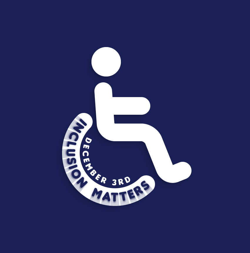
For starters, you will learn how to set up a simple grid and how to easily add or remove anchor points from a path. Moving on, you will learn how to add text on a path, how to stylize it, and how to easily mask it. Using basic stroke techniques and the Rounded Corners effect, you will learn how to create most of that wheelchair logo. Finally, you will learn how to add a simple background, some subtle shading, and a smaller piece of text on a path.
For more inspiration on how to adjust or improve your final text effect, you can find plenty of resources at GraphicRiver.
1. How to Create a New Document and Set Up a Grid
Hit Control-N to create a new document. Select Pixels from the Units drop-down menu, enter 850 in the width box and 860 in the height box, and then click that More Settings button. Select RGB for the Color Mode, set the Raster Effects to Screen (72 ppi), and then click Create Document.
Enable the Grid (View > Show Grid) and the Snap to Grid (View > Snap to Grid). You will need a grid every 10 px, so simply go to Edit > Preferences > Guides & Grid, and enter 10 in the Gridline every box and 1 in the Subdivisions box. Try not to get discouraged by all that grid—it will make your work easier, and keep in mind that you can easily enable or disable it using the Control-„ keyboard shortcut.
You should also open the Info panel (Window > Info) for a live preview with the size and position of your shapes. Don’t forget to set the unit of measurement to pixels from Edit > Preferences > Units. All these options will significantly increase your work speed.
2. How to Create the Wheelchair Wheel
Step 1
Pick the Rectangle Tool (M) and focus on your Toolbar. Remove the color from the fill and then select the stroke and set its color to R=37 G=170 B=227. Move to your artboard and simply create a 300 px circle—the grid and the Snap to Grid should make it easier.
Make sure that your shape stays selected, focus on the Appearance panel (Window > Appearance), and set the stroke weight to 60 px.
Step 2
With your shape still selected, go to Object > Path > Add Anchor Points twice. Pick the Direct Selection Tool (A), select the seven anchor points highlighted in the first image, and remove them using the Delete button on your keyboard.
Make sure that the resulting path remains selected and return to the Appearance panel. Click that „Stroke” piece of text to open the Stroke fly-out panel, and then check the Round Cap and Round Join buttons.
3. How to Add Text on a Path and Stylize It
Step 1
Pick the Ellipse Tool (L), create a 330 px circle, and place it exactly as shown in the following image. The color attributes are not very important.
Step 2
Make sure that your 330 px circle is still selected, pick the Type on a Path Tool, and simply click on the edge of your selected shape. This will allow you to add text along your path.
Add the „INCLUSION MATTERS” piece of text, make it white, and open the Character panel (Window > Type > Character). Select the Insaniburger font, and set the Size to 45 px and the Tracking to 75.
Next, you need to adjust the position of your text. Switch to the Direct Selection Tool (A) and simply drag that middle bracket from the outside to the inside of your circle. This should move your text inside the circle. Use that same bracket to move your text along the path as shown in the following image.
Step 3
Make sure that your text is still selected, focus on the Appearance panel, and add a new fill using the Add New Fill button. Select it and set the color to R=27 G=34 B=88.
Step 4
Make sure that your text is still selected and keep focusing on the Appearance panel. Add a second fill, drag it below the existing one, and select it.
Set the color to R=27 G=34 B=88, lower its Opacity to 30%, and go to Effect > Distort & Transform > Transform. Drag both Scale sliders to 101% and set the Move-Vertical slider to 0.2 px, enter 1 in that Copies box, and then click OK.
Step 5
Make sure that your text is still selected and keep focusing on the Appearance panel. Add a third fill, drag it below the existing ones, and select it.
Set the color to R=27 G=34 B=88, lower its Opacity to 30%, and go to Effect > Distort & Transform > Transform. Enter the attributes shown in the following image, click OK, and then go to Effect > Blur > Gaussian Blur. Enter a 3 px Radius and click OK.
Step 6
Make sure that your text is still selected and keep focusing on the Appearance panel. Add a fourth fill, drag it below the existing ones, and select it.
Set the color to R=27 G=34 B=88, lower its Opacity to 15%, and go to Effect > Distort & Transform > Transform. Enter the attributes shown in the following image and then click OK.
Step 7
Make sure that your text is still selected and keep focusing on the Appearance panel. Add a fifth fill, drag it below the existing ones, and select it.
Set the color to R=27 G=34 B=88, lower its Opacity to 20%, and go to Effect > Distort & Transform > Transform. Enter the attributes shown in the following image and then click OK.
Step 8
Select your blue path, make a copy in front (Control-C > Control-F), and bring it to front (Shift-Control-]). With this copy still selected, go to the Appearance panel and set the stroke color to white.
Select this white path along your text on a path, open the Transparency panel (Window > Transparency), and click the Make Mask button. In the end, things should look like in the third image.
4. How to Create the Background
Step 1
Pick the Rectangle Tool (M) and create an 870 x 880 px shape. Fill it with R=27 G=34 B=88, send it to back (Shift-Control-[), and make sure that it covers your entire artboard.
Step 2
Reselect your blue path and replace the blue with white.
5. How to Create a Human Silhouette
Step 1
Pick the Pen Tool (P) and create a simple path about as shown in the following image. Once again, the grid and the Snap to Grid will help. Add a 60 px stroke for this new path, make it white, and don’t forget to check the Round Cap and Round Join buttons.
Step 2
Make sure that the path created in the previous step is still selected and go to Effect > Stylize > Rounded Corners. Enter a 30 px Radius and then click OK.
Step 3
Using the Pen Tool (P) or the Line Segment Tool (\), create a 120 px horizontal path, and place it as shown in the following image. Add a 60 px stroke for this new path, make it white, and don’t forget to check the Round Cap button.
Step 4
Pick the Ellipse Tool (L) and create a 100 px circle. Fill it with white and place it as shown below.
6. How to Add Subtle Shading and a Second Text on a Path
Step 1
Reselect your white circle along with the three white paths and Group them (Control-G).
Step 2
With your group still selected, apply the three Drop Shadow effects (Effect > Stylize > Drop Shadow) shown in the following image.
Step 3
Pick the Ellipse Tool (L), create a 220 px circle, and place it exactly as shown in the following image.
Step 4
Make sure that your 220 px circle is still selected, pick the Type on a Path Tool, and add the „DECEMBER 3RD” piece of text along your selection. Make it white, use the text attributes shown below, and use the Direct Selection Tool (A) to adjust the text location as shown below.
Congratulations! You’re Done!
Here is how it should look. I hope you’ve enjoyed this tutorial and can apply these techniques in your future projects. Don’t hesitate to share your final result in the comments section.
Feel free to adjust the final design and make it your own. You can find some great sources of inspiration at GraphicRiver, with interesting solutions to improve your design.
For starters, you will learn how to set up a simple grid and how to easily add or remove anchor points from a path. Moving on, you will learn how to add text on a path, how to stylize it, and how to easily mask it. Using basic stroke techniques and the Rounded Corners effect, you will learn how to create most of that wheelchair logo. Finally, you will learn how to add a simple background, some subtle shading, and a smaller piece of text on a path.
For more inspiration on how to adjust or improve your final text effect, you can find plenty of resources at GraphicRiver.
1. How to Create a New Document and Set Up a Grid
Hit Control-N to create a new document. Select Pixels from the Units drop-down menu, enter 850 in the width box and 860 in the height box, and then click that More Settings button. Select RGB for the Color Mode, set the Raster Effects to Screen (72 ppi), and then click Create Document.
Enable the Grid (View > Show Grid) and the Snap to Grid (View > Snap to Grid). You will need a grid every 10 px, so simply go to Edit > Preferences > Guides & Grid, and enter 10 in the Gridline every box and 1 in the Subdivisions box. Try not to get discouraged by all that grid—it will make your work easier, and keep in mind that you can easily enable or disable it using the Control-„ keyboard shortcut.
You should also open the Info panel (Window > Info) for a live preview with the size and position of your shapes. Don’t forget to set the unit of measurement to pixels from Edit > Preferences > Units. All these options will significantly increase your work speed.
2. How to Create the Wheelchair Wheel
Step 1
Pick the Rectangle Tool (M) and focus on your Toolbar. Remove the color from the fill and then select the stroke and set its color to R=37 G=170 B=227. Move to your artboard and simply create a 300 px circle—the grid and the Snap to Grid should make it easier.
Make sure that your shape stays selected, focus on the Appearance panel (Window > Appearance), and set the stroke weight to 60 px.
Step 2
With your shape still selected, go to Object > Path > Add Anchor Points twice. Pick the Direct Selection Tool (A), select the seven anchor points highlighted in the first image, and remove them using the Delete button on your keyboard.
Make sure that the resulting path remains selected and return to the Appearance panel. Click that „Stroke” piece of text to open the Stroke fly-out panel, and then check the Round Cap and Round Join buttons.
3. How to Add Text on a Path and Stylize It
Step 1
Pick the Ellipse Tool (L), create a 330 px circle, and place it exactly as shown in the following image. The color attributes are not very important.
Step 2
Make sure that your 330 px circle is still selected, pick the Type on a Path Tool, and simply click on the edge of your selected shape. This will allow you to add text along your path.
Add the „INCLUSION MATTERS” piece of text, make it white, and open the Character panel (Window > Type > Character). Select the Insaniburger font, and set the Size to 45 px and the Tracking to 75.
Next, you need to adjust the position of your text. Switch to the Direct Selection Tool (A) and simply drag that middle bracket from the outside to the inside of your circle. This should move your text inside the circle. Use that same bracket to move your text along the path as shown in the following image.
Step 3
Make sure that your text is still selected, focus on the Appearance panel, and add a new fill using the Add New Fill button. Select it and set the color to R=27 G=34 B=88.
Step 4
Make sure that your text is still selected and keep focusing on the Appearance panel. Add a second fill, drag it below the existing one, and select it.
Set the color to R=27 G=34 B=88, lower its Opacity to 30%, and go to Effect > Distort & Transform > Transform. Drag both Scale sliders to 101% and set the Move-Vertical slider to 0.2 px, enter 1 in that Copies box, and then click OK.
Step 5
Make sure that your text is still selected and keep focusing on the Appearance panel. Add a third fill, drag it below the existing ones, and select it.
Set the color to R=27 G=34 B=88, lower its Opacity to 30%, and go to Effect > Distort & Transform > Transform. Enter the attributes shown in the following image, click OK, and then go to Effect > Blur > Gaussian Blur. Enter a 3 px Radius and click OK.
Step 6
Make sure that your text is still selected and keep focusing on the Appearance panel. Add a fourth fill, drag it below the existing ones, and select it.
Set the color to R=27 G=34 B=88, lower its Opacity to 15%, and go to Effect > Distort & Transform > Transform. Enter the attributes shown in the following image and then click OK.
Step 7
Make sure that your text is still selected and keep focusing on the Appearance panel. Add a fifth fill, drag it below the existing ones, and select it.
Set the color to R=27 G=34 B=88, lower its Opacity to 20%, and go to Effect > Distort & Transform > Transform. Enter the attributes shown in the following image and then click OK.
Step 8
Select your blue path, make a copy in front (Control-C > Control-F), and bring it to front (Shift-Control-]). With this copy still selected, go to the Appearance panel and set the stroke color to white.
Select this white path along your text on a path, open the Transparency panel (Window > Transparency), and click the Make Mask button. In the end, things should look like in the third image.
4. How to Create the Background
Step 1
Pick the Rectangle Tool (M) and create an 870 x 880 px shape. Fill it with R=27 G=34 B=88, send it to back (Shift-Control-[), and make sure that it covers your entire artboard.
Step 2
Reselect your blue path and replace the blue with white.
5. How to Create a Human Silhouette
Step 1
Pick the Pen Tool (P) and create a simple path about as shown in the following image. Once again, the grid and the Snap to Grid will help. Add a 60 px stroke for this new path, make it white, and don’t forget to check the Round Cap and Round Join buttons.
Step 2
Make sure that the path created in the previous step is still selected and go to Effect > Stylize > Rounded Corners. Enter a 30 px Radius and then click OK.
Step 3
Using the Pen Tool (P) or the Line Segment Tool (\), create a 120 px horizontal path, and place it as shown in the following image. Add a 60 px stroke for this new path, make it white, and don’t forget to check the Round Cap button.
Step 4
Pick the Ellipse Tool (L) and create a 100 px circle. Fill it with white and place it as shown below.
6. How to Add Subtle Shading and a Second Text on a Path
Step 1
Reselect your white circle along with the three white paths and Group them (Control-G).
Step 2
With your group still selected, apply the three Drop Shadow effects (Effect > Stylize > Drop Shadow) shown in the following image.
Step 3
Pick the Ellipse Tool (L), create a 220 px circle, and place it exactly as shown in the following image.
Step 4
Make sure that your 220 px circle is still selected, pick the Type on a Path Tool, and add the „DECEMBER 3RD” piece of text along your selection. Make it white, use the text attributes shown below, and use the Direct Selection Tool (A) to adjust the text location as shown below.
Congratulations! You’re Done!
Here is how it should look. I hope you’ve enjoyed this tutorial and can apply these techniques in your future projects. Don’t hesitate to share your final result in the comments section.
Feel free to adjust the final design and make it your own. You can find some great sources of inspiration at GraphicRiver, with interesting solutions to improve your design.