Your client doesn’t know what he wants in terms of design, so you have a blank screen to work on. The whole point of an e-commerce site is to sell, so all your design decisions must focus on what works for the final customer. You know what works, but you have to explain your choice to the client who is only interested in sales figures.
1. Understand the Target Profile
This is the one area where your client knows more than you. Listen and listen hard. Ask questions about the age, gender, education, and motivations of the target customer. Then go away and do your own research. This will include mobile use and color/font preferences. Look at other sites that are competing with your client’s and see what works for them.
The font you choose and layout also play a large part in any decision to stay or click the ‘back’ button. First impressions count, and you have only a fraction of a second to convince a website user that the site is reputable and aimed at them. A Stamford study showed that people’s decisions regarding a site’s trustworthiness depend on visual cues like the header, rather than logical ones such as a good privacy policy or generous returns conditions.
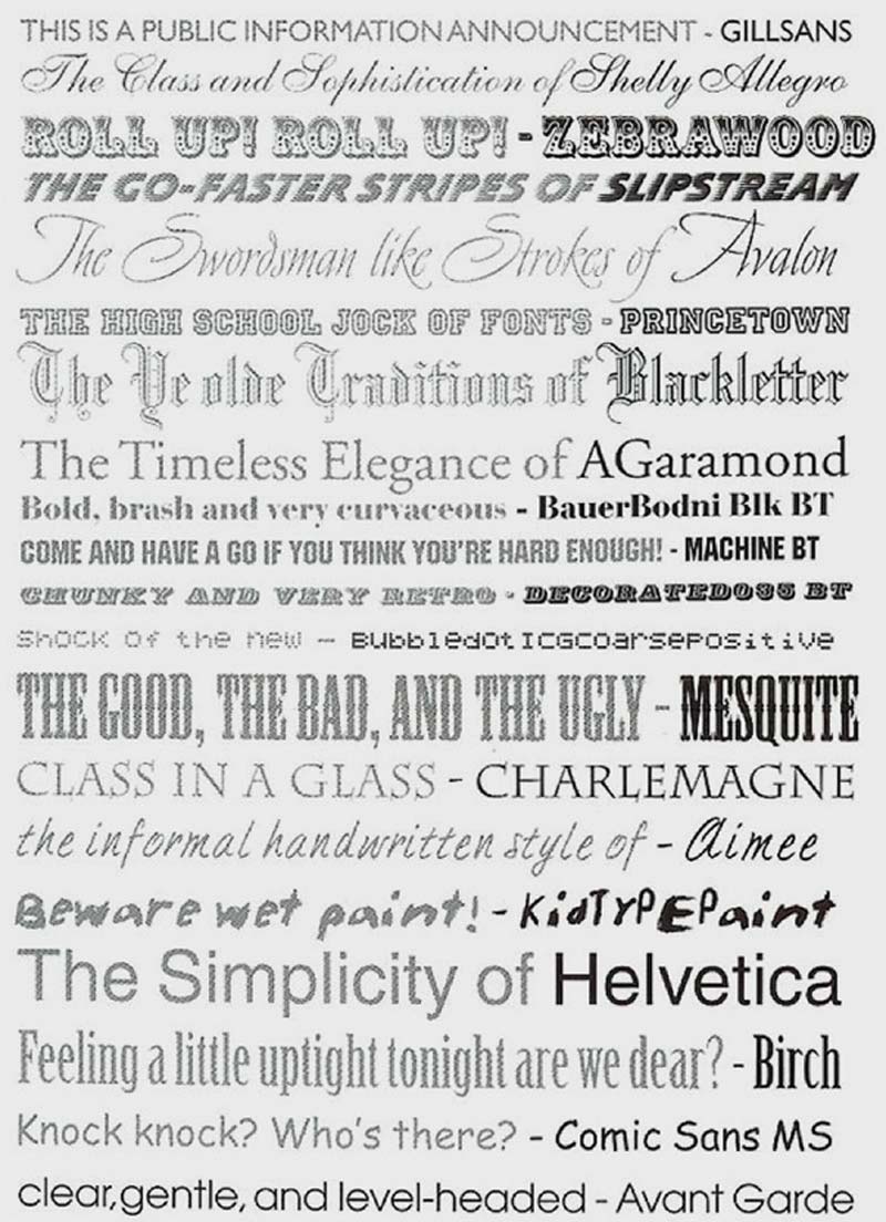
People read emotional meanings into fonts, and these are linked to the common usage types of each font. The image above from Graphic Design School by David Dabner illustrates this.
2. Understand What the Client Wants
Expand the brief to include the client’s expectations and preferences regarding layout, color, number of products to a page, product categories and total number of items. Failure to set down in black and white what the client expects can lead to your design being rejected and you not being paid for your time.
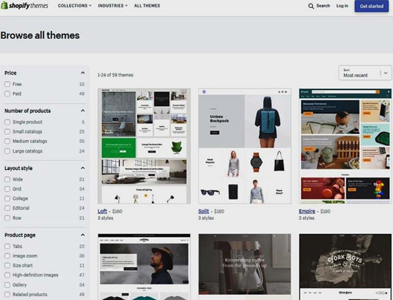
Just looking at Shopify themes, there are 59 themes to choose from. You can narrow your selection using the filters on the left of the screen, but you still have too many to choose from.
Most themes can be customized and come with two to four style options that allow you to change the layout. Use your brief to decide on the best option for the client’s customers, but be prepared to change the layout if the client demands you do so.
Mobile First Design Principles
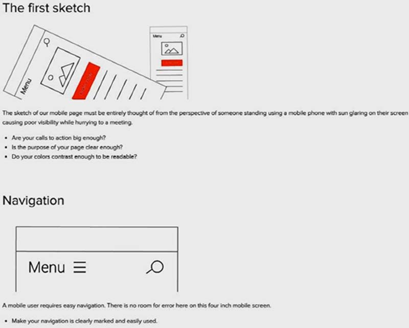
Most users will be on small phone screens, so your design needs to work for them. Buy Now, and Navigation links should use large buttons, rather than text links.
The screen shot above from Varvy illustrates a few mobile-first design principles, but the page itself is a prime example of how this design philosophy makes desktop users’ lives easier, too. There is lots of white space, fonts are large, and contrast is good, all of which benefit everyone, no matter what device they are using.
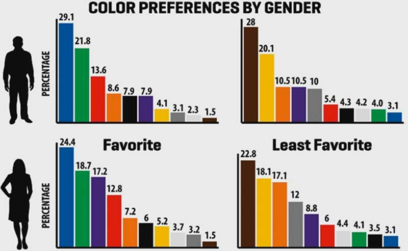
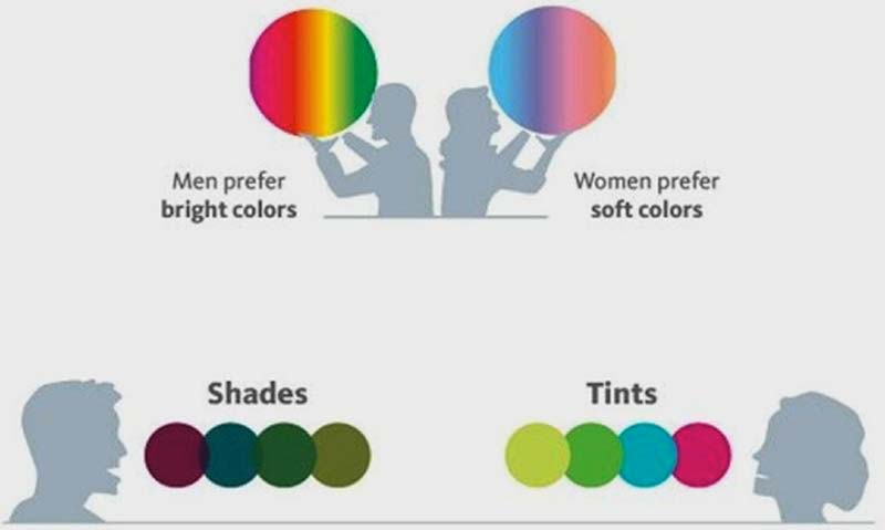
Color plays a large part in customers’ decisions to stay on a site, as this chart from HotDesign.com shows. It gives a clue as to why most websites use a blue design. Your color choices will be guided by the preferences of the target profile. Female users have a preference for more subtle shades as shown in the diagram below from Entrepreneur.com.
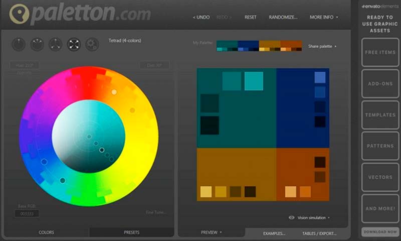
The Paletton tool allows you to choose different numbers and different color wheel relationships of colors.
In Brief
Avoid giving the client more than two options in your presentation. It is for you as the designer to decide on colors, layouts, and fonts, and to explain your choices to your client so he is happy enough to pay you. You have to justify your design decisions and relate them to your brief. Your final theme design may well differ from what the client was expecting, and he or she must be happy with that before you are paid.
Ultimately, it is your client who pays you, so you might have to compromise between what you think is the best design and what your client wants.
Scopes and closures are important in JavaScript. But, they were confusing for me when I first started. Here’s an explanation of scopes and closures to help you understand what they are.
Let’s start with scopes.
Scope
A scope in JavaScript defines what variables you have access to. There are two kinds of scope – global scope and local scope.
Global scope
If a variable is declared outside all functions or curly braces ({}), it is said to be defined in the global scope.
This is true only with JavaScript in web browsers. You declare global variables in Node.js differently, but we won’t go into Node.js in this article.
const globalVariable = 'some value'
Once you’ve declared a global variable, you can use that variable anywhere in your code, even in functions.
Although you can declare variables in the global scope, it is advised not to. This is because there is a chance of naming collisions, where two or more variables are named the same. If you declared your variables with const or let, you would receive an error whenever you a name collision happens. This is undesirable.
// Don't do this!
let thing = 'something'
let thing = 'something else' // Error, thing has already been declared
If you declare your variables with var, your second variable overwrites the first one after it is declared. This also undesirable as you make your code hard to debug.
// Don't do this!
var thing = 'something'
var thing = 'something else' // perhaps somewhere totally different in your code
console.log(thing) // 'something else'
So, you should always declare local variables, not global variables.
Local Scope
Variables that are usable only in a specific part of your code are considered to be in a local scope. These variables are also called local variables.
In JavaScript, there are two kinds of local scope: function scope and block scope.
Let’s talk about function scopes first.
Function scope
When you declare a variable in a function, you can access this variable only within the function. You can’t get this variable once you get out of it.
In the example below, the variable hello is in the sayHello scope:
function sayHello () {
  const hello = 'Hello CSS-Tricks Reader!'
  console.log(hello)
}

sayHello() // 'Hello CSS-Tricks Reader!'
console.log(hello) // Error, hello is not defined
Block scope
When you declare a variable with const or let within a curly brace ({}), you can access this variable only within that curly brace.
In the example below, you can see that hello is scoped to the curly brace:
{
  const hello = 'Hello CSS-Tricks Reader!'
  console.log(hello) // 'Hello CSS-Tricks Reader!'
}

console.log(hello) // Error, hello is not defined
The block scope is a subset of a function scope since functions need to be declared with curly braces (unless you’re using arrow functions with an implicit return).
Function hoisting and scopes
Functions, when declared with a function declaration, are always hoisted to the top of the current scope. So, these two are equivalent:
// This is the same as the one below
sayHello()
function sayHello () {
  console.log('Hello CSS-Tricks Reader!')
}

// This is the same as the code above
function sayHello () {
  console.log('Hello CSS-Tricks Reader!')
}
sayHello()
When declared with a function expression, functions are not hoisted to the top of the current scope.
sayHello() // Error, sayHello is not defined
const sayHello = function () {
  console.log(aFunction)
}
Because of these two variations, function hoisting can potentially be confusing, and should not be used. Always declare your functions before you use them.
Functions do not have access to each other’s scopes
Functions do not have access to each other’s scopes when you define them separately, even though one function may be used in another.
In this example below, second does not have access to firstFunctionVariable.
function first () {
  const firstFunctionVariable = `I'm part of first`
}

function second () {
  first()
  console.log(firstFunctionVariable) // Error, firstFunctionVariable is not defined
}
Nested scopes
When a function is defined in another function, the inner function has access to the outer function’s variables. This behavior is called lexical scoping.
However, the outer function does not have access to the inner function’s variables.
function outerFunction () {
  const outer = `I'm the outer function!`

  function innerFunction() {
    const inner = `I'm the inner function!`
    console.log(outer) // I'm the outer function!
  }

  console.log(inner) // Error, inner is not defined
}
To visualize how scopes work, you can imagine one-way glass. You can see the outside, but people from the outside cannot see you.
Scopes in functions behave like a one-way-glass. You can see the outside, but people outside can’t see you
If you have scopes within scopes, visualize multiple layers of one-way glass.
Multiple layers of functions mean multiple layers of one-way glass
After understanding everything about scopes so far, you’re well primed to figure out what closures are.
Closures
Whenever you create a function within another function, you have created a closure. The inner function is the closure. This closure is usually returned so you can use the outer function’s variables at a later time.
function outerFunction () {
  const outer = `I see the outer variable!`

  function innerFunction() {
    console.log(outer)
  }

  return innerFunction
}

outerFunction()() // I see the outer variable!
Since the inner function is returned, you can also shorten the code a little by writing a return statement while declaring the function.
function outerFunction () {
  const outer = `I see the outer variable!`

  return function innerFunction() {
    console.log(outer)
  }
}

outerFunction()() // I see the outer variable!
Since closures have access to the variables in the outer function, they are usually used for two things:
To control side effects
To create private variables
Controlling side effects with closures
Side effects happen when you do something in aside from returning a value from a function. Many things can be side effects, like an Ajax request, a timeout or even a console.log statement:
function (x) {
  console.log('A console.log is a side effect!')
}
When you use closures to control side effects, you’re usually concerned with ones that can mess up your code flow like Ajax or timeouts.
Let’s go through this with an example to make things clearer.
Let’s say you want to make a cake for your friend’s birthday. This cake would take a second to make, so you wrote a function that logs made a cake after one second.
I’m using ES6 arrow functions here to make the example shorter, and easier to understand.
function makeCake() {
  setTimeout(_ => console.log(`Made a cake`, 1000)
  )
}
As you can see, this cake making function has a side effect: a timeout.
Let’s further say you want your friend to choose a flavor for the cake. To do so, you can write add a flavor to your makeCake function.
function makeCake(flavor) {
  setTimeout(_ => console.log(`Made a ${flavor} cake!`, 1000))
}
When you run the function, notice the cake gets made immediately after one second.
makeCake('banana')
// Made a banana cake!
The problem here is that you don’t want to make the cake immediately after knowing the flavor. You want to make it later when the time is right.
To solve this problem, you can write a prepareCake function that stores your flavor. Then, return the makeCake closure within prepareCake.
From this point on, you can call the returned function whenever you want to, and the cake will be made within a second.
function prepareCake (flavor) {
  return function () {
    setTimeout(_ => console.log(`Made a ${flavor} cake!`, 1000))
  }
}

const makeCakeLater = prepareCake('banana')

// And later in your code...
makeCakeLater()
// Made a banana cake!
That’s how closures are used to reduce side effects – you create a function that activates the inner closure at your whim.
Private variables with closures
As you know by now, variables created in a function cannot be accessed outside the function. Since they can’t be accessed, they are also called private variables.
However, sometimes you need to access such a private variable. You can do so with the help of closures.
function secret (secretCode) {
  return {
    saySecretCode () {
      console.log(secretCode)
    }
  }
}

const theSecret = secret('CSS Tricks is amazing')
theSecret.saySecretCode()
// 'CSS Tricks is amazing'
saySecretCode in this example above is the only function (a closure) that exposes the secretCode outside the original secret function. As such, it is also called a privileged function.
Debugging scopes with DevTools
Chrome and Firefox’s DevTools make it simple for you to debug variables you can access in the current scope. There are two ways to use this functionality.
The first way is to add the debugger keyword in your code. This causes JavaScript execution in browsers to pause so you can debug.
Here’s an example with the prepareCake:
function prepareCake (flavor) {
  // Adding debugger
  debugger
  return function () {
    setTimeout(_ => console.log(`Made a ${flavor} cake!`, 1000))
  }
}

const makeCakeLater = prepareCake('banana')
If you open your DevTools and navigate to the Sources tab in Chrome (or Debugger tab in Firefox), you would see the variables available to you.
Debugging prepareCake’s scope
You can also shift the debugger keyword into the closure. Notice how the scope variables changes this time:
function prepareCake (flavor) {
  return function () {
    // Adding debugger
    debugger
    setTimeout(_ => console.log(`Made a ${flavor} cake!`, 1000))
  }
}

const makeCakeLater = prepareCake('banana')
Debugging the closure scope
The second way to use this debugging functionality is to add a breakpoint to your code directly in the sources (or debugger) tab by clicking on the line number.
Debugging scopes by adding breakpoints
Wrapping up
Scopes and closures aren’t incredibly hard to understand. They’re pretty simple once you know how to see them through a one-way glass.
When you declare a variable in a function, you can only access it in the function. These variables are said to be scoped to the function.
If you define any inner function within another function, this inner function is called a closure. It retains access to the variables created in the outer function.
Feel free to pop by and ask any questions you have. I’ll get back to you as soon as I can.
If you liked this article, you may also like other front-end-related articles I write on my blog and my newsletter. I also have a brand new (and free!) email course: JavaScript Roadmap.
Trevor Davis on how we’ll link up CSS when we go all-in on HTTP/2:
This is the opposite of what we have done as best practice for years now. But in order to take advantage of multiplexing, it’s best to break up your CSS into smaller files so that only the necessary CSS is loaded on each page. An example page markup would look something like this:
This idea shares some DNA with Critical CSS. Loading CSS with <link> is blocking, so load as little of it as you can right away and load the rest of it as you need it. There is no penalty for loading the stylesheets individually because of HTTP/2 multiplexing, and loading them right before the HTML that uses them actually takes advantage of the blocking by not allowing the rendering of the HTML before the CSS for it is gotten. Plus you’ll be able to break cache on these smaller bits of CSS as needed, just bear in mind it might not compress as well.
The thing is… for any browser that doesn’t support HTTP/2 (e.g. IE 10, Opera mobile/mini, UC browser), while this technique will still work, it will be pretty bad for performance. This will be an easier call to make on projects that don’t need to support those browsers for whatever reason.
I’ve been thinking about sound on websites for a while now.
When we talk about using sound on websites, most of us grimace and think of the old days, when blaring background music played when the website loaded.
Today this isn’t and needn’t be a thing. We can get clever with sound. We have the Web Audio API now and it gives us a great deal of control over how we design sound to be used within our web applications.
In this article, we’ll experiment with just one simple example: a form.
What if when you were filling out a form it gave you auditory feedback as well as visual feedback. I can see your grimacing faces! But give me a moment.
We already have a lot of auditory feedback within the digital products we use. The keyboard on a phone produces a tapping sound. Even if you have „message received” sounds turned off, you’re more than likely able to hear your phone vibrate. My MacBook makes a sound when I restart it and so do games consoles. Auditory feedback is everywhere and pretty well integrated, to the point that we don’t really think about it. When was the last time you grimaced at the microwave when it pinged? I bet you’re glad you didn’t have to watch it to know when it was done.
As I’m writing this article my computer just pinged. One of my open tabs sent me a useful notification. My point being sound can be helpful. We may not all need to know with our ears whether we’ve filled a form incorrectly, there may be plenty of people out there that do find it beneficial.
So I’m going to try it!
Why now? We have the capabilities at our finger tips now. I already mentioned the Web Audio API, we can use this to create/load and play sounds. Add this to HTML form validating capabilities and we should be all set to go.
We don’t want awful obtrusive sounds, but we do want those sounds to represent success and failure. One simple way to do this would be to have a higher, brighter sounds which go up for success and lower, more distorted sounds that go down for failure. This still gives us very broad options to choose from but is a general sound design pattern.
With the Web Audio API, we can create sounds right in the browser. Here are examples of little functions that play positive and negative sounds:
Those are examples of creating sound with the oscillator, which is kinda cool because it doesn’t require any web requests. You’re literally coding the sounds. It’s a bit like the SVG of the sound world. It can be fun, but it can be a lot of work and a lot of code.
While I was playing around with this idea, FaceBook released their SoundKit, which is:
To help designers explore how sound can impact their designs, Facebook Design created a collection of interaction sounds for prototypes.
Here’s an example of selecting a few sounds from that and playing them:
Another way would be to fetch the sound file and use the audioBufferSourceNode. As we’re using small files there isn’t much overhead here, but, the demo above does fetch the file over the network everytime it is played. If we put the sound in a buffer, we wouldn’t have to do that.
Figuring Out When to Play the Sounds
This experiment of adding sounds to a form brings up a lot of questions around the UX of using sound within an interface.
So far, we have two sounds, a positive/success sound and a negative/fail sound. It makes sense that we’d play these sounds to alert the user of these scenarios. But when exactly?
Here’s some food for thought:
Do we play sound for everyone, or is it an opt-in scenario? opt-out? Are there APIs or media queries we can use to inform the default?
Do we play success and fail sounds upon form submission or is it at the individual input level? Or maybe even groups/fieldsets/pages?
If we’re playing sounds for each input, when do we do that? On blur?
Do we play sounds on every blur? Is there different logic for success and fail sounds, like only one fail sound until it’s fixed?
There aren’t any extremely established best practices for this stuff. The best we can do is make tasteful choices and do user research. Which is to say, the examples in this post are ideas, not gospel.
Greg Genovese has an article all about form validation and screen readers. „Readers” being relevant here, as that’s all about audio! There is a lot to be done with aria roles and moving focus and such so that errors are clear and it’s clear how to fix them.
The Web Audio API could play a role here as well, or more likely, the Web Speech API. Audio feedback for form validation need not be limited to screen reader software. It certainly would be interesting to experiment with reading out actual error messages, perhaps in conjunction with other sounds like we’ve experimented with here.
Thoughts
All of this is what I call Sound Design in Web Design. It’s not merely just playing music and sounds, it’s giving the sound scape thought and undertaking some planning and designing like you would with any other aspect of what you design and build.
There is loads more to be said on this topic and absolutely more ways in which you can use sound in your designs. Let’s talk about it!
A’ Design Awards have now become a classic competition and event for designers. This year’s edition was a blast, with tons of great designers taking part from all over the world. The awards team have announced the winners recently, and there is lots of inspiration to be found there. If you are a designer or a design studio, don’t forget that you can already register in the 2017-2018 edition.
20 amazing designs selected by the jury
The awards international jury had the tremendous task to select the best designs among the many work submissions. Right after this, you can discover a selection of 20 awesome examples of designs that have been selected as winners of the competition. You can check this page for all the winners.
Which vegetable do we associate with Halloween? Of course, it is a pumpkin with a scary carved face, also known as a jack-o’-lantern.
In this tutorial I am going to show you how to create a Halloween pumpkin pattern in Adobe Illustrator using basic shapes, the Pen Tool, and the Pattern Tool.
First we need to set up a New Document (File > New or Control-N) with these settings:
Number of Artboards: 1
Width: 1200
Height: 1200
Units: pixels
From the Advanced tab:
Color Mode: RGB
Raster Effects: Screen
Preview Mode: Default
Uncheck Align New Objects to Pixel Grid
2. How to Create a Halloween Pumpkin
Step 1
Let’s start building a pumpkin from a 280 x 255px ellipse made with the help of the Ellipse Tool (L). Set the Fill color to default white and the Stroke color to default black, changing the Stroke weight to 4 px.
Add two narrower ellipses inside the first one.
Step 2
Take the Rectangle Tool (M) and create an 18 x 45 px rectangle with the same default colors and stroke weight of 4 px.
Select the figure and double-click the Rotate Tool (R) to open the Options menu. Set the Angle value to 45 degrees andpress OK.
Step 3
Choose the angled rectangle and select the Reflect Tool (O). Holding the Alt key, click on the middle of the shape. In the Reflect window, set the Axis to Vertical andpress the Copy button, getting a mirror copy of the angled rectangle right over the first one.
Step 4
Holding down Shift, select both figures that we created with the Selection Tool (V). Use the Unite option on the Pathfinder panel, merging them into one shape. It is going to be the eye of the pumpkin face.
Place the eye on the left side of the pumpkin and create a mirror copy of it on the right side using the Reflect Tool (O) method.
Step 5
Let’s continue adding details to the pumpkin by creating a 35 x 52 px rectangle. Choose the Add Anchor Point Tool (+) and click in the middle of the bottom edge of the rectangle, adding one more anchor point. Delete the left and right bottom anchors with the Delete Anchor Point Tool (-), getting a triangle shape.
Step 6
Select the bottom anchor with the Direct Selection Tool (A) and use the Live Corners feature to make the corner rounded by dragging the circle indicator to the center of the shape, setting the corner radius to about 4 px. Then slightly round the top anchors using the same method.
Add a small ellipse to the top of the triangle-like figure, forming the pumpkin stem. Group (Control-G) all the objects together and place the stem on the top of the pumpkin.
Step 7
With the help of the Pen Tool (P), add a crooked mouth to the pumpkin face.
Step 8
We should make some color changes to prepare our pumpkin for pattern making. Change the Fill color of eyes and mouth to black and the Stroke to None.
Set the fill color of the head and the stem to #231F20.
Step 9
Choose all the pumpkin parts and go to Object > Expand. Check the Stroke option, and uncheck the Fill option, pressing OK. Our strokes will transform into filled shapes.
Step 10
Select all shapes and go to the Pathfinder panel using the Divide function. The artwork gets cut into small pieces. (1)
Double-click on the Magic Wand Tool (Y), uncheck all options except the Fill Color option, and click on any black part of the pumpkin. Press Delete, getting all the black pieces removed. (2)
Choose the orange parts of the pumpkin and use the Unite option on the Pathfinder panel, merging all the small pieces into one shape. (3)
The pumpkin is ready!
3. How to Create a Pumpkin Pattern
Step 1
Select the pumpkin head and go to Object > Pattern > Make. In the Pattern Options, set the size to 1200 x 1200 px. Rotating and copying, spread a few pumpkin heads inside the blue outline, leaving empty spaces between them.
Step 2
Fill up the remaining space with more pumpkin heads, rotating them and varying their sizes to create a balanced composition.
Then press Done on the upper panel. The pattern will appear in the Swatches panel (Window > Swatches). You can edit it any time by just double-clicking on its thumbnail to open the Pattern Options window.
Step 3
Build a 1200 x 1200 px rectangle, which we will fill using #BD6B21 for the background, and align it to the Artboard.
Create another 1200 x 1200 px rectangle. Keeping it selected, go to the Swatches panel (Window > Swatches) and press on our pattern thumbnail.
Step 4
You can easily change the size of our pattern by going to Object > Transform > Scale. Then choose only Scale Pattern and set it to 70%.
In Options, check only the Transform Patterns option, leaving other options unchecked. Then press OK.
Happy Halloween Celebration!
Our pumpkin pattern is ready. Great job!
You can use your imagination and create complex patterns by adding more Halloween symbols and details.
I hope you enjoyed the process and learned some new tips and tricks that you can use for creating patterns in future. Feel free to share your results in the comments below.
Animators and motion designers are increasingly working on the web. But how can you make the transition? Do you have the skills you need? How do you even get started?
In this tutorial I will guide you through the steps to create a photo-realistic hot stamp mockup with Adobe Photoshop. The process starts from scratch, so be sure to grab your camera (your smartphone will be fine), plug in your printer, and open your Photoshop (CS6 or higher), because this thrilling trip is about to start!
Firstly, we need a real perspective that will be the base to build all the elements of the scene.
What we are going to do in this chapter is draw a solid object on a two-dimensional surface like the canvas of Photoshop, and then print and take a shot of it at different angles so as to give the right impression of the height, width, depth, and position of the object in relation to each other when viewed from a particular point.
I’ve already done this work for you, so you can just download it.
However, if you feel like it, you could create your own personal perspective. Just follow these steps:
Step 1
Create a 1240 x 1754 pxNew Document in Photoshop.
Select the Rectangle Tool.
Move the cursor over the canvas and click. You’ll open a small dialog box that allows you to enter precise dimensions for your new shape. Type 350 x 350 px and click the OK button. The shape is created to the lower right of the point where you clicked.
Step 2
Locate the Properties panel. If you can’t see the panel, open it by choosing Window > Properties.
Set the Shape Fill Type to Black, the Shape Stroke Fill to Transparent, and the position of the rectangle to 443 px for X and 700 px for Y axis:
Now, the black rectangle should be in the center of the canvas.
Step 3
Plug in your printer and print the document. Position your sheet on the floor, near a light source like a window or lamp.
Step 4
Grab your camera (your smartphone will be just fine) and get some shots of the black rectangle. With the camera in hand, try to get down and close to one of the rectangle’s corner to get a more intense perspective. Take several pictures with different angles and positions, and choose one that suits you. You should get a perspective similar to this:
From now on, I will use my perspective for the tutorial, but the following steps are fine even if you have decided to use your personal perspective.
2. How to Add a Rubber Texture to the Scene
Step 1
Open the perspective image with Photoshop or, if you’re using you own perspective created in the previous chapter, import it in a new 2500 x 1600 px document. If you’re using your own perspective image, try to keep the proportions between the black rectangle and the white background similar to my image:
Locate the Layers panel. If you can’t see the panel, open it by choosing Window > Layers.
Look at the „Background” layer. It could be locked (a small padlock appears close the right edge of the layer):
To unlock the layer, choose Layer > New > Layer from Background and press OK.
Rename the layer by double-clicking directly on the layer’s name in the Layers panel and changing it to „Perspective”.
Select the texture by choosing Select > All or pressing Command-A. Now copy the layer content by going to Edit > Copy or pressing Command-C.
Go back to the previous document (the one with the perspective) by clicking on the proper tab.
Now paste the rubber texture just copied by choosing Edit > Paste or pressing Command-V.
Rename the layer by double-clicking directly on the layer’s name in the Layers panel and changing it to „Rubber Texture”.
Close the rubber texture document. Don’t save changes to the document before closing.
Step 3
The rubber texture just imported is actually too large for our canvas, so choose Edit > Free Transform or press Command-T and drag a corner handle to resize the texture. Press Shift as you drag the corner handle to scale proportionally.
Move „Rubber Texture” layer behind „Perspective” by directly clicking and dragging the layer in the Layers panel:
3. How to Create the Smart Object
Step 1
In the Layers panel, select the „Perspective” layer and then choose the Rectangle Tool:
Move the cursor over the canvas and click. You’ll open a small dialog box that allows you to enter precise dimensions for your new shape. Type 1125 x 1125 px and click the OK button. The shape is created to the lower right of the point where you clicked.
Rename the layer by double-clicking directly on the layer’s name in the Layers panel and changing it to „Smart Object„.
Step 2
With the layer „Smart Object” selected, choose, in the top menu, Layer > Smart Object > Convert to Smart Object.
Now you should have a square (no matter the color) over the perspective image:
What we’re going to do now is distort the square (blue in my case) incorporated into the smart object to take the same shape of the black perspective image.
No worries! It’s easier than it looks. Just keep reading!
Step 3
Choose Edit > Transform > Scale.
If we look closely, a thin bounding box appears around the rectangle. We can also see a small square in the top center, bottom center, left center, and right center, as well as a square in each of the four corners. These little squares are called „handles”, and we can transform whatever is inside the bounding box simply by dragging these handles around.
In this step, it’s extremely important that we transform the square using only the handles at the corners of the bounding box.
Move the mouse cursor over the handle on the top-right corner, press and hold the Command button on your keyboard (the cursor will change to a small white arrow), and then click and drag the handle until you touch the top-right corner of the black perspective square with your mouse cursor:
Again, move the cursor over the handle on the top-left corner, press and hold the Command button on your keyboard, and then click and drag the handle until you touch the top-left corner of the black square with your mouse cursor:
Repeat the same action with the corner at the bottom left:
Finally, do the same with the corner at the bottom right, and then press OK to confirm the changes:
Now you can remove the „Perspective” layer by selecting it in the Layers panel and choosing Layer > Delete > Layer.
Good work! Now the Smart Object is in the right perspective. Everything we put inside the Smart Object will take the angle of the blue square.
Now we’re ready to replace the blue square inside the smart object with a badge or logo to customize our project. Let’s go!
4. How to Prepare the Badge With Adobe Illustrator
As you have learned, we need a logo or badge to complete the scene. This badge will be a prominent element that later will be engraved in the rubber texture.
Fortunately, Envato Elements offers a wide range of high-quality badges and vector elements ready for use. Subscribe to unlock unlimited, high-quality badges, templates, photos and more for one monthly fee!
Open the vector .ai file with Adobe Illustrator. While you open the file, a window may pop up alerting you that the document uses fonts that are currently not available on your computer. No worries about that—all the fonts are free for use, and you can find a text file inside the folder with all the references and links to download each font.
For the purpose of this tutorial, I replaced the two commercial fonts with the following free fonts:
Once you’re done with fonts, choose the Selection Tool (V).
Now select the „Seabreeze” badge (or whatever badge you like). Copy the badge by going to Edit > Copy or pressing Command-C.
Create a new 350 x 350 px document in Adobe Illustrator. Now paste the badge you just copied by choosing Edit > Paste or pressing Command-V.
Step 3
With the Selection Tool (V), move the badge over the grey area, out of the white canvas.
Before importing the badge into our scene in Photoshop, we need to expand the appearance, convert all the text to vector shapes, and remove the white area revealed now that we’ve moved the badge onto the grey area.
If the badge is not selected, select it by clicking on it with the Selection Tool (V).
In the top menu, choose Object > Expand Appearance.
Again, choose Object > Expand. A dialog window will appear; select Object and Fill and press OK:
Step 4
Locate the Pathfinder panel. If you can’t see the panel, open it by choosing Window > Pathfinder.
Choose Trim. The Trim button removes the part(s) of the objects that are overlapping or hidden.
Step 5
Now that the badge is 100% vector shapes, we can remove the white area.
Choose the Magic Wand Tool:
Move the cursor over a white area and click to select all the white areas of the badge:
If you need, magnify the canvas by using the Zoom Tool (Z).
Now that all the white areas of the badge are selected, remove them by choosing, in the top menu, Edit > Cut.
Now the badge is ready to be imported into the Photoshop scene!
5. How to Include the Badge in the Scene
Step 1
We’re still in the Adobe Illustrator workspace. If the badge is not selected, select it by clicking on it with the Selection Tool (V). Copy the badge by going to Edit > Copy or pressing Command-C.
Step 2
Go back to Photoshop, select the Smart Object from the Layers panel, and Double-click on the Smart Objects thumbnail.
When you edit a Smart Object, the source content is opened in a new window of Photoshop. Here, you can make any changes you like, and once you’re satisfied, all you need to do is save the file and the Photoshop Smart Object will be updated when you return to it.
Deactivate the visibility for the blue square layer:
Now, paste the badge just copied by choosing Edit > Paste or pressing Command-V.
From the dialog box, choose Smart Object and press OK.
Locate the top options bar and set the badge’s dimension to 562 x 562 px and its position to 440% for both Width and Height fields. When you’re done, press Enter on your keyboard:
Step 3
In the Layers panel, double-click the layer outside the layer name or thumbnail to open the Layer Style panel. Add a new Gradient Overlay, set the Blend Mode to Normal and the Opacity to 100%, and set the color of the overlay by clicking on the small color icon and typing the hex code #000000.
Step 4
Save the document by choosing File > Save or using the keyboard shortcut Command-S.
Go back to the main document and you’ll notice that the smart object is now updated with the last changes. The badge, in fact, has taken the perspective of the smart object.
6. How to Engrave the Badge Into the Rubber
It’s time to add some significant effects to the badge to give it a 3D feel, consistent with the scene.
Step 1
In the Layers panel, double-click the layer outside the layer name or thumbnail to open the Layer Style panel.
Add a Bevel & Embossed style. In the Structure section, set the Style to Outer Bevel, Technique to Smooth, Depth to 100%, Direction Up, Size 4 px, and Soften 0 px.
In the Shading section, set the Angle to –153°, Altitude to 32°, Gloss Contour to Linear, Highlight Mode to Screen with white color #ffffff and Opacity to 0%, and finally Shadow Mode to Multiply with black color #000000 and Opacity to 50%.
Step 2
Add an Inner Shadow style. In the Structure section, set the Blend Mode to Multiply with black color #000000 and Opacity to 75%, Angle to 45°, Distance 5 px, Choke 0%, and Size 3 px. Finally, in the Quality section, set the Contour to Linear and the Noise to 5%.
Step 3
Add an Inner Glow style. In the Structure section, set the Blend Mode to Normal, Opacity to 35%, Noise to 0% and black #000000 for the color of the glow.
In the Elements section, set the Technique to Softer, Source to Edge, Choke to 0%, and Size to 3 px.
Finally, in the Quality section, set the Contour to Linear, Range to 50%, and Jitter to 0%.
Step 4
Add a Gradient Overlay style. Set the Blend Mode to Multiply, Opacity to 100%, Style Linear, Angle 12°, and Scale 100%.
Now click on the gradient rectangle to edit the gradient colors.
Set the two opacity stops to 100% and add 4 color stops. Set the color stops from left to right as follows:
First color stop: color #040203, location 1%
Second color stop: #26272a, location 36%
Third color stop: #5b5e66, location 54%
Fourth color stop: #e3e4e9, location 100%
Press OK to confirm the changes:
Step 5
Add a Pattern Overlay style. Set the Blend Mode to Normal, Opacity to 100%, Scale to 100%, and click on the squared pattern icon:
A small window appears. Click on the tiny gear icon to open a flyout menu and choose Grayscale Paper. Click OK to replace the current patterns with the patterns from Grayscale Paper.
Choose Fiber 1 pattern from the list:
Step 6
Add an Outer Glow style. In the Structure section, set the Blend Mode to Screen, Opacity to 8%, Noise to 0%, and white #ffffff for the color of the glow.
In the Elements section, set the Technique to Softer, Spread to 0%, and Size to 10 px.
In the Quality section, set the Contour to Linear, Range to 100%, and Jitter to 0%.
Step 7
Add a Drop Shadow style. In the Structure section, set the Blend Mode to Normal with black #000000 color, Opacity to 75%, Angle to -135°, Distance to 1 px, Spread to 0%, and Size to 1 px.
In the Quality section, set the Contour to Linear and Noise to 3%.
All the styles for the badge are done. Press OK to close the Layer Style panel and confirm the changes.
In the next step, I will show you how to add a smart filter with mask to the badge.
Step 8
Choose the Ellipse Tool and click somewhere on the canvas. Type 1053 x 684 px. Now locate the Properties panel and set the position to 705 px for X and 494 for Y axis.
Rename the layer by double-clicking directly on the layer’s name in the Layers panel and changing it to „Blur„.
Right click on the „Blur” layer and choose Rasterize Layer.
Choose Filter > Blur > Gaussian Blur, set the radius to 45 px, and press OK.
Deactivate the „Blur” layer by clicking on the small eye icon.
Now press and hold the Command button on your keyboard and click on the layer thumbnail to make a selection of the ellipse.
Select the „Smart Object” layer, choose Filter > Blur > Gaussian Blur, and set the Radius to 4 px.
You’ll notice that there’s a small thumbnail near the smart filter you just added. Select the thumbnail by clicking on it:
Locate the Properties panel (Window > Properties) and click on Invert.
7. How to Add Some Highlights Effects to the Badge
Step 1
In the Layers panel, select the „Smart Object” layer and choose Layer > New > Layer Via Copy to duplicate the layer.
Rename the layer by double-clicking directly on the layer’s name in the Layers panel and changing it to „Highlights„.
Right click on the „Highlights” layer and choose Clear Layer Style from the flyout menu.
Step 2
Add a Bevel & Embossed style. In the Structure section, set the Style to Inner Bevel, Technique to Smooth, Depth to 100%, Direction Up, Size 5 px, and Soften 0 px.
In the Shading section, set the Angle to 20°, Altitude to 70°, Gloss Contour to Linear, Highlight Mode to Overlay with white color #ffffff and Opacity to 75%, and finally Shadow Mode to Multiply with black color #000000 and Opacity to 0%.
Step 3
Add an Inner Shadow style. In the Structure section, set the Blend Mode to Multiply with black color #000000 and Opacity to 95%, Angle to 90°, Distance 4 px, Choke 0%, and Size 2 px.
Finally, in the Quality section, set the Contour to Linear and the Noise to 5%.
Step 4
Add a Drop Shadow style. In the Structure section, set the Blend Mode to Overlay with black #000000 color, Opacity to 75%, Angle to 45°, Distance to 3 px, Spread to 0%, and Size to 4 px.
In the Quality section, set the Contour to Linear and Noise to 7%.
8. How to Add a Glossy Finish to the Badge
Step 1
Create a new layer above the „Highlights” layer by choosing Layer > New > Layer, type the name „Gradient„, and press OK.
Choose the Paint Bucket Tool and press D on your keyboard to set the foreground color to black.
Click somewhere on the canvas to fill the layer with black color. In the Layers panel set the Fill to 0%.
Step 2
In the Layers panel, double-click the layer outside the layer name or thumbnail to open the Layer Style panel.
Add a Gradient Overlay style. Set the Blend Mode to Normal, Opacity to 100%, Style Linear, Angle 25°, and Scale 80%.
Now click on the gradient rectangle to edit the gradient colors.
Set the two opacity stops to 100% and add 2 color stops. Set the color stops from left to right as follows:
First color stop: color #000000, location 50%
Second color stop: #ffffff, location 64%
Press OK to confirm the changes:
Step 3
In the Layers panel, move your cursor on the „Gradient” layer, right-click on it, and choose Convert to Smart Object from the flyout menu.
Do another right-click and choose Create Clipping Mask to reveal the badge and apply the effect.
In the top menu, Choose Filter > Filter Gallery. The Filter Gallery dialog box appears.
Click on Distort category folder.
The folder expands and displays the filters in that category. A thumbnail illustrating the filter’s effect accompanies each filter. Choose Glass and set the Distortion to 4, the Smoothness to 1, Texture to Frosted, and Scaling to 112%.
Finally, press OK to confirm and apply the effect.
9. How to Add an Overall Light Source to the Scene
In the Layers panel, select the „Rubber Texture” layer and then double-click the layer outside the layer name or thumbnail to open the Layer Style panel.
Add a Gradient Overlay style. Set the Blend Mode to Overlay, Opacity to 60%, Style Linear, Angle 40°, and Scale 100%.
Now click on the gradient rectangle to edit the gradient colors.
Set the two opacity stops to 100% and add 2 color stops. Set the color stops from left to right as follows:
First color stop: color #000000, location 1%
Second color stop: #ffffff, location 100%
Press OK to confirm the changes:
Congratulations, You’re Done!
In this tutorial, you learned how to create a realistic Hot Rubber Stamp Mockup from scratch with Adobe Photoshop!
I hope that you’ve enjoyed my tutorial and learned something new. Please feel free to leave your comments, suggestions, and outcomes below.
HTML has a special input type for dates, like this: <input type="date">. In supporting browsers (pretty good), users will get UI for selecting a date. Super useful stuff, especially since it falls back to a usable text input. But how do you set it to a particular day?
To set a particular day, you’ll need to set the value to a YYYY-MM-DD format, like this:
<input type="date" value="1980-08-26">
Minor note: placeholder won’t do anything in a browser that supports date inputs. Date inputs can have min and max, so only a date between a particular range can be selected. Those take the same format. Just for fun we’ve used a step value here to make only Tuesday selectable:
How about defaulting the input to the value of today? Unfortunately, there is no HTML-only solution for that, but it’s possible with JavaScript.
<input id="today" type="date">
let today = new Date().toISOString().substr(0, 10);
document.querySelector("#today").value = today;

// or...

document.querySelector("#today").valueAsDate = new Date();
It’s also possible to select a specific week or month. Prefilling those is like this: