If you like ethical homeware and value ecological projects, you should directly head to Folkk’s Kickstarter page and support them. Initiated by Nova Iskra, the project aims to connect craft artisans with designers to produce quality homeware that’s both modern and traditional.
Folkk is a design-driven project that goes with human values. It aims to empower artisans and create quality, long lasting products, not industrial plastic shit you’ll throw away a few weeks later. On the company’s website, you will find a presentation of the current designers and artisans, the goal of the Kickstarter campaign is to enable these artisans to keep on working and pass their knowledge, but also to start working with new artisans and designers.
You can see below a small selection of designs produced by Folkk’s designers and artisans, don’t forget you can obtain these by supporting the Kickstarter campaign.
This tutorial will show you how to use textures, layer styles, and brushes to create a colorful, delicious ice-cream scoop text effect. Let’s get started!
Create a 1000 x 800pxNew Document, click the Create new fill or adjustment layer icon at the bottom of the Layers panel, and choose Gradient.
Create the GradientFill using the Colors#7e4569 to the left, #5a1961 in the middle, and #311737 to the right.
Change the Style to Radial and the Scale to 150%, and check the Dither box.
Step 2
Create the text, each letter in a separate layer, in All Caps using the font Neretto Sans. Set the Size to 150 pt and the Color to White.
Step 3
For each letter you have, select its layer, and press Command-T to enter Free Transform Mode.
Rotate and move the letters slightly to create a dynamic result, and hit the Return key to accept the changes.
Step 4
In order to keep things organized, match each layer’s name with its letter, and add numbers for any repeated ones.
Step 5
For each letter’s layer you have, Duplicate it, and change the copy’s Fill value to 0.
2. How to Select and Add Texture Images
Step 1
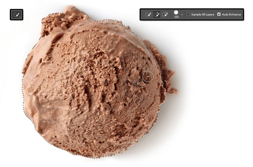
Open the Ice cream scoop images, and pick the Quick Selection Tool.
Click the Add to selection icon in the Options bar, and check the Auto-Enhance box if you want to get a precise selection, though this is optional as it might slow things down a little bit.
Click-drag to select a scoop image, and go to Edit > Copy.
Step 2
Back to the original document, go to Edit > Paste.
Right-click the pasted image’s layer and choose Convert to Smart Object.
Place the scoop image on top of the letter you want to add it to, right-click the scoop image’s layer again, and choose Create Clipping Mask to clip the image to the letter.
Step 3
Press Command-T, and Transform the scoop image until you like how it looks inside the letter.
Hit the Return key to accept the changes.
Step 4
Repeat the same steps to select the other scoop images and add them to the rest of the letters you have.
You can use the same image more than once, but Transform it to make it look different.
3. How to Style a Text Layer
Double-click the first letter’s original text layer to apply the following Layer Style:
Step 1
Add a Bevel and Emboss with these settings:
Size: 35
Check the Anti-aliased box
Highlight Mode:
Color: #ff988a
Shadow Mode: Color Burn
Color: #daaf98
Opacity: 35%
Step 2
Add a Contour with these settings:
Contour: Half Round
Check the Anti-aliased box.
Step 3
Add a Texture with these settings:
Pattern: Ant Farm
Step 4
Add an Inner Shadow with these settings:
Blend Mode: Linear Burn
Color: #b27a67
Opacity: 35%
Distance: 0
Choke: 13
Size: 24
Step 5
Right-click the styled layer, choose Copy Layer Style, select the remaining original text layers, right-click any of them, and choose Paste Layer Style.
Step 6
You might notice that the style doesn’t look good for all the different colors.
So you can double-click each letter’s layer, and adjust its Bevel and Emboss’s Highlight Mode and Shadow Mode Colors, as well as its Inner Shadow Color.
Match those colors to the letter’s texture colors, and you can even sample the colors from the texture itself. No specific values are needed, just whichever ones look good.
4. How to Add Dimension
Step 1
Double-click the first letter’s copy text layer to apply a Bevel and Emboss effect with these settings:
Size: 24
Uncheck the Use Global Light box
Angle: 164
Altitude: 53
Check the Anti-aliased box
Highlight Mode: Soft Light
Color: #ffe9e9
Shadow Mode:
Opacity: 0%
Step 2
Copy and Paste the Layer Style to the rest of the copy text layers you have.
Step 3
Place each letter’s layers in a Group with its name.
5. How to Create Stroke Layers
Step 1
Create a New Layer on top of all the first letter’s layers inside its group, and name it Stroke.
Step 2
Press-hold the Option key, and click-drag the letter’s scoop image to create a Copy and place it on top of the Stroke layer.
Step 3
Clip the copy scoop image’s layer to the Stroke layer.
Repeat the same steps to create the other letter’s Stroke layers.
6. How to Stroke a Work Path With a Modified Brush Tip
Step 1
Pick the Brush Tool, and open the Brush panel.
Choose a Hard Round Tip, and use these settings for the Brush Tip Shape and Shape Dynamics tabs.
Step 2
Right-click the first letter’s text layer, and choose Create Work Path.
Make sure to select the Stroke layer afterwards.
Step 3
With the Brush Tool active, hit the Return key once to Stroke the path.
Pick the Direct Selection Tool (A), and hit the Return key one more time to get rid of the work path.
Step 4
Repeat to create the rest of the letters’ strokes.
7. How to Style a Stroke Layer
Double-click the first letter’s Stroke layer to apply the following Layer Style:
Step 1
Add a Bevel and Emboss with these settings:
Size: 7
Uncheck the Use Global Light box
Angle: 167
Altitude: 21
Check the Anti-aliased box
Shadow Mode: Linear Burn
Color: #d5ccb9
Opacity: 65%
Step 2
Add a Drop Shadow with these settings:
Blend Mode: Linear Burn
Color: #6e6e6e
Opacity: 10%
Distance: 0
Size: 10
Step 3
Copy and Paste the Layer Style to all the Stroke layers.
8. How to Create a Sprinkles Brush Tip
Step 1
Create a 100 x 100pxNew Document with a WhiteBackground, pick the Rounded Rectangle Tool, and set the Radius in the Options bar to 15.
Click once anywhere in the document to get the Create Rectangle box, change the Width to 15 and the Height to 35, and click OK.
Make sure that the shape’s Fill Color is Black, and place it in the center of the document.
Step 2
Go to Edit > Define Brush Preset, change the Name to Sprinkles, and click OK.
Step 3
Go back to the original document, pick the Brush Tool and open the Brush panel.
Choose the Sprinkles tip and use these settings:
Brush Tip Shape
Shape Dynamics
Scattering
Color Dynamics
9. How to Use a Sprinkles Brush Tip
Step 1
Create a New Layer on top of all layers and call it Sprinkles.
Set the Foreground Color to #fe0000 and the Background Color to #1b9be6.
Click-drag slightly inside the text area to add the sprinkles.
You can change the color outcome by changing the Foreground and/or Background Colors.
Double-click the Sprinkles layer to apply the following Layer Style:
Step 2
Add a Bevel and Emboss with these settings:
Size: 1
Uncheck the Use Global Light box
Angle: 128
Altitude: 37
Check the Anti-aliased box
Highlight Mode: Vivid Light
Step 3
Add a Drop Shadow with these settings:
Blend Mode: Color Burn
Color: #010101
Opacity: 10%
Distance: 3
Size: 5
Step 4
Click the Add layer mask icon at the bottom of the Layers panel, and select the mask’s thumbnail.
10. How to Create a Mask’s Texture Fill
Step 1
Set the Foreground and Background Colors to Black and White, and go to Filter > Render > Clouds.
Step 2
Go to Filter > Filter Gallery > Sketch > Reticulation, and use these settings:
Density: 12
Foreground Level: 40
Background Level: 5
Step 3
Click the New effect layer icon in the bottom right corner, and apply the Photocopy filter with these settings:
Detail: 7
Darkness: 8
Step 4
Add another New effect layer, and apply the Bas Relief filter with these settings:
Detail: 13
Smoothness: 3
Light: Bottom
This will apply a Layer Mask that blends the sprinkles with the scoops to make the effect look more realistic.
11. How to Add More Sprinkles
Step 1
Create a New Layer on top of the Sprinkles layer, name it Sprinkles 2, and Copy and Paste the Sprinkles layer’s Layer Style to it.
Set the Foreground Color to #fe0000 and the Background Color to #01ffe5, and add some more sprinkles to the text.
Step 2
Add another New Layer on top of all layers, name it Sprinkles 3, Paste the same Layer Style to it, and add some more sprinkles around the text.
Step 3
Put all the sprinkle layers in a Sprinkles group.
12. How to Style a Drip Layer
Step 1
Create a New Layer on top of all the first letter’s layers, and name it Drip.
Press-hold the Option key to click-drag the letter’s scoop image on top of the Drip layer, and Clip it to it.
Right-click the scoop image and choose Convert to Smart Object.
Double-click the Drip layer to apply the following Layer Style:
Step 2
Add a Bevel and Emboss with these settings:
Size: 16
Soften: 1
Uncheck the Use Global Light box
Angle: 30
Altitude: 48
Gloss Contour: Cone
Check the Anti-aliased box
Shadow Mode: Vivid Light
Color: #a1a1a1
Step 3
Add a Contour with these settings:
Contour: Rounded Steps
Check the Anti-aliased box.
Step 4
Add an Inner Shadow with these settings:
Blend Mode: Color Burn
Opacity: 35%
Uncheck the Use Global Light box
Angle: 90
Distance: 3
Choke: 33
Size: 3
Step 5
Select the Drip layer’s scoop image, go to Filter > Noise > Median, and change the Radius to 5.
Step 6
Go to Filter > Blur > Gaussian Blur, and change the Radius to 2.
13. How to Paint Drips
Step 1
Pick the Brush Tool, use the same settings of the stroke brush tip, but change the Spacing value under the Brush Tip Shape tab to 1%.
Step 2
Select the Drip layer, and start painting the drips by slowly dragging the brush into the shape you like.
Step 3
Use the Eraser Tool to get rid of any areas you don’t like.
Step 4
Repeat all the steps to add drips to the rest of the letters you have.
14. How to Add Shadows and a Background Texture
Step 1
Double-click the first letter group you have to apply a Drop Shadow effect with these settings:
Blend Mode: Color Burn
Opacity: 7%
Distance: 45
Size: 20
Step 2
Copy and Paste the Layer Style to the rest of the letter groups.
Step 3
Place the MGrunge005 image on top of the Gradient Fill layer, resize it as needed, and change its layer’s Blend Mode to Soft Light and its Opacity to 25%.
15. How to Make Global Adjustments
Step 1
Create a New Layer on top of all layers, name it High Pass, and press the Shift-Option-Command-E keys to create a stamp layer.
Right-click the High Pass layer and choose Convert to Smart Object.
Step 2
Go to Filter > Other > High Pass, and change the Radius to 1.5.
Step 3
Change the High Pass layer’s Blend Mode to Soft Light and its Opacity to 50%.
Step 4
Add a Gradient Map layer on top of all layers, and create the Gradient Fill using the Colors#55456b to the left, #79566e in the middle, and #d4977c to the right.
Check the Dither box, and change the Gradient Map layer’s Blend Mode to Soft Light and its Opacity to 50%.
Congratulations! You’re Done
In this tutorial, we created a couple of text layers, and added ice-cream scoop textures to them.
Then, we used brushes and layer styles to style the textured letters and add strokes, drips, and sprinkles to them.
Finally, we used textures and adjustment layers to finish off the effect.
Please feel free to leave your comments, suggestions, and outcomes below.
If you needed a proof that doodling can be an art, any drawing by Visoth Kakvei should convince you. This Cambodian artist takes his doodle to a whole new level using symbols, details and perspective. You can follow more of his work on his Instagram account.
There is a native API for animation in JavaScript known as the Web Animations API. We’ll call it WAAPI in this post. MDN has good documentation on it, and Dan Wilson has a great article series.
In this article, we’ll compare WAAPI and animations done in CSS.
A note on browser support
WAAPI has a comprehensive and robust polyfill, making it usable in production today, even while browser support is limited.
As ever, you can check Can I Use for browser support data. However, that doesn’t provide very good info on support of all the sub features of WAAPI. Here’s a checker for that:
To experiment with all features without a polyfill, use Firefox Nightly.
The basics of WAAPI
If you’ve ever used jQuery’s .animate(), the basic syntax of WAAPI should look pretty familiar.
var element = document.querySelector('.animate-me');
element.animate(keyframes, 1000);
The animate method accepts two parameters: keyframes and duration. In contrast to jQuery, not only does it have the benefit of being built into the browser, it’s also more performant.
The first argument, the keyframes, should be an array of objects. Each object is a keyframe in our animation. Here’s a simple example:
The second argument, the duration, is how long we want the animation to last . In the example above it is 1000 milliseconds. Let’s look at a more exciting example.
Recreating an animista CSS animation with WAAPI
Here’s some CSS code I yanked from the awesome animista for something calling itself the „slide-in-blurred-top” entrance animation. It looks pretty sweet.
We’ve already seen how easy it is to apply the keyframes to whichever element we want to animate:
element.animate(keyframes, 700);
To keep the example simple, I’ve only specified the duration. However, we can use this second parameter to pass in far more options. At the very least, we should also specify an easing. Here’s the full list of available options with some example values:
Annoyingly, for those of us familiar with CSS animations, some of the terminologies varies from what we’re used to. Although on the plus side, things are a lot quicker to type!
It’s easing rather than animation-timing-function
Rather than animation-iteration-count it’s iterations. If we want the animation to repeat forever it’s Infinity rather than infinite. Somewhat confusingly, Infinity isn’t in quotes. Infinity is a JavaScript keyword, whereas the other values are strings.
We use milliseconds instead of seconds, which should be familiar to anyone who’s written much JavaScript before. (You can use milliseconds in CSS animations as well, but few people do.)
Let’s take a closer look at one of the options: iterationStart.
I was stumped when I first came across iterationStart. Why would you want to start on a specified iteration rather than just decreasing the number of iterations? This option is mostly useful when you use a decimal number. For example, you could set it to .5, and the animation would start half way through. It takes two halves to make a whole, so if your iteration count is set to one and your iterationStart is set to .5, the animation will play from halfway through until the end of the animation, then start at the beginning of the animation and end in the middle!
It is worth noting that you can also set the total number of iterations to less than one. For example:
var option = {
  iterations: .5,
  iterationStart: .5
}
This would play the animation from the middle until the end.
endDelay: endDelay is useful if you want to string multiple animations after each other, but want there to be a gap between the end of one animation and the start of any subsequent ones. Here’s a useful video to explain from Patrick Brosset.
Easing
Easing is one of the most important elements in any animation. WAAPI offers us two different ways to set easing — within our keyframes array or within our options object.
In CSS, if you applied animation-timing-function: ease-in-out you might assume that the start of your animation would ease in, and the end of your animation would ease out. In fact, the easing applies between keyframes, not over the entire animation. This can give fine-grained control over the feel of an animation. WAAPI also offers this ability.
It’s worth noting that in both CSS and WAAPI, you shouldn’t pass in an easing value for the last frame, as this will have no effect. This is a mistake a lot of people make.
Sometimes it’s a lot more intuitive to add easing over an entire animation. This is not possible with CSS, but can now be achieved with WAAPI.
var options = {
  duration: 1000,
  easing: 'ease-in-out',
}
You can see the difference between these two kinds of easing in this Pen:
It’s worth noting another difference between CSS animation and WAAPI: the default of CSS is ease, while the default of WAAPI is linear. Ease is actually a version of ease-in-out and is a pretty nice option if you’re feeling lazy. Meanwhile, linear is deadly dull and lifeless — a consistent speed that looks mechanical and unnatural. It was probably chosen as the default as it is the most neutral option. However, it makes it even more important to apply an easing when working with WAAPI than when working with CSS, lest your animation look tedious and robotic.
Performance
WAAPI provides the same performance improvements as CSS animations, although that doesn’t mean a smooth animation is inevitable.
I had hoped that the performance optimizations of this API would mean we could escape the use of will-change and the totally hacky translateZ — and eventually, it might. However, at least in the current browser implementations, these properties can still be helpful and necessary in dealing with jank issues.
However, at least if you have a delay on your animation, you don’t need to worry about using will-change. The primary author of the web animations spec had some interesting advice over on the Animation for Work Slack community, which hopefully he won’t mind me repeating here:
If you have a positive delay, you don’t need will-change since the browser will layerize at the start of the delay and when the animation starts it will be ready to go.
WAAPI Versus CSS Animations?
WAAPI gives us a syntax to do in JavaScript what we could already achieve in a stylesheet. Yet, they shouldn’t be seen as rivals. If we decide to stick to CSS for our animations and transitions, we can interact with those animations with WAAPI.
Animation Object
The .animate() method doesn’t just animate our element, it also returns something.
var myAnimation = element.animate(keyframes, options);
Animation object viewed in a console
If we take a look at the return value in the console, we’ll see its an animation object. This offers us all sorts of functionality, some of which is pretty self-explanatory, like myAnimation.pause(). We could already achieve a similar result with CSS animations by changing the animation-play-state property, but the WAAPI syntax is somewhat terser than element.style.animationPlayState = "paused". We also have the power to easily reverse our animation with myAnimation.reverse(), which again, is only a slight improvement over changing the animation-direction CSS property with our script.
However, up until now, manipulating @keyframes with JavaScript hasn’t been the easiest thing in the world. Even something as simple as restarting an animation takes a bit of know-how, as Chris Coyier has previously written about. Using WAAPI we can simply use myAnimation.play() to replay the animation from the beginning if it had previously completed, or to play it from mid-iteration if we had paused it.
We can even change the speed of an animation with complete ease.
myAnimation.playbackRate = 2; // speed it up
myAnimation.playbackRate = .4; // use a number less than one to slow it down
getAnimations()
This method will return an array of any animation objects for any animations we’ve defined with WAAPI, as well as for any CSS transitions or animations.
element.getAnimations() // returns any animations or transitions applied to our element using CSS or WAAPI
If you feel comfortable and content using CSS for defining and applying your animations, getAnimations() allows you to use the API in conjunction with @keyframes. It’s possible to continue to use CSS for the bulk of your animation work and still get the benefit of the API when you need it. Let’s see how easy that is.
Even if a DOM element only has one animation applied to it, getAnimations() will always return an array. Let’s grab that single animation object to work with.
var h2 = document.querySelector("h2");
var myCSSAnimation = h2.getAnimations()[0];
Now we can use the web animation API on our CSS animation 🙂
We already have a variety of events triggered by CSS that we can utilise in our JavaScript code : animationstart, animationend, animationiteration and transitionend. I often need to listen for the end of an animation or transition in order to then remove the element it was applied to from the DOM.
The equivalent of using animationend or transitionend for such a purpose in WAAPI would again make use of the animation object:
WAAPI offers us the choice of working with both events and promises. The .finished property of our animation object will return a promise that will resolve at the end of the animation. Here’s what the example above would look like using a promise:
myAnimation.finished.then(() =>
  element.remove())
Let’s look at a slightly more involved example yanked from the Mozilla Developer Network. Promise.all expects an array of promises and will only run our callback function once all of those promises have resolved. As we’ve already seen, element.getAnimations() returns an array of animation objects. We can map over all the animation objects in the array calling .finished on each of them, giving us the needed array of promises.
In this example, it’s only after all the animations on the page have finished that our function will run.
Promise.all(document.getAnimations().map(animation =>
  animation.finished)).then(function() {
    // do something cool
  })
The Future
The features mentioned in this article are just the beginning. The current spec and implementation look to be the start of something great.
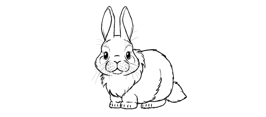
Do you want to draw something cute and simple? In this tutorial I
will show you how to draw a bunny from scratch, step by step. You don’t
need any reference and you can use any tools you want. This will be
simple and fun!
Before You Start
Let’s take a look at some
bunnies first, shall we? You may know what a bunny looks like, but it’s
always good to refresh your memory before you start drawing.
Draw
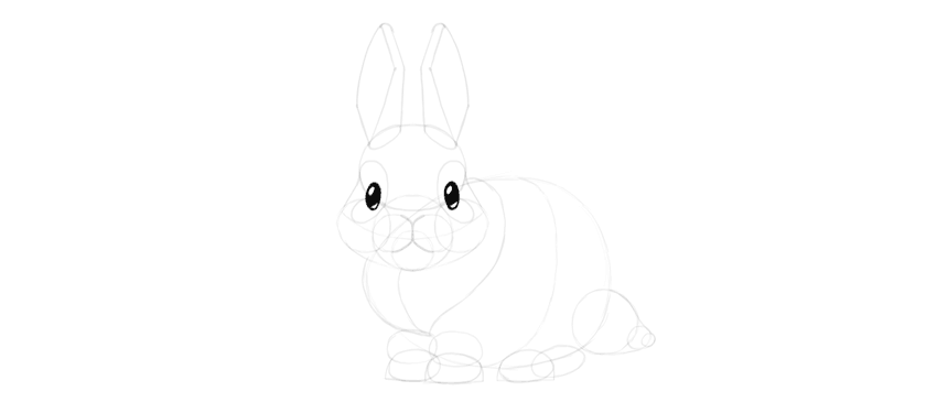
an oval—this will be the forehead. Draw it very lightly, because it’s
just a guide line for later. The smaller it is, the smaller the whole
drawing will be, and drawing small is a good way to keep the proportions
right! Also, you don’t need to draw the whole oval with one continuous
line—draw it with short, subtle lines, and then connect them.
Step 2
Draw a circle below. Keep sketching, and don’t press too hard!
Step 3
Cross the circle with a „smile”. This will help us place the cheeks properly.
Step 4
Draw two circles on the sides—these will be the fluffy cheeks.
Step 5
Draw a smaller circle inside the middle circle. This will help us with the chin.
Step 6
Draw two other circles on top. Can you see a bunny smile already?
Step 7
To give the eyes a cartoon cuteness, draw „butterfly wings” where the eyes will be.
Step 8
Draw two narrow ovals inside the „wings”.
Step 9
Outline the shape of the head going around the circles.
Step 10
Draw the cute mouth and nose.
2. How to Draw Bunny Ears
Step 1
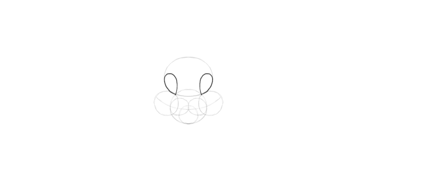
Draw two ovals on top of the bunny’s head. This will be the base of the ears.
Step 2
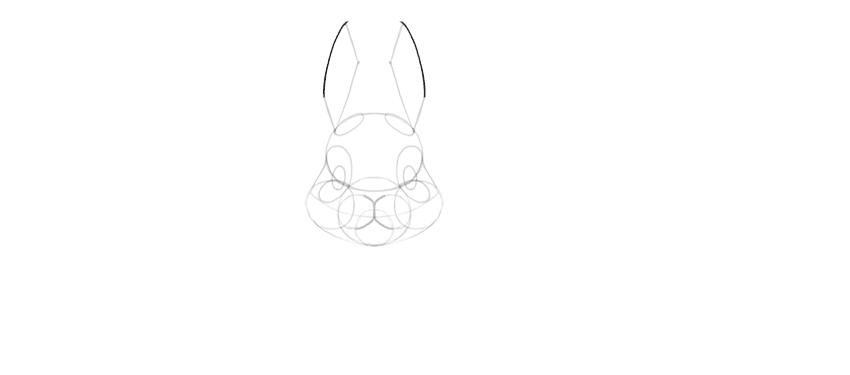
Draw two lines from the outer edge of the circles, going towards the central line of the head.
Step 3
Now turn outside with shorter lines.
Step 4
Draw a similar short line at the base of the ears.
Step 5
Close the shape with subtle curves.
Step 6
That’s not all! Draw small curves at the tips of the ears.
Step 7
Draw a line towards the inner side of the base circles.
3. How to Draw a Bunny Body
Step 1
Add
a body to the head. You can choose any shape and size you wish. I
decided to use a fat egg shape for a half-realistic, half-cartoon style.
Step 2
Draw the oval paws under the body.
Step 3
Draw horizontal lines under the paws.
Step 4
Draw curves around the paws to make their shape less basic.
Step 5
Draw ovals over the paws to create a part of the leg.
Step 6
Draw an oval behind the hind paw to create a foot.
Step 7
Draw a fluffy tail out of a few circles.
Step 8
You can a little fluffy ruff around the head to cover the neck.
Step 9
Additionally, you can draw a curve around the body to better see its 3D form.
4. How to Finish the Drawing of a Bunny
Step 1
Time
to finish the drawing! If you’ve been drawing digitally, create a new
layer for these final lines. If you’ve been drawing traditionally,
either take a darker tool to cover the lightly drawn sketch, or put a
new sheet of paper on top to draw the final lines here.
Outline the shape of the eyes.
Step 2
Outline the shine dots inside them.
Step 3
Draw smaller shine dots on the opposite side.
Step 4
Fill the eyes with dark shading.
Step 5
Subtly darken the smaller shine dots.
Step 6
Outline the mouth…
… and the fluffy muzzle.
Step 7
Don’t outline the whole shape around the eyes. Instead, sketch a suggestion of fur without closing the shape.
Step 8
Outline the ears with quick, short lines.
Step 9
Outline the whole head, but don’t close the shape entirely.
Step 10
Outline the rest of the fluff.
Step 11
Add the whiskers!
Step 12
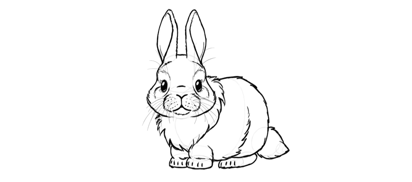
Finally, add a darker outline to the body and make some lines thicker for a more interesting look.
So Cute!
Congratulations!
You have learned how to draw a cute little bunny! If you want to learn
more about real rabbits and hares, don’t forget to check this tutorial:
The campaign promotes the New Outlander PHEV, the Mitsubishi’s Electric 4X4 car. This car model has a regular motor, like most cars, and a second electric motor. So the idea behind the ads was to mix the adventurous world of the Mitsubishi 4×4 and the electricity differential of the car.
Go Electric. New Outlander PHEV. The electric 4X4.
I remember a year ago I was having so much trouble vectoring my letterforms. I had a decent understanding of the Pen Tool, but had no idea that there are minor techniques that do wonders for your type to create those smooth curves you’re looking for.
This tutorial will hopefully answer all your questions regarding vectoring letterforms and vectoring nearly anything for that matter. The same process can be utilized for anything you compose within Illustrator. In the case of lettering, the key is to have relatively few anchor points while utilizing proper point placement and a variety of other tricks to perfect those curves, angles, widths, etc.
Three things to note before we get started:
First, the process below is utilizing some work I already created in a previous tutorial. For your practice and experience, I suggest creating/using your own piece of lettering, rather than recreating mine. It’s truly the best way to learn! I want you to take the information below and apply it to your very own lettering so you’ll have a finished piece that you can truly call yours!
Second, this tutorial isn’t about teaching you how to use/understand the Pen Tool. If you don’t understand how it works or its functionality, I suggest reading up on that before you begin—it’ll only make things easier later on.
Third, I want you all to know that this tutorial might seem a bit jumbled up and all over the place, but I promise it’s for the sake of teaching! I just want to share everything and anything to help your vectoring process. Long story short, it won’t be a streamlined beginning and end. There will be a beginning and there will be an end, but it’ll take us some time to get there!
Keep an open mind, and I promise we’ll create great things. Let’s begin!
1. Preparing the Tools You Will Need
Computer—PC or Mac. Either one will get the job done!
Adobe Illustrator
Initial sketch/scan of the lettering you want to vector
Pen or pencil
For this tutorial, you’re going to use a sketch of some previous lettering you may have done from the previous tutorials. We’re going to focus on taking that sketch and redrawing it in vector format.
2. Plotting Your Points on the Extrema
Before we begin working on the computer, we’re going to practice vectoring by hand! With paper! Crazy, right? I promise you it’ll give you a much larger understanding and appreciation for the wonderful Pen Tool.
Now, what does „extrema” mean? Firstly, it’s plural for extremum. In mathematics, that generally means the maximum or minimum. In the case of lettering, we’re talking about the extreme opposites of the letter to compose it with bezier handles. For example, the extrema of the letter „O” would be the north and south anchor points that form the curve. The east and west anchor points on the side allow you to distribute weight and width.
Take a look at this circle below. You can see the shape is being evenly created by four main points. Those are the „extrema” of the letter „O”.
Notice that the handles are evenly balanced and distributed as well. This same technique should be applied within your lettering. Make sure your handles are all balancing the workload and not allowing just one handle to be extremely long and carrying all of the weight.
Step 1
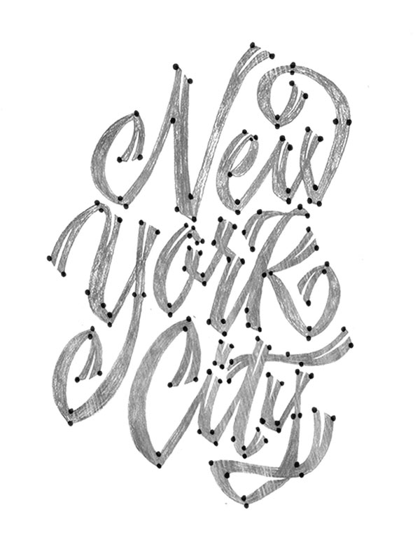
Download the attached lettering if you’d like to use mine. If not, feel free to use your own! From here, let’s begin drawing where the anchor points would go. Go ahead and use a pencil or pen anddraw circles wherever you think you would place those anchor pointsin Adobe Illustrator.
Don’t worry about if you’re right or wrong—just go for it and see what you currently think may be right. Later throughout this tutorial and further practice, you’ll be amazed at your growth / new knowledge.
Step 2
Next, take that same piece of lettering and begin to draw rectangles around each letterform. We’re using an easy trick to understand where you’ll plot your points on the „extrema” of your letterforms. Wherever the rectangles touches your letter is where the anchor point should lie. Now, that’s not to say that your letterform should only have four anchor points since there are four sides to a rectangle. This just gives you a great starting point.
Later on, we will begin with plotting the extrema in Illustrator, and then adding additional anchor points for particular curves or maybe increasing some weight in your letterform. Every letterform will differ, so this process isn’t set in stone. Ultimately it’ll give you a head start in the right direction, and then it’s up to you to determine what looks „good” or what looks „correct”.
3. 0°, 45°, 90°: Handle Angles
Now, before we get too deep into this section of the tutorial, I want to say that 0°, 45° and 90° aren’t necessarily the only angles you should place your handles at. Again, it all comes down to what looks good and using your own judgement to determine if it could use a random angle of 15°, for example.
So, what’s so special about horizontal, vertical, and diagonal (45 degree) angles? First, utilizing similar angles keeps things consistent across your lettering. Second, those angles are key to forming the smoothest curves. Ever noticed little points or edges in your lettering that are caused by anchor points? Well, that can easily be fixed with proper anchor point placement and the proper angle of your handles.
Let’s get to work!
Step 1
This simple process below will show the importance of horizontal and vertical anchor point handles. This process should be used for nearly any vectoring project you have from here on out. Let’s start out by vectoring the below „The”. I want to break down the vectoring process so you can see how I would normally go about vectoring a simple word such as this.
If you’d like, you can begin by applying the „rectangle” technique with your lettering before you begin so you can determine where your extrema should be placed.
Step 2
After drawing out your „The” lettering, we’re now going to begin taking it apart piece by piece to vector.
I’m going to start with the stem of the „T”. As you can tell, I’m utilizing those horizontal anchor point handles as well as two not so mathematical angles. Remember, not every handle needs to be horizontal. It’s truly what you think may look best. For this stem, I started with all of the handles horizontal, and then tweaked the two to fit my liking.
All in all, this entire stem was created with just four anchor points and a little trial and error.
Step 3
This is where things get a little crazy. For this particular example, I decided to vector the „Th” connection together to create one single shape. Each anchor point is equally balanced and equally distributing the curvature. As for where to begin plotting your anchor points, it’s all a matter of preference. The letterforms generally dictate where to begin. For me, I work left to right, so I began bydrawing the loop connection of the „T” and ended at the stem of the „h”.
Let’s keep pushing forward!
Step 4
Next,I formed the shoulder of the „h”(the second stem if you will). Every piece of this lettering is broken down into separate shapes so you can later make edits to individual pieces rather than the entire piece.
Step 5
The last step is to create the „e”.Utilizing just eight anchor points, I was able to create the right form without adding more points to adjust the width, contrast, etc.
Begin wherever you’d like, but for me personally, I began by forming the crossbar of the „e”, circled that shape around to form the bowl, and finished it off with the tail.
And there we have it! Our finished „The”. Remember to plot those points on the extrema, finesse those handles until perfection, and you’re golden! Patience is key!
I’ve included the below example as well, so you can see a completely different style of the word „The” while still using similar horizontal and vertical handles.
4. Additional Vectoring Tips & Tricks
Vectoring sure is time-consuming even for a master. No matter what, it’s a lot of fine-tuning and correcting those curves, anchor points, etc.
In this section of the tutorial, I hope to shed some more wisdom to speed up the process just a bit more. For simplicity, I’m going to be utilizing the letter „O” or a circle shape to demonstrate a lot of these tricks. Even though it’s a simple shape, the methodology and practice behind the tip can be used for every single letter.
Step 1
I call this technique the crossover. As you begin to vector your lettering, you may find it easier to apply this crossover technique to control the widths and angles of parts of your letterforms. In the example below, you can see I created an extra anchor point to allow me to control what is called the „crotch” of the „N”. Essentially, it allows you to move and alter one portion of your letterform without disturbing another.
In the bottom gif example, this shows exactly what I mean by altering one side without disturbing another. Now, this „A” construction definitely isn’t correct by any means. It’s just a perfect way to display what the crossover technique can accomplish.
Step 2
The Ellipse Tool and Rectangle Tool within Illustrator can become your best friends if you just think about what shapes are composing each letterform. For example, the letter „O” has two ellipses: one for the width and another ellipse on the inside to form weight. So, if you just create two ellipses, stacked on top of each other, you can form the letter „O” within seconds.
Additionally, if you wanted to continue and create another letter such as an „H”, you can utilize the Rectangle Tool. Each stem and the crossbar of the below „H” was formed with three separate rectangles. You can later expand and merge them if you’d like one complete shape.
Hopefully the sped-up gif process below shows exactly what I mean. I’m just using simple shapes to form these letters.
Step 3
In the below example, I utilized the Width Tool within Illustrator. It definitely can come in handy at times. With this tool, you’re essentially plotting where you want your width to be distributed. In this example, I wanted the left and right sides of the stroke to be .525in while the top and bottom remained .125in. This distributed the weight evenly and formed a nice high contrasted letter „O”.
As you can see from the example, the left is just a stroke—that was before I applied the Width Tool, while the right is after the Width Tool has been applied.
This tool can definitely help speed up vectoring certain letterforms, especially script. Just remember to draw with „strokes” and add the contrast to your letterforms with the Width Tool after.
The downside to the Width Tool is that when you go to expand your stroke, it forms a massive amount of extra anchor points that you don’t need. You can see what I mean in the image below. All those tiny red dots are anchor points!
So if you wanted to make edits after it was expanded, it would be rather difficult if you didn’t have the original stroke to edit.
5. Final Vector Piece
Alright guys, it’s time to knock out the final vectoring project since we just learned all about how to vector! We’re going to begin where we left off earlier in the tutorial and take this New York City piece to completion.
Step 1
Taking this piece by piece, begin vectoring your letterforms one at a time. Utilize the crossover technique to be able to adjust an area of your lettering without disturbing another part of it. For this particular piece of lettering, I had very few vertical and horizontal handles. But I still plotted my points on the extrema which allowed me to create the shapes you see.
Step 2
After vectoring the „New”, let’s start the next word: „York”. Use the same process and vector each piece by piece. You can probably see the collection of anchor points within the „K”. That is because I drew each part of the „K” as separate shapes to edit later if need be. So the stem and the two legs are all individually drawn, creating a total of three shapes to form the „K”.
Note that it’s okay if everything overlaps, since we’ll be filling these shapes later on.
Step 3
The last word to vector, „City”. You know what to do: begin plotting those points and carefully finesse your handles to your liking. Draw each letter separately as you can see below—it’ll help the editing process later on.
Step 4
There we have it! After you’ve completed vectoring the whole piece, you can give the lettering a fill instead of a stroke so you can see how the positive and negative space are interacting.
Step 5
Even after you think you’re done vectoring, you’re probably not!
There’s tons of editing to do after you „fill” the shapes because you can then see what needs more contrast, more kerning, etc. In this instance, I made lots of minor edits to help the overall color. Additionally, I altered the shape of the „Y” to extend into the negative space of the „N”.
Step 6
The last step! For this piece, I added little „notches” to the enter and exit strokes of the letterforms. How would one vector something like this? Just remember to break things down into simple shapes or strokes again. For me, I knew it would be perfect to utilize some simple strokes created with the Pen Tool, but I changed the „Variable Width Profile” of the stroke to create the triangular shape. You can see what I mean in the process below.
Conclusion
I took the liberty of filming a very sped-up video of the whole lettering process. It took me a good two hours to complete this piece. Again, patience is key if you want your vector lettering to look exactly how you sketched it out! Feel free to watch the process below and see the extra step I took to take the vectored lettering to the next level.
The below New York City piece is the finished vector after adding lots of extra details. If you’re curious as to how to create depth, texture, color combinations, etc., then my next tutorial will be perfect for you! Stay tuned for that in the next month or two.
I’m sure at this point you’ve practiced a good amount to hopefully become even more comfortable with vectoring than you already were. We’ve covered a lot of material, and now it’s time for you to put this knowledge to the test. Keep practicing what you’ve learned because it only gets better with time, I promise! Keep it up!
As always, if you have any issues or questions, feel free to leave a comment below and I’ll be able to help you out. Good luck!
Extra Resources
If you’re interested in getting some help with your lettering, Envato Studio has a great collection of Lettering & Calligraphy Specialists that you might like to explore.
Logo design just got a whole lot easier! Mix and match your favorite logo elements for a new custom design using free templates from Envato Logokit.
What Is a Logo Design Template Kit?
Your brand matters. That’s why we’ve developed a system to make the logo design process faster and more affordable.
A logo design template kit gives you high-quality vector elements to build the perfect logo. And the awesome part is that all our kits are completely free!
Envato Logokit is the best DIY logo solution for professional results! Our designers have created exceptional, high-quality logo kits featuring a wide range of text treatments, icons, and unique color combinations.
Explore a variety of categories to find a kit that fits your style. With a wide selection running from brilliant monograms to creative mascots, we’re sure you’ll be satisfied with our striking selection of modern logos.
Then download and unzip the kit. We’ll provide the main vector EPS files, which can be opened in a variety of vector-based programs.
Open the file for the logo combination you prefer in Adobe Illustrator. I chose the M letter file, which represents all the two-letter combinations for „M.” To match my name, Melody Nieves, with a logo, I’ll decide between these „MN” design styles. Use the Group Selection Tool to select the combination, and then Cut and Paste it onto a New Layer. Hide the other combinations.
Step 2
Put your imagination to the test as you mix and match elements to create the perfect logo. Scale the main shapes to a bigger size using the Selection Tool (V). Or add and change text with the Type Tool (T).
Continue modifying your logo with new colors and more. Then choose a color Fill you’d like to apply, like a vibrant solid color or a beautiful cool gradient.
Step 3
Once you’re through, Save your file with the appropriate extensions (.ai, .eps, .jpg, .pdf, etc.) to use your custom logo right away. It’s that simple!
Get Help From the Pros
Need help customizing your logo kit? Go with a professional! Choose from hundreds of designers at Envato Studio to help build the logo of your dreams.
Browse Our Free Logo Design Template Kits
Here is a current selection of all the fantastic kits now available on Envato Logokit. We also release new ones each week! So subscribe to our email newsletter to get notified when a new logo kit drops next!
Create an elite brand with this vintage monogram kit. This kit features 676 elegant letter pairings in a variety of minimalist styles. Turn your logo into an epic badge by adding a simple circle or finish it with the tagline of your choice.
Need a new mascot for your company? Then try this awesome stickman logo kit. Designed with a faceless character for more flexibility, this mascot cooks, fishes, and even has a great green thumb. And since he’s a mascot with many trades, we just know he’ll be a great addition to any service-based business.
For a more corporate look, check out this pack of modern gradient designs. With multi-layered shapes and symbols, this template lets you choose from a selection of premade gradients to adorn your special emblem.
The epitome of professional design, this corporate logo kit features minimalist icons with clean, bold lines. This diverse selection of icons covers many business themes and categories. Add vibrant colors to finalize your design or keep it monochromatic for an even sharper look.
Create a striking logo that employs the trendy use of negative space. Exude exceptional style with cutout designs that are sure to make your brand stand out. Choose from many text arrangement options for a versatile logo.
Design a monogram with class and sophistication with this incredible logo kit. This kit features 676 combinations of every letter pairing in the English alphabet! Choose from multiple styles to make the most out of your logo design.
Or enlist the help of a furry friend for greater logo impact! This brilliant kit features various animals that fit many industries. Enjoy the simplicity of the overall emblem design with clean vector lines and solid colors.
Add a charming mascot to your brand with this awesome logo kit. This flexible mascot can be altered to fit your needs by changing the skin color, outfit, and accessories. Choose from high-quality elements to create a personalized chef, businessman, and more!
This comprehensive suite of 676 letter combinations features every letter
pairing imaginable! And to make your logos truly one of a kind, this suite
also comes with a bonus set of embellishments for that extra special touch.
Follow your passion with this beautiful barber shop logo kit. Great for hairdressers and salons of all kinds, this kit includes hipster vector elements that fit a variety of grooming needs. Just replace the colors and text with the help of any vector design program.
Design a little guy mascot for your business! This set of interchangeable characters provides the perfect way to customize your brand. Switch up body positions or change the outfit colors for more options.
Turn your logo into an epic badge with this outdoor-themed kit. This kit features many badges and emblems that are great for nature-based organizations. Use the colorful options available or pick your own for a more personalized logo.
Celebrate your favorite team with a custom logo to match! Included in this kit is a full system of flexible icons suitable for a wide range of sport clubs and associations. Simply choose your favorite sports symbol, and then arrange the logo to fit your design needs.
Highlight your hospitality skills with a beautiful new logo! This logo kit is an amazing DIY solution for any food or hospitality business. Choose from dozens of stunning line art combinations for a sleek, modern vibe.
Share Your Logos With Us!
Found a design you love? Share your results with us! And let us know how you like Envato Logokit in the comments below.
Agregator najlepszych postów o designie, webdesignie, cssie i Internecie