When you name lines, you can optionally name them as *-start and *-end and this gives you a little more grid magic. We get a named grid area of the main name used. Sounds odd? Take a look at the diagram below, it shows 4 named grid lines, main-start and main-end both for columns and rows. The area marked out by the intersection of these lines can now be referenced by the name main. If we had named the lines foo-start and foo-end then we would have a named area called foo.
Rachel’s post stood out to me for a number of reasons. First, I love blog posts as responses to other blog posts. Second, it’s an excellent reminder that sharing how a concept works is equally as important as showing that it works. Lastly, the concept of implicitly named grid areas based on named grid lines is as good a reason as any to roll up our sleeves and get cozy with the spec. In fact, following Rachel’s series on the CSS Grid spec is a good starting point.
As a side note, Tyler’s clever use of named Grid lines reminded me of Dave Rupert’s equally crafty use of :not to achieve a similar full bleed effect.
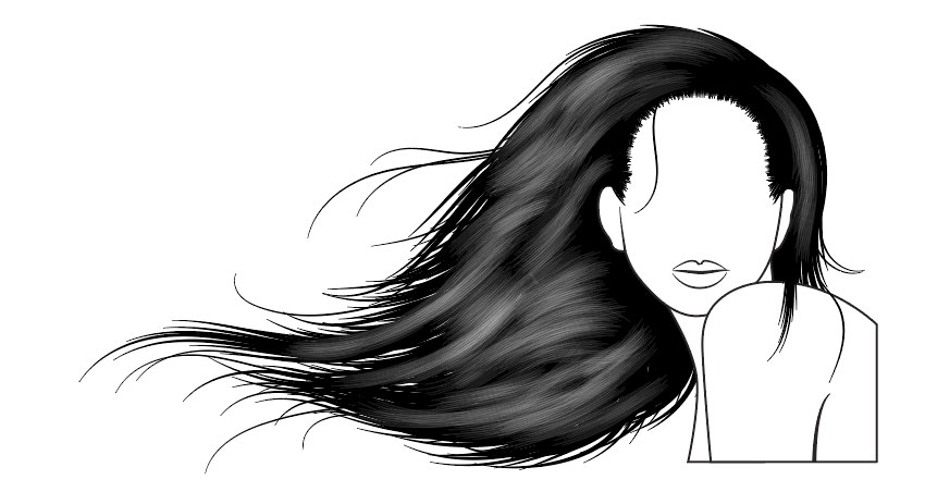
Vectoring hair on portraits can be a time-consuming process and is sometimes difficult to master in a short space of time. A few years back, I wanted to help solve this issue by creating a set of brushes in Adobe Illustrator. Since then, they have become the third best-selling AI brush on GraphicRiver!
In this tutorial, I’m going to show you how to create one set of brushes (four individual brushes) and then how to create a free-flowing, detailed hairstyle with them. You can easily adapt this process to create further brushes and hairstyles. Alternatively, you can purchase the full set of vector Hair Brushes on GraphicRiver.
1. How to Create a Tapered Art Brush
Let’s start by creating a basic tapered brush. This is the base shape for this set of brushes but also a handy brush for drawing individual hairs.
Step 1
Using the Ellipse Tool (L), click once on your canvas, and in the popup, set the Width to 30 px and the Height to 2 px. Click on OK. Make sure your ellipse is filled black.
Step 2
Using the Direct Selection Tool (A), select the rightmost point on the shape. Then click on the Convert selected anchor points to corner button to turn the curve into a point. This will give you one tapered point.
Repeat this with the leftmost point. This will complete your tapered shape.
Step 3
With the shape selected, in the Brushes panel click on the button Create New Brush. Select Art Brush from the popup, and you’ll be presented with the Art Brush Options window.
The key setting you’ll need to change is the Colorization Method to Tints. As your shape is black, it means it will take on the 100% saturation of the colour you select. Therefore, whatever your stroke colour will be, your brush will take on this colour.
I’ve named this brush Tapered Brush and then I click on OK.
2. How to Create a Hairline Brush
The hairline of any portrait is often neglected and often missing in vector portraits. This is mainly because it’s time-consuming and difficult to perfect. However, by creating a scatter brush, you can create a near realistic hairline effect. So instead of drawing one stroke per hair, you’re only creating one stroke for the entire hairline!
Step 1
You should still have your tapered shape. So for now, Copy and Paste it and hide the original.
Select your duplicate and go to Object > Transform > Rotate. Let’s rotate the shape by 90 degrees and click on OK.
Step 2
With the shape still selected, in the Brushes panel, click on Create New Brush and then select Scatter Brush.
The settings I want you to change are:
The Spacing to 5%. This is so the brush will overlap on itself.
The Scatter to Random and then 25%/0%. This is so the brush alters its placement above and below where the line is placed.
The Rotation relative to: Path as I want the brush to stay perpendicular to the direction of the path you’re drawing.
Finally, good old Colorization Method to Tints.
Then click on OK.
3. How to Create a Hair Shine Brush
The hair shine brush can be used for multiple things, depending on how you tailor the brush. This specific version will help you create a textured shine on the hair. When layered at different Opacities, it can give a realistic touch to a silhouette design.
Step 1
You should still have your vertical tapered shape. Copy and Paste this and, using the Selection Tool (V), move it to the side of the first. Repeat this until you’ve got five to eight shapes as shown below.
Step 2
With the shapes selected, let’s create a New Art Brush. The main settings to pay attention to are:
Direction is vertical (up/down or down/up doesn’t matter with this one)
Colorization Method: Tints.
Click on OK once you’re done.
4. How to Create a Hair Piece Brush
This particular brush is useful for drawing multiple clumps of strands in one stroke. This is a great time-saving brush and can be useful for long or short styles of hair.
Step 1
First, remove your vertical tapered shape, and let’s go back to the original horizontal shape.
Using the Rectangle Tool (M), draw over half of the shape. With Smart Guides (Control-U) enabled, you’ll be able to find the midpoint of the tapered shape more easily.
Select both shapes, and with the Pathfinder panel, select Minus Front. You’ll be left with half of the tapered shape.
Step 2
Let’s start by Copying the tapered shape. Using the Direct Selection Tool (A), click on the rightmost point and drag it out.
Paste in Front (Control-F), and then drag out the rightmost point again but this time pulling it to the side.
Paste in Front, drag out the rightmost point again, and place it in a new location. Continue doing this until you’ve got a fanned-out collection of tapered shapes, with the two vertical points at the left remaining in place.
Step 3
Select all of the fanned-out, tapered points, and create a New Art Brush. The settings to pay attention to are the Direction to be left to right (so your starting point is the root of the clump of hair) and the Colorization Method to Tints. Then click on OK.
5. How to Use Vector Hair Brushes
Let’s look at the four brushes you’ve created. These are all the same Stroke Weight, apart from the clump of hair, which is 3 pt. They’ve been applied to a straight horizontal line.
For this exercise, I’m going to be using a blank head shape which is included in the Easy Hair Brushes pack so you can practice. However, you can apply these to any head base you wish!
Step 1
This hairstyle is going to be in silhouette, with some added shine in greyscale. With the Pen Tool (P), draw a line which traces along the hairline. Don’t bring this completely to the bottom of the sideburns on a feminine face. You can, however, do this on a more masculine face to create trendy, 70s-style sideburns.
Step 2
Using the tapered brush and the Paintbrush Tool (B), add some hairs to merge the sideburns into the hairline.
Step 3
With the Pen Tool (P), draw an arched shape with a black fill for the mass of hair which covers the rest of the head. This completed hairstyle is an overall great base to practice further hairstyles on. So if you’re not keen on the free-flowing style that’s coming, you can go back to this point and start again.
Step 4
Create a New Layer behind your portrait to add hair with the Hair Piece Brush with the Paintbrush Tool. The smaller the Stroke Weight, the more detailed the hair strokes will be.
My advice is to start with a larger stroke (such as 8 pt) to create the main structure of the hair, and then come down gradually to a 1 pt to add finer strands for a more realistic look.
Step 5
With the original Tapered Brush, you can add smaller individual hairs which flow away from clumps of hair. This helps to break any patterns you may have created with the Hair Piece Brush.
It’s also great to have individual hairs overlapping onto the face or shoulder as that adds effortless detail.
Step 6
With the Hair Shine Brush, draw long and short strokes within the mass of hair set to Blending Mode Normal, Opacity 10%, and with a white stroke.
Overlap the strokes to create more intense shines in the hair.
Step 7
Finally, with the tapered brush by adding white strokes to add further realistic shines. Set these to Opacity 20% to stand out.
Awesome Work, You’re Done!
You’d be surprised how quickly you can create hairstyles with these brushes and how realistic you can make them. With practice, it will take you minutes rather than hours!
By creating several different brushes to fit different hair length, textures and styles, you can create many different looks.
Sony is promoting the XBR-A1E OLED television screen with “Earth Rising”, a commercial presenting an other-worldly perspective on clarity. Filmed in the Atacama Desert in Chile, the Sony Bravia Earth Rising film presents the concept of the Earth Rising on Earth, a newly imagined horizon allowing the demonstration of contrast, deep blacks and life-like colour. At first we could be excused for thinking we’re on the moon as men, women and children drive through a desolate landscape to reach their dawn viewing spot. But we get a glimpse of a reptilian creature, and helmets are removed, and we’re let into the secret of the Earth Rising magic, a huge viewing screen wall in the desert. The super: “Experience a whole new world”.
Captured by various cameras such as the Sony F65 or the Alpha 7 Mark II in a perfect 8K resolution, the film delivers exactly the qualities that characterize the new Bravia series: a visual experience that shows the incredible, but almost the feeling of the human eye There is reality. The absolute black of the night desert paired with the impressive colors in which the earth rises, shows the contrast strength that is found on the Sony Bravia OLED.
Sony head of brand and product communication, Shuhei Sugihara, explains the creative thinking behind the campaign:
“The campaign is in the Sony Bravia tradition of delivering visually stunning films. At the same time, we are introducing more storytelling as a new element, opening up more possibilities for brand communication. This year’s campaign is different from what we have done in many years of great Bravia campaigns. I think ‘Earth Rising’ is one of the most impressive and technically sophisticated scenes we’ve ever filmed. With the launch of the OLED, we also wanted to communicate a message – this is the ‘dawn of a new era of television’. In this sense, the spot is the perfect creative translation of all that we want to say.”
Gabriel Mattar, executive creative director at DDB Berlin, says:
“Sony has taken to the stars in the development of the Bravia OLED. In our third international Bravia campaign, it has therefore been a natural step for us to reach for the stars too.”
Sony Bravia Earth Rising Credits
The Sony Bravia Earth Rising campaign was developed at DDB Berlin by executive creative director Gabriel Mattar, creative director Hande Güler, managing creative director Myles Lord, art directors Mahmoud Fathy and Jacopo Biorcio, copywriter Andre Santa Cruz, agency producer (TV) Jens Mecking, print producer Petra Kraus, managing director Toby Pschorr, account manager Federica Sibilla, client service director David Barton working with Sony Pan European consumer marketing head Mikio Nakazawa, head of brand and product communication Shuhei Sugihara, brand and product communication manager Alessandra D’Avino, art directors Richard Small and Johan Andrews.
Post Production and visual effects were produced at NHB Studios Berlin, by producer Fiddy Sigmund, VFX supervisor Nhat Quang Tran, 3D artists Tany Heider and Andreas Petri, lead online artist Tobias Horvath, nuke artist Sebastian Ludwig, and colourist Pana Argueta.
Music, Robot Koch and Savannah Jo Lack “Heart as a River” ft. Delhia de France, was supervised by Visions from the Roof.
Groupama, an insurance company in France, has launched Le Trajet Le Plus Sur, (The Safest Route), a free road safety platform based on government data relating to road accidents. Online at LeTrajetLePlusSur.fr and a mobile app, the Safest Route platform is able to generate and compare two itineraries in just a few clicks, providing the fastest route, traditionally suggested by GPSs and the safest route, one that is statistically the least dangerous. Drivers can see the difference in travel time between the two routes and choose one with full knowledge. For example, in Paris, to get to Gare de Lyon from the Eiffel Tower, the fastest route would take 19 minutes and accounts for 129 more accidents than the less dangerous route (24 minutes). The Safest Route project is being promoted with film, radio and print advertising, and dedicated digital terminals will become available at participating Groupama locations allowing members to test this new service.
Groupama CEO Thierry Martel says: “I am thrilled with the launch of the LeTrajetLePlusSur.fr platform. This innovative tool is a down to earth example of Groupama’s pioneer and mutualist spirit. We are constantly listening to our members, looking for solutions to make their daily lives easier. LeTrajetLePlusSur.fr is the answer to a road safety need that was identified. One of those everyday things that concerns many people! Now our ambition is to make this service available to all, members of Groupama and nonmembers alike, and hope that it can be recommended by road transport professionals, integrated into the future updates of leading GPS brands… to benefit road safety for all French people.”
Safest Route Open Data
In order for this service to be reliable and effective, official government data pertaining to traffic accidents for the past seven years have been mapped in with their precise geolocation. All accidents leading to personal injuries requiring both police and firemen intervention were included. Based on statistics, an algorithm was developed from this data, identifying the roads that are less likely to experience accidents as long as they do not add more than 20% additional driving time on average to daily trips. It is a collaborative website; each user is encouraged to save their trip and share it on various social media platforms. More drivers using the safest route will improve everyone’s safety.
Safest Route Credits
The Safest Route campaign was developed at Marcel, Paris, by CEOs Charles Georges Picot and Pascal Nessim, creative chair Anne de Maupeou, chief creative officers Dimitri Guerassimov and Fabien Teichner, creative director Remy Aboukrat, copywriter Gaetan du Peloux, art director Youri Guerassimov, digital art director Eulalia Bartolomeu, managing partner & CSO Nicolas Levy, partner Blandine Mercier, project managers Valentin Moreau and Lucas Sengler, strategic planner Sarah Lemarie, PR officer Nathalie Roland, social media manager Nicolas Plasmondon, account director Alexandre Kobylko working with Groupama communication director Sylvain Burel, brand director Antoine Stattner and communication manager Perle Sun
Safest Route technology was developed at Marcel x ETO by CTO Louis Da Silva, UX director Vincent Mayol, front end developers Diono Corbel, Paul Vanlerberghe and Eric Beaufol, back end developers Charles Coulais and Edgar Lacouture, technical manager Maximilien Borne.
Filming was produced at Prodigious and Kuest Prod by director Manu G. Cuesta (Kuest Prod), editor Mikael Arslanyan (Prodigious), motion designer Mikael Arslanyan (Prodigious), sound producers Boris Nicou, Boris Jeanne, Thomas Corbel and Elodie Siliart (Prodigious), sound engineer Fabien Cornec (Prodigious). Voiceover on radio was Ombeline de la Teyssonière.
Print ads were produced at Prodigious by photographer Alain Cornu, art buyer Flore Silberfeld, producers Constance de Gourlet and Suzanne Pereira Dias, retouching team David Verduci, Quentin Le Roch, Mathieu Andrieu and Karine Villalon.
Working to the hauntingly beautiful voiceover of poet/performer Sh’maya, Sarah Beth Hulver and Tyler Morgan challenged themselves to create “Cocoon.” Both stretched out of their comfort zones for an intense collaboration that spanned 1.5 years of on-again, off-again work.
For this article in the international artist series, we turn to Hungary,
featuring seven artists who create fantastic work, from awesome manga illustrations to brilliant graphic design and more! I asked each artist how their
country and
culture inspired their work, and they delivered fantastic answers.
Enjoy!
Peter Nagy
Peter is an illustrator, motion designer, and 3D artist based in Budapest, Hungary. His work features brilliant digital illustrations with great atmosphere and lighting. Check out
a small selection of his work below, or see more in his portfolio.
Contact
The
scenery in Hungary has always fascinated me. I have a strong connection with
nature, and in Hungary, there are
beautiful forests and parks where I can become inspired. I live in Budapest and the character of the city is vibrant. I love
the differences between the two sides, Buda and Pest.
When I started my interest in art, the first classic Hungarian
artworks I saw were from Mihály Munácsy, László Pál and Színyei.
They inspired me to study the atmosphere, and to try plein air
painting. In my artwork, I put the focus on the atmosphere and try to bring
about a special mood, just like my favorite Hungarian painters.
The culture is vibrant in Hungary, and in Budapest there are a lot
of exhibitions and programs, both sub-cultural and mainstream-themed. There
are a lot of art spaces in Budapest where young talent can introduce
themselves, as well as many festivals and programs where you can meet fellow creatives
and their artwork.
Luleiya is an artist based in Budapest, Hungary. Her work features delightful illustrations in a colorful Manga style. Check out
a small selection of her work below, or see more in her portfolio.
King That Never Was
I definitely love the nature and forests in Hungary. There are great
hiking trails all around, so there is always a possibility to „get
away.” But on the other hand, I love living in Budapest because the center of the city
is bustling and full of energy, with tons of cute cafés and parks where
you can go hang out with friends.
If anything, it’s definitely the nature of Hungary that
has influenced my work. I used to walk in the forests and imagine all kinds
of stories with elves and other fantastical creatures.
I’m not sure about the art community here. I know there is one but I’m
not really a participant. I’m more active in global online art
communities where I can get to know artists from all around the world
and be inspired by them.
Daniel is an artist based in Szeged, Hungary. His work features amazing character designs inspired by his love of fantasy and sci-fi. Check out
a small selection of his work below, or see more in his portfolio.
Characters/Creatures
I am a native Hungarian. I’ve always felt a strong calling to entertainment design, but this sounded like a crazy career and something a Hungarian could
only achieve with great connections or tremendous risk taking. Needless
to say, I didn’t have any good connections but I am currently involved in freelance indie projects. Even in
Hungary, opportunities arise for entertainment artists who gravitate more
towards film and game design.
Hungary is an interesting place. It is cold in the winter and hot in
the summer. Life is cheap but the entertainment is costly. We pride
ourselves on being inventive in all sorts of ways. Perhaps too much at
times.
To be honest, the biggest influences in my life were none other than Hungarians
like Johann Sebastian Bach, Wernher von Braun, Vermeer, George Lucas, Syd Mead and many others.
For an artist, Hungary can be many things. You can find
jobs and opportunities, but art is somewhat a luxury for most. There
is definitely a growing market though. New
technologies are accessible now more than ever, so artists of many
trades can experiment or pioneer new ways to
create. I would
say Hungarian artists have great potential.
Aliz is a graphic designer based in Budapest, Hungary. Her work features playful, illustrative designs inspired by Budapest and more. Check out
a small selection of her work below, or see more in her portfolio.
Budapest Posters
I love the buildings of Budapest and the local architecture. The city
has lots of amazing hidden wonders, and despite living here for
several years, Budapest still surprises me every time. I like that the city is also not too huge, so I can get anywhere easily. The
different districts have diverse atmospheres but
generally they are all very friendly.
Some of my work has been influenced by the region and the local culture.
For example, recently I created designs dealing with transportation and
different districts in Budapest. I wanted to increase the overall attention for the local events, and the beautiful sights to see.
I graduated at the Moholy-Nagy University of Art and Design in
Budapest. The students here built quite a large and cohesive art
community. In addition, there are many pubs in the city where
artists can meet up with each other during the evenings.
Márton is an illustrator and graphic
designer based in Budapest, Hungary. His work features stunning digital
paintings of vast landscapes and fantasy characters. Check out
a small selection of his work below, or see more in his portfolio.
Shore 2
Honestly
I have never lived abroad, so It’s hard to compare it to
other countries, but I believe we are lucky to live in a climate with
all four seasons. The scale and measurements of the buildings as they fit into the environment, all give me the impression
of being at home. As a citizen of the capital, I am still amazed by all of
the highlights the city has to offer. Budapest is not a
place where you can easily get lost. It’s a very lively and colorful
Hungary’s history draws back a very long time, so there could
easily be many things that inspire me both historically and culturally. We are in an advantageous
position because most of our historical monuments have survived throughout the centuries and can be used to inspire artists today.
Being a small country, this profession has its own limits in
Hungary, especially because it’s influenced by the capital in every segment
of life. Certain artists may not know each other
personally but they know each other’s work. There is the
existence of the online art communities, but a lot of clubs,
competitions, and exhibitions are formed to
feed our creative interests. I believe there is still a
lot to learn about solidarity, innovation, and community building in Hungary.
Erika is a graphic and web designer based in Budapest, Hungary. Her work features her love for all things geek, transformed into gorgeous seamless patterns. Check out
a small selection of her work below, or see more in her portfolio.
Catstronauts
I love the diversity in Hungary. There is so much to look at and feel. Hungarian people are also very diverse. We have a lot of culture and our nation has been mixed throughout the centuries. This mixing gives us a very
enchanting and bohemian-like feeling.
I think the mix of cultures here helps me to be open minded. I’m using motifs from a lot of different nations
depending on the purpose and the topic of the project I’m working on. There is inspiration everywhere!
There are several art universities and colleges in Hungary. This is the reason that there are many
small, design-related groups with enthusiastic members who know each other well and work together even after graduating.
We used to say, that the designers in Hungary are a small group. You
can reach one person through two or three mutual friends. There are meetups
and big events for us where we can chat about art, work, clients and
the meaning of life.
And above all this, there are design and fashion markets every month, as well as different design weeks and exhibitions too.
László is a graphic designer based in Békéscsaba, Hungary. His work features a unique cartoon style used to draw crazy characters and colorful background illustrations. Check out
a small selection of his work below, or see more in his portfolio.
Cursed Knight
Hungary is really calm, well, at least in the city where I live. And there are no large distances between two places.
I’d say that the local culture hasn’t really
influenced me—though maybe a few Hungarian cartoons have, but nothing special. I
draw my main inspiration from a lot of different foreign cartoons, comic
books, novels and movies.
Unfortunately, I know only a few people personally who do this
sort of thing, whether it’s digital or traditional art. But they are all
really awesome and talented in their areas and I feel lucky to know
them.
Many thanks to the artists who took time to answer my questions
and share a bit about themselves and how their country and/or culture
has affected their work. You can check out more of their work in the
links below:
Summer heat in a tropical paradise! What
could be better? In this tutorial we’ll create our own tropical pattern, making
it seamless and discovering several ways of applying our pattern! We’ll be
using basic geometric shapes as well as some default custom shapes, creating
fancy objects in a few clicks and making them detailed with the help of texture
brushes.
Patterns and textures surround us
everywhere in our daily life. They are used in web design and for print
materials, they decorate our clothes and walls, and they are used for wrapping
paper and many other purposes.
In this tutorial we’ll be creating a
nature-inspired texture. By the end of the lesson you’ll be able to
create any other kind of pattern in the same style, whether it is a floral seamless pattern or birthday pattern, food wrapping pattern, or anything else.
If you wish to enhance your skills by creating a variety of textures, be sure
to check out Envato Market for inspiration, and then be ready to start!
1. Use Basic and Custom Shapes to Draw
Tropical Elements
Step 1
Let’s start by making a New File of 2000 x 2000 px size. We’re making the file big enough to be used for print, if needed.
Step 2
Let’s take the Ellipse Tool (U) and start making a pineapple. Make a 550 x 660 px bright oval of yellow color.
You can adjust the size of the shape and its fill color in the Properties panel (Window > Properties).
Use the Direct Selection Tool (A) to select the bottom anchor point and
drag the anchor handles, making them longer and so making the bottom of
the pineapple a bit flatter.
Step 3
Now we’ll shape the top, or the “crown”, of
the pineapple. Continue using the Ellipse
Tool (U) to make a 70 x 400 px
oval, filling it with turquoise-green color.
Take the Convert Point Tool (in the same drop-down menu as the Pen Tool) and click the bottom and
top anchor points to make the tips of the shape pointed.
Step 4
Now let’s bend the shape. Press Control-T for Free Transform Path. Click the right mouse button and select Warp. Head
to the control panel on top and open the drop-down menu to select the Arc effect. We need our shape to be
bent to the left, so let’s click Change
the warp orientation and set the Bend value to 30.
Looking good! Press Enter to apply the effect.
Step 5
Press Control-T
for Free Transform Path and rotate
the leaf, attaching it to the pineapple. Apply the transformation and press Control-J to make a copy of the leaf
layer. Make it a bit larger, using Free
Transform Path, and attach it above the first leaf. Make another leaf,
changing its size as well.
Select all three leaves, duplicate(Control-J) them and apply Edit
> Transform > Flip Horizontal to mirror the shapes to the opposite
side. Finish up with the top of the pineapple, attaching the leaves to each
other and putting a vertical leaf in the center.
Step 6
Now we need to make our pineapple editable
in order to add details to it. Select the yellow shape layer in the Layers panel, click the right mouse button and RasterizeLayer. After rasterizing the
shape, we won’t be able to change its size without quality loss anymore. However, it allows us to work with brushes and the Eraser Tool (E).
Step 7
Let’s depict stylized scales or segments
above our pineapple. We’ll be using a Clipping
Mask so that we can easily undo or redo any action, working in a
non-destructive way.
Select the yellow shape layer in the Layers panel and click Add vector mask at the bottom of the
panel.
Now arm yourself with the Pen Tool (P) and make a diagonal line across
the pineapple while holding Shift.
Step 8
Select the Clipping Mask in the Layers
panel and select black Fill color in
the Color panel.
Take the Brush Tool (B) and click the right mouse button to open the list of
brushes. Select any round textured brush to your liking. I’m using the Hard Round 9 #1 brush from the default M Brushes set.
Switch back to the Pen Tool (P), click the right
mouse button on the Artboard and select Stroke Path. Set the Tool
to Brush and click OK to make a textured stroke. As you can
see, the vector line made with the Pen Tool
(P) is still visible too.
This way we’re actually making a gap,
erasing a part of the pineapple, using the Clipping
Mask.
Step 9
Draw a new diagonal line with the Pen Tool (P) or select the existing vector path with the Move Tool (V) and press Control-T for Free Transform Path. Move the line down. Press Enter
to apply the transformation, and then take the Pen
Tool (P) and click the right mouse
button to Stroke Path.
Continue moving the line down and Stroke Path, adding more blank textured
strokes across the pineapple.
Step 10
When you’ve finished covering the pineapple with
strokes, select our vector path and Edit
> Transform Points > Flip Horizontal to mirror it horizontally.
Now
repeat the same action with Stroke Path
to add overlapping lines across the pineapple.
Step 11
Switch to the Brush Tool (B) and use the same brush to add short strokes or dots
in every cell. Remember to draw on the Clipping
Mask layer.
Now that the base of our pineapple is
ready, Group (Control-G) the elements.
Step 12
Now let’s shape a simple palm leaf for our
tropical pattern. Take the Ellipse Tool
(U) and make an 80 x 700 px oval
on a new layer. Use the Convert Point
Tool to make the top and bottom parts of the oval pointed.
Step 13
Now press Alt-Control-T for Free
Transform Path. Click the pivot point in the center of the leaf and drag it
down, placing it on the bottom tip of the shape. As you may notice, a copy
of the shape will be created in the Layers
panel after you move the pivot point. That’s exactly what we need, and it works
only when you use Alt-Control-T for
transformation.
Now we can rotate the copy of the leaf.
Press Enter to apply the
transformation, and keep pressing Shift-Control-Alt-T
to make more rotated copies. This is the fastest way to create equally rotated
and transformed copies automatically.
Step 14
Select all the shapes and duplicate (Control-J) them. Apply Edit > Transform > Flip Horizontal
to mirror the shapes to the opposite side, forming a big palm leaf. You can add
a few smaller pieces at the bottom to fill the blank spaces. Group (Control-G) all the parts in
order to keep your layers neat and organized.
Step 15
Now that we have a couple of elements for
our tropical pattern, let’s see the easiest way of adding more of those. Take
the Custom Shape Tool (U) and open
the drop-down list of shapes in the control panel on top. Here you can find a
great variety of flowers and leaves, which suit our theme perfectly. Pick shapes to your liking and combine them with each other, varying their colors and
sizes.
2. Apply Textures to the Elements
Step 1
Let’s start with our pineapple. Select the
yellow shape layer in the Layers
panel and Lock transparent pixels on
top of the panel. This allows us to paint over the shape with the brush,
without affecting any blank areas inside or outside the object. Let’s see how
it works!
Select a dry grungy brush, such as Dry Brush 1#2 from the
default M Brushes set, or try some textured brushes from the Envato Market, for example these Chalk Scattering Brushes.
Select orange color and start painting over
the bottom of the pineapple, gradually making it darker.
Step 2
Let’s do the same for the crown or top of
the pineapple. First of all, Merge (Control-E) the green leaves of the crown together and Rasterize them by clicking the merged
layer with right mouse button in the Layers panel.
Now we can Lock transparent pixels and paint over the shape, making it
slightly textured by adding a touch of dark green at the bottom and making its
top lighter.
Step 3
Let’s apply the same technique to the palm
leaf. Select the group of green elements and Layer > Merge Group. Be sure that the layer is rasterized and Lock transparent pixels in the Layers
panel. Use a dry textured brush to make the leaf more detailed and intricate.
Step 4
Now let’s color one of the flowers, using a different technique. We won’t be rasterizing it this time. Let’s select the
flower layer in the Layers panel,
hold Alt and click Create a new layer.
In the pop-up dialog window, tick the Use Previous Layer to Create Clipping Mask
checkbox to link a new layer to the flower layer.
Now we can use a
linked layer to paint over the flower, without crossing its edges.
Group (Control-G) the
flower layers together, keeping your artwork organized.
Step 5
Use one of the previous techniques to your
liking to color all the rest of the elements, making them textured and detailed.
3. Compose a Seamless Pattern With Tropical
Elements
Step 1
Select the Background layer in the Layers
panel and fill it with light blue. Let’s start arranging our elements
around the canvas.
Step 2
Duplicate
(Control-J) the elements, rotate them and mirror (Edit
> Transform > Flip Horizontal) to make the pattern versatile, adding a playful rhythm to it. Use the Custom Shape
Tool (U) to add more flowers in order to make the elements look different.
Step 3
Now let’s see how we can actually make our
pattern seamless. As you may notice, some of the elements cross the left edge of the Artboard. Select the
element (or group of elements) that is crossing the edge, duplicate (Control-J) it and press Control-T for Free Transform.
Head to the control panel on top and find the Horizontal and Vertical positions, marked as X and Y. You will see some
values, defining the position of our objects. Click the triangle button to Use relative positioning for reference
point, this way setting the values to zero. Now type 2000 (which is equal to the width of our Artboard) in the Horizontal
position value, thus moving the selected objects 2000 px to the right. Press Enter
to apply the transformation.
Step 4
Do the same for the objects, crossing the top edge of the canvas. Duplicate (Control-J) the elements,
press Control-T and type 2000 (which is the height of our
Artboard) in the Vertical position
value, this way moving the element 2000
px down.
If you need to move the objects in opposite directions, use negative values (-2000) to move the elements from bottom to the top or from the right side to the left.
Step 5
Add some minor custom shapes to fill the
blank spaces of our pattern. I’ve used contrast color combinations for new
elements, such as green with a touch of pink or red and yellow. I like how it looks with a
dry textured brush, adding a playful and diverse look to our pattern.
Step 6
Try adding textured colorful stains to
other elements of our pattern: palm leaves, the top of the pineapple, flowers, and so on. This will make your pattern look unique.
Step 7
Now that we’re happy with our pattern, with
the position of the elements and their colors, let’s see how we can save our
pattern and apply it to any custom shape.
Go to Edit
> Define Pattern and give your pattern a proper name in the pop-up
dialog box.
Step 8
Now, if we take the Paint Bucket Tool (G) and head to the control panel on top, we can
set the fill option to Pattern and
find our pattern in the drop-down list. From here, we can either click the tiny
cog icon and use Save Patterns or
open the Preset Manager and Save our pattern from there.
Step 9
Now there are several options that we can
use to apply our newly created pattern. We can use the Rectangular or Elliptical
Marquee Tool (M) to define a selected area and apply a Pattern Fill with the help of the Paint Bucket Tool (G).
Apart from that, we can use the Custom Shape Tool (U) to create any
custom shape and apply a Pattern Fill
from the control panel on top. From here, we can also adjust the Scale of our pattern.
Step 10
Last but not least, we can create a New File of larger size, make a New Layer and use the Paint Bucket Tool (G)
to fill all the Artboard with our tropical pattern!
Voila! Our Tropical Seamless Pattern Is
Ready!
Great job! We’ve finished
creating our fancy summer textured pattern with tropical elements. I hope this
tutorial brought you a sunny mood and helped you to discover some new tips and
tricks which will be useful for your future artworks!
Feel free to apply these simple techniques,
creating new patterns and textures, which can be used as web backgrounds, for
print, fabric, wrapping paper and any other purpose!
Have fun!
Agregator najlepszych postów o designie, webdesignie, cssie i Internecie