Creativity can often be found in the most unusual places and that’s certainly the case with the new wave of cryptocurrencies. Take, as an example, the process by which you spend Bitcoins: payments are made via invisible, heavily encrypted data known as the Blockchain and it’s not a procedure to get too excited about.
However, as more outlets begin to accept Bitcoin and cryptocurrency as a whole, the innovation comes in the art of spending. Here, then, are some of the more unusual places where you can use your Bitcoins.
Wining and Dining
One of our favorite recreational pastimes is eating out so it’s no surprise to see that a number of outlets across the globe are now taking Bitcoin in return for our favorite styles of food. Among the restaurants that accept this form of currency is Downtown Johnny Brown’s in San Diego or the Saw Mill Café in Stratford, East London, but they are just two from many hundreds.
After an evening out, you could finish with a couple of pints at a selection of bars and pubs including the Haymakers in Cambridge, UK or the Old Fitzroy in Sydney, Australia. As an alternative, if you don’t feel like heading out, you can exchange Bitcoins for a delivery via takeaway.com, which gives you access to a wide range of cuisines from all over the world.
Fancy a Flutter?
An increasing number of online sportsbooks and casinos are now accepting Bitcoin as a form of payment, alongside their more traditional methods. The list of operators is growing all the time and Bitcoin-based sites such as Sportsbet.io are among those who provide a wide list of sporting markets.
Whether you’re a serious punter or just someone who likes an occasional wager, the increasing acceptance of Bitcoin as a way of depositing to, or withdrawing, from your sportsbook account opens up a great deal of opportunities.
Take Yourself Away
Need a break from it all? Certain travel companies have also realized the potential of Bitcoin and you can now book a flight, or even a whole package holiday via this particular cryptocurrency. Private charter company privatefly.com were one of the first to embrace this new method of payment so, if you have the kind of budget that extends to chartering your own plane, they will have it covered.
Alternatively, there are much cheaper package deals around the web that can take care of flights, accommodation and more and these can cater for all pockets.
Or, maybe your travel plans are even more ambitious, in which case you could consider Virgin Atlantic. We know that Sir Richard Branson has always been at the forefront of innovation and creativity for many years so perhaps it’s no surprise that his the space travel arm of the Virgin Group has evolved to accept Bitcoins.
Other businesses where you can spend your Bitcoins include florists, taxi companies, coffee shops, clothing retailers, sports and theater ticket agents and much more. In terms of global currency, Bitcoin is still in its relative infancy but the list of outlets who accept it is getting bigger all the time. Soon, Bitcoin spending will be limited only by your imagination.
While there are some trends that only come around once before eventually disappearing into the ether of time, some retro icons manage to be revived by future generations. This has become increasingly clear over the last decade as Generation Y, possibly nostalgic for a simpler time that they never got to experience, have embraced trends that we all thought were slowly waning.
Don’t believe us? Well, here are three retro icons that are making a comeback in a big way:
Wonder Woman
On June 2, DC Comics’ greatest female superhero of all time will finally hit the big screens in her very own movie. It’s about time too as Wonder Woman has been around since December 1941 when she featured in DC’s All Star Comics 8 and fans have been waiting for her live-action debut ever since.
As her origin story goes, Princess Diana of Themyscira was sculpted from clay by her mother Hippolyta, Queen of the Amazons and granted life by Athena who gave her powers provided by the Greek Gods. It was later revealed that Zeus was, in fact, her father, and helped raise the young Princess alongside her mother and aunts Antiope and Menalippe. As Diana grew she mastered skills in strategy, hunting and combat before mastering the Lasso of Truth, her indestructible bracelets and a variety of other advanced Amazonian tech.
Over the last eighty years, she has become increasingly popular, with her own action figures, TV series and movie cameos. Wonder Woman is such an iconic part of pop culture that she has even received her own iGaming title Wonder Woman Gold, which can be found at Sun Bingo, amongst other Ancient myth-inspired slot games including Zeus and Amazon Wild. On October 21, 2016, Wonder Woman was even named a UN Honorary Ambassador for the Empowerment of Women and Girls, although this was revoked after two months – because we can’t have nice things.
Still, it is only now in 2017 that this retro icon is finally receiving her very own live-action movie as Gal Gadot returns to her role from Batman v Superman: Dawn of Justice. Wonder Woman will also appear in Justice League in November and Justice League 2 in June 2019.
Arcade Cabinets
Back in the 1980s, most youths could probably be found in their local shopping centers or purpose-built arcades. There they would play their favorite arcade games from Pac-Man to Cruis’n USA alongside their fellow gamers who would often cheer them on as they played. Not only were kids able to have all the fun they wanted, playing arcade games allowed them to find safety within a community of like-minded peers.
Unfortunately, when the millennium came around, arcades and the little nooks packed with cabinets began to disappear. This is probably due to the fact that home consoles became far more accessible and affordable, and kids would go to each other’s houses to play for free instead of travelling into town to spend money to play. As the years dragged by, arcade cabinets were left in the past, only really showing up at the seaside or in collections created by nostalgic and wealthy individuals.
For almost twenty years the arcade cabinet was in limbo. That was until a few years ago when the internet flipped the switch and the games began to appear online. Suddenly, the site Internet Archive began to provide virtual arcade titles while the Internet Arcade at Archive.org made their collection of almost 1000 retro titles available to play on desktop or mobile for free. What’s even more exciting is that there’s a small community of DIY enthusiasts who have come together to explain to the world how you can build your very own arcade cabinets. Alternatively, you can buy fully-functioning machines from anywhere in the world from sites like Liberty Games and Ultimate Arcade Cabinets.
The Nokia 3310
Finally, there’s the most famous phone in the world right now: the Nokia 3310. At the Mobile World Congress in Barcelona back in February, Nokia revealed that they plan to relaunch their iconic, almost indestructible mobile model complete with Snake for just £41 per handset in the second quarter of 2017.
The new Nokia 3310 isn’t entirely the same as it was back in the noughties, as it has a larger color screen and its design is a little more modern, but considering the device doesn’t even have 3G capabilities there is still a nostalgic pull that has encouraged thousands to purchase the remake. That said, it provides ten times the battery as its namesake, with a total of 22 hours of talk time as well as a standby time of one month.
According to Florian Seiche, president of mobile firm HMD Global, the decision to re-release the phone was based entirely on consumers, who had been asking for this for years. Meanwhile, Ben Wood of CCS Insight told The Guardian: “There is a segment of the population that just wants a basic phone. From the stereotype of builder that just wants to call and text and if it gets broken, it doesn’t matter, to the festival phone and the backup phone.”
If you’re interested, you can already pre-order the device through Carphone Warehouse while Vodafone plans to let their pre-orders go live any day now. When it comes to nostalgic, retro icons few are quite as renowned and beloved as the Nokia 3310.
When the Internet was new, websites were very simplistic things. These days, bells and whistles are the norm and, if you don’t have said bells and whistles, you might as well not have a website. To have an impact on your end users at all, you need to make it not only professional looking but also aesthetically pleasing … pretty, if you will! And when it comes to what you can do to make a website stand out from the rest these days; the world is your oyster. Read on for six website design trends that will show your audience that you took the time to make their website visit enjoyable.
1. Images and Text That Overlap
Choosing or taking the perfect photo is half the battle in website design, as we humans are very visual beings. But once you’ve got that ideal image, you need to say something about it. You might not have to have a lot of text but you at least need some, no matter whether it’s an ad or a blog post. As HubSpot’s Karla Cook notes, “Text that slightly overlaps accompanying images has become a popular effect for blogs and portfolios.” It’s not a mind-blowing update but it’s just enough to create something unique in website design.
2. Embed Video With Panache
We all know videos are oh-so-hot right now. Viral videos are everywhere we look—on Facebook, being shown by Carson Daly on The Today Show, and even your grandma has probably sent you one or two. So using them to your advantage in website design is a huge must. Whether you create your own video to reflect your brand, you’ve got videos playing in the “background” to create motion, or you’ve arranged that the video will play when the computer mouse hovers over it, integrating video in a compelling way is an integral part of staying current with website design trends. Helping a client to create a vlog is another creative way to captivate the end user, and it’s surprisingly inexpensive to get one up and running.
3. Don’t Forget the Little Touches
Remember those bells and whistles we talked about? When it comes to website design, the little things can go a long way. Use floating share icons like BuytheBestDrone.com. These follow the user as they scroll, making your articles as share-friendly as possible. And if you don’t know how to do it yourself, yep, there’s an app for that. Even ensuring you’re choosing the best font for your website as crucial, as hell hath no fury like a person who is turned off by a website font. It’s the fastest way to make someone jump without even reading a word. Even something as small as the company logo can have a huge impact, so make sure you spend a lot of time researching what looks best and what you think will have an impact on the end user.
4. Make the Most of Photography
Whether you or your client has made sure to hire a professional photographer, congratulate yourself on making a good decision and highlight this person’s work. There’s nothing worse than going to a website and seeing photos with a poor resolution that were clearly taken from someone’s iPhone. If you’ve got great photos that highlight your product—like these gorgeous photos of baking designs—any web designer worth her salt will ensure these are placed prominently on the site.
5. Get Creative With Color
It’s such a simple thing but many website designers these days are realizing the power of color. Not only do you want to swap drab colors that scream 1970s for more vibrant colors, but a good website designer will likely get even more creative, like creating sites with a duotone look.
6. Make Statistics Sexy
The bottom line is websites are there to impart information and, in most cases, to get people to convert (buy something!). There’s no way around the harsh reality is that sometimes this information is going to be boring, especially if it’s laden with statistics. But you can’t keep the information off the website simply because it’s a little dry! So these days, website designers are getting more savvy, by presenting numbers in a way that’s visually pleasing, like with engaging infographics.
Website design trends are heading the way of sleek and contemporary looks, almost bordering on minimalism. With new approaches being developed every day, the future in website design should be even more interesting.
A lot of Marketing has been hinged off the latest communication trends. The ability to share information is at the centerpiece of marketing as a profession. Even in the earliest times there proved to be uses of those primitive communication devices for marketing. Smoke signals were used to inform people of events. Events whose success was based on the number of people who attended. Therefore, the smoke was used to market the event to the greater public. Although clearly marketing strategies were still in their infancy.
With technological developments came new and exciting ways to reach people. Among all these ways the telephone provided a unique feature. That personal touch. Now marketers could talk directly with a possible consumer. Phones have become more mobile and intimate allowing for the evolution of cell phones as marketing devices. Not only the phone industry keeps up with technology, also online gambling has become so advance, for more information visit https://www.jackpotscasino.org/ and find out more about online gambling.
Cellphones have grown from being mere communication devices to being the top marketing devices. Below are three ways that cellphones have become the marketing devices of choice.
Three Top Features Making Cellphones the ultimate Marketing Devices
The ability to record user preferences. An increase in the capabilities of the phones has also led to them being targeted by marketers. Now, most smartphones record and store data on the preferences of the user. Even though this leads to great usability it also gives marketers essential data on what the population wants.
Individualism. This simply means easier targeting. Because each phone represents a unique individual it is possible to sell even the oddest of things because there is direct contact with the person who wants it. Based on information gathered from a person’s online activities.
Mobility. Although last on the list this may be the greatest selling point. Cellphones also known as mobile phones allow the user to use the device on the go. This means that at any time the marketing message can get to the intended recipient. Thus, the user can also take immediate action in response to the Ad. Especially for industries like online gambling at casinosonline-canada.ca where the entire transaction can occur on the mobile smart device.
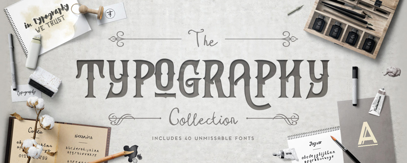
Every week, we’ll give you an overview of the best deals for designers, make sure you don’t miss any by subscribing to our deals feed. You can also follow the recently launched website Type Deals if you are looking for free fonts or font deals.
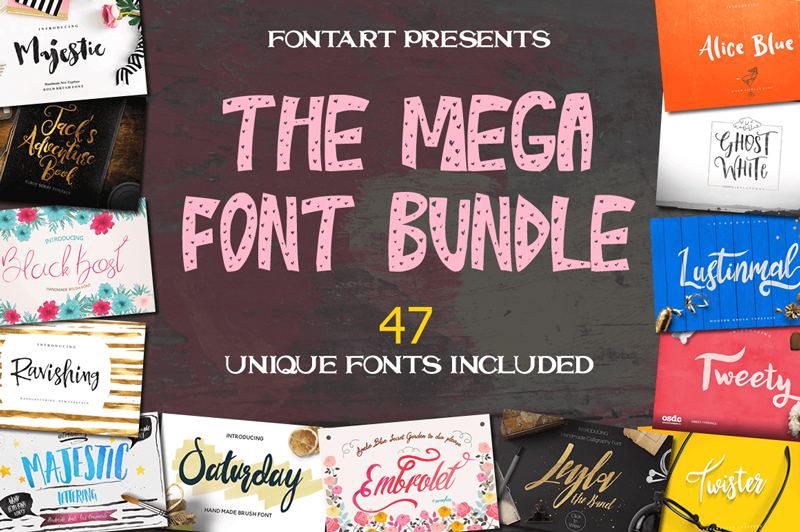
47 Professional Handcrafted Fonts from FontArt
Sick of searching around for the perfect font each time you start a new project? With this fontastic Mighty Deal from FontArt, you’ll get 47 different handcrafted fonts in 1 mega bundle. Available as both Desktop and Web Fonts, this huge collection is perfect for everything from elegant wedding invitations to whimsical T-shirts.
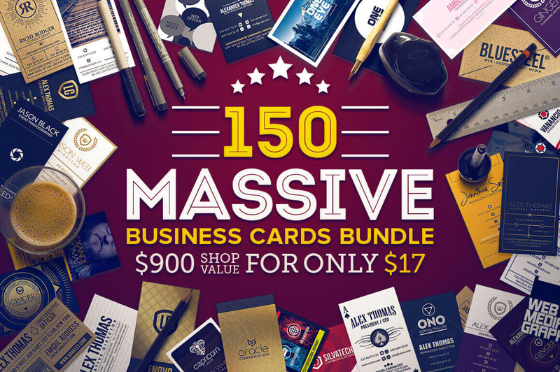
150 Massive Business Cards Bundle from Marvel Media
Need some new business cards for yourself or a client? This Mighty Deal is just what the doctor ordered then! You’ll get 150 hi-res, print-ready professional business cards for one ridiculously low price. Fully customizable through nicely organized and named Photoshop layers, these bad boys are print ready with CMYK color mode and 300 DPI high resolution.
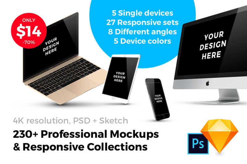
With just a few quick clicks, you can instantly see how your latest digital project looks in a realistic setting. That’s because this Mighty Deal from SmartMockups offers 230+ professional mockups, including a full set of pre-made responsive designs. See how your mobile app, website or other digital tool looks on a variety of realistic devices including the iPhone 7, iPhone SE, iPad mini, MacBook, iMac and more.
If you are visually impaired, it can be hard to access many electronic devices. Computers have special equipment to make typing and visiting websites more accessible, but newer techology is often built only for people with full sight.
Korean designer Dot worked on a way to make the smarwatches more accessible and designed the first smartwatch that uses Braille and comes with an impressive set of features.
The watch displays the information with the use of four Brailly cells that move dynamically and allows the user to select the character update speed. It connects to smartphones with Bluetooth and can receive text from apps and services like Messenger or others. The watch can also be used to send messages.
Ordered lists are among the oldest and most semantically rich elements in HTML. Anytime you need to communicate sequence or ranking, the <ol> tag is there to help. The default appearance of the <ol> tag presents numbers next to each item in the list. You can use the list-style-type property in CSS to change the default to use Roman numerals or the letters of the alphabet. If you are feeling exotic, you can even use numbering from other cultures like Hebrew or Greek. The full list of available values is well-documented and easy to use.
Recently, I saw an opportunity to use dice in place of numbers for several ordered lists explaining the features of an HTML5 game I created called Triple Score Bopzee. To accomplish my goal, I first experimented with a now-familiar technique for using a small image file as the background for the li::before selector in a list. One change I made to the usual procedure is that I decided to avoid list-style-type: none in favor of using list-style-type: decimal and setting list-style-image to a 1×1 transparent GIF. That small change helps the page pass accessibility tests because screen readers will still see the list as a valid numbered list.
I created a Pen to demonstrate this classic technique using GIFs of numbers that contain the balls used in four major sports.
This technique would have worked for my needs on the bopzee web site but I got curious about how I could do it without using any images. The answer was to use the Unicode symbols \2680 through \2685 for the six dice. I created a class selector called „dicey” and used the nth-child and before pseudo selectors to position and choose the Unicode character for each list item. I added a link to the Normalize.css library to smooth out the subtle browser differences.
<ol class="dicey">
  <li>I rolled a one.</li>
  <li>I rolled a two.</li>
  <li>I rolled a three.</li>
  <li>I rolled a four.</li>
  <li>I rolled a five.</li>
  <li>I rolled a six.</li>
</ol>
This was the trick:
/* Still use a decimal based list for a11y */
ol {
  margin-left:40px;
  list-style:decimal url(data:image/gif;base64,R0lGODlhAQABAIAAAAAAAP///yH5BAEAAAAALAAAAAABAAEAAAIBRAA7);
}

.dicey li:nth-child(1n):before {position:absolute;left:-1em;}

/* Actually set markers with pseudo element unicode */
.dicey li:nth-child(1):before {content: "\2680";}
.dicey li:nth-child(2):before {content: "\2681";}
.dicey li:nth-child(3):before {content: "\2682";}
.dicey li:nth-child(4):before {content: "\2683";}
.dicey li:nth-child(5):before {content: "\2684";}
.dicey li:nth-child(6):before {content: "\2685";}
Initially, I did not specify the font that would display the Unicode symbols. The result was not bad because today every modern web browser and web enabled device has access to at least one font that contains the necessary symbols from the Unicode block called „Miscellaneous Symbols.” There was some variation in appearance but it was quite tolerable. But I knew that if I wanted real control, I would have to find a free web font. I identified a font called DejaVu that would work by looking through the supported fonts list in the table of glyphs for the Miscellaneous Symbols block.
Once I knew the font name, I was able to create a WebFont kit at Font Squirrel. When creating a WebFont kit, it is important to choose the „No subsetting” option to be sure the fonts contain all the Unicode goodness you need for your icons. Or if you are concerned about file size, you can download the original TrueType or OpenType font, then use Font Squirrel’s WebFont generator in expert mode to include only the Unicode range 2600 to 26FF which captures all characters in the Unicode block called „Miscellaneous Symbols.”
Once you get started with Unicode, the fun never stops. I spent way too much time exploring the many icons that are part of the DejaVu font (complete list). There I found icons for playing card suits, astrological signs, arrows, bullets, musical symbols, geometric shapes, and a whole host of squiggles I can’t begin to name. So I took some of my favorites and created a Pen containing several different kinds of lists.
There is a new CSS rule called @counter-style which will allow us more easily to create custom counter styles for ordered lists, specifying the symbols to be used, the range of the list, and lots of other options. The CSS Counter Styles Level 3 specification is now a Candidate Recommendation at the W3C but as of May 2017 only FireFox supports it (with some issues). I would expect that Chrome, Edge, and Safari will add support sometime soon but the final version of Internet Explorer (version 11) will likely never have it. So if you have to support that browser, you will be stuck with tricks like the one described on this post until people stop using IE11 (perhaps the year 2020?).
Note that the @counter-style rule does not provide any way to style the counter symbol using CSS. So even when it is adopted by all browsers, there may be use cases for alternative solutions like the one presented here. You can read more about @counter-style on MDN. Here is a pen with a demonstration.
We posted not long ago about the difference between native CSS variables (custom properties) and preprocessor variables. There are a few esoteric things preprocessor variables can do that native variables cannot, but for the most part, native variables can do the same things. But, they are more powerful because of how they are live-interpolated. Should their values ever change (e.g. JavaScript, media query hits, etc) the change triggers immediate change on the site.
Cool, right? But still, how actually useful is that? What are the major use cases? I think we’re still seeing those shake out.
One use case, it occurred to me, would be theming of a site (think: custom colors for elements around a site). Rather than writing different CSS for a bunch of different themes, or writing JavaScript that targets all the elements we intend to change and changing them), we just write one base set of CSS that utilizes variables and set those variables to the theme colors.
Imagine we allow the header and footer background of our site to be customized.
The value is plucked out of localStorage and used when the page loads. A default value is also set (in CSS), in case that doesn’t exist.
What makes the above demo so compelling, to me, is how little code it is. Maintaining this as a a feature on a site is largely a CSS endeavour and seems flexible enough to stand the test of time (probably).
Not unusually, I was way behind on this one.
Lots of people think of theming as one of the major use-cases for CSS Custom Properties. Let’s look at some other folks examples.
Giacomo Zinetti has the same kind of color-picker implementation
Harry does a lot of consulting, and to my surprise, finds himself working with companies that want to do this a lot. He warns:
Theming, the vast majority of the time, is a complete nice-to-have. It is not business critical or usually even important. If you are asked to provide such theming, do not do so at the expense of performance or code quality.
They also created react-custom-properties which all about applying Custom Properties to components, taking advantage of the fact that you can set Custom Properties as inline styles:
<div style="--theme-primary-color: blue;">

</div>
More than one color and property
It’s not only colors that can change, a Custom Property can be any valid value. Here’s Keith Clark with a demo with multiple colors as well as font size:
Which meant that you could set those variables and have the component take on new colors.
Support and fallbacks
Support has gotten pretty good recently:
Green indicates full support at the version listed (and above). Yellow indicates partial support. Red indicates no support. See Caniuse for full browser support details.
Desktop
Chrome
Opera
Firefox
IE
Edge
Safari
49
36
31
No
15
9.1
Mobile / Tablet
iOS Safari
Opera Mobile
Opera Mini
Android
Android Chrome
Android Firefox
9.3
37
No
56
57
52
Opera Mini and IE are notably missing. We already covered the idea of a fallback through setting a valid non-variable property before the one using a Custom Property.
Like many modern CSS features, you can use @supports to test for support before using:
It always depends on the situation, but just putting fallbacks on a previous declaration is probably the most useful way to deal with non-support in CSS. There are also edge cases.
When setting colors for text, and the color behind that text, the contrast between those colors is an accessibility issue. Too little contrast, too hard to read.
One somewhat common solution to this is to choose whether the text should be light or dark (white or black) based on the color behind it.
David Halford has a demo calculating this with JavaScript:
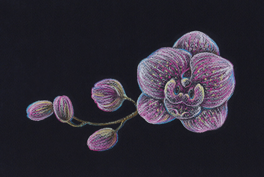
In this tutorial, I’ll show you how to draw an orchid. We will be using pastel pencils and black paper; this extraordinary combination of art supplies provides a broad space for experiments.
Orchids are wonderful, but drawing these flowers may seem challenging. I’ll show you an easy way to draw an orchid from scratch.
Our goal is to create a beautiful, expressive and emotional drawing, and have fun exploring the principles of making pastel sketches!
What You Will Need
Pastel pencils of different colors:
White
Light yellow
Light rosy
Pink
Dark violet
Blue
Light green
Medium green
Dark green
Brown
Grey
Black
And additional supplies:
Black pastel paper (smooth or with a subtle texture)
A graphite pencil
An eraser
A sharpener
1. How to Draw an Orchid With a Graphite Pencil
Step 1
In this part of the tutorial, I’ll show you how to draw an orchid from scratch, using a graphite pencil.
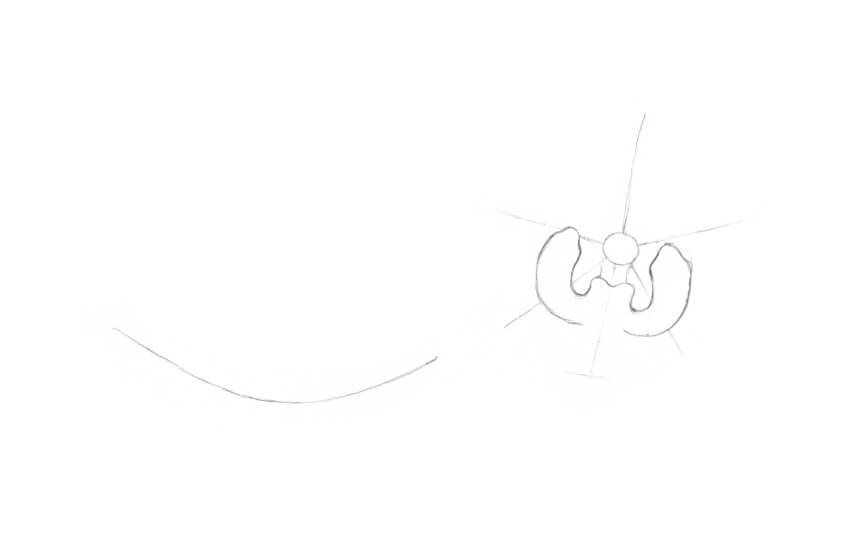
I mark the center of the flower with a small circle and add five divergent lines for the petal shapes. Then I draw a curved line to mark the core of the twig.
Step 2
In the central part of the flower, I draw two small vertical shapes that look like narrow petals.
Step 3
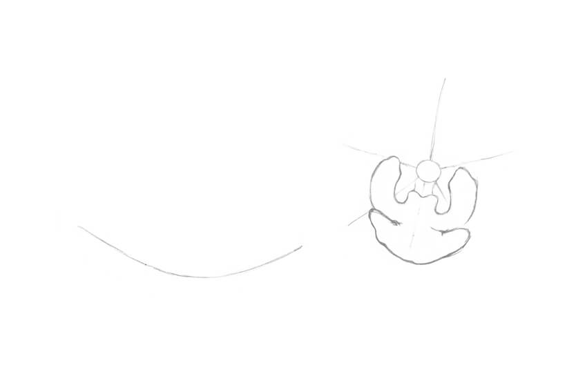
I add the lower petal of the orchid; it is also called a lip.
Step 4
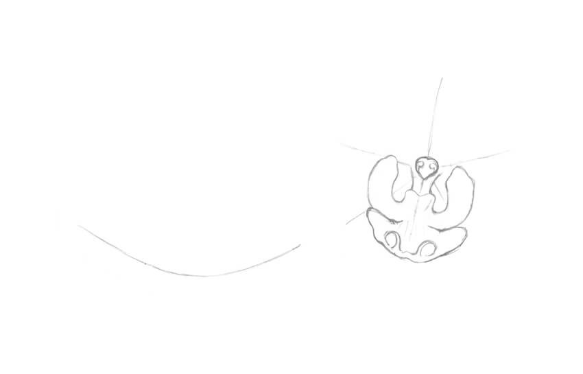
It’s time to add details. I refine the central structure of the orchid (known as a column) and add two tendril-like elements to the lip of the flower.
Step 5
I add two large petals. The lines are slightly irregular; this way of drawing lines helps to emphasize the organic nature of the object.
Step 6
I mark the sepals, which are three petal-like structures of approximately equal size.
Step 7
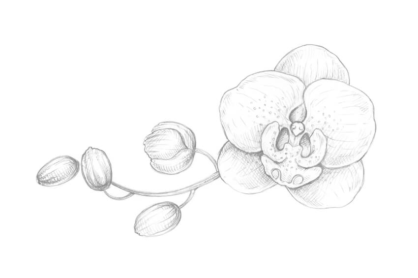
I refine the twig, making it wider and adding the rough shapes of the buds.
Step 8
I outline the buds. They are facing in slightly different directions; this simple trick makes the floral composition more interesting.
Step 9
I draw a pattern of small circles on the orchid, and then add thin lines that mark the direction from the central point of the flower to the periphery. The flower looks more realistic now.
Step 10
I create a value sketch, marking the places in my drawing that I consider the darkest: under the top petals, between the details of the flowers, and at the sides of the buds.
With regard to working on black paper in future steps, this action becomes especially important. When we are drawing on a dark surface, we have to pay the most attention to the lightest and brightest areas of the drawing. That is why we need to know where they are beforehand.
2. How to Draw With Pastel Pencils
Step 1
It’s time to try our tools and observe how the pastel pencils and black paper work together.
I draw small hatches and dots. As you can see, the strokes look uneven and spontaneous; it’s a perfect fit for the expressive floral sketch.
Step 2
I create a basic hatching, varying the line width and the tilt of the pencil.
Step 3
I incline the pencil and cover the paper with a layer of color. Just relax your hand and make a continuous line with soft rubbing movements.
My paper has a subtle texture, so the result of applying pencil strokes looks fascinating.
Step 4
I draw the same type of a stroke that we’ve tried in the previous step and shade it with my finger. The colors of the pencil and the paper sheet are blending with a blurry effect.
You can also use additional supplies, such as special shading stumps or just an ordinary cotton bud. The choice is entirely up to you.
3. How to Draw an Orchid Twig With Pastel Pencils
Step 1
I outline the main contours of my drawing, trying to keep it visually close to the pencil sketch that I’m using as a reference. I leave very light lines with the grey pastel pencil.
In this step, you can change some elements of your composition if you wish to make your pastel drawing slightly different from the graphite pencil sketch.
Step 2
I apply soft strokes with the white pastel pencil to the orchid flower and buds. The lines are going from the center of the flower to the edges of its petals.
Step 3
I shade the white strokes with my finger. Avoid going outside the contours of the shapes because this will cause a messy effect.
Step 4
I add another layer of long hatches, using the white pencil.
Now we have a base for applying bright colors and creating the pattern of the flower.
Step 5
I add lines with the light rosy pastel pencil to the flower and buds.
Step 6
With the pink pastel pencil, I add more bright hatches and dots to reveal the pattern of the flower.
Step 7
To make the flower and the buds more contrasting, I add more hatches with the white color.
It’s important to work on your drawing gradually and press on the pencils lightly because pastel paper can hold only a limited amount of the color pigment.
Step 8
I mark the twig with the brown pastel pencil. To keep the color unity of the artwork, I also add brown strokes to the central part of the flower and the buds.
Step 9
I add dots and short hatches to the twig with the dark green pencil.
It is also a good idea to leave just a couple of hatches of this color within the buds’ shapes.
Step 10
I intensify the brightness of the orchid, using the pencil of the dark violet color.
The lines are visually blending with the existing pink and light rosy strokes, so the result looks vivid and colorful.
Step 11
It’s time to vary the coloring of the drawing. I add dots and hatches with the light yellow pencil.
The goal of this step is to set up the light accents and emphasize the pattern of the flower.
Step 12
I add more bright, illuminated spots, applying the light green color.
You may notice that the light colors of the pastel pencils look closer to the white color when you are drawing on a dark surface.
Step 13
To make the drawing feel aerial, I add strokes and outline the contours with the blue pencil.
Such nuances of a cool color work great in shady areas of the drawing.
Step 14
Using the black pastel pencil, I make the borders between the elements in my drawing more accurate.
I also strengthen the shadows in the area of the flower buds, giving the objects more volume and contrast.
Step 15
I use the white pencil once again to accent the details, especially in the central part of the orchid.
Step 16
I add bright nuances with the pencil of the medium green color, slightly touching the contours of the flower and the buds.
Such tiny details always help to make the drawing more vivid.
Step 17
I add more hatches with the light rosy pencil.
Step 18
I evaluate my drawing and accent the tips of the petals even more, using the white pencil.
Your Drawing Is Complete
Congratulations—you’ve created a beautiful artwork! I hope you’ve enjoyed the process of working with pastel pencils and black paper.
I wish you much success with this wonderful technique and your creative projects!
Agregator najlepszych postów o designie, webdesignie, cssie i Internecie