Post pobrano z: A SpaceX rebrand designed by a graphic design student
It’s a bit hard to admit when you are a seasoned graphic design professional, but from time to time design students do much better work than older designers. This rebranding of SpaceX by Yuma Naito is an excellent example of this. This school project could easily be used in real life conditions by SpaceX, and […]
Wszystkie wpisy, których autorem jest admin
How to Create a Cafe Illustration in Adobe Illustrator
Post pobrano z: How to Create a Cafe Illustration in Adobe Illustrator

Everybody has their own way of relaxing and enjoying their life. One of
my favorite times of the day is taking a sip of morning coffee—this is
pretty much the only time when I can sit back and read some books
because once that time’s over, I’m in my Wonder Woman gear trying to get
everything done.
In this tutorial, I want to share this special
moment by illustrating a lady who is relaxing with her coffee. While
creating this illustration, you’ll learn to manipulate shapes and also
get acquainted with the Width Tool, which I haven’t used before in my
previous tutorials. As usual, we will use basic shapes and the Warp Effect.
Why don’t you browse through GraphicRiver and find more characters? Maybe you will decide to make another hair style or even clothes, who knows…
1. How to Create the Head
Step 1
After
opening the Adobe Illustrator, create a new document with 850 x 850 px
Width and Height. We’ll begin by illustrating the head.
Using
the Ellipse Tool (L), draw an oval. In the image below, you can see
which fill color you need. To give the head an irregular shape, go to
Effect > Warp > Inflate. Enter the options you see below.

Step 2
Let’s
start by drawing the top part of the hair. Draw two cream ovals with
the Ellipse Tool (L). Take the Direct Selection Tool (A) and move the
handles of the anchor points to create the shape you want.

Step 3
To
create long hair, make another cream oval and change its shape: go to
Effect > Warp > Inflate. Enter the options shown below. Be sure
to place this oval behind the head (Control-C, Control-B).

Step 4
Let’s
make a hair band. Create two more circles by using the Ellipse Tool
(L), and make them overlap as in the image below. Go to the
Pathfinder panel and press the Minus Front button.

Step 5
Place this hair band on the hair.
Now
we will add the ears. Make another small oval and rotate it to the
left. Place this ear on the left side of the head. While keeping the
left ear selected, right-click your mouse and select Transform >
Reflect. Once you get a dialogue box, select Axis Vertical, Angle 90
degrees, and press Copy. Move the new ear to the right.

Step 6
For
the dreamy, relaxed eyes, create an oval. Then grab the Scissors Tool
(C) and click on the left and right sides of the ellipse. Delete the
upper part of the ellipse by pressing the Delete button on your
keyboard. You should be left with an arc. Increase the stroke Weight and
check Round Cap on the Stroke panel.
To add the eyelashes, make a copy
of this arc, decrease the stroke weight, and attach it to the left corner
of the larger arc. Make another copy of this small arc. Our romantic
eye is ready.

Step 7
Place the left eye on the face and
create the right eye. Right-click your mouse and select Transform >
Reflect. Once you get a dialogue box, select Axis Vertical, Angle 90
degrees, and press Copy. Move the new eye to the right.

Step 8
Now
the lips. Let’s create a little matte red ellipse and by using the
Convert Anchor Point Tool (Shift-C), make the left and right anchor
points sharp by clicking them. After that, select those two anchor
points again (with the Direct Selection Tool (A)) and move them up by
pressing the Up Arrow on your keyboard.
For the upper lip,
create another small red ellipse. Select the top and bottom anchor points
with the Direct Selection Tool (A)) and move to the right by pressing
the Right Arrow on your keyboard. Make a reflected copy of this shape:
right-click your mouse and select Transform > Reflect. In the
dialogue box, select Axis Vertical, Angle 90 degrees, and hit Copy. Move
this copy to the right. The lips are ready.
(Note: You don’t need the
black strokes—it’s just to show you the shape and the placement).

Place the lips on the face.

Step 9
Let’s give the lady a pair of glasses.
Create
an oval with a dark gray stroke color and no fill. To create the shape
shown below, move the handles of the anchor points by using the Direct
Selection Tool (A). Add a line from the left side of this shape using
the Line Segment Tool (\).
Then create the right part of the glasses, just as we’ve been doing in the previous steps: right-click, Transform > Reflect. In the dialogue box, select Axis
Vertical, Angle 90 degrees, and hit Copy. Move this copy to the right.
Use the Arc Tool to make the middle part of the glasses and attach the
lenses together. An elegant pair of glasses is ready. You can play with
the shape of the frames to create a unique pair of glasses you
like.

Now place the pair of glasses on the face.

2. How to Create the Body
Step 1
Let’s
start by creating the neck and the shoulders. For the neck, create a
rectangle using the Rectangle Tool (M) and attach it to the head. After
that, create a horizontal oval (use the Ellipse Tool (L)) and attach it
to the neck.

Step 2
In this step, we will create the lady’s
body. Using the Rounded Rectangle Tool, create a gray rounded rectangle.
Let’s modify the bottom part of this shape. We’ll use the Fish effect:
go to Effect > Warp > Fish and enter the options below.

Step 3
To
create the arms, we will start with an arc. First, delete the fill
color and set the stroke color similar to the body color. Check Round Cap on the Stroke panel and make the Weight of this stroke very
thick. Now, using the Arc Tool, draw the woman’s arms. Move the handles
of the anchor points to achieve the result you need.

Step 4
Let’s continue drawing the arms.
Using the Line Segment Tool (/), create the lower part of the right arm. Then using the Arc Tool, create the left arm.
Now
we will modify these shapes so that this part is a bit thinner than the upper
arm. Select the Width Tool (Shift-W) and when you place the mouse over
the woman’s wrist, you will see new handles. If you move these
handles outside the line, the width of the line will increase on one
end. If you move anchor points inside the line, the width will decrease.
So go ahead and make the arms a little thinner around the wrist area.

Step 5
For the hands, we will use two ovals, which will be modified by manipulating
their handles. Remember to delete the stroke color and set the fill
color.

Here’s a closer look at the handle positions for the lady’s right hand.

Step 6
Now
we will create the cup. Pick the Rectangle Tool (M) and create a
rectangle. Keep it selected and go to Effect > Warp > Bulge.
Adjust the options as shown in the image below. Remove the fill color
and make the same stroke. Increase the stroke on the Stroke panel and
draw a circle (for a nice round circle you need to hold down the Shift
key). That’s the handle.

Place the cup under the lady’s right hand, but over the body.

3. How to Create the Hips and Legs
Step 1
Using
the Ellipse Tool (L), make an oval and attach it to the bottom part of
the body. Using the Direct Selection Tool (A), move both side anchor
points down. That’s the hips.

Step 2
Let’s make the legs.
Grab
the Line Segment Tool (\), and draw two vertical lines. To get a straight
line, hold the Shift key as you draw the line. Remember to remove
the fill color and choose the same stroke color as the skin color.
Before drawing, be sure to check the Round Cap button on the Stroke
panel and adjust the appropriate Weight of the stroke. To change the
thickness of the legs, select the Width Tool (Shift-W) and move the handles to make the upper part of the leg thicker and the bottom
ankle part a bit thinner.

Step 3
For the shoes, draw an oval
with the Ellipse Tool (L) and place it behind the leg. Using the Direct
Selection Tool (A), move the handles of the oval to create the shape
which will look like a shoe. Feel free to design your favorite shoes!

4. How to Create the Background and the Table
Step 1
Create a light blue square behind the woman, 850 px Width and Height, by using the Rectangle Tool (M).

Step 2
For the table top, add a white rounded rectangle by using the Rounded Rectangle Tool.

Step 3
Add two vertical rectangles by using the Rectangle Tool (M), for the table legs.

Step 4
For
the table decoration, add two spirals next to the table legs by using
the Spiral Tool. If you don’t see this tool, hold the Line Segment Tool
(\) for a few seconds, and a pop-up menu will appear—then you can select the
Spiral Tool.
Click on your artboard and a new dialogue window
will appear, asking you about the Radius of your spiral, Decay and Segments.
I recommend playing with different Decay and Segments to find out what
you like the most. Select the Round Cap button on the Stroke panel and
adjust the appropriate stroke Weight for this spiral. Create one spiral
and make another vertical copy of it.

5. How to Create the Chair
Step 1
For the seat of the chair, create a rounded rectangle using the Rounded Rectangle Tool.

Step 2
For
the back of the chair, create an oval with no fill and white stroke by
using the Ellipse Tool (L). Place this oval behind the table and the
lady. Slightly modify the oval shape by moving up its bottom anchor
point.

Step 3
To add the chair legs, create a vertical
rectangle using the Rectangle Tool (M) and a horizontal rounded rectangle
with the Rounded Rectangle Tool.

Step 4
To decorate the
chair, add two spirals on the bottom part of the chair’s leg. Create one
spiral by using the Spiral Tool and make a vertical copy with the
Reflect Tool (O).

Awesome Work, You’re Done!
We are done! Great job! I
hope you’ve enjoyed the process of illustrating using Adobe
Illustrator and learned some new tips and tricks, which you can use in
the future! Now it’s time to relax and grab a cup of coffee. Enjoy, have
fun, and don’t forget to share your art with us!

Sanispira: Creature
Post pobrano z: Sanispira: Creature
Print
Sanispira
Advertising Agency:White, Red&Green, Milan
Creative Directors:Riccardo Ciunci, Domenico Stragapede
Art Director:Domenico Stragapede
Copywriter:Riccardo Ciunci
Post Production:Artout Lab, Milan
Cadillac Carry at the Oscars
Post pobrano z: Cadillac Carry at the Oscars
GM brand Cadillac has run four commercials in association with the 89th Academy Awards, “Carry”, “Pioneers” and “Pedestal”. The Cadillac Carry commercial, one of the most talked about Oscars ad, focuses on an America with a shared commitment to carry one another, despite differences. “We are a nation divided. That’s what they tell us, right? This chasm between us. But what they don’t tell you, what doesn’t make the news, is this. Maybe what we carry isn’t just people, it’s an idea, that while we’re not the same, we can be one, and all it takes is the willingness to dare.” Footage of protests, rescues and community celebrations is presented alongside historical shots of Muhammad Ali, Marilyn Monroe and Dwight Eisenhower and classic Cadillac models.

One ad, called “Pedestal,” features the Escala concept car. Another ad called “Pioneers” spotlights technology used in Cadillac vehicles. A fourth ad is dedicated to the CTS-V.
Cadillac Carry Credits
The Cadillac Carry commercial was developed at Publicis New York by chief creative officer Andy Bird, executive creative director John Kenney, chief production officer Lisa Bifulco, executive producer Anthony Garetti, producer Justine Palivoda, chief executive officer Carla Serrano, managing director Adam Hunt, strategy directors Ben Zumsteg and Patrick White, music supervisor Rachel Rauch, group account director Emily Shahady and account director James Bundy.
Editor was Jay Rabinowitz at Lost Planet with executive producer Krystn Wagenberg and producer Felix Cabrera.
Visual effects were produced at Black Hole. Colorist was Tom Poole at Company 3.
Sound was produced at Sound Lounge. Music is “Climb” from the score of “The Mission”, by Ennio Morricone.
Further Credits
Pedestal and Pioneers were developed at Rokkan by chief creative officer Brian Carley, associate creative director Noel Nickol, creative directors Billy Veasey, Bill Carlson, Mario Stipinovich, senior art director Steff Wilson. Production was by Independent Media.
Piper wins Oscar
Post pobrano z: Piper wins Oscar
Pixar’s film, “Piper” has won the Oscar for Animated Short Film at the Academy Awards. Released in tandem with the animated feature film Finding Dory, “Piper” tells the story of a hungry baby seabird overcoming fear of water. Animation director Alan Barillaro found his inspiration for the short film as he jogged along the beach near Pixar Studios. He observed birds fleeing from the incoming waves but returning immediately to find their food. In “Piper” the baby sanderling is inspired by hermit crabs who dig into the sand to find food in the deeper water. The six minute film was developed over three years, with animation informed by regular visits to beaches in San Francisco Bay and Monterey Bay Aquarium. Macro photography and special effects software were combined to recreate sand, waves and feathers with a new level of accuracy in lighting and movement.

Credits
Piper was produced at Pixar by director/writer Alan Barillaro, producer Marc Sondheimer, director of photography Erik Smitt and Derek Williams, executive producers John Laseter and Andrew Stanton, production managers Sarah K Reimers and Richmond Horine, storyboard artists Rejean Bourdages and Enrico Casarosa, Tony Maki, Tony Rosenast and Rosanna Sullivan, head of story Brian Larsen, layout artists Colin Levy and Charlie Ramos, animation coordinator Samantha Jane Samuels, animators Dovi Anderson, Evan Bonifacio, James W. Brown, Simon Christen, Claudio de Oliveira, Graham Finley, Rob Gibbs, Joey Gilbreath, Catherine Hicks, Patty Kihm, Erick Oh, Bret ‘Brook’ Parker, Alli Sadegiani, Tal Shwarzman, Ricky Wight, Kureha Yokoo, sets shading artist Tracy Lee Church, effects artists Shaun Galinak and Sarah Beth Eisinger, digital artist Andrew Jimenez, visual effects artists David Lipton and Andrew Wheeler, FX technical director Leon JeongWook Park, character shading and grooming artist Kiki Mei Kee Poh, VFX supervisor Ferdi Scheepers, sets support Andrew Schmidt, effects animation technical director Vincent Serritella, colourist Susan Brunig, rendering supervisor Reid Sandros, title designer Laura Meyer, supervising technical director Brett Levin, technical developer Brandon Wang.
Sound was produced by sound designer Ren Klyce, production sound designer Samuel Lehmer and foley mixer Scott Curtis.
Music was by Adrian Belew.
DB Export launches Beer Bottle Sand
Post pobrano z: DB Export launches Beer Bottle Sand
DB Breweries has launched “Beer Bottle Sand”, an environmentally friendly campaign designed to encourage the recycling of glass beer bottles. In New Zealand, three out of every twelve beers sold end up in landfill. The Beer Bottle Sand project aims to keep recyclable glass out of landfill and sand on New Zealand’s beaches. The brewery has built a fleet of machines that let their drinkers instantly turn their empty bottles into sand substitute. DB Export Beer Bottle Sand will then be supplied to construction companies and commercial partners, reducing the country’s dependence on beach-derived sand. To do their bit, New Zealanders simply have to empty a bottle of DB Export. The Beer Bottle Sand campaign follows on from the ongoing DB Export Brewtroleum campaign.

http://www.dbexportbeer.co.nz/db-beer-bottle-sand
http://www.dbexportbeer.co.nz/sand-machine
The Beer Bottle Sand Machines reduce an empty bottle of DB Export into sand substitute in just 5 seconds. As the bottle is inserted, a laser triggers a wheel of small steel hammers spinning at 2800rpm. As the bottle is pulverised a vacuum system removes silica dust and plastic labels, leaving behind 200 grams of sand substitute. The brewery is in the process of finalising a two year deal to supply DB Export Beer Bottle Sand to Drymix – New Zealand’s biggest producer of bagged concrete. Beer Bottle Sand will also be supplied to national roading projects, commercial and residential construction, right through to golf bunkers.


Says Colenso BBDO Creative Chairman Nick Worthington: “Brewtroleum’s success came through finding partners who could make the idea more than advertising. We’re thrilled to partner with the country’s biggest construction companies to make DB Export Beer Bottle Sand a viable alternative to beach sand. And we’re excited to work with DB Export drinkers to ensure a reliable supply of empty bottles.”
Says Sean O’Donnell, Marketing Director at DB Breweries: “We can’t solve the problem alone but we knew we could do more to help. Our ambition is to help drive more recycling whilst looking out for the beaches which are an integral part of our Kiwi DNA. We’re proud to launch an initiative that can help us do our bit to protect our beaches for future generations.”


Beer Bottle Sand Credits
The Beer Bottle Sand campaign was developed at Colenso BBDO.
Filming was produced at Finch.
Media was handled at PHD.
PR was handled at Spark PR & Activate.
Shopper marketing work was done at Raydar.
Digital work was produced at Union Digital.
Genesis Noir – Teaser
Post pobrano z: Genesis Noir – Teaser

“Genesis Noir” takes place before, during and after the Big Bang as you race to stop the expansion of the universe and save your love. “A cosmic gunshot expands towards the heart of a god and the player must explore the universe, seeking clues on how creation might be undone.” Inspired by the world of animation and motion design, “Genesis Noir blends visual storytelling and interaction into one seamless experience”. With its beautiful and unique style, cosmic premise, and generative gameplay, we at Motionographer are very excited to find out more about this game and what is going on over at the Feral Cat Den!
You can find out more info below.
Hockney at Tate Britain
Post pobrano z: Hockney at Tate Britain

How to Create a Tasty 3D Typographic Illustration in Photoshop
Post pobrano z: How to Create a Tasty 3D Typographic Illustration in Photoshop

This tutorial was originally published in May 2012 as a Tuts+
Premium tutorial. It is now available free to view. Although this
tutorial does not use the latest version of Adobe Photoshop, its
techniques and process are still relevant.
If you’ve got a sweet tooth, then we’ve got a mouth-watering treat for you. In this tutorial we will show you how Photoshop CS6 Extended’s new 3D tools can be utilized to create a typographic illustration. We will also use plenty of free stock images and make full use of Photoshop’s non-destructive features, such as Adjustment Layers and Masks. Let’s get started!
Want an easier way to create tasty text? Browse the incredible selection of Candy Text Effects from GraphicRiver. Or enlist the help of a design professional from Envato Studio for all your typography needs.
Tutorial Assets
Note: The following references have been updated with workable links similar to the originals. But feel free to collect and experiment with your own.
- Ryno Slab font
- Choc ice
- Chocolate bar one
- Chocolate bar two
- Chocolate bar three
- Cookie one
- Cookie two
- Cookie three
- Cookie four
- Cake one
- Cake two
- Cake three
- Cake four
- Cake five
- Hand
- Strawberry
1. How to Create 3D Letters
Step 1
Create a new canvas 14.85cm wide x 10.5cm high with the Resolution at 300dpi. Set the Color Mode to RGB and the Background Contents as White.

Step 2
Grab the Type Tool (T) and add the first character at 160pt in this font, then click the color chip in the Character tab and recolor it to #5d1e0f.

Step 3
Choose 3D > New Extrusion from Selected Layer. If you’ve not got the 3D workspace active, the following prompt will appear.

Step 4
If you ever used CS5’s 3D Repousse Tool, you’ll know how far it was from being user-friendly. The 3D experience in CS6 has been totally overhauled and is much more intuitive as everything is built into your workspace. Grab the Move Tool (V), drag to reposition the 3d plane as shown.

Step 5
You’ll see the Properties panel on the right. Click the Cap icon (1) and copy the settings shown. Now activate the Deform icon (2) and Copy these settings too. Now activate the Mesh icon and turn off both shadow options.

Step 6
Duplicate your first 3D text layer. To modify text while still in 3D Mode, click the Edit Source button in the Properties panel. This will open a „child document”, Edit, Save, then close and your text will automatically update. Now Drag the new 3D layer along the X-Axis in 3D space to reposition it.
Repeat this until each word is complete, then place each character clearly labelled in a separate word folder as shown.

Step 7
Now use the 3D Tools to Rotate/Move each character. Be careful not to use the Z-Axis, as this will move the object towards or away, making it appear larger or smaller.

Step 8
When you’re happy with the lettering arrangement, choose 3D > Render, then and sit back while until the render process is complete.

2. How to Create the Background
Step 1
At this point I decided I would need a little more space at the top for the hand/strawberry. To do this, press Alt-Control-I to access the Canvas Size window, set the anchor point to bottom centre and increase the Height to 11.85cm.

Step 2
Place a new layer called „Pink solid” above the „Background”. Use the Color Picker to set your Foreground Color to #e2b4c1, then hit Alt-Delete to fill the layer with pink.

Step 3
Add a New Layer called „Floor shadow” above the previous one, change the Blend Mode to Multiply and reduce the Opacity to 94%. Choose the Gradient Tool (G) and set it to Linear and Foreground to Transparent in the Options bar. Set your Foreground to a slightly darker pink of #c18088. Now press Shift and Drag as indicated by the length and direction of the arrow.

Step 4
Add another layer called „Top shadow”. Keep the Blend Mode as Default, then set your Foreground Color to #e38da4. Shift-Drag a short Linear Gradient from the top, then change the Gradient to Radial and add two further gradients from both top corners.

Step 5
Change your Foreground Color to #f9f5f7 and add a central Radial Gradient on a new layer called „Inner glow”.

3. How to Create a Ground Shadow
Step 1
Now we’ll add a ground shadow. Grab the Elliptical Marquee Tool (M) and draw a selection below the text as shown. Add a new layer in Multiply Mode above the „Inner glow” and name it „Shadow 1”. Set your Foreground Color to #d0879c and Fill the active selection.

Step 2
Go to Filter > Blur > Motion Blur, set the Angle to 0 Degrees and change the Distance to 531px. Next, use the same menu to choose Gaussian Blur and enter a Radius of 15px.

Step 3
Reduce the „Shadow 1” layer to 53% Opacity. Now Duplicate and rename it „Shadow 2”. Nudge the layer content up slightly, then hit Control-T to access Transform and reduce in size as well. Finally, drop the Opacity of this layer to 31%.

Step 4
To reduce the intensity of the background, add an unclipped Hue/Saturation Adjustment Layer, Copy these settings, then reduce the adjustment to 27% Opacity.

Step 5
To break up the gradient banding and the solid pink, target the „Shadow 2” thumbnail and choose Filter > Noise > Add Noise, enter 3px and activate the Uniform button. Target the remaining layers in turn (as indicated) and hit Control-F to reapply the filter. Now place all these layers within a group folder called „BACKGROUND”.

4. How to Add Texture to the First Letter
Step 1
Now we’ll move onto texturing the first letter. Use the Lasso Tool (L) to create a rough Selection of a chocolate image. Copy > Paste as a new layer above the type folders, then Duplicate and reposition next to the original. Use a soft-edged Eraser (E) to blend the hard edge of the duplicate, then hit Conrol-E to Merge Down and name the layer „Texture 1”.
Transform/position over the letter, then Control-Click the corresponding text layer to generate a layer-based selection. Ensure your new layer is targeted, then click on the Add layer mask icon located at the foot of the Layers tab.

Step 2
This first layer will appear over the darker extruded areas of the letterform, so add a clipped (to affect this layer only) Levels Adjustment and set the whitepoint Output slider to 94.

Step 3
Now we’ll add a toffee and chocolate topping. Use the Quick Selection Tool (W) to extract this a cookie. Place as a new top layer and Transform/Position as shown. Add a Layer Mask, then use an assortment of Soft and Hard brushes to blend into the top and front face of the letterform. Name this layer „Texture 2”.

Step 4
Clip a Color Balance Adjustment to „Texture 2” and boost the Reds to +23.

Step 5
Extract the same entire choc ice (as used on Step 19), then Rotate, Scale and Position as a new layer. Name this layer „Texture 3”, add a Mask, then hit Control-I to Invert the mask to black. Now use a selection of white brushes to reinstate the area as shown.

Step 6
Clip a Levels Adjustment with these settings to the „Texture 3” layer to Darken the midtones.

Step 7
Add the same entire choc ice again as a new top layer and label it „Texture 4”. Position over the bottom of the letterform, then repeat the masking technique as used the previous layer.

Step 8
Clip another Levels Adjustment and increase the Midtones on „Texture 4” as well.

Step 9
Place the same choc ice as a final layer and label it „Texture 5”, then mask as shown.

Step 10
Place all these floating layers within a Group folder called „LETTER S”, then add a mask to the folder. Now Paint within a Selection from the letter „W” to hide the overlap.

5. How to Add Texture to the Letter W
Step 1
Extract the chocolate bar from its background, with the select active, hit Control-J to Copy as a new layer and Disable the Visibility of the original layer. Target the new layer, activate the Move Tool (V), then hold Control and drag out the top anchor points to remove the perspective.
Add this as a top layer called „Texture 1” and Resize/Position over the second letterform. Reduce the Opacity to 32%, then use a selection from its corresponding type layer to create a mask.

Step 2
Duplicate this layer, rename it „Texture 2” and change the Opacity to 95%. Drag the mask into the trash icon and click Delete in the following window. Temporarily Switch Off the Visibility of both texture layers, then use the Magic Wand (W) to select the front face from the corresponding type layer (shown by the marching ants in the screenshot). Now press Shift-F6 and Feather by 3px, then Select > Modify > Expand By 5px. Finally, click the Add Layer Mask icon.

Step 3
Clip a Color Balance Adjustment to „Texture 2” and increase the Reds and Yellows.

Step 4
Now clip a Levels Adjustment to the same layer to boost the Contrast.

Step 5
Now Clip a Hue/Saturation Adjustment to the same layer and adjust the Master, then the Reds and Yellows as shown.

Step 6
As a final modification, clip a Selective Color Adjustment to the same layer and increase the Blacks to +72. Add all these floating layers into a group folder called „LETTER W”

6. How to Add Texture to the Letter E
Step 1
Repeat the process as before to add and Mask the reference image. This texture only need to cover the extruded areas, so don’t worry if it falls short on the left. Name this layer „Texture 1”

Step 2
Clip a Levels Adjustment to the „Texture 1” layer and set the Output whitepoint value to 59 to darken it.

Step 3
Add the same image again and name it „Texture 2”. Now apply the same masking technique as before.

Step 4
Clip a Levels Adjustment to „Texture 2” and copy these settings. Place these layers within a group folder called „LETTER E1”.

Step 5
Now clip a Hue/Saturation Adjustment to the same layer and reduce the Reds Saturation to -15.

Step 6
Extract and Place a cookie image over the next letterform. Mask, then lower the Opacity to 45% and name it „Texture 1”.

Step 7
Modify the Mask with a black-filled Selection from the face of the corresponding text layer.

Step 8
Clip a Levels Adjustment to the „Texture 1” layer and adjust the Midpoint slider to 0.84.

Step 9
Add the same texture as a New Layer, label it „Texture 2” and Mask as shown, including the top bite mark.

Step 10
Clip a Levels Adjustment to the „Texture 2” layer and Copy these settings.

Step 11
Now clip a Color Balance Adjustment to the same layer.

Step 12
Extract the right-hand broken portion from an eaten portion of a candy bar. Position over the bite, then access Warp (via the Transform menu) to bend it into shape. Add a mask and gently blend the edges into the underlying texture. Name this layer „Texture 3”.

Step 13
Clip a Hue/Saturation Adjustment to this layer and modify the Reds and Yellows as shown. Now place all your floating layers into a Group folder called „LETTER E2”

Step 14
Finally, add a Mask the original type layer and hide the area interfering with the bite mark.

7. Add Texture to the Letter T
Step 1
Extract and add a cake image as a New Layer and name it „Texture 1”. Use the same masking technique so only the extruded areas are visible, then reduce the Opacity to 90%.

Step 2
Clip a Levels Adjustment to this layer and Copy these settings.

Step 3
Add the same cake texture as another layer and label it „Texture 2”. Now mask, so just the front face is visible.

Step 4
Clip a Color Balance Adjustment to the „Texture 2” layer and apply the following settings.

Step 5
Now Clip a Levels Adjustment to the same layer.

Step 6
Add the same cookie texture as used on the very first letterform and name it „Texture 3”. Position as shown, then blend with a mask.

Step 7
Clip a Color Balance adjustment to this layer, then increase the Red to +17 and the Yellow to +7. Now clip a Levels Adjustment to the same layer and change the midpoint to 0.67 and the whitepoint to 215. You can now place these layers into a group folder called „LETTER T”.

8. How to Add Texture to the Rest of the Letters
Step 1
The letter „O” will be more straightforward. Extract and place a glazed chocolate image as a New Layer. Resize to cover the letterform and label it „Texture 1”. Use a Selection from the corresponding text layer to create a Mask, then deselect and carefully paint back areas as required around the outer edge and centre hole.

Step 2
Clip a Levels Adjustment to this layer and Copy these settings to darken the texture. Place these two layers into a Group folder called „LETTER O1”.

Step 3
Lasso a rough Selection from the darker edge of a chocolate image. Copy > Paste several times and position over the extruded areas of the next letterform. When you’re happy Merge them and name the layer „Texture 1”. Now use the original type layer to create a Mask.

Step 4
Clip a Levels Adjustment to the „Texture 1” layer and set the Midpoint to 0.86 and the Whitepoint to 236. Extract the same cake image from it’s background, then duplicate, Offset and Merge as you did with the very first letterform texture. Add as a New Layer, then position and mask as shown. Name this layer „Texture 2”. Place all these layers into a group folder called „LETTER N”.

Step 5
Repeat the process to add merged segments from this image as a New Layer over the next letterform. Mask as shown, then name this layer „Texture 1”.

Step 6
Clip a Levels Adjustment to this layer and set the Whitepoint Output slider to 148. Next, clip a Color Balance Adjustment to the same layer and copy these settings.

Step 7
Roughly Extract the same cake from its background and place as a new layer. Duplicate a feathered central portion and enlarge/stretch as shown. Merge both layers, then Mask so only the front face is visible. Name this layer „Texture 2”.

Step 8
Clip a Color Balance Adjustment to this layer and apply the following settings. Add these layer into their own Group folder called „LETTER Y”.

Step 9
The next letterform will be fairly easy to create. Open a donut reference and Extract it from its background. Place as a New Layer, then Transform to fit. Name this layer „Texture 1”, then disable the visibility of the original type layer.
Now Clip two adjustments to this layer: Levels and Color Balance with the following settings. Place these layers within a Group folder called „LETTER O2”.

Step 10
Extract and add a pie image and position over the final letterform. Transform and Mask to reveal the extruded type area, then name the layer „Texture 1”.

Step 11
Clip a Levels Adjustment to this layer and Copy these settings to darken it.

Step 12
Place the same cake texture as another layer and label it „Texture 2”. Resize and Position, then reduce the Opacity to 48%. Now Mask so just the front face is visible.

Step 13
Clip a Color Balance Adjustment to this layer and Copy the following settings.

Step 14
Extract and place a bitten chocolate bar as a New Layer and label it „Texture 3”. Flip Horizontal, Rotate, Resize and Position as shown, then blend with a Mask as shown.

Step 15
Clip a Levels Adjustment to this layer and Copy these settings to darken it.

Step 16
Clip a Color Balance Adjustment to the same layer, then mask the original type layer to reveal the bite mark. Finally, add all these layers into a Group folder called „LETTER U”.

9. How to Add the Strawberry and Hand
Step 1
Next, we’ll move onto creating the hand/strawberry layered file. Open a hand image and Crop (C) the excess background.

Step 2
For this image we’ll need an accurate selection, so grab the Quick Selection Tool (W) and select the white background.

Step 3
Hit Shift-Control-I to Inverse your selection, then click the Refine Edge button in the Options bar. In the next window choose On Layers (L) from the View Mode drop-down menu, Copy these settings and click OK.

Step 4
You’ll now see a masked duplicate layer appear and the visibility of the original layer disabled. Drag the mask into the trash icon and click Apply in the next window, then delete the original layer.
The existing strawberry less than photogenic, luckily this is easy to fix. Open a strawberyy image and use the same Selection/Refine Edge workflow to extract it. Delete/Apply the mask, then add as a New Layer and Resize, Position over the hand.

Step 5
Now Add a Mask and carefully blend the new strawberry into hand.

Step 6
Clip a Hue/Saturation Adjustment to the „Hand” layer and slightly increase the Saturation levels as shown.

Step 7
Now Clip a Levels Adjustment to the „Strawberry” layer to increase the Contrast.

Step 8
Set the Clone Stamp Tool (S) to Current & Below, then fix any minor flaws in the hand on a New Layer above the Hue/Saturation Adjustment Layer.

Step 9
Add another layer in Overlay Mode („Nails”) above the „Hand retouch” layer. Sample a color from the nail varnish (I used #814564) and Paint over the nails to accentuate them. To remove any overpainting, create a layer-based Selection from the „Hand”, Inverse and hit Delete on the new layer.

Step 10
Clone over the white edges of the nails as indicated on a New Layer („Nails retouch”) and use the same method as the previous step to delete any excess. Now place all these layers into a Group folder called „HAND”.

Step 11
Drag the folder thumbnail into your project file and Resize/Position as shown. If you notice any edge halos on the „Hand” layer, target it and go to Layer > Matting > Defringe and enter a pixel or two.
At this stage you may want to clip some more adjustments to the „Hand” and „Strawberry” layers so they sit more comfortably in the composition.

10. How to Finish Your Text
Step 1
Use the Selection/Refine Edge extraction workflow on the melted chocolate images to add some puddles of chocolate. Use the techniques you’ve learnt to clip relevant Adjustment Layers and also recolor some to resemble drops of jelly. Place these layers within a new Group folder called „ELEMENTS”.

Step 2
Extract and add some white chocolate, then Warp over the donut and Mask accordingly. Clip a Levels Adjustment to boost the contrast and a Hue/Saturation Adjustment to recolor it pink. Next, select a a small area from a cookie image and place as a small cookie crumb within the „ELEMENTS” folder.
Add a New Layer in Multiply Mode at the bottom of the stack within the same folder. Now Fill selections from all your drips and crumb with dark brown. Transform as shown, then apply the same blurring and noise as you did at the start of the tutorial for the main shadow. Finally, reduce the Opacity to 90% and Mask with some black to transparent gradients.

Step 3
Place a New Layer above all the group folders and name it „Retouch”. Now grab the Clone Stamp Tool (S) and use a small brush at around 50% Hardness to clone around the edge of the lettering to make it less uniform.

Step 4
To wrap up, we’ll add some overall sharpening. Place an New Layer at the top, then go to Image > Apply Image. Set the Blending to Normal in the following window and hit OK (This command creates a composite from all visible layers). Name this layer „High pass”. Choose Filter > Other > High Pass and enter 3px. Change the Blend Mode to Overlay to render the grey invisible, then place both floating layers into a Group folder called „FINAL RETOUCH”.

Conclusion
I hope you’ve enjoyed this tutorial and discovered some new techniques along the way. I also hope it inspires you to create your own 3D typographic illustrations!

Yummy Candy Text Effects from GraphicRiver
Want to create an awesome sweet-inspired text effect like the one above? Choose from the incredible selection of Candy Text Effects and Layer Styles from GraphicRiver to satisfy your sweet tooth. And check out one of our favorites below!
Delicious Sweet Layer Styles V2
Sink your teeth into this incredible selection of sweet layer styles. This package features 10 delicious layer styles ranging from sweet ginger cookies to a yummy birthday cake. Easy to use, simply add this layer style to the text or shape you want to apply the effect.


A gift for Joe La Pompe? / C’est cadeau, ça me fait plaisir
Post pobrano z: A gift for Joe La Pompe? / C’est cadeau, ça me fait plaisir
 |
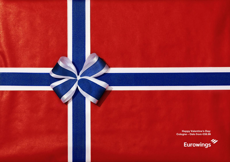 |
| THE ORIGINAL? El-Al Airlines – 2012 Source : Coloribus Agency : McCann (Israël) |
LESS ORIGINAL Eurowings Airlines “Happy Valentine’s Day” – 2017 Source : Coloribus Agency : Grey Dusseldorf (Germany) |