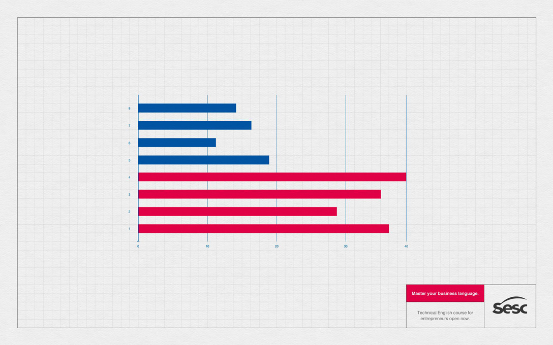
THE ORIGINAL? Sesc English Course – 2017 “Master your business language”
Click on the image to enlarge Source : Adeevee Agency : Competence, Florianópolis (Brazil)
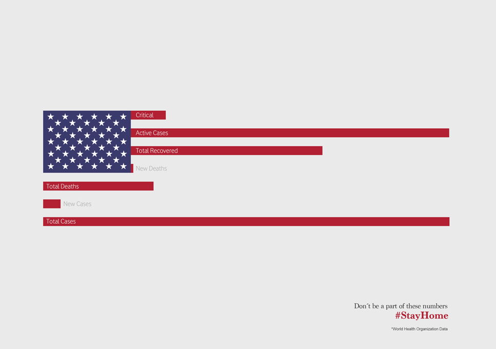
LESS ORIGINAL Covid-19 #StayHome – 2020 “Numbers are sending us a very direct message”
Click on the image to enlarge
Source : Adsoftheworld
Agency : Wunderman Thompson (Portugal)
A surprisingly common response when asking people about things they’d fix about anything in CSS, is to improve the handling of viewport units.
One thing that comes up often is how they relate to scrollbars. For example, if an element is sized to 100vw and stretches edge-to-edge, that’s fine so long as the page doesn’t have a vertical scrollbar. If it does have a vertical scrollbar, then 100vw is too wide, and the presence of that vertical scrollbar triggers a horizontal scrollbar because viewport units don’t have an elegant/optional way of handling that. So you might be hiding overflow on the body when you otherwise wouldn’t need to, for example. (Demo)
Another scenario involves mobile browsers. You might use viewport units to help you position a fixed footer along the bottom of the screen. But then browser chrome might come up (e.g. navigation, keyboard, etc), and it may cover the footer, because the mobile browser doesn’t consider anything changed about the viewport size.
On the left, the browser navigation bar (considered browser chrome) is covering up the footer making it appear that the footer is beyond 100vh when it is not. On the right, the -webkit-fill-available property is being used rather than viewport units to fix the problem.
And a solution of sorts:
body {
  min-height: 100vh;
  /* mobile viewport bug fix */
  min-height: -webkit-fill-available;
}
Does this really work? […] I’ve had no problems with any of the tests I’ve run and I’m using this method in production right now. But I did receive a number of responses to my tweet pointing to other possible problems with using this (the effects of rotating devices, Chrome not completely ignoring the property, etc.)
It would be better to get some real cross-browser solution for this someday, but I don’t see any issues using this as an improvement. It’s weird to use a vendor-prefixed property as a progressive enhancement, but hey, the world is weird.
As a little experiment, I shared a development tip on three different social networks. I also tried to post it in a format that was most suitable for that particular social network:
How did each of them “do”? Let’s take a look. But bear in mind… this ain’t scientific. This is just me having a glance at one isolated example to get a feel for things across different social media sites.
The Twitter Thread
The Tweet
A little journey with lists, as a 🧵 thread.
`list-style-position: outside;` is the default for lists, and is a pretty decent default. The best part about it is that both the markers *and* the content are aligned. pic.twitter.com/CkQv1hIt6q
Twitter is probably our largest social media outlet. Despite the fact that I’ve done absolutely nothing with it this year other than auto-tweeting posts from this site (via our Jetpack Integration), those tweets do just about as well as it ever did when I was writing each tweet. These numbers are bound to change, but at the time of writing:
Views
102,501
Followers
~446,000
Retweets
108
Engagements
3,753
Likes
428 (first tweet)
Twitter provides analytics on tweets
Going off that engagements number, a little bit less than 1% of the followers had anything to do with it. I’d say this was a very average tweet for us, if not on the low side.
A post shared by Chris Coyier (@real_css_tricks) on Apr 26, 2020 at 5:44pm PDT
Instagram is by far the smallest of our social media outlets, being newer and not something I stay particularly active or consistent on. No auto-posting there just yet.
Followers
~2,800
Likes
308
Reached
2,685
Instagram provides analytics (“insights”) on posts.
Using Reach, that’s 96% of the followers. That’s pretty incredible compared t 1% of followers on Twitter. Although, on Twitter. I can easily put URLs to tweets and send people places, where my only options on Instagram are “check out the link in my profile” or use a swipe-up thing in an Instagram Story. So, despite the high engagement of Instagram, I’m mostly just getting the satisfaction of teaching something as well as a little brand awareness. It’s much harder for me to get you to directly do something from Instagram.
The YouTube Video
The Video
YouTube is in the middle for us, much bigger than Instagram but not as big as Twitter. YouTube is a little unique in that there can be (and are) advertising directly on the videos and that get’s a “revenue share” from YouTube. That’s very much not driving motivation for using YouTube (I make 50 cents a day, but it is unique compared to the others.
Subscribers
51,300
Likes
116
Views
2,455
YouTube provides video analytics
Facebook?
We do have a Facebook page but it’s the most neglected of all of them. We auto-post new articles to it, but this experiment didn’t really have a blog post. I published the video to our site, but that doesn’t get auto-posted to Facebook, so the tip never made it there.
I used to feel a little guilty about not taking as much advantage of Facebook as I could, but whenever I look at overall analytics, I’m reminded that all of social media accounts combine for ~2% of traffic to this site. Spending any more time on this stuff is foolish for me, when that time could be spent on content for this site and information architecture for what we already have. And for Facebook specifically, whatever time we have spent there has never seemed to pan out. Just not a hive for developers.
CodePen?
I probably should have factored CodePen into this more, since it’s something of a social network itself with similar metrics. I worked on the examples in CodePen and the whole video was done in CodePen. But in this case, it was more about the journey than the destination. I did ultimately link to a demo at the end of the Twitter thread, but Instagram can’t link to it and I wasn’t as compelled to link to it on YouTube as the video itself to me was the important information.
If I was trying to compare CodePen stats here, I would have created the Pen in a step-by-step educational format so I could deliver the same idea. That actually sounds fun and I should probably still do that!
Winner?
Eh.
The problem is that there isn’t anything particularly useful to measure. What would have been way more interesting is if I had some really important call to action in each one where I’m like trying to sell you something or get you to sign up for something or whatever. I feel like that’s the real world of developer marketing. You gotta do 100 things for someone for free if you want them to do something for you on that 101st time. And on the 101st time, you should probably measure it somehow to see if the effort is worth it.
Here’s the very basic data together though…
Followers
Engagements
%
Twitter
~446,000
3,753
0.08%
Instagram
~2,800
2,685
96%
YouTube
~51,300
2,455
5%
One interesting thing is that I find the effort was about equal for all of them. You’d think a video would be hardest, but at least that’s just hit-record-hit-stop and minor editing. The other formats take longer to craft with custom text and graphics.
These would be my takeaways from this limited experiment:
You need big numbers on Twitter to do much. That’s because the engagement is pretty low.Still, it’s probably our best outlet for getting people to click a link and do something.
Instagram has amazing engagement, but it’s hard to send anyone anywhere. It’s still no wonder why people use it. You really do reach your audience there. If you had a strong call to action, I bet you could still get people do to it even with the absence of links (since people know how to search for stuff on the web).
While I mentioned that for this example the effort level was fairly even, in general, YouTube is going to require much higher effort. Video production just isn’t the same as farting out a couple of words or a screenshot. With that, and knowing that you’d need absolutely massive numbers to earn anything directly from YouTube, it’s pretty similar to other social networks in that you need to derive value from it abstractly.
This was not an idea that “went viral” in any sense. This is just standard-grade engagement, which was good for this experiment. I’m always super surprised at the type of developer tips that go viral. It’s always something I don’t expect, and often something I’m like awwwww we have an article about that too! I’d never bet on or expect anything going viral. Making stuff that your normal audience likes is the ticket.
Being active is pretty important. Any chart I’ve seen has big peaks when posts go out regularly and valleys when they don’t. Post regularly = riding the peaks.
None of this compares anywhere close to the real jewel of making things: blogging. Blogging is where you have full control and full benefit. The most important thing social media can do is get people over to your own site.
In CSS, line-height is probably one of the most misunderstood, yet commonly-used attributes. As designers and developers, when we think about line-height, we might think about the concept of leading from print design — a term, interestingly enough, that comes from literally putting pieces of lead between lines of type.
Leading and line-height, however similar, have some important differences. To understand those differences, we first have to understand a bit more about typography.
An overview of typography terms
In traditional Western type design, a line of text is comprised of several parts:
Baseline: This is the imaginary line on which the type sits. When you write in a ruled notebook, the baseline is the line on which you write.
Descender: This line sits just below the baseline. It is the line that some characters — like lowercase g, j, q, y and p — touch below the baseline.
X-height: This is (unsurprisingly) the height of a normal, lowercase x in a line of text. Generally, this is the height of other lowercase letters, although some may have parts of their characters that will exceed the x-height. For all intents and purposes, it servers as the perceived height of lowercase letters.
Cap-height: This is the height of most capital letters on a given line of text.
Ascender: A line that oftentimes appears just above the cap height where some characters like a lowercase h or b might exceed the normal cap height.
Each of the parts of text described above are intrinsic to the font itself. A font is designed with each of these parts in mind; however, there are some parts of typography that are left up to the type setter (like you and me!) rather than the designer. One of these is leading.
Leading is defined as the distance between two baselines in a set of type.
A CSS developer might think, “OK, leading is the line-height, let’s move on.” While the two are related, they are also different in some very important ways.
Let’s take a blank document and add a classic “CSS reset” to it:
* {
  margin: 0;
  padding: 0;
}
This removes the margin and padding from every single element.
We will need some content, so let’s an create an <h1> tag with some text and set the line-height to something obnoxiously huge, like 300px. The result is a single line of text with a surprising amount of space both above and below the single line of text.
CodePen Embed Fallback
When a browser encounters the line-height property, what it actually does is take the line of text and place it in the middle of a “line box” which has a height matching the element’s line-height. Instead of setting the leading on a font, we get something akin to padding one either side of the line box.
As illustrated above, the line box wraps around a line of text where leading is created by using space below one line of text and above the next. This means that for every text element on a page there will be half of the leading above the first line of text and after the last line of text in a particular text block.
What might be more surprising is that explicitly setting the line-height and font-size on an element with the same value will leave extra room above and below the text. We can see this by adding a background color to our elements.
CodePen Embed Fallback
This is because even though the font-size is set to 32px, the actual text size is something less than that value because of the generated spacing.
Getting CSS to treat line-height like leading
If we want CSS to use a more traditional type setting style instead of the line box, we’ll want a single line of text to have no space either above or below it — but allow for multi-line elements to maintain their entire line-height value.
It is possible to teach CSS about leading with a little bit of effort. Michael Taranto released a tool called Basekick that solves this very issue. It does so by applying a negative top margin to the ::before pseudo-elementand a translateY to the element itself. The end result is a line of text without any extra space around it.
The most up-to-date version of Basekick’s formula can be found in the source code for the Braid Design System from SEEK. In the example below, we are writing a Sass mixin to do the heavy lifting for us, but the same formula can be used with JavaScript, Less, PostCSS mixins, or anything else that provides these kinds of math features.
At first glance, this code definitely looks like a lot of magic numbers cobbled together. But it can be broken down considerably by thinking of it in the context of a particular system. Let’s take a look at what we need to know:
$baseFontSize:This is the normal font-size for our system around which everything else will be managed. We’ll use 16px as the default value.
$typeSizeModifier: This is a multiplier that is used in conjunction with the base font size to determine the font-size rule. For example, a value of 2 coupled with our base font size of 16px will give us font-size: 32px.
$descenderHeightScale: This is the height of the font’s descender expressed as a ratio. For Lato, this seems to be around 0.11.
$capHeight: This is the font’s specific cap height expressed as a ratio. For Lato, this is around 0.75.
$gridRowHeight: Layouts generally rely on default a vertical rhythm to make a nice and consistently spaced reading experience. For example, all elements on a page might be spaced apart in multiples of four or five pixels. We’ll be using 4 as the value because it divides easily into our $baseFontSize of 16px.
$typeRowSpan: Like $typeSizeModifier, this variable serves as a multiplier to be used with the grid row height to determine the rule’s line-height value. If our default grid row height is 4 and our type row span is 8, that would leave us with line-height: 32px.
Now we can then plug those numbers into the Basekick formula above (with the help of SCSS functions and mixins) and that will give us the result below.
CodePen Embed Fallback
That’s just what we’re looking for. For any set of text block elements without margins, the two elements should bump against each other. This way, any margins set between the two elements will be pixel perfect because they won’t be fighting with the line box spacing.
Refining our code
Instead of dumping all of our code into a single SCSS mixin, let’s organize it a bit better. If we’re thinking in terms of systems, will notice that there are three types of variables we are working with:
Variable Type
Description
Mixin Variables
System Level
These values are properties of the design system we’re working with.
$baseFontSize $gridRowHeight
Font Level
These values are intrinsic to the font we’re using. There might be some guessing and tweaking involved to get the perfect numbers.
$descenderHeightScale $capHeight
Rule Level
These values will are specific to the CSS rule we’re creating
$typeSizeMultiplier $typeRowSpan
Thinking in these terms will help us scale our system much easier. Let’s take each group in turn.
First off, the system level variables can be set globally as those are unlikely to change during the course of our project. That reduces the number of variables in our main mixin to four:
$baseFontSize: 16;
$gridRowHeight: 4;

@mixin basekick($typeSizeModifier, $typeRowSpan, $descenderHeightScale, $capHeight) {
  /* Same as above */
}
We also know that the font level variables are specific to their given font family. That means it would be easy enough to create a higher-order mixin that sets those as constants:
Now, on a rule basis, we can call the Lato mixin with little fuss:
.heading--medium {
  @include Lato(2, 10);
}
That output gives us a rule that uses the Lato font with a font-size of 32px and a line-height of 40px with all of the relevant translates and margins. This allows us to write simple style rules and utilize the grid consistency that designers are accustomed to when using tools like Sketch and Figma.
As a result, we can easily create pixel-perfect designs with little fuss. See how well the example aligns to our base 4px grid below. (You’ll likely have to zoom in to see the grid.)
CodePen Embed Fallback
Doing this gives us a unique superpower when it comes to creating layouts on our websites: We can, for the first time in history, actually create pixel-perfect pages. Couple this technique with some basic layout components and we can begin creating pages in the same way we would in a design tool.
CodePen Embed Fallback
Moving toward a standard
While teaching CSS to behave more like our design tools does take a little effort, there is potentially good news on the horizon. An addition to the CSS specification has been proposed to toggle this behavior natively. The proposal, as it stands now, would add an additional property to text elements similar to line-height-trim or leading-trim.
One of the amazing things about web languages is that we all have an ability to participate. If this seems like a feature you would like to see as part of CSS, you have the ability to drop in and add a comment to that thread to let your voice be heard.
Just like there is a movement to make more websites (and more of websites) from pre-rendered static files (Jamstack), so to might we consider moving content-based APIs to be static. Sean C Davis:
A static API is simply a collection of flat JSON files that live on a content delivery network (CDN). It doesn’t perform any action other than delivering content (static JSON files) to the requesting user.
But that doesn’t mean a static API is simple. And every file doesn’t have to be manually generated or updated. A static API can still use a database and it can still pull data from external services. In other words, it can be dynamically generated, but it is statically delivered.
The use cases are probably somewhat limited, but I still like it. In a sense, all RSS feeds (or, more directly, JSON feeds) could be done this way, and many are.
During the Covid-19 emergency, OTB Foundation actioned multiple initiatives aimed at providing support to smaller and lesser known hospitals in different Italian towns. These initiatives include: donations of protective equipment, distribution of masks, supplying cutting-edge technological equipment to prevent the spread of the virus, converting existing hospital wards in dedicated Covid-19 sections, donating sanitizers and disinfection systems for ambulances, distributing air sanitizers, respiratory helmets, full face masks and even tablets for patients to stay in touch with their loved ones.
But OTB Foundation still needs to help those in need. And for this, together with Publicis they have created a fund-raising campaign video that celebrates the various expressions of bravery that people have shown during these times.
Based on the principle that any small act of bravery (and kindness) generates others, the video showcases a compilation of some of the most heart-warming, funny and courageous videos that were shared online during these last months. From neighbors cheering with sticks from different balconies, to dinosaur costumes being used to shop safely, to couples getting married with masks on, to babies being welcomed in the world with tiny masks.
During the Covid-19 emergency, OTB Foundation actioned multiple initiatives aimed at providing support to smaller and lesser known hospitals in different Italian towns. These initiatives include: donations of protective equipment, distribution of masks, supplying cutting-edge technological equipment to prevent the spread of the virus, converting existing hospital wards in dedicated Covid-19 sections, donating sanitizers and disinfection systems for ambulances, distributing air sanitizers, respiratory helmets, full face masks and even tablets for patients to stay in touch with their loved ones.
But OTB Foundation still needs to help those in need. And for this, together with Publicis they have created a fund-raising campaign video that celebrates the various expressions of bravery that people have shown during these times.
Based on the principle that any small act of bravery (and kindness) generates others, the video showcases a compilation of some of the most heart-warming, funny and courageous videos that were shared online during these last months. From neighbors cheering with sticks from different balconies, to dinosaur costumes being used to shop safely, to couples getting married with masks on, to babies being welcomed in the world with tiny masks.
During the Covid-19 emergency, OTB Foundation actioned multiple initiatives aimed at providing support to smaller and lesser known hospitals in different Italian towns. These initiatives include: donations of protective equipment, distribution of masks, supplying cutting-edge technological equipment to prevent the spread of the virus, converting existing hospital wards in dedicated Covid-19 sections, donating sanitizers and disinfection systems for ambulances, distributing air sanitizers, respiratory helmets, full face masks and even tablets for patients to stay in touch with their loved ones.
But OTB Foundation still needs to help those in need. And for this, together with Publicis they have created a fund-raising campaign video that celebrates the various expressions of bravery that people have shown during these times.
Based on the principle that any small act of bravery (and kindness) generates others, the video showcases a compilation of some of the most heart-warming, funny and courageous videos that were shared online during these last months. From neighbors cheering with sticks from different balconies, to dinosaur costumes being used to shop safely, to couples getting married with masks on, to babies being welcomed in the world with tiny masks.
During the Covid-19 emergency, OTB Foundation actioned multiple initiatives aimed at providing support to smaller and lesser known hospitals in different Italian towns. These initiatives include: donations of protective equipment, distribution of masks, supplying cutting-edge technological equipment to prevent the spread of the virus, converting existing hospital wards in dedicated Covid-19 sections, donating sanitizers and disinfection systems for ambulances, distributing air sanitizers, respiratory helmets, full face masks and even tablets for patients to stay in touch with their loved ones.
But OTB Foundation still needs to help those in need. And for this, together with Publicis they have created a fund-raising campaign video that celebrates the various expressions of bravery that people have shown during these times.
Based on the principle that any small act of bravery (and kindness) generates others, the video showcases a compilation of some of the most heart-warming, funny and courageous videos that were shared online during these last months. From neighbors cheering with sticks from different balconies, to dinosaur costumes being used to shop safely, to couples getting married with masks on, to babies being welcomed in the world with tiny masks.
During the Covid-19 emergency, OTB Foundation actioned multiple initiatives aimed at providing support to smaller and lesser known hospitals in different Italian towns. These initiatives include: donations of protective equipment, distribution of masks, supplying cutting-edge technological equipment to prevent the spread of the virus, converting existing hospital wards in dedicated Covid-19 sections, donating sanitizers and disinfection systems for ambulances, distributing air sanitizers, respiratory helmets, full face masks and even tablets for patients to stay in touch with their loved ones.
But OTB Foundation still needs to help those in need. And for this, together with Publicis they have created a fund-raising campaign video that celebrates the various expressions of bravery that people have shown during these times.
Based on the principle that any small act of bravery (and kindness) generates others, the video showcases a compilation of some of the most heart-warming, funny and courageous videos that were shared online during these last months. From neighbors cheering with sticks from different balconies, to dinosaur costumes being used to shop safely, to couples getting married with masks on, to babies being welcomed in the world with tiny masks.