I read a few stories about math lately. One of them is a story by Kevin Hartnett about Francis Su, who believes math can be a gateway to a better life. To Live Your Best Life, Do Mathematics.:
Christopher, an inmate serving a long sentence for armed robbery who had begun to teach himself math from textbooks he had ordered. After seven years in prison, during which he studied algebra, trigonometry, geometry and calculus, he wrote to Su asking for advice on how to continue his work. After Su told this story, he asked the packed ballroom at the Marriott Marquis, his voice breaking: „When you think of who does mathematics, do you think of Christopher?”
If I learn mathematics and I become a better thinker, I develop perseverance, because I know what it’s like to wrestle with a hard problem, and I develop hopefulness that I will actually solve these problems. And some people experience a kind of transcendent wonder that they’re seeing something true about the universe. That’s a source of joy and flourishing.
I was quite proud of my artwork. It looked interesting, saved so much time compared to creating the same design in Illustrator or Photoshop. However, I realised without understanding geometry, there was no chance for me to reach somewhere near to Marius Watz.
Jinju slowly leveled up her math skills, applying it to everything she did along the way.
Of course, this all reminds me of Ana Tudor, who is an unconventional (and at times self-deprecating) mathematician, who uses her considerable math skills to create art with code.
If someone says to you, don’t you miss doing creative stuff, as an engineer? Don’t you miss the creativity of the art world? You can say: I’m working on an infinite canvas capable of any size and shape, that’s already glowing every color possible into the eyes of just about everyone on the planet. And I get to decide the kind of experience, feeling, and emotion they are going to have. How is that not creative?
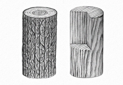
Fabrics are tricky to draw because of all the folds and complicated shading. In this tutorial I will show you how to go about drawing two different types of fabric: smooth and flowing, like silk, and rough and thick, like wool. You can follow me step by step to achieve the same results, or use the techniques I present in your own projects.
What You Will Need
Some sheets of paper
HB pencil
2B pencil
4B pencil
6B pencil
Blending stump/tortillon/cotton swab
Eraser
Pencil sharpener
1. How to Draw Silk Fabric
Step 1
Start with an oval—this will be the top of the cylinder the fabric is laid upon. Use the HB pencil for this.
Step 2
Draw another, bigger oval below. This will create a smooth edge of fabric dragged down by gravity, but not stuck to the edge of the cylinder.
Step 3
Draw the direction of the fabric going down the cylinder. The stiffer the fabric, the wider the angle.
Step 4
Draw the edge of the fabric and plan its folds. You can be creative here—just don’t cross the line.
Step 5
Draw the edges of the fabric as suggested by the fold line. The more acute the angle of the fold, the clearer the line.
Step 6
Add more guide lines near the top to finish defining the flow of the fabric.
Step 7
Take the eraser and clean up the unwanted lines.
Step 8
Tilt your pencil and subtly shade the top. We’re going to leave some shine near the edge.
Step 9
Use the blending stump (or other blending tool) to soften the shading.
Step 10
Shade the edge subtly.
Step 11
Take the 2B pencil and accentuate the shading. Silk is all about contrast!
Step 12
Take the eraser and give shine to a part of the edge.
Step 13
Go back to the HB pencil, tilt it, and shade the surface of the fabric. Be careful not to remove the lines in the process—you can press harder in the shadows to keep the folds visible.
Step 14
Use the blending stump to soften the shading.
Step 15
Take the 2B pencil and shade the folds one by one. No matter if the fold is convex or concave, always leave a stripe of shine in the middle—this is characteristic for silk. Use the blending stump when finished.
Leave the directly illuminated part with less contrast. Also, notice how the shiny stripes connect in arcs near the top, where there are no folds.
Step 16
Take the 4B pencil and increase the contrast even more. Don’t forget about blending!
Step 17
Finish the drawing by dragging your eraser along the shiny stripes to make them stand out even more. Feel free to use the 6B pencil in the darkest crevices, but use it sparingly. If your fabric is supposed to be darkly colored, darken the whole picture, keeping only the highlights white.
2. How to Draw a Woollen Sleeve
Step 1
Start with something to put in the woollen cloth. This can be a simple elbow. Use the HB pencil for this phase.
Step 2
Envelop the arm in curvy lines. The more there are, the looser the cloth will seem. Keep them tight where the material bends.
Step 3
Use the curves as a suggestion for the flow of the material. First draw one side…
… then the other…
… then fill the middle.
This technique helps you see the folds as what they really are—the bending of a single piece of material, not something separate stuck to the material.
Step 4
Work out the folds the guide lines are suggesting. Draw their edges, just like with the silk.
Step 5
Darken the shaded part with a side of the HB pencil. Don’t blend it!
Step 6
Include the folds in the shading.
Step 7
Take the 2B pencil and create more detailed shading.
Step 8
Take the HB pencil again and draw the rows of the thread. You can make them narrower if you want a softer look.
Step 9
Add the details to every row. Simple 'V’s all along the row are all you need.
Step 10
Take the 6B pencil to accentuate the darkest part of the picture. This will be a point of reference for contrast.
Step 11
Take the 4B pencil and darken the shaded part some more, including the rows in the border between light and shadow. This will make the texture more 3D.
Step 12
Finally, take the 6B pencil and subtly add detail to the shaded parts. Simple dark dots along the rows will give them depth and a detailed look. Don’t leave any wide bright surfaces—”break” them with some irregular shadow.
Good Job!
Now you know how to draw fabrics, no matter what their physical properties are. If you want to keep learning about drawing various textures, check out my other tutorials from this series:
Fur can be very simple to draw, if you just learn one secret of it! In this tutorial I will show you how to draw long and short fur, but you can use these…
Transparent glass is incredibly hard to draw from imagination. That’s because we know it’s "invisible", so what is there to draw? But the correct…
Fruit is not only tasty and nutritious, but also has an aesthetic appeal that makes it perfect for graphic design projects. You’ll see plenty of that below, but first, here are some interesting facts about fruit!
Most commercial fruits are clones.
The most expensive fruit in the world is the Japanese Yubari cantaloupe, priced at $23,500.
Cherry farmers hire helicopters to air dry their trees after rain so the cherries don’t split open.
Bananas are artificially ripened after being shipped to seven different shades of ripeness
U.S. raisin farmers aren’t allowed to sell all the raisins they grow; they must contribute to a “national raisin reserve” if supply exceeds demand.
The leaves of the rhubarb plant are very poisonous.
Cranberries don’t actually grow underwater.
Grapefruit can cause dangerous reactions with some prescription medications.
I’ve put together a collection of sweet n’ fresh fruit designs for your inspiration. Enjoy!
Credit to respective artists
credit:Kazuaki Kawahara
credit:Mission Design
credit:Leta Sobierajski
credit:Leta Sobierajski
credit:Leta Sobierajski
credit:Leta Sobierajski
credit:Leta Sobierajski
credit:Leta Sobierajski
credit:Leta Sobierajski
credit:Gonzalo Ausejo
credit:Gonzalo Ausejo
credit:Gonzalo Ausejo
credit:TATABI Studio
credit:Daniel Forero
credit:Daniel Forero
credit:Sam Sourivong
credit:Tereza Cenic
credit:Brain&Bros DZ.
credit:Yuliia Galchenko
credit:Leta Sobierajski
credit:Mohd Almousa
credit:Emily Zirimis
credit:Dan Cretu
credit:Dan Cretu
credit:Stas Neretin
Conclusion
Pretty sweet right? I think it’s safe to say that everyone can relate to the qualities and characteristics of fruit, which is why it makes for such an interesting design topic!
I hope that you enjoyed this graphic design collection! Thanks for stopping by!
Anheuser Busch has launched Budweiser Born The Hard Way, a Super Bowl commercial featuring co-founder Adolphus Busch’s experience as an immigrant arriving in the United States in 1857. The commercial begins in a bar with the comment, “You don’t look like you’re from around here”. We’re shown Busch (Sam Schweikert) travelling by ship from Hamburg to New Orleans, trekking inland on the Mississippi River to St Louis, braving storms, injury, ship fire, all the while reflecting on his strategies to achieve his ambition to brew beer. As an immigrant he encounters a mixture of warm welcome and bristly rejection, finally connecting with fellow immigrant Eberhard Anheuser over a beer. The commercial provides a glimpse of two Clydesdales, the horses that would one day be the Anheuser Busch mascots.
Budweiser believes freedom and the pursuit of the American dream are nothing without ambition, something the brand has believed throughout its 141-year history directly dating back to company co-founder Adolphus Busch. The visceral piece of cinematography brings viewers along for the journey as Adolphus Busch sets out to defeat the odds by travelling to America eventually destined to become the largest brewer in the world. The story is one of commitment, passion and never giving up or backing down.
“This story celebrates Adolphus Busch’s American dream and the bold vision to brew the best beer in the world,” said Peter Kraemer, Budweiser’s fifth generation master brewer. “While everyone knows Budweiser, they don’t necessarily know our story and how we came to be brewed the hard way.”
Added Vice President of Budweiser, Ricardo Marques, “This commercial shows the start of Budweiser’s journey, and while it is set in the 1800’s, it’s a story we believe will resonate with today’s entrepreneurial generation – those who continue strive for their dreams.”
Super Bowl LI marks the 28th year that Budweiser has been the exclusive beer category advertiser of the Super Bowl and Anheuser Busch’s 42nd year advertising in the game.
“When Budweiser told us they wanted to celebrate those who embody the American spirit, we realized the ultimate story lived within their own brand history,” said Anomaly Global Chief Creative Officer, Mike Byrne. “Adolphus Busch is the hero of the Anheuser-Busch American dream story, which makes him the perfect protagonist.”
Building on previous campaigns, Budweiser is continuing to hone its bold tone and rightful role in culture, tapping Super Bowl LI as the official kick-off of its year-long ambition-inspired platform. Throughout 2017, Budweiser will celebrate those who live life on their own terms and never back down.
“Adolphus would be proud to know we are continuing to celebrate his legacy and his relentless pursuit to create the most iconic beer brand in the world,” said Steven Busch great-great-grandson of founder, Adolphus Busch. “It’s an honour to follow in his footsteps in the beer business. He lived the American dream and his perseverance, hard work and unwavering commitment to quality laid the foundation for the success of Budweiser and this great company.”
“This campaign captures the true heritage of Budweiser and the man who started it all. Adolphus Busch was a visionary who had the courage to pursue his dream,” said August A. Busch III. “His story will resonate with consumers from all walks of life and provide a lasting point of connection to the brand. Great work by the Budweiser team.”
Budweiser Born the Hard Way Credits
The Budweiser Born the Hard Way commercial was developed at Anomaly by chief creative officer Mike Byrne, group creative director Scott Hayes, group strategy director Laura Rowan
Media was handled at MediaCom (media) and VaynerMedia (digital).
Filming was shot by director Chris Sargent via Anonymous Content with director of photography Jody Lee Lipes, head of production Kerry Haynie, executive producers Ayelet Weinerman and SueEllen Clair, line producer Alex Waite, lead makeup artist Ulla Gaudin.
Editor was Ross Birchall at Saints Editorial with executive producer Stephanie Hickman, and assistant editor Nancy Gidman-LaTorraca.
Post production was done at Artjail by creative director Steve Mottershead, head of production John Skeffington, Flame artists John Geehreng, Margolit Steiner, Chris Memoli, and senior producer Mike Tockman.