Go to View and make sure you have Custom selected.
Step 2
Go to View > Zoom and select Zoom 1:1 to make sure you’re zoomed in at 100%.
Step 3
Click on the Align and distribute objects icon in the top toolbar to open up the alignment panel. Then click on the Fill & Stroke icon in the top toolbar to open up the Colors, gradients and strokes menu.
Step 4
Go to File > Document Properties (Control-Shift-D) and deselect the boxes that read Show page border and Show border shadow, and then close out of that window.
2. How to Create the Base Shape
Step 1
Grab the Create Stars and Polygons (*) tool and set the parameters in the toolbar up top to the following specs:
Regular Polygon
Corners: 6
Rounded: 0.000
Randomized: 0.000
Step 2
Hold down the Control and Shift keys on your keyboard and click and drag on the canvas to create a polygon where the corners are pointing vertically as depicted below.
Step 3
Change the color of the polygon to red and bring down the Opacity to 50% using the Opacity Percentage tool in the Fill and Stroke panel.
Step 4
Grab the Select tool (F1) and turn on the lock icon between the W and H fields in the top toolbar. Then, change the value of the W box to 300 and press Enter to establish the width of the polygon as 300 pixels. After that, turn on the Snap to cusp nodes box in the Enable snapping toolbar at the very top of the window.
Step 5
Right-click on the polygon and select Duplicate (Control-D) to create another copy. Make that copy blue, and then click and drag the new polygon and snap the corners of it to the lower left corners of the red polygon.
Step 6
Right-click the blue copy and select Duplicate (Control-D) to create another copy. Make that copy green, and then snap the corners of it to the lower right corners of the red polygon.
Step 7
Right-click the green polygon and select Duplicate (Control-D) to create one more copy. Change the color to black, and snap the corners of it to the center of the three colored polygons as depicted below.
3. How to Trim Down the Base Shape
Step 1
Right-click on the black polygon and select Duplicate (Control-D) to create another copy, and with that copy selected, hold Shift on the keyboard and click on the blue polygon. With them both selected, go to Path > Intersection. You should end up with the following:
Step 2
Now we have to do the same with the red and green polygons. So right-click on the black polygon again and select Duplicate (Control-D), hold Shift and click on the red polygon, and then again go to Path > Intersection.
Step 3
Click on the black polygon, hold Shift and click on the green polygon, and then go to Path > Intersection. You should end up with a three-part polygon in three different colors.
4. How to Color the Shapes
Step 1
Click and drag over all three shapes to select all objects (Control-Alt-A), and then use the Opacity % slider to bring the opacity back up to 100%.
Step 2
Click off of the objects to deselect everything, and then select the blue portion of the polygon. With it selected, go over to the Fill and stroke panel, and under the Fill tab, change the RGBA value to ff2a2aff.
Step 3
Select the red object at the top of the polygon, and then go over to the Fill and stroke panel, and under the Fill tab, change the RGBA value to ffaaaaff.
Step 4
Select the green object on the right side of the polygon, and then go over to the Fill and stroke panel, and under the Fill tab, change the RGBA value to 800000ff.
Step 5
Click and drag over all three shapes to select all objects (Control-Alt-A), and then Group (Control-G) them together and change the value of the W box to 100 and press Enter to establish the width of the polygon as 100 pixels.
5. How to Create the Heart Shape
Step 1
With the polygon selected, Right-click on it and select Duplicate (Control-D), and then snap it onto the top left corners of the original polygon.
Step 2
Repeat the process with the duplicated polygon so that you have three polygons stacked in the following order:
Step 3
Repeat the process one more time with the most recently duplicated polygon, and then Duplicate (Control-D) it one more time and snap it directly above the previous polygon.
Step 4
Duplicate (Control-D) the most recently selected polygon and snap it onto the upper right corners of the previous polygon.
Step 5
Duplicate (Control-D) that polygon and snap it onto the lower right corners of the previous polygon.
Step 6
Duplicate (Control-D) the most recent polygon, and then snap it onto the bottom right corners of the polygon beneath it.
We now have half of the heart completed.
Step 7
Returning to the original polygon at the very bottom, Duplicate (Control-D) that three times and snap the copies onto the top right corners of each other in ascending order.
Step 8
With the most recently duplicated polygon still selected, Duplicate (Control-D) it and snap it directly above the original polygon.
Step 9
Duplicate (Control-D) that polygon again and snap it onto the upper right corners of the polygon on the left side.
Step 10
Finally, Duplicate (Control-D) the polygon one more time and snap it onto the lower right corners of the previous polygon.
Awesome Work, You’re Now Done!
And with that, our design is complete! We’ve successfully created a pixel heart using Inkscape.
Ethan Marcotte, on time- and budget-constrained organizations websites:
Between the urgency of their work and the size of their resources, spending months on a full redesign isn’t something they can afford to do. Given that, a free theme for, say, WordPress can yield a considerable amount of value, especially to budget-constrained organizations. They can launch their redesign more quickly, and continue reaching the people who need their information most.
So Ethan takes a look at a bunch of free themes, so at least a responsible choice can be made there, and finds
the results were surprising: on a 3G connection, the slower themes I tested took anywhere from 45-90 seconds for any content to appear. In other words, the pages took roughly a minute before they were usable.
Pretty rough.
What I find particularly scary is that these are just empty themes. I usually attribute the slowness of sites in this category (off the shelf, slap-a-CMS on it) to be what happens on top of the theme. Stuff like uploading too many/too large of images and installing a million plugins that load their own set of resources.
I think it shows off some recent technology in a new light: saving us from ourselves. HTTP/2 makes concatenating resources less important, and that’s saving us from ourselves and those million plugins individual CSS and JavaScript files. WordPress does responsive images by default now, that’s saving us from ourselves and ensuring we aren’t loading more image than we need. AMP, as a technology, is saying y’all have lost the plot here and we need to save you from yourselves.
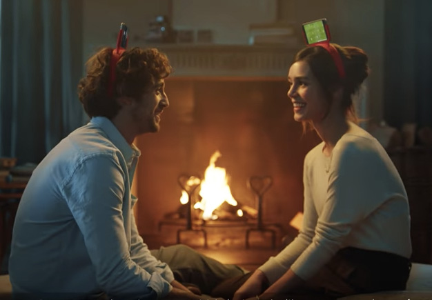
Mars has released Skittles Romance, a commercial designed for viewing during the 2017 Super Bowl game. The Skittles Romance commercial features a lovesick young man using Skittles to get a girl’s attention through her bedroom window. Katie is in her room making the most of his persistence, along with her parents, and some unexpected guests.
Skittles Romance Credits
The Skittles Romance campaign was developed at adam&eveDDB by chief creative officer Richard Brim, creative director Dan Fisher, creative Till Diestel, head of integrated production Matt Craigie Atherton, agency producer Cat Reynolds, head of planning Jessica Lovell, senior planner David Mortimer, managing partner Fiona McArthur, business director Robbie Black, account director Brittany Lippett, account director Matt Dankis, account managers Holly Fletcher and Josh Edwards.
Media was handled at Mediacom/Starcom.
Filmming was shot by director Harold Einstein via Outsider with director of photography Glynn Speeckaert, executive producer Richard Packer and producer Eric Liney.
Editor was Mark Edinoff at Work Editorial with assistant editor Jamie Hodgson.
Post production was done at The Mill by executive producer Alex Fitzgerald, producers Kirsty Ratcliffe, Tim Lyall, Anastasia von Rahl, shoot supervisor Tim Davies, 2D lead artists Gareth Brannan, Gary Driver, 2D artists Joseph Tang, Jeanette Eiternes, Brad Wood, Online Artists: David Wishart, George Rockliffe, motion graphics team Rajinder Davsi and Kwok Fung Lam, colourist Seamus O’Kane, producers Alex Fitzgerald and Kirsty Ratcliffe.
Audio post production was done at Factory Studios by audio engineer Jack Hallett.
For this article in the international artist series, we turn to Chile,
featuring six artists who create fantastic work, from illustrations to graphic design and more! I asked each artist how their country and
culture inspired their work, and they delivered fantastic answers.
Enjoy!
Sergio Edwards
Sergio is an art director and freelance illustrator based in Santiago, Chile. His work features incredibly detailed illustrations with amazing character designs. Check
out a small selection of his work below, or see more in his portfolio.
Cafe Caribe
I think what I love
the most about living in Chile is that this an inspiring country. For instance, it’s a country with diverse climates: from the driest desert
in the world, Atacama desert, to the beautiful green forests of the
southern region. That’s enough reason for me
to love this place and to feel inspired.
When I think about
my influences, I think about foreign influences like Disney animated movies, Asterix comics, and
Marvel-DC comics. Some of my influences are also Chilean classics, like „Condorito,” a humorous comic with funny and
expressive drawings.
I feel pretty amateur in terms of knowing the art industry in
Chile. But the
art community in general has many artists who are very positive people.
All the artists I know are very open to share their knowledge. It’s something that always impressed me because it helped me grow as an
artist. And now I try to do the same with people who are just starting out.
Daniela is an illustrator based in Santiago, Chile. Her work features charming illustrations with whimsical animals and gorgeous colors. Check out a small selection of her work below, or see more in her portfolio.
Fenix
The wonderful thing about Chile is that we have deserts, mountains, forests, and glacier landscapes. You never get bored or uninspired with places like that!
Right now I live in Santiago but I was born in Antofagasta, and the
north of Chile has always been very influenced by Peruvian and Bolivian
culture. The bright colors and figures of the Diablada and the mysticism
of the desert are huge sources of inspiration to me.
We have a lot of variety in the art community. Everybody here does their own thing, and I
absolutely love that. We all have different styles and different techniques. I also feel that the artists are very down to earth here so there’s no oversized egos,
which is awesome.
Pablo is an art director and digital artist based in Santiago, Chile. His work features exciting and inspiring designs for some of your favorite brands.
Check out a small selection of his work below, or see more in his portfolio.
Inteligencia Emocional
What I love about living in
Chile is its vast landscapes. It is a small country, but it has a desert in the north and glaciers in the south. I think the landscape
is what inspires many artists in my country.
In Chile there are still many artisans who try to maintain their
ancestral roots by doing things by hand and in clay. I think this has influenced my work since I like to create my graphic pieces by hand. Some
have been made with Plasticine, others are modeled with
paper and cardboard. Most of what is done today
is digital, however, so I try to escape from the norm by doing things also by hand.
The art community in my country is not very large. Many artists are dedicated to art as part of a
hobby, and must work on other things to support their love for art. Artists take to the
streets to show their talent rather than in the great art galleries.
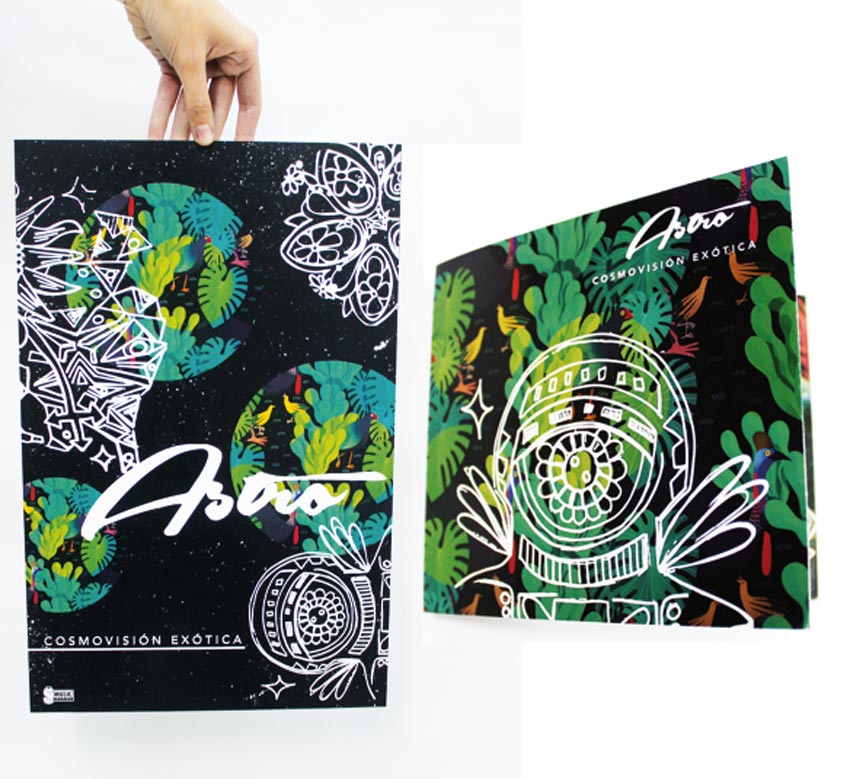
Paula is an art director and experimental illustrator based in Santiago, Chile. Her work features gorgeous geometric designs with powerful, vivid colors.
Check out a small selection of her work below, or see more in her portfolio.
The Space River
One of the things that I love about living here is that Chile is very
rich in nature and culture. It also possesses incredible and inspiring landscapes from the north and
south. I live in Santiago, it’s the
capital of Chile, and a variety of cultures exists here.
Santiago is a cosmopolitan city. The art here is set upon diverse stages, where architecture, cultural norms, and lifestyle are a fundamental role in
acquiring knowledge that contributes
to an artist’s growth.
Also, I am surrounded by many graphic artists where I work, so there is always a great feedback.
The art community in this city is small but there are many spaces for artists and varied cultural centers that allow us to gain recognition here. Though it has had an exponential
growth in the last few years, I feel that Chile as an artistic community that is still under
development.
Marcelo is a graphic designer based in Santiago, Chile. His work features incredible digital retouching and powerful graphics for notable brands. Check out a small selection of his work below, or see more in his portfolio.
Mercedes Benz Viewpoints – BBDO Chile
Chile is a very big country. In a couple of hours of travel you can be in another region
and it’s almost like a completely different country. What I love the most is that there’s still a lot of work to do in
Chile in terms of design. It has a huge role it can play in making a better
society, starting with educating clients about the benefits of great
design.
When it comes to graphic design, it’s very hard to pinpoint a Chilean
identity. In the northern region
there’s a lot of Inca empire influences in the culture, but in the south there’s a deep
connection with the terrain and the cold climate. In the last 10 years or
so, the capital has become very multicultural.
My work has been influenced in two ways. I try to come up with
results that appeal to a larger audience than just my country. And very
recently, I’ve also tried to incorporate elements of a broader, Latin American
vibe.
I think the art community here is becoming more accessible to new players. It slowly morphed
into a state where every weekend there’s a
fair showcasing emerging artists to common people in the
streets. There’s still a long way to go because Chile is not a place that
puts art in the same priority as more developed countries, but the
communities that are forming, especially the younger generations, have a
lot to say in that development. We just have to come together.
Caterina is a designer based in Santiago, Chile. Her work features unique designs full of culture and charm.
Check out a small selection of her work below, or see more in her portfolio.
Film Festival – Go San Cris
What I really like about my country is the diversity in people and landscapes. It inspires me to have different points of
view and makes me feel alive. I think that it’s very important for
creative people to know their land well because we are ultimately a part of it.
I really appreciate having lots of friends all over the country because they help me understand Chilean ways. I’ve learned to respect the different cultures more and now I think I have become more open-minded to my huge cultural background.
The art community has grown a lot in the past few years. It is very difficult here in
Chile, but we have a job to educate the people so that they may respect our artistic expressions. The new
generation is more open-minded and this has also helped us share more
about the true experiences of people living here.
Many thanks to the artists who took time to answer my questions
and share a bit about themselves and how their country and/or culture
has affected their work. You can check out more of their work in the
links below: