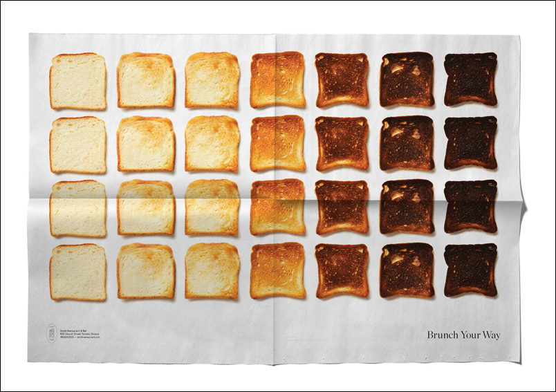
THE ORIGINAL? Smith Restaurant and Bar – 2018 “Brunch your way”
Click on the image to enlarge Source : Lüerzer’s International Archive Agency : Leo Burnett, Toronto (Canada)
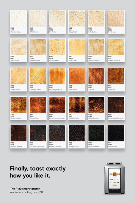
LESS ORIGINAL Revolution Cooking toaster – 2020 “Finally, toast exactly
how you like it”
Source : Adsoftheworld
Agency : MMB, Boston (USA)
Integration tests are a natural fit for interactive websites, like ones you might build with React. They validate how a user interacts with your app without the overhead of end-to-end testing.
This article follows an exercise that starts with a simple website, validates behavior with unit and integration tests, and demonstrates how integration testing delivers greater value from fewer lines of code. The content assumes a familiarity with React and testing in JavaScript. Experience with Jest and React Testing Library is helpful but not required.
There are three types of tests:
Unit tests verify one piece of code in isolation. They are easy to write, but can miss the big picture.
End-to-end tests (E2E) use an automation framework — such as Cypress or Selenium — to interact with your site like a user: loading pages, filling out forms, clicking buttons, etc. They are generally slower to write and run, but closely match the real user experience.
Integration tests fall somewhere in between. They validate how multiple units of your application work together but are more lightweight than E2E tests. Jest, for example, comes with a few built-in utilities to facilitate integration testing; Jest uses jsdom under the hood to emulate common browser APIs with less overhead than automation, and its robust mocking tools can stub out external API calls.
Another wrinkle: In React apps, unit and integration are written the same way, with the same tools.
Getting started with React tests
I created a simple React app (available on GitHub) with a login form. I wired this up to reqres.in, a handy API I found for testing front-end projects.
You can log in successfully:
…or encounter an error message from the API:
The code is structured like this:
LoginModule/
├── components/
⎪   ├── Login.js // renders LoginForm, error messages, and login confirmation
⎪   └── LoginForm.js // renders login form fields and button
├── hooks/
⎪    └── useLogin.js // connects to API and manages state
└── index.js // stitches everything together
Option 1: Unit tests
If you’re like me, and like writing tests — perhaps with your headphones on and something good on Spotify — then you might be tempted to knock out a unit test for every file.
Even if you’re not a testing aficionado, you might be working on a project that’s “trying to be good with testing” without a clear strategy and a testing approach of “I guess each file should have its own test?”
That would look something like this (where I’ve added unit to test file names for clarity):
I went through the exercise of adding each of these unit tests on on GitHub, and created a test:coverage:unit script to generate a coverage report (a built-in feature of Jest). We can get to 100% coverage with the four unit test files:
100% coverage is usually overkill, but it’s achievable for such a simple codebase.
Let’s dig into one of the unit tests created for the onLogin React hook. Don’t worry if you’re not well-versed in React hooks or how to test them.
This test was fun to write (because React Hooks Testing Library makes testing hooks a breeze), but it has a few problems.
First, the test validates that a piece of internal state changes from 'pending' to 'resolved'; this implementation detail is not exposed to the user, and therefore, probably not a good thing to be testing. If we refactor the app, we’ll have to update this test, even if nothing changes from the user’s perspective.
Additionally, as a unit test, this is just part of the picture. If we want to validate other features of the login flow, such as the submit button text changing to “Loading,” we’ll have to do so in a different test file.
Option 2: Integration tests
Let’s consider the alternative approach of adding one integration test to validate this flow:
I implemented this test and a test:coverage:integration script to generate a coverage report. Just like the unit tests, we can get to 100% coverage, but this time it’s all in one file and requires fewer lines of code.
Here’s the integration test covering a successful login flow:
test('successful login', async () => {
  // mock a successful API response
  jest
    .spyOn(window, 'fetch')
    .mockResolvedValue({ json: () => ({ token: '123' }) });


  const { getByLabelText, getByText, getByRole } = render(<LoginModule />);


  const emailField = getByLabelText('Email');
  const passwordField = getByLabelText('Password');
  const button = getByRole('button');


  // fill out and submit form
  fireEvent.change(emailField, { target: { value: 'test@email.com' } });
  fireEvent.change(passwordField, { target: { value: 'password' } });
  fireEvent.click(button);


  // it sets loading state
  expect(button.disabled).toBe(true);
  expect(button.textContent).toBe('Loading...');


  await waitFor(() => {
    // it hides form elements
    expect(button).not.toBeInTheDocument();
    expect(emailField).not.toBeInTheDocument();
    expect(passwordField).not.toBeInTheDocument();


    // it displays success text and email address
    const loggedInText = getByText('Logged in as');
    expect(loggedInText).toBeInTheDocument();
    const emailAddressText = getByText('test@email.com');
    expect(emailAddressText).toBeInTheDocument();
  });
});
I really like this test, because it validates the entire login flow from the user’s perspective: the form, the loading state, and the success confirmation message. Integration tests work really well for React apps for precisely this use case; the user experience is the thing we want to test, and that almost always involves several different pieces of code working together.
This test has no specific knowledge of the components or hook that makes the expected behavior work, and that’s good. We should be able to rewrite and restructure such implementation details without breaking the tests, so long as the user experience remains the same.
I’m not going to dig into the other integration tests for the login flow’s initial state and error handling, but I encourage you to check them out on GitHub.
So, what does need a unit test?
Rather than thinking about unit vs. integration tests, let’s back up and think about how we decide what needs to be tested in the first place. LoginModule needs to be tested because it’s an entity we want consumers (other files in the app) to be able to use with confidence.
The onLogin hook, on the other hand, does not need to be tested because it’s only an implementation detail of LoginModule. If our needs change, however, and onLogin has use cases elsewhere, then we would want to add our own (unit) tests to validate its functionality as a reusable utility. (We’d also want to move the file because it wouldn’t be specific to LoginModule anymore.)
There are still plenty of use cases for unit tests, such as the need to validate reusable selectors, hooks, and plain functions. When developing your code, you might also find it helpful to practice test-driven development with a unit test, even if you later move that logic higher up to an integration test.
Additionally, unit tests do a great job of exhaustively testing against multiple inputs and use cases. For example, if my form needed to show inline validations for various scenarios (e.g. invalid email, missing password, short password), I would cover one representative case in an integration test, then dig into the specific cases in a unit test.
Other goodies
While we’re here, I want to touch on few syntactic tricks that helped my integration tests stay clear and organized.
Big waitFor Blocks
Our test needs to account for the delay between the loading and success states of LoginModule:
const button = getByRole('button');
fireEvent.click(button);


expect(button).not.toBeInTheDocument(); // too soon, the button is still there!
We can do this with DOM Testing Library’s waitFor helper:
But, what if we want to test some other items too? There aren’t a lot of good examples of how to handle this online, and in past projects, I’ve dropped additional items outside of the waitFor:
// wait for the button
await waitFor(() => {
  expect(button).not.toBeInTheDocument();
});


// then test the confirmation message
const confirmationText = getByText('Logged in as test@email.com');
expect(confirmationText).toBeInTheDocument();
This works, but I don’t like it because it makes the button condition look special, even though we could just as easily switch the order of these statements:
// wait for the confirmation message
await waitFor(() => {
  const confirmationText = getByText('Logged in as test@email.com');
  expect(confirmationText).toBeInTheDocument();
});


// then test the button
expect(button).not.toBeInTheDocument();
It’s much better, in my opinion, to group everything related to the same update together inside the waitFor callback:
await waitFor(() => {
  expect(button).not.toBeInTheDocument();

  const confirmationText = getByText('Logged in as test@email.com');
  expect(confirmationText).toBeInTheDocument();
});
Interestingly, an empty waitFor will also get the job done, because waitFor has a default timeout of 50ms. I find this slightly less declarative than putting your expectations inside of the waitFor, but some indentation-averse developers may prefer it:
await waitFor(() => {}); // or maybe a custom util, `await waitForRerender()`


expect(button).not.toBeInTheDocument(); // I pass!
For tests with a few steps, we can have multiple waitFor blocks in row:
const button = getByRole('button');
const emailField = getByLabelText('Email');


// fill out form
fireEvent.change(emailField, { target: { value: 'test@email.com' } });


await waitFor(() => {
  // check button is enabled
  expect(button.disabled).toBe(false);
});


// submit form
fireEvent.click(button);


await waitFor(() => {
  // check button is no longer present
  expect(button).not.toBeInTheDocument();
});
Inline it comments
Another testing best practice is to write fewer, longer tests; this allows you to correlate your test cases to significant user flows while keeping tests isolated to avoid unexpected behavior. I subscribe to this approach, but it can present challenges in keeping code organized and documenting desired behavior. We need future developers to be able to return to a test and understand what it’s doing, why it’s failing, etc.
For example, let’s say one of these expectations starts to fail:
it('handles a successful login flow', async () => {
  // beginning of test hidden for clarity


  expect(button.disabled).toBe(true);
  expect(button.textContent).toBe('Loading...');


  await waitFor(() => {
    expect(button).not.toBeInTheDocument();
    expect(emailField).not.toBeInTheDocument();
    expect(passwordField).not.toBeInTheDocument();


    const confirmationText = getByText('Logged in as test@email.com');
    expect(confirmationText).toBeInTheDocument();
  });
});
A developer looking into this can’t easily determine what is being tested and might have trouble deciding whether the failure is a bug (meaning we should fix the code) or a change in behavior (meaning we should fix the test).
My favorite solution to this problem is using the lesser-known test syntax for each test, and adding inline it-style comments describing each key behavior being tested:
test('successful login', async () => {
  // beginning of test hidden for clarity


  // it sets loading state
  expect(button.disabled).toBe(true);
  expect(button.textContent).toBe('Loading...');


  await waitFor(() => {
    // it hides form elements
    expect(button).not.toBeInTheDocument();
    expect(emailField).not.toBeInTheDocument();
    expect(passwordField).not.toBeInTheDocument();


    // it displays success text and email address
    const confirmationText = getByText('Logged in as test@email.com');
    expect(confirmationText).toBeInTheDocument();
  });
});
These comments don’t magically integrate with Jest, so if you get a failure, the failing test name will correspond to the argument you passed to your test tag, in this case 'successful login'. However, Jest’s error messages contain surrounding code, so these it comments still help identify the failing behavior. Here’s the error message I got when I removed the not from one of my expectations:
For even more explicit errors, there’s package called jest-expect-message that allows you to define error messages for each expectation:
expect(button, 'button is still in document').not.toBeInTheDocument();
Some developers prefer this approach, but I find it a little too granular in most situations, since a single it often involves multiple expectations.
Next steps for teams
Sometimes I wish we could make linter rules for humans. If so, we could set up a prefer-integration-tests rule for our teams and call it a day.
But alas, we need to find a more analog solution to encourage developers to opt for integration tests in a situation, like the LoginModule example we covered earlier. Like most things, this comes down to discussing your testing strategy as a team, agreeing on something that makes sense for the project, and — hopefully — documenting it in an ADR.
When coming up with a testing plan, we should avoid a culture that pressures developers to write a test for every file. Developers need to feel empowered to make smart testing decisions, without worrying that they’re “not testing enough.” Jest’s coverage reports can help with this by providing a sanity check that you’re achieving good coverage, even if the tests are consolidated that the integration level.
I still don’t consider myself an expert on integration tests, but going through this exercise helped me break down a use case where integration testing delivered greater value than unit testing. I hope that sharing this with your team, or going through a similar exercise on your codebase, will help guide you in incorporating integration tests into your workflow.
The concept of an “incremental build” is that, when using some kind of generator that builds all the files that make for a website, rather than rebuilding 100% of those files every single time, it only changes the files that need to be changed since the last build. Seems like an obviously good idea, but in practice I’m sure it’s extremely tricky. How do you know what exactly which files will change and which won’t before building?
I don’t have the answer to that, but Gatsby has it figured out. Faster local builds is half the joy, the other half is that deployment also becomes faster, as the files that need to move around are far fewer.
I’d say incremental builds are a pretty damn big deal. I like seeing these hurdles get cleared Jamstack-land. I’m linking to the Netlify blog post here as getting it going on Netlify requires you to enable their “build plugins” feature which is also a real ahead-of-the-game feature, allowing you to run code during different parts of CI/CD with a really clean syntax.
Hey hey, these “chronicle” posts are little roundups of news that I haven’t gotten a chance to link up yet. They are often things that I’ve done off-site, like be a guest on a podcast or online conference. Or it’s news from other projects I work on. Or some other thing I’ve been meaning to shout out. Stuff like that! Enjoy the links!
I had a chance to chat with Paul about his Tito service about last year on ShopTalk in a really great episode. Tito is a best-in-class software tool for running a conference. It helps you build a site, sell tickets, manage attendees, run reports, and all that. Clearly the COVID-19 situation has impacted that business a lot, so I admire the accelerated pivot they are doing by creating Vito, a new platform for running online conferences, and running these conferences super quickly as a way to showcase it. If you’re running an online conference, I’d get on that invite list ASAP.
Jina Anne has been doing something new as well in the online event space. She’s been doing these 30-minute AMA (Ask Me Anything) sessions with interesting folks (excluding me). Upcoming events are here. They are five bucks, and that gets you live access and the ability to actually ask a question. Jina publishes past events to YouTube. Here’s one with me:
What do you think are some of the best habits or routines that you’ve developed over the years to help you achieve success in your life?
I’m quite sure I have more bad habits than good, so take all this with a bucket of salt. But one thing I like to do is to try to make as much of the time I spend working is spent working on something of lasting value.
That’s why I like to blog, for example. If I finish a blog post, that’s going to be published at a URL and that URL is going to get some traffic now, and at least a little bit of traffic forever. The more I do that the more I build out my base of lasting content that will serve me forever.
Over at CodePen, we’ve been busier than ever working toward our grand vision of what CodePen can become. We have a ton of focus on things lately, despite this terrible pandemic. It’s nice to be able to stay heads down into work you find important and meaningful in the best of times, and if that can be a mental escape as well, well, I’ll take it.
We’ve been building more community-showcasing features. On our Following page there are no less than three new features: (1) A “Recent” feed¹, (2) a “Top” feed, and (3) Follow suggestions. The Following page should be about 20× more interesting by my calculation! For example, the recent feed is the activity of all the people you follow, surfacing things you likely won’t want to miss.
You can toggle that feed from “Recent” over to “Top.” While that seems like a minor change, it’s actually an entirely different feed that we create that is like a ranked popularity feed, only scoped to people you follow.
Below that is a list of other recommended CodePen folks to follow that’s created just for you. I can testify that CodePen is a lot more fun when you follow people that create things you like, and that’s a fact we’re going to keep making more and more true.
We’re always pushing out little stuff, but while I’m focusing on big new things, the biggest is the fact that we’ve taken some steps toward “Custom Editors.” That is, Pen Editors that can do things that our normal Pen Editor can’t do. We’ve released two: Flutter and Vue Single File Components.
The word “feed” is new. We don’t actually use that term on the site. It’s a word we use internally on the team and what’s used by the technology we’re using. But I think it’s a good general description for the CodePen community as well, since CodePen is a developer-facing site anyway. I suppose “stream” is also a good descriptor (and just so happens to be the literal name of the tech we’re using.
This is about the time of year I would normally be telling you about the Smashing Conference I went to and the wonderful time I had there, but those in-person conferences have, of course, been re-scheduled for later in the year. At the moment, I’m still planning on Austin in October and San Francisco in November, but of course, nobody knows what the world will be like then. One thing is for sure though: online workshops. Smashing has been doing lots of these, and many of them are super deep courses that take place over several weeks.
Lots of conferences are going online and that’s kinda cool to see. It widens the possibility that anyone in the world can join, which is the web at its best. Conferences like All Day Hey are coming up in a few weeks (and is only a handful of bucks). Jamstack Conf is going virtual in May. My closest-to-home conference this year, CascadiaJS, is going virtual in September.
I got to be on the podcast Coding Zeal. I can’t figure out how to embed a BuzzSprout episode, so here’s a link.
In this tutorial, you’ll learn how to design a postcard template in Adobe InDesign. Perfect for promoting a business or event, this versatile postcard design template can be adapted for a range of industries and sectors, including retail, lifestyle, food, and corporate brands.
What you will learn in this Adobe InDesign postcard template tutorial:
How to create a postcard template in InDesign
How to create a two-sided postcard design, including the postcard back template
How to add pattern, photos, color, and typography to your postcard template
How to design your own postcard so that it can be easily customised to suit any industry or purpose
How to export your postcard template in InDesign as a print-ready file
Here, we’ll walk through how to design your own postcard step by step, complete with two sides, a clean, simple layout, and stylish typography, background graphics, and photos.
A globally recognized festival, Children’s Day on 30 April celebrates children and their well-being. Celebrate by creating a fun, colorful postcard, inspired…
Give back to your local community with a great fundraiser. Check out these amazing premium flyer templates from Placeit, Envato Market, and Envato Elements.
In this tutorial we’ll create a vintage postcard photo effect in style of famous Russian photographer Sergey Prokudin-Gorsky using Adobe Photoshop and…
Choosing the best wedding fonts for your designs needn’t be daunting—here you’ll find a selection of the most beautiful wedding calligraphy fonts, wedding…
What You’ll Need to Design Your Own Postcard Template
In this tutorial, we’ll create a versatile, easy-to-edit postcard design template that can be adapted with your own choice of background pattern, photos, and fonts.
However, if you’d like to use the same graphics in your design, you can download the following images and font files from Envato Elements. We’ll walk through the steps of creating a postcard design suited for retail, but an example of how the design could be adapted for a corporate business is also pictured.
Once you’ve downloaded the items and installed the fonts on your computer, you’re ready to get started with creating your postcard template.
1. How to Set Up Your Postcard Template in InDesign
Step 1
Open InDesign and go to File > New > Document.
Set the Width of the document to 105 mm and the Height to 148 mm*.
Deselect Facing Pages, and add Margins of 7 mm. Add a Bleed of 5 mm to all edges of the page. Then click Create.
* We’ll set up the template to a standard postcard A6 size, but you can always adjust this later using the Liquid Layout function in InDesign.
Step 2
Expand the Layers panel (Window > Layers) and double-click on Layer 1, renaming it Background Color.
Then create three more new layers in this order: Pattern, Images, and finally Text at the top.
Lock all layers except Background Color, which we’ll work on first.
Step 3
To create the earthy color palette we’ll be using for the retail postcard design, expand the Swatches panel (Window > Color > Swatches) and choose New Color Swatch from the panel’s main drop-down menu (at top right).
Set the Type to Process, Mode to CMYK, and the values below to C=31 M=75 Y=74 K=34, before clicking Add and OK.
Repeat to create three more CMYK swatches:
C=9 M=10 Y=14 K=0
C=91 M=77 Y=42 K=41
C=63 M=26 Y=18 K=3
2. How to Add a Background Pattern to Your Postcard
Step 1
Working on the Background Color layer, use the Rectangle Tool (M) to create a shape across the whole page, setting the Fill Color to dark blue.
Step 2
Unlock the Pattern layer.
Use the Rectangle Frame Tool (F) to create an image frame across the whole page. File > Place, choosing one of the PNG images from the artisan backgrounds pack (here I’ve used Background-14.png).
Click Open, allowing the image to fill the frame.
Step 3
Unlock the Images layer.
Switch to the Rectangle Tool (M) and create a small rectangle across the bottom half of the page, not extending the edge past the margin line.
Set the Fill Color to the pale cream swatch.
3. How to Add Photos and Text to Your Postcard Template
Step 1
Still working on the Images layer, use the Rectangle Frame Tool (F) to create an image frame across the top half of the page, again not extending across the margin.
File > Place, and choose a photo, such as this one, before clicking Open.
Step 2
Select both the cream rectangle and image frame above, and head up to Object > Effects > Drop Shadow.
Set the Mode to Multiply and Opacity to about 30%. Click on the colored square next to the Mode menu to switch the shadow color to the brown swatch in your palette.
Step 3
Lock all layers except the top layer, Text.
Use the Type Tool (T) to create a text frame towards the top of the cream rectangle, typing in the title, e.g. ‘Store Launch’.
From the Character panel (Window > Type & Tables > Character), set the Font to Marisa Bold, Size 25 pt, Align Center and, from the Swatches panel, to a brown Font Color.
Step 4
Add another text frame below, setting the date, time, and location of the event in dark blue Marisa Bold, Size 10 pt, Align Center.
Add smaller body text below, set in Fiona Regular and a dark blue Font Color.
You can place the business logo at the bottom of the rectangle, or set the name of the business using the fonts you’ve already used.
4. How to Create the Postcard Back Template
Step 1
To start creating your postcard back template, expand the Pages panel (Window > Pages).
Click on the Create New Page (‘+’) button at the bottom of the panel.
On the page, Right-Click > Page Attributes > Rotate Spread View > 90 Degrees CCW.
Step 2
Working on the Background Color layer, create a shape across the second page using the Rectangle Tool (M). Set the Fill to the cream swatch in your palette.
Step 3
On the Pattern layer, use the Rectangle Frame Tool (F) to create a tall, narrow image frame across the far left side of the page, and File > Place the same background image as before.
Step 4
Working on the Images layer, create two image frames in a vertical row to the right of the pattern’s frame.
File > Place a different image into each frame.
Step 5
To the right of the images, create text frames set in Marisa Bold, Size 11 pt, and a dark blue Font Color.
Use the Line Tool (\) to create a row of evenly spaced lines across the bottom of the cream section. From the Stroke panel (Window > Stroke), set the Weight to 0.25 pt.
Add a ‘TO’ text frame at the top-left corner of the lines to indicate space for writing an address.
Step 6
You might also want to add a website or contact details to the reverse of your card, as well as the business logo.
Allow room at the top right of the card for placing a postal stamp. Now your postcard back template is finished!
5. How to Export Your Postcard Template for Printing
Step 1
When you’ve finished working on your postcard, go to File > Export.
Choose Adobe PDF (Print) from the Format menu at the bottom of the window, name the file, and then click Save.
Step 2
In the Export Adobe PDF window that opens, choose [Press Quality] from the Adobe PDF Preset menu at the top.
Click on Marks and Bleeds in the window’s left-hand menu.
Check All Printer’s Marks and Use Document Bleed Settings.
Then click Export.
Conclusion: Your Finished Postcard Template
With your postcard design finished and exported, you’re ready to send your PDF artwork straight off to the printers. Great job!
You can File > Save your InDesign document, ready to use it in the future as a postcard template that you can adapt into a different style of design simply by switching up the color palette, background pattern, fonts, and photos.
A versatile InDesign postcard template that could be adapted for a variety of industries and purposes, such as photography, architecture, lifestyle, and business.
This clean and calm postcard template is ideally suited for yoga instructors or wellness brands. Available as a Photoshop postcard template with easy-to-edit fonts and graphics.
Designed with art galleries, travelers and brand identities in mind, this adaptable postcard and business card kit is stylish, simple, and laid-back. Available as two easy-to-edit Photoshop files.
Boost your company’s sales with this modern marketing postcard template for Photoshop. Customise the text and photos to create a marketing postcard to suit retail, business, or finance services.
Flyer templates vary quite widely across in quaity and effectiveness online and can range from premium to free. Today we’ll share with you over 25 free flyer…
Promote your next business venture or current products with this super-easy tutorial that will help you attract more consumers. In this tutorial, we show you…
In this tutorial, you’ll learn how to design a postcard template in Adobe InDesign. Perfect for promoting a business or event, this versatile postcard design template can be adapted for a range of industries and sectors, including retail, lifestyle, food, and corporate brands.
What you will learn in this Adobe InDesign postcard template tutorial:
How to create a postcard template in InDesign
How to create a two-sided postcard design, including the postcard back template
How to add pattern, photos, color, and typography to your postcard template
How to design your own postcard so that it can be easily customised to suit any industry or purpose
How to export your postcard template in InDesign as a print-ready file
Here, we’ll walk through how to design your own postcard step by step, complete with two sides, a clean, simple layout, and stylish typography, background graphics, and photos.
A globally recognized festival, Children’s Day on 30 April celebrates children and their well-being. Celebrate by creating a fun, colorful postcard, inspired…
Give back to your local community with a great fundraiser. Check out these amazing premium flyer templates from Placeit, Envato Market, and Envato Elements.
In this tutorial we’ll create a vintage postcard photo effect in style of famous Russian photographer Sergey Prokudin-Gorsky using Adobe Photoshop and…
Choosing the best wedding fonts for your designs needn’t be daunting—here you’ll find a selection of the most beautiful wedding calligraphy fonts, wedding…
What You’ll Need to Design Your Own Postcard Template
In this tutorial, we’ll create a versatile, easy-to-edit postcard design template that can be adapted with your own choice of background pattern, photos, and fonts.
However, if you’d like to use the same graphics in your design, you can download the following images and font files from Envato Elements. We’ll walk through the steps of creating a postcard design suited for retail, but an example of how the design could be adapted for a corporate business is also pictured.
Once you’ve downloaded the items and installed the fonts on your computer, you’re ready to get started with creating your postcard template.
1. How to Set Up Your Postcard Template in InDesign
Step 1
Open InDesign and go to File > New > Document.
Set the Width of the document to 105 mm and the Height to 148 mm*.
Deselect Facing Pages, and add Margins of 7 mm. Add a Bleed of 5 mm to all edges of the page. Then click Create.
* We’ll set up the template to a standard postcard A6 size, but you can always adjust this later using the Liquid Layout function in InDesign.
Step 2
Expand the Layers panel (Window > Layers) and double-click on Layer 1, renaming it Background Color.
Then create three more new layers in this order: Pattern, Images, and finally Text at the top.
Lock all layers except Background Color, which we’ll work on first.
Step 3
To create the earthy color palette we’ll be using for the retail postcard design, expand the Swatches panel (Window > Color > Swatches) and choose New Color Swatch from the panel’s main drop-down menu (at top right).
Set the Type to Process, Mode to CMYK, and the values below to C=31 M=75 Y=74 K=34, before clicking Add and OK.
Repeat to create three more CMYK swatches:
C=9 M=10 Y=14 K=0
C=91 M=77 Y=42 K=41
C=63 M=26 Y=18 K=3
2. How to Add a Background Pattern to Your Postcard
Step 1
Working on the Background Color layer, use the Rectangle Tool (M) to create a shape across the whole page, setting the Fill Color to dark blue.
Step 2
Unlock the Pattern layer.
Use the Rectangle Frame Tool (F) to create an image frame across the whole page. File > Place, choosing one of the PNG images from the artisan backgrounds pack (here I’ve used Background-14.png).
Click Open, allowing the image to fill the frame.
Step 3
Unlock the Images layer.
Switch to the Rectangle Tool (M) and create a small rectangle across the bottom half of the page, not extending the edge past the margin line.
Set the Fill Color to the pale cream swatch.
3. How to Add Photos and Text to Your Postcard Template
Step 1
Still working on the Images layer, use the Rectangle Frame Tool (F) to create an image frame across the top half of the page, again not extending across the margin.
File > Place, and choose a photo, such as this one, before clicking Open.
Step 2
Select both the cream rectangle and image frame above, and head up to Object > Effects > Drop Shadow.
Set the Mode to Multiply and Opacity to about 30%. Click on the colored square next to the Mode menu to switch the shadow color to the brown swatch in your palette.
Step 3
Lock all layers except the top layer, Text.
Use the Type Tool (T) to create a text frame towards the top of the cream rectangle, typing in the title, e.g. ‘Store Launch’.
From the Character panel (Window > Type & Tables > Character), set the Font to Marisa Bold, Size 25 pt, Align Center and, from the Swatches panel, to a brown Font Color.
Step 4
Add another text frame below, setting the date, time, and location of the event in dark blue Marisa Bold, Size 10 pt, Align Center.
Add smaller body text below, set in Fiona Regular and a dark blue Font Color.
You can place the business logo at the bottom of the rectangle, or set the name of the business using the fonts you’ve already used.
4. How to Create the Postcard Back Template
Step 1
To start creating your postcard back template, expand the Pages panel (Window > Pages).
Click on the Create New Page (‘+’) button at the bottom of the panel.
On the page, Right-Click > Page Attributes > Rotate Spread View > 90 Degrees CCW.
Step 2
Working on the Background Color layer, create a shape across the second page using the Rectangle Tool (M). Set the Fill to the cream swatch in your palette.
Step 3
On the Pattern layer, use the Rectangle Frame Tool (F) to create a tall, narrow image frame across the far left side of the page, and File > Place the same background image as before.
Step 4
Working on the Images layer, create two image frames in a vertical row to the right of the pattern’s frame.
File > Place a different image into each frame.
Step 5
To the right of the images, create text frames set in Marisa Bold, Size 11 pt, and a dark blue Font Color.
Use the Line Tool (\) to create a row of evenly spaced lines across the bottom of the cream section. From the Stroke panel (Window > Stroke), set the Weight to 0.25 pt.
Add a ‘TO’ text frame at the top-left corner of the lines to indicate space for writing an address.
Step 6
You might also want to add a website or contact details to the reverse of your card, as well as the business logo.
Allow room at the top right of the card for placing a postal stamp. Now your postcard back template is finished!
5. How to Export Your Postcard Template for Printing
Step 1
When you’ve finished working on your postcard, go to File > Export.
Choose Adobe PDF (Print) from the Format menu at the bottom of the window, name the file, and then click Save.
Step 2
In the Export Adobe PDF window that opens, choose [Press Quality] from the Adobe PDF Preset menu at the top.
Click on Marks and Bleeds in the window’s left-hand menu.
Check All Printer’s Marks and Use Document Bleed Settings.
Then click Export.
Conclusion: Your Finished Postcard Template
With your postcard design finished and exported, you’re ready to send your PDF artwork straight off to the printers. Great job!
You can File > Save your InDesign document, ready to use it in the future as a postcard template that you can adapt into a different style of design simply by switching up the color palette, background pattern, fonts, and photos.
A versatile InDesign postcard template that could be adapted for a variety of industries and purposes, such as photography, architecture, lifestyle, and business.
This clean and calm postcard template is ideally suited for yoga instructors or wellness brands. Available as a Photoshop postcard template with easy-to-edit fonts and graphics.
Designed with art galleries, travelers and brand identities in mind, this adaptable postcard and business card kit is stylish, simple, and laid-back. Available as two easy-to-edit Photoshop files.
Boost your company’s sales with this modern marketing postcard template for Photoshop. Customise the text and photos to create a marketing postcard to suit retail, business, or finance services.
Flyer templates vary quite widely across in quaity and effectiveness online and can range from premium to free. Today we’ll share with you over 25 free flyer…
Promote your next business venture or current products with this super-easy tutorial that will help you attract more consumers. In this tutorial, we show you…
In this tutorial, you’ll learn how to design a postcard template in Adobe InDesign. Perfect for promoting a business or event, this versatile postcard design template can be adapted for a range of industries and sectors, including retail, lifestyle, food, and corporate brands.
What you will learn in this Adobe InDesign postcard template tutorial:
How to create a postcard template in InDesign
How to create a two-sided postcard design, including the postcard back template
How to add pattern, photos, color, and typography to your postcard template
How to design your own postcard so that it can be easily customised to suit any industry or purpose
How to export your postcard template in InDesign as a print-ready file
Here, we’ll walk through how to design your own postcard step by step, complete with two sides, a clean, simple layout, and stylish typography, background graphics, and photos.
A globally recognized festival, Children’s Day on 30 April celebrates children and their well-being. Celebrate by creating a fun, colorful postcard, inspired…
Give back to your local community with a great fundraiser. Check out these amazing premium flyer templates from Placeit, Envato Market, and Envato Elements.
In this tutorial we’ll create a vintage postcard photo effect in style of famous Russian photographer Sergey Prokudin-Gorsky using Adobe Photoshop and…
Choosing the best wedding fonts for your designs needn’t be daunting—here you’ll find a selection of the most beautiful wedding calligraphy fonts, wedding…
What You’ll Need to Design Your Own Postcard Template
In this tutorial, we’ll create a versatile, easy-to-edit postcard design template that can be adapted with your own choice of background pattern, photos, and fonts.
However, if you’d like to use the same graphics in your design, you can download the following images and font files from Envato Elements. We’ll walk through the steps of creating a postcard design suited for retail, but an example of how the design could be adapted for a corporate business is also pictured.
Once you’ve downloaded the items and installed the fonts on your computer, you’re ready to get started with creating your postcard template.
1. How to Set Up Your Postcard Template in InDesign
Step 1
Open InDesign and go to File > New > Document.
Set the Width of the document to 105 mm and the Height to 148 mm*.
Deselect Facing Pages, and add Margins of 7 mm. Add a Bleed of 5 mm to all edges of the page. Then click Create.
* We’ll set up the template to a standard postcard A6 size, but you can always adjust this later using the Liquid Layout function in InDesign.
Step 2
Expand the Layers panel (Window > Layers) and double-click on Layer 1, renaming it Background Color.
Then create three more new layers in this order: Pattern, Images, and finally Text at the top.
Lock all layers except Background Color, which we’ll work on first.
Step 3
To create the earthy color palette we’ll be using for the retail postcard design, expand the Swatches panel (Window > Color > Swatches) and choose New Color Swatch from the panel’s main drop-down menu (at top right).
Set the Type to Process, Mode to CMYK, and the values below to C=31 M=75 Y=74 K=34, before clicking Add and OK.
Repeat to create three more CMYK swatches:
C=9 M=10 Y=14 K=0
C=91 M=77 Y=42 K=41
C=63 M=26 Y=18 K=3
2. How to Add a Background Pattern to Your Postcard
Step 1
Working on the Background Color layer, use the Rectangle Tool (M) to create a shape across the whole page, setting the Fill Color to dark blue.
Step 2
Unlock the Pattern layer.
Use the Rectangle Frame Tool (F) to create an image frame across the whole page. File > Place, choosing one of the PNG images from the artisan backgrounds pack (here I’ve used Background-14.png).
Click Open, allowing the image to fill the frame.
Step 3
Unlock the Images layer.
Switch to the Rectangle Tool (M) and create a small rectangle across the bottom half of the page, not extending the edge past the margin line.
Set the Fill Color to the pale cream swatch.
3. How to Add Photos and Text to Your Postcard Template
Step 1
Still working on the Images layer, use the Rectangle Frame Tool (F) to create an image frame across the top half of the page, again not extending across the margin.
File > Place, and choose a photo, such as this one, before clicking Open.
Step 2
Select both the cream rectangle and image frame above, and head up to Object > Effects > Drop Shadow.
Set the Mode to Multiply and Opacity to about 30%. Click on the colored square next to the Mode menu to switch the shadow color to the brown swatch in your palette.
Step 3
Lock all layers except the top layer, Text.
Use the Type Tool (T) to create a text frame towards the top of the cream rectangle, typing in the title, e.g. ‘Store Launch’.
From the Character panel (Window > Type & Tables > Character), set the Font to Marisa Bold, Size 25 pt, Align Center and, from the Swatches panel, to a brown Font Color.
Step 4
Add another text frame below, setting the date, time, and location of the event in dark blue Marisa Bold, Size 10 pt, Align Center.
Add smaller body text below, set in Fiona Regular and a dark blue Font Color.
You can place the business logo at the bottom of the rectangle, or set the name of the business using the fonts you’ve already used.
4. How to Create the Postcard Back Template
Step 1
To start creating your postcard back template, expand the Pages panel (Window > Pages).
Click on the Create New Page (‘+’) button at the bottom of the panel.
On the page, Right-Click > Page Attributes > Rotate Spread View > 90 Degrees CCW.
Step 2
Working on the Background Color layer, create a shape across the second page using the Rectangle Tool (M). Set the Fill to the cream swatch in your palette.
Step 3
On the Pattern layer, use the Rectangle Frame Tool (F) to create a tall, narrow image frame across the far left side of the page, and File > Place the same background image as before.
Step 4
Working on the Images layer, create two image frames in a vertical row to the right of the pattern’s frame.
File > Place a different image into each frame.
Step 5
To the right of the images, create text frames set in Marisa Bold, Size 11 pt, and a dark blue Font Color.
Use the Line Tool (\) to create a row of evenly spaced lines across the bottom of the cream section. From the Stroke panel (Window > Stroke), set the Weight to 0.25 pt.
Add a ‘TO’ text frame at the top-left corner of the lines to indicate space for writing an address.
Step 6
You might also want to add a website or contact details to the reverse of your card, as well as the business logo.
Allow room at the top right of the card for placing a postal stamp. Now your postcard back template is finished!
5. How to Export Your Postcard Template for Printing
Step 1
When you’ve finished working on your postcard, go to File > Export.
Choose Adobe PDF (Print) from the Format menu at the bottom of the window, name the file, and then click Save.
Step 2
In the Export Adobe PDF window that opens, choose [Press Quality] from the Adobe PDF Preset menu at the top.
Click on Marks and Bleeds in the window’s left-hand menu.
Check All Printer’s Marks and Use Document Bleed Settings.
Then click Export.
Conclusion: Your Finished Postcard Template
With your postcard design finished and exported, you’re ready to send your PDF artwork straight off to the printers. Great job!
You can File > Save your InDesign document, ready to use it in the future as a postcard template that you can adapt into a different style of design simply by switching up the color palette, background pattern, fonts, and photos.
A versatile InDesign postcard template that could be adapted for a variety of industries and purposes, such as photography, architecture, lifestyle, and business.
This clean and calm postcard template is ideally suited for yoga instructors or wellness brands. Available as a Photoshop postcard template with easy-to-edit fonts and graphics.
Designed with art galleries, travelers and brand identities in mind, this adaptable postcard and business card kit is stylish, simple, and laid-back. Available as two easy-to-edit Photoshop files.
Boost your company’s sales with this modern marketing postcard template for Photoshop. Customise the text and photos to create a marketing postcard to suit retail, business, or finance services.
Flyer templates vary quite widely across in quaity and effectiveness online and can range from premium to free. Today we’ll share with you over 25 free flyer…
Promote your next business venture or current products with this super-easy tutorial that will help you attract more consumers. In this tutorial, we show you…
Agregator najlepszych postów o designie, webdesignie, cssie i Internecie