Post pobrano z: Technical Writing for Developers
HTML, CSS, JavaScript, Python, PHP, C++, Dart — there are so many programming languages out there and you may even be totally fluent in several of them! But as we aim to write more and better code, the way we write and communicate in everyday language becomes more and more important… and perhaps even overlooked.
The way we write about and around code is arguably as important as the code itself. And despite where you fall on that line, we can all agree that our words have the potential to both help and hurt code’s effectiveness.
In this article, I want to outline how these two seemingly distinct fields — programming and writing — can come together and take our developer skills to the next level.
Wait, technical writing? Yes, that’s exactly what I mean. I truly believe we are all writers in one sense or another. And I’m here to give you a primer with writing tips, advice, and examples for how it can make you both a better developer and communicator.
Technical writing is everywhere
Last year, the team behind the popular Mac Git client, Tower, polled more than 4,000 developers and found that nearly 50% of them spent between 3-6 hours a day writing code.

And yes, that’s one survey polling a pretty niche group, but I imagine many of us fall somewhere in that range. Whatever the case, a developer isn’t writing code 24/7, because as this poll suggests, we’re spending plenty of time doing other things.
That might include:
- demoing a new feature,
- documenting that new feature,
- updating a work ticket related to that new feature, or
- backlogging work to support that new feature.
Of course, there’s always time for bathroom breaks and Wordle too.
Anyway, most of the things we typically do involve communicating with people like your team, colleagues, clients, users, and other developers.
So we do spend a good chunk of our time communicating with humans through words in addition to the communication we have with computers through code. Words are written language. And if we wrote our words better, we’d communicate better. When we communicate better, we’re more likely to get what we want.
That’s Technical Writing 101.

And it doesn’t even end here.. Some programmers also like to make their own products, which means they need to make marketing part of their job. Technical writing plays a huge role in that too. So, yeah. I think it’s pretty fair to say that technical writing is indeed everywhere.
What is good grammar?
With so many programming languages out there, the last thing we want is to learn another one.
Grammar is an integral part of English, and it unlocks the full potential of communication. It makes us more formal, professional, and coherent.
Let me give you a quick rundown on language.
The English syntax
Just like programming languages, English has a well-defined syntax, and it starts with words.
Words are the building blocks of English, and they fall into eight buckets:

Nouns
These can be names of people, animals, places, concepts, and objects.
Example:
CSS is one of the core languages of front-end development.
Verbs
Verbs convey action. Even “is” can be considered an action.
Example:
Marcia codes in the morning and answers emails in the afternoon.
Adjectives
Adjectives are how we describe nouns. They’re like meta that adds more detail to a sentence to paint a vivid picture.
Examples:
- CSS is an elegant and poetic language.
- The HTML for tables is complex and cumbersome.
- The Box Model is important to understand CSS.
Prepositions
Prepositions create a relationship between a noun and other words, often indicating direction, time, location, and space.
Examples:
- Did you commit your work to the repo?
- What is the best approach for this component?
- We conducted interviews with real users.
Adverbs
Sometimes actions need to be more specific, so we use adverbs such as “runs fast” and “compiles slowly.” They often end in “-ly.”
Examples:
- This is easily the best idea of them all.
- Chip waited patiently for Dale’s feedback.
- The team worked diligently on the project.
Conjunctions
Conjunctions connect phrases in a sentence. Remember this classic song from the show School House Rocks?
Examples:
- CSS for styling while HTML is for markup.
- Yes, I write code, but I also work on design.
- That fixes the bug. Yet it introduced a new one.
Transitions
Paragraphs are made of sentences that are connected to each other using transitions.
Examples:
- There are many programming languages. However, only a few are used in the web industry.
- First, clone the directory.
- I like this approach but on the other hand, I know another one.
Pronouns
When nouns become repetitive, we replace them with pronouns such as: “he,” “it,” and “that.”
Examples:
- CSS is a stylesheet language. We use it to style websites.
- Tony loves to code and he practices every day.
- Our customers are tech-savvy because they know code.
Think of these like UI components: they are modular pieces you can move around to construct a complete and robust sentence, the same way you might piece together a complete and robust UI. Do all of the components need to be there all of the time? Certainly not! Assemble a sentence with the pieces you need to complete the experience, just as you would with an interface.
Voice and tone
Vocabulary, punctuation, sentence structure, and word choice. These are all the ingredients of English. We use them to share ideas, communicate with our friends and family, and send emails to our coworkers.
But it’s crucial to consider the sound of our messages. It’s amazing how one exclamation point can completely shift the tone of a message:
- I like programming.
- I like programming! 🙂
It’s easy to confuse voice for tone, and vice versa.
Voice is what concerns our choice of words, which depends on context. For example, a tutorial for beginners is more likely to use slang and informal language to convey a friendly voice, whereas documentation might be written in a formal, serious, and professional manner in an effort to get straight to the point.
The same message, written in two different voices:
- Fun: “Expand your social network and stay updated on what’s trending now.”
- Serious: “Find jobs on one of the largest social networking apps and online jobs market.”
It’s not unusual to accidentally write messages that come across as condescending, offensive, and unprofessional. This is where tone comes into play. Read your messages out loud, get other people to read them for you, and experiment with your punctuation and sentence structure. That’s how you hone your tone.
Here’s another way to think of it: your voice never changes, but your tone does. Your voice is akin to who you are as a person, whereas tone is how you respond in a given situation.
Active and passive voice
A sentence always contains an actor, a verb, and a target. The order in which these come determines if the sentence is written in an active or passive voice.
The actor comes first in an active voice. For example: “CSS paints the background.”
Sentences that use an active voice are more straightforward than their counterparts. They’re clearer, shorter, and more understandable — perfect for a more professional voice that gets straight to the point.
With a passive voice, the actor comes last. (See what I did there?) That means our actor — CSS in this case — comes at the end like this: “The background is painted by CSS.”
Readers usually convert a passive voice to an active voice in their heads, resulting in more processing time. If you’ve ever heard that writing in an active voice is better, this is usually the reason why. Tech writers prefer the active voice most of the time, with very few exceptions such as citing research: “It has been suggested that …”
But that doesn’t mean you should always strive for an active voice. Switching from one to the other — even in the same paragraph — can make your content flow more seamlessly from one sentence to another if used effectively.
Avoiding mistakes
Grammar is all about the structure and correctness of language, and there’s nothing better to achieve that than a quick proofreading of your document. It’s very important to rid your writings of spelling mistakes, grammar issues, and semantic imperfections.
At the end of this article, I’ll show you the invaluable tools that professionals use to avoid writing mistakes. Obviously, there are built-in spell checkers in just about everything these days; our code editors even have spell-checking and linting plugins to help prevent mistakes.
But if you’re looking for a one-stop tool for all-things grammar, Grammarly is one of the most widely-used tools. I’m not getting a kickback for that or anything. It’s just a really great tool that many editors and writers use to write clean and clear content — similar to how you might use Emmet, eslint, or any other linter to write clean and clear code.
Writing code comments
The things we write for other developers can have a big impact on the overall quality of our work, whether it’s what we write in the code, how we explain the code, or how we give feedback on a piece of code.
It’s interesting that every programming language comes with a standard set of features to write a comment. They should explain what the code is doing. By that, I don’t mean vague comments like this:
red *= 1.2 // Multiply `red` by 1.2 and re-assign itInstead, use comments that provide more information:
red *= 1.2 // Apply a 'reddish' effect to the imageIt’s all about context. “What kind of program am I building?” is exactly the kind of question you should be asking yourself.
Comments should add value
Before we look at what makes a “good” code comment, here are two examples of lazy comments:
const age = 32 // Initialize `age` to 32filter: blur(32px); /* Create a blur effect with a 32px radius */Remember that the purpose of a comment is to add value to a piece of code, not to repeat it. If you can’t do that, you’re better off just leaving the code as-is. What makes these examples “lazy” is that they merely restate what the code is obviously doing. In this case, the comments are redundant because they tell us what we already know — they aren’t adding value!
Comments should reflect the current code
Out-of-date comments are no rare sight in large projects; dare I say in most projects.
Let’s imagine David, a programmer and an all-around cool guy to hang out with. David wants to sort a list of strings alphabetically from A to Z, so he does the obvious in JavaScript:
cities = sortWords(cities) // sort cities from A to ZDavid then realizes that sortWords() actually sorts lists from Z to A. That’s not a problem, as he can simply reverse the output:
cities = sortWords(cities) // sort cities from A to Z
cities = reverse(cities)
Unfortunately, David didn’t update his code comment.
Now imagine that I didn’t tell you this story, and all you saw was the code above. You’d naturally think that after running that second line of code, `cities` would be sorted from Z to A! This whole confusion fiasco was caused by a stale comment.
While this might be an exaggerated example, something similar can (and often does) happen if you’re racing against a close deadline. Thankfully, this can be prevented by following one simple rule… change your comments the same time you change the code.
That’s one simple rule that will save you and your team from a lot of technical debt.
Now that we know what poorly written comments look like, let’s look at some good examples.
Comments should explain unidiomatic code
Sometimes, the natural way of doing things isn’t right. Programmers might have to “break” the standards a bit, but when they do, it’s advisable to leave a little comment explaining their rationale:
 function addSetEntry(set, value) {
  /* Don't return `set.add` because it's not chainable in IE 11. */
  set.add(value);
  return set;
}
That’s helpful, right? If you were responsible for reviewing this code, you may have been tempted to correct it without that comment there explaining what’s up.
Comments can identify future tasks
Another useful thing to do with comments is to admit that there’s more work to be done.
// TODO: use a more efficient algorithm
linearSort(ids)
This way, you can stay focused on your flow. And at a later date, you (or someone else) can come back and fix it.
Comments can link back to the source
So, you just found a solution to your problem on StackOverflow. After copy-pasting that code, it’s sometimes a good thing to keep a link to the answer that helped you out so you can come back to it for future reference.
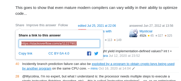
// Adds handling for legacy browsers
// https://stackoverflow.com/a/XXXXXXX
This is important because solutions can change. It’s always good to know where your code came from in case it ever breaks.
Writing pull requests
Pull requests (PRs) are a fundamental aspect of any project. They sit at the heart of code reviews. And code reviews can quickly become a bottleneck in your team’s performance without good wording.
A good PR description summarizes what change is being made and why it’s being made. Large projects have a pull request template, like this one adapted from a real example:
## Proposed changes
Describe the big picture of your changes here to communicate to the maintainers why we should accept this pull request.

## Types of changes
What types of changes does your code introduce to Appium?
 - [ ] Bugfix (non-breaking change which fixes an issue)
 - [ ] New feature (non-breaking change which adds functionality)
 - ...

## Checklist
 - [ ] I have read the CONTRIBUTING doc
 - [ ] I have signed the CLA
 - [ ] Lint and unit tests pass locally with my changes

## Further comments
If this is a relatively large or complex change, kick off the discussion by explaining why you chose the solution you did and what alternatives you considered, etc…
Avoid vague PR titles
Please avoid titles that look like this:
- Fix build.
- Fix bug.
- Add patch.
These don’t even attempt to describe what build, bug, or patch it is we’re dealing with. A little extra detail on what part of the build was fixed, which bug was squashed, or what patch was added can go a long way to establishing better communication and collaboration with your colleagues. It level-sets and gets folks on the same page.
PR titles are traditionally written in imperative tense. They’re a one-line summary of the entire PR, and they should describe what is being done by the PR.
Here are some good examples:
- Support custom srcset attributes in NgOptimizedImage
- Default image config to 75% image quality
- Add explicit selectors for all built-in ControlValueAccessors
Avoid long PRs
A large PR means a huge description, and no one wants to review hundreds or thousands of lines of code, sometimes just to end-up dismissing the whole thing!
Instead, you could:
- communicate with your team through Issues,
- make a plan,
- break down the problem into smaller pieces, or
- work on each piece separately with its own PR.
Isn’t it much cleaner now?
Provide details in the PR body
Unlike the PR title, the body is the place for all the details, including:
- Why is the PR being done?
- Why is this the best approach?
- Any shortcomings to the approach, and ideas to solve them if possible
- The bug or ticket number, benchmark results, etc.
Reporting bugs
Bug reports are one of the most important aspects of any project. And all great projects are built on user feedback. Usually, even after countless tests, it’s the users that find most bugs. Users are also great idealists, and sometimes they have feature ideas; please listen to them!
For technical projects, all of this stuff is done by reporting issues. A well-written issue is easy for another developer to find and respond to.
For example, most big projects come with a template:
 <!-- Modified from angular-translate/angular-translate -->
 ### Subject of the issue
 Describe your issue here.

 ### Your environment
 * version of angular-translate
 * version of angular
 * which browser and its version

 ### Steps to reproduce
 Tell us how to reproduce this issue.

 ### Expected behavior
 Tell us what should happen.

 ### Actual behavior
 Tell us what happens instead.
Gather screenshots
Capture the issue using your system’s screen-shooting utility.
If it’s a screenshot of a CLI program, make sure that the text is clear. If it’s a UI program, make sure the screenshot captures the right elements and states.
You may need to capture an actual interaction to demonstrate the issue. If that’s the case, try to record GIFs using a screen-recording tool.
How to reproduce the problem
It’s much easier for programmers to solve a bug when it’s live on their computer. That’s why a good commit should come with the steps to precisely reproduce the problem.
Here’s an example:
Update: you can actually reproduce this error with objects:
```html
<div *ngFor="let value of objs; let i = index">
<input [ngModel]="objs[i].v" (ngModelChange)="setObj(i, $event)" />
</div>
```
```js
export class OneComponent {
obj = {v: '0'};
objs = [this.obj, this.obj, this.obj, this.obj];
setObj(i: number, value: string) {
this.objs[i] = {v: value};
}
}
```
The bug is reproducible as long as the trackBy function returns the same value for any two entries in the array. So weird behavior can occur with any duplicate values.
Suggest a cause
You’re the one who caught the bug, so maybe you can suggest some potential causes for why it’s there. Maybe the bug only happens after you encounter a certain event, or maybe it only happens on mobile.
It also can’t hurt to explore the codebase, and maybe identify what’s causing the problem. Then, your Issue will be closed much quicker and you’re likely to be assigned to the related PR.
Communicating with clients
You may work as a solo freelancer, or perhaps you’re the lead developer on a small team. In either case, let’s say you’re responsible for interfacing with clients on a project.
Now, the programmer stereotype is that we’re poor communicators. We’ve been known to use overly technical jargon, tell others what is and is not possible, and even get defensive when someone questions our approach.
So, how do we mitigate that stereotype? Ask clients what they want, and always listen to their feedback. Here’s how to do that.
Ask the right questions
Start by making sure that you and the client are on the same page:
- Who is your target audience?
- What is the goal of the site?
- Who is your closest competitor and what are they doing right?
Asking questions is also a good way to write positively, particularly in situations when you disagree with a client’s feedback or decision. Asking questions forces that person to support their own claims rather than you attacking them by defending your own position:
- Are you OK with that even if it comes with an additional performance cost?
- Does moving the component help us better accomplish our objective?
- Great, who is responsible to maintain that after launch?
- Do you know offhand if the contrast between those two colors passes WCAG AA standards?
Questions are a lot more innocent and promote curiosity over animosity.
Sell yourself
If you’re making a pitch to a prospective client, you’re going to need to convince them to hire you. Why should the client choose you? It’s important to specify the following:
- Who you are
- What you do
- Why you’re a good fit for the job
- Links to relevant work you’ve done
And once you get the job and need to write up a contract, remember that there’s no content more intimidating than a bunch of legalese. Even though it’s written for design projects, the Contract Killer can be a nice starting point for writing something much friendlier.
Your attention to detail could be the difference between you and another developer trying to win the same project. In my experience, clients will just as easily hire a develop they think they will enjoy working with than the one who is technically the most competent or experienced for the job.
Writing microcopy
Microcopy is the art of writing user-friendly UI messages, such as errors. I’ll bet there have been times where you as a developer had to write error messages because they were put on the backburner all the way to launch time.
That may be why we sometimes see errors like this:
Error: Unexpected input (Code 693)Errors are the last thing that you want your users to deal with. But they do happen, and there’s nothing we can do about it. Here are some tips to improve your microcopy skills.
Avoid technical jargon
Most people don’t know what a server is, while 100% of programmers do. That’s why it’s not unusual to see uncommon terms written in an error message, like API or “timeout execution.”
Unless you’re dealing with a technical client or user base, It’s likely that most of your users didn’t take a computer science course, and don’t know how the Internet works, and why a particular thing doesn’’t work. Hence, the error.
Therefore, a good error message shouldn’t explain why something went wrong, because such explanations might require using scary technical terms. That’s why it’s very important to avoid using technical jargon.
Never blame the user
Imagine this: I’m trying to log into your platform. So I open my browser, visit your website, and enter my details. Then I’m told: “Your email/password is incorrect.”
Even though it seems dramatic to think that this message is hostile, it subconsciously makes me feel stupid. Microcopy says that it’s never okay to blame the user. Try changing your message to something less finger-pointy, like this this example adapted from Mailchimp’s login: “Sorry, that email-password combination isn’t right. We can help you recover your account.”
I’d also like to add the importance of avoiding ALL CAPS and exclamation points! Sure, they can be used to convey excitement, but in microcopy they create a sense of hostility towards the user.
Don’t overwhelm the user
Using humor in your microcopy is a good idea! It can lighten up the mood, and it’s an easy way to curb the negativity caused by even the worst errors.
But if you don’t use it perfectly, it can come across as condescending and insulting to the user. That’s just a big risk to take.
[D]on’t go out of your way to make a joke — forced humor can be worse than none at all. If you’re unsure, keep a straight face.
(Emphasis mine)
Writing accessible markup
We could easily spend an entire article about accessibility and how it relates to technical writing. Heck, accessibility is often included in content style guides, including those for Microsoft and Mailchimp.
You’re a developer and probably already know so much about accessibility. You may even be one of the more diligent developers that makes accessibility a core part of your workflow. Still, it’s incredible how often accessibility considerations are put on the back burner, no matter how important we all know it is to make accessible online experiences that are inclusive of all abilities.
So, if you find yourself implementing someone else’s copywriting into your code, writing documentation for other developers, or even writing UI copy yourself, be mindful of some fundamental accessibility best practices, as they round out all the other advice for technical writing.
Things like:
- Using semantic tags where possible (e.g.
<nav>,<header>,<article>, etc.) - Following a logical heading structure
- Adding alt text to images
- Watching for inline semantics (Mandy Michael has an exceptional article on this)
Andy Bell offers some relatively small things you can do to make content more accessible, and it’s worth your time checking them out. And, just for kicks, John Rhea shows off some neat editing tricks that are possible when we’re working with semantic HTML elements.
Conclusion
Those were six ways that demonstrate how technical writing and development coincide. While the examples and advice may not be rocket science, I hope that you found them useful, whether it’s collaborating with other developers, maintaining your own work, having to write your own copy in a pinch, or even drafting a project proposal, among other things.
The bottom line: sharpening your writing skills and putting a little extra effort into your writing can actually make you a better developer.
Technical writing resources
If you’re interested in technical writing:
- Advice for Technical Writing (Chris Coyier)
- Google’s Technical Writing Guide
- Technical Writing Fundamentals (GitLab)
- UX Writing: Study Guide (Nielson Norman Group)
- Write the Docs (Technical writing community)
If you’re interested in copywriting:
- Copywriting 101 (Copyblogger)
- What is Copywriting? (Ionos)
- SEO Copywriting Guide (Semrush)
- Copywriting is Still Writing (The Guardian)
If you’re interested in microcopy:
- Introduction to Microcopy (UX Planet)
- Apple’s Human Interface Guidelines
- Microsoft’s Writing Style Guide
- Mailchimp Content Style Guide
If you’re interested in using a professional style guide to improve your writing:
If you’re interested in writing for accessibility:
- Improve the readability of the content on your website (Andy Bell)
- 15 Practices to Improve Your Website Accessibility (Bruce Lawson)
- Accessibility Testing Tools (Chris Coyier)
- Why Don’t Developers Tke Accessibility Seriously? (Melanie Sumner)
- Naming things to improve accessibility (Hidde de Vries)
Technical Writing for Developers originally published on CSS-Tricks. You should get the newsletter.


