Archiwum kategorii: CSS

SVG, Favicons, and All the Fun Things We Can Do With Them

Post pobrano z: SVG, Favicons, and All the Fun Things We Can Do With Them

Favicons are the little icons you see in your browser tab. They help you understand which site is which when you’re scanning through your browser’s bookmarks and open tabs. They’re a neat part of internet history that are capable of performing some cool tricks.

One very new trick is the ability to use SVG as a favicon. It’s something that most modern browsers support, with more support on the way.

Here’s the code for how to add favicons to your site:

<link rel="icon" type="image/svg+xml" href="/favicon.svg">
<link rel="alternate icon" href="/favicon.ico">
<link rel="mask-icon" href="/safari-pinned-tab.svg" color="#ff8a01">

If a browser doesn’t support a SVG favicon, it will ignore the first link element declaration and continue on to the second. This ensures that all browsers that support favicons can enjoy the experience. 

You may also notice the alternate attribute value for our rel declaration in the second line. This programmatically communicates to the browser that the favicon with a file format that uses .ico is specifically used as an alternate presentation.

Following the favicons is a line of code that loads another SVG image, one called safari-pinned-tab.svg. This is to support Safari’s pinned tab functionality, which existed before other browsers had SVG favicon support. There’s additional files you can add here to enhance your site for different apps and services, but more on that in a bit.

Here’s more detail on the current level of SVG favicon support:

This browser support data is from Caniuse, which has more detail. A number indicates that browser supports the feature at that version and up.

Desktop

Chrome Firefox IE Edge Safari
80 41 No 80 TP

Mobile / Tablet

Android Chrome Android Firefox Android iOS Safari
80 No No 13.4

Why SVG?

You may be questioning why this is needed. The .ico file format has been around forever and can support images up to 256×256 pixels in size. Here are three answers for you.

Ease of authoring

It’s a pain to make .ico files. The file is a proprietary format used by Microsoft, meaning you’ll need specialized tools to make them. SVG is an open standard, meaning you can use them without any further tooling or platform lock-in.

Future-proofing

Retina? 5k? 6k? When we use a resolution-agnostic SVG file for a favicon, we guarantee that our favicons look crisp on future devices, regardless of how large their displays get. 

Performance

SVGs are usually very small files, especially when compared to their raster image counterparts — even more-so if you optimize them beforehand. By only using a 16×16 pixel favicon as a fallback for browsers that don’t support SVG, we provide a combination that enjoys a high degree of support with a smaller file size to boot. 

This might seem a bit extreme, but when it comes to web performance, every byte counts!

Tricks

Another cool thing about SVG is we can embed CSS directly in it. This means we can do fun things like dynamically adjust them with JavaScript, provided the SVG is declared inline and not embedded using an img element.

<svg  version="1.1" xmlns="http://www.w3.org/2000/svg" viewBox="0 0 100 100">
  <style>
    path { fill: #272019; }
  </style>
  <!-- etc. -->
</svg>

Since SVG favicons are embedded using the link element, they can’t really be modified using JavaScript. We can, however, use things like emoji and media queries.

Emoji

Lea Verou had a genius idea about using emoji inside of SVG’s text element to make a quick favicon with a transparent background that holds up at small sizes.

In response, Chris Coyier whipped up a neat little demo that lets you play around with the concept.

Dark Mode support

Both Thomas Steiner and Mathias Bynens independently stumbled across the idea that you can use the prefers-color-scheme media query to provide support for dark mode. This work is built off of Jake Archibald’s exploration of SVG and media queries.

<svg width="128" height="128" xmlns="http://www.w3.org/2000/svg">
  <style>
    path { fill: #000000; }
    @media (prefers-color-scheme: dark) {
      path { fill: #ffffff; }
    }
  </style>
  <path d="M111.904 52.937a1.95 1.95 0 00-1.555-1.314l-30.835-4.502-13.786-28.136c-.653-1.313-2.803-1.313-3.456 0L48.486 47.121l-30.835 4.502a1.95 1.95 0 00-1.555 1.314 1.952 1.952 0 00.48 1.99l22.33 21.894-5.28 30.918c-.115.715.173 1.45.768 1.894a1.904 1.904 0 002.016.135L64 95.178l27.59 14.59c.269.155.576.232.883.232a1.98 1.98 0 001.133-.367 1.974 1.974 0 00.768-1.894l-5.28-30.918 22.33-21.893c.518-.522.71-1.276.48-1.99z" fill-rule="nonzero"/>
</svg>

For supporting browsers, this code means our star-shaped SVG favicon will change its fill color from black to white when dark mode is activated. Pretty neat!

Other media queries

Dark mode support got me thinking: if SVGs can support prefers-color-scheme, what other things can we do with them? While the support for Level 5 Media Queries may not be there yet, here’s some ideas to consider:

Mockup of four SVG favicon treatments. The first treatment is a pink star with a tab title of, “SVG Favicon.” The second treatment is a hot pink star with a tab title of, “Light Level SVG Favicon.” The third treatment is a light pink star with a tab title of, “Inverted Colors SVG Favicon.” The fourth treatment is a black pink star with a tab title of, “High Contrast Mode SVG Favicon.” The tabs are screen captures from Microsoft Edge, with the browser chrome updating to match each specialized mode.
A mockup of how these media query-based adjustments could work.

Keep it crisp

Another important aspect of good favicon design is making sure they look good in the small browser tab area. The secret to this is making the paths of the vector image line up to the pixel grid, the guide a computer uses to turn SVG math into the bitmap we see on a screen. 

Here’s a simplified example using a square shape:
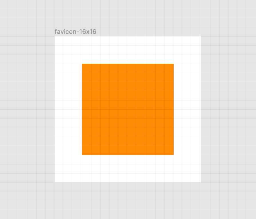
A crisp orange square on a white background. There is also a faint grid of gray horizontal and vertical lines that represent the pixel grid. Screenshot from Figma.

When the vector points of the square align to the pixel grid of the artboard, the antialiasing effect a computer uses to smooth out the shapes isn’t needed. When the vector points aren’t aligned, we get a “smearing” effect:

A blurred orange square on a white background. There is also a faint grid of gray horizontal and vertical lines that represent the pixel grid. Screenshot from Figma.

A vector point’s position can be adjusted on the pixel grid by using a vector editing program such as Figma, Sketch, Inkscape, or Illustrator. These programs export SVGs as well. To adjust a vector point’s location, select each node with a precision selection tool and drag it into position.

Some more complicated icons may need to be simplified, in order to look good at such a small size. If you’re looking for a good primer on this, Jeremy Frank wrote a really good two-part article over at Vidget.

Go the extra mile

In addition to favicons, there are a bunch of different (and unfortunately proprietary) ways to use icons to enhance its experience. These include things like the aforementioned pinned tab icon for Safari¹, chat app unfurls, a pinned Windows start menu tile, social media previews, and homescreen launchers.

If you’re looking for a great place to get started with these kinds of enhancements, I really like realfavicongenerator.net.

Icon output from realfavicongenerator.net arranged in a grid using CSS-Trick’s logo. There are two rows of five icons: android-chrome-192x192.png, android-chrome-384x384.png, apple-touch-icon.png, favicon-16x16.png, favicon-32x32.png, mstile-150x150.png, safari-pinned-tab.svg, favicon.ico, browserconfig.xml, and site.webmanifest.
It’s a lot, but it guarantees robust support.

A funny thing about the history of the favicon: Internet Explorer was the first browser to support them and they were snuck in at the 11th hour by a developer named Bharat Shyam:

As the story goes, late one night, Shyam was working on his new favicon feature. He called over junior project manager Ray Sun to take a look.

Shyam commented, “This is good, right? Check it in?”, requesting permission to check the code into the Internet Explorer codebase so it could be released in the next version. Sun didn’t think too much of it, the feature was cool and would clearly give IE an edge. So he told Shyam to go ahead and add it. And just like that, the favicon made its way into Internet Explorer 5, which would go on to become one of the largest browser releases the web has ever seen.

The next day, Sun was reprimanded by his manager for letting the feature get by so quickly. As it turns out, Shyam had specifically waited until later in the day, knowing that a less experienced Program Manager would give him a pass. But by then, the code had been merged in. Incidentally, you’d be surprised just how many relatively major browser features have snuck their way into releases like this.

From How We Got the Favicon by Jay Hoffmann

I’m happy to see the platform throw a little love at favicons. They’ve long been one of my favorite little design details, and I’m excited that they’re becoming more reactive to user’s needs. If you have a moment, why not sneak a SVG favicon into your project the same way Bharat Shyam did way back in 1999. 


¹ I haven’t been able to determine if Safari is going to implement SVG favicon support, but I hope they do. Has anyone heard anything?

The post SVG, Favicons, and All the Fun Things We Can Do With Them appeared first on CSS-Tricks.

Front-End Challenges

Post pobrano z: Front-End Challenges

My favorite way to level up as a front-end developer is to do the work. Literally just build websites. If you can do it for money, great, you should. If the websites you make can help yourself or anyone else you care about, then that’s also great. In lieu of that, you can also make things simply for the sake of making them, and you’ll still level up. It’s certainly better than just reading about things!

Here’s some resources that encourage you to level up by building things for the sake of leveling up, if you’re up to it.

Frontend Mentor

It looks like this recently launched, and it’s what inspired this post. This idea of giving people front-end work to do is enough to build a business around! Some of them are free, and some of them are not.

HackerRank

Other businesses have centered themselves around this too. HackerRank is all about getting jobs and hiring, so they’ve got a very strong agenda, but part of the way they do that is putting you through these skill tests (solving challenges) which are meant to asses you, but you can certainly learn from them too.

Others like this: Codewars, ChallengeRocket, Codesignal, Topcoder (Jeepers, VCs must love this idea.)

Coderbyte

Coderbyte has paid plans too, and they’re designed to leveling up your job interviewing skills with challenges.

Classic situation: sometimes the site is the product and you’re the customer, and sometimes hiring companies are the customer and you’re the product.

Build Dribbble shots

Here’s the classic move: find something you like on Dribbble, rebuild it. The @keyframers often do it. Tim Evko’s Practice site used to pick a shot for you (along with random GitHub issues and random coding challenges), but the Dribbble part appears broken at the moment. The other stuff still works!

Matt Delac used to do a series along these lines. Indrek Lasn also does it in Medium posts.

Front-End Challenges Club

Andy Bell did a Front-End Challenges Club for a while, and while I think it’s on break, you can view the archives.

CodePen Challenges

CodePen Challenges run every week are are a prompt (along with ideas and resources) for building whatever you like. Low key.

100 Days of CSS Challenge

Matthias Martin created 100 days of CSS challenges. They are all there for you to see, including entries from other people — but the point is for you to give it a shot yourself, of course.

Daily UI

Daily UI challenges gives you a new challenge every day that starts when you sign up (and it’s free). Lots of people complete the challenge with code.

Frontloops

Frontloops charges $19 for 30 challenges, which includes information, advice, assets, and a solution.

CSSBattle

If your idea of a fun challenge is mimicking a design in as few bytes of code as possible, CSSBattle will appeal to you.

Writing things as tersely as possible is often called “Code Golf” and there is a challenge site for that too.

Ace Front End

Ace Front End has challenges that focus specifically on vanilla HTML, CSS, and JavaScript.

I just happened to notice that the first challenge is a drop down navigation menu, and it doesn’t handle things like aria-expanded. I’m not entirely sure how big of a problem that is and I don’t mean to pick on Ace Front End — it’s just a reminder that there could be problems with any of these challenges. But that doesn’t mean you can’t learn something from them.

Codier

Codier has public challenges that include solutions posted by other users.

rendezvous with cassidoo

Cassidy’s weekly newsletter includes a challenge in every issue.


Rina Diane Caballar quoting Tim Carry in Extending the Limits of CSS:

Carry’s advice is to start with a real-world object—the interface of a gaming console or a calculator, for example—and to try to recreate it using only CSS. “A great way to push the boundaries with a language is to make something that the language wasn’t meant to be doing in the first place,” he says.

The post Front-End Challenges appeared first on CSS-Tricks.

Front-End Challenges

Post pobrano z: Front-End Challenges

My favorite way to level up as a front-end developer is to do the work. Literally just build websites. If you can do it for money, great, you should. If the websites you make can help yourself or anyone else you care about, then that’s also great. In lieu of that, you can also make things simply for the sake of making them, and you’ll still level up. It’s certainly better than just reading about things!

Here’s some resources that encourage you to level up by building things for the sake of leveling up, if you’re up to it.

Frontend Mentor

It looks like this recently launched, and it’s what inspired this post. This idea of giving people front-end work to do is enough to build a business around! Some of them are free, and some of them are not.

HackerRank

Other businesses have centered themselves around this too. HackerRank is all about getting jobs and hiring, so they’ve got a very strong agenda, but part of the way they do that is putting you through these skill tests (solving challenges) which are meant to asses you, but you can certainly learn from them too.

Others like this: Codewars, ChallengeRocket, Codesignal, Topcoder (Jeepers, VCs must love this idea.)

Coderbyte

Coderbyte has paid plans too, and they’re designed to leveling up your job interviewing skills with challenges.

Classic situation: sometimes the site is the product and you’re the customer, and sometimes hiring companies are the customer and you’re the product.

Build Dribbble shots

Here’s the classic move: find something you like on Dribbble, rebuild it. The @keyframers often do it. Tim Evko’s Practice site used to pick a shot for you (along with random GitHub issues and random coding challenges), but the Dribbble part appears broken at the moment. The other stuff still works!

Matt Delac used to do a series along these lines. Indrek Lasn also does it in Medium posts.

Front-End Challenges Club

Andy Bell did a Front-End Challenges Club for a while, and while I think it’s on break, you can view the archives.

CodePen Challenges

CodePen Challenges run every week are are a prompt (along with ideas and resources) for building whatever you like. Low key.

100 Days of CSS Challenge

Matthias Martin created 100 days of CSS challenges. They are all there for you to see, including entries from other people — but the point is for you to give it a shot yourself, of course.

Daily UI

Daily UI challenges gives you a new challenge every day that starts when you sign up (and it’s free). Lots of people complete the challenge with code.

Frontloops

Frontloops charges $19 for 30 challenges, which includes information, advice, assets, and a solution.

CSSBattle

If your idea of a fun challenge is mimicking a design in as few bytes of code as possible, CSSBattle will appeal to you.

Writing things as tersely as possible is often called “Code Golf” and there is a challenge site for that too.

Ace Front End

Ace Front End has challenges that focus specifically on vanilla HTML, CSS, and JavaScript.

I just happened to notice that the first challenge is a drop down navigation menu, and it doesn’t handle things like aria-expanded. I’m not entirely sure how big of a problem that is and I don’t mean to pick on Ace Front End — it’s just a reminder that there could be problems with any of these challenges. But that doesn’t mean you can’t learn something from them.

Codier

Codier has public challenges that include solutions posted by other users.

rendezvous with cassidoo

Cassidy’s weekly newsletter includes a challenge in every issue.


Rina Diane Caballar quoting Tim Carry in Extending the Limits of CSS:

Carry’s advice is to start with a real-world object—the interface of a gaming console or a calculator, for example—and to try to recreate it using only CSS. “A great way to push the boundaries with a language is to make something that the language wasn’t meant to be doing in the first place,” he says.

The post Front-End Challenges appeared first on CSS-Tricks.

Front-End Challenges

Post pobrano z: Front-End Challenges

My favorite way to level up as a front-end developer is to do the work. Literally just build websites. If you can do it for money, great, you should. If the websites you make can help yourself or anyone else you care about, then that’s also great. In lieu of that, you can also make things simply for the sake of making them, and you’ll still level up. It’s certainly better than just reading about things!

Here’s some resources that encourage you to level up by building things for the sake of leveling up, if you’re up to it.

Frontend Mentor

It looks like this recently launched, and it’s what inspired this post. This idea of giving people front-end work to do is enough to build a business around! Some of them are free, and some of them are not.

HackerRank

Other businesses have centered themselves around this too. HackerRank is all about getting jobs and hiring, so they’ve got a very strong agenda, but part of the way they do that is putting you through these skill tests (solving challenges) which are meant to asses you, but you can certainly learn from them too.

Others like this: Codewars, ChallengeRocket, Codesignal, Topcoder (Jeepers, VCs must love this idea.)

Coderbyte

Coderbyte has paid plans too, and they’re designed to leveling up your job interviewing skills with challenges.

Classic situation: sometimes the site is the product and you’re the customer, and sometimes hiring companies are the customer and you’re the product.

Build Dribbble shots

Here’s the classic move: find something you like on Dribbble, rebuild it. The @keyframers often do it. Tim Evko’s Practice site used to pick a shot for you (along with random GitHub issues and random coding challenges), but the Dribbble part appears broken at the moment. The other stuff still works!

Matt Delac used to do a series along these lines. Indrek Lasn also does it in Medium posts.

Front-End Challenges Club

Andy Bell did a Front-End Challenges Club for a while, and while I think it’s on break, you can view the archives.

CodePen Challenges

CodePen Challenges run every week are are a prompt (along with ideas and resources) for building whatever you like. Low key.

100 Days of CSS Challenge

Matthias Martin created 100 days of CSS challenges. They are all there for you to see, including entries from other people — but the point is for you to give it a shot yourself, of course.

Daily UI

Daily UI challenges gives you a new challenge every day that starts when you sign up (and it’s free). Lots of people complete the challenge with code.

Frontloops

Frontloops charges $19 for 30 challenges, which includes information, advice, assets, and a solution.

CSSBattle

If your idea of a fun challenge is mimicking a design in as few bytes of code as possible, CSSBattle will appeal to you.

Writing things as tersely as possible is often called “Code Golf” and there is a challenge site for that too.

Ace Front End

Ace Front End has challenges that focus specifically on vanilla HTML, CSS, and JavaScript.

I just happened to notice that the first challenge is a drop down navigation menu, and it doesn’t handle things like aria-expanded. I’m not entirely sure how big of a problem that is and I don’t mean to pick on Ace Front End — it’s just a reminder that there could be problems with any of these challenges. But that doesn’t mean you can’t learn something from them.

Codier

Codier has public challenges that include solutions posted by other users.

rendezvous with cassidoo

Cassidy’s weekly newsletter includes a challenge in every issue.


Rina Diane Caballar quoting Tim Carry in Extending the Limits of CSS:

Carry’s advice is to start with a real-world object—the interface of a gaming console or a calculator, for example—and to try to recreate it using only CSS. “A great way to push the boundaries with a language is to make something that the language wasn’t meant to be doing in the first place,” he says.

The post Front-End Challenges appeared first on CSS-Tricks.

Pseudo-Randomly Adding Illustrations with CSS

Post pobrano z: Pseudo-Randomly Adding Illustrations with CSS

Between each post of Eric Meyer’s blog there’s this rather lovely illustration that can randomly be one of these five options:

Eric made each illustration into a separate background image then switches out that image with the nth-of-type CSS property, like this:

.entry:nth-of-type(2n+1)::before {
   background-image: url(image-1.png);
}

.entry:nth-of-type(3n+1)::before {
   background-image: url(image-2.png);
}

.entry:nth-of-type(4n+1)::before {
   background-image: url(image-3.png);
}

.entry:nth-of-type(5n+1)::before {
   background-image: url(image-4.png);
}

This seems like a good time to plug our very own little :nth Tester tool. It definitely helps me understand what something like (2n+1) means in English. You can type in any string you like and see what effect that has on your site:

Anyway, back to Eric’s post. As he mentions, his technique is pseudo-random in that it looks like a random image on the page but it technically isn’t. Either way, I think it’s a really lovely technique! And it certainly breaks up the visual monotony that happens when you’re looking at a website for too long.

Here’s what it looks like in practice:

Lovely stuff!

Another way to do this is to use random numbers in CSS. For example, we could set a variable in JavaScript and then apply it with CSS custom properties. Or we could put all the images in a single sprite file and change the background-position based on a random number.

This is definitely one of those things in CSS where there are no wrong answers; just different ways to do the same awesome thing!

Direct Link to Article — Permalink

The post Pseudo-Randomly Adding Illustrations with CSS appeared first on CSS-Tricks.

Better Form Inputs for Better Mobile User Experiences

Post pobrano z: Better Form Inputs for Better Mobile User Experiences

Here’s one simple, practical way to make apps perform better on mobile devices: always configure HTML input fields with the correct type, inputmode, and autocomplete attributes. While these three attributes are often discussed in isolation, they make the most sense in the context of mobile user experience when you think of them as a team. 

There’s no question that forms on mobile devices can be time-consuming and tedious to fill in, but by properly configuring inputs, we can ensure that the data entry process is as seamless as possible for our users. Let’s take a look at some examples and best practices we can use to create better user experiences on mobile devices.

Use this demo to experiment on your own, if you’d like.

Using the correct input type

This is the easiest thing to get right. Input types, like email, tel, and url, are well-supported across browsers. While the benefit of using a type, like tel over the more generic text, might be hard to see on desktop browsers, it’s immediately apparent on mobile.

Choosing the appropriate type changes the keyboard that pops up on Android and iOS devices when a user focuses the field. For very little effort, just by using the right type, we will show custom keyboards for email, telephone numbers, URLs, and even search inputs. 

Text input type on iOS (left) and Android (right)
Email input type on iOS (left) and Android (right)
URL input type on iOS (left) and Android (right)
Search input type on iOS (left) and Android (right)

One thing to note is that both input type="email" and input type="url" come with validation functionality, and modern browsers will show an error tooltip if their values do not match the expected formats when the user submits the form. If you’d rather turn this functionality off, you can simply add the novalidate attribute to the containing form.

A quick detour into date types

HTML inputs comprise far more than specialized text inputs — you also have radio buttons, checkboxes, and so on. For the purposes of this discussion, though, I’m mostly talking about the more text-based inputs. 

There is a type of input that sits in the liminal space between the more free-form text inputs and input widgets like radio buttons: date. The date input type comes in a variety of flavors that are well-supported on mobile, including date, time, datetime-local, and month. These pop up custom widgets in iOS and Android when they are focused. Instead of triggering a specialized keyboard, they show a select-like interface in iOS, and various different types of widgets on Android (where the date and time selectors are particularly slick). 

I was excited to start using native defaults on mobile, until I looked around and realized that most major apps and mobile websites use custom date pickers rather than native date input types. There could be a couple reasons for this. First, I find the native iOS date selector to be less intuitive than a calendar-type widget. Second, even the beautifully-designed Android implementation is fairly limited compared to custom components — there’s no easy way to input a date range rather than a single date, for instance. 

Still, the date input types are worth checking out if the custom datepicker you’re using doesn’t perform well on mobile. If you’d like to try out the native input widgets on iOS and Android while making sure that desktop users see a custom widget instead of the default dropdown, this snippet of CSS will hide the calendar dropdown for desktop browsers that implement it:

::-webkit-calendar-picker-indicator {
  display: none;
}
Date input type on iOS (left) and Android (right)
Time input type on iOS (left) and Android (right)

One final thing to note is that date types cannot be overridden by the inputmode attribute, which we’ll discuss next.

Why should I care about inputmode?

The inputmode attribute allows you to override the mobile keyboard specified by the input’s type and directly declare the type of keyboard shown to the user. When I first learned about this attribute, I wasn’t impressed — why not just use the correct type in the first place? But while inputmode is often unnecessary, there are a few places where the attribute can be extremely helpful. The most notable use case that I’ve found for inputmode is building a better number input.

While some HTML5 input types, like url and email, are straightforward, input type="number" is a different matter. It has some accessibility concerns as well as a somewhat awkward UI. For example, desktop browsers, like Chrome, show tiny increment arrows that are easy to trigger accidentally by scrolling.

So here’s a pattern to memorize and use going forwards. For most numeric inputs, instead of using this: 

<input type="number" />

…you actually want to use this:

<input type="text" inputmode="decimal" />

Why not inputmode="numeric" instead of inputmode="decimal" ? 

The numeric and decimal attribute values produce identical keyboards on Android. On iOS, however, numeric displays a keyboard that shows both numbers and punctuation, while decimal shows a focused grid of numbers that almost looks exactly like the tel input type, only without extraneous telephone-number focused options. That’s why it’s my preference for most types of number inputs.

iOS numeric input (left) and decimal input (right)
Android numeric input (left) and decimal input (right)

Christian Oliff has written an excellent article dedicated solely to the inputmode attribute.

Don’t forget autocomplete

Even more important than showing the correct mobile keyboard is showing helpful autocomplete suggestions. That can go a long way towards creating a faster and less frustrating user experience on mobile.

While browsers have heuristics for showing autocomplete fields, you cannot rely on them, and should still be sure to add the correct autocomplete attribute. For instance, in iOS Safari, I found that an input type="tel" would only show autocomplete options if I explicitly added a autocomplete="tel" attribute.

You may think that you are familiar with the basic autocomplete options, such as those that help the user fill in credit card numbers or address form fields, but I’d urge you to review them to make sure that you are aware of all of the options. The spec lists over 50 values! Did you know that autocomplete="one-time-code" can make a phone verification user flow super smooth?

Speaking of autocomplete…

I’d like to mention one final element that allows you to create your own custom autocomplete functionality: datalist. While it creates a serviceable — if somewhat basic — autocomplete experience on desktop Chrome and Safari, it shines on iOS by surfacing suggestions in a convenient row right above the keyboard, where the system autocomplete functionality usually lives. Further, it allows the user to toggle between text and select-style inputs.

On Android, on the other hand, datalist creates a more typical autocomplete dropdown, with the area above the keyboard reserved for the system’s own typeahead functionality. One possible advantage to this style is that the dropdown list is easily scrollable, creating immediate access to all possible options as soon as the field is focused. (In iOS, in order to view more than the top three matches, the user would have to trigger the select picker by pressing the down arrow icon.)

You can use this demo to play around with datalist:

CodePen Embed Fallback

And you can explore all the autocomplete options, as well as input type and inputmode values, using this tool I made to help you quickly preview various input configurations on mobile.

In summary

When I’m building a form, I’m often tempted to focus on perfecting the desktop experience while treating the mobile web as an afterthought. But while it does take a little extra work to ensure forms work well on mobile, it doesn’t have to be too difficult. Hopefully, this article has shown that with a few easy steps, you can make forms much more convenient for your users on mobile devices.

The post Better Form Inputs for Better Mobile User Experiences appeared first on CSS-Tricks.

Thank You, Christopher Schmitt

Post pobrano z: Thank You, Christopher Schmitt

It’s incredibly sad that Christopher Schmitt passed away last week¹. I keep thinking about how Christopher was one of the best dudes I knew. Just incredibly kind and thoughtful all the way through. I know everyone says that about people after they pass, but I really mean it here. I’m sure we all know people that we like quite a bit, but hey, we know they can be an asshole sometimes too. Not Christopher, at least not to me. He was always good to me in ways I’ll never be able to reciprocate.

Here’s the most important thing:

We (a group of developer friends) would like to build a site of memories that people have of Christopher. We have our own, but we’d like to collect as many memories from as many people as possible to make this a true memorial to him. If you have one you would like to share publicly, please submit it to this little site just for that.

I hardly know where to start reminiscing about Christopher. Broadly: I spoke at more conferences thrown by Christopher (and Ari) than anyone else. At least a dozen. He used to throw one called In Control in Orlando that I spoke at a number of times and met some early web friends that I’m still close with today! Stephanie Rewis mentioned to me that’s where we met the first time and she remembers me coding away on a yet-to-be released CodePen while there. In Control went to Hawaii one year, along with the first-ever CSS Dev Conf, bringing me to Hawaii for the first time in my life, where I remember driving around the island with Daniel Burka. CSS Dev Conf went all sorts of amazing places, and I went to all of them! Estes Park, New Orleans, The Queen Mary… all these incredible locations that were all incredible memories for me.

And all I have are blurry, distant photos of him like this:

Christopher and Ari also ran an absolute ton of online conferences. CSS Summit, RWD Summit, SVG Summit… they ran a ton of them and they were really ahead of their time. I remember a funny moment where I had just moved to a new city and my internet wasn’t installed yet, but I still had to present online at one of these, so I did it out of my neighbors garage (as their kids slept), and the light in the garage kept going out because it didn’t detect movement. 😬

The people I met through Christopher are too many to count. He was a great connector in that way. His influence on the web was tremendous through his direct work, like writing (what, a dozen books?), blogging (even here!), speaking, and podcasting (e.g. The Non Breaking Space Show) but when you consider the people he brought together, his influence is immeasurable.

I literally made money off the guy. In the early years of ShopTalk, when it was tough to sell podcast spots at all, Christopher would sponsor every episode of ShopTalk, which probably gave us the boost that ensured it’s still happening today. Who knows what would have happened without that.

One of the things I liked best about Christopher is that he was a damn nerd. Through and through. In a way that made you envious that you could one day hope to up your nerd level that high. Guy had a Chewbacca costume that he wore regularly. His Instagram is full of snaps of him meeting other famous nerds.

I hope you still got those black Converses on wherever you are, buddy.

(And remember, if you have a memory with Christopher, please share it.)

  1. It wasn’t COVID-19. Poor guy was dealt bad cards from day one for his health and he fought it the the best he could.

The post Thank You, Christopher Schmitt appeared first on CSS-Tricks.

CSS Foldable Display Polyfill

Post pobrano z: CSS Foldable Display Polyfill

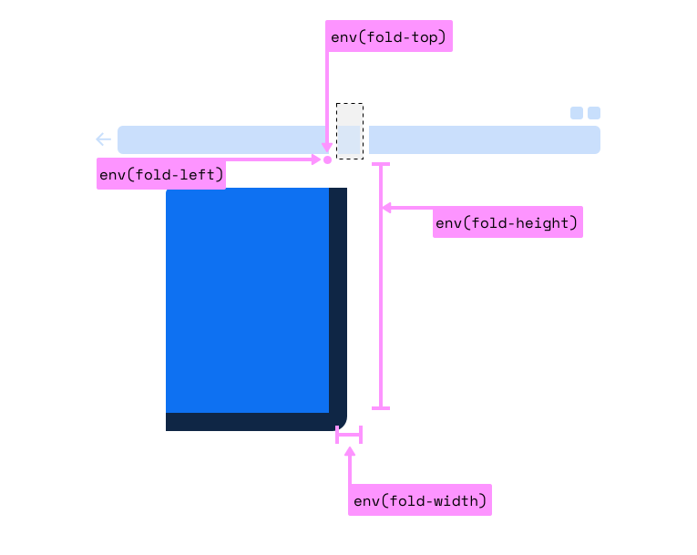
Foldable phones are starting to be a thing. Early days, for sure, but some are already shipping, and they definitely have web browsers on them. Stands to reason that, as web designers, we are going to want to know where that fold is so we can design screens that fit onto the top half and bottom half… or left half and right half¹.

Looks like that’s going to make its way to us in the form of env() constants, just like all that notch stuff.

The code block in the polyfill repo is:

@media (spanning: single-fold-vertical) {
  body {
    flex-direction: row;
  }
  .map {
    flex: 1 1 env(fold-left)
  }
  .locations-list {
    flex: 1;
  }
}

I would also think it could be…

@media (spanning: single-fold-vertical) {
  .page-wrap {
    display: grid;
    grid-template-columns: env(fold-left) 1fr;
  }
}

Interesting how there is no fold-right, isn’t it? And aren’t we trying to stay away from directional terms like that and use logical properties? Why not fold-inline-start?

  1. It’ll be interesting to see how that sentence ages. Just watch the first really popular foldable phone will have three segments.

The post CSS Foldable Display Polyfill appeared first on CSS-Tricks.

Create Diagonal Layouts Like it’s 2020

Post pobrano z: Create Diagonal Layouts Like it’s 2020

Nils Binder covers the ways:

1. Use an SVG in the form of a triangle. This technique is nicely described by Erik Kennedy on CSS-Tricks.

2. Hide part of your section using clip-path. Read Diagonal Containers in CSS by Sebastiano Guerriero or Sloped edges with consistent angle in CSS by Kilian Valkhof.

3. Using CSS Transforms

I would normally be a #2 kinda guy — slice off the top and bottom a bit, make sure there is ample padding, and call it a day. But Nils almost has me convinced this fancy math is better.

Here’s a kinda dumb clip-path way:

CodePen Embed Fallback

And Nils incredibly fancy playground:

CodePen Embed Fallback

Direct Link to Article — Permalink

The post Create Diagonal Layouts Like it’s 2020 appeared first on CSS-Tricks.

Thinking in Behaviors, Not Screen Sizes

Post pobrano z: Thinking in Behaviors, Not Screen Sizes

Chase McCoy wrote a nifty post about the “gap problem” when making a grid of items. His argument might be summarized like this: how should we space elements with margins in CSS? He notes that the gap property isn’t quite ready for prime time when it comes to using it with flexbox, like this:

.grid {
  display: flex;
  gap: 10px;
}

Right now, using gap with flexbox is only supported in Firefox and I’ve already caught myself forgetting about that in a few projects. So watch out for that.

Anyway, the part about Chase’s blog post that I love is where he mentions Andy Bell’s technique for creating a responsive layout with no media queries, like this:

.grid {
  display: grid;
  grid-gap: 10px;
  grid-template-columns: repeat(auto-fill, minmax(150px, 1fr));
}

This CSS is doing the following:

  • Make a grid with a 10px gap between each column and row.
  • Each column should have a minimum width (150px).
  • Each column should also be equal width (1fr).
  • The grid should auto-fill as many columns that can fit.

The nifty thing about all this is that our grid is now effectively responsive because of minmax — if you resize the browser, then the grid will snap down into fewer columns, just like this:

No media queries at all! Although sure, there’s a few other ways that you could get this to work but I think this is neat not just because we’re avoiding media queries — instead, it’s because it teaches us to think in a new way when designing and building components.

Chase continues:

With this technique, instead of using breakpoints to specify the screen size where your items should stack, you specify the minimum size an element should be before it stacks. I like this because it encourages developers to think about responsive design in terms of behaviors instead of screen sizes.

“Behaviors instead of screen sizes” is such a great way to think about component design! A lot of the problems I’ve encountered when making components for a design system is when I’ve been thinking about screen sizes — mobile, tablet, desktop, etc. — and trying to make those components fit within those constraints.

Thinking in behaviors is always more effective because there are so many things that can impact a component beyond what screen or device width we’re working with. Perhaps we want that component to fit inside another component. Or we want to align some helper text to the side of it for comparison.

Either way, thinking about behaviors instead of screen sizes isn’t really going to be fully impossible until we have container queries, as Chris writes:

Container queries are always on the top of the list of requested improvements to CSS. The general sentiment is that if we had container queries, we wouldn’t write as many global media queries based on page size. That’s because we’re actually trying to control a more scoped container, and the only reason we use media queries for that now is because it’s the best tool we have in CSS. I absolutely believe that.

The post Thinking in Behaviors, Not Screen Sizes appeared first on CSS-Tricks.