The problem: you click a jump link like <a href="#header-3">Jump</a> which links to something like <h3 id="header-3">Header</h3>. That’s totally fine, until you have a position: fixed; header at the top of the page obscuring the header you’re trying to link to!
Fixed headers have a nasty habit of hiding the element you’re trying to link to.
There used to be all kinds of wild hacks to get around this problem. In fact, in the design of CSS-Tricks as I write, I was like, „Screw it, I’ll just have a big generous padding-top on my in-article headers because I don’t mind that look anyway.”
But there is actually a really straightforward way of handling this in CSS now.
h3 {
  scroll-margin-top: 5rem; /* whatever is a nice number that gets you past the header */
}
We have an Almanac article on it, which includes browser support, which is essentially everywhere. It’s often talked about in conjunction with scroll snapping, but I find this use case even more practical.
Here’s a simple demo:
CodePen Embed Fallback
In a related vein, that weird (but cool) „text fragments” link that Chrome shipped takes you to the middle of the page instead, which I think is nice.
Here’s a heartwarming post from Stephanie Stimac on her experience teaching kids the very basics of web development:
[…] the response from that class of high school students delighted me and grounded me in a way I haven’t experienced before. What I view as a simple code was absolute magic to them. And for all of us who code, I think we forget it is magic. Computational magic but still magic. HTML and CSS are magic.
Publishing anything on the web is always going to be magic to some degree but sometimes it’s easy to forget on a day to day basis. We have to brush off the cobwebs! Shake our tailfeathers! And remind ourselves and everyone around us that the basics of web development are precious and fun and exciting still. Especially so we can help inspire the next generation of web designers and developers.
The developer’s debugging console has been available in one form or another in web browsers for many years. Starting out as a means for errors to be reported to the developer, its capabilities have increased in many ways; such as automatically logging information like network requests, network responses, security errors or warnings.
There is also a way for a website’s JavaScript to trigger various commands that output to the console for debugging purposes. These commands are contained in a console object available in almost every browser. Even though these features are mostly consistent between browsers, there are a few differences. Some of these differences are simply visual in nature while others do have slight functional differences to keep in mind.
This guide covers what’s available in the console object of Firefox and Chrome as they are often the most popular browsers for development and they do have a few differences in various aspects of the console. The new Chromium-based Edge is essentially the same as Chrome in many ways so, in most cases, the console commands will operate much the same.
The first thing we can do is log the console object itself to see what your browser of choice actually offers.
console.log(console);
This command will output the various properties of the console object as the browser knows them. Most of them are functions and will be rather consistent regardless of browser. If there are differences in the properties of the console object from one browser to another, this way you can see the differences. One such difference I can point out between Firefox and Chrome is that Chrome provides a “memory” property that outputs some basic memory usage stats. Firefox doesn’t provide this property and yet has a “name” property that Chrome does not have.
Thankfully, most of the differences between the browsers tend to be just as trivial. That way, you can be fairly confident that your code will output much the same regardless of the browser in use.
First things first: clear()
With heavy usage of the console comes a very crowded output of text. Sometimes you just want to clear things out and start with a fresh console. Browsers typically provide a button in DevTools that performs this task. However, the console object itself also provides a command to handle this:
console.clear();
This will clear the console and will helpfully inform you of that by outputting a message like „Console was cleared.”
Common usage: debug(), error(), info(), log(), and warn()
There are five commands that at first glance seem to do the exact same thing. And, technically, they do. But browsers provide additional features tied to the five commands to give each their own distinct benefit.
I’m sure many of you have seen console.log() before (I mean, we just talked about it up top) and have probably used it before. Before we get into what you can log in these five commands, let’s see our first minor difference between Chrome and Firefox.
Chrome console showing debug, error, info, log, and warn
This is an example in Chrome of each command outputting a string, such as console.debug('console.debug()');. Notice that some of them have a color treatment to give a visual indication of the type of output it is. The error and warn outputs have an additional icon for even easier identification.
Firefox console showing debug, error, info, log, and warn
Here is the same list in Firefox and, while it looks similar, there are three minor differences. For example, console.debug() is not color-coded and console.info() has an additional icon next to it. In Chrome, both console.error() and console.warn() can be expanded to show additional information about the output while Firefox only does this with console.error(). This additional information provides a trace of the lines of code involved to get to where the particular command was called.
One thing that is useful about these five commands is that the browsers provide filtering options to show or hide each type as you wish. Firefox has them right there at the top of the console above the output while Chrome hides them in a dropdown, labeled “All levels” which you can see in the earlier Chrome console screenshot. “All levels” is there because I have all five set to be shown. If you were to choose the “Default” option then the debug output (listed as „Verbose”) is hidden while the others are shown. Unchecking „Info”, „Warnings”, or „Errors” causes the dropdown to display a different title such as „Custom levels” or „Errors only” depending on what is selected.
The intentions for usage of error and warn are easy to determine; how to use the other choices is up to you. If you do make extensive use of the different options then you might consider documenting the expectations of each as to not confuse things late in the project — especially if it is a team project.
Now, let’s discuss what we can actually log inside these commands. Since they all behave the same, I’ll just focus on logging as the example.
The simplest examples involve just passing a string, number, object, or array into the log command. Technically, any of JavaScript’s data types can be used, but for most of them, the output is much the same.
Chrome string, number, object, and array log examples
I’m showing these examples in Chrome with the object and array already expanded. They are normally collapsed but the output next to the arrow is consistent between both states. Firefox displays a little differently but, for the most part, the output is the same. Firefox does tell you whether it is displaying an object or array before expanding, but shows the same as Chrome while expanded.
One interesting thing to add is that you can pass more than one item to the log as parameters and it’ll display them inline.
Chrome strings, numbers, objects, and arrays examples
Often when I’m working with x and y coordinates, such as what can be outputted by mouse events, it’s useful to log the two together in one statement.
String substitution
The different console logging commands provide string substitution that allows inserting different values into the string for output. This is useful for describing a variable in the log to make it clear as to what’s being reported.
console.log('This is a string: %s', 'string');
console.log('This is a number: %i', 42);
console.log('This is an object: %o', {object: 'object'});
Chrome string substitution examples
Here is a list of the data types that can substituted into the output string:
Data type
Substitution symbol
Objects and arrays
%o or %O
Integers
%d or %i
Strings
%s
Floats
%f
The first parameter would be the string to output with the symbols placed in the appropriate locations. Then each parameter after that is the value to substitute inside the first parameter’s string. Keep in mind that you’ll have to keep the substitution types and the parameters in the specific order or you’ll get unexpected results.
If your console supports template literals, it’s a bit easier to get similar results as string substitutions.
console.log(`This is a string: ${'string'}`);
console.log(`This is a number: ${42}`);
console.log(`This is an object: ${{object: 'object'}}`);
Chrome template literal examples
Notice that the object is handled a bit better with the string substitution, so pick the appropriate choice for your requirements. Since it’s possible to insert more than one value in the output, let’s compare the two.
console.log('This is a string: %s. This is a number: %i', 'string', 42);
console.log(`This is a string: ${'string'}. This is a number: ${42}`);
Chrome string substitution and template literals
With the string substitution each value is added as a parameter to be inserted into the output. With template literals, on the other hand, you add them wherever they need to be in the output. Also, you can combine them.
console.log(`This is a number: ${42}. This is an object: %o`, {object: 'object'});
Chrome string substitution with template literals
So, there are lots of options to pick and choose from so you can go with the best options for your needs.
Styling the output
Another potentially useful and fun thing is that you can apply CSS styles to the console’s output. It works just like the string substitution method where you insert a %c variable for styles to be applied from the parameters.
Here’s a simple example:
console.log('%cThis is large red text', 'color: red; font-size: 30px;');
Chrome styling in the console
This time there is a slight difference in the Firefox output:
Firefox styling in the console
Not really that much of a difference, but something to keep in mind.
What essentially happens is that %c reads the strings in the parameters to determine what styling to apply. So, say there’s a second styling being passed, %c moves on to the next parameter, much like with string substitution. An empty string in the parameter list resets the styling back to default.
console.log('This is %cred text %cand this is %cgreen text.', 'color: red;', '', 'color: green;');
Using multiple styles in the Chrome console.
The styling properties available are rather limited when compared to typical CSS styling on a webpage. You can look at it as a sort of inline block of text that allow you to manipulate a limited set of styling properties.
With some work and experimenting, you could create interesting messaging within the console. One idea is to draw extra attention to a particular log, especially an error of some sort.
In this example, we can see that the CSS is a bit verbose, but there is something we can do to mimic the class system that we leverage in CSS. The values of each parameter for styling can be stored in variables to allow for repeated use without having to duplicate the string of styles in each parameter.
There are several things going on here, so let’s break it down a bit. First, we have a collection of variables that holds our styling strings. Think of each as a sort of class to be reused in the parameters of the console log.
We are also using a template literal in the log, which means we can have line breaks in our output. Then, for each %c in the text, there’s a corresponding variable used in a parameter to define the styles for that particular part of the output text. In addition to each variable that holds styling, there is also a clearStyles argument that can be used to reset styles to prepare for the next set of styling. You could just use an empty string as in previous examples, but I like the clear intention that comes from using the variable name. The last parameter shows that the variables can be combined, which opens up more possible ways of handling the styles.
Now, that’s a great deal of text covering essentially five console commands that only output text to the console. So, let’s move on to other commands of the console object. Although, some of these can still use many of the features described so far, we won’t focus on that aspect as much with the following commands.
Being assertive: assert()
The console.assert() command is similar to the error command mentioned previously. The difference is that asserting allows for the usage of a boolean condition to determine whether it should output the text to the console.
For example, let’s say you wanted to test the value of a variable and make sure it wasn’t larger than a certain number value. If the variable is below that number and the condition resolves to true, the assert command does nothing. If the condition resolves to false, then the output text is displayed. This way you don’t have to wrap a console.error() command with an if statement to determine if the error message is needed in the first place.
let value = 10;
console.assert(value <= 7, 'The value is greater than 7.');
Chrome assert example
We can see that assert has the same appearance as the error command, except that it also prepends “Assertion failed:” to the output text. Chrome can also expand this output to show a trace of where the assertion came from.
The trace can be quite helpful with common patterns of functions within functions calling other functions and so on. Although, you can see in the example above that the line the assert came from doesn’t tell you how the code got to that line.
let value = 10;


function function_one () {
  function_two();
}


function function_two () {
  function_three();
}


function function_three() {
  console.assert(value < 7, 'This was false.');
}


function_one();
Chrome assert with trace
This sequence is actually in reverse order in terms of the code. The last line shows an anonymous entry (which is an HTML script tag in this case) on line 78. That’s where function_one was called. Inside that function, we have a call for function_two, which, in turn, calls function_three. Inside that last function is where the assert is located. So, in this development world of functions sharing other functions; a description of the path to that point of the assert is quite handy.
Unfortunately, this trace is not provided in Firefox with the assert command, as it is with the error command.
Firefox assert example
Keeping count: count() and countReset()
Ever wonder how many times a certain thing happens in your code? For instance, how many times does a particular function get called during a sequence of events? That’s where the console.count() command can help out.
By itself, the count command is rather simple and has limited use. If you use the command in its default state you only get a simple count. For example, if we call it three times in a row, we get a sequential count.
As you can see, we get a simple count from one to three. The default behavior means that count is merely incrementing the output by one each time it runs, no matter where it shows up in the code. You do get the line number in the code where it happened, but the count is a simple total no matter the situation.
To make this command a bit more useful, we can provide a label to keep a separate count for that label.
Even though using the count command with labels causes the output to alternate between labels, each one keeps its own count. One scenario where this comes in handy is placing a count inside a function so that every time that function is called, the count is incremented. The label option makes it so that a count can be kept for individual functions to provide for a good idea of how many times each function is being called. That’s great for troubleshooting performance bottlenecks or simply seeing how much work a page is doing.
There’s a way to reset the count. Let’s say we have a loop that gets called multiple times, but the number of iterations of the loop can be dynamic. This is done with the console.countReset() command with the same label from the count command.
console.count();
console.count();
console.countReset();
console.count();


console.count('this is a label');
console.count('this is a label');
console.countReset('this is a label');
console.count('this is a label');
Chrome count reset example
Each count — with and without a label — is called twice and console.countReset() is applied right before another count instance. You can see that Chrome counts up to two, then restarts when it encounters countReset. There’s nothing in DevTools to indicate the reset happened, so an assumption is made that it did happen because the count started over.
And yet, the same code is a bit different in Firefox.
Firefox count reset example
Here, the reset is indicated by the count being set all the way back to zero. That is the indicator that the reset was called, whereas we have no such indication in Chrome.
As for label options, just about anything can be used. I suppose a simple way to describe it is that if you give it anything that can be resolved to a string, it’ll probably work as a label. You could even use a variable that has values that change over time, where count will use the current value of the variable as a label each time it is encountered. So, you could keep count of the values as they change over time.
Describe that thing: dir() and dirxml()
The main idea behind these two commands is to display either properties of a Javascript object with console.dir() or descendant elements of an XML/HTML element with console.dirxml(). It appears Chrome has these implemented as expected, while Firefox just uses both as aliases for console.log().
Let’s give console.log(), console.dir(), and console.dirxml() the same simple object to see what we get. Keep in mind that you normally would not log an object with console.dirxml().
Firefox gives us much the same, except the console.dir() is automatically expanded.
Firefox simple dir() and dirxml() example
Another simple comparison to console.log() is to repeat the object in the same command.
Chrome dir() and dirxml() double exampleFirefox dir() and dirxml() double example
Not really that much different other than that Chrome doesn’t show the second object in console.dir() like Firefox does. Which makes sense because Chrome is trying to display properties of an object (ignoring the second) while Firefox is just aliasing everything to a console.log(). So, for situations like this with objects there is little difference between console.log(), console.dir(), and console.dirxml() in the browsers.
A useful benefit of console.dir() in Chrome that I can point out is how DOM elements are handled. For example, here’s how console.log() displays in Chrome and Firefox when given a DOM element.
Chrome console.log() DOM example.Firefox console.log() DOM example
Now, I’ve always liked how Firefox outputs a DOM element inside a console.log(), as it gives you all the properties of that DOM element. So, when I wanted to look up a specific property of a DOM element to manipulate with JavaScript, it’s only a console.log() away to find it. Chrome, on the other hand, gives us the HTML code of the DOM element in the console.log() just like it would in console.dirxml().
To get the properties in Chrome, use console.dir() with the DOM element. I was quite happy to find that console.dir() in Chrome provides the properties of a DOM element just as I came to rely on that information in Firefox.
As for console.dirxml() in Chrome, it can be useful for displaying an HTML element and its children outside of the clutter of the DOM Inspector. You can even edit some of the existing HTML live in the console, but you won’t have the same level of abilities as in the DOM Inspector.
Let’s get together: group(), groupCollapsed(), and groupEnd()
Here’s a simple one: Group different console outputs together to show a form of relationship among them. It is somewhat limited in features so its usefulness will depend a great deal on how you plan to use it. This is the console.group() command.
console.group();
console.log('one');
console.log('two');
console.log('three');
console.groupEnd();


console.group('this is a label');
console.log('one');
console.log('two');
console.log('three');
console.groupEnd();
Chrome group() example
In the first block of code we call console.group() in its default state, have three logs, and then finally call console.groupEnd(). The console.groupEnd() simply defines the end of the grouping. The second block has a string as a parameter that essentially becomes the label for that group. Notice that in the first block without a label it just identifies itself as a console.group in Chrome while in Firefox it shows as <no group label>. In most cases, you’ll want a proper label to distinguish between groups.
Also notice the arrow next to the labels. Clicking on that collapses the group. In the code examples above, if we change console.group() to console.groupCollapsed(), they start collapsed and must be opened to see the output.
You can also nest the groups. The console.groupEnd() command simply refers to the last opened group.
Just as a quick note, if you want the group label to stand out a bit more in a list of output in the console, you can style it just as we did with strings earlier.
In previous examples, we’ve seen what happens when we put an array or object inside a console.log() or console.dir(). There’s another option for these data types for a more structured display, which is console.table().
Here’s a simple example with an array:
let basicArray = [
  'one',
  'two',
  'three'
];
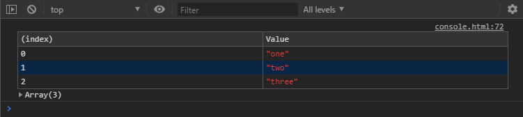
console.table(basicArray);
Chrome basic array table() example
Here’s the same example in Firefox for comparison.
Firefox basic array table() example
A slight visual difference, but pretty much the same. That said, Chrome does still give you the expandable output under the table, much like you’d see in console.log(). Chrome will also provide basic column sorting if you click on the heading.
So, that was a pretty simple example with basic outputs. How about something a little more complex and is often used in coding projects? Let’s look at an array of objects.
As you can see, this gets us a nice layout of objects with repeating keys as column labels. Imagine data along the lines of user information, dates, or whatever might be data often used in loops. Keep in mind that all the keys in each of the objects will be represented as a column, whether there is corresponding keys with data in the other objects. If an object doesn’t have data for a key’s column, it appears as empty.
An array of arrays is similar to the array of objects. Instead of keys being labels for the columns, it uses the index of the inner arrays as column labels. So if an array has more items than the other arrays, then there will be blank items in the table for those columns. Just like with the array of objects.
So far, simple arrays and objects have simple output displayed. Even a slightly more complex array of objects still has a solid, useful structure. Things can get a bit different with mixing the data types though.
For example, an array of arrays where one of the inner array items is an object.
Chrome array of arrays with object table() example
Now, to see what is contained in those objects in the third column, we’ll have to expand that array output below the table. Not that bad, really. Here’s how Firefox handles the same output.
Firefox array of array with object table() example
Firefox just lets us expand the object within the table.
How about mixing the data types the other way, where we have an object with arrays as values for each key? It works much the same as the array of arrays. The difference is that each row is labeled with a key instead of the index. Of course, for each level of data type you add to the mix will result in a more complex looking table.
This is all about: time(), timeLog(), and timeEnd()
Here we have a simple way to log how long something takes to complete. We call console.time() with a label, call console.timeLog() with the same label for an update, and call console.timeEnd() again with the same label to stop the timer.
console.time('this is a timer');
console.timeLog('this is a timer');
console.timeEnd('this is a timer');
The output for Chrome and Firefox is much the same. Here’s an example output with code that logs the time every second for five seconds and then stops.
Chrome time() exampleFirefox time() example
Notice that the reported times are not quite the same, but probably close enough for most requirements. Also, Firefox is nice enough to note that the timer has ended while Chrome requires an assumption once the label stops appearing. The first four lines of output come from the call console.timeLog('this is a timer'); and the last line is from the call to console.timeEnd('this is a timer');.
Dropping breadcrumbs with: trace()
The console.trace() command is actually similar to console.error() and console.warn(). Calling this command will output a stack trace to the console showing the path through the code to that call. We can even pass it a string as a form of label, but other data types such as arrays or objects can be passed. The behavior of passing data like that is the same as what we would get from a console.log() call. It’s a simple way to pass along some information to the console without triggering a more dire looking console.error() or console.warn() call.
debugger
This is a simple command to trigger a pause in the console’s debugger, if it exists. It is similar to placing a breakpoint in the debugger, or the browser’s equivalent, to cause the same type of pause while executing code. Here’s a simple example:
function whatsInHere() {
  debugger;
  // rest of the code
}
In this particular example, the open console’s debugger will pause code execution and the browser will open up the source file to show the line of code as soon as the function is called. It could be useful for easy breakpoints with some complicated projects.
Technically, the debugger command isn’t a part of the console object in the browser. It’s a useful feature that the console will respond to from JavaScript code.
Some additional console utilities
That’s a good look at most of the standard commands available to us in the console object. Each of these will work more-or-less the same across modern browsers. There may be some differences between browsers, as we saw in some of the examples. But there are a few more things I’d like to take a moment to point out, as they might prove useful in various ways.
The following examples can be considered more like console “utilities.” They are not a part of the console object like most of the previous examples. Therefore they are not called with a leading console object reference. These utilities are supported directly by the browsers themselves. They cannot be called from JavaScript code but must be typed directly in the console to be used. In some cases the utility might be unique to a particular browser, in others the utility is supported much the same way in several browsers. Your mileage may vary based on your browser of choice.
$0, $1, $2, $3, $4
These five commands are extremely handy. The first one, $0, represents the currently selected element in the DOM inspector. This essentially provides a shortcut instead of having to use more traditional DOM methods, such as getElementById or a querySelector. You can use it in various ways, within various console commands, or by itself to get information about the currently selected element. For example:
console.log($0);
The other commands in this set represent elements that were previously selected. Think of them as a form of selection history. $1 is the previous element, $2 is the previous before that, and so on. Although the first command is available in Firefox, the commands for previously selected elements are not.
$(‘element’), $$(‘elements’)
If you find yourself typing out document.querySelector('element') in the console repeatedly, there’s a shortcut. You can just type $('element') and it performs the same function. The shortcut might remind many of jQuery, but to select multiple elements reminds me of MooTools. To select multiple elements, you’d use $$('elements') instead of document.querySelectorAll('elements').
$x(‘//element’)
This is a shortcut for XPath that will return an array of elements that match the expression. An easy example is $x('//div'), which will present an array of every div element on the page. This isn’t that much different than using $$('div') like we did with $('element'), but there are many options for writing XPath expressions.
One example of a simple step up in a XPath expression is $x('//div[span]'), which would return the div elements on the page that happen to contain a span element. This is the equivalent of :has in CSS Selectors Level 4 draft, which isn’t supported in browsers yet.
These are just basic examples that only scratch the surface of XPath.
clear()
This is another version of console.clear(), but without the “Console was cleared” message.
getEventListeners(object)
This command, when given a DOM element, will report the event listeners registered to that element. For example, using the $0 example from above we can use getEventListeners($0) to get something like this:
Chrome getEventListeners() example
Expanding each item in the array provides various information about that event listener. This function isn’t supported in Firefox, but it does offer something similar that can be found in the DOM inspector.
Firefox DOM Inspector events information.
Clicking on the “event” badge next to the element provides a list of events registered to the element. Then each event can be expanded to show the code involved with the event.
That’s it for now!
I’ll end it here, with a large amount of information detailing various commands that can be used in the browser’s console output or with JavaScript. This isn’t everything that is possible — there’s simply too much to cover. In some cases, each browser has its own capabilities or utilities that can be leveraged. We looked at the bulk of what we might find in Chrome and Firefox, but there’s likely more out there. Plus, there will always be new features introduced in the future. I invite you to dig deeper to discover more ways to leverage browser DevTools for your coding projects.
This is mostly for native iOS apps kinda stuff, but it makes me wonder how much of this is expected when doing a mobile Progressive Web App. On one hand, this kind of stuff looks fun to try to build on the web, and it would be kinda cool to make your web app feel super native. On the other hand, doesn’t that make it extra awkward for Android and other non-iOS platforms?
A few other thoughts:
How much of this stuff do you get „for free” with SwiftUI?
As I understand it, when you build apps with Flutter / Material, the native apps that get built do some smart cross-platform stuff, mimicking how that platform does things.
Erik also does very in-depth design training with enrollment only opening once in a while, the next opens March 4th.
Web development is always changing. One trend in particular has become very popular lately, and it fundamentally goes against the conventional wisdom about how a web page should be made. It is exciting for some but frustrating for others, and the reasons for both are difficult to explain.
A web page is traditionally made up of three separate parts with separate responsibilities: HTML code defines the structure and meaning of the content on a page, CSS code defines its appearance, and JavaScript code defines its behavior. On teams with dedicated designers, HTML/CSS developers and JavaScript developers, this separation of concerns aligns nicely with job roles: Designers determine the visuals and user interactions on a page, HTML and CSS developers reproduce those visuals in a web browser, and JavaScript developers add the user interaction to tie it all together and “make it work.” People can work on one piece without getting involved with all three.
In recent years, JavaScript developers have realized that by defining a page’s structure in JavaScript instead of in HTML (using frameworks such as React), they can simplify the development and maintenance of user interaction code that is otherwise much more complex to build. Of course, when you tell someone that the HTML they wrote needs to be chopped up and mixed in with JavaScript they don’t know anything about, they can (understandably) become frustrated and start asking what the heck we’re getting out of this.
As a JavaScript developer on a cross-functional team, I get this question occasionally and I often have trouble answering it. All of the materials I’ve found on this topic are written for an audience that is already familiar with JavaScript — which is not terribly useful to those who focus on HTML and CSS. But this HTML-in-JS pattern (or something else that provides the same benefits) will likely be around for a while, so I think it’s an important thing that everyone involved in web development should understand.
This article will include code examples for those interested, but my goal is to explain this concept in a way that can be understood without them.
Background: HTML, CSS, and JavaScript
To broaden the audience of this article as much as possible, I want to give a quick background on the types of code involved in creating a web page and their traditional roles. If you have experience with these, you can skip ahead.
HTML is for structure and semantic meaning
HTML (HyperText Markup Language) code defines the structure and meaning of the content on a page. For example, this article’s HTML contains the text you’re reading right now, the fact that it is in a paragraph, and the fact that it comes after a heading and before a CodePen.
Let’s say we want to build a simple shopping list app. We might start with some HTML like this:
CodePen Embed Fallback
We can save this code in a file, open it in a web browser, and the browser will display the rendered result. As you can see, the HTML code in this example represents a section of a page that contains a heading reading “Shopping List (2 items),” a text input box, a button reading “Add Item,” and a list with two items reading “Eggs” and “Butter.” In a traditional website, a user would navigate to an address in their web browser, then the browser would request this HTML from a server, load it and display it. If there are already items in the list, the server could deliver HTML with the items already in place, like they are in this example.
Try to type something in the input box and click the “Add Item” button. You’ll notice nothing happens. The button isn’t connected to any code that can change the HTML, and the HTML can’t change itself. We’ll get to that in a moment.
CSS is for appearance
CSS (Cascading Style Sheets) code defines the appearance of a page. For example, this article’s CSS contains the font, spacing, and color of the text you’re reading.
You may have noticed that our shopping list example looks very plain. There is no way for HTML to specify things like spacing, font sizes, and colors. This is where CSS (Cascading Style Sheets) comes in. On the same page as the HTML above, we could add CSS code to style things up a bit:
CodePen Embed Fallback
As you can see, this CSS changed the font sizes and weights and gave the section a nice background color (designers, please don’t @ me; I know this is still ugly). A developer can write style rules like these and they will be applied consistently to any HTML structure: if we add more <section>, <button> or <ul> elements to this page, they will have the same font changes applied.
The button still doesn’t do anything, though: that’s where JavaScript comes in.
JavaScript is for behavior
JavaScript code defines the behavior of interactive or dynamic elements on a page. For example, the embedded CodePen examples in this article are powered by JavaScript.
Without JavaScript, to make the Add Item button in our example work would require us to use special HTML to make it submit data back to the server (<form action="...">, if you’re curious). Then the browser would discard the entire page and reload an updated version of the entire HTML file. If this shopping list was part of a larger page, anything else the user was doing would be lost. Scrolled down? You’re back at the top. Watching a video? It starts over. This is how all web applications worked for a long time: any time a user interacted with a webpage, it was as if they closed their web browser and opened it again. That’s not a big deal for this simple example, but for a large complex page which could take a while to load, it’s not efficient for either the browser or the server.
Now when we type some text in the box and click the “Add Item” button, our new item is added to the list and the item count at the top is updated! In a real app, we would also add some code to send the new item to the server in the background so that it will still show up the next time we load the page.
Separating JavaScript from the HTML and CSS makes sense in this simple example. Traditionally, even more complicated interactions would be added this way: HTML is loaded and displayed, and JavaScript runs afterwards to add things to it and change it. As things get more complex, however, we start needing to keep better track of things in our JavaScript.
If we were to keep building this shopping list app, next we’d probably add buttons for editing or removing items from the list. Let’s say we write the JavaScript for a button that removes an item, but we forget to add the code that updates the item total at the top of the page. Suddenly we have a bug: after a user removes an item, the total on the page won’t match the list! Once we notice the bug, we fix it by adding that same totalText.innerHTML line from our “Add Item” code to the “Remove Item” code. Now we have the same code duplicated in more than one place. Later on, let’s say we want to change that code so that instead of “(2 items)” at the top of the page it reads “Items: 2.” We’ll have to make sure we update it in all three places: in the HTML, in the JavaScript for the “Add Item” button, and in the JavaScript for the “Remove Item” button. If we don’t, we’ll have another bug where that text abruptly changes after a user interaction.
In this simple example, we can already see how quickly these things can get messy. There are ways to organize our JavaScript to make this kind of problem easier to deal with, but as things continue to get more complex, we’ll need to keep restructuring and rewriting things to keep up. As long as HTML and JavaScript are kept separate, a lot of effort can be required to make sure everything is kept in sync between them. That’s one of the reasons why new JavaScript frameworks, like React, have gained traction: they are designed to show the relationships between things like HTML and JavaScript. To understand how that works, we first need to understand just a teeny bit of computer science.
Two kinds of programming
The key concept to understand here involves the distinction between two common programming styles. (There are other programming styles, of course, but we’re only dealing with two of them here.) Most programming languages lend themselves to one or the other of these, and some can be used in both ways. It’s important to grasp both in order to understand the main benefit of HTML-in-JS from a JavaScript developer’s perspective.
Imperative programming: The word „imperative” here implies commanding a computer to do something. A line of imperative code is a lot like an imperative sentence in English: it gives the computer a specific instruction to follow. In imperative programming, we must tell the computer exactly how to do every little thing we need it to do. In web development, this is starting to be considered „the old way” of doing things and it’s what you do with vanilla JavaScript, or libraries like jQuery. The JavaScript in my shopping list example above is imperative code.
Imperative: “Do X, then do Y, then do Z”.
Example: When the user selects this element, add the .selected class to it; and when the user de-selects it, remove the .selected class from it.
Declarative programming: This is a more abstract layer above imperative programming. Instead of giving the computer instructions, we instead „declare” what we want the results to be after the computer does something. Our tools (e.g. React) figure out the how for us automatically. These tools are built with imperative code on the inside that we don’t have to pay attention to from the outside.
Declarative: “The result should be XYZ. Do whatever you need to do to make that happen.”
Example: This element has the .selected class if the user has selected it.
HTML is a declarative language
Forget about JavaScript for a moment. Here’s an important fact: HTML on its own is a declarative language. In an HTML file, you can declare something like:
<section>
  <h1>Hello</h1>
  <p>My name is Mike.</p>
</section>
When a web browser reads this HTML, it will figure out these imperative steps for you and execute them:
Create a section element
Create a heading element of level 1
Set the inner text of the heading element to “Hello”
Place the heading element into the section element
Create a paragraph element
Set the inner text of the paragraph element to “My name is Mike”
Place the paragraph element into the section element
Place the section element into the document
Display the document on the screen
As a web developer, the details of how a browser does these things is irrelevant; all that matters is that it does them. This is a perfect example of the difference between these two kinds of programming. In short, HTML is a declarative abstraction wrapped around a web browser’s imperative display engine. It takes care of the „how” so you only have to worry about the „what.” You can enjoy life writing declarative HTML because the fine people at Mozilla or Google or Apple wrote the imperative code for you when they built your web browser.
JavaScript is an imperative language
We’ve already looked at a simple example of imperative JavaScript in the shopping list example above, and I mentioned how the complexity of an app’s features has ripple effects on the effort required to implement them and the potential for bugs in that implementation. Now let’s look at a slightly more complex feature and see how it can be simplified by using a declarative approach.
Imagine a webpage that contains the following:
A list of labelled checkboxes, each row of which changes to a different color when it is selected
Text at the bottom like „1 of 4 selected” that should update when the checkboxes change
A „Select All” button which should be disabled if all checkboxes are already selected
A „Select None” button which should be disabled if no checkboxes are selected
Here’s an implementation of this in plain HTML, CSS and imperative JavaScript:
CodePen Embed Fallback
There isn’t much CSS code here because I’m using the wonderful PatternFly design system, which provides most of the CSS for my example. I imported their CSS file in the CodePen settings.
All the small things
In order to implement this feature with imperative JavaScript, we need to give the browser several granular instructions. This is the English-language equivalent to the code in my example above:
In our HTML, we declare the initial structure of the page:
There are four row elements, each containing a checkbox. The third box is checked.
There is some summary text which reads „1 of 4 selected.”
There is a „Select All” button which is enabled.
There is a „Select None” button which is disabled.
In our JavaScript, we write instructions for what to change when each of these events occurs:
When a checkbox changes from unchecked to checked:
Find the row element containing the checkbox and add the .selected CSS class to it.
Find all the checkbox elements in the list and count how many are checked and how many are not checked.
Find the summary text element and update it with the checked number and the total number.
Find the „Select None” button element and enable it if it was disabled.
If all checkboxes are now checked, find the „Select All” button element and disable it.
When a checkbox changes from checked to unchecked:
Find the row element containing the checkbox and remove the .selected class from it.
Find all the checkbox elements in the list and count how many are checked and not checked.
Find the summary text element and update it with the checked number and the total number.
Find the „Select All” button element and enable it if it was disabled.
If all checkboxes are now unchecked, find the „Select None” button element and disable it.
When the „Select All” button is clicked:
Find all the checkbox elements in the list and check them all.
Find all the row elements in the list and add the .selected class to them.
Find the summary text element and update it.
Find the „Select All” button and disable it.
Find the „Select None” button and enable it.
When the „Select None” button is clicked:
Find all the checkbox elements in the list and uncheck them all.
Find all the row elements in the list and remove the .selected class from them.
Find the summary text element and update it.
Find the „Select All” button and enable it.
Find the „Select None” button and disable it.
Wow. That’s a lot, right? Well, we better remember to write code for each and every one of those things. If we forget or screw up any of those instructions, we will end up with a bug where the totals don’t match the checkboxes, or a button is enabled that doesn’t do anything when you click it, or a row ends up with the wrong color, or something else we didn’t think of and won’t find out about until a user complains.
The big problem here is that there is no single source of truth for the state of our app, which in this case is “which checkboxes are checked?” The checkboxes know whether or not they are checked, of course, but, the row styles also have to know, the summary text has to know, and each button has to know. Five copies of this information are stored separately all around the HTML, and when it changes in any of those places the JavaScript developer needs to catch that and write imperative code to keep the others in sync.
This is still only a simple example of one small component of a page. If that sounds like a headache, imagine how complex and fragile an application becomes when you need to write the whole thing this way. For many complex modern web applications, it’s not a scalable solution.
Moving towards a single source of truth
Tools, like React, allow us to use JavaScript in a declarative way. Just as HTML is a declarative abstraction wrapped around the web browser’s display instructions, React is a declarative abstraction wrapped around JavaScript.
Remember how HTML let us focus on the structure of a page and not the details of how the browser displays that structure? Well, when we use React, we can focus on the structure again by defining it based on data stored in a single place. When that source of truth changes, React will update the structure of the page for us automatically. It will take care of the imperative steps behind the scenes, just like the web browser does for HTML. (Although React is used as an example here, this concept is not unique to React and is used by other frameworks, such as Vue.)
Let’s go back to our list of checkboxes from the example above. In this case, the truth we care about is simple: which checkboxes are checked? The other details on the page (e.g. what the summary says, the color of the rows, whether or not the buttons are enabled) are effects derived from that same truth. So, why should they need to have their own copy of this information? They should just use the single source of truth for reference, and everything on the page should „just know” which checkboxes are checked and conduct themselves accordingly. You might say that the row elements, summary text, and buttons should all be able to automatically react to a checkbox being checked or unchecked. (See what I did there?)
Tell me what you want (what you really, really want)
In order to implement this page with React, we can replace the list with a few simple declarations of facts:
There is a list of true/false values called checkboxValues that represents which boxes are checked.
This list represents the truth that we have four checkboxes, and that the third one is checked.
For each value in checkboxValues, there is a row element which:
has a CSS class called .selected if the value is true, and
contains a checkbox, which is checked if the value is true.
There is a summary text element that contains the text „{x} of {y} selected” where {x} is the number of true values in checkboxValues and {y} is the total number of values in checkboxValues.
There is a „Select All” button that is enabled if there are any false values in checkboxValues.
There is a „Select None” button that is enabled if there are any true values in checkboxValues.
When a checkbox is clicked, its corresponding value changes in checkboxValues.
When the „Select All” button is clicked, it sets all values in checkboxValues to true.
When the „Select None” button is clicked, it sets all values in checkboxValues to false.
You’ll notice that the last three items are still imperative instructions („When this happens, do that”), but that’s the only imperative code we need to write. It’s three lines of code, and they all update the single source of truth. The rest of those bullets are declarations („there is a…”) which are now built right into the definition of the page’s structure. In order to do this, we write our elements in a special JavaScript syntax provided by React called JSX, which resembles HTML but can contain JavaScript logic. That gives us the ability to mix logic like „if” and „for each” with the HTML structure, so the structure can be different depending on the contents of checkboxValues at any given time.
Here’s the same shopping list example as above, this time implemented with React:
CodePen Embed Fallback
JSX is definitely weird. When I first encountered it, it just felt wrong. My initial reaction was, “What the heck is this? HTML doesn’t belong in JavaScript!” I wasn’t alone. That said, it’s not HTML, but rather JavaScript dressed up to look like HTML. It is also quite powerful.
Remember that list of 20 imperative instructions above? Now we have three. For the price of defining our HTML inside our JavaScript, the rest of them come for free. React just does them for us whenever checkboxValues changes.
With this code, it is now impossible for the summary to not match the checkboxes, or for the color of a row to be wrong, or for a button to be enabled when it should be disabled. There is an entire category of bugs which are now impossible for us to have in our app: sources of truth being out of sync. Everything flows down from the single source of truth, and we developers can write less code and sleep better at night. Well, JavaScript developers can, at least…
It’s a trade-off
As web applications become more complex, maintaining the classic separation of concerns between HTML and JavaScript comes at an increasingly painful cost. HTML was originally designed for static documents, and in order to add more complex interactive functionality to those documents, imperative JavaScript has to keep track of more things and become more confusing and fragile.
The upside: predictability, reusability and composition
The ability to use a single source of truth is the most important benefit of this pattern, but the trade-off gives us other benefits, too. Defining elements of our page as JavaScript code means that we can turn chunks of it into reusable components, preventing us from copying and pasting the same HTML in multiple places. If we need to change a component, we can make that change in one place and it will update everywhere in our application (or in many applications, if we’re publishing reusable components to other teams).
We can take these simple components and compose them together like LEGO bricks, creating more complex and useful components, without making them too confusing to work with. And if we’re using components built by others, we can easily update them when they release improvements or fix bugs without having to rewrite our code.
The downside: it’s JavaScript all the way down
All of those benefits do come at a cost. There are good reasons people value keeping HTML and JavaScript separate, and to get these other benefits, we need to combine them into one. As I mentioned before, moving away from simple HTML files complicates the workflow of someone who didn’t need to worry about JavaScript before. It may mean that someone who previously could make changes to an application on their own must now learn additional complex skills to maintain that autonomy.
There can also be technical downsides. For example, some tools like linters and parsers expect regular HTML, and some third-party imperative JavaScript plugins can become harder to work with. Also, JavaScript isn’t the best-designed language; it’s just what we happen to have in our web browsers. Newer tools and features are making it better, but it still has some pitfalls you need to learn about before you can be productive with it.
Another potential problem is that when the semantic structure of a page is broken up into abstract components, it can become easy for developers to stop thinking about what actual HTML elements are being generated at the end. Specific HTML tags like <section> and <aside> have specific semantic meanings that are lost when using generic tags like <div> and <span>, even if they look the same visually on a page. This is especially important for accessibility. For example, these choices will impact how screen reader software behaves for visually impaired users. It might not be the most exciting part, but JavaScript developers should always remember that semantic HTML is the most important part of a web page.
Use it if it helps you, not because it’s “what’s hot right now”
It’s become a trend for developers to reach for frameworks on every single project. Some people are of the mindset that separating HTML and JavaScript is obsolete, but this isn’t true. For a simple static website that doesn’t need much user interaction, it’s not worth the trouble. The more enthusiastic React fans might disagree with me here, but if all your JavaScript is doing is creating a non-interactive webpage, you shouldn’t be using JavaScript. JavaScript doesn’t load as fast as regular HTML, so if you’re not getting a significant developer experience or code reliability improvement, it’s doing more harm than good.
You also don’t have to build your entire website in React! Or Vue! Or Whatever! A lot of people don’t know this because all the tutorials out there show how to use React for the whole thing. If you only have one little complex widget on an otherwise simple website, you can use React for that one component. You don’t always need to worry about webpack or Redux or Gatsby or any of the other crap people will tell you are “best practices” for your React app.
For a sufficiently complex application, declarative programming is absolutely worth the trouble. It is a game changer that has empowered developers the world over to build amazing, robust and reliable software with confidence and without having to sweat the small stuff. Is React in particular the best possible solution to these problems? No. Will it just be replaced by the next thing? Eventually. But declarative programming is not going anywhere, and the next thing will probably just do it better.
This article is full of a bunch of data from Aggelos Arvanitakis. But lemme just focus on his final bit of advice:
Investigate whether a zero-runtime CSS-in-JS library can work for your project. Sometimes we tend to prefer writing CSS in JS for the DX (developer experience) it offers, without a need to have access to an extended JS API. If you app doesn’t need support for theming and doesn’t make heavy and complex use of the css prop, then a zero-runtime CSS-in-JS library might be a good candidate.
„Zero-runtime” meaning you author your styles in a CSS-in-JS syntax, but what is produced is .css files like any other CSS preprocessor would produce. This shifts the tool into a totally different category. It’s a developer tool only, rather than a tool where the user of the website pays the price of using it.
The flagship zero-runtime CSS-in-JS library is Linaria. I think the syntax looks really nice.
One thing that caught my eye on the list of features for Lea Verou’s conic-gradient() polyfill was the last item:
Supports double position syntax (two positions for the same color stop, as a shortcut for two consecutive color stops with the same color)
Surprisingly, I recently discovered most people aren’t even aware that double position for gradient stops is something that actually exists in the spec, so I decided to write about it.
Specifying two locations makes it easier to create solid-color „stripes” in a gradient, without having to repeat the color twice.
I completely agree, this was the first thing I thought of when I became aware of this feature.
Let’s say we want to get the following result: a gradient with a bunch of equal width vertical stripes (which I picked up from an earlier post by Chris):
Desired gradient result.
The hex values are: #5461c8, #c724b1, #e4002b, #ff6900, #f6be00, #97d700, #00ab84 and #00a3e0.
Let’s first see how we’d CSS this without using double stop positions!
We have eight stripes, which makes each of them one-eighth of the gradient width. One eighth of 100% is 12.5%, so we go from one to the next at multiples of this value.
This means our linear-gradient() looks as follows:
Note that we don’t need to repeat stop position % values because, whenever a stop position is smaller than a previous one, we automatically have a sharp transition. That’s why it’s always safe to use 0 (which is always going to be smaller than any positive value) and have #c724b1 25%, #e4002b 0 instead of #c724b1 25%, #e4002b 25%, for example. This is something that can make our life easier in the future if, for example, we decide we want to add two more stripes and make the stop positions multiples of 10%.
Not too bad, especially compared to what gradient generators normally spit out. But if we decide one of those stripes in the middle doesn’t quite fit in with the others, then changing it to something else means updating in two places.
Again, not too bad and nothing we can’t get around with a little bit of help from a preprocessor:
However, even if a preprocessor can save us from typing the same thing twice, it doesn’t eliminate repetition from the generated code.
And we may not always want to use a preprocessor. Leaving aside the fact that some people are stubborn or have an irrational fear or hate towards preprocessors, it sometimes feels a bit silly to use a loop.
For example, when we barely have anything to loop over! Let’s say we want to get a much simpler background pattern, such as a diagonal hashes one, which I’d imagine is a much more common use case than an over-the-top rainbow one that’s probably not a good fit on most websites anyway.
Desired hashes result
This requires using repeating-linear-gradient() and this means a bit of repetition, even if we don’t have the same long list of hex values as we did before:
repeating-linear-gradient(-45deg,
    #ccc /* can't skip this, repeating gradient won't work */,
    #ccc 2px,
    transparent 0,
    transparent 9px /* can't skip this either, tells where gradient repetition starts */)
Here, we cannot ditch the first and last stops because those are precisely what indicate how the gradient repeats within the rectangle defined by the background-size.
If you want to understand why it’s better to use repeating-linear-gradient() instead of a plain old linear-gradient() combined with the proper background-size in order to create such hashes, check out this other article I wrote a while ago.
This is precisely where such feature comes to the rescue — it allows us to avoid repetition in the final CSS code.
What about support? Well, glad you asked! It actually happens to be pretty good! It works in Safari, Chromium browsers (which now includes Edge as well!) and Firefox. Pre-Chromium Edge and maybe some mobile browsers could still hold you back, but if you don’t have to worry about providing support for every browser under the sun or it’s fine to provide a fallback, go ahead and start using this!
One thing that caught my eye on the list of features for Lea Verou’s conic-gradient() polyfill was the last item:
Supports double position syntax (two positions for the same color stop, as a shortcut for two consecutive color stops with the same color)
Surprisingly, I recently discovered most people aren’t even aware that double position for gradient stops is something that actually exists in the spec, so I decided to write about it.
Specifying two locations makes it easier to create solid-color „stripes” in a gradient, without having to repeat the color twice.
I completely agree, this was the first thing I thought of when I became aware of this feature.
Let’s say we want to get the following result: a gradient with a bunch of equal width vertical stripes (which I picked up from an earlier post by Chris):
Desired gradient result.
The hex values are: #5461c8, #c724b1, #e4002b, #ff6900, #f6be00, #97d700, #00ab84 and #00a3e0.
Let’s first see how we’d CSS this without using double stop positions!
We have eight stripes, which makes each of them one-eighth of the gradient width. One eighth of 100% is 12.5%, so we go from one to the next at multiples of this value.
This means our linear-gradient() looks as follows:
Note that we don’t need to repeat stop position % values because, whenever a stop position is smaller than a previous one, we automatically have a sharp transition. That’s why it’s always safe to use 0 (which is always going to be smaller than any positive value) and have #c724b1 25%, #e4002b 0 instead of #c724b1 25%, #e4002b 25%, for example. This is something that can make our life easier in the future if, for example, we decide we want to add two more stripes and make the stop positions multiples of 10%.
Not too bad, especially compared to what gradient generators normally spit out. But if we decide one of those stripes in the middle doesn’t quite fit in with the others, then changing it to something else means updating in two places.
Again, not too bad and nothing we can’t get around with a little bit of help from a preprocessor:
However, even if a preprocessor can save us from typing the same thing twice, it doesn’t eliminate repetition from the generated code.
And we may not always want to use a preprocessor. Leaving aside the fact that some people are stubborn or have an irrational fear or hate towards preprocessors, it sometimes feels a bit silly to use a loop.
For example, when we barely have anything to loop over! Let’s say we want to get a much simpler background pattern, such as a diagonal hashes one, which I’d imagine is a much more common use case than an over-the-top rainbow one that’s probably not a good fit on most websites anyway.
Desired hashes result
This requires using repeating-linear-gradient() and this means a bit of repetition, even if we don’t have the same long list of hex values as we did before:
repeating-linear-gradient(-45deg,
    #ccc /* can't skip this, repeating gradient won't work */,
    #ccc 2px,
    transparent 0,
    transparent 9px /* can't skip this either, tells where gradient repetition starts */)
Here, we cannot ditch the first and last stops because those are precisely what indicate how the gradient repeats within the rectangle defined by the background-size.
If you want to understand why it’s better to use repeating-linear-gradient() instead of a plain old linear-gradient() combined with the proper background-size in order to create such hashes, check out this other article I wrote a while ago.
This is precisely where such feature comes to the rescue — it allows us to avoid repetition in the final CSS code.
What about support? Well, glad you asked! It actually happens to be pretty good! It works in Safari, Chromium browsers (which now includes Edge as well!) and Firefox. Pre-Chromium Edge and maybe some mobile browsers could still hold you back, but if you don’t have to worry about providing support for every browser under the sun or it’s fine to provide a fallback, go ahead and start using this!
There is a lot to know about links and buttons in HTML. There is markup implementation and related attributes, styling best practices, things to avoid, and the even-more-nuanced cousins of the link: buttons and button-like inputs.
Let’s take a look at the whole world of links and buttons, and all the considerations at the HTML, CSS, JavaScript, design, and accessibility layers that come with them. There are plenty of pitfalls and bad practices to avoid along the way. By covering it, we’ll have a complete good UX implementation of both elements.
Quick guidelines on when to use each:
Are you giving a user a way to go to another page or a different part of the same page? Use a link (<a href="/somewhere">link</a>)
Are you making a JavaScript-powered clickable action? Use a button (<button type="button">button</button>)
Are you submitting a form? Use a submit input (<input type="submit" value="Submit">)
Links
Links are one of the most basic, yet deeply fundamental and foundational building blocks of the web. Click a link, and you move to another page or are moved to another place within the same page.
That’s a link to a „fully qualified” or „absolute” URL.
A relative link
You can link „relatively” as well:
<!-- Useful in navigation, but be careful in content that may travel elsewhere (e.g. RSS) -->
<a href="/pages/about.html">About</a>
That can be useful, for example, in development where the domain name is likely to be different than the production site, but you still want to be able to click links. Relative URLs are most useful for things like navigation, but be careful of using them within content — like blog posts — where that content may be read off-site, like in an app or RSS feed.
A jump link
Links can also be „hash links” or „jump links” by starting with a #:
<a href="#section-2">Section Two</a>
<!-- will jump to... -->
<section id="section-2"></section>
Clicking that link will „jump” (scroll) to the first element in the DOM with an ID that matches, like the section element above.
💥 Little trick: Using a hash link (e.g. #0) in development can be useful so you can click the link without being sent back to the top of the page like a click on a # link does. But careful, links that don’t link anywhere should never make it to production.
💥 Little trick: Jump-links can sometimes benefit from smooth scrolling to help people understand that the page is moving from one place to another.
It’s a fairly common UI/UX thing to see a „Back to top” link on sites, particularly where important navigational controls are at the top but there is quite a bit of content to scroll (or otherwise navigate) through. To create a jump link, link to the ID of an element that is at the top of the page where it makes sense to send focus back to.
<a href="#top-of-page">Back to Top</a>
Jump links are sometimes also used to link to other anchor (<a>) elements that have no href attribute. Those are called „placeholder” links:
A link without an href attribute is the only practical way to disable a link. Why disable a link? Perhaps it’s a link that only becomes active after logging in or signing up.
a:not[href] {
  /* style a "disabled" link */
}
When a link has no href, it has no role, no focusability, and no keyboard events. This is intentional. You could think of it like a <span>.
Do you need the link to open in a new window or tab?
Because you’re trying to beef up your time on site metric.
Because you’re distinguishing between internal and external links or content types.
Because it’s your way out of dealing with infinite scroll trickiness.
Do use it:
Because a user is doing something on the current page, like actively playing media or has unsaved work.
You have some obscure technical reason where you are forced to (even then you’re still probably the rule, not the exception).
Need the link to trigger a download?
The download attribute on a link will instruct the browser to download the linked file rather than opening it within the current page/tab. It’s a nice UX touch.
This attribute is for the relationship of the link to the target.
The rel attribute is also commonly used on the <link> element (which is not used for creating hyperlinks, but for things like including CSS and preloading). We’re not including rel values for the <link> element here, just anchor links.
rel="sponsored": Mark links that are advertisements or paid placements (commonly called paid links) as sponsored.
rel="ugc": For not-particularly-trusted user-generated content, like comments and forum posts.
rel="nofollow": Tell the search engine to ignore this and not associate this site with where this links to.
And also some rel attributes that are most security-focused:
rel="noopener": Prevent a new tab from using the JavaScript window.opener feature, which could potentially access the page containing the link (your site) to perform malicious things, like stealing information or sharing infected code. Using this with target="_blank" is often a good idea.
rel="noreferrer": Prevent other sites or tracking services (e.g. Google Analytics) from identifying your page as the source of clicked link.
You can use multiple space-separated values if you need to (e.g. rel="noopener noreferrer")
rel="directory": Indicates that the destination of the hyperlink is a directory listing containing an entry for the current page.
rel="tag": Indicates that the destination of that hyperlink is an author-designated „tag” (or keyword/subject) for the current page.
rel="payment": Indicates that the destination of that hyperlink provides a way to show or give support for the current page.
rel="help": States that the resource linked to is a help file or FAQ for the current document.
ARIA roles
The default role of a link is link, so you do not need to do:
<a role="link" href="/">Link</a>
You’d only need that if you were faking a link, which would be a weird/rare thing to ever need to do, and you’d have to use some JavaScript in addition to this to make it actually follow the link.
<span class="link" tabindex="0" role="link" data-href="/">
  Fake accessible link created using a span
</span>
Just looking above you can see how much extra work faking a link is, and that is before you consider that is breaks right-clicking, doesn’t allow opening in a new tab, doesn’t work with Windows High Contrast Mode and other reader modes and assistive technology. Pretty bad!
Probably not. Save this for giving an iframe a short, descriptive title.
<a title="I don't need to be here" href="/">
  List of Concerts
</a>
title provides a hover-triggered UI popup showing the text you wrote. You can’t style it, and it’s not really that accessible.
Hover-triggered is the key phrase here. It’s unusable on any touch-only device. If a link needs more contextual information, provide that in actual content around the link, or use descriptive text the link itself (as opposed to something like „Click Here”).
That isn’t enough contextual information about the link, particularly for accessibility reasons, but potentially for anybody. Links with text are almost always more clear. If you absolutely can’t use text, you can use a pattern like:
<a href="/">
  <!-- Hide the icon from assistive technology -->
  <svg aria-hidden="true" focusable="false"> ... </svg>
  <!-- Acts as a label that is hidden from view -->
  <span class="visually-hidden">Useful link text</span>
</a>
visually-hidden is a class used to visually hide the label text with CSS:
Unlike aria-label, visually hidden text can be translated and will hold up better in specialized browsing modes.
Links around images
Images can be links if you wrap them in a link. There is no need to use the alt text to say the image is a link, as assistive technology will do that already.
But it’s slightly weird, so consider the UX of it if you ever do it. For example, it can be harder to select the text, and the entire element needs styling to create clear focus and hover states.
Take this example, where the entire element is wrapped in a link, but there are no hover and focus states applied to it.
CodePen Embed Fallback
If you need a link within that card element, well, you can’t nest links. You could get a little tricky if you needed ot, like using a pseudo-element on the link which is absolutely positioned to cover the whole area.
Additionally, this approach can make really long and potentially confusing announcements for screen readers. Even though links around chunks of content is technically possible, it’s best to avoid doing this if you can.
Styling and CSS considerations
Here’s the default look of a link:
The default User-Agent styling of a link.
It’s likely you’ll be changing the style of your links, and also likely you’ll use CSS to do it. I could make all my links red in CSS by doing:
a {
  color: red;
}
Sometimes selecting and styling all links on a page is a bit heavy-handed, as links in navigation might be treated entirely differently than links within text. You can always scope selectors to target links within particular areas like:
/* Navigation links */
nav a { }

/* Links in an article */
article a { }

/* Links contained in an element with a "text" class */
.text a { }
Or select the link directly to style.
.link {
  /* For styling <a class="link" href="/"> */
}

a[aria-current="page"] {
  /* You'll need to apply this attribute yourself, but it's a great pattern to use for active navigation. */
}
Link states
Links are focusable elements. In other words, they can be selected using the Tab key on a keyboard. Links are perhaps the most common element where you’ll very consciously design the different states, including a :focus state.
:hover: For styling when a mouse pointer is over the link.
:visited: For styling when the link has been followed, as best as the browser can remember. It has limited styling ability due to security.
:link: For styling when a link has not been visited.
:active: For styling when the link is pressed (e.g. the mouse button is down or the element is being tapped on a touch screen).
:focus: Very important! Links should always have a focus style. If you choose to remove the default blue outline that most browsers apply, also use this selector to re-apply a visually obvious focus style.
These are chainable like any pseudo-class, so you could do something like this if it is useful for your design/UX.
/* Style focus and hover states in a single ruleset */
a:focus:hover { }
You can style a link to look button-like
Perhaps some of the confusion between links and buttons is stuff like this:
That certainly looks like a button! Everyone would call that a button. Even a design system would likely call that a button and perhaps have a class like .button { }. But! A thing you can click that says „Learn More” is very much a link, not a button. That’s completely fine, it’s just yet another reminder to use the semantically and functionally correct element.
Color contrast
Since we often style links with a distinct color, it’s important to use a color with sufficient color contrast for accessibility. There is a wide variety of visual impairments (see the tool WhoCanUse for simulating color combinations with different impairments) and high contrast helps nearly all of them.
Perhaps you set a blue color for links:
The blue link is #2196F3.
While that might look OK to you, it’s better to use tools for testing to ensure the color has a strong enough ratio according to researched guidelines. Here, I’ll look at Chrome DevTools and it will tell me this color is not compliant in that it doesn’t have enough contrast with the background color behind it.
Chrome DevTools is telling us this link color does not have enough contrast.
Color contrast is a big consideration with links, not just because they are often colored in a unique color that needs to be checked, but because they have all those different states (hover, focus, active, visited) which also might have different colors. Compound that with the fact that text can be selected and you’ve got a lot of places to consider contrast. Here’s an article about all that.
Styling „types” of links
We can get clever in CSS with attribute selectors and figure out what kind of resource a link is pointing to, assuming the href value has useful stuff in it.
/* Style all links that include .pdf at the end */
a[href$=".pdf"]::after {
  content: " (PDF)";
}

/* Style links that point to Google */
a[href*="google.com"] {
  color: purple;
}
Styling links for print
CSS has an „at-rule” for declaring styles that only take effect on printed media (e.g. printing out a web page). You can include them in any CSS like this:
@media print {
  /* For links in content, visually display the link */
  article a::after {
    content: " (" attr(href) ")";
  }
}
Resetting styles
If you needed to take all the styling off a link (or really any other element for that matter), CSS provides a way to remove all the styles using the all property.
.special-area a {
  all: unset;
  all: revert;

  /* Start from scratch */
  color: purple;
}
You can also remove individual styles with keywords. (Again, this isn’t really unique to links, but is generically useful):
a {
  /* Grab color from nearest parent that sets it */
  color: inherit;

  /* Wipe out style (turn black) */
  color: initial;

  /* Change back to User Agent style (blue) */
  color: revert;
}
JavaScript considerations
Say you wanted to stop the clicking of a link from doing what it normally does: go to that link or jump around the page. In JavaScript, you can usepreventDefault to prevent jumping around.
const jumpLinks = document.querySelectorAll("a[href^='#']");

jumpLinks.forEach(link => {
 link.addEventListener('click', event => {
    event.preventDefault();
    // Do something else instead, like handle the navigation behavior yourself
  });
});
This kind of thing is at the core of how „Single Page Apps” (SPAs) work. They intercept the clicks so browsers don’t take over and handle the navigation.
SPAs see where you are trying to go (within your own site), load the data they need, replace what they need to on the page, and update the URL. It’s an awful lot of work to replicate what the browser does for free, but you get the ability to do things like animate between pages.
Another JavaScript concern with links is that, when a link to another page is clicked, the page is left and another page loads. That can be problematic for something like a page that contains a form the user is filling out but hasn’t completed. If they click the link and leave the page, they lose their work! Your only opportunity to prevent the user from leaving is by using the beforeunload event.
window.addEventListener("beforeunload", function(event) {
  // Remind user to save their work or whatever.
});
A link that has had its default behavior removed won’t announce the new destination. This means a person using assistive technology may not know where they wound up. You’ll have to do things like update the page’s title and move focus back up to the top of the document.
JavaScript frameworks
In a JavaScript framework, like React, you might sometimes see links created from something like a <Link /> component rather than a native <a> element. The custom component probably creates a native <a> element, but with extra functionality, like enabling the JavaScript router to work, and adding attributes like aria-current="page" as needed, which is a good thing!
Ultimately, a link is a link. A JavaScript framework might offer or encourage some level of abstraction, but you’re always free to use regular links.
Accessibility considerations
We covered some accessibility in the sections above (it’s all related!), but here are some more things to think about.
You don’t need text like “Link” or “Go to” in the link text itself. Make the text meaningful (“documentation” instead of “click here”).
Links already have an ARIA role by default (role="link") so there’s no need to explicitly set it.
Try not to use the URL itself as the text (<a href="google.com">google.com</a>)
Links are generally blue and generally underlined and that’s generally good.
All images in content should have alt text anyway, but doubly so when the image is wrapped in a link with otherwise no text.
Unique accessible names
Some assistive technology can create lists of interactive elements on the page. Imagine a group of four article cards that all have a „Read More”, the list of interactive elements will be like:
Read More
Read More
Read More
Read More
Not very useful. You could make use of that .visually-hidden class we covered to make the links more like:
<a href="/article">
  Read More
  <span class="visually-hidden">
    of the article "Dancing with Rabbits".
  <span>
</a>
Now each link is unique and clear. If the design can support it, do it without the visually hidden class to remove the ambiguity for everyone.
Buttons
Buttons are for triggering actions. When do you use the <button> element? A good rule is to use a button when there is “no meaningful href.” Here’s another way to think of that: if clicking it doesn’t do anything without JavaScript, it should be a <button>.
A <button> that is within a <form>, by default, will submit that form. But aside from that, button elements don’t have any default behavior, and you’ll be wiring up that interactivity with JavaScript.
Buttons inside of a <form> do something by default: they submit the form! They can also reset it, like their input counterparts. The type attributes matter:
<form action="/" method="POST">
  <input type="text" name="name" id="name">
  <button>Submit</button>

  <!-- If you want to be more explicit... -->
  <button type="submit">Submit</button>

  <!-- ...or clear the form inputs back to their initial values -->
  <button type="reset">Reset</button>

  <!-- This prevents a `submit` action from firing which may be useful sometimes inside a form -->
  <button type="button">Non-submitting button</button>
</form>
Speaking of forms, buttons have some neat tricks up their sleeve where they can override attributes of the <form> itself.
<form action="/" method="get">

  <!-- override the action -->
  <button formaction="/elsewhere/" type="submit">Submit to elsewhere</button>

  <!-- override encytype -->
  <button formenctype="multipart/form-data" type="submit"></button>

  <!-- override method -->
  <button formmethod="post" type="submit"></button>

  <!-- do not validate fields -->
  <button formnovalidate type="submit"></button>

  <!-- override target e.g. open in new tab -->
  <button formtarget="_blank" type="submit"></button>

</form>
Autofocus
Since buttons are focusable elements, we can automatically focus on them when the page loads using the autofocus attribute:
Perhaps you’d do that inside of a modal dialog where one of the actions is a default action and it helps the UX (e.g. you can press Enter to dismiss the modal). Autofocusing after a user action is perhaps the only good practice here, moving a user’s focus without their permission, as the autofocus attribute is capable of, can be a problem for screen reader and screen magnifier users.
Note thatautofocus may not work if the element is within an <iframe sandbox> for security reasons.
Disabling buttons
To prevent a button from being interactive, there is a disabled attribute you can use:
<button disabled>Pay Now</button>
<p class="error-message">Correct the form above to submit payment.</p>
Note that we’ve included descriptive text alongside the disabled button. It can be very frustrating to find a disabled button and not know why it’s disabled. A better way to do this could be to let someone submit the form, and then explain why it didn’t work in the validation feedback messaging.
Regardless, you could style a disabled button this way:
/* Might be good styles for ANY disabled element! */
button[disabled] {
  opacity: 0.5;
  pointer-events: none;
}
We’ll cover other states and styling later in this guide.
Buttons can contain child elements
A submit button and a submit input (<input type="submit">) are identical in functionality, but different in the sense that an input is unable to contain child elements while a button can.
Note the focusable="false" attribute on the SVG element above. In that case, since the icon is decorative, this will help assistive technology only announce the button’s label.
Styling and CSS considerations
Buttons are generally styled to look very button-like. They should look pressable. If you’re looking for inspiration on fancy button styles, you’d do well looking at the CodePen Topic on Buttons.
How buttons look by default varies by browser and platform.
Just on macOS: Chrome, Safari, and Firefox (they look the same)
Add border: 0; to those same buttons as above, and we have different styles entirely.
While there is some UX truth to leaving the defaults of form elements alone so that they match that browser/platform’s style and you get some affordance for free, designers typically don’t like default styles, particularly ones that differ across browsers.
Resetting the default button style
Removing all the styles from a button is easier than you think. You’d think, as a form control, appearance: none; would help, but don’t count on that. Actually all: revert; is a better bet to wipe the slate clean.
You can see how a variety of properties are involved
And that’s not all of them. Here’s a consolidated chunk of what Normalize does to buttons.
button {
  font-family: inherit; /* For all browsers */
  font-size: 100%; /* For all browsers */
  line-height: 1.15; /* For all browsers */
  margin: 0; /* Firefox and Safari have margin */
  overflow: visible; /* Edge hides overflow */
  text-transform: none; /* Firefox inherits text-transform */
  -webkit-appearance: button; /* Safari otherwise prevents some styles */
}

button::-moz-focus-inner {
  border-style: none;
  padding: 0;
}

button:-moz-focusring {
  outline: 1px dotted ButtonText;
}
A consistent .button class
In addition to using reset or baseline CSS, you may want to have a class for buttons that gives you a strong foundation for styling and works across both links and buttons.
There are always exceptions. For example, a website in which you need a button-triggered action within a sentence:
<p>You may open your <button>user settings</button> to change this.</p>
We’ve used a button instead of an anchor tag in the above code, as this hypothetical website opens user settings in a modal dialog rather than linking to another page. In this situation, you may want to style the button as if it looks like a link.
This is probably rare enough that you would probably make a class (e.g. .link-looking-button) that incorporates the reset styles from above and otherwise matches what you do for anchor links.
Breakout buttons
Remember earlier when we talked about the possibility of wrapping entire elements in links? If you have a button within another element, but you want that entire outer element to be clickable/tappable as if it’s the button, that’s a „breakout” button. You can use an absolutely-positioned pseudo-element on the button to expand the clickable area to the whole region. Fancy!
CodePen Embed Fallback
JavaScript considerations
Even without JavaScript, button elements can be triggered by the Space and Enter keys on a keyboard. That’s part of what makes them such appealing and useful elements: they are discoverable, focusable, and interactive with assistive technology in a predictable way.
Perhaps any <button> in that situation should be inserted into the DOM by JavaScript. A tall order! Food for thought. 🤔
„Once” handlers
Say a button does something pretty darn important, like submitting a payment. It would be pretty scary if it was programmed such that clicking the button multiple times submitted multiple payment requests. It is situations like this where you would attach a click handler to a button that only runs once. To make that clear to the user, we’ll disable the button on click as well.
That practice went from being standard practice to being a faux pas (not abstracting JavaScript functionality away from HTML) to, eh, you need it when you need it. One advantage is that if you’re injecting this HTML into the DOM, you don’t need to bind/re-bind JavaScript event handlers to it because it already has one.
JavaScript frameworks
It’s common in any JavaScript framework to make a component for handling buttons, as buttons typically have lots of variations. Those variations can be turned into an API of sorts. For example, in React:
In that example, the <Button /> component ensures the button will have a button class and handles a toggle-like active class.
Accessibility considerations
The biggest accessibility consideration with buttons is actually using buttons. Don’t try to replicate a button with a <div> or a <span>, which is, unfortunately, more common than you might think. It’s very likely that will cause problems. (Did you deal with focusability? Did you deal with keyboard events? Great. There’s still probably more stuff you’re forgetting.)
Focus styles
Like all focusable elements, browsers apply a default focus style, which is usually a blue outline.
Focus styles on Chrome/macOS
While it’s arguable that you should leave that alone as it’s a very clear and obvious style for people that benefit from focus styles, it’s also not out of the question to change it.
What you should not do is button:focus { outline: 0; } to remove it. If you ever remove a focus style like that, put it back at the same time.
button:focus {
  outline: 0; /* Removes the default blue ring */

  /* Now, let's create our own focus style */
  border-radius: 3px;
  box-shadow: 0 0 0 2px red;
}
Custom focus style
The fact that a button may become focused when clicked and apply that style at the same time is offputting to some. There is a trick (that has limited, but increasing, browser support) on removing focus styles from clicks and not keyboard events:
:focus:not(:focus-visible) {
  outline: 0;
}
ARIA
Buttons already have the role they need (role="button"). But there are some other ARIA attributes that are related to buttons:
aria-pressed: Turns a button into a toggle, between aria-pressed="true" and aria-pressed="false". More on button toggles, which can also be done with role="switch" and aria-checked="true".
aria-expanded: If the button controls the open/closed state of another element (like a dropdown menu), you apply this attribute to indicate that like aria-expanded="true".
aria-label: Overrides the text within the button. This is useful for labeling buttons that otherwise don’t have text, but you’re still probably better off using a visually-hidden class so it can be translated.
aria-labelledby: Points to an element that will act as the label for the button.
For that last one:
<button aria-labelledby="buttonText">
  Time is running out!
  <span id="buttonText">Add to Cart</span>
</button>
If a button opens a dialog, your job is to move the focus inside and trap it there. When closing the dialog, you need to return focus back to that button so the user is back exactly where they started. This makes the experience of using a modal the same for someone who relies on assistive technology as for someone who doesn’t.
Focus management isn’t just for dialogs, either. If clicking a button runs a calculation and changes a value on the page, there is no context change there, meaning focus should remain on the button. If the button does something like „move to next page,” the focus should be moved to the start of that next page.
Size
Don’t make buttons too small. That goes for links and any sort of interactive control. People with any sort of reduced dexterity will benefit.
In addition to ample size, don’t place buttons too close each other, whether they’re stacked vertically or together on the same line. Give them some margin because people experiencing motor control issues run the risk of clicking the wrong one.
Activating buttons
Buttons work by being clicked/touched, pressing the Enter key, or pressing the Space key (when focused). Even if you add role="button" to a link or div, you won’t get the spacebar functionality, so at the risk of beating a dead horse, use <button> in those cases.
There is a lot to know about links and buttons in HTML. There is markup implementation and related attributes, styling best practices, things to avoid, and the even-more-nuanced cousins of the link: buttons and button-like inputs.
Let’s take a look at the whole world of links and buttons, and all the considerations at the HTML, CSS, JavaScript, design, and accessibility layers that come with them. There are plenty of pitfalls and bad practices to avoid along the way. By covering it, we’ll have a complete good UX implementation of both elements.
Quick guidelines on when to use each:
Are you giving a user a way to go to another page or a different part of the same page? Use a link (<a href="/somewhere">link</a>)
Are you making a JavaScript-powered clickable action? Use a button (<button type="button">button</button>)
Are you submitting a form? Use a submit input (<input type="submit" value="Submit">)
Links
Links are one of the most basic, yet deeply fundamental and foundational building blocks of the web. Click a link, and you move to another page or are moved to another place within the same page.
That’s a link to a „fully qualified” or „absolute” URL.
A relative link
You can link „relatively” as well:
<!-- Useful in navigation, but be careful in content that may travel elsewhere (e.g. RSS) -->
<a href="/pages/about.html">About</a>
That can be useful, for example, in development where the domain name is likely to be different than the production site, but you still want to be able to click links. Relative URLs are most useful for things like navigation, but be careful of using them within content — like blog posts — where that content may be read off-site, like in an app or RSS feed.
A jump link
Links can also be „hash links” or „jump links” by starting with a #:
<a href="#section-2">Section Two</a>
<!-- will jump to... -->
<section id="section-2"></section>
Clicking that link will „jump” (scroll) to the first element in the DOM with an ID that matches, like the section element above.
💥 Little trick: Using a hash link (e.g. #0) in development can be useful so you can click the link without being sent back to the top of the page like a click on a # link does. But careful, links that don’t link anywhere should never make it to production.
💥 Little trick: Jump-links can sometimes benefit from smooth scrolling to help people understand that the page is moving from one place to another.
It’s a fairly common UI/UX thing to see a „Back to top” link on sites, particularly where important navigational controls are at the top but there is quite a bit of content to scroll (or otherwise navigate) through. To create a jump link, link to the ID of an element that is at the top of the page where it makes sense to send focus back to.
<a href="#top-of-page">Back to Top</a>
Jump links are sometimes also used to link to other anchor (<a>) elements that have no href attribute. Those are called „placeholder” links:
A link without an href attribute is the only practical way to disable a link. Why disable a link? Perhaps it’s a link that only becomes active after logging in or signing up.
a:not[href] {
  /* style a "disabled" link */
}
When a link has no href, it has no role, no focusability, and no keyboard events. This is intentional. You could think of it like a <span>.
Do you need the link to open in a new window or tab?
Because you’re trying to beef up your time on site metric.
Because you’re distinguishing between internal and external links or content types.
Because it’s your way out of dealing with infinite scroll trickiness.
Do use it:
Because a user is doing something on the current page, like actively playing media or has unsaved work.
You have some obscure technical reason where you are forced to (even then you’re still probably the rule, not the exception).
Need the link to trigger a download?
The download attribute on a link will instruct the browser to download the linked file rather than opening it within the current page/tab. It’s a nice UX touch.
This attribute is for the relationship of the link to the target.
The rel attribute is also commonly used on the <link> element (which is not used for creating hyperlinks, but for things like including CSS and preloading). We’re not including rel values for the <link> element here, just anchor links.
rel="sponsored": Mark links that are advertisements or paid placements (commonly called paid links) as sponsored.
rel="ugc": For not-particularly-trusted user-generated content, like comments and forum posts.
rel="nofollow": Tell the search engine to ignore this and not associate this site with where this links to.
And also some rel attributes that are most security-focused:
rel="noopener": Prevent a new tab from using the JavaScript window.opener feature, which could potentially access the page containing the link (your site) to perform malicious things, like stealing information or sharing infected code. Using this with target="_blank" is often a good idea.
rel="noreferrer": Prevent other sites or tracking services (e.g. Google Analytics) from identifying your page as the source of clicked link.
You can use multiple space-separated values if you need to (e.g. rel="noopener noreferrer")
rel="directory": Indicates that the destination of the hyperlink is a directory listing containing an entry for the current page.
rel="tag": Indicates that the destination of that hyperlink is an author-designated „tag” (or keyword/subject) for the current page.
rel="payment": Indicates that the destination of that hyperlink provides a way to show or give support for the current page.
rel="help": States that the resource linked to is a help file or FAQ for the current document.
ARIA roles
The default role of a link is link, so you do not need to do:
<a role="link" href="/">Link</a>
You’d only need that if you were faking a link, which would be a weird/rare thing to ever need to do, and you’d have to use some JavaScript in addition to this to make it actually follow the link.
<span class="link" tabindex="0" role="link" data-href="/">
  Fake accessible link created using a span
</span>
Just looking above you can see how much extra work faking a link is, and that is before you consider that is breaks right-clicking, doesn’t allow opening in a new tab, doesn’t work with Windows High Contrast Mode and other reader modes and assistive technology. Pretty bad!
Probably not. Save this for giving an iframe a short, descriptive title.
<a title="I don't need to be here" href="/">
  List of Concerts
</a>
title provides a hover-triggered UI popup showing the text you wrote. You can’t style it, and it’s not really that accessible.
Hover-triggered is the key phrase here. It’s unusable on any touch-only device. If a link needs more contextual information, provide that in actual content around the link, or use descriptive text the link itself (as opposed to something like „Click Here”).
That isn’t enough contextual information about the link, particularly for accessibility reasons, but potentially for anybody. Links with text are almost always more clear. If you absolutely can’t use text, you can use a pattern like:
<a href="/">
  <!-- Hide the icon from assistive technology -->
  <svg aria-hidden="true" focusable="false"> ... </svg>
  <!-- Acts as a label that is hidden from view -->
  <span class="visually-hidden">Useful link text</span>
</a>
visually-hidden is a class used to visually hide the label text with CSS:
Unlike aria-label, visually hidden text can be translated and will hold up better in specialized browsing modes.
Links around images
Images can be links if you wrap them in a link. There is no need to use the alt text to say the image is a link, as assistive technology will do that already.
But it’s slightly weird, so consider the UX of it if you ever do it. For example, it can be harder to select the text, and the entire element needs styling to create clear focus and hover states.
Take this example, where the entire element is wrapped in a link, but there are no hover and focus states applied to it.
CodePen Embed Fallback
If you need a link within that card element, well, you can’t nest links. You could get a little tricky if you needed ot, like using a pseudo-element on the link which is absolutely positioned to cover the whole area.
Additionally, this approach can make really long and potentially confusing announcements for screen readers. Even though links around chunks of content is technically possible, it’s best to avoid doing this if you can.
Styling and CSS considerations
Here’s the default look of a link:
The default User-Agent styling of a link.
It’s likely you’ll be changing the style of your links, and also likely you’ll use CSS to do it. I could make all my links red in CSS by doing:
a {
  color: red;
}
Sometimes selecting and styling all links on a page is a bit heavy-handed, as links in navigation might be treated entirely differently than links within text. You can always scope selectors to target links within particular areas like:
/* Navigation links */
nav a { }

/* Links in an article */
article a { }

/* Links contained in an element with a "text" class */
.text a { }
Or select the link directly to style.
.link {
  /* For styling <a class="link" href="/"> */
}

a[aria-current="page"] {
  /* You'll need to apply this attribute yourself, but it's a great pattern to use for active navigation. */
}
Link states
Links are focusable elements. In other words, they can be selected using the Tab key on a keyboard. Links are perhaps the most common element where you’ll very consciously design the different states, including a :focus state.
:hover: For styling when a mouse pointer is over the link.
:visited: For styling when the link has been followed, as best as the browser can remember. It has limited styling ability due to security.
:link: For styling when a link has not been visited.
:active: For styling when the link is pressed (e.g. the mouse button is down or the element is being tapped on a touch screen).
:focus: Very important! Links should always have a focus style. If you choose to remove the default blue outline that most browsers apply, also use this selector to re-apply a visually obvious focus style.
These are chainable like any pseudo-class, so you could do something like this if it is useful for your design/UX.
/* Style focus and hover states in a single ruleset */
a:focus:hover { }
You can style a link to look button-like
Perhaps some of the confusion between links and buttons is stuff like this:
That certainly looks like a button! Everyone would call that a button. Even a design system would likely call that a button and perhaps have a class like .button { }. But! A thing you can click that says „Learn More” is very much a link, not a button. That’s completely fine, it’s just yet another reminder to use the semantically and functionally correct element.
Color contrast
Since we often style links with a distinct color, it’s important to use a color with sufficient color contrast for accessibility. There is a wide variety of visual impairments (see the tool WhoCanUse for simulating color combinations with different impairments) and high contrast helps nearly all of them.
Perhaps you set a blue color for links:
The blue link is #2196F3.
While that might look OK to you, it’s better to use tools for testing to ensure the color has a strong enough ratio according to researched guidelines. Here, I’ll look at Chrome DevTools and it will tell me this color is not compliant in that it doesn’t have enough contrast with the background color behind it.
Chrome DevTools is telling us this link color does not have enough contrast.
Color contrast is a big consideration with links, not just because they are often colored in a unique color that needs to be checked, but because they have all those different states (hover, focus, active, visited) which also might have different colors. Compound that with the fact that text can be selected and you’ve got a lot of places to consider contrast. Here’s an article about all that.
Styling „types” of links
We can get clever in CSS with attribute selectors and figure out what kind of resource a link is pointing to, assuming the href value has useful stuff in it.
/* Style all links that include .pdf at the end */
a[href$=".pdf"]::after {
  content: " (PDF)";
}

/* Style links that point to Google */
a[href*="google.com"] {
  color: purple;
}
Styling links for print
CSS has an „at-rule” for declaring styles that only take effect on printed media (e.g. printing out a web page). You can include them in any CSS like this:
@media print {
  /* For links in content, visually display the link */
  article a::after {
    content: " (" attr(href) ")";
  }
}
Resetting styles
If you needed to take all the styling off a link (or really any other element for that matter), CSS provides a way to remove all the styles using the all property.
.special-area a {
  all: unset;
  all: revert;

  /* Start from scratch */
  color: purple;
}
You can also remove individual styles with keywords. (Again, this isn’t really unique to links, but is generically useful):
a {
  /* Grab color from nearest parent that sets it */
  color: inherit;

  /* Wipe out style (turn black) */
  color: initial;

  /* Change back to User Agent style (blue) */
  color: revert;
}
JavaScript considerations
Say you wanted to stop the clicking of a link from doing what it normally does: go to that link or jump around the page. In JavaScript, you can usepreventDefault to prevent jumping around.
const jumpLinks = document.querySelectorAll("a[href^='#']");

jumpLinks.forEach(link => {
 link.addEventListener('click', event => {
    event.preventDefault();
    // Do something else instead, like handle the navigation behavior yourself
  });
});
This kind of thing is at the core of how „Single Page Apps” (SPAs) work. They intercept the clicks so browsers don’t take over and handle the navigation.
SPAs see where you are trying to go (within your own site), load the data they need, replace what they need to on the page, and update the URL. It’s an awful lot of work to replicate what the browser does for free, but you get the ability to do things like animate between pages.
Another JavaScript concern with links is that, when a link to another page is clicked, the page is left and another page loads. That can be problematic for something like a page that contains a form the user is filling out but hasn’t completed. If they click the link and leave the page, they lose their work! Your only opportunity to prevent the user from leaving is by using the beforeunload event.
window.addEventListener("beforeunload", function(event) {
  // Remind user to save their work or whatever.
});
A link that has had its default behavior removed won’t announce the new destination. This means a person using assistive technology may not know where they wound up. You’ll have to do things like update the page’s title and move focus back up to the top of the document.
JavaScript frameworks
In a JavaScript framework, like React, you might sometimes see links created from something like a <Link /> component rather than a native <a> element. The custom component probably creates a native <a> element, but with extra functionality, like enabling the JavaScript router to work, and adding attributes like aria-current="page" as needed, which is a good thing!
Ultimately, a link is a link. A JavaScript framework might offer or encourage some level of abstraction, but you’re always free to use regular links.
Accessibility considerations
We covered some accessibility in the sections above (it’s all related!), but here are some more things to think about.
You don’t need text like “Link” or “Go to” in the link text itself. Make the text meaningful (“documentation” instead of “click here”).
Links already have an ARIA role by default (role="link") so there’s no need to explicitly set it.
Try not to use the URL itself as the text (<a href="google.com">google.com</a>)
Links are generally blue and generally underlined and that’s generally good.
All images in content should have alt text anyway, but doubly so when the image is wrapped in a link with otherwise no text.
Unique accessible names
Some assistive technology can create lists of interactive elements on the page. Imagine a group of four article cards that all have a „Read More”, the list of interactive elements will be like:
Read More
Read More
Read More
Read More
Not very useful. You could make use of that .visually-hidden class we covered to make the links more like:
<a href="/article">
  Read More
  <span class="visually-hidden">
    of the article "Dancing with Rabbits".
  <span>
</a>
Now each link is unique and clear. If the design can support it, do it without the visually hidden class to remove the ambiguity for everyone.
Buttons
Buttons are for triggering actions. When do you use the <button> element? A good rule is to use a button when there is “no meaningful href.” Here’s another way to think of that: if clicking it doesn’t do anything without JavaScript, it should be a <button>.
A <button> that is within a <form>, by default, will submit that form. But aside from that, button elements don’t have any default behavior, and you’ll be wiring up that interactivity with JavaScript.
Buttons inside of a <form> do something by default: they submit the form! They can also reset it, like their input counterparts. The type attributes matter:
<form action="/" method="POST">
  <input type="text" name="name" id="name">
  <button>Submit</button>

  <!-- If you want to be more explicit... -->
  <button type="submit">Submit</button>

  <!-- ...or clear the form inputs back to their initial values -->
  <button type="reset">Reset</button>

  <!-- This prevents a `submit` action from firing which may be useful sometimes inside a form -->
  <button type="button">Non-submitting button</button>
</form>
Speaking of forms, buttons have some neat tricks up their sleeve where they can override attributes of the <form> itself.
<form action="/" method="get">

  <!-- override the action -->
  <button formaction="/elsewhere/" type="submit">Submit to elsewhere</button>

  <!-- override encytype -->
  <button formenctype="multipart/form-data" type="submit"></button>

  <!-- override method -->
  <button formmethod="post" type="submit"></button>

  <!-- do not validate fields -->
  <button formnovalidate type="submit"></button>

  <!-- override target e.g. open in new tab -->
  <button formtarget="_blank" type="submit"></button>

</form>
Autofocus
Since buttons are focusable elements, we can automatically focus on them when the page loads using the autofocus attribute:
Perhaps you’d do that inside of a modal dialog where one of the actions is a default action and it helps the UX (e.g. you can press Enter to dismiss the modal). Autofocusing after a user action is perhaps the only good practice here, moving a user’s focus without their permission, as the autofocus attribute is capable of, can be a problem for screen reader and screen magnifier users.
Note thatautofocus may not work if the element is within an <iframe sandbox> for security reasons.
Disabling buttons
To prevent a button from being interactive, there is a disabled attribute you can use:
<button disabled>Pay Now</button>
<p class="error-message">Correct the form above to submit payment.</p>
Note that we’ve included descriptive text alongside the disabled button. It can be very frustrating to find a disabled button and not know why it’s disabled. A better way to do this could be to let someone submit the form, and then explain why it didn’t work in the validation feedback messaging.
Regardless, you could style a disabled button this way:
/* Might be good styles for ANY disabled element! */
button[disabled] {
  opacity: 0.5;
  pointer-events: none;
}
We’ll cover other states and styling later in this guide.
Buttons can contain child elements
A submit button and a submit input (<input type="submit">) are identical in functionality, but different in the sense that an input is unable to contain child elements while a button can.
Note the focusable="false" attribute on the SVG element above. In that case, since the icon is decorative, this will help assistive technology only announce the button’s label.
Styling and CSS considerations
Buttons are generally styled to look very button-like. They should look pressable. If you’re looking for inspiration on fancy button styles, you’d do well looking at the CodePen Topic on Buttons.
How buttons look by default varies by browser and platform.
Just on macOS: Chrome, Safari, and Firefox (they look the same)
Add border: 0; to those same buttons as above, and we have different styles entirely.
While there is some UX truth to leaving the defaults of form elements alone so that they match that browser/platform’s style and you get some affordance for free, designers typically don’t like default styles, particularly ones that differ across browsers.
Resetting the default button style
Removing all the styles from a button is easier than you think. You’d think, as a form control, appearance: none; would help, but don’t count on that. Actually all: revert; is a better bet to wipe the slate clean.
You can see how a variety of properties are involved
And that’s not all of them. Here’s a consolidated chunk of what Normalize does to buttons.
button {
  font-family: inherit; /* For all browsers */
  font-size: 100%; /* For all browsers */
  line-height: 1.15; /* For all browsers */
  margin: 0; /* Firefox and Safari have margin */
  overflow: visible; /* Edge hides overflow */
  text-transform: none; /* Firefox inherits text-transform */
  -webkit-appearance: button; /* Safari otherwise prevents some styles */
}

button::-moz-focus-inner {
  border-style: none;
  padding: 0;
}

button:-moz-focusring {
  outline: 1px dotted ButtonText;
}
A consistent .button class
In addition to using reset or baseline CSS, you may want to have a class for buttons that gives you a strong foundation for styling and works across both links and buttons.
There are always exceptions. For example, a website in which you need a button-triggered action within a sentence:
<p>You may open your <button>user settings</button> to change this.</p>
We’ve used a button instead of an anchor tag in the above code, as this hypothetical website opens user settings in a modal dialog rather than linking to another page. In this situation, you may want to style the button as if it looks like a link.
This is probably rare enough that you would probably make a class (e.g. .link-looking-button) that incorporates the reset styles from above and otherwise matches what you do for anchor links.
Breakout buttons
Remember earlier when we talked about the possibility of wrapping entire elements in links? If you have a button within another element, but you want that entire outer element to be clickable/tappable as if it’s the button, that’s a „breakout” button. You can use an absolutely-positioned pseudo-element on the button to expand the clickable area to the whole region. Fancy!
CodePen Embed Fallback
JavaScript considerations
Even without JavaScript, button elements can be triggered by the Space and Enter keys on a keyboard. That’s part of what makes them such appealing and useful elements: they are discoverable, focusable, and interactive with assistive technology in a predictable way.
Perhaps any <button> in that situation should be inserted into the DOM by JavaScript. A tall order! Food for thought. 🤔
„Once” handlers
Say a button does something pretty darn important, like submitting a payment. It would be pretty scary if it was programmed such that clicking the button multiple times submitted multiple payment requests. It is situations like this where you would attach a click handler to a button that only runs once. To make that clear to the user, we’ll disable the button on click as well.
That practice went from being standard practice to being a faux pas (not abstracting JavaScript functionality away from HTML) to, eh, you need it when you need it. One advantage is that if you’re injecting this HTML into the DOM, you don’t need to bind/re-bind JavaScript event handlers to it because it already has one.
JavaScript frameworks
It’s common in any JavaScript framework to make a component for handling buttons, as buttons typically have lots of variations. Those variations can be turned into an API of sorts. For example, in React:
In that example, the <Button /> component ensures the button will have a button class and handles a toggle-like active class.
Accessibility considerations
The biggest accessibility consideration with buttons is actually using buttons. Don’t try to replicate a button with a <div> or a <span>, which is, unfortunately, more common than you might think. It’s very likely that will cause problems. (Did you deal with focusability? Did you deal with keyboard events? Great. There’s still probably more stuff you’re forgetting.)
Focus styles
Like all focusable elements, browsers apply a default focus style, which is usually a blue outline.
Focus styles on Chrome/macOS
While it’s arguable that you should leave that alone as it’s a very clear and obvious style for people that benefit from focus styles, it’s also not out of the question to change it.
What you should not do is button:focus { outline: 0; } to remove it. If you ever remove a focus style like that, put it back at the same time.
button:focus {
  outline: 0; /* Removes the default blue ring */

  /* Now, let's create our own focus style */
  border-radius: 3px;
  box-shadow: 0 0 0 2px red;
}
Custom focus style
The fact that a button may become focused when clicked and apply that style at the same time is offputting to some. There is a trick (that has limited, but increasing, browser support) on removing focus styles from clicks and not keyboard events:
:focus:not(:focus-visible) {
  outline: 0;
}
ARIA
Buttons already have the role they need (role="button"). But there are some other ARIA attributes that are related to buttons:
aria-pressed: Turns a button into a toggle, between aria-pressed="true" and aria-pressed="false". More on button toggles, which can also be done with role="switch" and aria-checked="true".
aria-expanded: If the button controls the open/closed state of another element (like a dropdown menu), you apply this attribute to indicate that like aria-expanded="true".
aria-label: Overrides the text within the button. This is useful for labeling buttons that otherwise don’t have text, but you’re still probably better off using a visually-hidden class so it can be translated.
aria-labelledby: Points to an element that will act as the label for the button.
For that last one:
<button aria-labelledby="buttonText">
  Time is running out!
  <span id="buttonText">Add to Cart</span>
</button>
If a button opens a dialog, your job is to move the focus inside and trap it there. When closing the dialog, you need to return focus back to that button so the user is back exactly where they started. This makes the experience of using a modal the same for someone who relies on assistive technology as for someone who doesn’t.
Focus management isn’t just for dialogs, either. If clicking a button runs a calculation and changes a value on the page, there is no context change there, meaning focus should remain on the button. If the button does something like „move to next page,” the focus should be moved to the start of that next page.
Size
Don’t make buttons too small. That goes for links and any sort of interactive control. People with any sort of reduced dexterity will benefit.
In addition to ample size, don’t place buttons too close each other, whether they’re stacked vertically or together on the same line. Give them some margin because people experiencing motor control issues run the risk of clicking the wrong one.
Activating buttons
Buttons work by being clicked/touched, pressing the Enter key, or pressing the Space key (when focused). Even if you add role="button" to a link or div, you won’t get the spacebar functionality, so at the risk of beating a dead horse, use <button> in those cases.