ol ol ul,     ol ul ul,     ol menu ul,     ol dir ul,
ol ol menu,   ol ul menu,   ol menu menu,   ol dir menu,
ol ol dir,    ol ul dir,    ol menu dir,    ol dir dir,
ul ol ul,     ul ul ul,     ul menu ul,     ul dir ul,
ul ol menu,   ul ul menu,   ul menu menu,   ul dir menu,
ul ol dir,    ul ul dir,    ul menu dir,    ul dir dir,
menu ol ul,   menu ul ul,   menu menu ul,   menu dir ul,
menu ol menu, menu ul menu, menu menu menu, menu dir menu,
menu ol dir,  menu ul dir,  menu menu dir,  menu dir dir,
dir ol ul,    dir ul ul,    dir menu ul,    dir dir ul,
dir ol menu,  dir ul menu,  dir menu menu,  dir dir menu,
dir ol dir,   dir ul dir,   dir menu dir,   dir dir dir {
  list-style-type: square;
}
Browser support is just starting to get there and polyfilling is hard, so we aren’t at day-to-day no-brainer use levels quite yet. I’d bet it’s not too far away.
I suspect it is not highly known that CSS can control how text is selected. You can do user-select: none; to prevent some text from being selected. That’s probably not terribly good UX in general, but perhaps you use some period (.) characters as decoration or something, I could see preventing those from being selected.
The exact opposite is user-select: all; which forces all the text to be selected in an element. Again, probably somewhat iffy UX. Forcing someone to select all the text is fairly rare on the web and to actively prevent someone from selecting a part of it feels like it’s trying too hard to be helpful to the point that it’s actually hurting.
If you wanted to implement a situation where you click once to highlight all then stop interfering, you could do that in JavaScript with an click handler than removes itself after the first click.
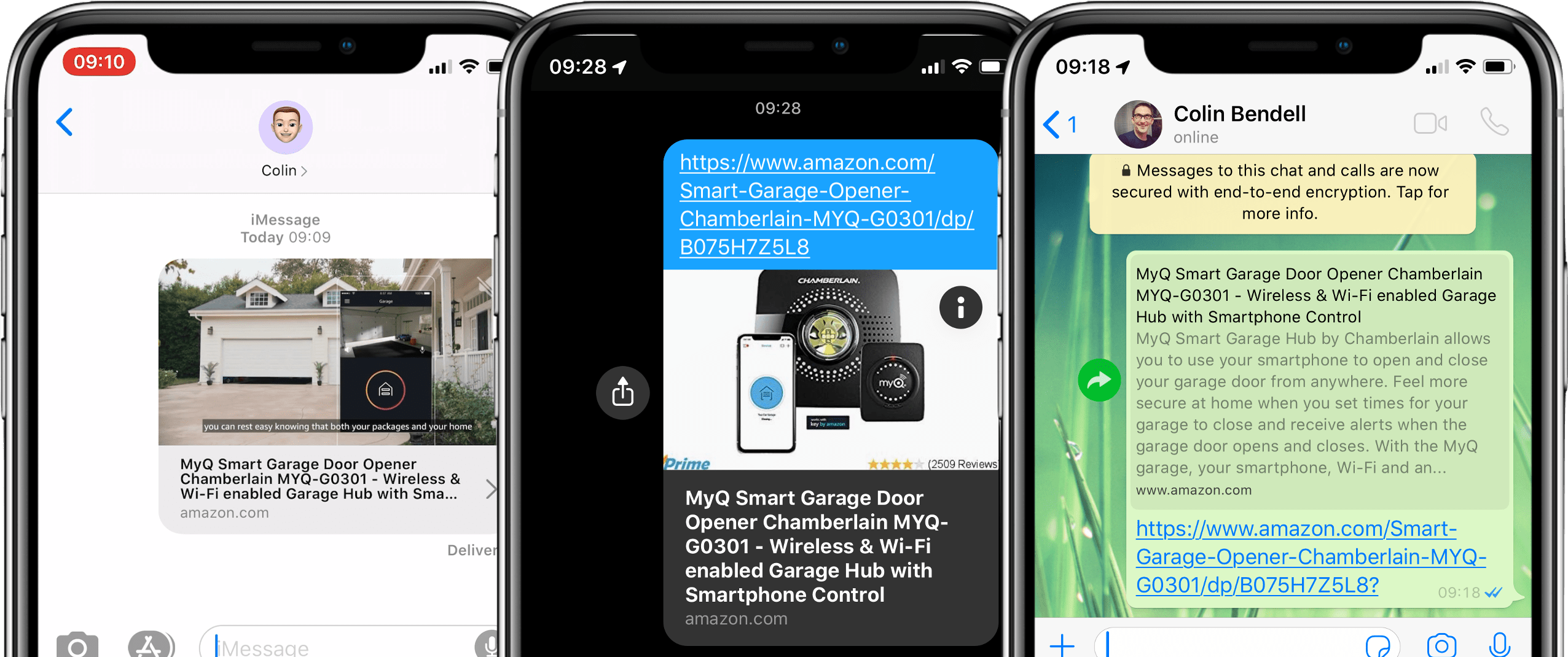
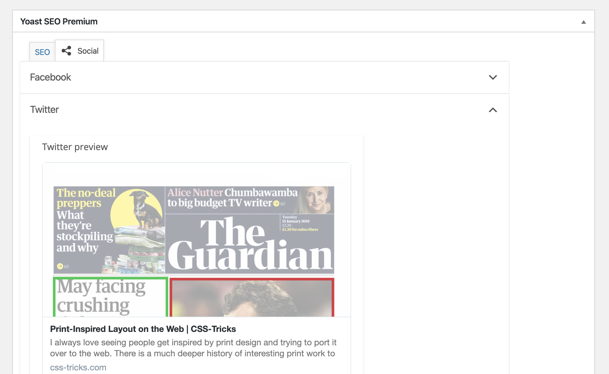
The word „microbrowser” clearly got my attention. Never heard that before. Colin Bendell defines them as the little parts of other software that do HTTP requests to a URL to generate a preview. Like the little URL preview in iOS messages, WhatsApp, or Slack.
I’m a tiny bit skeptical of the name, because what’s happening is the software making that HTTP request and parsing out a little data to use however it will. I’m not sure I’d call that a browser of any kind, but I take the point.
I agree that these things are mega important.
[…] the real gold for marketers is from word-of-mouth discussions. Those conversations with your friends when you recommend a TV show, a brand of clothing, or share a news report. This is the most valuable kind of marketing.
One of our yearly traditions here is to thank all y’all CSS-Tricks readers at the passing of a new year. It means a lot to me that people come here and read the words I write, and the words of all our staff and guest authors that contribute here as well.
Thank you!
Plus, we dig into the numbers this time of year. I’ve always tried to be open about the analytics on this site. Looking at them year after year always serves up a good reminder: niche blogging is a slow game. There’s no hockey-stick growth around here. Never has been, never will be. The trick is to build slowly over time, taking care of the site, investing in it, working hard, and with some luck, numbers trend upward. This year, overall traffic didn’t even do that. Sometimes you gotta fight for what you’ve got! Growth came in other areas though. Let’s take a gander.
It was January 1st, 2019 that the current design of this site (v17) debuted, so this entire year overlaps perfectly with that. I’ll certainly be tempted to release major iterations with that same timing in the future for comparison sake.
Overall numbers
Google Analytics is showing me 90.3 million pageviews, which is a bit of a decline from 2018 at over 91 million. A 1% decline. Not a big problem, but of course I’d way rather see a 1% increase instead. We’ll take that as a kick in the butt to produce a stronger year of content to hopefully more than win it back.
Looks like we published 726 articles over the year, which includes link posts and sponsored links. A good leap from 636 last year and 595 the year before that. Clearly quantity isn’t the trick to traffic for us.
I don’t know that we’ll slow down necessarily. I like the fact that we’re publishing multiple times a day with noteworthy links because I like to think of us as a timely industry publication that you can read like a daily or weekly newspaper in addition to being an evergreen reference. I don’t think we’ll invest in increasing volume, though. Quality moves the needle far more than quantity for this gang.
There is a bunch of numbers I just don’t feel like looking at this year. We’ve traditionally done stuff like what countries people are from, what browsers they use (Chrome-dominant), mobile usage (weirdly low), and things like that. This year, I just don’t care. This is a website. It’s for everyone in the world that cares to read it, in whatever country they are in and whatever browser they want to. We still track those numbers (because Google Analytics automatically does), so we can visit them again in the future and look historically if it gets interesting again. Taking a quick peak, however, it’s not much different than any other year.
Performance numbers are always fascinating. Google Analytics tells me the average page load time is 5.32s. On my fast home internet (even faster at the office), the homepage loads for me in 970ms, but it’s more like 30 seconds when throttled to „Slow 3G.” „Fast 3G” is 8 seconds. Sorta makes sense that most visitors are on faster-than-3G connections since the traffic is largely skewed toward desktop. No cache, we’re talking 54 requests (including ads) and 770KB (fits on a floppy). It’s good enough that I’m not itching to dig into a performance sprint.
Top posts of the year
You’d think we would do a section like this ever year, but because of our URL structure, I haven’t had easy access to figure this out. Fortunately, in March 2019, Jacob Worsøe helped us add some Custom Dimensions to our Google Analytics so we can track things like author and year with each pageview.
That means we can find things, like the most popular articles written in 2019, rather than just the most popular articles looked at in 2019 — regardless of when they were was written. Here’s a graph Jacob sent:
8.25% of traffic came from articles written this year. If you look at where these articles fall on the list of all URLs in 2019 (not just those published in 2019), the top article starts at #75! Hard to compete with older articles that have had time to gather SEO steam. This kind of thing makes me want to get re-focused on referential content even more.
Interesting that our top article was editorial, but everything else is referential. I like a little editorial here and there, but clearly our bread and butter is how-to technical stuff.
Search
There are two aspects of search that are interesting to me:
What do people search for right here on the site itself?
What search terms do people use on Google to find this site?
On-site search is handled by Jetpack’s Elasticsearch feature, which I’m still quite liking (they are a sponsor, but it’s very true). This also means we can track its usage pretty easily using the analytics on my WordPress.com dashboard. I also installed a Search Meter plugin to track search form entries. I can look at Google searches through the SiteKit plugin, which pulls from Google Search Console.
Here are all three, with duplicates removed.
Jetpack Search Data
Search Meter Search Data
Google Search Data
1
amazon (?!)
flexbox
flexbox
2
flexbox
grid
css grid
3
css tricks
flex
css tricks
4
flexbox guide
animation
css important
5
css grid
svg
css triangle
6
css flex
position
mailto link
7
grid guide
css grid
vertical align css
8
css important
css
css comment
9
the great divide
border
css shapes
10
css shapes
background
css background image opacity
There is a bit of a fat head of traffic here with our top 10 pages doing about 10% of traffic, which syncs up with those big searches for stuff like flexbox and grid and people landing on our great guides. If you look at our top 100 pages, that goes out to about 38% of traffic, and articles past that are about 0.1% of traffic and go down from there. So I’d say our long tail is our most valuable asset. That mass of articles, videos, snippets, threads, etc. that make up 62% of all traffic.
Social media
It’s always this time of year I realize how little social media does for our traffic and feel stupid for spending so much time on it. We pretty much only do Twitter and it accounts for 1% of the traffic to this site. We still have a Facebook page but it’s largely neglected except for auto-posting our own article links to it. I find value in Twitter, through listening in on industry conversations and having fun, but I’m going to make a concerted effort to spend less time and energy on our outgoing social media work. If something is worth tweeting for us, it should be worth blogging; and if we blog it, it can be auto-tweeted.
But by way of numbers, we went from 380k followers on @css to 430k. Solid growth there, but the rate of growth is the same every year, to the point it’s weirdly consistent.
I also picked up an Instagram account this year. Haven’t done much there, but I still like it. For us, I think each post on Instagram can represent this little opportunity to clearly explain an idea, which could ultimately turn into a nice referential book or the like someday. A paultry 1,389 followers there.
Newsletter
I quite like our newsletter. It’s this unique piece of writing that goes out each week and gives us a chance to say what we wanna say. It’s often a conglomeration of things we’ve posted to the site, so it’s an opportunity to stay caught up with the site, but even those internal links are posted with new commentary. Plus, we link out to other things that we may not mention on the site. And best of all, it typically has some fresh editorial that’s unique to the newsletter. The bulk of it is done by Robin, but we all chip in.
All that to say: I think it’s got a lot of potential and we’re definitely going to keep at it.
We had the biggest leap in subscribership ever this year, starting the year at 40k subscribers and ending at 65k. That’s 2.5× the biggest leap in year-over-year subscribers so far. I’d like to think that it’s because it’s a good newsletter, but also because it’s integrated into the site much better this year than it ever has been.
Comments
Oh, bittersweet comments. The bad news is that I feel like they get a little worse every year. There is more spam. People get a little nastier. I’m always teetering on the edge of just shutting them off. But then someone posts something really nice or really helpful and I’m reminded that we’re a community of developers and I love them again.
4,710 approved comments. Up quite a bit from 3,788 last year, but still down from 5,040 in 2017. Note that these are approved comments, and it’s notable that this entire year we’ve been on a system of hand-approving all comments before they go out. Last year, I estimated about half of comments make it through that, and this year I’d estimate it at more like 30-40%. So, the straight-up number of comments isn’t particularly interesting as it’s subject to our attitude on approval. Next year, I plan to have us be more strict than we’ve ever been on only approving very high-quality comments.
I’m still waiting for WordPress to swoon me with a recommitment to making commenting good again. 😉
Forums
There were a couple of weeks just in December where I literally shut down the forums. They’ve been teetering on end-of-life for years. The problem is that I don’t have time to tend to them myself, nor do I think it’s worth paying someone to do so, at least not now. Brass tacks, they don’t have any business value and I don’t extract enough other value out of them to rationalize spending time on them.
If they just sat there and were happy little forums, I’d just leave them alone, but the problem is spam. It was mostly spam toward the end, which is incredibly tedious to clean up and requires extra human work.
I’ve kicked them back on for now because I was informed about a spam-blocking plugin that apparently can do incredible work specifically for bbPress spam. Worth a shot!
Interestingly, over the year, the forums generated 7m pageviews, which is 7.6% of all traffic to the site. Sorta makes sense as they are the bulk of the site URLs and they are user-generated threads. Long tail.
Goal review
✅ Polish this new design. Mixed feelings. But I moved the site to a private GitHub repo half-way through the year, and there have been 195 commits since then, so obviously work is getting done. I’ll be leaving this design up all of 2020 and I’d like to make a more concerted effort at polish.
✅ Improve newsletter publishing and display. Nailed this one. In March, we moved authoring right here on the site using the new Gutenberg editor in WordPress. That means it’s easier to write while being much easier to display nicely on this site. Feels great.
☯️ Raise the bar on quality. I’m not marking it as a goal entirely met because I’m not sure we changed all that much. There was no obvious jump upward in quality, but I think we do pretty good in general and would like to see us continue to hold steady there.
❌ Better guides. We didn’t do all that much with guides. Part of the problem is that it’s a little confusing. For one thing, we have „guides” (e.g. our guide to flexbox) which is obviously useful and doing well. Then there are „Guide Collections” (e.g. our Custom Properties Guide) which are like hand-picked and hand-ordered selections of articles. I’m not entirely sure how useful those hand-curated guides are, especially considering we also have tag pages which are more sortable. The dudes with the biggest are the hand-written articles-on-steroids types, so that’s worth the most investment.
New goals
100k on email list. That would be a jump of 35k which is more than we’ve ever done. Ambitious. Part of this is that I’m tempted to try some stuff like paid advertising to grow it, so I can get a taste for that world. Didn’t Twitter have a special card where people could subscribe right from a Tweet? Stuff like that.
Two guides. The blog-post-on-steroids kind. The flexbox one does great for us, traffic-wise, but I also really enjoy this kind of creative output. I’ll be really sad if we can’t at least get two really good ones done this year.
Have an obvious focus on how-to referential technical content. This is related to the last goal, but goes for everyday publishing. I wouldn’t be mad if every darn article we published started with „How To.”
Get on Gutenberg. The new WordPress block editor. This is our most ambitious goal. Or at least I think it is. It’s the most unknown because I literally don’t know what issues we’re going to face when turning it on for more than a decade’s worth of content that’s been authored in the classic editor. I don’t think it’s going to hurt anything. It’s more a matter of making sure:
authoring posts has all the same functionality and conveniences as we have now,
editing old posts doesn’t require any manual conversion work, and
it feels worth doing.
But I haven’t even tried yet, so it’s a don’t-know-what-I-don’t-know situation.
Again, thanks so much!
I was thinking about how stage musicians do that thing where they thank their fans almost unfailingly. Across any genre. Even if they say hardly anything into a microphone during the performance, they will at least thank people for coming, if not absolutely gush appreciation at the crowd. It’s cliché, but it’s not disingenuous. I can imagine it’s genuinely touching to look out across a room of people that all choose to spend a slice of their lives listening to you do your thing.
I feel that way here. I can’t see you as easily as looking out over a room, but I feel it in the comments you post, the emails you send, the tweets you tagged us in, and all that. You’re spending some of your life with us and that makes me feel incredibly grateful. Cheers.
There’s been a run of tools, articles, and resources about color lately. Please allow me to close a few tabs by rounding them up here for your enjoyment.
Curated colors in context
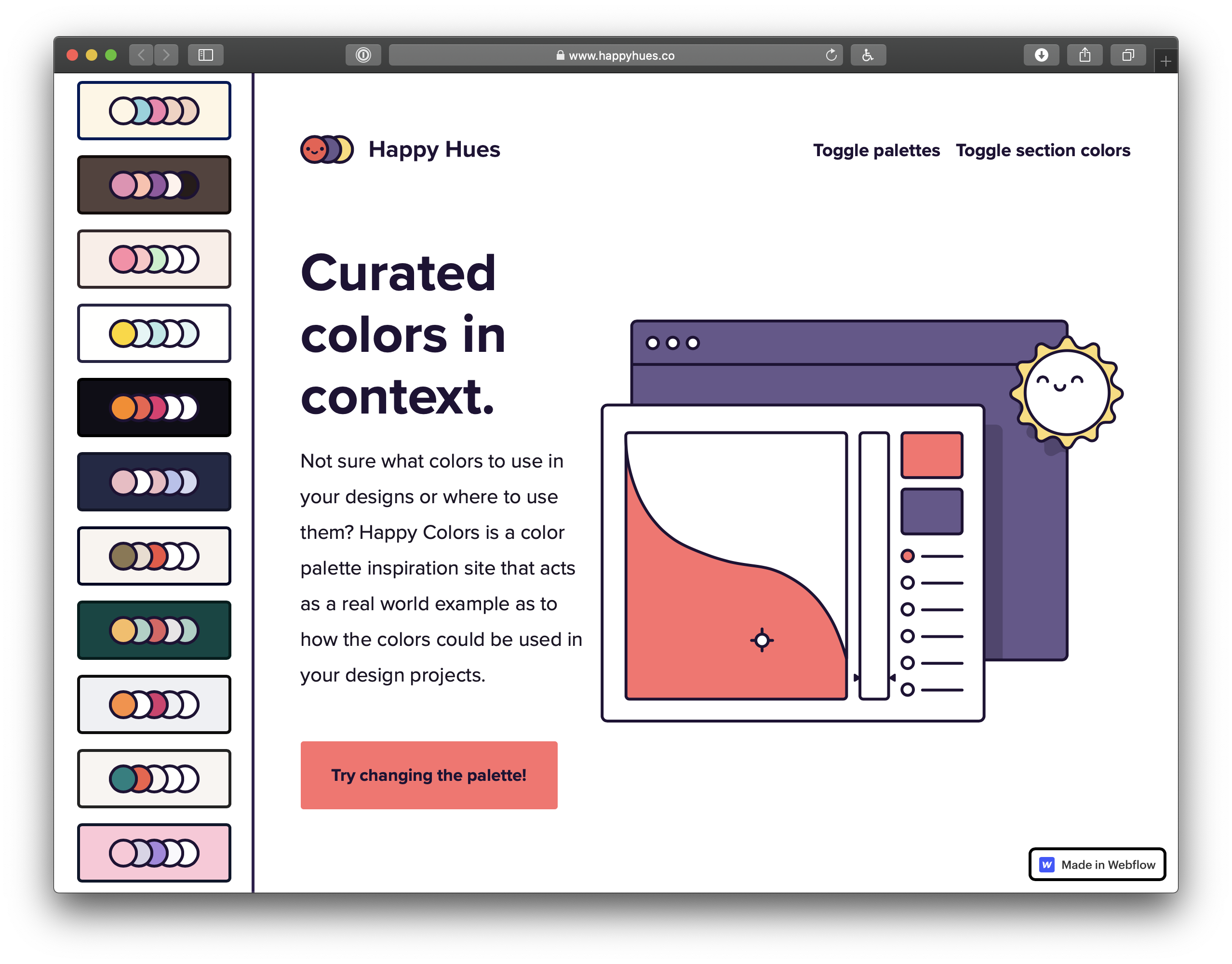
Happy Hues demonstrates a bunch of color palettes in the context of the site itself. That’s a nice way to do it, because choosing nice colors isn’t enough — it’s all about context. It can go bad, as the Refactoring UI blog demonstrates.
Dynamic, Date-Based Color with JavaScript, HSL, and CSS Variables
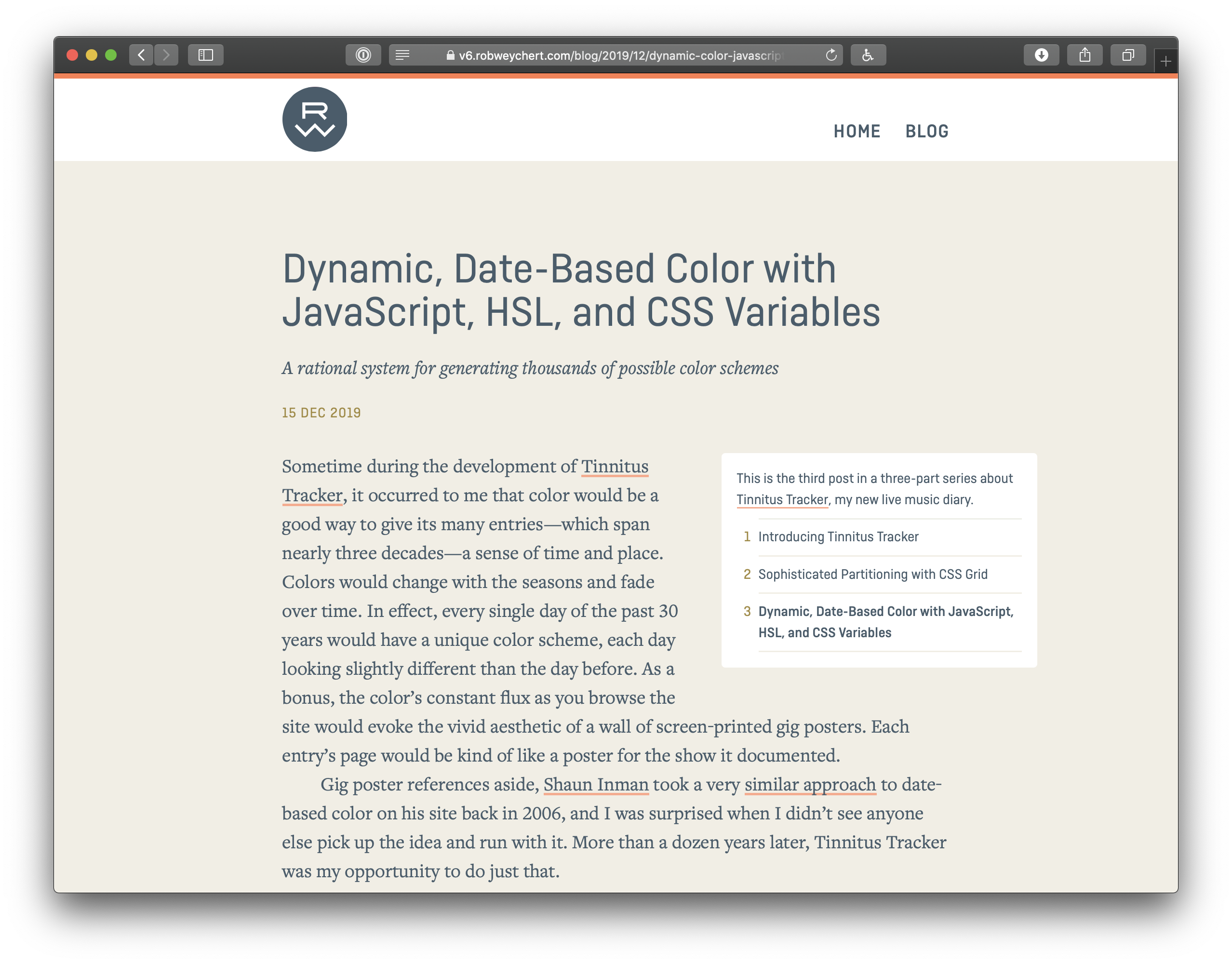
Rob Weychert shows off how he created date-based color schemes (so that every single day of the past 30 years would have a unique color scheme, each day looking slightly different than the day before).
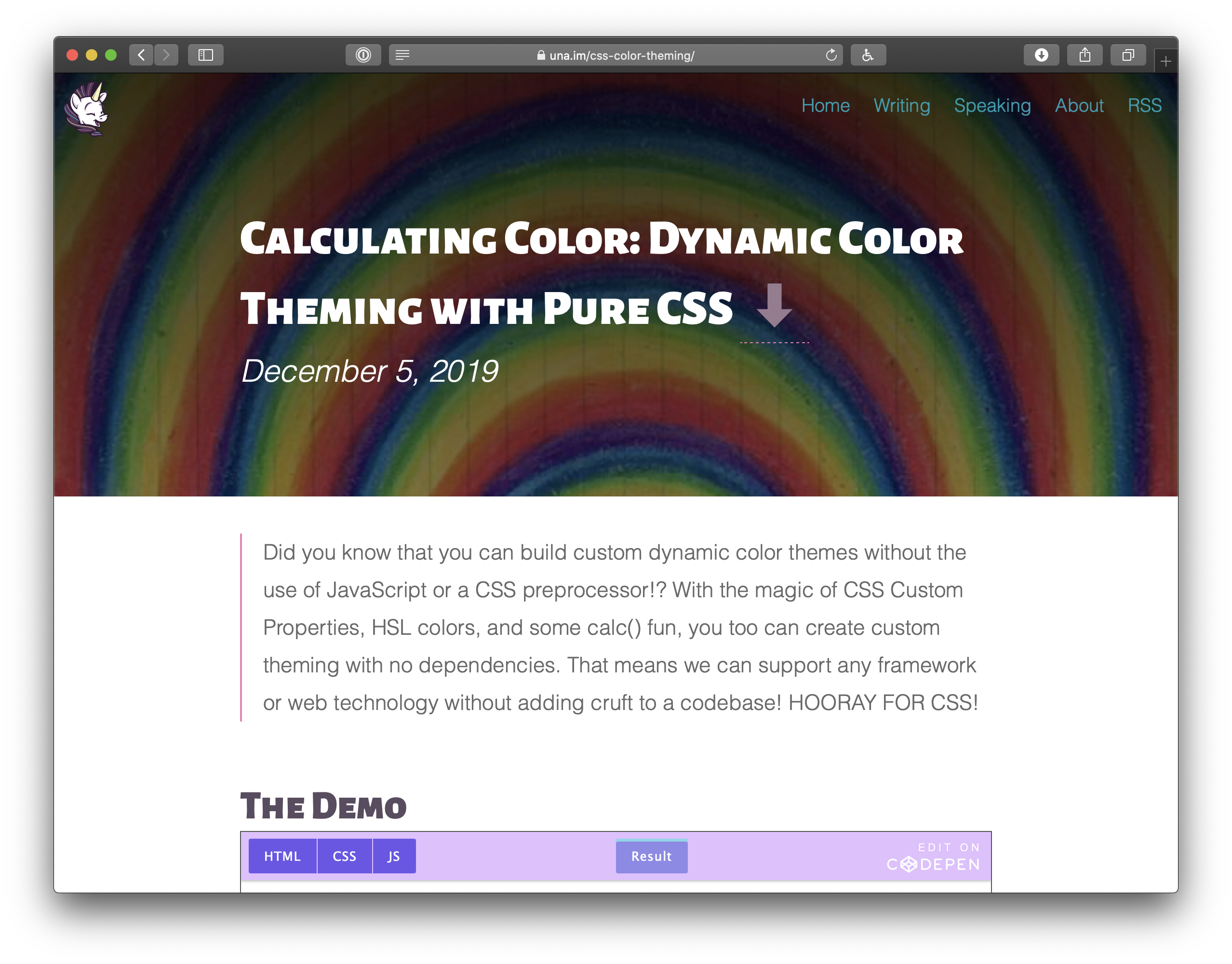
Calculating Color: Dynamic Color Theming with Pure CSS.
Build a site on a single domain, but detect mobile, and render a separate mobile site
Build a separate mobile site on a subdomain
It’s funny how quickly huge industry-defining conversations fade from view. This was probably the biggest question in web design and development this past decade, and we came up with an answer: It’s #1, you should build a responsive website. Any other answer and you’re building multiple websites and the pain from that comes from essentially doubling the workload, splitting teams, communication problems across those teams, inconsistencies across the sites, and an iceberg of other pain points this industry has struggled with for ages.
But, the web is a big place.
This emailer specifically mentioned imdb.com as their example. IMDB is an absolutely massive site with a large team (they are owned by Amazon) and lots of money flying around. If the IMDB team decides they would be better off building multiple websites, well that’s their business. They’ve got the resources to do whatever the heck they want.
The most likely answer from the thread: DOS was a massive operating system for PCs for a long time and it had a three-character limit on file extensions.
Interesting that the first book on HTML covers this specifically:
Where my mind went was server software. I know that web servers automatically do different things with different file types. In a test on my own server (set up to serve a WordPress site), I put some files at the root that all contain the exact same content: <h1>Cool</h1>
file.text = file is rendered as plain text in browser (Content-Type: text/plain)
file.html = file renders as HTML in browser (Content-Type: text/html)
file.htm = file renders as HTML in browser (Content-Type: text/html)
file.fart = file is downloaded by browser (Content-Type: application/octet-stream)
You can write code to serve files with whatever content types you want, but in lieu of that, file extensions do matter because they affect how default web servers choose to serve file type headers.
Is it harder or easier to build a website now than 10 years ago? Has the bar gone up or down? I don’t have any data for you, but I can shell out some loosey-goosey opinions.
HTML
HTML5 was the only big HTML change in the last decade, and it wasn’t particularly dramatic. It’s cool it’s the looser variant (instead of getting XHTML3 or something). More compatible this way. Maybe I’ll close my <br /> and maybe I <br> won’t. Having better semantic tags (e.g. <article>) is great. Input types are wonderful. But none of this pushes HTML to be significantly easier or harder.
Same.
CSS
CSS has gotten easier. We use way fewer „hacks” all the time. I can literally feel it. The CSS we write today feels so intentional and direct. 10 years ago I feel like every other element had some kind of weird hack on it, and today, almost none. If CSS feels any harder, I’d wager it’s because the sites we’re building are bigger and more complex so the styling systems for them need to be all the more robust and the dangers of getting it wrong more stark.
Easier.
JavaScript
I’m sure there are strong arguments to be made both ways here. The language, perhaps, with all its recent syntactic innovation… perhaps easier. But what JavaScript is being asked to do, and what we’re doing with it, is so astronomically larger that more difficulty comes along for the ride. It’s similar to CSS in that way, but even more pronounced since we’re not just doing what we were before on a new scale; we’re building entire interfaces with the language in a way we just weren’t before.
Harder.
Domains
I mention this one because it’s such a crucial step in any given person’s ability to go from zero to actually having a website.
I don’t think buying a domain name is any easier. Domain names are a commodity market, so the companies selling you them are selling you them for some other reason, meaning the incentive is very high for them to push other products on you. For someone entirely green, I can imagine the confusion is either high or they don’t know enough for the confusion to settle in yet. Do I buy it through this page builder thing? Do I have to buy it through this page builder thing? Do I need the WHOIS protection? Oh god, what even is DNS? I guess I do want email, right? Or is that like some weird special hosted email? Ughjakd. I’m gonna call it a wash. Nothing has made this any easier or harder in a decade.
Same.
Hosting
There is so much money in hosting it kind of blows my mind that we don’t see deeper innovation here. I might argue it’s a little easier these days. But commodity low-end hosting isn’t terribly different or being any more or less helpful than it was a decade ago. We’re still largely stringing together our own bespoke build and deployment processes like we were 10 years ago.
Large-scale stuff might have seen a lot of innovation, a la AWS, but nobody is going to argue that stuff is anywhere near easy.
The most innovation we’ve seen is from companies like Netlify and Zeit who are looking at the developer experience wholistically from helping you run things locally, to testing builds in staging, to immutable deploys. I’d love to see all hosting companies realize that every single one of their customers needs to get their code onto their platforms and they have a massive opportunity to help us do that directly.
Slightly easier.
How people actually do it
I like thinking about HTML, CSS, and JavaScript. But of course, precious few people actually start with those technologies to build actual websites from scratch. Really they end up being treated as underlying technologies you dabble in amongst a slew of other tech.
You can build a website from just an index.html file. I’d argue more people should. But people reach for more „complete” solutions and customize from there. I know I did. The first websites I ever created were WordPress because it was a whole website in a box (with its own struggles) and I customized it. People still do that today, probably more now than 10 years ago, and I don’t feel like it’s significantly easier or harder. Or they reach for something familiar. I made a one-page index.html site not long ago, only to have it picked up by another developer who turned it into a create-react-app site but otherwise changed nothing. They just didn’t know how to work on it without React.
Or they use WordPress.com, or Squarespace, or Wix, or Shopify, or BigCommerce, or you know what I mean. This isn’t about what people can do, it’s about what people do do. And for most people, these apps significantly lower the bar of creating a website.
So, for the average person, is it easier or harder to go from zero to having some kind of website?
Much easier.
Can people actually do it?
If we’re talking about creating from scratch, it’s interesting to see who feels like they even hold those keys anymore. The whole idea for this post came from a conversation I had with someone who has been a front-end developer and was asked to build a website by a friend. They declined because they didn’t know how.
Chatted with someone who’s been working at a company as a front-end developer for 3 years. Their friend asked them to help build a website, but they had to decline. They didn’t know how.
Some part of that doesn’t surprise me. As I write, the world is awfully full of React-specific developers working on huge sites (partially due to boot camps, partially due to market demand). They understand that very specific ecosystem and are perfectly productive within it, but don’t have a wider understanding of how it all comes together to make the complete site.
Specialists are specialists!
Them: What do you do? Me: I’m a web designer Them: Cool! Can you help me build my website? Me: [laughing] Oh god no, I have no idea how to do that
Another part of me is surprised. You know an index.html file with „Hello, World!” in it can be a website, right? Even React devs are generally highly aware of create-react-app and how that scaffolds out a ready-to-rock site. Tools like Stackbit slap together a JAMstack site for you that can go anywhere. For developers, it seems to be going from zero to website is a heck of a lot easier these days.
If you were starting out as a front end dev in 2020, what would you say is the first thing you would learn and why?
You need to put yourself in a position where it’s your job to create and take care of a website. Even if that feels like a stretch for you early on. Get the domain, get the website on the public internet. Put your name on it. Now you’ve given yourself stakes, and you’ll learn technology because you must make your ideas come to life.
For me, 650 years ago, that was putting up a website for the ol’ college band. We needed a website! That sounded like fun to me, and I managed to struggle through buying a domain, hosting, and putting up a WordPress website. Then, over time, I learned front-end web technologies because I wanted to change up the design, change up the templates, add cool features, etc.
Get yourself a project and learn through the project.
How do you determine what you want to turn into a blog post and what you leave as a simple Tweet?
I usually won’t avoid the tweet. The tweet is usually a good proving ground for the blog post anyway. If nobody cared, eh, maybe not that good of a post. If it does get good engagement, it’s like the conversation around it is useful in the creation of the blog post. Plus, tweets are so easy to kick out the door. Blog posts, for me, on purpose, have a longer schedule that includes editing and scheduling and such.
Here’s an example tweet. Just a silly little UI experiment. I didn’t feel like waiting to blog about it to drop the demo. But from the Twitter thread, I got some interesting technical feedback, info about what parts people were most suprised by, and some other related ideas. That will, hopefully, lead to a much more robust blog post.
Do you have a favorite CSS-Trick, where you were just like „wow”?
I think „scroll shadows” in CSS is one of my favorite CSS tricks of all time. It’s originally by Roman Komarov, but explained and improved by Lea Verou. I saw a tool the other day around the idea by Stefan Judis.
It’s a real mind-bender involving four-layered gradient backgrounds, each positioned, sized, and colored differently, and then behaviorally different regarding scrolling.
It’s not just a neat trick because it has real UX implications. Showing a shadow of where you can scroll is important UX. Consider this story of a recent design update in iOS that led to complete confusion around UI actions hidden behind a place you could scroll to, but had zero affordance on how to get there. (Happens to me all the time in Spotify, for the record.)
What would be your top 3 pieces of quick advice for developers trying to follow a similar path to growing their influence and exposure?
I think writing is literally the only way.
I can’t think of a developer with influence who has that influence for anything other than writing. Or if it’s not writing, then it’s a YouTube channel or some other form of creating public stuff.
How much do you see yourself personally playing with Houdini APIs as they are released? Which API are you most excited about (Painting, Layout, Typed OM, …)?
This super-low level stuff sometimes feels over my head. It’s hard for me to picture the industry implications of stuff like this just by looking at specs, ya know?
To me, it seems the Layout API has the most powerful potential.
What I’m imagining right now is that Houdini doesn’t affect normal day-to-day front-end developers like me that much. I won’t be writing much Houdini code. But I’ll use fancy things that other people create, because it does something useful for me. Just like most people don’t write their own libraries or have published npm packages — they just use them.
What is your favorite thing about working at CodePen and/or CSS-Tricks?
You know what I really like? I like getting into the office every day and having a pretty decent amount of freedom of what I’m going to do that day. I’ll probably have meetings. I’ll probably have some stuff on the ol’ calendar. I’ll probably have some team expectations I’m trying to meet. But I also usually have plenty of time to pursue things that are interesting to me at the moment.
Sometimes I’m in the moment to drill through some emails. Sometimes I want to tinker with some demo that sounds like fun. Sometimes I want to write up a thought or record a video. Sometimes I want to plan something out or document something. Sometimes I want to talk something out with other people or do some pair programming.
I’m fortunate that I’m the boss (lol) and I put myself in that position on purpose so I have that freedom.
What is something that you wish we could add in CSS?
I feel like every time someone asks this we all should take every opportunity to scream Container Queries! until we get them.
The idea is that we should be able to write CSS that says, „When this element is this wide, this CSS should take effect.” And not just width, but whatever media queries we have at the page level already.
I want to write a card component that shuffles itself around based on how wide it is, not how wide the page is, because there isn’t always a direct connection between those two things (e.g. a card component can show up in a narrow sidebar on a large screen, but be full-width on a tablet or something).
Every component can be in a situation like that, so for the love of CSS, let me write media queries scoped to those components. I echo a lot of other people when I saw that if we had this, the vast majority of media queries we write would be these, not page-level.
Do you think it’s worth suggesting a { position: above-fold; }?
I’m not sure I’ve ever made a big fold-based decision once in my career. Not a big fan of that thinking. THERE IS A LINE IN WHICH THIS IMPORTANT MODULE MUST NOT CROSS, haha. Prioritizing the most important stuff to be higher up the page, sure. Websites don’t fold like newspapers.
Plus, we’ve got viewport units now, so if you absolutely need to position something in the top visible viewport area, you can.
Since you’ve been writing blog posts for so long, have you developed a process for writing one?
Sorta! It still feels pretty casual to me (let’s call my writing medium quality), so it’s not like I’m renting a cabin in the wilderness and finding inspiration in the sunsets and cheap whiskey.
I write down every blog post idea that comes to me. I try to keep that list fairly public but I also have a personal list where I can be even sloppier.
I put as much context into those lists as I can, so I can hope to summon up the same emotion that made me write it down in the first place. If I revisit the idea a week later and can’t, it’s probably not a very good idea.
I write up the post with as much context as I can. Light research is typically involved.
We have a lead editor on CSS-Tricks, so it’s reviewed by at least one person before being scheduled.
CSS or CSS-in-JS?
I see a ton of cool stuff happening in CSS-in-JS. I think it solves a lot of interesting problems for certain websites. For example, I very much like the idea of having the option to write styles that are scoped to a component programmatically, and thus are tree-shaken when the component isn’t used automatically.
But the web is a big place, and dare I say most websites aren’t built with JavaScript-powered component models. Thus, CSS-in-JS isn’t necessary or appropriate for a lot of sites.
Although, two things to be clear:
You can’t have CSS-in-JS without CSS. CSS-in-JS is still styles that are applied to elements. It doesn’t absolve you from learning CSS.
The CSS-in-JS landscape is wide. It’s a little hard to talk about so vaguely. Each project in the bucket of CSS-in-JS handles things a bit differently and how the styles are applied to the site is even quite wide. I think it sometimes gets lost in the arguments that some of the approaches literally make a CSS stylesheet that you link up like you would any other CSS — even Sass-produced CSS — which there doesn’t seem to be much argument about anymore.