Richard Rutter, in support of his new book Web Typography, shares loads of great advice on data table design. Here’s a good one:
You might consider making all the columns an even width. This too does nothing for the readability of the contents. Some table cells will be too wide, leaving the data lost and detached from its neighbours. Other table cells will be too narrow, cramping the data uncomfortably. Table columns should be sized according to the data they contain.
I was excited to be reminded of the possibility for aligning numbers with decimals:
td { text-align: "." center; }
But the support for that is non-existent as best I can tell. Another tip, using font-variant-numeric: lining-nums tabular-nums;does have some support.
Tables can be beautiful but they are not works of art. Instead of painting and decorating them, design tables for your reader.
Our sponsor Media temple is holding a contest to give away a bunch of stuff, including a nice big monitor and gift cards. Entering is easy, you just drop them an image or URL to a project you’re proud of. Do it quickly though, as entries end on Tuesday. Then the top 20 will be publicly voted on. US residents only.
CSS animations and transitions are great! However, while recently toying with an idea, I got really frustrated with the fact that gradients are only animatable in Edge (and IE 10+). Yes, we can do all sorts of tricks with background-position, background-size, background-blend-mode or even opacity and transform on a pseudo-element/ child, but sometimes these are just not enough. Not to mention that we run into similar problems when wanting to animate SVG attributes without a CSS correspondent.
Using a lot of examples, this article is going to explain how to smoothly go from one state to another in a similar fashion to that of common CSS timing functions using just a little bit of JavaScript, without having to rely on a library, so without including a lot of complicated and unnecessary code that may become a big burden in the future.
This is not how the CSS timing functions work. This is an approach that I find simpler and more intuitive than working with Bézier curves. I’m going to show how to experiment with different timing functions using JavaScript and dissect use cases. It is not a tutorial on how to do beautiful animation.
A few examples using a linear timing function
Let’s start with a left to right linear-gradient() with a sharp transition where we want to animate the first stop. Here’s a way to express that using CSS custom properties:
On click, we want the value of this stop to go from 0% to 100% (or the other way around, depending on the state it’s already in) over the course of NF frames. If an animation is already running at the time of the click, we stop it, change its direction, then restart it.
We also need a few variables such as the request ID (this gets returned by requestAnimationFrame), the index of the current frame (an integer in the [0, NF] interval, starting at 0) and the direction our transition is going in (which is 1 when going towards 100% and -1 when going towards 0%).
While nothing is changing, the request ID is null. We also set the current frame index to 0 initially and the direction to -1, as if we’ve just arrived to 0% from 100%.
const NF = 80; // number of frames transition happens over

let rID = null, f = 0, dir = -1;

function stopAni() {
  cancelAnimationFrame(rID);
  rID = null;
};

function update() {};

addEventListener('click', e => {
  if(rID) stopAni(); // if an animation is already running, stop it
  dir *= -1; // change animation direction
  update();
}, false);
Now all that’s left is to populate the update() function. Within it, we update the current frame index f. Then we compute a progress variable k as the ratio between this current frame index f and the total number of frames NF. Given that f goes from 0 to NF (included), this means that our progress k goes from 0 to 1. Multiply this with 100% and we get the desired stop.
After this, we check whether we’ve reached one of the end states. If we have, we stop the animation and exit the update() function.
function update() {
  f += dir; // update current frame index

  let k = f/NF; // compute progress

  document.body.style.setProperty('--stop', `${+(k*100).toFixed(2)}%`);

  if(!(f%NF)) {
    stopAni();
    return
  }

  rID = requestAnimationFrame(update)
};
The result can be seen in the Pen below (note that we go back on a second click):
The way the pseudo-element is made to contrast with the background below is explained in an older article.
The above demo may look like something we could easily achieve with an element and translating a pseudo-element that can fully cover it, but things get a lot more interesting if we give the background-size a value that’s smaller than 100% along the x axis, let’s say 5em:
This gives us a sort of a „vertical blinds” effect that cannot be replicated in a clean manner with just CSS if we don’t want to use more than one element.
Another option would be not to alternate the direction and always sweep from left to right, except only odd sweeps would be orange. This requires tweaking the CSS a bit:
In the JavaScript, we ditch the direction variable and add a type one (typ) that switches between 0 and 1 at the end of every transition. That’s when we also update all custom properties:
const S = document.body.style;

let typ = 0;

function update() {
  let k = ++f/NF;

  S.setProperty('--stop', `${+(k*100).toFixed(2)}%`);

  if(!(f%NF)) {
    f = 0;
    S.setProperty('--gc1', `var(--c${typ})`);
    typ = 1 - typ;
    S.setProperty('--gc0', `var(--c${typ})`);
    S.setProperty('--stop', `0%`);
    stopAni();
    return
  }

  rID = requestAnimationFrame(update)
};
This gives us the desired result (click at least twice to see how the effect differs from that in the first demo):
In this case, we might also want to keep going clockwise to get back to the 0deg state instead of changing the direction. So we just ditch the dir variable altogether, discard any clicks happening during the transition, and always increment the frame index f, resetting it to 0 when we’ve completed a full rotation around the circle:
function update() {
  let k = ++f/NF;

  document.body.style.setProperty(
    '--angle',
    `${+(k*180).toFixed(2)}deg`
  );

  if(!(f%NF)) {
    f = f%(2*NF);
    stopAni();
    return
  }

  rID = requestAnimationFrame(update)
};

addEventListener('click', e => {
  if(!rID) update()
}, false);
The following Pen illustrates the result – our rotation is now always clockwise:
We may also not want to go back when clicking again, but instead make another blob grow and cover the entire viewport. In this case, we add a few more custom properties to the CSS:
A fun tweak to this would be to make our circle start growing from the point we clicked. To do so, we introduce two more custom properties, --x and --y:
Note that in the case of conic-gradient(), we must use a unit for the zero value (whether that unit is % or an angular one like deg doesn’t matter), otherwise our code won’t work – writing conic-gradient(#ff9800 var(--stop, 0%), #3c3c3c 0) means nothing gets displayed.
The JavaScript is the same as for animating the stop in the linear or radial case, but bear in mind that this currently only works in Chrome with Experimental Web Platform Features enabled in chrome://flags.
The Experimental Web Platform Features flag enabled in Chrome Canary (63.0.3210.0).
Just for the purpose of displaying conic gradients in the browser, there’s a polyfill by Lea Verou and this works cross-browser but doesn’t allow using CSS custom properties.
The recording below illustrates how our code works:
Recording of how our first conic-gradient() demo works in Chrome with the flag enabled (live demo).
This is another situation where we might not want to go back on a second click. This means we need to alter the CSS a bit, in the same way we did for the last radial-gradient() demo:
The JavaScript code is exactly the same as in the corresponding linear-gradient() or radial-gradient() case and the result can be seen below:
Recording of how our second conic-gradient() demo works in Chrome with the flag enabled (live demo).
Before we move on to other timing functions, there’s one more thing to cover: the case when we don’t go from 0% to 100%, but in between any two values. We take the example of our first linear-gradient, but with a different default for --stop, let’s say 85% and we also set a --stop-fin value – this is going to be the final value for --stop:
In the JavaScript, we read these two values – the initial (default) and the final one – and we compute a range as the difference between them:
const S = getComputedStyle(document.body),
      INI = +S.getPropertyValue('--stop-ini').replace('%', ''),
      FIN = +S.getPropertyValue('--stop-fin').replace('%', ''),
      RANGE = FIN - INI;
Finally, in the update() function, we take into account the initial value and the range when setting the current value for --stop:
If we want to mix units for the stop value, things get hairier as we need to compute more things (box dimensions when mixing % and px, font sizes if we throw em or rem in the mix, viewport dimensions if we want to use viewport units, the length of the 0% to 100% segment on the gradient line for gradients that are not horizontal or vertical), but the basic idea remains the same.
Emulating ease-in/ ease-out
An ease-in kind of function means the change in value happens slow at first and then accelerates. ease-out is exactly the opposite – the change happens fast in the beginning, but then slows down towards the end.
The slope of the curves above gives us the rate of change. The steeper it is, the faster the change in value happens.
We can emulate these functions by tweaking the linear method described in the first section. Since k takes values in the [0, 1] interval, raising it to any positive power also gives us a number within the same interval. The interactive demo below shows the graph of a function f(k) = pow(k, p) (k raised to an exponent p) shown in purple and that of a function g(k) = 1 - pow(1 - k, p) shown in red on the [0, 1] interval versus the identity function id(k) = k (which corresponds to a linear timing function).
When the exponent p is equal to 1, the graphs of the f and g functions are identical to that of the identity function.
When exponent p is greater than 1, the graph of the f function is below the identity line – the rate of change increases as k increases. This is like an ease-in type of function. The graph of the g function is above the identity line – the rate of change decreases as k increases. This is like an ease-out type of function.
It seems an exponent p of about 2 gives us an f that’s pretty similar to ease-in, while g is pretty similar to ease-out. With a bit more tweaking, it looks like the best approximation is for a p value of about 1.675:
In this interactive demo, we want the graphs of the f and g functions to be as close as possible to the dashed lines, which represent the ease-in timing function (below the identity line) and the ease-out timing function (above the identity line).
Emulating ease-in-out
The CSS ease-in-out timing function looks like in the illustration below:
Well, that’s what harmonic functions are for! More exactly, the ease-in-out out shape is reminiscent the shape of the sin() function on the [-90°,90°] interval.
The sin(k) function on the [-90°,90°] interval (live).
However, we don’t want a function whose input is in the [-90°,90°] interval and output is in the [-1,1] interval, so let’s fix this!
This means we need to squish the hashed rectangle ([-90°,90°]x[-1,1]) in the illustration above into the unit one ([0,1]x[0,1]).
First, let’s take the domain [-90°,90°]. If we change our function to be sin(k·180°) (or sin(k·π) in radians), then our domain becomes [-.5,.5] (we can check that -.5·180° = 90° and .5·180° = 90°):
The sin(k·π) function on the [-.5,.5] interval (live).
We can shift this domain to the right by .5 and get the desired [0,1] interval if we change our function to be sin((k - .5)·π) (we can check that 0 - .5 = -.5 and 1 - .5 = .5):
The sin((k - .5)·π) function on the [0,1] interval (live).
Now let’s get the desired codomain. If we add 1 to our function making it sin((k - .5)·π) + 1 this shifts out codomain up into the [0, 2] interval:
The sin((k - .5)·π) + 1 function on the [0,1] interval (live).
Dividing everything by 2 gives us the (sin((k - .5)·π) + 1)/2 function and compacts the codomain into our desired [0,1] interval:
The (sin((k - .5)·π) + 1)/2 function on the [0,1] interval (live).
This turns out to be a good approximation of the ease-in-out timing function (represented with an orange dashed line in the illustration above).
Comparison of all these timing functions
Let’s say we want to have a bunch of elements with a linear-gradient() (like in the third demo). On click, their --stop values go from 0% to 100%, but with a different timing function for each.
In the JavaScript, we create a timing functions object with the corresponding function for each type of easing:
const _ART = [];

let frag = document.createDocumentFragment();

for(let p in tfn) {
  let art = document.createElement('article'),
      hd = document.createElement('h3');

  hd.textContent = p;
  art.appendChild(hd);
  art.setAttribute('id', p);
  _ART.push(art);
  frag.appendChild(art);
}

n = _ART.length;
document.body.appendChild(frag);
The update function is pretty much the same, except we set the --stop custom property for every element as the value returned by the corresponding timing function when fed the current progress k. Also, when resetting the --stop to 0% at the end of the animation, we also need to do this for every element.
function update() {
  let k = ++f/NF;

  for(let i = 0; i < n; i++) {
    _ART[i].style.setProperty(
      '--stop',
      `${+tfn[_ART[i].id](k).toFixed(5)*100}%`
    );
  }

  if(!(f%NF)) {
    f = 0;

    S.setProperty('--gc1', `var(--c${typ})`);
    typ = 1 - typ;
    S.setProperty('--gc0', `var(--c${typ})`);

    for(let i = 0; i < n; i++)
      _ART[i].style.setProperty('--stop', `0%`);

    stopAni();
    return;
  }

  rID = requestAnimationFrame(update)
};
This gives us a nice visual comparison of these timing functions:
They all start and finish at the same time, but while the progress is constant for the linear one, the ease-in one starts slowly and then accelerates, the ease-out one starts fast and then slows down and, finally, the ease-in-out one starts slowly, accelerates and then slows down again at the end.
Timing functions for bouncing transitions
I first came across the concept years ago, in Lea Verou’s CSS Secrets talk. These happen when the y (even) values in a cubic-bezier() function are outside the [0, 1] range and the effect they create is of the animated value going outside the interval between its initial and final value.
This bounce can happen right after the transition starts, right before it finishes or at both ends.
A bounce at the start means that, at first, we don’t go towards the final state, but in the opposite direction. For example, if want to animate a stop from 43% to 57% and we have a bounce at the start, then, at first, out stop value doesn’t increase towards 57%, but decreases below 43% before going back up to the final state. Similarly, if we go from an initial stop value of 57% to a final stop value of 43% and we have a bounce at the start, then, at first, the stop value increases above 57% before going down to the final value.
A bounce at the end means we overshoot our final state and only then go back to it. If want to animate a stop from 43% to 57% and we have a bounce at the end, then we start going normally from the initial state to the final one, but towards the end, we go above 57% before going back down to it. And if we go from an inital stop value of 57% to a final stop value of 43% and we have a bounce at the end, then, at first, we go down towards the final state, but, towards the end, we pass it and we briefly have stop values below 43% before our transition finishes there.
If what they do is still difficult to grasp, below there’s a comparative example of all three of them in action.
The three cases.
These kinds of timing functions don’t have their own keywords associated, but they look cool and they are what we want in a lot of situations.
Just like in the case of ease-in-out, the quickest way of getting them is by using harmonic functions. The difference lies in the fact that now we don’t start from the [-90°,90°] domain anymore.
For a bounce at the beginning, we start with the [s, 0°] portion of the sin() function, where s (the start angle) is in the (-180°,-90°) interval. The closer it is to -180°, the bigger the bounce is and the faster it will go to the final state after it. So we don’t want it to be really close to -180° because the result would look too unnatural. We also want it to be far enough from -90° that the bounce is noticeable.
In the interactive demo below, you can drag the slider to change the start angle and then click on the stripe at the bottom to see the effect in action:
In the interactive demo above, the hashed area ([s,0]x[sin(s),0]) is the area we need move and scale into the [0,1]x[0,1] area in order to get our timing function. The part of the curve that’s below its lower edge is where the bounce happens. You can adjust the start angle using the slider and then click on the bottom bar to see how the transition looks for different start angles.
Just like in the ease-in-out case, we first squish the domain into the [-1,0] interval by dividing the argument with the range (which is the maximum 0 minus the minimum s). Therefore, our function becomes sin(-k·s) (we can check that -(-1)·s = s and -0·s = 0):
The sin(-k·s) function on the [-1,0] interval (live).
Next, we shift this interval to the right (by 1, into [0,1]). This makes our function sin(-(k - 1)·s) = sin((1 - k)·s) (it checks that 0 - 1 = -1 and 1 - 1 = 0):
The sin(-(k - 1)·s) function on the [0,1] interval (live).
We then shift the codomain up by its value at 0 (sin((1 - 0)*s) = sin(s)). Our function is now sin((1 - k)·s) - sin(s) and our codomain [0,-sin(s)].
The sin(-(k - 1)·s) - sin(s) function on the [0,1] interval (live).
The last step is to expand the codomain into the [0,1] range. We do this by dividing by its upper limit (which is -sin(s)). This means our final easing function is 1 - sin((1 - k)·s)/sin(s)
The 1 - sin((1 - k)·s)/sin(s) function on the [0,1] interval (live).
For a bounce at the end, we start with the [0°, e] portion of the sin() function, where e (the end angle) is in the (90°,180°) interval. The closer it is to 180°, the bigger the bounce is and the faster it will move from the initial state to the final one before it overshoots it and the bounce happens. So we don’t want it to be really close to 180° as the result would look too unnatural. We also want it to be far enough from 90° so that the bounce is noticeable.
In the interactive demo above, the hashed area ([0,e]x[0,sin(e)]) is the area we need to squish and move into the [0,1]x[0,1] square in order to get our timing function. The part of the curve that’s below its upper edge is where the bounce happens.
We start by squishing the domain into the [0,1] interval by dividing the argument with the range (which is the maximum e minus the minimum 0). Therefore, our function becomes sin(k·e) (we can check that 0·e = 0 and 1·e = e):
The sin(k·e) function on the [0,1] interval (live).
What’s still left to do is to expand the codomain into the [0,1] range. We do this by dividing by its upper limit (which is sin(e)). This means our final easing function is sin(k·e)/sin(e).
The sin(k·e)/sin(e) function on the [0,1] interval (live).
If we want a bounce at each end, we start with the [s, e] portion of the sin() function, where s is in the (-180°,-90°) interval and e in the (90°,180°) interval. The larger s and e are in absolute values, the bigger the corresponding bounces are and the more of the total transition time is spent on them alone. On the other hand, the closer their absolute values get to 90°, the less noticeable their corresponding bounces are. So, just like in the previous two cases, it’s all about finding the right balance.
In the interactive demo above, the hashed area ([s,e]x[sin(s),sin(e)]) is the area we need to move and scale into the [0,1]x[0,1] square in order to get our timing function. The part of the curve that’s beyond its horizontal edges is where the bounces happen.
We start by shifting the domain to the right into the [0,e - s] interval. This means our function becomes sin(k + s) (we can check that 0 + s = s and that e - s + s = e).
The sin(k + s) function on the [0,e - s] interval (live).
Then we shrink the domain to fit into the [0,1] interval, which gives us the function sin(k·(e - s) + s).
The sin(k·(e - s) + s) function on the [0,1] interval (live).
Moving on to the codomain, we first shift it up by its value at 0 (sin(0·(e - s) + s)), which means we now have sin(k·(e - s) + s) - sin(s). This gives us the new codomain [0,sin(e) - sin(s)].
The sin(k·(e - s) + s) - sin(s) function on the [0,1] interval (live).
Finally, we shrink the codomain to the [0,1] interval by dividing with the range (sin(e) - sin(s)), so our final function is (sin(k·(e - s) + s) - sin(s))/(sin(e - sin(s)).
The (sin(k·(e - s) + s) - sin(s))/(sin(e - sin(s)) function on the [0,1] interval (live).
So in order to do a similar comparative demo to that for the JS equivalents of the CSS linear, ease-in, ease-out, ease-in-out, our timing functions object becomes:
In CSS, setting animation-direction to alternate also reverses the timing function. In order to better understand this, consider a .box element on which we animate its transform property such that we move to the right. This means our @keyframes look as follows:
We use a custom timing function that allows us to have a bounce at the end and we make this animation alternate – that is, go from the final state (translate(50vw)) back to the initial state (no translation) for the even-numbered iterations (second, fourth and so on).
One important thing to notice here is that, for the even-numbered iterations, our bounce doesn’t happen at the end, but at the start – the timing function is reversed. Visually, this means it’s reflected both horizontally and vertically with respect to the .5,.5 point.
The normal timing function (f, in red, with a bounce at the end) and the symmetrical reverse one (g, in purple, with a bounce at the start) (live)
In CSS, there is no way of having a different timing function other than the symmetrical one on going back if we are to use this set of keyframes and animation-direction: alternate. We can introduce the going back part into the keyframes and control the timing function for each stage of the animation, but that’s outside the scope of this article.
When changing values with JavaScript in the fashion presented so far in this article, the same thing happens by default. Consider the case when we want to animate the stop of a linear-gradient() between an initial and a final position and we want to have a bounce at the end. This is pretty much the last example presented in the first section with timing function that lets us have a bounce at the end (one in the bounce-fin category described before) instead of a linear one.
The CSS is exactly the same and we only make a few minor changes to the JavaScript code. We set a limit angle E and we use a custom bounce-fin kind of timing function in place of the linear one:
const E = .75*Math.PI;

/* same as before */

function timing(k) {
  return Math.sin(k*E)/Math.sin(E)
};

function update() {
  /* same as before */

  document.body.style.setProperty(
    '--stop',
    `${+(INI + timing(k)*RANGE).toFixed(2)}%`
  );

  /* same as before */
};

/* same as before */
In the initial state, the stop is at 85%. We animate it to 26% (which is the final state) using a timing function that gives us a bounce at the end. This means we go beyond our final stop position at 26% before going back up and stopping there. This is what happens during the odd iterations.
During the even iterations, this behaves just like in the CSS case, reversing the timing function, so that the bounce happens at the beginning, not at the end.
But what if we don’t want the timing function to be reversed?
In this case, we need to use the symmetrical function. For any timing function f(k) defined on the [0,1] interval (this is the domain), whose values are in the [0,1] (codomain), the symmetrical function we want is 1 - f(1 - k). Note that functions whose shape is actually symmetrical with respect to the .5,.5 point, like linear or ease-in-out are identical to their symmetrical functions.
So what we do is use our timing function f(k) for the odd iterations and use 1 - f(1 - k) for the even ones. We can tell whether an iteration is odd or even from the direction (dir) variable. This is 1 for odd iterations and -1 for even ones.
This means we can combine our two timing functions into one: m + dir*f(m + dir*k).
Here, the multiplier m is 0 for the odd iterations (when dir is 1) and 1 for the even ones (when dir is -1), so we can compute it as .5*(1 - dir):
dir = +1 → m = .5*(1 - (+1)) = .5*(1 - 1) = .5*0 = 0
dir = -1 → m = .5*(1 - (-1)) = .5*(1 + 1) = .5*2 = 1
This way, our JavaScript becomes:
let m;

/* same as before */

function update() {
  /* same as before */

  document.body.style.setProperty(
    '--stop',
    `${+(INI + (m + dir*timing(m + dir*k))*RANGE).toFixed(2)}%`
  );

  /* same as before */
};

addEventListener('click', e => {
  if(rID) stopAni();
  dir *= -1;
  m = .5*(1 - dir);
  update();
}, false);
Gradient stops are not the only things that aren’t animatable cross-browser with just CSS.
Gradient end going from orange to violet
For a first example of something different, let’s say we want the orange in our gradient to animate to a kind of violet. We start with a CSS that looks something like this:
In order to interpolate between the initial and final values, we need to know the format we get when reading them via JavaScript – is it going to be the same format we set them in? Is it going to be always rgb()/ rgba()?
Here is where things get a bit hairy. Consider the following test, where we have a gradient where we’ve used every format possible:
Screenshots showing what gets logged in Chrome, Edge and Firefox (live).
Whatever we do, if we have an alpha of strictly less than 1, what we get via JavaScript seems to be always an rgba() value, regardless of whether we’ve set it with rgba() or hsla().
All browsers also agree when reading the custom properties directly, though, this time, what we get doesn’t seem to make much sense: orange, crimson and seashell are returned as keywords regardless of how they were set, but we get hex values for springgreen and blueviolet. Except for orange, which was added in Level 2, all these values were added to CSS in Level 3, so why do we get some as keywords and others as hex values?
For the background-image, Firefox always returns the fully opaque values only as rgb(), while Chrome and Edge return them as either keywords or hex values, just like they do in the case when we read the custom properties directly.
Oh well, at least that lets us know we need to take into account different formats.
So the first thing we need to do is map the keywords to rgb() values. Not going to write all that manually, so a quick search finds this repo – perfect, it’s exactly what we want! We can now set that as the value of a CMAP constant.
The next step here is to create a getRGBA(c) function that would take a string representing a keyword, a hex or an rgb()/ rgba() value and return an array containing the RGBA values ([red, green, blue, alpha]).
We start by building our regular expressions for the hex and rgb()/ rgba() values. These are a bit loose and would catch quite a few false positives if we were to have user input, but since we’re only using them on CSS computed style values, we can afford to take the quick and dirty path here:
let re_hex = /^\#([a-f\d]{1,2})([a-f\d]{1,2})([a-f\d]{1,2})$/i,
    re_rgb = /^rgba?\((\d{1,3},\s){2}\d{1,3}(,\s((0|1)?\.?\d*))?\)/;
Then we handle the three types of values we’ve seen we might get by reading the computed styles:
if(c in CMAP) return CMAP[c]; // keyword lookup, return rgb

if([4, 7].indexOf(c.length) !== -1 && re_hex.test(c)) {
  c = c.match(re_hex).slice(1); // remove the '#'
  if(c[0].length === 1) c = c.map(x => x + x);
	// go from 3-digit form to 6-digit one
  c.push(1); // add an alpha of 1

  // return decimal valued RGBA array
  return c.map(x => parseInt(x, 16))
}

if(re_rgb.test(c)) {
  // extract values
  c = c.replace(/rgba?\(/, '').replace(')', '').split(',').map(x => +x.trim());
  if(c.length === 3) c.push(1); // if no alpha specified, use 1

  return c // return RGBA array
}
Now after adding the keyword to RGBA map (CMAP) and the getRGBA() function, our JavaScript code doesn’t change much from the previous examples:
const INI = getRGBA(S.getPropertyValue('--c-ini').trim()),
      FIN = getRGBA(S.getPropertyValue('--c-fin').trim()),
      RANGE = [],
      ALPHA = 1 - INI[3] || 1 - FIN[3];

/* same as before */

function update() {
  /* same as before */

  document.body.style.setProperty(
    '--c',
    `rgb${ALPHA ? 'a' : ''}(
      ${INI.map((c, i) => Math.round(c + k*RANGE[i])).join(',')})`
  );

  /* same as before */
};

(function init() {
  if(!ALPHA) INI.pop(); // get rid of alpha if always 1
  RANGE.splice(0, 0, ...INI.map((c, i) => FIN[i] - c));
})();

/* same as before */
We can also use a different, non-linear timing function, for example one that allows for a bounce at the end:
const E = .8*Math.PI;

/* same as before */

function timing(k) {
  return Math.sin(k*E)/Math.sin(E)
}

function update() {
  /* same as before */

  document.body.style.setProperty(
    '--c',
    `rgb${ALPHA ? 'a' : ''}(
      ${INI.map((c, i) => Math.round(c + timing(k)*RANGE[i])).join(',')})`
  );

  /* same as before */
};

/* same as before */
This means we go all the way to a kind of blue before going back to our final violet:
Do note however that, in general, RGBA transitions are not the best place to illustrate bounces. That’s because the RGB channels are strictly limited to the [0,255] range and the alpha channel is strictly limited to the [0,1] range. rgb(255, 0, 0) is as red as red gets, there’s no redder red with a value of over 255 for the first channel. A value of 0 for the alpha channel means completely transparent, there’s no greater transparency with a negative value.
By now, you’re probably already bored with gradients, so let’s switch to something else!
Smooth changing SVG attribute values
At this point, we cannot alter the geometry of SVG elements via CSS. We should be able to as per the SVG2 spec and Chrome does support some of this stuff, but what if we want to animate the geometry of SVG elements now, in a more cross-browser manner?
Well, you’ve probably guessed it, JavaScript to the rescue!
Growing a circle
Our first example is that of a circle whose radius goes from nothing (0) to a quarter of the minimum viewBox dimension. We keep the document structure simple, without any other aditional elements.
<svg viewBox='-100 -50 200 100'>
  <circle/>
</svg>
For the JavaScript part, the only notable difference from the previous demos is that we read the SVG viewBox dimensions in order to get the maximum radius and we now set the r attribute within the update() function, not a CSS variable (it would be immensely useful if CSS variables were allowed as values for such attributes, but, sadly, we don’t live in an ideal world):
const _G = document.querySelector('svg'),
      _C = document.querySelector('circle'),
      VB = _G.getAttribute('viewBox').split(' '),
      RMAX = .25*Math.min(...VB.slice(2)),
      E = .8*Math.PI;

/* same as before */

function update() {
  /* same as before */

  _C.setAttribute('r', (timing(k)*RMAX).toFixed(2));

  /* same as before */
};

/* same as before */
Below, you can see the result when using a bounce-fin kind of timing function:
Another SVG example is a smooth pan and zoom map demo. In this case, we take a map like those from amCharts, clean up the SVG and then create this effect by triggering a linear viewBox animation when pressing the +/ - keys (zoom) and the arrow keys (pan).
The first thing we do in the JavaScript is create a navigation map, where we take the key codes of interest and attach info about what we do when the corresponding keys are pressed (note that we need different key codes for + and - in Firefox for some reason).
When pressing the + key, what we want to do is zoom in. The action we perform is 'zoom' in the positive direction – we go 'in'. Similarly, when pressing the - key, the action is also 'zoom', but in the negative (-1) direction – we go 'out'.
When pressing the arrow left key, the action we perform is 'move' along the x axis (which is the first axis, at index 0) in the negative (-1) direction – we go 'left'. When pressing the arrow up key, the action we perform is 'move' along the y axis (which is the second axis, at index 1) in the negative (-1) direction – we go 'up'.
When pressing the arrow right key, the action we perform is 'move' along the x axis (which is the first axis, at index 0) in the positive direction – we go 'right'. When pressing the arrow down key, the action we perform is 'move' along the y axis (which is the second axis, at index 1) in the positive direction – we go 'down'.
We then get the SVG element, its initial viewBox, set the maximum zoom out level to these initial viewBox dimensions and set the smallest possible viewBox width to a much smaller value (let’s say 8).
We also create an empty current navigation object to hold the current navigation action data and a target viewBox array to contain the final state we animate the viewBox to for the current animation.
let nav = {}, tg = Array(4);
On 'keyup', if we don’t have any animation running already and the key that was pressed is one of interest, we get the current navigation object from the navigation map we created at the beginning. After this, we handle the two action cases ('zoom'/ 'move') and call the update() function:
addEventListener('keyup', e => {
  if(!rID && e.keyCode in NAV_MAP) {
    nav = NAV_MAP[e.keyCode];

    if(nav.act === 'zoom') {
      /* what we do if the action is 'zoom' */
    }

    else if(nav.act === 'move') {
      /* what we do if the action is 'move' */
    }

    update()
  }
}, false);
Now let’s see what we do if we zoom. First off, and this is a very useful programming tactic in general, not just here in particular, we get the edge cases that make us exit the function out of the way.
So what are our edge cases here?
The first one is when we want to zoom out (a zoom in the negative direction) when our whole map is already in sight (the current viewBox dimensions are bigger or equal to the maximum ones). In our case, this should happen if we want to zoom out at the very beginning because we start with the whole map in sight.
The second edge case is when we hit the other limit – we want to zoom in, but we’re at the maximum detail level (the current viewBox dimensions are smaller or equal to the minimum ones).
Now that we’ve handled the edge cases, let’s move on to the main case. Here, we set the target viewBox values. We use a 2x zoom on each step, meaning that when we zoom in, the target viewBox dimensions are half the ones at the start of the current zoom action, and when we zoom out they’re double. The target offsets are half the difference between the maximum viewBox dimensions and the target ones.
Next, let’s see what we do if we want to move instead of zooming.
In a similar fashion, we get the edge cases that make us exit the function out of the way first. Here, these happen when we’re at an edge of the map and we want to keep going in that direction (whatever the direction might be). Since originally the top left corner of our viewBox is at 0,0, this means we cannot go below 0 or above the maximum viewBox size minus the current one. Note that given we’re initially fully zoomed out, this also means we cannot move in any direction until we zoom in.
else if(nav.act === 'move') {
  if((nav.dir === -1 && VB[nav.axis] <= 0) ||
     (nav.dir ===  1 && VB[nav.axis] >= DMAX[nav.axis] - VB[2 + nav.axis])) {
    console.log(`at the edge, cannot go ${nav.name}`);
    return
  }

  /* main case */
For the main case, we move in the desired direction by half the viewBox size along that axis:
Now let’s see what we need to do inside the update() function. This is going to be pretty similar to previous demos, except now we need to handle the 'move' and 'zoom' cases separately. We also create an array to store the current viewBox data in (cvb):
function update() {
  let k = ++f/NF, j = 1 - k, cvb = VB.slice();

  if(nav.act === 'zoom') {
    /* what we do if the action is zoom */
  }

  if(nav.act === 'move') {
    /* what we do if the action is move */
  }

  _SVG.setAttribute('viewBox', cvb.join(' '));

  if(!(f%NF)) {
    f = 0;
    VB.splice(0, 4, ...cvb);
    nav = {};
    tg = Array(4);
    stopAni();
    return
  }

  rID = requestAnimationFrame(update)
};
In the 'zoom' case, we need to recompute all viewBox values. We do this with linear interpolation between the values at the start of the animation and the target values we’ve previously computed:
if(nav.act === 'zoom') {
  for(let i = 0; i < 4; i++)
    cvb[i] = j*VB[i] + k*tg[i];
}
In the 'move' case, we only need to recompute one viewBox value – the offset for the axis we move along:
Another example would be morphing a sad square SVG into a happy circle. We create an SVG with a square viewBox whose 0,0 point is right in the middle. Symmetrical with respect to the origin of the SVG system of coordinates we have a square (a rect element) covering 80% of the SVG. This is our face. We create the eyes with an ellipse and a copy of it, symmetrical with respect to the vertical axis. The mouth is a cubic Bézier curve created with a path element.
In the JavaScript, we get the face and the mouth elements. We read the face width, which is equal to the height and we use it to compute the maximum corner rounding. This is the value for which we get a circle and is equal to half the square edge. We also get the mouth path data, from where we extract the initial y coordinate of the control points and compute the final y coordinate of the same control points.
The rest is very similar to all other transition on click demos so far, with just a few minor differences (note that we use an ease-out kind of timing function):
/* same as before */

function timing(k) { return 1 - Math.pow(1 - k, 2) };

function update() {
  f += dir;

  let k = f/NF, cpy = CPY_INI + timing(k)*CPY_RANGE;

  _FACE.setAttribute('rx', (timing(k)*RMAX).toFixed(2));
  _MOUTH.setAttribute(
    'd',
    `M${DATA.slice(0,2)}
     C${DATA[2]} ${cpy} ${DATA[4]} ${cpy} ${DATA.slice(-2)}`
  );

  /* same as before */
};

/* same as before */
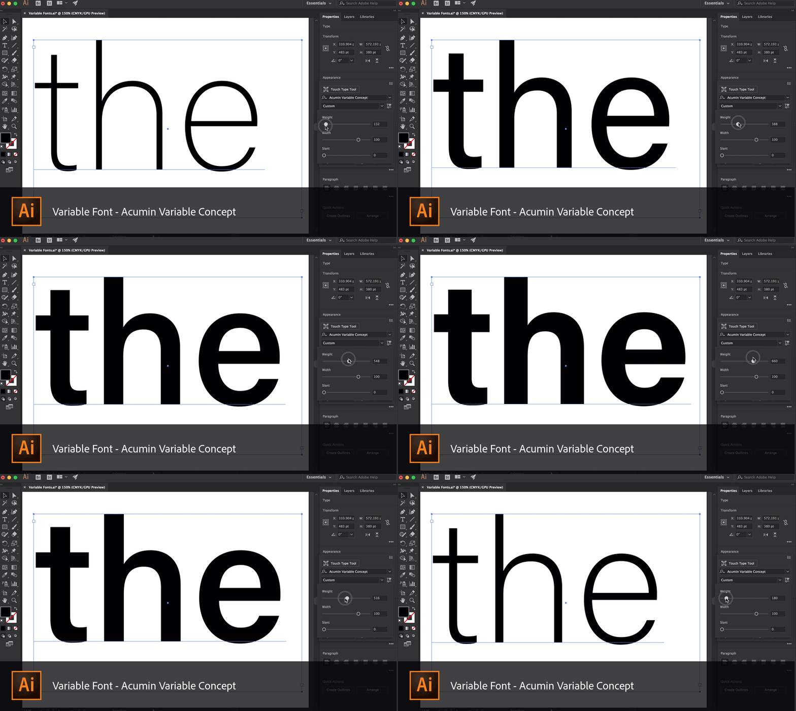
It’s one thing to see a variable fonts demo (oooooo one font can change things like weight, width, and slant?) but it feels a lot more real when fonts you see and work with all the time go variable. Adobe made six of them available: Source Sans, Source Serif, Source Code, Myriad, Acumin, and Minion. You can’t serve them on the web directly through TypeKit yet, but you can download them from GitHub to start playing.
Print designers have just as much reason to be excited, or perhaps more, as so long as you have software that supports variable fonts, you can use them right now:
Considering how much the command line is an integral part of the developer’s workflow, it should not be thought overly difficult or tedious to learn.
At one time I avoided it myself, but one day began teaching myself ways to make the difficult as easy as it should be. I got over the hurdle, and you can too. It was worth investing my time to increase my command line comfort-level, and I am going to share a few tips and resources that I found helpful in this post.
The intended reader is the type who typically avoids the command line, or perhaps uses it occasionally but not as a regular or essential tool.
Tip #1: Maintain a Pragmatic Mindset
The way to get more comfortable with the command line is this: practice. You practice, and you get better. There is no secret trick to this; study and repetition of skills will turn into understanding and mastery. There is no use in the mindset that you cannot do this; it will only keep you from your goal. You may as well discard such thoughts and get down to it.
Tip #2: Keep a Cheat sheet
Don’t be afraid to keep a cheat sheet. I find that a thin, spiral-bound notebook kept next to my keyboard is perfect; writing the command down helps commit it to memory; having it in a place where I can refer to it while I am typing is convenient to the process. Do not permit yourself merely to copy and paste; you will not learn this way. Until you know the command, make yourself type it out.
Tip #3: Peruse languages outside of the one(s) you normally use
Spend time looking at commands in various languages, looking at the commands even if you don’t immediately absorb, use, or remember them. It is worth it to invest a bit of time regularly, looking at these commands; patterns will eventually emerge. Some of them may even come back to you at an unexpected time and give you an extra eureka moment!
Skimming through books with lots of CLI commands can prove interestingly useful for recognizing patterns in commands. I even take this one step further by getting my favorites spiral-bound. I am a big fan of spiral binding; a place like FedEx offers coil binding services at a surprisingly low cost.
Tip #4: Practice… safely
When I am advising someone who is new to contributing to open source, they are inevitably a bit nervous about it. I think this is perfectly natural if only to comfort myself that my own nervousness about it was perfectly natural. A good way to practice, though, is to set up your own repository for a project and regularly commit to it. Simply using common Git commands in a terminal window to commit inconsequential changes to a project of your own, will establish the „muscle memory” so that when it does come time to actually commit code of consequence, you won’t be held back by still being nervous about the commands themselves.
These are the commands I have noticed most common to use in the practical day-to-day of development. It’s perfectly acceptable to expect yourself to learn these and to be able to do any of them without a second thought. Do not use a GUI tool (they make weird merge choices). Learn how to write these commands yourself.
Check status
Create a new branch and switch to it
Add files
Add all the changes
Just add one of the changes
Commit
Push to a remote branch
Get a list of your branches
Checkout a branch
Delete a branch
Delete a branch even if there are changes
Fetch and merge the changes to a branch
Syncing a fork took longer to learn- I don’t often spend my work hours writing code for a repository that I don’t have access to. While contributing to open source software, however, I had to learn how to do this. The GitHub article about the topic is sufficient; even now I still have it bookmarked.
Tip #5: Level Up!
I really enjoy using Digital Ocean to level up my skills. Their step-by-step guides are really useful, and for $5 USD per month, „Droplets” are a cost-effective way to do so.
Here’s a suggested self-learning path (which, feel free to choose your own adventure! There are over 1700 tutorials in the Digital Ocean community):
Create a Droplet with Ghost pre-installed. There is a little command line work to finalize the installation, which makes it a good candidate. It’s not completely done for you but there’s not so much to do that it’s overwhelming. There’s even an excellent tutorial already written by Melissa Anderson.
Set up a GitHub repo to work on a little theming for Ghost, making small changes and practice your command line work.
It would be remiss of me to write any guide without mentioning Ember, as the ember-cli is undoubtedly one of the strongest there is. Feel free to head over to the docs and read that list!
Conclusion
There may be some that find this brief guide too simplistic. However, as famously said by S. Thompson in Calculus Made Easy- „What one fool can do, other fools can do also.” Don’t let anyone else make you think that using the command line is horribly difficult, or that they are a genius because they can. With practice, you will be able to do it, and it will soon be a simple thing.
Reboot, a collection of element-specific CSS changes in a single file, kickstart Bootstrap to provide an elegant, consistent, and simple baseline to build upon.
If you’re new to CSS development, the whole idea of a CSS reset is to deal with styling inconsistencies across browsers. For example, just now I popped a <button> onto a page with no other styling whatsoever. Chrome applies padding: 2px 6px 3px; – Firefox applies padding: 0 8px;. A CSS reset would apply newpadding to that element, so that all browsers are consistent about what they apply. There are loads of examples like that.
By way of a bit of history…
In 2007 Jeff Starr rounded up a bunch of different CSS resets. The oldest one dated is Tantek Çelik’s undohtml.css (that’s a direct link to the source). We can see that the purpose behind it was to strip away default styling.
/* undohtml.css */
/* (CC) 2004 Tantek Celik. Some Rights Reserved.             */
/*   http://creativecommons.org/licenses/by/2.0                   */
/* This style sheet is licensed under a Creative Commons License. */

/* Purpose: undo some of the default styling of common (X)HTML browsers */
By far, the most popular reset came shortly after: the Meyer reset. It has different stuff in it than Tantek’s did (it has even been updated with some HTML5 elements) but the spirit is the same: remove default styling. You’ll probably recognize this famous block of code, finding its way into your DevTools style panel everywhere:
Start with a reset like this (at the top of your production stylesheet) and the styles you write afterword will be on a steady foundation.
Years later, as HTML5 became more real, resets like Richard Clark’s HTML5 Reset gained popularity. It was still a modified version of the Meyer reset, and the retained that spirit.
Sprinkled all throughout this, there were plenty of developers who went minimal by just zapping margin and padding from everything and leaving it at that:
* {
  padding: 0;
  margin: 0;
}
Dumb trivia: the CSS-Tricks logo was inspired by the universal selector and that idea.
Along comes Normalize.css…
Normalize.css represents the first meaningful shift in spirit for what a CSS reset should do. This is what seemed so different about it to me:
It was a fresh evaluation of everything that could be styled different across browsers and it address all of it. Where older CSS resets were a handful of lines of code, the uncompressed and documented normalize is 447.
It didn’t remove any styling from elements that were already consistent across browsers (for the most part). For example, there isn’t anything in Normalize for h2-h6 elements, just a fix for a weird h1 thing. That means you aren’t zapping away header hierarchy, that default styling remains.
It was more accommodating to the idea of altering it, rather than just including it. For example, there is a section just for the <pre> tag and one line of that sets its font-family. You could change that to the font-family you want, and it would be just as effective of a reset.
The code is satisfying to read, as it explains what it’s doing without drowning in specifics:
/**
 * 1. Remove the bottom border in Chrome 57- and Firefox 39-.
 * 2. Add the correct text decoration in Chrome, Edge, IE, Opera, and Safari.
 */

abbr[title] {
  border-bottom: none; /* 1 */
  text-decoration: underline; /* 2 */
  text-decoration: underline dotted; /* 2 */
}
Today Normalize is at 7.0.0 and has going on 30,000 GitHub stars. It’s wicked popular.
So… resets can be opinionated?
We’ve seen lots of different takes on CSS resets and we’ve seen fundamental shifts in the approach, so I think it’s fair to say CSS resets can take an opinionated stance.
Let’s consider some ways…
Does the reset touch every single possible element? Or a subset of elements? How does it decide which elements to touch and which not to?
What properties are changed? Only ones with cross-browser differences? Or some other criteria, like the similarity to other elements that needed changes? Is it OK to apply properties to elements that don’t have cross-browser issues in the name of consistency and efficiency?
Do you try to preserve the spirit of the user agent stylesheet? Sensible defaults?
Do you apply any properties that don’t have cross-browser issues could be considered beneficial to „reset”, like typographic defaults or box-sizing?
Do you include „toolbox” classes for common needs? Or leave that for other projects to handle?
Are you concerned about the size of it?
Do you use a preprocessor or any other tooling?
Take a look at Vanilla CSS Un-Reset. Loads of opinions here, starting with the idea that it’s meant to re-style elements after you un-style then with a reset. It set’s the body font size in pt, set a very specific monospace font stack, includes a ol ol ol ol selector, a clearfix, and alignment helper classes. No judgment there. People make things to help with their own problems and I’m sure this was helpful to the creator. But we can see the opinions shine through there.
Now look at MiniReset.css. Very different! It does wipe out type styles „so that using semantic markup doesn’t affect the styling”, but leaves some defaults in place on purpose „so that buttons and inputs keep their default layout”, puts in some things that don’t have cross-browser problems but are useful globally (box-sizing), and adds some minor responsive design helpers.
Totally different set of opinions there.
Jonathan Neal created a reset called santize.css that is very clear about it’s opinions. Search for the word „opinionated” in the source code and you’ll see it 19 times. All these are choices that Jonathan made based on research and what seem to be modern best practices, and no doubt sprinkled with his own needs and desires for what should be in a reset.
/*
 * Remove the text shadow on text selections (opinionated).
 * 1. Restore the coloring undone by defining the text shadow (opinionated).
 */

::-moz-selection {
	background-color: #b3d4fc; /* 1 */
	color: #000000; /* 1 */
	text-shadow: none;
}

::selection {
	background-color: #b3d4fc; /* 1 */
	color: #000000; /* 1 */
	text-shadow: none;
}
The word „reset”
Personally, I think it’s useful to think of all of them under the same umbrella term and just be aware of the philosophical differences. But, Normalize intentionally separates itself:
A modern, HTML5-ready alternative to CSS resets
Sanitize calls itself a CSS library and doesn’t use the word „reset” anywhere except to cite the Meyer reset.
Reboot
Reboot is interesting as it’s perhaps the newest player in this world. It’s file history dates back to 2015, which is probably related to Bootstrap 4 taking a while to drop after Bootstrap 3. Reboot doesn’t have its own repo, it’s a part of Bootstrap. Here’s the direct file and the docs.
The way they think about it is interesting:
Reboot builds upon Normalize, providing many HTML elements with somewhat opinionated styles using only element selectors. Additional styling is done only with classes. For example, we reboot some <table> styles for a simpler baseline and later provide .table, .table-bordered, and more.
You can have a class that does styling, but if you use a reset, you don’t have to overload that class with reset styles that handle cross-browser consistency issues.
//
// Tables
//

table {
  border-collapse: collapse; // Prevent double borders
}

caption {
  padding-top: $table-cell-padding;
  padding-bottom: $table-cell-padding;
  color: $text-muted;
  text-align: left;
  caption-side: bottom;
}

th {
  // Matches default `<td>` alignment by inheriting from the `<body>`, or the
  // closest parent with a set `text-align`.
  text-align: inherit;
}
It’s definitely opinionated, but in a way that rolls with Bootstrap nicely. The fact that it’s buried within Bootstrap is pretty good signaling this is designed for that world, not as a drop-in for any project. That said, I did my best to compile a straight CSS version of it here.
Tailoring a reset based on browser support
So long as we’re talking about the past and future of resets, it’s worth mentioning Browserslist again, which is a standardized format for declaring what browsers/versions a project supports.
A reset could be built in a such a way that the things it includes know why they are there. Exactly what browser and version it is there to support. Then if browserslist configuration says that particular browser isn’t supported by this project anyway, that CSS could be removed.
It was awesome to hear Charlotte Dann on CodePen Radio the other day, who is Kickstarting a new jewelry business. The idea is that you draw your own jewelry (everything you draw looks awesome because it’s on this interesting hexagon grid) and then it gets actually made. This tying together of her passions sprang to life on CodePen.
Drop shadows. Web designers have loved them for a long time to the extent that we used to fake them with PNG images before CSS Level 3 formally introduced them to the spec as the box-shadow property. I still reach for drop shadows often in my work because they add a nice texture in some contexts, like working with largely flat designs.
Not too long after box-shadow was introduced, a working draft for CSS Filters surfaced and, with it, a method for drop-shadow() that looks a lot like box-shadow at first glance. However, the two are different and it’s worth comparing those differences.
For me, the primary difference came to light early on when I started working with box-shadow. Here’s a simple triangle not unlike the one I made back then.
It’s annoying, but makes sense. CSS uses a box model, where the element’s edges are bound in the shape of a rectangle. Even in cases where the shape of the element does not appear to be a box, the box is still there and that is was box-shadow is applied to. This was my „ah-ha moment” when understanding the box in box-shadow.
CSS Filter Drop Shadow
CSS Filters are pretty awesome. Take a gander at all the possibilities for adding visual filters on elements and marvel at how CSS suddenly starts doing a lot of things we used to have to mockup in Photoshop.
Filters are not bound to the box model. That means the outline of our triangle is recognized and the transparency around it is ignored so that the intended shape receives the shadow.
The answer is totally up to you. The simple example of a triangle above might make it seem that filter: drop-shadow() is better, but it’s not a fair comparison of the benefits or even the possibilities of both methods. It’s merely an illustration of their different behaviors in a specific context.
Like most things in development, the answer of which method to use depends. Here’s a side-by-side comparison to help distinguish the two and when it might be best to choose one over the other.
Hardware accelerated in browsers that support it. It’s a heavy lift without it.
Wrapping Up
The difference between box-shadow and filter: drop-shadow() really boils down to the CSS box model. One sees it and the other disregards it. There are other differences that distinguish the two in terms of browser support, performance and such, but the way the two treat the box model is the key difference.
Update: Amelia identified another key difference in the comments where the spread of the radius for drop-shadow() is calculated differently than box-shadow and even that of text-shadow. That means that the spread radius you might specify in box-shadow is not one-to-one with the default spread value for drop-shadow, so the two are not equal replacements of one another in some cases.
My last two projects hurled me into the JAMstack. SPAs, headless content management, static generation… you name it. More importantly, they gave me the opportunity to learn Vue.js. More than „Build a To-Do App” Vue.js, I got to ship real-life, production-ready Vue apps.
The agency behind Snipcart (Spektrum) wanted to start using decoupled JavaScript frameworks for small to medium sites. Before using them on client projects, however, they chose to experiment on themselves. After a few of my peers had unfruitful experiences with React, I was given the green light to prototype a few apps in Vue. This prototyping morphed into full-blown Vue apps for Spektrum connected to a headless CMS. First, I spent time figuring out how to model and render our data appropriately. Then I dove head first into Vue transformations to apply a much-needed layer of polish on our two projects.
This post digs into Vue.js and the tools it offers with its transition system. It is assumed that you are already comfortable with the basics of Vue.js and CSS transitions. For the sake of brevity and clarity, we won’t get into the „logic” used in the demo.
Handling Vue.js Transitions & Animations
Animations & transitions can bring your site to life and entice users to explore. Animations and transitions are an integral part of UX and UI design. They are, however, easy to get wrong. In complex situations like dealing with lists, they can be nearly impossible to reason about when relying on native JavaScript and CSS. Whenever I ask backend developers why they dislike front end so vehemently, their response is usually somewhere along the lines of „… animations„.
Even for those of us who are drawn to the field by an urge to create intricate micro-interactions and smooth page transitions, it’s not easy work. We often need to rely on CSS for performance reasons, even while working in a mostly JavaScript environment, and that break in the environment can be difficult to manage.
This is where frameworks like Vue.js step in, taking the guess-work and clumsy chains of setTimeout functions out of transitions.
The Difference Between Transitions and Animations
The terms transition and animation are often used interchangeably but are actually different things.
A transition is a change in the style properties on an element to be transitioned in a single step. They are often handled purely through CSS.
An animation is more complex. They are usually multi-step and sometimes run continuously. Animations will often call on JavaScript to pick up where CSS’ lack of logic drops off.
It can be confusing, as adding a class could be the trigger for a transition or an animation. Still, it is an important distinction when stepping into the world of Vue because both have very different approaches and toolboxes.
Here’s an example of transitions in use on Spektrum’s site:
Using Transitions
The simplest way to achieve transition effects on your page is through Vue’s <transition> component. It makes things so simple, it almost feels like cheating. Vue will detect if any CSS animations or transitions are being used and will automatically toggle classes on the transitioned content, allowing for a perfectly timed transition system and complete control.
First step is to identify our scope. We tell Vue to prepend the transition classes with modal, for example, by setting the component’s name attribute. Then to trigger a transition all you need to do is toggle the content’s visibility using the v-if or v-show attributes. Vue will add/remove the classes accordingly.
There are two „directions” for transitions: enter (for an element going from hidden to visible) and leave (for an element going from visble to hidden). Vue then provides 3 „hooks” that represent different timeframes in the transition:
.modal-enter-active / .modal-leave-active: These will be present throughout the entire transition and should be used to apply your CSS transition declaration. You can also declare styles that need to be applied from beginning to end.
.modal-enter / .modal-leave: Use these classes to define how your element looks before it starts the transition.
.modal-enter-to / .modal-leave-to: You’ve probably already guessed, these determine the styles you wish to transition towards, the „complete” state.
To visualize the whole process, take a look at this chart from Vue’s documentation:
How does this translate into code? Say we simply want to fade in and out, putting the pieces together would look like this:
This is likely the most basic implementation you will come across. Keep in mind that this transition system can also handle content changes. For example, you could react to a change in Vue’s dynamic <component>.
Things get interesting when we start dealing with lists. Be it some bullet points or a grid of blog posts, Vue gives you the <transition-group> component.
It is worth noting that while the <transition> component doesn’t actually render an element, <transition-group> does. The default behaviour is to use a <span> but you can override this by setting the tag attribute on the <transition-group>.
The other gotcha is that all list items need to have a unique key attribute. Vue can then keep track of each item individually and optimize its performance. In our demo, we’re looping over the list of companies, each of which has a unique ID. So we can set up our list like so:
The most impressive feature of transition-group is how Vue handles changes in the list’s order so seamlessly. For this, an additional transition class is available, .company-move (much like the active classes for entering and leaving), which will be applied to list items that are moving about but will remain visible.
In the demo, I broke it down a bit more to show how to leverage different states to get a cleaner end result. Here’s a simplified and uncluttered version of the styles:
/* base */
.company {
  backface-visibility: hidden;
  z-index: 1;
}

/* moving */
.company-move {
  transition: all 600ms ease-in-out 50ms;
}

/* appearing */
.company-enter-active {
  transition: all 300ms ease-out;
}

/* disappearing */
.company-leave-active {
  transition: all 200ms ease-in;
  position: absolute;
  z-index: 0;
}

/* appear at / disappear to */
.company-enter,
.company-leave-to {
  opacity: 0;
}
Using backface-visibility: hidden on an element, even in the absence of 3D transforms, will ensure silky 60fps transitions and avoid fuzzy text rendering during transformations by tricking the browser into leveraging hardware acceleration.
In the above snippet, I’ve set the base style to z-index: 1. This assures that elements staying on page will always appear above elements that are leaving. I also apply a absolute positioning to items that are leaving to remove them from the natural flow, triggering the move transition on the rest of the items.
That’s all we need! The result is, frankly, almost magic.
Using Animations
The possibilities and approaches for animation in Vue are virtually endless, so I’ve chosen one of my favourite techniques to showcase how you could animate your data.
We’re going to use GSAP’s TweenLite library to apply easing functions to our state’s changes and let Vue’s lightning fast reactivity reflect this on the DOM. Vue is just as comfortable working with inline SVG as it is with HTML.
We’ll be creating a line graph with 5 points, evenly spaced along the X-axis, whose Y-axis will represent a percentage. You can take a look here at the result.
new Vue({
  el: '#app',
  // this is the data-set that will be animated
  data() {
    return {
      points: { a: -1, b: -1, c: -1, d: -1, e: -1 }
    }
  },

  // this computed property builds an array of coordinates that
  // can be used as is in our path
  computed: {
    path() {
      return Object.keys(this.points)
        // we need to filter the array to remove any
        // properties TweenLite has added
        .filter(key => ~'abcde'.indexOf(key))
        // calculate X coordinate for 5 points evenly spread
        // then reverse the data-point, a higher % should
        // move up but Y coordinates increase downwards
        .map((key, i) => [i * 100, 100 - this.points[key]])
    }
  },

  methods: {
    // our randomly generated destination values
    // could be replaced by an array.unshift process
    setPoint(key) {
      let duration = this.random(3, 5)
      let destination = this.random(0, 100)
      this.animatePoint({ key, duration, destination })
    },
    // start the tween on this given object key and call setPoint
    // once complete to start over again, passing back the key
    animatePoint({ key, duration, destination }) {
      TweenLite.to(this.points, duration, {
        [key]: destination,
        ease: Sine.easeInOut,
        onComplete: this.setPoint,
        onCompleteParams: [key]
      })
    },
    random(min, max) {
      return ((Math.random() * (max - min)) + min).toFixed(2)
    }
  },

  // finally, trigger the whole process when ready
  mounted() {
    Object.keys(this.points).forEach(key => {
      this.setPoint(key)
    })
  }
});
Notice how we bind our path computed property to the path element’s d attribute. We do something similar with the text nodes that output the current value for that point. When TweenLite updates the data, Vue reacts instantly and keeps the DOM in sync.
That’s really all there is to it! Of course, additional styles were applied to make things pretty, which at this point you might realize is more work then the animation itself!
Live demos (CodePen) & GitHub repo
Go ahead, browse the live demos or analyze/re-use the code in our open source repo!
I’ve always been a fan of animations and transitions on the web, but I’m also a stickler for performance. As a result, I’m always very cautious when it comes to relying on JavaScript. However, combining Vue’s blazing fast and low-cost reactivity with its ability to manage pure CSS transitions, you would really have to go overboard to have performance issues.
It’s impressive that such a powerful framework can offer such a simple yet manageable API. The animation demo, including the styling, was built in only 45 minutes. And if you discount the time it took to set up the mock data used in the list-transition, it’s achievable in under 2 hours. I don’t even want to imagine the migraine-inducing process of building similar setups without Vue, much less how much time it would take!
Now get out there and get creative! The use cases go far beyond what we have seen in this post: the only true limitation is your imagination. Don’t forget to check out the transitions and animations section in Vue.js’ documentation for more information and inspiration.
This post originally appeared on Snipcart’s blog. Got comments, questions? Add them below!
I believe commenting code is important. Most of all, I believe commenting is misunderstood. I tweeted out the other day that „I hear conflicting opinions on whether or not you should write comments. But I get thank you’s from junior devs for writing them so I’ll continue.” The responses I received were varied, but what caught my eye was that for every person agreeing that commenting was necessary, they all had different reasons for believing this.
Commenting is a more nuanced thing than we give it credit for. There is no nomenclature for commenting (not that there should be) but lumping all comments together is an oversimplification. The example in this comic that was tweeted in response is true:
From Abstrusegoose
This is where I think a lot of the misconceptions of comments lie. The book Clean Code by Robert C. Martin talks about this: that comments shouldn’t be necessary because code should be self-documenting. That if you feel a comment is necessary, you should rewrite it to be more legible. I both agree and disagree with this. In the process of writing a comment, you can often find things that could be written better, but it’s not an either/or. I might still be able to rewrite that code to be more self-documenting and also write a comment as well, for the following reason:
Code can describe how, but it cannot explain why.
This isn’t a new concept, but it’s a common theme I notice in helpful comments that I have come across. The ability to communicate something that the code cannot, or cannot concisely.
All of that said, there is just not one right way or one reason to write a comment. In order to better learn, let’s dig into some of the many beneficial types of comments that might all serve a different purpose, followed by patterns we might want to avoid.
Good comments
What is the Why
Many examples of good comments can be housed under this category. Code explains what you’d like the computer to take action on. You’ll hear people talk about declarative code because it describes the logic precisely but without describing all of the steps like a recipe. It lets the computer do the heavy lifting. We could also write our comments to be a bit more declarative
/*
  We had to write this function because the browser
  interprets that everything is a box
*/
This doesn’t describe what the code below it will do. It doesn’t describe the actions it will take. But if you found a more elegant way of rewriting this function, you could feel confident in doing so because your code is likely the solution to the same problem in a different way.
Because of this, less maintenance is required (we’ll dig more into this further on). If you found a better way to write this, you probably wouldn’t need to rewrite the comment. You could also quickly understand whether you could rewrite another section of code to make this function unnecessary without spending a long time parsing all the steps to make the whole.
Clarifying something that is not legible by regular human beings
When you look at a long line of regex, can you immediately grok what’s going on? If you can, you’re in the minority, and even if you can at this moment, you might not be able to next year. What about a browser hack? Have you ever seen this in your code?
.selector { [;property: value;]; }
what about
var isFF = /a/[-1]=='a';
The first one targets Chrome ≤ 28, Safari ≤ 7, Opera ≥ 14, the second one is Firefox versions 2-3. I have written code that needs something like this. In order to avoid another maintainer or a future me assuming I took some Salvia before heading to work that day, it’s great to tell people what the heck that’s for. Especially in preparation for a time when we don’t have to support that browser anymore, or the browser bug is fixed and we can remove it.
Something that is clear and legible to you is not necessarily clear to others
Who’s smart? We are! Who writes clean code? We do! We don’t have to comment, look how clear it is. The problem with this way of thinking is that we all have deeper knowledge in different areas. On small teams where people’s skillsets and expertise are more of a circle than a venn diagram, this is less of an issue than big groups that change teams or get junior devs or interns frequently. But I’d probably still make room for those newcomers or for future you. On bigger teams where there are junior engineers or even just engineers from all types of background, people might not outrightly tell you they need you to comment, but many of these people will also express gratitude when you do.
Comments like chapters of a book
If this very article was written as one big hunk rather than broken up into sections with whitespace and smaller headings, it would be harder to skim through. Maybe not all of what I’m saying applies to you. Commenting sections or pieces allows people to skip to a part most relevant to them. But alas! You say. We have functional programming, imports, and modules for this now.
It’s true! We break things down into smaller bits so that they are more manageable, and thank goodness for that. But even in smaller sections of code, you’ll necessarily come to a piece that has to be a bit longer. Being able quickly grasp what is relevant or a label for an area that’s a bit different can speed up productivity.
A guide to keep the logic straight while writing the code
This one is an interesting one! These are not the kind of comments you keep, and thus could also be found in the „bad patterns” section. Many times when I’m working on a bigger project with a lot of moving parts, breaking things up into the actions I’m going to take is extremely helpful. This could look like
// get the request from the server and give an error if it failed
// do x thing with that request
// format the data like so
Then I can easily focus on one thing at a time. But when left in your code as is, these comments can be screwy to read later. They’re so useful while you’re writing it but once you’re finished can merely be a duplication of what the code does, forcing the reader to read the same thing twice in two different ways. It doesn’t make them any less valuable to write, though.
My perfect-world suggestion would be to use these comments at the time of writing and then revisit them after. As you delete them, you could ask „does this do this in the most elegant and legible way possible?” „Is there another comment I might replace this with that will explain why this is necessary?” „What would I think is the most useful thing to express to future me or other from another mother?”
This is OK to refactor
Have you ever had a really aggressive product deadline? Perhaps you implemented a feature that you yourself disagreed with, or they told you it was „temporary” and „just an AB test so it doesn’t matter”. *Cue horror music* … and then it lived on… forever…
As embarrassing as it might be, writing comments like
// this isn't my best work, we had to get it in by the deadline
is rather helpful. As a maintainer, when I run across comments like this, I’ll save buckets of time trying to figure out what the heck is wrong with this person and envisioning ways I could sabotage their morning commute. I’ll immediately stop trying to figure out what parts of this code I should preserve and instead focus on what can be refactored. The only warning I’ll give is to try not to make this type of coding your fallback (we’ll discuss this in detail further on).
Commenting as a teaching tool
Are you a PHP shop that just was given a client that’s all Ruby? Maybe it’s totally standard Ruby but your team is in slightly over their heads. Are you writing a tutorial for someone? These are the limited examples for when writing out the how can be helpful. The person is literally learning on the spot and might not be able to just infer what it’s doing because they’ve never seen it before in their lives. Comment that sh*t. Learning is humbling enough without them having to ask you aloud what they could more easily learn on their own.
I StackOverflow’d the bejeezus outta this
Did you just copy paste a whole block of code from Stack Overflow and modify it to fit your needs? This isn’t a great practice but we’ve all been there. Something I’ve done that’s saved me in the past is to put the link to the post where I found it. But! Then we won’t get credit for that code! You might say. You’re optimizing for the wrong thing would be my answer.
Inevitably people have different coding styles and the author of the solution solved a problem in a different way than you would if you knew the area deeper. Why does this matter? Because later, you might be smarter. You might level up in this area and then you’ll spend less time scratching your head at why you wrote it that way, or learn from the other person’s approach. Plus, you can always look back at the post, and see if any new replies came in that shed more light on the subject. There might even be another, better answer later.
Bad Comments
Writing comments gets a bad wrap sometimes, and that’s because bad comments do indeed exist. Let’s talk about some things to avoid while writing them.
They just say what it’s already doing
John Papa made the accurate joke that this:
// if foo equals bar ...
If (foo === bar) {

} // end if
is a big pain. Why? Because you’re actually reading everything twice in two different ways. It gives no more information, in fact, it makes you have to process things in two different formats, which is mental overhead rather than helpful. We’ve all written comments like this. Perhaps because we didn’t understand it well enough ourselves or we were overly worried about reading it later. For whatever the reason, it’s always good to take a step back and try to look at the code and comment from the perspective of someone reading it rather than you as the author, if you can.
It wasn’t maintained
Bad documentation can be worse than no documentation. There’s nothing more frustrating than coming across a block of code where the comment says something completely different than what’s expressed below. Worse than time-wasting, it’s misleading.
One solution to this is making sure that whatever code you are updating, you’re maintaining the comments as well. And certainly having less and only more meaningful comments makes this upkeep less arduous. But commenting and maintaining comments are all part of an engineer’s job. The comment is in your code, it is your job to work on it, even if it means deleting it.
If your comments are of good quality to begin with, and express why and not the how, you may find that this problem takes care of itself. For instance, if I write
// we need to FLIP this animation to be more performant in every browser
and refactor this code later to go from using getBoundingClientRect() to getBBox(), the comment still applies. The function exists for the same reason, but the details of how are what has changed.
You could have used a better name
I’ve definitely seen people write code (or done this myself) where the variable or functions names are one letter, and then comment what the thing is. This is a waste. We all hate typing, but if you are using a variable or function name repeatedly, I don’t want to scan up the whole document where you explained what the name itself could do. I get it, naming is hard. But some comments take the place of something that could easily be written more precisely.
The comments are an excuse for not writing the code better to begin with
This is the crux of the issue for a lot of people. If you are writing code that is haphazard, and leaning back on your comments to clarify, this means the comments are holding back your programming. This is a horse-behind-the-cart kind of scenario. Unfortunately, even as the author it’s not so easy to determine which is which.
We lie to ourselves in myriad ways. We might spend the time writing a comment that could be better spent making the code cleaner to begin with. We might also tell ourselves we don’t need to comment our code because our code is well-written, even if other people might not agree.
There are lazy crutches in both directions. Just do your best. Try not to rely on just one correct way and instead write your code, and then read it. Try to envision you are both the author and maintainer, or how that code might look to a younger you. What information would you need to be as productive as possible?
People tend to, lately, get on one side or the other of „whether you should write comments”, but I would argue that that conversation is not nuanced enough. Hopefully opening the floor to a deeper conversation about how to write meaningful comments bridges the gap.
Even so, it can be a lot to parse. Haha get it? Anyways, I’ll leave you with some (better) humor. A while back there was a Stack Overflow post about the best comments people have written or seen. You can definitely waste some time in here. Pretty funny stuff.


![Illustration showing the graphs of the ease-in and ease-out timing functions, both defined on the [0,1] interval, taking values within the [0,1] interval. The ease-in function has a slow increase at first, the change in value accelerating as we get closer to 1. The ease-out function has a fast increase at first, the change in value slowing down as we get closer to 1.](https://cdn.css-tricks.com/wp-content/uploads/2017/09/graph_easein_easeout.svg)
![Illustration showing the graph of the ease-in-out timing function, defined on the [0,1] interval, taking values within the [0,1] interval. This function has a slow rate of change in value at first, then accelerates and finally slows down again such that it's symmetric with respect to the (½,½) point.](https://cdn.css-tricks.com/wp-content/uploads/2017/09/graph_easeinout.svg)
![The sin(k) function on the [-90°,90°] interval. At -90°, this function is at its minimum, which is -1. After that, it increases, at first slow, then accelerates and finally slows down again when k gets close to 90°. At 90°, the sin(k) function is at its maximum, which is 1. Its graph is symmetrical with respect to the (0°,0) point.](https://cdn.css-tricks.com/wp-content/uploads/2017/09/graph_sin_to_easeinout_0.svg)
![The sin(k·π) function on the [-½,½] interval. At -½, the sin(k·π) function is at its minimum, which is -1. After that, it increases, at first slow, then accelerates and finally slows down again when k gets close to ½. At ½, the sin(k·π) function is at its maximum, which is 1. Its graph is symmetrical with respect to the (0,0) point.](https://cdn.css-tricks.com/wp-content/uploads/2017/09/graph_sin_to_easeinout_1.svg)


![The sin(-k·s) function on the [-1,0] interval. At -1, the sin(-k·s) function is sin(s). After that, it decreases, reaches a minimum, then starts increasing again and keeps increasing until k gets to 0. At 0, the sin(-k·s) function is 0.](https://cdn.css-tricks.com/wp-content/uploads/2017/10/graph_sin_to_bounceini_1.svg)
![The sin(-(k - 1)·s) function on the [0,1] interval. At 0, the sin(-(k - 1)·s) function is sin(s). After that, it decreases, reaches a minimum, then starts increasing again and keeps increasing until k gets to 1. At 1, the sin(-(k - 1)·s) function is 0.](https://cdn.css-tricks.com/wp-content/uploads/2017/10/graph_sin_to_bounceini_2.svg)
![The sin(-(k - 1)·s) - sin(s) function on the [0,1] interval. At 0, the sin(-(k - 1)·s) - sin(s) function is 0. After that, it decreases, reaches a minimum, then starts increasing again and keeps increasing until k gets to 1. At 1, the sin(-(k - 1)·s) - sin(s) function is -sin(s).](https://cdn.css-tricks.com/wp-content/uploads/2017/10/graph_sin_to_bounceini_3.svg)
![The 1 - sin((1 - k)·s)/sin(s) function on the [0,1] interval. At 0, the 1 - sin((1 - k)·s)/sin(s) function is 0. After that, it decreases, reaches a minimum, then starts increasing again and keeps increasing until k gets to 1. At 1, the 1 - sin((1 - k)·s)/sin(s) function is 1.](https://cdn.css-tricks.com/wp-content/uploads/2017/10/graph_sin_to_bounceini_4.svg)
![The sin(k·e) function on the [0,1] interval. At 0, the sin(k·e) function is 0. After that, it increases, overshoots the final value, reaches a maximum of 1, then decreases back to sin(e) for a k equal to 1.](https://cdn.css-tricks.com/wp-content/uploads/2017/10/graph_sin_to_bouncefin_1.svg)
![The sin(k·e)/sin(e) function on the [0,1] interval. At 0, the sin(k·e)/sin(e) function is 0. After that, it increases, overshoots the final value, reaches a maximum, then decreases back to 1 for a k equal to 1.](https://cdn.css-tricks.com/wp-content/uploads/2017/10/graph_sin_to_bouncefin_2.svg)
![The sin(k + s) function on the [0,e - s] interval. At 0, the sin(k + s) function is sin(s). At first, it decreases, reaches a minimum of -1, then starts increasing and keeps increasing until it overshoots the final value, reaches a maximum of 1, then decreases back to sin(e) for a k equal to e - s.](https://cdn.css-tricks.com/wp-content/uploads/2017/10/graph_sin_to_bounceinifin_1.svg)
![The sin(k·(e - s) + s) function on the [0,1] interval. At 0, the sin(k·(e - s) + s) function is sin(s). At first, it decreases, reaches a minimum of -1, then starts increasing and keeps increasing until it overshoots the final value, reaches a maximum of 1, then decreases back to sin(e) for a k equal to 1.](https://cdn.css-tricks.com/wp-content/uploads/2017/10/graph_sin_to_bounceinifin_2.svg)
![The sin(k·(e - s) + s) - sin(s) function on the [0,1] interval. At 0, the sin(k·(e - s) + s) - sin(s) function is 0. At first, it decreases, reaches a minimum, then starts increasing and keeps increasing until it overshoots the final value, reaches a maximum, then decreases back to sin(e) - sin(s) for a k equal to 1.](https://cdn.css-tricks.com/wp-content/uploads/2017/10/graph_sin_to_bounceinifin_3.svg)
![The (sin(k·(e - s) + s) - sin(s))/(sin(e - sin(s)) function on the [0,1] interval. At 0, the s(sin(k·(e - s) + s) - sin(s))/(sin(e - sin(s)) function is 0. At first it decreases, reaches a minimum, then starts increasing and keeps increasing until it overshoots the final value, reaches a maximum, then decreases back to 1 for a k equal to 1.](https://cdn.css-tricks.com/wp-content/uploads/2017/10/graph_sin_to_bounceinifin_4.svg)