A podcast (turns out to be a 2-parter) from Reply All in which Alex Goldman gets a scam phone call about his iCloud account being compromised. He goes pretty far into investigating it, speaking regularly with the people who run these scams.
I was asked (by this fella on Twitter) a question about design patterns. It has an interesting twist though, related to hiring, which I hope makes for a good poll.
Note: There is a poll embedded within this post, please visit the site to participate in this post’s poll.
I’ll let this run for a week or two. Then (probably) instead of writing a new post with the results, I’ll update this one with the results. Feel free to comment with the reasoning for your vote.
Imgix has been a long-time display ad sponsor here on CSS-Tricks. This post is not technically sponsored, I just noticed that they released a tool for analyzing image performance at any given URL that is pretty interesting.
We know web performance is a big deal. We know that images are perhaps the largest offender in ballooning page weights across the web. We know we have tools for looking at page performance as a whole. It seems fairly new to me to have tools for specifically analyzing and demonstrating how we could have done better with images specifically. That’s what this Page Weight tool is.
Clearly this is a marketing tool for them. You put in a URL, and it tells you how you could have done better, and specifically how imgix can help do that. I’m generally a fan of that. Tools with businesses behind them have the resources and motivation to stick around and get better. But as ever, something to be aware of.
As we can see checking out the homepage for Page Weight, you drop in a URL, it analyzes all the images and gives you some information about how much more performant they could have been. What’s going on behind the scenes there?
We run each image on the page through imgix, resizing to fit the image container as best we can tell, and also transform file formats, color palettes, and quality breakpoints to determine which combination provides the best size savings. Then we display that version for each image.
I see it suggests fitting the image to the container, but that only makes sense for 1x displays right? Images need to be larger than their display pixel size for visual crispness on high-density display.
Definitely. The Page Weight tool does not currently address high-DPR display differences, but our service does. We offer automated high-DPR support via Client Hints, and manually via our dpr parameter, which allows developers to set the desired value directly (useful on its own or as a fallback for Client Hint support in browsers that don’t yet support that functionality). Our imgix.js front-end library also generates a comprehensive srcset (based on the defined sizes) to address whatever size/DPR the device requires.
I think most developers here are smart enough to realize this is really smart marketing for imgix. But also smart enough to realize the images are a huge deal in web performance and want to do better. What can imgix do that a developer on their own can’t do? Or that is fairly impractical for a developer to do on their own?
First, it is important to note that resizing is not the only thing that imgix does, although it is a very common use case. We provide over 100 different processing parameters that enable developers to do everything from context-aware cropping to color space handling to image compositing. So adopting imgix gives a developer access to a lot of image handling flexibility without a lot of hassle, even if they’re primarily using it to support responsive design.
That said, it is not impossible to get a very simple resizing solution running on your own, and many developers start out there. Usually, this takes the form of some kind of batch script based on ImageMagick or Pillow or some other image manipulation library that creates derivative images for the different breakpoints.
For a while, that’s often sufficient. But once your image library gets beyond a few hundred images, batch-based systems begin to break down in various ways. Visibility, error handling, image catalog cleaning, and adding support for new formats and devices are all things that get much harder at scale. Very large sites and sites where content changes constantly will often end up spending significant dev time on these kinds of maintenance tasks.
So really, „could you build this?” is a less useful question than „should you build this?” In other words, is image processing central enough to the value proposition of what you’re building that you’re willing to spend time and effort maintaining your own system to handle it? Usually, the answer is no. Most developers would rather focus on the what’s important and leave images to something like imgix — a robust, scaleable system that just works.
Does the tool look at responsive images syntax in HTML? As in, which image was actually downloaded according to the srcset/sizes or picture element rules?
Not yet. That’s a feature we’re hoping to implement in the next version of the tool.
Can you share implementations of imgix that are particularly impressive or creative?
An interesting use we see more and more is image processing for social media. These days, many sites see the majority of their traffic coming in through social, which makes it more important than ever to make content look good in the feed. Setting OpenGraph tags is a start, but every social network has a different container size. This creates a similar problem to the one posed by mobile fragmentation, and we can help by dynamically generating social images for each network. This provides a polished presentation without adding a ton of overhead for the person maintaining the site.
Other customers are pushing even further by combining several images to create a custom presentation for social. HomeChef, a meal delivery service, does this to dynamically create polished, branded images for Pinterest from their ingredient photos.
We actually created an open source tool called Motif (GitHub Repo) to make it easier for developers to get started with dynamically generating social images through imgix.
Nicky Case’s games are a damn treasure in this world. Most importantly, they are fun and compelling to play. They also make gameplay the vehicle for education on tricky, intricate, and important issues. Issues that would be much harder to learn about by just reading. They are also a masterclass in design: clear calls to action, clear onboarding, meaningful interactions and animations, and good copy.
I met Michael Jackson for the first time at React Rally 2016, soon after writing an article on React Router 3. Michael is one of the principal authors of React Router along with Ryan Florence. It was exciting to meet someone who built a tool I liked so much, but I was shocked when he said. „Let me show you our ideas React Router 4, it’s way different!” Truthfully, I didn’t understand the new direction and why it needed such big changes. Since the router is such a big part of an application’s architecture, this would potentially change some patterns I’ve grown to love. The idea of these changes gave me anxiety. Considering community cohesiveness and being that React Router plays a huge role in so many React applications, I didn’t know how the community would accept the changes.
A few months later, React Router 4 was released, and I could tell just from the Twitter buzz there was mixed feelings on the drastic re-write. It reminded me of the push-back the first version of React Router had for its progressive concepts. In some ways, earlier versions of React Router resembled our traditional mental model of what an application router „should be” by placing all the routes rules in one place. However, the use of nested JSX routes wasn’t accepted by everyone. But just as JSX itself overcame its critics (at least most of them), many came around to believe that a nested JSX router was a pretty cool idea.
So, I learned React Router 4. Admittedly, it was a struggle the first day. The struggle was not with the API, but more so the patterns and strategy for using it. My mental model for using React Router 3 wasn’t migrating well to v4. I would have to change how I thought about the relationship between the router and the layout components if I was going to be successful. Eventually, new patterns emerged that made sense to me and I became very happy with the router’s new direction. React Router 4 allowed me to do everything I could do with v3, and more. Also, at first, I was over-complicating the use of v4. Once I gained a new mental model for it, I realized that this new direction is amazing!
My intentions for this article aren’t to rehash the already well-written documentation for React Router 4. I will cover the most common API concepts, but the real focus is on patterns and strategies that I’ve found to be successful.
Here are some JavaScript concepts you need to be familiar with for this article:
Earlier versions of React Router centralized the routing rules into one place, keeping them separate from layout components. Sure, the router could be partitioned and organized into several files, but conceptually the router was a unit, and basically a glorified configuration file.
Perhaps the best way to see how v4 is different is to write a simple two-page app in each version and compare. The example app has just two routes for a home page and a user’s page.
Here are some key concepts in v3 that are not true in v4 anymore:
The router is centralized to one place.
Layout and page nesting is derived by the nesting of <Route> components.
Layout and page components are completely naive that they are a part of a router.
React Router 4 does not advocate for a centralized router anymore. Instead, routing rules live within the layout and amongst the UI itself. As an example, here’s the same application in v4:
New API Concept: Since our app is meant for the browser, we need to wrap it in <BrowserRouter> which comes from v4. Also notice we import from react-router-dom now (which means we npm install react-router-dom not react-router). Hint! It’s called react-router-dom now because there’s also a native version.
The first thing that stands out when looking at an app built with React Router v4 is that the „router” seems to be missing. In v3 the router was this giant thing we rendered directly to the DOM which orchestrated our application. Now, besides <BrowserRouter>, the first thing we throw into the DOM is our application itself.
Another v3-staple missing from the v4 example is the use of {props.children} to nest components. This is because in v4, wherever the <Route> component is written is where the sub-component will render to if the route matches.
Inclusive Routing
In the previous example, you may have noticed the exact prop. So what’s that all about? V3 routing rules were „exclusive” which meant that only one route would win. V4 routes are „inclusive” by default which means more than one <Route> can match and render at the same time.
In the previous example, we’re trying to render either the HomePage or the UsersPage depending on the path. If the exact prop were removed from the example, both the HomePage and UsersPage components would have rendered at the same time when visiting `/users` in the browser.
To understand the matching logic better, review path-to-regexp which is what v4 now uses to determine whether routes match the URL.
To demonstrate how inclusive routing is helpful, let’s include a UserMenu in the header, but only if we’re in the user’s part of our application:
Now, when the user visits `/users`, both components will render. Something like this was doable in v3 with certain patterns, but it was more difficult. Thanks to v4’s inclusive routes, it’s now a breeze.
Exclusive Routing
If you need just one route to match in a group, use <Switch> to enable exclusive routing:
Only one of the routes in a given <Switch> will render. We still need exact on the HomePage route though if we’re going to list it first. Otherwise the home page route would match when visiting paths like `/users` or `/users/add`. In fact, strategic placement is the name-of-the-game when using an exclusive routing strategy (as it always has been with traditional routers). Notice that we strategically place the routes for /users/add before /users to ensure the correct matching. Since the path /users/add would match for `/users` and `/users/add`, putting the /users/add first is best.
Sure, we could put them in any order if we use exact in certain ways, but at least we have options.
The <Redirect> component will always do a browser-redirect if encountered, but when it’s in a <Switch> statement, the redirect component only gets rendered if no other routes match first. To see how <Redirect> might be used in a non-switch circumstance, see Authorized Route below.
„Index Routes” and „Not Found”
While there is no more <IndexRoute> in v4, using <Route exact> achieves the same thing. Or if no routes resolved, then use <Switch> with <Redirect> to redirect to a default page with a valid path (as I did with HomePage in the example), or even a not-found page.
Nested Layouts
You’re probably starting to anticipate nested sub layouts and how you might achieve them. I didn’t think I would struggle with this concept, but I did. React Router v4 gives us a lot of options, which makes it powerful. Options, though, means the freedom to choose strategies that are not ideal. On the surface, nested layouts are trivial, but depending on your choices you may experience friction because of the way you organized the router.
To demonstrate, let’s imagine that we want to expand our users section so we have a „browse users” page and a „user profile” page. We also want similar pages for products. Users and products both need sub-layout that are special and unique to each respective section. For example, each might have different navigation tabs. There are a few approaches to solve this, some good and some bad. The first approach is not very good but I want to show you so you don’t fall into this trap. The second approach is much better.
For the first, let’s modify our PrimaryLayout to accommodate the browsing and profile pages for users and products:
New API Concept:props.match is given to any component rendered by <Route>. As you can see, the userId is provided by props.match.params. See more in v4 documentation. Alternatively, if any component needs access to props.match but the component wasn’t rendered by a <Route> directly, we can use the withRouter() Higher Order Component.
Each user page not only renders its respective content but also has to be concerned with the sub layout itself (and the sub layout is repeated for each). While this example is small and might seem trivial, repeated code can be a problem in a real application. Not to mention, each time a BrowseUsersPage or UserProfilePage is rendered, it will create a new instance of UserNav which means all of its lifecycle methods start over. Had the navigation tabs required initial network traffic, this would cause unnecessary requests — all because of how we decided to use the router.
Instead of four routes corresponding to each of the user’s and product’s pages, we have two routes for each section’s layout instead.
Notice the above routes do not use the exact prop anymore because we want /users to match any route that starts with /users and similarly for products.
With this strategy, it becomes the task of the sub layouts to render additional routes. Here’s what the UserSubLayout could look like:
The most obvious win in the new strategy is that the layout isn’t repeated among all the user pages. It’s a double win too because it won’t have the same lifecycle problems as with the first example.
One thing to notice is that even though we’re deeply nested in our layout structure, the routes still need to identify their full path in order to match. To save yourself the repetitive typing (and in case you decide to change the word „users” to something else), use props.match.path instead:
As we’ve seen so far, props.match is useful for knowing what userId the profile is rendering and also for writing our routes. The match object gives us several properties including match.params, match.path, match.url and several more.
match.path vs match.url
The differences between these two can seem unclear at first. Console logging them can sometimes reveal the same output making their differences even more unclear. For example, both these console logs will output the same value when the browser path is `/users`:
ES2015 Concept:match is being destructured at the parameter level of the component function. This means we can type match.path instead of props.match.path.
While we can’t see the difference yet, match.url is the actual path in the browser URL and match.path is the path written for the router. This is why they are the same, at least so far. However, if we did the same console logs one level deeper in UserProfilePage and visit `/users/5` in the browser, match.url would be "/users/5" and match.path would be "/users/:userId".
Which to choose?
If you’re going to use one of these to help build your route paths, I urge you to choose match.path. Using match.url to build route paths will eventually lead a scenario that you don’t want. Here’s a scenario which happened to me. Inside a component like UserProfilePage (which is rendered when the user visits `/users/5`), I rendered sub components like these:
To illustrate the problem, I’m rendering two sub components with one route path being made from match.url and one from match.path. Here’s what happens when visiting these pages in the browser:
So why does match.path work for helping to build our paths and match.url doesn’t? The answer lies in the fact that {${match.url}/comments} is basically the same thing as if I had hard-coded {'/users/5/comments'}. Doing this means the subsequent component won’t be able to fill match.params correctly because there were no params in the path, only a hardcoded 5.
path – (string) The path pattern used to match. Useful for building nested <Route>s
url – (string) The matched portion of the URL. Useful for building nested <Link>s
Avoiding Match Collisions
Let’s assume the app we’re making is a dashboard so we want to be able to add and edit users by visiting `/users/add` and `/users/5/edit`. But with the previous examples, users/:userId already points to a UserProfilePage. So does that mean that the route with users/:userId now needs to point to yet another sub-sub-layout to accomodate editing and the profile? I don’t think so. Since both the edit and profile pages share the same user-sub-layout, this strategy works out fine:
Notice that the add and edit routes strategically come before the profile route to ensure there the proper matching. Had the profile path been first, visiting `/users/add` would have matched the profile (because „add” would have matched the :userId.
Alternatively, we can put the profile route first if we make the path ${match.path}/:userId(\\d+) which ensures that :userId must be a number. Then visiting `/users/add` wouldn’t create a conflict. I learned this trick in the docs for path-to-regexp.
Authorized Route
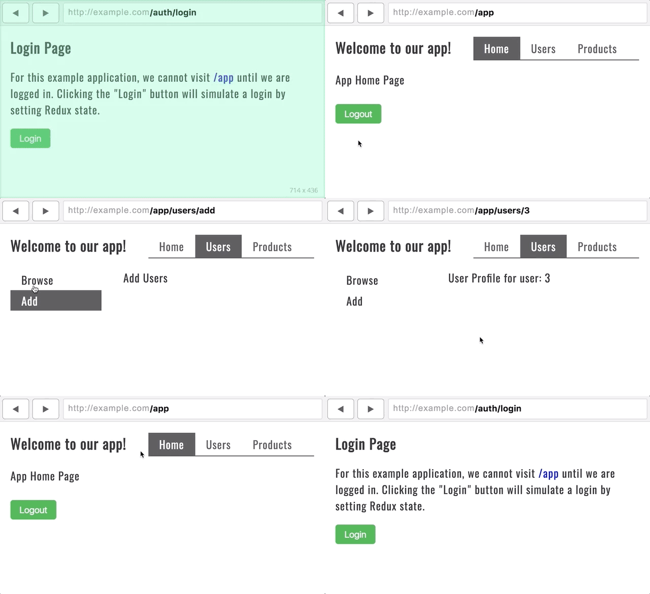
It’s very common in applications to restrict the user’s ability to visit certain routes depending on their login status. Also common is to have a „look-and-feel” for the unauthorized pages (like „log in” and „forgot password”) vs the „look-and-feel” for the authorized ones (the main part of the application). To solve each of these needs, consider this main entry point to an application:
Using react-redux works very similarly with React Router v4 as it did before, simply wrap <BrowserRouter> in <Provider> and it’s all set.
There are a few takeaways with this approach. The first being that I’m choosing between two top-level layouts depending on which section of the application we’re in. Visiting paths like `/auth/login` or `/auth/forgot-password` will utilize the UnauthorizedLayout — one that looks appropriate for those contexts. When the user is logged in, we’ll ensure all paths have an `/app` prefix which uses AuthorizedRoute to determine if the user is logged in or not. If the user tries to visit a page starting with `/app` and they aren’t logged in, they will be redirected to the login page.
AuthorizedRoute isn’t a part of v4 though. I made it myself with the help of v4 docs. One amazing new feature in v4 is the ability to create your own routes for specialized purposes. Instead of passing a component prop into <Route>, pass a render callback instead:
While your login strategy might differ from mine, I use a network request to getLoggedUser() and plug pending and logged into Redux state. pending just means the request is still in route.
There’s a lot of other cool aspects React Router v4. To wrap up though, let’s be sure to mention a few small things so they don’t catch you off guard.
<Link> vs <NavLink>
In v4, there are two ways to integrate an anchor tag with the router: <Link> and <NavLink>
<NavLink> works the same as <Link> but gives you some extra styling abilities depending on if the <NavLink> matches the browser’s URL. For instance, in the example application, there is a <PrimaryHeader> component that looks like this:
The use of <NavLink> allows me to set a class of active to whichever link is active. But also, notice that I can use exact on these as well. Without exact the home page link would be active when visiting `/app/users` because of the inclusive matching strategies of v4. In my personal experiences, <NavLink> with the option of exact is a lot more stable than the v3 <Link> equivalent.
URL Query Strings
There is no longer way to get the query-string of a URL from React Router v4. It seems to me that the decision was made because there is no standard for how to deal with complex query strings. So instead of v4 baking an opinion into the module, they decided to just let the developer choose how to deal with query strings. This is a good thing.
One of the best parts about v4 is that almost everything (including <Route>) is just a React component. Routes aren’t magical things anymore. We can render them conditionally whenever we want. Imagine an entire section of your application is available to route to when certain conditions are met. When those conditions aren’t met, we can remove routes. We can even do some crazy cool recursive route stuff.
At first the title made me think of Git conflicts, but that’s not what this is about. It’s about namespacing selectors for components. Ultimately, they decided to use a Webpack loader (not open source, it doesn’t appear) to prefix every single class with a hashed string representing the version. I guess that must happen in both the HTML and CSS so they match. Lots of folks landing on style-scoping in one way or another to solve their problems.
It makes me think about another smaller-in-scope issue. Say you have an alternate version of a header that you’re going to send to 5% of your users. It has different HTML and CSS. Easy enough to send different HTML to users from the server. But CSS tends to be bundled, and it seems slightly impractical to make an entirely different CSS bundle for a handful of lines of CSS. One solution: add an additional attribute to the new header and ship the new CSS with artificially-boosted specificity to avoid all the old CSS. Then when you go live, remove the new attribute from both.
According to an article from A List Apart about CSS Grid, a „new era in digital design is dawning right now.” With Flexbox and Grid, we have the ability to create layouts that used to be extremely difficult to implement, if not impossible. There’s an entirely new system available for creating layouts, especially with Grid. However, as with most web technologies, browser support is always something of an issue. Let’s look at how we can make the fundamental aspects of Grid work across the browsers that support it, including older versions of Internet Explorer that supported an older and slightly different version of Grid.
The Sales Pitch
If you visit caniuse.com, you’ll see that CSS Grid is supported in current versions of all major browsers except Opera Mini. So why not start using it? Rachel Andrew wrote extensively on the subject of if it’s „safe to use” or not. It is, assuming you’re OK with a fallback scenario that doesn’t replicate exactly what Grid can do:
If your website really needs to look the same in all browsers (whatever that means to you), you won’t be able to use any features only available by using Grid. In that case, don’t use Grid Layout! Use Grid Layout if you want to achieve something that you can’t do in a good way with older technologies.
Grid is a major change to CSS layout. It’s powerful, (fairly) easy to use, and, if you’re working on open source or on a team, easy for fellow developers to read. In this article, we’re going to look at how we can write Grid code to be as compatible as we can possibly make it, including some degree of fallback.
The Sauce
The main thing we want to do in this post is address browser compatibility for the fundamentals of CSS Grid. We’ll cover how to construct a parent grid element and place child grid elements within.
The outliers are going to be Internet Explorer and Edge. Edge is just starting to ship the modern CSS grid syntax, and it’s an evergreen browser so ultimately we won’t have to worry about Edge too much, but at the time of this writing, it matters. IE 10 and 11 are rather locked in time, and both support the old syntax.
Again, Rachel Andrewhas information on this old syntax, what it supports, and how to use it. The old syntax, for example, doesn’t support display: grid;, we have to do display: -ms-grid;. And there are similarly prefixed for many of the properties.
Even then, many of the properties themselves are not the same. But it’s okay. The differences are not that great and we can get some help from Sass. The saving grace here is that we only need vendor prefixes for IE/Edge. Any other browsers will be addressed by the „standard” properties.
First, let’s define a Grid parent using a Sass @mixin:
This is helpful, but the grid itself isn’t yet compatible with the old CSS Grid style.
Next we need to cover the differences in defining the grid parent rows and columns. Let’s beef up the grid a little bit and define it to be compatible across all browsers (for example, by using -ms-grid-columns in addition to grid-template-columns):
The -ms- prefixed properties will work for IE/Edge and the non-prefixed properties will work for other grid-supporting browsers. This particular demo will give us the following dimensions:
One column 150px wide.
One column that takes up all available space left over by the other columns (1fr = 1 fraction of the remaining space after other elements are calculated).
Two columns at 100px wide apiece.
Three rows at 1fr tall apiece.
Check out the value for grouping on line 19. IE and Edge don’t have syntax for grouping a set of rows or columns that are all the same dimensions. We can accomplish the same thing in any other browser using the repeat() function:
repeat([number of columns or rows], [width of columns or height of rows])
No vendor prefix can help us here, we’ll need to write out each column manually with the old syntax.
Now we have a grid that’s compatible across all browsers, but we still need to address the grid children. The following Pen illustrates how they can be made compatible:
Here’s what you need to know about the difference between properties for the grid children in different browsers. In most browsers, you define a grid child by the grid lines where it starts and ends. Grid lines are the lines that exist between the columns and rows you’ve defined. The syntax looks like this:
grid-column-start: 3;
grid-column-end: 5;
/* or the shorthand version: */
grid-column: 3 / 5;
This element will span column lines 3 through 5 in your grid.
In IE and Edge, you define a grid child by the line it starts on and how many rows or columns it spans (There is no shorthand version as in the previous example). The syntax looks like this:
-ms-grid-column: 3;
-ms-grid-column-span: 2;
This element will start on line 3 and span 2 columns. The two code snippets above will effectively create the same element. Notice that 5 – 3 (from the first snippet) is 2, which is the column span from the IE/Edge example. This allows us to do some quick math in our @mixin and get all the needed information from four numbers. The subtraction on lines 17 and 19 sets your span number for IE/Edge.
Using @include grid-element; allows you to define a grid child for any browser using only four numbers: The column start and end, and row start and end.
So now we’ve got grid parents and children that work for all browsers.
Drawbacks and Fallbacks
It’s an unfortunate reality that not all browsers support CSS Grid, and that the old syntax doesn’t support everything from the modern syntax. For example, grid-gap and grid-auto-rows or grid-auto-columns are very useful properties in the modern syntax that there isn’t any equivalent to in the old syntax.
Sometimes you can use the @supports for help. @supports works a bit like a media query, where if it matches the CSS inside it applies.
This can get very tricky though, as @supports is not supported in IE. This kind of creates a puzzle when you want to use features like grid-auto-rows or grid-gap to automate portions of the layout, as you have three scenarios now: modern grid support, old grid support with @supports, old grid support without @supports.
@supports (display: -ms-grid) {
  /* This will apply in Edge (old syntax), but not IE 10 or 11 */
}
For the old syntax, you’ll have to place your grid children and set their margins explicitly so the CSS is recognized by IE, which would nullify the need for auto placement or grid-gap in other browsers.
The following Pen is kind of a hodge-podge, due to the issue of @supports compatibility. You can see how grid-auto-rows works, and how to set the gaps for IE/Edge where grid-gap won’t work. Again, if you have to support IE, the need for explicitly setting values may nullify the need for properties that set layout styles automatically.
The grid-auto-rows property will automatically generate successive rows of a specified height as the columns fill up. You can play with it in the Pen by adding more divs. Another row will be added each time you increase the number of divs past a multiple of three (the number of columns).
The grid-gap property essentially turns the lines between your grid children into gutters. You can set its value using all the usual CSS size units like rems, ems, pixels, etc. In the demo above, the properties involving nth-child set margins that replicate the gutter effect of grid-gap for IE and Edge. It’s not that difficult to account for with simple grids but you can see how it could get out of hand quickly with more advanced or flexible grids.
These two properties and others can be used as a basis for some very powerful layouts. If you’re responsible for supporting IE and Edge, it will come down to a judgment call on whether or not your project warrants the code it takes to account for them. It’s also true that sites don’t necessarily have to look the same in all browsers. And because grid layouts are so easy to construct, they’re probably worth the extra time.
I think it’s worth taking some time to consider whether your project would benefit from CSS Grid and use the @supports rule if it would.
Conclusion
CSS Grid is changing the way layouts on the web are constructed and how they work. Browser support is probably always going to be an issue for web technologies but the saving grace here is that it’s really not that bad for CSS Grid. And even then, the differences are easily accounted for in our code. CSS Grid layouts are awesome and powerful and with a little convenience help from tools like Sass, they can also be compatible.
I was working on a personal project this past week and got a weird error when I tried to compile my Sass files. Unfortunately, I did not screenshot the exact error, but was something along the lines of this:
Failed to write to location cssmin: style.css EACCES
That EACCES code threw me for a loop but I was able to deduce that it was a file permissions issue, based on the error description saying it was unable to write the file and from some quick StackOverflow searching.
I couldn’t find a lot of answers for how to fix this, so I made an attempt to fix it myself. Many of the forum threads I found suggested it could a permissions issue with Node, so I went through the painful exercise of reinstalling it and only made things worse because then Terminal could not even find the npm or grunt tasks.
I finally had to reach out to a buddy (thanks, Neal!) to sort things out. I thought I’d chronicle the process he took me through in case it helps other people down the road.
I’ll preface all this by saying I am working on a Mac. That said, I doubt that everything covered here will be universally applicable for all platforms.
Reinstalling Node
Before I talked to Neal, I went ahead and reinstalled Node via the installer package on nodejs.org.
I was told that my permissions issue will likely come up again on future projects until I take the step to re-install Node yet again using a package manager. Some people use Homebrew, though I’ve seen forums caution against it for various reasons. Node Version Manager appears to be a solid option because it’s designed specifically for managing multiple Node versions on the same machine, which makes it easy for future installations and version switching on projects.
Setting a Path to Node Modules
With Node installed, I expected I could point Terminal to my project:
cd /path/to/my/project/folder
…then install the Node modules I put in the project’s package.json file:
npm install
Instead, I got this:
npm: command not found
Crap. Didn’t I just reinstall Node?
Turns out Terminal (or more correctly, my system in general) was making an assumption about where Node was installed and needed to be told where to look.
I resolved this by opening the system’s .bash_profile file and adding the path there. You can get all geeky and open the file up with Terminal using something like:
touch .bash_profile
open .bask_profile
Or do what I did and simply open it with your code editor. It’s an invisible file, but most code editors show those in the folder panel. The file should be located in your user directory, which is something like Macintosh HD > Users > Your User Folder.
This is what I added to ensure Node was being referenced in the correct location:
That’s basically telling the system to go look in the .npm-packages/bin/ directory for Node commands. In fact, If I browse into that folder, I do indeed see my NPM and Grunt commands, both of which Terminal previously could not locate.
With that little snippet in hand and saved to .bash_profile, I was stoked when I tried to install my Node modules again:
cd /path/to/my/project/folder
npm install
…and saw everything load up as expected!
Updating Permissions
My commands were up and running again, but I was still getting the same EACCES error that I started with at the beginning of this post.
The issue was that the project folders were originally created as the Root user, probably when I was in Terminal using sudo for something else. As a result, running my Grunt tasks with my user account was not enough to give Grunt permission to write files to those folders.
I changed directory to the folder where Grunt was trying to write my style.css file, then checked the permissions of that folder:
cd /path/of/the/parent/directory
ls -al
That displays the permissions for all of the files and folders in that directory. It showed me that the permissions for the folder were indeed not set for my user account to write files to the folder. I changed directory to that specific folder and used the following command to make myself the owner (replacing username with my username, of course):
sudo chown -R username:staff
I went to run my Grunt tasks again and, voila, everything ran, compiled and saved as I hoped.
In Summary
I know the issues I faced here may either be unique to me or of my own making, but I hope this helps someone else. As a web designer, the command line can be daunting or even a little scary to me, even though I feel I’m expected to be familiar with tools that rely on it.
It’s great that we have community-driven sites like StackOverflow when we need them. At the same time, there is is often no substitute for reaching out for personal help.
CSS is written slowly, line by line, and with each passing moment, we limit the space of what’s possible for our design system. Take this example:
body {
  font-family: 'Proxima-Nova', sans-serif;
  color: #333;
}
With just a couple of lines of CSS we’ve set the defaults for our entire codebase. Most elements (like paragraphs, lists and plain ol’ divs) will inherit these instructions. But what we rarely think about when we write CSS is that from here on out we’ll have to continuously override these rules if we want another typeface or color. And it’s those overrides that cause a lot of issues in terms of maintenance and scalability. And it’s those issues that cost us heartbreak, time and money.
In the example above that’s probably not an issue but I think in general we don’t recognize the true strength and dangers of the cascade and what it means to our design systems; most folks think that the cascade is designed to let us overwrite previous instructions but I would warn against that. Every time we override a style that is inherited we are making our codebase vastly more complex. How many hours have you spent inspecting an element and scrolled through each rule in order to understand why an element looks the way it does or how the long chain of inheritance has messed up your styles completely?
I think the reason for this is because we often don’t set the proper default styles up for our elements. And when we want to change the style of an element, instead of taking the time to question and refactor those default styles, we simply override them – making matters worse.
So I’ve been thinking a lot about how we ought to make a codebase that incentivizes us all to write better code and how to design our CSS so that it doesn’t encourage other people to make hacky classes to override things.
…never be more explicit than you need to be. Web pages are responsive by default. Writing good CSS means leveraging that fact instead of overriding it. Use percentages or viewport units instead of a media query if possible. Use min-width instead of width where you can. Think in terms of rules, in terms of what you really mean to say, instead of just adding properties until things look right. Try to get a feel for how the browser resolves layout and sizing, and make your changes and additions on top of that judiciously. Work with CSS, instead of against it.
One of Brandon’s suggestions is to avoid using the width property altogether and to stick to max-width or min-width instead. Throughout that post he reminds us that whatever we’re building should sit between ranges, between one of two extremes. So here’s an example of a class with a bad default style:
.button {
  width: 300px;
}
Is that button likely to be that width always, everywhere? On mobile? In every media query? In every state? I highly doubt it and in fact, I believe that this class is just the sort that’s begging to be overwritten with yet another class:
.button-thats-just-a-bit-bigger {
  width: 310px;
}
That’s a silly example but I’ve seen code like this in a lot of teams – and it’s not because the person was writing bad code but because the system encouraged them to write bad code. Everyone is on a deadline for shipping a product and most folks don’t have the time or the inclination to dive into a large codebase and refactor those core default styles I mentioned. It’s easier to just keep writing CSS because it solves all of their problems immediately.
Unlike a programming language that requires knowledge of loops, variables, and other concepts, CSS is pretty easy to pick up. Maybe it’s because of this that it has gained the reputation of being simple. It is simple in the sense of “not complex”, but that doesn’t mean it’s easy. Mistaking “simple” for “easy” will only lead to heartache.
I think that’s what’s happened with some programmers coming to CSS for the first time. They’ve heard it’s simple, so they assume it’s easy. But then when they try to use it, it doesn’t work. It must be the fault of the language because they know that they are smart, and this is supposed to be easy. So they blame the language. They say it’s broken. And so they try to “fix” it by making it conform to a more programmatic way of thinking.
I can’t help but think that they would be less frustrated if they would accept that CSS is not easy. Simple, yes, but not easy.
The reason why CSS is simple is because of the cascade, but it’s not as easy as we might first think because of the cascade, too. It’s those default styles that filter down into everything that is the biggest strength and greatest weakness of the language. And I don’t think JavaScript-based solutions will help with that as much as everyone argues to the contrary.
So what’s the solution? I think that by designing in a range, thinking between states and looking at each and every line of CSS as a suggestion instead of an absolute, unbreakable law is the first step forward. What’s the step after that? Container queries. Container queries. Container queries.
Let’s say you took on a client, and they wanted something very specific from you. They wanted a website that without any changes at all, would still look good in 10 years.
Turns out, when you pose this question to a bunch of web designers and developers, the responses are hugely variant!
The Bring It On Crowd
There are certain folks who see this as an intreguing challenge and would relish the opportunity.
To be fair, we didn’t exactly set the stage with a lot of detail here. I bet some folks imagined these clients as dummies that don’t know what they are asking.
Decline the business, because that’s not a reasonable expectation.
I wonder if the client presented themselves well, clearly knew what they were asking, and were happy to pay for it, if many of these designers would have responded differently.
Based on experience and observation in my time in the industry, I’d say it’s somewhere around 75% of websites are completely gone after 10 years, let alone particular URL’s on those websites being exactly the same (reliable external resources).
Our very own Robin Rendle had an interesting take. Due to population growth, growing networks, and mobile device ubiquity, they site may not want to be in English, especially if it has a global audience. Or at least, be in multiple major world languages.
Leave it to Sarah to come in for the side tackle:
shape the culture that uses the app/site to hate change
Although I might argue in that case, you might as well make it an `.html` file instead of `.txt` so you can at least hyperlink things.
My Take
Clearly „it depends” on what this website is supposed to accomplish.
I can tell you what I picture though when I think about it.
I picture a business card style website. I picture black-and-white. I picture a clean and simple logo.
I picture really (really) good typography. Typography is way older than the web and will be around long after. Pick typefaces that have already stood the test of time.
I picture some, but minimal copy. Even words go stale.
I picture the bare minimum call to action. Probably just a displayed email address. I’d bet on email over phones.
Technically, I think you can count on HTML, CSS, and JavaScript. I don’t think anything you can do now with those languages will be deprecated in 10 years.
Layout-wise, I’d look at doing as much as you can with viewport units. Screens will absolutely change in size and density in 10 years. Anything you can make SVG, make SVG. That will reduce worry about new screens. Responsive design is an obvious choice.
Anything that even passably smells like a trend, avoid.
Inputs will also definitely change. We’re already starting to assume a touch screen. Presumably, you won’t have to do anything overly interactive, but if you do, I wouldn’t bet on a keyboard and mouse.
I’d also spend time on the hosting aspects. Register the domain name for the full 10 years. See if you can pre-buy hosting that long. Pick a company you’re reasonably sure will last that long. Use a credit card that you’re reasonable sure will last that long. Make sure anything that needs to renew renews automatically, like SSL certificates.
More thoughts, as always, welcome in the comments.