Archiwum kategorii: CSS

CSS is Awesome

Post pobrano z: CSS is Awesome

I bought this mug recently for use at work. Being a professional web developer, I decided it would establish me as the office’s king of irony. The joke on it isn’t unique, of course. I’ve seen it everywhere from t-shirts to conference presentations.

Most of you reading this have probably encountered this image at least once. It’s a joke we can all relate to, right? You try and do something simple with CSS, and the arcane ways in which even basic properties interact inevitably borks it up.

If this joke epitomizes the collective frustration that developers have with CSS, then at the risk of ruining the fun, I thought it would be interesting to dissect the bug at its heart, as a case study in why people get frustrated with CSS.

The problem

See the Pen CSS is Awesome by Brandon (@brundolf) on CodePen.

There are three conditions that have to be met for this problem to occur:

  • The content can’t shrink to fit the container
  • The container can’t expand to fit the content
  • The container doesn’t handle overflow gracefully

In real-world scenarios, the second condition is most likely the thing that needs to be fixed, but we’ll explore all three.

Fixing the content size

This is little bit unfair to the box’s content because the word AWESOME can’t fit on one line at the given font size and container width. By default, text wraps at white space and doesn’t break up words. But let’s assume for a moment that we absolutely cannot afford to change the container’s size. Perhaps, for instance, the text is a blown-up header on a site that’s being viewed on an especially small phone.

Breaking up words

To get a continuous word to wrap, we have to use the CSS property word-break. Setting it to break-all will instruct the browser to break up words if necessary to wrap text content within its container.

See the Pen CSS is Awesome: word-break by Brandon (@brundolf) on CodePen.

Other content

In this case, the only way to make the content more responsive was to enable word breaking. But there are other kinds of content that might be overflowing. If word-wrap were set to nowrap, the text wouldn’t even wrap in-between words. Or, the content could be a block-level element, whose width or min-width is set to be greater than the container’s width.

Fixing the container size

There are many possible ways the container element might have been forced to not grow. For example: width, max-width, and flex. But the thing they all have in common, is that the width is being determined by something other than its content. This isn’t inherently bad, especially since there is no fixed height, which in most cases would cause the content to simply expand downwards. But if you run into a variation on this situation, it’s worth considering whether you really need to be controlling the width, or whether it can be left up to the page to determine.

Alternatives to setting width

More often than not, if you set an element’s width, and you set it in pixels, you really meant to set either min-width or max-width. Ask yourself what you really care about. Was this element disappearing entirely when it lacked content because it shrunk to a width of 0? Set min-width, so that it has dimension but still has room to grow. Was it getting so wide that a whole paragraph fit on one line and was hard to read? Set max-width, so it won’t go beyond a certain limit, but also won’t extend beyond the edge of the screen on small devices. CSS is like an assistant: you want to guide it, not dictate its every move.

Overflow caused by flexbox

If one of your flex items has overflowing content, things get a little more complicated. The first thing you can do is check if you’re specifying its width, as in the previous section. If you aren’t, probably what’s happening is the element is „flex-shrinking”. Flex items first get sized following the normal rules; width, content, etc. The resulting size is called their flex-basis (which can also be set explicitly with a property of the same name). After establishing the flex basis for each item, flex-grow and flex-shrink are applied (or flex, which specifies both at once). The items grow and shrink in a weighted way, based on these two values and the container’s size.

Setting flex-shrink: 0 will instruct the browser that this item should never get smaller than its flex basis. If the flex basis is determined by content (the default), this should solve your problem. be careful with this, though. You could end up running into the same problem again in the element’s parent. If this flex item refuses to shrink, even when the flex container is smaller than it, it’ll overflow and you’re back to square one.

Handling overflow

Sometimes there’s just no way around it. Maybe the container width is limited by the screen size itself. Maybe the content is a table of data, with rows that can’t be wrapped and columns that can’t be collapsed any further. We can still handle the overflow more gracefully than just having it spill out wherever.

overflow: hidden;

The most straightforward solution is to hide the content that’s overflowing. Setting overflow: hidden; will simply cut things off where they reach the border of the container element. If the content is of a more aesthetic nature and doesn’t include critical info, this might be acceptable.

See the Pen CSS is Awesome: overflow:hidden by Brandon (@brundolf) on CodePen.

If the content is text, we can make this a little more visually appealing by adding text-overflow: ellipsis;, which automatically adds a nice little „…” to text that gets cut off. It is worth noting, though, that you’ll see slightly less of the actual content to make room for the ellipsis. Also note that this requires overflow: hidden; to be set.

See the Pen CSS is Awesome: ellipsis by Brandon (@brundolf) on CodePen.

overflow: auto;

The preferable remedy is usually going to be setting overflow-x: auto;. This gives the browser the go-ahead to add a scroll bar if the content overflows, allowing the user to scroll the container in that direction.

See the Pen CSS is Awesome: overflow:auto by Brandon (@brundolf) on CodePen.

This is a particularly graceful fallback, because it means that no matter what, the user will be able to access all of the content. Plus, the scrollbar will only appear if it’s needed, which means it’s not a bad idea to add this property in key places, even if you don’t expect it to come into play.

Why does this conundrum resonate so universally with people who have used CSS?

CSS is hard because its properties interact, often in unexpected ways. Because when you set one of them, you’re never just setting that one thing. That one thing combines and bounces off of and contradicts with a dozen other things, including default things that you never actually set yourself.

One rule of thumb for mitigating this is, never be more explicit than you need to be. Web pages are responsive by default. Writing good CSS means leveraging that fact instead of overriding it. Use percentages or viewport units instead of a media query if possible. Use min-width instead of width where you can. Think in terms of rules, in terms of what you really mean to say, instead of just adding properties until things look right. Try to get a feel for how the browser resolves layout and sizing, and make your changes and additions on top of that judiciously. Work with CSS, instead of against it.

Another rule of thumb is to let either width or height be determined by content. In this case, that wasn’t enough, but in most cases, it will be. Give things an avenue for expansion. When you’re setting rules for how your elements get sized, especially if those elements will contain text content, think through the edge cases. „What if this content was pared down to a single character? What if this content expanded to be three paragraphs? It might not look great, but would my layout be totally broken?”

CSS is weird. It’s unlike any other code, and that makes a lot of programmers uncomfortable. But used wisely it can, in fact, be awesome.


CSS is Awesome is a post from CSS-Tricks

The Tenth Fourth

Post pobrano z: The Tenth Fourth

We made it a decade! It’s our tenth birthday! 🎉 This is an extra-special one, as we hit those double digits. Each year on July 4th we mark the occasion with a post. In that tradition, allow me to ramble on a bit about the past and present.


The very first post ever on this site was literally a CSS trick. It’s a classic, too. „Header Text Image Replacement”:

.headerReplacement {
   text-indent: -9999px;
   width: 600px;
   height: 100px;
   background: url(/path/to/your/image.jpg) #cccccc no-repeat;  
}

Funny, I just used that trick a couple of days ago.

The post is interesting to me for a number of reasons. For one, I certainly didn’t come up with that technique. At the time, I was just learning CSS myself and writing down interesting stuff I’d come across and used in my own work. I think I felt like I learned it a little more deeply by writing it out as an explanation like that.

For another, at the time, I was entirely unaware of where a trick like that fit into CSS history and larger discussions about CSS and semantics and accessibility and all that. A year later, I started getting interested in stuff like that and did stuff like rounded up many possible techniques for image replacement. Ultimately, even making a „museum” for it.


Before I go too much further here, I gotta mention the fact that we just re-opened the shop in honor of this anniversary. We made up some nerdy web related T-Shirts, and would love it if you would pick one up to help support the site:


CSS-Tricks was a WordPress site running on PHP and MySQL back then. Today, it’s… a WordPress site running on PHP and MySQL. Although WordPress was 2.0.1 back then and 4.8 now. PHP was 5.2 then and 7.1 now. MySQL 5.0 then and 5.7 now. All those seem fairly small version bumps for a 10-year span, but really they are quite significant technological advances.


Back then we made sites with HTML, CSS, and JavaScript. These days, sites are… HTML, CSS, and JavaScript.


I try to keep a design history the best I can. Let’s do a little blast-to-the-past of header styles:


This one isn’t to be underestimated: it takes serious work to keep a website running. There is always something that needs to be done.

  • There is always some bit of software that needs to be updated.
  • There is always some weird bug that needs attention.
  • There is always some business opportunity that needs work to get going.
  • There is always some part of the design that really needs a look.
  • There is always some SSL certificate to worry about.
  • There is always some server or DevOps thing to think about.

I have a whole section of my TODO’s called „Site Work” that is full of things I need to get done around here. For example, right this second, I know there are some assets that are loading in a way I don’t want them to and I need to look at it for performance reasons. I’d like to do some stuff with embedded Pens to make them a bit wider by default, but need to be careful not to screw up any layout. I know markdown is behaving weird in the forums for the 692nd time, and that a private forum is showing publicly in a place I don’t want. That’s like 5% of the list!

I shudder to think what would happen if all this work wasn’t done constantly. The site would fall to pieces.

And that doesn’t include what you might actually think is the hard work involved in running a website:

  • Writing new content
  • Editing submitted content
  • Updating old content
  • Managing the publishing schedule and planning future content
  • Community management
  • Promoting and marketing the site
  • Finding sponsors
  • Make sure sponsors are happy
  • Social media

If you do all that work, on both lists, the hope is that you just keep to keep on keeping on. Everyone gets paid for their effort. This is not a hockey-stick growth kind of site. It’s a modest publication.


Speaking of slow growth, that’s the deal:

That’s not representative of just doing the same ol’ same ol’ year in and year out. That’s representative of more and more people working on the site and more and more money being invested back into the site.

One interesting aspect of this is how the bulk of that traffic is generated by search. Of course, I have no problem with that. I’m very happy that this site shows up in search results and can be useful to people that way. At the same time, having an active readership is a very valuable thing. Not just people who show up in search, but people who read the site regularly like they do the news. Definitely a balance there. That’s why we do things like invest in the newsletter, to make sure we have ways to read CSS-Tricks that come to you and are worth your time.


On a personal note, I’m still living in Milwaukee, back here after a 7-month stint in Miami. My fiance Miranda got a job down there at FIU and we took the opportunity to move down, skip the Wisconsin winter, and be close to our Florida friends. I don’t post publicly all that much about personal life stuff, but this will be a huge year for me. The Miami move to and back was big! Miranda and I are getting married this summer! We’re also expecting a baby in the fall! And we’re also planning to move to Oregon in late summer! Crazy times. There almost couldn’t possibly be more going on, especially factoring in all this running multiple businesses stuff and a fairly aggressive speaking schedule this year.


My main focus is CodePen, which has had a tremendous last year. After taking funding, hiring an amazing team, and releasing lots of big stuff, we’ve got ourselves to that wonderful spot all businesses desire: profitability. The roadmap of ideas on CodePen is absolutely never ending. I’ve never felt like we have more work in front of us as strongly as I do right now.


I’d like to give special thanks to all the sponsors that make the site possible. I can’t thank every single one, but I will give a special shout out to Media Temple, who has been a long time sponsor and supporter of CSS-Tricks.


And of course the heartiest of thanks to all you readers, without whom there would be no reason to have a site at all. The discourse that happens here is top notch and I couldn’t be happier to facilitate it. And lastly, as you likely know, this site is by front-end developers for front-end developers, so if you have something to say, feel free to reach out.


See the Pen Conways Fireworks by Ben Matthews (@tsuhre) on CodePen.


The Tenth Fourth is a post from CSS-Tricks

Repeatable, Staggered Animation Three Ways: Sass, GSAP and Web Animations API

Post pobrano z: Repeatable, Staggered Animation Three Ways: Sass, GSAP and Web Animations API

Staggered animation, also known as „follow through” or „overlapping action” is one of the twelve Disney principles of animation as defined by Ollie Johnston and Frank Thomas in their 1981 book „The Illusion of Life”. At its core, the concept deals with animating objects in delayed succession to produce fluid motion.

The technique doesn’t only apply to cute character animations though. The Motion design aspect of a digital interface has significant implications on UX, user perception and „feel”. Google even makes a point to mention staggered animation in its Motion Choreography page, as part of the Material Design guide:

While the topic of motion design is truly vast, I often find myself applying bits and pieces even in smallest of projects. During the design process of the Interactive Coke ad on Eko I was tasked with creating some animation to be shown as the interactive video is loading, and so this mockup was born:

At a first glance, this animation seems trivial to implement in CSS, but turns out that is not that case! While it might be simpler with GSAP and the shiny new Web Animations API, doing so with CSS requires a few tricks which I’m going to explain in this post. Why use CSS at all then? In this case — as the animation was meant to run while the user waits for assets to load, it didn’t make much sense to load an animation library just to display a loading spinner.

First, a bit about the anatomy of the animation.

There are four circles, absolutely positioned within a container with overflow: hidden to frame and crop the edges of the two outermost circles. Why four and not three? Because the first one is offscreen, waiting to enter stage left and the last one exists the frame stage right. The other two are always in the frame. This way, the end state of the animation iteration looks exactly like its beginning state. Circle 1 takes circle 2’s place, circle 2 takes circle 3’s place and so on.

Here’s the basic HTML:

<div id="container">
  <span></span>
  <span></span>
  <span></span>
  <span></span>
</div>

And the accompanying CSS:

#container {
  position: absolute;
  left: 50%;
  top: 50%;
  transform: translate(-50%, -50%);
  width: 160px;
  height: 40px;
  display: block;
  overflow: hidden;
}
span {
  width: 40px;
  height: 40px;
  border-radius: 50%;
  background: #4df5c4;
  display: inline-block;
  position: absolute; 
  transform: translateX(0px);
}

Let’s try this out with a simple animation for each circle that translates X from 0 to 60 pixels:

See the Pen dot loader – no stagger by Opher Vishnia (@OpherV) on CodePen.

Looks kind of weird and robotic, right? That’s because we’re missing one major component: Staggered animation. That is, each circle’s animation needs to start a bit after its predecessor. „No problem!”, you might think to yourself, „let’s use the animation-delay” property. „We’ll give the 4th circle a value of 0s, the 3rd of 0.15s and so on”. Alright, let’s try that:

See the Pen dot loader – broken by Opher Vishnia (@OpherV) on CodePen.

Hmm… What just happened? The property animation-delay affects only the initial delay before the animations starts. It doesn’t add additional delays between every iteration so the animation goes out of sync like in the following diagram:

Math to the rescue

To overcome this, I baked the delay into the animation. CSS keyframe animations are specified in percents, and with some calculation, you can use those to define how much delay should the animation include. For example, if you set an animation-duration of 1s, and specify your start keyframe at 0%, the same values at 20%, your end at 80% and the same end values at 100%, your animation will wait 0.2 seconds, run for 0.6 seconds, then wait for another 0.2 seconds.

In my case, I wanted each circle to wait with a stagger time of 0.15 seconds before performing the actual animation taking 0.5 seconds, with the entire process taking 1 second. This means that the 4th circle animation waits 0 seconds, then animates for 0.5 seconds and waits for another 0.5 seconds. The second circle waits 0.15 seconds, then animates 0.5 seconds and waits for 0.35 seconds and so forth.

To achieve this, you need four keyframes (or three keyframe pairs): 1 and 2 account for the stagger wait, 2 and 3 for the actual animation time while 3 and 4 account for the final wait. The „trick” is to understand how to convert the required timings into keyframe percentages, but that’s a relatively simple calculation. For example, the 2nd circle needs to wait 0.15 * 2 = 0.3 seconds, then animate for 0.5 seconds. I know the total time for the animation is one second, so the keyframe percentages are calculated like so:

0s = 0%
0.3s = 0.3 / 1s * 100 =  30%
0.8s = (0.3 + 0.5) / 1s * 100 = 80%
1s = 100%

The end result looks something like this:

With the entire animation, including stagger time and wait baked into the CSS keyframes taking exactly one second, the animation doesn’t go out of sync.

Luckily, Sass allows us automate this process with a simple for loop and some inline math, which ultimately compiles into a series of keyframe animations. This way you can manipulate the timing variables to experiment and test whatever works best for your animation:

@mixin createCircleAnimation($i, $animTime, $totalTime, $delay) {      
  @include keyframes(circle#{$i}) {
    0% {              
      @include transform(translateX(0));            
    }
    #{($i * $delay)/$totalTime * 100}% {     
      @include transform(translateX(0));            
    }          
    #{($i * $delay + $animTime)/$totalTime * 100}% {     
      @include transform(translateX(60px));            
    }          
    100% {
      @include transform(translateX(60px));             
    }
  }      
}

$animTime: 0.5s;
$totalTime: 1s;
$staggerTime: 0.15s;

@for $i from 0 through 3 {
  @include createCircleAnimation($i, $animTime, $totalTime, $staggerTime); 
  span:nth-child(#{($i + 1)}) {
    animation: circle#{(3 - $i)} $totalTime infinite;
    left: #{$i * 60 - 60 }px;
  }
}

And voila — here’s the final result

See the Pen dot loading animation – SASS stagger by Opher Vishnia (@OpherV) on CodePen.

There are two main caveats with this method:

First, you need to make sure the defined stagger time/animation time isn’t too long that it overlaps the total animation time, otherwise the math (and the animation) will break.

Second, this method does generate some hefty amount of CSS code, especially if you’re using Sass to emit all the prefixes for browser compatibility. In my example, I had only four items to animate, but if yours has more items, the amount of code generated might not be worth the effort, and you probably want to stick with JS based animation libraries such as GSAP. Still, doing this entirely in CSS is pretty cool.

Making life easier

To contrast the verbosity of the Sass solution, I’d like to show you how the same can be easily achieved with the use of GSAP’s Timeline, and staggerTo function:

See the Pen dot loading animation – GSAP by Opher Vishnia (@OpherV) on CodePen.

There are two interesting bits here. First, the last parameter of staggerTo, which defines the wait time between animating elements is set to a negative value (-0.15). This allows the elements to stagger in reverse order (circle 4–3–2–1 instead of 1–2–3–4). Cool, huh?

Second, see the bit with tl.set({}, {}, "1");? What’s this weird syntax all about? That’s a neat hack to implement the wait time at the end each circle’s animation. Essentially by setting an empty object to an empty object at time 1, the Timeline animation will now repeat after the 1-second mark, rather than after the circle animation had ended.

Looking forwards to the future

The Web Animations API is the new and exciting kid on the block, but out of scope for this article. I couldn’t resist providing you with a sample implementation though, which uses the same math as the CSS implementation:

See the Pen dot loading animation – WAAPI by Opher Vishnia (@OpherV) on CodePen.

Was this helpful? Have you created some smooth animations using this technique? Let me know!


Repeatable, Staggered Animation Three Ways: Sass, GSAP and Web Animations API is a post from CSS-Tricks

Form Validation Part 2: The Constraint Validation API (JavaScript)

Post pobrano z: Form Validation Part 2: The Constraint Validation API (JavaScript)

In my last article, I showed you how to use native browser form validation through a combination of semantic input types (for example, <input type="email">) and validation attributes (such as required and pattern).

While incredibly easy and super lightweight, this approach does have a few shortcomings.

  1. You can style fields that have errors on them with the :invalid pseudo-selector, but you can’t style the error messages themselves.
  2. Behavior is also inconsistent across browsers.

User studies from Christian Holst and Luke Wroblewski (separately) found that displaying an error when the user leaves a field, and keeping that error persistent until the issue is fixed, provided the best and fastest user experience.

Unfortunately, none of the browsers natively behave this way. However, there is a way to get this behavior without depending on a large JavaScript form validation library.

Article Series:

  1. Constraint Validation in HTML
  2. The Constraint Validation API in JavaScript (You are here!)
  3. A Validity State API Polyfill (Coming Soon!)
  4. Validating the MailChimp Subscribe Form (Coming Soon!)

The Constraint Validation API

In addition to HTML attributes, browser-native constraint validation also provides a JavaScript API we can use to customize our form validation behavior.

There are a few different methods the API exposes, but the most powerful, Validity State, allows us to use the browser’s own field validation algorithms in our scripts instead of writing our own.

In this article, I’m going to show you how to use Validity State to customize the behavior, appearance, and content of your form validation error messages.

Validity State

The validity property provides a set of information about a form field, in the form of boolean (true/false) values.

var myField = document.querySelector('input[type="text"]');
var validityState = myField.validity;

The returned object contains the following properties:

  • valid – Is true when the field passes validation.
  • valueMissing – Is true when the field is empty but required.
  • typeMismatch – Is true when the field type is email or url but the entered value is not the correct type.
  • tooShort – Is true when the field contains a minLength attribute and the entered value is shorter than that length.
  • tooLong – Is true when the field contains a maxLength attribute and the entered value is longer than that length.
  • patternMismatch – Is true when the field contains a pattern attribute and the entered value does not match the pattern.
  • badInput – Is true when the input type is number and the entered value is not a number.
  • stepMismatch – Is true when the field has a step attribute and the entered value does not adhere to the step values.
  • rangeOverflow – Is true when the field has a max attribute and the entered number value is greater than the max.
  • rangeUnderflow – Is true when the field has a min attribute and the entered number value is lower than the min.

By using the validity property in conjunction with our input types and HTML validation attributes, we can build a robust form validation script that provides a great user experience with a relatively small amount of JavaScript.

Let’s get to it!

Disable native form validation

Since we’re writing our validation script, we want to disable the native browser validation by adding the novalidate attribute to our forms. We can still use the Constraint Validation API — we just want to prevent the native error messages from displaying.

As a best practice, we should add this attribute with JavaScript so that if our script has an error or fails to load, the native browser form validation will still work.

// Add the novalidate attribute when the JS loads
var forms = document.querySelectorAll('form');
for (var i = 0; i < forms.length; i++) {
    forms[i].setAttribute('novalidate', true);
}

There may be some forms that you don’t want to validate (for example, a search form that shows up on every page). Rather than apply our validation script to all forms, let’s apply it just to forms that have the .validate class.

// Add the novalidate attribute when the JS loads
var forms = document.querySelectorAll('.validate');
for (var i = 0; i < forms.length; i++) {
    forms[i].setAttribute('novalidate', true);
}

See the Pen Form Validation: Add `novalidate` programatically by Chris Ferdinandi (@cferdinandi) on CodePen.

Check validity when the user leaves the field

Whenever a user leaves a field, we want to check if it’s valid. To do this, we’ll setup an event listener.

Rather than add a listener to every form field, we’ll use a technique called event bubbling (or event propagation) to listen for all blur events.

// Listen to all blur events
document.addEventListener('blur', function (event) {
    // Do something on blur...
}, true);

You’ll note that the last argument in addEventListener is set to true. This argument is called useCapture, and it’s normally set to false. The blur event doesn’t bubble the way events like click do. Setting this argument to true allows us to capture all blur events rather than only those that happen directly on the element we’re listening to.

Next, we want to make sure that the blurred element was a field in a form with the .validate class. We can get the blurred element using event.target, and get it’s parent form by calling event.target.form. Then we’ll use classList to check if the form has the validation class or not.

If it does, we can check the field validity.

// Listen to all blur events
document.addEventListener('blur', function (event) {

    // Only run if the field is in a form to be validated
    if (!event.target.form.classList.contains('validate')) return;

    // Validate the field
    var error = event.target.validity;
    console.log(error);

}, true);

If error.validity is true, the field is valid. Otherwise, there’s an error.

See the Pen Form Validation: Validate On Blur by Chris Ferdinandi (@cferdinandi) on CodePen.

Getting the error

Once we know there’s an error, it’s helpful to know what the error actually is. We can use the other Validity State properties to get that information.

Since we need to check each property, the code for this can get a bit long. Let’s setup a separate function for this and pass our field into it.

// Validate the field
var hasError = function (field) {
    // Get the error
};

// Listen to all blur events
document.addEventListner('blur', function (event) {

    // Only run if the field is in a form to be validated
    if (!event.target.form.classList.contains('validate')) return;

    // Validate the field
    var error = hasError(event.target);

}, true);

There are a few field types we want to ignore: fields that are disabled, file and reset inputs, and submit inputs and buttons. If a field isn’t one of those, let’s get it’s validity.

// Validate the field
var hasError = function (field) {

    // Don't validate submits, buttons, file and reset inputs, and disabled fields
    if (field.disabled || field.type === 'file' || field.type === 'reset' || field.type === 'submit' || field.type === 'button') return;

    // Get validity
    var validity = field.validity;

};

If there’s no error, we’ll return null. Otherwise, we’ll check each of the Validity State properties until we find the error.

When we find the match, we’ll return a string with the error. If none of the properties are true but validity is false, we’ll return a generic „catchall” error message (I can’t imagine a scenario where this happens, but it’s good to plan for the unexpected).

// Validate the field
var hasError = function (field) {

    // Don't validate submits, buttons, file and reset inputs, and disabled fields
    if (field.disabled || field.type === 'file' || field.type === 'reset' || field.type === 'submit' || field.type === 'button') return;

    // Get validity
    var validity = field.validity;

    // If valid, return null
    if (validity.valid) return;

    // If field is required and empty
    if (validity.valueMissing) return 'Please fill out this field.';

    // If not the right type
    if (validity.typeMismatch) return 'Please use the correct input type.';

    // If too short
    if (validity.tooShort) return 'Please lengthen this text.';

    // If too long
    if (validity.tooLong) return 'Please shorten this text.';

    // If number input isn't a number
    if (validity.badInput) return 'Please enter a number.';

    // If a number value doesn't match the step interval
    if (validity.stepMismatch) return 'Please select a valid value.';

    // If a number field is over the max
    if (validity.rangeOverflow) return 'Please select a smaller value.';

    // If a number field is below the min
    if (validity.rangeUnderflow) return 'Please select a larger value.';

    // If pattern doesn't match
    if (validity.patternMismatch) return 'Please match the requested format.';

    // If all else fails, return a generic catchall error
    return 'The value you entered for this field is invalid.';

};

This is a good start, but we can do some additional parsing to make a few of our errors more useful. For typeMismatch, we can check if it’s supposed to be an email or url and customize the error accordingly.

// If not the right type
if (validity.typeMismatch) {

    // Email
    if (field.type === 'email') return 'Please enter an email address.';

    // URL
    if (field.type === 'url') return 'Please enter a URL.';

}

If the field value is too long or too short, we can find out both how long or short it’s supposed to be and how long or short it actually is. We can then include that information in the error.

// If too short
if (validity.tooShort) return 'Please lengthen this text to ' + field.getAttribute('minLength') + ' characters or more. You are currently using ' + field.value.length + ' characters.';

// If too long
if (validity.tooLong) return 'Please short this text to no more than ' + field.getAttribute('maxLength') + ' characters. You are currently using ' + field.value.length + ' characters.';

If a number field is over or below the allowed range, we can include that minimum or maximum allowed value in our error.

// If a number field is over the max
if (validity.rangeOverflow) return 'Please select a value that is no more than ' + field.getAttribute('max') + '.';

// If a number field is below the min
if (validity.rangeUnderflow) return 'Please select a value that is no less than ' + field.getAttribute('min') + '.';

And if there is a pattern mismatch and the field has a title, we can use that as our error, just like the native browser behavior.

// If pattern doesn't match
if (validity.patternMismatch) {

    // If pattern info is included, return custom error
    if (field.hasAttribute('title')) return field.getAttribute('title');

    // Otherwise, generic error
    return 'Please match the requested format.';

}

Here’s the complete code for our hasError() function.

// Validate the field
var hasError = function (field) {

    // Don't validate submits, buttons, file and reset inputs, and disabled fields
    if (field.disabled || field.type === 'file' || field.type === 'reset' || field.type === 'submit' || field.type === 'button') return;

    // Get validity
    var validity = field.validity;

    // If valid, return null
    if (validity.valid) return;

    // If field is required and empty
    if (validity.valueMissing) return 'Please fill out this field.';

    // If not the right type
    if (validity.typeMismatch) {

        // Email
        if (field.type === 'email') return 'Please enter an email address.';

        // URL
        if (field.type === 'url') return 'Please enter a URL.';

    }

    // If too short
    if (validity.tooShort) return 'Please lengthen this text to ' + field.getAttribute('minLength') + ' characters or more. You are currently using ' + field.value.length + ' characters.';

    // If too long
    if (validity.tooLong) return 'Please shorten this text to no more than ' + field.getAttribute('maxLength') + ' characters. You are currently using ' + field.value.length + ' characters.';

    // If number input isn't a number
    if (validity.badInput) return 'Please enter a number.';

    // If a number value doesn't match the step interval
    if (validity.stepMismatch) return 'Please select a valid value.';

    // If a number field is over the max
    if (validity.rangeOverflow) return 'Please select a value that is no more than ' + field.getAttribute('max') + '.';

    // If a number field is below the min
    if (validity.rangeUnderflow) return 'Please select a value that is no less than ' + field.getAttribute('min') + '.';

    // If pattern doesn't match
    if (validity.patternMismatch) {

        // If pattern info is included, return custom error
        if (field.hasAttribute('title')) return field.getAttribute('title');

        // Otherwise, generic error
        return 'Please match the requested format.';

    }

    // If all else fails, return a generic catchall error
    return 'The value you entered for this field is invalid.';

};

Try it yourself in the pen below.

See the Pen Form Validation: Get the Error by Chris Ferdinandi (@cferdinandi) on CodePen.

Show an error message

Once we get our error, we can display it below the field. We’ll create a showError() function to handle this, and pass in our field and the error. Then, we’ll call it in our event listener.

// Show the error message
var showError = function (field, error) {
    // Show the error message...
};

// Listen to all blur events
document.addEventListener('blur', function (event) {

    // Only run if the field is in a form to be validated
    if (!event.target.form.classList.contains('validate')) return;

    // Validate the field
    var error = hasError(event.target);

    // If there's an error, show it
    if (error) {
        showError(event.target, error);
    }

}, true);

In our showError function, we’re going to do a few things:

  1. We’ll add a class to the field with the error so that we can style it.
  2. If an error message already exists, we’ll update it with new text.
  3. Otherwise, we’ll create a message and inject it into the DOM immediately after the field.

We’ll also use the field ID to create a unique ID for the message so we can find it again later (falling back to the field name in case there’s no ID).

var showError = function (field, error) {

    // Add error class to field
    field.classList.add('error');

    // Get field id or name
    var id = field.id || field.name;
    if (!id) return;

    // Check if error message field already exists
    // If not, create one
    var message = field.form.querySelector('.error-message#error-for-' + id );
    if (!message) {
        message = document.createElement('div');
        message.className = 'error-message';
        message.id = 'error-for-' + id;
        field.parentNode.insertBefore( message, field.nextSibling );
    }

    // Update error message
    message.innerHTML = error;

    // Show error message
    message.style.display = 'block';
    message.style.visibility = 'visible';

};

To make sure that screen readers and other assistive technology know that our error message is associated with our field, we also need to add the aria-describedby role.

var showError = function (field, error) {

    // Add error class to field
    field.classList.add('error');

    // Get field id or name
    var id = field.id || field.name;
    if (!id) return;

    // Check if error message field already exists
    // If not, create one
    var message = field.form.querySelector('.error-message#error-for-' + id );
    if (!message) {
        message = document.createElement('div');
        message.className = 'error-message';
        message.id = 'error-for-' + id;
        field.parentNode.insertBefore( message, field.nextSibling );
    }

    // Add ARIA role to the field
    field.setAttribute('aria-describedby', 'error-for-' + id);

    // Update error message
    message.innerHTML = error;

    // Show error message
    message.style.display = 'block';
    message.style.visibility = 'visible';

};

Style the error message

We can use the .error and .error-message classes to style our form field and error message.

As a simple example, you may want to display a red border around fields with an error, and make the error message red and italicized.

.error {
  border-color: red;
}

.error-message {
  color: red;
  font-style: italic;
}

See the Pen Form Validation: Display the Error by Chris Ferdinandi (@cferdinandi) on CodePen.

Hide an error message

Once we show an error, your visitor will (hopefully) fix it. Once the field validates, we need to remove the error message. Let’s create another function, removeError(), and pass in the field. We’ll call this function from event listener as well.

// Remove the error message
var removeError = function (field) {
    // Remove the error message...
};

// Listen to all blur events
document.addEventListener('blur', function (event) {

    // Only run if the field is in a form to be validated
    if (!event.target.form.classList.contains('validate')) return;

    // Validate the field
    var error = event.target.validity;

    // If there's an error, show it
    if (error) {
        showError(event.target, error);
        return;
    }

    // Otherwise, remove any existing error message
    removeError(event.target);

}, true);

In removeError(), we want to:

  1. Remove the error class from our field.
  2. Remove the aria-describedby role from the field.
  3. Hide any visible error messages in the DOM.

Because we could have multiple forms on a page, and there’s a chance those forms might have fields with the same name or ID (even though that’s invalid, it happens), we’re going to limit our search for the error message with querySelector the form our field is in rather than the entire document.

// Remove the error message
var removeError = function (field) {

    // Remove error class to field
    field.classList.remove('error');

    // Remove ARIA role from the field
    field.removeAttribute('aria-describedby');

    // Get field id or name
    var id = field.id || field.name;
    if (!id) return;

    // Check if an error message is in the DOM
    var message = field.form.querySelector('.error-message#error-for-' + id + '');
    if (!message) return;

    // If so, hide it
    message.innerHTML = '';
    message.style.display = 'none';
    message.style.visibility = 'hidden';

};

See the Pen Form Validation: Remove the Error After It’s Fixed by Chris Ferdinandi (@cferdinandi) on CodePen.

If the field is a radio button or checkbox, we need to change how we add our error message to the DOM.

The field label often comes after the field, or wraps it entirely, for these types of inputs. Additionally, if the radio button is part of a group, we want the error to appear after the group rather than just the radio button.

See the Pen Form Validation: Issues with Radio Buttons & Checkboxes by Chris Ferdinandi (@cferdinandi) on CodePen.

First, we need to modify our showError() method. If the field type is radio and it has a name, we want get all radio buttons with that same name (ie. all other radio buttons in the group) and reset our field variable to the last one in the group.

// Show the error message
var showError = function (field, error) {

    // Add error class to field
    field.classList.add('error');

    // If the field is a radio button and part of a group, error all and get the last item in the group
    if (field.type === 'radio' && field.name) {
        var group = document.getElementsByName(field.name);
        if (group.length > 0) {
            for (var i = 0; i < group.length; i++) {
                // Only check fields in current form
                if (group[i].form !== field.form) continue;
                group[i].classList.add('error');
            }
            field = group[group.length - 1];
        }
    }

    ...

};

When we go to inject our message into the DOM, we first want to check if the field type is radio or checkbox. If so, we want to get the field label and inject our message after it instead of after the field itself.

// Show the error message
var showError = function (field, error) {

    ...

    // Check if error message field already exists
    // If not, create one
    var message = field.form.querySelector('.error-message#error-for-' + id );
    if (!message) {
        message = document.createElement('div');
        message.className = 'error-message';
        message.id = 'error-for-' + id;

        // If the field is a radio button or checkbox, insert error after the label
        var label;
        if (field.type === 'radio' || field.type ==='checkbox') {
            label = field.form.querySelector('label[for="' + id + '"]') || field.parentNode;
            if (label) {
                label.parentNode.insertBefore( message, label.nextSibling );
            }
        }

        // Otherwise, insert it after the field
        if (!label) {
            field.parentNode.insertBefore( message, field.nextSibling );
        }
    }

    ...

};

When we go to remove the error, we similarly need to check if the field is a radio button that’s part of a group, and if so, use the last radio button in that group to get the ID of our error message.

// Remove the error message
var removeError = function (field) {

    // Remove error class to field
    field.classList.remove('error');

    // If the field is a radio button and part of a group, remove error from all and get the last item in the group
    if (field.type === 'radio' && field.name) {
        var group = document.getElementsByName(field.name);
        if (group.length > 0) {
            for (var i = 0; i < group.length; i++) {
                // Only check fields in current form
                if (group[i].form !== field.form) continue;
                group[i].classList.remove('error');
            }
            field = group[group.length - 1];
        }
    }

    ...

};

See the Pen Form Validation: Fixing Radio Buttons & Checkboxes by Chris Ferdinandi (@cferdinandi) on CodePen.

Checking all fields on submit

When a visitor submits our form, we should first validate every field in the form and display error messages on any invalid fields. We should also bring the first field with an error into focus so that the visitor can immediately take action to correct it.

We’ll do this by adding a listener for the submit event.

// Check all fields on submit
document.addEventListener('submit', function (event) {
    // Validate all fields...
}, false);

If the form has the .validate class, we’ll get every field, loop through each one, and check for errors. We’ll store the first invalid field we find to a variable and bring it into focus when we’re done. If no errors are found, the form can submit normally.

// Check all fields on submit
document.addEventListener('submit', function (event) {

    // Only run on forms flagged for validation
    if (!event.target.classList.contains('validate')) return;

    // Get all of the form elements
    var fields = event.target.elements;

    // Validate each field
    // Store the first field with an error to a variable so we can bring it into focus later
    var error, hasErrors;
    for (var i = 0; i < fields.length; i++) {
        error = hasError(fields[i]);
        if (error) {
            showError(fields[i], error);
            if (!hasErrors) {
                hasErrors = fields[i];
            }
        }
    }

    // If there are errrors, don't submit form and focus on first element with error
    if (hasErrors) {
        event.preventDefault();
        hasErrors.focus();
    }

    // Otherwise, let the form submit normally
    // You could also bolt in an Ajax form submit process here

}, false);

See the Pen Form Validation: Validate on Submit by Chris Ferdinandi (@cferdinandi) on CodePen.

Tying it all together

Our finished script weight just 6kb (2.7kb minified). You can download a plugin version on GitHub.

It works in all modern browsers and provides support IE support back to IE10. But, there are some browser gotchas…

  1. Because we can’t have nice things, not every browser supports every Validity State property.
  2. Internet Explorer is, of course, the main violator, though Edge does lack support for tooLong even though IE10+ supports it. Go figure.

Here’s the good news: with a lightweight polyfill (5kb, 2.7kb minified) we can extend our browser support all the way back to IE9, and add missing properties to partially supporting browsers, without having to touch any of our core code.

There is one exception to the IE9 support: radio buttons. IE9 doesn’t support CSS3 selectors (like [name="' + field.name + '"]). We use that to make sure at least one radio button has been selected within a group. IE9 will always return an error.

I’ll show you how to create this polyfill in the next article.

Article Series:

  1. Constraint Validation in HTML
  2. The Constraint Validation API in JavaScript (You are here!)
  3. A Validity State API Polyfill (Coming Soon!)
  4. Validating the MailChimp Subscribe Form (Coming Soon!)

Form Validation Part 2: The Constraint Validation API (JavaScript) is a post from CSS-Tricks

A Pretty Good SVG Icon System

Post pobrano z: A Pretty Good SVG Icon System

I’ve long advocated SVG icon systems. Still do. To name a few benefits: vector-based icons look great in a high pixel density world, SVG offers lots of design control, and they are predictable and performant.

I’ve also often advocated for a SVG icon system that is based on <symbol>s (an „SVG sprite”) and the <use> element for placing them. I’ve changed my mind a little. I don’t think that is a bad way to go, really, but there is certainly a simpler (and perhaps a little better) way to go.

Just include the icons inline.

That’s it. Sorry if you were hoping for something fancier.

Like this:

<button>
  <svg class="icon icon-cart" viewBox="0 0 100 100" aria-hidden="true">
    <!-- all your hot svg action, like: -->
    <path d=" ... " />
  </svg>
  Add to Cart
</button>

Or perhaps more practically, with your server-side include of choice:

<button>
  <?php include("/icons/icon-cart.svg"); ?>
  Add to Cart
</button>

Like I said:

<?php include "icon.svg
<% render "icon.svg"
<Icon icon="icon"
{% include "icon.svg"

Putting right into markup is a pretty 👍 icon system.

— Chris Coyier (@chriscoyier) May 31, 2017

Advantage #1: No Build Process

You need no fancy tooling to make this work. Your folder full of SVG icons remain a folder full of SVG icons. You’ll probably want to optimize them, but that’s about it.

Advantage #2: No Shadow DOM Weirdness

SVG icons included as a <use> reference have a shadow DOM boundary.

Showing the Shadow DOM boundry in Chrome DevTools

This can easily cause confusion. For example:

var playButton = document.querySelector("#play-button-shape");

playButton.addEventListener("click", function() {
  alert("test");
});

That’s not going to work. You’d be targetting the path in the <symbol>, which doesn’t really do anything, and the click handler is kinda lost in the cloning. You’d have to attach a handler like that to the parent , like #play-button.

Likewise, a CSS selector like:

.button #play-button-shape {

}

Will not select anything, as there is a Shadow DOM boundry between those two things.

When you just drop inline SVG right into place, there is no Shadow DOM boundry.

Advantage #3: Only the Icons You Need

With a <use>/<symbol> system, you have this SVG sprite that is likely included on every page, whether or not they are all used on any given page or not. When you just include inline SVG, the only icons on the page are the ones you are actually using.

I listed that as advantage, but it sorta could go either way. To be fair, it’s possible to cache an SVG sprite (e.g. Ajax for it and inject onto page), which could be pretty efficient.

@Real_CSS_Tricks how cache-friendly is SVG <use>? #SVG #CSS

— Samia Ruponti (@Snowbell1992) June 7, 2017

That’s a bit of a trick question. <use> itself doesn’t have anything to do with caching, it’s about where the SVG is that the <use> is referencing. If the sprite is Ajax’d for, it could be cached. If the sprite is just part of the HTML already, that HTML can be cached. Or the <use> can point to an external file, and that can be cached. That’s pretty tempting, but…

Advantage #4: No cross-browser support concerns

No IE or Edge browser can do this:

<use xlink:href="/icons/sprite.svg#icon-cart" />

That is, link to the icon via a relative file path. The only way it works in Microsoft land is to reference an ID to SVG on the same page. There are work arounds for this, such as Ajaxing for the sprite and dumping it onto the page, or libraries like SVG for Everybody that detects browser support and Ajaxs for the bit of SVG it needs and injects it if necessary.

Minor Potential Downside: Bloat of HTML Cache

If you end up going the sprite route, as I said, it’s tempting to want to link to the sprite with a relative path to take advantage of caching. But Microsoft browsers kill that, so you have the choice between:

  1. A JavaScript solution, like Ajaxing for the whole sprite and injecting it, or a polyfill.
  2. Dumping the sprite into the HTML server-side.

I find myself doing #2 more often, because #1 ends up with async loading icons and that feels janky. But going with #2 means „bloated” HTML cache, meaning that you have this sprite being cached over and over and over on each unique HTML page, which isn’t very efficient.

The same can be said for directly inlining SVG.


Conclusion and TLDR: Because of the simplicity, advantages, and only minor downsides, I suspect directly inlining SVG icons will become the most popular way of handling an SVG icon system.


A Pretty Good SVG Icon System is a post from CSS-Tricks

Creating a Design System Process with UXPin

Post pobrano z: Creating a Design System Process with UXPin

There’s never a better time to work in software. Developers and designers are among the most desired people on the market. Companies all over the world seem to have a never-ending thirst for software experts. In 2003 the U.S. Bureau of Labor Statistics estimated the number of software engineers working in the US to be 677,900 people. In 2016, this number increased over 5× to 3,870,000.

At the same time, design teams grew faster than software development. In the last 5 years, the design-developer ratio increased by an average of 2.5×. These changes put enormous pressure on designers and developers to take on more projects while delivering higher quality faster. But the challenge is that software development doesn’t scale easily.

Scaling through hiring, without first putting standards in place, doesn’t usually end well. With every new hire, the technical and design debt increases. New ideas for color palettes, typography, patterns, code standards or even frameworks appear in the product, increasing the inconsistency and maintenance cost.

Creating a design systems process is one of the best ways to prevent this problem.

The Era of Systems

For faster and more consistent product development, companies all over the world, including such giants as Salesforce, IBM, Airbnb or Microsoft, started to invest in Design Systems.

Unlike past approaches to setting up standards in software development (pattern libraries, style guides…), design systems are not a static deliverable created from months of work. In fact, design systems are not a deliverable at all – they’re a new process of building software.

What is a Design System?

A design system reflects the truth about the standard experience in a given organization. It’s both trustworthy documentation and a modular toolkit for designers and developers.

Design systems adapt naturally to changes in the product and sync design and code for an easier way to create consistent experiences.

The Toolset for the new Era

Over a year ago, the team at UXPin started our user research. After 40+ interviews with design and engineering leaders and a survey of 3,100+ designers and developers, we’ve concluded traditional design tools aren’t good enough to serve this new reality.

They’re too fragmented, disconnected, and unfocused. Design system tools must be a complete hub for design and development.

We’ve summed up the research with simple rules for our first release of UXPin Systems:

  • Dynamic environment, not static documentation
  • Actionable system, not a reference document
  • Connection between design and development, not just a library of design patterns

With these principles in mind, we released the first design system platform on June 13th 2017.

Step by Step in UXPin: Creating a Design System Process

Using our internal design system as an example, let’s explore how to create the foundation for your design system:

  • Color Palette and Text Styles
  • Assets (logos, icons)
  • Design Patterns
  • Development Documentation

Important disclaimer: All the following examples were created within UXPin only, but the UXPin Design Systems solution also supports Sketch.

1. Create an Actionable Library of Styles

Start with the most prevalent pieces of any design: text styles and a color palette.

In UXPin, both color palette and text styles can be pulled directly from design projects and saved in a shared Design Systems library (an actionable toolkit that’s always synced with design system). Your entire team will always have access to approved styling, minimizing the temptation of introducing yet another typeface or shade of gray.

To add every color or text style, simply select layers in Sketch or UXPin and UXPin will pull the right styling and add it to the system.

All these styles always stay in sync with the library in UXPin or Sketch, which makes for a living system (not just static documentation).

2. Create an Actionable Library of Assets

Just like colors and text styles, you can save all your graphic design assets in UXPin Systems.

Think logos, approved stock photos, or icon libraries. You can save all these in the Design Systems Library, which stays in sync with the Design System and your entire team. One library, directly in your tools and always in sync.

3. Create an Actionable Library of Patterns

You can also save your design patterns in UXPin. All your symbols from UXPin and Sketch can be saved in a Design Systems Library. UXPin symbols can be interactive and animated, so you don’t have to recreate interactions every single time.

Symbols in both UXPin and Sketch have overriding abilities, so you don’t have to worry about your patterns being used in multiple places with different copy. UXPin allows you to adjust the copy however you want and sync everything with the library whenever you’re ready.

It’s a powerful tool to manage all your shared design patterns.

4. Generate a System and Keep it in Sync

Having a library of shared assets is great, but it’s definitely not enough to solve the problem of scaling software development.

Most solutions stop here and don’t move towards development. We’ve decided to go all the way.

In UXPin Systems all the colors, text styles, assets, and patterns become a living system with one click. Just go into the Design Systems tab in UXPin Dashboard, select your library, and it comes to life.

A new documentation page is automatically created and always stays in sync with your library. If you add a new pattern or a color, it automatically appears in your design system.

5. Add Documentation for Developers

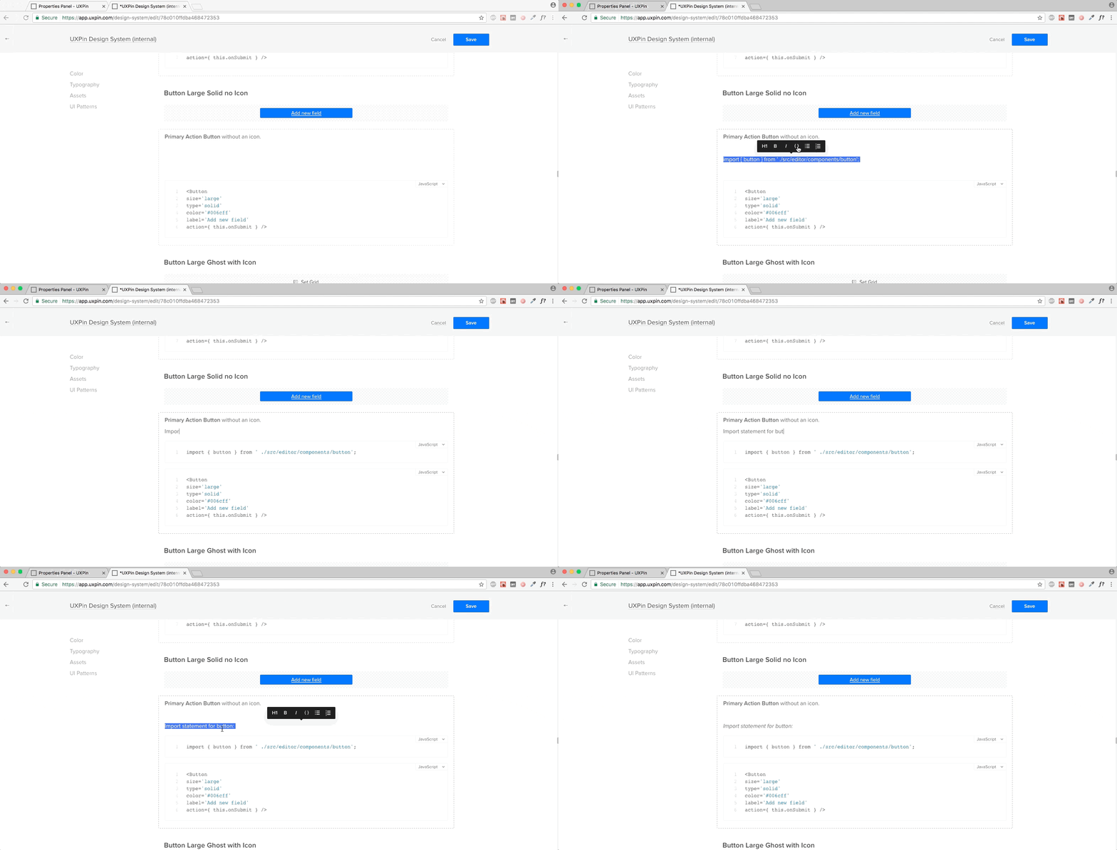
Once you’ve generated your system, you can add documentation, including code snippets to any element. The documentation editor makes it very straightforward to document your system.

Again, the documentation is immediately available to your team.

6. Make Documentation Actionable

Design system documentation shouldn’t just be a reference document. It needs to be where the action is: in the design projects themselves.

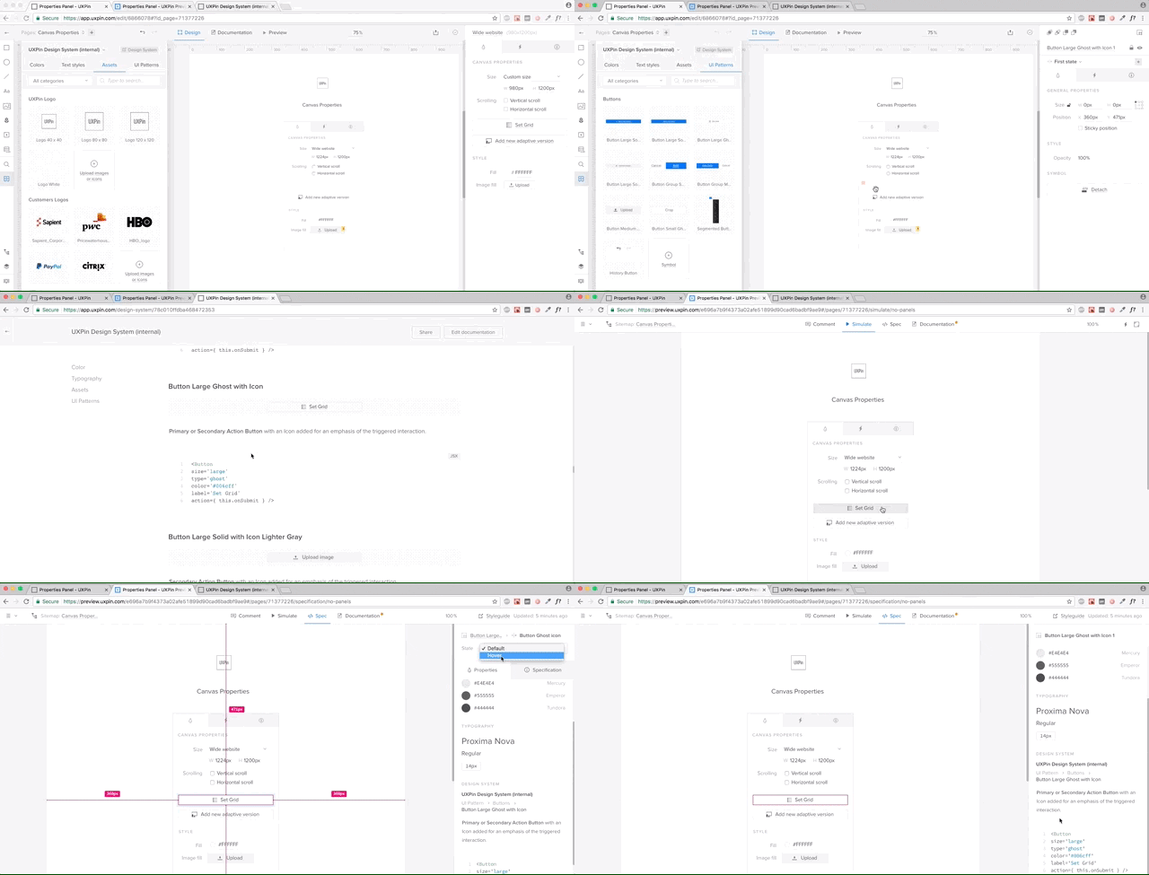
With UXPin, documentation from the design system follows the elements in any project.

If you’re working on yet another sign-up form, once you drop in the symbols from the library, UXPin automatically generates full documentation for developers – including all the information coming from the design system (full markup, information about imports, and names of JavaScript components, etc).

The First Complete Solution

Needless to say, I’m extremely proud of our focus on design systems as the heart of a better software development process. Of course, this is just a beginning.

If you’d like to try out UXPin for yourself, you can go ahead and start a free trial.


Creating a Design System Process with UXPin is a post from CSS-Tricks

Form Validation Part 1: Constraint Validation in HTML

Post pobrano z: Form Validation Part 1: Constraint Validation in HTML

Most JavaScript form validation libraries are large, and often require other libraries like jQuery. For example, MailChimp’s embeddable form includes a 140kb validation file (minified). It includes the entire jQuery library, a third-party form validation plugin, and some custom MailChimp code. In fact, that setup is what inspired this new series about modern form validation. What new tools do we have these days for form validation? What is possible? What is still needed?

In this series, I’m going to show you two lightweight ways to validate forms on the front end. Both take advantage of newer web APIs. I’m also going to teach you how to push browser support for these APIs back to IE9 (which provides you with coverage for 99.6% of all web traffic worldwide).

Finally, we’ll take a look at MailChimp’s sign-up form, and provide the same experience with 28× (2,800%) less code.

It’s worth mentioning that front-end form validation can be bypassed. You should always validate your code on the server, too.

Alright, let’s get started!

Article Series:

  1. Constraint Validation in HTML (You are here!)
  2. The Constraint Validation API in JavaScript (Coming Soon!)
  3. A Validity State API Polyfil (Coming Soon!)l
  4. Validating the MailChimp Subscribe Form (Coming Soon!)

The Incredibly Easy Way: Constraint Validation

Through a combination of semantic input types (for example, <input type="email">) and validation attributes (such as required and pattern), browsers can natively validate form inputs and alert users when they’re doing it wrong.

Support for the various input types and attributes varies wildly from browser to browser, but I’ll provide some tricks and workarounds to maximize browser compatibility.

Basic Text Validation

Let’s say you have a text field that is required for a user to fill out before the form can be submitted. Add the required attribute, and supporting browsers will both alert users who don’t fill it out and refuse to let them submit the form.

<input type="text" required>
A required text input in Chrome.

Do you need the response to be a minimum or maximum number of characters? Use minlength and maxlength to enforce those rules. This example requires a value to be between 3 and 12 characters in length.

<input type="text" minlength="3" maxlength="12">
Error message for the wrong number of characters in Firefox.

The pattern attribute let’s you run regex validations against input values. If you, for example, required passwords to contain at least 1 uppercase character, 1 lowercase character, and 1 number, the browser can validate that for you.

<input type="password" pattern="^(?=.*\d)(?=.*[a-z])(?=.*[A-Z])(?!.*\s).*$" required>
Wrong format error message in Safari.

If you provide a title attribute with the pattern, the title value will be included with any error message if the pattern doesn’t match.

<input type="password" pattern="^(?=.*\d)(?=.*[a-z])(?=.*[A-Z])(?!.*\s).*$" title="Please include at least 1 uppercase character, 1 lowercase character, and 1 number." required>
Wrong format message in Opera, with title text explaining RegEx.

You can even combine it with minlength and (as seems to be the case with banks, maxlength) to enforce a minimum or maximum length.

<input type="password" minlength="8" pattern="^(?=.*\d)(?=.*[a-z])(?=.*[A-Z])(?!.*\s).*$" title="Please include at least 1 uppercase character, 1 lowercase character, and 1 number." required>

See the Pen Form Validation: Basic Text by Chris Ferdinandi (@cferdinandi) on CodePen.

Validating Numbers

The number input type only accepts numbers. Browsers will either refuse to accept letters and other characters, or alert users if they use them. Browser support for input[type="number"] varies, but you can supply a pattern as a fallback.

<input type="number" pattern="[-+]?[0-9]">

By default, the number input type allows only whole numbers.

You can allow floats (numbers with decimals) with the step attribute. This tells the browser what numeric interval to accept. It can be any numeric value (example, 0.1 ), or any if you want to allow any number.

You should also modify your pattern to allow decimals.

<input type="number" step="any" pattern="[-+]?[0-9]*[.,]?[0-9]+">

If the numbers should value between a set of values, the browser can validate those with the min and max attributes. You should also modify your pattern to match. For example, if a number has to be between 3 and 42, you would do this:

<input type="number" min="3" max="42" pattern="[3-42]">

See the Pen Form Validation: Numbers by Chris Ferdinandi (@cferdinandi) on CodePen.

Validating Email Addresses and URLs

The email input type will alert users if the supplied email address is invalid. Like with the number input type, you should supply a pattern for browsers that don’t support this input type.

Email validation regex patterns are a hotly debated issue. I tested a ton of them specifically looking for ones that met RFC822 specs. The one used below, by Richard Willis, was the best one I found.

<input type="email" pattern="^([^\x00-\x20\x22\x28\x29\x2c\x2e\x3a-\x3c\x3e\x40\x5b-\x5d\x7f-\xff]+|\x22([^\x0d\x22\x5c\x80-\xff]|\x5c[\x00-\x7f])*\x22)(\x2e([^\x00-\x20\x22\x28\x29\x2c\x2e\x3a-\x3c\x3e\x40\x5b-\x5d\x7f-\xff]+|\x22([^\x0d\x22\x5c\x80-\xff]|\x5c[\x00-\x7f])*\x22))*\x40([^\x00-\x20\x22\x28\x29\x2c\x2e\x3a-\x3c\x3e\x40\x5b-\x5d\x7f-\xff]+|\x5b([^\x0d\x5b-\x5d\x80-\xff]|\x5c[\x00-\x7f])*\x5d)(\x2e([^\x00-\x20\x22\x28\x29\x2c\x2e\x3a-\x3c\x3e\x40\x5b-\x5d\x7f-\xff]+|\x5b([^\x0d\x5b-\x5d\x80-\xff]|\x5c[\x00-\x7f])*\x5d))*$">

One „gotcha” with the the email input type is that it allows email addresses without a TLD (the „example.com” part of „email@example.com”). This is because RFC822, the standard for email addresses, allows for localhost emails which don’t need one.

If you want to require a TLD (and you likely do), you can modify the pattern to force a domain extension like so:

<input type="email" title="The domain portion of the email address is invalid (the portion after the @)." pattern="^([^\x00-\x20\x22\x28\x29\x2c\x2e\x3a-\x3c\x3e\x40\x5b-\x5d\x7f-\xff]+|\x22([^\x0d\x22\x5c\x80-\xff]|\x5c[\x00-\x7f])*\x22)(\x2e([^\x00-\x20\x22\x28\x29\x2c\x2e\x3a-\x3c\x3e\x40\x5b-\x5d\x7f-\xff]+|\x22([^\x0d\x22\x5c\x80-\xff]|\x5c[\x00-\x7f])*\x22))*\x40([^\x00-\x20\x22\x28\x29\x2c\x2e\x3a-\x3c\x3e\x40\x5b-\x5d\x7f-\xff]+|\x5b([^\x0d\x5b-\x5d\x80-\xff]|\x5c[\x00-\x7f])*\x5d)(\x2e([^\x00-\x20\x22\x28\x29\x2c\x2e\x3a-\x3c\x3e\x40\x5b-\x5d\x7f-\xff]+|\x5b([^\x0d\x5b-\x5d\x80-\xff]|\x5c[\x00-\x7f])*\x5d))*(\.\w{2,})+$">

Similarly, the url input type will alert users if the supplied value is not a valid URL. Once again, you should supply a pattern for browsers that don’t support this input type. The one included below was adapted from a project by Diego Perini, and is the most robust I’ve encountered.

<input type="url" pattern="^(?:(?:https?|HTTPS?|ftp|FTP):\/\/)(?:\S+(?::\S*)?@)?(?:(?!(?:10|127)(?:\.\d{1,3}){3})(?!(?:169\.254|192\.168)(?:\.\d{1,3}){2})(?!172\.(?:1[6-9]|2\d|3[0-1])(?:\.\d{1,3}){2})(?:[1-9]\d?|1\d\d|2[01]\d|22[0-3])(?:\.(?:1?\d{1,2}|2[0-4]\d|25[0-5])){2}(?:\.(?:[1-9]\d?|1\d\d|2[0-4]\d|25[0-4]))|(?:(?:[a-zA-Z\u00a1-\uffff0-9]-*)*[a-zA-Z\u00a1-\uffff0-9]+)(?:\.(?:[a-zA-Z\u00a1-\uffff0-9]-*)*[a-zA-Z\u00a1-\uffff0-9]+)*)(?::\d{2,5})?(?:[\/?#]\S*)?$">

Like the email attribute, url does not require a TLD. If you don’t want to allow for localhost URLs, you can update the pattern to check for a TLD, like this.

<input type="url" title="The URL is a missing a TLD (for example, .com)." pattern="^(?:(?:https?|HTTPS?|ftp|FTP):\/\/)(?:\S+(?::\S*)?@)?(?:(?!(?:10|127)(?:\.\d{1,3}){3})(?!(?:169\.254|192\.168)(?:\.\d{1,3}){2})(?!172\.(?:1[6-9]|2\d|3[0-1])(?:\.\d{1,3}){2})(?:[1-9]\d?|1\d\d|2[01]\d|22[0-3])(?:\.(?:1?\d{1,2}|2[0-4]\d|25[0-5])){2}(?:\.(?:[1-9]\d?|1\d\d|2[0-4]\d|25[0-4]))|(?:(?:[a-zA-Z\u00a1-\uffff0-9]-*)*[a-zA-Z\u00a1-\uffff0-9]+)(?:\.(?:[a-zA-Z\u00a1-\uffff0-9]-*)*[a-zA-Z\u00a1-\uffff0-9]+)*(?:\.(?:[a-zA-Z\u00a1-\uffff]{2,}))\.?)(?::\d{2,5})?(?:[/?#]\S*)?$">

See the Pen Form Validation: Email & URLs by Chris Ferdinandi (@cferdinandi) on CodePen.

Validating Dates

There are a few really awesome input types that not only validate dates but also provide native date pickers. Unfortunately, Chrome and Mobile Safari are the only two browsers that implement it. (I’ve been waiting years for Firefox to adopt this feature!) Other browsers just display it as a text field.

As always, we can provide a pattern to catch browsers that don’t support it.
The date input type is for standard day/month/year dates.

<input type="date" pattern="(?:19|20)[0-9]{2}-(?:(?:0[1-9]|1[0-2])-(?:0[1-9]|1[0-9]|2[0-9])|(?:(?!02)(?:0[1-9]|1[0-2])-(?:30))|(?:(?:0[13578]|1[02])-31))">

In supporting browsers, the selected date is displayed like this: MM/DD/YYYY. But the value is actually in this format: YYYY-MM-DD.

You should provide guidance to users of unsupported browsers about this format—something like, „Please use the YYYY-MM-DD format.” However, you don’t want people visiting with Chrome or Mobile Safari to see this since that’s not the format they’ll see, which is confusing.

See the Pen Form Validation: Dates by Chris Ferdinandi (@cferdinandi) on CodePen.

A Simple Feature Test

We can write a simple feature test to check for support, though. We’ll create an input[type="date"] element, add a value that’s not a valid date, and then see if the browser sanitizes it or not. You can then hide the descriptive text for browsers that support the date input type.

<label for="date">Date <span class="description-date">YYYY-MM-DDD</span></label>
<input type="date" id="date" pattern="(?:19|20)[0-9]{2}-(?:(?:0[1-9]|1[0-2])-(?:0[1-9]|1[0-9]|2[0-9])|(?:(?!02)(?:0[1-9]|1[0-2])-(?:30))|(?:(?:0[13578]|1[02])-31))">

<script>
  var isDateSupported = function () {
      var input = document.createElement('input');
      var value = 'a';
      input.setAttribute('type', 'date');
      input.setAttribute('value', value);
      return (input.value !== value);
  };

  if (isDateSupported()) {
      document.documentElement.className += ' supports-date';
  }
</scipt>

<style>
  .supports-date .description-date {
      display: none;
  }
</style>

See the Pen Form Validation: Dates with a Feature Test by Chris Ferdinandi (@cferdinandi) on CodePen.

Other Date Types

The time input type let’s visitors select a time, while the month input type let’s them choose from a month/year picker. Once again, we’ll include a pattern for non-supporting browsers.

<input type="time" pattern="(0[0-9]|1[0-9]|2[0-3])(:[0-5][0-9])">
<input type="month" pattern="(?:19|20)[0-9]{2}-(?:(?:0[1-9]|1[0-2]))">

The time input displays time in 12-hour am/pm format, but the value is 24-hour military time. The month input is displayed as May 2017 in supporting browsers, but the value is in YYYY-MM format.

Just like with input[type="date"], you should provide a pattern description that’s hidden in supporting browsers.

See the Pen Form Validation: Add `novalidate` programatically by Chris Ferdinandi (@cferdinandi) on CodePen.

This seems super easy. What’s the catch?

While the Constraint Validation API is easy and light-weight, it does have some drawbacks.

You can style fields that have errors on them with the :invalid pseudo-selector, but you can’t style the error messages themselves.

Behavior is also inconsistent across browsers. Chrome doesn’t display any errors until you try to submit the form. Firefox displays a red border when the field loses focus, but only displays error messages on hover (whereas WebKit browsers keep the errors persistent).

User studies from Christian Holst and Luke Wroblewski (separately) found that displaying an error when the user leaves a field, and keeping that error persistent until the issue is fixed, provided the best and fastest user experience. Bonus CSS tip: style invalid selectors only when they arern’t currently being edited with :not(:focus):invalid { }.

Unfortunately, none of the browsers behave exactly this way by default.

In the next article in this series, I’ll show you how to use the native Constraint Validation API to bolt-in our desired UX with some lightweight JavaScript. No third-party library required!

Article Series:

  1. Constraint Validation in HTML (You are here!)
  2. The Constraint Validation API in JavaScript (Coming Soon!)
  3. A Validity State API Polyfil (Coming Soon!)l
  4. Validating the MailChimp Subscribe Form (Coming Soon!)

Form Validation Part 1: Constraint Validation in HTML is a post from CSS-Tricks

Stickybits: an alternative to `position: sticky` polyfills

Post pobrano z: Stickybits: an alternative to `position: sticky` polyfills

Stickybits is a small JavaScript utility plugin. It’s goal is not to get in the way. It does one thing well: help with sticky elements. It is not dependent on other JavaScript Plugins, can be imported via npm, and approaches sticky elements in a very utility-oriented way.

Solving the sticky element problem can lead to sticky situations

When navigating sites, it is common to see HTML elements, like banners and navigations, sticking to the top and bottom of the browser. There are a couple of ways that can be done.

One, there is position: sticky, a native CSS feature. You might use it something like this:

header {
  position: sticky;
  top: -1px;
}

MDN explains it well:

Sticky positioning is a hybrid of relative and fixed positioning. The element is treated as relative positioned until it crosses a specified threshold, at which point it is treated as fixed positioned.

Two, you can essentially fake that behavior with JavaScript. You measure scroll positions and flip-flop the element between position: relative (or static or anything else) and position: fixed as needed.

I’d say that neither of these techniques are quite ideal.

By doing the flip-flopping yourself, there may be jumpiness when these elements go from fixed position to not. This issues is worsened in mobile device browsers.

With native CSS alone, you don’t have the ability to know when the element is in one state or the other.

Get the best of both worlds with StickyBits

Stickybits a lightweight (~2KB) alternative to position: sticky polyfills. It is an easy to set up plugin that is cross-compatible with any other plugins, libraries, or frameworks.

Installation with npm:

npm i stickybits --save-dev

Or, installation with Yarn:

yarn add stickybits --dev

Usage:

stickybits('[your-sticky-selector]');

With the out-of-the-box solution above, you now have set any element with your selector to be sticky. This will work for browsers that support .classList whether position: sticky is supported or not.

Stickybits, with the additional useStickyClasses: true property set will add sticky and stuck classes when elements become sticky or stuck. This makes it easy to hook up CSS styles based on when the selected element become static, sticky or stuck. This useful utility was added after Dave Rupert mentioned it on the Shop Talk Show Podcast.

Stickybits also supplies offset properties and a clean-up method hook to help better manage its sticky state.

Demos

See the Pen Njwpep by Jeff Wainwright (@yowainwright) on CodePen.

See the Pen CSS `position: sticky` example by Jeff Wainwright (@yowainwright) on CodePen.

More demos provided on GitHub.

Conclusion

Stickybits is a JavaScript Plugin for making an HTML element stick to the top or bottom of a browser window within its parent. With the varying implementations of position: fixed; and position: sticky; across browsers, making high quality sticky features is challenging. Stickybits solves this.

Stickybits was inspired by FixedSticky from Fillament Group, who has recently deprecated their plugin.

It is open-sourced by Dollar Shave Club and maintained by our team and I.


Stickybits: an alternative to `position: sticky` polyfills is a post from CSS-Tricks

Reactive UI’s with VanillaJS – Part 2: Class Based Components

Post pobrano z: Reactive UI’s with VanillaJS – Part 2: Class Based Components

In Part 1, I went over various functional-style techniques for cleanly rendering HTML given some JavaScript data. We broke our UI up into component functions, each of which returned a chunk of markup as a function of some data. We then composed these into views that could be reconstructed from new data by making a single function call.

This is the bonus round. In this post, the aim will be to get as close as possible to full-blown, class-based React Component syntax, with VanillaJS (i.e. using native JavaScript with no libraries/frameworks). I want to make a disclaimer that some of the techniques here are not super practical, but I think they’ll still make a fun and interesting exploration of how far JavaScript has come in recent years, and what exactly React does for us.

Article Series:

  1. Pure Functional Style
  2. Class Based Components (You are here!)

From functions to classes

Let’s continue using the same example we used in the first post: a blog. Our functional BlogPost component looked like this:

var blogPostData = {
  author: 'Brandon Smith',
  title: 'A CSS Trick',
  body: 'Lorem ipsum dolor sit amet, consectetur adipiscing elit, sed do eiusmod tempor incididunt ut labore et dolore magna aliqua.'
};

function BlogPost(postData) {
  return `<div class="post">
            <h1>${postData.title}</h1>
            <h3>By ${postData.author}</h3>
            <p>${postData.body}</p>
          </div>`;
}

document.querySelector('body').innerHTML = BlogPost(blogPostData);

In class-based components, we’ll still need that same rendering function, but we’ll incorporate it as a method of a class. Instances of the class will hold their own BlogPost data and know how to render themselves.

var blogPostData = {
  author: 'Brandon Smith',
  title: 'A CSS Trick',
  body: 'Lorem ipsum dolor sit amet, consectetur adipiscing elit, sed do eiusmod tempor incididunt ut labore et dolore magna aliqua.'
};

class BlogPost {

  constructor(props) {
    this.state = {
      author: props.author,
      title: props.title,
      body: props.body
    }
  }

  render() {
    return `<div class="post">
              <h1>${this.state.title}</h1>
              <h3>By ${this.state.author}</h3>
              <p>${this.state.body}</p>
            </div>`;
  }

}

var blogPostComponent = new BlogPost(blogPostData);

document.querySelector('body').innerHTML = blogPostComponent.render();

Modifying state

The advantage of a class-based (object oriented) coding style is that it allows for encapsulation of state. Let’s imagine that our blog site allows admin users to edit their blog posts right on the same page readers view them on. Instances of the BlogPost component would be able to maintain their own state, separate from the outside page and/or other instances of BlogPost. We can change the state through a method:

class BlogPost {

  constructor(props) {
    this.state = {
      author: props.author,
      title: props.title,
      body: props.body
    }
  }

  render() {
    return `<div class="post">
              <h1>${this.state.title}</h1>
              <h3>By ${this.state.author}</h3>
              <p>${this.state.body}</p>
            </div>`;
  }

  setBody(newBody) {
    this.state.body = newBody;
  }

}

However, in any real-world scenario, this state change would have to be triggered by either a network request or a DOM event. Let’s explore what the latter would look like since it’s the most common case.

Handling events

Normally, listening for DOM events is straightforward – just use element.addEventListener() – but the fact that our components only evaluate to strings, and not actual DOM elements, makes it trickier. We don’t have an element to bind to, and just putting a function call inside onchange isn’t enough, because it won’t be bound to our component instance. We have to somehow reference our component from the global scope, which is where the snippet will be evaluated. Here’s my solution:

document.componentRegistry = { };
document.nextId = 0;

class Component {
  constructor() {
    this._id = ++document.nextId;
    document.componentRegistry[this._id] = this;
  }
}

class BlogPost extends Component {

  constructor(props) {
    super();

    this.state = {
      author: props.author,
      title: props.title,
      body: props.body
    }
  }

  render() {
    return `<div class="post">
              <h1>${this.state.title}</h1>
              <h3>By ${this.state.author}</h3>
              <textarea onchange="document.componentRegistry[${this._id}].setBody(this.value)">
                ${this.state.body}
              </textarea>
            </div>`;
  }

  setBody(newBody) {
    this.state.body = newBody;
  }

}

Okay, there’s quite a bit going on here.

Referencing the component instance

First, we had to get a reference, from within the HTML string, to the present instance of the component. React is able to do this more easily because JSX actually converts to a series of function calls instead of an HTML string. This allows the code to pass this straight in, and the reference to the JavaScript object is preserved. We, on the other hand, have to serialize a string of JavaScript to insert within our string of HTML. Therefore, the reference to our component instance has to somehow be represented as a string. To accomplish this, we assign each component instance a unique ID at construction time. You don’t have to put this behavior in a parent class, but it’s a good use of inheritance. Essentially what happens is, whenever a BlogPost instance is constructed, it creates a new ID, stores it as a property on itself, and registers itself in document.componentRegistry under that ID. Now, any JavaScript code anywhere can retrieve our object if it has that ID. Other components we might write could also extend the Component class and automatically get unique ID’s of their own.

Calling the method

So we can retrieve the component instance from any arbitrary JavaScript string. Next we need to call the method on it when our event fires (onchange). Let’s isolate the following snippet and step through what’s happening:

<textarea onchange="document.componentRegistry[${this._id}].setBody(this.value)">
  ${this.state.body}
</textarea>

You’re probably familiar with hooking up event listeners by putting code inside on_______ HTML attributes. The code inside will get evaluated and run when the event triggers.

document.componentRegistry[${this._id}] looks in the component registry and gets the component instance by its ID. Remember, all of this is inside a template string, so ${this._id} evaluates to the current component’s ID. The resulting HTML will look like this:

<textarea onchange="document.componentRegistry[0].setBody(this.value)">
  Lorem ipsum dolor sit amet, consectetur adipiscing elit, sed do eiusmod tempor incididunt ut labore et dolore magna aliqua.
</textarea>

We call the method on that object, passing this.value (where this is the element the event is happening on; in our case, <textarea>) as newBody.

Updating in response to state changes

Our JavaScript variable’s value gets changed, but we need to actually perform a re-render to see its value reflected across the page. In our previous article, we re-rendered like this:

function update() {
  document.querySelector('body').innerHTML = BlogPost(blogPostData);
}

This is another place where we’ll have to make some adjustments for class-style components. We don’t want to throw away and rebuild our component instances every time we re-render; we only want to rebuild the HTML string. The internal state needs to be preserved. So, our objects will exist separately, and we’ll just call render() again:

var blogPost = new BlogPost(blogPostData);

function update() {
  document.querySelector('body').innerHTML = blogPost.render();
}

We then have to call update() whenever we modify state. This is one more thing React does transparently for us; its setState() function modifies the state, and also triggers a re-render for that component. We have to do that manually:

// ...
setBody(newBody) {
  this.state.body = newBody;
  update();
}
// ...

Note that even when we have a complex nested structure of components, there will only ever be one update() function, and it will always apply to the root component.

Child components

React (along with virtually all other JavaScript frameworks) distinguishes between elements and components that comprise a component and those that are its children. Children can be passed in from the outside, allowing us to write custom components that are containers of other arbitrary content. We can do this too.

class BlogPost extends Component {

  constructor(props, children) {
    super();

    this.children = children;
    this.state = {
      author: props.author,
      title: props.title,
      body: props.body
    }
  }

  render() {
    return `<div class="post">
              <h1>${this.state.title}</h1>
              <h3>By ${this.state.author}</h3>
              <textarea onchange="document.componentRegistry[${this._id}].setBody(this.value)">
                ${this.state.body}
              </textarea>
              <div>
                ${this.children.map((child) => child.render()).join('')}
              </div>
            </div>`;
  }

  setBody(newBody) {
    this.state.body = newBody;
    update();
  }

}

This allows us to write usage code like the following:

var adComponents = ...;
var blogPost = new BlogPost(blogPostData, adComponents);

Which will insert the components into the designated location in the markup.

Concluding thoughts

React seems simple, but it does a lot of subtle things to make our lives much easier. The most obvious thing is performance; only rendering the components whose state updates and drastically minimizing the DOM operations that get performed. But some of the less obvious things are important too.

One of these is that by making granular DOM changes instead of rebuilding the DOM entirely, React preserves some natural DOM state that gets lost when using our technique. Things like CSS transitions, user-resized textareas, focus, and cursor position in an input all get lost when we scrap the DOM and reconstruct it. For our use case, that’s workable. But in a lot of situations, it might not be. Of course, we could make DOM modifications ourselves, but then we’re back to square one, and we lose our declarative, functional syntax.

React gives us the advantages of DOM modification while allowing us to write our code in a more maintainable, declarative style. We’ve shown that vanilla JavaScript can do either, but it can’t get the best of both worlds.

Article Series:

  1. Pure Functional Style
  2. Class Based Components (You are here!)

Reactive UI’s with VanillaJS – Part 2: Class Based Components is a post from CSS-Tricks

Naming Things is Only Getting Harder

Post pobrano z: Naming Things is Only Getting Harder

I was working with CSS Grid and came to the grid-column and grid-row properties. I paused for a moment.

They’re not overly complicated. They are shorthand properties for expressing where an element should start and end on a grids defined columns and rows.

What caught me was the fact that I can name these lines. It’s not a requirement (you can use numbers), but the ability to name the grid lines is something we can do here. In fact, naming lines can be open up neat CSS tricks.

Grid lines are another item in a long list of examples where front end developers have the power to name things. Class names and IDs have always been things we need to name in CSS, but consider a few of the more historically recent things where naming is important when it comes to styling:

  • Variables: Naming values for context, such as re-usable colors or numeric values whether in preprocessors or new CSS variables.
  • Data attributes: Selecting elements based on their HTML attributes rather than a class name.
  • Components: Like what we’re seeing in React and future CSS features like Web Components.
  • CSS files: Organizational methods like Atomic Design have accentuated the importance of naming our files, including preprocessor partials.
  • Media queries: We know naming them after devices is futile, so that has to make sense as well.

It’s not that naming things is ridiculously hard in and of itself. It’s more that there is a sense of power that comes with the ability to name things. And is always said: with power comes great responsibility. In this case, naming has an impact on everything from how code is written and organized to its overall performance and maintainability. Poorly named elements is smelly by nature and often indicative of the overall quality of the code. It can lead to the wariness of a growing code base.

Let’s just say I’ve spent more time naming some CSS classes than I spent naming my own two kids. I’m embarrassed to say that, but it’s the truth.

Naming grid lines is just another item in the growing cascade of things we are responsible for as front-enders. It’s not a bad thing or even an annoying one, but yet another reminder of how front end development is development, design and architecture all in one.

Related Reads


Naming Things is Only Getting Harder is a post from CSS-Tricks