Archiwum kategorii: Design

China’s New Large Solar-Powered Drone Reaches 20,000 Meters in Altitude

Post pobrano z: China’s New Large Solar-Powered Drone Reaches 20,000 Meters in Altitude


China’s first domestically designed large solar-powered unmanned plane reached above 20,000 meters in altitude on its test flight in the country’s northwest regions recently.

The drone was developed by the China Academy of Aerospace Aerodynamics (CAAA), it’s developers kept the exact size of the drone as a secret, but it is believed to be about 14 meters long with a 45 meter wingspan according to earlier prototypes.


BIKI: the first bionic underwater wireless drone

Post pobrano z: BIKI: the first bionic underwater wireless drone
first image of the post

When thinking of drones, the average Joe usually pictures a flying thing in his mind. This is far from reality, although most media focus is on the flying, noisy devices.

A Kickstarter campaign, already largely financed, is still collecting money to start producing the first bionic wireless underwater fish drone. This electronic fish, controllable with your smartphone, will be your underwater eyes and film some surprisingly good imagery.

As you can see on the above gif, the drone moves around a bit like a fish. It can go as deep as 196 feet, which is about 60 meters. The camera can produce 4K ultra HD videos and comes with a stabilizer. It can store 90 to 120 minutes of video.

Design Deals for the week

Post pobrano z: Design Deals for the week
first image of the post

Every week, we’ll give you an overview of the best deals for designers, make sure you don’t miss any by subscribing to our deals feed. You can also follow the recently launched website Type Deals if you are looking for free fonts or font deals.

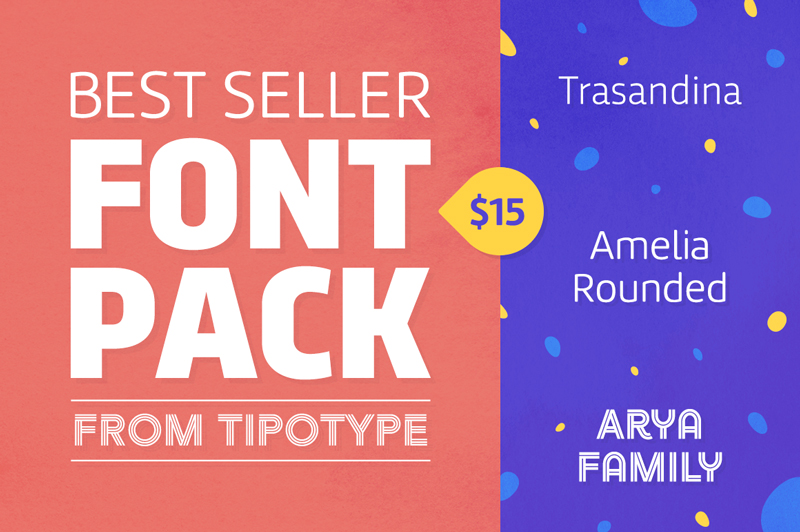
Best Seller Font Pack from TipoType

Now’s the chance to beef up your typeface toolbox with this Deal from TipoType! The Best Seller Font Pack features 3 unique font families: Amelia Rounded, Trasandina and Arya. These professional fonts offer real versatility in your projects with a variety of weights, styles and features.

$15 instead of $342 – Get it now!

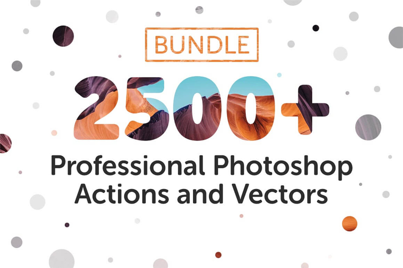
Bundle: 2500+ Professional Photoshop Actions and Vectors

Now you can turn any photo into a professional image. Best of all, it’s not just simple, it’s lightning fast! With this Mega Photoshop Actions Bundle from Inventicons, you’ll get 7 different Photoshop Action sets, adding up to more than 2500 unique actions and vectors! Add everything from light leaks to vintage to bubbles with a few quick clicks of your mouse. Act now and get them all for a massive 96% off!

$17 instead of $475 – Get it now!

EASYTHREE Website UX Flowchart (Sketch Version)

Flowcharts make building websites and apps loads easier. But building flowcharts can be a bit tricky and time-consuming if you’re not careful. Luckily, if you have Sketch, this Mighty Deal will save you loads of time and money! The EasyThree Website UX Flowchart – Sketch version lets you quickly and easily whip up detailed flowcharts with mini wireframes, flowchart elements and a variety of styles and schemes to choose from.

$14 instead of $27 – Get it now!

Learn SWIFT iOS App Programming (Beginner/Intermediate)

Have a great idea for an app but don’t have the foggiest notion how to start? No worries, you’re halfway there already! This Mighty Deal from Appcoda offers you a big discount on beginner and intermediate eBooks that will teach you beginning iOS10 programming with Swift! Fully updated for Xcode 8, Swift 3 and iOS 10.3, you’ll learn to build real usable apps from scratch thanks to all sorts of hands-on exercises and projects. PLUS you’ll get 1 year of free updates, which includes the updated eBooks for iOS 11.

$27 instead of $49 – Get it now!

Digital Dreaming – 5 Hot Trends in the Mobile App World

Post pobrano z: Digital Dreaming – 5 Hot Trends in the Mobile App World
first image of the post


Source: Shutterstock

You can see it everywhere: Heads buried in their mobile devices, completely oblivious to the world around them. Sitting in their cars, staring down while the light has already turned green, with their kid looking up at them forlornly, waiting to be pushed on the swing, or as you dive out of the way before getting barreled over on the footpath. We are utterly obsessed with our phones, often to the exclusion of everything else that is going on in the world. Time on mobile devices comprises 65% of all time spent consuming digital media. That’s a huge proportion, and it’s getting bigger. It’s no wonder that apps are such huge business, with legions of companies competing for all that attention. Today we’ll look at a few prominent ways in which app developers are vying for that decisive edge.

Augmented Reality (AR)

AR has been hot ever since Pokemon Go took the world by storm. Digital minds all over the world have since been experimenting with new and exciting ways to AR-infused apps to the marked. One app developer in Melbourne devised a way to assist travelers to get their luggage and to their gate in unfamiliar airports. Another company in New York devised a slick app that allows you to superimpose tattoo designs on your body through your phone’s camera so you can see what it will look like before taking the plunge. Whatever the application, the potential for this amazing technology is limited only by our imaginations.

Wearable Technology

Technologies that can be worn on the body have enormous power to integrate with mobile and desktop apps. Fitbit is a great example of this and has been a great success that has spawned numerous copycat products. Breakthrough technologies such as Apple Watch and Google Glass have underwhelmed commercially and in terms of winning hearts and minds. However, it is almost certainly just a matter of time in until someone gets the right recipe.

Instant Apps

It’s Murphy’s law of Apps. You download a seemingly amazing app that promises to be your next best friend, only to have it sit on your device unopened and unloved for months. Eventually, you delete it, casting it into digital oblivion. Then, the very next day you encounter precisely the situation in which you could have used the app, and you curse in frustration. Instant apps promise to change all this. Rather than clutter your device with a million apps that you rarely if ever use, instant apps can be accessed instantly from the Cloud, without downloading or installation.

Artificial Intelligence (AI)

AI is one of those controversial topics that is at once exciting and yet downright scary. The specter of machines that can learn how to think like us and take over the world might be the stuff of science fiction. However, with AI started to take over people’s jobs, predict our online behaviors and outsmart human hackers, it is clear that we need to think very carefully about how we use this sensitive technology. Like most things, there is plenty of opportunity to use it to better our lives. AI applications that understand how kids learn and tailor educational programs to their individual needs are just one way that we can harness AI to make a positive impact.

Internet of Things

Ever since Mark Zuckerberg announced that he would build an app to interface with the bot that pretty much controls his entire house, the world has realized that IoT is not just a catchy buzzword. We can expect to see the intersection between those ubiquitous icons on our phones and the things that we use every day continue to grow.

We’d love to hear what you think are some other exciting trends that will impact the mobile technology world!

Mobile Optimization: Reassessing the Responsive vs. Mobile Site Debate

Post pobrano z: Mobile Optimization: Reassessing the Responsive vs. Mobile Site Debate
first image of the post

For the last four or five years, responsive design has been the go-to approach for most webmasters looking to optimize their sites for mobile. There are good reasons for this, which we touch on in this article, but it’s not necessarily the ideal solution in when creating a positive mobile browsing experience. Despite widespread perception that responsive design is now the optimal approach, there are still valid reasons to consider a different way: a dedicated mobile site. In this article we address some of the benefits of mobile sites that you may not have considered, as well as a reassessment of the strengths and weaknesses of responsive design. The purpose is not to dispute the general efficacy of responsive design, but rather to highlight the fact that it isn’t the de facto ‘best’ choice in all applications.

The industry standard

The introduction of responsive design as a way to easily accommodate a range of screen sizes was revolutionary. As the number of people using mobile devices for internet browsing grew so rapidly, the ability to accommodate a variety of formats was a huge bonus for webmasters. Now that mobile browsing has overtaken desktop, it’s no surprise that responsive design is considered by many to be the industry standard. So much so that website building packages, designed to be accessible for a layperson, often include integrated responsive design to bring this advantage to non-experts. The hosting company 1&1 is a prime example of this. For a quick refresher, here are a few core advantages to responsive design:

  • Versatile
    Ready to adapt to any size of screen automatically
  • One website
    Because it doesn’t require a separate website, responsive design sites are easier to maintain and promote
  • One URL
    Eliminates confusion of having a different URL for a mobile site for both users and search engines
  • Prepared for the future
    Responsive design can handle the dimensions of new devices with ease

The Unsung Hero

In the eyes of some, mobile websites (usually denoted with ‘m.’ in the URL) are old hat – why go to the effort of creating two sites when you can stick to one? It’s true that having to develop a separate mobile site with a different URL poses some challenges. For instance, you have to maintain two websites simultaneously, which is not only more time consuming but can also create complications for search engine visibility if not managed correctly. However, it’s not quite as simple as that. Not all websites are alike, and there are compelling reasons to consider a mobile-dedicated site, depending on the nature of your project.

User experience

A major advantage of a mobile-dedicated site is that it’s bespoke. That is, because it’s distinct you’re your main website, you can tailor it specifically for mobile use without affecting the desktop browsing experience. The difficulty with responsive design is that any design changes you make to improve the mobile UX will also affect users browsing on larger screens, sometimes negatively. This is a tricky balancing act, and can result in trying to please both mobile and desktop users, but achieving neither. Mobile sites allow you to separate these concerns.

That said, the significance of this issue largely depends on how complex your website is in terms of content and functionality. For example, relatively simple and streamlined websites without many complex design elements or applications won’t have much of an issue. On the other hand, large online stores would struggle to implement design elements for their entire stock and payment processing in way that satisfies both mobile and desktop UX. Particularly for a business like this, a hassle-free user experience is crucial to optimizing conversion rates. This is where a mobile site comes into its element.

Speed

Responsive sites tend to be slower than dedicated mobile sites, which can also negatively impact user experience. This is because a responsive site still has to load virtually all HTML elements and content, no matter if a desktop or mobile device is being used. So, either you have to significantly reduce the size of your site – and risk diluting the desktop user experience – or accept slower loading times on mobile. On the other hand, mobile sites allow you to streamline mobile performance completely independently of your desktop site. This way, you can ensure both sites load as quickly as possible.

SEO

In the past, search engines weren’t as good at ranking mobile sites effectively, so responsive design was regarded as more SEO-friendly. This is changing, and search engines are now much more able to appropriately recognize them. Having a mobile site also offers you the potential to optimize for mobile-specific search intention. This means you can more precisely target mobile users and direct them to a website that’s created specifically for them. Furthermore, the greater freedom to tailor the mobile user experience can be beneficial for SEO, as UX is a tangible ranking factor.

Summary

Responsive design is an extremely useful method of mobile optimization, no doubt about it. It excels in its role for many websites, but can be complicated to implement for necessarily more bloated and complicated sites. Mobile sites offer more design freedom, allowing you to maximize the user experience of more complex web projects. Mobile optimization is not a case of choosing the ‘best’ method – it’s a matter of selecting the most appropriate method for your individual needs.

Inspired by Japanese prints, art by Mike Dorsey

Post pobrano z: Inspired by Japanese prints, art by Mike Dorsey
first image of the post

Mike Dorsey is a tattoo artist who also creates stunning artworks in the style of Japanese ukiyo-e prints. Despite the large inspiration from Middle-Age Japan, his prints keep their own specificities, because the artist includes lots of elements from modern day Western society. You can see a glimpse of his work below, but you should head to his portfolio to see more.