Digital design is great, it opens a range of possibilities that were unheard of previously. However, sometimes you just want to give a more human, non-digital look-and-feel to your designs. Unfortunately, you cannot always work by hand on your designs for obvious time reasons, but there is a solution, thanks to great online resources. Here is a list of 10 great paper cut-out fonts that will give a more human touch to your graphic design work.
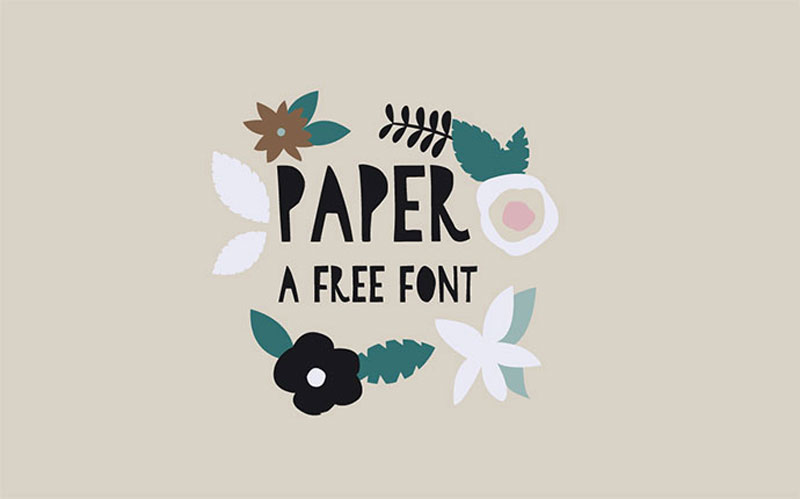
1. Paper (Free)
Paper was designed by Amy Cox out of real paper cut-outs, which makes it more real than a purely digital font. A nice touch that was added to the font is the filling of the counters, which give it a unique personality.
2. Hitchcut
As you already may have guessed, Hitchcut is a tribute to the work of Alfred Hitchcock and his famous designer Saul Bass. The font was designed to look like the ones used in several Hitchcock’s movie posters, and the name is a blend of the filmmaker’s name and the word “cut”.
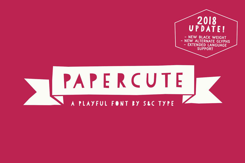
3. Papercute
Designed by two Frech designers, Fanny Coulez and Julien Saurin, Papercute was inspired by… paper cutting. It’s a very legible font, with alternate glyphs that can be used to give more diversity in your designs and reinforce the paper-cutting effect. It also comes with paper ornaments to add some extra cuteness to your designs.
4. Cut Out the Jams (Free)
Made out of thick cardstock, Cut Out The Jams is a thick display typeface that is perfect for headlines. It includes uppercase, lowercase, numbers, and English punctuation.
5. Highflier
Described by its author as “cheerful”, Highflier looks less like a paper cut-out than the previous examples, but it still fits in the category. Perfect to design anything related to children, the typeface comes with 4 overlays: Slice, Scribble, Shadow, and Block, which makes it very adaptable.
6. Fake Empire
Fake Empire is a font that celebrates imperfections. It was built using paper, glue, and scissors, by Ben Simmons. The design flaws are voluntary, they are what give the using personality to the typeface.
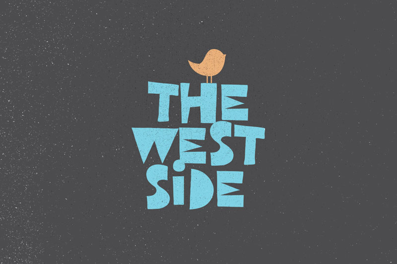
7. West Side (Free)
This bold looking cut-out font was inspired by the 1980s handmade poster designs and illustrations. West Side was handcrafted and it’s perfect to give a retro feeling in your designs.
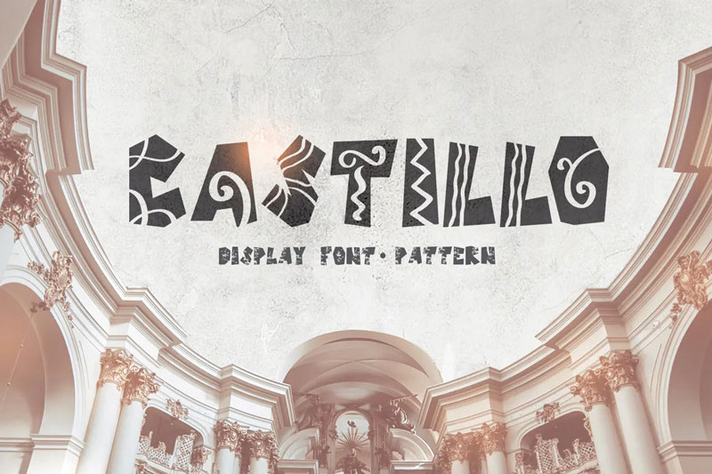
8. Castillo
Castillo is a handmade font that was inspired by paper cut-outs and Hispanic style patterns. It will look great in any children albums, greeting cards, logos, presentations, or for social media images.
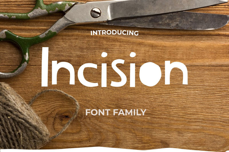
9. Incision
Incision is a hand-cut font with a scrappy look-and-feel. It comes with a strong personality that will make it a perfect fit for any personalized project. It also comes with a range of cut-out shapes for a total of 450 glyphs. On top of the font, purchasing Incision will also get you a set of 70 editable designs created with the font.
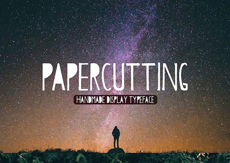
10. Papercutting
You could guess it by its name, Papercutting is a handmade display typeface that was made with… paper cuttings.
There are billions of customers in the world, and there are a large number of ways to promote a business.
Nowadays the Internet has made it possible to open a business with minimal cost. For example, to create your own online clothing store, you do not need to spend money on renting premises, consultants’ salaries and purchasing goods. You can purchase things upon order and invest only in advertising on the Web.
There will be never the right time to start something. So, let’s start to advertise your business now.
How to promote your business online?
There are many ways to promote your business. No matter which method you choose, you will achieve a certain result. The only important thing is constantly to make efforts and use the appropriate set of marketing techniques.
Below you will find a list of the best ways that will help you to get more customers. Let’s find you the best way to market your website.
NB! You can choose one channel/method, or several at once, for example, the Landing Page website, social networks and email campaign.
Promote your brand on social media
Other ways to advertise your business are social media. This is one of the most popular digital marketing tools for your business.
It is suitable for you if:
You sell clothes, shoes, household goods, handmade jewelry, cosmetics, and so on.
Your target audience spends time on social networks.
There is enough information about goods and services to publish information posts.
When choosing your product/service, a potential customer pays attention to the brand.
Not ready to wait until six months to achieve the first results of the promotion.
You do not have a large promotion budget.
In fact, the page on social networks will not be superfluous for any online business. If this is not a key channel of your promotion, then you can post links to Facebook, Pinterest, Instagram, and Twitter on the site and regularly publish infrequent posts about company life or industry news.
This option is not suitable for large businesses with premium goods, the target audience of which will definitely not make spontaneous purchases through social networks.
Another thing is cosmetics, clothes, toys, textile products of the middle price category. Also, through social networks, the services of beauty masters, artists, artisans, and photographers are excellently sold.
Method Description
Promote your brand in any social media according to a single scheme:
Content plan development. Prepare topics and distribute publication dates one month in advance. Content may be duplicated. To do this, rely on competitors’ social networks, but do not copy them completely.
Content creation. The advantage of SMM is that this method gives scope for a wide variety of content: videos, texts, photos, pictures, podcasts. The main thing is that the content is consistent with the theme. You can hire an SMM ‑ specialist, copywriter, designer or videographer, or do it yourself. Also, you can use ready-made social media templates. They don’t cost much but help to present your business in a better light. All you need is to change texts on a template. Remember, it should be small and understandable to your audience.
The attraction of subscribers. Your content should be of interest to the target audience. For example, if you are selling tools for hairdressers, then on the page you should post tips on choosing such products, industry news, and useful life hacks. It is also necessary to set thematic hashtags and geolocation.
Social Media Favorites:
Facebook. One of the most popular social sites in the world with business and entertainment content. Facebook provides a convenient service for advertisers, provides advanced statistics on advertising companies, is equipped with useful functions for working with targeted advertising. The main audience – solvent people aged 30-45 years, residents of large cities.
Instagram. The platform contains mainly visual photo/video content with comments, which has the maximum number of views and responses. Instagram users are most loyal to branded accounts, willingly subscribe to business pages that provide the feed with unique, diverse content. The main audience is young active people aged 16-34 years.
YouTube. Video hosting with social network features. It makes it possible to clearly demonstrate the product in video reviews, post videos with useful tips, lessons, expert interviews. The brand’s own YouTube channel is a great source of traffic. YouTube reaches the widest audience – from 12 to 64 years.
Twitter. An independent communication channel, an online microblogging service that publishes the latest, relevant and urgent news. The main audience is young people aged 20-34.
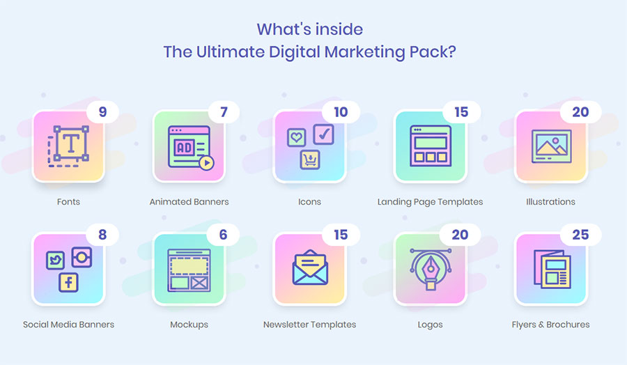
Choose one or several social media depending on your target audience. For those who decided to pick several social media platforms, I can suggest using a digital marketing bundle. There are not only different social media banners, but also newsletter templates, mockups, fonts, icons, logos, etc.
A landing page is a one-page site that is used to sell goods and services. This is the most important and the best way to promote a new business.
It will suit you if:
You have a small assortment (1-2 positions).
To purchase your product/service, the client does not need to get to know your company closely.
Your target audience is prone to impulsive one-click purchases.
You are selling a seasonal product/service.
You do not have the time, money or desire to work long hours with a multi-page website and groups in social networks.
I would say that a one-page site is ideal for selling one product or service. Moreover, it is effective for the implementation of both simple and inexpensive products, and for a complex, premium segment. For example, you only sell a portable speaker of a certain model or personal shopper services.
The advantage of this tool is that it does not require complex technical development and, with proper promotion, quickly leads to customers.
Landing Page is not suitable for online stores with a large assortment and for companies with an abundance of various services. This tool is also useless if, to stimulate a purchase, you need to arouse the confidence of the audience in the brand itself. For example, a company selling medical devices will need a site that contains detailed information about the company, services, and certificates.
Method Description
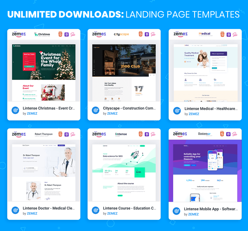
Not the only webmaster can create a landing page for you. You can do it yourself too. You can use any constructor (uKit, Wix, and others) or a ready-made website template. The second way is the most flexible and cheapest. For example, with ONE web development kit, you can create a website on any topic, have one year of free hosting, stock photos, graphics, and 24/7 online web support.
Join the MembershipThe effective landing should have the following parameters:
There is one offer on the page.
Text and graphic content are intended for one target audience. If your project has several, then it will take several different pages.
At the bottom, there is always a call to action – and offer to buy a product or service.
The text is divided into logically connected, small and visual blocks.
After reading, the potential buyer has no questions and doubts.
The purpose of the page is to quickly inform the buyer in the most accessible and selling form about why he should buy the presented product or order a service.
Create an online store
Landing Page is not suitable for online stores with a large assortment and for companies with an abundance of various services. If you already know that you need an online store, you need a suitable website template. The best platform for it is Shopify. Try to use one of Shopify themes. With it, you can create an online store or customize it to any niche.
So, if you have another business, you don’t need to buy another website theme.
Create a blog with quality content
Write regularly interesting blog posts in your store. Blogging is a great way to promote your store. Creating a blog will help increase traffic by increasing interest from Google and will lead to increased credibility in the industry. And this will increase your visibility, and as a result, sales too.
Email Marketing
Email marketing is the second way to market your website. It will help to attract attention to a brand through contact with the target audience. It is suitable for almost any online business.
It is suitable for you if:
You need to establish direct communication with the audience, to increase brand loyalty.
You are interested in resale (prompting the customer to purchase at least one more product/service along with the first purchase or immediately after it).
You have a limited promotion budget.
Your brand strategy involves a large number of discounts and promotions.
You regularly or periodically conduct thematic events.
The advantage of email marketing is that it does not require large financial investments and you can deal with it yourself.
But newsletters cannot be the only promotion tool on the Web. This is just a great additional tool that stimulates sales, increases recognition and stimulates brand loyalty.
Method Description
A mailing list about a company, goods, and services, as well as promotions and news of your business sector, can solve different problems:
Sales promotion, including through promotions and special offers.
Increasing company loyalty.
Increase brand awareness.
Develop relationships with them using systems such as Get Response, Aweber, Mailchimp or Constant Contact. Do not try to sell something right away. Build first a trusting relationship and then focus on sales.
Hold contests and Giveaways
A great tool to engage your audience and increase the visibility of your business.
When conducting a contest, the best thing to use as a prize is to use the goods of your online store or the product that you produce. Especially good contests and various promotions work on social networks.
Сontextual advertising
Let’s not forget to promote business on Google too. Contextual advertising allows you to display your site in the top for search queries without using SEO promotion.
It is suitable for you if:
It is necessary to bring traffic to the site as part of SEO promotion.
You have a new site, which so far by default cannot rise to the top of search results by SEO-promotion.
You urgently need the first clients for a speedy payback of the project.
You sell seasonal goods or services.
The target audience is looking for your product or service in search engines, and not in social networks.
You do not have strict budget restrictions, and you are ready to make significant financial investments.
Contextual advertising is well combined with SEO, making work on website promotion in search more effective.
Method Description
Thanks to a properly configured advertising campaign, your site appears in the first place with a note “Advertising”. The advantage of this digital marketing method for your business is that it gives results in just a few hours after the setup.
You do not need to wait a few months for the first customers to come to the site. Google Ads is the most popular service for setting up contextual advertising in the largest search engines. There you will find a step-by-step guide on setting up and running an advertising campaign. Also, you will find practical tips on how not to waste your budget on promotion and use the tool most effectively.
SEO
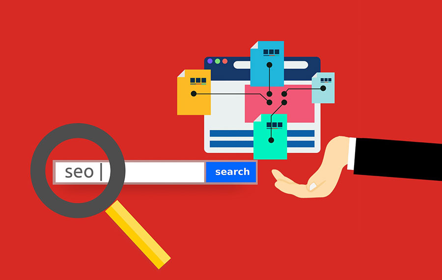
SEO optimization is a set of internal and external works for website promotion in search engines.
It is suitable for you if:
You are ready to wait until six months to get the first results.
The target audience comes for your product through the search.
For a potential buyer, trust in the brand is important.
You have a big budget for promotion.
You are ready to combine SEO with contextual advertising or other methods of promotion to accelerate the work on bringing the site to the top.
Search engine promotion consists of several steps:
Checking technical errors on the site.
The formation of the semantic core – a set of words and phrases that characterize the activity of the site.
Usability improvement.
Link building – the number of active external links to a site hosted on third-party sites.
Project analysis and content strategy development.
There are plenty of plugins for SEO-optimization. One of them is Yoast SEO. It has a free and premium version.
Use directories like Yahoo Local and Google Local
If you want to offer clients living nearby a brick or mortar, then you should enter your site in business directories such as Yahoo Local and Google Local.
Google Local is the best way to promote your business and to provide company information. The service allows you to display information on Google Maps such as the address of the company, hours of operation, etc. Just be sure to provide accurate information.
Conclusion
So, you have chosen the best way to market your website. The work did not end there. Control the intermediate results, draw conclusions and respond quickly to them.
If something goes wrong, does not bring results at all, then you need to make adjustments to the strategy.
However, a universal check of all promotion methods does not exist. For example, SEO gives the first results only after 3-6 months, and the quality of contextual advertising settings is immediately visible. Attracting real customers to the social network will also take time, and the effectiveness of the email distribution largely depends on the size of your contact database.
Regardless of what kind of marketing tools you use, promotion is always based on the right choice of the target audience.
Follow marketing news, promote your brand on social media, apply new advertising tools and pay attention to the audience’s reaction.
I wish you good luck with the promotion of your business. If you have more questions, feel free to ask them below in the comments.
There are billions of customers in the world, and there are a large number of ways to promote a business.
Nowadays the Internet has made it possible to open a business with minimal cost. For example, to create your own online clothing store, you do not need to spend money on renting premises, consultants’ salaries and purchasing goods. You can purchase things upon order and invest only in advertising on the Web.
There will be never the right time to start something. So, let’s start to advertise your business now.
How to promote your business online?
There are many ways to promote your business. No matter which method you choose, you will achieve a certain result. The only important thing is constantly to make efforts and use the appropriate set of marketing techniques.
Below you will find a list of the best ways that will help you to get more customers. Let’s find you the best way to market your website.
NB! You can choose one channel/method, or several at once, for example, the Landing Page website, social networks and email campaign.
Promote your brand on social media
Other ways to advertise your business are social media. This is one of the most popular digital marketing tools for your business.
It is suitable for you if:
You sell clothes, shoes, household goods, handmade jewelry, cosmetics, and so on.
Your target audience spends time on social networks.
There is enough information about goods and services to publish information posts.
When choosing your product/service, a potential customer pays attention to the brand.
Not ready to wait until six months to achieve the first results of the promotion.
You do not have a large promotion budget.
In fact, the page on social networks will not be superfluous for any online business. If this is not a key channel of your promotion, then you can post links to Facebook, Pinterest, Instagram, and Twitter on the site and regularly publish infrequent posts about company life or industry news.
This option is not suitable for large businesses with premium goods, the target audience of which will definitely not make spontaneous purchases through social networks.
Another thing is cosmetics, clothes, toys, textile products of the middle price category. Also, through social networks, the services of beauty masters, artists, artisans, and photographers are excellently sold.
Method Description
Promote your brand in any social media according to a single scheme:
Content plan development. Prepare topics and distribute publication dates one month in advance. Content may be duplicated. To do this, rely on competitors’ social networks, but do not copy them completely.
Content creation. The advantage of SMM is that this method gives scope for a wide variety of content: videos, texts, photos, pictures, podcasts. The main thing is that the content is consistent with the theme. You can hire an SMM ‑ specialist, copywriter, designer or videographer, or do it yourself. Also, you can use ready-made social media templates. They don’t cost much but help to present your business in a better light. All you need is to change texts on a template. Remember, it should be small and understandable to your audience.
The attraction of subscribers. Your content should be of interest to the target audience. For example, if you are selling tools for hairdressers, then on the page you should post tips on choosing such products, industry news, and useful life hacks. It is also necessary to set thematic hashtags and geolocation.
Social Media Favorites:
Facebook. One of the most popular social sites in the world with business and entertainment content. Facebook provides a convenient service for advertisers, provides advanced statistics on advertising companies, is equipped with useful functions for working with targeted advertising. The main audience – solvent people aged 30-45 years, residents of large cities.
Instagram. The platform contains mainly visual photo/video content with comments, which has the maximum number of views and responses. Instagram users are most loyal to branded accounts, willingly subscribe to business pages that provide the feed with unique, diverse content. The main audience is young active people aged 16-34 years.
YouTube. Video hosting with social network features. It makes it possible to clearly demonstrate the product in video reviews, post videos with useful tips, lessons, expert interviews. The brand’s own YouTube channel is a great source of traffic. YouTube reaches the widest audience – from 12 to 64 years.
Twitter. An independent communication channel, an online microblogging service that publishes the latest, relevant and urgent news. The main audience is young people aged 20-34.
Choose one or several social media depending on your target audience. For those who decided to pick several social media platforms, I can suggest using a digital marketing bundle. There are not only different social media banners, but also newsletter templates, mockups, fonts, icons, logos, etc.
A landing page is a one-page site that is used to sell goods and services. This is the most important and the best way to promote a new business.
It will suit you if:
You have a small assortment (1-2 positions).
To purchase your product/service, the client does not need to get to know your company closely.
Your target audience is prone to impulsive one-click purchases.
You are selling a seasonal product/service.
You do not have the time, money or desire to work long hours with a multi-page website and groups in social networks.
I would say that a one-page site is ideal for selling one product or service. Moreover, it is effective for the implementation of both simple and inexpensive products, and for a complex, premium segment. For example, you only sell a portable speaker of a certain model or personal shopper services.
The advantage of this tool is that it does not require complex technical development and, with proper promotion, quickly leads to customers.
Landing Page is not suitable for online stores with a large assortment and for companies with an abundance of various services. This tool is also useless if, to stimulate a purchase, you need to arouse the confidence of the audience in the brand itself. For example, a company selling medical devices will need a site that contains detailed information about the company, services, and certificates.
Method Description
Not the only webmaster can create a landing page for you. You can do it yourself too. You can use any constructor (uKit, Wix, and others) or a ready-made website template. The second way is the most flexible and cheapest. For example, with ONE web development kit, you can create a website on any topic, have one year of free hosting, stock photos, graphics, and 24/7 online web support.
Join the MembershipThe effective landing should have the following parameters:
There is one offer on the page.
Text and graphic content are intended for one target audience. If your project has several, then it will take several different pages.
At the bottom, there is always a call to action – and offer to buy a product or service.
The text is divided into logically connected, small and visual blocks.
After reading, the potential buyer has no questions and doubts.
The purpose of the page is to quickly inform the buyer in the most accessible and selling form about why he should buy the presented product or order a service.
Create an online store
Landing Page is not suitable for online stores with a large assortment and for companies with an abundance of various services. If you already know that you need an online store, you need a suitable website template. The best platform for it is Shopify. Try to use one of Shopify themes. With it, you can create an online store or customize it to any niche.
So, if you have another business, you don’t need to buy another website theme.
Create a blog with quality content
Write regularly interesting blog posts in your store. Blogging is a great way to promote your store. Creating a blog will help increase traffic by increasing interest from Google and will lead to increased credibility in the industry. And this will increase your visibility, and as a result, sales too.
Email Marketing
Email marketing is the second way to market your website. It will help to attract attention to a brand through contact with the target audience. It is suitable for almost any online business.
It is suitable for you if:
You need to establish direct communication with the audience, to increase brand loyalty.
You are interested in resale (prompting the customer to purchase at least one more product/service along with the first purchase or immediately after it).
You have a limited promotion budget.
Your brand strategy involves a large number of discounts and promotions.
You regularly or periodically conduct thematic events.
The advantage of email marketing is that it does not require large financial investments and you can deal with it yourself.
But newsletters cannot be the only promotion tool on the Web. This is just a great additional tool that stimulates sales, increases recognition and stimulates brand loyalty.
Method Description
A mailing list about a company, goods, and services, as well as promotions and news of your business sector, can solve different problems:
Sales promotion, including through promotions and special offers.
Increasing company loyalty.
Increase brand awareness.
Develop relationships with them using systems such as Get Response, Aweber, Mailchimp or Constant Contact. Do not try to sell something right away. Build first a trusting relationship and then focus on sales.
Hold contests and Giveaways
A great tool to engage your audience and increase the visibility of your business.
When conducting a contest, the best thing to use as a prize is to use the goods of your online store or the product that you produce. Especially good contests and various promotions work on social networks.
Сontextual advertising
Let’s not forget to promote business on Google too. Contextual advertising allows you to display your site in the top for search queries without using SEO promotion.
It is suitable for you if:
It is necessary to bring traffic to the site as part of SEO promotion.
You have a new site, which so far by default cannot rise to the top of search results by SEO-promotion.
You urgently need the first clients for a speedy payback of the project.
You sell seasonal goods or services.
The target audience is looking for your product or service in search engines, and not in social networks.
You do not have strict budget restrictions, and you are ready to make significant financial investments.
Contextual advertising is well combined with SEO, making work on website promotion in search more effective.
Method Description
Thanks to a properly configured advertising campaign, your site appears in the first place with a note “Advertising”. The advantage of this digital marketing method for your business is that it gives results in just a few hours after the setup.
You do not need to wait a few months for the first customers to come to the site. Google Ads is the most popular service for setting up contextual advertising in the largest search engines. There you will find a step-by-step guide on setting up and running an advertising campaign. Also, you will find practical tips on how not to waste your budget on promotion and use the tool most effectively.
SEO
SEO optimization is a set of internal and external works for website promotion in search engines.
It is suitable for you if:
You are ready to wait until six months to get the first results.
The target audience comes for your product through the search.
For a potential buyer, trust in the brand is important.
You have a big budget for promotion.
You are ready to combine SEO with contextual advertising or other methods of promotion to accelerate the work on bringing the site to the top.
Search engine promotion consists of several steps:
Checking technical errors on the site.
The formation of the semantic core – a set of words and phrases that characterize the activity of the site.
Usability improvement.
Link building – the number of active external links to a site hosted on third-party sites.
Project analysis and content strategy development.
There are plenty of plugins for SEO-optimization. One of them is Yoast SEO. It has a free and premium version.
Use directories like Yahoo Local and Google Local
If you want to offer clients living nearby a brick or mortar, then you should enter your site in business directories such as Yahoo Local and Google Local.
Google Local is the best way to promote your business and to provide company information. The service allows you to display information on Google Maps such as the address of the company, hours of operation, etc. Just be sure to provide accurate information.
Conclusion
So, you have chosen the best way to market your website. The work did not end there. Control the intermediate results, draw conclusions and respond quickly to them.
If something goes wrong, does not bring results at all, then you need to make adjustments to the strategy.
However, a universal check of all promotion methods does not exist. For example, SEO gives the first results only after 3-6 months, and the quality of contextual advertising settings is immediately visible. Attracting real customers to the social network will also take time, and the effectiveness of the email distribution largely depends on the size of your contact database.
Regardless of what kind of marketing tools you use, promotion is always based on the right choice of the target audience.
Follow marketing news, promote your brand on social media, apply new advertising tools and pay attention to the audience’s reaction.
I wish you good luck with the promotion of your business. If you have more questions, feel free to ask them below in the comments.
There are billions of customers in the world, and there are a large number of ways to promote a business.
Nowadays the Internet has made it possible to open a business with minimal cost. For example, to create your own online clothing store, you do not need to spend money on renting premises, consultants’ salaries and purchasing goods. You can purchase things upon order and invest only in advertising on the Web.
There will be never the right time to start something. So, let’s start to advertise your business now.
How to promote your business online?
There are many ways to promote your business. No matter which method you choose, you will achieve a certain result. The only important thing is constantly to make efforts and use the appropriate set of marketing techniques.
Below you will find a list of the best ways that will help you to get more customers. Let’s find you the best way to market your website.
NB! You can choose one channel/method, or several at once, for example, the Landing Page website, social networks and email campaign.
Promote your brand on social media
Other ways to advertise your business are social media. This is one of the most popular digital marketing tools for your business.
It is suitable for you if:
You sell clothes, shoes, household goods, handmade jewelry, cosmetics, and so on.
Your target audience spends time on social networks.
There is enough information about goods and services to publish information posts.
When choosing your product/service, a potential customer pays attention to the brand.
Not ready to wait until six months to achieve the first results of the promotion.
You do not have a large promotion budget.
In fact, the page on social networks will not be superfluous for any online business. If this is not a key channel of your promotion, then you can post links to Facebook, Pinterest, Instagram, and Twitter on the site and regularly publish infrequent posts about company life or industry news.
This option is not suitable for large businesses with premium goods, the target audience of which will definitely not make spontaneous purchases through social networks.
Another thing is cosmetics, clothes, toys, textile products of the middle price category. Also, through social networks, the services of beauty masters, artists, artisans, and photographers are excellently sold.
Method Description
Promote your brand in any social media according to a single scheme:
Content plan development. Prepare topics and distribute publication dates one month in advance. Content may be duplicated. To do this, rely on competitors’ social networks, but do not copy them completely.
Content creation. The advantage of SMM is that this method gives scope for a wide variety of content: videos, texts, photos, pictures, podcasts. The main thing is that the content is consistent with the theme. You can hire an SMM ‑ specialist, copywriter, designer or videographer, or do it yourself. Also, you can use ready-made social media templates. They don’t cost much but help to present your business in a better light. All you need is to change texts on a template. Remember, it should be small and understandable to your audience.
The attraction of subscribers. Your content should be of interest to the target audience. For example, if you are selling tools for hairdressers, then on the page you should post tips on choosing such products, industry news, and useful life hacks. It is also necessary to set thematic hashtags and geolocation.
Social Media Favorites:
Facebook. One of the most popular social sites in the world with business and entertainment content. Facebook provides a convenient service for advertisers, provides advanced statistics on advertising companies, is equipped with useful functions for working with targeted advertising. The main audience – solvent people aged 30-45 years, residents of large cities.
Instagram. The platform contains mainly visual photo/video content with comments, which has the maximum number of views and responses. Instagram users are most loyal to branded accounts, willingly subscribe to business pages that provide the feed with unique, diverse content. The main audience is young active people aged 16-34 years.
YouTube. Video hosting with social network features. It makes it possible to clearly demonstrate the product in video reviews, post videos with useful tips, lessons, expert interviews. The brand’s own YouTube channel is a great source of traffic. YouTube reaches the widest audience – from 12 to 64 years.
Twitter. An independent communication channel, an online microblogging service that publishes the latest, relevant and urgent news. The main audience is young people aged 20-34.
Choose one or several social media depending on your target audience. For those who decided to pick several social media platforms, I can suggest using a digital marketing bundle. There are not only different social media banners, but also newsletter templates, mockups, fonts, icons, logos, etc.
A landing page is a one-page site that is used to sell goods and services. This is the most important and the best way to promote a new business.
It will suit you if:
You have a small assortment (1-2 positions).
To purchase your product/service, the client does not need to get to know your company closely.
Your target audience is prone to impulsive one-click purchases.
You are selling a seasonal product/service.
You do not have the time, money or desire to work long hours with a multi-page website and groups in social networks.
I would say that a one-page site is ideal for selling one product or service. Moreover, it is effective for the implementation of both simple and inexpensive products, and for a complex, premium segment. For example, you only sell a portable speaker of a certain model or personal shopper services.
The advantage of this tool is that it does not require complex technical development and, with proper promotion, quickly leads to customers.
Landing Page is not suitable for online stores with a large assortment and for companies with an abundance of various services. This tool is also useless if, to stimulate a purchase, you need to arouse the confidence of the audience in the brand itself. For example, a company selling medical devices will need a site that contains detailed information about the company, services, and certificates.
Method Description
Not the only webmaster can create a landing page for you. You can do it yourself too. You can use any constructor (uKit, Wix, and others) or a ready-made website template. The second way is the most flexible and cheapest. For example, with ONE web development kit, you can create a website on any topic, have one year of free hosting, stock photos, graphics, and 24/7 online web support.
Join the MembershipThe effective landing should have the following parameters:
There is one offer on the page.
Text and graphic content are intended for one target audience. If your project has several, then it will take several different pages.
At the bottom, there is always a call to action – and offer to buy a product or service.
The text is divided into logically connected, small and visual blocks.
After reading, the potential buyer has no questions and doubts.
The purpose of the page is to quickly inform the buyer in the most accessible and selling form about why he should buy the presented product or order a service.
Create an online store
Landing Page is not suitable for online stores with a large assortment and for companies with an abundance of various services. If you already know that you need an online store, you need a suitable website template. The best platform for it is Shopify. Try to use one of Shopify themes. With it, you can create an online store or customize it to any niche.
So, if you have another business, you don’t need to buy another website theme.
Create a blog with quality content
Write regularly interesting blog posts in your store. Blogging is a great way to promote your store. Creating a blog will help increase traffic by increasing interest from Google and will lead to increased credibility in the industry. And this will increase your visibility, and as a result, sales too.
Email Marketing
Email marketing is the second way to market your website. It will help to attract attention to a brand through contact with the target audience. It is suitable for almost any online business.
It is suitable for you if:
You need to establish direct communication with the audience, to increase brand loyalty.
You are interested in resale (prompting the customer to purchase at least one more product/service along with the first purchase or immediately after it).
You have a limited promotion budget.
Your brand strategy involves a large number of discounts and promotions.
You regularly or periodically conduct thematic events.
The advantage of email marketing is that it does not require large financial investments and you can deal with it yourself.
But newsletters cannot be the only promotion tool on the Web. This is just a great additional tool that stimulates sales, increases recognition and stimulates brand loyalty.
Method Description
A mailing list about a company, goods, and services, as well as promotions and news of your business sector, can solve different problems:
Sales promotion, including through promotions and special offers.
Increasing company loyalty.
Increase brand awareness.
Develop relationships with them using systems such as Get Response, Aweber, Mailchimp or Constant Contact. Do not try to sell something right away. Build first a trusting relationship and then focus on sales.
Hold contests and Giveaways
A great tool to engage your audience and increase the visibility of your business.
When conducting a contest, the best thing to use as a prize is to use the goods of your online store or the product that you produce. Especially good contests and various promotions work on social networks.
Сontextual advertising
Let’s not forget to promote business on Google too. Contextual advertising allows you to display your site in the top for search queries without using SEO promotion.
It is suitable for you if:
It is necessary to bring traffic to the site as part of SEO promotion.
You have a new site, which so far by default cannot rise to the top of search results by SEO-promotion.
You urgently need the first clients for a speedy payback of the project.
You sell seasonal goods or services.
The target audience is looking for your product or service in search engines, and not in social networks.
You do not have strict budget restrictions, and you are ready to make significant financial investments.
Contextual advertising is well combined with SEO, making work on website promotion in search more effective.
Method Description
Thanks to a properly configured advertising campaign, your site appears in the first place with a note “Advertising”. The advantage of this digital marketing method for your business is that it gives results in just a few hours after the setup.
You do not need to wait a few months for the first customers to come to the site. Google Ads is the most popular service for setting up contextual advertising in the largest search engines. There you will find a step-by-step guide on setting up and running an advertising campaign. Also, you will find practical tips on how not to waste your budget on promotion and use the tool most effectively.
SEO
SEO optimization is a set of internal and external works for website promotion in search engines.
It is suitable for you if:
You are ready to wait until six months to get the first results.
The target audience comes for your product through the search.
For a potential buyer, trust in the brand is important.
You have a big budget for promotion.
You are ready to combine SEO with contextual advertising or other methods of promotion to accelerate the work on bringing the site to the top.
Search engine promotion consists of several steps:
Checking technical errors on the site.
The formation of the semantic core – a set of words and phrases that characterize the activity of the site.
Usability improvement.
Link building – the number of active external links to a site hosted on third-party sites.
Project analysis and content strategy development.
There are plenty of plugins for SEO-optimization. One of them is Yoast SEO. It has a free and premium version.
Use directories like Yahoo Local and Google Local
If you want to offer clients living nearby a brick or mortar, then you should enter your site in business directories such as Yahoo Local and Google Local.
Google Local is the best way to promote your business and to provide company information. The service allows you to display information on Google Maps such as the address of the company, hours of operation, etc. Just be sure to provide accurate information.
Conclusion
So, you have chosen the best way to market your website. The work did not end there. Control the intermediate results, draw conclusions and respond quickly to them.
If something goes wrong, does not bring results at all, then you need to make adjustments to the strategy.
However, a universal check of all promotion methods does not exist. For example, SEO gives the first results only after 3-6 months, and the quality of contextual advertising settings is immediately visible. Attracting real customers to the social network will also take time, and the effectiveness of the email distribution largely depends on the size of your contact database.
Regardless of what kind of marketing tools you use, promotion is always based on the right choice of the target audience.
Follow marketing news, promote your brand on social media, apply new advertising tools and pay attention to the audience’s reaction.
I wish you good luck with the promotion of your business. If you have more questions, feel free to ask them below in the comments.
Mobile is
something that is not always designed for the first time around; however, it’s
something that should always be considered depending on the specific type of
website that’s being constructed, as well as the overall demographics and how
the website itself is used in general.
With a mobile-first approach, you are really seeing more of the content
than the graphics or the design itself, meaning that the content that you
create to help improve the user experience itself is extremely important.
This is
the most basic mobile-first definition. This kind of content not only includes
text, but also images, audio, and video. Designers always work hard to dedicate
their time to create a better user experience by ensuring that every bit of
content is arranged in a manner that is convenient, especially when it comes to
viewing this content on various kinds of mobile devices.
Why you should use a mobile-first strategy
All of
the different needs of mobile users are always met, including all of the
various specifications of mobile platforms. Besides that, designers are able to
focus on various technicalities, as well as details involving navigation,
structure, and content.
Let’s not
forget that websites are much easier to navigate, which leads to better user
experience. In addition, a fresher concept and design can materialize as the
result of a mobile-first approach.
There are
other additional benefits to approaching a mobile website before a more
traditional website. For starters, a mobile user’s requirements are able to be
met on a level that is more basic thanks in large part to the platform’s
landscape and performance constraints.
The
device used by a mobile user is smaller in terms of both real estate and
overall connection speed and/or specific data plan. This, essentially, makes us
become much more focused and direct with the content that is created, which, in
turn, produces a great user experience that can carry over to a desktop
website.
Delivering a better experience in various viewports
There are
many challenges in terms of mobile development that must be met before a
website can be created that works well for various types of mobile devices in
terms of context rather than just the smaller screen size.
Thanks to
the different constraints of mobile context, we are essentially forced to focus
on exactly what particular content is essential, as well as determining exactly
how to present that content in the quickest possible way.
When we
concentrate on first building mobile experiences that are both optimized and
fast-loading, this will eventually lead to a form of “trickle-down”
effect for other platforms such as desktops and tablets.
Different
adaptive experiences are able to be kept manageable and accessible thanks in
large part to the latest advancements in web technologies, especially in HTML, with the release of
HTML5, and CSS with the latest version, CSS3. For example, if responsive tables
were a bit science fiction a while ago, now they are the norm. I know at least
one WordPress table plugin that does this by default. Most likely, there
are several others.
The best
approach with this is not to reinvent the wheel, but to use one of the many CSS libraries out there and get on with the next task that
you have for the site.
One
useful way to help reduce the overall need for any type of background images is
to use special HTML characters for the simplest shapes. This is also a great
way to save HTTP requests as well.
When it
comes to stars that are generally used to rate something or other simple icons, you could use something as simple as a
question mark to create both solid and empty stars. Even better is the fact
that since it’s HTML and not an image, the end result will be a lot crisper
visually on screens that are of a higher resolution.
Whenever
we craft anything involving CSS, it’s important that we do anything to keep all
elements as fluid and lightweight as possible. It’s no secret that mobile
devices have many different screen sizes.
It’s also
no secret that the devices that come later on down the road won’t have a lot of
the same features as the ones of today do. The content itself is therefore used
to help determine how the layout should actually adjust to the device that
contains it.
When you
start with a style that is more baseline and shared, you will be able to
introduce more advanced layout rules whenever the screen size itself actually
permits you to do so. This is something that will help to keep the code
smaller, more maintainable, and a lot simpler.
JS libraries
JavaScript
enhancements can then be added to add a sense of functionality to the overall
navigation of the website. Doing so will also add functionality to aspects such
as auxiliary content and image galleries. The best interactive websites out there are taking advantage to the maximum
of JS libraries.
This is
something that can be especially tricky when it comes to experiences that are
adaptive. Aspects such as top navigation are very common for desktop websites;
however, this is something that can also clutter up the screen itself, as well
as push down the amount of primary content on screens that are smaller in size.
A
hamburger menu could be useful, but be careful to make some tests before using
one form of another of this type of navigation.
Mobile
optimized images should always be loaded in by default before loading in any
larger images whenever they are needed. Different techniques exist for responsive
images on both
the server-side and the client-side of the spectrum. Whenever images are
optimized, overall performance can also be optimized even further.
Make sure you deliver a good user experience
Search
engines such as Google have worked hard to identify many different components
involving user experience mistakes. These mistakes are common and are ones that
you should work hard not to make. This is because of the fact that Google uses
these to judge your pages on how mobile-friendly they actually are. For
example, if you have an event
website and
people can’t book events easily, you will lose positions in SERP.
Here are
the most common mistakes to avoid:
Avoid using lots of plugins
Avoid using font sizes that are not
legible. Also aim for good fonts.
Size all of your tap targets as
appropriately as possible
Forgetting to configure the viewport
Forgetting to size content to viewport
What you won’t like
Perhaps
the biggest downside of mobile web design is that it’s not fun, nor is it easy,
as you are hit with a lot of constraints from the first step.
These can
range from a smaller-sized screen to fewer amounts of resources, which can
create many headaches on your part. Additionally, beginning with mobile design
and working your way up from there can make it especially difficult to really
dive into a design concept, but it’s doable.
When you
adopt a mobile-first approach, you are essentially helping out your user base a
lot. After all, the main point of establishing a presence on the internet is to
reach all of your users and have a pleasant interaction with them.
Ending thoughts
Image source: Nathan Powell
Adopting
a mobile-first strategy can be extremely difficult at first; however, there are
many benefits to this concept. All that is required from you is to step up and
take the leap. So what’s holding you back from doing so?
Mobile is
something that is not always designed for the first time around; however, it’s
something that should always be considered depending on the specific type of
website that’s being constructed, as well as the overall demographics and how
the website itself is used in general.
With a mobile-first approach, you are really seeing more of the content
than the graphics or the design itself, meaning that the content that you
create to help improve the user experience itself is extremely important.
This is
the most basic mobile-first definition. This kind of content not only includes
text, but also images, audio, and video. Designers always work hard to dedicate
their time to create a better user experience by ensuring that every bit of
content is arranged in a manner that is convenient, especially when it comes to
viewing this content on various kinds of mobile devices.
Why you should use a mobile-first strategy
All of
the different needs of mobile users are always met, including all of the
various specifications of mobile platforms. Besides that, designers are able to
focus on various technicalities, as well as details involving navigation,
structure, and content.
Let’s not
forget that websites are much easier to navigate, which leads to better user
experience. In addition, a fresher concept and design can materialize as the
result of a mobile-first approach.
There are
other additional benefits to approaching a mobile website before a more
traditional website. For starters, a mobile user’s requirements are able to be
met on a level that is more basic thanks in large part to the platform’s
landscape and performance constraints.
The
device used by a mobile user is smaller in terms of both real estate and
overall connection speed and/or specific data plan. This, essentially, makes us
become much more focused and direct with the content that is created, which, in
turn, produces a great user experience that can carry over to a desktop
website.
Delivering a better experience in various viewports
There are
many challenges in terms of mobile development that must be met before a
website can be created that works well for various types of mobile devices in
terms of context rather than just the smaller screen size.
Thanks to
the different constraints of mobile context, we are essentially forced to focus
on exactly what particular content is essential, as well as determining exactly
how to present that content in the quickest possible way.
When we
concentrate on first building mobile experiences that are both optimized and
fast-loading, this will eventually lead to a form of “trickle-down”
effect for other platforms such as desktops and tablets.
Different
adaptive experiences are able to be kept manageable and accessible thanks in
large part to the latest advancements in web technologies, especially in HTML, with the release of
HTML5, and CSS with the latest version, CSS3. For example, if responsive tables
were a bit science fiction a while ago, now they are the norm. I know at least
one WordPress table plugin that does this by default. Most likely, there
are several others.
The best
approach with this is not to reinvent the wheel, but to use one of the many CSS libraries out there and get on with the next task that
you have for the site.
One
useful way to help reduce the overall need for any type of background images is
to use special HTML characters for the simplest shapes. This is also a great
way to save HTTP requests as well.
When it
comes to stars that are generally used to rate something or other simple icons, you could use something as simple as a
question mark to create both solid and empty stars. Even better is the fact
that since it’s HTML and not an image, the end result will be a lot crisper
visually on screens that are of a higher resolution.
Whenever
we craft anything involving CSS, it’s important that we do anything to keep all
elements as fluid and lightweight as possible. It’s no secret that mobile
devices have many different screen sizes.
It’s also
no secret that the devices that come later on down the road won’t have a lot of
the same features as the ones of today do. The content itself is therefore used
to help determine how the layout should actually adjust to the device that
contains it.
When you
start with a style that is more baseline and shared, you will be able to
introduce more advanced layout rules whenever the screen size itself actually
permits you to do so. This is something that will help to keep the code
smaller, more maintainable, and a lot simpler.
JS libraries
JavaScript
enhancements can then be added to add a sense of functionality to the overall
navigation of the website. Doing so will also add functionality to aspects such
as auxiliary content and image galleries. The best interactive websites out there are taking advantage to the maximum
of JS libraries.
This is
something that can be especially tricky when it comes to experiences that are
adaptive. Aspects such as top navigation are very common for desktop websites;
however, this is something that can also clutter up the screen itself, as well
as push down the amount of primary content on screens that are smaller in size.
A
hamburger menu could be useful, but be careful to make some tests before using
one form of another of this type of navigation.
Mobile
optimized images should always be loaded in by default before loading in any
larger images whenever they are needed. Different techniques exist for responsive
images on both
the server-side and the client-side of the spectrum. Whenever images are
optimized, overall performance can also be optimized even further.
Make sure you deliver a good user experience
Search
engines such as Google have worked hard to identify many different components
involving user experience mistakes. These mistakes are common and are ones that
you should work hard not to make. This is because of the fact that Google uses
these to judge your pages on how mobile-friendly they actually are. For
example, if you have an event
website and
people can’t book events easily, you will lose positions in SERP.
Here are
the most common mistakes to avoid:
Avoid using lots of plugins
Avoid using font sizes that are not
legible. Also aim for good fonts.
Size all of your tap targets as
appropriately as possible
Forgetting to configure the viewport
Forgetting to size content to viewport
What you won’t like
Perhaps
the biggest downside of mobile web design is that it’s not fun, nor is it easy,
as you are hit with a lot of constraints from the first step.
These can
range from a smaller-sized screen to fewer amounts of resources, which can
create many headaches on your part. Additionally, beginning with mobile design
and working your way up from there can make it especially difficult to really
dive into a design concept, but it’s doable.
When you
adopt a mobile-first approach, you are essentially helping out your user base a
lot. After all, the main point of establishing a presence on the internet is to
reach all of your users and have a pleasant interaction with them.
Ending thoughts
Image source: Nathan Powell
Adopting
a mobile-first strategy can be extremely difficult at first; however, there are
many benefits to this concept. All that is required from you is to step up and
take the leap. So what’s holding you back from doing so?
Many
people are choosing to sell products online as it is now easier than ever. When
designing and maintaining an online shop you should focus on the shopping cart
as one of the main areas of importance.
Having
a checkout that runs smoothly and is easy to access is by far the most
important element within a successful e-commerce site.
Having
a well-designed e-commerce website is all about getting trust from the
customers and it is for this reason that the checkout area on the payment page
needs to be very secure and well-designed.
A
well designed and simple layout will make the customer feel more at ease when
they enter their payment information and their private details.
The
problem with an e-commerce website is that if they are too vague and
unwelcoming they can drive customers away. This mostly happens when the web development company handles the UX
as well. Shop owners then risk losing over half of all their customers. So how
do you make sure that your shopping cart is well tweaked to all the potential
customers? For starters, let UX designers handle UX. Still, here are a few
guidelines on designing the checkout interface.
Registration should be optional
The
benefit of registration is that they can allow one the ability to gain
information about their customers. However, this may deter new customers from
using the website and will stop sales of products from taking
place.
The
best websites really will give the customer the choice of whether they want to
register or not as many people do not enjoy sharing their personal information
but may still wish to buy the products on the website. The annoyance of having
to fill out a registration form is a danger of putting the customer off for
life.
So
how does one get a customer to register without intruding on the purchase? One
method is to ask the customer if they wish to register once they have made the
purchase by offering them a set of forms to fill in. This may be as simple as a
username and password.
The
trend these days with the modern checkout design is to have a single page
checkout which is easy to understand and quick to fill out.
These
are the most popular ways to purchase orders as multiple columns have shown to
confuse and deter customers from making the initial purchase.
Once
you have a single page flow in your checkout area of the site, you are much
more likely to get your customers purchasing the products that they want to
buy.
If
you’re using WooCommerce and you want to enable this functionality, look
through the best WooCommerce plugins. There surely is
one that has this one built in. If you’re using Opencart or something
else, you might need to look into their guides to see if they have a solution
for this.
Have a back button in the design
It
can be a very good idea to have a back button in the checkout process. If this
is not implemented, when the customer chooses to go back on the process they
may get an error message which will cause frustration and problems for the
purchase. Having a back button allows the customer the ability to check their
details.
If
a back button is not implemented and the customer gets an error message, they
are likely to give up on the whole process altogether.
Optimize for mobile
Many
web designers forget that customers often use their phones to browse websites
and may use this device to purchase products that they find online.
However,
many websites are not optimized for mobile devices and will not be
able to sell products to the customer in this way. In order to maximize
profits, the individual needs to make sure that their website can work on many
different mobile devices. This often means cutting back on the design of the
site for mobile devices by removing input fields and focusing on the
essentials.
A
checkout on a mobile device should also be as simple as it is on the web and
should not try to make the customer register for the site before they make
their purchase. You should constantly do tweaks to the whole buying process and
make sure everything is as smooth as possible for the end user. Look into web application testing to streamline
your optimization process instead of doing things oldschool.
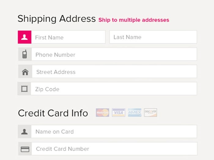
Set the shipping address as billing address
It
is always a good idea to combine the shipping address and the billing address to
make things simpler for the customer as they will often be making a purchase
from home.
By
doing this the checkout form becomes simpler for the customer and they will
quickly understand that their shipping address is also the billing address by
default.
It
is important to clearly show what the customer has bought when they are at the
checkout stage of their purchase. This is also important if you are offering a
special type of shipping such as express delivery.
If
you are in any way unclear about the purchases that customers are making at
this stage, they may very well abandon the purchase and give up completely on
the website.
However,
the good thing is that online shops are becoming more and more popular as one
of the main ways in which to buy products while security and design are also
developing at a rapid rate. Just as in the real world, there is always the
possibility of data being lost or stolen. However, these situations are rare.
Keeping the customer feeling safe and
confident
is the key goal and this can be done by offering a more personal experience.
Showing phone numbers and other easy ways to contact the shop is always a good
idea.
Another
good idea is to have trust signals which can be placed throughout the site.
These are simply symbols that have been designed and state things that will
keep the customer feeling safe and secure.
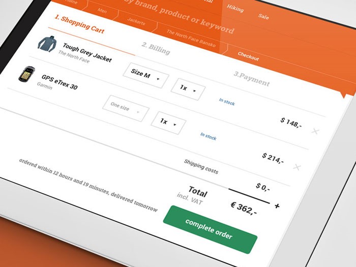
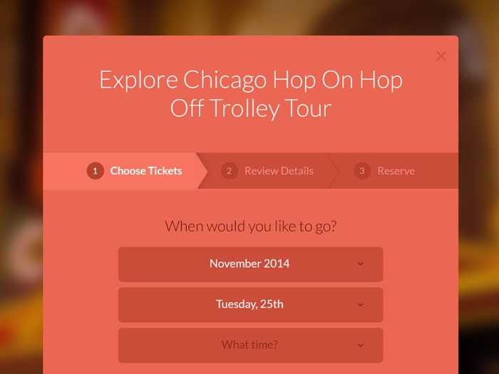
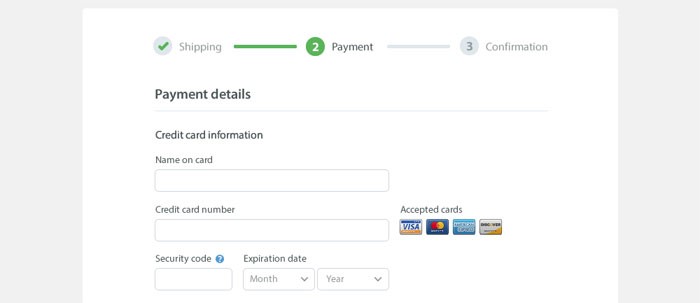
A
well-designed checkout page will give the customer the information they need in
order for them to feel safe within the checkout process. In this situation, a
progress tracker is used to show the customer exactly what stage they are at
with the checkout process so that they know how much further they have to go
until the order is completed.
Use descriptions for your form fields
There
will also be many moments when one will need to enter information regarding
personal information such as the email address. Some customers will understand
what this information is needed for. However, others may need a small
description which can either be on the show or hidden behind an arrow button to
explain what the information is used for.
It
really is a good idea to avoid as many forms as possible and stick to the bare
essentials as customers often feel like their personal information is invaded.
This
technique can be seen in some of the bigger websites, which always stick to the
minimal amount of forms, allowing customers to quickly enter the information
and make a purchase without unnecessary hassle.
Avoid multi-columns
It
is also a good idea to avoid multi-columns as these can confuse the customers
when they least expect it. The customer wants to enter their data quickly and
does not want to spend on time and energy on forms that they don’t understand.
The
problem with having several columns on one page is that users begin to wonder
whether these columns are related and this begins to bring confusion to the
user.
Consider closed checkouts
The
final thing to make sure when setting up an e-commerce site is to make sure the
customer fully understands what they are purchasing and how much they have paid
for that product. It is important to outline any other costs when the customer
makes their purchase so that they know exactly how much they are spending.
Finally,
the customer should feel completely confident that their purchase has been
processed and that it is on the way to them. Once they feel this, they are
likely to rely on the website for more product purchases in the future.
Many
people are choosing to sell products online as it is now easier than ever. When
designing and maintaining an online shop you should focus on the shopping cart
as one of the main areas of importance.
Having
a checkout that runs smoothly and is easy to access is by far the most
important element within a successful e-commerce site.
Having
a well-designed e-commerce website is all about getting trust from the
customers and it is for this reason that the checkout area on the payment page
needs to be very secure and well-designed.
A
well designed and simple layout will make the customer feel more at ease when
they enter their payment information and their private details.
The
problem with an e-commerce website is that if they are too vague and
unwelcoming they can drive customers away. This mostly happens when the web development company handles the UX
as well. Shop owners then risk losing over half of all their customers. So how
do you make sure that your shopping cart is well tweaked to all the potential
customers? For starters, let UX designers handle UX. Still, here are a few
guidelines on designing the checkout interface.
Registration should be optional
The
benefit of registration is that they can allow one the ability to gain
information about their customers. However, this may deter new customers from
using the website and will stop sales of products from taking
place.
The
best websites really will give the customer the choice of whether they want to
register or not as many people do not enjoy sharing their personal information
but may still wish to buy the products on the website. The annoyance of having
to fill out a registration form is a danger of putting the customer off for
life.
So
how does one get a customer to register without intruding on the purchase? One
method is to ask the customer if they wish to register once they have made the
purchase by offering them a set of forms to fill in. This may be as simple as a
username and password.
The
trend these days with the modern checkout design is to have a single page
checkout which is easy to understand and quick to fill out.
These
are the most popular ways to purchase orders as multiple columns have shown to
confuse and deter customers from making the initial purchase.
Once
you have a single page flow in your checkout area of the site, you are much
more likely to get your customers purchasing the products that they want to
buy.
If
you’re using WooCommerce and you want to enable this functionality, look
through the best WooCommerce plugins. There surely is
one that has this one built in. If you’re using Opencart or something
else, you might need to look into their guides to see if they have a solution
for this.
Have a back button in the design
It
can be a very good idea to have a back button in the checkout process. If this
is not implemented, when the customer chooses to go back on the process they
may get an error message which will cause frustration and problems for the
purchase. Having a back button allows the customer the ability to check their
details.
If
a back button is not implemented and the customer gets an error message, they
are likely to give up on the whole process altogether.
Optimize for mobile
Many
web designers forget that customers often use their phones to browse websites
and may use this device to purchase products that they find online.
However,
many websites are not optimized for mobile devices and will not be
able to sell products to the customer in this way. In order to maximize
profits, the individual needs to make sure that their website can work on many
different mobile devices. This often means cutting back on the design of the
site for mobile devices by removing input fields and focusing on the
essentials.
A
checkout on a mobile device should also be as simple as it is on the web and
should not try to make the customer register for the site before they make
their purchase. You should constantly do tweaks to the whole buying process and
make sure everything is as smooth as possible for the end user. Look into web application testing to streamline
your optimization process instead of doing things oldschool.
Set the shipping address as billing address
It
is always a good idea to combine the shipping address and the billing address to
make things simpler for the customer as they will often be making a purchase
from home.
By
doing this the checkout form becomes simpler for the customer and they will
quickly understand that their shipping address is also the billing address by
default.
It
is important to clearly show what the customer has bought when they are at the
checkout stage of their purchase. This is also important if you are offering a
special type of shipping such as express delivery.
If
you are in any way unclear about the purchases that customers are making at
this stage, they may very well abandon the purchase and give up completely on
the website.
However,
the good thing is that online shops are becoming more and more popular as one
of the main ways in which to buy products while security and design are also
developing at a rapid rate. Just as in the real world, there is always the
possibility of data being lost or stolen. However, these situations are rare.
Keeping the customer feeling safe and
confident
is the key goal and this can be done by offering a more personal experience.
Showing phone numbers and other easy ways to contact the shop is always a good
idea.
Another
good idea is to have trust signals which can be placed throughout the site.
These are simply symbols that have been designed and state things that will
keep the customer feeling safe and secure.
A
well-designed checkout page will give the customer the information they need in
order for them to feel safe within the checkout process. In this situation, a
progress tracker is used to show the customer exactly what stage they are at
with the checkout process so that they know how much further they have to go
until the order is completed.
Use descriptions for your form fields
There
will also be many moments when one will need to enter information regarding
personal information such as the email address. Some customers will understand
what this information is needed for. However, others may need a small
description which can either be on the show or hidden behind an arrow button to
explain what the information is used for.
It
really is a good idea to avoid as many forms as possible and stick to the bare
essentials as customers often feel like their personal information is invaded.
This
technique can be seen in some of the bigger websites, which always stick to the
minimal amount of forms, allowing customers to quickly enter the information
and make a purchase without unnecessary hassle.
Avoid multi-columns
It
is also a good idea to avoid multi-columns as these can confuse the customers
when they least expect it. The customer wants to enter their data quickly and
does not want to spend on time and energy on forms that they don’t understand.
The
problem with having several columns on one page is that users begin to wonder
whether these columns are related and this begins to bring confusion to the
user.
Consider closed checkouts
The
final thing to make sure when setting up an e-commerce site is to make sure the
customer fully understands what they are purchasing and how much they have paid
for that product. It is important to outline any other costs when the customer
makes their purchase so that they know exactly how much they are spending.
Finally,
the customer should feel completely confident that their purchase has been
processed and that it is on the way to them. Once they feel this, they are
likely to rely on the website for more product purchases in the future.
Many
people are choosing to sell products online as it is now easier than ever. When
designing and maintaining an online shop you should focus on the shopping cart
as one of the main areas of importance.
Having
a checkout that runs smoothly and is easy to access is by far the most
important element within a successful e-commerce site.
Having
a well-designed e-commerce website is all about getting trust from the
customers and it is for this reason that the checkout area on the payment page
needs to be very secure and well-designed.
A
well designed and simple layout will make the customer feel more at ease when
they enter their payment information and their private details.
The
problem with an e-commerce website is that if they are too vague and
unwelcoming they can drive customers away. This mostly happens when the web development company handles the UX
as well. Shop owners then risk losing over half of all their customers. So how
do you make sure that your shopping cart is well tweaked to all the potential
customers? For starters, let UX designers handle UX. Still, here are a few
guidelines on designing the checkout interface.
Registration should be optional
The
benefit of registration is that they can allow one the ability to gain
information about their customers. However, this may deter new customers from
using the website and will stop sales of products from taking
place.
The
best websites really will give the customer the choice of whether they want to
register or not as many people do not enjoy sharing their personal information
but may still wish to buy the products on the website. The annoyance of having
to fill out a registration form is a danger of putting the customer off for
life.
So
how does one get a customer to register without intruding on the purchase? One
method is to ask the customer if they wish to register once they have made the
purchase by offering them a set of forms to fill in. This may be as simple as a
username and password.
The
trend these days with the modern checkout design is to have a single page
checkout which is easy to understand and quick to fill out.
These
are the most popular ways to purchase orders as multiple columns have shown to
confuse and deter customers from making the initial purchase.
Once
you have a single page flow in your checkout area of the site, you are much
more likely to get your customers purchasing the products that they want to
buy.
If
you’re using WooCommerce and you want to enable this functionality, look
through the best WooCommerce plugins. There surely is
one that has this one built in. If you’re using Opencart or something
else, you might need to look into their guides to see if they have a solution
for this.
Have a back button in the design
It
can be a very good idea to have a back button in the checkout process. If this
is not implemented, when the customer chooses to go back on the process they
may get an error message which will cause frustration and problems for the
purchase. Having a back button allows the customer the ability to check their
details.
If
a back button is not implemented and the customer gets an error message, they
are likely to give up on the whole process altogether.
Optimize for mobile
Many
web designers forget that customers often use their phones to browse websites
and may use this device to purchase products that they find online.
However,
many websites are not optimized for mobile devices and will not be
able to sell products to the customer in this way. In order to maximize
profits, the individual needs to make sure that their website can work on many
different mobile devices. This often means cutting back on the design of the
site for mobile devices by removing input fields and focusing on the
essentials.
A
checkout on a mobile device should also be as simple as it is on the web and
should not try to make the customer register for the site before they make
their purchase. You should constantly do tweaks to the whole buying process and
make sure everything is as smooth as possible for the end user. Look into web application testing to streamline
your optimization process instead of doing things oldschool.
Set the shipping address as billing address
It
is always a good idea to combine the shipping address and the billing address to
make things simpler for the customer as they will often be making a purchase
from home.
By
doing this the checkout form becomes simpler for the customer and they will
quickly understand that their shipping address is also the billing address by
default.
It
is important to clearly show what the customer has bought when they are at the
checkout stage of their purchase. This is also important if you are offering a
special type of shipping such as express delivery.
If
you are in any way unclear about the purchases that customers are making at
this stage, they may very well abandon the purchase and give up completely on
the website.
However,
the good thing is that online shops are becoming more and more popular as one
of the main ways in which to buy products while security and design are also
developing at a rapid rate. Just as in the real world, there is always the
possibility of data being lost or stolen. However, these situations are rare.
Keeping the customer feeling safe and
confident
is the key goal and this can be done by offering a more personal experience.
Showing phone numbers and other easy ways to contact the shop is always a good
idea.
Another
good idea is to have trust signals which can be placed throughout the site.
These are simply symbols that have been designed and state things that will
keep the customer feeling safe and secure.
A
well-designed checkout page will give the customer the information they need in
order for them to feel safe within the checkout process. In this situation, a
progress tracker is used to show the customer exactly what stage they are at
with the checkout process so that they know how much further they have to go
until the order is completed.
Use descriptions for your form fields
There
will also be many moments when one will need to enter information regarding
personal information such as the email address. Some customers will understand
what this information is needed for. However, others may need a small
description which can either be on the show or hidden behind an arrow button to
explain what the information is used for.
It
really is a good idea to avoid as many forms as possible and stick to the bare
essentials as customers often feel like their personal information is invaded.
This
technique can be seen in some of the bigger websites, which always stick to the
minimal amount of forms, allowing customers to quickly enter the information
and make a purchase without unnecessary hassle.
Avoid multi-columns
It
is also a good idea to avoid multi-columns as these can confuse the customers
when they least expect it. The customer wants to enter their data quickly and
does not want to spend on time and energy on forms that they don’t understand.
The
problem with having several columns on one page is that users begin to wonder
whether these columns are related and this begins to bring confusion to the
user.
Consider closed checkouts
The
final thing to make sure when setting up an e-commerce site is to make sure the
customer fully understands what they are purchasing and how much they have paid
for that product. It is important to outline any other costs when the customer
makes their purchase so that they know exactly how much they are spending.
Finally,
the customer should feel completely confident that their purchase has been
processed and that it is on the way to them. Once they feel this, they are
likely to rely on the website for more product purchases in the future.
Many
people are choosing to sell products online as it is now easier than ever. When
designing and maintaining an online shop you should focus on the shopping cart
as one of the main areas of importance.
Having
a checkout that runs smoothly and is easy to access is by far the most
important element within a successful e-commerce site.
Having
a well-designed e-commerce website is all about getting trust from the
customers and it is for this reason that the checkout area on the payment page
needs to be very secure and well-designed.
A
well designed and simple layout will make the customer feel more at ease when
they enter their payment information and their private details.
The
problem with an e-commerce website is that if they are too vague and
unwelcoming they can drive customers away. This mostly happens when the web development company handles the UX
as well. Shop owners then risk losing over half of all their customers. So how
do you make sure that your shopping cart is well tweaked to all the potential
customers? For starters, let UX designers handle UX. Still, here are a few
guidelines on designing the checkout interface.
Registration should be optional
The
benefit of registration is that they can allow one the ability to gain
information about their customers. However, this may deter new customers from
using the website and will stop sales of products from taking
place.
The
best websites really will give the customer the choice of whether they want to
register or not as many people do not enjoy sharing their personal information
but may still wish to buy the products on the website. The annoyance of having
to fill out a registration form is a danger of putting the customer off for
life.
So
how does one get a customer to register without intruding on the purchase? One
method is to ask the customer if they wish to register once they have made the
purchase by offering them a set of forms to fill in. This may be as simple as a
username and password.
The
trend these days with the modern checkout design is to have a single page
checkout which is easy to understand and quick to fill out.
These
are the most popular ways to purchase orders as multiple columns have shown to
confuse and deter customers from making the initial purchase.
Once
you have a single page flow in your checkout area of the site, you are much
more likely to get your customers purchasing the products that they want to
buy.
If
you’re using WooCommerce and you want to enable this functionality, look
through the best WooCommerce plugins. There surely is
one that has this one built in. If you’re using Opencart or something
else, you might need to look into their guides to see if they have a solution
for this.
Have a back button in the design
It
can be a very good idea to have a back button in the checkout process. If this
is not implemented, when the customer chooses to go back on the process they
may get an error message which will cause frustration and problems for the
purchase. Having a back button allows the customer the ability to check their
details.
If
a back button is not implemented and the customer gets an error message, they
are likely to give up on the whole process altogether.
Optimize for mobile
Many
web designers forget that customers often use their phones to browse websites
and may use this device to purchase products that they find online.
However,
many websites are not optimized for mobile devices and will not be
able to sell products to the customer in this way. In order to maximize
profits, the individual needs to make sure that their website can work on many
different mobile devices. This often means cutting back on the design of the
site for mobile devices by removing input fields and focusing on the
essentials.
A
checkout on a mobile device should also be as simple as it is on the web and
should not try to make the customer register for the site before they make
their purchase. You should constantly do tweaks to the whole buying process and
make sure everything is as smooth as possible for the end user. Look into web application testing to streamline
your optimization process instead of doing things oldschool.
Set the shipping address as billing address
It
is always a good idea to combine the shipping address and the billing address to
make things simpler for the customer as they will often be making a purchase
from home.
By
doing this the checkout form becomes simpler for the customer and they will
quickly understand that their shipping address is also the billing address by
default.
It
is important to clearly show what the customer has bought when they are at the
checkout stage of their purchase. This is also important if you are offering a
special type of shipping such as express delivery.
If
you are in any way unclear about the purchases that customers are making at
this stage, they may very well abandon the purchase and give up completely on
the website.
However,
the good thing is that online shops are becoming more and more popular as one
of the main ways in which to buy products while security and design are also
developing at a rapid rate. Just as in the real world, there is always the
possibility of data being lost or stolen. However, these situations are rare.
Keeping the customer feeling safe and
confident
is the key goal and this can be done by offering a more personal experience.
Showing phone numbers and other easy ways to contact the shop is always a good
idea.
Another
good idea is to have trust signals which can be placed throughout the site.
These are simply symbols that have been designed and state things that will
keep the customer feeling safe and secure.
A
well-designed checkout page will give the customer the information they need in
order for them to feel safe within the checkout process. In this situation, a
progress tracker is used to show the customer exactly what stage they are at
with the checkout process so that they know how much further they have to go
until the order is completed.
Use descriptions for your form fields
There
will also be many moments when one will need to enter information regarding
personal information such as the email address. Some customers will understand
what this information is needed for. However, others may need a small
description which can either be on the show or hidden behind an arrow button to
explain what the information is used for.
It
really is a good idea to avoid as many forms as possible and stick to the bare
essentials as customers often feel like their personal information is invaded.
This
technique can be seen in some of the bigger websites, which always stick to the
minimal amount of forms, allowing customers to quickly enter the information
and make a purchase without unnecessary hassle.
Avoid multi-columns
It
is also a good idea to avoid multi-columns as these can confuse the customers
when they least expect it. The customer wants to enter their data quickly and
does not want to spend on time and energy on forms that they don’t understand.
The
problem with having several columns on one page is that users begin to wonder
whether these columns are related and this begins to bring confusion to the
user.
Consider closed checkouts
The
final thing to make sure when setting up an e-commerce site is to make sure the
customer fully understands what they are purchasing and how much they have paid
for that product. It is important to outline any other costs when the customer
makes their purchase so that they know exactly how much they are spending.
Finally,
the customer should feel completely confident that their purchase has been
processed and that it is on the way to them. Once they feel this, they are
likely to rely on the website for more product purchases in the future.
Agregator najlepszych postów o designie, webdesignie, cssie i Internecie