Archiwum kategorii: Design

Graphic Design Trends to Put to Rest in 2019

Post pobrano z: Graphic Design Trends to Put to Rest in 2019

There are two types of trends in web design.
The first type is trends that stem from research. UX trends do not disappear,
they evolve. Ultimately, there are some things that work best, and they are
there to stay.

Then there are UI trends. Most of the times,
they’re a great way to show your website is changing. Some trends, however, tend
to be so prevalent they become trite.

It’s these trends that you’d be better off not
using in 2019.

1. Bright Colors

How do you attract attention to something on
your website? You make it bright red! This was the motto of some web designers
for quite some time.

Even though the trend to use bright colors is
not as egregious as this simple strategy, it’s not without its faults either.
It’s been overused, and frankly, bright colors do not work for most websites.

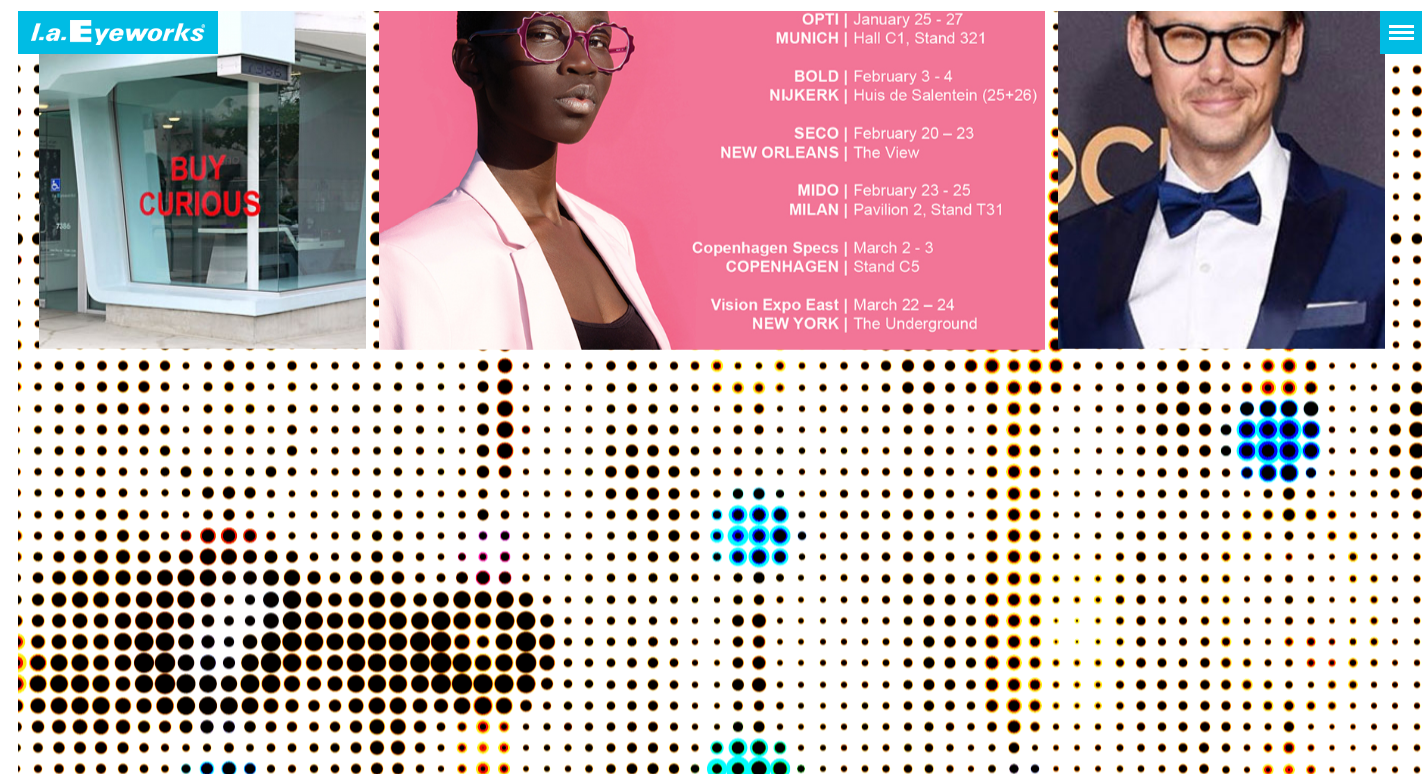
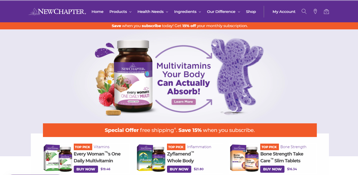
Take a look at this website. It does a great
job with imagery on the top of the page – great photography and smooth pastel
tones. Then it descends into this nightmare of a background.
Source

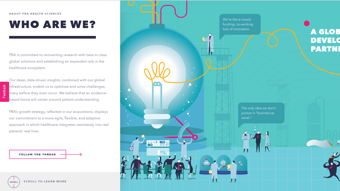
If you have to use color, make it smoother.
Take a look at this screenshot. The biggest part of a page is taken up by a
picture, but it isn’t bright and doesn’t make your eyes bleed.
Source

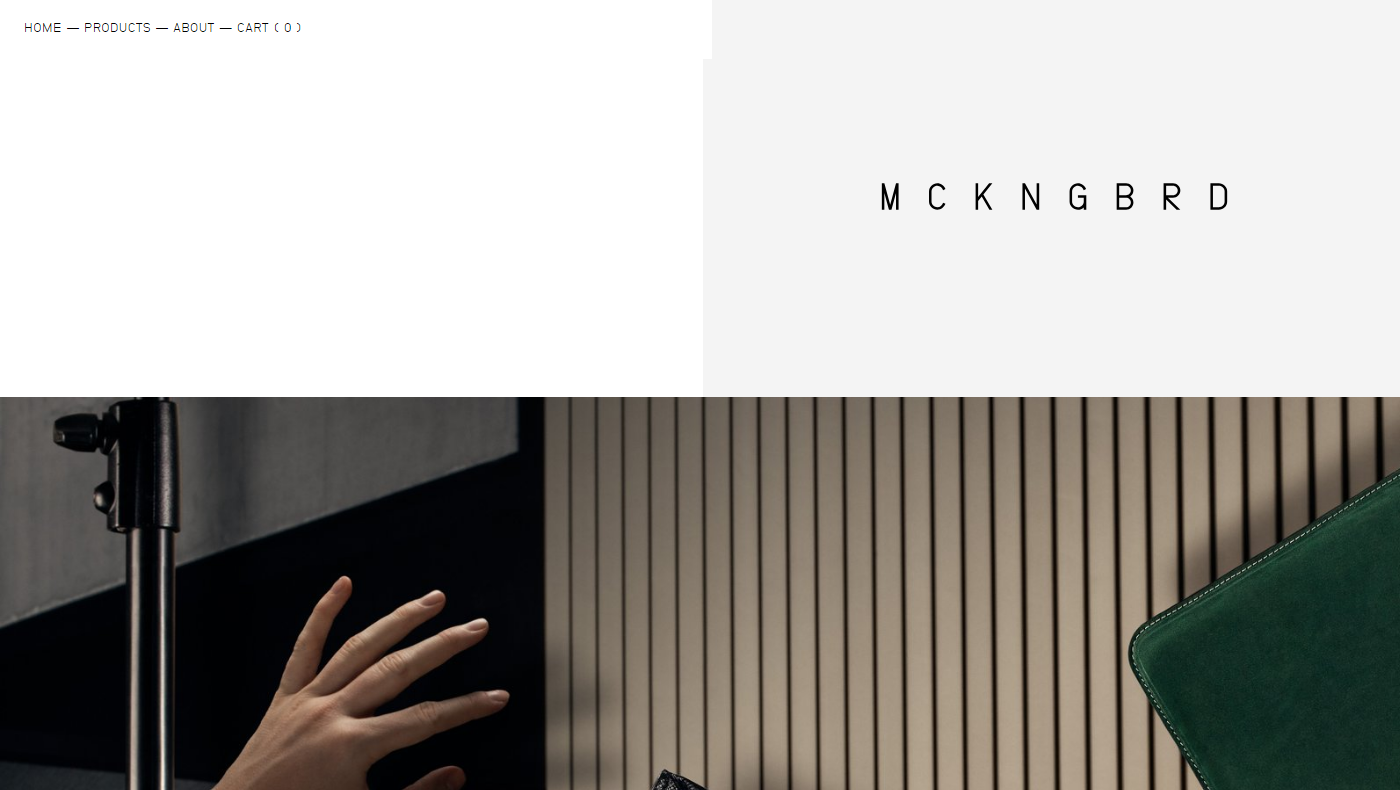
You can also go for complete minimalism, and
forget about colors whatsoever as this website does.
Source

2. Mixed Typography

If you’ve read something on typography trends,
you know that people love to mix fonts. Sometimes it looks good, sometimes it’s
over the top.

When you take on too many fonts, the odds of
you making something that looks good are rather low. Add to it too many
different and mismatching fonts and you’re headed for a disaster.

Sometimes, creative use of fonts works. Take a
look at this website, for instance.
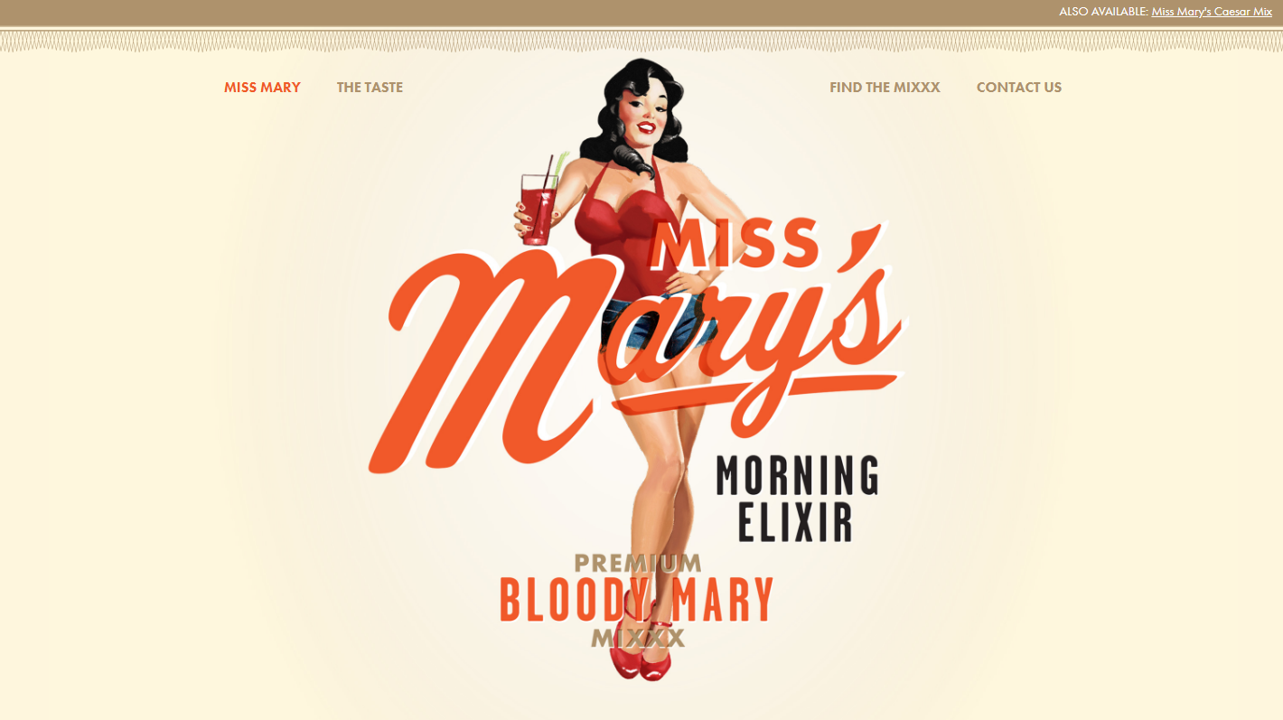
Source

In most cases, it just doesn’t cut it. If you
stick to a more traditional approach, you have higher chances of success. At
least, you don’t have as many opportunities to fail. Make your typography look
something along these lines, and you’re on the safe side.
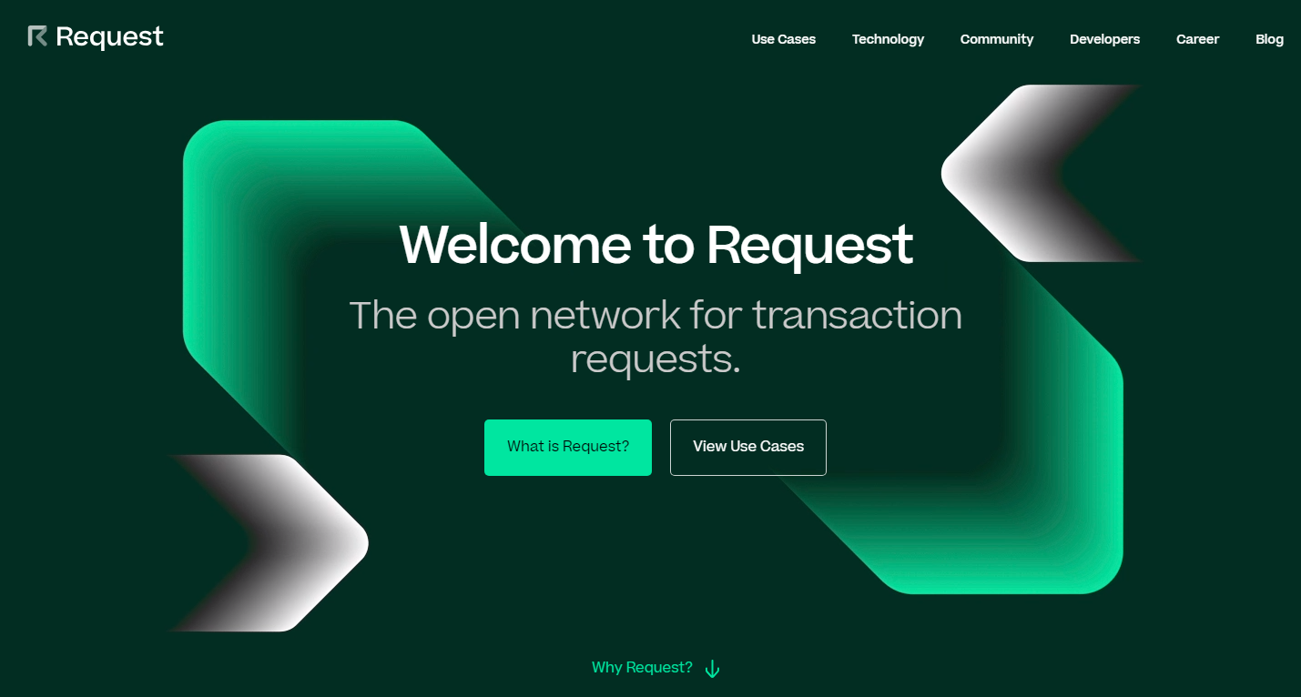
Source

3. Badge Logos

If you’ve tried to design your own logo, you
know what badge logos are. They’re supposed to look hip and vintage. They’re
the Gucci of logo design – everyone wants one but few can afford them.

The thing is, most stock websites offer some
kind of badge logo. Most of these logos look pretty cool, and they may be a
great fit for a website that sells beard lotions with wood flavor.

But what is a logo for, anyway? It should make
your company stand out from the crowd. A badge logo will only make you look
like every other company that visited this page to get a cheap logo.
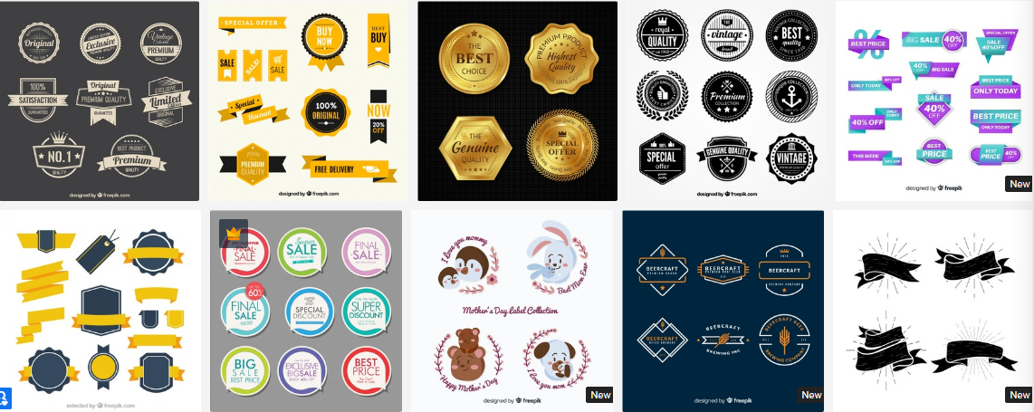
Approach creating your logo like getting your APA style paper written for you. If the thing
you’re paying for predicts your success, make sure to find a professional and
pay them well.

4. The Burst

The burst is another ugly trend that comes
from the stock websites and must go. It’s a classic way to attract attention to
something important, and it shows you’re a lazy designer.

The problem with this design trend is that
it’s overused. It’s overused to the point where it’s become trite. The bursting
badge that says “New” or “Sale” is boring now.

Try to present your sale in a new and fun way.
Make the news about a sale an experience of its own. This is what your popup
that informs people about discounts can look like.
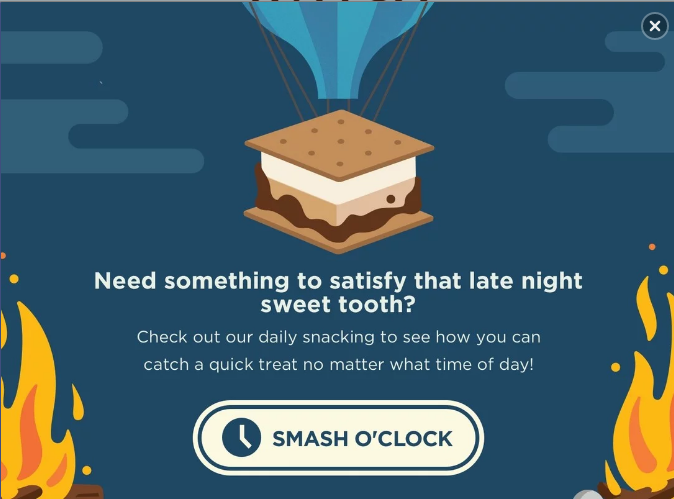
Source

It catches attention due to being well-designed
and well-written, and not due to being bright and having the word “Sale” in all
caps.

If you need to use badges for products, make
them minimalistic. These badges attract attention by means of contrast, even
though they don’t look like a small explosion that the burst is .
Source

5. Asymmetrical Design

What? Do you want my website to look boring?

No. The thing is, there’s a fear that if you
conform to the standards of UX design this will make your website look dull.

That’s not what makes it this way. It’s a
combination of things, really. If your website does follow the standards of
layout that many conform to and then doesn’t communicate to the users, you end
up looking like this.
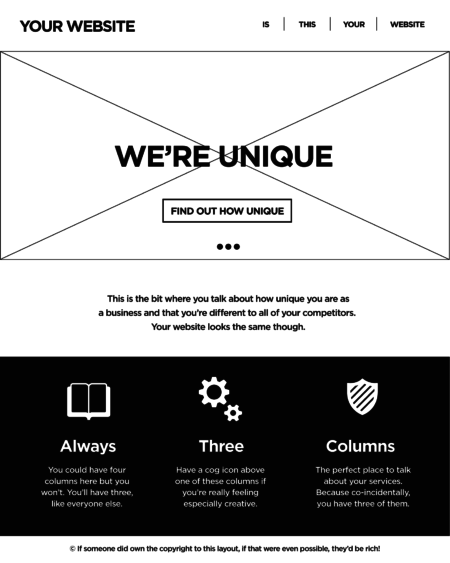
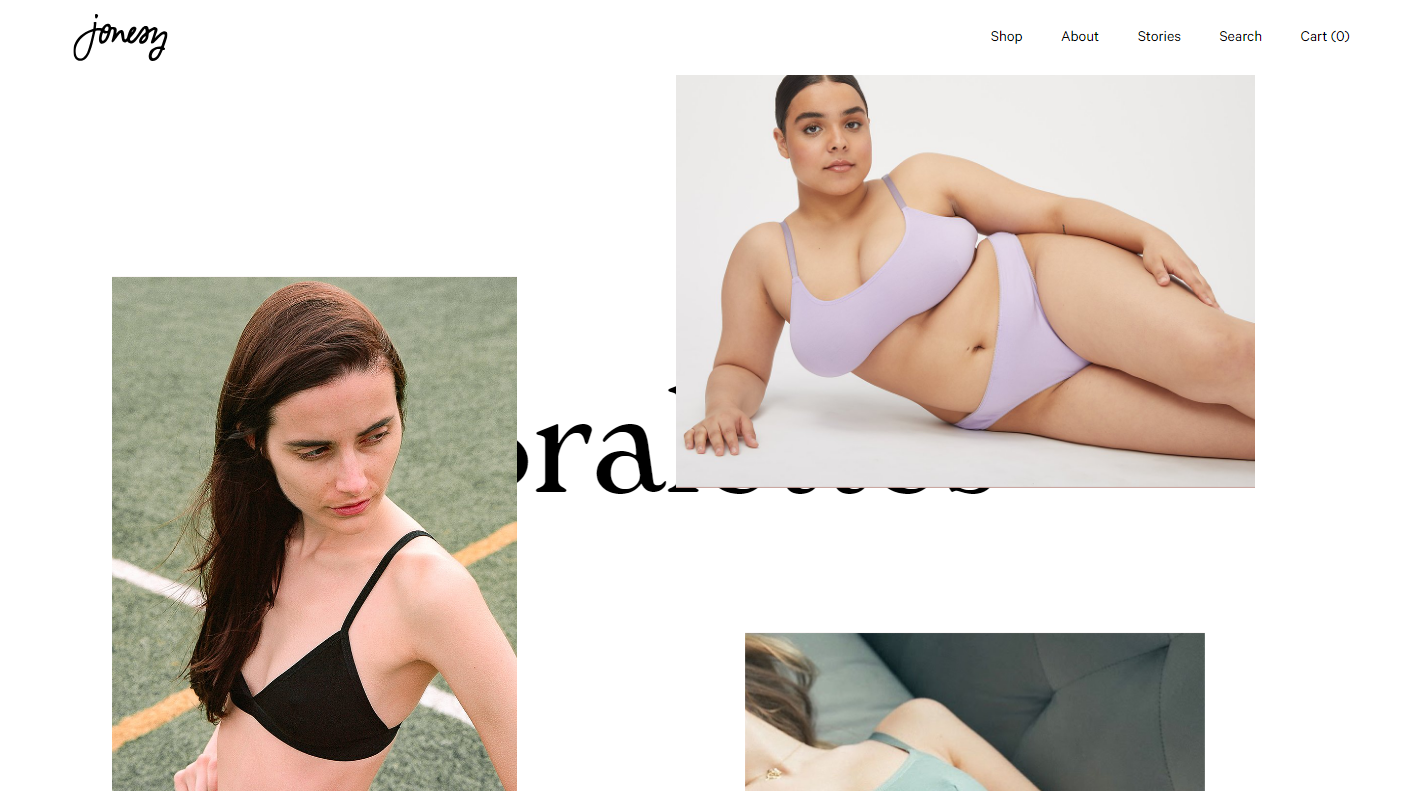
It sure looks ugly, but breaking the tree
columns rule won’t make your website interesting. It’s inconsistent and
confusing for the customers. It will only work if you have a couple of products
on display as well since scrolling through four screens of these is hard.
Source

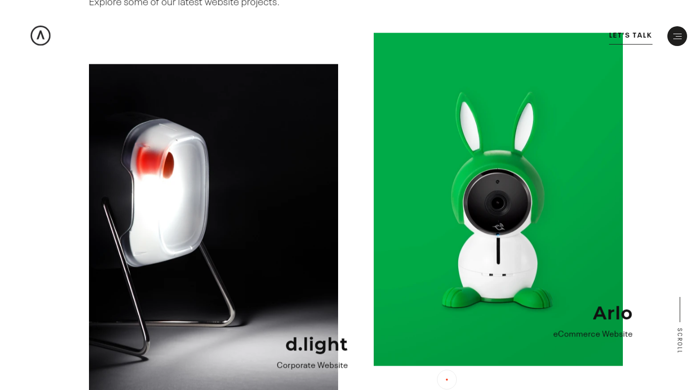
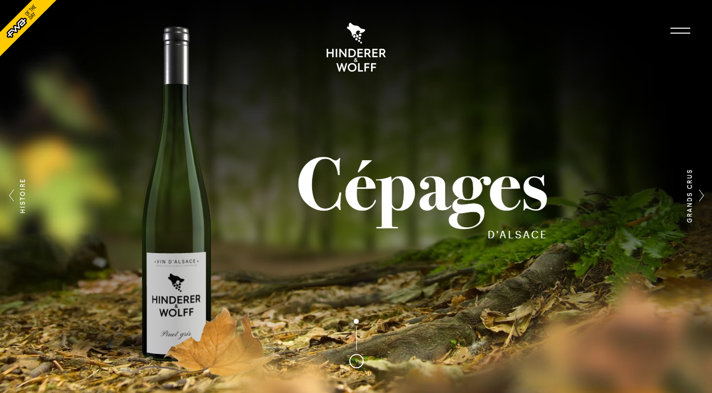
You can add a bit of asymmetry to spice things
up though. Here’s one way to do that.
Source

The simplest way of making things a bit
asymmetric but maintaining the overall graphics hierarchy is placing an object
or a picture a bit off center.
Source

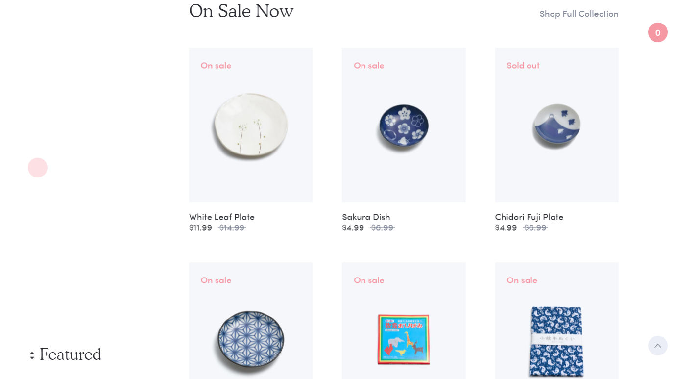
In the end, you’ll most likely have to stick
with the three columns. But they can look pretty fresh as well if you know how
to make them work.
Source

6. Flat Design

Minimalism is trendy. It’s great, too. Flat
design is not the minimalism you need, however.

It’s been around for a while. It had its peak
of popularity, and now it’s time for it to go. The problem with flat is that
it’s overused (just like the burst and badge logos). Every stock photo website
offers it. This picture must have been posted on too many websites.

Source

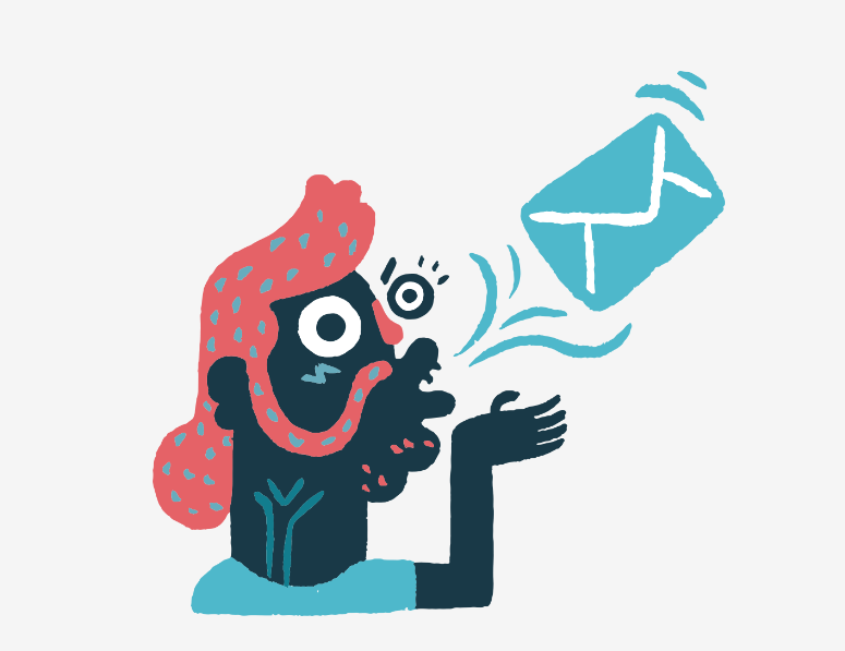
Your illustrations don’t have to be this
boring. Take a look at how MailChimp treats illustrations in their blog
articles. It’s just a random picture, but it’s fun and attention-grabbing.

Source

You can even get this kind of abstract
illustrations for little to no money on the web. Here’s how you can present a
sent message to your users.
Source

7. Following Trends

The ultimate lesson you should draw from this
list is that following UI trends is not a great idea in general. You can use
most of them and make your website look great but only if you adopt a trend,
not follow it.

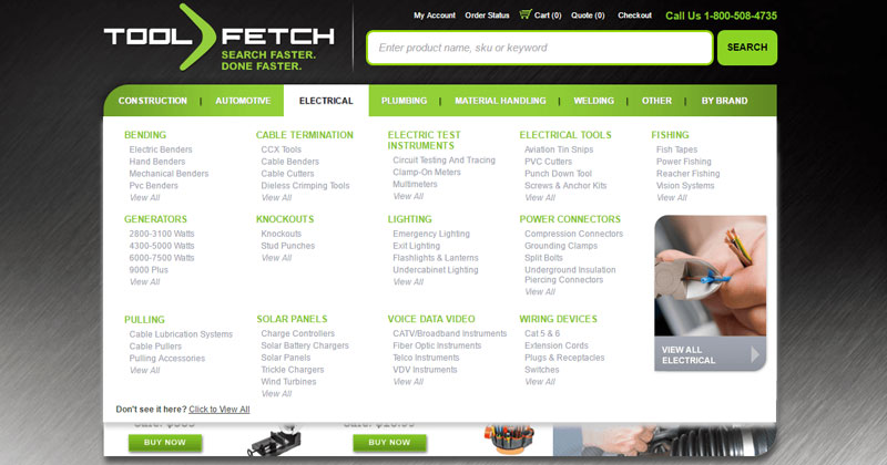
Take a trend and give it your own spin. This
will make you both up to date and unique.
Web Design Sins to Avoid – Turning Bad Websites into Successful Websites

Post pobrano z: Web Design Sins to Avoid – Turning Bad Websites into Successful Websites

Have you ever visited a website that pushed you away? No, it’s not about content, you didn’t even read it. The design of the site was so unattractive and disturbing that you closed it and looked for a better place to order or buy something. We all bump into deadly navigation websites sometimes, they are visually disturbing and make us leave them as soon as possible, even though there can be very useful information to read and learn. The design is a huge part of a website and if it’s done nicely, users want to spend hours on such a site. The main purpose of a design is to turn visitors into customers, therefore, we decided to dedicate this article to the most common mistakes that web designers make.

If
you want to become a web designer and help people to sell stuff via their
websites, you need to know what attracts visitors and what pushes them away.
When you have to prepare a piece of dissertation proposal writing on web design topic,
you have to explain how to meet the client’s expectations and how to solve your
client’s problem with the help of the latest tools. In your dissertation, you
can describe the problems such as impractical gallery, the absence of CMS, low
bounce rate of a landing page and list the solutions that you can offer your
client. What you don’t want to do is to provide the wrong solutions and get a
low grade from your professor. To avoid this and help you with writing a decent
proposal, keep reading our article.

10 Deadly Sins That You Can Commit as a Web Designer

1. Complicated Navigation

The first rule is to keep navigation simple. Remember that the users can be the people who use the Internet sometimes and don’t visit dozens of websites every day as you do. Such an audience can get easily confused and frustrated. It’s recommended to create a menu with short descriptive tags. There also should be a clearly visible search box, so the users can type the name of the product and quickly find what they came for.

2. Fonts are Too Small

Do
you enjoy reading small fonts online? No, this is
very disturbing and makes you ask “Who was this written for?” Forget about an
old-school website with font 12 that is really hard to read. It’s not so bad
when someone is using a tablet but what if someone is using a computer with 24
inches screen, are they supposed to zoom? Important information should be
written clearly. The statistic shows that you have only 8 seconds to make an
impression, therefore, use headline fonts to grab users’ attention.

3. A Lack of Call to Action

There are plenty of websites that provide interesting information but make someone doubt what to do next. Call to action wording such as “Sign up today”, “Contact us” or “Add to cart” will make users’ experience so much easier and much more effective for the business. A custom writing service Paperial and the professional authors with good knowledge in web design topic will help you to write more ideas in your dissertation on useful tools and mistakes in designing websites.

4. Moving Sliders

Moving
banners often distract users from searching for the necessary items on the
website. In some cases, such moving sliders are absolutely useless. The recent
statistic showed that only 1% of website visitors click the sliders. When poorly
designed websites need help, web designers recommend creating a page with
important information and pictures that will be clearly found and understood by
the visitors.

5. Popups

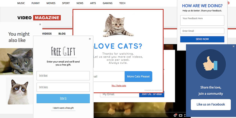
Google has recently warned the websites to use pop up adverts because they hurt SEO and make users’ experience negative especially for those who use mobile devices. Reconsider pop up adverts on the website. Mobile users will tell you that some pop-ups really annoy especially when you can’t close them.

6. The Absence of Bullets

The practice
shows that using bullets help users to find necessary information quicker. For
example, sections pros and cons should be organized in bullets. By listing
advantages of the service that the company offers instead of putting this
information in the text, you will highlight what is important and direct the
users. Bullet lists will improve the document’s readability and help users not
to get confused by looking for important information through texts.

7. Too Large Images

Using
picture and photos on a website is great but when their size is too large, it
will take a long time for a site to load. Reconsider the size of graphics that you are using on
the website and whether they are needed after all. Average users don’t wait for
a site to load if it takes longer than 5 seconds. You wouldn’t like to lose a
customer because of those beautiful pictures on the site, would you?

8. Hidden Contact Information

Contact
information is the link between you and your customers. Often contact
information is hidden or it’s really difficult to find it on the site. Such
details as phone number, email address, and mailing addresses with the map
should be visible on the front page. Add “Contact us” section where users can
be guided to see all contact information or fill the online form with questions
and send their inquiry.

9. The Absence of Social Media Links

Believe us
or not but modern users want to find your business on social media to read more
information, see photos and read what others say about the company. Popular
social media accounts dedicated to the business will create a better
relationship with the customers. It will help to drive big traffic to the site
within a short time.

10. Free Software

If
you are just learning how to design websites, using free software is acceptable
but if you are working as a web designer already, forget about free programs.
The downsides of using free apps for building site are lots of errors,
long loading time and poor performance in general. If you want to create
unique, excellently-performing and attractive websites that will make users’
experience positive, pay for the app to build a fantastic website and recommend
yourself as a professional web designer.

So, now you
know what mistakes to avoid in order to create and keep the website in the
perfect condition. Make it attractive yet convenient for users and the website
will bring the desired result.

Web Design Sins to Avoid – Turning Bad Websites into Successful Websites

Post pobrano z: Web Design Sins to Avoid – Turning Bad Websites into Successful Websites

Have you ever visited a website that pushed you away? No, it’s not about content, you didn’t even read it. The design of the site was so unattractive and disturbing that you closed it and looked for a better place to order or buy something. We all bump into deadly navigation websites sometimes, they are visually disturbing and make us leave them as soon as possible, even though there can be very useful information to read and learn. The design is a huge part of a website and if it’s done nicely, users want to spend hours on such a site. The main purpose of a design is to turn visitors into customers, therefore, we decided to dedicate this article to the most common mistakes that web designers make.

If
you want to become a web designer and help people to sell stuff via their
websites, you need to know what attracts visitors and what pushes them away.
When you have to prepare a piece of dissertation proposal writing on web design topic,
you have to explain how to meet the client’s expectations and how to solve your
client’s problem with the help of the latest tools. In your dissertation, you
can describe the problems such as impractical gallery, the absence of CMS, low
bounce rate of a landing page and list the solutions that you can offer your
client. What you don’t want to do is to provide the wrong solutions and get a
low grade from your professor. To avoid this and help you with writing a decent
proposal, keep reading our article.

10 Deadly Sins That You Can Commit as a Web Designer

1. Complicated Navigation

The first rule is to keep navigation simple. Remember that the users can be the people who use the Internet sometimes and don’t visit dozens of websites every day as you do. Such an audience can get easily confused and frustrated. It’s recommended to create a menu with short descriptive tags. There also should be a clearly visible search box, so the users can type the name of the product and quickly find what they came for.

2. Fonts are Too Small

Do
you enjoy reading small fonts online? No, this is
very disturbing and makes you ask “Who was this written for?” Forget about an
old-school website with font 12 that is really hard to read. It’s not so bad
when someone is using a tablet but what if someone is using a computer with 24
inches screen, are they supposed to zoom? Important information should be
written clearly. The statistic shows that you have only 8 seconds to make an
impression, therefore, use headline fonts to grab users’ attention.

3. A Lack of Call to Action

There are plenty of websites that provide interesting information but make someone doubt what to do next. Call to action wording such as “Sign up today”, “Contact us” or “Add to cart” will make users’ experience so much easier and much more effective for the business. A custom writing service Paperial and the professional authors with good knowledge in web design topic will help you to write more ideas in your dissertation on useful tools and mistakes in designing websites.

4. Moving Sliders

Moving
banners often distract users from searching for the necessary items on the
website. In some cases, such moving sliders are absolutely useless. The recent
statistic showed that only 1% of website visitors click the sliders. When poorly
designed websites need help, web designers recommend creating a page with
important information and pictures that will be clearly found and understood by
the visitors.

5. Popups

Google has recently warned the websites to use pop up adverts because they hurt SEO and make users’ experience negative especially for those who use mobile devices. Reconsider pop up adverts on the website. Mobile users will tell you that some pop-ups really annoy especially when you can’t close them.

6. The Absence of Bullets

The practice
shows that using bullets help users to find necessary information quicker. For
example, sections pros and cons should be organized in bullets. By listing
advantages of the service that the company offers instead of putting this
information in the text, you will highlight what is important and direct the
users. Bullet lists will improve the document’s readability and help users not
to get confused by looking for important information through texts.

7. Too Large Images

Using
picture and photos on a website is great but when their size is too large, it
will take a long time for a site to load. Reconsider the size of graphics that you are using on
the website and whether they are needed after all. Average users don’t wait for
a site to load if it takes longer than 5 seconds. You wouldn’t like to lose a
customer because of those beautiful pictures on the site, would you?

8. Hidden Contact Information

Contact
information is the link between you and your customers. Often contact
information is hidden or it’s really difficult to find it on the site. Such
details as phone number, email address, and mailing addresses with the map
should be visible on the front page. Add “Contact us” section where users can
be guided to see all contact information or fill the online form with questions
and send their inquiry.

9. The Absence of Social Media Links

Believe us
or not but modern users want to find your business on social media to read more
information, see photos and read what others say about the company. Popular
social media accounts dedicated to the business will create a better
relationship with the customers. It will help to drive big traffic to the site
within a short time.

10. Free Software

If
you are just learning how to design websites, using free software is acceptable
but if you are working as a web designer already, forget about free programs.
The downsides of using free apps for building site are lots of errors,
long loading time and poor performance in general. If you want to create
unique, excellently-performing and attractive websites that will make users’
experience positive, pay for the app to build a fantastic website and recommend
yourself as a professional web designer.

So, now you
know what mistakes to avoid in order to create and keep the website in the
perfect condition. Make it attractive yet convenient for users and the website
will bring the desired result.

Web Design Sins to Avoid – Turning Bad Websites into Successful Websites

Post pobrano z: Web Design Sins to Avoid – Turning Bad Websites into Successful Websites

Have you ever visited a website that pushed you away? No, it’s not about content, you didn’t even read it. The design of the site was so unattractive and disturbing that you closed it and looked for a better place to order or buy something. We all bump into deadly navigation websites sometimes, they are visually disturbing and make us leave them as soon as possible, even though there can be very useful information to read and learn. The design is a huge part of a website and if it’s done nicely, users want to spend hours on such a site. The main purpose of a design is to turn visitors into customers, therefore, we decided to dedicate this article to the most common mistakes that web designers make.

If
you want to become a web designer and help people to sell stuff via their
websites, you need to know what attracts visitors and what pushes them away.
When you have to prepare a piece of dissertation proposal writing on web design topic,
you have to explain how to meet the client’s expectations and how to solve your
client’s problem with the help of the latest tools. In your dissertation, you
can describe the problems such as impractical gallery, the absence of CMS, low
bounce rate of a landing page and list the solutions that you can offer your
client. What you don’t want to do is to provide the wrong solutions and get a
low grade from your professor. To avoid this and help you with writing a decent
proposal, keep reading our article.

10 Deadly Sins That You Can Commit as a Web Designer

1. Complicated Navigation

The first rule is to keep navigation simple. Remember that the users can be the people who use the Internet sometimes and don’t visit dozens of websites every day as you do. Such an audience can get easily confused and frustrated. It’s recommended to create a menu with short descriptive tags. There also should be a clearly visible search box, so the users can type the name of the product and quickly find what they came for.

2. Fonts are Too Small

Do
you enjoy reading small fonts online? No, this is
very disturbing and makes you ask “Who was this written for?” Forget about an
old-school website with font 12 that is really hard to read. It’s not so bad
when someone is using a tablet but what if someone is using a computer with 24
inches screen, are they supposed to zoom? Important information should be
written clearly. The statistic shows that you have only 8 seconds to make an
impression, therefore, use headline fonts to grab users’ attention.

3. A Lack of Call to Action

There are plenty of websites that provide interesting information but make someone doubt what to do next. Call to action wording such as “Sign up today”, “Contact us” or “Add to cart” will make users’ experience so much easier and much more effective for the business. A custom writing service Paperial and the professional authors with good knowledge in web design topic will help you to write more ideas in your dissertation on useful tools and mistakes in designing websites.

4. Moving Sliders

Moving
banners often distract users from searching for the necessary items on the
website. In some cases, such moving sliders are absolutely useless. The recent
statistic showed that only 1% of website visitors click the sliders. When poorly
designed websites need help, web designers recommend creating a page with
important information and pictures that will be clearly found and understood by
the visitors.

5. Popups

Google has recently warned the websites to use pop up adverts because they hurt SEO and make users’ experience negative especially for those who use mobile devices. Reconsider pop up adverts on the website. Mobile users will tell you that some pop-ups really annoy especially when you can’t close them.

6. The Absence of Bullets

The practice
shows that using bullets help users to find necessary information quicker. For
example, sections pros and cons should be organized in bullets. By listing
advantages of the service that the company offers instead of putting this
information in the text, you will highlight what is important and direct the
users. Bullet lists will improve the document’s readability and help users not
to get confused by looking for important information through texts.

7. Too Large Images

Using
picture and photos on a website is great but when their size is too large, it
will take a long time for a site to load. Reconsider the size of graphics that you are using on
the website and whether they are needed after all. Average users don’t wait for
a site to load if it takes longer than 5 seconds. You wouldn’t like to lose a
customer because of those beautiful pictures on the site, would you?

8. Hidden Contact Information

Contact
information is the link between you and your customers. Often contact
information is hidden or it’s really difficult to find it on the site. Such
details as phone number, email address, and mailing addresses with the map
should be visible on the front page. Add “Contact us” section where users can
be guided to see all contact information or fill the online form with questions
and send their inquiry.

9. The Absence of Social Media Links

Believe us
or not but modern users want to find your business on social media to read more
information, see photos and read what others say about the company. Popular
social media accounts dedicated to the business will create a better
relationship with the customers. It will help to drive big traffic to the site
within a short time.

10. Free Software

If
you are just learning how to design websites, using free software is acceptable
but if you are working as a web designer already, forget about free programs.
The downsides of using free apps for building site are lots of errors,
long loading time and poor performance in general. If you want to create
unique, excellently-performing and attractive websites that will make users’
experience positive, pay for the app to build a fantastic website and recommend
yourself as a professional web designer.

So, now you
know what mistakes to avoid in order to create and keep the website in the
perfect condition. Make it attractive yet convenient for users and the website
will bring the desired result.

Visual Composer’s New Name: and Why An Explanation Is in Order

Post pobrano z: Visual Composer’s New Name: and Why An Explanation Is in Order

Anytime a popular product undergoes a
change, especially when the name if the brand is impacted, it’s bound to create
a certain amount of confusion – especially among long-time users.

At least some of you may have noticed that
the Visual Composer Page Builder appears to have disappeared from the scene.
Highly popular page-building tools don’t simply go away, any more than
long-time favorite breakfast cereals simply vanish from the marketplace.

To add to the confusion, you still see the
Visual Composer Website Builder advertised, which could lead some to think that
the Page Builder was simply swallowed up by the Website Builder.

Nothing could be farther from the truth as
the two are quite different animals, although not totally different in some
respects, and we would like to apologize
to our users and our long-time partners for the confusion we’ve created
.

Our apology and some clarification is the
purpose of this article. The Visual Composer Page Builder is still with us, but
under a different name. The Visual Composer Website Builder is still
with us too, and the name remains the same.

Why did we rename the Visual Composer Page
Builder?

We didn’t want to, but we really had no
choice. The problem we faced was caused by the emergence of our new product –
the Visual
Composer Website Builder
, which is 
entirely different from the Visual Composer Page Builder, and serves
a different purpose.

The Website Builder is not as some have
been led to believe, a souped-up version of the Page Builder.

The VC Page Builder is an Envato-exclusive
product that features a lifetime license; just like all the other products sold
by Envato.

The VC Website Builder is a much more
complex product whose development costs are simply too high to be supported by
a lifetime license. Because of these high costs, it made more sense to switch
the VC Website Builder to annual licensing.

Problem solved? Not quite. Marketplace
contract limitations would not allow us to sell a product outside the platform
using the VC name.

This left us with a couple of options:

Option 1. By changing the name of the VC
Page Builder, we could free ourselves of the contractual limitations involved
in selling it. Changing a familiar and popular name was something we were
naturally reluctant to do.

Option 2. We could slim down our new
product (the VC Website Builder) to the point that the lower development costs
would nicely fit in with the lifetime license model.

The problem with Option 2 was that the VC
Website Builder would be far less flexible and powerful than planned, which was
in direct opposition to the route we intended to take.

In the final analysis, we looked at Option
1 as the lesser of two evils, and we decided that a name change was more
palatable than compromising on the quality of our new product.

So – we changed the name
of the Visual Composer Page Builder to
WP Bakery.

Check
out the following video if you’re interested in knowing about the name change
in greater detail.

We though
we solved our problem, but we failed to anticipate the confusion the name
change would cause.

Users
wondered where the VC Page Builder disappeared to.

They
wondered if VC Website Builder was the Page Builder under a new name, an
enhanced Page Builder, or something entirely different.

And,
they wondered what  WP Bakery had to do with anything.

The explanation: We have two plugins, the Visual
Composer Website Builder
and WP Bakery. Let’s see what sets
them apart.

What is WP Bakery?

WP
Bakery is simply the new name for the Visual Composer Page Builder. Only the
name has changed. All the features you loved and worked with are still there.

What is the Visual Composer Website Builder?

The Visual Composer Website Builder is a brand new tool, and NOT a premium
version of the former Visual Composer Page Builder as some may have been led to
believe.

With
the VC Website Builder, you can create an entire website from scratch, and do
so easily thanks to its drag and drop features and a large and diverse
selection of WordPress templates to work with. There are templates for a
variety of page types, plus you can use the VC Website Builder with any
WordPress theme.

Pages
can be edited with the front-end editor and the tree view. The latter allows
you to see your changes in real time – a definite time-saver.

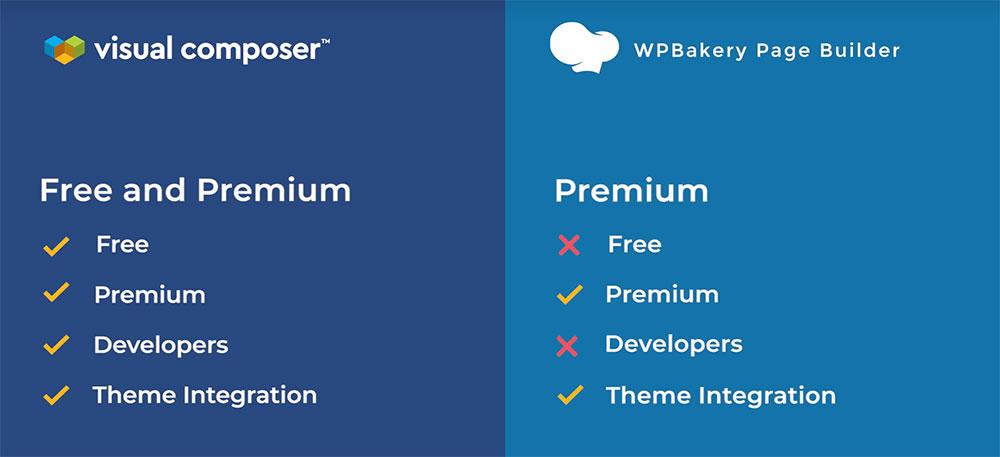
Both
a free and a Premium version of the VC Website Builder are available. The
Premium version has, as you would expect, several additional features including
one that really stands out as it allows you to access the header, footer, and
sidebar editor.

What’s the difference between WP Bakery and Visual
Composer Website Builder?

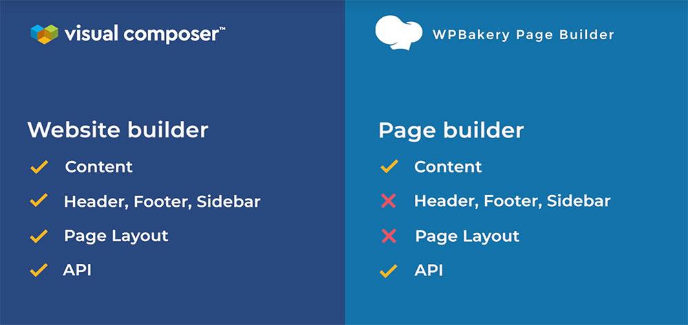
A
quick view:

Notice
that WP Bakery can only be used for the content part, while
the Visual Composer Website Builder allows you to build a complete website from
scratch.

Also,
WP Bakery is shortcode-based, while the VC Website Builder is not. By not using
shortcodes it allows you to generate clean code and also avoid nuisance
problems when you disable the plugin.

You
can find the complete list of differences between WP Bakery and VC Website
Builder here.

Another
thing to like about the VC Website Builder is the cloud-based Hub where you’ll
find an array of interesting and useful design elements and add-ons to help you
turn your visions and ideas into realities.

Each
product comes with its own set of features and benefits. While we’ve worked
hard to develop VC Website Builder, we haven’t forgotten about WP Bakery. So
far, only the name has changed, but we’ll always be working hard to provide the
best customer experience possible – for both products.

Visual Composer’s New Name: and Why An Explanation Is in Order

Post pobrano z: Visual Composer’s New Name: and Why An Explanation Is in Order

Anytime a popular product undergoes a
change, especially when the name if the brand is impacted, it’s bound to create
a certain amount of confusion – especially among long-time users.

At least some of you may have noticed that
the Visual Composer Page Builder appears to have disappeared from the scene.
Highly popular page-building tools don’t simply go away, any more than
long-time favorite breakfast cereals simply vanish from the marketplace.

To add to the confusion, you still see the
Visual Composer Website Builder advertised, which could lead some to think that
the Page Builder was simply swallowed up by the Website Builder.

Nothing could be farther from the truth as
the two are quite different animals, although not totally different in some
respects, and we would like to apologize
to our users and our long-time partners for the confusion we’ve created
.

Our apology and some clarification is the
purpose of this article. The Visual Composer Page Builder is still with us, but
under a different name. The Visual Composer Website Builder is still
with us too, and the name remains the same.

Why did we rename the Visual Composer Page
Builder?

We didn’t want to, but we really had no
choice. The problem we faced was caused by the emergence of our new product –
the Visual
Composer Website Builder
, which is 
entirely different from the Visual Composer Page Builder, and serves
a different purpose.

The Website Builder is not as some have
been led to believe, a souped-up version of the Page Builder.

The VC Page Builder is an Envato-exclusive
product that features a lifetime license; just like all the other products sold
by Envato.

The VC Website Builder is a much more
complex product whose development costs are simply too high to be supported by
a lifetime license. Because of these high costs, it made more sense to switch
the VC Website Builder to annual licensing.

Problem solved? Not quite. Marketplace
contract limitations would not allow us to sell a product outside the platform
using the VC name.

This left us with a couple of options:

Option 1. By changing the name of the VC
Page Builder, we could free ourselves of the contractual limitations involved
in selling it. Changing a familiar and popular name was something we were
naturally reluctant to do.

Option 2. We could slim down our new
product (the VC Website Builder) to the point that the lower development costs
would nicely fit in with the lifetime license model.

The problem with Option 2 was that the VC
Website Builder would be far less flexible and powerful than planned, which was
in direct opposition to the route we intended to take.

In the final analysis, we looked at Option
1 as the lesser of two evils, and we decided that a name change was more
palatable than compromising on the quality of our new product.

So – we changed the name
of the Visual Composer Page Builder to
WP Bakery.

Check
out the following video if you’re interested in knowing about the name change
in greater detail.

We though
we solved our problem, but we failed to anticipate the confusion the name
change would cause.

Users
wondered where the VC Page Builder disappeared to.

They
wondered if VC Website Builder was the Page Builder under a new name, an
enhanced Page Builder, or something entirely different.

And,
they wondered what  WP Bakery had to do with anything.

The explanation: We have two plugins, the Visual
Composer Website Builder
and WP Bakery. Let’s see what sets
them apart.

What is WP Bakery?

WP
Bakery is simply the new name for the Visual Composer Page Builder. Only the
name has changed. All the features you loved and worked with are still there.

What is the Visual Composer Website Builder?

The Visual Composer Website Builder is a brand new tool, and NOT a premium
version of the former Visual Composer Page Builder as some may have been led to
believe.

With
the VC Website Builder, you can create an entire website from scratch, and do
so easily thanks to its drag and drop features and a large and diverse
selection of WordPress templates to work with. There are templates for a
variety of page types, plus you can use the VC Website Builder with any
WordPress theme.

Pages
can be edited with the front-end editor and the tree view. The latter allows
you to see your changes in real time – a definite time-saver.

Both
a free and a Premium version of the VC Website Builder are available. The
Premium version has, as you would expect, several additional features including
one that really stands out as it allows you to access the header, footer, and
sidebar editor.

What’s the difference between WP Bakery and Visual
Composer Website Builder?

A
quick view:

Notice
that WP Bakery can only be used for the content part, while
the Visual Composer Website Builder allows you to build a complete website from
scratch.

Also,
WP Bakery is shortcode-based, while the VC Website Builder is not. By not using
shortcodes it allows you to generate clean code and also avoid nuisance
problems when you disable the plugin.

You
can find the complete list of differences between WP Bakery and VC Website
Builder here.

Another
thing to like about the VC Website Builder is the cloud-based Hub where you’ll
find an array of interesting and useful design elements and add-ons to help you
turn your visions and ideas into realities.

Each
product comes with its own set of features and benefits. While we’ve worked
hard to develop VC Website Builder, we haven’t forgotten about WP Bakery. So
far, only the name has changed, but we’ll always be working hard to provide the
best customer experience possible – for both products.

Most Common Interaction Design Mistakes On The Web

Post pobrano z: Most Common Interaction Design Mistakes On The Web

Your website is often the first point of contact between your business and a potential client. As online competition heats up it’s becoming more important than ever to put your best digital foot forward online. Consumers have increasingly higher expectations of website quality and performance. You can ensure a great first impression by avoiding these common website design mistakes.  

Mistake #1 – Websites That Are TOO MUCH

We’ve all
stumbled onto headache-inducing, cluttered sites. These busy looking sites are
jam-packed with images and text. There is just too much of everything going on
at once, your eye isn’t sure where to focus.

Common
contributing factors: Too many images. Big walls of text without paragraphs.
Too many things flashing, moving, autoplaying… you get the picture.

Do the world
a favor, don’t build an eyesore! Instead, learn
to use white space
generously to separate your text and other elements on
the page. Embrace the idea that less is often more, your visitor’s eyes will
thank you.

Here are some rules of thumb for streamlined web design that you can build by:

  • Using more than two or three different fonts on a page is usually visually aggravating and distracting. As a general rule, you should choose one for heading text and one for body text and stick to them throughout your site.
  • Don’t overuse wacky novelty fonts, they can distract from the substance of what the text is actually saying. Also, these trendy type of fonts don’t tend to age well, people get sick of them pretty quickly. Stick to the classic fonts with clean lines for timeless style and the best readability.
  • Unless you are an old pro at color palettes, three or four colors for your palette is probably plenty. Don’t forget to include either white or another neutral to break things up visually on your page.
  • Lack of contrast. A site that is too monotone can quickly render your text unreadable. Make sure your text stands out strong and clear against the background you have chosen.

Mistake #2 – Websites That Are Not Doing Enough

Remember when
we said less is more? Well, that’s usually true unless your poor website
visitors are stumbling around in the dark trying to figure out what your site
is about. 

Sure, edgy
minimalism might be your aesthetic but consider that according to
Statisticbrain.com the average person’s attention span is a paltry 8 seconds.
If your site is an enigma wrapped in a riddle shrouded in mystery well…
people may just leave without a second glance.

You can still
build a minimalistic site, just make sure that the most important information
that you want your visitors to see and know is immediately identifiable and
easily digestible.

Mistake #3 – Botched Navigation Menus

Navigation menus can be a hotbed of design sins and poor user experience. On the one hand, you have very minimalist, non-descriptive menus that don’t tell the user anything much less offer any compelling reason to explore the other pages on a site. On the other hand, you see massive phonebook type menus that list every page of the site in alphabetical order and manage to be both overwhelming and less than useful for moving throughout the site.

The happy medium is to create descriptive menu items and group them in a relevant way, using categories and whitespace as needed for easier reading. So instead of this alphabetical kitchen sink list as a dropdown menu:

  • Children’s Jackets
  • Children’s Pants
  • Children’s Shirts
  • Men’s Jackets
  • Men’s Pants
  • Men’s Shirts
  • Women’s Jackets
  • Women’s Pants
  • Women’s Shirts
  • You’d have something like this:

Children

  • Jackets
  • Pants
  • Shirts

Men

  • Jackets
  • Pants
  • Shirts

Women

  • Jackets
  • Pants
  • Shirts

Something
else to keep in mind when considering your site’s navigation: keep the format
simple; a fancy or quirky “non-traditional” menu might seem fun but if visitors
find it confusing to use they may just click away to another site

Mistake #4 – Dropping the Ball on The CTA

A solid call to action (CTA) is usually the “end zone” of your webpage. It’s often the reason for your page to exist. The CTA is where you get the visitor to perform an action that benefits you such as opting in to your mailing list or clicking on that blessed buy button.

If you get
just one thing right with your site, it has to be this yet too often the call
to action is hidden, confusing or easily overlooked. Considering that your CTA
might be directly related to the success of your website and/or business, this
can become the most deadly of our common website design mistakes.

So how can
you ensure that your call to action won’t go unanswered? Here are some
guidelines:

  • Your CTA should feature prominently on your page, it should be eye-catching and above the fold. When possible you should plan your page’s design around it. That usually works out better than to try to shoehorn a CTA into your existing (beautiful) design.
  • Keep it simple! If a second grader can’t figure out what to do on the page then you’ve failed. Give clear instructions and use actionable language like Click here, go here, buy now.
  • Make your buttons look like buttons! This applies to all of the UI web design elements on your page. People expect common elements like buttons, menus, and forms to work in predictable ways and look fairly standardized. Making UI elements easily identifiable leads to a better user experience every step of the way.
  • Keep your forms short and sweet and don’t make your visitors jump through more than two hoops if you don’t want to risk losing them along the way. If the action you are calling them to take is too time-consuming, confusing or complex they may bail out mid-conversion.

Mistake #5 – Website Maintenance Neglect

It is absolutely scandalous how common it is to see signs of visible neglect on a website. This type of decay affects high dollar corporate websites just as readily as it affects smaller sites. It usually presents itself as broken links, outdated content, non-functional UI elements like contact forms and other scariness such as visible error messages. The signs of neglect are not just ugly, they can cost you money, traffic, and credibility.

So what leads to this and how can we combat it? Things break over time and your website is no exception. Perhaps your hosting provider does an update to their software that subsequently breaks the slider on your homepage. Or maybe the contact form plugin you are using is outdated and stops working. Murphy’s law tells us that if something can go wrong it will and so we must be prepared and vigilant.

The best way
to ensure that your site stays beautiful and functional is to simply check it
regularly. Scheduling a weekly or bi-monthly check up is smart. Set aside the
time yourself or hire someone to regularly review each page of your site. Click
each link, test each form, make sure the videos play, test any payment
processes, etc. That way if there is a problem you are sure to catch it early.

Preventing and Correcting Common Website  Design Mistakes

While it is
simpler to avoid making these costly common website design mistakes while building
a new website it is also possible to correct them on existing sites. One of the
best ways to measure the quality of the user’s experience on your website is to
ask users for feedback regularly. The people using your site are often the best
possible experts to advise you on your web interface design.

If you talk
to real visitors regularly, you’ll get insight into what may need to be updated
or reworked so that your website always stays a cut above the rest.

Most Common Interaction Design Mistakes On The Web

Post pobrano z: Most Common Interaction Design Mistakes On The Web

Your website is often the first point of contact between your business and a potential client. As online competition heats up it’s becoming more important than ever to put your best digital foot forward online. Consumers have increasingly higher expectations of website quality and performance. You can ensure a great first impression by avoiding these common website design mistakes.  

Mistake #1 – Websites That Are TOO MUCH

We’ve all
stumbled onto headache-inducing, cluttered sites. These busy looking sites are
jam-packed with images and text. There is just too much of everything going on
at once, your eye isn’t sure where to focus.

Common
contributing factors: Too many images. Big walls of text without paragraphs.
Too many things flashing, moving, autoplaying… you get the picture.

Do the world
a favor, don’t build an eyesore! Instead, learn
to use white space
generously to separate your text and other elements on
the page. Embrace the idea that less is often more, your visitor’s eyes will
thank you.

Here are some rules of thumb for streamlined web design that you can build by:

  • Using more than two or three different fonts on a page is usually visually aggravating and distracting. As a general rule, you should choose one for heading text and one for body text and stick to them throughout your site.
  • Don’t overuse wacky novelty fonts, they can distract from the substance of what the text is actually saying. Also, these trendy type of fonts don’t tend to age well, people get sick of them pretty quickly. Stick to the classic fonts with clean lines for timeless style and the best readability.
  • Unless you are an old pro at color palettes, three or four colors for your palette is probably plenty. Don’t forget to include either white or another neutral to break things up visually on your page.
  • Lack of contrast. A site that is too monotone can quickly render your text unreadable. Make sure your text stands out strong and clear against the background you have chosen.

Mistake #2 – Websites That Are Not Doing Enough

Remember when
we said less is more? Well, that’s usually true unless your poor website
visitors are stumbling around in the dark trying to figure out what your site
is about. 

Sure, edgy
minimalism might be your aesthetic but consider that according to
Statisticbrain.com the average person’s attention span is a paltry 8 seconds.
If your site is an enigma wrapped in a riddle shrouded in mystery well…
people may just leave without a second glance.

You can still
build a minimalistic site, just make sure that the most important information
that you want your visitors to see and know is immediately identifiable and
easily digestible.

Mistake #3 – Botched Navigation Menus

Navigation menus can be a hotbed of design sins and poor user experience. On the one hand, you have very minimalist, non-descriptive menus that don’t tell the user anything much less offer any compelling reason to explore the other pages on a site. On the other hand, you see massive phonebook type menus that list every page of the site in alphabetical order and manage to be both overwhelming and less than useful for moving throughout the site.

The happy medium is to create descriptive menu items and group them in a relevant way, using categories and whitespace as needed for easier reading. So instead of this alphabetical kitchen sink list as a dropdown menu:

  • Children’s Jackets
  • Children’s Pants
  • Children’s Shirts
  • Men’s Jackets
  • Men’s Pants
  • Men’s Shirts
  • Women’s Jackets
  • Women’s Pants
  • Women’s Shirts
  • You’d have something like this:

Children

  • Jackets
  • Pants
  • Shirts

Men

  • Jackets
  • Pants
  • Shirts

Women

  • Jackets
  • Pants
  • Shirts

Something
else to keep in mind when considering your site’s navigation: keep the format
simple; a fancy or quirky “non-traditional” menu might seem fun but if visitors
find it confusing to use they may just click away to another site

Mistake #4 – Dropping the Ball on The CTA

A solid call to action (CTA) is usually the “end zone” of your webpage. It’s often the reason for your page to exist. The CTA is where you get the visitor to perform an action that benefits you such as opting in to your mailing list or clicking on that blessed buy button.

If you get
just one thing right with your site, it has to be this yet too often the call
to action is hidden, confusing or easily overlooked. Considering that your CTA
might be directly related to the success of your website and/or business, this
can become the most deadly of our common website design mistakes.

So how can
you ensure that your call to action won’t go unanswered? Here are some
guidelines:

  • Your CTA should feature prominently on your page, it should be eye-catching and above the fold. When possible you should plan your page’s design around it. That usually works out better than to try to shoehorn a CTA into your existing (beautiful) design.
  • Keep it simple! If a second grader can’t figure out what to do on the page then you’ve failed. Give clear instructions and use actionable language like Click here, go here, buy now.
  • Make your buttons look like buttons! This applies to all of the UI web design elements on your page. People expect common elements like buttons, menus, and forms to work in predictable ways and look fairly standardized. Making UI elements easily identifiable leads to a better user experience every step of the way.
  • Keep your forms short and sweet and don’t make your visitors jump through more than two hoops if you don’t want to risk losing them along the way. If the action you are calling them to take is too time-consuming, confusing or complex they may bail out mid-conversion.

Mistake #5 – Website Maintenance Neglect

It is absolutely scandalous how common it is to see signs of visible neglect on a website. This type of decay affects high dollar corporate websites just as readily as it affects smaller sites. It usually presents itself as broken links, outdated content, non-functional UI elements like contact forms and other scariness such as visible error messages. The signs of neglect are not just ugly, they can cost you money, traffic, and credibility.

So what leads to this and how can we combat it? Things break over time and your website is no exception. Perhaps your hosting provider does an update to their software that subsequently breaks the slider on your homepage. Or maybe the contact form plugin you are using is outdated and stops working. Murphy’s law tells us that if something can go wrong it will and so we must be prepared and vigilant.

The best way
to ensure that your site stays beautiful and functional is to simply check it
regularly. Scheduling a weekly or bi-monthly check up is smart. Set aside the
time yourself or hire someone to regularly review each page of your site. Click
each link, test each form, make sure the videos play, test any payment
processes, etc. That way if there is a problem you are sure to catch it early.

Preventing and Correcting Common Website  Design Mistakes

While it is
simpler to avoid making these costly common website design mistakes while building
a new website it is also possible to correct them on existing sites. One of the
best ways to measure the quality of the user’s experience on your website is to
ask users for feedback regularly. The people using your site are often the best
possible experts to advise you on your web interface design.

If you talk
to real visitors regularly, you’ll get insight into what may need to be updated
or reworked so that your website always stays a cut above the rest.

Get Access To All Premium Themes And Plugins By TemplateMonster Product With ONE Service

Post pobrano z: Get Access To All Premium Themes And Plugins By TemplateMonster Product With ONE Service

There’s no secret, in 2019, you can build a responsive, visitor-friendly, and visually-pleasing website in hours. The days when we used to pay big money to launch a website are far behind. Today, you can set up, design, and feature the online project of your dream without trouble. No coding required and no extra skills needed! We live in times of smart technologies, so website building becomes more and more creator-friendly. The technology improves every day. Actually, all you need now is knowledge. And that’s why I decided to make this post. As the name of the article says, today, I’ll show you how to get access to all TemplateMonster’s products for less than $230!

What Is ONE Service?

For starters, I’m about to showcase you ONE by TemplateMonster. It is a fresh subscription service that furthers your working process and allows to save good money as well. How does it work? Basically, ONE provides you with access to any digital product you can see in the company’s gallery. The list contains not only single page templates but also such items as:

  • multipurpose themes,
  • premium plugins,
  • Elementor-oriented themes,
  • best-sellers,
  • flagships, etc.

Join Now

When it comes to ONE subscription, you won’t face any limits. There are products for any business niche as well as for any CMS. For example, here are just a few flagships you can use with ONE:

  • Monstroid2 WordPress theme,
  • WooStroid2 WooCommerce theme,
  • Intense HTML theme,
  • Eveprest PrestaShop theme,
  • Multifly Shopify theme,
  • Magetique Magento theme,
  • and StoreFlex OpenCart theme.

About The Products

To start with, all the themes you will be able to use are quality. They come with trendy designs and have everything and anything to meet all recent requirements. For these simple reasons, all of them are SEO-ready, easy-to-customize, and 100% responsive. Obviously, these products are creator-friendly and mobile-friendly too.

So, using ONE, you can work with as many themes as you need. What is more, you can create as many domains as needed and use your templates as many times as needed. Actually, there are many reasons why you may need ONE. Buying the products one by one you simply overpay for them. And getting everything at once is not just faster and easier. ONE will save your budget as well!

By the way, ONE provides all its users with tech support. It’s free, friendly, and available anytime.

How Much Does ONE Cost?

Join Now

Now let’s take a look at the price of the service. To make a long story short, ONE subscription will cost you $229. It’s an amazing price comparing to the original cost of 1 premium theme. On average, it will cost you $70-80 but using ONE you get numerous platforms, hundreds of topics, and dozens of themes!

And Which License You Get With ONE Subscription?

Finally, it’s time to take a closer look at the license you get with ONE. To put it briefly, this subscription service provides users with an Unlimited Yearly License. It means that you will be able to download any theme from TM’s gallery for 1 year from the date of purchase. Moreover, all the sites you built with ONE will continue working even when the license expired. What is more, you will continue receiving free updates for such elements as plugins.

For Startups

Without a doubt, ONE subscription is a fantastic solution for everyone who wants to run a worthy site. And it doesn’t matter which business niche you are about to cover or how specific your topic is. Saving your budget is always a nice thing to do especially when it comes to startups or young companies.

For Web Designers

On the other hand, in case you are a web designer or web developer, ONE is exactly what you need! Just think about it. You pay only $229 (or even less if you choose pre-order option) and get 1-year-long access to all the groundbreaking ready-made digital products from TM. You can take as many as you want and build as many sites as needed. As a result, you will not just save good money but further the working process as well! Your customers won’t lose their projects when your license expires. Thus, these sites will still work even if you won’t renew the license. There will be no additional payments!

For Website Owners

I should also highlight that ONE will be a wonderful helper for skilled website owners. All in all, managing your site is much more than creating a domain name. You will need a lot of tools and here is how ONE subscription can help you. You will be able to choose from a wide list of stylish UI components, assets, plugins, etc.

Final Thoughts

Looks like it is time to sum everything up. Here are the main reasons why you should think of using ONE service from TemplateMonster.

Join Now

  1. It’s always easier to purchase the subscription with multiple items than finding and buying them separately.
  2. Using ONE, you do save the project’s budget!
  3. The gallery has new products on regular basis. That’s why you will get all the new web design trends for free.
  4. There’s free tech support that works 24/7.
  5. You will get access to dozens of premium digital products.
  6. Your websites will still work when the license expired.
  7. You will continue getting updates.

Get Access To All Premium Themes And Plugins By TemplateMonster Product With ONE Service

Post pobrano z: Get Access To All Premium Themes And Plugins By TemplateMonster Product With ONE Service

There’s no secret, in 2019, you can build a responsive, visitor-friendly, and visually-pleasing website in hours. The days when we used to pay big money to launch a website are far behind. Today, you can set up, design, and feature the online project of your dream without trouble. No coding required and no extra skills needed! We live in times of smart technologies, so website building becomes more and more creator-friendly. The technology improves every day. Actually, all you need now is knowledge. And that’s why I decided to make this post. As the name of the article says, today, I’ll show you how to get access to all TemplateMonster’s products for less than $230!

What Is ONE Service?

For starters, I’m about to showcase you ONE by TemplateMonster. It is a fresh subscription service that furthers your working process and allows to save good money as well. How does it work? Basically, ONE provides you with access to any digital product you can see in the company’s gallery. The list contains not only single page templates but also such items as:

  • multipurpose themes,
  • premium plugins,
  • Elementor-oriented themes,
  • best-sellers,
  • flagships, etc.

Join Now

When it comes to ONE subscription, you won’t face any limits. There are products for any business niche as well as for any CMS. For example, here are just a few flagships you can use with ONE:

  • Monstroid2 WordPress theme,
  • WooStroid2 WooCommerce theme,
  • Intense HTML theme,
  • Eveprest PrestaShop theme,
  • Multifly Shopify theme,
  • Magetique Magento theme,
  • and StoreFlex OpenCart theme.

About The Products

To start with, all the themes you will be able to use are quality. They come with trendy designs and have everything and anything to meet all recent requirements. For these simple reasons, all of them are SEO-ready, easy-to-customize, and 100% responsive. Obviously, these products are creator-friendly and mobile-friendly too.

So, using ONE, you can work with as many themes as you need. What is more, you can create as many domains as needed and use your templates as many times as needed. Actually, there are many reasons why you may need ONE. Buying the products one by one you simply overpay for them. And getting everything at once is not just faster and easier. ONE will save your budget as well!

By the way, ONE provides all its users with tech support. It’s free, friendly, and available anytime.

How Much Does ONE Cost?

Join Now

Now let’s take a look at the price of the service. To make a long story short, ONE subscription will cost you $229. It’s an amazing price comparing to the original cost of 1 premium theme. On average, it will cost you $70-80 but using ONE you get numerous platforms, hundreds of topics, and dozens of themes!

And Which License You Get With ONE Subscription?

Finally, it’s time to take a closer look at the license you get with ONE. To put it briefly, this subscription service provides users with an Unlimited Yearly License. It means that you will be able to download any theme from TM’s gallery for 1 year from the date of purchase. Moreover, all the sites you built with ONE will continue working even when the license expired. What is more, you will continue receiving free updates for such elements as plugins.

For Startups

Without a doubt, ONE subscription is a fantastic solution for everyone who wants to run a worthy site. And it doesn’t matter which business niche you are about to cover or how specific your topic is. Saving your budget is always a nice thing to do especially when it comes to startups or young companies.

For Web Designers

On the other hand, in case you are a web designer or web developer, ONE is exactly what you need! Just think about it. You pay only $229 (or even less if you choose pre-order option) and get 1-year-long access to all the groundbreaking ready-made digital products from TM. You can take as many as you want and build as many sites as needed. As a result, you will not just save good money but further the working process as well! Your customers won’t lose their projects when your license expires. Thus, these sites will still work even if you won’t renew the license. There will be no additional payments!

For Website Owners

I should also highlight that ONE will be a wonderful helper for skilled website owners. All in all, managing your site is much more than creating a domain name. You will need a lot of tools and here is how ONE subscription can help you. You will be able to choose from a wide list of stylish UI components, assets, plugins, etc.

Final Thoughts

Looks like it is time to sum everything up. Here are the main reasons why you should think of using ONE service from TemplateMonster.

Join Now

  1. It’s always easier to purchase the subscription with multiple items than finding and buying them separately.
  2. Using ONE, you do save the project’s budget!
  3. The gallery has new products on regular basis. That’s why you will get all the new web design trends for free.
  4. There’s free tech support that works 24/7.
  5. You will get access to dozens of premium digital products.
  6. Your websites will still work when the license expired.
  7. You will continue getting updates.