Archiwum kategorii: Web Tools

How to Create a Typography Dispersion Action in Adobe Photoshop

Post pobrano z: How to Create a Typography Dispersion Action in Adobe Photoshop

Final product image
What You’ll Be Creating

In this tutorial, you will learn how to create an amazing typography dispersion effect. First, we are going to create and define a few patterns and brushes. Then, we are going to create a typography effect from our subject, and then disperse the letters in the direction we choose. After that, we are going to make some final adjustments.

I will try to explain everything in so much detail that everyone can
create it, even those who have just opened Photoshop for the first time.

The effect shown above is the one I will show you how
to create here in this tutorial. If you would like to create the effects
shown below, using just a single click and in just a few minutes, then check out my Typography 4 Photoshop Action.
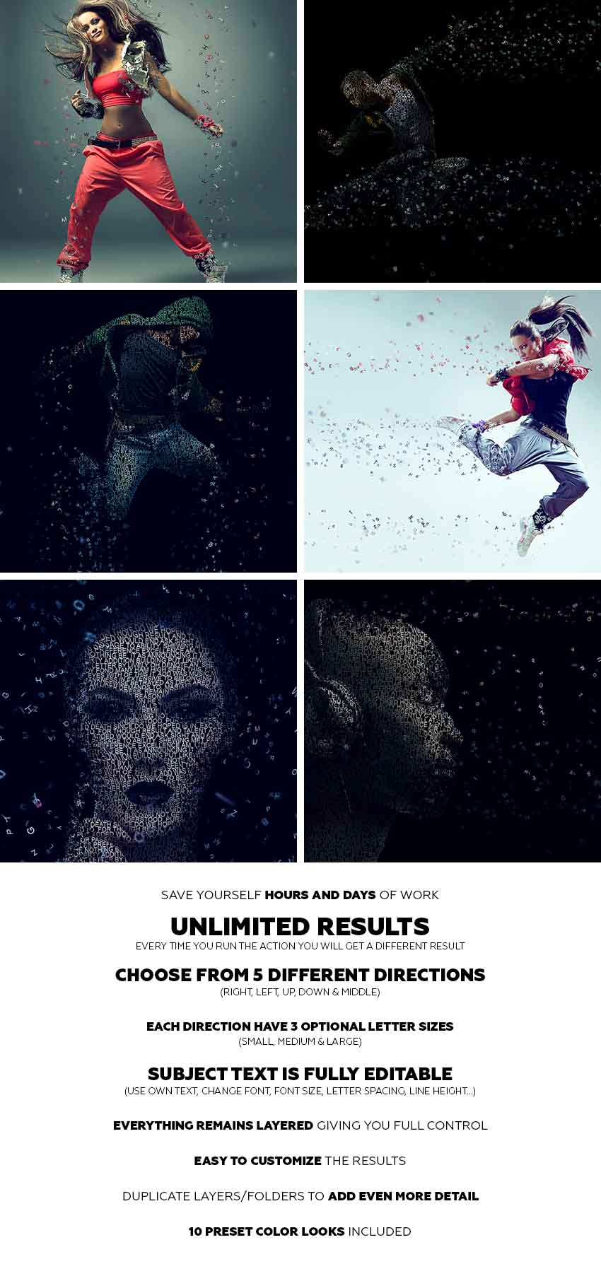
Action final results

What You’ll Need

To recreate the design above, you will need the following photo:

  • The stock image is no longer available, but you can get a similar one over on PhotoDune.

1. How to Get Started

Step 1

First, open the photo that you want to work with. To open your photo, go to File > Open, choose your photo, and click Open. Now, before we get started, just check a couple of things:

  1. Your photo should be in RGB Color mode, 8 Bits/Channel. To check this, go to Image > Mode.
  2. For best results, your photo size should be 1500–4000 px wide/high. To check this, go to Image > Image Size.
  3. Your photo should be the Background layer. If it is not, go to Layer > New > Background from Layer.
Checking image mode and size

Step 2

We are going to create a typography dispersion effect in the downward direction, so we need to expand the canvas on the bottom so we have more space for the effect, and also a little bit on the left and right sides. Go to Image > Canvas Size and use the settings below:

Expanding canvas

Step 3

Now we need to make this expanded canvas area seamless. Choose the Magic Wand Tool (W) and click once over the white area to select the whole white area we have just added. Go to Edit > Fill and select the settings below. After that, press Control-D on your keyboard to remove the selection.

Filling selection with content-aware

2. How to Create Patterns and Brushes

Step 1

In this section, we are going to create the patterns and brushes we’ll need. Go to File > New to create a new file, name it Typography Pattern 1, and use the settings below:

Creating new file named Typography Pattern 1

Step 2

Now choose the Horizontal Type Tool (T), click anywhere inside the canvas, and type a single letter. You can use any font, font style, and font size. I have chosen Arial font, Regular font style, and 31.47 px size. After you type a letter, hit Enter on your keyboard and use the same method to add several letters. Here is what I got:

Creating typography pattern 1

Step 3

Now click on the Background layer eye icon next to its thumbnail to hide it. Go to Edit > Define Pattern to define a pattern and name it Typography_Pattern_1. Keep this file open.

Defining pattern named Typography_Pattern_1

Step 4

Repeat the first two steps in this section, but in Step 1 name the new file Typography Pattern 2, and in Step 2 use different letters with the same font, font style and font size you used for the previous pattern. Here is what I got:

Creating typography pattern 2

Step 5

Now click on the Background layer eye icon next to its thumbnail to hide it. Go to Edit > Define Pattern to define a pattern and name it Typography_Pattern_2. Keep this file open as well.

Defining pattern named Typography_Pattern_2

Step 6

Repeat the first two steps in this section, but in Step 1 name the new file Typography Pattern 3,
and in Step 2 use different letters with the same font, font style and
font size you used for the previous two patterns. Here is what I got:

Creating typography pattern 3

Step 7

Now click on the Background layer eye icon next to its thumbnail to hide it. Go to Edit > Define Pattern to define a pattern and name it Typography_Pattern_3. Keep this file open as well.

Defining pattern named Typography_Pattern_3

Step 8

We are going to create brushes now. Select the Typography Pattern 1 document, go to Edit > Define Brush Preset, and name it Temp as we will remove this brush in the next few steps.

Defining brush named Temp

Step 9

Press B on your keyboard, right-click anywhere inside the canvas, select the Temp brush, and hit Enter. Then go to Window > Brush and inside the Brush window use the settings below:

Changing brush settings

Step 10

Now we are going to define this brush with new settings as a new brush. Go to Edit > Define Brush Preset and name it Typography_Brush_1. Press B on your keyboard, right-click anywhere inside the canvas, and Alt-click on the Temp brush to remove it.

Defining brush named Typography_Brush_1

Step 11

Repeat all the steps from Step 8 to Step 10 to create two more brushes from the two other documents Typography Pattern 2 and Typography Pattern 3. Of course, name those two new brushes according to their serial number. Then close all documents except your photo document.

Defining two more brushes

3. How to Create the Base

Step 1

Now we need to create the base that determines which part of our photo will be turned into typography. So the base will actually be our subject. Go to Layer > New > Layer to create a new layer and name it Base.

Creating new layer named Base

Step 2

While the Base layer is selected, fill your subject with a color. You can do it in various ways. For example, you can create a selection of your subject using the Pen Tool (P), Magic Wand Tool (W), Lasso Tool (L) or some other tool, and then just fill the selection with a color. Or you can choose the Brush Tool (B) and brush over your photo using a hard or soft brush.

Creating the base

4. How to Create Typography From a Subject

Step 1

In this section we are going to create a typography effect from a subject that we have defined with the Base layer. Control-click on the Base layer thumbnail to make a selection of that layer, select the Background layer, and go to Layer > New > Layer Via Copy. Then hide the Base layer by clicking on the eye icon next to its thumbnail.

Creating new layer via copy

Step 2

Now go to File > New to create a new file, name it Text, and use the settings below. You can use different values for width/height, but make sure that the document is at least as big as your photo document.

Ceating new file named Text

Step 3

Choose the Horizontal Type Tool (T) and type the text so it covers the whole document. You should use the same font and font style that you used for creating patterns and brushes. Also, the font size should be the same or very close. 

Feel free to make changes to your text, like increasing or decreasing leading, tracking and more. If the content of the text does not matter to you, you can use a text generator to speed up the process.

Typing the text

Step 4

Now choose the Move Tool (V), click and hold inside the canvas, and drag the text layer from the Text document to your photo document and position it so it covers the whole subject. Double-click on this layer name and rename it Text.

Dragging the text layer to photo document

Step 5

Control-click on the Layer 1 thumbnail to make a selection of that layer, and then go to Layer > Layer Mask > Reveal Selection.

Making layer mask using selection

Step 6

Now select Layer 1 and drag it above the Text layer. Then go to Layer > Create Clipping Mask. Double-click on this layer name and rename it Text Color.

Creating clipping mask and renaming layer to Text Color

Step 7

Now we are going to create a solid color background. Select the Background layer and go to Layer > New Fill Layer > Solid Color to create a new solid color fill layer, name it Background Color, and use the settings below:

Creating new solid color fill layer

Step 8

Select the Background layer and go to Layer > New > Layer Via Copy to duplicate that layer. Then drag this layer just below the Base layer, go to Filter > Blur > Gaussian Blur, and use the settings below:

Adding gaussian blur filter to Background copy layer

Step 9

Now go to File > Save As to save your document as a new file. You can name it however you want, and you can save it anywhere you want, but keep in mind that you will need to select that file later to apply a filter. Then right-click on the Background copy layer and choose Delete Layer.

Saving document as a new file and deleting Background copy layer

Step 10

We need to correct the edges of the subject slightly. Select the layer mask of the Text layer, go to Select > Select and Mask, and use the settings below:

Selecting and masking layer mask of Text layer

Step 11

Right-click on the Text layer name and choose Convert to Smart Object. Then go to Filter > Displace, use the settings below, and choose OK. After that you will get another window, and there you can choose the file you have previously saved and click Open.

Adding displace filter to the Text layer

Step 12

Now we are just going to group some layers. Select the Background Color layer, Shift-click on the Text Color layer, go to Layer > New > Group from Layers to create a new group from these layers, and name it Subject Typography.

Creating new group from layers nameds Subject Typography

5. How to Create Dispersed Letters

Step 1

In this section, we are going to create letters that we are going to disperse later. First we need to create another base layer that determines which areas will be dispersed. Select the Base layer, go to Layer > New > Layer to create a new layer, and name it Base 2.

Creating new layer named Base 2

Step 2

Control-click on the Base layer thumbnail to make a selection of that layer and go to Layer > Layer Mask > Reveal Selection.

Making layer mask using selection

Step 3

Now select the Base 2 layer thumbnail, choose the Brush Tool (B), pick a soft or hard brush, and start brushing over the areas you want to disperse.

Creating the base 2

Step 4

Select the layer mask of the Base 2 layer, right-click on it, and choose Apply Layer Mask.

Applying layer mask of Base 2 layer

Step 5

Control-click on the Base 2 layer thumbnail to make a selection of that layer. Choose the Lasso Tool (L), right-click anywhere inside the canvas, choose Make Work Path, and use the settings below:

Making work path

Step 6

Now click on the eye icon of the Base 2 layer next to its thumbnail to hide it. Select the Subject Typography group and go to Layer > New > Layer to create a new layer. Leave the default name Layer 1 because we will delete this layer in the next few steps.

Creating a new layer named Layer 1

Step 7

Choose the Pen Tool (P), right-click anywhere inside the canvas, choose Fill Work Path, and use the settings below:

Filling work path with Typography_Pattern_1
Custom Pattern is Typography_Pattern_1.

Step 8

Now Control-click on the Layer 1 thumbnail to make a selection of that layer, select the Background layer, and go to Layer > New > Layer Via Copy to create a new layer via copy, and name it L_1 (abbreviation of Letter_1). Then right-click on Layer 1 and choose Delete Layer.

Creating first letters layer

Step 9

Now repeat all the steps from Step 6 to Step 8 as many times you want, depending on how many letters layers you want to create, using Typography_Pattern_1. I have repeated it nine more times, so I have ten letters layers in total.

Creating more letters layers

Step 10

Now we are going to create more letters layers but with other patterns, so we have different letters. Repeat all the steps from Step 6 to Step 8, but in Step 7 use the settings below instead of the settings you used the previous time.

Filling work path with Typography_Pattern_2
Custom Pattern is Typography_Pattern_2.

Step 11

Now repeat Step 10 as many times you want, depending on
how many letters layers you want to create, using Typography_Pattern_2. I have repeated it nine more
times, so I have 20 letters layers in total.

Creating more the letters layers

Step 12

Now we are going to create more letters layers with our last pattern,
so we have different letters. Repeat all the steps from Step 6 to Step 8,  but in Step 7 use the settings below instead of the settings you used the previous time.

Filling work path with Typography_Pattern_3
Custom Pattern is Typography_Pattern_3.

Step 13

Now repeat Step 12 as many times as you want, depending on
how many letters layers you want to create, using Typography_Pattern_3. I have repeated it nine more
times, so I have 30 letters layers in total.

Creating more letters layers

Step 14

Now select the first letters layer, go to Filter > Displace, use the settings below, and choose OK. After that you will get another window, and there you can choose the file you have previously saved and click Open.

Displacing letters

Step 15

Select the next letters layer and press Control-F to apply the previous filter with the same settings. Use the same method to apply this filter to all other letters layers.

Displacing other letters

Step 16

We are going to group all the letters layers now. Select your top letters layer and Shift-click on the last letters layer to select all letters layers, go to Layer > New > Group from Layers to create a new group from selected layers and name it Letters. Then drag the group just above the Subject Typography group.

Creating new group from layers named Letters

6. How to Disperse Letters

Step 1

In this section, we are going to disperse the letters we have just created. So all you have to do now is to choose the Move Tool (V), select the letters layer that you want to move, and move it in the direction of your choice. I want to create a dispersion in the downward direction, so here is what I got:

Dispersing the letters

Step 2

Now we are going to transform some letters to create depth. Select the letters layer that you want to transform, choose the Lasso Tool (L), right-click anywhere inside the canvas, and use the settings below:

Transforming the letters

Step 3

I have transformed a few more letters layers. Feel free to transform as many layers as you want, and also to use different values for width/height. Here is what I got:

Transforming a more letters

Step 4

Now to give more depth and focus to the effect, we are going to blur some letters. Select the letters layer that you want to blur, go to Filter > Blur > Gaussian Blur, and use the settings below:

Adding gaussian blur filter to letters

Step 5

I have blurred a few more letters layers. Feel free to transform as
many layers as you want, and also to use different values for Gaussian blur. Here is what I got:

Adding gaussian blur filter to more letters

Step 6

Now make some final changes to the dispersed letters, so you can move, transform and blur letters layers as you like. Also feel free to move or transform the whole Letters group and also change the layer order in the Layers panel. Here is what I got:

Making final changes to the letters

7. How to Create a Missing Letters Effect

Step 1

In this section, we are going to create a missing letters effect. Select the Text layer and go to Layer > Layer Mask > Reveal All to add a blank layer mask to this layer.

Making layer mask to Text layer

Step 2

Select the layer mask of the Text layer and press D on your keyboard to reset the swatches. Choose the Brush Tool (B), right-click anywhere inside the canvas, pick some of the typography brushes we have created at the beginning of the tutorial, and hit Enter. Then start brushing over the areas where you wish to create a missing letters effect. You can also use a soft brush for the edges. Here is what I got:

Creating missing letters effect

8. How to Make Adjustments

Step 1

In this section, we are going to make some final adjustments to the effect. Firstly we are going to add a nice color look. So select the Letters group and go to Layer > New Adjustment Layer > Curves to create a new curves adjustment layer just below the Base layer, and name it Color Look.

Creating new curves adjustment layer

Step 2

Now double-click on the Color Look layer thumbnail and use the settings below:

Changing settings of curves adjustment layer

Step 3

Now we are going to add a subtle filter. Go to Layer > New Adjustment Layer > Photo Filter to create a new photo filter adjustment layer and name it Photo Tint.

Creating new photo filter adjustment layer

Step 4

Double-click on the Photo Tint layer thumbnail and use the settings below:

Changing settings of photo filter adjustment layer

Step 5

Now we are going to add a subtle contrast. Press D on your keyboard to reset the swatches, go to Layer > New Adjustment Layer > Gradient Map to create a new gradient map adjustment layer and name it Overall Contrast.

Creating new gradient map adjustment layer

Step 6

Change the blending mode of the Overall Contrast layer to Soft Light and drop the Opacity to 8%.

Changing blending mode and opacity of Overall Contrast layer

Step 7

Finally we are going to add sharpening to the whole effect. Press Control-Alt-Shift-E on your keyboard to make a snapshot, and then go to Filter > Other > High Pass and use the settings below:

Adding high pass filter to Layer 1

Step 8

Double-click on the Layer 1 name and rename it Overall Sharpening. Change its blending mode to Hard Light and drop the Opacity to 82%.

Changing name blending mode and opacity of Overall Sharpening layer

You Made it!

Congratulations, you have succeeded! Here is our final result:

Final result

If you would like to create the effect shown below, using just a single click and in just a few minutes, then check out
my Typography 4 Photoshop Action.

Action final results

The action works so that you just brush over the areas that you want to disperse in letters, play the
action, and the action will do everything for you, giving you fully
layered and customizable results.

You can choose from five different dispersion directions:

  • Right
  • Left
  • Up
  • Down
  • Middle

And each direction comes in three optional letter sizes:

  • Small
  • Medium
  • Large

The action is made so that every time you run the action,
you will get a unique result even if you use the same brushed
area. The letters will always be differently arranged and deployed. The subject typography is a fully editable text layer. You can use your own text, change the font, font style, letter spacing, line height, etc. The action will also create 10 preset
color looks for you.

It
comes with a detailed video tutorial that demonstrates how to use and customize the look of your action to get the most out of the effect.

How to Create a Typography Dispersion Action in Adobe Photoshop

Post pobrano z: How to Create a Typography Dispersion Action in Adobe Photoshop

Final product image
What You’ll Be Creating

In this tutorial, you will learn how to create an amazing typography dispersion effect. First, we are going to create and define a few patterns and brushes. Then, we are going to create a typography effect from our subject, and then disperse the letters in the direction we choose. After that, we are going to make some final adjustments.

I will try to explain everything in so much detail that everyone can
create it, even those who have just opened Photoshop for the first time.

The effect shown above is the one I will show you how
to create here in this tutorial. If you would like to create the effects
shown below, using just a single click and in just a few minutes, then check out my Typography 4 Photoshop Action.

Action final results

What You’ll Need

To recreate the design above, you will need the following photo:

  • The stock image is no longer available, but you can get a similar one over on PhotoDune.

1. How to Get Started

Step 1

First, open the photo that you want to work with. To open your photo, go to File > Open, choose your photo, and click Open. Now, before we get started, just check a couple of things:

  1. Your photo should be in RGB Color mode, 8 Bits/Channel. To check this, go to Image > Mode.
  2. For best results, your photo size should be 1500–4000 px wide/high. To check this, go to Image > Image Size.
  3. Your photo should be the Background layer. If it is not, go to Layer > New > Background from Layer.
Checking image mode and size

Step 2

We are going to create a typography dispersion effect in the downward direction, so we need to expand the canvas on the bottom so we have more space for the effect, and also a little bit on the left and right sides. Go to Image > Canvas Size and use the settings below:

Expanding canvas

Step 3

Now we need to make this expanded canvas area seamless. Choose the Magic Wand Tool (W) and click once over the white area to select the whole white area we have just added. Go to Edit > Fill and select the settings below. After that, press Control-D on your keyboard to remove the selection.

Filling selection with content-aware

2. How to Create Patterns and Brushes

Step 1

In this section, we are going to create the patterns and brushes we’ll need. Go to File > New to create a new file, name it Typography Pattern 1, and use the settings below:

Creating new file named Typography Pattern 1

Step 2

Now choose the Horizontal Type Tool (T), click anywhere inside the canvas, and type a single letter. You can use any font, font style, and font size. I have chosen Arial font, Regular font style, and 31.47 px size. After you type a letter, hit Enter on your keyboard and use the same method to add several letters. Here is what I got:

Creating typography pattern 1

Step 3

Now click on the Background layer eye icon next to its thumbnail to hide it. Go to Edit > Define Pattern to define a pattern and name it Typography_Pattern_1. Keep this file open.

Defining pattern named Typography_Pattern_1

Step 4

Repeat the first two steps in this section, but in Step 1 name the new file Typography Pattern 2, and in Step 2 use different letters with the same font, font style and font size you used for the previous pattern. Here is what I got:

Creating typography pattern 2

Step 5

Now click on the Background layer eye icon next to its thumbnail to hide it. Go to Edit > Define Pattern to define a pattern and name it Typography_Pattern_2. Keep this file open as well.

Defining pattern named Typography_Pattern_2

Step 6

Repeat the first two steps in this section, but in Step 1 name the new file Typography Pattern 3,
and in Step 2 use different letters with the same font, font style and
font size you used for the previous two patterns. Here is what I got:

Creating typography pattern 3

Step 7

Now click on the Background layer eye icon next to its thumbnail to hide it. Go to Edit > Define Pattern to define a pattern and name it Typography_Pattern_3. Keep this file open as well.

Defining pattern named Typography_Pattern_3

Step 8

We are going to create brushes now. Select the Typography Pattern 1 document, go to Edit > Define Brush Preset, and name it Temp as we will remove this brush in the next few steps.

Defining brush named Temp

Step 9

Press B on your keyboard, right-click anywhere inside the canvas, select the Temp brush, and hit Enter. Then go to Window > Brush and inside the Brush window use the settings below:

Changing brush settings

Step 10

Now we are going to define this brush with new settings as a new brush. Go to Edit > Define Brush Preset and name it Typography_Brush_1. Press B on your keyboard, right-click anywhere inside the canvas, and Alt-click on the Temp brush to remove it.

Defining brush named Typography_Brush_1

Step 11

Repeat all the steps from Step 8 to Step 10 to create two more brushes from the two other documents Typography Pattern 2 and Typography Pattern 3. Of course, name those two new brushes according to their serial number. Then close all documents except your photo document.

Defining two more brushes

3. How to Create the Base

Step 1

Now we need to create the base that determines which part of our photo will be turned into typography. So the base will actually be our subject. Go to Layer > New > Layer to create a new layer and name it Base.

Creating new layer named Base

Step 2

While the Base layer is selected, fill your subject with a color. You can do it in various ways. For example, you can create a selection of your subject using the Pen Tool (P), Magic Wand Tool (W), Lasso Tool (L) or some other tool, and then just fill the selection with a color. Or you can choose the Brush Tool (B) and brush over your photo using a hard or soft brush.

Creating the base

4. How to Create Typography From a Subject

Step 1

In this section we are going to create a typography effect from a subject that we have defined with the Base layer. Control-click on the Base layer thumbnail to make a selection of that layer, select the Background layer, and go to Layer > New > Layer Via Copy. Then hide the Base layer by clicking on the eye icon next to its thumbnail.

Creating new layer via copy

Step 2

Now go to File > New to create a new file, name it Text, and use the settings below. You can use different values for width/height, but make sure that the document is at least as big as your photo document.

Ceating new file named Text

Step 3

Choose the Horizontal Type Tool (T) and type the text so it covers the whole document. You should use the same font and font style that you used for creating patterns and brushes. Also, the font size should be the same or very close. 

Feel free to make changes to your text, like increasing or decreasing leading, tracking and more. If the content of the text does not matter to you, you can use a text generator to speed up the process.

Typing the text

Step 4

Now choose the Move Tool (V), click and hold inside the canvas, and drag the text layer from the Text document to your photo document and position it so it covers the whole subject. Double-click on this layer name and rename it Text.

Dragging the text layer to photo document

Step 5

Control-click on the Layer 1 thumbnail to make a selection of that layer, and then go to Layer > Layer Mask > Reveal Selection.

Making layer mask using selection

Step 6

Now select Layer 1 and drag it above the Text layer. Then go to Layer > Create Clipping Mask. Double-click on this layer name and rename it Text Color.

Creating clipping mask and renaming layer to Text Color

Step 7

Now we are going to create a solid color background. Select the Background layer and go to Layer > New Fill Layer > Solid Color to create a new solid color fill layer, name it Background Color, and use the settings below:

Creating new solid color fill layer

Step 8

Select the Background layer and go to Layer > New > Layer Via Copy to duplicate that layer. Then drag this layer just below the Base layer, go to Filter > Blur > Gaussian Blur, and use the settings below:

Adding gaussian blur filter to Background copy layer

Step 9

Now go to File > Save As to save your document as a new file. You can name it however you want, and you can save it anywhere you want, but keep in mind that you will need to select that file later to apply a filter. Then right-click on the Background copy layer and choose Delete Layer.

Saving document as a new file and deleting Background copy layer

Step 10

We need to correct the edges of the subject slightly. Select the layer mask of the Text layer, go to Select > Select and Mask, and use the settings below:

Selecting and masking layer mask of Text layer

Step 11

Right-click on the Text layer name and choose Convert to Smart Object. Then go to Filter > Displace, use the settings below, and choose OK. After that you will get another window, and there you can choose the file you have previously saved and click Open.

Adding displace filter to the Text layer

Step 12

Now we are just going to group some layers. Select the Background Color layer, Shift-click on the Text Color layer, go to Layer > New > Group from Layers to create a new group from these layers, and name it Subject Typography.

Creating new group from layers nameds Subject Typography

5. How to Create Dispersed Letters

Step 1

In this section, we are going to create letters that we are going to disperse later. First we need to create another base layer that determines which areas will be dispersed. Select the Base layer, go to Layer > New > Layer to create a new layer, and name it Base 2.

Creating new layer named Base 2

Step 2

Control-click on the Base layer thumbnail to make a selection of that layer and go to Layer > Layer Mask > Reveal Selection.

Making layer mask using selection

Step 3

Now select the Base 2 layer thumbnail, choose the Brush Tool (B), pick a soft or hard brush, and start brushing over the areas you want to disperse.

Creating the base 2

Step 4

Select the layer mask of the Base 2 layer, right-click on it, and choose Apply Layer Mask.

Applying layer mask of Base 2 layer

Step 5

Control-click on the Base 2 layer thumbnail to make a selection of that layer. Choose the Lasso Tool (L), right-click anywhere inside the canvas, choose Make Work Path, and use the settings below:

Making work path

Step 6

Now click on the eye icon of the Base 2 layer next to its thumbnail to hide it. Select the Subject Typography group and go to Layer > New > Layer to create a new layer. Leave the default name Layer 1 because we will delete this layer in the next few steps.

Creating a new layer named Layer 1

Step 7

Choose the Pen Tool (P), right-click anywhere inside the canvas, choose Fill Work Path, and use the settings below:

Filling work path with Typography_Pattern_1
Custom Pattern is Typography_Pattern_1.

Step 8

Now Control-click on the Layer 1 thumbnail to make a selection of that layer, select the Background layer, and go to Layer > New > Layer Via Copy to create a new layer via copy, and name it L_1 (abbreviation of Letter_1). Then right-click on Layer 1 and choose Delete Layer.

Creating first letters layer

Step 9

Now repeat all the steps from Step 6 to Step 8 as many times you want, depending on how many letters layers you want to create, using Typography_Pattern_1. I have repeated it nine more times, so I have ten letters layers in total.

Creating more letters layers

Step 10

Now we are going to create more letters layers but with other patterns, so we have different letters. Repeat all the steps from Step 6 to Step 8, but in Step 7 use the settings below instead of the settings you used the previous time.

Filling work path with Typography_Pattern_2
Custom Pattern is Typography_Pattern_2.

Step 11

Now repeat Step 10 as many times you want, depending on
how many letters layers you want to create, using Typography_Pattern_2. I have repeated it nine more
times, so I have 20 letters layers in total.

Creating more the letters layers

Step 12

Now we are going to create more letters layers with our last pattern,
so we have different letters. Repeat all the steps from Step 6 to Step 8,  but in Step 7 use the settings below instead of the settings you used the previous time.

Filling work path with Typography_Pattern_3
Custom Pattern is Typography_Pattern_3.

Step 13

Now repeat Step 12 as many times as you want, depending on
how many letters layers you want to create, using Typography_Pattern_3. I have repeated it nine more
times, so I have 30 letters layers in total.

Creating more letters layers

Step 14

Now select the first letters layer, go to Filter > Displace, use the settings below, and choose OK. After that you will get another window, and there you can choose the file you have previously saved and click Open.

Displacing letters

Step 15

Select the next letters layer and press Control-F to apply the previous filter with the same settings. Use the same method to apply this filter to all other letters layers.

Displacing other letters

Step 16

We are going to group all the letters layers now. Select your top letters layer and Shift-click on the last letters layer to select all letters layers, go to Layer > New > Group from Layers to create a new group from selected layers and name it Letters. Then drag the group just above the Subject Typography group.

Creating new group from layers named Letters

6. How to Disperse Letters

Step 1

In this section, we are going to disperse the letters we have just created. So all you have to do now is to choose the Move Tool (V), select the letters layer that you want to move, and move it in the direction of your choice. I want to create a dispersion in the downward direction, so here is what I got:

Dispersing the letters

Step 2

Now we are going to transform some letters to create depth. Select the letters layer that you want to transform, choose the Lasso Tool (L), right-click anywhere inside the canvas, and use the settings below:

Transforming the letters

Step 3

I have transformed a few more letters layers. Feel free to transform as many layers as you want, and also to use different values for width/height. Here is what I got:

Transforming a more letters

Step 4

Now to give more depth and focus to the effect, we are going to blur some letters. Select the letters layer that you want to blur, go to Filter > Blur > Gaussian Blur, and use the settings below:

Adding gaussian blur filter to letters

Step 5

I have blurred a few more letters layers. Feel free to transform as
many layers as you want, and also to use different values for Gaussian blur. Here is what I got:

Adding gaussian blur filter to more letters

Step 6

Now make some final changes to the dispersed letters, so you can move, transform and blur letters layers as you like. Also feel free to move or transform the whole Letters group and also change the layer order in the Layers panel. Here is what I got:

Making final changes to the letters

7. How to Create a Missing Letters Effect

Step 1

In this section, we are going to create a missing letters effect. Select the Text layer and go to Layer > Layer Mask > Reveal All to add a blank layer mask to this layer.

Making layer mask to Text layer

Step 2

Select the layer mask of the Text layer and press D on your keyboard to reset the swatches. Choose the Brush Tool (B), right-click anywhere inside the canvas, pick some of the typography brushes we have created at the beginning of the tutorial, and hit Enter. Then start brushing over the areas where you wish to create a missing letters effect. You can also use a soft brush for the edges. Here is what I got:

Creating missing letters effect

8. How to Make Adjustments

Step 1

In this section, we are going to make some final adjustments to the effect. Firstly we are going to add a nice color look. So select the Letters group and go to Layer > New Adjustment Layer > Curves to create a new curves adjustment layer just below the Base layer, and name it Color Look.

Creating new curves adjustment layer

Step 2

Now double-click on the Color Look layer thumbnail and use the settings below:

Changing settings of curves adjustment layer

Step 3

Now we are going to add a subtle filter. Go to Layer > New Adjustment Layer > Photo Filter to create a new photo filter adjustment layer and name it Photo Tint.

Creating new photo filter adjustment layer

Step 4

Double-click on the Photo Tint layer thumbnail and use the settings below:

Changing settings of photo filter adjustment layer

Step 5

Now we are going to add a subtle contrast. Press D on your keyboard to reset the swatches, go to Layer > New Adjustment Layer > Gradient Map to create a new gradient map adjustment layer and name it Overall Contrast.

Creating new gradient map adjustment layer

Step 6

Change the blending mode of the Overall Contrast layer to Soft Light and drop the Opacity to 8%.

Changing blending mode and opacity of Overall Contrast layer

Step 7

Finally we are going to add sharpening to the whole effect. Press Control-Alt-Shift-E on your keyboard to make a snapshot, and then go to Filter > Other > High Pass and use the settings below:

Adding high pass filter to Layer 1

Step 8

Double-click on the Layer 1 name and rename it Overall Sharpening. Change its blending mode to Hard Light and drop the Opacity to 82%.

Changing name blending mode and opacity of Overall Sharpening layer

You Made it!

Congratulations, you have succeeded! Here is our final result:

Final result

If you would like to create the effect shown below, using just a single click and in just a few minutes, then check out
my Typography 4 Photoshop Action.

Action final results

The action works so that you just brush over the areas that you want to disperse in letters, play the
action, and the action will do everything for you, giving you fully
layered and customizable results.

You can choose from five different dispersion directions:

  • Right
  • Left
  • Up
  • Down
  • Middle

And each direction comes in three optional letter sizes:

  • Small
  • Medium
  • Large

The action is made so that every time you run the action,
you will get a unique result even if you use the same brushed
area. The letters will always be differently arranged and deployed. The subject typography is a fully editable text layer. You can use your own text, change the font, font style, letter spacing, line height, etc. The action will also create 10 preset
color looks for you.

It
comes with a detailed video tutorial that demonstrates how to use and customize the look of your action to get the most out of the effect.

How to Create a Typography Dispersion Action in Adobe Photoshop

Post pobrano z: How to Create a Typography Dispersion Action in Adobe Photoshop

Final product image
What You’ll Be Creating

In this tutorial, you will learn how to create an amazing typography dispersion effect. First, we are going to create and define a few patterns and brushes. Then, we are going to create a typography effect from our subject, and then disperse the letters in the direction we choose. After that, we are going to make some final adjustments.

I will try to explain everything in so much detail that everyone can
create it, even those who have just opened Photoshop for the first time.

The effect shown above is the one I will show you how
to create here in this tutorial. If you would like to create the effects
shown below, using just a single click and in just a few minutes, then check out my Typography 4 Photoshop Action.

Action final results

What You’ll Need

To recreate the design above, you will need the following photo:

  • The stock image is no longer available, but you can get a similar one over on PhotoDune.

1. How to Get Started

Step 1

First, open the photo that you want to work with. To open your photo, go to File > Open, choose your photo, and click Open. Now, before we get started, just check a couple of things:

  1. Your photo should be in RGB Color mode, 8 Bits/Channel. To check this, go to Image > Mode.
  2. For best results, your photo size should be 1500–4000 px wide/high. To check this, go to Image > Image Size.
  3. Your photo should be the Background layer. If it is not, go to Layer > New > Background from Layer.
Checking image mode and size

Step 2

We are going to create a typography dispersion effect in the downward direction, so we need to expand the canvas on the bottom so we have more space for the effect, and also a little bit on the left and right sides. Go to Image > Canvas Size and use the settings below:

Expanding canvas

Step 3

Now we need to make this expanded canvas area seamless. Choose the Magic Wand Tool (W) and click once over the white area to select the whole white area we have just added. Go to Edit > Fill and select the settings below. After that, press Control-D on your keyboard to remove the selection.

Filling selection with content-aware

2. How to Create Patterns and Brushes

Step 1

In this section, we are going to create the patterns and brushes we’ll need. Go to File > New to create a new file, name it Typography Pattern 1, and use the settings below:

Creating new file named Typography Pattern 1

Step 2

Now choose the Horizontal Type Tool (T), click anywhere inside the canvas, and type a single letter. You can use any font, font style, and font size. I have chosen Arial font, Regular font style, and 31.47 px size. After you type a letter, hit Enter on your keyboard and use the same method to add several letters. Here is what I got:

Creating typography pattern 1

Step 3

Now click on the Background layer eye icon next to its thumbnail to hide it. Go to Edit > Define Pattern to define a pattern and name it Typography_Pattern_1. Keep this file open.

Defining pattern named Typography_Pattern_1

Step 4

Repeat the first two steps in this section, but in Step 1 name the new file Typography Pattern 2, and in Step 2 use different letters with the same font, font style and font size you used for the previous pattern. Here is what I got:

Creating typography pattern 2

Step 5

Now click on the Background layer eye icon next to its thumbnail to hide it. Go to Edit > Define Pattern to define a pattern and name it Typography_Pattern_2. Keep this file open as well.

Defining pattern named Typography_Pattern_2

Step 6

Repeat the first two steps in this section, but in Step 1 name the new file Typography Pattern 3,
and in Step 2 use different letters with the same font, font style and
font size you used for the previous two patterns. Here is what I got:

Creating typography pattern 3

Step 7

Now click on the Background layer eye icon next to its thumbnail to hide it. Go to Edit > Define Pattern to define a pattern and name it Typography_Pattern_3. Keep this file open as well.

Defining pattern named Typography_Pattern_3

Step 8

We are going to create brushes now. Select the Typography Pattern 1 document, go to Edit > Define Brush Preset, and name it Temp as we will remove this brush in the next few steps.

Defining brush named Temp

Step 9

Press B on your keyboard, right-click anywhere inside the canvas, select the Temp brush, and hit Enter. Then go to Window > Brush and inside the Brush window use the settings below:

Changing brush settings

Step 10

Now we are going to define this brush with new settings as a new brush. Go to Edit > Define Brush Preset and name it Typography_Brush_1. Press B on your keyboard, right-click anywhere inside the canvas, and Alt-click on the Temp brush to remove it.

Defining brush named Typography_Brush_1

Step 11

Repeat all the steps from Step 8 to Step 10 to create two more brushes from the two other documents Typography Pattern 2 and Typography Pattern 3. Of course, name those two new brushes according to their serial number. Then close all documents except your photo document.

Defining two more brushes

3. How to Create the Base

Step 1

Now we need to create the base that determines which part of our photo will be turned into typography. So the base will actually be our subject. Go to Layer > New > Layer to create a new layer and name it Base.

Creating new layer named Base

Step 2

While the Base layer is selected, fill your subject with a color. You can do it in various ways. For example, you can create a selection of your subject using the Pen Tool (P), Magic Wand Tool (W), Lasso Tool (L) or some other tool, and then just fill the selection with a color. Or you can choose the Brush Tool (B) and brush over your photo using a hard or soft brush.

Creating the base

4. How to Create Typography From a Subject

Step 1

In this section we are going to create a typography effect from a subject that we have defined with the Base layer. Control-click on the Base layer thumbnail to make a selection of that layer, select the Background layer, and go to Layer > New > Layer Via Copy. Then hide the Base layer by clicking on the eye icon next to its thumbnail.

Creating new layer via copy

Step 2

Now go to File > New to create a new file, name it Text, and use the settings below. You can use different values for width/height, but make sure that the document is at least as big as your photo document.

Ceating new file named Text

Step 3

Choose the Horizontal Type Tool (T) and type the text so it covers the whole document. You should use the same font and font style that you used for creating patterns and brushes. Also, the font size should be the same or very close. 

Feel free to make changes to your text, like increasing or decreasing leading, tracking and more. If the content of the text does not matter to you, you can use a text generator to speed up the process.

Typing the text

Step 4

Now choose the Move Tool (V), click and hold inside the canvas, and drag the text layer from the Text document to your photo document and position it so it covers the whole subject. Double-click on this layer name and rename it Text.

Dragging the text layer to photo document

Step 5

Control-click on the Layer 1 thumbnail to make a selection of that layer, and then go to Layer > Layer Mask > Reveal Selection.

Making layer mask using selection

Step 6

Now select Layer 1 and drag it above the Text layer. Then go to Layer > Create Clipping Mask. Double-click on this layer name and rename it Text Color.

Creating clipping mask and renaming layer to Text Color

Step 7

Now we are going to create a solid color background. Select the Background layer and go to Layer > New Fill Layer > Solid Color to create a new solid color fill layer, name it Background Color, and use the settings below:

Creating new solid color fill layer

Step 8

Select the Background layer and go to Layer > New > Layer Via Copy to duplicate that layer. Then drag this layer just below the Base layer, go to Filter > Blur > Gaussian Blur, and use the settings below:

Adding gaussian blur filter to Background copy layer

Step 9

Now go to File > Save As to save your document as a new file. You can name it however you want, and you can save it anywhere you want, but keep in mind that you will need to select that file later to apply a filter. Then right-click on the Background copy layer and choose Delete Layer.

Saving document as a new file and deleting Background copy layer

Step 10

We need to correct the edges of the subject slightly. Select the layer mask of the Text layer, go to Select > Select and Mask, and use the settings below:

Selecting and masking layer mask of Text layer

Step 11

Right-click on the Text layer name and choose Convert to Smart Object. Then go to Filter > Displace, use the settings below, and choose OK. After that you will get another window, and there you can choose the file you have previously saved and click Open.

Adding displace filter to the Text layer

Step 12

Now we are just going to group some layers. Select the Background Color layer, Shift-click on the Text Color layer, go to Layer > New > Group from Layers to create a new group from these layers, and name it Subject Typography.

Creating new group from layers nameds Subject Typography

5. How to Create Dispersed Letters

Step 1

In this section, we are going to create letters that we are going to disperse later. First we need to create another base layer that determines which areas will be dispersed. Select the Base layer, go to Layer > New > Layer to create a new layer, and name it Base 2.

Creating new layer named Base 2

Step 2

Control-click on the Base layer thumbnail to make a selection of that layer and go to Layer > Layer Mask > Reveal Selection.

Making layer mask using selection

Step 3

Now select the Base 2 layer thumbnail, choose the Brush Tool (B), pick a soft or hard brush, and start brushing over the areas you want to disperse.

Creating the base 2

Step 4

Select the layer mask of the Base 2 layer, right-click on it, and choose Apply Layer Mask.

Applying layer mask of Base 2 layer

Step 5

Control-click on the Base 2 layer thumbnail to make a selection of that layer. Choose the Lasso Tool (L), right-click anywhere inside the canvas, choose Make Work Path, and use the settings below:

Making work path

Step 6

Now click on the eye icon of the Base 2 layer next to its thumbnail to hide it. Select the Subject Typography group and go to Layer > New > Layer to create a new layer. Leave the default name Layer 1 because we will delete this layer in the next few steps.

Creating a new layer named Layer 1

Step 7

Choose the Pen Tool (P), right-click anywhere inside the canvas, choose Fill Work Path, and use the settings below:

Filling work path with Typography_Pattern_1
Custom Pattern is Typography_Pattern_1.

Step 8

Now Control-click on the Layer 1 thumbnail to make a selection of that layer, select the Background layer, and go to Layer > New > Layer Via Copy to create a new layer via copy, and name it L_1 (abbreviation of Letter_1). Then right-click on Layer 1 and choose Delete Layer.

Creating first letters layer

Step 9

Now repeat all the steps from Step 6 to Step 8 as many times you want, depending on how many letters layers you want to create, using Typography_Pattern_1. I have repeated it nine more times, so I have ten letters layers in total.

Creating more letters layers

Step 10

Now we are going to create more letters layers but with other patterns, so we have different letters. Repeat all the steps from Step 6 to Step 8, but in Step 7 use the settings below instead of the settings you used the previous time.

Filling work path with Typography_Pattern_2
Custom Pattern is Typography_Pattern_2.

Step 11

Now repeat Step 10 as many times you want, depending on
how many letters layers you want to create, using Typography_Pattern_2. I have repeated it nine more
times, so I have 20 letters layers in total.

Creating more the letters layers

Step 12

Now we are going to create more letters layers with our last pattern,
so we have different letters. Repeat all the steps from Step 6 to Step 8,  but in Step 7 use the settings below instead of the settings you used the previous time.

Filling work path with Typography_Pattern_3
Custom Pattern is Typography_Pattern_3.

Step 13

Now repeat Step 12 as many times as you want, depending on
how many letters layers you want to create, using Typography_Pattern_3. I have repeated it nine more
times, so I have 30 letters layers in total.

Creating more letters layers

Step 14

Now select the first letters layer, go to Filter > Displace, use the settings below, and choose OK. After that you will get another window, and there you can choose the file you have previously saved and click Open.

Displacing letters

Step 15

Select the next letters layer and press Control-F to apply the previous filter with the same settings. Use the same method to apply this filter to all other letters layers.

Displacing other letters

Step 16

We are going to group all the letters layers now. Select your top letters layer and Shift-click on the last letters layer to select all letters layers, go to Layer > New > Group from Layers to create a new group from selected layers and name it Letters. Then drag the group just above the Subject Typography group.

Creating new group from layers named Letters

6. How to Disperse Letters

Step 1

In this section, we are going to disperse the letters we have just created. So all you have to do now is to choose the Move Tool (V), select the letters layer that you want to move, and move it in the direction of your choice. I want to create a dispersion in the downward direction, so here is what I got:

Dispersing the letters

Step 2

Now we are going to transform some letters to create depth. Select the letters layer that you want to transform, choose the Lasso Tool (L), right-click anywhere inside the canvas, and use the settings below:

Transforming the letters

Step 3

I have transformed a few more letters layers. Feel free to transform as many layers as you want, and also to use different values for width/height. Here is what I got:

Transforming a more letters

Step 4

Now to give more depth and focus to the effect, we are going to blur some letters. Select the letters layer that you want to blur, go to Filter > Blur > Gaussian Blur, and use the settings below:

Adding gaussian blur filter to letters

Step 5

I have blurred a few more letters layers. Feel free to transform as
many layers as you want, and also to use different values for Gaussian blur. Here is what I got:

Adding gaussian blur filter to more letters

Step 6

Now make some final changes to the dispersed letters, so you can move, transform and blur letters layers as you like. Also feel free to move or transform the whole Letters group and also change the layer order in the Layers panel. Here is what I got:

Making final changes to the letters

7. How to Create a Missing Letters Effect

Step 1

In this section, we are going to create a missing letters effect. Select the Text layer and go to Layer > Layer Mask > Reveal All to add a blank layer mask to this layer.

Making layer mask to Text layer

Step 2

Select the layer mask of the Text layer and press D on your keyboard to reset the swatches. Choose the Brush Tool (B), right-click anywhere inside the canvas, pick some of the typography brushes we have created at the beginning of the tutorial, and hit Enter. Then start brushing over the areas where you wish to create a missing letters effect. You can also use a soft brush for the edges. Here is what I got:

Creating missing letters effect

8. How to Make Adjustments

Step 1

In this section, we are going to make some final adjustments to the effect. Firstly we are going to add a nice color look. So select the Letters group and go to Layer > New Adjustment Layer > Curves to create a new curves adjustment layer just below the Base layer, and name it Color Look.

Creating new curves adjustment layer

Step 2

Now double-click on the Color Look layer thumbnail and use the settings below:

Changing settings of curves adjustment layer

Step 3

Now we are going to add a subtle filter. Go to Layer > New Adjustment Layer > Photo Filter to create a new photo filter adjustment layer and name it Photo Tint.

Creating new photo filter adjustment layer

Step 4

Double-click on the Photo Tint layer thumbnail and use the settings below:

Changing settings of photo filter adjustment layer

Step 5

Now we are going to add a subtle contrast. Press D on your keyboard to reset the swatches, go to Layer > New Adjustment Layer > Gradient Map to create a new gradient map adjustment layer and name it Overall Contrast.

Creating new gradient map adjustment layer

Step 6

Change the blending mode of the Overall Contrast layer to Soft Light and drop the Opacity to 8%.

Changing blending mode and opacity of Overall Contrast layer

Step 7

Finally we are going to add sharpening to the whole effect. Press Control-Alt-Shift-E on your keyboard to make a snapshot, and then go to Filter > Other > High Pass and use the settings below:

Adding high pass filter to Layer 1

Step 8

Double-click on the Layer 1 name and rename it Overall Sharpening. Change its blending mode to Hard Light and drop the Opacity to 82%.

Changing name blending mode and opacity of Overall Sharpening layer

You Made it!

Congratulations, you have succeeded! Here is our final result:

Final result

If you would like to create the effect shown below, using just a single click and in just a few minutes, then check out
my Typography 4 Photoshop Action.

Action final results

The action works so that you just brush over the areas that you want to disperse in letters, play the
action, and the action will do everything for you, giving you fully
layered and customizable results.

You can choose from five different dispersion directions:

  • Right
  • Left
  • Up
  • Down
  • Middle

And each direction comes in three optional letter sizes:

  • Small
  • Medium
  • Large

The action is made so that every time you run the action,
you will get a unique result even if you use the same brushed
area. The letters will always be differently arranged and deployed. The subject typography is a fully editable text layer. You can use your own text, change the font, font style, letter spacing, line height, etc. The action will also create 10 preset
color looks for you.

It
comes with a detailed video tutorial that demonstrates how to use and customize the look of your action to get the most out of the effect.

How to Create a Typography Dispersion Action in Adobe Photoshop

Post pobrano z: How to Create a Typography Dispersion Action in Adobe Photoshop

Final product image
What You’ll Be Creating

In this tutorial, you will learn how to create an amazing typography dispersion effect. First, we are going to create and define a few patterns and brushes. Then, we are going to create a typography effect from our subject, and then disperse the letters in the direction we choose. After that, we are going to make some final adjustments.

I will try to explain everything in so much detail that everyone can
create it, even those who have just opened Photoshop for the first time.

The effect shown above is the one I will show you how
to create here in this tutorial. If you would like to create the effects
shown below, using just a single click and in just a few minutes, then check out my Typography 4 Photoshop Action.

Action final results

What You’ll Need

To recreate the design above, you will need the following photo:

  • The stock image is no longer available, but you can get a similar one over on PhotoDune.

1. How to Get Started

Step 1

First, open the photo that you want to work with. To open your photo, go to File > Open, choose your photo, and click Open. Now, before we get started, just check a couple of things:

  1. Your photo should be in RGB Color mode, 8 Bits/Channel. To check this, go to Image > Mode.
  2. For best results, your photo size should be 1500–4000 px wide/high. To check this, go to Image > Image Size.
  3. Your photo should be the Background layer. If it is not, go to Layer > New > Background from Layer.
Checking image mode and size

Step 2

We are going to create a typography dispersion effect in the downward direction, so we need to expand the canvas on the bottom so we have more space for the effect, and also a little bit on the left and right sides. Go to Image > Canvas Size and use the settings below:

Expanding canvas

Step 3

Now we need to make this expanded canvas area seamless. Choose the Magic Wand Tool (W) and click once over the white area to select the whole white area we have just added. Go to Edit > Fill and select the settings below. After that, press Control-D on your keyboard to remove the selection.

Filling selection with content-aware

2. How to Create Patterns and Brushes

Step 1

In this section, we are going to create the patterns and brushes we’ll need. Go to File > New to create a new file, name it Typography Pattern 1, and use the settings below:

Creating new file named Typography Pattern 1

Step 2

Now choose the Horizontal Type Tool (T), click anywhere inside the canvas, and type a single letter. You can use any font, font style, and font size. I have chosen Arial font, Regular font style, and 31.47 px size. After you type a letter, hit Enter on your keyboard and use the same method to add several letters. Here is what I got:

Creating typography pattern 1

Step 3

Now click on the Background layer eye icon next to its thumbnail to hide it. Go to Edit > Define Pattern to define a pattern and name it Typography_Pattern_1. Keep this file open.

Defining pattern named Typography_Pattern_1

Step 4

Repeat the first two steps in this section, but in Step 1 name the new file Typography Pattern 2, and in Step 2 use different letters with the same font, font style and font size you used for the previous pattern. Here is what I got:

Creating typography pattern 2

Step 5

Now click on the Background layer eye icon next to its thumbnail to hide it. Go to Edit > Define Pattern to define a pattern and name it Typography_Pattern_2. Keep this file open as well.

Defining pattern named Typography_Pattern_2

Step 6

Repeat the first two steps in this section, but in Step 1 name the new file Typography Pattern 3,
and in Step 2 use different letters with the same font, font style and
font size you used for the previous two patterns. Here is what I got:

Creating typography pattern 3

Step 7

Now click on the Background layer eye icon next to its thumbnail to hide it. Go to Edit > Define Pattern to define a pattern and name it Typography_Pattern_3. Keep this file open as well.

Defining pattern named Typography_Pattern_3

Step 8

We are going to create brushes now. Select the Typography Pattern 1 document, go to Edit > Define Brush Preset, and name it Temp as we will remove this brush in the next few steps.

Defining brush named Temp

Step 9

Press B on your keyboard, right-click anywhere inside the canvas, select the Temp brush, and hit Enter. Then go to Window > Brush and inside the Brush window use the settings below:

Changing brush settings

Step 10

Now we are going to define this brush with new settings as a new brush. Go to Edit > Define Brush Preset and name it Typography_Brush_1. Press B on your keyboard, right-click anywhere inside the canvas, and Alt-click on the Temp brush to remove it.

Defining brush named Typography_Brush_1

Step 11

Repeat all the steps from Step 8 to Step 10 to create two more brushes from the two other documents Typography Pattern 2 and Typography Pattern 3. Of course, name those two new brushes according to their serial number. Then close all documents except your photo document.

Defining two more brushes

3. How to Create the Base

Step 1

Now we need to create the base that determines which part of our photo will be turned into typography. So the base will actually be our subject. Go to Layer > New > Layer to create a new layer and name it Base.

Creating new layer named Base

Step 2

While the Base layer is selected, fill your subject with a color. You can do it in various ways. For example, you can create a selection of your subject using the Pen Tool (P), Magic Wand Tool (W), Lasso Tool (L) or some other tool, and then just fill the selection with a color. Or you can choose the Brush Tool (B) and brush over your photo using a hard or soft brush.

Creating the base

4. How to Create Typography From a Subject

Step 1

In this section we are going to create a typography effect from a subject that we have defined with the Base layer. Control-click on the Base layer thumbnail to make a selection of that layer, select the Background layer, and go to Layer > New > Layer Via Copy. Then hide the Base layer by clicking on the eye icon next to its thumbnail.

Creating new layer via copy

Step 2

Now go to File > New to create a new file, name it Text, and use the settings below. You can use different values for width/height, but make sure that the document is at least as big as your photo document.

Ceating new file named Text

Step 3

Choose the Horizontal Type Tool (T) and type the text so it covers the whole document. You should use the same font and font style that you used for creating patterns and brushes. Also, the font size should be the same or very close. 

Feel free to make changes to your text, like increasing or decreasing leading, tracking and more. If the content of the text does not matter to you, you can use a text generator to speed up the process.

Typing the text

Step 4

Now choose the Move Tool (V), click and hold inside the canvas, and drag the text layer from the Text document to your photo document and position it so it covers the whole subject. Double-click on this layer name and rename it Text.

Dragging the text layer to photo document

Step 5

Control-click on the Layer 1 thumbnail to make a selection of that layer, and then go to Layer > Layer Mask > Reveal Selection.

Making layer mask using selection

Step 6

Now select Layer 1 and drag it above the Text layer. Then go to Layer > Create Clipping Mask. Double-click on this layer name and rename it Text Color.

Creating clipping mask and renaming layer to Text Color

Step 7

Now we are going to create a solid color background. Select the Background layer and go to Layer > New Fill Layer > Solid Color to create a new solid color fill layer, name it Background Color, and use the settings below:

Creating new solid color fill layer

Step 8

Select the Background layer and go to Layer > New > Layer Via Copy to duplicate that layer. Then drag this layer just below the Base layer, go to Filter > Blur > Gaussian Blur, and use the settings below:

Adding gaussian blur filter to Background copy layer

Step 9

Now go to File > Save As to save your document as a new file. You can name it however you want, and you can save it anywhere you want, but keep in mind that you will need to select that file later to apply a filter. Then right-click on the Background copy layer and choose Delete Layer.

Saving document as a new file and deleting Background copy layer

Step 10

We need to correct the edges of the subject slightly. Select the layer mask of the Text layer, go to Select > Select and Mask, and use the settings below:

Selecting and masking layer mask of Text layer

Step 11

Right-click on the Text layer name and choose Convert to Smart Object. Then go to Filter > Displace, use the settings below, and choose OK. After that you will get another window, and there you can choose the file you have previously saved and click Open.

Adding displace filter to the Text layer

Step 12

Now we are just going to group some layers. Select the Background Color layer, Shift-click on the Text Color layer, go to Layer > New > Group from Layers to create a new group from these layers, and name it Subject Typography.

Creating new group from layers nameds Subject Typography

5. How to Create Dispersed Letters

Step 1

In this section, we are going to create letters that we are going to disperse later. First we need to create another base layer that determines which areas will be dispersed. Select the Base layer, go to Layer > New > Layer to create a new layer, and name it Base 2.

Creating new layer named Base 2

Step 2

Control-click on the Base layer thumbnail to make a selection of that layer and go to Layer > Layer Mask > Reveal Selection.

Making layer mask using selection

Step 3

Now select the Base 2 layer thumbnail, choose the Brush Tool (B), pick a soft or hard brush, and start brushing over the areas you want to disperse.

Creating the base 2

Step 4

Select the layer mask of the Base 2 layer, right-click on it, and choose Apply Layer Mask.

Applying layer mask of Base 2 layer

Step 5

Control-click on the Base 2 layer thumbnail to make a selection of that layer. Choose the Lasso Tool (L), right-click anywhere inside the canvas, choose Make Work Path, and use the settings below:

Making work path

Step 6

Now click on the eye icon of the Base 2 layer next to its thumbnail to hide it. Select the Subject Typography group and go to Layer > New > Layer to create a new layer. Leave the default name Layer 1 because we will delete this layer in the next few steps.

Creating a new layer named Layer 1

Step 7

Choose the Pen Tool (P), right-click anywhere inside the canvas, choose Fill Work Path, and use the settings below:

Filling work path with Typography_Pattern_1
Custom Pattern is Typography_Pattern_1.

Step 8

Now Control-click on the Layer 1 thumbnail to make a selection of that layer, select the Background layer, and go to Layer > New > Layer Via Copy to create a new layer via copy, and name it L_1 (abbreviation of Letter_1). Then right-click on Layer 1 and choose Delete Layer.

Creating first letters layer

Step 9

Now repeat all the steps from Step 6 to Step 8 as many times you want, depending on how many letters layers you want to create, using Typography_Pattern_1. I have repeated it nine more times, so I have ten letters layers in total.

Creating more letters layers

Step 10

Now we are going to create more letters layers but with other patterns, so we have different letters. Repeat all the steps from Step 6 to Step 8, but in Step 7 use the settings below instead of the settings you used the previous time.

Filling work path with Typography_Pattern_2
Custom Pattern is Typography_Pattern_2.

Step 11

Now repeat Step 10 as many times you want, depending on
how many letters layers you want to create, using Typography_Pattern_2. I have repeated it nine more
times, so I have 20 letters layers in total.

Creating more the letters layers

Step 12

Now we are going to create more letters layers with our last pattern,
so we have different letters. Repeat all the steps from Step 6 to Step 8,  but in Step 7 use the settings below instead of the settings you used the previous time.

Filling work path with Typography_Pattern_3
Custom Pattern is Typography_Pattern_3.

Step 13

Now repeat Step 12 as many times as you want, depending on
how many letters layers you want to create, using Typography_Pattern_3. I have repeated it nine more
times, so I have 30 letters layers in total.

Creating more letters layers

Step 14

Now select the first letters layer, go to Filter > Displace, use the settings below, and choose OK. After that you will get another window, and there you can choose the file you have previously saved and click Open.

Displacing letters

Step 15

Select the next letters layer and press Control-F to apply the previous filter with the same settings. Use the same method to apply this filter to all other letters layers.

Displacing other letters

Step 16

We are going to group all the letters layers now. Select your top letters layer and Shift-click on the last letters layer to select all letters layers, go to Layer > New > Group from Layers to create a new group from selected layers and name it Letters. Then drag the group just above the Subject Typography group.

Creating new group from layers named Letters

6. How to Disperse Letters

Step 1

In this section, we are going to disperse the letters we have just created. So all you have to do now is to choose the Move Tool (V), select the letters layer that you want to move, and move it in the direction of your choice. I want to create a dispersion in the downward direction, so here is what I got:

Dispersing the letters

Step 2

Now we are going to transform some letters to create depth. Select the letters layer that you want to transform, choose the Lasso Tool (L), right-click anywhere inside the canvas, and use the settings below:

Transforming the letters

Step 3

I have transformed a few more letters layers. Feel free to transform as many layers as you want, and also to use different values for width/height. Here is what I got:

Transforming a more letters

Step 4

Now to give more depth and focus to the effect, we are going to blur some letters. Select the letters layer that you want to blur, go to Filter > Blur > Gaussian Blur, and use the settings below:

Adding gaussian blur filter to letters

Step 5

I have blurred a few more letters layers. Feel free to transform as
many layers as you want, and also to use different values for Gaussian blur. Here is what I got:

Adding gaussian blur filter to more letters

Step 6

Now make some final changes to the dispersed letters, so you can move, transform and blur letters layers as you like. Also feel free to move or transform the whole Letters group and also change the layer order in the Layers panel. Here is what I got:

Making final changes to the letters

7. How to Create a Missing Letters Effect

Step 1

In this section, we are going to create a missing letters effect. Select the Text layer and go to Layer > Layer Mask > Reveal All to add a blank layer mask to this layer.

Making layer mask to Text layer

Step 2

Select the layer mask of the Text layer and press D on your keyboard to reset the swatches. Choose the Brush Tool (B), right-click anywhere inside the canvas, pick some of the typography brushes we have created at the beginning of the tutorial, and hit Enter. Then start brushing over the areas where you wish to create a missing letters effect. You can also use a soft brush for the edges. Here is what I got:

Creating missing letters effect

8. How to Make Adjustments

Step 1

In this section, we are going to make some final adjustments to the effect. Firstly we are going to add a nice color look. So select the Letters group and go to Layer > New Adjustment Layer > Curves to create a new curves adjustment layer just below the Base layer, and name it Color Look.

Creating new curves adjustment layer

Step 2

Now double-click on the Color Look layer thumbnail and use the settings below:

Changing settings of curves adjustment layer

Step 3

Now we are going to add a subtle filter. Go to Layer > New Adjustment Layer > Photo Filter to create a new photo filter adjustment layer and name it Photo Tint.

Creating new photo filter adjustment layer

Step 4

Double-click on the Photo Tint layer thumbnail and use the settings below:

Changing settings of photo filter adjustment layer

Step 5

Now we are going to add a subtle contrast. Press D on your keyboard to reset the swatches, go to Layer > New Adjustment Layer > Gradient Map to create a new gradient map adjustment layer and name it Overall Contrast.

Creating new gradient map adjustment layer

Step 6

Change the blending mode of the Overall Contrast layer to Soft Light and drop the Opacity to 8%.

Changing blending mode and opacity of Overall Contrast layer

Step 7

Finally we are going to add sharpening to the whole effect. Press Control-Alt-Shift-E on your keyboard to make a snapshot, and then go to Filter > Other > High Pass and use the settings below:

Adding high pass filter to Layer 1

Step 8

Double-click on the Layer 1 name and rename it Overall Sharpening. Change its blending mode to Hard Light and drop the Opacity to 82%.

Changing name blending mode and opacity of Overall Sharpening layer

You Made it!

Congratulations, you have succeeded! Here is our final result:

Final result

If you would like to create the effect shown below, using just a single click and in just a few minutes, then check out
my Typography 4 Photoshop Action.

Action final results

The action works so that you just brush over the areas that you want to disperse in letters, play the
action, and the action will do everything for you, giving you fully
layered and customizable results.

You can choose from five different dispersion directions:

  • Right
  • Left
  • Up
  • Down
  • Middle

And each direction comes in three optional letter sizes:

  • Small
  • Medium
  • Large

The action is made so that every time you run the action,
you will get a unique result even if you use the same brushed
area. The letters will always be differently arranged and deployed. The subject typography is a fully editable text layer. You can use your own text, change the font, font style, letter spacing, line height, etc. The action will also create 10 preset
color looks for you.

It
comes with a detailed video tutorial that demonstrates how to use and customize the look of your action to get the most out of the effect.

How to Create a Typography Dispersion Action in Adobe Photoshop

Post pobrano z: How to Create a Typography Dispersion Action in Adobe Photoshop

Final product image
What You’ll Be Creating

In this tutorial, you will learn how to create an amazing typography dispersion effect. First, we are going to create and define a few patterns and brushes. Then, we are going to create a typography effect from our subject, and then disperse the letters in the direction we choose. After that, we are going to make some final adjustments.

I will try to explain everything in so much detail that everyone can
create it, even those who have just opened Photoshop for the first time.

The effect shown above is the one I will show you how
to create here in this tutorial. If you would like to create the effects
shown below, using just a single click and in just a few minutes, then check out my Typography 4 Photoshop Action.

Action final results

What You’ll Need

To recreate the design above, you will need the following photo:

  • The stock image is no longer available, but you can get a similar one over on PhotoDune.

1. How to Get Started

Step 1

First, open the photo that you want to work with. To open your photo, go to File > Open, choose your photo, and click Open. Now, before we get started, just check a couple of things:

  1. Your photo should be in RGB Color mode, 8 Bits/Channel. To check this, go to Image > Mode.
  2. For best results, your photo size should be 1500–4000 px wide/high. To check this, go to Image > Image Size.
  3. Your photo should be the Background layer. If it is not, go to Layer > New > Background from Layer.
Checking image mode and size

Step 2

We are going to create a typography dispersion effect in the downward direction, so we need to expand the canvas on the bottom so we have more space for the effect, and also a little bit on the left and right sides. Go to Image > Canvas Size and use the settings below:

Expanding canvas

Step 3

Now we need to make this expanded canvas area seamless. Choose the Magic Wand Tool (W) and click once over the white area to select the whole white area we have just added. Go to Edit > Fill and select the settings below. After that, press Control-D on your keyboard to remove the selection.

Filling selection with content-aware

2. How to Create Patterns and Brushes

Step 1

In this section, we are going to create the patterns and brushes we’ll need. Go to File > New to create a new file, name it Typography Pattern 1, and use the settings below:

Creating new file named Typography Pattern 1

Step 2

Now choose the Horizontal Type Tool (T), click anywhere inside the canvas, and type a single letter. You can use any font, font style, and font size. I have chosen Arial font, Regular font style, and 31.47 px size. After you type a letter, hit Enter on your keyboard and use the same method to add several letters. Here is what I got:

Creating typography pattern 1

Step 3

Now click on the Background layer eye icon next to its thumbnail to hide it. Go to Edit > Define Pattern to define a pattern and name it Typography_Pattern_1. Keep this file open.

Defining pattern named Typography_Pattern_1

Step 4

Repeat the first two steps in this section, but in Step 1 name the new file Typography Pattern 2, and in Step 2 use different letters with the same font, font style and font size you used for the previous pattern. Here is what I got:

Creating typography pattern 2

Step 5

Now click on the Background layer eye icon next to its thumbnail to hide it. Go to Edit > Define Pattern to define a pattern and name it Typography_Pattern_2. Keep this file open as well.

Defining pattern named Typography_Pattern_2

Step 6

Repeat the first two steps in this section, but in Step 1 name the new file Typography Pattern 3,
and in Step 2 use different letters with the same font, font style and
font size you used for the previous two patterns. Here is what I got:

Creating typography pattern 3

Step 7

Now click on the Background layer eye icon next to its thumbnail to hide it. Go to Edit > Define Pattern to define a pattern and name it Typography_Pattern_3. Keep this file open as well.

Defining pattern named Typography_Pattern_3

Step 8

We are going to create brushes now. Select the Typography Pattern 1 document, go to Edit > Define Brush Preset, and name it Temp as we will remove this brush in the next few steps.

Defining brush named Temp

Step 9

Press B on your keyboard, right-click anywhere inside the canvas, select the Temp brush, and hit Enter. Then go to Window > Brush and inside the Brush window use the settings below:

Changing brush settings

Step 10

Now we are going to define this brush with new settings as a new brush. Go to Edit > Define Brush Preset and name it Typography_Brush_1. Press B on your keyboard, right-click anywhere inside the canvas, and Alt-click on the Temp brush to remove it.

Defining brush named Typography_Brush_1

Step 11

Repeat all the steps from Step 8 to Step 10 to create two more brushes from the two other documents Typography Pattern 2 and Typography Pattern 3. Of course, name those two new brushes according to their serial number. Then close all documents except your photo document.

Defining two more brushes

3. How to Create the Base

Step 1

Now we need to create the base that determines which part of our photo will be turned into typography. So the base will actually be our subject. Go to Layer > New > Layer to create a new layer and name it Base.

Creating new layer named Base

Step 2

While the Base layer is selected, fill your subject with a color. You can do it in various ways. For example, you can create a selection of your subject using the Pen Tool (P), Magic Wand Tool (W), Lasso Tool (L) or some other tool, and then just fill the selection with a color. Or you can choose the Brush Tool (B) and brush over your photo using a hard or soft brush.

Creating the base

4. How to Create Typography From a Subject

Step 1

In this section we are going to create a typography effect from a subject that we have defined with the Base layer. Control-click on the Base layer thumbnail to make a selection of that layer, select the Background layer, and go to Layer > New > Layer Via Copy. Then hide the Base layer by clicking on the eye icon next to its thumbnail.

Creating new layer via copy

Step 2

Now go to File > New to create a new file, name it Text, and use the settings below. You can use different values for width/height, but make sure that the document is at least as big as your photo document.

Ceating new file named Text

Step 3

Choose the Horizontal Type Tool (T) and type the text so it covers the whole document. You should use the same font and font style that you used for creating patterns and brushes. Also, the font size should be the same or very close. 

Feel free to make changes to your text, like increasing or decreasing leading, tracking and more. If the content of the text does not matter to you, you can use a text generator to speed up the process.

Typing the text

Step 4

Now choose the Move Tool (V), click and hold inside the canvas, and drag the text layer from the Text document to your photo document and position it so it covers the whole subject. Double-click on this layer name and rename it Text.

Dragging the text layer to photo document

Step 5

Control-click on the Layer 1 thumbnail to make a selection of that layer, and then go to Layer > Layer Mask > Reveal Selection.

Making layer mask using selection

Step 6

Now select Layer 1 and drag it above the Text layer. Then go to Layer > Create Clipping Mask. Double-click on this layer name and rename it Text Color.

Creating clipping mask and renaming layer to Text Color

Step 7

Now we are going to create a solid color background. Select the Background layer and go to Layer > New Fill Layer > Solid Color to create a new solid color fill layer, name it Background Color, and use the settings below:

Creating new solid color fill layer

Step 8

Select the Background layer and go to Layer > New > Layer Via Copy to duplicate that layer. Then drag this layer just below the Base layer, go to Filter > Blur > Gaussian Blur, and use the settings below:

Adding gaussian blur filter to Background copy layer

Step 9

Now go to File > Save As to save your document as a new file. You can name it however you want, and you can save it anywhere you want, but keep in mind that you will need to select that file later to apply a filter. Then right-click on the Background copy layer and choose Delete Layer.

Saving document as a new file and deleting Background copy layer

Step 10

We need to correct the edges of the subject slightly. Select the layer mask of the Text layer, go to Select > Select and Mask, and use the settings below:

Selecting and masking layer mask of Text layer

Step 11

Right-click on the Text layer name and choose Convert to Smart Object. Then go to Filter > Displace, use the settings below, and choose OK. After that you will get another window, and there you can choose the file you have previously saved and click Open.

Adding displace filter to the Text layer

Step 12

Now we are just going to group some layers. Select the Background Color layer, Shift-click on the Text Color layer, go to Layer > New > Group from Layers to create a new group from these layers, and name it Subject Typography.

Creating new group from layers nameds Subject Typography

5. How to Create Dispersed Letters

Step 1

In this section, we are going to create letters that we are going to disperse later. First we need to create another base layer that determines which areas will be dispersed. Select the Base layer, go to Layer > New > Layer to create a new layer, and name it Base 2.

Creating new layer named Base 2

Step 2

Control-click on the Base layer thumbnail to make a selection of that layer and go to Layer > Layer Mask > Reveal Selection.

Making layer mask using selection

Step 3

Now select the Base 2 layer thumbnail, choose the Brush Tool (B), pick a soft or hard brush, and start brushing over the areas you want to disperse.

Creating the base 2

Step 4

Select the layer mask of the Base 2 layer, right-click on it, and choose Apply Layer Mask.

Applying layer mask of Base 2 layer

Step 5

Control-click on the Base 2 layer thumbnail to make a selection of that layer. Choose the Lasso Tool (L), right-click anywhere inside the canvas, choose Make Work Path, and use the settings below:

Making work path

Step 6

Now click on the eye icon of the Base 2 layer next to its thumbnail to hide it. Select the Subject Typography group and go to Layer > New > Layer to create a new layer. Leave the default name Layer 1 because we will delete this layer in the next few steps.

Creating a new layer named Layer 1

Step 7

Choose the Pen Tool (P), right-click anywhere inside the canvas, choose Fill Work Path, and use the settings below:

Filling work path with Typography_Pattern_1
Custom Pattern is Typography_Pattern_1.

Step 8

Now Control-click on the Layer 1 thumbnail to make a selection of that layer, select the Background layer, and go to Layer > New > Layer Via Copy to create a new layer via copy, and name it L_1 (abbreviation of Letter_1). Then right-click on Layer 1 and choose Delete Layer.

Creating first letters layer

Step 9

Now repeat all the steps from Step 6 to Step 8 as many times you want, depending on how many letters layers you want to create, using Typography_Pattern_1. I have repeated it nine more times, so I have ten letters layers in total.

Creating more letters layers

Step 10

Now we are going to create more letters layers but with other patterns, so we have different letters. Repeat all the steps from Step 6 to Step 8, but in Step 7 use the settings below instead of the settings you used the previous time.

Filling work path with Typography_Pattern_2
Custom Pattern is Typography_Pattern_2.

Step 11

Now repeat Step 10 as many times you want, depending on
how many letters layers you want to create, using Typography_Pattern_2. I have repeated it nine more
times, so I have 20 letters layers in total.

Creating more the letters layers

Step 12

Now we are going to create more letters layers with our last pattern,
so we have different letters. Repeat all the steps from Step 6 to Step 8,  but in Step 7 use the settings below instead of the settings you used the previous time.

Filling work path with Typography_Pattern_3
Custom Pattern is Typography_Pattern_3.

Step 13

Now repeat Step 12 as many times as you want, depending on
how many letters layers you want to create, using Typography_Pattern_3. I have repeated it nine more
times, so I have 30 letters layers in total.

Creating more letters layers

Step 14

Now select the first letters layer, go to Filter > Displace, use the settings below, and choose OK. After that you will get another window, and there you can choose the file you have previously saved and click Open.

Displacing letters

Step 15

Select the next letters layer and press Control-F to apply the previous filter with the same settings. Use the same method to apply this filter to all other letters layers.

Displacing other letters

Step 16

We are going to group all the letters layers now. Select your top letters layer and Shift-click on the last letters layer to select all letters layers, go to Layer > New > Group from Layers to create a new group from selected layers and name it Letters. Then drag the group just above the Subject Typography group.

Creating new group from layers named Letters

6. How to Disperse Letters

Step 1

In this section, we are going to disperse the letters we have just created. So all you have to do now is to choose the Move Tool (V), select the letters layer that you want to move, and move it in the direction of your choice. I want to create a dispersion in the downward direction, so here is what I got:

Dispersing the letters

Step 2

Now we are going to transform some letters to create depth. Select the letters layer that you want to transform, choose the Lasso Tool (L), right-click anywhere inside the canvas, and use the settings below:

Transforming the letters

Step 3

I have transformed a few more letters layers. Feel free to transform as many layers as you want, and also to use different values for width/height. Here is what I got:

Transforming a more letters

Step 4

Now to give more depth and focus to the effect, we are going to blur some letters. Select the letters layer that you want to blur, go to Filter > Blur > Gaussian Blur, and use the settings below:

Adding gaussian blur filter to letters

Step 5

I have blurred a few more letters layers. Feel free to transform as
many layers as you want, and also to use different values for Gaussian blur. Here is what I got:

Adding gaussian blur filter to more letters

Step 6

Now make some final changes to the dispersed letters, so you can move, transform and blur letters layers as you like. Also feel free to move or transform the whole Letters group and also change the layer order in the Layers panel. Here is what I got:

Making final changes to the letters

7. How to Create a Missing Letters Effect

Step 1

In this section, we are going to create a missing letters effect. Select the Text layer and go to Layer > Layer Mask > Reveal All to add a blank layer mask to this layer.

Making layer mask to Text layer

Step 2

Select the layer mask of the Text layer and press D on your keyboard to reset the swatches. Choose the Brush Tool (B), right-click anywhere inside the canvas, pick some of the typography brushes we have created at the beginning of the tutorial, and hit Enter. Then start brushing over the areas where you wish to create a missing letters effect. You can also use a soft brush for the edges. Here is what I got:

Creating missing letters effect

8. How to Make Adjustments

Step 1

In this section, we are going to make some final adjustments to the effect. Firstly we are going to add a nice color look. So select the Letters group and go to Layer > New Adjustment Layer > Curves to create a new curves adjustment layer just below the Base layer, and name it Color Look.

Creating new curves adjustment layer

Step 2

Now double-click on the Color Look layer thumbnail and use the settings below:

Changing settings of curves adjustment layer

Step 3

Now we are going to add a subtle filter. Go to Layer > New Adjustment Layer > Photo Filter to create a new photo filter adjustment layer and name it Photo Tint.

Creating new photo filter adjustment layer

Step 4

Double-click on the Photo Tint layer thumbnail and use the settings below:

Changing settings of photo filter adjustment layer

Step 5

Now we are going to add a subtle contrast. Press D on your keyboard to reset the swatches, go to Layer > New Adjustment Layer > Gradient Map to create a new gradient map adjustment layer and name it Overall Contrast.

Creating new gradient map adjustment layer

Step 6

Change the blending mode of the Overall Contrast layer to Soft Light and drop the Opacity to 8%.

Changing blending mode and opacity of Overall Contrast layer

Step 7

Finally we are going to add sharpening to the whole effect. Press Control-Alt-Shift-E on your keyboard to make a snapshot, and then go to Filter > Other > High Pass and use the settings below:

Adding high pass filter to Layer 1

Step 8

Double-click on the Layer 1 name and rename it Overall Sharpening. Change its blending mode to Hard Light and drop the Opacity to 82%.

Changing name blending mode and opacity of Overall Sharpening layer

You Made it!

Congratulations, you have succeeded! Here is our final result:

Final result

If you would like to create the effect shown below, using just a single click and in just a few minutes, then check out
my Typography 4 Photoshop Action.

Action final results

The action works so that you just brush over the areas that you want to disperse in letters, play the
action, and the action will do everything for you, giving you fully
layered and customizable results.

You can choose from five different dispersion directions:

  • Right
  • Left
  • Up
  • Down
  • Middle

And each direction comes in three optional letter sizes:

  • Small
  • Medium
  • Large

The action is made so that every time you run the action,
you will get a unique result even if you use the same brushed
area. The letters will always be differently arranged and deployed. The subject typography is a fully editable text layer. You can use your own text, change the font, font style, letter spacing, line height, etc. The action will also create 10 preset
color looks for you.

It
comes with a detailed video tutorial that demonstrates how to use and customize the look of your action to get the most out of the effect.

How to Create a Typography Dispersion Action in Adobe Photoshop

Post pobrano z: How to Create a Typography Dispersion Action in Adobe Photoshop

Final product image
What You’ll Be Creating

In this tutorial, you will learn how to create an amazing typography dispersion effect. First, we are going to create and define a few patterns and brushes. Then, we are going to create a typography effect from our subject, and then disperse the letters in the direction we choose. After that, we are going to make some final adjustments.

I will try to explain everything in so much detail that everyone can
create it, even those who have just opened Photoshop for the first time.

The effect shown above is the one I will show you how
to create here in this tutorial. If you would like to create the effects
shown below, using just a single click and in just a few minutes, then check out my Typography 4 Photoshop Action.

Action final results

What You’ll Need

To recreate the design above, you will need the following photo:

  • The stock image is no longer available, but you can get a similar one over on PhotoDune.

1. How to Get Started

Step 1

First, open the photo that you want to work with. To open your photo, go to File > Open, choose your photo, and click Open. Now, before we get started, just check a couple of things:

  1. Your photo should be in RGB Color mode, 8 Bits/Channel. To check this, go to Image > Mode.
  2. For best results, your photo size should be 1500–4000 px wide/high. To check this, go to Image > Image Size.
  3. Your photo should be the Background layer. If it is not, go to Layer > New > Background from Layer.
Checking image mode and size

Step 2

We are going to create a typography dispersion effect in the downward direction, so we need to expand the canvas on the bottom so we have more space for the effect, and also a little bit on the left and right sides. Go to Image > Canvas Size and use the settings below:

Expanding canvas

Step 3

Now we need to make this expanded canvas area seamless. Choose the Magic Wand Tool (W) and click once over the white area to select the whole white area we have just added. Go to Edit > Fill and select the settings below. After that, press Control-D on your keyboard to remove the selection.

Filling selection with content-aware

2. How to Create Patterns and Brushes

Step 1

In this section, we are going to create the patterns and brushes we’ll need. Go to File > New to create a new file, name it Typography Pattern 1, and use the settings below:

Creating new file named Typography Pattern 1

Step 2

Now choose the Horizontal Type Tool (T), click anywhere inside the canvas, and type a single letter. You can use any font, font style, and font size. I have chosen Arial font, Regular font style, and 31.47 px size. After you type a letter, hit Enter on your keyboard and use the same method to add several letters. Here is what I got:

Creating typography pattern 1

Step 3

Now click on the Background layer eye icon next to its thumbnail to hide it. Go to Edit > Define Pattern to define a pattern and name it Typography_Pattern_1. Keep this file open.

Defining pattern named Typography_Pattern_1

Step 4

Repeat the first two steps in this section, but in Step 1 name the new file Typography Pattern 2, and in Step 2 use different letters with the same font, font style and font size you used for the previous pattern. Here is what I got:

Creating typography pattern 2

Step 5

Now click on the Background layer eye icon next to its thumbnail to hide it. Go to Edit > Define Pattern to define a pattern and name it Typography_Pattern_2. Keep this file open as well.

Defining pattern named Typography_Pattern_2

Step 6

Repeat the first two steps in this section, but in Step 1 name the new file Typography Pattern 3,
and in Step 2 use different letters with the same font, font style and
font size you used for the previous two patterns. Here is what I got:

Creating typography pattern 3

Step 7

Now click on the Background layer eye icon next to its thumbnail to hide it. Go to Edit > Define Pattern to define a pattern and name it Typography_Pattern_3. Keep this file open as well.

Defining pattern named Typography_Pattern_3

Step 8

We are going to create brushes now. Select the Typography Pattern 1 document, go to Edit > Define Brush Preset, and name it Temp as we will remove this brush in the next few steps.

Defining brush named Temp

Step 9

Press B on your keyboard, right-click anywhere inside the canvas, select the Temp brush, and hit Enter. Then go to Window > Brush and inside the Brush window use the settings below:

Changing brush settings

Step 10

Now we are going to define this brush with new settings as a new brush. Go to Edit > Define Brush Preset and name it Typography_Brush_1. Press B on your keyboard, right-click anywhere inside the canvas, and Alt-click on the Temp brush to remove it.

Defining brush named Typography_Brush_1

Step 11

Repeat all the steps from Step 8 to Step 10 to create two more brushes from the two other documents Typography Pattern 2 and Typography Pattern 3. Of course, name those two new brushes according to their serial number. Then close all documents except your photo document.

Defining two more brushes

3. How to Create the Base

Step 1

Now we need to create the base that determines which part of our photo will be turned into typography. So the base will actually be our subject. Go to Layer > New > Layer to create a new layer and name it Base.

Creating new layer named Base

Step 2

While the Base layer is selected, fill your subject with a color. You can do it in various ways. For example, you can create a selection of your subject using the Pen Tool (P), Magic Wand Tool (W), Lasso Tool (L) or some other tool, and then just fill the selection with a color. Or you can choose the Brush Tool (B) and brush over your photo using a hard or soft brush.

Creating the base

4. How to Create Typography From a Subject

Step 1

In this section we are going to create a typography effect from a subject that we have defined with the Base layer. Control-click on the Base layer thumbnail to make a selection of that layer, select the Background layer, and go to Layer > New > Layer Via Copy. Then hide the Base layer by clicking on the eye icon next to its thumbnail.

Creating new layer via copy

Step 2

Now go to File > New to create a new file, name it Text, and use the settings below. You can use different values for width/height, but make sure that the document is at least as big as your photo document.

Ceating new file named Text

Step 3

Choose the Horizontal Type Tool (T) and type the text so it covers the whole document. You should use the same font and font style that you used for creating patterns and brushes. Also, the font size should be the same or very close. 

Feel free to make changes to your text, like increasing or decreasing leading, tracking and more. If the content of the text does not matter to you, you can use a text generator to speed up the process.

Typing the text

Step 4

Now choose the Move Tool (V), click and hold inside the canvas, and drag the text layer from the Text document to your photo document and position it so it covers the whole subject. Double-click on this layer name and rename it Text.

Dragging the text layer to photo document

Step 5

Control-click on the Layer 1 thumbnail to make a selection of that layer, and then go to Layer > Layer Mask > Reveal Selection.

Making layer mask using selection

Step 6

Now select Layer 1 and drag it above the Text layer. Then go to Layer > Create Clipping Mask. Double-click on this layer name and rename it Text Color.

Creating clipping mask and renaming layer to Text Color

Step 7

Now we are going to create a solid color background. Select the Background layer and go to Layer > New Fill Layer > Solid Color to create a new solid color fill layer, name it Background Color, and use the settings below:

Creating new solid color fill layer

Step 8

Select the Background layer and go to Layer > New > Layer Via Copy to duplicate that layer. Then drag this layer just below the Base layer, go to Filter > Blur > Gaussian Blur, and use the settings below:

Adding gaussian blur filter to Background copy layer

Step 9

Now go to File > Save As to save your document as a new file. You can name it however you want, and you can save it anywhere you want, but keep in mind that you will need to select that file later to apply a filter. Then right-click on the Background copy layer and choose Delete Layer.

Saving document as a new file and deleting Background copy layer

Step 10

We need to correct the edges of the subject slightly. Select the layer mask of the Text layer, go to Select > Select and Mask, and use the settings below:

Selecting and masking layer mask of Text layer

Step 11

Right-click on the Text layer name and choose Convert to Smart Object. Then go to Filter > Displace, use the settings below, and choose OK. After that you will get another window, and there you can choose the file you have previously saved and click Open.

Adding displace filter to the Text layer

Step 12

Now we are just going to group some layers. Select the Background Color layer, Shift-click on the Text Color layer, go to Layer > New > Group from Layers to create a new group from these layers, and name it Subject Typography.

Creating new group from layers nameds Subject Typography

5. How to Create Dispersed Letters

Step 1

In this section, we are going to create letters that we are going to disperse later. First we need to create another base layer that determines which areas will be dispersed. Select the Base layer, go to Layer > New > Layer to create a new layer, and name it Base 2.

Creating new layer named Base 2

Step 2

Control-click on the Base layer thumbnail to make a selection of that layer and go to Layer > Layer Mask > Reveal Selection.

Making layer mask using selection

Step 3

Now select the Base 2 layer thumbnail, choose the Brush Tool (B), pick a soft or hard brush, and start brushing over the areas you want to disperse.

Creating the base 2

Step 4

Select the layer mask of the Base 2 layer, right-click on it, and choose Apply Layer Mask.

Applying layer mask of Base 2 layer

Step 5

Control-click on the Base 2 layer thumbnail to make a selection of that layer. Choose the Lasso Tool (L), right-click anywhere inside the canvas, choose Make Work Path, and use the settings below:

Making work path

Step 6

Now click on the eye icon of the Base 2 layer next to its thumbnail to hide it. Select the Subject Typography group and go to Layer > New > Layer to create a new layer. Leave the default name Layer 1 because we will delete this layer in the next few steps.

Creating a new layer named Layer 1

Step 7

Choose the Pen Tool (P), right-click anywhere inside the canvas, choose Fill Work Path, and use the settings below:

Filling work path with Typography_Pattern_1
Custom Pattern is Typography_Pattern_1.

Step 8

Now Control-click on the Layer 1 thumbnail to make a selection of that layer, select the Background layer, and go to Layer > New > Layer Via Copy to create a new layer via copy, and name it L_1 (abbreviation of Letter_1). Then right-click on Layer 1 and choose Delete Layer.

Creating first letters layer

Step 9

Now repeat all the steps from Step 6 to Step 8 as many times you want, depending on how many letters layers you want to create, using Typography_Pattern_1. I have repeated it nine more times, so I have ten letters layers in total.

Creating more letters layers

Step 10

Now we are going to create more letters layers but with other patterns, so we have different letters. Repeat all the steps from Step 6 to Step 8, but in Step 7 use the settings below instead of the settings you used the previous time.

Filling work path with Typography_Pattern_2
Custom Pattern is Typography_Pattern_2.

Step 11

Now repeat Step 10 as many times you want, depending on
how many letters layers you want to create, using Typography_Pattern_2. I have repeated it nine more
times, so I have 20 letters layers in total.

Creating more the letters layers

Step 12

Now we are going to create more letters layers with our last pattern,
so we have different letters. Repeat all the steps from Step 6 to Step 8,  but in Step 7 use the settings below instead of the settings you used the previous time.

Filling work path with Typography_Pattern_3
Custom Pattern is Typography_Pattern_3.

Step 13

Now repeat Step 12 as many times as you want, depending on
how many letters layers you want to create, using Typography_Pattern_3. I have repeated it nine more
times, so I have 30 letters layers in total.

Creating more letters layers

Step 14

Now select the first letters layer, go to Filter > Displace, use the settings below, and choose OK. After that you will get another window, and there you can choose the file you have previously saved and click Open.

Displacing letters

Step 15

Select the next letters layer and press Control-F to apply the previous filter with the same settings. Use the same method to apply this filter to all other letters layers.

Displacing other letters

Step 16

We are going to group all the letters layers now. Select your top letters layer and Shift-click on the last letters layer to select all letters layers, go to Layer > New > Group from Layers to create a new group from selected layers and name it Letters. Then drag the group just above the Subject Typography group.

Creating new group from layers named Letters

6. How to Disperse Letters

Step 1

In this section, we are going to disperse the letters we have just created. So all you have to do now is to choose the Move Tool (V), select the letters layer that you want to move, and move it in the direction of your choice. I want to create a dispersion in the downward direction, so here is what I got:

Dispersing the letters

Step 2

Now we are going to transform some letters to create depth. Select the letters layer that you want to transform, choose the Lasso Tool (L), right-click anywhere inside the canvas, and use the settings below:

Transforming the letters

Step 3

I have transformed a few more letters layers. Feel free to transform as many layers as you want, and also to use different values for width/height. Here is what I got:

Transforming a more letters

Step 4

Now to give more depth and focus to the effect, we are going to blur some letters. Select the letters layer that you want to blur, go to Filter > Blur > Gaussian Blur, and use the settings below:

Adding gaussian blur filter to letters

Step 5

I have blurred a few more letters layers. Feel free to transform as
many layers as you want, and also to use different values for Gaussian blur. Here is what I got:

Adding gaussian blur filter to more letters

Step 6

Now make some final changes to the dispersed letters, so you can move, transform and blur letters layers as you like. Also feel free to move or transform the whole Letters group and also change the layer order in the Layers panel. Here is what I got:

Making final changes to the letters

7. How to Create a Missing Letters Effect

Step 1

In this section, we are going to create a missing letters effect. Select the Text layer and go to Layer > Layer Mask > Reveal All to add a blank layer mask to this layer.

Making layer mask to Text layer

Step 2

Select the layer mask of the Text layer and press D on your keyboard to reset the swatches. Choose the Brush Tool (B), right-click anywhere inside the canvas, pick some of the typography brushes we have created at the beginning of the tutorial, and hit Enter. Then start brushing over the areas where you wish to create a missing letters effect. You can also use a soft brush for the edges. Here is what I got:

Creating missing letters effect

8. How to Make Adjustments

Step 1

In this section, we are going to make some final adjustments to the effect. Firstly we are going to add a nice color look. So select the Letters group and go to Layer > New Adjustment Layer > Curves to create a new curves adjustment layer just below the Base layer, and name it Color Look.

Creating new curves adjustment layer

Step 2

Now double-click on the Color Look layer thumbnail and use the settings below:

Changing settings of curves adjustment layer

Step 3

Now we are going to add a subtle filter. Go to Layer > New Adjustment Layer > Photo Filter to create a new photo filter adjustment layer and name it Photo Tint.

Creating new photo filter adjustment layer

Step 4

Double-click on the Photo Tint layer thumbnail and use the settings below:

Changing settings of photo filter adjustment layer

Step 5

Now we are going to add a subtle contrast. Press D on your keyboard to reset the swatches, go to Layer > New Adjustment Layer > Gradient Map to create a new gradient map adjustment layer and name it Overall Contrast.

Creating new gradient map adjustment layer

Step 6

Change the blending mode of the Overall Contrast layer to Soft Light and drop the Opacity to 8%.

Changing blending mode and opacity of Overall Contrast layer

Step 7

Finally we are going to add sharpening to the whole effect. Press Control-Alt-Shift-E on your keyboard to make a snapshot, and then go to Filter > Other > High Pass and use the settings below:

Adding high pass filter to Layer 1

Step 8

Double-click on the Layer 1 name and rename it Overall Sharpening. Change its blending mode to Hard Light and drop the Opacity to 82%.

Changing name blending mode and opacity of Overall Sharpening layer

You Made it!

Congratulations, you have succeeded! Here is our final result:

Final result

If you would like to create the effect shown below, using just a single click and in just a few minutes, then check out
my Typography 4 Photoshop Action.

Action final results

The action works so that you just brush over the areas that you want to disperse in letters, play the
action, and the action will do everything for you, giving you fully
layered and customizable results.

You can choose from five different dispersion directions:

  • Right
  • Left
  • Up
  • Down
  • Middle

And each direction comes in three optional letter sizes:

  • Small
  • Medium
  • Large

The action is made so that every time you run the action,
you will get a unique result even if you use the same brushed
area. The letters will always be differently arranged and deployed. The subject typography is a fully editable text layer. You can use your own text, change the font, font style, letter spacing, line height, etc. The action will also create 10 preset
color looks for you.

It
comes with a detailed video tutorial that demonstrates how to use and customize the look of your action to get the most out of the effect.

How to Create a Typography Dispersion Action in Adobe Photoshop

Post pobrano z: How to Create a Typography Dispersion Action in Adobe Photoshop

Final product image
What You’ll Be Creating

In this tutorial, you will learn how to create an amazing typography dispersion effect. First, we are going to create and define a few patterns and brushes. Then, we are going to create a typography effect from our subject, and then disperse the letters in the direction we choose. After that, we are going to make some final adjustments.

I will try to explain everything in so much detail that everyone can
create it, even those who have just opened Photoshop for the first time.

The effect shown above is the one I will show you how
to create here in this tutorial. If you would like to create the effects
shown below, using just a single click and in just a few minutes, then check out my Typography 4 Photoshop Action.

Action final results

What You’ll Need

To recreate the design above, you will need the following photo:

  • The stock image is no longer available, but you can get a similar one over on PhotoDune.

1. How to Get Started

Step 1

First, open the photo that you want to work with. To open your photo, go to File > Open, choose your photo, and click Open. Now, before we get started, just check a couple of things:

  1. Your photo should be in RGB Color mode, 8 Bits/Channel. To check this, go to Image > Mode.
  2. For best results, your photo size should be 1500–4000 px wide/high. To check this, go to Image > Image Size.
  3. Your photo should be the Background layer. If it is not, go to Layer > New > Background from Layer.
Checking image mode and size

Step 2

We are going to create a typography dispersion effect in the downward direction, so we need to expand the canvas on the bottom so we have more space for the effect, and also a little bit on the left and right sides. Go to Image > Canvas Size and use the settings below:

Expanding canvas

Step 3

Now we need to make this expanded canvas area seamless. Choose the Magic Wand Tool (W) and click once over the white area to select the whole white area we have just added. Go to Edit > Fill and select the settings below. After that, press Control-D on your keyboard to remove the selection.

Filling selection with content-aware

2. How to Create Patterns and Brushes

Step 1

In this section, we are going to create the patterns and brushes we’ll need. Go to File > New to create a new file, name it Typography Pattern 1, and use the settings below:

Creating new file named Typography Pattern 1

Step 2

Now choose the Horizontal Type Tool (T), click anywhere inside the canvas, and type a single letter. You can use any font, font style, and font size. I have chosen Arial font, Regular font style, and 31.47 px size. After you type a letter, hit Enter on your keyboard and use the same method to add several letters. Here is what I got:

Creating typography pattern 1

Step 3

Now click on the Background layer eye icon next to its thumbnail to hide it. Go to Edit > Define Pattern to define a pattern and name it Typography_Pattern_1. Keep this file open.

Defining pattern named Typography_Pattern_1

Step 4

Repeat the first two steps in this section, but in Step 1 name the new file Typography Pattern 2, and in Step 2 use different letters with the same font, font style and font size you used for the previous pattern. Here is what I got:

Creating typography pattern 2

Step 5

Now click on the Background layer eye icon next to its thumbnail to hide it. Go to Edit > Define Pattern to define a pattern and name it Typography_Pattern_2. Keep this file open as well.

Defining pattern named Typography_Pattern_2

Step 6

Repeat the first two steps in this section, but in Step 1 name the new file Typography Pattern 3,
and in Step 2 use different letters with the same font, font style and
font size you used for the previous two patterns. Here is what I got:

Creating typography pattern 3

Step 7

Now click on the Background layer eye icon next to its thumbnail to hide it. Go to Edit > Define Pattern to define a pattern and name it Typography_Pattern_3. Keep this file open as well.

Defining pattern named Typography_Pattern_3

Step 8

We are going to create brushes now. Select the Typography Pattern 1 document, go to Edit > Define Brush Preset, and name it Temp as we will remove this brush in the next few steps.

Defining brush named Temp

Step 9

Press B on your keyboard, right-click anywhere inside the canvas, select the Temp brush, and hit Enter. Then go to Window > Brush and inside the Brush window use the settings below:

Changing brush settings

Step 10

Now we are going to define this brush with new settings as a new brush. Go to Edit > Define Brush Preset and name it Typography_Brush_1. Press B on your keyboard, right-click anywhere inside the canvas, and Alt-click on the Temp brush to remove it.

Defining brush named Typography_Brush_1

Step 11

Repeat all the steps from Step 8 to Step 10 to create two more brushes from the two other documents Typography Pattern 2 and Typography Pattern 3. Of course, name those two new brushes according to their serial number. Then close all documents except your photo document.

Defining two more brushes

3. How to Create the Base

Step 1

Now we need to create the base that determines which part of our photo will be turned into typography. So the base will actually be our subject. Go to Layer > New > Layer to create a new layer and name it Base.

Creating new layer named Base

Step 2

While the Base layer is selected, fill your subject with a color. You can do it in various ways. For example, you can create a selection of your subject using the Pen Tool (P), Magic Wand Tool (W), Lasso Tool (L) or some other tool, and then just fill the selection with a color. Or you can choose the Brush Tool (B) and brush over your photo using a hard or soft brush.

Creating the base

4. How to Create Typography From a Subject

Step 1

In this section we are going to create a typography effect from a subject that we have defined with the Base layer. Control-click on the Base layer thumbnail to make a selection of that layer, select the Background layer, and go to Layer > New > Layer Via Copy. Then hide the Base layer by clicking on the eye icon next to its thumbnail.

Creating new layer via copy

Step 2

Now go to File > New to create a new file, name it Text, and use the settings below. You can use different values for width/height, but make sure that the document is at least as big as your photo document.

Ceating new file named Text

Step 3

Choose the Horizontal Type Tool (T) and type the text so it covers the whole document. You should use the same font and font style that you used for creating patterns and brushes. Also, the font size should be the same or very close. 

Feel free to make changes to your text, like increasing or decreasing leading, tracking and more. If the content of the text does not matter to you, you can use a text generator to speed up the process.

Typing the text

Step 4

Now choose the Move Tool (V), click and hold inside the canvas, and drag the text layer from the Text document to your photo document and position it so it covers the whole subject. Double-click on this layer name and rename it Text.

Dragging the text layer to photo document

Step 5

Control-click on the Layer 1 thumbnail to make a selection of that layer, and then go to Layer > Layer Mask > Reveal Selection.

Making layer mask using selection

Step 6

Now select Layer 1 and drag it above the Text layer. Then go to Layer > Create Clipping Mask. Double-click on this layer name and rename it Text Color.

Creating clipping mask and renaming layer to Text Color

Step 7

Now we are going to create a solid color background. Select the Background layer and go to Layer > New Fill Layer > Solid Color to create a new solid color fill layer, name it Background Color, and use the settings below:

Creating new solid color fill layer

Step 8

Select the Background layer and go to Layer > New > Layer Via Copy to duplicate that layer. Then drag this layer just below the Base layer, go to Filter > Blur > Gaussian Blur, and use the settings below:

Adding gaussian blur filter to Background copy layer

Step 9

Now go to File > Save As to save your document as a new file. You can name it however you want, and you can save it anywhere you want, but keep in mind that you will need to select that file later to apply a filter. Then right-click on the Background copy layer and choose Delete Layer.

Saving document as a new file and deleting Background copy layer

Step 10

We need to correct the edges of the subject slightly. Select the layer mask of the Text layer, go to Select > Select and Mask, and use the settings below:

Selecting and masking layer mask of Text layer

Step 11

Right-click on the Text layer name and choose Convert to Smart Object. Then go to Filter > Displace, use the settings below, and choose OK. After that you will get another window, and there you can choose the file you have previously saved and click Open.

Adding displace filter to the Text layer

Step 12

Now we are just going to group some layers. Select the Background Color layer, Shift-click on the Text Color layer, go to Layer > New > Group from Layers to create a new group from these layers, and name it Subject Typography.

Creating new group from layers nameds Subject Typography

5. How to Create Dispersed Letters

Step 1

In this section, we are going to create letters that we are going to disperse later. First we need to create another base layer that determines which areas will be dispersed. Select the Base layer, go to Layer > New > Layer to create a new layer, and name it Base 2.

Creating new layer named Base 2

Step 2

Control-click on the Base layer thumbnail to make a selection of that layer and go to Layer > Layer Mask > Reveal Selection.

Making layer mask using selection

Step 3

Now select the Base 2 layer thumbnail, choose the Brush Tool (B), pick a soft or hard brush, and start brushing over the areas you want to disperse.

Creating the base 2

Step 4

Select the layer mask of the Base 2 layer, right-click on it, and choose Apply Layer Mask.

Applying layer mask of Base 2 layer

Step 5

Control-click on the Base 2 layer thumbnail to make a selection of that layer. Choose the Lasso Tool (L), right-click anywhere inside the canvas, choose Make Work Path, and use the settings below:

Making work path

Step 6

Now click on the eye icon of the Base 2 layer next to its thumbnail to hide it. Select the Subject Typography group and go to Layer > New > Layer to create a new layer. Leave the default name Layer 1 because we will delete this layer in the next few steps.

Creating a new layer named Layer 1

Step 7

Choose the Pen Tool (P), right-click anywhere inside the canvas, choose Fill Work Path, and use the settings below:

Filling work path with Typography_Pattern_1
Custom Pattern is Typography_Pattern_1.

Step 8

Now Control-click on the Layer 1 thumbnail to make a selection of that layer, select the Background layer, and go to Layer > New > Layer Via Copy to create a new layer via copy, and name it L_1 (abbreviation of Letter_1). Then right-click on Layer 1 and choose Delete Layer.

Creating first letters layer

Step 9

Now repeat all the steps from Step 6 to Step 8 as many times you want, depending on how many letters layers you want to create, using Typography_Pattern_1. I have repeated it nine more times, so I have ten letters layers in total.

Creating more letters layers

Step 10

Now we are going to create more letters layers but with other patterns, so we have different letters. Repeat all the steps from Step 6 to Step 8, but in Step 7 use the settings below instead of the settings you used the previous time.

Filling work path with Typography_Pattern_2
Custom Pattern is Typography_Pattern_2.

Step 11

Now repeat Step 10 as many times you want, depending on
how many letters layers you want to create, using Typography_Pattern_2. I have repeated it nine more
times, so I have 20 letters layers in total.

Creating more the letters layers

Step 12

Now we are going to create more letters layers with our last pattern,
so we have different letters. Repeat all the steps from Step 6 to Step 8,  but in Step 7 use the settings below instead of the settings you used the previous time.

Filling work path with Typography_Pattern_3
Custom Pattern is Typography_Pattern_3.

Step 13

Now repeat Step 12 as many times as you want, depending on
how many letters layers you want to create, using Typography_Pattern_3. I have repeated it nine more
times, so I have 30 letters layers in total.

Creating more letters layers

Step 14

Now select the first letters layer, go to Filter > Displace, use the settings below, and choose OK. After that you will get another window, and there you can choose the file you have previously saved and click Open.

Displacing letters

Step 15

Select the next letters layer and press Control-F to apply the previous filter with the same settings. Use the same method to apply this filter to all other letters layers.

Displacing other letters

Step 16

We are going to group all the letters layers now. Select your top letters layer and Shift-click on the last letters layer to select all letters layers, go to Layer > New > Group from Layers to create a new group from selected layers and name it Letters. Then drag the group just above the Subject Typography group.

Creating new group from layers named Letters

6. How to Disperse Letters

Step 1

In this section, we are going to disperse the letters we have just created. So all you have to do now is to choose the Move Tool (V), select the letters layer that you want to move, and move it in the direction of your choice. I want to create a dispersion in the downward direction, so here is what I got:

Dispersing the letters

Step 2

Now we are going to transform some letters to create depth. Select the letters layer that you want to transform, choose the Lasso Tool (L), right-click anywhere inside the canvas, and use the settings below:

Transforming the letters

Step 3

I have transformed a few more letters layers. Feel free to transform as many layers as you want, and also to use different values for width/height. Here is what I got:

Transforming a more letters

Step 4

Now to give more depth and focus to the effect, we are going to blur some letters. Select the letters layer that you want to blur, go to Filter > Blur > Gaussian Blur, and use the settings below:

Adding gaussian blur filter to letters

Step 5

I have blurred a few more letters layers. Feel free to transform as
many layers as you want, and also to use different values for Gaussian blur. Here is what I got:

Adding gaussian blur filter to more letters

Step 6

Now make some final changes to the dispersed letters, so you can move, transform and blur letters layers as you like. Also feel free to move or transform the whole Letters group and also change the layer order in the Layers panel. Here is what I got:

Making final changes to the letters

7. How to Create a Missing Letters Effect

Step 1

In this section, we are going to create a missing letters effect. Select the Text layer and go to Layer > Layer Mask > Reveal All to add a blank layer mask to this layer.

Making layer mask to Text layer

Step 2

Select the layer mask of the Text layer and press D on your keyboard to reset the swatches. Choose the Brush Tool (B), right-click anywhere inside the canvas, pick some of the typography brushes we have created at the beginning of the tutorial, and hit Enter. Then start brushing over the areas where you wish to create a missing letters effect. You can also use a soft brush for the edges. Here is what I got:

Creating missing letters effect

8. How to Make Adjustments

Step 1

In this section, we are going to make some final adjustments to the effect. Firstly we are going to add a nice color look. So select the Letters group and go to Layer > New Adjustment Layer > Curves to create a new curves adjustment layer just below the Base layer, and name it Color Look.

Creating new curves adjustment layer

Step 2

Now double-click on the Color Look layer thumbnail and use the settings below:

Changing settings of curves adjustment layer

Step 3

Now we are going to add a subtle filter. Go to Layer > New Adjustment Layer > Photo Filter to create a new photo filter adjustment layer and name it Photo Tint.

Creating new photo filter adjustment layer

Step 4

Double-click on the Photo Tint layer thumbnail and use the settings below:

Changing settings of photo filter adjustment layer

Step 5

Now we are going to add a subtle contrast. Press D on your keyboard to reset the swatches, go to Layer > New Adjustment Layer > Gradient Map to create a new gradient map adjustment layer and name it Overall Contrast.

Creating new gradient map adjustment layer

Step 6

Change the blending mode of the Overall Contrast layer to Soft Light and drop the Opacity to 8%.

Changing blending mode and opacity of Overall Contrast layer

Step 7

Finally we are going to add sharpening to the whole effect. Press Control-Alt-Shift-E on your keyboard to make a snapshot, and then go to Filter > Other > High Pass and use the settings below:

Adding high pass filter to Layer 1

Step 8

Double-click on the Layer 1 name and rename it Overall Sharpening. Change its blending mode to Hard Light and drop the Opacity to 82%.

Changing name blending mode and opacity of Overall Sharpening layer

You Made it!

Congratulations, you have succeeded! Here is our final result:

Final result

If you would like to create the effect shown below, using just a single click and in just a few minutes, then check out
my Typography 4 Photoshop Action.

Action final results

The action works so that you just brush over the areas that you want to disperse in letters, play the
action, and the action will do everything for you, giving you fully
layered and customizable results.

You can choose from five different dispersion directions:

  • Right
  • Left
  • Up
  • Down
  • Middle

And each direction comes in three optional letter sizes:

  • Small
  • Medium
  • Large

The action is made so that every time you run the action,
you will get a unique result even if you use the same brushed
area. The letters will always be differently arranged and deployed. The subject typography is a fully editable text layer. You can use your own text, change the font, font style, letter spacing, line height, etc. The action will also create 10 preset
color looks for you.

It
comes with a detailed video tutorial that demonstrates how to use and customize the look of your action to get the most out of the effect.

How to Create a Typography Dispersion Action in Adobe Photoshop

Post pobrano z: How to Create a Typography Dispersion Action in Adobe Photoshop

Final product image
What You’ll Be Creating

In this tutorial, you will learn how to create an amazing typography dispersion effect. First, we are going to create and define a few patterns and brushes. Then, we are going to create a typography effect from our subject, and then disperse the letters in the direction we choose. After that, we are going to make some final adjustments.

I will try to explain everything in so much detail that everyone can
create it, even those who have just opened Photoshop for the first time.

The effect shown above is the one I will show you how
to create here in this tutorial. If you would like to create the effects
shown below, using just a single click and in just a few minutes, then check out my Typography 4 Photoshop Action.

Action final results

What You’ll Need

To recreate the design above, you will need the following photo:

  • The stock image is no longer available, but you can get a similar one over on PhotoDune.

1. How to Get Started

Step 1

First, open the photo that you want to work with. To open your photo, go to File > Open, choose your photo, and click Open. Now, before we get started, just check a couple of things:

  1. Your photo should be in RGB Color mode, 8 Bits/Channel. To check this, go to Image > Mode.
  2. For best results, your photo size should be 1500–4000 px wide/high. To check this, go to Image > Image Size.
  3. Your photo should be the Background layer. If it is not, go to Layer > New > Background from Layer.
Checking image mode and size

Step 2

We are going to create a typography dispersion effect in the downward direction, so we need to expand the canvas on the bottom so we have more space for the effect, and also a little bit on the left and right sides. Go to Image > Canvas Size and use the settings below:

Expanding canvas

Step 3

Now we need to make this expanded canvas area seamless. Choose the Magic Wand Tool (W) and click once over the white area to select the whole white area we have just added. Go to Edit > Fill and select the settings below. After that, press Control-D on your keyboard to remove the selection.

Filling selection with content-aware

2. How to Create Patterns and Brushes

Step 1

In this section, we are going to create the patterns and brushes we’ll need. Go to File > New to create a new file, name it Typography Pattern 1, and use the settings below:

Creating new file named Typography Pattern 1

Step 2

Now choose the Horizontal Type Tool (T), click anywhere inside the canvas, and type a single letter. You can use any font, font style, and font size. I have chosen Arial font, Regular font style, and 31.47 px size. After you type a letter, hit Enter on your keyboard and use the same method to add several letters. Here is what I got:

Creating typography pattern 1

Step 3

Now click on the Background layer eye icon next to its thumbnail to hide it. Go to Edit > Define Pattern to define a pattern and name it Typography_Pattern_1. Keep this file open.

Defining pattern named Typography_Pattern_1

Step 4

Repeat the first two steps in this section, but in Step 1 name the new file Typography Pattern 2, and in Step 2 use different letters with the same font, font style and font size you used for the previous pattern. Here is what I got:

Creating typography pattern 2

Step 5

Now click on the Background layer eye icon next to its thumbnail to hide it. Go to Edit > Define Pattern to define a pattern and name it Typography_Pattern_2. Keep this file open as well.

Defining pattern named Typography_Pattern_2

Step 6

Repeat the first two steps in this section, but in Step 1 name the new file Typography Pattern 3,
and in Step 2 use different letters with the same font, font style and
font size you used for the previous two patterns. Here is what I got:

Creating typography pattern 3

Step 7

Now click on the Background layer eye icon next to its thumbnail to hide it. Go to Edit > Define Pattern to define a pattern and name it Typography_Pattern_3. Keep this file open as well.

Defining pattern named Typography_Pattern_3

Step 8

We are going to create brushes now. Select the Typography Pattern 1 document, go to Edit > Define Brush Preset, and name it Temp as we will remove this brush in the next few steps.

Defining brush named Temp

Step 9

Press B on your keyboard, right-click anywhere inside the canvas, select the Temp brush, and hit Enter. Then go to Window > Brush and inside the Brush window use the settings below:

Changing brush settings

Step 10

Now we are going to define this brush with new settings as a new brush. Go to Edit > Define Brush Preset and name it Typography_Brush_1. Press B on your keyboard, right-click anywhere inside the canvas, and Alt-click on the Temp brush to remove it.

Defining brush named Typography_Brush_1

Step 11

Repeat all the steps from Step 8 to Step 10 to create two more brushes from the two other documents Typography Pattern 2 and Typography Pattern 3. Of course, name those two new brushes according to their serial number. Then close all documents except your photo document.

Defining two more brushes

3. How to Create the Base

Step 1

Now we need to create the base that determines which part of our photo will be turned into typography. So the base will actually be our subject. Go to Layer > New > Layer to create a new layer and name it Base.

Creating new layer named Base

Step 2

While the Base layer is selected, fill your subject with a color. You can do it in various ways. For example, you can create a selection of your subject using the Pen Tool (P), Magic Wand Tool (W), Lasso Tool (L) or some other tool, and then just fill the selection with a color. Or you can choose the Brush Tool (B) and brush over your photo using a hard or soft brush.

Creating the base

4. How to Create Typography From a Subject

Step 1

In this section we are going to create a typography effect from a subject that we have defined with the Base layer. Control-click on the Base layer thumbnail to make a selection of that layer, select the Background layer, and go to Layer > New > Layer Via Copy. Then hide the Base layer by clicking on the eye icon next to its thumbnail.

Creating new layer via copy

Step 2

Now go to File > New to create a new file, name it Text, and use the settings below. You can use different values for width/height, but make sure that the document is at least as big as your photo document.

Ceating new file named Text

Step 3

Choose the Horizontal Type Tool (T) and type the text so it covers the whole document. You should use the same font and font style that you used for creating patterns and brushes. Also, the font size should be the same or very close. 

Feel free to make changes to your text, like increasing or decreasing leading, tracking and more. If the content of the text does not matter to you, you can use a text generator to speed up the process.

Typing the text

Step 4

Now choose the Move Tool (V), click and hold inside the canvas, and drag the text layer from the Text document to your photo document and position it so it covers the whole subject. Double-click on this layer name and rename it Text.

Dragging the text layer to photo document

Step 5

Control-click on the Layer 1 thumbnail to make a selection of that layer, and then go to Layer > Layer Mask > Reveal Selection.

Making layer mask using selection

Step 6

Now select Layer 1 and drag it above the Text layer. Then go to Layer > Create Clipping Mask. Double-click on this layer name and rename it Text Color.

Creating clipping mask and renaming layer to Text Color

Step 7

Now we are going to create a solid color background. Select the Background layer and go to Layer > New Fill Layer > Solid Color to create a new solid color fill layer, name it Background Color, and use the settings below:

Creating new solid color fill layer

Step 8

Select the Background layer and go to Layer > New > Layer Via Copy to duplicate that layer. Then drag this layer just below the Base layer, go to Filter > Blur > Gaussian Blur, and use the settings below:

Adding gaussian blur filter to Background copy layer

Step 9

Now go to File > Save As to save your document as a new file. You can name it however you want, and you can save it anywhere you want, but keep in mind that you will need to select that file later to apply a filter. Then right-click on the Background copy layer and choose Delete Layer.

Saving document as a new file and deleting Background copy layer

Step 10

We need to correct the edges of the subject slightly. Select the layer mask of the Text layer, go to Select > Select and Mask, and use the settings below:

Selecting and masking layer mask of Text layer

Step 11

Right-click on the Text layer name and choose Convert to Smart Object. Then go to Filter > Displace, use the settings below, and choose OK. After that you will get another window, and there you can choose the file you have previously saved and click Open.

Adding displace filter to the Text layer

Step 12

Now we are just going to group some layers. Select the Background Color layer, Shift-click on the Text Color layer, go to Layer > New > Group from Layers to create a new group from these layers, and name it Subject Typography.

Creating new group from layers nameds Subject Typography

5. How to Create Dispersed Letters

Step 1

In this section, we are going to create letters that we are going to disperse later. First we need to create another base layer that determines which areas will be dispersed. Select the Base layer, go to Layer > New > Layer to create a new layer, and name it Base 2.

Creating new layer named Base 2

Step 2

Control-click on the Base layer thumbnail to make a selection of that layer and go to Layer > Layer Mask > Reveal Selection.

Making layer mask using selection

Step 3

Now select the Base 2 layer thumbnail, choose the Brush Tool (B), pick a soft or hard brush, and start brushing over the areas you want to disperse.

Creating the base 2

Step 4

Select the layer mask of the Base 2 layer, right-click on it, and choose Apply Layer Mask.

Applying layer mask of Base 2 layer

Step 5

Control-click on the Base 2 layer thumbnail to make a selection of that layer. Choose the Lasso Tool (L), right-click anywhere inside the canvas, choose Make Work Path, and use the settings below:

Making work path

Step 6

Now click on the eye icon of the Base 2 layer next to its thumbnail to hide it. Select the Subject Typography group and go to Layer > New > Layer to create a new layer. Leave the default name Layer 1 because we will delete this layer in the next few steps.

Creating a new layer named Layer 1

Step 7

Choose the Pen Tool (P), right-click anywhere inside the canvas, choose Fill Work Path, and use the settings below:

Filling work path with Typography_Pattern_1
Custom Pattern is Typography_Pattern_1.

Step 8

Now Control-click on the Layer 1 thumbnail to make a selection of that layer, select the Background layer, and go to Layer > New > Layer Via Copy to create a new layer via copy, and name it L_1 (abbreviation of Letter_1). Then right-click on Layer 1 and choose Delete Layer.

Creating first letters layer

Step 9

Now repeat all the steps from Step 6 to Step 8 as many times you want, depending on how many letters layers you want to create, using Typography_Pattern_1. I have repeated it nine more times, so I have ten letters layers in total.

Creating more letters layers

Step 10

Now we are going to create more letters layers but with other patterns, so we have different letters. Repeat all the steps from Step 6 to Step 8, but in Step 7 use the settings below instead of the settings you used the previous time.

Filling work path with Typography_Pattern_2
Custom Pattern is Typography_Pattern_2.

Step 11

Now repeat Step 10 as many times you want, depending on
how many letters layers you want to create, using Typography_Pattern_2. I have repeated it nine more
times, so I have 20 letters layers in total.

Creating more the letters layers

Step 12

Now we are going to create more letters layers with our last pattern,
so we have different letters. Repeat all the steps from Step 6 to Step 8,  but in Step 7 use the settings below instead of the settings you used the previous time.

Filling work path with Typography_Pattern_3
Custom Pattern is Typography_Pattern_3.

Step 13

Now repeat Step 12 as many times as you want, depending on
how many letters layers you want to create, using Typography_Pattern_3. I have repeated it nine more
times, so I have 30 letters layers in total.

Creating more letters layers

Step 14

Now select the first letters layer, go to Filter > Displace, use the settings below, and choose OK. After that you will get another window, and there you can choose the file you have previously saved and click Open.

Displacing letters

Step 15

Select the next letters layer and press Control-F to apply the previous filter with the same settings. Use the same method to apply this filter to all other letters layers.

Displacing other letters

Step 16

We are going to group all the letters layers now. Select your top letters layer and Shift-click on the last letters layer to select all letters layers, go to Layer > New > Group from Layers to create a new group from selected layers and name it Letters. Then drag the group just above the Subject Typography group.

Creating new group from layers named Letters

6. How to Disperse Letters

Step 1

In this section, we are going to disperse the letters we have just created. So all you have to do now is to choose the Move Tool (V), select the letters layer that you want to move, and move it in the direction of your choice. I want to create a dispersion in the downward direction, so here is what I got:

Dispersing the letters

Step 2

Now we are going to transform some letters to create depth. Select the letters layer that you want to transform, choose the Lasso Tool (L), right-click anywhere inside the canvas, and use the settings below:

Transforming the letters

Step 3

I have transformed a few more letters layers. Feel free to transform as many layers as you want, and also to use different values for width/height. Here is what I got:

Transforming a more letters

Step 4

Now to give more depth and focus to the effect, we are going to blur some letters. Select the letters layer that you want to blur, go to Filter > Blur > Gaussian Blur, and use the settings below:

Adding gaussian blur filter to letters

Step 5

I have blurred a few more letters layers. Feel free to transform as
many layers as you want, and also to use different values for Gaussian blur. Here is what I got:

Adding gaussian blur filter to more letters

Step 6

Now make some final changes to the dispersed letters, so you can move, transform and blur letters layers as you like. Also feel free to move or transform the whole Letters group and also change the layer order in the Layers panel. Here is what I got:

Making final changes to the letters

7. How to Create a Missing Letters Effect

Step 1

In this section, we are going to create a missing letters effect. Select the Text layer and go to Layer > Layer Mask > Reveal All to add a blank layer mask to this layer.

Making layer mask to Text layer

Step 2

Select the layer mask of the Text layer and press D on your keyboard to reset the swatches. Choose the Brush Tool (B), right-click anywhere inside the canvas, pick some of the typography brushes we have created at the beginning of the tutorial, and hit Enter. Then start brushing over the areas where you wish to create a missing letters effect. You can also use a soft brush for the edges. Here is what I got:

Creating missing letters effect

8. How to Make Adjustments

Step 1

In this section, we are going to make some final adjustments to the effect. Firstly we are going to add a nice color look. So select the Letters group and go to Layer > New Adjustment Layer > Curves to create a new curves adjustment layer just below the Base layer, and name it Color Look.

Creating new curves adjustment layer

Step 2

Now double-click on the Color Look layer thumbnail and use the settings below:

Changing settings of curves adjustment layer

Step 3

Now we are going to add a subtle filter. Go to Layer > New Adjustment Layer > Photo Filter to create a new photo filter adjustment layer and name it Photo Tint.

Creating new photo filter adjustment layer

Step 4

Double-click on the Photo Tint layer thumbnail and use the settings below:

Changing settings of photo filter adjustment layer

Step 5

Now we are going to add a subtle contrast. Press D on your keyboard to reset the swatches, go to Layer > New Adjustment Layer > Gradient Map to create a new gradient map adjustment layer and name it Overall Contrast.

Creating new gradient map adjustment layer

Step 6

Change the blending mode of the Overall Contrast layer to Soft Light and drop the Opacity to 8%.

Changing blending mode and opacity of Overall Contrast layer

Step 7

Finally we are going to add sharpening to the whole effect. Press Control-Alt-Shift-E on your keyboard to make a snapshot, and then go to Filter > Other > High Pass and use the settings below:

Adding high pass filter to Layer 1

Step 8

Double-click on the Layer 1 name and rename it Overall Sharpening. Change its blending mode to Hard Light and drop the Opacity to 82%.

Changing name blending mode and opacity of Overall Sharpening layer

You Made it!

Congratulations, you have succeeded! Here is our final result:

Final result

If you would like to create the effect shown below, using just a single click and in just a few minutes, then check out
my Typography 4 Photoshop Action.

Action final results

The action works so that you just brush over the areas that you want to disperse in letters, play the
action, and the action will do everything for you, giving you fully
layered and customizable results.

You can choose from five different dispersion directions:

  • Right
  • Left
  • Up
  • Down
  • Middle

And each direction comes in three optional letter sizes:

  • Small
  • Medium
  • Large

The action is made so that every time you run the action,
you will get a unique result even if you use the same brushed
area. The letters will always be differently arranged and deployed. The subject typography is a fully editable text layer. You can use your own text, change the font, font style, letter spacing, line height, etc. The action will also create 10 preset
color looks for you.

It
comes with a detailed video tutorial that demonstrates how to use and customize the look of your action to get the most out of the effect.

How to Make a (Good Looking) Poster

Post pobrano z: How to Make a (Good Looking) Poster

Final product image
What You’ll Be Creating

So you’ve decided you’d like to design a poster—but that’s a little easier said than done, isn’t it? Making a poster isn’t terribly difficult, but knowing how to make a poster look good… that’s another story. We ultimately want to create a poster that does its job—communicating a message to the viewer—and does so in a memorable and engaging way.

We’ll take a look at the ins and outs of great poster design: what makes a poster design really strong? We’ll break this down by observing some examples and then discussing some tips and tricks for making your own poster designs look great—and if you’re looking for a user-friendly creation tool, check out Placeit! Not only is it another great source of poster design examples, it’s also a simple, easy-to-use tool for design mockups—for pros and beginners alike.

Now, let’s dig in and take a look at what makes an awesome poster design.

Let’s Look at Examples

Examples of Strong Design

Here are some examples of strong poster design (created by, from left to right, Figen Demireva, „Free Falling”, „Good in the End”, Shmuly Gniwisch, and „Ostracism Apollo, Poster Design Challenge #20”, Severino Canepa).

They’re all aesthetically quite different, but they have one major thing in common: they’re all using the principles of design in a strategic and purposeful way. It can be a little hard to recognize, at first, especially if you’re a design newcomer. Don’t worry—we’ll dig into that in just a moment.

A Familiar Example

Poster Design from Popular Culture

The same applies to iconic movie posters—you’re probably familiar with this movie, if not also this movie poster. It looks great! One look and we can get the general idea of what the movie’s about: we can expect an otherworldly experience (and that’s even without the iconic „finger touch” visual). There’s a bicycle in the sky! They’re flying! Our eyes go right to the silhouette in the sky.

But how do you design something like this?

Whether you’d like to learn how to make a movie poster, an event poster, or just how to make a good poster in general, there are certain ground rules we can count on for success. We’ll break down these concepts into simple examples and then review them, again, in these working examples of strong poster design.

Let’s start with the basics: a good poster typically has strongly established emphasis and hierarchy.

Emphasis and Hierarchy

Emphasis and Hierarchy Example

The emphasis in our composition commands our attention. It’s often a focal point or a point of interest. Notice, above, that the word „emphasis” really stands out.

Hierarchy is generally used to describe an order of importance in your composition. For example, what’s most important in your poster design? What do you want the audience to see first—and why? This might be the title or perhaps a key image that’ll prove to be engaging and draw your audience in—our emphasis, or focal point.

We can’t stop there, however. Hierarchy is more than just “making things big” or “thinking about what’s most important”. Most compositions have supplemental elements too. We can establish hierarchy in our compositions by using the other principles of design to our advantage. Let’s try this out with a simple example.

A Simple Example

Alternate Example

Above is a simplified example of hierarchy. Notice how the movie title is large and dark. This is our focal point. Then, the subtitle is smaller and a lighter shade of gray. Then, even smaller and lighter, we have some credit information. Our eyes start with the largest content and then move downwards until we reach the bottom.

Notice, as well, that the title has higher contrast. Black on white is higher contrast than light gray on white—because of this, the black type commands more attention. Proportion and scale are also at work here. The title is larger and therefore appears more dominant in the composition.

Now, that’s not to say that your title should always have the highest contrast and the largest size in your poster design, no. This is just a simplified example of these design principles in action.

We don’t necessarily have to stack these elements on top of each other, either, to establish a system of hierarchy. Let’s try the same simple design, but with the different parts rearranged.

Let’s Mix It Up

Additional Example

The top of the composition has a lot more negative space now (note, negative space refers to the space not occupied by the design elements—think about it like “breathing room”). I chose to put the subtitle here, with the title at the very bottom. It reads differently, doesn’t it? Our eyes go to the subtitle, in black. The title is large, but has low contrast.

One More Remix

Additional Example

So, again, I’ve repositioned those same three parts of our design. Notice how it affects how the content reads and how our eyes move through the space. We’ve largely been experimenting with proximity—the visual relationship that these elements share.

Above, the credits and subtitle share the same right margin. This makes them look visually related. Notice, as well, that the baseline of the subtitle also aligns with the letter „T” in „Title”. Here are some visual guides to help illustrate this.

Visual Relationships

Example of Visual Relationships and Guidelines

Notice how the placement of each of these elements is inspired by the others. The power of using proximity to our advantage becomes more obvious when we start to add more content to our composition. Let’s try another simplified example, this time using some imagery. We’ll use a movie poster as our example focus.

An Example With Imagery

Example with Imagery

If you’d like to follow along, this image is available at Envato Elements. The font used in this example, Lemonade Stand, is available too!

In this example, notice how the type visually associates with the imagery. It’s not haphazardly placed. Instead, it utilizes the imagery as a point of visual reference. Let’s take a second look, with some guidelines.

Deconstructing These Relationships

Example with Added Reference Guidelines

Note the guidelines placed on top of the same design, above. They were inspired by the shoes and the point where the grass and the ground meet. For the far right guide, I just wanted to stick with one unified margin. Not every guideline has to be directly inspired by your imagery or emphasis to work.

By making these visual associations, we can potentially make our work look more unified. The contents here have been placed purposefully; they’re working together and inspired by each other.

Personally, I like to think of this as my own personal cheat sheet. If I’m not sure where to „put something” in my design, I can create guidelines based on my focal point or another key element in my composition. Using this as a starting point, I can make my own, easy-to-follow map. Now, I might not always stick to it—sometimes, a detour might prove to be a more interesting route—but it can be a handy way to start, especially if you’re not sure where to begin.

Let’s try this a second time.

Build a Design „Cheat Sheet”

In Progress Example with Guidelines

Here, I’ve placed our image in the upper part of the composition. I’ve left some space at the bottom, and I’ve drawn on some guidelines. These are key points where I think I’d like to experiment with some visual associations.

This composition generally has asymmetrical balance; notice how most of the weight has been placed on the right side of the composition.

Adding in Content

Example with Added Content and Guidelines

Here’s our concept with added content. If you’re unable to see this clearly, check out the simplified version on the right. The image has been replaced with a simple shape, but the visual relationships all remain the same.

Let’s Try a Few Other Variants

Variant Example with Guidelines

Notice how cropping and isolation can really change our composition. This time, our balance is more symmetrical—most of the composition is inspired by the centered legs and feet. Check out the simplified version on the right, for suggested guidelines.

Can you spot the emphasis? There’s a lot of attention here drawn to the title. The legs and feet draw our eyes down to that point. It’s got a lot of contrast against the background, too, which really commands our attention.

Let’s take the same concept, change up the aesthetic, and push the movement further.

Pushing the Concept in a Different Direction

Variant Example with Guidelines

This example uses some illustrative elements to add additional movement to the composition. 

I used a number of different visuals to create a flowery, whimsical, flourish-like effect. Notice how these additional elements help further move our eyes towards the base of the shoes and the title. They’re growing outward from this point.

Movement describes how the viewer’s eyes are guided through the composition. All kinds of things can direct our eyes, and movement is often subtle. Remember our hierarchy examples? We started with the title, at the top, and worked our way down to the supplemental elements at the bottom.

If you’d like to check out the assets I used in this example, to experiment on your own, you can check them out here on Envato Elements:

Line and shape can imply movement, help create emphasis, and even change how your work communicates. Let’s take a look at an additional example.

Experimenting With Movement and Orientation

Variant Example with Guidelines

Above, I rotated the content so I’m working with diagonal lines. It changes things up and alters how the image communicates too. Now, the subject’s balance looks off and tilted—is the world feeling off-center to this person? It’s now how we expect to see feet on the ground. This differs a lot from the previous example, where the subject was „flowering”—see what I mean?

These are a lot of different examples to consider. So where do you start, and what happens if you’re feeling lost?

Where Do You Start?

Finished Examples of Variant Designs

If you’re ever stuck and you’re not quite sure where to begin placing your content, think about those visual relationships. A strong design is unified and works together, so relating different parts of your content to each other is typically a great start.

Try Out Guidelines

Examples of Guidelines

You can make yourself a „cheat sheet”—place some guides down! You don’t have to follow them exactly, but they can be a great place to get started.

In addition, keep in mind that a good design doesn’t just look good. A good design works well, too. What do you want to communicate to your audience? Is your movie poster supposed to convey excitement? Is your event poster supposed to get the viewer excited? Think about the mood and the message—what visual associations could you make there?

Let’s take what we’ve looked at and go back to those examples of strong poster design, now that we have some insight into what makes them so strong.

Free Falling

Figen Demireva Free Falling

Let’s start with Figen Demireva’s „Free Falling”. Notice the repetition here—we see this falling figure three times, two of which are off the page. It implies movement, which works perfectly with the theme that the artist was trying to convey.

Remember when we talked about visual relationships? Notice how „30 Days of Poster” and „Day 05” share the same top margin. „Day 05”, „Free Falling”, and „30 Days of Poster” also share the same left margin.  Likewise, observe „free and „falling” on the right-hand side. They vary, and this variety gives them added interest. What other visual relationships do you see?

You can check out more of Figen’s lovely design work here!

Good in the End

Shmuly Gniwisch Good In The End

Next, we have „Good in the End” by Shmuly Gniwisch, featuring beautiful, hand-drawn type.

The color gradually changes here, from the top to the bottom of the piece. It helps create movement, guiding our eyes towards the bottom of both the poster and the phrase. The type itself has a host of beautiful line strokes, flourishes, and embellishments, but notice how they visually relate to one another. There is a very clearly defined left and right margin here. Everything „fits” into this space, which helps establish this as one unified phrase.

More of Shmuly’s work, including process videos, are available here!

Ostracism Apollo

Serevino Canepa Ostracism Apollo

„Ostracism Apollo, Poster Design Challenge #20” is beautifully detailed, varied, and exciting to look at, designed by the talented Severino Canepa.

First, notice some of the supplements here. See the elements around the corners of the design? Note the visual relationships here and how they align with each other.

This premise is expanded upon in an advanced way when we look at the facial features. For example, the large magenta shape on the left-hand side moves and associates with the eye. We see clever cutouts for visual interest associated with the mouth, in blue, and the hair, in magenta.

While there is a lot of variation there, note how the balance is somewhat symmetrically inspired. There’s also generous negative space here, so things don’t get overly chaotic. All of the color and texture here takes something that is „still”—a statue—and gives it a lot of life and excitement.

Check out more of Severino’s work here! He’s got a process video of this poster, as well, if you’d like to watch him at work!

From Pop Culture

Pop Culture Poster Design Example

Finally, let’s return to our iconic movie poster. Remember, our objective, as designers, isn’t just to make something look good—it should communicate well, too. This poster says a lot with visuals alone.

The silhouette of the bicycle and the two main characters commands our attention, particularly against the darker values in the moon. The imagery has also been cropped in a way that really brings that focus up to the moon in the first place. Without knowing anything about the movie, a flying bicycle is going to be a curious image.

The title is in white—this has a lot of contrast against the dark values of the trees. That makes it stand out. Notice, like our earlier examples, that the title is larger than the supplementary text. It gives it priority and dominance over those other elements. The typography is generally balanced symmetrically—envision a guideline down the center.

Hopefully, this gives you some insights into not only how to make a poster, but how to pick out what makes a poster work well! For added practice, take a look at some of your favorite poster designs and see what design principles you can spot. Remember, if you’re unsure of where to start in your own designs, placing down some guidelines can be a great place to start.

Looking for Extra Help?

PlaceIt Example

Still need some help? If you’re looking for an easy-to-use, beginner-friendly tool to help you create poster design mockups, check out Placeit. There are also poster templates you can use to help get you started, if you’d like a little more help getting your poster design off the ground. Need a movie poster template? Placeit has you covered.

And That’s a Wrap!

Example of Final Poster Design Walkthroughs

Thank you for joining me as we explored how to make a good-looking poster! This is hardly the end—there are so many amazing design solutions out there, and the only limit is your imagination! I hope these insights helped spark some ideas. Happy creating, and good luck with your next poster design project!

Want more design tips and insights? Check out these other articles:

How to Make a (Good Looking) Poster

Post pobrano z: How to Make a (Good Looking) Poster

Final product image
What You’ll Be Creating

So you’ve decided you’d like to design a poster—but that’s a little easier said than done, isn’t it? Making a poster isn’t terribly difficult, but knowing how to make a poster look good… that’s another story. We ultimately want to create a poster that does its job—communicating a message to the viewer—and does so in a memorable and engaging way.

We’ll take a look at the ins and outs of great poster design: what makes a poster design really strong? We’ll break this down by observing some examples and then discussing some tips and tricks for making your own poster designs look great—and if you’re looking for a user-friendly creation tool, check out Placeit! Not only is it another great source of poster design examples, it’s also a simple, easy-to-use tool for design mockups—for pros and beginners alike.

Now, let’s dig in and take a look at what makes an awesome poster design.

Let’s Look at Examples

Examples of Strong Design

Here are some examples of strong poster design (created by, from left to right, Figen Demireva, „Free Falling”, „Good in the End”, Shmuly Gniwisch, and „Ostracism Apollo, Poster Design Challenge #20”, Severino Canepa).

They’re all aesthetically quite different, but they have one major thing in common: they’re all using the principles of design in a strategic and purposeful way. It can be a little hard to recognize, at first, especially if you’re a design newcomer. Don’t worry—we’ll dig into that in just a moment.

A Familiar Example

Poster Design from Popular Culture

The same applies to iconic movie posters—you’re probably familiar with this movie, if not also this movie poster. It looks great! One look and we can get the general idea of what the movie’s about: we can expect an otherworldly experience (and that’s even without the iconic „finger touch” visual). There’s a bicycle in the sky! They’re flying! Our eyes go right to the silhouette in the sky.

But how do you design something like this?

Whether you’d like to learn how to make a movie poster, an event poster, or just how to make a good poster in general, there are certain ground rules we can count on for success. We’ll break down these concepts into simple examples and then review them, again, in these working examples of strong poster design.

Let’s start with the basics: a good poster typically has strongly established emphasis and hierarchy.

Emphasis and Hierarchy

Emphasis and Hierarchy Example

The emphasis in our composition commands our attention. It’s often a focal point or a point of interest. Notice, above, that the word „emphasis” really stands out.

Hierarchy is generally used to describe an order of importance in your composition. For example, what’s most important in your poster design? What do you want the audience to see first—and why? This might be the title or perhaps a key image that’ll prove to be engaging and draw your audience in—our emphasis, or focal point.

We can’t stop there, however. Hierarchy is more than just “making things big” or “thinking about what’s most important”. Most compositions have supplemental elements too. We can establish hierarchy in our compositions by using the other principles of design to our advantage. Let’s try this out with a simple example.

A Simple Example

Alternate Example

Above is a simplified example of hierarchy. Notice how the movie title is large and dark. This is our focal point. Then, the subtitle is smaller and a lighter shade of gray. Then, even smaller and lighter, we have some credit information. Our eyes start with the largest content and then move downwards until we reach the bottom.

Notice, as well, that the title has higher contrast. Black on white is higher contrast than light gray on white—because of this, the black type commands more attention. Proportion and scale are also at work here. The title is larger and therefore appears more dominant in the composition.

Now, that’s not to say that your title should always have the highest contrast and the largest size in your poster design, no. This is just a simplified example of these design principles in action.

We don’t necessarily have to stack these elements on top of each other, either, to establish a system of hierarchy. Let’s try the same simple design, but with the different parts rearranged.

Let’s Mix It Up

Additional Example

The top of the composition has a lot more negative space now (note, negative space refers to the space not occupied by the design elements—think about it like “breathing room”). I chose to put the subtitle here, with the title at the very bottom. It reads differently, doesn’t it? Our eyes go to the subtitle, in black. The title is large, but has low contrast.

One More Remix

Additional Example

So, again, I’ve repositioned those same three parts of our design. Notice how it affects how the content reads and how our eyes move through the space. We’ve largely been experimenting with proximity—the visual relationship that these elements share.

Above, the credits and subtitle share the same right margin. This makes them look visually related. Notice, as well, that the baseline of the subtitle also aligns with the letter „T” in „Title”. Here are some visual guides to help illustrate this.

Visual Relationships

Example of Visual Relationships and Guidelines

Notice how the placement of each of these elements is inspired by the others. The power of using proximity to our advantage becomes more obvious when we start to add more content to our composition. Let’s try another simplified example, this time using some imagery. We’ll use a movie poster as our example focus.

An Example With Imagery

Example with Imagery

If you’d like to follow along, this image is available at Envato Elements. The font used in this example, Lemonade Stand, is available too!

In this example, notice how the type visually associates with the imagery. It’s not haphazardly placed. Instead, it utilizes the imagery as a point of visual reference. Let’s take a second look, with some guidelines.

Deconstructing These Relationships

Example with Added Reference Guidelines

Note the guidelines placed on top of the same design, above. They were inspired by the shoes and the point where the grass and the ground meet. For the far right guide, I just wanted to stick with one unified margin. Not every guideline has to be directly inspired by your imagery or emphasis to work.

By making these visual associations, we can potentially make our work look more unified. The contents here have been placed purposefully; they’re working together and inspired by each other.

Personally, I like to think of this as my own personal cheat sheet. If I’m not sure where to „put something” in my design, I can create guidelines based on my focal point or another key element in my composition. Using this as a starting point, I can make my own, easy-to-follow map. Now, I might not always stick to it—sometimes, a detour might prove to be a more interesting route—but it can be a handy way to start, especially if you’re not sure where to begin.

Let’s try this a second time.

Build a Design „Cheat Sheet”

In Progress Example with Guidelines

Here, I’ve placed our image in the upper part of the composition. I’ve left some space at the bottom, and I’ve drawn on some guidelines. These are key points where I think I’d like to experiment with some visual associations.

This composition generally has asymmetrical balance; notice how most of the weight has been placed on the right side of the composition.

Adding in Content

Example with Added Content and Guidelines

Here’s our concept with added content. If you’re unable to see this clearly, check out the simplified version on the right. The image has been replaced with a simple shape, but the visual relationships all remain the same.

Let’s Try a Few Other Variants

Variant Example with Guidelines

Notice how cropping and isolation can really change our composition. This time, our balance is more symmetrical—most of the composition is inspired by the centered legs and feet. Check out the simplified version on the right, for suggested guidelines.

Can you spot the emphasis? There’s a lot of attention here drawn to the title. The legs and feet draw our eyes down to that point. It’s got a lot of contrast against the background, too, which really commands our attention.

Let’s take the same concept, change up the aesthetic, and push the movement further.

Pushing the Concept in a Different Direction

Variant Example with Guidelines

This example uses some illustrative elements to add additional movement to the composition. 

I used a number of different visuals to create a flowery, whimsical, flourish-like effect. Notice how these additional elements help further move our eyes towards the base of the shoes and the title. They’re growing outward from this point.

Movement describes how the viewer’s eyes are guided through the composition. All kinds of things can direct our eyes, and movement is often subtle. Remember our hierarchy examples? We started with the title, at the top, and worked our way down to the supplemental elements at the bottom.

If you’d like to check out the assets I used in this example, to experiment on your own, you can check them out here on Envato Elements:

Line and shape can imply movement, help create emphasis, and even change how your work communicates. Let’s take a look at an additional example.

Experimenting With Movement and Orientation

Variant Example with Guidelines

Above, I rotated the content so I’m working with diagonal lines. It changes things up and alters how the image communicates too. Now, the subject’s balance looks off and tilted—is the world feeling off-center to this person? It’s now how we expect to see feet on the ground. This differs a lot from the previous example, where the subject was „flowering”—see what I mean?

These are a lot of different examples to consider. So where do you start, and what happens if you’re feeling lost?

Where Do You Start?

Finished Examples of Variant Designs

If you’re ever stuck and you’re not quite sure where to begin placing your content, think about those visual relationships. A strong design is unified and works together, so relating different parts of your content to each other is typically a great start.

Try Out Guidelines

Examples of Guidelines

You can make yourself a „cheat sheet”—place some guides down! You don’t have to follow them exactly, but they can be a great place to get started.

In addition, keep in mind that a good design doesn’t just look good. A good design works well, too. What do you want to communicate to your audience? Is your movie poster supposed to convey excitement? Is your event poster supposed to get the viewer excited? Think about the mood and the message—what visual associations could you make there?

Let’s take what we’ve looked at and go back to those examples of strong poster design, now that we have some insight into what makes them so strong.

Free Falling

Figen Demireva Free Falling

Let’s start with Figen Demireva’s „Free Falling”. Notice the repetition here—we see this falling figure three times, two of which are off the page. It implies movement, which works perfectly with the theme that the artist was trying to convey.

Remember when we talked about visual relationships? Notice how „30 Days of Poster” and „Day 05” share the same top margin. „Day 05”, „Free Falling”, and „30 Days of Poster” also share the same left margin.  Likewise, observe „free and „falling” on the right-hand side. They vary, and this variety gives them added interest. What other visual relationships do you see?

You can check out more of Figen’s lovely design work here!

Good in the End

Shmuly Gniwisch Good In The End

Next, we have „Good in the End” by Shmuly Gniwisch, featuring beautiful, hand-drawn type.

The color gradually changes here, from the top to the bottom of the piece. It helps create movement, guiding our eyes towards the bottom of both the poster and the phrase. The type itself has a host of beautiful line strokes, flourishes, and embellishments, but notice how they visually relate to one another. There is a very clearly defined left and right margin here. Everything „fits” into this space, which helps establish this as one unified phrase.

More of Shmuly’s work, including process videos, are available here!

Ostracism Apollo

Serevino Canepa Ostracism Apollo

„Ostracism Apollo, Poster Design Challenge #20” is beautifully detailed, varied, and exciting to look at, designed by the talented Severino Canepa.

First, notice some of the supplements here. See the elements around the corners of the design? Note the visual relationships here and how they align with each other.

This premise is expanded upon in an advanced way when we look at the facial features. For example, the large magenta shape on the left-hand side moves and associates with the eye. We see clever cutouts for visual interest associated with the mouth, in blue, and the hair, in magenta.

While there is a lot of variation there, note how the balance is somewhat symmetrically inspired. There’s also generous negative space here, so things don’t get overly chaotic. All of the color and texture here takes something that is „still”—a statue—and gives it a lot of life and excitement.

Check out more of Severino’s work here! He’s got a process video of this poster, as well, if you’d like to watch him at work!

From Pop Culture

Pop Culture Poster Design Example

Finally, let’s return to our iconic movie poster. Remember, our objective, as designers, isn’t just to make something look good—it should communicate well, too. This poster says a lot with visuals alone.

The silhouette of the bicycle and the two main characters commands our attention, particularly against the darker values in the moon. The imagery has also been cropped in a way that really brings that focus up to the moon in the first place. Without knowing anything about the movie, a flying bicycle is going to be a curious image.

The title is in white—this has a lot of contrast against the dark values of the trees. That makes it stand out. Notice, like our earlier examples, that the title is larger than the supplementary text. It gives it priority and dominance over those other elements. The typography is generally balanced symmetrically—envision a guideline down the center.

Hopefully, this gives you some insights into not only how to make a poster, but how to pick out what makes a poster work well! For added practice, take a look at some of your favorite poster designs and see what design principles you can spot. Remember, if you’re unsure of where to start in your own designs, placing down some guidelines can be a great place to start.

Looking for Extra Help?

PlaceIt Example

Still need some help? If you’re looking for an easy-to-use, beginner-friendly tool to help you create poster design mockups, check out Placeit. There are also poster templates you can use to help get you started, if you’d like a little more help getting your poster design off the ground. Need a movie poster template? Placeit has you covered.

And That’s a Wrap!

Example of Final Poster Design Walkthroughs

Thank you for joining me as we explored how to make a good-looking poster! This is hardly the end—there are so many amazing design solutions out there, and the only limit is your imagination! I hope these insights helped spark some ideas. Happy creating, and good luck with your next poster design project!

Want more design tips and insights? Check out these other articles: