Mockup templates offer a great way for graphic designers and business owners to preview, showcase or promote their artwork and logos easily. If you’re looking for a variety of free mockup templates, you really can’t do better than these cool mockups available at Placeit.
What’s more, the Placeit software makes these free product mockups super easy to use. Let me show you what I mean.
How to Use Your FREE Mockup Templates
1. Go to Placeit and sign up for FREE! Select the free product mockups you want to use from the list below.
This is another flyer mockup free to download that allows you to see how your flyer will look in a real-life scenario. This time, the flyer is posted on a container surface. This allows you to see if your flyer would stand out and what it would look like posted around town.
If you’ve created a great app and are looking for just the right free iPhone mockup to advertise your creation, this mockup, which shows an iPhone shot from above and displayed against a beautiful multicoloured surface, is an excellent option.
This free iPhone mockup brings a bit more style to your project as the iPhone X is pictured against a bright blue background and set off by layers of torn paper in gorgeous colours. Would be great for displaying loads of different kinds of apps.
This flat lay of an iPhone lying at an angle on a weathered wooden table is a great free iPhone mockup choice for apps or websites dealing with health, the environment, or the great outdoors.
Photographed against a gorgeous rug of warm beautiful colors, this free mockup template adds a bit of earthiness and texture to your iPhone display. Just upload your image or enter the URL for a website, and your mockup is ready to use.
Keep your viewer’s eyes riveted to your design when you use this terrific free coffee mug mockup which sits in the foreground of the photo and stands out quite clearly against a softly blurred background of a kitchen countertop.
Featuring a young woman standing behind a counter, this free T-shirt mockup template uses a real-life context to bring your designs to life and help people visualize themselves wearing your T-shirts.
This free T-shirt mockup template features a flat lay format and allows you to change the background to fit seamlessly into whatever context you need to use the mockup in. Then you just use the cut-out shapes in a contrasting colour to jazz up your design.
Maybe you want to show off a fashion brand or a travel logo. Either way, this free T-shirt mockup template is another great way to incorporate a real-life context—this time, a neatly folded T-shirt lying on a bed next to other items—that would work well to show your designs to their best advantage.
This simple, free T-shirt mockup template with its neutral background would be a great way to show off products or services targeting a male audience. Just upload your image, select the desired T-shirt colour, and you’re done.
Take Your Free Mockup Template for a Spin
That’s it for our wonderful collection of free mockup templates. Why not try one out and show us how you’ve used it in the comments below?
And if you like the free mockup templates featured here but haven’t seen quite what you’re looking for, there are plenty more terrific mockup templates at both Placeit and Envato Elements, so definitely check out both sites and let me know in the comments if you’ve found a new favourite that’s not on my list.
Mockup templates offer a great way for graphic designers and business owners to preview, showcase or promote their artwork and logos easily. If you’re looking for a variety of free mockup templates, you really can’t do better than these cool mockups available at Placeit.
What’s more, the Placeit software makes these free product mockups super easy to use. Let me show you what I mean.
How to Use Your FREE Mockup Templates
1. Go to Placeit and sign up for FREE! Select the free product mockups you want to use from the list below.
This is another flyer mockup free to download that allows you to see how your flyer will look in a real-life scenario. This time, the flyer is posted on a container surface. This allows you to see if your flyer would stand out and what it would look like posted around town.
If you’ve created a great app and are looking for just the right free iPhone mockup to advertise your creation, this mockup, which shows an iPhone shot from above and displayed against a beautiful multicoloured surface, is an excellent option.
This free iPhone mockup brings a bit more style to your project as the iPhone X is pictured against a bright blue background and set off by layers of torn paper in gorgeous colours. Would be great for displaying loads of different kinds of apps.
This flat lay of an iPhone lying at an angle on a weathered wooden table is a great free iPhone mockup choice for apps or websites dealing with health, the environment, or the great outdoors.
Photographed against a gorgeous rug of warm beautiful colors, this free mockup template adds a bit of earthiness and texture to your iPhone display. Just upload your image or enter the URL for a website, and your mockup is ready to use.
Keep your viewer’s eyes riveted to your design when you use this terrific free coffee mug mockup which sits in the foreground of the photo and stands out quite clearly against a softly blurred background of a kitchen countertop.
Featuring a young woman standing behind a counter, this free T-shirt mockup template uses a real-life context to bring your designs to life and help people visualize themselves wearing your T-shirts.
This free T-shirt mockup template features a flat lay format and allows you to change the background to fit seamlessly into whatever context you need to use the mockup in. Then you just use the cut-out shapes in a contrasting colour to jazz up your design.
Maybe you want to show off a fashion brand or a travel logo. Either way, this free T-shirt mockup template is another great way to incorporate a real-life context—this time, a neatly folded T-shirt lying on a bed next to other items—that would work well to show your designs to their best advantage.
This simple, free T-shirt mockup template with its neutral background would be a great way to show off products or services targeting a male audience. Just upload your image, select the desired T-shirt colour, and you’re done.
Take Your Free Mockup Template for a Spin
That’s it for our wonderful collection of free mockup templates. Why not try one out and show us how you’ve used it in the comments below?
And if you like the free mockup templates featured here but haven’t seen quite what you’re looking for, there are plenty more terrific mockup templates at both Placeit and Envato Elements, so definitely check out both sites and let me know in the comments if you’ve found a new favourite that’s not on my list.
This simple flyer tutorial shows you how to create a rainbow-themed flyer template to promote IDAHOBIT at your workplace, college, or school. Perfect for beginners to Adobe InDesign, this is a quick and simple flyer design to put together.
On 17 May,people worldwide are invited to celebrate IDAHOBIT (International Day Against Homophobia, Biphobia, Intersexism and Transphobia).
This important event invites people to show their support for their lesbian, gay, bisexual, transgender, intersex, and queer (LGBTIQ) mates, colleagues, and families, and make a stand against discrimination.
Install the font files on your computer and save the texture pack to a safe place.
You’ll also need to download the provided Adobe Swatch Exchange file, to access the color swatches for your poster. We’ll look at how to install the swatches a little later.
Then you’re ready to start creating your flyer!
1. How to Set Up the Flyer Document in InDesign
Step 1
First up, you’ll need to define the flyer dimensions in InDesign.
Open InDesign and go to File > New > Document.
Choose Print from the options at the top of the window, and select A3 for the Page Size. Deselect Facing Pages.
Add Margins of 0.375 in and a Bleed of 0.25 in*.
*The bleed is only necessary if you’re sending your flyer for professional printing. If you’re printing from a home or office printer, you can skip this step.
Step 2
Expand the Layers panel (Window > Layers) and double-click on Layer 1, renaming it Background.
Create four more new layers in this order—Texture Background, Hearts, Type, and finally Texture Overlay at the top of the sequence.
Then lock all layers except the bottom layer, Background.
Step 3
Expand the Swatches panel (Window > Color > Swatches), and choose Load Swatches from the panel’s drop-down menu.
Navigate to the IDAHOBIT Poster Swatches.ase file you downloaded earlier, and click Open, loading the color swatches into the panel.
2. How to Build Up Color and Texture on Your Flyer Template
Step 1
Working on the Background layer, use the Rectangle Tool (M) to create a shape across the page, extending the edges up to the margins.
From the Swatches panel, set the Fill to the pale beige swatch in the Swatches panel.
Step 2
Lock the Background layer and unlock the next layer up, Texture Background.
Use the Rectangle Frame Tool (F) to create an image frame across the top half of the background shape. Go to File > Place, and choose Texture 6.png from the folder of PNG images inside the textile textures pack you downloaded earlier.
Click Open and allow the image to fill the frame.
With the image frame selected, go to Object > Effects > Transparency, and set the Mode to Screen.
Step 3
Copy and Paste the image frame, moving the second frame directly below, so that the background shape is completely overlaid with texture.
Expand the Texture Background layer in the Layers panel and select both the PNG elements sitting inside this layer.
Select Duplicate Page Items from the panel’s menu, to make a copy of the elements.
Unlock the Texture Overlay layer at the top, drag the two copies up, and drop them into this top layer.
Then lock both the Texture Background and Texture Overlay layers.
3. How to Create IDAHOBIT Hearts for Your Poster
Step 1
Unlock the Hearts layer. Use the Pen Tool (P) to create a half-heart shape, dragging on the anchor points to create the curved top of the half-heart.
Don’t panic if the shape looks a little bit shaky. You can switch to the Smooth Tool and drag your cursor over the line, smoothing out any lumps and bumps.
Step 2
When you’re happy with the shape, select it and Edit > Copy, Edit > Paste it.
On the copy, Right-Click > Transform > Flip Horizontal.
Bring the two lines together and go to Object > Paths > Join.
Step 3
With your heart shape joined and ready to use in your design, hold Shift while you scale it down, placing it at the top left of the layout.
Switch the Fill Color to your red swatch, and the Stroke Color to [None].
With the heart selected, go to Object > Effects > Transparency. Switch the Mode to Multiply and bring the Opacity down to 90%, before clicking OK.
Step 4
Copy and Paste the red heart and position it to the right of the first, creating an overlapping effect.
Adjust the Fill Color to the orange swatch in the Swatches panel.
Paste again, moving further to the right, and switch the Fill to yellow. Add a fourth and final yellow heart to the sequence.
Step 5
Select all four heart shapes and Copy and Paste them, moving the new sequence of four about two-thirds of the way down the page.
Adjust the colors to move from green to blue to purple to complete the Pride colors.
4. How to Format Colorful Typography on Your Flyer Template
Step 1
Lock the Hearts layer and unlock the Type layer.
Use the Type Tool (T) to create a sequence of text frames across the layout, adding a large header at the top ‘WE STAND WITH OUR/LGBTIQ MATES’ and a sub-heading below this reading ‘International Day Against Homophobia, Biphobia, Intersexism and Transphobia’.
Add the date, May 17, below this.
Below the second sequence of hearts, you can find space to add a text frame for the event details, and below this add a social media hashtag for IDAHOBIT.
From either the top Controls panel or the Character and Paragraph panels (Window > Type & Tables > Character), set the Font to Liber.
Step 2
Use your Type Tool cursor to highlight individual words and letters across the text and apply different color swatches to these to make them pop.
Step 3
For the main header of the flyer, we can create a gradient swatch to really add an extra special touch to the design.
Choose New Gradient Swatch from the Swatches panel’s main menu.
Name the swatch Gradient 1, and set the Type to Linear.
Choose Swatches from the Stop Color menu. Click on the left-hand stop on the Gradient Ramp and set this to the red swatch in the Swatches list. For the right-hand stop, choose the orange swatch.
Then click Add and OK.
Highlight the header text with your Type Tool cursor and apply the Gradient 1 swatch to the Font Color from the Swatches panel.
5. How to Export Your Flyer Design for Printing
If you’re simply printing your flyer from a home or office printer, you can head straight up to File > Print.
If you’re sending the flyer off to be printed at a local print shop or through an online print-on-demand service, you should follow the instructions below.
Step 1
Go to File > Export and choose Adobe PDF (Print) from the Format menu in the Export window.
Click Save. In the Export Adobe PDF window that opens, choose [Press Quality] from the Preset menu at the top of the window.
Step 2
Click on Marks and Bleeds in the window’s left-hand menu.
Check both All Printer’s Marks and Use Document Bleed Settings. Then go ahead and click Export. You can send this PDF straight off to the printers—great job!
Conclusion: Your Finished Flyer Design
IDAHOBIT is the perfect opportunity to show your support for your LGBTIQ friends, colleagues and family members, and encourage others to do the same.
Display your poster with Pride in your local community hall, college, school, or workplace, and help to make the world a better and more inclusive place!
Here we’ll look at how to create a tribute poster, using typography, colors and grids which are trademarks of the Bauhaus style. This is a great all-round…
This simple flyer tutorial shows you how to create a rainbow-themed flyer template to promote IDAHOBIT at your workplace, college, or school. Perfect for beginners to Adobe InDesign, this is a quick and simple flyer design to put together.
On 17 May,people worldwide are invited to celebrate IDAHOBIT (International Day Against Homophobia, Biphobia, Intersexism and Transphobia).
This important event invites people to show their support for their lesbian, gay, bisexual, transgender, intersex, and queer (LGBTIQ) mates, colleagues, and families, and make a stand against discrimination.
Install the font files on your computer and save the texture pack to a safe place.
You’ll also need to download the provided Adobe Swatch Exchange file, to access the color swatches for your poster. We’ll look at how to install the swatches a little later.
Then you’re ready to start creating your flyer!
1. How to Set Up the Flyer Document in InDesign
Step 1
First up, you’ll need to define the flyer dimensions in InDesign.
Open InDesign and go to File > New > Document.
Choose Print from the options at the top of the window, and select A3 for the Page Size. Deselect Facing Pages.
Add Margins of 0.375 in and a Bleed of 0.25 in*.
*The bleed is only necessary if you’re sending your flyer for professional printing. If you’re printing from a home or office printer, you can skip this step.
Step 2
Expand the Layers panel (Window > Layers) and double-click on Layer 1, renaming it Background.
Create four more new layers in this order—Texture Background, Hearts, Type, and finally Texture Overlay at the top of the sequence.
Then lock all layers except the bottom layer, Background.
Step 3
Expand the Swatches panel (Window > Color > Swatches), and choose Load Swatches from the panel’s drop-down menu.
Navigate to the IDAHOBIT Poster Swatches.ase file you downloaded earlier, and click Open, loading the color swatches into the panel.
2. How to Build Up Color and Texture on Your Flyer Template
Step 1
Working on the Background layer, use the Rectangle Tool (M) to create a shape across the page, extending the edges up to the margins.
From the Swatches panel, set the Fill to the pale beige swatch in the Swatches panel.
Step 2
Lock the Background layer and unlock the next layer up, Texture Background.
Use the Rectangle Frame Tool (F) to create an image frame across the top half of the background shape. Go to File > Place, and choose Texture 6.png from the folder of PNG images inside the textile textures pack you downloaded earlier.
Click Open and allow the image to fill the frame.
With the image frame selected, go to Object > Effects > Transparency, and set the Mode to Screen.
Step 3
Copy and Paste the image frame, moving the second frame directly below, so that the background shape is completely overlaid with texture.
Expand the Texture Background layer in the Layers panel and select both the PNG elements sitting inside this layer.
Select Duplicate Page Items from the panel’s menu, to make a copy of the elements.
Unlock the Texture Overlay layer at the top, drag the two copies up, and drop them into this top layer.
Then lock both the Texture Background and Texture Overlay layers.
3. How to Create IDAHOBIT Hearts for Your Poster
Step 1
Unlock the Hearts layer. Use the Pen Tool (P) to create a half-heart shape, dragging on the anchor points to create the curved top of the half-heart.
Don’t panic if the shape looks a little bit shaky. You can switch to the Smooth Tool and drag your cursor over the line, smoothing out any lumps and bumps.
Step 2
When you’re happy with the shape, select it and Edit > Copy, Edit > Paste it.
On the copy, Right-Click > Transform > Flip Horizontal.
Bring the two lines together and go to Object > Paths > Join.
Step 3
With your heart shape joined and ready to use in your design, hold Shift while you scale it down, placing it at the top left of the layout.
Switch the Fill Color to your red swatch, and the Stroke Color to [None].
With the heart selected, go to Object > Effects > Transparency. Switch the Mode to Multiply and bring the Opacity down to 90%, before clicking OK.
Step 4
Copy and Paste the red heart and position it to the right of the first, creating an overlapping effect.
Adjust the Fill Color to the orange swatch in the Swatches panel.
Paste again, moving further to the right, and switch the Fill to yellow. Add a fourth and final yellow heart to the sequence.
Step 5
Select all four heart shapes and Copy and Paste them, moving the new sequence of four about two-thirds of the way down the page.
Adjust the colors to move from green to blue to purple to complete the Pride colors.
4. How to Format Colorful Typography on Your Flyer Template
Step 1
Lock the Hearts layer and unlock the Type layer.
Use the Type Tool (T) to create a sequence of text frames across the layout, adding a large header at the top ‘WE STAND WITH OUR/LGBTIQ MATES’ and a sub-heading below this reading ‘International Day Against Homophobia, Biphobia, Intersexism and Transphobia’.
Add the date, May 17, below this.
Below the second sequence of hearts, you can find space to add a text frame for the event details, and below this add a social media hashtag for IDAHOBIT.
From either the top Controls panel or the Character and Paragraph panels (Window > Type & Tables > Character), set the Font to Liber.
Step 2
Use your Type Tool cursor to highlight individual words and letters across the text and apply different color swatches to these to make them pop.
Step 3
For the main header of the flyer, we can create a gradient swatch to really add an extra special touch to the design.
Choose New Gradient Swatch from the Swatches panel’s main menu.
Name the swatch Gradient 1, and set the Type to Linear.
Choose Swatches from the Stop Color menu. Click on the left-hand stop on the Gradient Ramp and set this to the red swatch in the Swatches list. For the right-hand stop, choose the orange swatch.
Then click Add and OK.
Highlight the header text with your Type Tool cursor and apply the Gradient 1 swatch to the Font Color from the Swatches panel.
5. How to Export Your Flyer Design for Printing
If you’re simply printing your flyer from a home or office printer, you can head straight up to File > Print.
If you’re sending the flyer off to be printed at a local print shop or through an online print-on-demand service, you should follow the instructions below.
Step 1
Go to File > Export and choose Adobe PDF (Print) from the Format menu in the Export window.
Click Save. In the Export Adobe PDF window that opens, choose [Press Quality] from the Preset menu at the top of the window.
Step 2
Click on Marks and Bleeds in the window’s left-hand menu.
Check both All Printer’s Marks and Use Document Bleed Settings. Then go ahead and click Export. You can send this PDF straight off to the printers—great job!
Conclusion: Your Finished Flyer Design
IDAHOBIT is the perfect opportunity to show your support for your LGBTIQ friends, colleagues and family members, and encourage others to do the same.
Display your poster with Pride in your local community hall, college, school, or workplace, and help to make the world a better and more inclusive place!
Here we’ll look at how to create a tribute poster, using typography, colors and grids which are trademarks of the Bauhaus style. This is a great all-round…
This simple flyer tutorial shows you how to create a rainbow-themed flyer template to promote IDAHOBIT at your workplace, college, or school. Perfect for beginners to Adobe InDesign, this is a quick and simple flyer design to put together.
On 17 May,people worldwide are invited to celebrate IDAHOBIT (International Day Against Homophobia, Biphobia, Intersexism and Transphobia).
This important event invites people to show their support for their lesbian, gay, bisexual, transgender, intersex, and queer (LGBTIQ) mates, colleagues, and families, and make a stand against discrimination.
Install the font files on your computer and save the texture pack to a safe place.
You’ll also need to download the provided Adobe Swatch Exchange file, to access the color swatches for your poster. We’ll look at how to install the swatches a little later.
Then you’re ready to start creating your flyer!
1. How to Set Up the Flyer Document in InDesign
Step 1
First up, you’ll need to define the flyer dimensions in InDesign.
Open InDesign and go to File > New > Document.
Choose Print from the options at the top of the window, and select A3 for the Page Size. Deselect Facing Pages.
Add Margins of 0.375 in and a Bleed of 0.25 in*.
*The bleed is only necessary if you’re sending your flyer for professional printing. If you’re printing from a home or office printer, you can skip this step.
Step 2
Expand the Layers panel (Window > Layers) and double-click on Layer 1, renaming it Background.
Create four more new layers in this order—Texture Background, Hearts, Type, and finally Texture Overlay at the top of the sequence.
Then lock all layers except the bottom layer, Background.
Step 3
Expand the Swatches panel (Window > Color > Swatches), and choose Load Swatches from the panel’s drop-down menu.
Navigate to the IDAHOBIT Poster Swatches.ase file you downloaded earlier, and click Open, loading the color swatches into the panel.
2. How to Build Up Color and Texture on Your Flyer Template
Step 1
Working on the Background layer, use the Rectangle Tool (M) to create a shape across the page, extending the edges up to the margins.
From the Swatches panel, set the Fill to the pale beige swatch in the Swatches panel.
Step 2
Lock the Background layer and unlock the next layer up, Texture Background.
Use the Rectangle Frame Tool (F) to create an image frame across the top half of the background shape. Go to File > Place, and choose Texture 6.png from the folder of PNG images inside the textile textures pack you downloaded earlier.
Click Open and allow the image to fill the frame.
With the image frame selected, go to Object > Effects > Transparency, and set the Mode to Screen.
Step 3
Copy and Paste the image frame, moving the second frame directly below, so that the background shape is completely overlaid with texture.
Expand the Texture Background layer in the Layers panel and select both the PNG elements sitting inside this layer.
Select Duplicate Page Items from the panel’s menu, to make a copy of the elements.
Unlock the Texture Overlay layer at the top, drag the two copies up, and drop them into this top layer.
Then lock both the Texture Background and Texture Overlay layers.
3. How to Create IDAHOBIT Hearts for Your Poster
Step 1
Unlock the Hearts layer. Use the Pen Tool (P) to create a half-heart shape, dragging on the anchor points to create the curved top of the half-heart.
Don’t panic if the shape looks a little bit shaky. You can switch to the Smooth Tool and drag your cursor over the line, smoothing out any lumps and bumps.
Step 2
When you’re happy with the shape, select it and Edit > Copy, Edit > Paste it.
On the copy, Right-Click > Transform > Flip Horizontal.
Bring the two lines together and go to Object > Paths > Join.
Step 3
With your heart shape joined and ready to use in your design, hold Shift while you scale it down, placing it at the top left of the layout.
Switch the Fill Color to your red swatch, and the Stroke Color to [None].
With the heart selected, go to Object > Effects > Transparency. Switch the Mode to Multiply and bring the Opacity down to 90%, before clicking OK.
Step 4
Copy and Paste the red heart and position it to the right of the first, creating an overlapping effect.
Adjust the Fill Color to the orange swatch in the Swatches panel.
Paste again, moving further to the right, and switch the Fill to yellow. Add a fourth and final yellow heart to the sequence.
Step 5
Select all four heart shapes and Copy and Paste them, moving the new sequence of four about two-thirds of the way down the page.
Adjust the colors to move from green to blue to purple to complete the Pride colors.
4. How to Format Colorful Typography on Your Flyer Template
Step 1
Lock the Hearts layer and unlock the Type layer.
Use the Type Tool (T) to create a sequence of text frames across the layout, adding a large header at the top ‘WE STAND WITH OUR/LGBTIQ MATES’ and a sub-heading below this reading ‘International Day Against Homophobia, Biphobia, Intersexism and Transphobia’.
Add the date, May 17, below this.
Below the second sequence of hearts, you can find space to add a text frame for the event details, and below this add a social media hashtag for IDAHOBIT.
From either the top Controls panel or the Character and Paragraph panels (Window > Type & Tables > Character), set the Font to Liber.
Step 2
Use your Type Tool cursor to highlight individual words and letters across the text and apply different color swatches to these to make them pop.
Step 3
For the main header of the flyer, we can create a gradient swatch to really add an extra special touch to the design.
Choose New Gradient Swatch from the Swatches panel’s main menu.
Name the swatch Gradient 1, and set the Type to Linear.
Choose Swatches from the Stop Color menu. Click on the left-hand stop on the Gradient Ramp and set this to the red swatch in the Swatches list. For the right-hand stop, choose the orange swatch.
Then click Add and OK.
Highlight the header text with your Type Tool cursor and apply the Gradient 1 swatch to the Font Color from the Swatches panel.
5. How to Export Your Flyer Design for Printing
If you’re simply printing your flyer from a home or office printer, you can head straight up to File > Print.
If you’re sending the flyer off to be printed at a local print shop or through an online print-on-demand service, you should follow the instructions below.
Step 1
Go to File > Export and choose Adobe PDF (Print) from the Format menu in the Export window.
Click Save. In the Export Adobe PDF window that opens, choose [Press Quality] from the Preset menu at the top of the window.
Step 2
Click on Marks and Bleeds in the window’s left-hand menu.
Check both All Printer’s Marks and Use Document Bleed Settings. Then go ahead and click Export. You can send this PDF straight off to the printers—great job!
Conclusion: Your Finished Flyer Design
IDAHOBIT is the perfect opportunity to show your support for your LGBTIQ friends, colleagues and family members, and encourage others to do the same.
Display your poster with Pride in your local community hall, college, school, or workplace, and help to make the world a better and more inclusive place!
Here we’ll look at how to create a tribute poster, using typography, colors and grids which are trademarks of the Bauhaus style. This is a great all-round…
In this tutorial, you will learn how to create an amazing dispersion effect.
First we will create several patterns that we will use for creating the dispersed parts. We will then define which areas of our photo we want to disperse and create the parts. After that, we will disperse them in the direction we choose, transform them, blur some of them to add depth, and finally make some adjustments to our design.
I will try to explain everything in so much detail that everyone can create it, even those who have just opened Photoshop for the first time.
The effect shown above is the one I will show you how to create here in this tutorial. If you would like to create the effects shown below, with a single click and in just a few minutes, then check out my Dispersion Photoshop Action.
What You’ll Need
To recreate this tutorial design, you will need the following photo:
The stock image used is no longer available, however you can find similar over on Photodune.
1. How to Get Started
First, open the photo that you want to work with. To open your photo, go to File > Open, choose your photo, and click Open. Now, before we get started, just check a couple of things:
Your photo should be in RGB Color mode, 8 Bits/Channel. To check this, go to Image > Mode.
For best results, your photo size should be 1500–4000 px wide/high. To check this, go to Image > Image Size.
Your photo should be the Background layer. If it is not, go to Layer > New > Background from Layer.
2. How to Create the Patterns
Step 1
In this step, we are going to create some patterns that we will use for creating the dispersed parts. So, go to File > New to create a new file, name it Pattern 1, and choose the settings below:
Step 2
Now choose the Ellipse Tool and left-click anywhere inside the canvas to create an ellipse, and select the settings below. Then position the ellipse exactly in the center of the canvas.
Step 3
Left-click the eye icon of the Background layer to hide it, go to Edit > Define Pattern to define a new pattern, and name it Circle_Pattern_1.
Step 4
Now you can close the Pattern 1 file. Go to File > New to create a new file, name it Pattern 2, and enter the settings below:
Step 5
Choose the Ellipse Tool and left-click
anywhere inside the canvas to create an ellipse, and select the settings
below. Then position the ellipse exactly in the center of the canvas.
Step 6
Left-click the eye icon of the Background layer to hide it, go to Edit > Define Pattern to define a new pattern, and name it Circle_Pattern_2.
Step 7
Now you can close the Pattern 2 file. Go to File > New to create a new file, name it Pattern 3, and select the settings below:
Step 8
Choose the Ellipse Tool and left-click
anywhere inside the canvas to create an ellipse, and choose the settings
below. Then position the ellipse exactly in the center of the canvas.
Step 9
Left-click the eye icon of the Background layer to hide it, go to Edit > Define Pattern to define a new pattern, and name it Circle_Pattern_3.
3. How to Create the Base
Step 1
In this chapter we are going to create the base that determines which areas of the photo will be dispersed. Go to Layer > New > Layer to create a new layer and name it Base.
Step 2
Now choose the Brush Tool (B),
pick a soft brush, adjust the size of the brush, and brush over the
areas that you want to disperse. You can use any
color—it doesn’t matter.
4. How to Create the Parts
Step 1
In this chapter we are going to create parts that we will disperse later. Control-click on the Base layer thumbnail to make a selection of that layer.
Step 2
Now hide the Base layer by clicking on the eye icon next to its thumbnail. Pick the Lasso Tool (L), right-click anywhere inside the canvas, choose Make Work Path, and enter the settings below:
Step 3
Select the Background layer and go to Layer > New > Layer to create a new layer. Keep the default name Layer 1 because we will delete this layer in one of the next few steps.
Step 4
Pick the Pen Tool (P), right-click anywhere inside the canvas, choose Fill Path, and select Circle_Pattern_1 as Custom Pattern. Enter the other settings shown below:
Step 5
Now Control-click on the Layer 1 thumbnail to make a selection of that layer, select the Background layer, and choose Layer > New > Layer Via Copy.
Step 6
Double-click on the Layer 2 name and rename it MP_1 as these are medium-sized parts. Then right-click on Layer 1 and choose Delete Layer.
Step 7
Now to create more medium-sized parts, repeat all the steps from Step 3 to Step 6 in this chapter. Of course, in Step 6, change the name according to the sequence number of the medium parts layer. Repeat these steps as many times as you want, depending on how many parts you would like to create. I have repeated these steps 49 times, and created 50 medium-sized parts layers.
Step 8
We are going to group these parts so it will be much easier for us to work with them later. So while your last medium parts layer is selected, Shift-click on the first medium parts layer on the top, go to Layer > New > Group from Layers to create a new group from these layers, and name it Medium Parts.
Step 9
Now we are going to create small parts. Select the Background layer and go to Layer > New > Layer to create a new layer, and keep the default name Layer 1 because we will delete this layer in one of the next few steps.
Step 10
Pick the Pen Tool (P), right-click anywhere inside the canvas, choose Fill Path, and select Circle_Pattern_2 as Custom Pattern. Enter the other settings shown below:
Step 11
Now Control-click on the Layer 1 thumbnail to make a selection of that layer, select the Background layer, and choose Layer > New > Layer Via Copy.
Step 12
Double-click on the Layer 2 name and rename it SP_1 as these are small parts. Then right-click on the Layer 1 layer and choose Delete Layer.
Step 13
Now, to create more small parts, repeat all the steps from
Step 9 to Step 12 in this chapter. Of course, in Step 12 change the name according to the sequence number of the small parts layer. Repeat these steps as many times as
you want, depending on how many parts you would like to create. I have
repeated these steps 14 times, and created 15 small parts layers.
Step 14
We are going to group these parts as well. So while your last small parts
layer is selected, Shift-click on the first small parts layer on the top, go to Layer > New > Group from Layers to create a new group from these layers, and name it Small Parts.
Step 15
Now we are going to create large parts. Select the Background layer and go to Layer > New > Layer to create a new layer, and keep the default name Layer 1 because we will delete this layer in one of the next few steps.
Step 16
Pick the Pen Tool (P), right-click anywhere inside the canvas, choose Fill Path, and select Circle_Pattern_3 as Custom Pattern. Enter the other settings shown below:
Step 17
Now Control-click on the Layer 1 layer thumbnail to make a selection of that layer, select the Background layer, and choose Layer > New > Layer Via Copy.
Step 18
Double-click on the Layer 2 layer name and rename it LP_1 as these are small parts. Then right-click on Layer 1 and choose Delete Layer.
Step 19
Now, to create more large parts, repeat all the steps from
Step 15 to Step 18 in this chapter. Of course, in Step 18 change the name according to the sequence number of the large parts layer. Repeat these steps as many times as
you want, depending on how many parts you would like to create. I have
repeated these steps 13 times, and created 14 large parts layers.
Step 20
We are going to group these parts as well. So while your last large parts
layer is selected, Shift-click on the first large parts layer on the top, go to Layer > New > Group from Layers to create a new group from these layers, and name it Large Parts.
Step 21
Now drag the Large Parts group above the Medium Parts group. Then pick the Pen Tool (P), Right-click anywhere inside the canvas and choose Delete Path.
5. How to Disperse the Parts
Step 1
In this chapter, we are going to disperse the parts. Pick the Move Tool (V) and start selecting the parts layers in the Layers panel and moving them around to create a dispersion effect. You can disperse them in any direction you like. I’ll disperse them in an upward direction. So here is what I got:
Step 2
Now we are going to blur some parts to create depth. So select some of the parts layers, go to Filter > Blur > Gaussian Blur, and enter the settings below:
Step 3
You can repeat Step 2 to blur as many parts as you want. Also, feel free to use different Radius values in the Gaussian Blur panel. I have blurred 14 parts in total, and here is my result:
Step 4
Now we are going to rename all layers that we have blurred to BP_1, BP_2 and so on, depending on how many blurred layers you have, so it will be easier for us later to customize the effect if needed.
Then select all the blurred parts layers, in my case all layers from BP_1 to BP_14 as I have blurred 14 parts, and then go to Layer > New > Group from Layers to create a new group from these layers. Name it Blurred Parts. Position this group on top of the other parts groups, just below the Base layer.
Step 5
Now we are going to transform some parts to add more depth. So select some of the parts layers, press Control-T on your keyboard, and change the width and height as below:
Step 6
You can repeat Step 5 to transform as many parts as you want. Also, feel free to use different transforming values. I have transformed nine parts in total, and here is my result:
Step 7
Now you can make some final changes to the parts, like blurring some more parts, transforming them, changing their position, creating more parts by duplicating some of the layers, or removing some parts by hiding some layers or using the Eraser Tool (E) and a soft brush. Here is my result:
6. How to Add Motion
Step 1
In this chapter, we are going to add motion to the parts. Click on the Background layer eye icon next to its thumbnail to hide that layer, select the Blurred Parts group, and then press Control-Alt-Shift-E on your keyboard to make a snapshot.
Step 2
Change the blending mode of this layer to Screen,go to Filter > Blur > Gaussian Blur, and enter the settings below.
Step 3
Now press Control-Alt-Shift-E on your keyboard to make a snapshot again. Then go to Filter > Blur > Motion Blur and choose the settings below:
Step 4
Go to Filter > Distort > Wave and select the settings below:
Step 5
Now right-click on Layer 1 in the Layers panel, choose Delete Layer, and click on the Layer 2 eye icon next to its thumbnail to hide that layer. Select the Blurred Parts group and press Control-Alt-Shift-E on your keyboard to make a snapshot again.
Step 6
Now select Layer 2 and click on the eye icon next to its thumbnail to show it. Control-click on the Layer 3 thumbnail to make a selection of that layer, pick the Move Tool (V), and click on Align bottom edges in the top menu. Then go to Select > Deselect to remove the selection.
Step 7
Right-click on the Layer 3 and choose Delete Layer. Then click on the Background layer eye icon next to its thumbnail to show that layer. Drag Layer 2 just above the Background layer, double-click on its name, and rename it Parts Motion. Drop its Opacity to 20%.
7. How to Add Contrast to Parts
Step 1
In this chapter, we are going to add some contrast to the parts. Press D on your keyboard to reset the swatches, select the Blurred Parts group, and go to Layer > New Adjustment Layer > Gradient Map to create a new curves adjustment layer. Name it Parts Contrast.
Step 2
Now change this layer blending mode to Soft Light and drop the Opacity to 20%.
Step 3
Now, while the Parts Contrast layer is selected, Shift-click on the Parts Motion layer to select these two layers and all other layers between them, and go to Layer > New > Group from Layers to create a group from these selected layers. Name it Parts and change its blending mode to Normal.
8. How to Make the Final Adjustments
Step 1
In this chapter we are going to make some final adjustments to our design. Go to Layer > New Adjustment Layer > Curves to create a new curves adjustment layer and name it Color Look.
Step 2
Double-click on the Color Look layer thumbnail and enter the following settings:
Step 3
Now go to Layer > New Adjustment Layer > Vibrance to create a new vibrance adjustment layer and name it Overall Vibrance.
Step 4
Double-click on the Overall Vibrance layer thumbnail and enter the following settings:
Step 5
Now press D on your keyboard to reset the swatches and go to Layer > New Adjustment Layer > Gradient Map to create a new gradient map adjustment layer. Name it Overall Contrast.
Step 6
Change this layer blending mode to Soft Light and drop the Opacity to 15%.
Step 7
And finally we will add some sharpening to our design. Press Control-Alt-Shift-E on your keyboard to make a snapshot, go to Filter > Other > High Pass, and choose the settings below:
Step 8
Now double-click on the Layer 1 name and rename it Overall Sharpening. Then change its blending mode to Hard Light and drop the Opacity to 80%.
You Made It!
Congratulations, you have succeeded! Here is our final result:
Creating this effect manually can be really time-consuming and painful. If you would like to create dispersion effects with a single click and in just a few minutes, with the direction and shape of parts of your choice, then check out my Dispersion Photoshop Action.
The action works so that you just brush over the areas that you want to disperse, choose a shape and direction, and play the
action. The action will do everything for you in a few minutes, giving you fully
layered and customizable results. The action includes 13 different shapes that you can choose from:
circle
heart
diamond
star
triangle
hexagon
musical note
circle stroke
heart stroke
diamond stroke
star stroke
triangle stroke
hexagon stroke
And also five different directions of dispersion that you can choose from:
In this tutorial, you will learn how to create an amazing dispersion effect.
First we will create several patterns that we will use for creating the dispersed parts. We will then define which areas of our photo we want to disperse and create the parts. After that, we will disperse them in the direction we choose, transform them, blur some of them to add depth, and finally make some adjustments to our design.
I will try to explain everything in so much detail that everyone can create it, even those who have just opened Photoshop for the first time.
The effect shown above is the one I will show you how to create here in this tutorial. If you would like to create the effects shown below, with a single click and in just a few minutes, then check out my Dispersion Photoshop Action.
What You’ll Need
To recreate this tutorial design, you will need the following photo:
The stock image used is no longer available, however you can find similar over on Photodune.
1. How to Get Started
First, open the photo that you want to work with. To open your photo, go to File > Open, choose your photo, and click Open. Now, before we get started, just check a couple of things:
Your photo should be in RGB Color mode, 8 Bits/Channel. To check this, go to Image > Mode.
For best results, your photo size should be 1500–4000 px wide/high. To check this, go to Image > Image Size.
Your photo should be the Background layer. If it is not, go to Layer > New > Background from Layer.
2. How to Create the Patterns
Step 1
In this step, we are going to create some patterns that we will use for creating the dispersed parts. So, go to File > New to create a new file, name it Pattern 1, and choose the settings below:
Step 2
Now choose the Ellipse Tool and left-click anywhere inside the canvas to create an ellipse, and select the settings below. Then position the ellipse exactly in the center of the canvas.
Step 3
Left-click the eye icon of the Background layer to hide it, go to Edit > Define Pattern to define a new pattern, and name it Circle_Pattern_1.
Step 4
Now you can close the Pattern 1 file. Go to File > New to create a new file, name it Pattern 2, and enter the settings below:
Step 5
Choose the Ellipse Tool and left-click
anywhere inside the canvas to create an ellipse, and select the settings
below. Then position the ellipse exactly in the center of the canvas.
Step 6
Left-click the eye icon of the Background layer to hide it, go to Edit > Define Pattern to define a new pattern, and name it Circle_Pattern_2.
Step 7
Now you can close the Pattern 2 file. Go to File > New to create a new file, name it Pattern 3, and select the settings below:
Step 8
Choose the Ellipse Tool and left-click
anywhere inside the canvas to create an ellipse, and choose the settings
below. Then position the ellipse exactly in the center of the canvas.
Step 9
Left-click the eye icon of the Background layer to hide it, go to Edit > Define Pattern to define a new pattern, and name it Circle_Pattern_3.
3. How to Create the Base
Step 1
In this chapter we are going to create the base that determines which areas of the photo will be dispersed. Go to Layer > New > Layer to create a new layer and name it Base.
Step 2
Now choose the Brush Tool (B),
pick a soft brush, adjust the size of the brush, and brush over the
areas that you want to disperse. You can use any
color—it doesn’t matter.
4. How to Create the Parts
Step 1
In this chapter we are going to create parts that we will disperse later. Control-click on the Base layer thumbnail to make a selection of that layer.
Step 2
Now hide the Base layer by clicking on the eye icon next to its thumbnail. Pick the Lasso Tool (L), right-click anywhere inside the canvas, choose Make Work Path, and enter the settings below:
Step 3
Select the Background layer and go to Layer > New > Layer to create a new layer. Keep the default name Layer 1 because we will delete this layer in one of the next few steps.
Step 4
Pick the Pen Tool (P), right-click anywhere inside the canvas, choose Fill Path, and select Circle_Pattern_1 as Custom Pattern. Enter the other settings shown below:
Step 5
Now Control-click on the Layer 1 thumbnail to make a selection of that layer, select the Background layer, and choose Layer > New > Layer Via Copy.
Step 6
Double-click on the Layer 2 name and rename it MP_1 as these are medium-sized parts. Then right-click on Layer 1 and choose Delete Layer.
Step 7
Now to create more medium-sized parts, repeat all the steps from Step 3 to Step 6 in this chapter. Of course, in Step 6, change the name according to the sequence number of the medium parts layer. Repeat these steps as many times as you want, depending on how many parts you would like to create. I have repeated these steps 49 times, and created 50 medium-sized parts layers.
Step 8
We are going to group these parts so it will be much easier for us to work with them later. So while your last medium parts layer is selected, Shift-click on the first medium parts layer on the top, go to Layer > New > Group from Layers to create a new group from these layers, and name it Medium Parts.
Step 9
Now we are going to create small parts. Select the Background layer and go to Layer > New > Layer to create a new layer, and keep the default name Layer 1 because we will delete this layer in one of the next few steps.
Step 10
Pick the Pen Tool (P), right-click anywhere inside the canvas, choose Fill Path, and select Circle_Pattern_2 as Custom Pattern. Enter the other settings shown below:
Step 11
Now Control-click on the Layer 1 thumbnail to make a selection of that layer, select the Background layer, and choose Layer > New > Layer Via Copy.
Step 12
Double-click on the Layer 2 name and rename it SP_1 as these are small parts. Then right-click on the Layer 1 layer and choose Delete Layer.
Step 13
Now, to create more small parts, repeat all the steps from
Step 9 to Step 12 in this chapter. Of course, in Step 12 change the name according to the sequence number of the small parts layer. Repeat these steps as many times as
you want, depending on how many parts you would like to create. I have
repeated these steps 14 times, and created 15 small parts layers.
Step 14
We are going to group these parts as well. So while your last small parts
layer is selected, Shift-click on the first small parts layer on the top, go to Layer > New > Group from Layers to create a new group from these layers, and name it Small Parts.
Step 15
Now we are going to create large parts. Select the Background layer and go to Layer > New > Layer to create a new layer, and keep the default name Layer 1 because we will delete this layer in one of the next few steps.
Step 16
Pick the Pen Tool (P), right-click anywhere inside the canvas, choose Fill Path, and select Circle_Pattern_3 as Custom Pattern. Enter the other settings shown below:
Step 17
Now Control-click on the Layer 1 layer thumbnail to make a selection of that layer, select the Background layer, and choose Layer > New > Layer Via Copy.
Step 18
Double-click on the Layer 2 layer name and rename it LP_1 as these are small parts. Then right-click on Layer 1 and choose Delete Layer.
Step 19
Now, to create more large parts, repeat all the steps from
Step 15 to Step 18 in this chapter. Of course, in Step 18 change the name according to the sequence number of the large parts layer. Repeat these steps as many times as
you want, depending on how many parts you would like to create. I have
repeated these steps 13 times, and created 14 large parts layers.
Step 20
We are going to group these parts as well. So while your last large parts
layer is selected, Shift-click on the first large parts layer on the top, go to Layer > New > Group from Layers to create a new group from these layers, and name it Large Parts.
Step 21
Now drag the Large Parts group above the Medium Parts group. Then pick the Pen Tool (P), Right-click anywhere inside the canvas and choose Delete Path.
5. How to Disperse the Parts
Step 1
In this chapter, we are going to disperse the parts. Pick the Move Tool (V) and start selecting the parts layers in the Layers panel and moving them around to create a dispersion effect. You can disperse them in any direction you like. I’ll disperse them in an upward direction. So here is what I got:
Step 2
Now we are going to blur some parts to create depth. So select some of the parts layers, go to Filter > Blur > Gaussian Blur, and enter the settings below:
Step 3
You can repeat Step 2 to blur as many parts as you want. Also, feel free to use different Radius values in the Gaussian Blur panel. I have blurred 14 parts in total, and here is my result:
Step 4
Now we are going to rename all layers that we have blurred to BP_1, BP_2 and so on, depending on how many blurred layers you have, so it will be easier for us later to customize the effect if needed.
Then select all the blurred parts layers, in my case all layers from BP_1 to BP_14 as I have blurred 14 parts, and then go to Layer > New > Group from Layers to create a new group from these layers. Name it Blurred Parts. Position this group on top of the other parts groups, just below the Base layer.
Step 5
Now we are going to transform some parts to add more depth. So select some of the parts layers, press Control-T on your keyboard, and change the width and height as below:
Step 6
You can repeat Step 5 to transform as many parts as you want. Also, feel free to use different transforming values. I have transformed nine parts in total, and here is my result:
Step 7
Now you can make some final changes to the parts, like blurring some more parts, transforming them, changing their position, creating more parts by duplicating some of the layers, or removing some parts by hiding some layers or using the Eraser Tool (E) and a soft brush. Here is my result:
6. How to Add Motion
Step 1
In this chapter, we are going to add motion to the parts. Click on the Background layer eye icon next to its thumbnail to hide that layer, select the Blurred Parts group, and then press Control-Alt-Shift-E on your keyboard to make a snapshot.
Step 2
Change the blending mode of this layer to Screen,go to Filter > Blur > Gaussian Blur, and enter the settings below.
Step 3
Now press Control-Alt-Shift-E on your keyboard to make a snapshot again. Then go to Filter > Blur > Motion Blur and choose the settings below:
Step 4
Go to Filter > Distort > Wave and select the settings below:
Step 5
Now right-click on Layer 1 in the Layers panel, choose Delete Layer, and click on the Layer 2 eye icon next to its thumbnail to hide that layer. Select the Blurred Parts group and press Control-Alt-Shift-E on your keyboard to make a snapshot again.
Step 6
Now select Layer 2 and click on the eye icon next to its thumbnail to show it. Control-click on the Layer 3 thumbnail to make a selection of that layer, pick the Move Tool (V), and click on Align bottom edges in the top menu. Then go to Select > Deselect to remove the selection.
Step 7
Right-click on the Layer 3 and choose Delete Layer. Then click on the Background layer eye icon next to its thumbnail to show that layer. Drag Layer 2 just above the Background layer, double-click on its name, and rename it Parts Motion. Drop its Opacity to 20%.
7. How to Add Contrast to Parts
Step 1
In this chapter, we are going to add some contrast to the parts. Press D on your keyboard to reset the swatches, select the Blurred Parts group, and go to Layer > New Adjustment Layer > Gradient Map to create a new curves adjustment layer. Name it Parts Contrast.
Step 2
Now change this layer blending mode to Soft Light and drop the Opacity to 20%.
Step 3
Now, while the Parts Contrast layer is selected, Shift-click on the Parts Motion layer to select these two layers and all other layers between them, and go to Layer > New > Group from Layers to create a group from these selected layers. Name it Parts and change its blending mode to Normal.
8. How to Make the Final Adjustments
Step 1
In this chapter we are going to make some final adjustments to our design. Go to Layer > New Adjustment Layer > Curves to create a new curves adjustment layer and name it Color Look.
Step 2
Double-click on the Color Look layer thumbnail and enter the following settings:
Step 3
Now go to Layer > New Adjustment Layer > Vibrance to create a new vibrance adjustment layer and name it Overall Vibrance.
Step 4
Double-click on the Overall Vibrance layer thumbnail and enter the following settings:
Step 5
Now press D on your keyboard to reset the swatches and go to Layer > New Adjustment Layer > Gradient Map to create a new gradient map adjustment layer. Name it Overall Contrast.
Step 6
Change this layer blending mode to Soft Light and drop the Opacity to 15%.
Step 7
And finally we will add some sharpening to our design. Press Control-Alt-Shift-E on your keyboard to make a snapshot, go to Filter > Other > High Pass, and choose the settings below:
Step 8
Now double-click on the Layer 1 name and rename it Overall Sharpening. Then change its blending mode to Hard Light and drop the Opacity to 80%.
You Made It!
Congratulations, you have succeeded! Here is our final result:
Creating this effect manually can be really time-consuming and painful. If you would like to create dispersion effects with a single click and in just a few minutes, with the direction and shape of parts of your choice, then check out my Dispersion Photoshop Action.
The action works so that you just brush over the areas that you want to disperse, choose a shape and direction, and play the
action. The action will do everything for you in a few minutes, giving you fully
layered and customizable results. The action includes 13 different shapes that you can choose from:
circle
heart
diamond
star
triangle
hexagon
musical note
circle stroke
heart stroke
diamond stroke
star stroke
triangle stroke
hexagon stroke
And also five different directions of dispersion that you can choose from:
In this tutorial, you will learn how to create an amazing dispersion effect.
First we will create several patterns that we will use for creating the dispersed parts. We will then define which areas of our photo we want to disperse and create the parts. After that, we will disperse them in the direction we choose, transform them, blur some of them to add depth, and finally make some adjustments to our design.
I will try to explain everything in so much detail that everyone can create it, even those who have just opened Photoshop for the first time.
The effect shown above is the one I will show you how to create here in this tutorial. If you would like to create the effects shown below, with a single click and in just a few minutes, then check out my Dispersion Photoshop Action.
What You’ll Need
To recreate this tutorial design, you will need the following photo:
The stock image used is no longer available, however you can find similar over on Photodune.
1. How to Get Started
First, open the photo that you want to work with. To open your photo, go to File > Open, choose your photo, and click Open. Now, before we get started, just check a couple of things:
Your photo should be in RGB Color mode, 8 Bits/Channel. To check this, go to Image > Mode.
For best results, your photo size should be 1500–4000 px wide/high. To check this, go to Image > Image Size.
Your photo should be the Background layer. If it is not, go to Layer > New > Background from Layer.
2. How to Create the Patterns
Step 1
In this step, we are going to create some patterns that we will use for creating the dispersed parts. So, go to File > New to create a new file, name it Pattern 1, and choose the settings below:
Step 2
Now choose the Ellipse Tool and left-click anywhere inside the canvas to create an ellipse, and select the settings below. Then position the ellipse exactly in the center of the canvas.
Step 3
Left-click the eye icon of the Background layer to hide it, go to Edit > Define Pattern to define a new pattern, and name it Circle_Pattern_1.
Step 4
Now you can close the Pattern 1 file. Go to File > New to create a new file, name it Pattern 2, and enter the settings below:
Step 5
Choose the Ellipse Tool and left-click
anywhere inside the canvas to create an ellipse, and select the settings
below. Then position the ellipse exactly in the center of the canvas.
Step 6
Left-click the eye icon of the Background layer to hide it, go to Edit > Define Pattern to define a new pattern, and name it Circle_Pattern_2.
Step 7
Now you can close the Pattern 2 file. Go to File > New to create a new file, name it Pattern 3, and select the settings below:
Step 8
Choose the Ellipse Tool and left-click
anywhere inside the canvas to create an ellipse, and choose the settings
below. Then position the ellipse exactly in the center of the canvas.
Step 9
Left-click the eye icon of the Background layer to hide it, go to Edit > Define Pattern to define a new pattern, and name it Circle_Pattern_3.
3. How to Create the Base
Step 1
In this chapter we are going to create the base that determines which areas of the photo will be dispersed. Go to Layer > New > Layer to create a new layer and name it Base.
Step 2
Now choose the Brush Tool (B),
pick a soft brush, adjust the size of the brush, and brush over the
areas that you want to disperse. You can use any
color—it doesn’t matter.
4. How to Create the Parts
Step 1
In this chapter we are going to create parts that we will disperse later. Control-click on the Base layer thumbnail to make a selection of that layer.
Step 2
Now hide the Base layer by clicking on the eye icon next to its thumbnail. Pick the Lasso Tool (L), right-click anywhere inside the canvas, choose Make Work Path, and enter the settings below:
Step 3
Select the Background layer and go to Layer > New > Layer to create a new layer. Keep the default name Layer 1 because we will delete this layer in one of the next few steps.
Step 4
Pick the Pen Tool (P), right-click anywhere inside the canvas, choose Fill Path, and select Circle_Pattern_1 as Custom Pattern. Enter the other settings shown below:
Step 5
Now Control-click on the Layer 1 thumbnail to make a selection of that layer, select the Background layer, and choose Layer > New > Layer Via Copy.
Step 6
Double-click on the Layer 2 name and rename it MP_1 as these are medium-sized parts. Then right-click on Layer 1 and choose Delete Layer.
Step 7
Now to create more medium-sized parts, repeat all the steps from Step 3 to Step 6 in this chapter. Of course, in Step 6, change the name according to the sequence number of the medium parts layer. Repeat these steps as many times as you want, depending on how many parts you would like to create. I have repeated these steps 49 times, and created 50 medium-sized parts layers.
Step 8
We are going to group these parts so it will be much easier for us to work with them later. So while your last medium parts layer is selected, Shift-click on the first medium parts layer on the top, go to Layer > New > Group from Layers to create a new group from these layers, and name it Medium Parts.
Step 9
Now we are going to create small parts. Select the Background layer and go to Layer > New > Layer to create a new layer, and keep the default name Layer 1 because we will delete this layer in one of the next few steps.
Step 10
Pick the Pen Tool (P), right-click anywhere inside the canvas, choose Fill Path, and select Circle_Pattern_2 as Custom Pattern. Enter the other settings shown below:
Step 11
Now Control-click on the Layer 1 thumbnail to make a selection of that layer, select the Background layer, and choose Layer > New > Layer Via Copy.
Step 12
Double-click on the Layer 2 name and rename it SP_1 as these are small parts. Then right-click on the Layer 1 layer and choose Delete Layer.
Step 13
Now, to create more small parts, repeat all the steps from
Step 9 to Step 12 in this chapter. Of course, in Step 12 change the name according to the sequence number of the small parts layer. Repeat these steps as many times as
you want, depending on how many parts you would like to create. I have
repeated these steps 14 times, and created 15 small parts layers.
Step 14
We are going to group these parts as well. So while your last small parts
layer is selected, Shift-click on the first small parts layer on the top, go to Layer > New > Group from Layers to create a new group from these layers, and name it Small Parts.
Step 15
Now we are going to create large parts. Select the Background layer and go to Layer > New > Layer to create a new layer, and keep the default name Layer 1 because we will delete this layer in one of the next few steps.
Step 16
Pick the Pen Tool (P), right-click anywhere inside the canvas, choose Fill Path, and select Circle_Pattern_3 as Custom Pattern. Enter the other settings shown below:
Step 17
Now Control-click on the Layer 1 layer thumbnail to make a selection of that layer, select the Background layer, and choose Layer > New > Layer Via Copy.
Step 18
Double-click on the Layer 2 layer name and rename it LP_1 as these are small parts. Then right-click on Layer 1 and choose Delete Layer.
Step 19
Now, to create more large parts, repeat all the steps from
Step 15 to Step 18 in this chapter. Of course, in Step 18 change the name according to the sequence number of the large parts layer. Repeat these steps as many times as
you want, depending on how many parts you would like to create. I have
repeated these steps 13 times, and created 14 large parts layers.
Step 20
We are going to group these parts as well. So while your last large parts
layer is selected, Shift-click on the first large parts layer on the top, go to Layer > New > Group from Layers to create a new group from these layers, and name it Large Parts.
Step 21
Now drag the Large Parts group above the Medium Parts group. Then pick the Pen Tool (P), Right-click anywhere inside the canvas and choose Delete Path.
5. How to Disperse the Parts
Step 1
In this chapter, we are going to disperse the parts. Pick the Move Tool (V) and start selecting the parts layers in the Layers panel and moving them around to create a dispersion effect. You can disperse them in any direction you like. I’ll disperse them in an upward direction. So here is what I got:
Step 2
Now we are going to blur some parts to create depth. So select some of the parts layers, go to Filter > Blur > Gaussian Blur, and enter the settings below:
Step 3
You can repeat Step 2 to blur as many parts as you want. Also, feel free to use different Radius values in the Gaussian Blur panel. I have blurred 14 parts in total, and here is my result:
Step 4
Now we are going to rename all layers that we have blurred to BP_1, BP_2 and so on, depending on how many blurred layers you have, so it will be easier for us later to customize the effect if needed.
Then select all the blurred parts layers, in my case all layers from BP_1 to BP_14 as I have blurred 14 parts, and then go to Layer > New > Group from Layers to create a new group from these layers. Name it Blurred Parts. Position this group on top of the other parts groups, just below the Base layer.
Step 5
Now we are going to transform some parts to add more depth. So select some of the parts layers, press Control-T on your keyboard, and change the width and height as below:
Step 6
You can repeat Step 5 to transform as many parts as you want. Also, feel free to use different transforming values. I have transformed nine parts in total, and here is my result:
Step 7
Now you can make some final changes to the parts, like blurring some more parts, transforming them, changing their position, creating more parts by duplicating some of the layers, or removing some parts by hiding some layers or using the Eraser Tool (E) and a soft brush. Here is my result:
6. How to Add Motion
Step 1
In this chapter, we are going to add motion to the parts. Click on the Background layer eye icon next to its thumbnail to hide that layer, select the Blurred Parts group, and then press Control-Alt-Shift-E on your keyboard to make a snapshot.
Step 2
Change the blending mode of this layer to Screen,go to Filter > Blur > Gaussian Blur, and enter the settings below.
Step 3
Now press Control-Alt-Shift-E on your keyboard to make a snapshot again. Then go to Filter > Blur > Motion Blur and choose the settings below:
Step 4
Go to Filter > Distort > Wave and select the settings below:
Step 5
Now right-click on Layer 1 in the Layers panel, choose Delete Layer, and click on the Layer 2 eye icon next to its thumbnail to hide that layer. Select the Blurred Parts group and press Control-Alt-Shift-E on your keyboard to make a snapshot again.
Step 6
Now select Layer 2 and click on the eye icon next to its thumbnail to show it. Control-click on the Layer 3 thumbnail to make a selection of that layer, pick the Move Tool (V), and click on Align bottom edges in the top menu. Then go to Select > Deselect to remove the selection.
Step 7
Right-click on the Layer 3 and choose Delete Layer. Then click on the Background layer eye icon next to its thumbnail to show that layer. Drag Layer 2 just above the Background layer, double-click on its name, and rename it Parts Motion. Drop its Opacity to 20%.
7. How to Add Contrast to Parts
Step 1
In this chapter, we are going to add some contrast to the parts. Press D on your keyboard to reset the swatches, select the Blurred Parts group, and go to Layer > New Adjustment Layer > Gradient Map to create a new curves adjustment layer. Name it Parts Contrast.
Step 2
Now change this layer blending mode to Soft Light and drop the Opacity to 20%.
Step 3
Now, while the Parts Contrast layer is selected, Shift-click on the Parts Motion layer to select these two layers and all other layers between them, and go to Layer > New > Group from Layers to create a group from these selected layers. Name it Parts and change its blending mode to Normal.
8. How to Make the Final Adjustments
Step 1
In this chapter we are going to make some final adjustments to our design. Go to Layer > New Adjustment Layer > Curves to create a new curves adjustment layer and name it Color Look.
Step 2
Double-click on the Color Look layer thumbnail and enter the following settings:
Step 3
Now go to Layer > New Adjustment Layer > Vibrance to create a new vibrance adjustment layer and name it Overall Vibrance.
Step 4
Double-click on the Overall Vibrance layer thumbnail and enter the following settings:
Step 5
Now press D on your keyboard to reset the swatches and go to Layer > New Adjustment Layer > Gradient Map to create a new gradient map adjustment layer. Name it Overall Contrast.
Step 6
Change this layer blending mode to Soft Light and drop the Opacity to 15%.
Step 7
And finally we will add some sharpening to our design. Press Control-Alt-Shift-E on your keyboard to make a snapshot, go to Filter > Other > High Pass, and choose the settings below:
Step 8
Now double-click on the Layer 1 name and rename it Overall Sharpening. Then change its blending mode to Hard Light and drop the Opacity to 80%.
You Made It!
Congratulations, you have succeeded! Here is our final result:
Creating this effect manually can be really time-consuming and painful. If you would like to create dispersion effects with a single click and in just a few minutes, with the direction and shape of parts of your choice, then check out my Dispersion Photoshop Action.
The action works so that you just brush over the areas that you want to disperse, choose a shape and direction, and play the
action. The action will do everything for you in a few minutes, giving you fully
layered and customizable results. The action includes 13 different shapes that you can choose from:
circle
heart
diamond
star
triangle
hexagon
musical note
circle stroke
heart stroke
diamond stroke
star stroke
triangle stroke
hexagon stroke
And also five different directions of dispersion that you can choose from:
Create the best logos with monogram designs. Check out this list of premium logo fonts.
30 Best Fonts for Monograms & Logos
Having trouble designing a logo? A popular concept style that is easy and memorable is the classic monogram logo.
Simply put, a monogram is a symbol, usually made up of letters. Monograms have had a strong function in history, and many designers today use these simple motifs for symbolic professional and personal logos.
So today we’re bringing you another fantastic selection of premium resources from Envato Market and Envato Elements.
Featuring the best logo fonts with 30 amazing styles, this collection is unique and futuristic. Take advantage of cool monogram fonts created by our talented community.
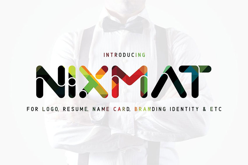
Design impressive logos with the cool Nixmat font. Featuring bold, rounded letters and creative linear details, this font is sure to make you shine. Pair it with effective brand materials for the all-around complete package. Download it today to add style to your work!
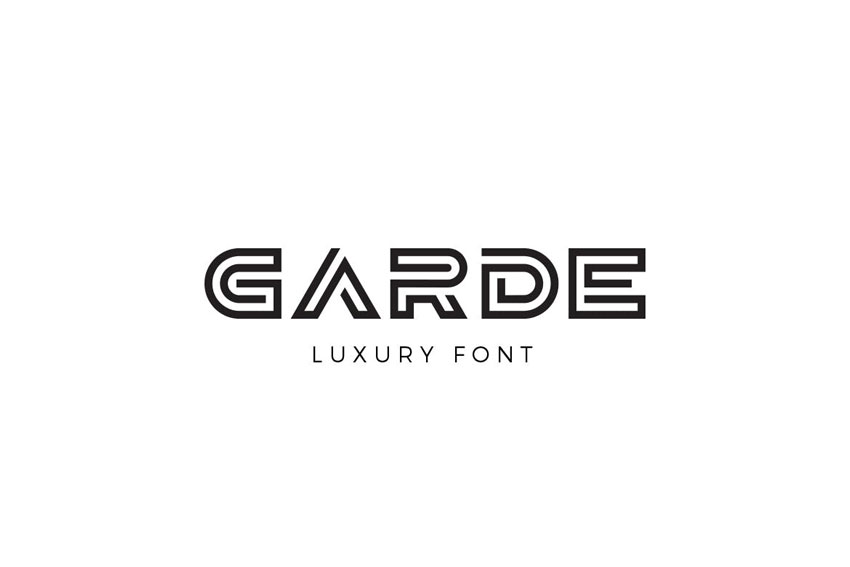
Create compelling campaigns with the luxurious Garde font. A clean monogram font with high-end features, this font is stylish and strong. It works perfectly with many creative industries including beauty, fashion, and so much more. So give your logos that bold edge over the competition with Garde!
Improve your karma with a creative font. The Karma font is unique and outstanding. Its geometric line style perfectly matches the recent trends in retro 90s design. And you’ll love its clean, block-style design. Test it out with your name or company for a new monogram logo.
Make a bold impact with the WS Free Line typeface. This monogram font is the perfect companion to any design project. Create decorative logos with tall, elegant letters and interesting line details. Use it on posters, stationery, and more!
You don’t need extra characters or symbols with the Hom Monogram font. This extraordinary pack features a trendy monogram suitable for weddings or brands. Personalize it easily with the help of most design programs. Try it out!
Need a font for a strong brand? Try out this amazing armor font. Great for old world projects or athletic brands, this font conveys incredible strength with tall letters and a cool serif decoration. Enjoy this typeface for branding, headers, and even merchandise.
How will robotic design affect the future of
fonts? The Robodron font family reflects the incredible look of clean,
futuristic curves and capital letters. This impressive download is
certainly a great find and perfect for any budding creative. Create
logos for posters, websites, and more!
Script font styles with sweeping curves are a popular treat for designers. And the Raisa Script font features a compelling design that is stunning yet casual. Create flowy monogram letters perfect for any wedding invite or stationery. A pretty and elegant look!
Brighten your stationery with a classic, elegant script. This Bathey calligraphy font will do just the trick for a clean and modern appeal. This font package includes upper and lowercase letters as well as numbers and punctuation. How will you use it?
Taking inspiration from an old Western film, this Rancho font is spicy and cool. It gives you that authentic-looking ranch vibe with nice serif details. Instantly make your work look more rustic and rugged with this Rancho font. Try it out!
Font duo packs are always a fantastic way to upgrade your logo! This handwritten font duo includes two well made typefaces. One is script and the other is sans serif for all your basic projects. Combine the two for a stellar result. Check it out!
Celebrate your special day with the Mustica script font. A favorite among wedding planners and designers, this script font features wavy, calligraphic letters. Each line was created with incredible care for an all-around beautiful and soft look. Add it to your collection!
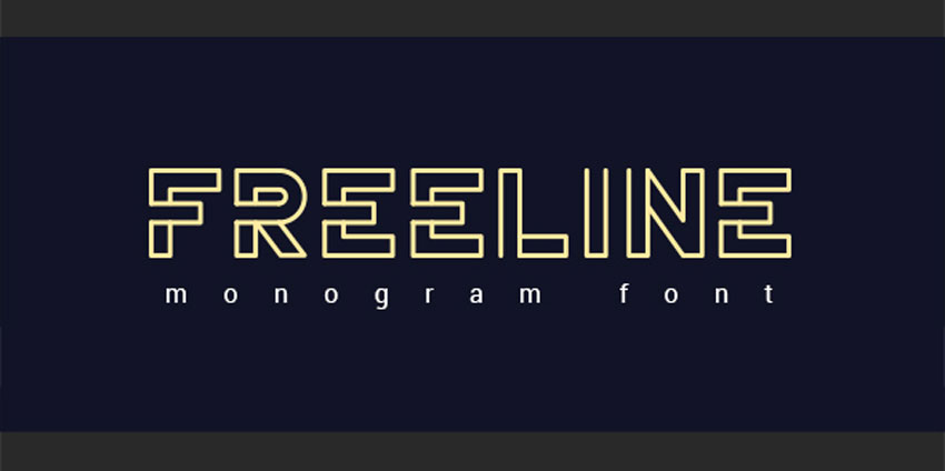
Innovate with a strong monogram font like the FreeLine typeface. This fashionable font features bold capital letters designed with creative, linear details. Wow any crowd with phenomenal headlines and impressive titles. And match it with any color to fit your style!
Need a font that looks as if it was made with a brush? Introducing this phenomenal handwritten typeface! The Giodasi font is different and fresh. It features long brush-styled letters that were individually made by hand. Use it for logos on apparel and more.
Sometimes you have to be a little unusual to stand out. The Sentaline Monogram font will help you break barriers with its futuristic monogram style. Great for headlines, logos, and titles, this font comes with a full set of letters, numbers, and characters. Enjoy!
Show off your creative style with the Bowlist logo typeface. A bold calligraphic font, this typeface features a natural handwritten look. So update your recent projects with a modern logo font that is cool and impressive. Check it out on posters and more!
This good-looking font could definitely work for luxury brands or fashionable personalities. Check out the creative Sentagram logo with sleek and sophisticated lines. Create an artistic brand that will shine the moment you place it on any stationery. Add it to your collection!
Our next font family is definitely like no other. The letters for the Radon logo font interlock with exciting line designs. Perfect for minimalists, this font has just enough details to stand out from the crowd. Great for monogram logos, headlines, and posters too!
Perhaps you need something simple but elegant. Then check out the lovely Goldiana font script. Including lowercase and capital letters, this font pack is sweet and super pretty. It’s best suited for logos and invites, but I’m sure it’ll work for other creative projects too. Give it a try!
Choose between light, regular and bold styles for this creative Forest Line Linear font. This typeface is bold and unique. It looks best at a size of 40 pt and includes all the files you need to get started. Add this one to your design arsenal!
Craft an extraordinary look with the Shintya typeface. A curvy font full of feelings and allure, this typeface is soft and approachable. Fulfill the needs of your brand or wedding planning with this lovely design. And make sure to check out the preview images to see all the letters and characters!
It’s
easy to get caught up with standard, boring logos. Freshen up your look
with this daring and beautiful color font. This font is suitable for
many projects and is supported by applications that use color fonts.
Enjoy four different styles for more fabulous options.
How would you use the thrilling Aline font? A cool, linear style that resembles many Art Deco designs, this font is striking and classy. Update your concert posters, invite cards, and so much more with its fantastic characters. Works best in large font sizes.
Designers are now able to capture rich, authentic brush textures from calligraphy brushes. And this Qindom brush pack is a wonderful example of a beautiful brush script which retains its quality and texture. Enjoy an additional web font version for more versatility.
It may take some time before your find the right font. Make sure to experiment with interesting and unique styles like this Cephalonia typeface. This handwritten font includes alternates, ligatures and an additional underline option. Use it on posters, merch and more!
We’re back with another great font and that’s this classic style Neue Stanley typeface. This font is inspired by the classic letter styling found in old posters and advertisements. Make authentic looking vintage projects with this stunning font.
What kind of font are you looking for? Try out this brilliant Bernaillo script typeface. This handwritten font has an elegant and curvy baseline with tall, script letters you’ll certainly adore. Add this look to your stationery, invites and logos for a personal touch.
Add a natural, rustic flair to your monogram logo. The Academy House font features striking textures and curvy loops. It’s made with a playful baseline to add a lot of character to your work. Perfect for prints, posters, and invites, this font will refresh your logos!
Design a classic monogram like your favorite vintage crests. The Austen display font is elegant and refined. Give your work that Victorian flavor with this beautiful font style that’s great for logos. Test it out on invites for weddings or any special occasion for stunning results.
Your logo should reflect your unique spirit. So write out stunning letters and more with the Gramin font. A hand-painted display font with tall, serif letters, this font is casual and friendly. Download this official set of all capital letters, numbers, and punctuation today!
More Font Inspiration
You can make exquisite logos with minimalist monogram fonts. Which ones will you try to upgrade your designs and invites?
Love these logo collections? Check out these amazing articles for more:
Tried any of these assets? Let us know! Tell us your favorite logo monogram fonts in the comments below.
This has been a selection of premium resources perfect for the avid designer. For more logo monogram fonts, make sure to check out Envato Market and Envato Elements, or enlist the help of our talented professionals at Envato Studio. Happy designing!
Create the best logos with monogram designs. Check out this list of premium logo fonts.
30 Best Fonts for Monograms & Logos
Having trouble designing a logo? A popular concept style that is easy and memorable is the classic monogram logo.
Simply put, a monogram is a symbol, usually made up of letters. Monograms have had a strong function in history, and many designers today use these simple motifs for symbolic professional and personal logos.
So today we’re bringing you another fantastic selection of premium resources from Envato Market and Envato Elements.
Featuring the best logo fonts with 30 amazing styles, this collection is unique and futuristic. Take advantage of cool monogram fonts created by our talented community.
Design impressive logos with the cool Nixmat font. Featuring bold, rounded letters and creative linear details, this font is sure to make you shine. Pair it with effective brand materials for the all-around complete package. Download it today to add style to your work!
Create compelling campaigns with the luxurious Garde font. A clean monogram font with high-end features, this font is stylish and strong. It works perfectly with many creative industries including beauty, fashion, and so much more. So give your logos that bold edge over the competition with Garde!
Improve your karma with a creative font. The Karma font is unique and outstanding. Its geometric line style perfectly matches the recent trends in retro 90s design. And you’ll love its clean, block-style design. Test it out with your name or company for a new monogram logo.
Make a bold impact with the WS Free Line typeface. This monogram font is the perfect companion to any design project. Create decorative logos with tall, elegant letters and interesting line details. Use it on posters, stationery, and more!
You don’t need extra characters or symbols with the Hom Monogram font. This extraordinary pack features a trendy monogram suitable for weddings or brands. Personalize it easily with the help of most design programs. Try it out!
Need a font for a strong brand? Try out this amazing armor font. Great for old world projects or athletic brands, this font conveys incredible strength with tall letters and a cool serif decoration. Enjoy this typeface for branding, headers, and even merchandise.
How will robotic design affect the future of
fonts? The Robodron font family reflects the incredible look of clean,
futuristic curves and capital letters. This impressive download is
certainly a great find and perfect for any budding creative. Create
logos for posters, websites, and more!
Script font styles with sweeping curves are a popular treat for designers. And the Raisa Script font features a compelling design that is stunning yet casual. Create flowy monogram letters perfect for any wedding invite or stationery. A pretty and elegant look!
Brighten your stationery with a classic, elegant script. This Bathey calligraphy font will do just the trick for a clean and modern appeal. This font package includes upper and lowercase letters as well as numbers and punctuation. How will you use it?
Taking inspiration from an old Western film, this Rancho font is spicy and cool. It gives you that authentic-looking ranch vibe with nice serif details. Instantly make your work look more rustic and rugged with this Rancho font. Try it out!
Font duo packs are always a fantastic way to upgrade your logo! This handwritten font duo includes two well made typefaces. One is script and the other is sans serif for all your basic projects. Combine the two for a stellar result. Check it out!
Celebrate your special day with the Mustica script font. A favorite among wedding planners and designers, this script font features wavy, calligraphic letters. Each line was created with incredible care for an all-around beautiful and soft look. Add it to your collection!
Innovate with a strong monogram font like the FreeLine typeface. This fashionable font features bold capital letters designed with creative, linear details. Wow any crowd with phenomenal headlines and impressive titles. And match it with any color to fit your style!
Need a font that looks as if it was made with a brush? Introducing this phenomenal handwritten typeface! The Giodasi font is different and fresh. It features long brush-styled letters that were individually made by hand. Use it for logos on apparel and more.
Sometimes you have to be a little unusual to stand out. The Sentaline Monogram font will help you break barriers with its futuristic monogram style. Great for headlines, logos, and titles, this font comes with a full set of letters, numbers, and characters. Enjoy!
Show off your creative style with the Bowlist logo typeface. A bold calligraphic font, this typeface features a natural handwritten look. So update your recent projects with a modern logo font that is cool and impressive. Check it out on posters and more!
This good-looking font could definitely work for luxury brands or fashionable personalities. Check out the creative Sentagram logo with sleek and sophisticated lines. Create an artistic brand that will shine the moment you place it on any stationery. Add it to your collection!
Our next font family is definitely like no other. The letters for the Radon logo font interlock with exciting line designs. Perfect for minimalists, this font has just enough details to stand out from the crowd. Great for monogram logos, headlines, and posters too!
Perhaps you need something simple but elegant. Then check out the lovely Goldiana font script. Including lowercase and capital letters, this font pack is sweet and super pretty. It’s best suited for logos and invites, but I’m sure it’ll work for other creative projects too. Give it a try!
Choose between light, regular and bold styles for this creative Forest Line Linear font. This typeface is bold and unique. It looks best at a size of 40 pt and includes all the files you need to get started. Add this one to your design arsenal!
Craft an extraordinary look with the Shintya typeface. A curvy font full of feelings and allure, this typeface is soft and approachable. Fulfill the needs of your brand or wedding planning with this lovely design. And make sure to check out the preview images to see all the letters and characters!
It’s
easy to get caught up with standard, boring logos. Freshen up your look
with this daring and beautiful color font. This font is suitable for
many projects and is supported by applications that use color fonts.
Enjoy four different styles for more fabulous options.
How would you use the thrilling Aline font? A cool, linear style that resembles many Art Deco designs, this font is striking and classy. Update your concert posters, invite cards, and so much more with its fantastic characters. Works best in large font sizes.
Designers are now able to capture rich, authentic brush textures from calligraphy brushes. And this Qindom brush pack is a wonderful example of a beautiful brush script which retains its quality and texture. Enjoy an additional web font version for more versatility.
It may take some time before your find the right font. Make sure to experiment with interesting and unique styles like this Cephalonia typeface. This handwritten font includes alternates, ligatures and an additional underline option. Use it on posters, merch and more!
We’re back with another great font and that’s this classic style Neue Stanley typeface. This font is inspired by the classic letter styling found in old posters and advertisements. Make authentic looking vintage projects with this stunning font.
What kind of font are you looking for? Try out this brilliant Bernaillo script typeface. This handwritten font has an elegant and curvy baseline with tall, script letters you’ll certainly adore. Add this look to your stationery, invites and logos for a personal touch.
Add a natural, rustic flair to your monogram logo. The Academy House font features striking textures and curvy loops. It’s made with a playful baseline to add a lot of character to your work. Perfect for prints, posters, and invites, this font will refresh your logos!
Design a classic monogram like your favorite vintage crests. The Austen display font is elegant and refined. Give your work that Victorian flavor with this beautiful font style that’s great for logos. Test it out on invites for weddings or any special occasion for stunning results.
Your logo should reflect your unique spirit. So write out stunning letters and more with the Gramin font. A hand-painted display font with tall, serif letters, this font is casual and friendly. Download this official set of all capital letters, numbers, and punctuation today!
More Font Inspiration
You can make exquisite logos with minimalist monogram fonts. Which ones will you try to upgrade your designs and invites?
Love these logo collections? Check out these amazing articles for more:
Tried any of these assets? Let us know! Tell us your favorite logo monogram fonts in the comments below.
This has been a selection of premium resources perfect for the avid designer. For more logo monogram fonts, make sure to check out Envato Market and Envato Elements, or enlist the help of our talented professionals at Envato Studio. Happy designing!
Agregator najlepszych postów o designie, webdesignie, cssie i Internecie