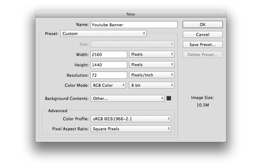
Start by creating a 2560 x 1440 px document in Photoshop with the following configuration. Set the Background Fill Color to #333333.
Step 2
Add the background and adjust its size. Then Rasterize the layer (right click > Rasterize layer) and subsequently desaturate the image (Shift-Command-U).
Step 3
Now add a Layer Mask from the Layers panel and apply a Radial Gradient with the Gradient Tool (G) using the front black color. Then set the layer Opacity to 80%.
Step 4
Let’s create the boxes to place the stock images. Draw a rectangle with the Rectangle Tool (U) and set the Stroke thickness to 20 px; any fill color will do.
Step 5
Apply a Drop Shadow to the rectangle using the Blending options, using the following values:
Step 6
Import the first stock image and place it over the rectangle. Rasterize the image (Layer > Rasterize > Layer) and then desaturate the layer (Shift-command-U).
Step 7
Now create a ClippingMask with the rectangle below (right click > Create Clipping Mask) to enter in the box.
Step 8
Draw another rectangle around the frame with a 1 pxStroke thickness (#FFFFFF) and no fill color. Then Group the rectangle, the image and the frame (Command-G).
Step 9
Make six copies of the portrait (Command-J) and place the rest of the stock images in each of the portraits. Then Rotate and place them as shown in the image below.
Be sure to frame the images well in the box and to desaturate them.
Step 10
Create a text title called “TRAVELCITY” with the Horizontal Type Tool (T) and apply Bold to the word „CITY„.
Step 11
Take the Pen Tool (P) and draw a 5 px thick frame around the text title, leaving the upper right corner open. Then draw a cross with a Stroke thicknessof 10 px.
Step 12
Now we are going to create a vignette. To do so, create a Gradient layer from the Layers panel using the black color as front, and apply the following settings.
Congratulations! You’re Finished!
And that’s it! We have created a banner for your YouTube Channel, simply and quickly. I hope you find it useful and use what you learnt here for your future banners. I hope to see your results!
Want more YouTube banners? Check out the following articles:
Start by creating a 2560 x 1440 px document in Photoshop with the following configuration. Set the Background Fill Color to #333333.
Step 2
Add the background and adjust its size. Then Rasterize the layer (right click > Rasterize layer) and subsequently desaturate the image (Shift-Command-U).
Step 3
Now add a Layer Mask from the Layers panel and apply a Radial Gradient with the Gradient Tool (G) using the front black color. Then set the layer Opacity to 80%.
Step 4
Let’s create the boxes to place the stock images. Draw a rectangle with the Rectangle Tool (U) and set the Stroke thickness to 20 px; any fill color will do.
Step 5
Apply a Drop Shadow to the rectangle using the Blending options, using the following values:
Step 6
Import the first stock image and place it over the rectangle. Rasterize the image (Layer > Rasterize > Layer) and then desaturate the layer (Shift-command-U).
Step 7
Now create a ClippingMask with the rectangle below (right click > Create Clipping Mask) to enter in the box.
Step 8
Draw another rectangle around the frame with a 1 pxStroke thickness (#FFFFFF) and no fill color. Then Group the rectangle, the image and the frame (Command-G).
Step 9
Make six copies of the portrait (Command-J) and place the rest of the stock images in each of the portraits. Then Rotate and place them as shown in the image below.
Be sure to frame the images well in the box and to desaturate them.
Step 10
Create a text title called “TRAVELCITY” with the Horizontal Type Tool (T) and apply Bold to the word „CITY„.
Step 11
Take the Pen Tool (P) and draw a 5 px thick frame around the text title, leaving the upper right corner open. Then draw a cross with a Stroke thicknessof 10 px.
Step 12
Now we are going to create a vignette. To do so, create a Gradient layer from the Layers panel using the black color as front, and apply the following settings.
Congratulations! You’re Finished!
And that’s it! We have created a banner for your YouTube Channel, simply and quickly. I hope you find it useful and use what you learnt here for your future banners. I hope to see your results!
Want more YouTube banners? Check out the following articles:
Start by creating a 2560 x 1440 px document in Photoshop with the following configuration. Set the Background Fill Color to #333333.
Step 2
Add the background and adjust its size. Then Rasterize the layer (right click > Rasterize layer) and subsequently desaturate the image (Shift-Command-U).
Step 3
Now add a Layer Mask from the Layers panel and apply a Radial Gradient with the Gradient Tool (G) using the front black color. Then set the layer Opacity to 80%.
Step 4
Let’s create the boxes to place the stock images. Draw a rectangle with the Rectangle Tool (U) and set the Stroke thickness to 20 px; any fill color will do.
Step 5
Apply a Drop Shadow to the rectangle using the Blending options, using the following values:
Step 6
Import the first stock image and place it over the rectangle. Rasterize the image (Layer > Rasterize > Layer) and then desaturate the layer (Shift-command-U).
Step 7
Now create a ClippingMask with the rectangle below (right click > Create Clipping Mask) to enter in the box.
Step 8
Draw another rectangle around the frame with a 1 pxStroke thickness (#FFFFFF) and no fill color. Then Group the rectangle, the image and the frame (Command-G).
Step 9
Make six copies of the portrait (Command-J) and place the rest of the stock images in each of the portraits. Then Rotate and place them as shown in the image below.
Be sure to frame the images well in the box and to desaturate them.
Step 10
Create a text title called “TRAVELCITY” with the Horizontal Type Tool (T) and apply Bold to the word „CITY„.
Step 11
Take the Pen Tool (P) and draw a 5 px thick frame around the text title, leaving the upper right corner open. Then draw a cross with a Stroke thicknessof 10 px.
Step 12
Now we are going to create a vignette. To do so, create a Gradient layer from the Layers panel using the black color as front, and apply the following settings.
Congratulations! You’re Finished!
And that’s it! We have created a banner for your YouTube Channel, simply and quickly. I hope you find it useful and use what you learnt here for your future banners. I hope to see your results!
Want more YouTube banners? Check out the following articles:
Start by creating a 2560 x 1440 px document in Photoshop with the following configuration. Set the Background Fill Color to #333333.
Step 2
Add the background and adjust its size. Then Rasterize the layer (right click > Rasterize layer) and subsequently desaturate the image (Shift-Command-U).
Step 3
Now add a Layer Mask from the Layers panel and apply a Radial Gradient with the Gradient Tool (G) using the front black color. Then set the layer Opacity to 80%.
Step 4
Let’s create the boxes to place the stock images. Draw a rectangle with the Rectangle Tool (U) and set the Stroke thickness to 20 px; any fill color will do.
Step 5
Apply a Drop Shadow to the rectangle using the Blending options, using the following values:
Step 6
Import the first stock image and place it over the rectangle. Rasterize the image (Layer > Rasterize > Layer) and then desaturate the layer (Shift-command-U).
Step 7
Now create a ClippingMask with the rectangle below (right click > Create Clipping Mask) to enter in the box.
Step 8
Draw another rectangle around the frame with a 1 pxStroke thickness (#FFFFFF) and no fill color. Then Group the rectangle, the image and the frame (Command-G).
Step 9
Make six copies of the portrait (Command-J) and place the rest of the stock images in each of the portraits. Then Rotate and place them as shown in the image below.
Be sure to frame the images well in the box and to desaturate them.
Step 10
Create a text title called “TRAVELCITY” with the Horizontal Type Tool (T) and apply Bold to the word „CITY„.
Step 11
Take the Pen Tool (P) and draw a 5 px thick frame around the text title, leaving the upper right corner open. Then draw a cross with a Stroke thicknessof 10 px.
Step 12
Now we are going to create a vignette. To do so, create a Gradient layer from the Layers panel using the black color as front, and apply the following settings.
Congratulations! You’re Finished!
And that’s it! We have created a banner for your YouTube Channel, simply and quickly. I hope you find it useful and use what you learnt here for your future banners. I hope to see your results!
Want more YouTube banners? Check out the following articles:
Start by creating a 2560 x 1440 px document in Photoshop with the following configuration. Set the Background Fill Color to #333333.
Step 2
Add the background and adjust its size. Then Rasterize the layer (right click > Rasterize layer) and subsequently desaturate the image (Shift-Command-U).
Step 3
Now add a Layer Mask from the Layers panel and apply a Radial Gradient with the Gradient Tool (G) using the front black color. Then set the layer Opacity to 80%.
Step 4
Let’s create the boxes to place the stock images. Draw a rectangle with the Rectangle Tool (U) and set the Stroke thickness to 20 px; any fill color will do.
Step 5
Apply a Drop Shadow to the rectangle using the Blending options, using the following values:
Step 6
Import the first stock image and place it over the rectangle. Rasterize the image (Layer > Rasterize > Layer) and then desaturate the layer (Shift-command-U).
Step 7
Now create a ClippingMask with the rectangle below (right click > Create Clipping Mask) to enter in the box.
Step 8
Draw another rectangle around the frame with a 1 pxStroke thickness (#FFFFFF) and no fill color. Then Group the rectangle, the image and the frame (Command-G).
Step 9
Make six copies of the portrait (Command-J) and place the rest of the stock images in each of the portraits. Then Rotate and place them as shown in the image below.
Be sure to frame the images well in the box and to desaturate them.
Step 10
Create a text title called “TRAVELCITY” with the Horizontal Type Tool (T) and apply Bold to the word „CITY„.
Step 11
Take the Pen Tool (P) and draw a 5 px thick frame around the text title, leaving the upper right corner open. Then draw a cross with a Stroke thicknessof 10 px.
Step 12
Now we are going to create a vignette. To do so, create a Gradient layer from the Layers panel using the black color as front, and apply the following settings.
Congratulations! You’re Finished!
And that’s it! We have created a banner for your YouTube Channel, simply and quickly. I hope you find it useful and use what you learnt here for your future banners. I hope to see your results!
Want more YouTube banners? Check out the following articles:
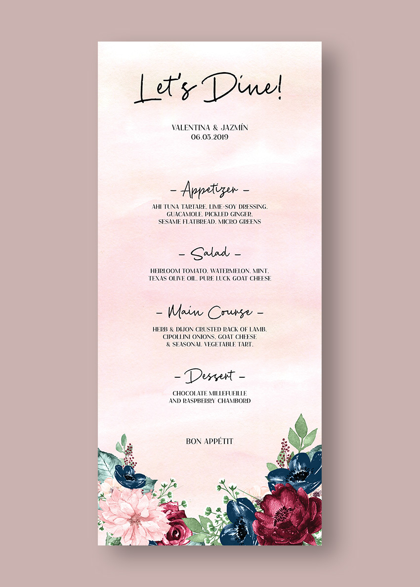
Make a statement with your wedding stationery by learning how to make an InDesign menu template in just a few easy steps.
In this tutorial, we will cover how to set up a wedding menu template through the use of Layers and Paragraph styles. You will also learn how to prepare your wedding menu template in an InDesign template that users can edit easily. This menu format measures 9 in x 4 in, which makes it easy for you and other users to print at home.
Download the assets and make sure the fonts are installed on your system before starting. When you are ready, we can dive in!
1.Setting Up a Wedding Menu Template File in InDesign
Step 1
In InDesign, go to File > New. Name the document wedding menu template. Set the file to the following dimensions:
Width to 4 in
Height to 9 in
Orientation to Portrait
Units to Inches
Pages to 1
Uncheck Facing Pages
Columns to 1
Margins to 0.5 in
Bleeds to 0.125 in (it’s best to seek your professional printer’s preference)
Click Create.
Step 2
Organizing layers is an important practice when designing an InDesign template.Bring up the Layers panel by going to Window > Layers. Double-click on Layer 1 and rename it Background.
Step 3
On the Layers panel main menu, select New Layer. Name it Copy. Click OK.
Create a new layer named Images. Click OK.
2.Designing Your Wedding Menu Layout in InDesign
Step 1
On the Layers panel, select the Background layer.
To Place an image, press Command-D. Locate the Watercolor pink backgroundsfolder and select the 7.jpg file. Click Place.
Step 2
Click on the InDesign menu template to place the image. Using the Direct Selection Tool (V), resize the frame to cover the width of the wedding menu template and extend it to the bleed.
Step 3
Head over to the Layers panel and lock the Background layer. Select the Copy layer.
Step 4
Using the Text Tool (T), create a text frame at the very top of the InDesign menu template. Use the side margins to help you place the text box in the center of the page. Add text—in this case, I’ve added ‘Let’s Dine!’
Step 5
Open the Character panel by going to Window > Type & Tables > Character panel.
On the Character panel, set the Font to Cest Lavie Regular and the Size to 40 pt.
On the Control bar, set the Alignment to Center.
Step 6
Create a text box under the title using the Text Tool (T). Here, we will include the couple’s name and date on two lines.
On the Character panel, set the Font to Cest Lavie Serif and the Size to 10 pt.
On the Control bar, set the Alignment to Center.
Step 7
Create a text box under the names using the Text Tool (T). Here, we will include the menu for the day. We will use a combination of the Regular and Serif family. Add copy, and let’s start formatting:
Subtitle: Add a hyphen before and after each subtitle as this will help create emphasis. Set the Font to Cest Lavie Regular and the Size to 20 pt.
Menu items: set the Font to Cest Lavie Serif and the Size to 8 pt.
On the Control bar, set the Alignment to Center.
Step 8
Create a text box under the menu with the Text Tool (T). Include a line such as ‘Bon Appetit’.
On the Character panel, set the Font to Cest Lavie Serif and the Size to 10 pt.
On the Control bar, set the Alignment to Center.
Step 9
Head over to the Layers panel and lock the Copy layer. Select the Images layer.
Step 10
Press Command-D to Place an image on the InDesign menu template. Locate the arrange_6.png file and click Open.
Step 11
Click on the menu layout to place the image.
Head over to the Control panel and activate the Constrain Proportions button. Set the Percentage to 45%.
Place the image on the bottom left corner of the menu. Make sure that the image is touching the bleed marks.
Step 12
Press Command-D to Place an image on the menu card template. Locate the arrange_5.png file and click Open.
Click on the InDesign menu template to place the image.
Head over to the Control panel and activate the Constrain Proportions button. Set the Percentage to 55%.
Place the image on the bottom right corner of the menu. Make sure that the image is touching the bleed mark.
3.Converting Your Menu Layout Into an InDesign Template
Once you’ve finished designing your menu layout, it’s time to get it ready for easy customization. In this particular InDesign menu template, we will create Paragraph Styles for the content. The rest of the elements are JPEG files that don’t require specific formatting.
Step 1
Go to Window > Styles >Paragraph Styles. On the Paragraph Styles panel, we will create a number of formatting styles based on our menu design.
Select and activate the text box at the top of the page. Head over to the Paragraph Styles panel and click on the Create New Style button. This will create a new style based on the text you selected.
Step 2
Double-click on Paragraph Style 1 to open the Paragraph Style Options window.
Change the Style Name to Title. You will notice that the Style Settings will include the settings you used on the text—this is a great way to double-check everything is in order. Click OK.
Step 3
Select the couple’s name and date using the Text Tool (T). Head over to the Paragraph Styles panel and click on the Create New Style button.
Double-click on the new Paragraph Style and set the Style Name to Couple name.
Repeat the same procedure for the rest of the menu and create styles for the Subtitle and Menu Description.
Now your InDesign menu template is ready to be shared with others. Users will have the option to easily change the fonts and content through the paragraph styles. Users will also be able to change the images if they desire through the organized Layers panel.
4.How to Export a File for Printing
Before exporting a file for printing, it is useful to take a look around all the edges of the menu design. This is to make sure all the images bleeding out are touching the bleeds.
Step 1
To export the file, go to File > Export. Name the file Wedding Menu Templateand choose Adobe PDF (Print) from the Format dropdown menu. Click Save.
Step 2
In the Export Adobe PDF window, set the Adobe PDF Preset to Press Quality.
On the left side of the panel, select Marks and Bleeds. Check All Printer’s Marks and Use Document Bleed Settings. Click Export. You will have a ready-to-print PDF file.
Great Job! You’ve Finished Your Wedding Menu Template!
In this tutorial, we learned how to make a wedding menu template in InDesign. We covered key tools that will help you create a ready-to-edit menu design. Today, we learned to:
Make a statement with your wedding stationery by learning how to make an InDesign menu template in just a few easy steps.
In this tutorial, we will cover how to set up a wedding menu template through the use of Layers and Paragraph styles. You will also learn how to prepare your wedding menu template in an InDesign template that users can edit easily. This menu format measures 9 in x 4 in, which makes it easy for you and other users to print at home.
Download the assets and make sure the fonts are installed on your system before starting. When you are ready, we can dive in!
1.Setting Up a Wedding Menu Template File in InDesign
Step 1
In InDesign, go to File > New. Name the document wedding menu template. Set the file to the following dimensions:
Width to 4 in
Height to 9 in
Orientation to Portrait
Units to Inches
Pages to 1
Uncheck Facing Pages
Columns to 1
Margins to 0.5 in
Bleeds to 0.125 in (it’s best to seek your professional printer’s preference)
Click Create.
Step 2
Organizing layers is an important practice when designing an InDesign template.Bring up the Layers panel by going to Window > Layers. Double-click on Layer 1 and rename it Background.
Step 3
On the Layers panel main menu, select New Layer. Name it Copy. Click OK.
Create a new layer named Images. Click OK.
2.Designing Your Wedding Menu Layout in InDesign
Step 1
On the Layers panel, select the Background layer.
To Place an image, press Command-D. Locate the Watercolor pink backgroundsfolder and select the 7.jpg file. Click Place.
Step 2
Click on the InDesign menu template to place the image. Using the Direct Selection Tool (V), resize the frame to cover the width of the wedding menu template and extend it to the bleed.
Step 3
Head over to the Layers panel and lock the Background layer. Select the Copy layer.
Step 4
Using the Text Tool (T), create a text frame at the very top of the InDesign menu template. Use the side margins to help you place the text box in the center of the page. Add text—in this case, I’ve added ‘Let’s Dine!’
Step 5
Open the Character panel by going to Window > Type & Tables > Character panel.
On the Character panel, set the Font to Cest Lavie Regular and the Size to 40 pt.
On the Control bar, set the Alignment to Center.
Step 6
Create a text box under the title using the Text Tool (T). Here, we will include the couple’s name and date on two lines.
On the Character panel, set the Font to Cest Lavie Serif and the Size to 10 pt.
On the Control bar, set the Alignment to Center.
Step 7
Create a text box under the names using the Text Tool (T). Here, we will include the menu for the day. We will use a combination of the Regular and Serif family. Add copy, and let’s start formatting:
Subtitle: Add a hyphen before and after each subtitle as this will help create emphasis. Set the Font to Cest Lavie Regular and the Size to 20 pt.
Menu items: set the Font to Cest Lavie Serif and the Size to 8 pt.
On the Control bar, set the Alignment to Center.
Step 8
Create a text box under the menu with the Text Tool (T). Include a line such as ‘Bon Appetit’.
On the Character panel, set the Font to Cest Lavie Serif and the Size to 10 pt.
On the Control bar, set the Alignment to Center.
Step 9
Head over to the Layers panel and lock the Copy layer. Select the Images layer.
Step 10
Press Command-D to Place an image on the InDesign menu template. Locate the arrange_6.png file and click Open.
Step 11
Click on the menu layout to place the image.
Head over to the Control panel and activate the Constrain Proportions button. Set the Percentage to 45%.
Place the image on the bottom left corner of the menu. Make sure that the image is touching the bleed marks.
Step 12
Press Command-D to Place an image on the menu card template. Locate the arrange_5.png file and click Open.
Click on the InDesign menu template to place the image.
Head over to the Control panel and activate the Constrain Proportions button. Set the Percentage to 55%.
Place the image on the bottom right corner of the menu. Make sure that the image is touching the bleed mark.
3.Converting Your Menu Layout Into an InDesign Template
Once you’ve finished designing your menu layout, it’s time to get it ready for easy customization. In this particular InDesign menu template, we will create Paragraph Styles for the content. The rest of the elements are JPEG files that don’t require specific formatting.
Step 1
Go to Window > Styles >Paragraph Styles. On the Paragraph Styles panel, we will create a number of formatting styles based on our menu design.
Select and activate the text box at the top of the page. Head over to the Paragraph Styles panel and click on the Create New Style button. This will create a new style based on the text you selected.
Step 2
Double-click on Paragraph Style 1 to open the Paragraph Style Options window.
Change the Style Name to Title. You will notice that the Style Settings will include the settings you used on the text—this is a great way to double-check everything is in order. Click OK.
Step 3
Select the couple’s name and date using the Text Tool (T). Head over to the Paragraph Styles panel and click on the Create New Style button.
Double-click on the new Paragraph Style and set the Style Name to Couple name.
Repeat the same procedure for the rest of the menu and create styles for the Subtitle and Menu Description.
Now your InDesign menu template is ready to be shared with others. Users will have the option to easily change the fonts and content through the paragraph styles. Users will also be able to change the images if they desire through the organized Layers panel.
4.How to Export a File for Printing
Before exporting a file for printing, it is useful to take a look around all the edges of the menu design. This is to make sure all the images bleeding out are touching the bleeds.
Step 1
To export the file, go to File > Export. Name the file Wedding Menu Templateand choose Adobe PDF (Print) from the Format dropdown menu. Click Save.
Step 2
In the Export Adobe PDF window, set the Adobe PDF Preset to Press Quality.
On the left side of the panel, select Marks and Bleeds. Check All Printer’s Marks and Use Document Bleed Settings. Click Export. You will have a ready-to-print PDF file.
Great Job! You’ve Finished Your Wedding Menu Template!
In this tutorial, we learned how to make a wedding menu template in InDesign. We covered key tools that will help you create a ready-to-edit menu design. Today, we learned to:
Make a statement with your wedding stationery by learning how to make an InDesign menu template in just a few easy steps.
In this tutorial, we will cover how to set up a wedding menu template through the use of Layers and Paragraph styles. You will also learn how to prepare your wedding menu template in an InDesign template that users can edit easily. This menu format measures 9 in x 4 in, which makes it easy for you and other users to print at home.
Download the assets and make sure the fonts are installed on your system before starting. When you are ready, we can dive in!
1.Setting Up a Wedding Menu Template File in InDesign
Step 1
In InDesign, go to File > New. Name the document wedding menu template. Set the file to the following dimensions:
Width to 4 in
Height to 9 in
Orientation to Portrait
Units to Inches
Pages to 1
Uncheck Facing Pages
Columns to 1
Margins to 0.5 in
Bleeds to 0.125 in (it’s best to seek your professional printer’s preference)
Click Create.
Step 2
Organizing layers is an important practice when designing an InDesign template.Bring up the Layers panel by going to Window > Layers. Double-click on Layer 1 and rename it Background.
Step 3
On the Layers panel main menu, select New Layer. Name it Copy. Click OK.
Create a new layer named Images. Click OK.
2.Designing Your Wedding Menu Layout in InDesign
Step 1
On the Layers panel, select the Background layer.
To Place an image, press Command-D. Locate the Watercolor pink backgroundsfolder and select the 7.jpg file. Click Place.
Step 2
Click on the InDesign menu template to place the image. Using the Direct Selection Tool (V), resize the frame to cover the width of the wedding menu template and extend it to the bleed.
Step 3
Head over to the Layers panel and lock the Background layer. Select the Copy layer.
Step 4
Using the Text Tool (T), create a text frame at the very top of the InDesign menu template. Use the side margins to help you place the text box in the center of the page. Add text—in this case, I’ve added ‘Let’s Dine!’
Step 5
Open the Character panel by going to Window > Type & Tables > Character panel.
On the Character panel, set the Font to Cest Lavie Regular and the Size to 40 pt.
On the Control bar, set the Alignment to Center.
Step 6
Create a text box under the title using the Text Tool (T). Here, we will include the couple’s name and date on two lines.
On the Character panel, set the Font to Cest Lavie Serif and the Size to 10 pt.
On the Control bar, set the Alignment to Center.
Step 7
Create a text box under the names using the Text Tool (T). Here, we will include the menu for the day. We will use a combination of the Regular and Serif family. Add copy, and let’s start formatting:
Subtitle: Add a hyphen before and after each subtitle as this will help create emphasis. Set the Font to Cest Lavie Regular and the Size to 20 pt.
Menu items: set the Font to Cest Lavie Serif and the Size to 8 pt.
On the Control bar, set the Alignment to Center.
Step 8
Create a text box under the menu with the Text Tool (T). Include a line such as ‘Bon Appetit’.
On the Character panel, set the Font to Cest Lavie Serif and the Size to 10 pt.
On the Control bar, set the Alignment to Center.
Step 9
Head over to the Layers panel and lock the Copy layer. Select the Images layer.
Step 10
Press Command-D to Place an image on the InDesign menu template. Locate the arrange_6.png file and click Open.
Step 11
Click on the menu layout to place the image.
Head over to the Control panel and activate the Constrain Proportions button. Set the Percentage to 45%.
Place the image on the bottom left corner of the menu. Make sure that the image is touching the bleed marks.
Step 12
Press Command-D to Place an image on the menu card template. Locate the arrange_5.png file and click Open.
Click on the InDesign menu template to place the image.
Head over to the Control panel and activate the Constrain Proportions button. Set the Percentage to 55%.
Place the image on the bottom right corner of the menu. Make sure that the image is touching the bleed mark.
3.Converting Your Menu Layout Into an InDesign Template
Once you’ve finished designing your menu layout, it’s time to get it ready for easy customization. In this particular InDesign menu template, we will create Paragraph Styles for the content. The rest of the elements are JPEG files that don’t require specific formatting.
Step 1
Go to Window > Styles >Paragraph Styles. On the Paragraph Styles panel, we will create a number of formatting styles based on our menu design.
Select and activate the text box at the top of the page. Head over to the Paragraph Styles panel and click on the Create New Style button. This will create a new style based on the text you selected.
Step 2
Double-click on Paragraph Style 1 to open the Paragraph Style Options window.
Change the Style Name to Title. You will notice that the Style Settings will include the settings you used on the text—this is a great way to double-check everything is in order. Click OK.
Step 3
Select the couple’s name and date using the Text Tool (T). Head over to the Paragraph Styles panel and click on the Create New Style button.
Double-click on the new Paragraph Style and set the Style Name to Couple name.
Repeat the same procedure for the rest of the menu and create styles for the Subtitle and Menu Description.
Now your InDesign menu template is ready to be shared with others. Users will have the option to easily change the fonts and content through the paragraph styles. Users will also be able to change the images if they desire through the organized Layers panel.
4.How to Export a File for Printing
Before exporting a file for printing, it is useful to take a look around all the edges of the menu design. This is to make sure all the images bleeding out are touching the bleeds.
Step 1
To export the file, go to File > Export. Name the file Wedding Menu Templateand choose Adobe PDF (Print) from the Format dropdown menu. Click Save.
Step 2
In the Export Adobe PDF window, set the Adobe PDF Preset to Press Quality.
On the left side of the panel, select Marks and Bleeds. Check All Printer’s Marks and Use Document Bleed Settings. Click Export. You will have a ready-to-print PDF file.
Great Job! You’ve Finished Your Wedding Menu Template!
In this tutorial, we learned how to make a wedding menu template in InDesign. We covered key tools that will help you create a ready-to-edit menu design. Today, we learned to:
Make a statement with your wedding stationery by learning how to make an InDesign menu template in just a few easy steps.
In this tutorial, we will cover how to set up a wedding menu template through the use of Layers and Paragraph styles. You will also learn how to prepare your wedding menu template in an InDesign template that users can edit easily. This menu format measures 9 in x 4 in, which makes it easy for you and other users to print at home.
Download the assets and make sure the fonts are installed on your system before starting. When you are ready, we can dive in!
1.Setting Up a Wedding Menu Template File in InDesign
Step 1
In InDesign, go to File > New. Name the document wedding menu template. Set the file to the following dimensions:
Width to 4 in
Height to 9 in
Orientation to Portrait
Units to Inches
Pages to 1
Uncheck Facing Pages
Columns to 1
Margins to 0.5 in
Bleeds to 0.125 in (it’s best to seek your professional printer’s preference)
Click Create.
Step 2
Organizing layers is an important practice when designing an InDesign template.Bring up the Layers panel by going to Window > Layers. Double-click on Layer 1 and rename it Background.
Step 3
On the Layers panel main menu, select New Layer. Name it Copy. Click OK.
Create a new layer named Images. Click OK.
2.Designing Your Wedding Menu Layout in InDesign
Step 1
On the Layers panel, select the Background layer.
To Place an image, press Command-D. Locate the Watercolor pink backgroundsfolder and select the 7.jpg file. Click Place.
Step 2
Click on the InDesign menu template to place the image. Using the Direct Selection Tool (V), resize the frame to cover the width of the wedding menu template and extend it to the bleed.
Step 3
Head over to the Layers panel and lock the Background layer. Select the Copy layer.
Step 4
Using the Text Tool (T), create a text frame at the very top of the InDesign menu template. Use the side margins to help you place the text box in the center of the page. Add text—in this case, I’ve added ‘Let’s Dine!’
Step 5
Open the Character panel by going to Window > Type & Tables > Character panel.
On the Character panel, set the Font to Cest Lavie Regular and the Size to 40 pt.
On the Control bar, set the Alignment to Center.
Step 6
Create a text box under the title using the Text Tool (T). Here, we will include the couple’s name and date on two lines.
On the Character panel, set the Font to Cest Lavie Serif and the Size to 10 pt.
On the Control bar, set the Alignment to Center.
Step 7
Create a text box under the names using the Text Tool (T). Here, we will include the menu for the day. We will use a combination of the Regular and Serif family. Add copy, and let’s start formatting:
Subtitle: Add a hyphen before and after each subtitle as this will help create emphasis. Set the Font to Cest Lavie Regular and the Size to 20 pt.
Menu items: set the Font to Cest Lavie Serif and the Size to 8 pt.
On the Control bar, set the Alignment to Center.
Step 8
Create a text box under the menu with the Text Tool (T). Include a line such as ‘Bon Appetit’.
On the Character panel, set the Font to Cest Lavie Serif and the Size to 10 pt.
On the Control bar, set the Alignment to Center.
Step 9
Head over to the Layers panel and lock the Copy layer. Select the Images layer.
Step 10
Press Command-D to Place an image on the InDesign menu template. Locate the arrange_6.png file and click Open.
Step 11
Click on the menu layout to place the image.
Head over to the Control panel and activate the Constrain Proportions button. Set the Percentage to 45%.
Place the image on the bottom left corner of the menu. Make sure that the image is touching the bleed marks.
Step 12
Press Command-D to Place an image on the menu card template. Locate the arrange_5.png file and click Open.
Click on the InDesign menu template to place the image.
Head over to the Control panel and activate the Constrain Proportions button. Set the Percentage to 55%.
Place the image on the bottom right corner of the menu. Make sure that the image is touching the bleed mark.
3.Converting Your Menu Layout Into an InDesign Template
Once you’ve finished designing your menu layout, it’s time to get it ready for easy customization. In this particular InDesign menu template, we will create Paragraph Styles for the content. The rest of the elements are JPEG files that don’t require specific formatting.
Step 1
Go to Window > Styles >Paragraph Styles. On the Paragraph Styles panel, we will create a number of formatting styles based on our menu design.
Select and activate the text box at the top of the page. Head over to the Paragraph Styles panel and click on the Create New Style button. This will create a new style based on the text you selected.
Step 2
Double-click on Paragraph Style 1 to open the Paragraph Style Options window.
Change the Style Name to Title. You will notice that the Style Settings will include the settings you used on the text—this is a great way to double-check everything is in order. Click OK.
Step 3
Select the couple’s name and date using the Text Tool (T). Head over to the Paragraph Styles panel and click on the Create New Style button.
Double-click on the new Paragraph Style and set the Style Name to Couple name.
Repeat the same procedure for the rest of the menu and create styles for the Subtitle and Menu Description.
Now your InDesign menu template is ready to be shared with others. Users will have the option to easily change the fonts and content through the paragraph styles. Users will also be able to change the images if they desire through the organized Layers panel.
4.How to Export a File for Printing
Before exporting a file for printing, it is useful to take a look around all the edges of the menu design. This is to make sure all the images bleeding out are touching the bleeds.
Step 1
To export the file, go to File > Export. Name the file Wedding Menu Templateand choose Adobe PDF (Print) from the Format dropdown menu. Click Save.
Step 2
In the Export Adobe PDF window, set the Adobe PDF Preset to Press Quality.
On the left side of the panel, select Marks and Bleeds. Check All Printer’s Marks and Use Document Bleed Settings. Click Export. You will have a ready-to-print PDF file.
Great Job! You’ve Finished Your Wedding Menu Template!
In this tutorial, we learned how to make a wedding menu template in InDesign. We covered key tools that will help you create a ready-to-edit menu design. Today, we learned to:
Let’s draw some fun cartoon icons in Adobe Illustrator CC! Download the sketch file to the right of this tutorial, or you can sketch out some portraits of your own and apply the techniques outlined below to create your own personalized icons, ready for web and print use.
On 31st March, it is International Transgender Day of Visibility, a day celebrating the transgender community and raising awareness of the discrimination transgender people face worldwide. The people I chose for these icons identify in a variety of ways and have been active for transgender awareness and within the larger LGBT community:
Janet Mock: Notable writer, trans+ activist, and entertainment host. Janet has worked with LGBT organizations in creating transgender-specific youth programs to support and educate, as well as written and spoken frequently about trans* issues within our society and her own experiences.
Laura Jane Grace: The front woman for the punk band Against Me!, Laura is not only a fantastic musician, but also went through the process of transition in a public way. Against Me!’s album Transgender Dysphoria Blues deals with the topic of gender dysphoria.
Marsha P. Johnson: Notable LGBT activist, Stonewall Riot veteran, and drag queen, Marsha was a staple of New York City’s gay and art scene throughout the 60s and 70s. She, along with Sylvia Rivera, co-founded STAR (Sweet Transvestite Action Revolutionaries), a group focused on helping homeless drag queens and trans* women of color.
Chaz Bono: Quite famous as the son of Cher and the late Sonny Bono, Chaz is a writer, entertainer, and LGBT activist in his own right. Like some of the others in this list, his transition was public. He has written for the magazine The Advocate, worked as spokesperson for the Human Rights Campaign, and worked with GLAAD as their Entertainment Media Director.
Balian Buschbaum: German pole vaulter who competed in world and Olympic competitions before retiring to transition. I included him for his openness and public transition, as athletes are often regarded in high esteem and those who tackle gender issues in a public way are icons to youths.
Tyler Ford: Though not as famous as those listed above, Tyler is a noted agender youth and LGBT activist and writer. They’ve written for Rookie magazine, MTV, and worked with the Happy Hippie foundation, an organization supporting homeless LGBT youth.
The list of notable trans* activists goes quite a bit further than this, and I encourage you, after creating something fantastic with the tutorial, to consider those profiled here as a starting point for International Transgender Day of Visibility.
1. Using a Sketch for an Icon
Step 1
Let’s check out my initial sketches. All six of my subjects have portraits drawn out in little rounded boxes. I’ve made notes about their hairstyles and face shapes, and aimed for a cute, cartoony likeness for each.
You’re welcome to build your icons off these sketches and follow along with me, or use something of your own and apply the techniques outlined below.
Step 2
Our first icon subject is Janet Mock. I’ve locked my sketch on its own layer in the Layers panel of a New Document in Adobe Illustrator. On a new layer, I started with the Pen Tool (P) and traced the basic head shape from my sketch.
Then I started to trace the eyes. I temporarily set the head shape’s Blending Mode to Multiply in the Transparency panel in order to make sure it fit with the facial features I was beginning to draw.
Step 3
I’ve hidden the head shape for now in the Layers panel. Using the Blob Brush Tool (Shift-B), with pressure enabled, I followed my sketch’s lines in order to draw the eyes, nose, and mouth. (If you’re using a mouse, feel free to stick with the Pen Tool or Curvature Tool (Shift-~) to draw components and trace your sketch.)
For the eyes, I drew two almond-shaped gradient objects with Linear Gradients going from dark purple to white and back to dark purple. Adjust the gradient’s distribution with the Gradient Tool (G) or the Gradient panel.
I find that using the Blob Brush Tool keeps the design cartoony and looking as if it was drawn with a marker. You can also get a similar look by using stroked paths and adjusting the stroke weight with the Width Tool (Shift-W).
Step 4
I’ve placed the head shape beneath the newly drawn facial features. Group (Control-G) together the face components and center them vertically with the head object. As you can see, we have the basics ready: eyebrows, eyes, nose, and mouth. Let’s get on to the details!
2. Detailing the Face With Gradients
Step 1
I like to reference my sketches as often as possible. Give the nose some color variation by drawing a shape over the entirety of the nose and applying a gradient that goes from a red, orange, or brown hue to the skin tone you’re using for your portrait.
I’ve done the same thing with eyeshadow behind both eyes, emphasizing the arch of the brow and the cat-eye shape of the eyelashes.
I changed the lines of the nose and mouth to a dark pink and drew the mouth with the Pencil Tool (N) as two distinct shapes placed below the mouth lines in the Layers panel.
Step 2
Let’s break down some of the details created so far:
Place the eyeshadow gradients behind the eyes. Also note the transparent shadow drawn over the eyes. Make sure it’s the same color as your eye outline and adjust the transparency or apply a gradient to it to give a little bit of depth to the face.
The teeth are the same gradient and shadow attribute as those on the eyes—note how the shadows are in the corners of the mouth and the highlight is in the center.
For the nose, I drew an oval for the center of the nose using the same gradient used previously on the nose. The Blending Mode was set to Screen and the Opacity was reduced to 70-50% in the Transparency panel.
Step 3
For Janet’s high cheek-bones, I drew a shape that cuts the side of her face in half diagonally and used the Shape Builder Tool(Shift-M) to fit it to the head object perfectly. I applied a Linear Gradient to the shape that goes from dark brown to the same brown used for her skin color, with the darker color on the outside of the jaw (see below).
Step 4
Next up I drew some highlight shapes on the forehead and cheeks. I applied Radial Gradients to each, going from skin tone at 100% Opacity to 0% Opacity with the Blending Mode set to Screen.
Step 5
Speeding up our face creation process, let’s take a look at the details I’ve added:
Add some simple ears! Using the sketch as a guide, draw two ear shapes and place them behind the head with dark pink detail shapes.
The earrings are two rounded rectangles with a Linear Gradient applied that goes from yellow to light yellow and back to yellow again. There’s also a yellow-orange stroke applied to the shape to separate it a bit from the face.
Finally, I’ve added shadow and highlight shapes to the chin and mouth areas.
3. Creating Hair and Clothes
Step 1
I like to handle the drawing of hairstyles in sections. For Janet’s fabulous, thick hair, check out my process below:
I like to start with the largest section and a side part. Using the Pencil Tool, I’ve drawn a fluffy, cloud-like shape in the same dark brown I’ve used throughout this illustration.
Continue filling in the other side of her hair. I want to make sure it covers most of her forehead and part of her ears.
I added another fluffy shape to the left side in order to lead us into the rest of the hairdo, which will be placed behind the head.
Finally, with a darker brown, I’ve drawn a large shape behind the head in order to give the hair some depth in addition to all of this dimension.
Step 2
The neck and shoulders are one shape drawn with the Pen Tool. The Linear Gradient applied to the shape goes from dark brown at the top to medium brown. Place this behind the head but above the lower layer of hair.
For the shirt, I drew it quickly and simply with the Pen Tool and added a couple of stroked paths to create a quick bit of detail without taking away too much attention from the rest of the portrait.
Step 3
Each of my icons will have a similar background of a rounded rectangle, which you can draw with the Rounded Rectangle Tool, with a Radial Gradient applied. Group all of the icon components together. Draw another rounded rectangle and place it over the icon group. Create a Clipping Mask (Control-7) so the portrait body stays within the icon’s frame.
Add other details like a bit of scripted text (check out some fantastic fonts over at GraphicRiver, or draw them in yourself) and additional shadow shapes to define the hair.
4. Creating Other Hair Styles
Step 1
Rather than going through the same process for each of the icons, I’d like to highlight some of the techniques that make each icon unique. Starting with a cartoony version of Laura Jane Grace, let’s check out how I handled her long tresses.
On a layer above the rest of her body, I started with a half circle for her bangs. This was drawn with the Blob Brush Tool, but could definitely be done with the drawing tool of your choice.
Like Janet’s hair above, I like to handle hair in sections. A couple of curved lines take care of the details in the top of her hair.
Then, I focused on wavy hair to frame the face. Notice how it’s not detailing every strand, but gives you a good idea of volume and shape.
Group these hair outlines together, and we’ll define the hair further with some shadow shapes next.
Step 2
Much like shadow shapes drawn before, we’ll be using Linear Gradients that go from 100% to 0% Opacity.
Draw a large shape outlining the hair with the Pen Tool or Pencil Tool and place it beneath the hair line art. I drew a big, jagged shape that follows the contour of the bangs.
Apply the shadow gradient and continue drawing shapes that define a few sections of hair, similar to what’s seen below.
Step 3
The highlights are similar to the shadow shapes: they accentuate several sections in the hair and bring depth to the design. Use a lighter shade than the hair or set the gradient shapes to Screen as the Blending Mode in the Transparency or Appearance panels.
5. Drawing Clothes and Accessories
Step 1
For the crown of flowers on either Marsha P. Johnson’s or Tyler Ford’s heads, I mostly followed my initial sketch and drew shapes with the Pencil Tool. Like the hair, I took it all in sections.
In the case of the flower crown below, I went for color sections of flowers and leaves. I drew red flowers, Grouped them together, and then drew yellow flowers and leaves after that.
Step 2
Drawing something complex like a crown of flowers or a floral arrangement in sections allows you to change colors quickly and easily. I drew veins on the leaves with the Blob Brush Tool.
To add some shadow to the flowers I Grouped the crown together and then Copied (Control-C) and Pasted (Control-V) the whole thing. In the Gradient panel, I applied a Radial Gradient of dark brown at 100% to 0% Opacity (with the opaque color in the center), and set the Blending Mode to Overlay in the Transparency panel.
The highlights are light yellow Linear Gradient shapes, similar to those drawn on the Laura Jane Grace icon’s hair.
Step 3
Most of the clothes drawn on each icon are simple. The clothes drawn on my Balian Buschbaum icon were drawn in three steps: shirt, scarf around the neck, and scarf hanging down. Then I drew simple gradient shadow shapes that accentuated the draping and folds in the scarf itself (as seen below).
Great Job, You’re Done!
The icons seen below were created with the techniques highlighted above. Feel free to follow along with the sketch provided or create some designs of your own and use the ideas, style, and techniques from this tutorial. Share your results in the comment section below!
Agregator najlepszych postów o designie, webdesignie, cssie i Internecie



 Adobe Photoshop41 Creative YouTube Banner TemplatesMelody Nieves
 Placeit24 Best Gaming YouTube Banners Made With a YouTube Banner MakerNona Blackman
 Banner AdsHow to Make a Banner for a YouTube Channel (With a Banner Maker)Andrei Stefan