Archiwum kategorii: Web Tools

20+ Online Ad Banner (Maker) Template Designs to Customise Now

Post pobrano z: 20+ Online Ad Banner (Maker) Template Designs to Customise Now

If you’re just getting into online advertising or hoping to boost your online traffic with better advertisements, ad banners are the way to go. 

Ad banners are currently one of the most ubiquitous forms of marketing used on the internet. Companies use them for everything from raising their brand profile to increasing engagement, announcing discounts, and promoting products. They provide an affordable, effective and measurable method to successfully target your ideal audience.  

But what exactly is an ad banner? An ad banner, also called a banner ad or a web banner, is essentially an advertisement consisting of an image with text or a multimedia object that is displayed on a selected web page. It works in much the same way as a physical banner alerting you to a discount on a specific product in a store would entice you to take a closer look and maybe buy the product. 

The sole purpose of an ad banner, therefore, is to catch the eye of visitors on a host website and get them interested enough to click the ad banner, which will take them to the advertiser’s website where the advertiser will try to close the deal. 

7 Components of a Compelling Banner Design

Compelling Web Banner Design

The million dollar question, then, is how do you create a web banner that will attract your ideal customer/client and cause them to click through to your website? First, you need to understand what makes a successful ad banner. 

Before I begin, I want to remind you to KISS. That’s right, Keep It Simple Sunshine. Newbies to design often labour under the mistaken notion that they need to add loads of stuff to make their design effective. But with all design, including ad banner design, your best strategy should be to use a few key elements well. Remember, viewers are probably only going to glance at your web banner for a nanosecond, so you need to focus on making a few elements stand out rather than packing your ad with everything but the kitchen sink.

1. Get Your Dimensions Right 

According to Google AdSense, the most successful standard banner sizes are:

  • 728×90px — Leaderboard
  • 300×600px — Half Page
  • 336×280px — Large Rectangle
  • 300×250px — Medium Rectangle
Top performing ad sizes from Google

We’ll talk about this a bit more later, but for now it’s something for you to be aware of and keep in mind. 

2. Incorporate Your Brand 

Your ad banner is an extension of your company, so its design should be consistent with your company’s brand identity. This means you need to build an ad banner that incorporates your company’s logo, font styles, colour scheme and general style so that when your prospective client/customer clicks through from the ad banner to the dedicated landing page you’ve created for your offer, they’ll feel confident that they’re in the right place because the two will match each other.

3. Make Your Heading the Centre of Attention 

Your ad banner heading needs to be the first thing that your target audience will see, so it’s got to catch their attention with its colour, size, and message. At first glance, it should tell your audience what your ad is about, and it should entice them to keep reading, e.g. „Valentine’s Day Sale”.

4. Use Subtitles Smartly 

This is not always necessary, but if you use secondary text, it should be smaller or a lighter font weight than your heading text, easily readable, and less than ten words. It should give just enough information to get the readers interested and leave them wanting more, e.g. „50% off all items”.

Compelling Banner Design

5. A Picture Is Worth a Thousand Words 

Of course, this doesn’t mean you always have to use images, but if you do, they should be beautiful, luscious images that complement your message and are relevant to your product. 

6. Don’t Forget a 'Call to Action’ Button 

Every banner needs a 'call to action’ button. This is a button with text like ‘Buy Now’, ‘Shop Now’, ‘Enter to win’, etc. that makes the reader act by clicking the button. 

7. Smaller Is Better  

… when it comes to the size of your files, that is. According to Google Ads, your ad file needs to be under 150 KB so that it loads fast on the page before viewers scroll down and miss it entirely. 

Use an Online Banner Maker 

Now, the next thing you need to consider is how to put these elements all together to create an effective design. 

This can be a tall order if you’re not a seasoned designer, but don’t worry—we’ve got two great resources for all you novices out there to help you make the perfect ad banner. These will also work for seasoned designers who need to turn over a project quickly and don’t have the time to create a design from scratch. 

The first is a terrific banner maker app by Placeit. 

Online Banner Maker

This online banner generator offers hundreds of affordable banner design templates that help you make compelling banners quickly and painlessly. But the thing I love the most about this ad creator is that you can enter your headline, subtitle and call to action in the header, and the banner maker app will show you how your specific text looks on all the banner design templates on offer. Totally cool and amazing! Let me show you what I mean. 

How to Use Banner Design Templates

Let’s say you want to create a stunning ad banner design to advertise a New Year’s Sale. All you need to do is follow these simple steps to have your own great banner ready in minutes.

1. Navigate to the Banner Maker at Placeit. 

Sign up for FREE!

2. Fill in the Text Bars at the Top of the Page 

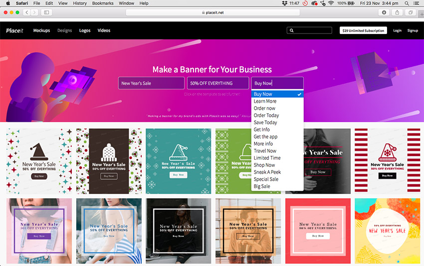
Enter your text in the Heading, Subtitle, and Call to Action bars. Notice that if you can’t come up with a call to action, this online ad creator provides a number of prompts for you. 
Online Banner Maker

As an example, I’ve entered information for a New Year Sale for a fictitious clothing shop client. As you can see in the image below, all the banner templates update with the information I’ve added.

Online Banner Maker

3. Select a Banner Design Template

Peruse the banner ad templates, and when you see a banner design you like and that is appropriate for your business, double-click on it. This will open it up in the custom banner maker.

Online Banner Maker

4. Customise Your Banner Template 

Starting with the controls on the left and working your way down from the top, you can modify your text and change the font style and colour to match your brand. I’m happy with the font style as it matches the brand of my fictitious client, but I changed the colour from red to orange to match their brand. 

Now let’s move to the controls on the right and work from the top. Remember earlier I mentioned that there were four ad banner dimensions that according to Google AdSense work the best? Well, at the very top right of the custom banner maker, you can change your ad banner dimensions from the default 1080x1080px to any dimension you require. I changed mine to the medium rectangle size of 300×250px. 

I then changed the colour of the lines sandwiching „New Year’s Sale”. I changed the button design and colour again to correspond with my fictional client’s brand. I kept the image of the model for the same reason—it corresponded with my client’s brand image. 

Online Banner Maker

Scrolling down the page, you have two additional options. If you get stuck while you’re customising your design, you can try one of the presets on offer. They are all different versions of the banner template you chose and can help you see how your template would look with different settings applied. 

Online Banner Maker

Alternatively, just below the presets, you can see your selected colours and text applied to different banner design templates for more design inspiration.

Online Banner Maker

5. Download Your Banner Design

Once you’re satisfied with your design, hit the Download button at the top of the screen and download your banner design for a small fee. Alternatively, if you regularly need to create ad banners, flyers, posters, social media banners etc., then the monthly plan may be the best deal for you.

Online Banner Maker

20 Best Banner Design Templates

Now that you know how easy it is to use the online banner maker, these 20 best web banner designs will get you even more excited about creating your own banner. 

1. Home Design Store Banner Ad Maker

Home Design Store Banner Ad Maker

Customise this gorgeous Home Design Store Banner Ad Maker template by uploading photos from your own home design portfolio and promote your business on websites your ideal customers frequent. The template offers all sorts of features like beautiful gradient overlays and fantastic frames for dividing up the banner space in different ways. 

2. Banner Generator for Wedding Planners

Home Design Store Banner Ad Maker

Capture the romance and whimsy of a wedding with the Banner Generator for Wedding Planners. The template offers beautiful photos and graphics, and you can even change the dimensions to fit perfectly in Instagram posts. 

3. Online Banner Maker for Discount Eyewear

Online Banner Maker for Discount Eyewear

Use this funky web banner design to entice customers to pop on over to your online eyewear shop and browse your merchandise. The template uses playful illustrations of frames and loads of cool graphics, and it even offers a space to add a promotion code. 

4. Banner Maker for Grocery Stores

Banner Maker for Grocery Stores

Whether you’re selling eggs, meat, or fresh fruit and vegetables, the Banner Maker for Grocery Stores template offers an exciting array of alluring images to hook your potential customers. Combine them with the wonderful hand-drawn icons and the large array of stylish and modern fonts on offer, and you have everything you need to create a knock-out web banner design.

5. Ad Banner Maker for an Online Clothing Sale

Ad Banner Maker for an Online Clothing Sale

A great half-page banner template, the Ad Banner Maker for an Online Clothing Sale template is perfect for showing off your clothing photos and creating a bold modern banner for any website.

6. Banner Maker for Furniture Store Promo Codes

Banner Maker for Furniture Store Promo Codes

The Banner Maker for Furniture Store Promo Codes uses a minimalist approach to web banner design. Using a strong, appealing photo, a beautiful cursive font in the header, and a bold, modern font for the call to action button, the template is an ode to the power of simplicity. 

7. Online Banner Maker for Ice Cream Shops

Online Banner Maker for Ice Cream Shops

If you run an ice-cream business, this is the banner template for you, but really it’s also a great web banner design for any number of businesses. Select one of their tantalising images or upload one of your own, promise a giveaway, and watch the customers roll in. 

8. Summer Online Banner Maker

Summer Online Banner Maker

Summer Online Banner Maker is a light and playful banner template that uses illustration and fun background elements to reference the joy of summer while enticing visitors to click the call to action button and join the fun.  

9. Home Care Online Banner Maker

Home Care Online Banner Maker

Looking for a great banner template to drum up business for a home care business? Check out the Home Care Online Banner Maker template. It’s simple, customisable, and can also be adapted to create a social media banner. 

10. Ad Banner Template for Furniture Store Giveaway

Ad Banner Template for Furniture Store Giveaway

Another excellent furniture store banner template from the banner generator, Ad Banner Template for Furniture Store Giveaway is an elegant, eye-catching way to grab your prospective clients’ attention, thanks to its prominent image overlaid with creative fonts.

11. Online Banner Ad Maker for Travel Agency

Online Banner Ad Maker for Travel Agency

The banner you create for your travel agency needs to inspire wanderlust. The Online Banner Ad Maker for Travel Agency template will do just that with its choice of beautiful images from around the world. It’s easy to customise with your brand fonts and colours using the super online banner maker controls.

12. Camera Giveaway Ad Banner Make

Camera Giveaway Ad Banner Make

Another great example of a half-page banner template, the Camera Giveaway Ad Banner Maker uses images of a range of cameras and lenses. And, of course, the banner creator helps you modify your template so that it’ll be ready to add to your ad campaign in no time. 

13. Ad Banner Creator for Store Sales

Ad Banner Creator for Store Sales

With its cool black and white images and strong modern fonts, this ad banner uses a very specific aesthetic to communicate polish and sophistication. Ad Banner Creator for Store Sales is a great banner template for brands that sell classic and timeless clothing. 

14. Custom Promotional Online Banner Maker

Custom Promotional Online Banner Maker

Another great banner template that uses fabulous illustration and playful text, Custom Promotional Online Banner Maker is a great reminder that offering stuff for free is a great way to get clicks. Just make sure that the freebie is an example of the fantastic products you offer, and you’ll probably gain a loyal customer.

15. Vertical Online Banner Maker

 Vertical Online Banner Maker

A great way to attract clicks is to ask more questions than you answer. Is this a conceptual art piece? Am I going to get an extra 30% off a cool piece of furniture or a ginormous pink balloon? How could you not click to find out? 

16. Minimal Discount Online Banner Maker

Minimal Discount Online Banner Maker

Minimal Discount Online Banner Maker carries minimalism to the next level. The web banner design rests heavily on the magnetism of the images provided (or the images you upload) and the power of one large badge that rests in the lower right corner of the banner. This badge acts as the banner’s text box and button as well. You can add your header text or a call to action, but whatever you do, make it irresistible.

17. Ad Maker for Art Supplies Shop

Ad Maker for Art Supplies Shop

Promoting your art supply business online is a cinch with the Ad Maker for Art Supplies Shop template. The template offers lots of fun art-inspired graphics, and you can make it as colourful and playful as you like.

18. Black Friday Sales Online Banner Template

Black Friday Sales Online Banner Template

Another great banner ad template that uses gorgeous black and white photos and strong modern text, Black Friday Sales Online Banner Template is a clean and alluring template that your target audience won’t be able to resist. 

19. Christmas Sale Ad Generator

Christmas Sale Ad Generator

Since Christmas comes every year, it’s always a good idea to have the Christmas Sale Ad Generator template on standby for when you need it. It’s a versatile template that can be used for a wide variety of businesses and customised to reflect your particular brand. 

20. 50% Off Shoes Ad Banner Template

50 Off Shoes Ad Banner Template

A beautifully designed banner targeting shoe shops but ideal for a variety of merchandise, the wonderful 50% Off Shoes Ad Banner Template is a joy to use. You can add photos of your own merchandise, change the background colour of the right side of the banner, and add a wide variety of fun graphics and effects or upload your own. 

More Terrific Banner Design Templates

Now let’s move to the second great resource for web banner design, Envato Elements

These banner ad templates are more suitable for those who have some knowledge of Adobe Photoshop and Illustrator. If that’s you then head on over to Elements and take a look at their terrific banner templates. Here are just a few to whet your appetite. 

Corporate Banners

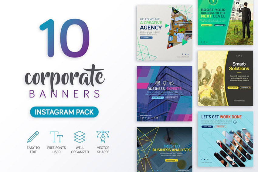
This eye-catching collection of corporate banner design templates is perfect for small and medium businesses who may not have a budget to hire a designer. The pack contains 10 creative layouts designed with Adobe Photoshop. The layered PSD files are easy to customise with editable text and fully scalable vector shapes. 
Banner Ad Templates

New Year Offer Ad Banner

This collection of 25 banner ad templates is designed to fit Google’s recommended sizes for online ad banners. The PSD files are provided in well-organised layers for easy and targeted customisation. The templates also use smart objects and vector shapes that can be scaled and customised to fit your needs. A really versatile and useful collection. 

Banner Ad Templates

Web Design Banner Ads

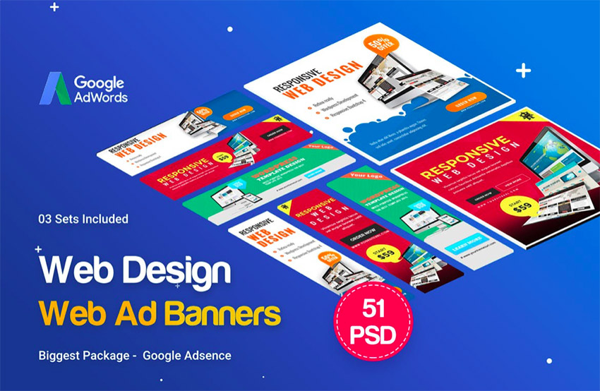
These three sets of web banner design templates contain three of the four most successful standard banner sizes—the half page, leaderboard, and large rectangle—which can be scaled down to fulfil the fourth most successful standard banner size, the medium rectangle. As is the case with all the templates found at Envato Elements, the PSD files contained in the template can all be customised to suit your needs.
Banner Ad Templates

These are just a small sample of the thousands of web banner designs to be found at Envato Elements, and you can download as many as you like for one affordable price. What’s also great is that the price also gives you access to thousands of other creative graphics and templates that you can also use as often as you like. Now that’s a deal that’s hard to beat!

Select Your Favourite Custom Banner Maker 

This is just a small sample of the terrific banner templates you can customise and download at both Placeit and Envato Elements. If you haven’t found just the right one for you here, head on over to both sites and have a browse. I just know there’s a web banner design there you can use to take your business to the heights you and it deserve. And be sure to let us know what you think of our list and if you’ve found a banner template you just can’t do without. Looking forward to hearing all about it. 

By the way, if you’re looking for a YouTube channel banner template, a Facebook banner template, or any other social media banner template, check out last week’s article, 20+ Social Media Image Maker Templates for Instagram, Facebook + More. Have a read—you won’t be disappointed. 

20+ Online Ad Banner (Maker) Template Designs to Customise Now

Post pobrano z: 20+ Online Ad Banner (Maker) Template Designs to Customise Now

If you’re just getting into online advertising or hoping to boost your online traffic with better advertisements, ad banners are the way to go. 

Ad banners are currently one of the most ubiquitous forms of marketing used on the internet. Companies use them for everything from raising their brand profile to increasing engagement, announcing discounts, and promoting products. They provide an affordable, effective and measurable method to successfully target your ideal audience.  

But what exactly is an ad banner? An ad banner, also called a banner ad or a web banner, is essentially an advertisement consisting of an image with text or a multimedia object that is displayed on a selected web page. It works in much the same way as a physical banner alerting you to a discount on a specific product in a store would entice you to take a closer look and maybe buy the product. 

The sole purpose of an ad banner, therefore, is to catch the eye of visitors on a host website and get them interested enough to click the ad banner, which will take them to the advertiser’s website where the advertiser will try to close the deal. 

7 Components of a Compelling Banner Design

Compelling Web Banner Design

The million dollar question, then, is how do you create a web banner that will attract your ideal customer/client and cause them to click through to your website? First, you need to understand what makes a successful ad banner. 

Before I begin, I want to remind you to KISS. That’s right, Keep It Simple Sunshine. Newbies to design often labour under the mistaken notion that they need to add loads of stuff to make their design effective. But with all design, including ad banner design, your best strategy should be to use a few key elements well. Remember, viewers are probably only going to glance at your web banner for a nanosecond, so you need to focus on making a few elements stand out rather than packing your ad with everything but the kitchen sink.

1. Get Your Dimensions Right 

According to Google AdSense, the most successful standard banner sizes are:

  • 728×90px — Leaderboard
  • 300×600px — Half Page
  • 336×280px — Large Rectangle
  • 300×250px — Medium Rectangle
Top performing ad sizes from Google

We’ll talk about this a bit more later, but for now it’s something for you to be aware of and keep in mind. 

2. Incorporate Your Brand 

Your ad banner is an extension of your company, so its design should be consistent with your company’s brand identity. This means you need to build an ad banner that incorporates your company’s logo, font styles, colour scheme and general style so that when your prospective client/customer clicks through from the ad banner to the dedicated landing page you’ve created for your offer, they’ll feel confident that they’re in the right place because the two will match each other.

3. Make Your Heading the Centre of Attention 

Your ad banner heading needs to be the first thing that your target audience will see, so it’s got to catch their attention with its colour, size, and message. At first glance, it should tell your audience what your ad is about, and it should entice them to keep reading, e.g. „Valentine’s Day Sale”.

4. Use Subtitles Smartly 

This is not always necessary, but if you use secondary text, it should be smaller or a lighter font weight than your heading text, easily readable, and less than ten words. It should give just enough information to get the readers interested and leave them wanting more, e.g. „50% off all items”.

Compelling Banner Design

5. A Picture Is Worth a Thousand Words 

Of course, this doesn’t mean you always have to use images, but if you do, they should be beautiful, luscious images that complement your message and are relevant to your product. 

6. Don’t Forget a 'Call to Action’ Button 

Every banner needs a 'call to action’ button. This is a button with text like ‘Buy Now’, ‘Shop Now’, ‘Enter to win’, etc. that makes the reader act by clicking the button. 

7. Smaller Is Better  

… when it comes to the size of your files, that is. According to Google Ads, your ad file needs to be under 150 KB so that it loads fast on the page before viewers scroll down and miss it entirely. 

Use an Online Banner Maker 

Now, the next thing you need to consider is how to put these elements all together to create an effective design. 

This can be a tall order if you’re not a seasoned designer, but don’t worry—we’ve got two great resources for all you novices out there to help you make the perfect ad banner. These will also work for seasoned designers who need to turn over a project quickly and don’t have the time to create a design from scratch. 

The first is a terrific banner maker app by Placeit. 

Online Banner Maker

This online banner generator offers hundreds of affordable banner design templates that help you make compelling banners quickly and painlessly. But the thing I love the most about this ad creator is that you can enter your headline, subtitle and call to action in the header, and the banner maker app will show you how your specific text looks on all the banner design templates on offer. Totally cool and amazing! Let me show you what I mean. 

How to Use Banner Design Templates

Let’s say you want to create a stunning ad banner design to advertise a New Year’s Sale. All you need to do is follow these simple steps to have your own great banner ready in minutes.

1. Navigate to the Banner Maker at Placeit. 

Sign up for FREE!

2. Fill in the Text Bars at the Top of the Page 

Enter your text in the Heading, Subtitle, and Call to Action bars. Notice that if you can’t come up with a call to action, this online ad creator provides a number of prompts for you. 

Online Banner Maker

As an example, I’ve entered information for a New Year Sale for a fictitious clothing shop client. As you can see in the image below, all the banner templates update with the information I’ve added.

Online Banner Maker

3. Select a Banner Design Template

Peruse the banner ad templates, and when you see a banner design you like and that is appropriate for your business, double-click on it. This will open it up in the custom banner maker.

Online Banner Maker

4. Customise Your Banner Template 

Starting with the controls on the left and working your way down from the top, you can modify your text and change the font style and colour to match your brand. I’m happy with the font style as it matches the brand of my fictitious client, but I changed the colour from red to orange to match their brand. 

Now let’s move to the controls on the right and work from the top. Remember earlier I mentioned that there were four ad banner dimensions that according to Google AdSense work the best? Well, at the very top right of the custom banner maker, you can change your ad banner dimensions from the default 1080x1080px to any dimension you require. I changed mine to the medium rectangle size of 300×250px. 

I then changed the colour of the lines sandwiching „New Year’s Sale”. I changed the button design and colour again to correspond with my fictional client’s brand. I kept the image of the model for the same reason—it corresponded with my client’s brand image. 

Online Banner Maker

Scrolling down the page, you have two additional options. If you get stuck while you’re customising your design, you can try one of the presets on offer. They are all different versions of the banner template you chose and can help you see how your template would look with different settings applied. 

Online Banner Maker

Alternatively, just below the presets, you can see your selected colours and text applied to different banner design templates for more design inspiration.

Online Banner Maker

5. Download Your Banner Design

Once you’re satisfied with your design, hit the Download button at the top of the screen and download your banner design for a small fee. Alternatively, if you regularly need to create ad banners, flyers, posters, social media banners etc., then the monthly plan may be the best deal for you.

Online Banner Maker

20 Best Banner Design Templates

Now that you know how easy it is to use the online banner maker, these 20 best web banner designs will get you even more excited about creating your own banner. 

1. Home Design Store Banner Ad Maker

Home Design Store Banner Ad Maker

Customise this gorgeous Home Design Store Banner Ad Maker template by uploading photos from your own home design portfolio and promote your business on websites your ideal customers frequent. The template offers all sorts of features like beautiful gradient overlays and fantastic frames for dividing up the banner space in different ways. 

2. Banner Generator for Wedding Planners

Home Design Store Banner Ad Maker

Capture the romance and whimsy of a wedding with the Banner Generator for Wedding Planners. The template offers beautiful photos and graphics, and you can even change the dimensions to fit perfectly in Instagram posts. 

3. Online Banner Maker for Discount Eyewear

Online Banner Maker for Discount Eyewear

Use this funky web banner design to entice customers to pop on over to your online eyewear shop and browse your merchandise. The template uses playful illustrations of frames and loads of cool graphics, and it even offers a space to add a promotion code. 

4. Banner Maker for Grocery Stores

Banner Maker for Grocery Stores

Whether you’re selling eggs, meat, or fresh fruit and vegetables, the Banner Maker for Grocery Stores template offers an exciting array of alluring images to hook your potential customers. Combine them with the wonderful hand-drawn icons and the large array of stylish and modern fonts on offer, and you have everything you need to create a knock-out web banner design.

5. Ad Banner Maker for an Online Clothing Sale

Ad Banner Maker for an Online Clothing Sale

A great half-page banner template, the Ad Banner Maker for an Online Clothing Sale template is perfect for showing off your clothing photos and creating a bold modern banner for any website.

6. Banner Maker for Furniture Store Promo Codes

Banner Maker for Furniture Store Promo Codes

The Banner Maker for Furniture Store Promo Codes uses a minimalist approach to web banner design. Using a strong, appealing photo, a beautiful cursive font in the header, and a bold, modern font for the call to action button, the template is an ode to the power of simplicity. 

7. Online Banner Maker for Ice Cream Shops

Online Banner Maker for Ice Cream Shops

If you run an ice-cream business, this is the banner template for you, but really it’s also a great web banner design for any number of businesses. Select one of their tantalising images or upload one of your own, promise a giveaway, and watch the customers roll in. 

8. Summer Online Banner Maker

Summer Online Banner Maker

Summer Online Banner Maker is a light and playful banner template that uses illustration and fun background elements to reference the joy of summer while enticing visitors to click the call to action button and join the fun.  

9. Home Care Online Banner Maker

Home Care Online Banner Maker

Looking for a great banner template to drum up business for a home care business? Check out the Home Care Online Banner Maker template. It’s simple, customisable, and can also be adapted to create a social media banner. 

10. Ad Banner Template for Furniture Store Giveaway

Ad Banner Template for Furniture Store Giveaway

Another excellent furniture store banner template from the banner generator, Ad Banner Template for Furniture Store Giveaway is an elegant, eye-catching way to grab your prospective clients’ attention, thanks to its prominent image overlaid with creative fonts.

11. Online Banner Ad Maker for Travel Agency

Online Banner Ad Maker for Travel Agency

The banner you create for your travel agency needs to inspire wanderlust. The Online Banner Ad Maker for Travel Agency template will do just that with its choice of beautiful images from around the world. It’s easy to customise with your brand fonts and colours using the super online banner maker controls.

12. Camera Giveaway Ad Banner Make

Camera Giveaway Ad Banner Make

Another great example of a half-page banner template, the Camera Giveaway Ad Banner Maker uses images of a range of cameras and lenses. And, of course, the banner creator helps you modify your template so that it’ll be ready to add to your ad campaign in no time. 

13. Ad Banner Creator for Store Sales

Ad Banner Creator for Store Sales

With its cool black and white images and strong modern fonts, this ad banner uses a very specific aesthetic to communicate polish and sophistication. Ad Banner Creator for Store Sales is a great banner template for brands that sell classic and timeless clothing. 

14. Custom Promotional Online Banner Maker

Custom Promotional Online Banner Maker

Another great banner template that uses fabulous illustration and playful text, Custom Promotional Online Banner Maker is a great reminder that offering stuff for free is a great way to get clicks. Just make sure that the freebie is an example of the fantastic products you offer, and you’ll probably gain a loyal customer.

15. Vertical Online Banner Maker

 Vertical Online Banner Maker

A great way to attract clicks is to ask more questions than you answer. Is this a conceptual art piece? Am I going to get an extra 30% off a cool piece of furniture or a ginormous pink balloon? How could you not click to find out? 

16. Minimal Discount Online Banner Maker

Minimal Discount Online Banner Maker

Minimal Discount Online Banner Maker carries minimalism to the next level. The web banner design rests heavily on the magnetism of the images provided (or the images you upload) and the power of one large badge that rests in the lower right corner of the banner. This badge acts as the banner’s text box and button as well. You can add your header text or a call to action, but whatever you do, make it irresistible.

17. Ad Maker for Art Supplies Shop

Ad Maker for Art Supplies Shop

Promoting your art supply business online is a cinch with the Ad Maker for Art Supplies Shop template. The template offers lots of fun art-inspired graphics, and you can make it as colourful and playful as you like.

18. Black Friday Sales Online Banner Template

Black Friday Sales Online Banner Template

Another great banner ad template that uses gorgeous black and white photos and strong modern text, Black Friday Sales Online Banner Template is a clean and alluring template that your target audience won’t be able to resist. 

19. Christmas Sale Ad Generator

Christmas Sale Ad Generator

Since Christmas comes every year, it’s always a good idea to have the Christmas Sale Ad Generator template on standby for when you need it. It’s a versatile template that can be used for a wide variety of businesses and customised to reflect your particular brand. 

20. 50% Off Shoes Ad Banner Template

50 Off Shoes Ad Banner Template

A beautifully designed banner targeting shoe shops but ideal for a variety of merchandise, the wonderful 50% Off Shoes Ad Banner Template is a joy to use. You can add photos of your own merchandise, change the background colour of the right side of the banner, and add a wide variety of fun graphics and effects or upload your own. 

More Terrific Banner Design Templates

Now let’s move to the second great resource for web banner design, Envato Elements

These banner ad templates are more suitable for those who have some knowledge of Adobe Photoshop and Illustrator. If that’s you then head on over to Elements and take a look at their terrific banner templates. Here are just a few to whet your appetite. 

Corporate Banners

This eye-catching collection of corporate banner design templates is perfect for small and medium businesses who may not have a budget to hire a designer. The pack contains 10 creative layouts designed with Adobe Photoshop. The layered PSD files are easy to customise with editable text and fully scalable vector shapes. 

Banner Ad Templates

New Year Offer Ad Banner

This collection of 25 banner ad templates is designed to fit Google’s recommended sizes for online ad banners. The PSD files are provided in well-organised layers for easy and targeted customisation. The templates also use smart objects and vector shapes that can be scaled and customised to fit your needs. A really versatile and useful collection. 

Banner Ad Templates

Web Design Banner Ads

These three sets of web banner design templates contain three of the four most successful standard banner sizes—the half page, leaderboard, and large rectangle—which can be scaled down to fulfil the fourth most successful standard banner size, the medium rectangle. As is the case with all the templates found at Envato Elements, the PSD files contained in the template can all be customised to suit your needs.

Banner Ad Templates

These are just a small sample of the thousands of web banner designs to be found at Envato Elements, and you can download as many as you like for one affordable price. What’s also great is that the price also gives you access to thousands of other creative graphics and templates that you can also use as often as you like. Now that’s a deal that’s hard to beat!

Select Your Favourite Custom Banner Maker 

This is just a small sample of the terrific banner templates you can customise and download at both Placeit and Envato Elements. If you haven’t found just the right one for you here, head on over to both sites and have a browse. I just know there’s a web banner design there you can use to take your business to the heights you and it deserve. And be sure to let us know what you think of our list and if you’ve found a banner template you just can’t do without. Looking forward to hearing all about it. 

By the way, if you’re looking for a YouTube channel banner template, a Facebook banner template, or any other social media banner template, check out last week’s article, 20+ Social Media Image Maker Templates for Instagram, Facebook + More. Have a read—you won’t be disappointed. 

20+ Online Ad Banner (Maker) Template Designs to Customise Now

Post pobrano z: 20+ Online Ad Banner (Maker) Template Designs to Customise Now

If you’re just getting into online advertising or hoping to boost your online traffic with better advertisements, ad banners are the way to go. 

Ad banners are currently one of the most ubiquitous forms of marketing used on the internet. Companies use them for everything from raising their brand profile to increasing engagement, announcing discounts, and promoting products. They provide an affordable, effective and measurable method to successfully target your ideal audience.  

But what exactly is an ad banner? An ad banner, also called a banner ad or a web banner, is essentially an advertisement consisting of an image with text or a multimedia object that is displayed on a selected web page. It works in much the same way as a physical banner alerting you to a discount on a specific product in a store would entice you to take a closer look and maybe buy the product. 

The sole purpose of an ad banner, therefore, is to catch the eye of visitors on a host website and get them interested enough to click the ad banner, which will take them to the advertiser’s website where the advertiser will try to close the deal. 

7 Components of a Compelling Banner Design

Compelling Web Banner Design

The million dollar question, then, is how do you create a web banner that will attract your ideal customer/client and cause them to click through to your website? First, you need to understand what makes a successful ad banner. 

Before I begin, I want to remind you to KISS. That’s right, Keep It Simple Sunshine. Newbies to design often labour under the mistaken notion that they need to add loads of stuff to make their design effective. But with all design, including ad banner design, your best strategy should be to use a few key elements well. Remember, viewers are probably only going to glance at your web banner for a nanosecond, so you need to focus on making a few elements stand out rather than packing your ad with everything but the kitchen sink.

1. Get Your Dimensions Right 

According to Google AdSense, the most successful standard banner sizes are:

  • 728×90px — Leaderboard
  • 300×600px — Half Page
  • 336×280px — Large Rectangle
  • 300×250px — Medium Rectangle
Top performing ad sizes from Google

We’ll talk about this a bit more later, but for now it’s something for you to be aware of and keep in mind. 

2. Incorporate Your Brand 

Your ad banner is an extension of your company, so its design should be consistent with your company’s brand identity. This means you need to build an ad banner that incorporates your company’s logo, font styles, colour scheme and general style so that when your prospective client/customer clicks through from the ad banner to the dedicated landing page you’ve created for your offer, they’ll feel confident that they’re in the right place because the two will match each other.

3. Make Your Heading the Centre of Attention 

Your ad banner heading needs to be the first thing that your target audience will see, so it’s got to catch their attention with its colour, size, and message. At first glance, it should tell your audience what your ad is about, and it should entice them to keep reading, e.g. „Valentine’s Day Sale”.

4. Use Subtitles Smartly 

This is not always necessary, but if you use secondary text, it should be smaller or a lighter font weight than your heading text, easily readable, and less than ten words. It should give just enough information to get the readers interested and leave them wanting more, e.g. „50% off all items”.

Compelling Banner Design

5. A Picture Is Worth a Thousand Words 

Of course, this doesn’t mean you always have to use images, but if you do, they should be beautiful, luscious images that complement your message and are relevant to your product. 

6. Don’t Forget a 'Call to Action’ Button 

Every banner needs a 'call to action’ button. This is a button with text like ‘Buy Now’, ‘Shop Now’, ‘Enter to win’, etc. that makes the reader act by clicking the button. 

7. Smaller Is Better  

… when it comes to the size of your files, that is. According to Google Ads, your ad file needs to be under 150 KB so that it loads fast on the page before viewers scroll down and miss it entirely. 

Use an Online Banner Maker 

Now, the next thing you need to consider is how to put these elements all together to create an effective design. 

This can be a tall order if you’re not a seasoned designer, but don’t worry—we’ve got two great resources for all you novices out there to help you make the perfect ad banner. These will also work for seasoned designers who need to turn over a project quickly and don’t have the time to create a design from scratch. 

The first is a terrific banner maker app by Placeit. 

Online Banner Maker

This online banner generator offers hundreds of affordable banner design templates that help you make compelling banners quickly and painlessly. But the thing I love the most about this ad creator is that you can enter your headline, subtitle and call to action in the header, and the banner maker app will show you how your specific text looks on all the banner design templates on offer. Totally cool and amazing! Let me show you what I mean. 

How to Use Banner Design Templates

Let’s say you want to create a stunning ad banner design to advertise a New Year’s Sale. All you need to do is follow these simple steps to have your own great banner ready in minutes.

1. Navigate to the Banner Maker at Placeit. 

Sign up for FREE!

2. Fill in the Text Bars at the Top of the Page 

Enter your text in the Heading, Subtitle, and Call to Action bars. Notice that if you can’t come up with a call to action, this online ad creator provides a number of prompts for you. 

Online Banner Maker

As an example, I’ve entered information for a New Year Sale for a fictitious clothing shop client. As you can see in the image below, all the banner templates update with the information I’ve added.

Online Banner Maker

3. Select a Banner Design Template

Peruse the banner ad templates, and when you see a banner design you like and that is appropriate for your business, double-click on it. This will open it up in the custom banner maker.

Online Banner Maker

4. Customise Your Banner Template 

Starting with the controls on the left and working your way down from the top, you can modify your text and change the font style and colour to match your brand. I’m happy with the font style as it matches the brand of my fictitious client, but I changed the colour from red to orange to match their brand. 

Now let’s move to the controls on the right and work from the top. Remember earlier I mentioned that there were four ad banner dimensions that according to Google AdSense work the best? Well, at the very top right of the custom banner maker, you can change your ad banner dimensions from the default 1080x1080px to any dimension you require. I changed mine to the medium rectangle size of 300×250px. 

I then changed the colour of the lines sandwiching „New Year’s Sale”. I changed the button design and colour again to correspond with my fictional client’s brand. I kept the image of the model for the same reason—it corresponded with my client’s brand image. 

Online Banner Maker

Scrolling down the page, you have two additional options. If you get stuck while you’re customising your design, you can try one of the presets on offer. They are all different versions of the banner template you chose and can help you see how your template would look with different settings applied. 

Online Banner Maker

Alternatively, just below the presets, you can see your selected colours and text applied to different banner design templates for more design inspiration.

Online Banner Maker

5. Download Your Banner Design

Once you’re satisfied with your design, hit the Download button at the top of the screen and download your banner design for a small fee. Alternatively, if you regularly need to create ad banners, flyers, posters, social media banners etc., then the monthly plan may be the best deal for you.

Online Banner Maker

20 Best Banner Design Templates

Now that you know how easy it is to use the online banner maker, these 20 best web banner designs will get you even more excited about creating your own banner. 

1. Home Design Store Banner Ad Maker

Home Design Store Banner Ad Maker

Customise this gorgeous Home Design Store Banner Ad Maker template by uploading photos from your own home design portfolio and promote your business on websites your ideal customers frequent. The template offers all sorts of features like beautiful gradient overlays and fantastic frames for dividing up the banner space in different ways. 

2. Banner Generator for Wedding Planners

Home Design Store Banner Ad Maker

Capture the romance and whimsy of a wedding with the Banner Generator for Wedding Planners. The template offers beautiful photos and graphics, and you can even change the dimensions to fit perfectly in Instagram posts. 

3. Online Banner Maker for Discount Eyewear

Online Banner Maker for Discount Eyewear

Use this funky web banner design to entice customers to pop on over to your online eyewear shop and browse your merchandise. The template uses playful illustrations of frames and loads of cool graphics, and it even offers a space to add a promotion code. 

4. Banner Maker for Grocery Stores

Banner Maker for Grocery Stores

Whether you’re selling eggs, meat, or fresh fruit and vegetables, the Banner Maker for Grocery Stores template offers an exciting array of alluring images to hook your potential customers. Combine them with the wonderful hand-drawn icons and the large array of stylish and modern fonts on offer, and you have everything you need to create a knock-out web banner design.

5. Ad Banner Maker for an Online Clothing Sale

Ad Banner Maker for an Online Clothing Sale

A great half-page banner template, the Ad Banner Maker for an Online Clothing Sale template is perfect for showing off your clothing photos and creating a bold modern banner for any website.

6. Banner Maker for Furniture Store Promo Codes

Banner Maker for Furniture Store Promo Codes

The Banner Maker for Furniture Store Promo Codes uses a minimalist approach to web banner design. Using a strong, appealing photo, a beautiful cursive font in the header, and a bold, modern font for the call to action button, the template is an ode to the power of simplicity. 

7. Online Banner Maker for Ice Cream Shops

Online Banner Maker for Ice Cream Shops

If you run an ice-cream business, this is the banner template for you, but really it’s also a great web banner design for any number of businesses. Select one of their tantalising images or upload one of your own, promise a giveaway, and watch the customers roll in. 

8. Summer Online Banner Maker

Summer Online Banner Maker

Summer Online Banner Maker is a light and playful banner template that uses illustration and fun background elements to reference the joy of summer while enticing visitors to click the call to action button and join the fun.  

9. Home Care Online Banner Maker

Home Care Online Banner Maker

Looking for a great banner template to drum up business for a home care business? Check out the Home Care Online Banner Maker template. It’s simple, customisable, and can also be adapted to create a social media banner. 

10. Ad Banner Template for Furniture Store Giveaway

Ad Banner Template for Furniture Store Giveaway

Another excellent furniture store banner template from the banner generator, Ad Banner Template for Furniture Store Giveaway is an elegant, eye-catching way to grab your prospective clients’ attention, thanks to its prominent image overlaid with creative fonts.

11. Online Banner Ad Maker for Travel Agency

Online Banner Ad Maker for Travel Agency

The banner you create for your travel agency needs to inspire wanderlust. The Online Banner Ad Maker for Travel Agency template will do just that with its choice of beautiful images from around the world. It’s easy to customise with your brand fonts and colours using the super online banner maker controls.

12. Camera Giveaway Ad Banner Make

Camera Giveaway Ad Banner Make

Another great example of a half-page banner template, the Camera Giveaway Ad Banner Maker uses images of a range of cameras and lenses. And, of course, the banner creator helps you modify your template so that it’ll be ready to add to your ad campaign in no time. 

13. Ad Banner Creator for Store Sales

Ad Banner Creator for Store Sales

With its cool black and white images and strong modern fonts, this ad banner uses a very specific aesthetic to communicate polish and sophistication. Ad Banner Creator for Store Sales is a great banner template for brands that sell classic and timeless clothing. 

14. Custom Promotional Online Banner Maker

Custom Promotional Online Banner Maker

Another great banner template that uses fabulous illustration and playful text, Custom Promotional Online Banner Maker is a great reminder that offering stuff for free is a great way to get clicks. Just make sure that the freebie is an example of the fantastic products you offer, and you’ll probably gain a loyal customer.

15. Vertical Online Banner Maker

 Vertical Online Banner Maker

A great way to attract clicks is to ask more questions than you answer. Is this a conceptual art piece? Am I going to get an extra 30% off a cool piece of furniture or a ginormous pink balloon? How could you not click to find out? 

16. Minimal Discount Online Banner Maker

Minimal Discount Online Banner Maker

Minimal Discount Online Banner Maker carries minimalism to the next level. The web banner design rests heavily on the magnetism of the images provided (or the images you upload) and the power of one large badge that rests in the lower right corner of the banner. This badge acts as the banner’s text box and button as well. You can add your header text or a call to action, but whatever you do, make it irresistible.

17. Ad Maker for Art Supplies Shop

Ad Maker for Art Supplies Shop

Promoting your art supply business online is a cinch with the Ad Maker for Art Supplies Shop template. The template offers lots of fun art-inspired graphics, and you can make it as colourful and playful as you like.

18. Black Friday Sales Online Banner Template

Black Friday Sales Online Banner Template

Another great banner ad template that uses gorgeous black and white photos and strong modern text, Black Friday Sales Online Banner Template is a clean and alluring template that your target audience won’t be able to resist. 

19. Christmas Sale Ad Generator

Christmas Sale Ad Generator

Since Christmas comes every year, it’s always a good idea to have the Christmas Sale Ad Generator template on standby for when you need it. It’s a versatile template that can be used for a wide variety of businesses and customised to reflect your particular brand. 

20. 50% Off Shoes Ad Banner Template

50 Off Shoes Ad Banner Template

A beautifully designed banner targeting shoe shops but ideal for a variety of merchandise, the wonderful 50% Off Shoes Ad Banner Template is a joy to use. You can add photos of your own merchandise, change the background colour of the right side of the banner, and add a wide variety of fun graphics and effects or upload your own. 

More Terrific Banner Design Templates

Now let’s move to the second great resource for web banner design, Envato Elements

These banner ad templates are more suitable for those who have some knowledge of Adobe Photoshop and Illustrator. If that’s you then head on over to Elements and take a look at their terrific banner templates. Here are just a few to whet your appetite. 

Corporate Banners

This eye-catching collection of corporate banner design templates is perfect for small and medium businesses who may not have a budget to hire a designer. The pack contains 10 creative layouts designed with Adobe Photoshop. The layered PSD files are easy to customise with editable text and fully scalable vector shapes. 

Banner Ad Templates

New Year Offer Ad Banner

This collection of 25 banner ad templates is designed to fit Google’s recommended sizes for online ad banners. The PSD files are provided in well-organised layers for easy and targeted customisation. The templates also use smart objects and vector shapes that can be scaled and customised to fit your needs. A really versatile and useful collection. 

Banner Ad Templates

Web Design Banner Ads

These three sets of web banner design templates contain three of the four most successful standard banner sizes—the half page, leaderboard, and large rectangle—which can be scaled down to fulfil the fourth most successful standard banner size, the medium rectangle. As is the case with all the templates found at Envato Elements, the PSD files contained in the template can all be customised to suit your needs.

Banner Ad Templates

These are just a small sample of the thousands of web banner designs to be found at Envato Elements, and you can download as many as you like for one affordable price. What’s also great is that the price also gives you access to thousands of other creative graphics and templates that you can also use as often as you like. Now that’s a deal that’s hard to beat!

Select Your Favourite Custom Banner Maker 

This is just a small sample of the terrific banner templates you can customise and download at both Placeit and Envato Elements. If you haven’t found just the right one for you here, head on over to both sites and have a browse. I just know there’s a web banner design there you can use to take your business to the heights you and it deserve. And be sure to let us know what you think of our list and if you’ve found a banner template you just can’t do without. Looking forward to hearing all about it. 

By the way, if you’re looking for a YouTube channel banner template, a Facebook banner template, or any other social media banner template, check out last week’s article, 20+ Social Media Image Maker Templates for Instagram, Facebook + More. Have a read—you won’t be disappointed. 

How to Turn a Photo Into Art by Creating a Painting Photoshop Action

Post pobrano z: How to Turn a Photo Into Art by Creating a Painting Photoshop Action

Final product image
What You’ll Be Creating

In this tutorial, you will learn how to turn a photo into art. I will explain everything in so much detail that everyone can create the effect, even those who have just opened Photoshop for the first time.

The effect shown above is the one I will show you how to create in this tutorial. If you would like to create the even more advanced photo art effect shown below, using just a single click and in only a few minutes, then check out my Paint Photoshop Action.

Action final result

What You’ll Need

To recreate the design above, you will need the following resources:

1. How to Start Creating an Action

Step 1

First, open the photo that you want to work with. To open your photo, go to File > Open, choose your photo, and click Open. Now, before we get started, just check a couple of things:

  1. Your photo should be in RGB Color mode, 8 Bits/Channel. To check this, go to Image > Mode.
  2. For best results, your photo size should be 2000–3500 px wide/high. To check this, go to Image > Image Size.
  3. Your photo should be the Background layer. If it is not, go to Layer > New > Background from Layer.
Checking image size and mode

Step 2

If you have changed the image size in the previous step, in the History panel, click on the camera icon to create a new snapshot. Then, set the Snapshot 1 as the source of the history brush tool.

Creating new snapshot

2. How to Create the Painting Effect

Step 1

In this section, we are going to create the painting effect. Go to Layer > New > Layer to create a new layer and name it Painting_Large_Details.

Creating new layer

Step 2

Now choose the Art History Brush Tool (Y), and set the Area to 500 px, Tolerance to 0 px, and Style to Tight Long. Then, pick a soft brush, set the Diameter to 20 px, and brush over the whole photo.

Brushing into layer

Step 3

Go to Layer > New > Layer to create a new layer and name it Painting_Large_Details.

Creating new layer

Step 4

Now choose the Art History Brush Tool (Y), and set the Area to 500 px, Tolerance to 0 px, and Style to Tight Long. Then, pick a soft brush, set the Diameter to 10 px, and brush over the whole photo.

Brushing into layer

Step 5

Go to Layer > Layer Mask > Hide All to add a layer mask that hides the whole layer.

Adding layer mask

Step 6

Now set the foreground color to #000000, choose the Brush Tool (B), pick a soft brush, and brush over the area where you want more details to appear. Feel free to use different brush sizes.

Brushing into layer mask

Step 7

Go to Layer > New > Layer to create a new layer and name it Painting_Small_Details.

Creating new layer

Step 8

Now choose the Art History Brush Tool (Y), and set the Area to 500 px, Tolerance to 0 px, and Style to Tight Long. Then, pick a soft brush, set the Diameter to 5 px, and brush over the whole photo.

Brushing into layer

Step 9

Go to Layer > Layer Mask > Hide All to add a layer mask that hides the whole layer.

Adding layer mask

Step 10

Now set the foreground color to #000000, choose the Brush Tool (B), pick a soft brush, and brush over the area where you want more details to appear. Feel free to use different brush sizes.

Brushing into mask

3. How to Create the Emboss Effect

Step 1

In this section, we are going to create the emboss effect. Press Control-Alt-Shift-E on your keyboard to make a screenshot, and then press Control-Shift-U to desaturate this layer.

Making screenshot

Step 2

Go to Filter > Stylize > Emboss and set the Angle to 135°, Height to 3 px, and Amount to 200%.

Adding emboss filter

Step 3

Now change the Blending Mode of this layer to Hard Light, and name it Emboss Effect.

Changing blending mode

You Made It!

Congratulations, you have succeeded! Here is our final result:

Final result

If you would like to create the even more advanced photo art effect
shown below, using just a single click and in only a few minutes, then
check out my Paint Photoshop Action.

The action will create amazing, realistic painting photo effects from your photos with no work at all from your side! You just open your photo and play the action. It’s really that simple! The action
will do all the work for you, leaving you fully layered and customizable
results that you can further modify.

The action also creates ten preset color looks and five overlay textures that you can
choose from.

The action comes with a detailed video tutorial that demonstrates how to use the action and customize the results to get the most out of the effect.

Action final result

You may also like:

How to Turn a Photo Into Art by Creating a Painting Photoshop Action

Post pobrano z: How to Turn a Photo Into Art by Creating a Painting Photoshop Action

Final product image
What You’ll Be Creating

In this tutorial, you will learn how to turn a photo into art. I will explain everything in so much detail that everyone can create the effect, even those who have just opened Photoshop for the first time.

The effect shown above is the one I will show you how to create in this tutorial. If you would like to create the even more advanced photo art effect shown below, using just a single click and in only a few minutes, then check out my Paint Photoshop Action.

Action final result

What You’ll Need

To recreate the design above, you will need the following resources:

1. How to Start Creating an Action

Step 1

First, open the photo that you want to work with. To open your photo, go to File > Open, choose your photo, and click Open. Now, before we get started, just check a couple of things:

  1. Your photo should be in RGB Color mode, 8 Bits/Channel. To check this, go to Image > Mode.
  2. For best results, your photo size should be 2000–3500 px wide/high. To check this, go to Image > Image Size.
  3. Your photo should be the Background layer. If it is not, go to Layer > New > Background from Layer.
Checking image size and mode

Step 2

If you have changed the image size in the previous step, in the History panel, click on the camera icon to create a new snapshot. Then, set the Snapshot 1 as the source of the history brush tool.

Creating new snapshot

2. How to Create the Painting Effect

Step 1

In this section, we are going to create the painting effect. Go to Layer > New > Layer to create a new layer and name it Painting_Large_Details.

Creating new layer

Step 2

Now choose the Art History Brush Tool (Y), and set the Area to 500 px, Tolerance to 0 px, and Style to Tight Long. Then, pick a soft brush, set the Diameter to 20 px, and brush over the whole photo.

Brushing into layer

Step 3

Go to Layer > New > Layer to create a new layer and name it Painting_Large_Details.

Creating new layer

Step 4

Now choose the Art History Brush Tool (Y), and set the Area to 500 px, Tolerance to 0 px, and Style to Tight Long. Then, pick a soft brush, set the Diameter to 10 px, and brush over the whole photo.

Brushing into layer

Step 5

Go to Layer > Layer Mask > Hide All to add a layer mask that hides the whole layer.

Adding layer mask

Step 6

Now set the foreground color to #000000, choose the Brush Tool (B), pick a soft brush, and brush over the area where you want more details to appear. Feel free to use different brush sizes.

Brushing into layer mask

Step 7

Go to Layer > New > Layer to create a new layer and name it Painting_Small_Details.

Creating new layer

Step 8

Now choose the Art History Brush Tool (Y), and set the Area to 500 px, Tolerance to 0 px, and Style to Tight Long. Then, pick a soft brush, set the Diameter to 5 px, and brush over the whole photo.

Brushing into layer

Step 9

Go to Layer > Layer Mask > Hide All to add a layer mask that hides the whole layer.

Adding layer mask

Step 10

Now set the foreground color to #000000, choose the Brush Tool (B), pick a soft brush, and brush over the area where you want more details to appear. Feel free to use different brush sizes.

Brushing into mask

3. How to Create the Emboss Effect

Step 1

In this section, we are going to create the emboss effect. Press Control-Alt-Shift-E on your keyboard to make a screenshot, and then press Control-Shift-U to desaturate this layer.

Making screenshot

Step 2

Go to Filter > Stylize > Emboss and set the Angle to 135°, Height to 3 px, and Amount to 200%.

Adding emboss filter

Step 3

Now change the Blending Mode of this layer to Hard Light, and name it Emboss Effect.

Changing blending mode

You Made It!

Congratulations, you have succeeded! Here is our final result:

Final result

If you would like to create the even more advanced photo art effect
shown below, using just a single click and in only a few minutes, then
check out my Paint Photoshop Action.

The action will create amazing, realistic painting photo effects from your photos with no work at all from your side! You just open your photo and play the action. It’s really that simple! The action
will do all the work for you, leaving you fully layered and customizable
results that you can further modify.

The action also creates ten preset color looks and five overlay textures that you can
choose from.

The action comes with a detailed video tutorial that demonstrates how to use the action and customize the results to get the most out of the effect.

Action final result

You may also like:

How to Make a Brochure

Post pobrano z: How to Make a Brochure

Brochures may be one of the oldest marketing tools, but they’re a tried and tested technique used by all sorts of businesses to reach potential customers. 

A poorly designed brochure might be tossed in the trash, but a creative and beautiful one will be kept and pored over and can directly lead to sales for the business.

brochure mockup
Bifold brochure mockup template

In this article, you’ll learn how to create a brochure that’s guaranteed to grab and hold someone’s attention. Read on to get to know your bifolds, trifolds and everything in-between.

Looking for a high-quality brochure template that’s ready to customise? You can find a huge range of stylish brochure design templates over on Envato Elements and GraphicRiver.

1. What Kind of Brochure Do I Need?

Before you start designing, hit pause and think about the kind of brochure that will suit your brief best. Some questions to consider:

  • What industry is the company operating in? 
  • Are there particular types of marketing campaign that work best in this industry, such as door-to-door sales, attending conventions, or showroom presentations? 

The format of your brochure should suit the marketing campaign perfectly. So, for example, a small, compact brochure design might work best for posting through front doors, but a more impressive booklet with a presentation folder might be more appropriate for conventions or showrooms.

folder mockup
Presentation folder mockup template

Make yourself familiar with the huge range of brochure formats that you could choose from (yep, there are a lot!). These are just a few of the more common formats:

Bifold

A bifold brochure is folded just once, down the spine. They are easy to make, and have a formal feel to them as they mimic the design of books or booklets.

Great for: Pretty much anything!

bi-fold brochure
fashion bifold template
Fashion bifold brochure template

Trifold

A trifold brochure has two parallel folds, splitting the brochure into three sections. Even when printed on low-weight paper, trifolds can stand up easily, which makes them a great choice for displaying at conventions. You can fold both folds inwards so that the left and right sections of the brochure sit on top of one another, or you can have one fold inwards and the other outwards, to create an accordion effect, which looks very attractive.

Great for: Companies on small budgets who want a brochure that still looks great on display.

tri-fold brochure
tri-fold brochure
start up trifold
Square start-up trifold brochure template

Booklets

The big daddy of the brochure world, a booklet is really a group of multiple bifold brochures bound together into a larger book-like format. Booklets are more expensive to print, but they can make a big impression. You will need to choose how to bind your booklet from a range of options, such as saddle stitching, perfect binding and spiral binding. Spiral binding is usually cheaper, but perfect binding or saddle stitching can make your booklet look much more polished and professional.

Great for: Big corporations who want a formal brochure design.

booklet mockup
case study booklet
Case study booklet template

Folders and Inserts

If you’re looking for something more formal without the bulk of a big booklet, consider creating a custom folder and an insert brochure, which is specifically designed to fit inside. This is a great choice for more corporate marketing events, and you can pop a business card inside too.

Great for: Educational organisations, like universities and schools, real estate firms, and companies attending conventions and industry events.

presentation folder
Presentation folder template

Flyers

Flyers are the simplest form of brochure, and the cheapest to produce. Flyers are usually simple, one-sheet promotions printed on low-weight paper. They are ideally suited for reaching the maximum number of potential customers, but they are also the most likely type of brochure to be thrown away.

Great for: Events, like music gigs, club nights, festivals and community meet-ups

Above all, you need to remember that brochures are a marketing tool, so even if you’ve just been tasked with the design of the brochure, you need to have some idea of how the brochure is going to be used. Brush up on your marketing design skills with Nicki Hart’s course on Print Marketing Design

corporate flyer
Corporate business flyer template

2. Allow for Folds in Your Design

Unless you’re designing a one-page flyer, your brochure will have to be folded in some way, whether that’s as a bifold, trifold or something more complex. Folds can be tricky to accommodate, but they can also enhance your design if you set them up in the correct way.

modern trifold brochure
Modern trifold brochure template

Because you’ll be initially designing your brochure as a 2D, flat layout, you need to make sure that the final brochure is going to look just as good when it’s printed and folded. 

Before you start designing on the computer, it’s a great idea to put together a rough mock-up that you can scribble on and fold. This doesn’t necessarily need to be true to size—a smaller-scale version will still give you a good idea of where content should be placed. 

If you’re going to be printing on a medium- or heavy-weight paper, like a thick paper or card, you also need to consider that a fold can make the margins around it appear narrower, even if by just a millimeter or so. Experiment with folding different weights of paper to get a good idea of how the fold will behave—it may be a good idea to increase the margins around folds by an extra millimeter or two. 

Tip: If you’re creating a trifold brochure (which has two folds on a page, effectively ‘splitting’ the brochure into three parts), make sure you double the margin space across a fold. If you include the same margin as you do around the edge of the page, the fold will slice the margin width in half, giving the layout a cramped, uneven appearance once folded.

Folds have the ability to conceal and reveal selectively. This means you can design a brochure that has multiple different ‘looks’, depending on how the brochure is folded, and whether it is open or closed. 

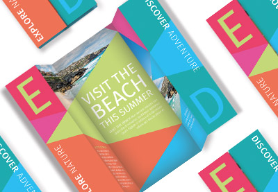
Take a look at the layout for this folded tourism brochure: 

layout with fold lines

This brochure was created in CorelDRAW as a 2D layout. You can see how when the brochure is closed, the outside sections are drawn together, and the typography and triangular shapes have been designed to match each other.

When the brochure is opened up, the outside sections are drawn apart, revealing a different design. The triangular shapes still work together seamlessly whether the brochure is opened or closed.

folded brochure

Creating a rough mock-up will help you to visualise how these different fold combinations will affect the look of your brochure. Take my word for it, it’s well worth doing this before you begin designing on the computer!

Whether you’re using Adobe InDesign, Photoshop or CorelDRAW, pull out guidelines from the workspace’s rulers to define the fold lines without the need to print them. 

layout with fold guides

A printer might find it helpful if you also leave short lines on the bleed (if you’re supplying a print-ready PDF) or pasteboard (if you’re sending them the original artwork) to indicate where the brochure should be folded. 

3. Think Outside the Box

Unlike other printed items like books, magazines and posters, brochures are often seen as being instantly disposable by the reader. Because they are cheaply produced, brochures are rarely seen as something to be treasured, and more often than not end up in the trash soon after delivery to market.

How can you make sure that your flyer doesn’t instantly end up in landfill? Well, you need to think outside of the box and make your design really creative and eye-catching. 

One way of doing this is to make your brochure into an unusual format or shape that people will want to keep. This folded city guide is a great example of how to condense a lot of information into a format that tightly folds up and can easily be slotted into someone’s back pocket. 

It’s cute, practical and non-obtrusive—great qualities to aim for in your own brochure designs.

expanded city map

Why not try adapting the layout of this city map to your own brochure content? Giving your brochure an additional use, such as featuring a map or a calendar, is going to ensure that your brochure hangs around for longer in someone’s possession too.

A simple fold technique to try that looks really effective is a French fold:

french fold

This results in a compact brochure that actually has a very simple one-sheet layout at its core. It’s the perfect way to get lots of information onto your brochure while keeping the design pocket-friendly. 

You can also look into unusual print finishes to give your brochure an edge—metallic foiling or laser cutting might be more pricey, but they can be worth investing in to make sure your brochure translates into sales or attendees. 

4. Be Bold!

A brochure is no place to be shy—to grab someone’s attention quickly, you need to create a bold, in-your-face design. Brochures may be smaller than posters, but headings and images should be blown up much larger than you would normally think. 

Focus on making the cover of your brochure (the side that is visible when the brochure is closed) as bold as possible, and focus on formatting the graphics and typography for maximum impact. 

fashion catalog
Fashion catalog brochure template

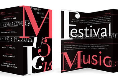
Take inspiration from this typographic brochure design—the event details inside the brochure may be at normal reading size, but the title of the event has been blown up to fill the whole cover. 

Bright, bold color is also a great way to attract attention. 

colored flyer bbq

Rainbow-inspired colors, like the ones used on this BBQ flyer, are instantly optimistic, sunny and cheerful, making the reader feel positive about the brochure. 

A lit-up effect, made by contrasting pale or neon colors against a darker background, instantly draws the eye and has a glamorous, exciting look which is perfect for advertising after-dark events.

new year flyer
New Year’s Eve flyer template

Think big and bold with your brochure designs. It might be useful to print out a draft of your brochure and place it 5 meters or so away from you—does it still stand out to the eye, or could you make some elements look even more striking? A successful brochure is one that will be spotted from afar, hold a reader’s attention and be picked up, so maximizing the size and impact of your typography, colors and graphics will help your brochure to really stand out. Go big or go home!

5. Meet Your New Best Friend…

Everybody has their own preference for the software they like to use for designing brochures, whether that’s Adobe Photoshop, Quark or CorelDRAW. But if you really want to create an ultra-professional brochure layout, you need to make very good friends with Adobe InDesign.

indesign logo

As the resident InDesign writer here at Envato Tuts+, I am admittedly biased. But InDesign really does allow you to create any sort of brochure, and produce it to a very high standard. Here are just a few reasons why you should set up your brochure layout in InDesign:

  • It’s optimised for print design—setting the Intent of your document to Print will allow you to design in CMYK color, and you can also use the Preflight function to identify low-resolution images or stray RGB swatches. 
  • You can do the fiddly stuff with ease—creating multi-page layouts, applying die lines and instructing them to Overprint, rotating pages… it’s all possible with InDesign.
  • Printing mock-ups of your brochures is a breeze with the Print Booklet feature in InDesign. Discover how to use the function with this tutorial:

This isn’t to say that you can’t use other programs to set up your brochure layouts, but just to point out that InDesign is ideally suited to the task, and can make the whole job a lot easier and smoother.

If you want to get started with learning the basics of Adobe InDesign, check out our selection of 30 quick and simple tutorials:

Or why not let Nicki Hart guide you through the process of designing booklets in Adobe InDesign?

6. Let’s Get Practical!

When you set up your brochure in InDesign, you need to think carefully about the practical elements of the design. 

We’ve already touched on the need to accommodate folds, but you also need to think about the rotation of content—will some sections of the brochure need to be rotated a different way to work in the right way once folded? If the brochure is two-sided, you also need to make sure that the sides will match up in the right way once the brochure’s been printed. As I’ve already stressed, a rough mock-up is the best way to iron out these problems and get your head around the final 3D format of the brochure.

bifold brochure
Bifold brochure mockup template

If you’re designing a lengthier brochure, like a booklet, you also need to consider how your page count will work out. Booklets should be made up of groups of four pages, so your final page count should be divisible by four

To avoid being left with extra blank pages at the end of your booklet, you need to remember that each sheet of paper will be folded in half, creating four actual pages—two on the reverse side and two on the front.

Adobe InDesign makes this easier for you as you can set up a Facing Pages layout, creating a sequence of reader’s spreads (these are how the reader will actually see the booklet once it’s printed and bound). The number of pages is easy to track using the Pages panel (Window > Pages).

You can also view how the Imposition process (whereby the printer rearranges your pages to make the printing and binding process easier) would play out by using the Print Booklet function (File > Print Booklet > Preview).

print booklet function

Still feeling confused about the practicalities of designing booklets? Take ten minutes to check out this helpful tutorial on page counts:

7. Understand Your Printing Choices

Once you have your brochure artwork set up and refined, you’re ready to export it for printing.

You can provide your brochure artwork to a professional printer as either a print-ready PDF (make sure all Bleeds and necessary Printer’s Marks are included on a Press-Quality PDF) or as a ‘native’ file (this is the artwork in its original format, such as a packaged InDesign INDD file). Your printer may prefer one or the other, so make sure to ask them in advance.

export adobe pdf press quality

It’s a good idea to have a basic understanding of the print process, and the various finishes and techniques that can affect the final look of your brochure. Some important things to consider are:

  • The Paper Weight—Brochures can be printed on a range of paper weights. Lower weights are cheaper, and they can look and feel lower quality as a result. For more formal brochures and booklets, heavier weights will look better, but they will also cost more. You can ask your printer for paper samples before you make a decision.
  • The Paper Finish—Paper finishes fall into two main categories: Coated and Uncoated. Uncoated paper feels a bit smoother and stronger than standard copy paper. Coated paper falls into two sub-groups: Matte-coated and Gloss-coated. Matte-coated gives a smooth, non-glossy finish and can give your print documents a modern, pared-back look. Gloss-coated paper is smooth, with a slightly reflective finish, giving your documents a glossy, high-end look. Because the ink sits on the surface of the coating, rather than being absorbed into the paper, colors appear more vibrant and rich. You should choose the paper finish that’s going to be the most suitable for your brochure—keep in mind that even though gloss finishes can be pricey, they don’t always look as modern as matte finishes.
  • Post-Print Techniques—If you’ve designed a brochure with many folds, multiple pages that need to be bound, or intricate die lines, you should expect the post-print process to be longer and costlier. Make sure you get a quote from your printer for both the print and post-print jobs before you hand over your artwork to avoid nasty shocks (or days of folding brochures by hand!).

If you have a basic understanding of the print process, you’ll feel much more confident that your final brochure will look as good in hard copy as it does on your screen. Read up on all the essentials of preparing your artwork for print with this useful beginner’s guide:

Go Forth and Design Fantastic Brochures!

In this article, we’ve looked at seven key steps to designing and producing beautiful, striking, print-ready booklets. 

fashion bifold brochure
Fashion bifold brochure template

Let’s recap this checklist, and keep it to hand for future brochure design projects.

  • Decide on the kind of brochure you need—brochures are designed to be used as part of a marketing campaign and the brochure format needs to be perfectly adapted to the sort of campaign. Would a flyer work better for door-to-door? Would a trifold look great on display? Would a booklet be more appropriate for a convention or conference?
  • Allow for folds in your artwork—all brochures, except flyers, will need to be folded in some way. Because you’ll be designing your artwork in a 2D format, make use of mock-ups to test out how folds will affect your design.
  • Think outside the box­—Unusual folds or multi-purpose designs can make your brochure look unique and special, which will encourage readers to keep hold of it. 
  • Be bold—strong, large-scale typography and bright, eye-catching color and graphics will make your brochure more visible from afar and help it to stand out from the crowd.
  • Adobe InDesign is your new best friend—for designing print-friendly multi-page layouts like booklets, you can’t go wrong with using InDesign.
  • Think about the practicalities—take the time to adjust the page count of your booklet, or to switch the orientation of content on a brochure that’s going to be folded. Again, using a printed mock-up can be really helpful to get your head around the tricky technicalities. 
  • Understand your printing choices—paper weights and finishes, and post-print techniques, such as binding and folding, will affect the final look of your brochure and will have a significant impact on the cost of producing it too, so make sure you have an awareness of what you can expect before you approach a professional printer.

You can find a huge range of InDesign brochure templates over on Envato Elements and GraphicRiver. Discover some of our favorite picks below:

Modern architecture brochure

Looking for a bright and colorful brochure template design? This modern and funky style could be adapted for photographers, illustrators or interior designers. 

modern brochure
Modern architecture brochure template

Creative agency portfolio brochure

This landscape brochure template has a simple, punchy style with a single color accent. Perfect for showcasing portfolio work or photos to their best potential. 

creative agency
Creative agency portfolio brochure

Minimal brochure template

The pared-back, Scandinavian-inspired style of this simple brochure template makes it a versatile choice for a variety of industries and purposes. 

minimal template
Minimal brochure template

Company profile brochure template

Looking for a fresh, colorful design for your brochure? This square brochure template has an app-inspired design which gives the pages an optimistic, youthful look. 

company profile
Company profile square brochure template

How to Make a Brochure

Post pobrano z: How to Make a Brochure

Brochures may be one of the oldest marketing tools, but they’re a tried and tested technique used by all sorts of businesses to reach potential customers. 

A poorly designed brochure might be tossed in the trash, but a creative and beautiful one will be kept and pored over and can directly lead to sales for the business.

brochure mockup
Bifold brochure mockup template

In this article, you’ll learn how to create a brochure that’s guaranteed to grab and hold someone’s attention. Read on to get to know your bifolds, trifolds and everything in-between.

Looking for a high-quality brochure template that’s ready to customise? You can find a huge range of stylish brochure design templates over on Envato Elements and GraphicRiver.

1. What Kind of Brochure Do I Need?

Before you start designing, hit pause and think about the kind of brochure that will suit your brief best. Some questions to consider:

  • What industry is the company operating in? 
  • Are there particular types of marketing campaign that work best in this industry, such as door-to-door sales, attending conventions, or showroom presentations? 

The format of your brochure should suit the marketing campaign perfectly. So, for example, a small, compact brochure design might work best for posting through front doors, but a more impressive booklet with a presentation folder might be more appropriate for conventions or showrooms.

folder mockup
Presentation folder mockup template

Make yourself familiar with the huge range of brochure formats that you could choose from (yep, there are a lot!). These are just a few of the more common formats:

Bifold

A bifold brochure is folded just once, down the spine. They are easy to make, and have a formal feel to them as they mimic the design of books or booklets.

Great for: Pretty much anything!

bi-fold brochure
fashion bifold template
Fashion bifold brochure template

Trifold

A trifold brochure has two parallel folds, splitting the brochure into three sections. Even when printed on low-weight paper, trifolds can stand up easily, which makes them a great choice for displaying at conventions. You can fold both folds inwards so that the left and right sections of the brochure sit on top of one another, or you can have one fold inwards and the other outwards, to create an accordion effect, which looks very attractive.

Great for: Companies on small budgets who want a brochure that still looks great on display.

tri-fold brochure
tri-fold brochure
start up trifold
Square start-up trifold brochure template

Booklets

The big daddy of the brochure world, a booklet is really a group of multiple bifold brochures bound together into a larger book-like format. Booklets are more expensive to print, but they can make a big impression. You will need to choose how to bind your booklet from a range of options, such as saddle stitching, perfect binding and spiral binding. Spiral binding is usually cheaper, but perfect binding or saddle stitching can make your booklet look much more polished and professional.

Great for: Big corporations who want a formal brochure design.

booklet mockup
case study booklet
Case study booklet template

Folders and Inserts

If you’re looking for something more formal without the bulk of a big booklet, consider creating a custom folder and an insert brochure, which is specifically designed to fit inside. This is a great choice for more corporate marketing events, and you can pop a business card inside too.

Great for: Educational organisations, like universities and schools, real estate firms, and companies attending conventions and industry events.

presentation folder
Presentation folder template

Flyers

Flyers are the simplest form of brochure, and the cheapest to produce. Flyers are usually simple, one-sheet promotions printed on low-weight paper. They are ideally suited for reaching the maximum number of potential customers, but they are also the most likely type of brochure to be thrown away.

Great for: Events, like music gigs, club nights, festivals and community meet-ups

Above all, you need to remember that brochures are a marketing tool, so even if you’ve just been tasked with the design of the brochure, you need to have some idea of how the brochure is going to be used. Brush up on your marketing design skills with Nicki Hart’s course on Print Marketing Design

corporate flyer
Corporate business flyer template

2. Allow for Folds in Your Design

Unless you’re designing a one-page flyer, your brochure will have to be folded in some way, whether that’s as a bifold, trifold or something more complex. Folds can be tricky to accommodate, but they can also enhance your design if you set them up in the correct way.

modern trifold brochure
Modern trifold brochure template

Because you’ll be initially designing your brochure as a 2D, flat layout, you need to make sure that the final brochure is going to look just as good when it’s printed and folded. 

Before you start designing on the computer, it’s a great idea to put together a rough mock-up that you can scribble on and fold. This doesn’t necessarily need to be true to size—a smaller-scale version will still give you a good idea of where content should be placed. 

If you’re going to be printing on a medium- or heavy-weight paper, like a thick paper or card, you also need to consider that a fold can make the margins around it appear narrower, even if by just a millimeter or so. Experiment with folding different weights of paper to get a good idea of how the fold will behave—it may be a good idea to increase the margins around folds by an extra millimeter or two. 

Tip: If you’re creating a trifold brochure (which has two folds on a page, effectively ‘splitting’ the brochure into three parts), make sure you double the margin space across a fold. If you include the same margin as you do around the edge of the page, the fold will slice the margin width in half, giving the layout a cramped, uneven appearance once folded.

Folds have the ability to conceal and reveal selectively. This means you can design a brochure that has multiple different ‘looks’, depending on how the brochure is folded, and whether it is open or closed. 

Take a look at the layout for this folded tourism brochure: 

layout with fold lines

This brochure was created in CorelDRAW as a 2D layout. You can see how when the brochure is closed, the outside sections are drawn together, and the typography and triangular shapes have been designed to match each other.

When the brochure is opened up, the outside sections are drawn apart, revealing a different design. The triangular shapes still work together seamlessly whether the brochure is opened or closed.

folded brochure

Creating a rough mock-up will help you to visualise how these different fold combinations will affect the look of your brochure. Take my word for it, it’s well worth doing this before you begin designing on the computer!

Whether you’re using Adobe InDesign, Photoshop or CorelDRAW, pull out guidelines from the workspace’s rulers to define the fold lines without the need to print them. 

layout with fold guides

A printer might find it helpful if you also leave short lines on the bleed (if you’re supplying a print-ready PDF) or pasteboard (if you’re sending them the original artwork) to indicate where the brochure should be folded. 

3. Think Outside the Box

Unlike other printed items like books, magazines and posters, brochures are often seen as being instantly disposable by the reader. Because they are cheaply produced, brochures are rarely seen as something to be treasured, and more often than not end up in the trash soon after delivery to market.

How can you make sure that your flyer doesn’t instantly end up in landfill? Well, you need to think outside of the box and make your design really creative and eye-catching. 

One way of doing this is to make your brochure into an unusual format or shape that people will want to keep. This folded city guide is a great example of how to condense a lot of information into a format that tightly folds up and can easily be slotted into someone’s back pocket. 

It’s cute, practical and non-obtrusive—great qualities to aim for in your own brochure designs.

expanded city map

Why not try adapting the layout of this city map to your own brochure content? Giving your brochure an additional use, such as featuring a map or a calendar, is going to ensure that your brochure hangs around for longer in someone’s possession too.

A simple fold technique to try that looks really effective is a French fold:

french fold

This results in a compact brochure that actually has a very simple one-sheet layout at its core. It’s the perfect way to get lots of information onto your brochure while keeping the design pocket-friendly. 

You can also look into unusual print finishes to give your brochure an edge—metallic foiling or laser cutting might be more pricey, but they can be worth investing in to make sure your brochure translates into sales or attendees. 

4. Be Bold!

A brochure is no place to be shy—to grab someone’s attention quickly, you need to create a bold, in-your-face design. Brochures may be smaller than posters, but headings and images should be blown up much larger than you would normally think. 

Focus on making the cover of your brochure (the side that is visible when the brochure is closed) as bold as possible, and focus on formatting the graphics and typography for maximum impact. 

fashion catalog
Fashion catalog brochure template

Take inspiration from this typographic brochure design—the event details inside the brochure may be at normal reading size, but the title of the event has been blown up to fill the whole cover. 

Bright, bold color is also a great way to attract attention. 

colored flyer bbq

Rainbow-inspired colors, like the ones used on this BBQ flyer, are instantly optimistic, sunny and cheerful, making the reader feel positive about the brochure. 

A lit-up effect, made by contrasting pale or neon colors against a darker background, instantly draws the eye and has a glamorous, exciting look which is perfect for advertising after-dark events.

new year flyer
New Year’s Eve flyer template

Think big and bold with your brochure designs. It might be useful to print out a draft of your brochure and place it 5 meters or so away from you—does it still stand out to the eye, or could you make some elements look even more striking? A successful brochure is one that will be spotted from afar, hold a reader’s attention and be picked up, so maximizing the size and impact of your typography, colors and graphics will help your brochure to really stand out. Go big or go home!

5. Meet Your New Best Friend…

Everybody has their own preference for the software they like to use for designing brochures, whether that’s Adobe Photoshop, Quark or CorelDRAW. But if you really want to create an ultra-professional brochure layout, you need to make very good friends with Adobe InDesign.

indesign logo

As the resident InDesign writer here at Envato Tuts+, I am admittedly biased. But InDesign really does allow you to create any sort of brochure, and produce it to a very high standard. Here are just a few reasons why you should set up your brochure layout in InDesign:

  • It’s optimised for print design—setting the Intent of your document to Print will allow you to design in CMYK color, and you can also use the Preflight function to identify low-resolution images or stray RGB swatches. 
  • You can do the fiddly stuff with ease—creating multi-page layouts, applying die lines and instructing them to Overprint, rotating pages… it’s all possible with InDesign.
  • Printing mock-ups of your brochures is a breeze with the Print Booklet feature in InDesign. Discover how to use the function with this tutorial:

This isn’t to say that you can’t use other programs to set up your brochure layouts, but just to point out that InDesign is ideally suited to the task, and can make the whole job a lot easier and smoother.

If you want to get started with learning the basics of Adobe InDesign, check out our selection of 30 quick and simple tutorials:

Or why not let Nicki Hart guide you through the process of designing booklets in Adobe InDesign?

6. Let’s Get Practical!

When you set up your brochure in InDesign, you need to think carefully about the practical elements of the design. 

We’ve already touched on the need to accommodate folds, but you also need to think about the rotation of content—will some sections of the brochure need to be rotated a different way to work in the right way once folded? If the brochure is two-sided, you also need to make sure that the sides will match up in the right way once the brochure’s been printed. As I’ve already stressed, a rough mock-up is the best way to iron out these problems and get your head around the final 3D format of the brochure.

bifold brochure
Bifold brochure mockup template

If you’re designing a lengthier brochure, like a booklet, you also need to consider how your page count will work out. Booklets should be made up of groups of four pages, so your final page count should be divisible by four

To avoid being left with extra blank pages at the end of your booklet, you need to remember that each sheet of paper will be folded in half, creating four actual pages—two on the reverse side and two on the front.

Adobe InDesign makes this easier for you as you can set up a Facing Pages layout, creating a sequence of reader’s spreads (these are how the reader will actually see the booklet once it’s printed and bound). The number of pages is easy to track using the Pages panel (Window > Pages).

You can also view how the Imposition process (whereby the printer rearranges your pages to make the printing and binding process easier) would play out by using the Print Booklet function (File > Print Booklet > Preview).

print booklet function

Still feeling confused about the practicalities of designing booklets? Take ten minutes to check out this helpful tutorial on page counts:

7. Understand Your Printing Choices

Once you have your brochure artwork set up and refined, you’re ready to export it for printing.

You can provide your brochure artwork to a professional printer as either a print-ready PDF (make sure all Bleeds and necessary Printer’s Marks are included on a Press-Quality PDF) or as a ‘native’ file (this is the artwork in its original format, such as a packaged InDesign INDD file). Your printer may prefer one or the other, so make sure to ask them in advance.

export adobe pdf press quality

It’s a good idea to have a basic understanding of the print process, and the various finishes and techniques that can affect the final look of your brochure. Some important things to consider are:

  • The Paper Weight—Brochures can be printed on a range of paper weights. Lower weights are cheaper, and they can look and feel lower quality as a result. For more formal brochures and booklets, heavier weights will look better, but they will also cost more. You can ask your printer for paper samples before you make a decision.
  • The Paper Finish—Paper finishes fall into two main categories: Coated and Uncoated. Uncoated paper feels a bit smoother and stronger than standard copy paper. Coated paper falls into two sub-groups: Matte-coated and Gloss-coated. Matte-coated gives a smooth, non-glossy finish and can give your print documents a modern, pared-back look. Gloss-coated paper is smooth, with a slightly reflective finish, giving your documents a glossy, high-end look. Because the ink sits on the surface of the coating, rather than being absorbed into the paper, colors appear more vibrant and rich. You should choose the paper finish that’s going to be the most suitable for your brochure—keep in mind that even though gloss finishes can be pricey, they don’t always look as modern as matte finishes.
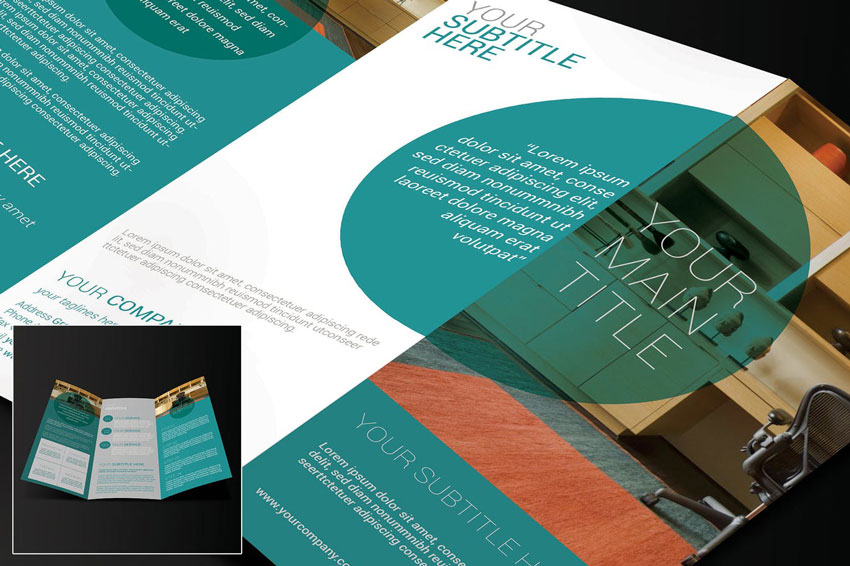
  • Post-Print Techniques—If you’ve designed a brochure with many folds, multiple pages that need to be bound, or intricate die lines, you should expect the post-print process to be longer and costlier. Make sure you get a quote from your printer for both the print and post-print jobs before you hand over your artwork to avoid nasty shocks (or days of folding brochures by hand!).

If you have a basic understanding of the print process, you’ll feel much more confident that your final brochure will look as good in hard copy as it does on your screen. Read up on all the essentials of preparing your artwork for print with this useful beginner’s guide:

Go Forth and Design Fantastic Brochures!

In this article, we’ve looked at seven key steps to designing and producing beautiful, striking, print-ready booklets. 

fashion bifold brochure
Fashion bifold brochure template

Let’s recap this checklist, and keep it to hand for future brochure design projects.

  • Decide on the kind of brochure you need—brochures are designed to be used as part of a marketing campaign and the brochure format needs to be perfectly adapted to the sort of campaign. Would a flyer work better for door-to-door? Would a trifold look great on display? Would a booklet be more appropriate for a convention or conference?
  • Allow for folds in your artwork—all brochures, except flyers, will need to be folded in some way. Because you’ll be designing your artwork in a 2D format, make use of mock-ups to test out how folds will affect your design.
  • Think outside the box­—Unusual folds or multi-purpose designs can make your brochure look unique and special, which will encourage readers to keep hold of it. 
  • Be bold—strong, large-scale typography and bright, eye-catching color and graphics will make your brochure more visible from afar and help it to stand out from the crowd.
  • Adobe InDesign is your new best friend—for designing print-friendly multi-page layouts like booklets, you can’t go wrong with using InDesign.
  • Think about the practicalities—take the time to adjust the page count of your booklet, or to switch the orientation of content on a brochure that’s going to be folded. Again, using a printed mock-up can be really helpful to get your head around the tricky technicalities. 
  • Understand your printing choices—paper weights and finishes, and post-print techniques, such as binding and folding, will affect the final look of your brochure and will have a significant impact on the cost of producing it too, so make sure you have an awareness of what you can expect before you approach a professional printer.

You can find a huge range of InDesign brochure templates over on Envato Elements and GraphicRiver. Discover some of our favorite picks below:

Modern architecture brochure

Looking for a bright and colorful brochure template design? This modern and funky style could be adapted for photographers, illustrators or interior designers. 

modern brochure
Modern architecture brochure template

Creative agency portfolio brochure

This landscape brochure template has a simple, punchy style with a single color accent. Perfect for showcasing portfolio work or photos to their best potential. 

creative agency
Creative agency portfolio brochure

Minimal brochure template

The pared-back, Scandinavian-inspired style of this simple brochure template makes it a versatile choice for a variety of industries and purposes. 

minimal template
Minimal brochure template

Company profile brochure template

Looking for a fresh, colorful design for your brochure? This square brochure template has an app-inspired design which gives the pages an optimistic, youthful look. 

company profile
Company profile square brochure template

How to Make a Brochure

Post pobrano z: How to Make a Brochure

Brochures may be one of the oldest marketing tools, but they’re a tried and tested technique used by all sorts of businesses to reach potential customers. 

A poorly designed brochure might be tossed in the trash, but a creative and beautiful one will be kept and pored over and can directly lead to sales for the business.

brochure mockup
Bifold brochure mockup template

In this article, you’ll learn how to create a brochure that’s guaranteed to grab and hold someone’s attention. Read on to get to know your bifolds, trifolds and everything in-between.

Looking for a high-quality brochure template that’s ready to customise? You can find a huge range of stylish brochure design templates over on Envato Elements and GraphicRiver.

1. What Kind of Brochure Do I Need?

Before you start designing, hit pause and think about the kind of brochure that will suit your brief best. Some questions to consider:

  • What industry is the company operating in? 
  • Are there particular types of marketing campaign that work best in this industry, such as door-to-door sales, attending conventions, or showroom presentations? 

The format of your brochure should suit the marketing campaign perfectly. So, for example, a small, compact brochure design might work best for posting through front doors, but a more impressive booklet with a presentation folder might be more appropriate for conventions or showrooms.

folder mockup
Presentation folder mockup template

Make yourself familiar with the huge range of brochure formats that you could choose from (yep, there are a lot!). These are just a few of the more common formats:

Bifold

A bifold brochure is folded just once, down the spine. They are easy to make, and have a formal feel to them as they mimic the design of books or booklets.

Great for: Pretty much anything!

bi-fold brochure
fashion bifold template
Fashion bifold brochure template

Trifold

A trifold brochure has two parallel folds, splitting the brochure into three sections. Even when printed on low-weight paper, trifolds can stand up easily, which makes them a great choice for displaying at conventions. You can fold both folds inwards so that the left and right sections of the brochure sit on top of one another, or you can have one fold inwards and the other outwards, to create an accordion effect, which looks very attractive.

Great for: Companies on small budgets who want a brochure that still looks great on display.

tri-fold brochure
tri-fold brochure
start up trifold
Square start-up trifold brochure template

Booklets

The big daddy of the brochure world, a booklet is really a group of multiple bifold brochures bound together into a larger book-like format. Booklets are more expensive to print, but they can make a big impression. You will need to choose how to bind your booklet from a range of options, such as saddle stitching, perfect binding and spiral binding. Spiral binding is usually cheaper, but perfect binding or saddle stitching can make your booklet look much more polished and professional.

Great for: Big corporations who want a formal brochure design.

booklet mockup
case study booklet
Case study booklet template

Folders and Inserts

If you’re looking for something more formal without the bulk of a big booklet, consider creating a custom folder and an insert brochure, which is specifically designed to fit inside. This is a great choice for more corporate marketing events, and you can pop a business card inside too.

Great for: Educational organisations, like universities and schools, real estate firms, and companies attending conventions and industry events.

presentation folder
Presentation folder template

Flyers

Flyers are the simplest form of brochure, and the cheapest to produce. Flyers are usually simple, one-sheet promotions printed on low-weight paper. They are ideally suited for reaching the maximum number of potential customers, but they are also the most likely type of brochure to be thrown away.

Great for: Events, like music gigs, club nights, festivals and community meet-ups

Above all, you need to remember that brochures are a marketing tool, so even if you’ve just been tasked with the design of the brochure, you need to have some idea of how the brochure is going to be used. Brush up on your marketing design skills with Nicki Hart’s course on Print Marketing Design

corporate flyer
Corporate business flyer template

2. Allow for Folds in Your Design

Unless you’re designing a one-page flyer, your brochure will have to be folded in some way, whether that’s as a bifold, trifold or something more complex. Folds can be tricky to accommodate, but they can also enhance your design if you set them up in the correct way.

modern trifold brochure
Modern trifold brochure template

Because you’ll be initially designing your brochure as a 2D, flat layout, you need to make sure that the final brochure is going to look just as good when it’s printed and folded. 

Before you start designing on the computer, it’s a great idea to put together a rough mock-up that you can scribble on and fold. This doesn’t necessarily need to be true to size—a smaller-scale version will still give you a good idea of where content should be placed. 

If you’re going to be printing on a medium- or heavy-weight paper, like a thick paper or card, you also need to consider that a fold can make the margins around it appear narrower, even if by just a millimeter or so. Experiment with folding different weights of paper to get a good idea of how the fold will behave—it may be a good idea to increase the margins around folds by an extra millimeter or two. 

Tip: If you’re creating a trifold brochure (which has two folds on a page, effectively ‘splitting’ the brochure into three parts), make sure you double the margin space across a fold. If you include the same margin as you do around the edge of the page, the fold will slice the margin width in half, giving the layout a cramped, uneven appearance once folded.

Folds have the ability to conceal and reveal selectively. This means you can design a brochure that has multiple different ‘looks’, depending on how the brochure is folded, and whether it is open or closed. 

Take a look at the layout for this folded tourism brochure: 

layout with fold lines

This brochure was created in CorelDRAW as a 2D layout. You can see how when the brochure is closed, the outside sections are drawn together, and the typography and triangular shapes have been designed to match each other.

When the brochure is opened up, the outside sections are drawn apart, revealing a different design. The triangular shapes still work together seamlessly whether the brochure is opened or closed.

folded brochure

Creating a rough mock-up will help you to visualise how these different fold combinations will affect the look of your brochure. Take my word for it, it’s well worth doing this before you begin designing on the computer!

Whether you’re using Adobe InDesign, Photoshop or CorelDRAW, pull out guidelines from the workspace’s rulers to define the fold lines without the need to print them. 

layout with fold guides

A printer might find it helpful if you also leave short lines on the bleed (if you’re supplying a print-ready PDF) or pasteboard (if you’re sending them the original artwork) to indicate where the brochure should be folded. 

3. Think Outside the Box

Unlike other printed items like books, magazines and posters, brochures are often seen as being instantly disposable by the reader. Because they are cheaply produced, brochures are rarely seen as something to be treasured, and more often than not end up in the trash soon after delivery to market.

How can you make sure that your flyer doesn’t instantly end up in landfill? Well, you need to think outside of the box and make your design really creative and eye-catching. 

One way of doing this is to make your brochure into an unusual format or shape that people will want to keep. This folded city guide is a great example of how to condense a lot of information into a format that tightly folds up and can easily be slotted into someone’s back pocket. 

It’s cute, practical and non-obtrusive—great qualities to aim for in your own brochure designs.

expanded city map

Why not try adapting the layout of this city map to your own brochure content? Giving your brochure an additional use, such as featuring a map or a calendar, is going to ensure that your brochure hangs around for longer in someone’s possession too.

A simple fold technique to try that looks really effective is a French fold:

french fold

This results in a compact brochure that actually has a very simple one-sheet layout at its core. It’s the perfect way to get lots of information onto your brochure while keeping the design pocket-friendly. 

You can also look into unusual print finishes to give your brochure an edge—metallic foiling or laser cutting might be more pricey, but they can be worth investing in to make sure your brochure translates into sales or attendees. 

4. Be Bold!

A brochure is no place to be shy—to grab someone’s attention quickly, you need to create a bold, in-your-face design. Brochures may be smaller than posters, but headings and images should be blown up much larger than you would normally think. 

Focus on making the cover of your brochure (the side that is visible when the brochure is closed) as bold as possible, and focus on formatting the graphics and typography for maximum impact. 

fashion catalog
Fashion catalog brochure template

Take inspiration from this typographic brochure design—the event details inside the brochure may be at normal reading size, but the title of the event has been blown up to fill the whole cover. 

Bright, bold color is also a great way to attract attention. 

colored flyer bbq

Rainbow-inspired colors, like the ones used on this BBQ flyer, are instantly optimistic, sunny and cheerful, making the reader feel positive about the brochure. 

A lit-up effect, made by contrasting pale or neon colors against a darker background, instantly draws the eye and has a glamorous, exciting look which is perfect for advertising after-dark events.

new year flyer
New Year’s Eve flyer template

Think big and bold with your brochure designs. It might be useful to print out a draft of your brochure and place it 5 meters or so away from you—does it still stand out to the eye, or could you make some elements look even more striking? A successful brochure is one that will be spotted from afar, hold a reader’s attention and be picked up, so maximizing the size and impact of your typography, colors and graphics will help your brochure to really stand out. Go big or go home!

5. Meet Your New Best Friend…

Everybody has their own preference for the software they like to use for designing brochures, whether that’s Adobe Photoshop, Quark or CorelDRAW. But if you really want to create an ultra-professional brochure layout, you need to make very good friends with Adobe InDesign.

indesign logo

As the resident InDesign writer here at Envato Tuts+, I am admittedly biased. But InDesign really does allow you to create any sort of brochure, and produce it to a very high standard. Here are just a few reasons why you should set up your brochure layout in InDesign:

  • It’s optimised for print design—setting the Intent of your document to Print will allow you to design in CMYK color, and you can also use the Preflight function to identify low-resolution images or stray RGB swatches. 
  • You can do the fiddly stuff with ease—creating multi-page layouts, applying die lines and instructing them to Overprint, rotating pages… it’s all possible with InDesign.
  • Printing mock-ups of your brochures is a breeze with the Print Booklet feature in InDesign. Discover how to use the function with this tutorial:

This isn’t to say that you can’t use other programs to set up your brochure layouts, but just to point out that InDesign is ideally suited to the task, and can make the whole job a lot easier and smoother.

If you want to get started with learning the basics of Adobe InDesign, check out our selection of 30 quick and simple tutorials:

Or why not let Nicki Hart guide you through the process of designing booklets in Adobe InDesign?

6. Let’s Get Practical!

When you set up your brochure in InDesign, you need to think carefully about the practical elements of the design. 

We’ve already touched on the need to accommodate folds, but you also need to think about the rotation of content—will some sections of the brochure need to be rotated a different way to work in the right way once folded? If the brochure is two-sided, you also need to make sure that the sides will match up in the right way once the brochure’s been printed. As I’ve already stressed, a rough mock-up is the best way to iron out these problems and get your head around the final 3D format of the brochure.

bifold brochure
Bifold brochure mockup template

If you’re designing a lengthier brochure, like a booklet, you also need to consider how your page count will work out. Booklets should be made up of groups of four pages, so your final page count should be divisible by four

To avoid being left with extra blank pages at the end of your booklet, you need to remember that each sheet of paper will be folded in half, creating four actual pages—two on the reverse side and two on the front.

Adobe InDesign makes this easier for you as you can set up a Facing Pages layout, creating a sequence of reader’s spreads (these are how the reader will actually see the booklet once it’s printed and bound). The number of pages is easy to track using the Pages panel (Window > Pages).

You can also view how the Imposition process (whereby the printer rearranges your pages to make the printing and binding process easier) would play out by using the Print Booklet function (File > Print Booklet > Preview).

print booklet function

Still feeling confused about the practicalities of designing booklets? Take ten minutes to check out this helpful tutorial on page counts:

7. Understand Your Printing Choices

Once you have your brochure artwork set up and refined, you’re ready to export it for printing.

You can provide your brochure artwork to a professional printer as either a print-ready PDF (make sure all Bleeds and necessary Printer’s Marks are included on a Press-Quality PDF) or as a ‘native’ file (this is the artwork in its original format, such as a packaged InDesign INDD file). Your printer may prefer one or the other, so make sure to ask them in advance.

export adobe pdf press quality

It’s a good idea to have a basic understanding of the print process, and the various finishes and techniques that can affect the final look of your brochure. Some important things to consider are:

  • The Paper Weight—Brochures can be printed on a range of paper weights. Lower weights are cheaper, and they can look and feel lower quality as a result. For more formal brochures and booklets, heavier weights will look better, but they will also cost more. You can ask your printer for paper samples before you make a decision.
  • The Paper Finish—Paper finishes fall into two main categories: Coated and Uncoated. Uncoated paper feels a bit smoother and stronger than standard copy paper. Coated paper falls into two sub-groups: Matte-coated and Gloss-coated. Matte-coated gives a smooth, non-glossy finish and can give your print documents a modern, pared-back look. Gloss-coated paper is smooth, with a slightly reflective finish, giving your documents a glossy, high-end look. Because the ink sits on the surface of the coating, rather than being absorbed into the paper, colors appear more vibrant and rich. You should choose the paper finish that’s going to be the most suitable for your brochure—keep in mind that even though gloss finishes can be pricey, they don’t always look as modern as matte finishes.
  • Post-Print Techniques—If you’ve designed a brochure with many folds, multiple pages that need to be bound, or intricate die lines, you should expect the post-print process to be longer and costlier. Make sure you get a quote from your printer for both the print and post-print jobs before you hand over your artwork to avoid nasty shocks (or days of folding brochures by hand!).

If you have a basic understanding of the print process, you’ll feel much more confident that your final brochure will look as good in hard copy as it does on your screen. Read up on all the essentials of preparing your artwork for print with this useful beginner’s guide:

Go Forth and Design Fantastic Brochures!

In this article, we’ve looked at seven key steps to designing and producing beautiful, striking, print-ready booklets. 

fashion bifold brochure
Fashion bifold brochure template

Let’s recap this checklist, and keep it to hand for future brochure design projects.

  • Decide on the kind of brochure you need—brochures are designed to be used as part of a marketing campaign and the brochure format needs to be perfectly adapted to the sort of campaign. Would a flyer work better for door-to-door? Would a trifold look great on display? Would a booklet be more appropriate for a convention or conference?
  • Allow for folds in your artwork—all brochures, except flyers, will need to be folded in some way. Because you’ll be designing your artwork in a 2D format, make use of mock-ups to test out how folds will affect your design.
  • Think outside the box­—Unusual folds or multi-purpose designs can make your brochure look unique and special, which will encourage readers to keep hold of it. 
  • Be bold—strong, large-scale typography and bright, eye-catching color and graphics will make your brochure more visible from afar and help it to stand out from the crowd.
  • Adobe InDesign is your new best friend—for designing print-friendly multi-page layouts like booklets, you can’t go wrong with using InDesign.
  • Think about the practicalities—take the time to adjust the page count of your booklet, or to switch the orientation of content on a brochure that’s going to be folded. Again, using a printed mock-up can be really helpful to get your head around the tricky technicalities. 
  • Understand your printing choices—paper weights and finishes, and post-print techniques, such as binding and folding, will affect the final look of your brochure and will have a significant impact on the cost of producing it too, so make sure you have an awareness of what you can expect before you approach a professional printer.

You can find a huge range of InDesign brochure templates over on Envato Elements and GraphicRiver. Discover some of our favorite picks below:

Modern architecture brochure

Looking for a bright and colorful brochure template design? This modern and funky style could be adapted for photographers, illustrators or interior designers. 

modern brochure
Modern architecture brochure template

Creative agency portfolio brochure

This landscape brochure template has a simple, punchy style with a single color accent. Perfect for showcasing portfolio work or photos to their best potential. 

creative agency
Creative agency portfolio brochure

Minimal brochure template

The pared-back, Scandinavian-inspired style of this simple brochure template makes it a versatile choice for a variety of industries and purposes. 

minimal template
Minimal brochure template

Company profile brochure template

Looking for a fresh, colorful design for your brochure? This square brochure template has an app-inspired design which gives the pages an optimistic, youthful look. 

company profile
Company profile square brochure template

How to Make a Brochure

Post pobrano z: How to Make a Brochure

Brochures may be one of the oldest marketing tools, but they’re a tried and tested technique used by all sorts of businesses to reach potential customers. 

A poorly designed brochure might be tossed in the trash, but a creative and beautiful one will be kept and pored over and can directly lead to sales for the business.

brochure mockup
Bifold brochure mockup template

In this article, you’ll learn how to create a brochure that’s guaranteed to grab and hold someone’s attention. Read on to get to know your bifolds, trifolds and everything in-between.

Looking for a high-quality brochure template that’s ready to customise? You can find a huge range of stylish brochure design templates over on Envato Elements and GraphicRiver.

1. What Kind of Brochure Do I Need?

Before you start designing, hit pause and think about the kind of brochure that will suit your brief best. Some questions to consider:

  • What industry is the company operating in? 
  • Are there particular types of marketing campaign that work best in this industry, such as door-to-door sales, attending conventions, or showroom presentations? 

The format of your brochure should suit the marketing campaign perfectly. So, for example, a small, compact brochure design might work best for posting through front doors, but a more impressive booklet with a presentation folder might be more appropriate for conventions or showrooms.

folder mockup
Presentation folder mockup template

Make yourself familiar with the huge range of brochure formats that you could choose from (yep, there are a lot!). These are just a few of the more common formats:

Bifold

A bifold brochure is folded just once, down the spine. They are easy to make, and have a formal feel to them as they mimic the design of books or booklets.

Great for: Pretty much anything!

bi-fold brochure
fashion bifold template
Fashion bifold brochure template

Trifold

A trifold brochure has two parallel folds, splitting the brochure into three sections. Even when printed on low-weight paper, trifolds can stand up easily, which makes them a great choice for displaying at conventions. You can fold both folds inwards so that the left and right sections of the brochure sit on top of one another, or you can have one fold inwards and the other outwards, to create an accordion effect, which looks very attractive.

Great for: Companies on small budgets who want a brochure that still looks great on display.

tri-fold brochure
tri-fold brochure
start up trifold
Square start-up trifold brochure template

Booklets

The big daddy of the brochure world, a booklet is really a group of multiple bifold brochures bound together into a larger book-like format. Booklets are more expensive to print, but they can make a big impression. You will need to choose how to bind your booklet from a range of options, such as saddle stitching, perfect binding and spiral binding. Spiral binding is usually cheaper, but perfect binding or saddle stitching can make your booklet look much more polished and professional.

Great for: Big corporations who want a formal brochure design.

booklet mockup
case study booklet
Case study booklet template

Folders and Inserts

If you’re looking for something more formal without the bulk of a big booklet, consider creating a custom folder and an insert brochure, which is specifically designed to fit inside. This is a great choice for more corporate marketing events, and you can pop a business card inside too.

Great for: Educational organisations, like universities and schools, real estate firms, and companies attending conventions and industry events.

presentation folder
Presentation folder template

Flyers

Flyers are the simplest form of brochure, and the cheapest to produce. Flyers are usually simple, one-sheet promotions printed on low-weight paper. They are ideally suited for reaching the maximum number of potential customers, but they are also the most likely type of brochure to be thrown away.

Great for: Events, like music gigs, club nights, festivals and community meet-ups

Above all, you need to remember that brochures are a marketing tool, so even if you’ve just been tasked with the design of the brochure, you need to have some idea of how the brochure is going to be used. Brush up on your marketing design skills with Nicki Hart’s course on Print Marketing Design

corporate flyer
Corporate business flyer template

2. Allow for Folds in Your Design

Unless you’re designing a one-page flyer, your brochure will have to be folded in some way, whether that’s as a bifold, trifold or something more complex. Folds can be tricky to accommodate, but they can also enhance your design if you set them up in the correct way.

modern trifold brochure
Modern trifold brochure template

Because you’ll be initially designing your brochure as a 2D, flat layout, you need to make sure that the final brochure is going to look just as good when it’s printed and folded. 

Before you start designing on the computer, it’s a great idea to put together a rough mock-up that you can scribble on and fold. This doesn’t necessarily need to be true to size—a smaller-scale version will still give you a good idea of where content should be placed. 

If you’re going to be printing on a medium- or heavy-weight paper, like a thick paper or card, you also need to consider that a fold can make the margins around it appear narrower, even if by just a millimeter or so. Experiment with folding different weights of paper to get a good idea of how the fold will behave—it may be a good idea to increase the margins around folds by an extra millimeter or two. 

Tip: If you’re creating a trifold brochure (which has two folds on a page, effectively ‘splitting’ the brochure into three parts), make sure you double the margin space across a fold. If you include the same margin as you do around the edge of the page, the fold will slice the margin width in half, giving the layout a cramped, uneven appearance once folded.

Folds have the ability to conceal and reveal selectively. This means you can design a brochure that has multiple different ‘looks’, depending on how the brochure is folded, and whether it is open or closed. 

Take a look at the layout for this folded tourism brochure: 

layout with fold lines

This brochure was created in CorelDRAW as a 2D layout. You can see how when the brochure is closed, the outside sections are drawn together, and the typography and triangular shapes have been designed to match each other.

When the brochure is opened up, the outside sections are drawn apart, revealing a different design. The triangular shapes still work together seamlessly whether the brochure is opened or closed.

folded brochure

Creating a rough mock-up will help you to visualise how these different fold combinations will affect the look of your brochure. Take my word for it, it’s well worth doing this before you begin designing on the computer!

Whether you’re using Adobe InDesign, Photoshop or CorelDRAW, pull out guidelines from the workspace’s rulers to define the fold lines without the need to print them. 

layout with fold guides

A printer might find it helpful if you also leave short lines on the bleed (if you’re supplying a print-ready PDF) or pasteboard (if you’re sending them the original artwork) to indicate where the brochure should be folded. 

3. Think Outside the Box

Unlike other printed items like books, magazines and posters, brochures are often seen as being instantly disposable by the reader. Because they are cheaply produced, brochures are rarely seen as something to be treasured, and more often than not end up in the trash soon after delivery to market.

How can you make sure that your flyer doesn’t instantly end up in landfill? Well, you need to think outside of the box and make your design really creative and eye-catching. 

One way of doing this is to make your brochure into an unusual format or shape that people will want to keep. This folded city guide is a great example of how to condense a lot of information into a format that tightly folds up and can easily be slotted into someone’s back pocket. 

It’s cute, practical and non-obtrusive—great qualities to aim for in your own brochure designs.

expanded city map

Why not try adapting the layout of this city map to your own brochure content? Giving your brochure an additional use, such as featuring a map or a calendar, is going to ensure that your brochure hangs around for longer in someone’s possession too.

A simple fold technique to try that looks really effective is a French fold:

french fold

This results in a compact brochure that actually has a very simple one-sheet layout at its core. It’s the perfect way to get lots of information onto your brochure while keeping the design pocket-friendly. 

You can also look into unusual print finishes to give your brochure an edge—metallic foiling or laser cutting might be more pricey, but they can be worth investing in to make sure your brochure translates into sales or attendees. 

4. Be Bold!

A brochure is no place to be shy—to grab someone’s attention quickly, you need to create a bold, in-your-face design. Brochures may be smaller than posters, but headings and images should be blown up much larger than you would normally think. 

Focus on making the cover of your brochure (the side that is visible when the brochure is closed) as bold as possible, and focus on formatting the graphics and typography for maximum impact. 

fashion catalog
Fashion catalog brochure template

Take inspiration from this typographic brochure design—the event details inside the brochure may be at normal reading size, but the title of the event has been blown up to fill the whole cover. 

Bright, bold color is also a great way to attract attention. 

colored flyer bbq

Rainbow-inspired colors, like the ones used on this BBQ flyer, are instantly optimistic, sunny and cheerful, making the reader feel positive about the brochure. 

A lit-up effect, made by contrasting pale or neon colors against a darker background, instantly draws the eye and has a glamorous, exciting look which is perfect for advertising after-dark events.

new year flyer
New Year’s Eve flyer template

Think big and bold with your brochure designs. It might be useful to print out a draft of your brochure and place it 5 meters or so away from you—does it still stand out to the eye, or could you make some elements look even more striking? A successful brochure is one that will be spotted from afar, hold a reader’s attention and be picked up, so maximizing the size and impact of your typography, colors and graphics will help your brochure to really stand out. Go big or go home!

5. Meet Your New Best Friend…

Everybody has their own preference for the software they like to use for designing brochures, whether that’s Adobe Photoshop, Quark or CorelDRAW. But if you really want to create an ultra-professional brochure layout, you need to make very good friends with Adobe InDesign.

indesign logo

As the resident InDesign writer here at Envato Tuts+, I am admittedly biased. But InDesign really does allow you to create any sort of brochure, and produce it to a very high standard. Here are just a few reasons why you should set up your brochure layout in InDesign:

  • It’s optimised for print design—setting the Intent of your document to Print will allow you to design in CMYK color, and you can also use the Preflight function to identify low-resolution images or stray RGB swatches. 
  • You can do the fiddly stuff with ease—creating multi-page layouts, applying die lines and instructing them to Overprint, rotating pages… it’s all possible with InDesign.
  • Printing mock-ups of your brochures is a breeze with the Print Booklet feature in InDesign. Discover how to use the function with this tutorial:

This isn’t to say that you can’t use other programs to set up your brochure layouts, but just to point out that InDesign is ideally suited to the task, and can make the whole job a lot easier and smoother.

If you want to get started with learning the basics of Adobe InDesign, check out our selection of 30 quick and simple tutorials:

Or why not let Nicki Hart guide you through the process of designing booklets in Adobe InDesign?

6. Let’s Get Practical!

When you set up your brochure in InDesign, you need to think carefully about the practical elements of the design. 

We’ve already touched on the need to accommodate folds, but you also need to think about the rotation of content—will some sections of the brochure need to be rotated a different way to work in the right way once folded? If the brochure is two-sided, you also need to make sure that the sides will match up in the right way once the brochure’s been printed. As I’ve already stressed, a rough mock-up is the best way to iron out these problems and get your head around the final 3D format of the brochure.

bifold brochure
Bifold brochure mockup template

If you’re designing a lengthier brochure, like a booklet, you also need to consider how your page count will work out. Booklets should be made up of groups of four pages, so your final page count should be divisible by four

To avoid being left with extra blank pages at the end of your booklet, you need to remember that each sheet of paper will be folded in half, creating four actual pages—two on the reverse side and two on the front.

Adobe InDesign makes this easier for you as you can set up a Facing Pages layout, creating a sequence of reader’s spreads (these are how the reader will actually see the booklet once it’s printed and bound). The number of pages is easy to track using the Pages panel (Window > Pages).

You can also view how the Imposition process (whereby the printer rearranges your pages to make the printing and binding process easier) would play out by using the Print Booklet function (File > Print Booklet > Preview).

print booklet function

Still feeling confused about the practicalities of designing booklets? Take ten minutes to check out this helpful tutorial on page counts:

7. Understand Your Printing Choices

Once you have your brochure artwork set up and refined, you’re ready to export it for printing.

You can provide your brochure artwork to a professional printer as either a print-ready PDF (make sure all Bleeds and necessary Printer’s Marks are included on a Press-Quality PDF) or as a ‘native’ file (this is the artwork in its original format, such as a packaged InDesign INDD file). Your printer may prefer one or the other, so make sure to ask them in advance.

export adobe pdf press quality

It’s a good idea to have a basic understanding of the print process, and the various finishes and techniques that can affect the final look of your brochure. Some important things to consider are:

  • The Paper Weight—Brochures can be printed on a range of paper weights. Lower weights are cheaper, and they can look and feel lower quality as a result. For more formal brochures and booklets, heavier weights will look better, but they will also cost more. You can ask your printer for paper samples before you make a decision.
  • The Paper Finish—Paper finishes fall into two main categories: Coated and Uncoated. Uncoated paper feels a bit smoother and stronger than standard copy paper. Coated paper falls into two sub-groups: Matte-coated and Gloss-coated. Matte-coated gives a smooth, non-glossy finish and can give your print documents a modern, pared-back look. Gloss-coated paper is smooth, with a slightly reflective finish, giving your documents a glossy, high-end look. Because the ink sits on the surface of the coating, rather than being absorbed into the paper, colors appear more vibrant and rich. You should choose the paper finish that’s going to be the most suitable for your brochure—keep in mind that even though gloss finishes can be pricey, they don’t always look as modern as matte finishes.
  • Post-Print Techniques—If you’ve designed a brochure with many folds, multiple pages that need to be bound, or intricate die lines, you should expect the post-print process to be longer and costlier. Make sure you get a quote from your printer for both the print and post-print jobs before you hand over your artwork to avoid nasty shocks (or days of folding brochures by hand!).

If you have a basic understanding of the print process, you’ll feel much more confident that your final brochure will look as good in hard copy as it does on your screen. Read up on all the essentials of preparing your artwork for print with this useful beginner’s guide:

Go Forth and Design Fantastic Brochures!

In this article, we’ve looked at seven key steps to designing and producing beautiful, striking, print-ready booklets. 

fashion bifold brochure
Fashion bifold brochure template

Let’s recap this checklist, and keep it to hand for future brochure design projects.

  • Decide on the kind of brochure you need—brochures are designed to be used as part of a marketing campaign and the brochure format needs to be perfectly adapted to the sort of campaign. Would a flyer work better for door-to-door? Would a trifold look great on display? Would a booklet be more appropriate for a convention or conference?
  • Allow for folds in your artwork—all brochures, except flyers, will need to be folded in some way. Because you’ll be designing your artwork in a 2D format, make use of mock-ups to test out how folds will affect your design.
  • Think outside the box­—Unusual folds or multi-purpose designs can make your brochure look unique and special, which will encourage readers to keep hold of it. 
  • Be bold—strong, large-scale typography and bright, eye-catching color and graphics will make your brochure more visible from afar and help it to stand out from the crowd.
  • Adobe InDesign is your new best friend—for designing print-friendly multi-page layouts like booklets, you can’t go wrong with using InDesign.
  • Think about the practicalities—take the time to adjust the page count of your booklet, or to switch the orientation of content on a brochure that’s going to be folded. Again, using a printed mock-up can be really helpful to get your head around the tricky technicalities. 
  • Understand your printing choices—paper weights and finishes, and post-print techniques, such as binding and folding, will affect the final look of your brochure and will have a significant impact on the cost of producing it too, so make sure you have an awareness of what you can expect before you approach a professional printer.

You can find a huge range of InDesign brochure templates over on Envato Elements and GraphicRiver. Discover some of our favorite picks below:

Modern architecture brochure

Looking for a bright and colorful brochure template design? This modern and funky style could be adapted for photographers, illustrators or interior designers. 

modern brochure
Modern architecture brochure template

Creative agency portfolio brochure

This landscape brochure template has a simple, punchy style with a single color accent. Perfect for showcasing portfolio work or photos to their best potential. 

creative agency
Creative agency portfolio brochure

Minimal brochure template

The pared-back, Scandinavian-inspired style of this simple brochure template makes it a versatile choice for a variety of industries and purposes. 

minimal template
Minimal brochure template

Company profile brochure template

Looking for a fresh, colorful design for your brochure? This square brochure template has an app-inspired design which gives the pages an optimistic, youthful look. 

company profile
Company profile square brochure template

How to Make a Brochure

Post pobrano z: How to Make a Brochure

Brochures may be one of the oldest marketing tools, but they’re a tried and tested technique used by all sorts of businesses to reach potential customers. 

A poorly designed brochure might be tossed in the trash, but a creative and beautiful one will be kept and pored over and can directly lead to sales for the business.

brochure mockup
Bifold brochure mockup template

In this article, you’ll learn how to create a brochure that’s guaranteed to grab and hold someone’s attention. Read on to get to know your bifolds, trifolds and everything in-between.

Looking for a high-quality brochure template that’s ready to customise? You can find a huge range of stylish brochure design templates over on Envato Elements and GraphicRiver.

1. What Kind of Brochure Do I Need?

Before you start designing, hit pause and think about the kind of brochure that will suit your brief best. Some questions to consider:

  • What industry is the company operating in? 
  • Are there particular types of marketing campaign that work best in this industry, such as door-to-door sales, attending conventions, or showroom presentations? 

The format of your brochure should suit the marketing campaign perfectly. So, for example, a small, compact brochure design might work best for posting through front doors, but a more impressive booklet with a presentation folder might be more appropriate for conventions or showrooms.

folder mockup
Presentation folder mockup template

Make yourself familiar with the huge range of brochure formats that you could choose from (yep, there are a lot!). These are just a few of the more common formats:

Bifold

A bifold brochure is folded just once, down the spine. They are easy to make, and have a formal feel to them as they mimic the design of books or booklets.

Great for: Pretty much anything!

bi-fold brochure
fashion bifold template
Fashion bifold brochure template

Trifold

A trifold brochure has two parallel folds, splitting the brochure into three sections. Even when printed on low-weight paper, trifolds can stand up easily, which makes them a great choice for displaying at conventions. You can fold both folds inwards so that the left and right sections of the brochure sit on top of one another, or you can have one fold inwards and the other outwards, to create an accordion effect, which looks very attractive.

Great for: Companies on small budgets who want a brochure that still looks great on display.

tri-fold brochure
tri-fold brochure
start up trifold
Square start-up trifold brochure template

Booklets

The big daddy of the brochure world, a booklet is really a group of multiple bifold brochures bound together into a larger book-like format. Booklets are more expensive to print, but they can make a big impression. You will need to choose how to bind your booklet from a range of options, such as saddle stitching, perfect binding and spiral binding. Spiral binding is usually cheaper, but perfect binding or saddle stitching can make your booklet look much more polished and professional.

Great for: Big corporations who want a formal brochure design.

booklet mockup
case study booklet
Case study booklet template

Folders and Inserts

If you’re looking for something more formal without the bulk of a big booklet, consider creating a custom folder and an insert brochure, which is specifically designed to fit inside. This is a great choice for more corporate marketing events, and you can pop a business card inside too.

Great for: Educational organisations, like universities and schools, real estate firms, and companies attending conventions and industry events.

presentation folder
Presentation folder template

Flyers

Flyers are the simplest form of brochure, and the cheapest to produce. Flyers are usually simple, one-sheet promotions printed on low-weight paper. They are ideally suited for reaching the maximum number of potential customers, but they are also the most likely type of brochure to be thrown away.

Great for: Events, like music gigs, club nights, festivals and community meet-ups

Above all, you need to remember that brochures are a marketing tool, so even if you’ve just been tasked with the design of the brochure, you need to have some idea of how the brochure is going to be used. Brush up on your marketing design skills with Nicki Hart’s course on Print Marketing Design

corporate flyer
Corporate business flyer template

2. Allow for Folds in Your Design

Unless you’re designing a one-page flyer, your brochure will have to be folded in some way, whether that’s as a bifold, trifold or something more complex. Folds can be tricky to accommodate, but they can also enhance your design if you set them up in the correct way.

modern trifold brochure
Modern trifold brochure template

Because you’ll be initially designing your brochure as a 2D, flat layout, you need to make sure that the final brochure is going to look just as good when it’s printed and folded. 

Before you start designing on the computer, it’s a great idea to put together a rough mock-up that you can scribble on and fold. This doesn’t necessarily need to be true to size—a smaller-scale version will still give you a good idea of where content should be placed. 

If you’re going to be printing on a medium- or heavy-weight paper, like a thick paper or card, you also need to consider that a fold can make the margins around it appear narrower, even if by just a millimeter or so. Experiment with folding different weights of paper to get a good idea of how the fold will behave—it may be a good idea to increase the margins around folds by an extra millimeter or two. 

Tip: If you’re creating a trifold brochure (which has two folds on a page, effectively ‘splitting’ the brochure into three parts), make sure you double the margin space across a fold. If you include the same margin as you do around the edge of the page, the fold will slice the margin width in half, giving the layout a cramped, uneven appearance once folded.

Folds have the ability to conceal and reveal selectively. This means you can design a brochure that has multiple different ‘looks’, depending on how the brochure is folded, and whether it is open or closed. 

Take a look at the layout for this folded tourism brochure: 

layout with fold lines

This brochure was created in CorelDRAW as a 2D layout. You can see how when the brochure is closed, the outside sections are drawn together, and the typography and triangular shapes have been designed to match each other.

When the brochure is opened up, the outside sections are drawn apart, revealing a different design. The triangular shapes still work together seamlessly whether the brochure is opened or closed.

folded brochure

Creating a rough mock-up will help you to visualise how these different fold combinations will affect the look of your brochure. Take my word for it, it’s well worth doing this before you begin designing on the computer!

Whether you’re using Adobe InDesign, Photoshop or CorelDRAW, pull out guidelines from the workspace’s rulers to define the fold lines without the need to print them. 

layout with fold guides

A printer might find it helpful if you also leave short lines on the bleed (if you’re supplying a print-ready PDF) or pasteboard (if you’re sending them the original artwork) to indicate where the brochure should be folded. 

3. Think Outside the Box

Unlike other printed items like books, magazines and posters, brochures are often seen as being instantly disposable by the reader. Because they are cheaply produced, brochures are rarely seen as something to be treasured, and more often than not end up in the trash soon after delivery to market.

How can you make sure that your flyer doesn’t instantly end up in landfill? Well, you need to think outside of the box and make your design really creative and eye-catching. 

One way of doing this is to make your brochure into an unusual format or shape that people will want to keep. This folded city guide is a great example of how to condense a lot of information into a format that tightly folds up and can easily be slotted into someone’s back pocket. 

It’s cute, practical and non-obtrusive—great qualities to aim for in your own brochure designs.

expanded city map

Why not try adapting the layout of this city map to your own brochure content? Giving your brochure an additional use, such as featuring a map or a calendar, is going to ensure that your brochure hangs around for longer in someone’s possession too.

A simple fold technique to try that looks really effective is a French fold:

french fold

This results in a compact brochure that actually has a very simple one-sheet layout at its core. It’s the perfect way to get lots of information onto your brochure while keeping the design pocket-friendly. 

You can also look into unusual print finishes to give your brochure an edge—metallic foiling or laser cutting might be more pricey, but they can be worth investing in to make sure your brochure translates into sales or attendees. 

4. Be Bold!

A brochure is no place to be shy—to grab someone’s attention quickly, you need to create a bold, in-your-face design. Brochures may be smaller than posters, but headings and images should be blown up much larger than you would normally think. 

Focus on making the cover of your brochure (the side that is visible when the brochure is closed) as bold as possible, and focus on formatting the graphics and typography for maximum impact. 

fashion catalog
Fashion catalog brochure template

Take inspiration from this typographic brochure design—the event details inside the brochure may be at normal reading size, but the title of the event has been blown up to fill the whole cover. 

Bright, bold color is also a great way to attract attention. 

colored flyer bbq

Rainbow-inspired colors, like the ones used on this BBQ flyer, are instantly optimistic, sunny and cheerful, making the reader feel positive about the brochure. 

A lit-up effect, made by contrasting pale or neon colors against a darker background, instantly draws the eye and has a glamorous, exciting look which is perfect for advertising after-dark events.

new year flyer
New Year’s Eve flyer template

Think big and bold with your brochure designs. It might be useful to print out a draft of your brochure and place it 5 meters or so away from you—does it still stand out to the eye, or could you make some elements look even more striking? A successful brochure is one that will be spotted from afar, hold a reader’s attention and be picked up, so maximizing the size and impact of your typography, colors and graphics will help your brochure to really stand out. Go big or go home!

5. Meet Your New Best Friend…

Everybody has their own preference for the software they like to use for designing brochures, whether that’s Adobe Photoshop, Quark or CorelDRAW. But if you really want to create an ultra-professional brochure layout, you need to make very good friends with Adobe InDesign.

indesign logo

As the resident InDesign writer here at Envato Tuts+, I am admittedly biased. But InDesign really does allow you to create any sort of brochure, and produce it to a very high standard. Here are just a few reasons why you should set up your brochure layout in InDesign:

  • It’s optimised for print design—setting the Intent of your document to Print will allow you to design in CMYK color, and you can also use the Preflight function to identify low-resolution images or stray RGB swatches. 
  • You can do the fiddly stuff with ease—creating multi-page layouts, applying die lines and instructing them to Overprint, rotating pages… it’s all possible with InDesign.
  • Printing mock-ups of your brochures is a breeze with the Print Booklet feature in InDesign. Discover how to use the function with this tutorial:

This isn’t to say that you can’t use other programs to set up your brochure layouts, but just to point out that InDesign is ideally suited to the task, and can make the whole job a lot easier and smoother.

If you want to get started with learning the basics of Adobe InDesign, check out our selection of 30 quick and simple tutorials:

Or why not let Nicki Hart guide you through the process of designing booklets in Adobe InDesign?

6. Let’s Get Practical!

When you set up your brochure in InDesign, you need to think carefully about the practical elements of the design. 

We’ve already touched on the need to accommodate folds, but you also need to think about the rotation of content—will some sections of the brochure need to be rotated a different way to work in the right way once folded? If the brochure is two-sided, you also need to make sure that the sides will match up in the right way once the brochure’s been printed. As I’ve already stressed, a rough mock-up is the best way to iron out these problems and get your head around the final 3D format of the brochure.

bifold brochure
Bifold brochure mockup template

If you’re designing a lengthier brochure, like a booklet, you also need to consider how your page count will work out. Booklets should be made up of groups of four pages, so your final page count should be divisible by four

To avoid being left with extra blank pages at the end of your booklet, you need to remember that each sheet of paper will be folded in half, creating four actual pages—two on the reverse side and two on the front.

Adobe InDesign makes this easier for you as you can set up a Facing Pages layout, creating a sequence of reader’s spreads (these are how the reader will actually see the booklet once it’s printed and bound). The number of pages is easy to track using the Pages panel (Window > Pages).

You can also view how the Imposition process (whereby the printer rearranges your pages to make the printing and binding process easier) would play out by using the Print Booklet function (File > Print Booklet > Preview).

print booklet function

Still feeling confused about the practicalities of designing booklets? Take ten minutes to check out this helpful tutorial on page counts:

7. Understand Your Printing Choices

Once you have your brochure artwork set up and refined, you’re ready to export it for printing.

You can provide your brochure artwork to a professional printer as either a print-ready PDF (make sure all Bleeds and necessary Printer’s Marks are included on a Press-Quality PDF) or as a ‘native’ file (this is the artwork in its original format, such as a packaged InDesign INDD file). Your printer may prefer one or the other, so make sure to ask them in advance.

export adobe pdf press quality

It’s a good idea to have a basic understanding of the print process, and the various finishes and techniques that can affect the final look of your brochure. Some important things to consider are:

  • The Paper Weight—Brochures can be printed on a range of paper weights. Lower weights are cheaper, and they can look and feel lower quality as a result. For more formal brochures and booklets, heavier weights will look better, but they will also cost more. You can ask your printer for paper samples before you make a decision.
  • The Paper Finish—Paper finishes fall into two main categories: Coated and Uncoated. Uncoated paper feels a bit smoother and stronger than standard copy paper. Coated paper falls into two sub-groups: Matte-coated and Gloss-coated. Matte-coated gives a smooth, non-glossy finish and can give your print documents a modern, pared-back look. Gloss-coated paper is smooth, with a slightly reflective finish, giving your documents a glossy, high-end look. Because the ink sits on the surface of the coating, rather than being absorbed into the paper, colors appear more vibrant and rich. You should choose the paper finish that’s going to be the most suitable for your brochure—keep in mind that even though gloss finishes can be pricey, they don’t always look as modern as matte finishes.
  • Post-Print Techniques—If you’ve designed a brochure with many folds, multiple pages that need to be bound, or intricate die lines, you should expect the post-print process to be longer and costlier. Make sure you get a quote from your printer for both the print and post-print jobs before you hand over your artwork to avoid nasty shocks (or days of folding brochures by hand!).

If you have a basic understanding of the print process, you’ll feel much more confident that your final brochure will look as good in hard copy as it does on your screen. Read up on all the essentials of preparing your artwork for print with this useful beginner’s guide:

Go Forth and Design Fantastic Brochures!

In this article, we’ve looked at seven key steps to designing and producing beautiful, striking, print-ready booklets. 

fashion bifold brochure
Fashion bifold brochure template

Let’s recap this checklist, and keep it to hand for future brochure design projects.

  • Decide on the kind of brochure you need—brochures are designed to be used as part of a marketing campaign and the brochure format needs to be perfectly adapted to the sort of campaign. Would a flyer work better for door-to-door? Would a trifold look great on display? Would a booklet be more appropriate for a convention or conference?
  • Allow for folds in your artwork—all brochures, except flyers, will need to be folded in some way. Because you’ll be designing your artwork in a 2D format, make use of mock-ups to test out how folds will affect your design.
  • Think outside the box­—Unusual folds or multi-purpose designs can make your brochure look unique and special, which will encourage readers to keep hold of it. 
  • Be bold—strong, large-scale typography and bright, eye-catching color and graphics will make your brochure more visible from afar and help it to stand out from the crowd.
  • Adobe InDesign is your new best friend—for designing print-friendly multi-page layouts like booklets, you can’t go wrong with using InDesign.
  • Think about the practicalities—take the time to adjust the page count of your booklet, or to switch the orientation of content on a brochure that’s going to be folded. Again, using a printed mock-up can be really helpful to get your head around the tricky technicalities. 
  • Understand your printing choices—paper weights and finishes, and post-print techniques, such as binding and folding, will affect the final look of your brochure and will have a significant impact on the cost of producing it too, so make sure you have an awareness of what you can expect before you approach a professional printer.

You can find a huge range of InDesign brochure templates over on Envato Elements and GraphicRiver. Discover some of our favorite picks below:

Modern architecture brochure

Looking for a bright and colorful brochure template design? This modern and funky style could be adapted for photographers, illustrators or interior designers. 

modern brochure
Modern architecture brochure template

Creative agency portfolio brochure

This landscape brochure template has a simple, punchy style with a single color accent. Perfect for showcasing portfolio work or photos to their best potential. 

creative agency
Creative agency portfolio brochure

Minimal brochure template

The pared-back, Scandinavian-inspired style of this simple brochure template makes it a versatile choice for a variety of industries and purposes. 

minimal template
Minimal brochure template

Company profile brochure template

Looking for a fresh, colorful design for your brochure? This square brochure template has an app-inspired design which gives the pages an optimistic, youthful look. 

company profile
Company profile square brochure template