Archiwum kategorii: Web Tools

How to Create an Embossed Paper Logo Mockup in Adobe Photoshop

Post pobrano z: How to Create an Embossed Paper Logo Mockup in Adobe Photoshop

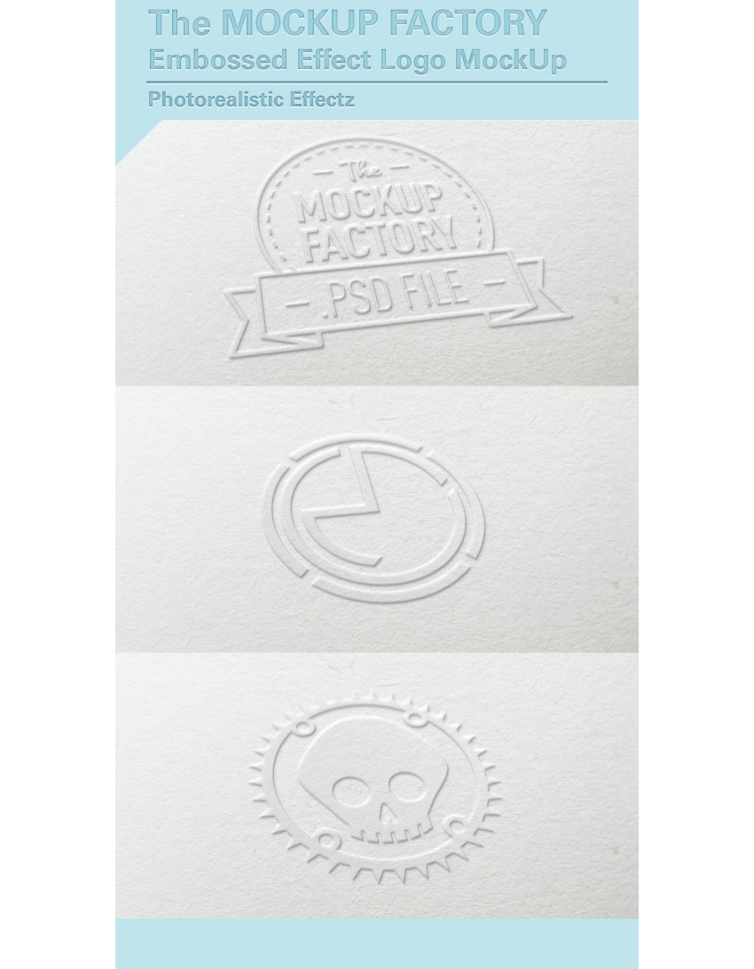
Final product image
What You’ll Be Creating

Building your own high-quality mockup is not as hard as it seems. In fact, it’s something anyone with a digital camera and some basic Photoshop knowledge can master. In this tutorial, I’ll show you how to create a realistic paper embossed logo mockup with Adobe Photoshop, and I’ll provide you all the resources that you need to get this done quickly!

But first, do you need to design a logo? Check out this simple, easy to use online logo maker. Over 745 SMART logo templates to design your custom logo all in one place, Placeit

There are many logo mockups available on GraphicRiver, such as this embossed logo mockup, similar to what I’ll be teaching today.
Tutorial Assets

The following assets were used during the production of this tutorial:

1. How to Prepare the Source Files

Step 1

Download the Background Image and open it with Photoshop.

Background image

Step 2

Download the Perspective Image and open it with Photoshop.

In the top menu, choose Select > All, and then choose Edit > Copy to copy the selection to the clipboard.

Go back to the background document and choose, in the top menu, Edit > Paste to paste the perspective image over the background.

Rename the layer by double-clicking directly on the layer’s name in the Layers panel and changing it to „Perspective„.

Perspective image

2. How to Create the Smart Object

Step 1

Set the foreground color to red (any color different from black is good).

Then choose the Rectangle Tool, move the cursor over the canvas, and click. You’ll open a small dialog box that allows you to enter precise dimensions for your new shape. Type 1353 x 1015 px and click the OK button.

Rename the layer by double-clicking directly on the layer’s name in the Layers panel and changing it to „Smart Object„.

With the „Smart Object” layer selected, choose, in the top menu, Layer > Smart Object > Convert to Smart Object.

Perspective image

Step 2

What we’re going to do now is distort the red rectangle to fit the shape of the black perspective rectangle.

Choose Edit > Transform > Distort

Click on the top right corner of the red rectangle and drag the corner until it touches the top right corner of the black rectangle.

In this step, it’s extremely important that we transform the red rectangle using only the handles at the corners of the bounding box.

Perspective image

Step 3

Keep dragging the corners to fit the red rectangle into the black one:

Perspective image

Step 4

Select the „Perspective” layer in the Layers panel and remove it by choosing Layer > Delete > Layer.

Now we’re ready to replace the red rectangle inside the smart object with a badge or logo to customize our project. Let’s go!

3. How to Get the Badge Ready With Illustrator

Now, for the purpose of this tutorial, we’re going to use a badge from a set available on Envato Elements. The site offers a wide range of high-quality badges and vector elements ready for use. Subscribe to unlock unlimited, high-quality badges, templates, photos and more for one monthly fee!

In this tutorial we’ll use a badge that comes from a great collection of Vintage Style Badges and Logos:

Badge from Vintage Style Badges and Logos set

Step 1

Open the vector .ai file with Adobe Illustrator. While you open the file, a window may pop up alerting you that the document uses fonts that are currently not available on your computer. Download the required fonts for the badge that we’re going to use.

Missing font dialog

For the purpose of this tutorial, I replaced the commercial fonts used in this badge with two free fonts:

Step 2

Once you’re done with fonts, choose the Selection Tool (V).

Selection tool

Now select the „Skateboards” badge (or whatever badge you like). Copy the badge by going to Edit > Copy or pressing Command-C.

Create a new 350 x 350 px document in Adobe Illustrator. Now paste the badge you just copied by choosing Edit > Paste or pressing Command-V.

Step 3

With the Selection Tool (V), move the badge over the grey area, out of the white canvas.

Badge from Vintage Style Badges and Logos set

Select the badge by clicking on it using the Selection Tool (V).

In the top menu, choose Object > Expand Appearance. Again, choose Object > Expand. A dialog window will appear; select Object and Fill and press OK:

Expand dialog

Step 4

Locate the Pathfinder panel. If you can’t see the panel, open it by choosing Window > Pathfinder.

Pathfinder panel

Choose the Trim button, from the Pathfinder panel, to remove the overlapping elements of the badge.

Step 5

Choose the Magic Wand Tool:

Magic Wand Tool

Move the cursor over a white area and click to select all the white areas of the badge:

Badge from Vintage Style Badges and Logos set

Remove the selected white areas by choosing, in the top menu, Edit > Cut. Keep removing all the white areas within the badge:

Badge from Vintage Style Badges and Logos set

Remove them by choosing, in the top menu, Edit > Cut

Now the badge is ready to be imported into the Photoshop scene!

4. How to Include the Badge in the Scene

Step 1

Select and copy the badge by going to Edit > Copy or pressing Command-C.

Badge from Vintage Style Badges and Logos set

Step 2

Go back to Photoshop, select the Smart Object from the Layers panel, and double-click on the Smart Objects thumbnail.

In the Layers panel, deactivate the visibility for the red rectangle layer, and paste the badge just copied by choosing Edit > Paste or pressing Command-V.

From the dialog box, choose Smart Object and press OK.

Paste dialog

Locate the top options bar and set the badge’s position to 676 x 507 px and its dimension to 440% for both the Width and Height fields. When you’re done, press Enter on your keyboard.

Top options bar

Step 3

Save the document by choosing File > Save or using the keyboard shortcut Command-S. The smart object is now updated with the last changes.

Embossed paper logo mockup

5. How to Add the Embossed Effect

Step 1

Set the Fill for the „Smart Object” layer to 0%:

Layer panel

Duplicate the „Smart Object” layer three times by going to Layer > New > Layer Via Copy. Now rename the layers as shown in the image below:

Layer panel

From now on, when you need to replace the badge in your smart object, you can use the „Smart Object” layer, by clicking on it and editing the content.

Step 2

Let’s start adding some layer styles to the „Effect 3” layer. Open the Layers Style panel and add a new Bevel & Embossed effect. Set it as shown in the image below:

Layer style dialog

The color is White #ffffff for the Highlight Mode and Black #000000 for the Shadow Mode.

Step 3

Add a new Inner Shadow effect and set it as shown in the image below:

Layer style dialog

The color for the Blend Mode is White #ffffff.

Step 4

Add a new Drop Shadow effect and set it as shown in the image below:

Layer style dialog

The color for the Blend Mode is Black #000000.

Step 5

Let’s add some smart filters by choosing Filter > Distort > Ripple. Set the filter amount to -50%.

Ripple filter dialog

Choose Filter > Blur > Gaussian Blur and set the radius to 1.0 pixels.

Gaussian blur filter

Step 6

Now let’s add some layer styles to the „Effect 2” layer. Open the Layers Style panel and add a new Bevel & Embossed effect, and set it as shown in the image below:

Layer style dialog

The color is White #ffffff for the Highlight Mode and Black #000000 for the Shadow Mode.

Step 7

Add a new Inner Shadow effect and set it as shown in the image below:

Layer style dialog

The color for the Blend Mode is White #ffffff.

Step 8

Let’s add some smart filters by choosing Filter > Distort > Ripple. Set the filter amount to -50%.

Ripple filter dialog

Choose Filter > Blur > Gaussian Blur and set the radius to 1.0 pixels.

Gaussian blur filter dialog

Step 9

Select the „Effect 2” layer and right-click on it. Choose Group from Layers, type the name „Group 1„, and press OK.

Now choose Layer > Layer Mask > Reveal All to add a mask to the group. 

Choose Layer > New Fill Layer > Gradient and press OK to confirm.

In the Gradient Fill dialog, set the effect as follows:

Gradient fill dialog

Then click on the small gradient window to edit the gradient. Set the first color stop to Location 0% with Color #444444 and the second color stop to Location 100% and Color #ffffff.

Gradient editor dialog

Press OK twice to confirm the effect.

Select the gradient layer just created (its name should be „Gradient Fill 1″), right-click on it, and choose Convert to Smart Object. Right-click again and choose Rasterize Layer.

In the top menu, choose Select > All, choose Edit > Copy, and then choose Select > Deselect.

Press the Option/Alt key on your keyboard and click on the mask thumbnail for the „Group 1” folder to edit the mask.

Layers panel

Paste the gradient inside the mask by choosing Edit > Paste, and then choose Select > Deselect.

Remove the gradient by selecting the „Gradient Fill 1” layer, right-click on it, and choose Delete > Layer.

Step 10

Now let’s add some layer styles to the „Effect 1” layer. Open the Layers Style panel and add a new Bevel & Embossed effect, and set it as shown in the image below:

Layer style dialog

The color is White #ffffff for the Highlight Mode and Black #000000 for the Shadow Mode.

Step 11

Add a new Inner Shadow effect and set it as shown in the image below:

Layer style dialog

The color for the Blend Mode is White #ffffff.

Step 12

Add a new Drop Shadow effect and set it as shown in the image below:

Layer style dialog

The color for the Blend Mode is Black #000000.

Step 13

Let’s add some smart filters by choosing Filter > Distort > Ripple. Set the filter amount to -50%.

Ripple filter dialog

Choose Filter > Blur > Gaussian Blur and set the radius to 1.0 pixels.

Gaussian blur filter dialog

Step 14

Select the „Effect 1” layer and then right-click on it, choose Group from Layers, type the name „Group 2„, and press OK.

Now choose Layer > Layer Mask > Reveal All to add a mask to the group.

Choose Layer > New Fill Layer > Gradient and press OK to confirm.

In the Gradient Fill dialog, set the effect as follows:

Gradient fill dialog

Then click on the small gradient window to edit the gradient. Set the first color stop to Location 0% with Color #000000 and the second color stop to Location 100% and Color #ffffff.

Gradient editor dialog

Press OK twice to confirm the effect.

Select the gradient layer just created (its name should be „Gradient Fill 1″), right-click on it, and choose Convert to Smart Object. Right-click again and choose Rasterize Layer.

In the top menu, choose Select > All, choose Edit > Copy, and then choose Select > Deselect.

Press the Option/Alt key on your keyboard and click on the mask thumbnail for the „Group 2” folder to edit the mask.

Layers panel

Paste the gradient inside the mask by choosing Edit > Paste, and then choose Select > Deselect.

Remove the gradient by selecting the „Gradient Fill 1” layer, right-click on it, and choose Delete > Layer.

Congratulations, You’re Done!

In this tutorial, you learned how to create an embossed paper logo mockup with Adobe Photoshop!

I hope that you’ve enjoyed my tutorial and learned something new. Please feel free to leave your comments, suggestions, and outcomes below.

Enjoy Photoshopping!

Embossed paper logo mockup

How to Create an Embossed Paper Logo Mockup in Adobe Photoshop

Post pobrano z: How to Create an Embossed Paper Logo Mockup in Adobe Photoshop

Final product image
What You’ll Be Creating

Building your own high-quality mockup is not as hard as it seems. In fact, it’s something anyone with a digital camera and some basic Photoshop knowledge can master. In this tutorial, I’ll show you how to create a realistic paper embossed logo mockup with Adobe Photoshop, and I’ll provide you all the resources that you need to get this done quickly!

But first, do you need to design a logo? Check out this simple, easy to use online logo maker. Over 745 SMART logo templates to design your custom logo all in one place, Placeit

There are many logo mockups available on GraphicRiver, such as this embossed logo mockup, similar to what I’ll be teaching today.

Tutorial Assets

The following assets were used during the production of this tutorial:

1. How to Prepare the Source Files

Step 1

Download the Background Image and open it with Photoshop.

Background image

Step 2

Download the Perspective Image and open it with Photoshop.

In the top menu, choose Select > All, and then choose Edit > Copy to copy the selection to the clipboard.

Go back to the background document and choose, in the top menu, Edit > Paste to paste the perspective image over the background.

Rename the layer by double-clicking directly on the layer’s name in the Layers panel and changing it to „Perspective„.

Perspective image

2. How to Create the Smart Object

Step 1

Set the foreground color to red (any color different from black is good).

Then choose the Rectangle Tool, move the cursor over the canvas, and click. You’ll open a small dialog box that allows you to enter precise dimensions for your new shape. Type 1353 x 1015 px and click the OK button.

Rename the layer by double-clicking directly on the layer’s name in the Layers panel and changing it to „Smart Object„.

With the „Smart Object” layer selected, choose, in the top menu, Layer > Smart Object > Convert to Smart Object.

Perspective image

Step 2

What we’re going to do now is distort the red rectangle to fit the shape of the black perspective rectangle.

Choose Edit > Transform > Distort

Click on the top right corner of the red rectangle and drag the corner until it touches the top right corner of the black rectangle.

In this step, it’s extremely important that we transform the red rectangle using only the handles at the corners of the bounding box.

Perspective image

Step 3

Keep dragging the corners to fit the red rectangle into the black one:

Perspective image

Step 4

Select the „Perspective” layer in the Layers panel and remove it by choosing Layer > Delete > Layer.

Now we’re ready to replace the red rectangle inside the smart object with a badge or logo to customize our project. Let’s go!

3. How to Get the Badge Ready With Illustrator

Now, for the purpose of this tutorial, we’re going to use a badge from a set available on Envato Elements. The site offers a wide range of high-quality badges and vector elements ready for use. Subscribe to unlock unlimited, high-quality badges, templates, photos and more for one monthly fee!

In this tutorial we’ll use a badge that comes from a great collection of Vintage Style Badges and Logos:

Badge from Vintage Style Badges and Logos set

Step 1

Open the vector .ai file with Adobe Illustrator. While you open the file, a window may pop up alerting you that the document uses fonts that are currently not available on your computer. Download the required fonts for the badge that we’re going to use.

Missing font dialog

For the purpose of this tutorial, I replaced the commercial fonts used in this badge with two free fonts:

Step 2

Once you’re done with fonts, choose the Selection Tool (V).

Selection tool

Now select the „Skateboards” badge (or whatever badge you like). Copy the badge by going to Edit > Copy or pressing Command-C.

Create a new 350 x 350 px document in Adobe Illustrator. Now paste the badge you just copied by choosing Edit > Paste or pressing Command-V.

Step 3

With the Selection Tool (V), move the badge over the grey area, out of the white canvas.

Badge from Vintage Style Badges and Logos set

Select the badge by clicking on it using the Selection Tool (V).

In the top menu, choose Object > Expand Appearance. Again, choose Object > Expand. A dialog window will appear; select Object and Fill and press OK:

Expand dialog

Step 4

Locate the Pathfinder panel. If you can’t see the panel, open it by choosing Window > Pathfinder.

Pathfinder panel

Choose the Trim button, from the Pathfinder panel, to remove the overlapping elements of the badge.

Step 5

Choose the Magic Wand Tool:

Magic Wand Tool

Move the cursor over a white area and click to select all the white areas of the badge:

Badge from Vintage Style Badges and Logos set

Remove the selected white areas by choosing, in the top menu, Edit > Cut. Keep removing all the white areas within the badge:

Badge from Vintage Style Badges and Logos set

Remove them by choosing, in the top menu, Edit > Cut

Now the badge is ready to be imported into the Photoshop scene!

4. How to Include the Badge in the Scene

Step 1

Select and copy the badge by going to Edit > Copy or pressing Command-C.

Badge from Vintage Style Badges and Logos set

Step 2

Go back to Photoshop, select the Smart Object from the Layers panel, and double-click on the Smart Objects thumbnail.

In the Layers panel, deactivate the visibility for the red rectangle layer, and paste the badge just copied by choosing Edit > Paste or pressing Command-V.

From the dialog box, choose Smart Object and press OK.

Paste dialog

Locate the top options bar and set the badge’s position to 676 x 507 px and its dimension to 440% for both the Width and Height fields. When you’re done, press Enter on your keyboard.

Top options bar

Step 3

Save the document by choosing File > Save or using the keyboard shortcut Command-S. The smart object is now updated with the last changes.

Embossed paper logo mockup

5. How to Add the Embossed Effect

Step 1

Set the Fill for the „Smart Object” layer to 0%:

Layer panel

Duplicate the „Smart Object” layer three times by going to Layer > New > Layer Via Copy. Now rename the layers as shown in the image below:

Layer panel

From now on, when you need to replace the badge in your smart object, you can use the „Smart Object” layer, by clicking on it and editing the content.

Step 2

Let’s start adding some layer styles to the „Effect 3” layer. Open the Layers Style panel and add a new Bevel & Embossed effect. Set it as shown in the image below:

Layer style dialog

The color is White #ffffff for the Highlight Mode and Black #000000 for the Shadow Mode.

Step 3

Add a new Inner Shadow effect and set it as shown in the image below:

Layer style dialog

The color for the Blend Mode is White #ffffff.

Step 4

Add a new Drop Shadow effect and set it as shown in the image below:

Layer style dialog

The color for the Blend Mode is Black #000000.

Step 5

Let’s add some smart filters by choosing Filter > Distort > Ripple. Set the filter amount to -50%.

Ripple filter dialog

Choose Filter > Blur > Gaussian Blur and set the radius to 1.0 pixels.

Gaussian blur filter

Step 6

Now let’s add some layer styles to the „Effect 2” layer. Open the Layers Style panel and add a new Bevel & Embossed effect, and set it as shown in the image below:

Layer style dialog

The color is White #ffffff for the Highlight Mode and Black #000000 for the Shadow Mode.

Step 7

Add a new Inner Shadow effect and set it as shown in the image below:

Layer style dialog

The color for the Blend Mode is White #ffffff.

Step 8

Let’s add some smart filters by choosing Filter > Distort > Ripple. Set the filter amount to -50%.

Ripple filter dialog

Choose Filter > Blur > Gaussian Blur and set the radius to 1.0 pixels.

Gaussian blur filter dialog

Step 9

Select the „Effect 2” layer and right-click on it. Choose Group from Layers, type the name „Group 1„, and press OK.

Now choose Layer > Layer Mask > Reveal All to add a mask to the group. 

Choose Layer > New Fill Layer > Gradient and press OK to confirm.

In the Gradient Fill dialog, set the effect as follows:

Gradient fill dialog

Then click on the small gradient window to edit the gradient. Set the first color stop to Location 0% with Color #444444 and the second color stop to Location 100% and Color #ffffff.

Gradient editor dialog

Press OK twice to confirm the effect.

Select the gradient layer just created (its name should be „Gradient Fill 1″), right-click on it, and choose Convert to Smart Object. Right-click again and choose Rasterize Layer.

In the top menu, choose Select > All, choose Edit > Copy, and then choose Select > Deselect.

Press the Option/Alt key on your keyboard and click on the mask thumbnail for the „Group 1” folder to edit the mask.

Layers panel

Paste the gradient inside the mask by choosing Edit > Paste, and then choose Select > Deselect.

Remove the gradient by selecting the „Gradient Fill 1” layer, right-click on it, and choose Delete > Layer.

Step 10

Now let’s add some layer styles to the „Effect 1” layer. Open the Layers Style panel and add a new Bevel & Embossed effect, and set it as shown in the image below:

Layer style dialog

The color is White #ffffff for the Highlight Mode and Black #000000 for the Shadow Mode.

Step 11

Add a new Inner Shadow effect and set it as shown in the image below:

Layer style dialog

The color for the Blend Mode is White #ffffff.

Step 12

Add a new Drop Shadow effect and set it as shown in the image below:

Layer style dialog

The color for the Blend Mode is Black #000000.

Step 13

Let’s add some smart filters by choosing Filter > Distort > Ripple. Set the filter amount to -50%.

Ripple filter dialog

Choose Filter > Blur > Gaussian Blur and set the radius to 1.0 pixels.

Gaussian blur filter dialog

Step 14

Select the „Effect 1” layer and then right-click on it, choose Group from Layers, type the name „Group 2„, and press OK.

Now choose Layer > Layer Mask > Reveal All to add a mask to the group.

Choose Layer > New Fill Layer > Gradient and press OK to confirm.

In the Gradient Fill dialog, set the effect as follows:

Gradient fill dialog

Then click on the small gradient window to edit the gradient. Set the first color stop to Location 0% with Color #000000 and the second color stop to Location 100% and Color #ffffff.

Gradient editor dialog

Press OK twice to confirm the effect.

Select the gradient layer just created (its name should be „Gradient Fill 1″), right-click on it, and choose Convert to Smart Object. Right-click again and choose Rasterize Layer.

In the top menu, choose Select > All, choose Edit > Copy, and then choose Select > Deselect.

Press the Option/Alt key on your keyboard and click on the mask thumbnail for the „Group 2” folder to edit the mask.

Layers panel

Paste the gradient inside the mask by choosing Edit > Paste, and then choose Select > Deselect.

Remove the gradient by selecting the „Gradient Fill 1” layer, right-click on it, and choose Delete > Layer.

Congratulations, You’re Done!

In this tutorial, you learned how to create an embossed paper logo mockup with Adobe Photoshop!

I hope that you’ve enjoyed my tutorial and learned something new. Please feel free to leave your comments, suggestions, and outcomes below.

Enjoy Photoshopping!

Embossed paper logo mockup

How to Create an Embossed Paper Logo Mockup in Adobe Photoshop

Post pobrano z: How to Create an Embossed Paper Logo Mockup in Adobe Photoshop

Final product image
What You’ll Be Creating

Building your own high-quality mockup is not as hard as it seems. In fact, it’s something anyone with a digital camera and some basic Photoshop knowledge can master. In this tutorial, I’ll show you how to create a realistic paper embossed logo mockup with Adobe Photoshop, and I’ll provide you all the resources that you need to get this done quickly!

But first, do you need to design a logo? Check out this simple, easy to use online logo maker. Over 745 SMART logo templates to design your custom logo all in one place, Placeit

There are many logo mockups available on GraphicRiver, such as this embossed logo mockup, similar to what I’ll be teaching today.

Tutorial Assets

The following assets were used during the production of this tutorial:

1. How to Prepare the Source Files

Step 1

Download the Background Image and open it with Photoshop.

Background image

Step 2

Download the Perspective Image and open it with Photoshop.

In the top menu, choose Select > All, and then choose Edit > Copy to copy the selection to the clipboard.

Go back to the background document and choose, in the top menu, Edit > Paste to paste the perspective image over the background.

Rename the layer by double-clicking directly on the layer’s name in the Layers panel and changing it to „Perspective„.

Perspective image

2. How to Create the Smart Object

Step 1

Set the foreground color to red (any color different from black is good).

Then choose the Rectangle Tool, move the cursor over the canvas, and click. You’ll open a small dialog box that allows you to enter precise dimensions for your new shape. Type 1353 x 1015 px and click the OK button.

Rename the layer by double-clicking directly on the layer’s name in the Layers panel and changing it to „Smart Object„.

With the „Smart Object” layer selected, choose, in the top menu, Layer > Smart Object > Convert to Smart Object.

Perspective image

Step 2

What we’re going to do now is distort the red rectangle to fit the shape of the black perspective rectangle.

Choose Edit > Transform > Distort

Click on the top right corner of the red rectangle and drag the corner until it touches the top right corner of the black rectangle.

In this step, it’s extremely important that we transform the red rectangle using only the handles at the corners of the bounding box.

Perspective image

Step 3

Keep dragging the corners to fit the red rectangle into the black one:

Perspective image

Step 4

Select the „Perspective” layer in the Layers panel and remove it by choosing Layer > Delete > Layer.

Now we’re ready to replace the red rectangle inside the smart object with a badge or logo to customize our project. Let’s go!

3. How to Get the Badge Ready With Illustrator

Now, for the purpose of this tutorial, we’re going to use a badge from a set available on Envato Elements. The site offers a wide range of high-quality badges and vector elements ready for use. Subscribe to unlock unlimited, high-quality badges, templates, photos and more for one monthly fee!

In this tutorial we’ll use a badge that comes from a great collection of Vintage Style Badges and Logos:

Badge from Vintage Style Badges and Logos set

Step 1

Open the vector .ai file with Adobe Illustrator. While you open the file, a window may pop up alerting you that the document uses fonts that are currently not available on your computer. Download the required fonts for the badge that we’re going to use.

Missing font dialog

For the purpose of this tutorial, I replaced the commercial fonts used in this badge with two free fonts:

Step 2

Once you’re done with fonts, choose the Selection Tool (V).

Selection tool

Now select the „Skateboards” badge (or whatever badge you like). Copy the badge by going to Edit > Copy or pressing Command-C.

Create a new 350 x 350 px document in Adobe Illustrator. Now paste the badge you just copied by choosing Edit > Paste or pressing Command-V.

Step 3

With the Selection Tool (V), move the badge over the grey area, out of the white canvas.

Badge from Vintage Style Badges and Logos set

Select the badge by clicking on it using the Selection Tool (V).

In the top menu, choose Object > Expand Appearance. Again, choose Object > Expand. A dialog window will appear; select Object and Fill and press OK:

Expand dialog

Step 4

Locate the Pathfinder panel. If you can’t see the panel, open it by choosing Window > Pathfinder.

Pathfinder panel

Choose the Trim button, from the Pathfinder panel, to remove the overlapping elements of the badge.

Step 5

Choose the Magic Wand Tool:

Magic Wand Tool

Move the cursor over a white area and click to select all the white areas of the badge:

Badge from Vintage Style Badges and Logos set

Remove the selected white areas by choosing, in the top menu, Edit > Cut. Keep removing all the white areas within the badge:

Badge from Vintage Style Badges and Logos set

Remove them by choosing, in the top menu, Edit > Cut

Now the badge is ready to be imported into the Photoshop scene!

4. How to Include the Badge in the Scene

Step 1

Select and copy the badge by going to Edit > Copy or pressing Command-C.

Badge from Vintage Style Badges and Logos set

Step 2

Go back to Photoshop, select the Smart Object from the Layers panel, and double-click on the Smart Objects thumbnail.

In the Layers panel, deactivate the visibility for the red rectangle layer, and paste the badge just copied by choosing Edit > Paste or pressing Command-V.

From the dialog box, choose Smart Object and press OK.

Paste dialog

Locate the top options bar and set the badge’s position to 676 x 507 px and its dimension to 440% for both the Width and Height fields. When you’re done, press Enter on your keyboard.

Top options bar

Step 3

Save the document by choosing File > Save or using the keyboard shortcut Command-S. The smart object is now updated with the last changes.

Embossed paper logo mockup

5. How to Add the Embossed Effect

Step 1

Set the Fill for the „Smart Object” layer to 0%:

Layer panel

Duplicate the „Smart Object” layer three times by going to Layer > New > Layer Via Copy. Now rename the layers as shown in the image below:

Layer panel

From now on, when you need to replace the badge in your smart object, you can use the „Smart Object” layer, by clicking on it and editing the content.

Step 2

Let’s start adding some layer styles to the „Effect 3” layer. Open the Layers Style panel and add a new Bevel & Embossed effect. Set it as shown in the image below:

Layer style dialog

The color is White #ffffff for the Highlight Mode and Black #000000 for the Shadow Mode.

Step 3

Add a new Inner Shadow effect and set it as shown in the image below:

Layer style dialog

The color for the Blend Mode is White #ffffff.

Step 4

Add a new Drop Shadow effect and set it as shown in the image below:

Layer style dialog

The color for the Blend Mode is Black #000000.

Step 5

Let’s add some smart filters by choosing Filter > Distort > Ripple. Set the filter amount to -50%.

Ripple filter dialog

Choose Filter > Blur > Gaussian Blur and set the radius to 1.0 pixels.

Gaussian blur filter

Step 6

Now let’s add some layer styles to the „Effect 2” layer. Open the Layers Style panel and add a new Bevel & Embossed effect, and set it as shown in the image below:

Layer style dialog

The color is White #ffffff for the Highlight Mode and Black #000000 for the Shadow Mode.

Step 7

Add a new Inner Shadow effect and set it as shown in the image below:

Layer style dialog

The color for the Blend Mode is White #ffffff.

Step 8

Let’s add some smart filters by choosing Filter > Distort > Ripple. Set the filter amount to -50%.

Ripple filter dialog

Choose Filter > Blur > Gaussian Blur and set the radius to 1.0 pixels.

Gaussian blur filter dialog

Step 9

Select the „Effect 2” layer and right-click on it. Choose Group from Layers, type the name „Group 1„, and press OK.

Now choose Layer > Layer Mask > Reveal All to add a mask to the group. 

Choose Layer > New Fill Layer > Gradient and press OK to confirm.

In the Gradient Fill dialog, set the effect as follows:

Gradient fill dialog

Then click on the small gradient window to edit the gradient. Set the first color stop to Location 0% with Color #444444 and the second color stop to Location 100% and Color #ffffff.

Gradient editor dialog

Press OK twice to confirm the effect.

Select the gradient layer just created (its name should be „Gradient Fill 1″), right-click on it, and choose Convert to Smart Object. Right-click again and choose Rasterize Layer.

In the top menu, choose Select > All, choose Edit > Copy, and then choose Select > Deselect.

Press the Option/Alt key on your keyboard and click on the mask thumbnail for the „Group 1” folder to edit the mask.

Layers panel

Paste the gradient inside the mask by choosing Edit > Paste, and then choose Select > Deselect.

Remove the gradient by selecting the „Gradient Fill 1” layer, right-click on it, and choose Delete > Layer.

Step 10

Now let’s add some layer styles to the „Effect 1” layer. Open the Layers Style panel and add a new Bevel & Embossed effect, and set it as shown in the image below:

Layer style dialog

The color is White #ffffff for the Highlight Mode and Black #000000 for the Shadow Mode.

Step 11

Add a new Inner Shadow effect and set it as shown in the image below:

Layer style dialog

The color for the Blend Mode is White #ffffff.

Step 12

Add a new Drop Shadow effect and set it as shown in the image below:

Layer style dialog

The color for the Blend Mode is Black #000000.

Step 13

Let’s add some smart filters by choosing Filter > Distort > Ripple. Set the filter amount to -50%.

Ripple filter dialog

Choose Filter > Blur > Gaussian Blur and set the radius to 1.0 pixels.

Gaussian blur filter dialog

Step 14

Select the „Effect 1” layer and then right-click on it, choose Group from Layers, type the name „Group 2„, and press OK.

Now choose Layer > Layer Mask > Reveal All to add a mask to the group.

Choose Layer > New Fill Layer > Gradient and press OK to confirm.

In the Gradient Fill dialog, set the effect as follows:

Gradient fill dialog

Then click on the small gradient window to edit the gradient. Set the first color stop to Location 0% with Color #000000 and the second color stop to Location 100% and Color #ffffff.

Gradient editor dialog

Press OK twice to confirm the effect.

Select the gradient layer just created (its name should be „Gradient Fill 1″), right-click on it, and choose Convert to Smart Object. Right-click again and choose Rasterize Layer.

In the top menu, choose Select > All, choose Edit > Copy, and then choose Select > Deselect.

Press the Option/Alt key on your keyboard and click on the mask thumbnail for the „Group 2” folder to edit the mask.

Layers panel

Paste the gradient inside the mask by choosing Edit > Paste, and then choose Select > Deselect.

Remove the gradient by selecting the „Gradient Fill 1” layer, right-click on it, and choose Delete > Layer.

Congratulations, You’re Done!

In this tutorial, you learned how to create an embossed paper logo mockup with Adobe Photoshop!

I hope that you’ve enjoyed my tutorial and learned something new. Please feel free to leave your comments, suggestions, and outcomes below.

Enjoy Photoshopping!

Embossed paper logo mockup

How to Paint Natural, Afro Textured Hair in Adobe Photoshop

Post pobrano z: How to Paint Natural, Afro Textured Hair in Adobe Photoshop

Final product image
What You’ll Be Creating

In this tutorial, we’re going to look at different ways of painting natural, afro textured hair in Adobe Photoshop. We’ll create a trio portrait, with each subject’s hair drawing inspiration from different hair types. 

Before diving into this lesson, check out the previous two tutorials in this series:

1. How to Set Up Your File

Step 1

First, create a New Document. I like to work at a print-appropriate resolution, but choose a size that is appropriate for your goals. In this case, I’m working at 17 inches by 11 inches, at 300 dpi.

Example of New Document window

Step 2

Before we begin to draw, I would recommend reviewing your Brush Settings. Photoshop’s default Brushes sometimes yield less than desirable results, if you’re looking for the kind of sensitivity you may be used to seeing when using a standard pencil or brush.

To open your Brush Settings, go to Window > Brush.

Under the Transfer tab, make sure that Opacity Jitter and Flow Jitter are set to Pen Pressure

Example of Brush Settings

Step 3

I would also recommend keeping an eye on your Opacity and Flow in your Options Panel. With the Brush Tool selected, you’ll see options that look like the screenshot below.

Adjust the Opacity and Flow to your liking as you draw and paint. Keep in mind that Opacity refers to the amount of transparency in your stroke. Flow is in reference to how much color „comes out” of your stroke.

Example of Options Panel

2. How to Create the Initial Artwork

Step 1

On a New Layer, begin to lay out your composition. I’m going to draw a portrait of three people, so we can experiment with rendering three different hair „types”: 4A, 4B, and 4C. They are the three coily hair types generally included in the Andre Walker Hair Typing System. While this system is not without its flaws (and valid criticisms), we’ll use it as a visual starting point.

Keep in mind that people, in general, do not usually fit into perfect categories. We’re all unique and beautiful in our own way—and that includes our hair! You may find that some people have combination hair or traits of more than one type. When in doubt, take a look at references! This is not a rigid rule book, but rather an example of how these qualities can be visually interpreted. 

Using a Hard Round Brush, begin to establish the basic facial structure and where you would like the hair to sit on the head. I’m going to work with hair generally inspired by 4A, 4B, and 4C curls, in that order. 

Initial sketch example

Step 2

Once I’m happy with my initial composition, I like to create a New Layer and refine my work. Notice how I kept my initial sketch visible, as a reference. Again, I largely utilize a Hard Round Brush with Pen Pressure sensitivity on for both my Opacity and Flow

One key tip—keep in mind that the hair here is not straight. Therefore, I generally like to avoid straight lines. Curved, varied lines will often make for a more organic aesthetic.

Want more insights on drawing this hair type? I would recommend taking a look at my How to Draw Natural, Textured Afro Hair (How to Draw Curly Hair) tutorial.

Example of refined lines over sketch

Step 3

When it comes to my initial colors, I like to place the colors on top, on a New Layer. Set this Layer’s Blending Mode to Multiply. Notice how the applied color affects the initial line art. I like to start with a single, flat color for each subject in this phase.

Example of initial flat color

Step 4

Then, on a New Layer acting as a Clipping Mask, apply color variation where applicable. Notice that because we defined a specific area for our color in the previous step, we can’t color outside of this area now.

Colors added with Clipping Masks

Step 5

I use a similar method to place my initial shadows. Create a New Layer, and set it as a Clipping Mask. Set this Layer’s Blending Mode to Multiply, and then experiment with where you would like your shadows to be in the composition. I decided to place my light source on the viewer’s left-hand side.

Values added with Clipping Mask

Step 6

At this point, I like to refine my work by painting on top of it. However, the focus of this tutorial is on the hair specifically, so we won’t spend too much time on rendering the other parts of the composition.

If you would, however, like to review this part of my process, you can check out some of my other tutorials, where I go through this in detail:

When painting on top of the base composition I’ve created, I largely use a Soft Round Brush and a Hard Round Brush. We’ll jump ahead to my rendered work and focus on the hair.

Example of rendered illustration without hair completed

3. How to Paint Type 4A Hair

Step 1

Let’s start with the subject on the viewer’s left. My intention is to give this subject’s hair qualities that are often associated with Type 4A. These coils can have a visible curl pattern, so we’ll work with that aesthetic here.

Note that I often do a lot of drawing on the same Layer—but if you are feeling less confident and/or want to preserve your work, you may want to use a New Layer for each step.

Using a Hard Round Brush, alter the Opacity so it is around 80%. Then, begin to add varied lines, starting from the hairline. They should be darker than the hair’s base color. 

Adding dark values at the hair line

Step 2

Lower the Opacity on your Hard Round Brush even more—around 70% will do. 

Begin to layer lighter colors in a spiral pattern. It doesn’t have to be perfect—we’re just establishing some texture and flow here. Note that while the pattern is a little abstract, the movement is not. The hair has a distinct direction on the head.

I also used this same, darker color, to add some variety to the hairline, so it looks more organic.

Establishing pattern

Step 3

As we continue to layer color on the hair, make your Brush Size smaller. I alternated between dark and light colors here, again using a Hard Round Brush.

Adding refinements

Step 4

Then, I created a New Layer and set it to Multiply, so I could bring back some of those dark values in the hairline area. 

Adding dark values to the hair line area

Step 5

Now, switch to a Soft Round Brush. Keep its size small, and add small variations and curls. If you notice a space that seems unnatural or out of place, you can also use this Brush for blending. 

Remember, you can alter your Opacity and Flow—in my opinion, this is often crucial in getting the line transparency and sensitivity you want.

Additional refinements with a Soft Round Brush

Step 6

Finally, I added some variation to the outermost contours of the hair. The edges looked a little too perfect—so stray hairs and extra curls can help make things look more natural. I achieved this with a Hard Round Brush.

Variation added to make things look more organic

4. How to Paint Type 4B Hair

Step 1

The center subject’s hair is going to draw inspiration from 4B hair qualities. 4Bs and 4Cs tend to have very dense curls with a lot of shrinkage. Many who have this hair type do not have a visible curl pattern, like 4As.

The difference is in the density; 4B coils are generally a little looser than 4Cs. 

I started with a Hard Round Brush. Similar to how we started with the previous subject, I added some darker values to begin to establish some depth.

Darker values added

Step 2

Then, layer on lighter colors. In this case, I like to use a Custom Brush, but you could use a Hard Round Brush and a Soft Round Brush with lowered Opacity

If you’d like more info on my Custom Brush, I created one, step by step, in my How to Draw & Paint a Galaxy Afro Portrait in Adobe Photoshop tutorial.

Remember to keep the light source in mind. I like to work in large, pillowy shapes. 

Lighter values added on top

Step 3

Then, I went in and added some additional definition to the darker areas in the hairline. My process is very much about layering colors and decreasing the size of the Brush each time I do so.

Further establishing the way the hair flows on the head

Step 4 

Note how the color placement follows the movement of the hair. It isn’t haphazard. In layering colors, darker values peek out from behind the lighter ones too, helping to further visually convey depth.

Light values layered on top

Step 5

To put the finishing touches on this, I made some edits to the outermost contours of the hair. I added variation here with a Hard Round Eraser, but the varied lines were inspired by the shapes I created within the hair. 

I also added some tiny tufts on the front because it looks cute! It’s as simple as using the Eyedropper Tool to grab the dark color and then the light color. Layer them just as we did the rest of the hair. 

Final refinements

5. How to Paint Type 4C Hair

Step 1

And now for the character on the viewer’s right, with hair inspired by 4C qualities. I want this afro to look thick and gorgeous, with minimal curl pattern. 

Similar to the center subject, I started with darker values to help define the dimensional qualities of the hair. 

Initial dark values added

Step 2

Layer on large clumps of lighter values. Again, the same Brushes apply from the previous subject. You can stick with a Hard Round Brush, or try using a custom one that has a little texture to it. 

Light values layered on top

Step 3

Again, when layering color like this, I recommend decreasing the Brush Size. Notice in this case, however, that there’s less of a pattern. I want an aesthetic that looks soft and unified.

Example of continuation of layered color

Step 4 

Continue to layer colors. I generally like to alternate between light and dark values; I like to use the Eyedropper Tool to „pick up” colors in the local area, where I’m painting. I find that it makes blending and choosing the right colors easier.

In addition, some variation in the hairline will make for a more natural look, similar to the previous two subjects.

Additional refinements

Step 5

Finally, I adjusted the outermost contours of the hair using a Hard Round Eraser. In this case, I wanted the shape of the hair to stay more unified and less divided, to help further visually illustrate the thickness and density of the hair.

Variation in outer contours

6. Add the Finishing Touches

Step 1

Now that I’ve rendered the hair on all three subjects, I decided I wanted to push the shadows further.

I created a New Layer and set its Blending Mode to Multiply. Make this Layer a Clipping Mask, and then apply these additional values. I used a light pinkish color.

Additional shadows added

Step 2

While the focus of this tutorial is not the background, I still wanted to do something visually interesting with it. I used a Hard Round Brush and drew some directional lines in various sizes. No need for perfectionism here—I just had fun drawing zigzags!

Lines added to background

Step 3

Then, to give the background some varied color, I locked this layer and used a Soft Round Brush to apply color. The colors were inspired by the subjects’ shirts, using the Eyedropper Tool.

Background color applied

And There You Have It!

We’ve explored three different ways one could potentially paint natural, afro textured hair—inspired by 4A, 4B, and 4C! Remember, regardless of the „type”, hair comes in all sorts of wonderful varieties. When in doubt, look at references!

Happy painting! 

The Finished Illustration

How to Paint Natural, Afro Textured Hair in Adobe Photoshop

Post pobrano z: How to Paint Natural, Afro Textured Hair in Adobe Photoshop

Final product image
What You’ll Be Creating

In this tutorial, we’re going to look at different ways of painting natural, afro textured hair in Adobe Photoshop. We’ll create a trio portrait, with each subject’s hair drawing inspiration from different hair types. 

Before diving into this lesson, check out the previous two tutorials in this series:

1. How to Set Up Your File

Step 1

First, create a New Document. I like to work at a print-appropriate resolution, but choose a size that is appropriate for your goals. In this case, I’m working at 17 inches by 11 inches, at 300 dpi.

Example of New Document window

Step 2

Before we begin to draw, I would recommend reviewing your Brush Settings. Photoshop’s default Brushes sometimes yield less than desirable results, if you’re looking for the kind of sensitivity you may be used to seeing when using a standard pencil or brush.

To open your Brush Settings, go to Window > Brush.

Under the Transfer tab, make sure that Opacity Jitter and Flow Jitter are set to Pen Pressure

Example of Brush Settings

Step 3

I would also recommend keeping an eye on your Opacity and Flow in your Options Panel. With the Brush Tool selected, you’ll see options that look like the screenshot below.

Adjust the Opacity and Flow to your liking as you draw and paint. Keep in mind that Opacity refers to the amount of transparency in your stroke. Flow is in reference to how much color „comes out” of your stroke.

Example of Options Panel

2. How to Create the Initial Artwork

Step 1

On a New Layer, begin to lay out your composition. I’m going to draw a portrait of three people, so we can experiment with rendering three different hair „types”: 4A, 4B, and 4C. They are the three coily hair types generally included in the Andre Walker Hair Typing System. While this system is not without its flaws (and valid criticisms), we’ll use it as a visual starting point.

Keep in mind that people, in general, do not usually fit into perfect categories. We’re all unique and beautiful in our own way—and that includes our hair! You may find that some people have combination hair or traits of more than one type. When in doubt, take a look at references! This is not a rigid rule book, but rather an example of how these qualities can be visually interpreted. 

Using a Hard Round Brush, begin to establish the basic facial structure and where you would like the hair to sit on the head. I’m going to work with hair generally inspired by 4A, 4B, and 4C curls, in that order. 

Initial sketch example

Step 2

Once I’m happy with my initial composition, I like to create a New Layer and refine my work. Notice how I kept my initial sketch visible, as a reference. Again, I largely utilize a Hard Round Brush with Pen Pressure sensitivity on for both my Opacity and Flow

One key tip—keep in mind that the hair here is not straight. Therefore, I generally like to avoid straight lines. Curved, varied lines will often make for a more organic aesthetic.

Want more insights on drawing this hair type? I would recommend taking a look at my How to Draw Natural, Textured Afro Hair (How to Draw Curly Hair) tutorial.

Example of refined lines over sketch

Step 3

When it comes to my initial colors, I like to place the colors on top, on a New Layer. Set this Layer’s Blending Mode to Multiply. Notice how the applied color affects the initial line art. I like to start with a single, flat color for each subject in this phase.

Example of initial flat color

Step 4

Then, on a New Layer acting as a Clipping Mask, apply color variation where applicable. Notice that because we defined a specific area for our color in the previous step, we can’t color outside of this area now.

Colors added with Clipping Masks

Step 5

I use a similar method to place my initial shadows. Create a New Layer, and set it as a Clipping Mask. Set this Layer’s Blending Mode to Multiply, and then experiment with where you would like your shadows to be in the composition. I decided to place my light source on the viewer’s left-hand side.

Values added with Clipping Mask

Step 6

At this point, I like to refine my work by painting on top of it. However, the focus of this tutorial is on the hair specifically, so we won’t spend too much time on rendering the other parts of the composition.

If you would, however, like to review this part of my process, you can check out some of my other tutorials, where I go through this in detail:

When painting on top of the base composition I’ve created, I largely use a Soft Round Brush and a Hard Round Brush. We’ll jump ahead to my rendered work and focus on the hair.

Example of rendered illustration without hair completed

3. How to Paint Type 4A Hair

Step 1

Let’s start with the subject on the viewer’s left. My intention is to give this subject’s hair qualities that are often associated with Type 4A. These coils can have a visible curl pattern, so we’ll work with that aesthetic here.

Note that I often do a lot of drawing on the same Layer—but if you are feeling less confident and/or want to preserve your work, you may want to use a New Layer for each step.

Using a Hard Round Brush, alter the Opacity so it is around 80%. Then, begin to add varied lines, starting from the hairline. They should be darker than the hair’s base color. 

Adding dark values at the hair line

Step 2

Lower the Opacity on your Hard Round Brush even more—around 70% will do. 

Begin to layer lighter colors in a spiral pattern. It doesn’t have to be perfect—we’re just establishing some texture and flow here. Note that while the pattern is a little abstract, the movement is not. The hair has a distinct direction on the head.

I also used this same, darker color, to add some variety to the hairline, so it looks more organic.

Establishing pattern

Step 3

As we continue to layer color on the hair, make your Brush Size smaller. I alternated between dark and light colors here, again using a Hard Round Brush.

Adding refinements

Step 4

Then, I created a New Layer and set it to Multiply, so I could bring back some of those dark values in the hairline area. 

Adding dark values to the hair line area

Step 5

Now, switch to a Soft Round Brush. Keep its size small, and add small variations and curls. If you notice a space that seems unnatural or out of place, you can also use this Brush for blending. 

Remember, you can alter your Opacity and Flow—in my opinion, this is often crucial in getting the line transparency and sensitivity you want.

Additional refinements with a Soft Round Brush

Step 6

Finally, I added some variation to the outermost contours of the hair. The edges looked a little too perfect—so stray hairs and extra curls can help make things look more natural. I achieved this with a Hard Round Brush.

Variation added to make things look more organic

4. How to Paint Type 4B Hair

Step 1

The center subject’s hair is going to draw inspiration from 4B hair qualities. 4Bs and 4Cs tend to have very dense curls with a lot of shrinkage. Many who have this hair type do not have a visible curl pattern, like 4As.

The difference is in the density; 4B coils are generally a little looser than 4Cs. 

I started with a Hard Round Brush. Similar to how we started with the previous subject, I added some darker values to begin to establish some depth.

Darker values added

Step 2

Then, layer on lighter colors. In this case, I like to use a Custom Brush, but you could use a Hard Round Brush and a Soft Round Brush with lowered Opacity

If you’d like more info on my Custom Brush, I created one, step by step, in my How to Draw & Paint a Galaxy Afro Portrait in Adobe Photoshop tutorial.

Remember to keep the light source in mind. I like to work in large, pillowy shapes. 

Lighter values added on top

Step 3

Then, I went in and added some additional definition to the darker areas in the hairline. My process is very much about layering colors and decreasing the size of the Brush each time I do so.

Further establishing the way the hair flows on the head

Step 4 

Note how the color placement follows the movement of the hair. It isn’t haphazard. In layering colors, darker values peek out from behind the lighter ones too, helping to further visually convey depth.

Light values layered on top

Step 5

To put the finishing touches on this, I made some edits to the outermost contours of the hair. I added variation here with a Hard Round Eraser, but the varied lines were inspired by the shapes I created within the hair. 

I also added some tiny tufts on the front because it looks cute! It’s as simple as using the Eyedropper Tool to grab the dark color and then the light color. Layer them just as we did the rest of the hair. 

Final refinements

5. How to Paint Type 4C Hair

Step 1

And now for the character on the viewer’s right, with hair inspired by 4C qualities. I want this afro to look thick and gorgeous, with minimal curl pattern. 

Similar to the center subject, I started with darker values to help define the dimensional qualities of the hair. 

Initial dark values added

Step 2

Layer on large clumps of lighter values. Again, the same Brushes apply from the previous subject. You can stick with a Hard Round Brush, or try using a custom one that has a little texture to it. 

Light values layered on top

Step 3

Again, when layering color like this, I recommend decreasing the Brush Size. Notice in this case, however, that there’s less of a pattern. I want an aesthetic that looks soft and unified.

Example of continuation of layered color

Step 4 

Continue to layer colors. I generally like to alternate between light and dark values; I like to use the Eyedropper Tool to „pick up” colors in the local area, where I’m painting. I find that it makes blending and choosing the right colors easier.

In addition, some variation in the hairline will make for a more natural look, similar to the previous two subjects.

Additional refinements

Step 5

Finally, I adjusted the outermost contours of the hair using a Hard Round Eraser. In this case, I wanted the shape of the hair to stay more unified and less divided, to help further visually illustrate the thickness and density of the hair.

Variation in outer contours

6. Add the Finishing Touches

Step 1

Now that I’ve rendered the hair on all three subjects, I decided I wanted to push the shadows further.

I created a New Layer and set its Blending Mode to Multiply. Make this Layer a Clipping Mask, and then apply these additional values. I used a light pinkish color.

Additional shadows added

Step 2

While the focus of this tutorial is not the background, I still wanted to do something visually interesting with it. I used a Hard Round Brush and drew some directional lines in various sizes. No need for perfectionism here—I just had fun drawing zigzags!

Lines added to background

Step 3

Then, to give the background some varied color, I locked this layer and used a Soft Round Brush to apply color. The colors were inspired by the subjects’ shirts, using the Eyedropper Tool.

Background color applied

And There You Have It!

We’ve explored three different ways one could potentially paint natural, afro textured hair—inspired by 4A, 4B, and 4C! Remember, regardless of the „type”, hair comes in all sorts of wonderful varieties. When in doubt, look at references!

Happy painting! 

The Finished Illustration

How to Paint Natural, Afro Textured Hair in Adobe Photoshop

Post pobrano z: How to Paint Natural, Afro Textured Hair in Adobe Photoshop

Final product image
What You’ll Be Creating

In this tutorial, we’re going to look at different ways of painting natural, afro textured hair in Adobe Photoshop. We’ll create a trio portrait, with each subject’s hair drawing inspiration from different hair types. 

Before diving into this lesson, check out the previous two tutorials in this series:

1. How to Set Up Your File

Step 1

First, create a New Document. I like to work at a print-appropriate resolution, but choose a size that is appropriate for your goals. In this case, I’m working at 17 inches by 11 inches, at 300 dpi.

Example of New Document window

Step 2

Before we begin to draw, I would recommend reviewing your Brush Settings. Photoshop’s default Brushes sometimes yield less than desirable results, if you’re looking for the kind of sensitivity you may be used to seeing when using a standard pencil or brush.

To open your Brush Settings, go to Window > Brush.

Under the Transfer tab, make sure that Opacity Jitter and Flow Jitter are set to Pen Pressure

Example of Brush Settings

Step 3

I would also recommend keeping an eye on your Opacity and Flow in your Options Panel. With the Brush Tool selected, you’ll see options that look like the screenshot below.

Adjust the Opacity and Flow to your liking as you draw and paint. Keep in mind that Opacity refers to the amount of transparency in your stroke. Flow is in reference to how much color „comes out” of your stroke.

Example of Options Panel

2. How to Create the Initial Artwork

Step 1

On a New Layer, begin to lay out your composition. I’m going to draw a portrait of three people, so we can experiment with rendering three different hair „types”: 4A, 4B, and 4C. They are the three coily hair types generally included in the Andre Walker Hair Typing System. While this system is not without its flaws (and valid criticisms), we’ll use it as a visual starting point.

Keep in mind that people, in general, do not usually fit into perfect categories. We’re all unique and beautiful in our own way—and that includes our hair! You may find that some people have combination hair or traits of more than one type. When in doubt, take a look at references! This is not a rigid rule book, but rather an example of how these qualities can be visually interpreted. 

Using a Hard Round Brush, begin to establish the basic facial structure and where you would like the hair to sit on the head. I’m going to work with hair generally inspired by 4A, 4B, and 4C curls, in that order. 

Initial sketch example

Step 2

Once I’m happy with my initial composition, I like to create a New Layer and refine my work. Notice how I kept my initial sketch visible, as a reference. Again, I largely utilize a Hard Round Brush with Pen Pressure sensitivity on for both my Opacity and Flow

One key tip—keep in mind that the hair here is not straight. Therefore, I generally like to avoid straight lines. Curved, varied lines will often make for a more organic aesthetic.

Want more insights on drawing this hair type? I would recommend taking a look at my How to Draw Natural, Textured Afro Hair (How to Draw Curly Hair) tutorial.

Example of refined lines over sketch

Step 3

When it comes to my initial colors, I like to place the colors on top, on a New Layer. Set this Layer’s Blending Mode to Multiply. Notice how the applied color affects the initial line art. I like to start with a single, flat color for each subject in this phase.

Example of initial flat color

Step 4

Then, on a New Layer acting as a Clipping Mask, apply color variation where applicable. Notice that because we defined a specific area for our color in the previous step, we can’t color outside of this area now.

Colors added with Clipping Masks

Step 5

I use a similar method to place my initial shadows. Create a New Layer, and set it as a Clipping Mask. Set this Layer’s Blending Mode to Multiply, and then experiment with where you would like your shadows to be in the composition. I decided to place my light source on the viewer’s left-hand side.

Values added with Clipping Mask

Step 6

At this point, I like to refine my work by painting on top of it. However, the focus of this tutorial is on the hair specifically, so we won’t spend too much time on rendering the other parts of the composition.

If you would, however, like to review this part of my process, you can check out some of my other tutorials, where I go through this in detail:

When painting on top of the base composition I’ve created, I largely use a Soft Round Brush and a Hard Round Brush. We’ll jump ahead to my rendered work and focus on the hair.

Example of rendered illustration without hair completed

3. How to Paint Type 4A Hair

Step 1

Let’s start with the subject on the viewer’s left. My intention is to give this subject’s hair qualities that are often associated with Type 4A. These coils can have a visible curl pattern, so we’ll work with that aesthetic here.

Note that I often do a lot of drawing on the same Layer—but if you are feeling less confident and/or want to preserve your work, you may want to use a New Layer for each step.

Using a Hard Round Brush, alter the Opacity so it is around 80%. Then, begin to add varied lines, starting from the hairline. They should be darker than the hair’s base color. 

Adding dark values at the hair line

Step 2

Lower the Opacity on your Hard Round Brush even more—around 70% will do. 

Begin to layer lighter colors in a spiral pattern. It doesn’t have to be perfect—we’re just establishing some texture and flow here. Note that while the pattern is a little abstract, the movement is not. The hair has a distinct direction on the head.

I also used this same, darker color, to add some variety to the hairline, so it looks more organic.

Establishing pattern

Step 3

As we continue to layer color on the hair, make your Brush Size smaller. I alternated between dark and light colors here, again using a Hard Round Brush.

Adding refinements

Step 4

Then, I created a New Layer and set it to Multiply, so I could bring back some of those dark values in the hairline area. 

Adding dark values to the hair line area

Step 5

Now, switch to a Soft Round Brush. Keep its size small, and add small variations and curls. If you notice a space that seems unnatural or out of place, you can also use this Brush for blending. 

Remember, you can alter your Opacity and Flow—in my opinion, this is often crucial in getting the line transparency and sensitivity you want.

Additional refinements with a Soft Round Brush

Step 6

Finally, I added some variation to the outermost contours of the hair. The edges looked a little too perfect—so stray hairs and extra curls can help make things look more natural. I achieved this with a Hard Round Brush.

Variation added to make things look more organic

4. How to Paint Type 4B Hair

Step 1

The center subject’s hair is going to draw inspiration from 4B hair qualities. 4Bs and 4Cs tend to have very dense curls with a lot of shrinkage. Many who have this hair type do not have a visible curl pattern, like 4As.

The difference is in the density; 4B coils are generally a little looser than 4Cs. 

I started with a Hard Round Brush. Similar to how we started with the previous subject, I added some darker values to begin to establish some depth.

Darker values added

Step 2

Then, layer on lighter colors. In this case, I like to use a Custom Brush, but you could use a Hard Round Brush and a Soft Round Brush with lowered Opacity

If you’d like more info on my Custom Brush, I created one, step by step, in my How to Draw & Paint a Galaxy Afro Portrait in Adobe Photoshop tutorial.

Remember to keep the light source in mind. I like to work in large, pillowy shapes. 

Lighter values added on top

Step 3

Then, I went in and added some additional definition to the darker areas in the hairline. My process is very much about layering colors and decreasing the size of the Brush each time I do so.

Further establishing the way the hair flows on the head

Step 4 

Note how the color placement follows the movement of the hair. It isn’t haphazard. In layering colors, darker values peek out from behind the lighter ones too, helping to further visually convey depth.

Light values layered on top

Step 5

To put the finishing touches on this, I made some edits to the outermost contours of the hair. I added variation here with a Hard Round Eraser, but the varied lines were inspired by the shapes I created within the hair. 

I also added some tiny tufts on the front because it looks cute! It’s as simple as using the Eyedropper Tool to grab the dark color and then the light color. Layer them just as we did the rest of the hair. 

Final refinements

5. How to Paint Type 4C Hair

Step 1

And now for the character on the viewer’s right, with hair inspired by 4C qualities. I want this afro to look thick and gorgeous, with minimal curl pattern. 

Similar to the center subject, I started with darker values to help define the dimensional qualities of the hair. 

Initial dark values added

Step 2

Layer on large clumps of lighter values. Again, the same Brushes apply from the previous subject. You can stick with a Hard Round Brush, or try using a custom one that has a little texture to it. 

Light values layered on top

Step 3

Again, when layering color like this, I recommend decreasing the Brush Size. Notice in this case, however, that there’s less of a pattern. I want an aesthetic that looks soft and unified.

Example of continuation of layered color

Step 4 

Continue to layer colors. I generally like to alternate between light and dark values; I like to use the Eyedropper Tool to „pick up” colors in the local area, where I’m painting. I find that it makes blending and choosing the right colors easier.

In addition, some variation in the hairline will make for a more natural look, similar to the previous two subjects.

Additional refinements

Step 5

Finally, I adjusted the outermost contours of the hair using a Hard Round Eraser. In this case, I wanted the shape of the hair to stay more unified and less divided, to help further visually illustrate the thickness and density of the hair.

Variation in outer contours

6. Add the Finishing Touches

Step 1

Now that I’ve rendered the hair on all three subjects, I decided I wanted to push the shadows further.

I created a New Layer and set its Blending Mode to Multiply. Make this Layer a Clipping Mask, and then apply these additional values. I used a light pinkish color.

Additional shadows added

Step 2

While the focus of this tutorial is not the background, I still wanted to do something visually interesting with it. I used a Hard Round Brush and drew some directional lines in various sizes. No need for perfectionism here—I just had fun drawing zigzags!

Lines added to background

Step 3

Then, to give the background some varied color, I locked this layer and used a Soft Round Brush to apply color. The colors were inspired by the subjects’ shirts, using the Eyedropper Tool.

Background color applied

And There You Have It!

We’ve explored three different ways one could potentially paint natural, afro textured hair—inspired by 4A, 4B, and 4C! Remember, regardless of the „type”, hair comes in all sorts of wonderful varieties. When in doubt, look at references!

Happy painting! 

The Finished Illustration

How to Paint Natural, Afro Textured Hair in Adobe Photoshop

Post pobrano z: How to Paint Natural, Afro Textured Hair in Adobe Photoshop

Final product image
What You’ll Be Creating

In this tutorial, we’re going to look at different ways of painting natural, afro textured hair in Adobe Photoshop. We’ll create a trio portrait, with each subject’s hair drawing inspiration from different hair types. 

Before diving into this lesson, check out the previous two tutorials in this series:

1. How to Set Up Your File

Step 1

First, create a New Document. I like to work at a print-appropriate resolution, but choose a size that is appropriate for your goals. In this case, I’m working at 17 inches by 11 inches, at 300 dpi.

Example of New Document window

Step 2

Before we begin to draw, I would recommend reviewing your Brush Settings. Photoshop’s default Brushes sometimes yield less than desirable results, if you’re looking for the kind of sensitivity you may be used to seeing when using a standard pencil or brush.

To open your Brush Settings, go to Window > Brush.

Under the Transfer tab, make sure that Opacity Jitter and Flow Jitter are set to Pen Pressure

Example of Brush Settings

Step 3

I would also recommend keeping an eye on your Opacity and Flow in your Options Panel. With the Brush Tool selected, you’ll see options that look like the screenshot below.

Adjust the Opacity and Flow to your liking as you draw and paint. Keep in mind that Opacity refers to the amount of transparency in your stroke. Flow is in reference to how much color „comes out” of your stroke.

Example of Options Panel

2. How to Create the Initial Artwork

Step 1

On a New Layer, begin to lay out your composition. I’m going to draw a portrait of three people, so we can experiment with rendering three different hair „types”: 4A, 4B, and 4C. They are the three coily hair types generally included in the Andre Walker Hair Typing System. While this system is not without its flaws (and valid criticisms), we’ll use it as a visual starting point.

Keep in mind that people, in general, do not usually fit into perfect categories. We’re all unique and beautiful in our own way—and that includes our hair! You may find that some people have combination hair or traits of more than one type. When in doubt, take a look at references! This is not a rigid rule book, but rather an example of how these qualities can be visually interpreted. 

Using a Hard Round Brush, begin to establish the basic facial structure and where you would like the hair to sit on the head. I’m going to work with hair generally inspired by 4A, 4B, and 4C curls, in that order. 

Initial sketch example

Step 2

Once I’m happy with my initial composition, I like to create a New Layer and refine my work. Notice how I kept my initial sketch visible, as a reference. Again, I largely utilize a Hard Round Brush with Pen Pressure sensitivity on for both my Opacity and Flow

One key tip—keep in mind that the hair here is not straight. Therefore, I generally like to avoid straight lines. Curved, varied lines will often make for a more organic aesthetic.

Want more insights on drawing this hair type? I would recommend taking a look at my How to Draw Natural, Textured Afro Hair (How to Draw Curly Hair) tutorial.

Example of refined lines over sketch

Step 3

When it comes to my initial colors, I like to place the colors on top, on a New Layer. Set this Layer’s Blending Mode to Multiply. Notice how the applied color affects the initial line art. I like to start with a single, flat color for each subject in this phase.

Example of initial flat color

Step 4

Then, on a New Layer acting as a Clipping Mask, apply color variation where applicable. Notice that because we defined a specific area for our color in the previous step, we can’t color outside of this area now.

Colors added with Clipping Masks

Step 5

I use a similar method to place my initial shadows. Create a New Layer, and set it as a Clipping Mask. Set this Layer’s Blending Mode to Multiply, and then experiment with where you would like your shadows to be in the composition. I decided to place my light source on the viewer’s left-hand side.

Values added with Clipping Mask

Step 6

At this point, I like to refine my work by painting on top of it. However, the focus of this tutorial is on the hair specifically, so we won’t spend too much time on rendering the other parts of the composition.

If you would, however, like to review this part of my process, you can check out some of my other tutorials, where I go through this in detail:

When painting on top of the base composition I’ve created, I largely use a Soft Round Brush and a Hard Round Brush. We’ll jump ahead to my rendered work and focus on the hair.

Example of rendered illustration without hair completed

3. How to Paint Type 4A Hair

Step 1

Let’s start with the subject on the viewer’s left. My intention is to give this subject’s hair qualities that are often associated with Type 4A. These coils can have a visible curl pattern, so we’ll work with that aesthetic here.

Note that I often do a lot of drawing on the same Layer—but if you are feeling less confident and/or want to preserve your work, you may want to use a New Layer for each step.

Using a Hard Round Brush, alter the Opacity so it is around 80%. Then, begin to add varied lines, starting from the hairline. They should be darker than the hair’s base color. 

Adding dark values at the hair line

Step 2

Lower the Opacity on your Hard Round Brush even more—around 70% will do. 

Begin to layer lighter colors in a spiral pattern. It doesn’t have to be perfect—we’re just establishing some texture and flow here. Note that while the pattern is a little abstract, the movement is not. The hair has a distinct direction on the head.

I also used this same, darker color, to add some variety to the hairline, so it looks more organic.

Establishing pattern

Step 3

As we continue to layer color on the hair, make your Brush Size smaller. I alternated between dark and light colors here, again using a Hard Round Brush.

Adding refinements

Step 4

Then, I created a New Layer and set it to Multiply, so I could bring back some of those dark values in the hairline area. 

Adding dark values to the hair line area

Step 5

Now, switch to a Soft Round Brush. Keep its size small, and add small variations and curls. If you notice a space that seems unnatural or out of place, you can also use this Brush for blending. 

Remember, you can alter your Opacity and Flow—in my opinion, this is often crucial in getting the line transparency and sensitivity you want.

Additional refinements with a Soft Round Brush

Step 6

Finally, I added some variation to the outermost contours of the hair. The edges looked a little too perfect—so stray hairs and extra curls can help make things look more natural. I achieved this with a Hard Round Brush.

Variation added to make things look more organic

4. How to Paint Type 4B Hair

Step 1

The center subject’s hair is going to draw inspiration from 4B hair qualities. 4Bs and 4Cs tend to have very dense curls with a lot of shrinkage. Many who have this hair type do not have a visible curl pattern, like 4As.

The difference is in the density; 4B coils are generally a little looser than 4Cs. 

I started with a Hard Round Brush. Similar to how we started with the previous subject, I added some darker values to begin to establish some depth.

Darker values added

Step 2

Then, layer on lighter colors. In this case, I like to use a Custom Brush, but you could use a Hard Round Brush and a Soft Round Brush with lowered Opacity

If you’d like more info on my Custom Brush, I created one, step by step, in my How to Draw & Paint a Galaxy Afro Portrait in Adobe Photoshop tutorial.

Remember to keep the light source in mind. I like to work in large, pillowy shapes. 

Lighter values added on top

Step 3

Then, I went in and added some additional definition to the darker areas in the hairline. My process is very much about layering colors and decreasing the size of the Brush each time I do so.

Further establishing the way the hair flows on the head

Step 4 

Note how the color placement follows the movement of the hair. It isn’t haphazard. In layering colors, darker values peek out from behind the lighter ones too, helping to further visually convey depth.

Light values layered on top

Step 5

To put the finishing touches on this, I made some edits to the outermost contours of the hair. I added variation here with a Hard Round Eraser, but the varied lines were inspired by the shapes I created within the hair. 

I also added some tiny tufts on the front because it looks cute! It’s as simple as using the Eyedropper Tool to grab the dark color and then the light color. Layer them just as we did the rest of the hair. 

Final refinements

5. How to Paint Type 4C Hair

Step 1

And now for the character on the viewer’s right, with hair inspired by 4C qualities. I want this afro to look thick and gorgeous, with minimal curl pattern. 

Similar to the center subject, I started with darker values to help define the dimensional qualities of the hair. 

Initial dark values added

Step 2

Layer on large clumps of lighter values. Again, the same Brushes apply from the previous subject. You can stick with a Hard Round Brush, or try using a custom one that has a little texture to it. 

Light values layered on top

Step 3

Again, when layering color like this, I recommend decreasing the Brush Size. Notice in this case, however, that there’s less of a pattern. I want an aesthetic that looks soft and unified.

Example of continuation of layered color

Step 4 

Continue to layer colors. I generally like to alternate between light and dark values; I like to use the Eyedropper Tool to „pick up” colors in the local area, where I’m painting. I find that it makes blending and choosing the right colors easier.

In addition, some variation in the hairline will make for a more natural look, similar to the previous two subjects.

Additional refinements

Step 5

Finally, I adjusted the outermost contours of the hair using a Hard Round Eraser. In this case, I wanted the shape of the hair to stay more unified and less divided, to help further visually illustrate the thickness and density of the hair.

Variation in outer contours

6. Add the Finishing Touches

Step 1

Now that I’ve rendered the hair on all three subjects, I decided I wanted to push the shadows further.

I created a New Layer and set its Blending Mode to Multiply. Make this Layer a Clipping Mask, and then apply these additional values. I used a light pinkish color.

Additional shadows added

Step 2

While the focus of this tutorial is not the background, I still wanted to do something visually interesting with it. I used a Hard Round Brush and drew some directional lines in various sizes. No need for perfectionism here—I just had fun drawing zigzags!

Lines added to background

Step 3

Then, to give the background some varied color, I locked this layer and used a Soft Round Brush to apply color. The colors were inspired by the subjects’ shirts, using the Eyedropper Tool.

Background color applied

And There You Have It!

We’ve explored three different ways one could potentially paint natural, afro textured hair—inspired by 4A, 4B, and 4C! Remember, regardless of the „type”, hair comes in all sorts of wonderful varieties. When in doubt, look at references!

Happy painting! 

The Finished Illustration

How to Animate a Creative Reveal Animation in Toon Boom

Post pobrano z: How to Animate a Creative Reveal Animation in Toon Boom

Final product image
What You’ll Be Creating

Learn how to transform your drawing from one look to another in this tutorial. With a few drawings and some Toon Boom tricks, give your character that awesome magical reveal!

1. How to Set Up the Scene

Step 1

Let’s begin by starting up Toon Boom.

I like to customize my resolution settings by clicking the + button and filling in my preferred dimensions. For this project, I set the Width and Height to 850, and the Frame Rate to 12.

When all the boxes are filled in, go ahead and click Create.

Scene settings

Step 2

Next, create the before and after images. It’s best that they have the same pose. Here, their difference is their hair and outfits.

Poses

Step 3

On your Timeline, create your before image on a layer named pose1.

Then create the after image on a new layer named pose2.

Make sure that pose2 is on top of pose1, and make sure they are perfectly aligned with each other.

Pose1 and pose2 layers

Step 4

Create a new layer, and name it rough_path. This will serve as our guide for the effects we will be adding later on.

To animate the path, draw loops around the character from top to bottom.

Rough_path layer

Step 5

Play your animation.

Now, we have a rough idea of what our output will look like. As demonstrated below, larger spaces between drawings result in faster movement, and narrower spaces result in slower movement.

Rough path animation

2. How to Mask Drawings

Step 1

Next, we’re going to create a mask for the transformation effect from pose1 to pose2.

Create a new layer and name it mask. Go to the frame where the drawing from the rough_path layer first makes contact with the pose1 and pose2 layers—in this case, Frame 4.

Mask layer

Step 2

Using the Polyline, create a new shape. The bottom of the shape should conform to the drawing from the rough_path layer. The top of the shape should be able to cover the rest of the character.

Using the Paint tool, fill the shape. The color used isn’t important.

Polyline and paint

Step 3

Do the same for the next frames, until the pose1 and pose2 layers are completely covered.

Extend the last frame by dragging the Playhead to the end of the Timeline and pressing F5.

Complete mask layer

Step 4

Create a new layer named mask2, and Copy and Paste the frames from mask onto this layer.

Copy and paste mask

Step 5

Now, we go to the Network tab. To find it, simply click the downward arrow symbol on your right-side panel, and select Network from the drop-down list.

You’ll see a bunch of nodes that are named according to our layers on the Timeline, and these nodes are connected to a rectangle labelled Composite.

Network

Step 6

If the nodes on your network are all clumped into one spot, simply select all the nodes and click the button with the symbol of three rectangles. If you can’t find this button on your interface, go to Windows > Toolbars and make sure Scripting is checked.

Once the button is clicked, the Order Network Settings tab pops up. Simply click OK, and your nodes will become evenly spaced.

Order network settings

Step 7

On the panel where your camera view is, click the downward arrow symbol and select the Module Library from the drop-down menu.

Look for the Cutter and drag it onto the Network.

Repeat, so that you’ll have two Cutter nodes on the Network.

Cutter

Step 8

Take a look at the Network.

For more consistency, double-click mask and rename it to mask1.

Arrange your network such that the mask1 and pose1 nodes are beside each other, and likewise with the mask2 and pose2 nodes. Then drag a Cutter node right underneath each pair.

Arrange nodes

Step 9

Click the cable of mask2 and drag it to the left-side port of the Cutter.

Click the cable of pose2 and drag it to the right-side port of the Cutter.

Click the bottom port of the Cutter and drag the cable to the Composite.

Click the yellow box on the Cutter node. When the Layer Properties box pops up, make sure the Inverted check box is checked.

Rearrange cables

Step 10

Do the same for the mask1 and pose1 nodes.

On the Layer Properties of the Cutter, make sure the Inverted check box is unchecked.

Repeat

Step 11

Go back to the camera view and play the animation. Now, pose1 and pose2 are properly masked!

Play masked animation

3. How to Add a Blur Effect

Step 1

Go to the Module Library again and look for Matte-Blur. Drag it onto the Network, and then return to the Camera view.

Matte-blur

Step 2

Disable the rough_path layer by clicking the check mark aligned under the eye symbol.

Enable the Render View by clicking the button indicated below. This gives you a preview of what your frame would look like when rendered.

Render view

Step 3

On your Network, take the cable of mask2 and connect it to the Matte-Blur. Connect the Matte-Blur to the left-side port of the Cutter.

Connect matte-blur

Step 4

Click the yellow box on the Matte-Blur node to bring out the Layer Properties settings.

Make the following changes:

  • Blur Type: Directional
  • Radius: 70
  • Directional Angle: 90
  • Directional Falloff Rate: 1
Matte-blur layer properties

Now you have a blur effect on your animation!

Note: You can only see this effect on the Render View or once your project is rendered into video format.

Animation with blur

4. How to Create a Ring of Sparkles

Step 1

Animate three variations of sparkles. We’ll just be using these over and over again.

To animate a sparkle, start by drawing a small dot, and then expand it into a bigger and bigger shape. The shape could be a diamond, or an eight-pointed star, or whatever you like.

Then break the shape apart into several smaller shapes. Make them smaller and spread them apart.

Sparkle variations

Step 2

On the timeline, create new layers for the sparkle animations, namely spark1, spark2, and spark3.

Situate the first drawings of these layers on Frame 2.

Select these three layers, and click the Add Peg button indicated below. This will add pegs to your layers, which helps make the animating easier.

Sparkle layers

Step 3

Make sure the rough_path layer is enabled again.

On Frame 2 of the spark3 peg (or spark3-p), use the Transform tool to drag the drawing to the loop from the rough_path guide.

This creates a Keyframe, which you can see as a red dot that appears on the peg layer.

Keyframe sparkle

Step 4

At the end of the animation, which is on Frame 8, use the Transform tool again to drag the drawing along the guide.

This creates another Keyframe. Now, an animation has been created between the two Keyframes, where the drawings are moving from the first position to the second.

Next keyframe

Step 5

Do the same on spark2-p and spark1-p, and set Keyframes on the start and end of the animations.

You just want to make the sparkle animations follow the loop guides.

Make more keyframes

Step 6

On spark3, copy and paste the frame animation. Basically, select Frame 2 to 8, press Control-C, and then go to Frame 9 and press Control-P.

Copy and paste frame animation

Step 7

Since the animation on the rough_path is quite inconsistent from here, we’re going to set the Keyframes one by one.

Starting on Frame 9, drag the drawing along the loop guide. Then go to the next frame and drag again, and then keep repeating.

Set keyframes

Step 8

Copy and paste the frame animation again up to the end of the scene.

Copy and paste frame animation again

Step 9

Continue dragging the drawing along the loop guide.

When you’ve reached the end of the loop guide or the rough_path animation, drag the sparkle drawing to different parts of the scene.

Continue keyframing

Step 10

Play the animation. Here, we have a few animated sparkles on our scene. 

Now, the goal is to make a whole ring of sparkles surrounding the transformation. 

Play animation

Step 11

Keep Copy and Pasting the three variations of the sparkle animation onto new layers and keep setting Keyframes along the loop guide.

This is the most tedious and repetitive process. Just keep getting creative with the Transform tool, the Reposition All Drawings tool, and Copy and Pasting. Then just keep filling the curve of the loop with as many sparkles as you can manage.

Fill the loop with sparkles

5. How to Set the Background Color

Click the + symbol on the Timeline and select the Colour-Card from the drop-down list. A white color comes out by default.

Double-click the Colour-Card layer so the Layer Properties tab pops up. Click the color on the tab so that a color wheel pops up. Select the color you like, and then close the tabs.

Colour-card

6. How to Export the Scene

When you’re satisfied with your animation, go to File > Export > Movie. Browse where you want to save your animation, and then click OK.

When your animation finishes rendering, you’ll have a .MOV file of your scene.

Export

And We’re Finished! Awesome Job!

Hope you learned a few neat tricks from this tutorial! There’s a lot you can do once you’ve gotten the hang of some basics and learned some cool techniques.

So keep practicing and experimenting to unleash all that creativity inside you!

Finished animation

Looking for more tutorials? Why not try these:

How to Animate a Creative Reveal Animation in Toon Boom

Post pobrano z: How to Animate a Creative Reveal Animation in Toon Boom

Final product image
What You’ll Be Creating

Learn how to transform your drawing from one look to another in this tutorial. With a few drawings and some Toon Boom tricks, give your character that awesome magical reveal!

1. How to Set Up the Scene

Step 1

Let’s begin by starting up Toon Boom.

I like to customize my resolution settings by clicking the + button and filling in my preferred dimensions. For this project, I set the Width and Height to 850, and the Frame Rate to 12.

When all the boxes are filled in, go ahead and click Create.

Scene settings

Step 2

Next, create the before and after images. It’s best that they have the same pose. Here, their difference is their hair and outfits.

Poses

Step 3

On your Timeline, create your before image on a layer named pose1.

Then create the after image on a new layer named pose2.

Make sure that pose2 is on top of pose1, and make sure they are perfectly aligned with each other.

Pose1 and pose2 layers

Step 4

Create a new layer, and name it rough_path. This will serve as our guide for the effects we will be adding later on.

To animate the path, draw loops around the character from top to bottom.

Rough_path layer

Step 5

Play your animation.

Now, we have a rough idea of what our output will look like. As demonstrated below, larger spaces between drawings result in faster movement, and narrower spaces result in slower movement.

Rough path animation

2. How to Mask Drawings

Step 1

Next, we’re going to create a mask for the transformation effect from pose1 to pose2.

Create a new layer and name it mask. Go to the frame where the drawing from the rough_path layer first makes contact with the pose1 and pose2 layers—in this case, Frame 4.

Mask layer

Step 2

Using the Polyline, create a new shape. The bottom of the shape should conform to the drawing from the rough_path layer. The top of the shape should be able to cover the rest of the character.

Using the Paint tool, fill the shape. The color used isn’t important.

Polyline and paint

Step 3

Do the same for the next frames, until the pose1 and pose2 layers are completely covered.

Extend the last frame by dragging the Playhead to the end of the Timeline and pressing F5.

Complete mask layer

Step 4

Create a new layer named mask2, and Copy and Paste the frames from mask onto this layer.

Copy and paste mask

Step 5

Now, we go to the Network tab. To find it, simply click the downward arrow symbol on your right-side panel, and select Network from the drop-down list.

You’ll see a bunch of nodes that are named according to our layers on the Timeline, and these nodes are connected to a rectangle labelled Composite.

Network

Step 6

If the nodes on your network are all clumped into one spot, simply select all the nodes and click the button with the symbol of three rectangles. If you can’t find this button on your interface, go to Windows > Toolbars and make sure Scripting is checked.

Once the button is clicked, the Order Network Settings tab pops up. Simply click OK, and your nodes will become evenly spaced.

Order network settings

Step 7

On the panel where your camera view is, click the downward arrow symbol and select the Module Library from the drop-down menu.

Look for the Cutter and drag it onto the Network.

Repeat, so that you’ll have two Cutter nodes on the Network.

Cutter

Step 8

Take a look at the Network.

For more consistency, double-click mask and rename it to mask1.

Arrange your network such that the mask1 and pose1 nodes are beside each other, and likewise with the mask2 and pose2 nodes. Then drag a Cutter node right underneath each pair.

Arrange nodes

Step 9

Click the cable of mask2 and drag it to the left-side port of the Cutter.

Click the cable of pose2 and drag it to the right-side port of the Cutter.

Click the bottom port of the Cutter and drag the cable to the Composite.

Click the yellow box on the Cutter node. When the Layer Properties box pops up, make sure the Inverted check box is checked.

Rearrange cables

Step 10

Do the same for the mask1 and pose1 nodes.

On the Layer Properties of the Cutter, make sure the Inverted check box is unchecked.

Repeat

Step 11

Go back to the camera view and play the animation. Now, pose1 and pose2 are properly masked!

Play masked animation

3. How to Add a Blur Effect

Step 1

Go to the Module Library again and look for Matte-Blur. Drag it onto the Network, and then return to the Camera view.

Matte-blur

Step 2

Disable the rough_path layer by clicking the check mark aligned under the eye symbol.

Enable the Render View by clicking the button indicated below. This gives you a preview of what your frame would look like when rendered.

Render view

Step 3

On your Network, take the cable of mask2 and connect it to the Matte-Blur. Connect the Matte-Blur to the left-side port of the Cutter.

Connect matte-blur

Step 4

Click the yellow box on the Matte-Blur node to bring out the Layer Properties settings.

Make the following changes:

  • Blur Type: Directional
  • Radius: 70
  • Directional Angle: 90
  • Directional Falloff Rate: 1
Matte-blur layer properties

Now you have a blur effect on your animation!

Note: You can only see this effect on the Render View or once your project is rendered into video format.

Animation with blur

4. How to Create a Ring of Sparkles

Step 1

Animate three variations of sparkles. We’ll just be using these over and over again.

To animate a sparkle, start by drawing a small dot, and then expand it into a bigger and bigger shape. The shape could be a diamond, or an eight-pointed star, or whatever you like.

Then break the shape apart into several smaller shapes. Make them smaller and spread them apart.

Sparkle variations

Step 2

On the timeline, create new layers for the sparkle animations, namely spark1, spark2, and spark3.

Situate the first drawings of these layers on Frame 2.

Select these three layers, and click the Add Peg button indicated below. This will add pegs to your layers, which helps make the animating easier.

Sparkle layers

Step 3

Make sure the rough_path layer is enabled again.

On Frame 2 of the spark3 peg (or spark3-p), use the Transform tool to drag the drawing to the loop from the rough_path guide.

This creates a Keyframe, which you can see as a red dot that appears on the peg layer.

Keyframe sparkle

Step 4

At the end of the animation, which is on Frame 8, use the Transform tool again to drag the drawing along the guide.

This creates another Keyframe. Now, an animation has been created between the two Keyframes, where the drawings are moving from the first position to the second.

Next keyframe

Step 5

Do the same on spark2-p and spark1-p, and set Keyframes on the start and end of the animations.

You just want to make the sparkle animations follow the loop guides.

Make more keyframes

Step 6

On spark3, copy and paste the frame animation. Basically, select Frame 2 to 8, press Control-C, and then go to Frame 9 and press Control-P.

Copy and paste frame animation

Step 7

Since the animation on the rough_path is quite inconsistent from here, we’re going to set the Keyframes one by one.

Starting on Frame 9, drag the drawing along the loop guide. Then go to the next frame and drag again, and then keep repeating.

Set keyframes

Step 8

Copy and paste the frame animation again up to the end of the scene.

Copy and paste frame animation again

Step 9

Continue dragging the drawing along the loop guide.

When you’ve reached the end of the loop guide or the rough_path animation, drag the sparkle drawing to different parts of the scene.

Continue keyframing

Step 10

Play the animation. Here, we have a few animated sparkles on our scene. 

Now, the goal is to make a whole ring of sparkles surrounding the transformation. 

Play animation

Step 11

Keep Copy and Pasting the three variations of the sparkle animation onto new layers and keep setting Keyframes along the loop guide.

This is the most tedious and repetitive process. Just keep getting creative with the Transform tool, the Reposition All Drawings tool, and Copy and Pasting. Then just keep filling the curve of the loop with as many sparkles as you can manage.

Fill the loop with sparkles

5. How to Set the Background Color

Click the + symbol on the Timeline and select the Colour-Card from the drop-down list. A white color comes out by default.

Double-click the Colour-Card layer so the Layer Properties tab pops up. Click the color on the tab so that a color wheel pops up. Select the color you like, and then close the tabs.

Colour-card

6. How to Export the Scene

When you’re satisfied with your animation, go to File > Export > Movie. Browse where you want to save your animation, and then click OK.

When your animation finishes rendering, you’ll have a .MOV file of your scene.

Export

And We’re Finished! Awesome Job!

Hope you learned a few neat tricks from this tutorial! There’s a lot you can do once you’ve gotten the hang of some basics and learned some cool techniques.

So keep practicing and experimenting to unleash all that creativity inside you!

Finished animation

Looking for more tutorials? Why not try these:

How to Create a Hand-Lettered T-Shirt Design in Adobe Illustrator

Post pobrano z: How to Create a Hand-Lettered T-Shirt Design in Adobe Illustrator

Final product image
What You’ll Be Creating

In this tutorial, I would like to share with you the artistic process of creating a unique, personalised hand-lettering design and transforming it digitally into a ready-to-print T-shirt design. We will begin with a concept sketch and move on to learn how to vector the design in Adobe Illustrator.

Along the way, you will learn some lettering tips and techniques that will enhance your lettering skills. This tutorial is for beginners who want to start the art of hand lettering, not just for t-shirt design, but also for anything else, like a book cover, mug design, or art print.

If you want to find hand-lettering images or get inspired, please visit GraphicRiver.

1. How to Sketch & Plot the Hand Lettering

Step 1

To kickstart the process, let’s whip up a quick rough sketch. 

You can use a traditional pen or ink and paper to sketch and scan, or you can use your choice of digital pen and tablet. I prefer to use either Adobe Photoshop or Procreate for sketching, cleaning pencil marks, correcting, spacing, alignment, and adjusting proportions. 

In celebration of Envato’s France culture week, we’re going to draw the French phrase „Fou D’amour” meaning „Crazy in Love”. 

The sketch will be used just as reference material. You will be able to adjust the thickness, curves, and balance of the design later on. As a beginner, start by quickly sketching out the concept ideas through thumbnail sketches. Experiment with lettering shapes, angles, and compositions.

I played around with my natural cursive handwriting, which I will turn into a thick brush-like script.

natural cursive hand ettering sketch  thumbnails curves composition

Step 2

Select one of the sketches that you think is best for your tshirt design. Replicate the concept in the thumbnail on an A4 (8.5″ x 11″) sheet of paper or digital file.

Start by placing the center alignment cross-lines, and then add the cap-height, x-height, and baseline where the text will be placed.

Afterwards, write in your own natural, simple, cursive handwriting: „Fou D’amour”.

It doesn’t need to be perfectly aligned as we want to create a personalized feel.

sketch pencil simple text alignment cap hieght baseline xheight adobe photoshop

Step 3

Next, we’re going to go over the simple hand-lettered line and build around it. At this stage, you can manipulate the lettering in any direction you want. I went towards a fluid and thick brush-like feel. 

Take the time to sketch around to add weight, refine, and apply contrast to the lettering. 

The idea is to sketch around the lines of the initial sketch, experimenting with thick and thin strokes, edges, and tips. Pay attention to negative spacing, kerning, and the connectors between letters.

Decorate it with some stars, drops, and hearts all around, to give it a „love-pop” effect, as I have done below.

sketch build up on simple handwriting stars drops hearts rough piece

Step 4

Before we begin working on the computer, you need to trace over the sketch in order to refine the letters, making it a bit cleaner and more precise.

When you’re roughly satisfied and done with the tracing over the lettering, then you need to plot out where the vector points will be placed. Plotting is like adding guide points to simplify the vector process later. That means we add dots where the anchor points are, and a line to show the anchor handle direction. 

This simple process of plotting out the placement of anchor points and horizontal and vertical anchor point handles will give you cleaner shapes and more precise letterforms, once turned into vector.

Keep in mind the following:

  • Plotting is usually placed on the 0°, 45° and 90° angles, or where there’s a change in the direction of a curve. 
  • Place anchor points on the top, side, wall, and floor of letterforms. So the top and bottom and the far left and right of letters will have anchor points. 
  • Letter edges will always have a point.
  • Add as few anchor points as possible to get natural-looking curves.
  • Knowing the placement of these anchor points and handles will save you hours of work.
  • You shouldn’t worry about placing them right or wrong; with time, you will get the hang of it and have better judgment.
Add anchor points vector cleaner shapes precise letterform

2. How to Vectorise the Letterforms

Step 1

Let’s upload our artwork into Adobe Illustrator.

Note: If you’ve sketched it out on paper, scan your hand-lettered sketch and save as JPG.

Set up a New Document (File > New or Control-N) using the following settings:

  • Blank Document Presets: A4 
  • Name: Fou_Damour
  • Number of Artboards: 1
  • Width: 8.5″
  • Height: 11″
  • Orientation: Landscape
  • Units: Inches

Open the Advanced tab:

  • Color Mode: CMYK

And click Create.

adobe illustrator new document set up artboard name size width height orientation units color mode

Step 2

Next, you need to set your layers.

Open the Layers panel (Window > Layers). Rename 'Layer 1′ as ’Sketch’.

Then click the Create New Layer icon, create another layer, and rename it ’Lettering’. Click Place (Command-Shift-P) to add the sketch to the Artboard.

Open the Layers panel: Window > Layers. Double-click the ’Sketch’ layer to open the sub-menu of the Layers panel:

  1. NameSketch
  2. Select Lock
  3. Dim Images to: 20%
  4. OK

File > Save (Command-S)

layer panel create new layer place command shift P Lock and Dim file save

Step 3

Let’s get to vectoring!

First, make sure you are on the 'Lettering’ layer.

We will begin tracing, piece by piece. I will show you how to break down the vector process, so you can go about vectoring it easily.

Select the Pen Tool (P). From the Control panel, select null Fill and black Stroke of 1 pt.

Begin by vectoring the word ’Fou’, starting with the stem of the ’F’. The letter shapes tend to guide you where to begin. I always work from left to right.

Follow the plotted sketch points, and use the Anchor Point Tool (Shift-C) to vertically and horizontally align the anchor handles equally. 

pen tool hora point tool to vertically and horizontally align handles equally stroke black 1pt

Step 4

Trace every piece of the lettering as if it is broken down into separate shapes. This will help you edit each piece rather than the entire text.

  • Don’t cross the directional handles.
  • Don’t pressure one anchor point to do all the curving.
  • Make sure the curves flow beautifully and the edges are clean.

For the ’F’ crossbar, make the tips pointy. Then use the Direct Selection Tool (A) to select the two edge corners. This will automatically turn the anchor points to Live Corner widgets.

Click the Corners option in the Control panel (Window > Control), and set the Radius to 0.03 in. 

F select tips with direct selection tool turn on live corner widgets and set radius 003 in

Step 5

Continue tracing the ’ou’ with the Pen Tool (P), and use the Anchor Point Tool (Shift-C) to adjust the handles. 

Trace the crossover of the ’o’ loop as shown below. It’s okay if everything overlaps. Make sure to trace your letters individually so you can make space adjustments later in the process. Later we will edit and merge everything together.

Afterwards, separately trace the ’u’.

You will notice that some anchor points need to be added, and anchor handles need a change of direction. Plot the points and align the handles as perfectly as possible. There is a lot of trial and error, but eventually you will get the hang of it.

Trace fou pen tool

Step 6

After vectoring the ’Fou’, apply the crossover technique to each vector, piece by piece, to the word 'D’amour’. This technique helps control each letter intersection, width, and angle. 

To ensure a clean result, work with horizontal and vertical point handles. It’s a bit complicated at first. You may need additional 45° angles, depending on the typography and the angle of the design.

Try to maintain the same width between connectors.

Take the Direct Selection Tool (A), select the anchor points, and drag while holding down the Shift key to equally stretch the vertical and horizontal handles. The further you stretch the handles, the longer the curves are going to be.

cross over technique damour text trace pen tool and anchor point tool

Step 7

The last to vector are the decorative elements around the lettering.

Use the Ellipse Tool (L) to draw the ellipse, but otherwise manually eye and trace the other shapes with the Pen Tool (P) to give them an organic feel.

trace lettering shapes and forms ellipse tool for ellipses

Step 8

After you’ve vectored the whole piece, Delete the ’Sketch’ layer from the Layers panel.

Select All (Command-A), and Swap Fill & Stroke (Shift-X), to give the lettering a fill instead of a stroke.

So now you can view the positive and negative spaces more clearly and see where the flaws lie.

negative positive space analysis swap fil and stroke select all

3. How to Edit & Color the Lettering

Step 1

Now it’s time to adjust the shapes and edit the sizing. Take the time to tune the curves and correct the anchor handles. 

First, edit each letterform by adjusting the handlebars using the Shift key. 

Then tweak by transforming, rotating, aligning or stretching the letters, so they are in visual harmony.

To scale, take the Selection Tool (V) and select the Free Transform Tool (E), holding down Shift to scale proportionally.

To move, just select the letterforms using the Selection Tool (V) and align the text properly.

tweak text using direct selection tool and free transform tool shortcuts

Step 2

Afterwards, you need to analyse the negative and positive space. 

The negative space is the white or empty space between the elements. The filled space is referred to as positive. The negative space basically helps define what the positive space is, and it supports readability.

To fix the space interaction, keep consistency within the element spacing, and keep your design uncluttered, readable, and clean. See what needs more kerning or more curving, alignment, etc. I made minor edits so that the text is readable and aligned.

The skill of being able to precisely convert a sketch to a vector is valuable. Being able to do that enables you to scale your lettering up without losing detail and the feel of the text

fou damour text editing curves kerning spacing negative positive space

Step 3

Once you are satisfied with the overall look, it’s time to join the overlapping paths.

Open the Pathfinder panel: Windows > Pathfinder. Then, for example, take the Selection Tool (V), select the elements of ’F’, and select the option Shape Modes: Unite.

Go on to select all the overlapping shapes you want to merge, and click on Unite from the Pathfinder panel.

fou damouir french text  window pathfinder unite selection tool

Step 4

We’re almost finished! 

Jump over to a color scheme generator like Coolor.co or Adobe Color CC, and select a 'love’ inspired palette.

Chose what HEX palette colors you want and apply them to fill the lettering.

I worked with the following palette, and I gave each element a color fill I found fitting:

  • Rose Red: HEX color #E73938
  • Pumpkin: HEX color #ED6E31
  • Orange: HEX color #f18924
  • Yolk: HEX color #EFBBB1E
  • Cyclamen: HEX color #EB5f9E
  • Sinopia: HEX color #D31216
coolor adobe color palette generator apply fillcolor

4. How to Export the Image for Print

In order to export the vector images to be ready for print, you need PNG files.

Go to File > Export.

Choose PNG format with a resolution of 300 ppi, and make sure you are exporting it with a background set at Transparent.

file export fou damour png format options 300ppi transparent format

Crazy in Love! Great Job

Now you can use your finalized hand-lettering file to print and sell your new T-shirt design or use it on other merchandise, for web, or whatever else you decide on!

I’ve used Placeit to show you how your hand-lettered design would look on a T-shirt.

I hope this tutorial was helpful and explained some tips for digitising your lettering in a way that is helpful and easy to understand.

Thanks for going through this tutorial with me. Feel free to share your hand-lettered designs in the comments section below, and if you have any issues or questions, let me know. See you next time!

final fou damour french crazy in love france tshirt design by miss chatz

If you liked this tutorial, feel free to check my other tutorials.