Archiwum kategorii: Web Tools

How to Make a Marketing Flyer Template in InDesign

Post pobrano z: How to Make a Marketing Flyer Template in InDesign

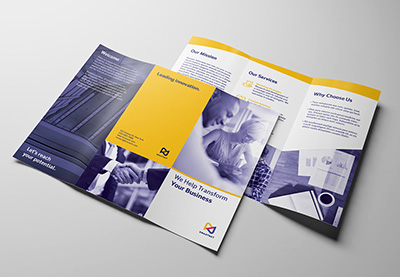
Final product image
What You’ll Be Creating

Promote your next business venture or current products with this super-easy tutorial that will help you attract more consumers. In this tutorial, I’ll show you how to make a flyer template.

Corporate business flyers are cost-effective advertising that you can use. Having an easy-to-use business flyer whose format you or your clients can quickly change is a huge advantage. 

In this tutorial, I’ll show you how to make a flyer with the most essential tools. You’ll learn how to successfully set up a template with layers, Color Swatches, and Paragraph styles. These three components will make trouble-free business flyers that can be formatted in just minutes. 

In a hurry? We’ve got amazing InDesign marketing flyer templates and business flyer templates over at Envato Elements and GraphicRiver. Go check them out! 

What You Will Need for Your InDesign Flyer Template

You’ll need access to Adobe InDesign and Adobe Illustrator. If you don’t have the software, you can download a trial from the Adobe website. You’ll also need:

Download the assets and make sure the font is installed on your system before starting. When you are ready, we can start designing the business flyer template! 

1. Setting Up a Marketing Flyer Template InDesign File

Step 1

In InDesign, go to File > New. In the New Document window, select the Print Tab. Select the A4 preset and name the document „Marketing Flyer Template”. Change the settings to the following:

  • Width to 21 cm
  • Height to 29.7 cm
  • Orientation to Portrait
  • Units to Centimeters
  • Pages to 1
  • Uncheck Facing Pages
  • Margins to 1.27 cm
  • Bleeds to 0.3 cm (it’s best to seek your professional printer’s preference)

Click Create.

Create a new marketing flyer template file

Step 2

For this open marketing flyer template, we will work with three Layers. Organizing layers is an important practice when designing a template as they will make it easier for the user to edit.

Bring up the Layers panel by going to Window > Layers. Double-click on Layer 1 and rename it Background. 

In the Layers panel main menu, select New Layer. Name it Images. Click OK.

Additionally, create a new layer named Copy. Click OK.

add layers on the layers panel

Step 3

Head over to Window > Color > Swatches to expand the Swatches panel. Choose New Color Swatch from the main menu. Set the Swatch Name and values to the following: 

  • Teal: C=60 M=0 Y=30 K=0 
  • Dark Blue: C=100 M=80 Y=0 K=70

Click Add and OK after you input each color value.

add colors on the swatches panel

Step 4

For this tutorial, we will create a list of Paragraph Styles that we will use to format the marketing flyer template. 

Head over to Window > Styles > Paragraph Styles to open the Paragraph Styles panel. On the main menu, select New Paragraph Style and set the Style Name to Copy. Select the Basic Character Formats option from the left side menu. Use the following settings:

  • Font Family: RNS Sanz
  • Font Style: Normal
  • Size: 9 pt

Select the Character Color option from the left side menu. Set the color to the Blue swatch. Click OK.

create paragraph styles for your marketing flyer template

Create a New Paragraph Style, setting the Style Name to Headline. Set the Basic Character Formats option to the following:

  • Font Family: RNS Sanz
  • Font Style: Extra Bold
  • Size: 14 pt

Select the Character Color option from the left side menu. Set the color to the Teal swatch. Click OK.

Create a New Paragraph Style, setting the Style Name to Subheadline. Set the Basic Character Formats option to the following:

  • Font Family: RNS Sanz
  • Font Style: Extra Bold
  • Size: 9 pt

Select the Character Color option from the left side menu. Set the color to the Teal swatch. Click OK.

Create a New Paragraph Style, setting the Style Name to Tagline. Set the Basic Character Formats option to the following:

  • Font Family: RNS Sanz
  • Font Style: Extra Bold
  • Size: 18 pt

Select the Character Color option from the left side menu. Set the color to the Blue swatch. Click OK.

paragraph styles

Step 5

Go to Layout > Create Guides. In the Create Guides option window, use the following settings:

  • Rows Number: 5
  • Rows Gutter: 0.5 cm
  • Columns Number: 2
  • Columns Gutter: 0.5 cm
  • Fit Guides to: Margins

Click OK.

create guides on your marketing flyer template

2. How to Design a Marketing Flyer Template in InDesign

Step 1

Select the Background layer from the Layers panel.

Using the Rectangle Tool (M), create a rectangle that measures 15 cm in Width and 5 cm in Height.

On the Swatches panel, select the Blue swatch. Set the Tint to 10%. 

create a rectangle on the top right corner of the marketing flyer template

Create a small text frame over the element and on the top right corner of the marketing flyer. Here, you can include contact information. Use the Paragraph Styles panel to format the frame into the Copy style. On the Control bar, select the Align Right button.

add contact information

Step 2

Select the Images layer from the Layers panel.   

Press Command-D to Place an image. Select the Social Media Logo EPS file and click Open. 

Use the Selection Tool (V) to crop the frame to the preferred logo. Place the logo on the top left corner of the flyer design. 

place a logon on the top left corner of the marketing flyer templates

Step 3

Press Command-D to Place an image. Select the Female Asian Architect JPG file and click Open. 

Place the image on the top guide of the first gutter. Use the Selection Tool (V) to crop the frame to the fourth row. 

Use the Direct Selection Tool (A) to resize the image to 50%. Check for the Scale percentage on the Control bar. 

place an image on the flyer design

Step 4

Select the Rectangle Tool (M) from the toolbar. Click on the document to open the Rectangle Option Window. 

Create a rectangle that measures 10.55 cm in Width and 3.45 cm in Height. Click OK.

Step 5

On the Swatches panel, select the [Paper] swatch for the rectangle. Set the Opacity to 90%. Align the rectangle to the top left corner of the image. 

add a rectangle on the indesign flyer template

Step 6

Select the Copy layer from the Layers panel.

Select the Text Tool (T) from the toolbar. Create a text frame over the rectangle that extends over the first column. 

add copy over the rectangle on the flyer design

Step 7

Add content to the frame and use the Paragraph Styles panel to style the text. Use the Tagline style for the first two lines—this is great for a catchphrase to attract customers. 

Use the Copy style for the description under the tagline.

use the paragraph styles panel to style the content

Step 8

While selecting the text frame, press Command-B to open the Text Frame Options window. Under Inset Spacing, set the Right option to 0.5 cm. Click OK.

add an inset spacing on the text frame

Step 9

Using the Text Tool (T), create a one-column text frame under the image. This frame can extend all the way to the bottom margin.

Add content and use the Paragraph Styles panel to style the frame. Use the Headline and Copy styles. Select the copy and change the color on the Swatches panel to [Paper]. 

Press Command-B to open the Text Frame Options window. Under Inset Spacing, set the Left side to 0.5 cm. 

Using the Rectangle Tool (M), create a rectangle that covers the text frame we created in this step. On the Swatches panel, set the color to Blue. Place this element on the Background layer.

add content and add a rectangle on the background of the flyer design

Step 10

Select the Text Tool (T) from the toolbar. Create a square text frame that measures 1 cm on all sides. 

Set the color of the frame to Blue on the Swatches panel. 

Add a number to the frame and use the Paragraph Styles panel to style it. Select the Headline style and change the color to [Paper] on the Swatches panel.

create a small text frame and add a number

Step 11

Head over to the Control bar and select the Align Center button. 

While selecting the text frame, press Command-B to open the Text Frame Options window. Under Inset Spacing, add 0.5 cm to all sides. Click OK.

use the text frame options to add an inset spacing

Step 12

Open the Text Wrap panel by going to Window > Text Wrap. On the panel, set the Offset to 0.3 cm on all sides

use the text wrap panel to add a wrap around on the text frame

Step 13

Duplicate the text frame by pressing Option and dragging. Change the numbers to „2” and „3”. Place the frames over the full-column frame created previously. 

duplicate the text frame and place over the content

Step 14

Using the Text Tool (T), create a second text frame on the opposite column. 

Use the Paragraph Styles panel to design the frame with the Headline and Copy styles. 

add a text frame to the opposite column of the flyer design

Step 15

Open the Digital Marketing Icons in Illustrator. Select three icons and copy/paste them onto the marketing flyer template in InDesign. 

Resize the icons on the Control bar. Set the Percentage Scale to 20%. 

copy and paste the icons

Step 16

You’ll notice the colors don’t match our design. On the Swatches panel, select the cream color and click on the Delete button. In the Delete Swatch options window, select the Replacement to Defined Swatch. In the dropdown menu, select the [Paper} swatch. Click OK.

Select the RGB teal color on the Swatches panel. Delete it and replace it with the Blue swatch. 

substitute the icons colors for the swatches we created

Step 17

Place each icon at the top of each gutter on the last three rows. 

Create a text frame with the Text Tool (T) for each icon/row. Add content and use the Paragraph Styles panel to style it. Use the Subheadline and Copy styles. 

add text next to the icons

Step 18

Using the Line Tool (/), create a stroke between each text frame. 

Open the Stroke panel by going to Window > Stroke. Set the Stroke Weight to 1 pt and the Type to Dotted.

On the Swatches panel, set the Stroke color to Blue. 

create stroke lines in between the text frames

3. How to Export an InDesign Flyer Template File for Printing

Before exporting a file for printing, it is useful to take a look around all the edges to make sure all the images and vectors bleeding out are touching the bleeds.

Step 1

To export the file, go to File > Export. Name the file „Marketing Flyer Template” and choose Adobe PDF (Print) from the Format dropdown menu. Click Save. 

export the marketing flyer template as a PDF

Step 2

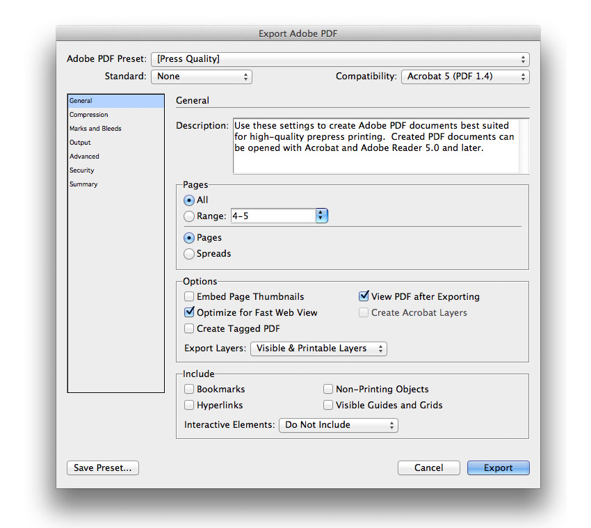
In the Export Adobe PDF window, set the Adobe PDF Preset to Press Quality.

select Press Quality under the Adobe PDF Preset

On the left side of the panel, select Marks and Bleeds. Check All Printer’s Marks and Use Document Bleed Settings. Click Export. You will have a ready-to-print PDF file.

select all printers marks and document bleed settings

Great Job! You’ve Finished Your Business Flyer!

In this tutorial, we learned how to make a flyer template. We covered key tools that will help anyone edit this template fast and easy. Today, we learned to:

  • set up a ready-to-print InDesign file
  • create layers to keep an organized file
  • add color swatches and replace colors
  • create Paragraph styles to style text frames
  • use the Text Frame options and Text Wrap tool on text frames

If you are new to InDesign and need flyer templates or flyer design inspiration right away, head over to Envato Elements and GraphicRiver. We’ve got many options to explore! 

If you liked this tutorial, you might like these:

How to Manage a Graphic Design Project With monday.com

Post pobrano z: How to Manage a Graphic Design Project With monday.com

The process of seeing a graphic design project through from conception to delivery can be a challenging one for even the most talented designers, but one thing experienced designers know is that excellent project management is critical to delivering successful projects within identified deadlines and budgets. 

There are many approaches to effective project management, all of which have been left in the dust by today’s cloud-based project and team management tools like the ever-popular monday.com.

Mondaycom

Used by more than 70,000 businesses around the world, monday.com is a simple yet sophisticated tool that allows team members to communicate with each other, plan each stage of a project, track tasks, costs and deadlines, brainstorm solutions and much more, no matter where they are or what digital device they happen to be using. 

Let’s take a look at how you can manage your next graphic design project expertly using monday.com.

1. How to Set Up an Account

The first thing you’ll notice about monday.com is that it offers users a lot of flexibility in terms of pricing plans. There are, in fact, four different pricing plans to suit a variety of needs. What I suggest, though, is that you start with the free trial to get a feel for what this incredible tool can do. Set up your account by typing your email address into the appropriate slot at the top of the page and hitting the Get Started button.

Set Up an Account

Once you’ve submitted your email address, you will be walked through a few screens where you’ll be asked to provide key details about the kind of projects you’re likely to use the application for, your role in the team, and how many people you will be collaborating with. 

Add Account Details

At this point, you can also add the email addresses of your team members, and monday.com will automatically invite them to join you.

Add Team Members

2. How to Create a Board

Now that you’re all set up, your next step is to create a design board for your project. Here you have a number of options. You can use one of the 70+ ready-made and highly functional templates on offer to start customising and building out your project details.

Creating a Board from Templates Provided

Or you can create your own blank board template from scratch. That’s the route we’re going to take for our example here, so that you can get a clear idea of the level of flexibility monday.com offers in creating highly individualised boards.

Click the + sign next to Boards on the left of the screen, and select the Blank Board template.

Creating a Blank Board

Enter your project name in the dialog that pops up and press the Create Board button.

Create a Board

This is what your board will look like.

Create a Board

3. How to Customise Your Board 

Design boards are a key organisational component of your project. As you can see in the image above, each board is made up of groups, each group is made up of a number of items, and each item can have several columns.

It is inevitable that each team that uses these boards will use them differently based on their needs, but let me show you how you can use them to manage your graphic design project using the goal of creating a brochure for a cafe.

As you can see, the Brodbake Cafe Brochure board already has two generic self-generated groups. I will use these groups to break the project down into more manageable parts/steps and then break each step down into even more manageable parts/steps. 

A. Create Groups

First, let’s change the titles of each group. To do so, just double-click on the title and type your title over the existing one. You can also change the colour assigned to each group by clicking on the coloured circle shown next to the title.

Create Groups

Once you’ve renamed the existing groups, you can add more groups to your board by clicking the three dots in the upper right corner of the app. This will expand an extensive customisation menu. Click the first menu item, Add Group

Create Groups

B. Create Tasks

Now it’s time to add the tasks that need to be completed in each Phase. To do so, just start typing in the row where it says +Add, and hit Return to create a new task row.

Create Tasks

Repeat these steps for each of your phases until all the tasks that need to be completed to move the project from start to finish have been added. 

C. Add Columns

Now that you have added all the tasks that need to be accomplished to create your graphic design project, it’s time to add some columns. 

Columns are all about accountability. They allow you to create checkpoints that identify and monitor critical details regarding each task, like deadlines and budget, who is responsible for which task, monitoring of progression on each task, and more. 

To add a column, click the plus sign over the last column of any group. 

Add Columns

This will open a list of the most popular columns. Select the More Columns button at the end of this list to open an extensive menu of columns options available for you to customise your tasks. When you see a column you want to add, simply press the Add to board button. 

Add Columns

Any columns that you add to your board will be shared by all groups on your board, so if you delete or move a column in one group, it will affect the columns in another group.

Add Columns

D. Pick Your View

One of the coolest features of monday.com for teams managing a graphic design project is the ability to choose alternative ways of viewing project information to quickly gather specific information. 

The standard project view is via the main table shown in the image above, but it is also possible to view project information in the form of a chart which could provide information like the distribution of tasks within a team. It is also possible to use a Kanban view in order to view tasks grouped by status or the Timeline view to identify information like pending tasks or the workload of different team members.

To access the different views offered by monday.com, go to the top left of the app window and use the dropdown menu to open the Views Center by clicking on the Add View button. Select the view you want from the list provided.

Pick Your View

4. Communication and Collaboration

We all know that bad communication can sink even the most promising project. And that is why one of the most critical features of monday.com is the freedom and ease it brings to team communication and collaboration by having all your team’s communication in one place. 

With the ability to access the app from your computer or mobile device of choice, team members can bounce ideas around easily during the critical brainstorming stage of a project and comment on any aspect of a shared project from directly in the app using the @mention. 

Communication and Collaboration

monday.com also allows teammates to share files, links, images and ideas easily, and no one has to worry about being left out of the loop or being bogged down by duplicating information endlessly. With the possibility of including the entire team on a project, communication is easy, fast, and collaborative. 

5. Track Progress, Promoting Accountability

Being able to track progress is critical to a project’s success, and monday.com provides several systems that will enable team leaders to keep things on track and intervene quickly before they get derailed. Not only does the app provide a „Project Tracker For Teams” template, but even if you’re not using that specific template, it makes it easy to integrate its features in your project. 

Track Progress Promoting Accountability

For example, you could use the Status column feature with its colour coding of red, amber and green, so that you always know at a glance where problems are likely to arise and are better positioned to head them off.

The Person column indicates clear ownership of each aspect of a project and keeps everyone aware of where team members are with any given project at any given time. 

What’s more, the Progress column is another great tool for understanding at a glance just how close you are to keeping your deadlines and delivering your project on time. 

All these systems are indispensable in successfully managing a graphic design project from start to finish. 

Manage Your Next Graphic Design Project With monday.com

All these great features make monday.com a terrific project management tool for the savvy graphic designer and team leader. To learn more about the other great features of this awesome app, check out the official guides and sign up for the generous free seven-day trial. You’ll be so impressed with this app, you’ll wonder how you ever got anything done without it.

How to Manage a Graphic Design Project With monday.com

Post pobrano z: How to Manage a Graphic Design Project With monday.com

The process of seeing a graphic design project through from conception to delivery can be a challenging one for even the most talented designers, but one thing experienced designers know is that excellent project management is critical to delivering successful projects within identified deadlines and budgets. 

There are many approaches to effective project management, all of which have been left in the dust by today’s cloud-based project and team management tools like the ever-popular monday.com.

Mondaycom

Used by more than 70,000 businesses around the world, monday.com is a simple yet sophisticated tool that allows team members to communicate with each other, plan each stage of a project, track tasks, costs and deadlines, brainstorm solutions and much more, no matter where they are or what digital device they happen to be using. 

Let’s take a look at how you can manage your next graphic design project expertly using monday.com.

1. How to Set Up an Account

The first thing you’ll notice about monday.com is that it offers users a lot of flexibility in terms of pricing plans. There are, in fact, four different pricing plans to suit a variety of needs. What I suggest, though, is that you start with the free trial to get a feel for what this incredible tool can do. Set up your account by typing your email address into the appropriate slot at the top of the page and hitting the Get Started button.

Set Up an Account

Once you’ve submitted your email address, you will be walked through a few screens where you’ll be asked to provide key details about the kind of projects you’re likely to use the application for, your role in the team, and how many people you will be collaborating with. 

Add Account Details

At this point, you can also add the email addresses of your team members, and monday.com will automatically invite them to join you.

Add Team Members

2. How to Create a Board

Now that you’re all set up, your next step is to create a design board for your project. Here you have a number of options. You can use one of the 70+ ready-made and highly functional templates on offer to start customising and building out your project details.

Creating a Board from Templates Provided

Or you can create your own blank board template from scratch. That’s the route we’re going to take for our example here, so that you can get a clear idea of the level of flexibility monday.com offers in creating highly individualised boards.

Click the + sign next to Boards on the left of the screen, and select the Blank Board template.

Creating a Blank Board

Enter your project name in the dialog that pops up and press the Create Board button.

Create a Board

This is what your board will look like.

Create a Board

3. How to Customise Your Board 

Design boards are a key organisational component of your project. As you can see in the image above, each board is made up of groups, each group is made up of a number of items, and each item can have several columns.

It is inevitable that each team that uses these boards will use them differently based on their needs, but let me show you how you can use them to manage your graphic design project using the goal of creating a brochure for a cafe.

As you can see, the Brodbake Cafe Brochure board already has two generic self-generated groups. I will use these groups to break the project down into more manageable parts/steps and then break each step down into even more manageable parts/steps. 

A. Create Groups

First, let’s change the titles of each group. To do so, just double-click on the title and type your title over the existing one. You can also change the colour assigned to each group by clicking on the coloured circle shown next to the title.

Create Groups

Once you’ve renamed the existing groups, you can add more groups to your board by clicking the three dots in the upper right corner of the app. This will expand an extensive customisation menu. Click the first menu item, Add Group

Create Groups

B. Create Tasks

Now it’s time to add the tasks that need to be completed in each Phase. To do so, just start typing in the row where it says +Add, and hit Return to create a new task row.

Create Tasks

Repeat these steps for each of your phases until all the tasks that need to be completed to move the project from start to finish have been added. 

C. Add Columns

Now that you have added all the tasks that need to be accomplished to create your graphic design project, it’s time to add some columns. 

Columns are all about accountability. They allow you to create checkpoints that identify and monitor critical details regarding each task, like deadlines and budget, who is responsible for which task, monitoring of progression on each task, and more. 

To add a column, click the plus sign over the last column of any group. 

Add Columns

This will open a list of the most popular columns. Select the More Columns button at the end of this list to open an extensive menu of columns options available for you to customise your tasks. When you see a column you want to add, simply press the Add to board button. 

Add Columns

Any columns that you add to your board will be shared by all groups on your board, so if you delete or move a column in one group, it will affect the columns in another group.

Add Columns

D. Pick Your View

One of the coolest features of monday.com for teams managing a graphic design project is the ability to choose alternative ways of viewing project information to quickly gather specific information. 

The standard project view is via the main table shown in the image above, but it is also possible to view project information in the form of a chart which could provide information like the distribution of tasks within a team. It is also possible to use a Kanban view in order to view tasks grouped by status or the Timeline view to identify information like pending tasks or the workload of different team members.

To access the different views offered by monday.com, go to the top left of the app window and use the dropdown menu to open the Views Center by clicking on the Add View button. Select the view you want from the list provided.

Pick Your View

4. Communication and Collaboration

We all know that bad communication can sink even the most promising project. And that is why one of the most critical features of monday.com is the freedom and ease it brings to team communication and collaboration by having all your team’s communication in one place. 

With the ability to access the app from your computer or mobile device of choice, team members can bounce ideas around easily during the critical brainstorming stage of a project and comment on any aspect of a shared project from directly in the app using the @mention. 

Communication and Collaboration

monday.com also allows teammates to share files, links, images and ideas easily, and no one has to worry about being left out of the loop or being bogged down by duplicating information endlessly. With the possibility of including the entire team on a project, communication is easy, fast, and collaborative. 

5. Track Progress, Promoting Accountability

Being able to track progress is critical to a project’s success, and monday.com provides several systems that will enable team leaders to keep things on track and intervene quickly before they get derailed. Not only does the app provide a „Project Tracker For Teams” template, but even if you’re not using that specific template, it makes it easy to integrate its features in your project. 

Track Progress Promoting Accountability

For example, you could use the Status column feature with its colour coding of red, amber and green, so that you always know at a glance where problems are likely to arise and are better positioned to head them off.

The Person column indicates clear ownership of each aspect of a project and keeps everyone aware of where team members are with any given project at any given time. 

What’s more, the Progress column is another great tool for understanding at a glance just how close you are to keeping your deadlines and delivering your project on time. 

All these systems are indispensable in successfully managing a graphic design project from start to finish. 

Manage Your Next Graphic Design Project With monday.com

All these great features make monday.com a terrific project management tool for the savvy graphic designer and team leader. To learn more about the other great features of this awesome app, check out the official guides and sign up for the generous free seven-day trial. You’ll be so impressed with this app, you’ll wonder how you ever got anything done without it.

How to Manage a Graphic Design Project With monday.com

Post pobrano z: How to Manage a Graphic Design Project With monday.com

The process of seeing a graphic design project through from conception to delivery can be a challenging one for even the most talented designers, but one thing experienced designers know is that excellent project management is critical to delivering successful projects within identified deadlines and budgets. 

There are many approaches to effective project management, all of which have been left in the dust by today’s cloud-based project and team management tools like the ever-popular monday.com.

Mondaycom

Used by more than 70,000 businesses around the world, monday.com is a simple yet sophisticated tool that allows team members to communicate with each other, plan each stage of a project, track tasks, costs and deadlines, brainstorm solutions and much more, no matter where they are or what digital device they happen to be using. 

Let’s take a look at how you can manage your next graphic design project expertly using monday.com.

1. How to Set Up an Account

The first thing you’ll notice about monday.com is that it offers users a lot of flexibility in terms of pricing plans. There are, in fact, four different pricing plans to suit a variety of needs. What I suggest, though, is that you start with the free trial to get a feel for what this incredible tool can do. Set up your account by typing your email address into the appropriate slot at the top of the page and hitting the Get Started button.

Set Up an Account

Once you’ve submitted your email address, you will be walked through a few screens where you’ll be asked to provide key details about the kind of projects you’re likely to use the application for, your role in the team, and how many people you will be collaborating with. 

Add Account Details

At this point, you can also add the email addresses of your team members, and monday.com will automatically invite them to join you.

Add Team Members

2. How to Create a Board

Now that you’re all set up, your next step is to create a design board for your project. Here you have a number of options. You can use one of the 70+ ready-made and highly functional templates on offer to start customising and building out your project details.

Creating a Board from Templates Provided

Or you can create your own blank board template from scratch. That’s the route we’re going to take for our example here, so that you can get a clear idea of the level of flexibility monday.com offers in creating highly individualised boards.

Click the + sign next to Boards on the left of the screen, and select the Blank Board template.

Creating a Blank Board

Enter your project name in the dialog that pops up and press the Create Board button.

Create a Board

This is what your board will look like.

Create a Board

3. How to Customise Your Board 

Design boards are a key organisational component of your project. As you can see in the image above, each board is made up of groups, each group is made up of a number of items, and each item can have several columns.

It is inevitable that each team that uses these boards will use them differently based on their needs, but let me show you how you can use them to manage your graphic design project using the goal of creating a brochure for a cafe.

As you can see, the Brodbake Cafe Brochure board already has two generic self-generated groups. I will use these groups to break the project down into more manageable parts/steps and then break each step down into even more manageable parts/steps. 

A. Create Groups

First, let’s change the titles of each group. To do so, just double-click on the title and type your title over the existing one. You can also change the colour assigned to each group by clicking on the coloured circle shown next to the title.

Create Groups

Once you’ve renamed the existing groups, you can add more groups to your board by clicking the three dots in the upper right corner of the app. This will expand an extensive customisation menu. Click the first menu item, Add Group

Create Groups

B. Create Tasks

Now it’s time to add the tasks that need to be completed in each Phase. To do so, just start typing in the row where it says +Add, and hit Return to create a new task row.

Create Tasks

Repeat these steps for each of your phases until all the tasks that need to be completed to move the project from start to finish have been added. 

C. Add Columns

Now that you have added all the tasks that need to be accomplished to create your graphic design project, it’s time to add some columns. 

Columns are all about accountability. They allow you to create checkpoints that identify and monitor critical details regarding each task, like deadlines and budget, who is responsible for which task, monitoring of progression on each task, and more. 

To add a column, click the plus sign over the last column of any group. 

Add Columns

This will open a list of the most popular columns. Select the More Columns button at the end of this list to open an extensive menu of columns options available for you to customise your tasks. When you see a column you want to add, simply press the Add to board button. 

Add Columns

Any columns that you add to your board will be shared by all groups on your board, so if you delete or move a column in one group, it will affect the columns in another group.

Add Columns

D. Pick Your View

One of the coolest features of monday.com for teams managing a graphic design project is the ability to choose alternative ways of viewing project information to quickly gather specific information. 

The standard project view is via the main table shown in the image above, but it is also possible to view project information in the form of a chart which could provide information like the distribution of tasks within a team. It is also possible to use a Kanban view in order to view tasks grouped by status or the Timeline view to identify information like pending tasks or the workload of different team members.

To access the different views offered by monday.com, go to the top left of the app window and use the dropdown menu to open the Views Center by clicking on the Add View button. Select the view you want from the list provided.

Pick Your View

4. Communication and Collaboration

We all know that bad communication can sink even the most promising project. And that is why one of the most critical features of monday.com is the freedom and ease it brings to team communication and collaboration by having all your team’s communication in one place. 

With the ability to access the app from your computer or mobile device of choice, team members can bounce ideas around easily during the critical brainstorming stage of a project and comment on any aspect of a shared project from directly in the app using the @mention. 

Communication and Collaboration

monday.com also allows teammates to share files, links, images and ideas easily, and no one has to worry about being left out of the loop or being bogged down by duplicating information endlessly. With the possibility of including the entire team on a project, communication is easy, fast, and collaborative. 

5. Track Progress, Promoting Accountability

Being able to track progress is critical to a project’s success, and monday.com provides several systems that will enable team leaders to keep things on track and intervene quickly before they get derailed. Not only does the app provide a „Project Tracker For Teams” template, but even if you’re not using that specific template, it makes it easy to integrate its features in your project. 

Track Progress Promoting Accountability

For example, you could use the Status column feature with its colour coding of red, amber and green, so that you always know at a glance where problems are likely to arise and are better positioned to head them off.

The Person column indicates clear ownership of each aspect of a project and keeps everyone aware of where team members are with any given project at any given time. 

What’s more, the Progress column is another great tool for understanding at a glance just how close you are to keeping your deadlines and delivering your project on time. 

All these systems are indispensable in successfully managing a graphic design project from start to finish. 

Manage Your Next Graphic Design Project With monday.com

All these great features make monday.com a terrific project management tool for the savvy graphic designer and team leader. To learn more about the other great features of this awesome app, check out the official guides and sign up for the generous free seven-day trial. You’ll be so impressed with this app, you’ll wonder how you ever got anything done without it.

How to Manage a Graphic Design Project With monday.com

Post pobrano z: How to Manage a Graphic Design Project With monday.com

The process of seeing a graphic design project through from conception to delivery can be a challenging one for even the most talented designers, but one thing experienced designers know is that excellent project management is critical to delivering successful projects within identified deadlines and budgets. 

There are many approaches to effective project management, all of which have been left in the dust by today’s cloud-based project and team management tools like the ever-popular monday.com.

Mondaycom

Used by more than 70,000 businesses around the world, monday.com is a simple yet sophisticated tool that allows team members to communicate with each other, plan each stage of a project, track tasks, costs and deadlines, brainstorm solutions and much more, no matter where they are or what digital device they happen to be using. 

Let’s take a look at how you can manage your next graphic design project expertly using monday.com.

1. How to Set Up an Account

The first thing you’ll notice about monday.com is that it offers users a lot of flexibility in terms of pricing plans. There are, in fact, four different pricing plans to suit a variety of needs. What I suggest, though, is that you start with the free trial to get a feel for what this incredible tool can do. Set up your account by typing your email address into the appropriate slot at the top of the page and hitting the Get Started button.

Set Up an Account

Once you’ve submitted your email address, you will be walked through a few screens where you’ll be asked to provide key details about the kind of projects you’re likely to use the application for, your role in the team, and how many people you will be collaborating with. 

Add Account Details

At this point, you can also add the email addresses of your team members, and monday.com will automatically invite them to join you.

Add Team Members

2. How to Create a Board

Now that you’re all set up, your next step is to create a design board for your project. Here you have a number of options. You can use one of the 70+ ready-made and highly functional templates on offer to start customising and building out your project details.

Creating a Board from Templates Provided

Or you can create your own blank board template from scratch. That’s the route we’re going to take for our example here, so that you can get a clear idea of the level of flexibility monday.com offers in creating highly individualised boards.

Click the + sign next to Boards on the left of the screen, and select the Blank Board template.

Creating a Blank Board

Enter your project name in the dialog that pops up and press the Create Board button.

Create a Board

This is what your board will look like.

Create a Board

3. How to Customise Your Board 

Design boards are a key organisational component of your project. As you can see in the image above, each board is made up of groups, each group is made up of a number of items, and each item can have several columns.

It is inevitable that each team that uses these boards will use them differently based on their needs, but let me show you how you can use them to manage your graphic design project using the goal of creating a brochure for a cafe.

As you can see, the Brodbake Cafe Brochure board already has two generic self-generated groups. I will use these groups to break the project down into more manageable parts/steps and then break each step down into even more manageable parts/steps. 

A. Create Groups

First, let’s change the titles of each group. To do so, just double-click on the title and type your title over the existing one. You can also change the colour assigned to each group by clicking on the coloured circle shown next to the title.

Create Groups

Once you’ve renamed the existing groups, you can add more groups to your board by clicking the three dots in the upper right corner of the app. This will expand an extensive customisation menu. Click the first menu item, Add Group

Create Groups

B. Create Tasks

Now it’s time to add the tasks that need to be completed in each Phase. To do so, just start typing in the row where it says +Add, and hit Return to create a new task row.

Create Tasks

Repeat these steps for each of your phases until all the tasks that need to be completed to move the project from start to finish have been added. 

C. Add Columns

Now that you have added all the tasks that need to be accomplished to create your graphic design project, it’s time to add some columns. 

Columns are all about accountability. They allow you to create checkpoints that identify and monitor critical details regarding each task, like deadlines and budget, who is responsible for which task, monitoring of progression on each task, and more. 

To add a column, click the plus sign over the last column of any group. 

Add Columns

This will open a list of the most popular columns. Select the More Columns button at the end of this list to open an extensive menu of columns options available for you to customise your tasks. When you see a column you want to add, simply press the Add to board button. 

Add Columns

Any columns that you add to your board will be shared by all groups on your board, so if you delete or move a column in one group, it will affect the columns in another group.

Add Columns

D. Pick Your View

One of the coolest features of monday.com for teams managing a graphic design project is the ability to choose alternative ways of viewing project information to quickly gather specific information. 

The standard project view is via the main table shown in the image above, but it is also possible to view project information in the form of a chart which could provide information like the distribution of tasks within a team. It is also possible to use a Kanban view in order to view tasks grouped by status or the Timeline view to identify information like pending tasks or the workload of different team members.

To access the different views offered by monday.com, go to the top left of the app window and use the dropdown menu to open the Views Center by clicking on the Add View button. Select the view you want from the list provided.

Pick Your View

4. Communication and Collaboration

We all know that bad communication can sink even the most promising project. And that is why one of the most critical features of monday.com is the freedom and ease it brings to team communication and collaboration by having all your team’s communication in one place. 

With the ability to access the app from your computer or mobile device of choice, team members can bounce ideas around easily during the critical brainstorming stage of a project and comment on any aspect of a shared project from directly in the app using the @mention. 

Communication and Collaboration

monday.com also allows teammates to share files, links, images and ideas easily, and no one has to worry about being left out of the loop or being bogged down by duplicating information endlessly. With the possibility of including the entire team on a project, communication is easy, fast, and collaborative. 

5. Track Progress, Promoting Accountability

Being able to track progress is critical to a project’s success, and monday.com provides several systems that will enable team leaders to keep things on track and intervene quickly before they get derailed. Not only does the app provide a „Project Tracker For Teams” template, but even if you’re not using that specific template, it makes it easy to integrate its features in your project. 

Track Progress Promoting Accountability

For example, you could use the Status column feature with its colour coding of red, amber and green, so that you always know at a glance where problems are likely to arise and are better positioned to head them off.

The Person column indicates clear ownership of each aspect of a project and keeps everyone aware of where team members are with any given project at any given time. 

What’s more, the Progress column is another great tool for understanding at a glance just how close you are to keeping your deadlines and delivering your project on time. 

All these systems are indispensable in successfully managing a graphic design project from start to finish. 

Manage Your Next Graphic Design Project With monday.com

All these great features make monday.com a terrific project management tool for the savvy graphic designer and team leader. To learn more about the other great features of this awesome app, check out the official guides and sign up for the generous free seven-day trial. You’ll be so impressed with this app, you’ll wonder how you ever got anything done without it.

How to Manage a Graphic Design Project With monday.com

Post pobrano z: How to Manage a Graphic Design Project With monday.com

The process of seeing a graphic design project through from conception to delivery can be a challenging one for even the most talented designers, but one thing experienced designers know is that excellent project management is critical to delivering successful projects within identified deadlines and budgets. 

There are many approaches to effective project management, all of which have been left in the dust by today’s cloud-based project and team management tools like the ever-popular monday.com.

Mondaycom

Used by more than 70,000 businesses around the world, monday.com is a simple yet sophisticated tool that allows team members to communicate with each other, plan each stage of a project, track tasks, costs and deadlines, brainstorm solutions and much more, no matter where they are or what digital device they happen to be using. 

Let’s take a look at how you can manage your next graphic design project expertly using monday.com.

1. How to Set Up an Account

The first thing you’ll notice about monday.com is that it offers users a lot of flexibility in terms of pricing plans. There are, in fact, four different pricing plans to suit a variety of needs. What I suggest, though, is that you start with the free trial to get a feel for what this incredible tool can do. Set up your account by typing your email address into the appropriate slot at the top of the page and hitting the Get Started button.

Set Up an Account

Once you’ve submitted your email address, you will be walked through a few screens where you’ll be asked to provide key details about the kind of projects you’re likely to use the application for, your role in the team, and how many people you will be collaborating with. 

Add Account Details

At this point, you can also add the email addresses of your team members, and monday.com will automatically invite them to join you.

Add Team Members

2. How to Create a Board

Now that you’re all set up, your next step is to create a design board for your project. Here you have a number of options. You can use one of the 70+ ready-made and highly functional templates on offer to start customising and building out your project details.

Creating a Board from Templates Provided

Or you can create your own blank board template from scratch. That’s the route we’re going to take for our example here, so that you can get a clear idea of the level of flexibility monday.com offers in creating highly individualised boards.

Click the + sign next to Boards on the left of the screen, and select the Blank Board template.

Creating a Blank Board

Enter your project name in the dialog that pops up and press the Create Board button.

Create a Board

This is what your board will look like.

Create a Board

3. How to Customise Your Board 

Design boards are a key organisational component of your project. As you can see in the image above, each board is made up of groups, each group is made up of a number of items, and each item can have several columns.

It is inevitable that each team that uses these boards will use them differently based on their needs, but let me show you how you can use them to manage your graphic design project using the goal of creating a brochure for a cafe.

As you can see, the Brodbake Cafe Brochure board already has two generic self-generated groups. I will use these groups to break the project down into more manageable parts/steps and then break each step down into even more manageable parts/steps. 

A. Create Groups

First, let’s change the titles of each group. To do so, just double-click on the title and type your title over the existing one. You can also change the colour assigned to each group by clicking on the coloured circle shown next to the title.

Create Groups

Once you’ve renamed the existing groups, you can add more groups to your board by clicking the three dots in the upper right corner of the app. This will expand an extensive customisation menu. Click the first menu item, Add Group

Create Groups

B. Create Tasks

Now it’s time to add the tasks that need to be completed in each Phase. To do so, just start typing in the row where it says +Add, and hit Return to create a new task row.

Create Tasks

Repeat these steps for each of your phases until all the tasks that need to be completed to move the project from start to finish have been added. 

C. Add Columns

Now that you have added all the tasks that need to be accomplished to create your graphic design project, it’s time to add some columns. 

Columns are all about accountability. They allow you to create checkpoints that identify and monitor critical details regarding each task, like deadlines and budget, who is responsible for which task, monitoring of progression on each task, and more. 

To add a column, click the plus sign over the last column of any group. 

Add Columns

This will open a list of the most popular columns. Select the More Columns button at the end of this list to open an extensive menu of columns options available for you to customise your tasks. When you see a column you want to add, simply press the Add to board button. 

Add Columns

Any columns that you add to your board will be shared by all groups on your board, so if you delete or move a column in one group, it will affect the columns in another group.

Add Columns

D. Pick Your View

One of the coolest features of monday.com for teams managing a graphic design project is the ability to choose alternative ways of viewing project information to quickly gather specific information. 

The standard project view is via the main table shown in the image above, but it is also possible to view project information in the form of a chart which could provide information like the distribution of tasks within a team. It is also possible to use a Kanban view in order to view tasks grouped by status or the Timeline view to identify information like pending tasks or the workload of different team members.

To access the different views offered by monday.com, go to the top left of the app window and use the dropdown menu to open the Views Center by clicking on the Add View button. Select the view you want from the list provided.

Pick Your View

4. Communication and Collaboration

We all know that bad communication can sink even the most promising project. And that is why one of the most critical features of monday.com is the freedom and ease it brings to team communication and collaboration by having all your team’s communication in one place. 

With the ability to access the app from your computer or mobile device of choice, team members can bounce ideas around easily during the critical brainstorming stage of a project and comment on any aspect of a shared project from directly in the app using the @mention. 

Communication and Collaboration

monday.com also allows teammates to share files, links, images and ideas easily, and no one has to worry about being left out of the loop or being bogged down by duplicating information endlessly. With the possibility of including the entire team on a project, communication is easy, fast, and collaborative. 

5. Track Progress, Promoting Accountability

Being able to track progress is critical to a project’s success, and monday.com provides several systems that will enable team leaders to keep things on track and intervene quickly before they get derailed. Not only does the app provide a „Project Tracker For Teams” template, but even if you’re not using that specific template, it makes it easy to integrate its features in your project. 

Track Progress Promoting Accountability

For example, you could use the Status column feature with its colour coding of red, amber and green, so that you always know at a glance where problems are likely to arise and are better positioned to head them off.

The Person column indicates clear ownership of each aspect of a project and keeps everyone aware of where team members are with any given project at any given time. 

What’s more, the Progress column is another great tool for understanding at a glance just how close you are to keeping your deadlines and delivering your project on time. 

All these systems are indispensable in successfully managing a graphic design project from start to finish. 

Manage Your Next Graphic Design Project With monday.com

All these great features make monday.com a terrific project management tool for the savvy graphic designer and team leader. To learn more about the other great features of this awesome app, check out the official guides and sign up for the generous free seven-day trial. You’ll be so impressed with this app, you’ll wonder how you ever got anything done without it.

How to Manage a Graphic Design Project With monday.com

Post pobrano z: How to Manage a Graphic Design Project With monday.com

The process of seeing a graphic design project through from conception to delivery can be a challenging one for even the most talented designers, but one thing experienced designers know is that excellent project management is critical to delivering successful projects within identified deadlines and budgets. 

There are many approaches to effective project management, all of which have been left in the dust by today’s cloud-based project and team management tools like the ever-popular monday.com.

Mondaycom

Used by more than 70,000 businesses around the world, monday.com is a simple yet sophisticated tool that allows team members to communicate with each other, plan each stage of a project, track tasks, costs and deadlines, brainstorm solutions and much more, no matter where they are or what digital device they happen to be using. 

Let’s take a look at how you can manage your next graphic design project expertly using monday.com.

1. How to Set Up an Account

The first thing you’ll notice about monday.com is that it offers users a lot of flexibility in terms of pricing plans. There are, in fact, four different pricing plans to suit a variety of needs. What I suggest, though, is that you start with the free trial to get a feel for what this incredible tool can do. Set up your account by typing your email address into the appropriate slot at the top of the page and hitting the Get Started button.

Set Up an Account

Once you’ve submitted your email address, you will be walked through a few screens where you’ll be asked to provide key details about the kind of projects you’re likely to use the application for, your role in the team, and how many people you will be collaborating with. 

Add Account Details

At this point, you can also add the email addresses of your team members, and monday.com will automatically invite them to join you.

Add Team Members

2. How to Create a Board

Now that you’re all set up, your next step is to create a design board for your project. Here you have a number of options. You can use one of the 70+ ready-made and highly functional templates on offer to start customising and building out your project details.

Creating a Board from Templates Provided

Or you can create your own blank board template from scratch. That’s the route we’re going to take for our example here, so that you can get a clear idea of the level of flexibility monday.com offers in creating highly individualised boards.

Click the + sign next to Boards on the left of the screen, and select the Blank Board template.

Creating a Blank Board

Enter your project name in the dialog that pops up and press the Create Board button.

Create a Board

This is what your board will look like.

Create a Board

3. How to Customise Your Board 

Design boards are a key organisational component of your project. As you can see in the image above, each board is made up of groups, each group is made up of a number of items, and each item can have several columns.

It is inevitable that each team that uses these boards will use them differently based on their needs, but let me show you how you can use them to manage your graphic design project using the goal of creating a brochure for a cafe.

As you can see, the Brodbake Cafe Brochure board already has two generic self-generated groups. I will use these groups to break the project down into more manageable parts/steps and then break each step down into even more manageable parts/steps. 

A. Create Groups

First, let’s change the titles of each group. To do so, just double-click on the title and type your title over the existing one. You can also change the colour assigned to each group by clicking on the coloured circle shown next to the title.

Create Groups

Once you’ve renamed the existing groups, you can add more groups to your board by clicking the three dots in the upper right corner of the app. This will expand an extensive customisation menu. Click the first menu item, Add Group

Create Groups

B. Create Tasks

Now it’s time to add the tasks that need to be completed in each Phase. To do so, just start typing in the row where it says +Add, and hit Return to create a new task row.

Create Tasks

Repeat these steps for each of your phases until all the tasks that need to be completed to move the project from start to finish have been added. 

C. Add Columns

Now that you have added all the tasks that need to be accomplished to create your graphic design project, it’s time to add some columns. 

Columns are all about accountability. They allow you to create checkpoints that identify and monitor critical details regarding each task, like deadlines and budget, who is responsible for which task, monitoring of progression on each task, and more. 

To add a column, click the plus sign over the last column of any group. 

Add Columns

This will open a list of the most popular columns. Select the More Columns button at the end of this list to open an extensive menu of columns options available for you to customise your tasks. When you see a column you want to add, simply press the Add to board button. 

Add Columns

Any columns that you add to your board will be shared by all groups on your board, so if you delete or move a column in one group, it will affect the columns in another group.

Add Columns

D. Pick Your View

One of the coolest features of monday.com for teams managing a graphic design project is the ability to choose alternative ways of viewing project information to quickly gather specific information. 

The standard project view is via the main table shown in the image above, but it is also possible to view project information in the form of a chart which could provide information like the distribution of tasks within a team. It is also possible to use a Kanban view in order to view tasks grouped by status or the Timeline view to identify information like pending tasks or the workload of different team members.

To access the different views offered by monday.com, go to the top left of the app window and use the dropdown menu to open the Views Center by clicking on the Add View button. Select the view you want from the list provided.

Pick Your View

4. Communication and Collaboration

We all know that bad communication can sink even the most promising project. And that is why one of the most critical features of monday.com is the freedom and ease it brings to team communication and collaboration by having all your team’s communication in one place. 

With the ability to access the app from your computer or mobile device of choice, team members can bounce ideas around easily during the critical brainstorming stage of a project and comment on any aspect of a shared project from directly in the app using the @mention. 

Communication and Collaboration

monday.com also allows teammates to share files, links, images and ideas easily, and no one has to worry about being left out of the loop or being bogged down by duplicating information endlessly. With the possibility of including the entire team on a project, communication is easy, fast, and collaborative. 

5. Track Progress, Promoting Accountability

Being able to track progress is critical to a project’s success, and monday.com provides several systems that will enable team leaders to keep things on track and intervene quickly before they get derailed. Not only does the app provide a „Project Tracker For Teams” template, but even if you’re not using that specific template, it makes it easy to integrate its features in your project. 

Track Progress Promoting Accountability

For example, you could use the Status column feature with its colour coding of red, amber and green, so that you always know at a glance where problems are likely to arise and are better positioned to head them off.

The Person column indicates clear ownership of each aspect of a project and keeps everyone aware of where team members are with any given project at any given time. 

What’s more, the Progress column is another great tool for understanding at a glance just how close you are to keeping your deadlines and delivering your project on time. 

All these systems are indispensable in successfully managing a graphic design project from start to finish. 

Manage Your Next Graphic Design Project With monday.com

All these great features make monday.com a terrific project management tool for the savvy graphic designer and team leader. To learn more about the other great features of this awesome app, check out the official guides and sign up for the generous free seven-day trial. You’ll be so impressed with this app, you’ll wonder how you ever got anything done without it.

How to Create Layouts for a Fashion Magazine in Adobe InDesign

Post pobrano z: How to Create Layouts for a Fashion Magazine in Adobe InDesign

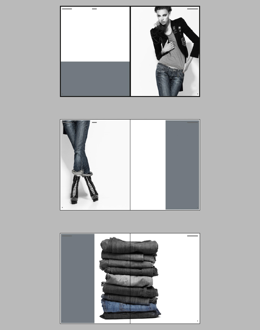
Final product image
What You’ll Be Creating

Open up the pages of any high-end magazine and you can find some really outstanding design work. The interior layouts of fashion titles can be particularly awe-inspiring. Designers are becoming more experimental with typography, irregular grids and unusual image choices to create magazine layouts that look as gorgeous as the covers. 

In this tutorial you’ll learn how to design your own three-spread layout for a magazine feature using Adobe InDesign. We’ll look at how to prepare a grid, work with Masters to create visual uniformity across the pages, and how to select colors, images and typefaces to create a professional-standard design.

We’ll take you through the process gradually, step by step, so this tutorial is suitable for beginners to InDesign.

Let’s get started!

1. Create Your Magazine Document and Grid

Step 1

Open InDesign and select New Document from the Welcome window or go to File > New > Document.

In the New Document window, keep Intent as Print. Set the No. of Pages to 6. Keep Facing Pages checked.

From the Page Size drop-down menu select Custom… to open the Custom Page Size window. We’re going to be using the same dimensions as we did for this Magazine Cover tutorial, which uses a standard US magazine page size. This is 8 3/8 inches by 10 7/8 inches, though we’ll be working in millimeters throughout.

Custom Page Size

Type ‘US Magazine’ into the text box at the top of the window and set the Width to 213 mm and the Height to 276.5 mm (this equates to 8 3/8 in by 10 7/8 in). Click Add and then OK.

Step 2

Back in the New Document window, set the Top, Bottom and Inside Margins to 10 mm. Click the chain icon to the right of the margin values to break the chain. Type 6 mm into the Outside Margin value box. This is so that we allow a bit more space on the inside edge of the page, to accommodate for binding.

You should also include a Bleed of 3 mm on all sides except the Inside, where it won’t be needed. Set the Inside Bleed to 0 mm.

New Document Settings

Click OK.

Step 3

You will notice that the first page of your document begins on a right-hand single page. However, we want to create the layout for three two-page spreads. If you’re creating a whole magazine in one document, you can simply treat Page 1 as the first page of your whole magazine, e.g. a page for contents or perhaps for an advertisement.

For now, though, we want to be able to shuffle Page 2 of the document upwards, so that it sits next to Page 1, forming a full spread.

Open the Pages panel (Window > Pages) and then open the panel’s drop-down menu, accessible from the top-right corner of the panel. Click once on Allow Document Pages to Shuffle to uncheck the option.

Allow Document Pages to Shuffle

Back in the Pages panel, you can now grab individual pages and move them around more freely, connecting them to other pages without the restraints of the normal shuffle mode. 

Grab the Page 2 page icon and connect it to the right-hand side of Page 1. Repeat with the process with the other pages until you have a set of three two-page spreads, as shown.

The Shuffled Pages

Step 4

Even though experimenting with typography is encouraged for dynamic, exciting magazine layouts, you should always set up some sort of grid to allow text to appear consistent across the spreads of your magazine. This will give the layouts a professional, clean look.

Let’s create a simple grid on the Master spread, as this will then be applied automatically to all the pages in your document.

Return to the Pages panel and double-click on one of the A-Master page icons to bring up the Master on screen. 

The Master Spread

If the rulers are not shown by default go to View > Show Rulers. Drag a Guide down from the top ruler to 37 mm, allowing it to sit on the left-hand page. Drag a second guide down to 254 mm.

Guides 1

From the left-hand ruler, drag a vertical guide out to 13 mm and then drag a second out to 195 mm

Guides 2

These guides will form the top, bottom and outer edges of your columns of text.

Let’s mark out the center point of the document. The center point will actually be slightly off center, as the outside margin is narrower than the inside margin. But this is absolutely fine; all your content will appear centered once printed and bound.

Go to Layout > Margins & Columns and set the Number of Columns to 2 and the Gutter to 0 mm. Click OK.

margins and columns

Drag out another vertical guide from the left-hand ruler to 94 mm and drag a second to 115 mm.

Guides 3

Finally, drag your mouse over the whole of the left page to select all the guides and go to Edit > Copy, Edit > Paste. Manoeuvre this pasted set of guides into a mirrored position on the right page of the Master spread.

Pasted Guides

2. Customize the Master(s) 

You should place any content you will want to show up on every page of your document on a Master page. So things like running headers and page numbers should be placed here, to make creating the rest of your layouts fuss-free.

Step 1

Select the Zoom Tool (Z) from the Tools panel and click and drag over the bottom left-hand corner of the left page of the Master spread. 

Using the Type Tool (T) create a small text frame, positioning it just below the bottom margin. Place your cursor in the text frame and go to Type > Insert Special Character > Markers > Current Page Number.

Highlight the ‘A’ character and adjust the Font, from the Character Formatting Controls panel running along the top of the screen, to Adobe Garamond Pro, Semibold Italic, and Size to 10 pt.

Page Number 1

Select the text frame using the Selection Tool (V, Escape) and Edit > Copy, Edit > Paste. Manoeuvre the pasted frame to the bottom-right corner of the right page of the Master and adjust the alignment of the text to Align Right.

Page Number 2
The Final Spread

Step 2

You can also add running headers to the Master spread. 

Use the Type Tool (T) to create two text frames, one at the top left-hand corner of the left page for the ‘Name of Magazine’. Set the Font as before to Adobe Garamond Pro, Size 10 pt. Set the weight to Semibold.

Position the other text frame centrally at the top of the left page, typing in the ‘Issue No.’, and setting the Font to Adobe Garamond Pro, Semibold Italic, and Size 10 pt. Set the text to Align Center.

Running Headers

Create a third text frame, positioning it at the top-right corner of the right-hand page of the Master. This is the perfect place to put in the name of your article. Here, it’s ‘days of denim dreaming’. Set the Font to Adobe Garamond Pro, Semibold Italic, and Size 10 pt. Set the text to Align Right. 

We’re going to build up the magazine layout using just three colours: [Black], [Paper] and a new grey-blue swatch. Open the Swatches panel (Window > Color > Swatches) and click on the New Swatch icon. Add a new CMYK Swatch, C=56 M=41 Y=37 K=20.

Swatch Options

Set the article title in this new swatch.

Article Title

Step 3

Some of the pages in your magazine layout might include dark images or background colors, and dark text will disappear against these. Let’s solve that right now.

Return to the Pages panel and hold Shift and select both pages of the A-Master. Drag them down to the Create New Page icon at the bottom of the panel. A second Master spread, a B-Master, will be created. 

Pages Panel

Ensure the B-Master is brought up on screen, then drag your mouse across the whole of the spread, selecting all the text frames. Adjust the Font Color of all the text on the spread to [Paper]. Delete the ‘Issue No.’ text frame. 

Second Master

Step 4

To ensure that the text on your Master pages will be brought to the front of your design, you can sit the content of the Masters on the same layer as the main text of your layouts.

Open the Layers panel (Window > Layers) and double-click the default Layer 1 name. Rename the layer as Typography and click OK.

Typography Master

3. Introduce Borders on Your Layouts

To give your magazine that extra professional look, you should introduce borders around the pages. This helps to frame your content, making it look really elegant.

Step 1

Remaining in the Layers panel, first Lock the Typography layer. Then click the New Layer icon at the bottom of the panel. Rename the layer as Border.

Grab the Border layer and move it to sit below the Typography layer.

Border Layer

Step 2

Remaining on the Border layer, bring up the first spread, Pages 1–2, of your document on screen.

Select the Rectangle Tool (M) and drag to create a frame that extends across the whole of Page 1, resting the edges on the trim edge of the document. 

Set the Fill Color to [None] and Stroke to [Black], and increase the Weight of the Stroke to 4 mm.

Black Border

Select the frame and Edit > Copy and Edit > Paste. Position the pasted frame in a mirrored position on Page 2.

Pasted Border

Step 3

Drag your mouse across the whole of the spread to select both of the black frames and Edit > Copy.

Navigate down to Pages 3–4, and Edit > Paste in Place. Alter the Stroke Color to [Paper].

White Boarder 1

Repeat again for Pages 5–6, setting the Stroke Color to [Paper].

White Boarder 2

4. Get Playful with Color and Images

Now we can get started with the fun stuff!

Step 1

Return to the Layers panel and Lock the Border layer. Create a new layer, renaming it Image.

Grab the new layer and move it to sit below the Border layer.

Image Layer

Step 2

You want to select an image that will look strong and dramatic when placed across an entire page. For this fashion feature, I’ve chosen an image of a stylish woman wearing jeans.

Original Color Photo

The original image is in full color. But for added edge, I post-edited the photo in Adobe Photoshop. To imitate the look of the image here, where only the jeans are pulled out in color, use the Lasso Tool (L) to select the area of the jeans only. Copy and Paste the selection, so it stands apart on a separate layer. 

Apply a Channel Mixer Adjustment Layer in Monochrome to the original photo only, keeping the jeans pulled out in color. 

Channel Mixer
Lasso Tool

Step 3

Return to InDesign and bring up Page 2 of the document on screen.

Select the Rectangle Frame Tool (F) and drag to create a frame that extends across the whole of the page.

Go to File > Place and select your chosen image. Click Open. Arrange the image in the frame until you are happy with the scale.

Placed Image

Step 4

Select the Rectangle Tool (M) and drag to create a frame 216 mm in Width and 110 mm in Height. Place this at the bottom of Page 1 in the position shown.

Colored Shape

Step 5

Navigate down to Page 3 of your document. As before, create an image frame the Width and Height of the page, extending to the Bleed, and File > Place. Select the same image as before. 

Double-click inside the frame to select the image directly and Control-Click (Mac OS) or Right-Click (Windows) > Transform > Flip Horizontal. This time enlarge the scale of the image, and focus on the lower half of the photo, bringing the jeans and shoes into the frame. Leave a decent space to the right of the image to allow some space for text.

Image Placed

Step 6

Select the Rectangle Tool (M) and drag to create a frame that extends from the top to the bottom of Page 4. Rest the right edge on the far right bleed, and extend the Width until it meets at the center point of Page 4.

Colored Shape

You’ll notice that the article title at the top right corner of Page 4 is now no longer visible and the page number doesn’t look very clear, now it’s set against a dark background. To solve this, simply go the Pages panel and drag the right-hand page icon of the B-Master, dropping it onto the Page 4 page icon in the panel.

Pages Panel

While you’re there, you can also apply the B-Master to Page 5 of the document.

Pages Panel 2

Step 7

Select the grey frame you’ve just created and Edit > Copy. Navigate further down to Page 5 of the document and Edit > Paste. Move the pasted frame to the left side of the page, as shown.

Colored Shape

Step 8

Use the Rectangle Frame Tool (F) to create a new large image frame. Position it centrally on the Pages 5–6 spread.

Go to File > Place and select a second image. Here, I’ve gone for an image of a stack of jeans.

Original Photo of Jeans

As I did with the first image earlier, I then used Photoshop to pull out one of the pairs of jeans in color, with the rest of the stack set in monochrome.

Image Placed on Spread

Step 9

The white border’s cutting through the center of the image, which doesn’t look great. So, return to the Layers panel and Unlock the Border layer. Pull back the inside edges of each border to the center of the page, so you still have a white border around the colored background on the left-hand page.

Pull Back Boarders

Great work! This is how your magazine feature looks at the moment:

Layout with Images

Now all we need to do is add some text!

5. Typography for Your Magazine Layouts

Step 1

Go to the Layers panel and Lock the Image layer. Unlock the Typography layer.

Typography Layer

Step 2

We’ve already used Adobe Garamond Pro for the running headers and page numbers, so we can continue to use this for the main text of the article. However, you can introduce one, or even two, more typeface(s) to use for a more exciting title, and to use across the document for quotes and other decorative text elements.

Futura Std is a clean, minimal font which will give an extra stylish, modern edge to a fashion magazine layout. But any sans serif with an optional condensed weight would be a good pick too.

To add a fun touch, you can also install Sail, which has a more playful feel.

Navigate to Page 1 of your document and use the Type Tool (T) to create a text frame 214 mm in Width and 94 mm in Height. Type ‘Days of (paragraph break) Denim’ and set the Font to Futura Std Light Condensed, and the text to All Caps. 

Highlight ‘Days of’ alone and set the Size to 122 pt. Increase the Tracking, from the Character Formatting Controls panel at the top of the screen, to 230.

Highlight ‘Denim’ alone and increase the Size to 135 pt, Leading to 160 pt and Tracking to 430. Set the text to Align Right and alter the Font Color to the grey‑blue swatch, C=56 M=41 Y=37 K=20. 

Position the text frame just above the center of the page, as shown.

Futura Std

Step 3

Introduce a second smaller text frame (about 75 mm in Width) on Page 1, positioning it centrally towards the bottom of the page. Here you can type in a short summary of the article, setting the Font to Futura Std Light Condensed, Size 14 pt, All Caps, Font Color to [Paper] and text alignment to Justified (All Lines).

Set the ‘Name’ of the article’s author below the summary, in Adobe Garamond Pro.

Summary of Article

Step 4

Create a third text frame on Page 1, about 170 mm in Width. Position it centrally on the page, at the top of the grey frame.

Type ‘Dreaming’ and set the Font to Sail, Size 112 pt, and Font Colour to [Paper]. With the Selection Tool (V, Escape) active, hover your cursor over the bottom right corner of the frame and rotate it upwards a little to give the text a slight slant.

Experimental Typography

Step 5

Navigate down to the second spread of the document, focussing on Page 3.

Use the Type Tool (T) to create a square text frame, and position it between the guides marking out the right-hand half of the page. Rest the top edge of the frame on the top horizontal guide, as shown below.

Type an introductory sub-title of four five-character words. Here, I’ve gone for ‘Basic Smart Rough Chic?’, positioning each word on a new line.

Set the Font to Futura Std Light Condensed, Size 50 pt, Leading 70 pt, All Caps and Justify All Lines. Increase the Tracking to 600 and highlight individual parts of the text, setting them in a different color, C=56 M=41 Y=37 K=20. 

Subtitle

Step 6

Pull out a guide from the left-hand ruler to the center of the text frame, and the center of the column section. 

Center Guide

Select the Type Tool (T) and create a new text frame, 37.5 mm in Width and 115.5 mm in Height. Align the left edge of this new text frame with the left edge of the sub-title text frame, and rest the bottom edge against the bottom horizontal guide.

You can start to feed in the text of your article into this text frame. If you don’t have any text yet, you can go to Type > Fill with Placeholder Text. Set the Font to Adobe Garamond Pro, Size 11 pt. 

Column of Text

You can also pull out the first letter of the article in a Drop Cap, using the options available in the Character Formatting Controls panel. Set the Drop Cap Number of Lines to 3, and adjust the Font of the first character to Futura Std Medium Condensed and the Color to C=56 M=41 Y=37 K=20. 

Drop Cap

Step 7

Create another text frame at the same dimensions as the tall text frame you just created. Position to the right of the first frame, resting against the guide on the far right, as shown. 

Second Column

Click on the white box at the bottom right corner of the first frame, before clicking in the second frame, allowing the text to flow into it.

Continue to create new text frames at the same dimensions, positioning them in pairs on the opposite page of the spread, using the guides to help you. Repeat the process above, threading the text into the frames as you go. Adjust the color of some of the text to [Paper] if you need to contrast it against the dark background.

Threaded Text

Continue onto the next spread, Pages 5–6, positioning the text frames around the image of the stacked jeans as shown.

Threaded text on next spread

Step 8

Return to Page 4 of the document, on the second spread. You can add in some pulled-out quotations to give a bit more depth to the design.

Use the Type Tool (T) to create a text frame the width of two columns, just like the sub-heading text frame. Type in a quote and set the Font to Futura Std light Condensed, Size 15 pt, Font Color to C=56 M=41 Y=37 K=20 and Justify All Lines. Set the Tracking to 300.

Open the Story panel (Window > Type & Tables > Story) and check the Optical Margin Alignment checkbox to shift the quotation marks to sit outside the text frame, giving a more even appearance to the text.

The Story Panel

Position the first quotation text frame below the two left-hand columns on Page 4. Copy and Paste the text frame, adjusting the text content, three more times, placing them on Pages 4, 5 and 6 as shown.

Quotations
Quotations

Step 9

Your layouts are almost finished, and they’re looking awesome!

You can add a final decorative touch to give your layouts that extra pro touch. Create a square text frame and position it below the left-hand quotation on Page 4 of your document. Type ‘D’ (for ‘denim’) and set the Font to Sail, Size 200 pt, Color C=56 M=41 Y=37 K=20. Rotate the text frame slightly to give it a slightly jaunty angle.

D Type Effect

With the text frame selected, go to Object > Effects > Transparency and reduce the Opacity to 30%.

Edit > Copy and Edit > Paste the text frame, adjusting the Font Color to [Paper]. Position this second frame at the top right corner of Page 4.

Transparency on Text

Copy and Paste both of the ‘D’ text frames onto the final spread of the magazine, positioning them as shown.

Text Applied to Next Spread

Step 10

Before you go to export your layouts for print, just take a quick detour back to the second spread of your document. You might notice that the right shoe in the photo is edging into the left-hand column of text, which isn’t ideal. 

To quickly sort this out, select the Ellipse Tool (L) from the Tools panel and drag to create a small irregular ellipse that sits just over the bottom part of the shoe.

Ellipse Tool

Adjust the Stroke Color to [None]. Go to Window > Text Wrap and set the wrap to Wrap Around Object Shape, at an Offset of 5 mm.

Text Wrap

6. Export Your Magazine for Print

Your layouts are finished—super work! They look fantastic.

Final Product

When you’re ready to send your designs off to print, simply follow the steps below.

Step 1

Go to File > Export… to open the Export window. Select Adobe PDF (Print) from the Format drop-down menu. Name the file and click Save.

In the Export Adobe PDF window select Press Quality from the Adobe PDF Preset drop-down menu. 

Keep Pages checked, not Spreads, unless otherwise specified by your printer.

Export to PDF

Step 2

Under the Marks and Bleeds section, click to select All Printer’s Marks under the Marks menu and click to select Use Document Bleed Settings under the Bleed and Slug menu. Click Export.

Marks and Bleeds

Well done! You now have your magazine layouts ready to be sent to the printers. 

Final PDF for Print

In this tutorial, we have learned how to design professional-standard layouts for a fashion magazine feature. The lessons we’ve covered here, such as setting up suitable Master pages, creating a simple grid, and experimenting with stylish typography, would also apply really well to any other kind of magazine you’re designing. Great work!

Want to jumpstart your next inDesign magazine design? Check out these high-quality templates—beautifully designed and ready to use in your next project.

Fashion Lookbook InDesign Template

Perfect for your fashion-centric projects, this template comes in two sizes: A4 & US letter. It includes both INDD and IDML files, as well as 30 custom pages!

Fashion Lookbook

ENTHICA / Fashion Magazine InDesign Template

Choose from 26 unique pages in this high-quality design. Master pages, character styles, and paragraphs are all included, in both A4 and US Letter paper size.

ENTHICA Fashion Magazine Template

InDesign Magazine Template

This template is print ready with bleeds and includes free fonts. It comes with paragraph styles in both A4 and US Letter size.

InDesign Magazine Template

Lightazine InDesign Template

This beautiful, multi-purpose design, for both digital and print, includes automatic page numbers already set up, two alternative covers, and more!

Lightazine InDesign Template

Helvetica Magazine InDesign Template

A stylish design with over 30 pages, this template includes images, paragraph styles, page numbers set up, alternative covers, and more—a great fit for a variety of InDesign projects.

Helvetica Magazine InDesign Template

Enjoyed this tutorial? Check out these other inDesign tutorials:

How to Create Layouts for a Fashion Magazine in Adobe InDesign

Post pobrano z: How to Create Layouts for a Fashion Magazine in Adobe InDesign

Final product image
What You’ll Be Creating

Open up the pages of any high-end magazine and you can find some really outstanding design work. The interior layouts of fashion titles can be particularly awe-inspiring. Designers are becoming more experimental with typography, irregular grids and unusual image choices to create magazine layouts that look as gorgeous as the covers. 

In this tutorial you’ll learn how to design your own three-spread layout for a magazine feature using Adobe InDesign. We’ll look at how to prepare a grid, work with Masters to create visual uniformity across the pages, and how to select colors, images and typefaces to create a professional-standard design.

We’ll take you through the process gradually, step by step, so this tutorial is suitable for beginners to InDesign.

Let’s get started!

1. Create Your Magazine Document and Grid

Step 1

Open InDesign and select New Document from the Welcome window or go to File > New > Document.

In the New Document window, keep Intent as Print. Set the No. of Pages to 6. Keep Facing Pages checked.

From the Page Size drop-down menu select Custom… to open the Custom Page Size window. We’re going to be using the same dimensions as we did for this Magazine Cover tutorial, which uses a standard US magazine page size. This is 8 3/8 inches by 10 7/8 inches, though we’ll be working in millimeters throughout.

Custom Page Size

Type ‘US Magazine’ into the text box at the top of the window and set the Width to 213 mm and the Height to 276.5 mm (this equates to 8 3/8 in by 10 7/8 in). Click Add and then OK.

Step 2

Back in the New Document window, set the Top, Bottom and Inside Margins to 10 mm. Click the chain icon to the right of the margin values to break the chain. Type 6 mm into the Outside Margin value box. This is so that we allow a bit more space on the inside edge of the page, to accommodate for binding.

You should also include a Bleed of 3 mm on all sides except the Inside, where it won’t be needed. Set the Inside Bleed to 0 mm.

New Document Settings

Click OK.

Step 3

You will notice that the first page of your document begins on a right-hand single page. However, we want to create the layout for three two-page spreads. If you’re creating a whole magazine in one document, you can simply treat Page 1 as the first page of your whole magazine, e.g. a page for contents or perhaps for an advertisement.

For now, though, we want to be able to shuffle Page 2 of the document upwards, so that it sits next to Page 1, forming a full spread.

Open the Pages panel (Window > Pages) and then open the panel’s drop-down menu, accessible from the top-right corner of the panel. Click once on Allow Document Pages to Shuffle to uncheck the option.

Allow Document Pages to Shuffle

Back in the Pages panel, you can now grab individual pages and move them around more freely, connecting them to other pages without the restraints of the normal shuffle mode. 

Grab the Page 2 page icon and connect it to the right-hand side of Page 1. Repeat with the process with the other pages until you have a set of three two-page spreads, as shown.

The Shuffled Pages

Step 4

Even though experimenting with typography is encouraged for dynamic, exciting magazine layouts, you should always set up some sort of grid to allow text to appear consistent across the spreads of your magazine. This will give the layouts a professional, clean look.

Let’s create a simple grid on the Master spread, as this will then be applied automatically to all the pages in your document.

Return to the Pages panel and double-click on one of the A-Master page icons to bring up the Master on screen. 

The Master Spread

If the rulers are not shown by default go to View > Show Rulers. Drag a Guide down from the top ruler to 37 mm, allowing it to sit on the left-hand page. Drag a second guide down to 254 mm.

Guides 1

From the left-hand ruler, drag a vertical guide out to 13 mm and then drag a second out to 195 mm

Guides 2

These guides will form the top, bottom and outer edges of your columns of text.

Let’s mark out the center point of the document. The center point will actually be slightly off center, as the outside margin is narrower than the inside margin. But this is absolutely fine; all your content will appear centered once printed and bound.

Go to Layout > Margins & Columns and set the Number of Columns to 2 and the Gutter to 0 mm. Click OK.

margins and columns

Drag out another vertical guide from the left-hand ruler to 94 mm and drag a second to 115 mm.

Guides 3

Finally, drag your mouse over the whole of the left page to select all the guides and go to Edit > Copy, Edit > Paste. Manoeuvre this pasted set of guides into a mirrored position on the right page of the Master spread.

Pasted Guides

2. Customize the Master(s) 

You should place any content you will want to show up on every page of your document on a Master page. So things like running headers and page numbers should be placed here, to make creating the rest of your layouts fuss-free.

Step 1

Select the Zoom Tool (Z) from the Tools panel and click and drag over the bottom left-hand corner of the left page of the Master spread. 

Using the Type Tool (T) create a small text frame, positioning it just below the bottom margin. Place your cursor in the text frame and go to Type > Insert Special Character > Markers > Current Page Number.

Highlight the ‘A’ character and adjust the Font, from the Character Formatting Controls panel running along the top of the screen, to Adobe Garamond Pro, Semibold Italic, and Size to 10 pt.

Page Number 1

Select the text frame using the Selection Tool (V, Escape) and Edit > Copy, Edit > Paste. Manoeuvre the pasted frame to the bottom-right corner of the right page of the Master and adjust the alignment of the text to Align Right.

Page Number 2
The Final Spread

Step 2

You can also add running headers to the Master spread. 

Use the Type Tool (T) to create two text frames, one at the top left-hand corner of the left page for the ‘Name of Magazine’. Set the Font as before to Adobe Garamond Pro, Size 10 pt. Set the weight to Semibold.

Position the other text frame centrally at the top of the left page, typing in the ‘Issue No.’, and setting the Font to Adobe Garamond Pro, Semibold Italic, and Size 10 pt. Set the text to Align Center.

Running Headers

Create a third text frame, positioning it at the top-right corner of the right-hand page of the Master. This is the perfect place to put in the name of your article. Here, it’s ‘days of denim dreaming’. Set the Font to Adobe Garamond Pro, Semibold Italic, and Size 10 pt. Set the text to Align Right. 

We’re going to build up the magazine layout using just three colours: [Black], [Paper] and a new grey-blue swatch. Open the Swatches panel (Window > Color > Swatches) and click on the New Swatch icon. Add a new CMYK Swatch, C=56 M=41 Y=37 K=20.

Swatch Options

Set the article title in this new swatch.

Article Title

Step 3

Some of the pages in your magazine layout might include dark images or background colors, and dark text will disappear against these. Let’s solve that right now.

Return to the Pages panel and hold Shift and select both pages of the A-Master. Drag them down to the Create New Page icon at the bottom of the panel. A second Master spread, a B-Master, will be created. 

Pages Panel

Ensure the B-Master is brought up on screen, then drag your mouse across the whole of the spread, selecting all the text frames. Adjust the Font Color of all the text on the spread to [Paper]. Delete the ‘Issue No.’ text frame. 

Second Master

Step 4

To ensure that the text on your Master pages will be brought to the front of your design, you can sit the content of the Masters on the same layer as the main text of your layouts.

Open the Layers panel (Window > Layers) and double-click the default Layer 1 name. Rename the layer as Typography and click OK.

Typography Master

3. Introduce Borders on Your Layouts

To give your magazine that extra professional look, you should introduce borders around the pages. This helps to frame your content, making it look really elegant.

Step 1

Remaining in the Layers panel, first Lock the Typography layer. Then click the New Layer icon at the bottom of the panel. Rename the layer as Border.

Grab the Border layer and move it to sit below the Typography layer.

Border Layer

Step 2

Remaining on the Border layer, bring up the first spread, Pages 1–2, of your document on screen.

Select the Rectangle Tool (M) and drag to create a frame that extends across the whole of Page 1, resting the edges on the trim edge of the document. 

Set the Fill Color to [None] and Stroke to [Black], and increase the Weight of the Stroke to 4 mm.

Black Border

Select the frame and Edit > Copy and Edit > Paste. Position the pasted frame in a mirrored position on Page 2.

Pasted Border

Step 3

Drag your mouse across the whole of the spread to select both of the black frames and Edit > Copy.

Navigate down to Pages 3–4, and Edit > Paste in Place. Alter the Stroke Color to [Paper].

White Boarder 1

Repeat again for Pages 5–6, setting the Stroke Color to [Paper].

White Boarder 2

4. Get Playful with Color and Images

Now we can get started with the fun stuff!

Step 1

Return to the Layers panel and Lock the Border layer. Create a new layer, renaming it Image.

Grab the new layer and move it to sit below the Border layer.

Image Layer

Step 2

You want to select an image that will look strong and dramatic when placed across an entire page. For this fashion feature, I’ve chosen an image of a stylish woman wearing jeans.

Original Color Photo

The original image is in full color. But for added edge, I post-edited the photo in Adobe Photoshop. To imitate the look of the image here, where only the jeans are pulled out in color, use the Lasso Tool (L) to select the area of the jeans only. Copy and Paste the selection, so it stands apart on a separate layer. 

Apply a Channel Mixer Adjustment Layer in Monochrome to the original photo only, keeping the jeans pulled out in color. 

Channel Mixer
Lasso Tool

Step 3

Return to InDesign and bring up Page 2 of the document on screen.

Select the Rectangle Frame Tool (F) and drag to create a frame that extends across the whole of the page.

Go to File > Place and select your chosen image. Click Open. Arrange the image in the frame until you are happy with the scale.

Placed Image

Step 4

Select the Rectangle Tool (M) and drag to create a frame 216 mm in Width and 110 mm in Height. Place this at the bottom of Page 1 in the position shown.

Colored Shape

Step 5

Navigate down to Page 3 of your document. As before, create an image frame the Width and Height of the page, extending to the Bleed, and File > Place. Select the same image as before. 

Double-click inside the frame to select the image directly and Control-Click (Mac OS) or Right-Click (Windows) > Transform > Flip Horizontal. This time enlarge the scale of the image, and focus on the lower half of the photo, bringing the jeans and shoes into the frame. Leave a decent space to the right of the image to allow some space for text.

Image Placed

Step 6

Select the Rectangle Tool (M) and drag to create a frame that extends from the top to the bottom of Page 4. Rest the right edge on the far right bleed, and extend the Width until it meets at the center point of Page 4.

Colored Shape

You’ll notice that the article title at the top right corner of Page 4 is now no longer visible and the page number doesn’t look very clear, now it’s set against a dark background. To solve this, simply go the Pages panel and drag the right-hand page icon of the B-Master, dropping it onto the Page 4 page icon in the panel.

Pages Panel

While you’re there, you can also apply the B-Master to Page 5 of the document.

Pages Panel 2

Step 7

Select the grey frame you’ve just created and Edit > Copy. Navigate further down to Page 5 of the document and Edit > Paste. Move the pasted frame to the left side of the page, as shown.

Colored Shape

Step 8

Use the Rectangle Frame Tool (F) to create a new large image frame. Position it centrally on the Pages 5–6 spread.

Go to File > Place and select a second image. Here, I’ve gone for an image of a stack of jeans.

Original Photo of Jeans

As I did with the first image earlier, I then used Photoshop to pull out one of the pairs of jeans in color, with the rest of the stack set in monochrome.

Image Placed on Spread

Step 9

The white border’s cutting through the center of the image, which doesn’t look great. So, return to the Layers panel and Unlock the Border layer. Pull back the inside edges of each border to the center of the page, so you still have a white border around the colored background on the left-hand page.

Pull Back Boarders

Great work! This is how your magazine feature looks at the moment:

Layout with Images

Now all we need to do is add some text!

5. Typography for Your Magazine Layouts

Step 1

Go to the Layers panel and Lock the Image layer. Unlock the Typography layer.

Typography Layer

Step 2

We’ve already used Adobe Garamond Pro for the running headers and page numbers, so we can continue to use this for the main text of the article. However, you can introduce one, or even two, more typeface(s) to use for a more exciting title, and to use across the document for quotes and other decorative text elements.

Futura Std is a clean, minimal font which will give an extra stylish, modern edge to a fashion magazine layout. But any sans serif with an optional condensed weight would be a good pick too.

To add a fun touch, you can also install Sail, which has a more playful feel.

Navigate to Page 1 of your document and use the Type Tool (T) to create a text frame 214 mm in Width and 94 mm in Height. Type ‘Days of (paragraph break) Denim’ and set the Font to Futura Std Light Condensed, and the text to All Caps. 

Highlight ‘Days of’ alone and set the Size to 122 pt. Increase the Tracking, from the Character Formatting Controls panel at the top of the screen, to 230.

Highlight ‘Denim’ alone and increase the Size to 135 pt, Leading to 160 pt and Tracking to 430. Set the text to Align Right and alter the Font Color to the grey‑blue swatch, C=56 M=41 Y=37 K=20. 

Position the text frame just above the center of the page, as shown.

Futura Std

Step 3

Introduce a second smaller text frame (about 75 mm in Width) on Page 1, positioning it centrally towards the bottom of the page. Here you can type in a short summary of the article, setting the Font to Futura Std Light Condensed, Size 14 pt, All Caps, Font Color to [Paper] and text alignment to Justified (All Lines).

Set the ‘Name’ of the article’s author below the summary, in Adobe Garamond Pro.

Summary of Article

Step 4

Create a third text frame on Page 1, about 170 mm in Width. Position it centrally on the page, at the top of the grey frame.

Type ‘Dreaming’ and set the Font to Sail, Size 112 pt, and Font Colour to [Paper]. With the Selection Tool (V, Escape) active, hover your cursor over the bottom right corner of the frame and rotate it upwards a little to give the text a slight slant.

Experimental Typography

Step 5

Navigate down to the second spread of the document, focussing on Page 3.

Use the Type Tool (T) to create a square text frame, and position it between the guides marking out the right-hand half of the page. Rest the top edge of the frame on the top horizontal guide, as shown below.

Type an introductory sub-title of four five-character words. Here, I’ve gone for ‘Basic Smart Rough Chic?’, positioning each word on a new line.

Set the Font to Futura Std Light Condensed, Size 50 pt, Leading 70 pt, All Caps and Justify All Lines. Increase the Tracking to 600 and highlight individual parts of the text, setting them in a different color, C=56 M=41 Y=37 K=20. 

Subtitle

Step 6

Pull out a guide from the left-hand ruler to the center of the text frame, and the center of the column section. 

Center Guide

Select the Type Tool (T) and create a new text frame, 37.5 mm in Width and 115.5 mm in Height. Align the left edge of this new text frame with the left edge of the sub-title text frame, and rest the bottom edge against the bottom horizontal guide.

You can start to feed in the text of your article into this text frame. If you don’t have any text yet, you can go to Type > Fill with Placeholder Text. Set the Font to Adobe Garamond Pro, Size 11 pt. 

Column of Text

You can also pull out the first letter of the article in a Drop Cap, using the options available in the Character Formatting Controls panel. Set the Drop Cap Number of Lines to 3, and adjust the Font of the first character to Futura Std Medium Condensed and the Color to C=56 M=41 Y=37 K=20. 

Drop Cap

Step 7

Create another text frame at the same dimensions as the tall text frame you just created. Position to the right of the first frame, resting against the guide on the far right, as shown. 

Second Column

Click on the white box at the bottom right corner of the first frame, before clicking in the second frame, allowing the text to flow into it.

Continue to create new text frames at the same dimensions, positioning them in pairs on the opposite page of the spread, using the guides to help you. Repeat the process above, threading the text into the frames as you go. Adjust the color of some of the text to [Paper] if you need to contrast it against the dark background.

Threaded Text

Continue onto the next spread, Pages 5–6, positioning the text frames around the image of the stacked jeans as shown.

Threaded text on next spread

Step 8

Return to Page 4 of the document, on the second spread. You can add in some pulled-out quotations to give a bit more depth to the design.

Use the Type Tool (T) to create a text frame the width of two columns, just like the sub-heading text frame. Type in a quote and set the Font to Futura Std light Condensed, Size 15 pt, Font Color to C=56 M=41 Y=37 K=20 and Justify All Lines. Set the Tracking to 300.

Open the Story panel (Window > Type & Tables > Story) and check the Optical Margin Alignment checkbox to shift the quotation marks to sit outside the text frame, giving a more even appearance to the text.

The Story Panel

Position the first quotation text frame below the two left-hand columns on Page 4. Copy and Paste the text frame, adjusting the text content, three more times, placing them on Pages 4, 5 and 6 as shown.

Quotations
Quotations

Step 9

Your layouts are almost finished, and they’re looking awesome!

You can add a final decorative touch to give your layouts that extra pro touch. Create a square text frame and position it below the left-hand quotation on Page 4 of your document. Type ‘D’ (for ‘denim’) and set the Font to Sail, Size 200 pt, Color C=56 M=41 Y=37 K=20. Rotate the text frame slightly to give it a slightly jaunty angle.

D Type Effect

With the text frame selected, go to Object > Effects > Transparency and reduce the Opacity to 30%.

Edit > Copy and Edit > Paste the text frame, adjusting the Font Color to [Paper]. Position this second frame at the top right corner of Page 4.

Transparency on Text

Copy and Paste both of the ‘D’ text frames onto the final spread of the magazine, positioning them as shown.

Text Applied to Next Spread

Step 10

Before you go to export your layouts for print, just take a quick detour back to the second spread of your document. You might notice that the right shoe in the photo is edging into the left-hand column of text, which isn’t ideal. 

To quickly sort this out, select the Ellipse Tool (L) from the Tools panel and drag to create a small irregular ellipse that sits just over the bottom part of the shoe.

Ellipse Tool

Adjust the Stroke Color to [None]. Go to Window > Text Wrap and set the wrap to Wrap Around Object Shape, at an Offset of 5 mm.

Text Wrap

6. Export Your Magazine for Print

Your layouts are finished—super work! They look fantastic.

Final Product

When you’re ready to send your designs off to print, simply follow the steps below.

Step 1

Go to File > Export… to open the Export window. Select Adobe PDF (Print) from the Format drop-down menu. Name the file and click Save.

In the Export Adobe PDF window select Press Quality from the Adobe PDF Preset drop-down menu. 

Keep Pages checked, not Spreads, unless otherwise specified by your printer.

Export to PDF

Step 2

Under the Marks and Bleeds section, click to select All Printer’s Marks under the Marks menu and click to select Use Document Bleed Settings under the Bleed and Slug menu. Click Export.

Marks and Bleeds

Well done! You now have your magazine layouts ready to be sent to the printers. 

Final PDF for Print

In this tutorial, we have learned how to design professional-standard layouts for a fashion magazine feature. The lessons we’ve covered here, such as setting up suitable Master pages, creating a simple grid, and experimenting with stylish typography, would also apply really well to any other kind of magazine you’re designing. Great work!

Want to jumpstart your next inDesign magazine design? Check out these high-quality templates—beautifully designed and ready to use in your next project.

Fashion Lookbook InDesign Template

Perfect for your fashion-centric projects, this template comes in two sizes: A4 & US letter. It includes both INDD and IDML files, as well as 30 custom pages!

Fashion Lookbook

ENTHICA / Fashion Magazine InDesign Template

Choose from 26 unique pages in this high-quality design. Master pages, character styles, and paragraphs are all included, in both A4 and US Letter paper size.

ENTHICA Fashion Magazine Template

InDesign Magazine Template

This template is print ready with bleeds and includes free fonts. It comes with paragraph styles in both A4 and US Letter size.

InDesign Magazine Template

Lightazine InDesign Template

This beautiful, multi-purpose design, for both digital and print, includes automatic page numbers already set up, two alternative covers, and more!

Lightazine InDesign Template

Helvetica Magazine InDesign Template

A stylish design with over 30 pages, this template includes images, paragraph styles, page numbers set up, alternative covers, and more—a great fit for a variety of InDesign projects.

Helvetica Magazine InDesign Template

Enjoyed this tutorial? Check out these other inDesign tutorials:

How to Create Layouts for a Fashion Magazine in Adobe InDesign

Post pobrano z: How to Create Layouts for a Fashion Magazine in Adobe InDesign

Final product image
What You’ll Be Creating

Open up the pages of any high-end magazine and you can find some really outstanding design work. The interior layouts of fashion titles can be particularly awe-inspiring. Designers are becoming more experimental with typography, irregular grids and unusual image choices to create magazine layouts that look as gorgeous as the covers. 

In this tutorial you’ll learn how to design your own three-spread layout for a magazine feature using Adobe InDesign. We’ll look at how to prepare a grid, work with Masters to create visual uniformity across the pages, and how to select colors, images and typefaces to create a professional-standard design.

We’ll take you through the process gradually, step by step, so this tutorial is suitable for beginners to InDesign.

Let’s get started!

1. Create Your Magazine Document and Grid

Step 1

Open InDesign and select New Document from the Welcome window or go to File > New > Document.

In the New Document window, keep Intent as Print. Set the No. of Pages to 6. Keep Facing Pages checked.

From the Page Size drop-down menu select Custom… to open the Custom Page Size window. We’re going to be using the same dimensions as we did for this Magazine Cover tutorial, which uses a standard US magazine page size. This is 8 3/8 inches by 10 7/8 inches, though we’ll be working in millimeters throughout.

Custom Page Size

Type ‘US Magazine’ into the text box at the top of the window and set the Width to 213 mm and the Height to 276.5 mm (this equates to 8 3/8 in by 10 7/8 in). Click Add and then OK.

Step 2

Back in the New Document window, set the Top, Bottom and Inside Margins to 10 mm. Click the chain icon to the right of the margin values to break the chain. Type 6 mm into the Outside Margin value box. This is so that we allow a bit more space on the inside edge of the page, to accommodate for binding.

You should also include a Bleed of 3 mm on all sides except the Inside, where it won’t be needed. Set the Inside Bleed to 0 mm.

New Document Settings

Click OK.

Step 3

You will notice that the first page of your document begins on a right-hand single page. However, we want to create the layout for three two-page spreads. If you’re creating a whole magazine in one document, you can simply treat Page 1 as the first page of your whole magazine, e.g. a page for contents or perhaps for an advertisement.

For now, though, we want to be able to shuffle Page 2 of the document upwards, so that it sits next to Page 1, forming a full spread.

Open the Pages panel (Window > Pages) and then open the panel’s drop-down menu, accessible from the top-right corner of the panel. Click once on Allow Document Pages to Shuffle to uncheck the option.

Allow Document Pages to Shuffle

Back in the Pages panel, you can now grab individual pages and move them around more freely, connecting them to other pages without the restraints of the normal shuffle mode. 

Grab the Page 2 page icon and connect it to the right-hand side of Page 1. Repeat with the process with the other pages until you have a set of three two-page spreads, as shown.

The Shuffled Pages

Step 4

Even though experimenting with typography is encouraged for dynamic, exciting magazine layouts, you should always set up some sort of grid to allow text to appear consistent across the spreads of your magazine. This will give the layouts a professional, clean look.

Let’s create a simple grid on the Master spread, as this will then be applied automatically to all the pages in your document.

Return to the Pages panel and double-click on one of the A-Master page icons to bring up the Master on screen. 

The Master Spread

If the rulers are not shown by default go to View > Show Rulers. Drag a Guide down from the top ruler to 37 mm, allowing it to sit on the left-hand page. Drag a second guide down to 254 mm.

Guides 1

From the left-hand ruler, drag a vertical guide out to 13 mm and then drag a second out to 195 mm

Guides 2

These guides will form the top, bottom and outer edges of your columns of text.

Let’s mark out the center point of the document. The center point will actually be slightly off center, as the outside margin is narrower than the inside margin. But this is absolutely fine; all your content will appear centered once printed and bound.

Go to Layout > Margins & Columns and set the Number of Columns to 2 and the Gutter to 0 mm. Click OK.

margins and columns

Drag out another vertical guide from the left-hand ruler to 94 mm and drag a second to 115 mm.

Guides 3

Finally, drag your mouse over the whole of the left page to select all the guides and go to Edit > Copy, Edit > Paste. Manoeuvre this pasted set of guides into a mirrored position on the right page of the Master spread.

Pasted Guides

2. Customize the Master(s) 

You should place any content you will want to show up on every page of your document on a Master page. So things like running headers and page numbers should be placed here, to make creating the rest of your layouts fuss-free.

Step 1

Select the Zoom Tool (Z) from the Tools panel and click and drag over the bottom left-hand corner of the left page of the Master spread. 

Using the Type Tool (T) create a small text frame, positioning it just below the bottom margin. Place your cursor in the text frame and go to Type > Insert Special Character > Markers > Current Page Number.

Highlight the ‘A’ character and adjust the Font, from the Character Formatting Controls panel running along the top of the screen, to Adobe Garamond Pro, Semibold Italic, and Size to 10 pt.

Page Number 1

Select the text frame using the Selection Tool (V, Escape) and Edit > Copy, Edit > Paste. Manoeuvre the pasted frame to the bottom-right corner of the right page of the Master and adjust the alignment of the text to Align Right.

Page Number 2
The Final Spread

Step 2

You can also add running headers to the Master spread. 

Use the Type Tool (T) to create two text frames, one at the top left-hand corner of the left page for the ‘Name of Magazine’. Set the Font as before to Adobe Garamond Pro, Size 10 pt. Set the weight to Semibold.

Position the other text frame centrally at the top of the left page, typing in the ‘Issue No.’, and setting the Font to Adobe Garamond Pro, Semibold Italic, and Size 10 pt. Set the text to Align Center.

Running Headers

Create a third text frame, positioning it at the top-right corner of the right-hand page of the Master. This is the perfect place to put in the name of your article. Here, it’s ‘days of denim dreaming’. Set the Font to Adobe Garamond Pro, Semibold Italic, and Size 10 pt. Set the text to Align Right. 

We’re going to build up the magazine layout using just three colours: [Black], [Paper] and a new grey-blue swatch. Open the Swatches panel (Window > Color > Swatches) and click on the New Swatch icon. Add a new CMYK Swatch, C=56 M=41 Y=37 K=20.

Swatch Options

Set the article title in this new swatch.

Article Title

Step 3

Some of the pages in your magazine layout might include dark images or background colors, and dark text will disappear against these. Let’s solve that right now.

Return to the Pages panel and hold Shift and select both pages of the A-Master. Drag them down to the Create New Page icon at the bottom of the panel. A second Master spread, a B-Master, will be created. 

Pages Panel

Ensure the B-Master is brought up on screen, then drag your mouse across the whole of the spread, selecting all the text frames. Adjust the Font Color of all the text on the spread to [Paper]. Delete the ‘Issue No.’ text frame. 

Second Master

Step 4

To ensure that the text on your Master pages will be brought to the front of your design, you can sit the content of the Masters on the same layer as the main text of your layouts.

Open the Layers panel (Window > Layers) and double-click the default Layer 1 name. Rename the layer as Typography and click OK.

Typography Master

3. Introduce Borders on Your Layouts

To give your magazine that extra professional look, you should introduce borders around the pages. This helps to frame your content, making it look really elegant.

Step 1

Remaining in the Layers panel, first Lock the Typography layer. Then click the New Layer icon at the bottom of the panel. Rename the layer as Border.

Grab the Border layer and move it to sit below the Typography layer.

Border Layer

Step 2

Remaining on the Border layer, bring up the first spread, Pages 1–2, of your document on screen.

Select the Rectangle Tool (M) and drag to create a frame that extends across the whole of Page 1, resting the edges on the trim edge of the document. 

Set the Fill Color to [None] and Stroke to [Black], and increase the Weight of the Stroke to 4 mm.

Black Border

Select the frame and Edit > Copy and Edit > Paste. Position the pasted frame in a mirrored position on Page 2.

Pasted Border

Step 3

Drag your mouse across the whole of the spread to select both of the black frames and Edit > Copy.

Navigate down to Pages 3–4, and Edit > Paste in Place. Alter the Stroke Color to [Paper].

White Boarder 1

Repeat again for Pages 5–6, setting the Stroke Color to [Paper].

White Boarder 2

4. Get Playful with Color and Images

Now we can get started with the fun stuff!

Step 1

Return to the Layers panel and Lock the Border layer. Create a new layer, renaming it Image.

Grab the new layer and move it to sit below the Border layer.

Image Layer

Step 2

You want to select an image that will look strong and dramatic when placed across an entire page. For this fashion feature, I’ve chosen an image of a stylish woman wearing jeans.

Original Color Photo

The original image is in full color. But for added edge, I post-edited the photo in Adobe Photoshop. To imitate the look of the image here, where only the jeans are pulled out in color, use the Lasso Tool (L) to select the area of the jeans only. Copy and Paste the selection, so it stands apart on a separate layer. 

Apply a Channel Mixer Adjustment Layer in Monochrome to the original photo only, keeping the jeans pulled out in color. 

Channel Mixer
Lasso Tool

Step 3

Return to InDesign and bring up Page 2 of the document on screen.

Select the Rectangle Frame Tool (F) and drag to create a frame that extends across the whole of the page.

Go to File > Place and select your chosen image. Click Open. Arrange the image in the frame until you are happy with the scale.

Placed Image

Step 4

Select the Rectangle Tool (M) and drag to create a frame 216 mm in Width and 110 mm in Height. Place this at the bottom of Page 1 in the position shown.

Colored Shape

Step 5

Navigate down to Page 3 of your document. As before, create an image frame the Width and Height of the page, extending to the Bleed, and File > Place. Select the same image as before. 

Double-click inside the frame to select the image directly and Control-Click (Mac OS) or Right-Click (Windows) > Transform > Flip Horizontal. This time enlarge the scale of the image, and focus on the lower half of the photo, bringing the jeans and shoes into the frame. Leave a decent space to the right of the image to allow some space for text.

Image Placed

Step 6

Select the Rectangle Tool (M) and drag to create a frame that extends from the top to the bottom of Page 4. Rest the right edge on the far right bleed, and extend the Width until it meets at the center point of Page 4.

Colored Shape

You’ll notice that the article title at the top right corner of Page 4 is now no longer visible and the page number doesn’t look very clear, now it’s set against a dark background. To solve this, simply go the Pages panel and drag the right-hand page icon of the B-Master, dropping it onto the Page 4 page icon in the panel.

Pages Panel

While you’re there, you can also apply the B-Master to Page 5 of the document.

Pages Panel 2

Step 7

Select the grey frame you’ve just created and Edit > Copy. Navigate further down to Page 5 of the document and Edit > Paste. Move the pasted frame to the left side of the page, as shown.

Colored Shape

Step 8

Use the Rectangle Frame Tool (F) to create a new large image frame. Position it centrally on the Pages 5–6 spread.

Go to File > Place and select a second image. Here, I’ve gone for an image of a stack of jeans.

Original Photo of Jeans

As I did with the first image earlier, I then used Photoshop to pull out one of the pairs of jeans in color, with the rest of the stack set in monochrome.

Image Placed on Spread

Step 9

The white border’s cutting through the center of the image, which doesn’t look great. So, return to the Layers panel and Unlock the Border layer. Pull back the inside edges of each border to the center of the page, so you still have a white border around the colored background on the left-hand page.

Pull Back Boarders

Great work! This is how your magazine feature looks at the moment:

Layout with Images

Now all we need to do is add some text!

5. Typography for Your Magazine Layouts

Step 1

Go to the Layers panel and Lock the Image layer. Unlock the Typography layer.

Typography Layer

Step 2

We’ve already used Adobe Garamond Pro for the running headers and page numbers, so we can continue to use this for the main text of the article. However, you can introduce one, or even two, more typeface(s) to use for a more exciting title, and to use across the document for quotes and other decorative text elements.

Futura Std is a clean, minimal font which will give an extra stylish, modern edge to a fashion magazine layout. But any sans serif with an optional condensed weight would be a good pick too.

To add a fun touch, you can also install Sail, which has a more playful feel.

Navigate to Page 1 of your document and use the Type Tool (T) to create a text frame 214 mm in Width and 94 mm in Height. Type ‘Days of (paragraph break) Denim’ and set the Font to Futura Std Light Condensed, and the text to All Caps. 

Highlight ‘Days of’ alone and set the Size to 122 pt. Increase the Tracking, from the Character Formatting Controls panel at the top of the screen, to 230.

Highlight ‘Denim’ alone and increase the Size to 135 pt, Leading to 160 pt and Tracking to 430. Set the text to Align Right and alter the Font Color to the grey‑blue swatch, C=56 M=41 Y=37 K=20. 

Position the text frame just above the center of the page, as shown.

Futura Std

Step 3

Introduce a second smaller text frame (about 75 mm in Width) on Page 1, positioning it centrally towards the bottom of the page. Here you can type in a short summary of the article, setting the Font to Futura Std Light Condensed, Size 14 pt, All Caps, Font Color to [Paper] and text alignment to Justified (All Lines).

Set the ‘Name’ of the article’s author below the summary, in Adobe Garamond Pro.

Summary of Article

Step 4

Create a third text frame on Page 1, about 170 mm in Width. Position it centrally on the page, at the top of the grey frame.

Type ‘Dreaming’ and set the Font to Sail, Size 112 pt, and Font Colour to [Paper]. With the Selection Tool (V, Escape) active, hover your cursor over the bottom right corner of the frame and rotate it upwards a little to give the text a slight slant.

Experimental Typography

Step 5

Navigate down to the second spread of the document, focussing on Page 3.

Use the Type Tool (T) to create a square text frame, and position it between the guides marking out the right-hand half of the page. Rest the top edge of the frame on the top horizontal guide, as shown below.

Type an introductory sub-title of four five-character words. Here, I’ve gone for ‘Basic Smart Rough Chic?’, positioning each word on a new line.

Set the Font to Futura Std Light Condensed, Size 50 pt, Leading 70 pt, All Caps and Justify All Lines. Increase the Tracking to 600 and highlight individual parts of the text, setting them in a different color, C=56 M=41 Y=37 K=20. 

Subtitle

Step 6

Pull out a guide from the left-hand ruler to the center of the text frame, and the center of the column section. 

Center Guide

Select the Type Tool (T) and create a new text frame, 37.5 mm in Width and 115.5 mm in Height. Align the left edge of this new text frame with the left edge of the sub-title text frame, and rest the bottom edge against the bottom horizontal guide.

You can start to feed in the text of your article into this text frame. If you don’t have any text yet, you can go to Type > Fill with Placeholder Text. Set the Font to Adobe Garamond Pro, Size 11 pt. 

Column of Text

You can also pull out the first letter of the article in a Drop Cap, using the options available in the Character Formatting Controls panel. Set the Drop Cap Number of Lines to 3, and adjust the Font of the first character to Futura Std Medium Condensed and the Color to C=56 M=41 Y=37 K=20. 

Drop Cap

Step 7

Create another text frame at the same dimensions as the tall text frame you just created. Position to the right of the first frame, resting against the guide on the far right, as shown. 

Second Column

Click on the white box at the bottom right corner of the first frame, before clicking in the second frame, allowing the text to flow into it.

Continue to create new text frames at the same dimensions, positioning them in pairs on the opposite page of the spread, using the guides to help you. Repeat the process above, threading the text into the frames as you go. Adjust the color of some of the text to [Paper] if you need to contrast it against the dark background.

Threaded Text

Continue onto the next spread, Pages 5–6, positioning the text frames around the image of the stacked jeans as shown.

Threaded text on next spread

Step 8

Return to Page 4 of the document, on the second spread. You can add in some pulled-out quotations to give a bit more depth to the design.

Use the Type Tool (T) to create a text frame the width of two columns, just like the sub-heading text frame. Type in a quote and set the Font to Futura Std light Condensed, Size 15 pt, Font Color to C=56 M=41 Y=37 K=20 and Justify All Lines. Set the Tracking to 300.

Open the Story panel (Window > Type & Tables > Story) and check the Optical Margin Alignment checkbox to shift the quotation marks to sit outside the text frame, giving a more even appearance to the text.

The Story Panel

Position the first quotation text frame below the two left-hand columns on Page 4. Copy and Paste the text frame, adjusting the text content, three more times, placing them on Pages 4, 5 and 6 as shown.

Quotations
Quotations

Step 9

Your layouts are almost finished, and they’re looking awesome!

You can add a final decorative touch to give your layouts that extra pro touch. Create a square text frame and position it below the left-hand quotation on Page 4 of your document. Type ‘D’ (for ‘denim’) and set the Font to Sail, Size 200 pt, Color C=56 M=41 Y=37 K=20. Rotate the text frame slightly to give it a slightly jaunty angle.

D Type Effect

With the text frame selected, go to Object > Effects > Transparency and reduce the Opacity to 30%.

Edit > Copy and Edit > Paste the text frame, adjusting the Font Color to [Paper]. Position this second frame at the top right corner of Page 4.

Transparency on Text

Copy and Paste both of the ‘D’ text frames onto the final spread of the magazine, positioning them as shown.

Text Applied to Next Spread

Step 10

Before you go to export your layouts for print, just take a quick detour back to the second spread of your document. You might notice that the right shoe in the photo is edging into the left-hand column of text, which isn’t ideal. 

To quickly sort this out, select the Ellipse Tool (L) from the Tools panel and drag to create a small irregular ellipse that sits just over the bottom part of the shoe.

Ellipse Tool

Adjust the Stroke Color to [None]. Go to Window > Text Wrap and set the wrap to Wrap Around Object Shape, at an Offset of 5 mm.

Text Wrap

6. Export Your Magazine for Print

Your layouts are finished—super work! They look fantastic.

Final Product

When you’re ready to send your designs off to print, simply follow the steps below.

Step 1

Go to File > Export… to open the Export window. Select Adobe PDF (Print) from the Format drop-down menu. Name the file and click Save.

In the Export Adobe PDF window select Press Quality from the Adobe PDF Preset drop-down menu. 

Keep Pages checked, not Spreads, unless otherwise specified by your printer.

Export to PDF

Step 2

Under the Marks and Bleeds section, click to select All Printer’s Marks under the Marks menu and click to select Use Document Bleed Settings under the Bleed and Slug menu. Click Export.

Marks and Bleeds

Well done! You now have your magazine layouts ready to be sent to the printers. 

Final PDF for Print

In this tutorial, we have learned how to design professional-standard layouts for a fashion magazine feature. The lessons we’ve covered here, such as setting up suitable Master pages, creating a simple grid, and experimenting with stylish typography, would also apply really well to any other kind of magazine you’re designing. Great work!

Want to jumpstart your next inDesign magazine design? Check out these high-quality templates—beautifully designed and ready to use in your next project.

Fashion Lookbook InDesign Template

Perfect for your fashion-centric projects, this template comes in two sizes: A4 & US letter. It includes both INDD and IDML files, as well as 30 custom pages!

Fashion Lookbook

ENTHICA / Fashion Magazine InDesign Template

Choose from 26 unique pages in this high-quality design. Master pages, character styles, and paragraphs are all included, in both A4 and US Letter paper size.

ENTHICA Fashion Magazine Template

InDesign Magazine Template

This template is print ready with bleeds and includes free fonts. It comes with paragraph styles in both A4 and US Letter size.

InDesign Magazine Template

Lightazine InDesign Template

This beautiful, multi-purpose design, for both digital and print, includes automatic page numbers already set up, two alternative covers, and more!

Lightazine InDesign Template

Helvetica Magazine InDesign Template

A stylish design with over 30 pages, this template includes images, paragraph styles, page numbers set up, alternative covers, and more—a great fit for a variety of InDesign projects.

Helvetica Magazine InDesign Template

Enjoyed this tutorial? Check out these other inDesign tutorials: